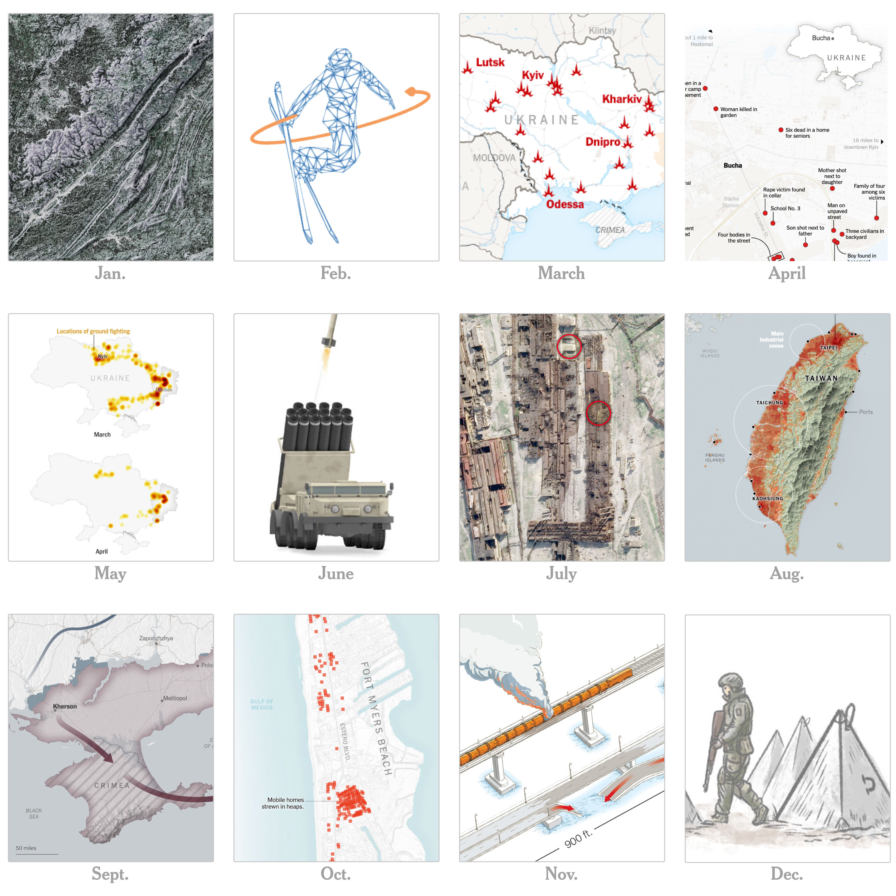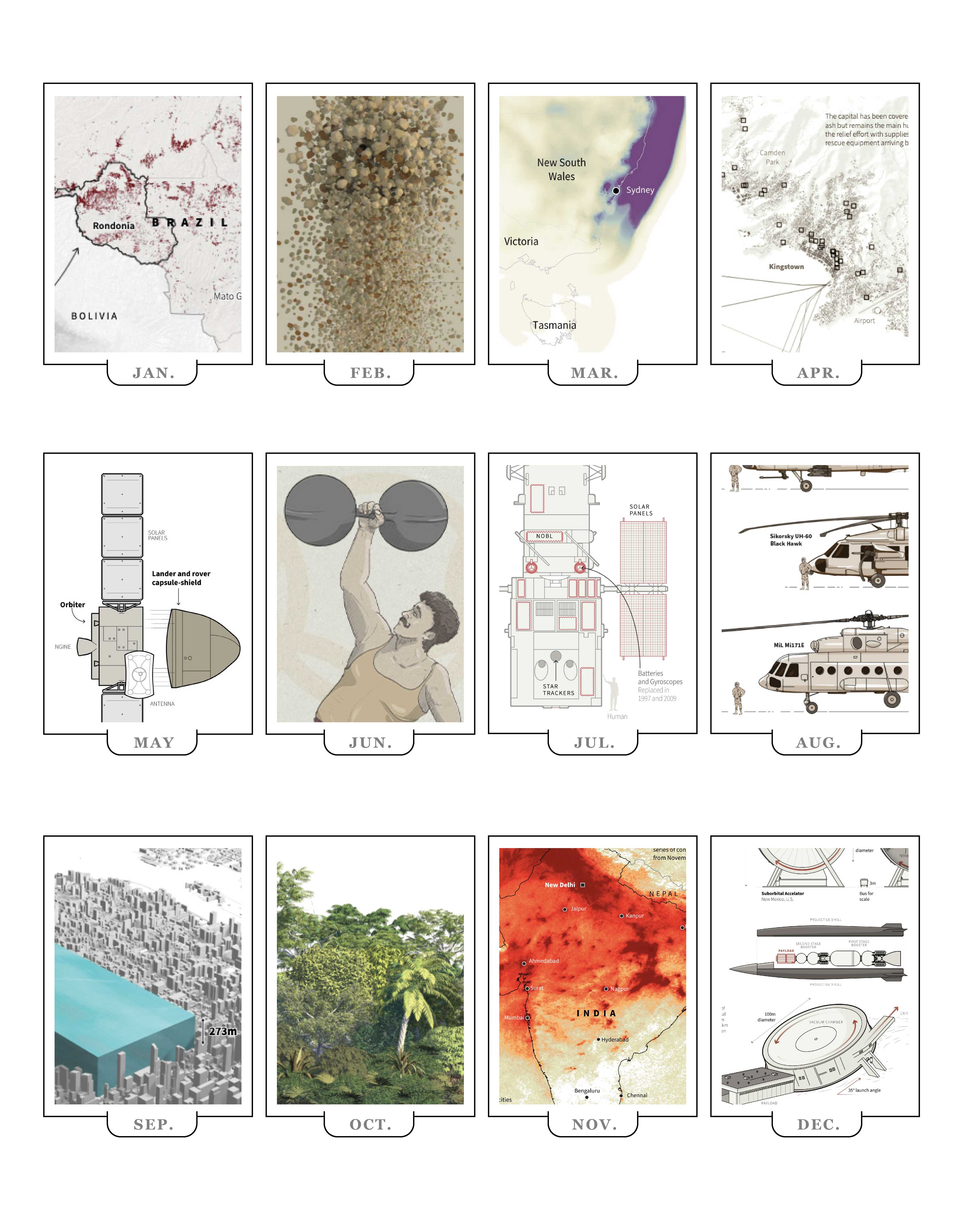
As we prepare for the next year, it’s always nice to remember what we spent our time on during the latest Earth’s lap across the orbit. So, here’s a collection of my favorite details at work and other things I have done in 2023.
January: Wild weather
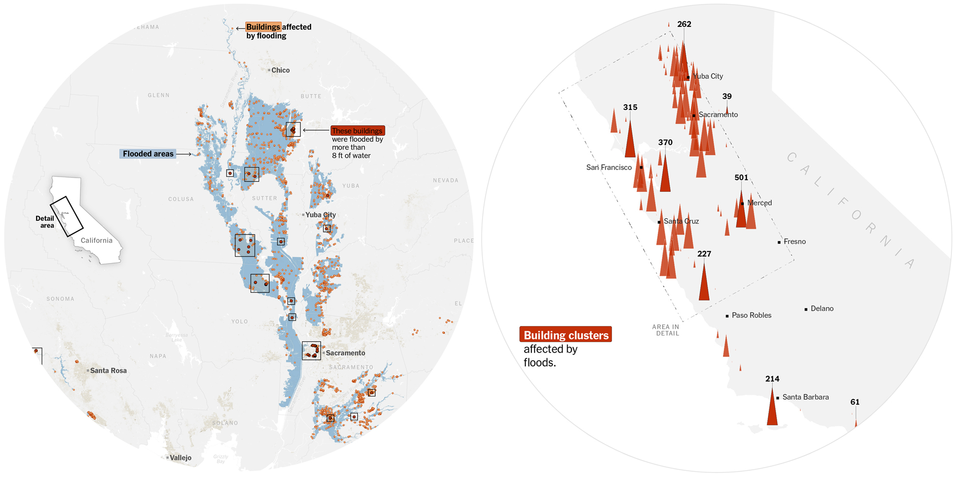
The beginning of the year was full of extreme weather events. We covered some, including the flooding in California, I was immersed in the coverage of the war in Ukraine, but, I did some maps that were not published, among them, a flood map showing the extent of the water using SAR data, and a count of buildings affected by the flood.
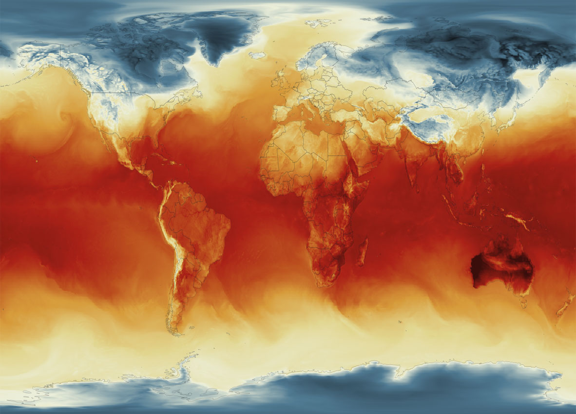
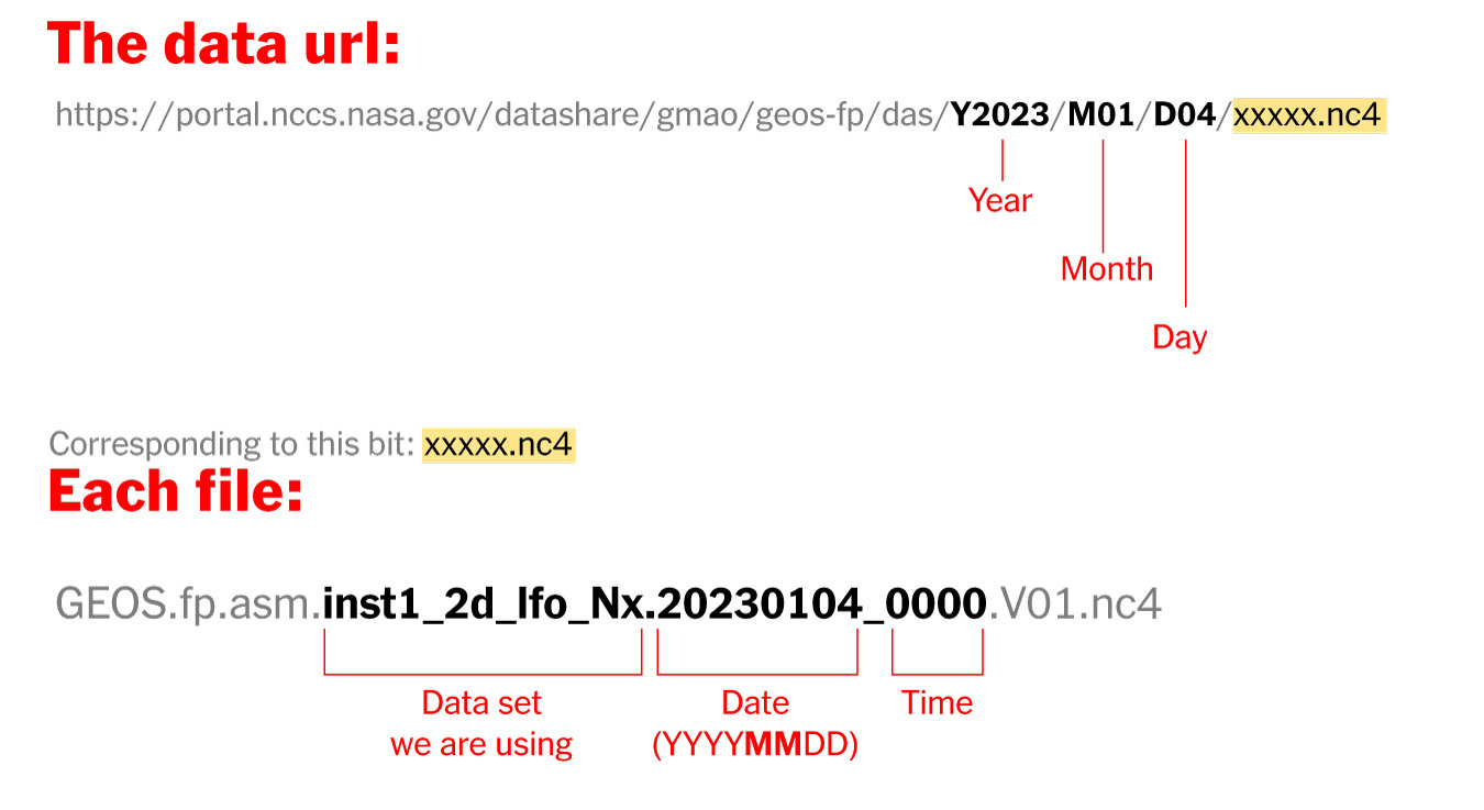
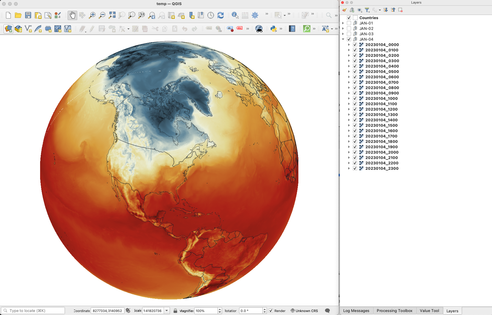
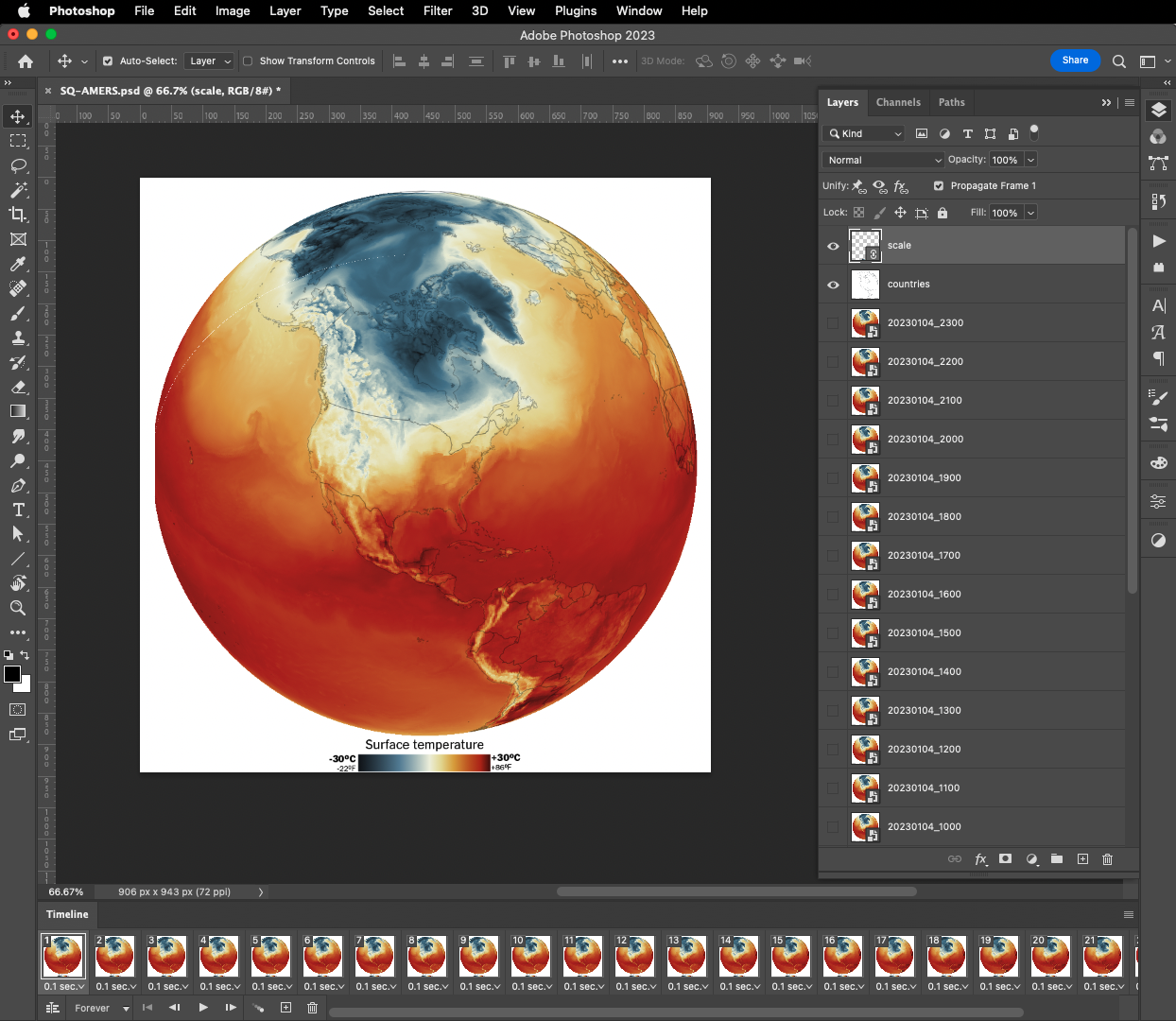
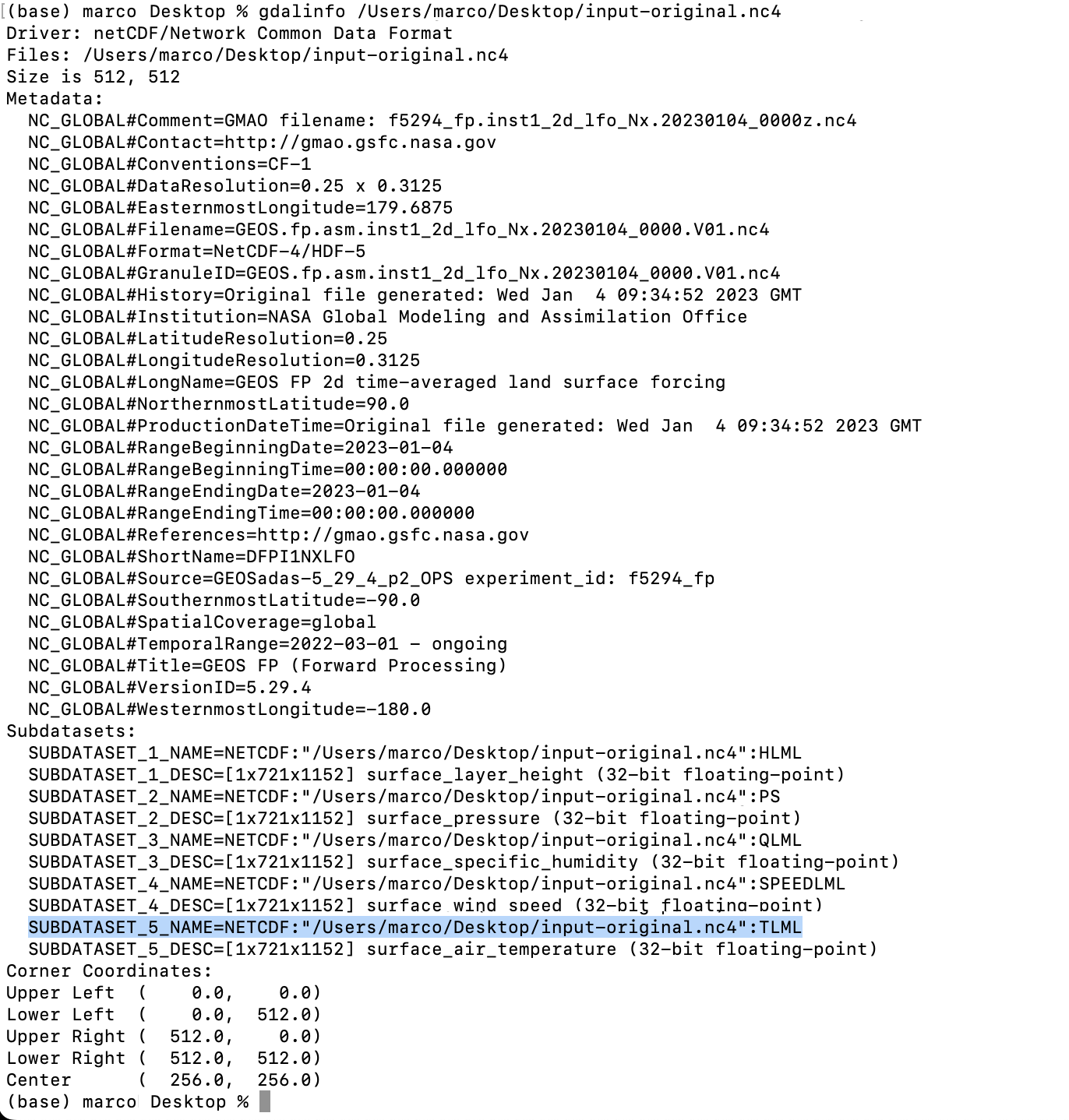
January was a month to think about all that I do, and no one sees. I thought that maybe, some of that stuff could be helpful to students or other professionals who are starting their careers. So I made a post showing how to visualize global temperature with data provided by NASA. Quickly I started to receive questions about it, so, I did my best to answer them all. Thanks all of you who reached out.
Later I learned some journalists around the world published stories with visualizations using my tutorial. It was very nice to know that I was able to help and I would love to do more of this next year when my other responsibilities allow me.
––––––– :::: 🗓️ ::::: –––––––
February: The next stage of the war in Ukraine
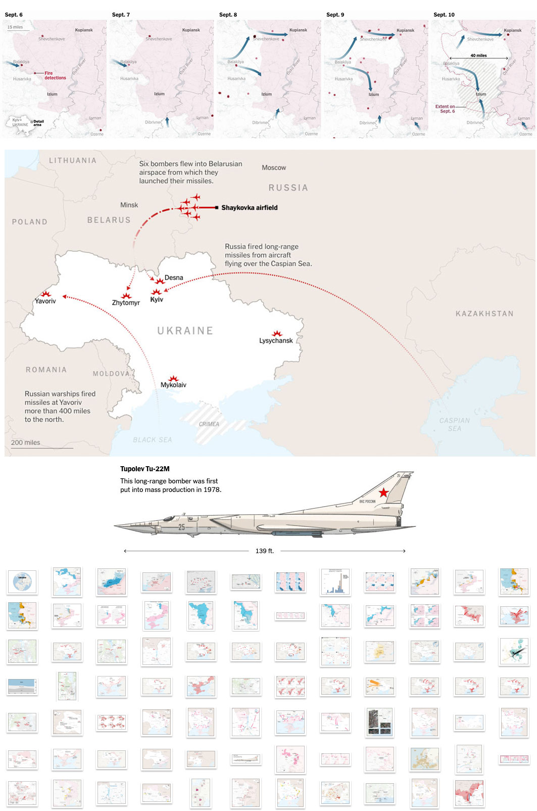
At the beginning of the year we were trying to find clues about where the war in Ukraine was going. Military analysts gave us some opinions as to what the objectives of both sides could be for the spring, although none of the forecasts were accurate, we were able to create a series of maps explaining the aims of both sides.
I always make basic maps and draw things on top of them, like when you use a marker to explain ideas to your colleagues. My editor saw that and convinced me to publish a version of the maps with marker-like styles. You can see the piece at the following link without a paywall: The War’s violent Next Stage.
––––––– :::: 🗓️ ::::: –––––––
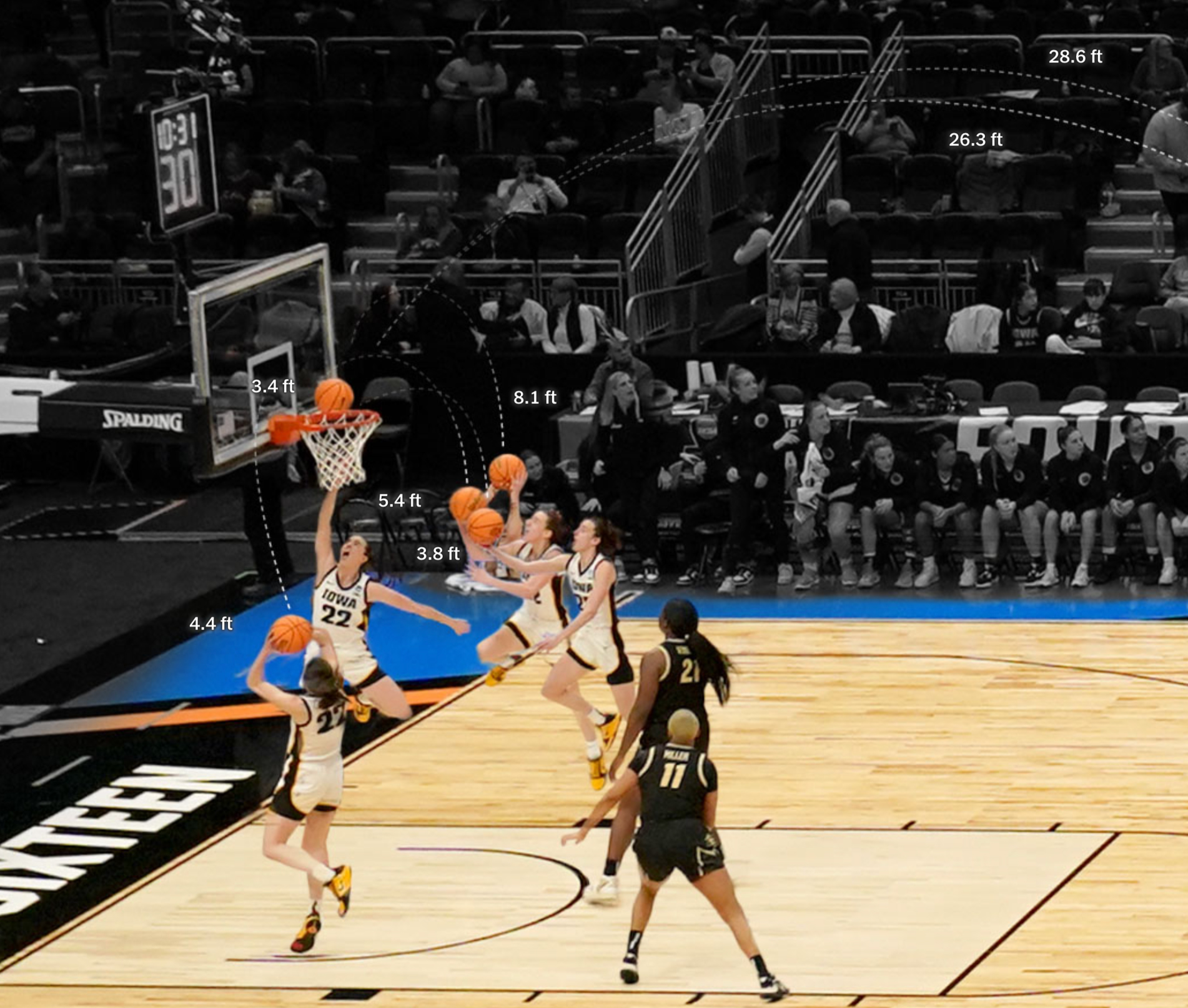
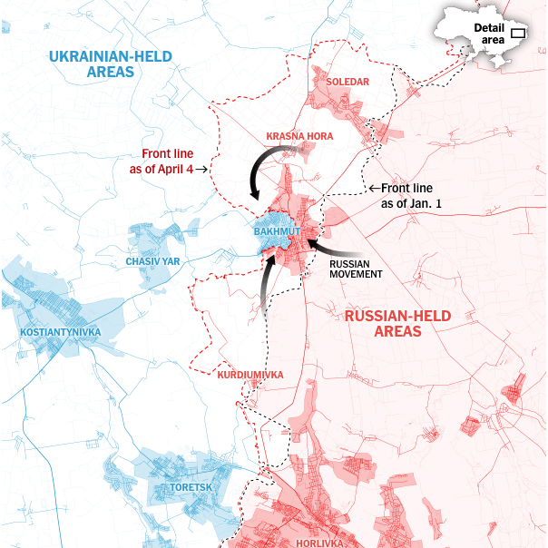
March: War and Basketball
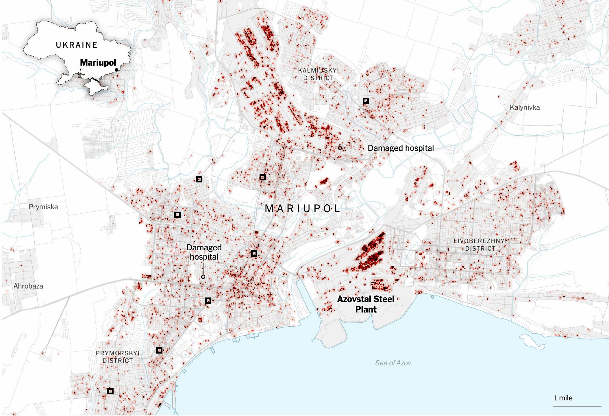
Earlier this year, all eyes were on Bakhmut. I did some pieces about how the Russians were slowly advancing from the east towards the city while the satellites captured the destruction caused by the fierce battle that the Ukrainians fought trying to maintain their positions.
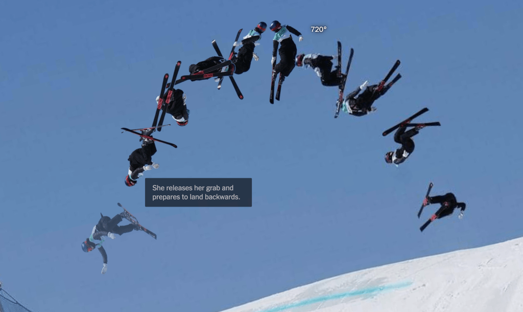
But small projects also come while we are doing some other long or mid-term stories, like this one I helped with to cover college basketball player Caitlin Clark. The main visuals in the piece are photocompositions showing several of the player’s many shots. The images show the distance and position of each shot as if it were captured in a single photo.
––––––– :::: 🗓️ ::::: –––––––
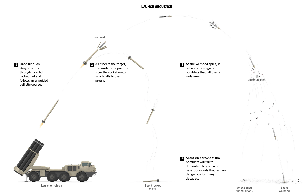
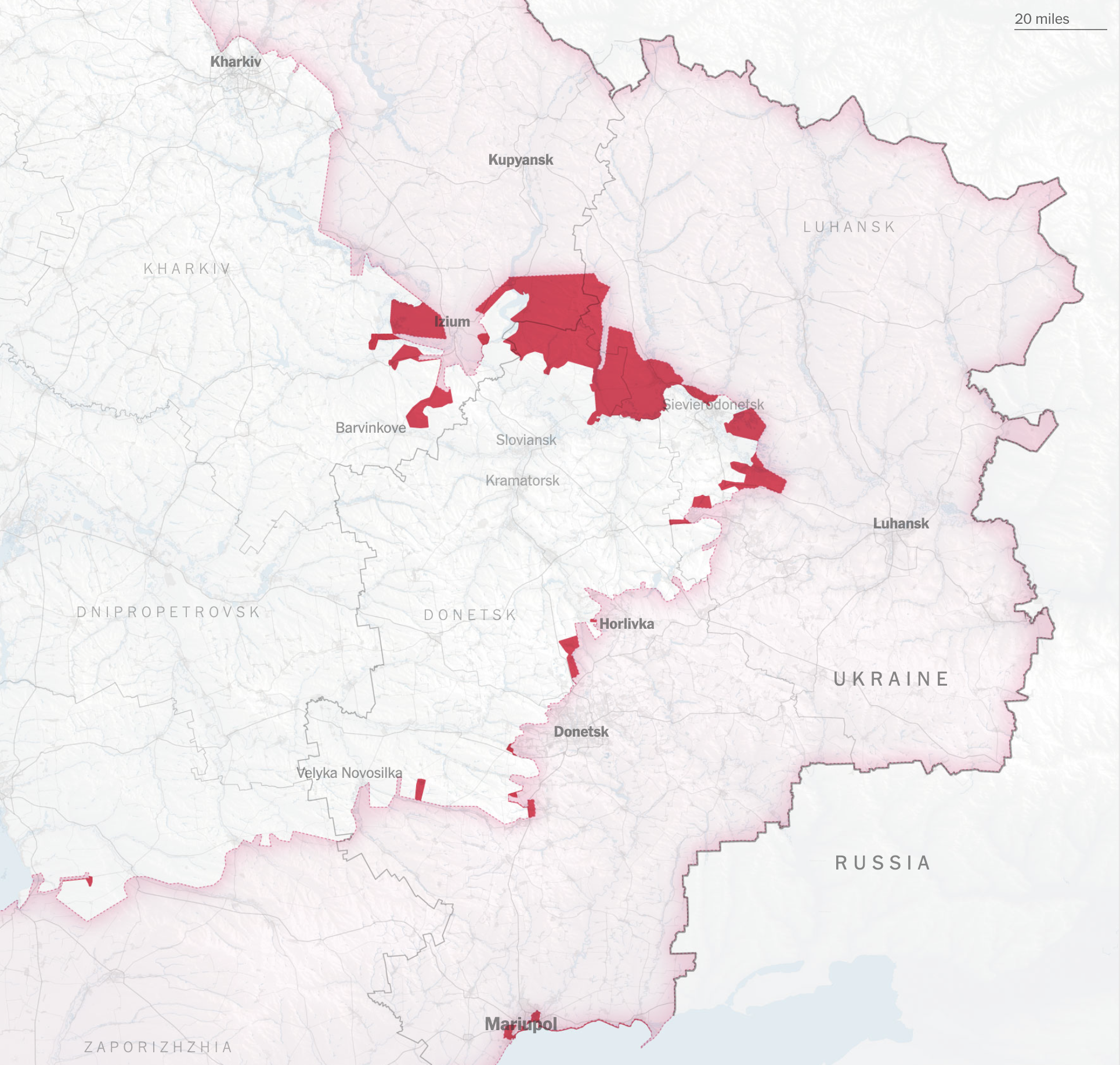
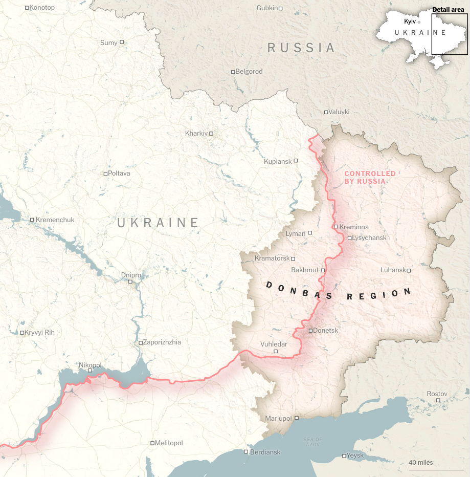
April: The fierce battles in the Donbas
After months of pouring resources into the war, we analyzed the progress of Russia in Ukraine in 2023, the declarations of taking over the Donbas were not accomplished, and in fact, the progress was reduced to just 4 small settlements. I particularly liked the concept of inking the streets according to whether they were either Russian or Ukrainian held, highlighting the urban areas a little better.
You can read the piece at here: How Russia’s Offensive Ran Aground.
––––––– :::: 🗓️ ::::: –––––––
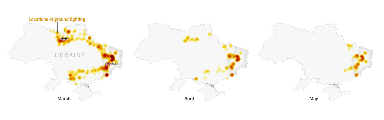
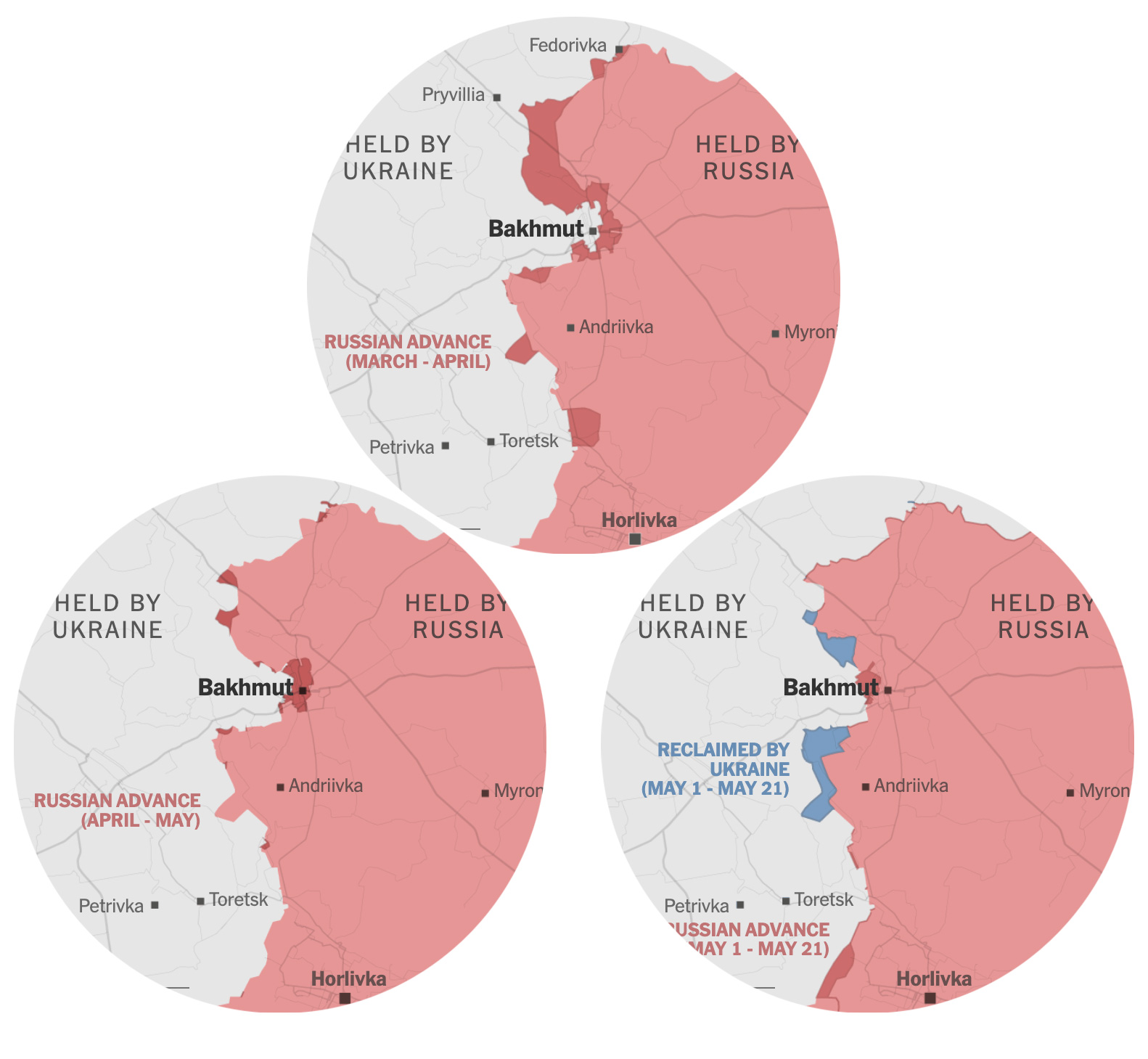
May: The fall of Bakhmut
In May, the battle for the city of Bakhmut that we had covered for almost a year finally reached a favorable outcome for the Russians when they managed to take the center of the city. We made a series of maps showing how the Russian forces slowly moved to engulf the city.
––––––– :::: 🗓️ ::::: –––––––
June: A busy month of publications
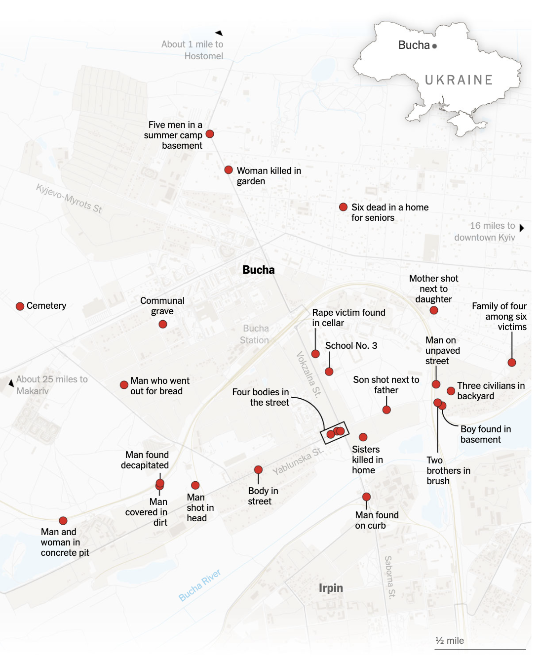
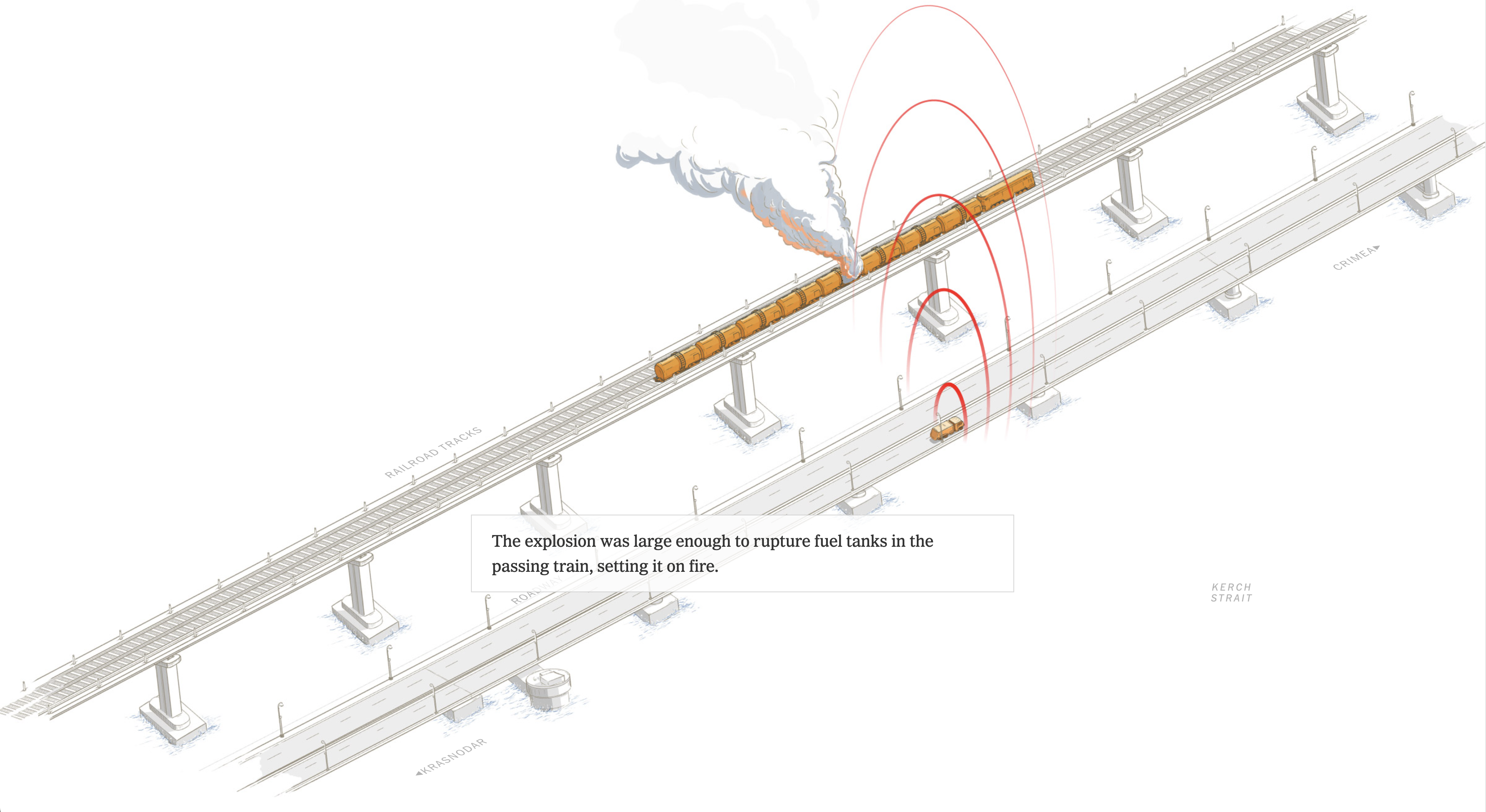
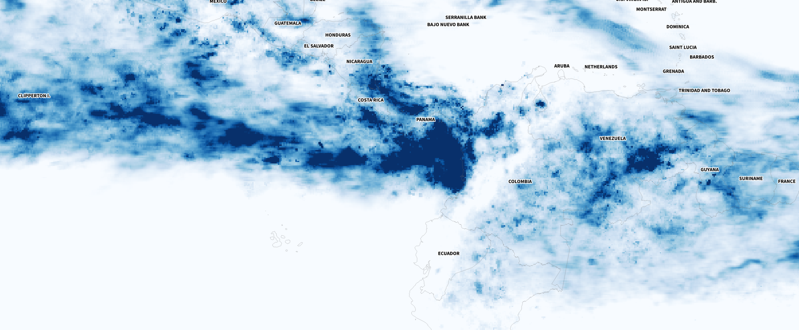
Since I joined the Times team, on average, every month I have published two or three stories. But June of 2023 was a pretty intense month, I reported on breaking news like the train crash in India, the Kakhovka dam breach and the smoke from the Canadian wildfires. I also did other mid-term stories like the tragedy of the submersible that imploded in the Atlantic while trying to visit the Titanic wreckage, I also reported on the sudden rebellion of the Wagner forces marching towards Moscow, and another story about people using little figurines to protest against war in Russia through Instagram.
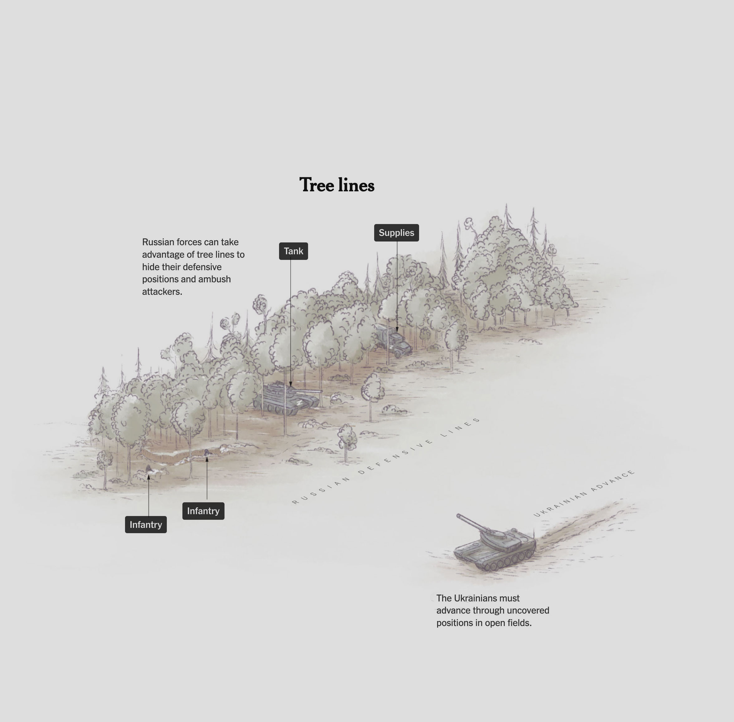
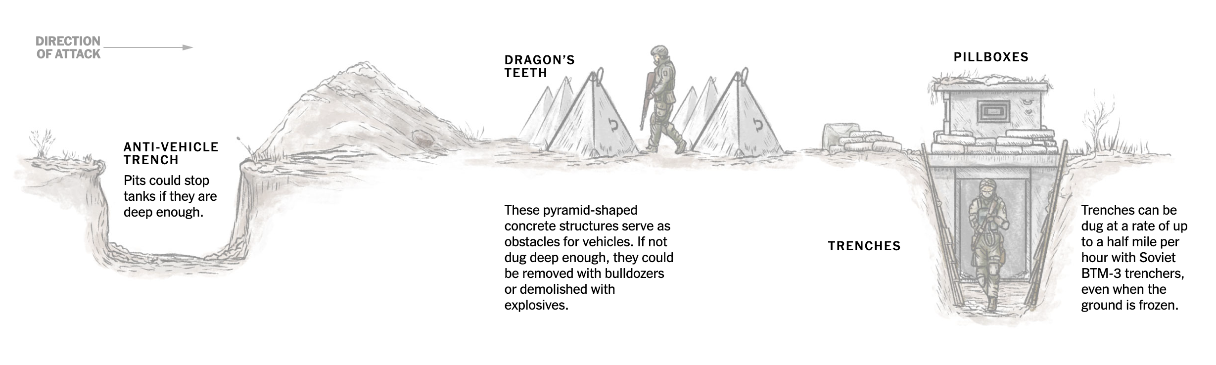
Almost at the end of June, we published an analysis of the challenges that Ukrainians face in their counter-offensive in the south of their country. The story shows some of the obstacles along a strategic 21-mile stretch that the Ukrainians must navigate if they wish to make their counteroffensive effective.
––––––– :::: 🗓️ ::::: –––––––
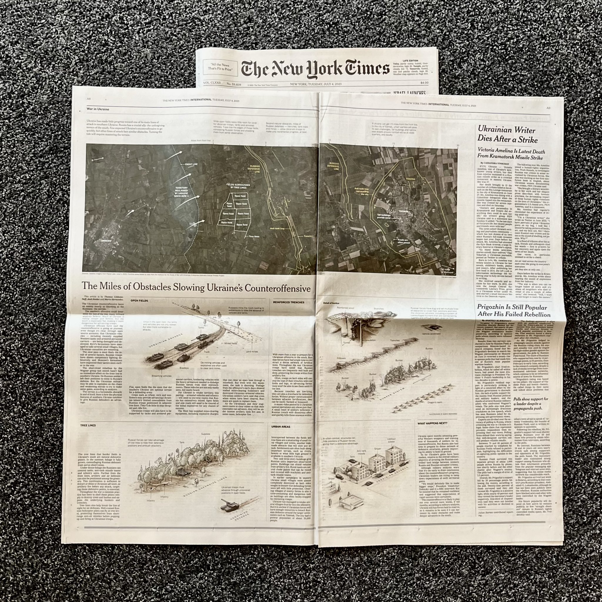
July: Paper editions
The print edition always comes after we publish our stories online. And since the story of those 21 miles of obstacles was published near the end of June, it wasn’t until July that the paper version was published with the help of the print editors.
July was also a special month, I also received my copy of Nightingale magazine, where I contributed with an article about my reflections on things I have learned in these twenty years making graphics in different media/continents.
––––––– :::: 🗓️ ::::: –––––––
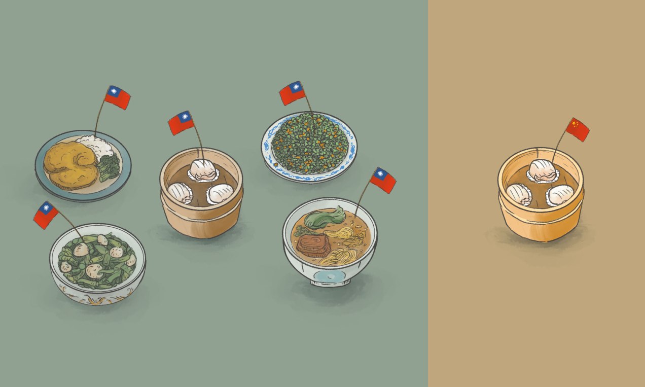
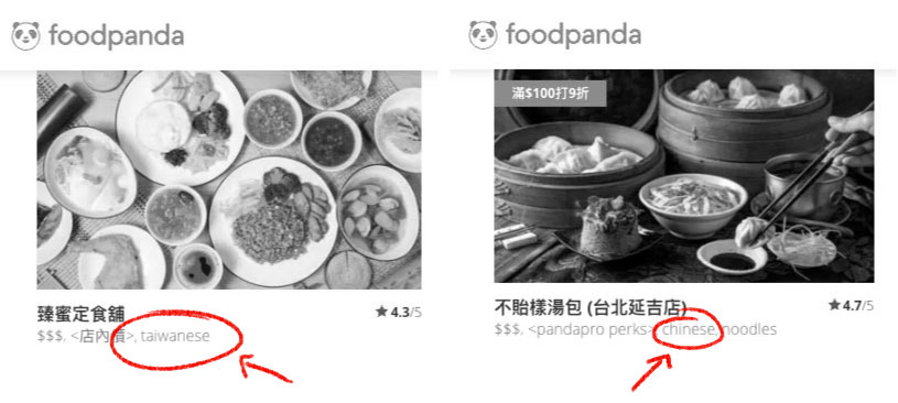
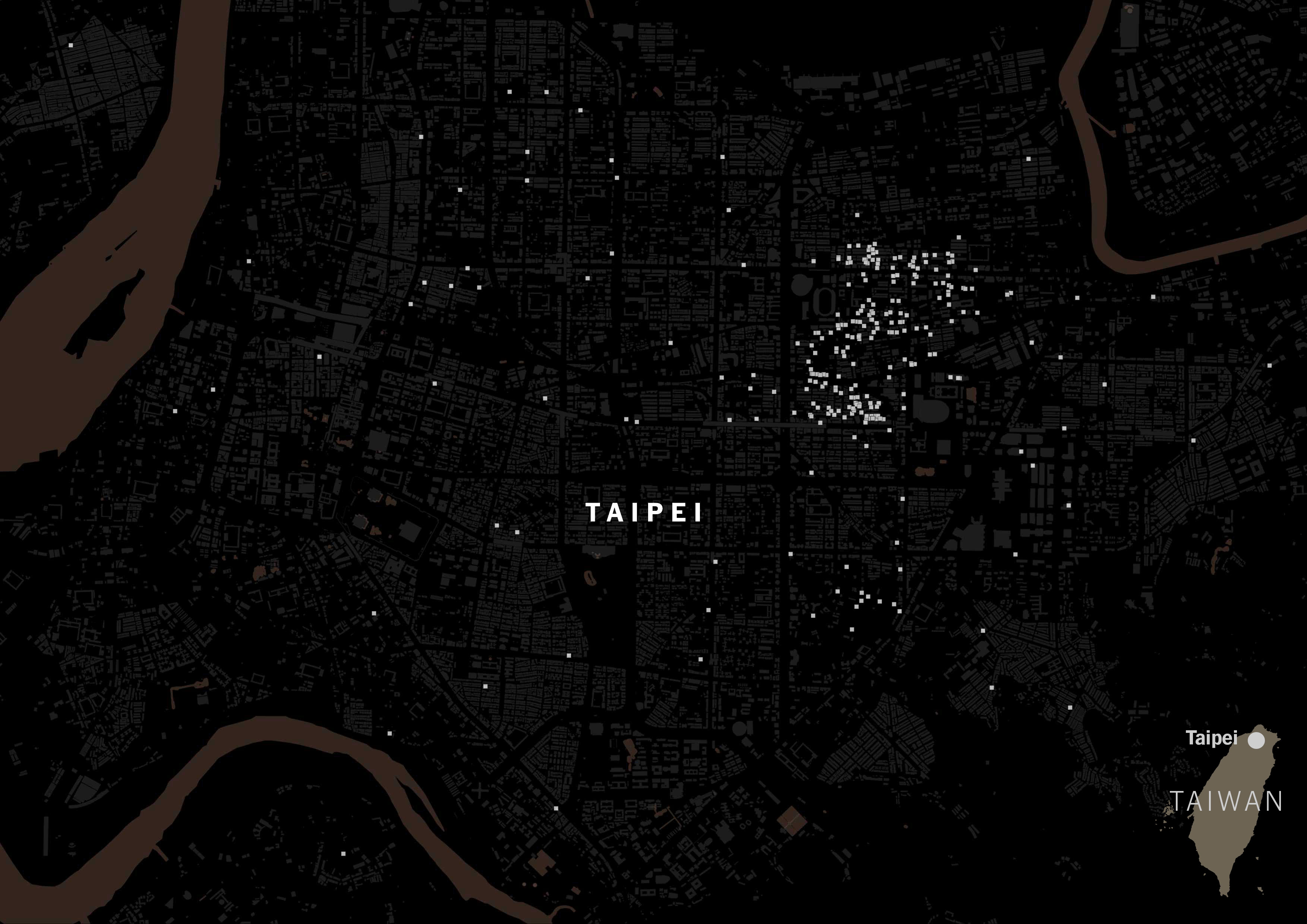
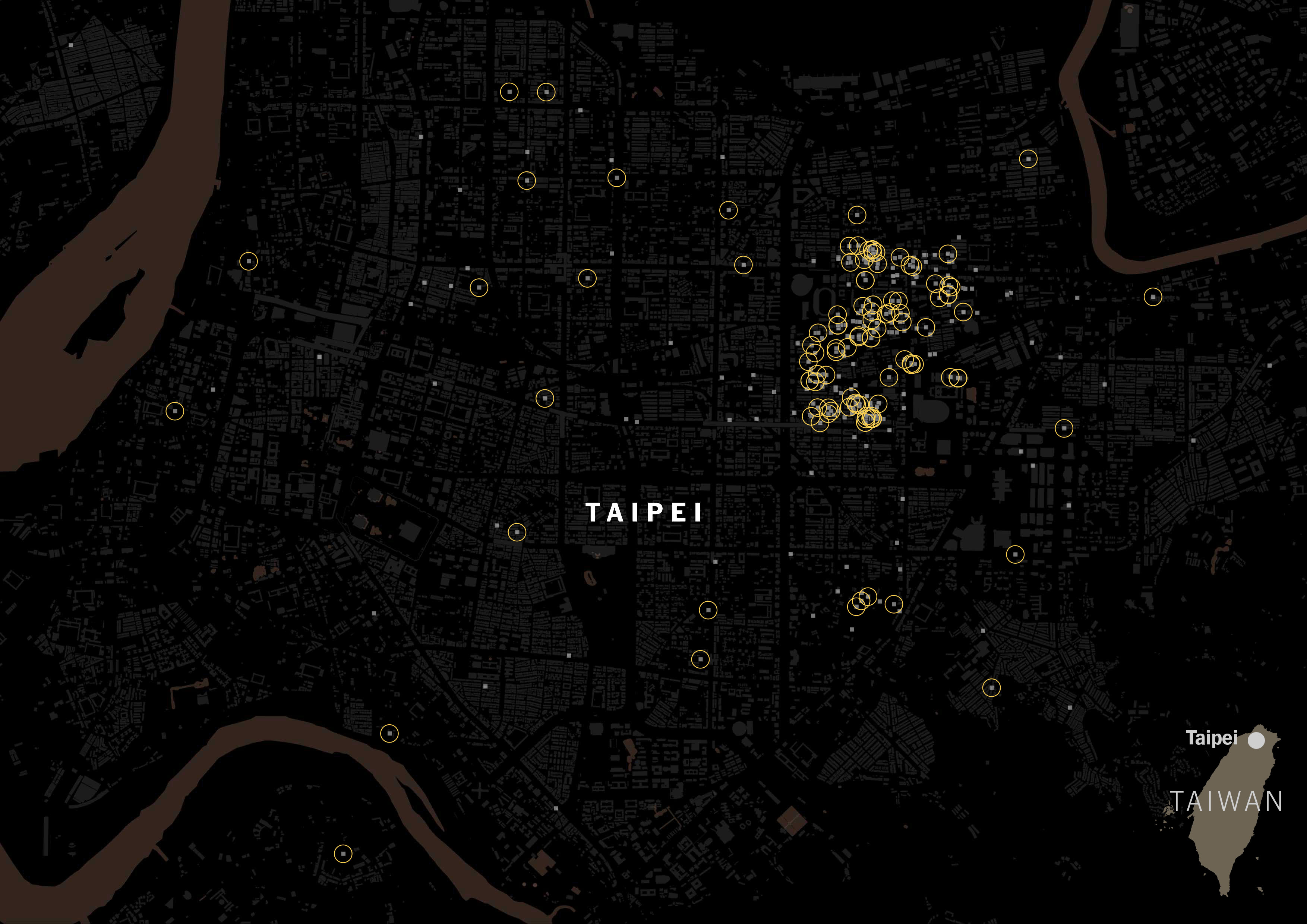
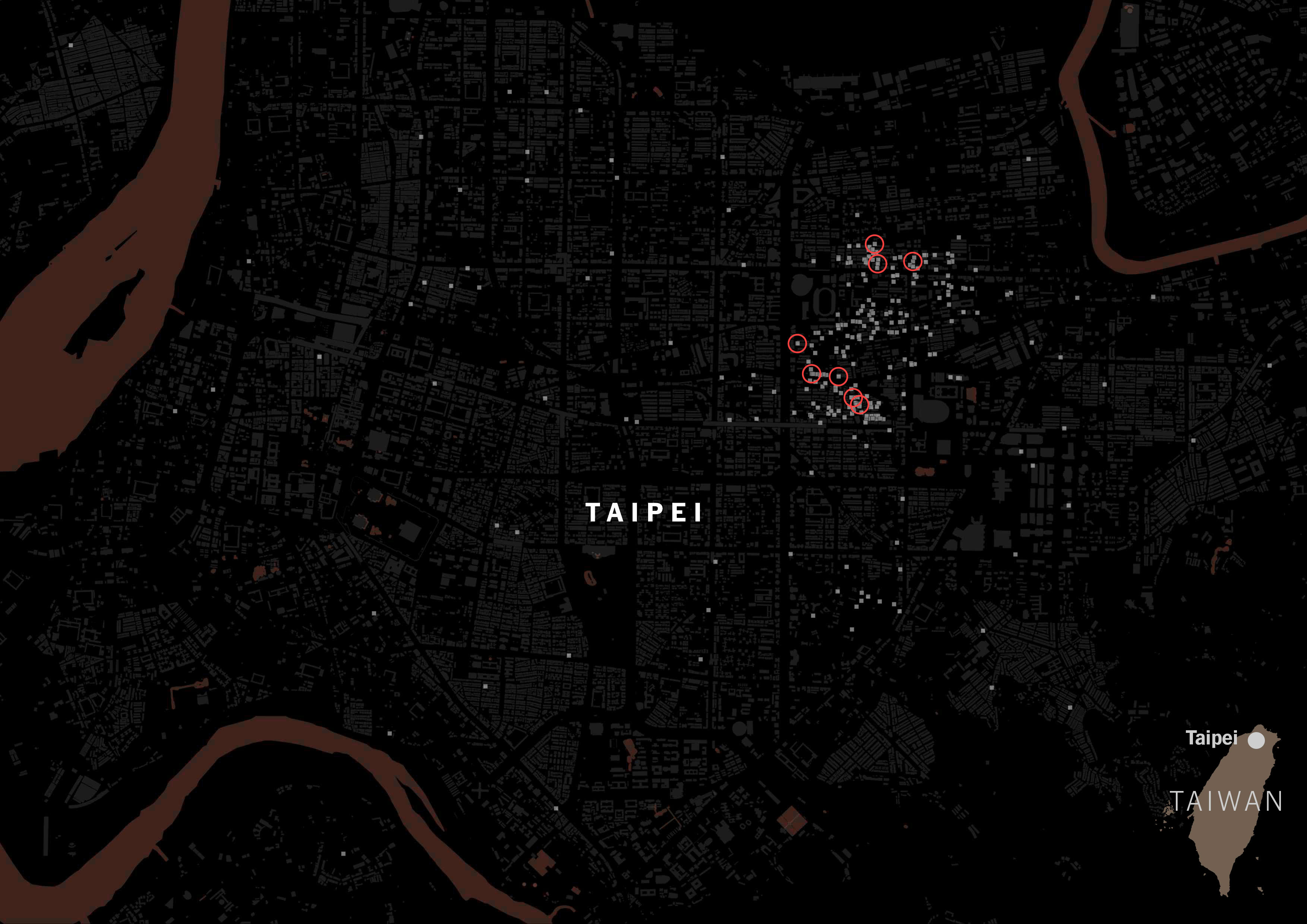
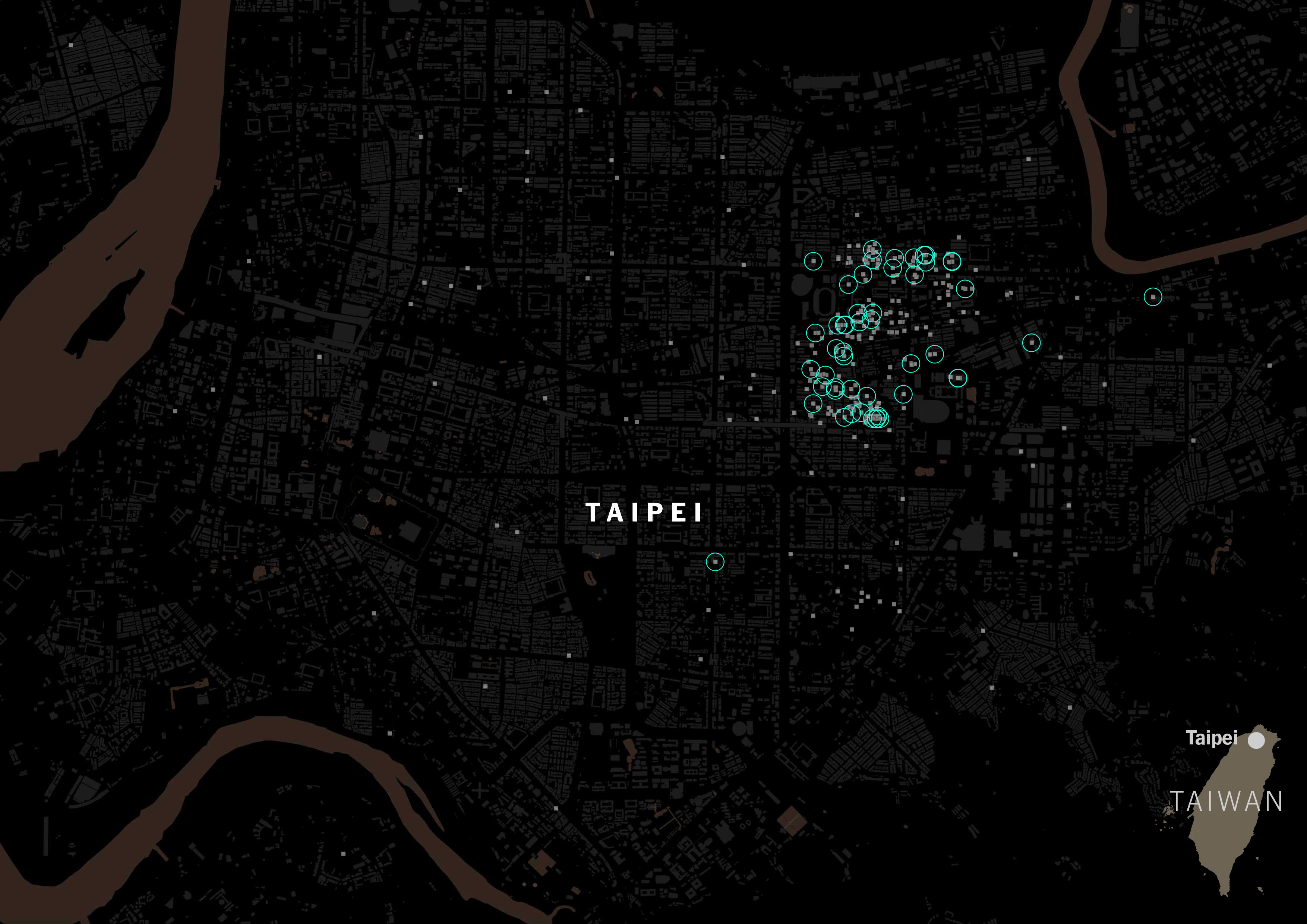
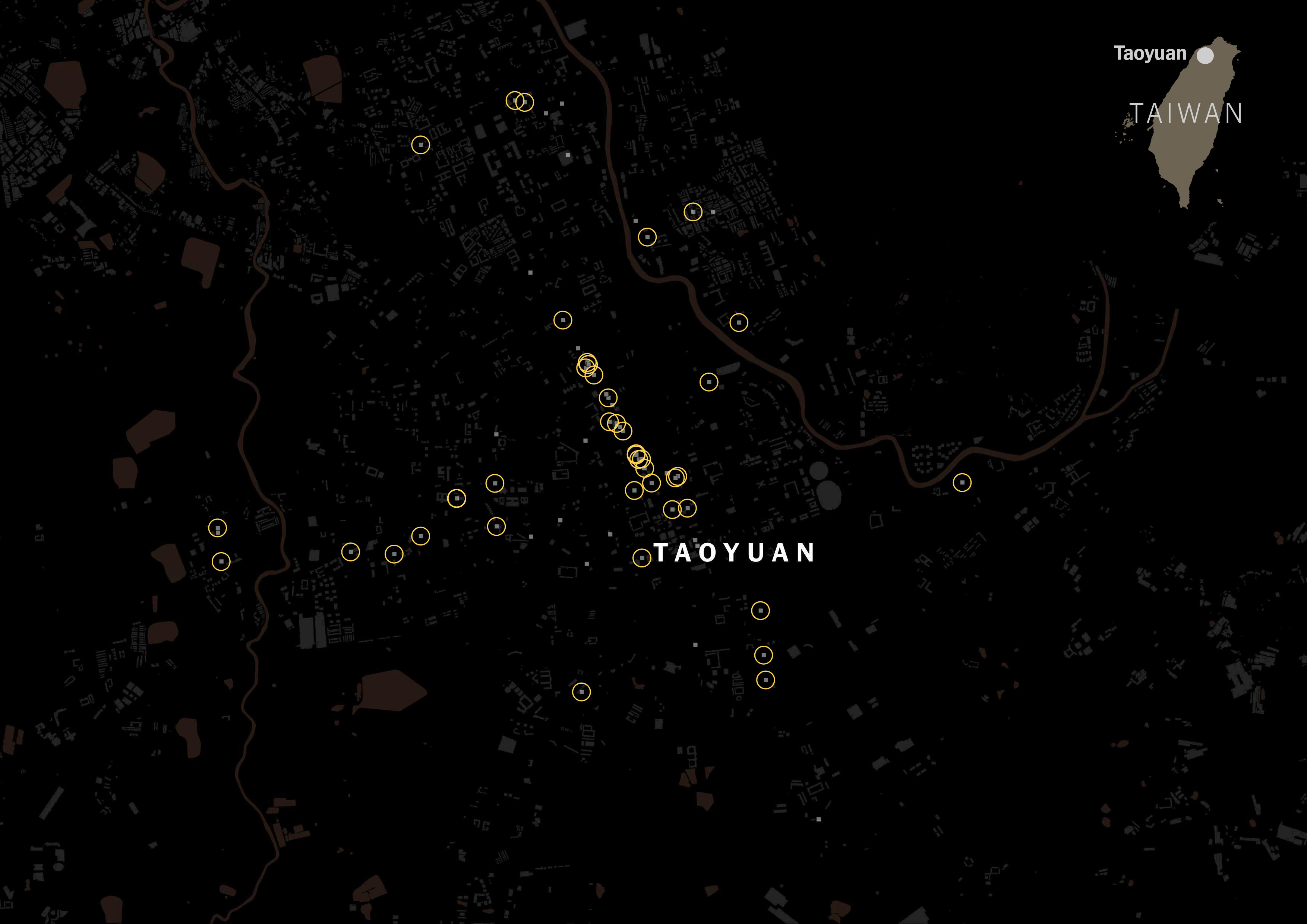
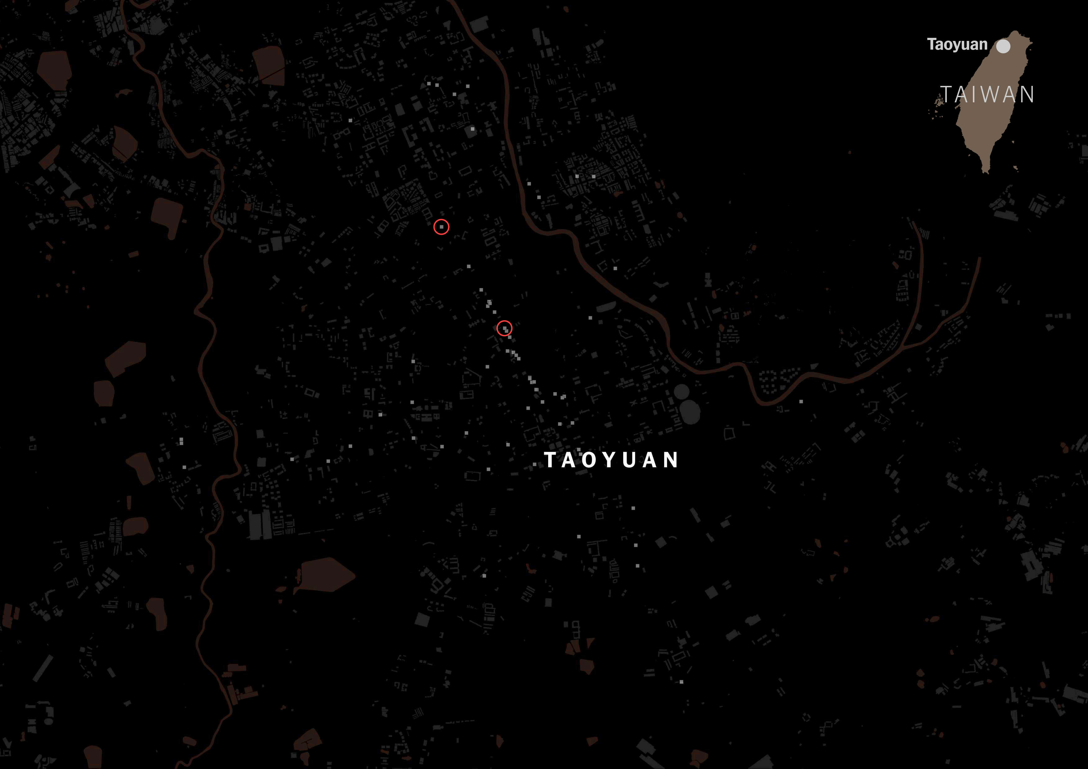
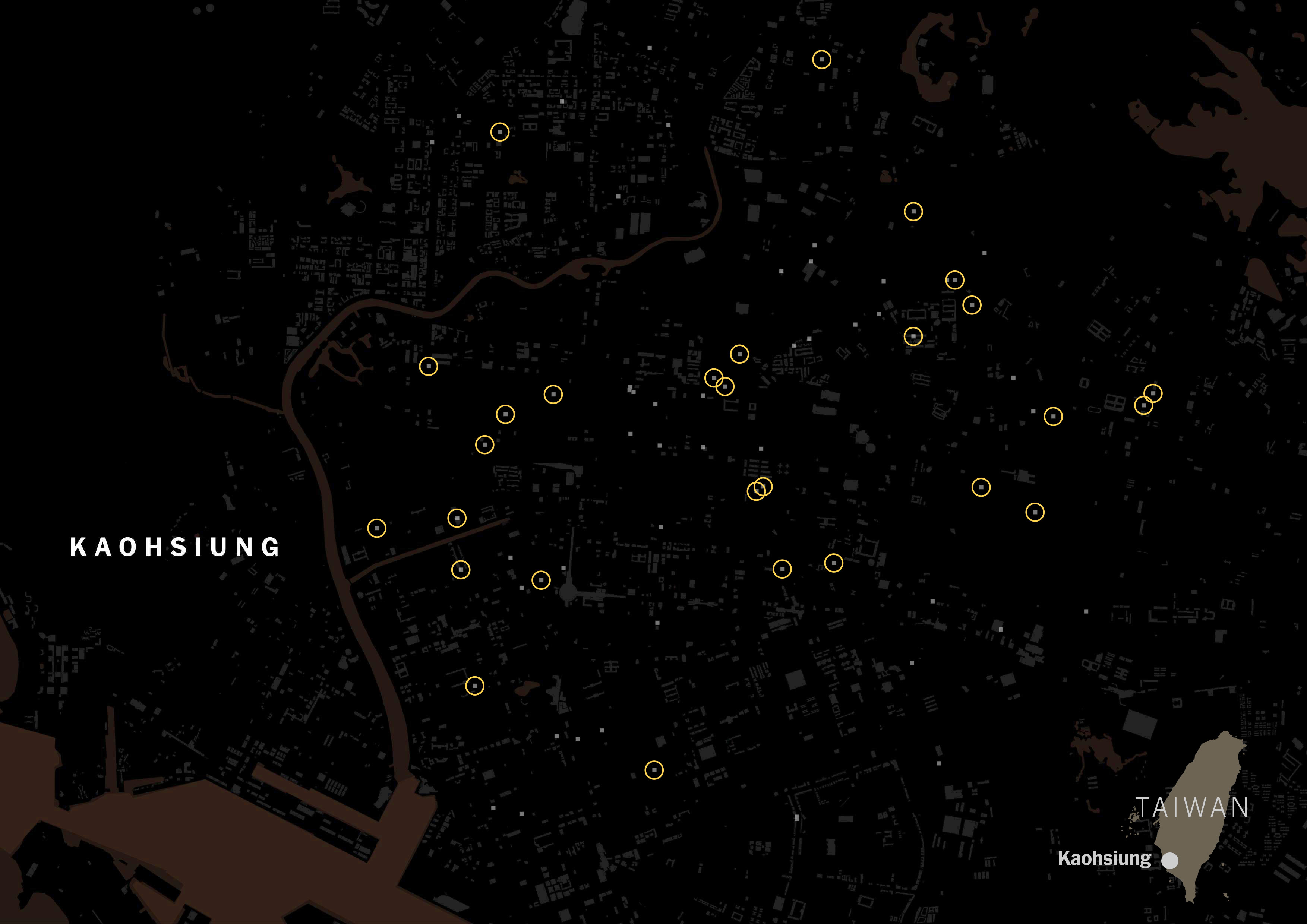
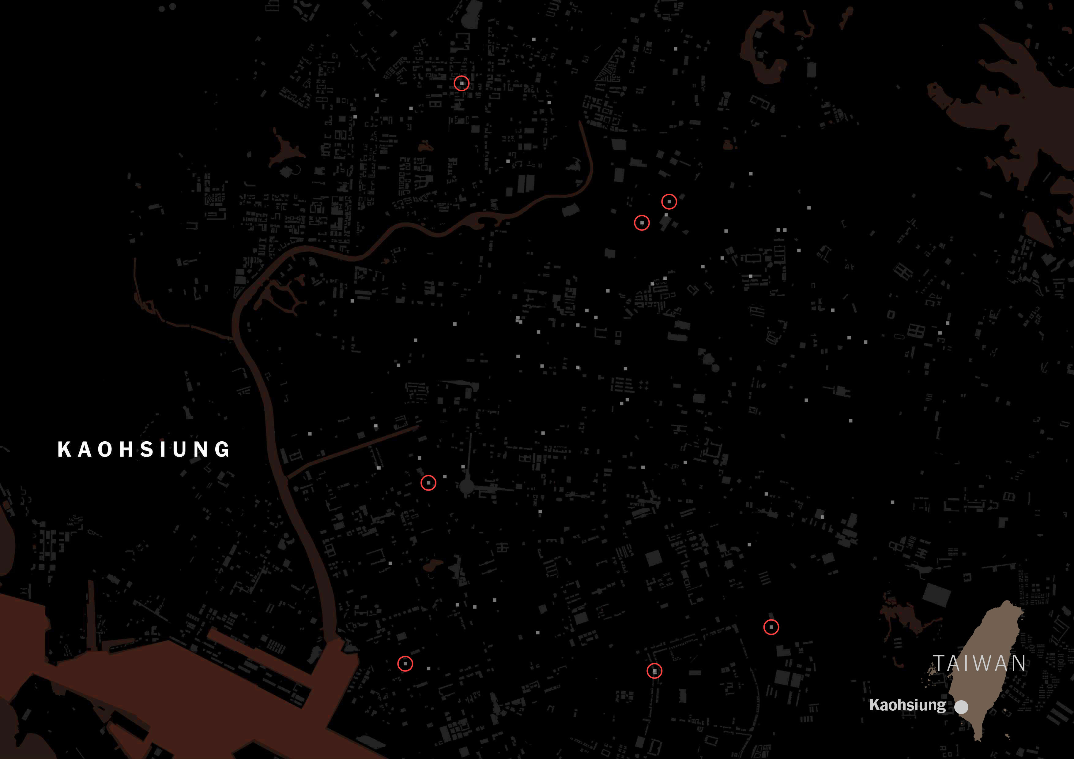
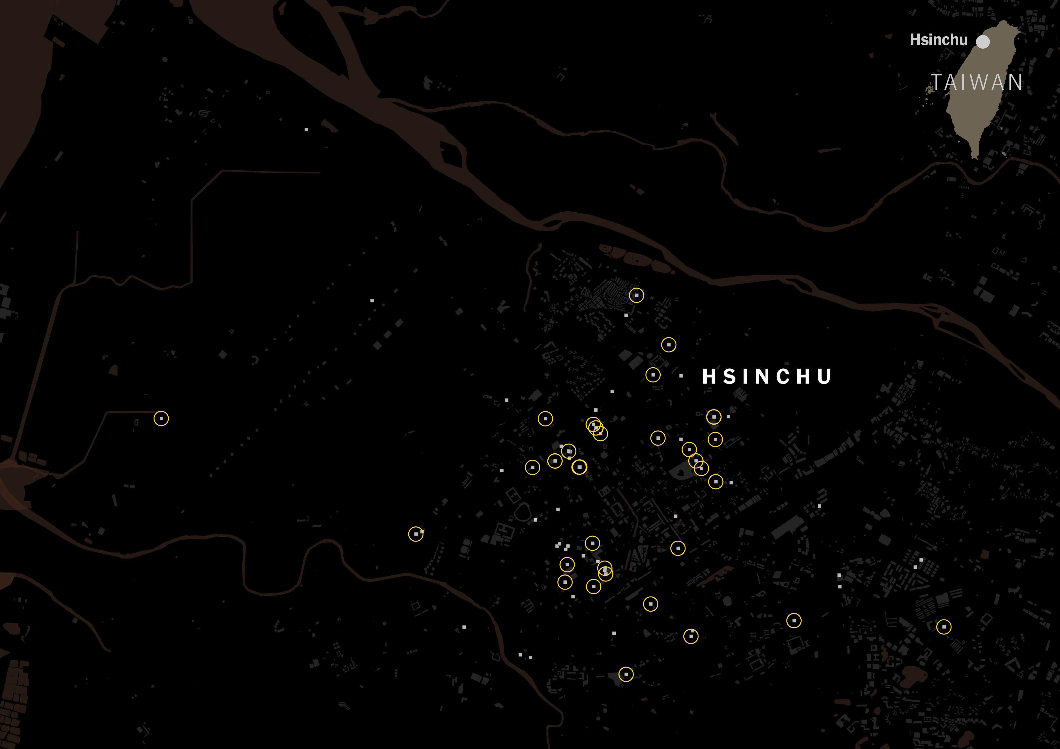
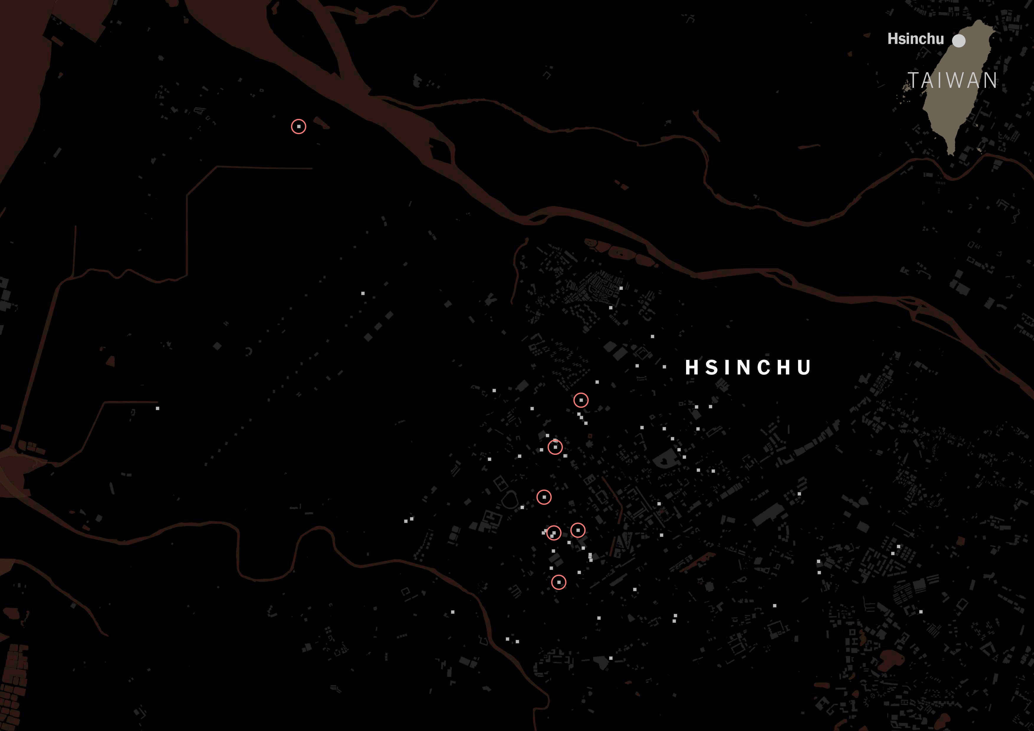
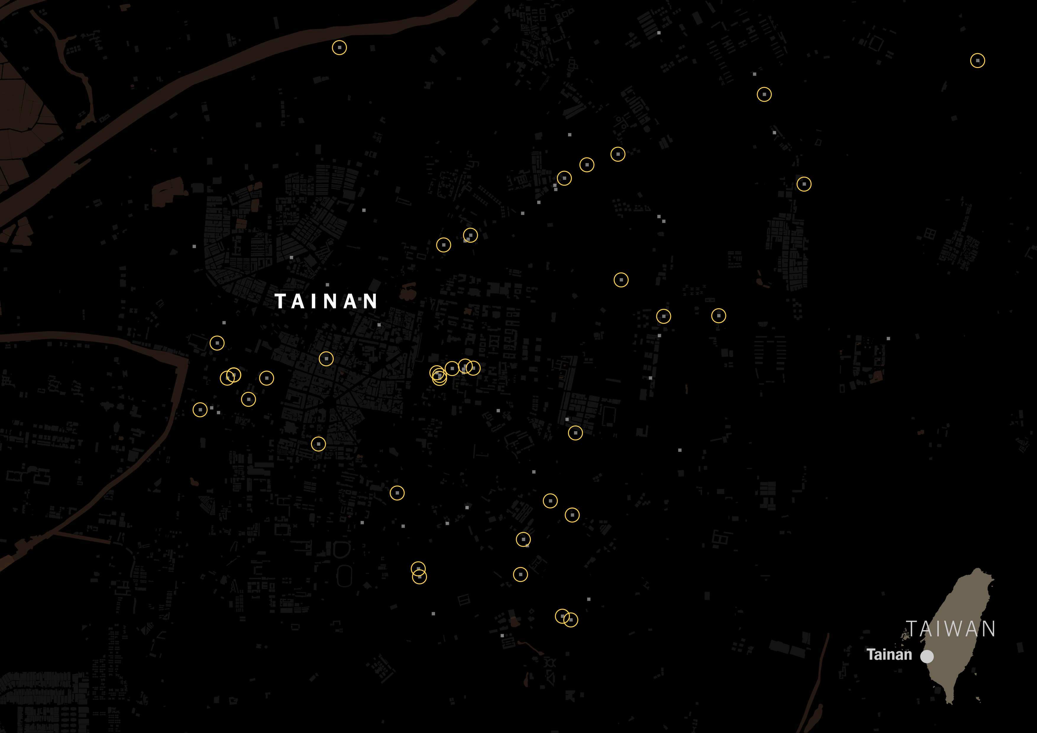
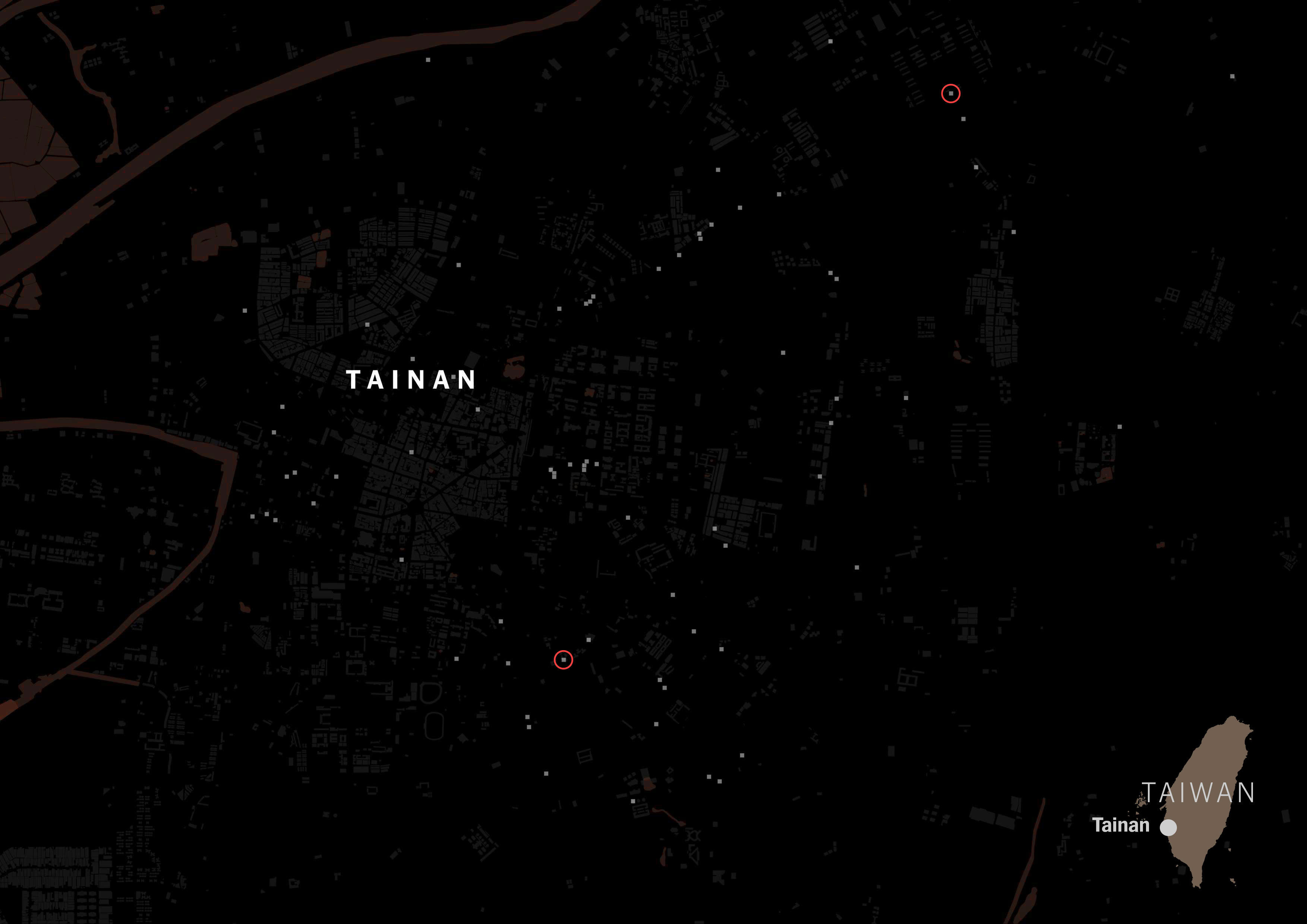
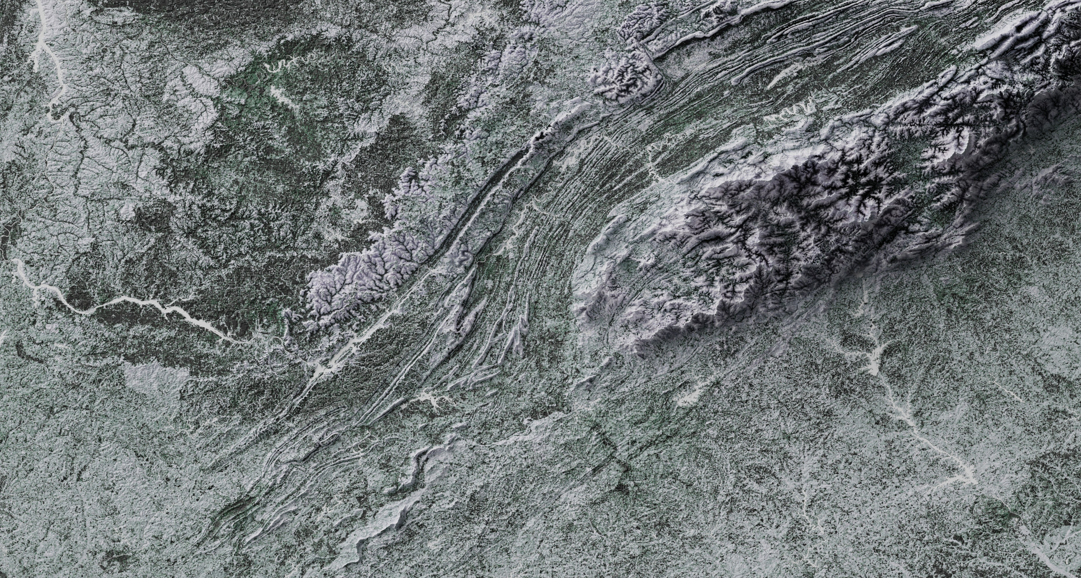
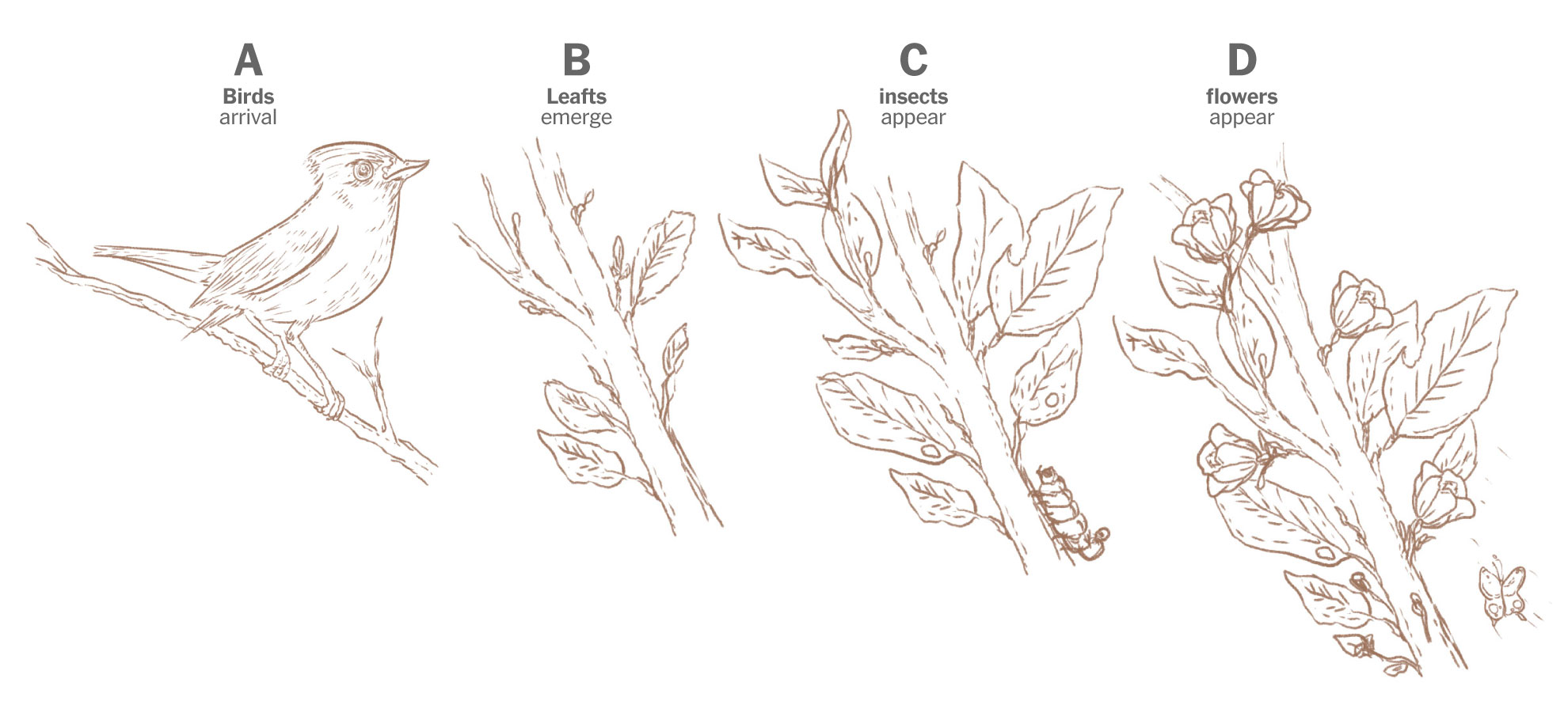
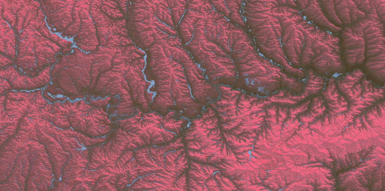
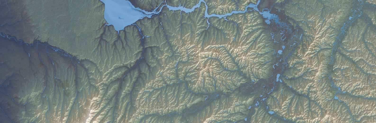
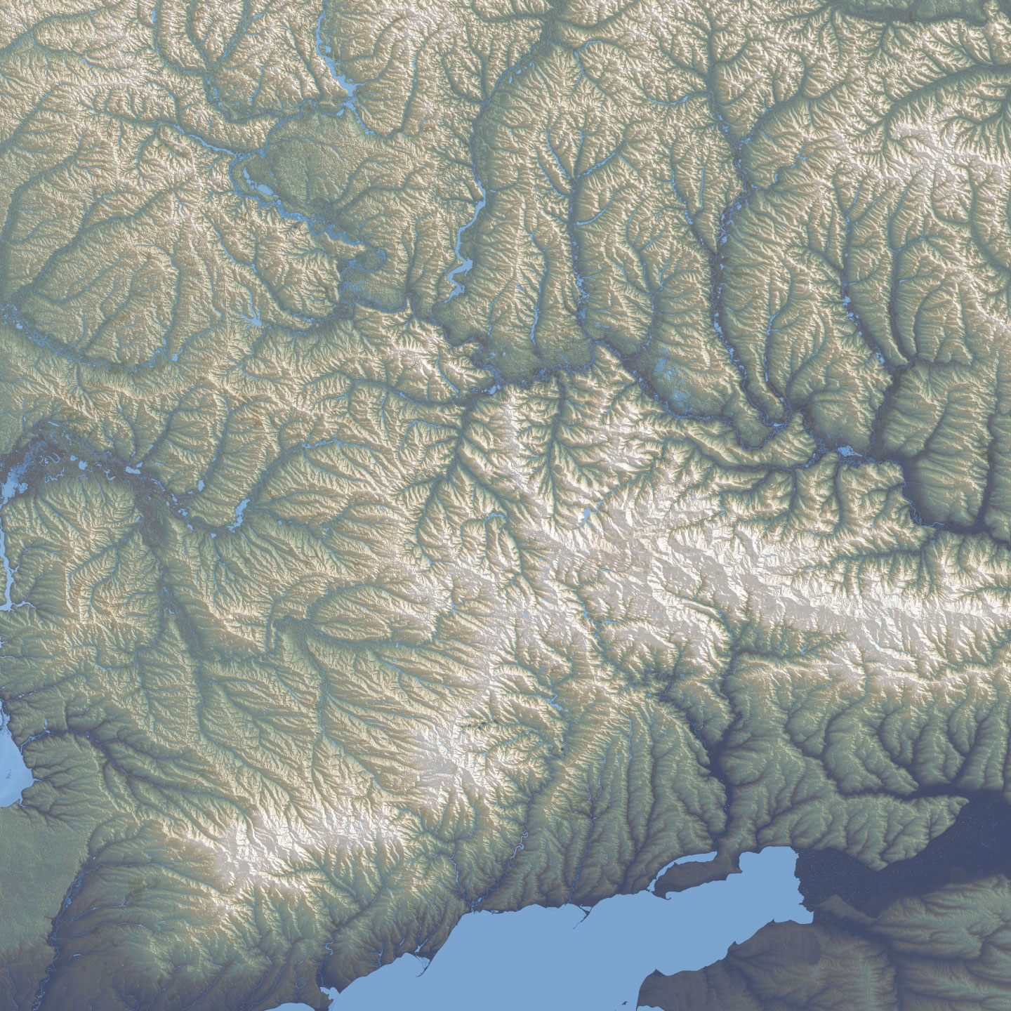
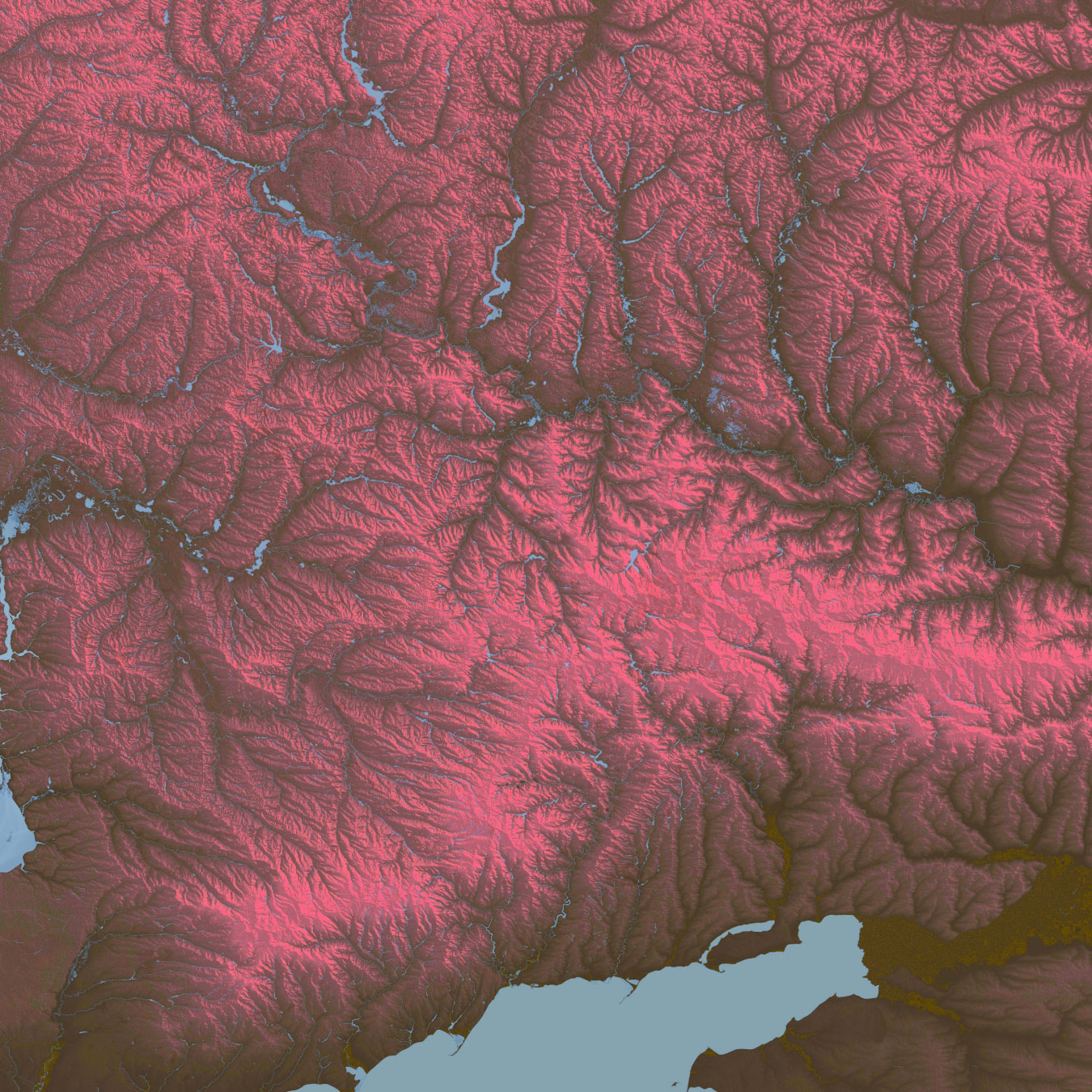
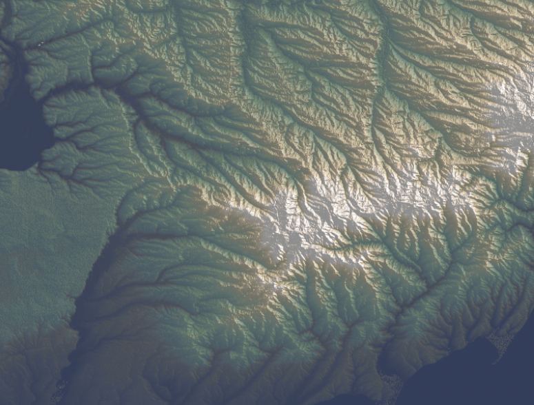
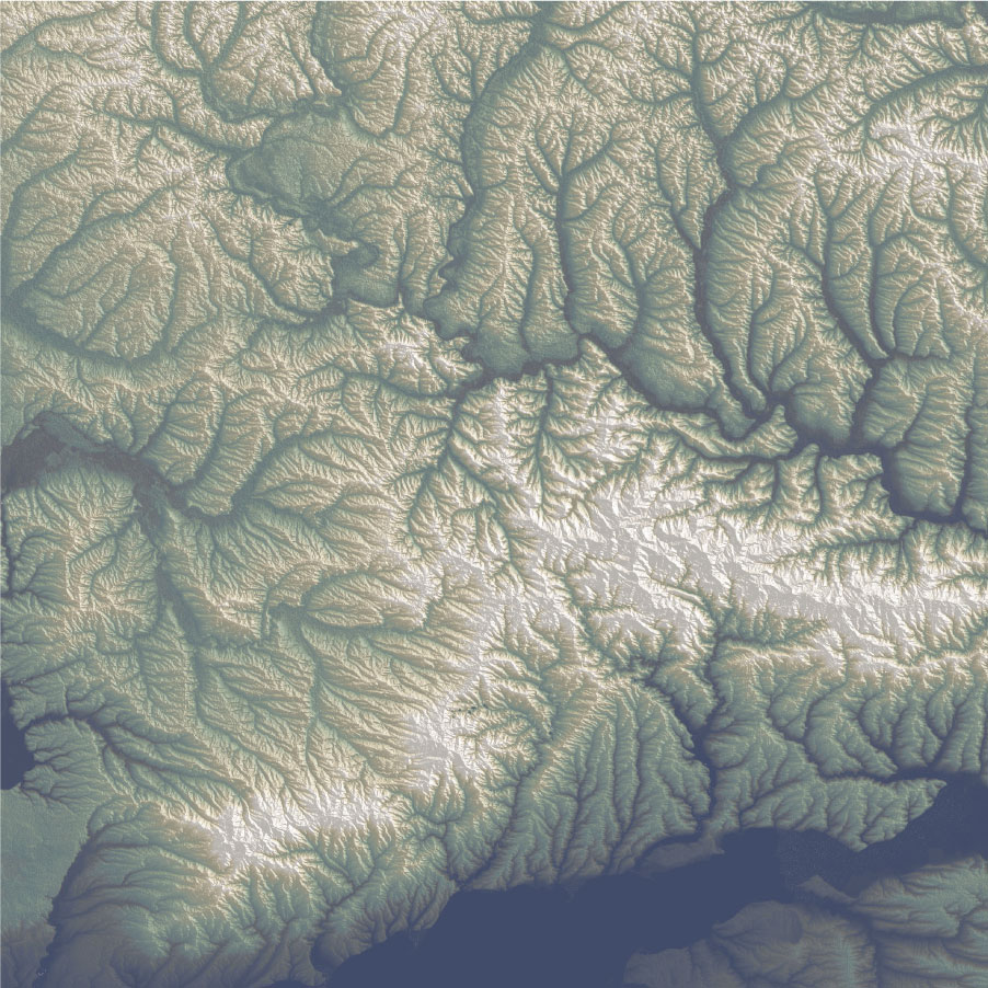
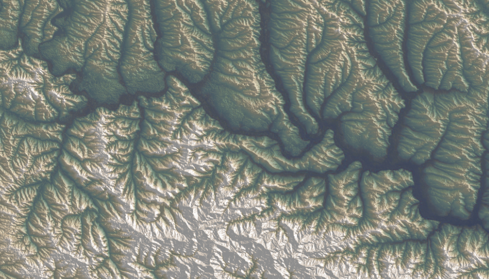
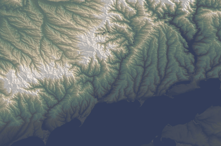
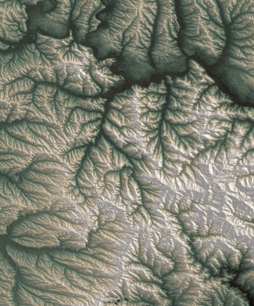
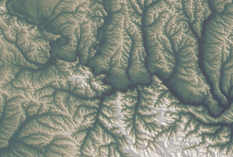
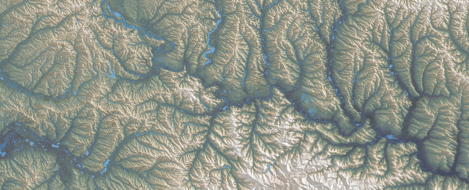
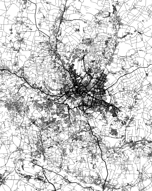
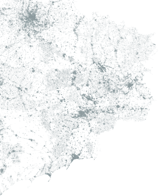
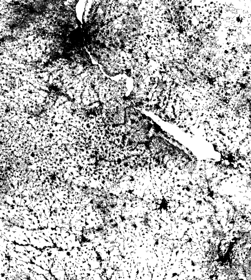
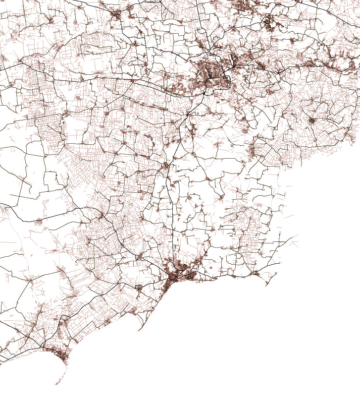
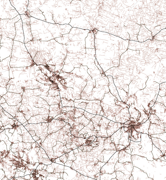
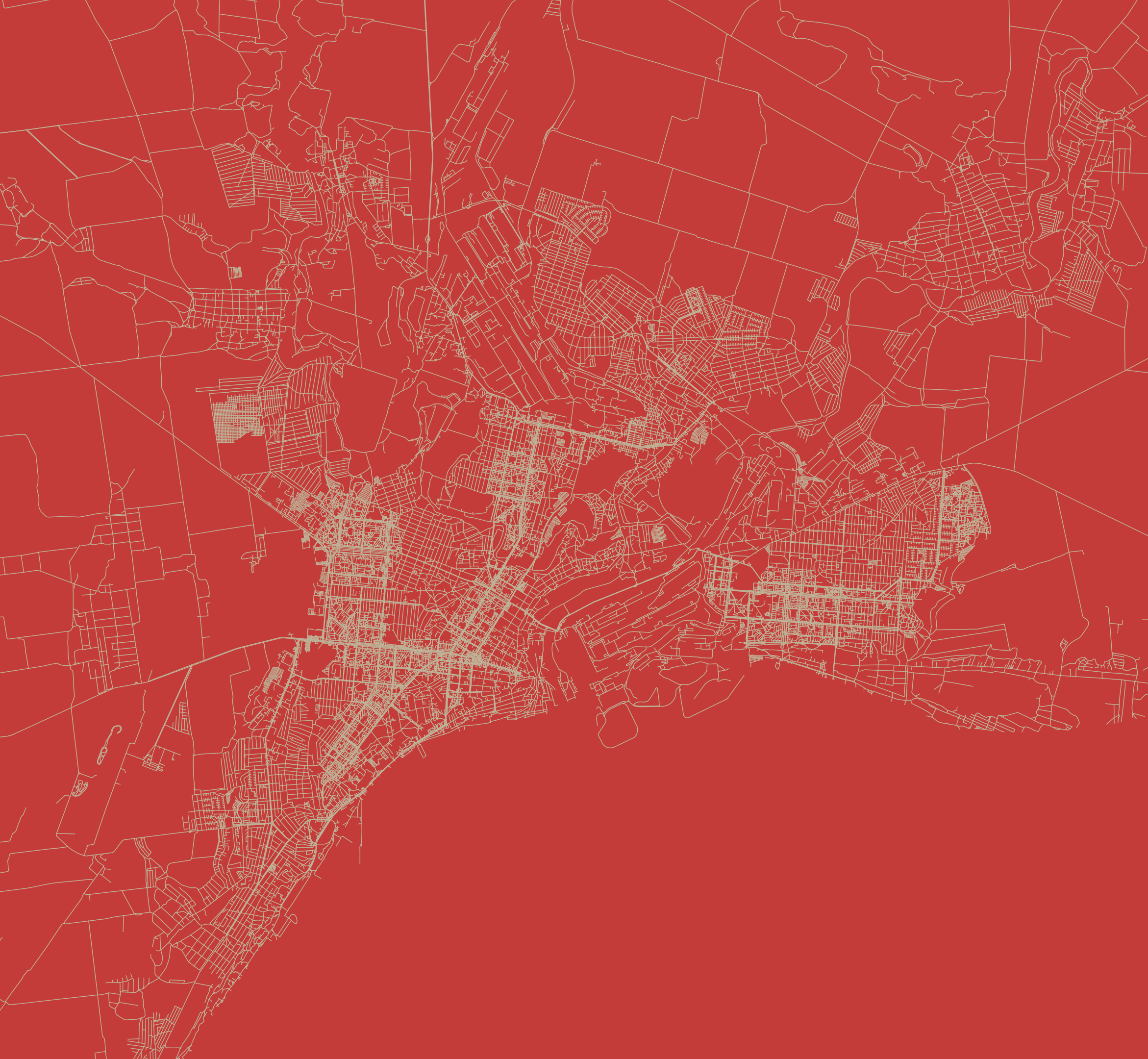
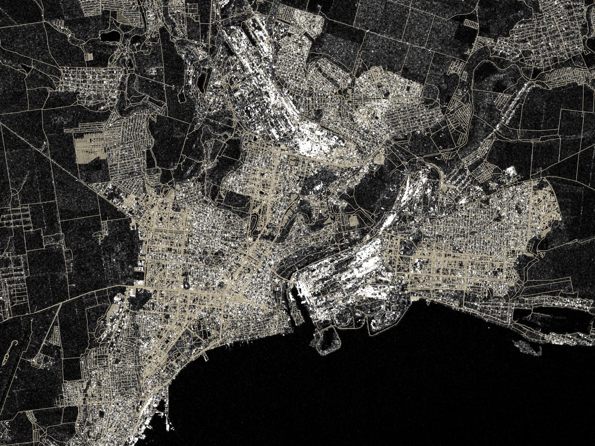
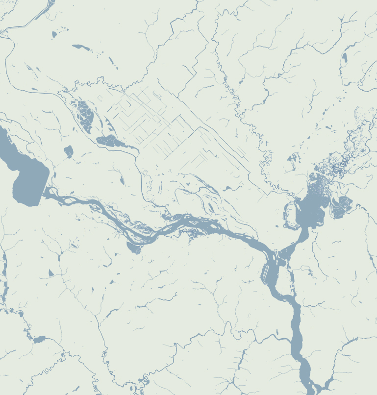
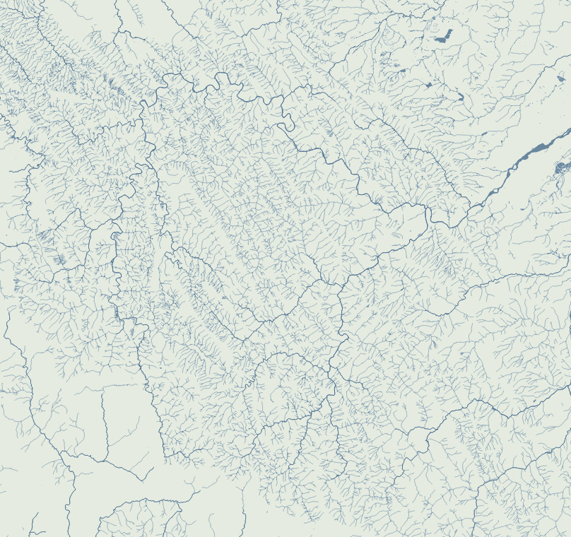
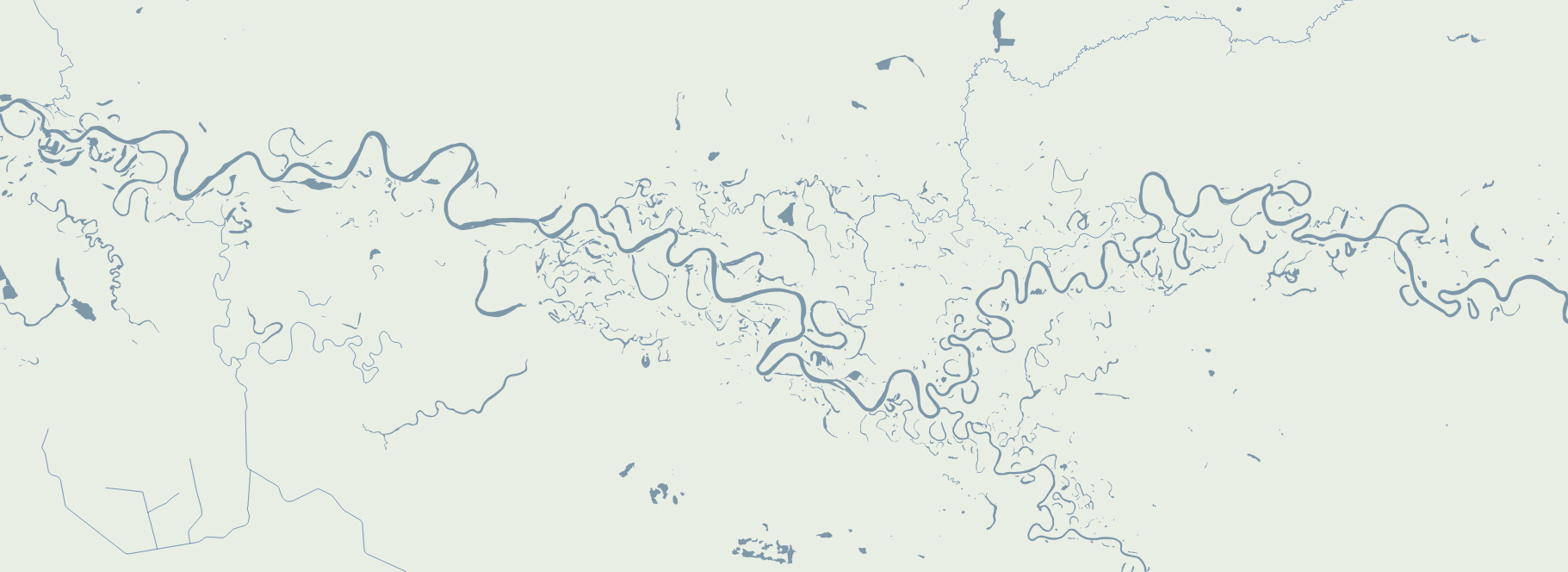
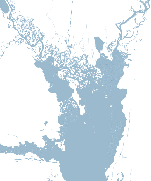
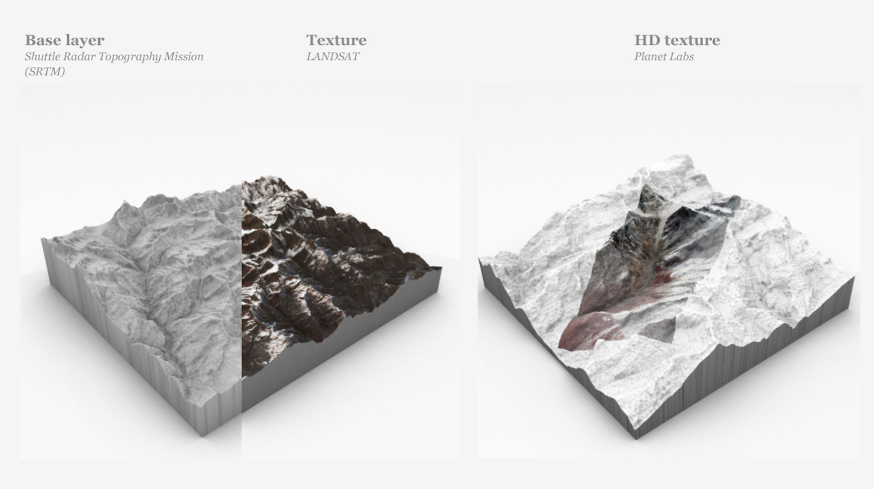
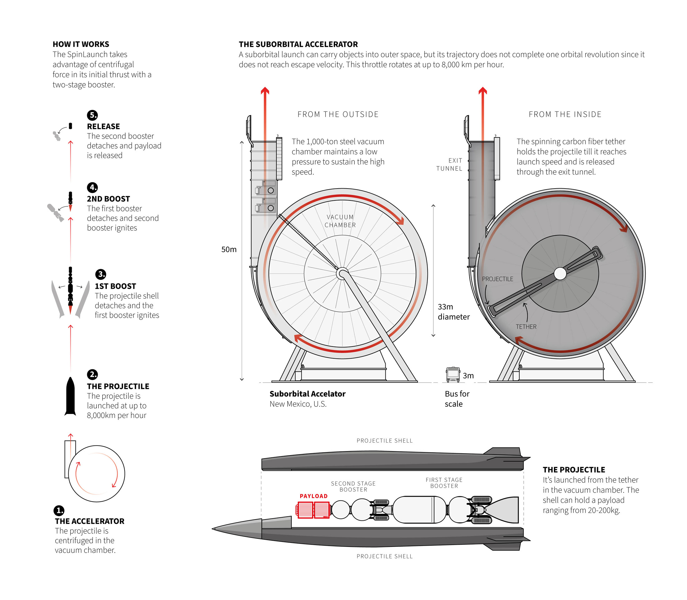
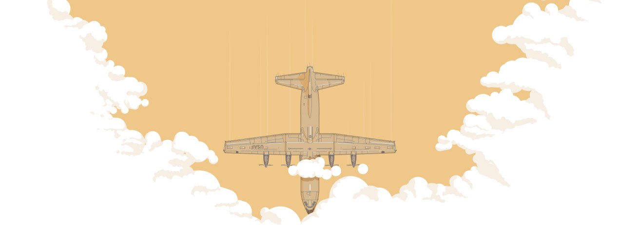
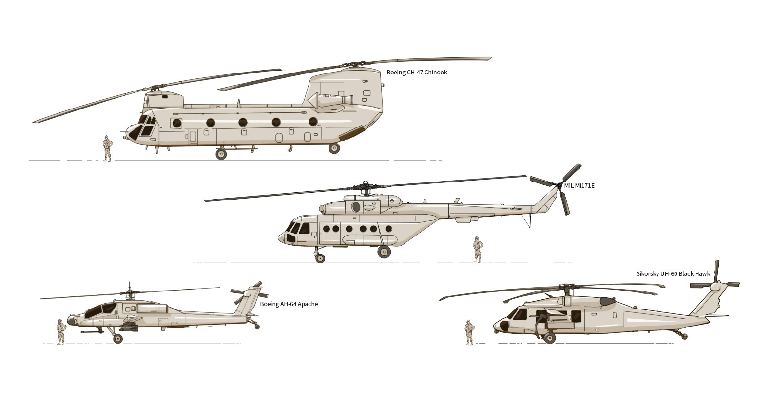
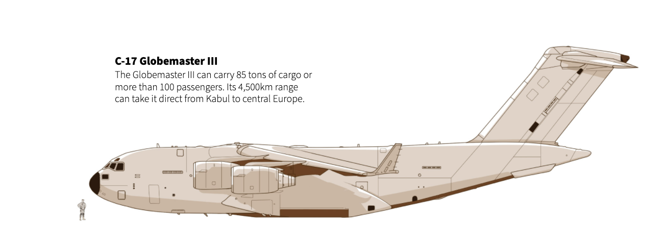
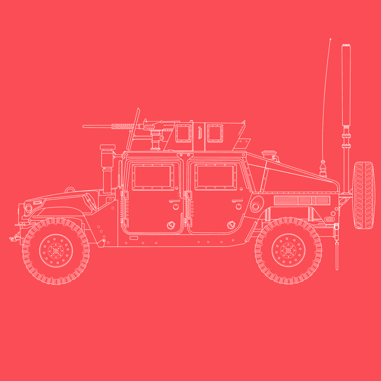
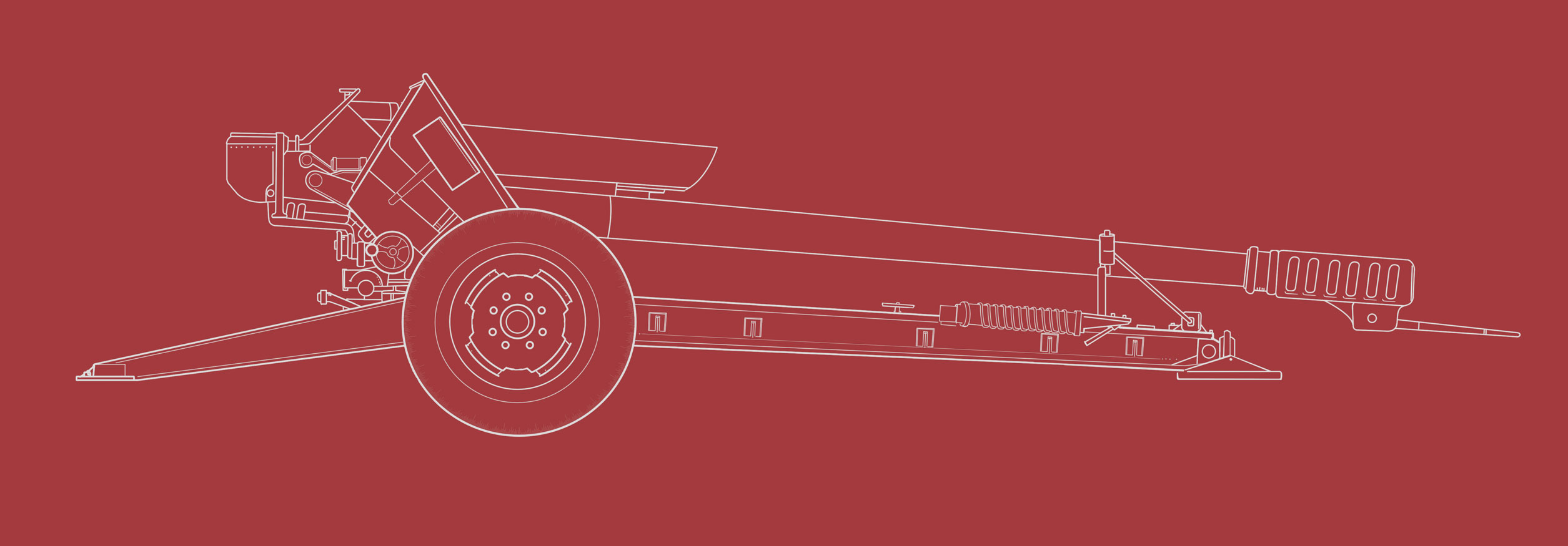
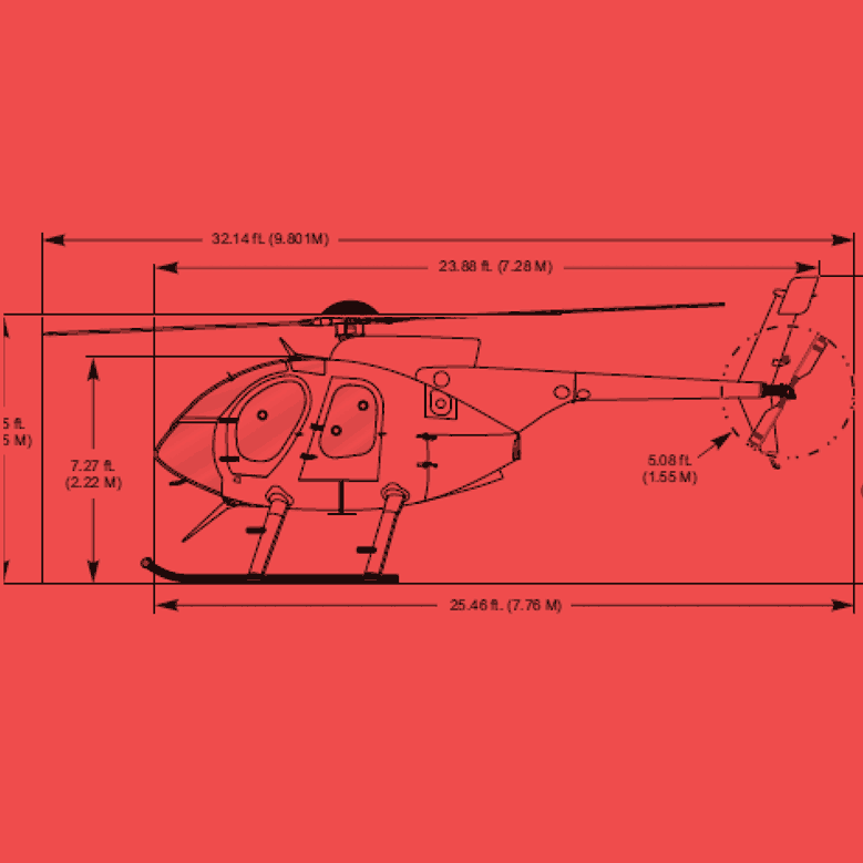
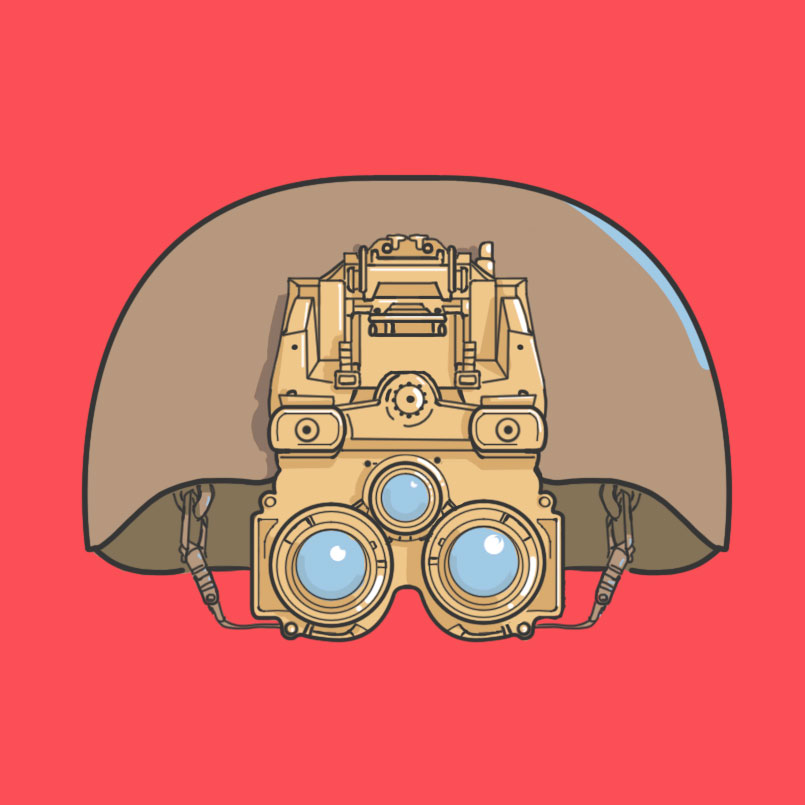
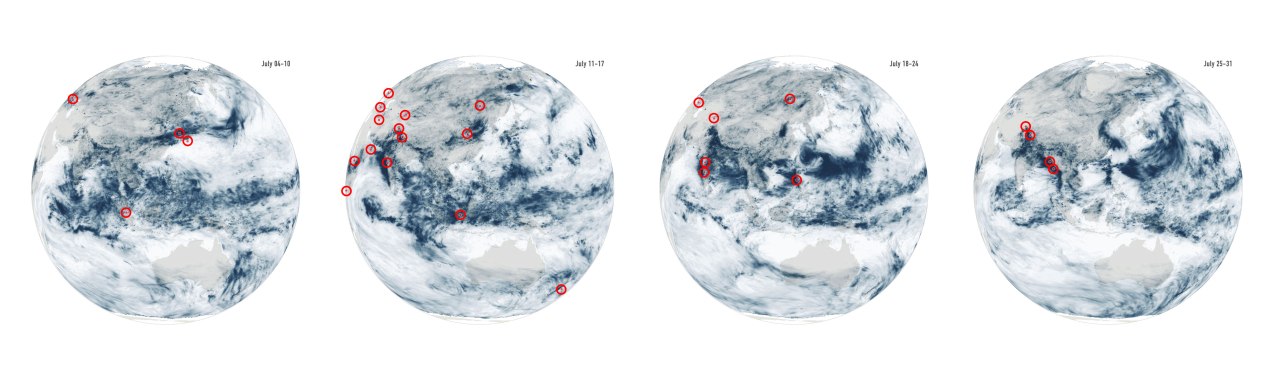
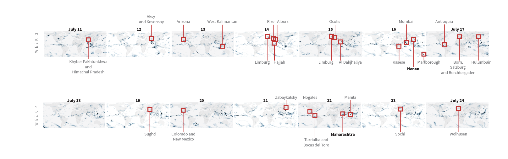
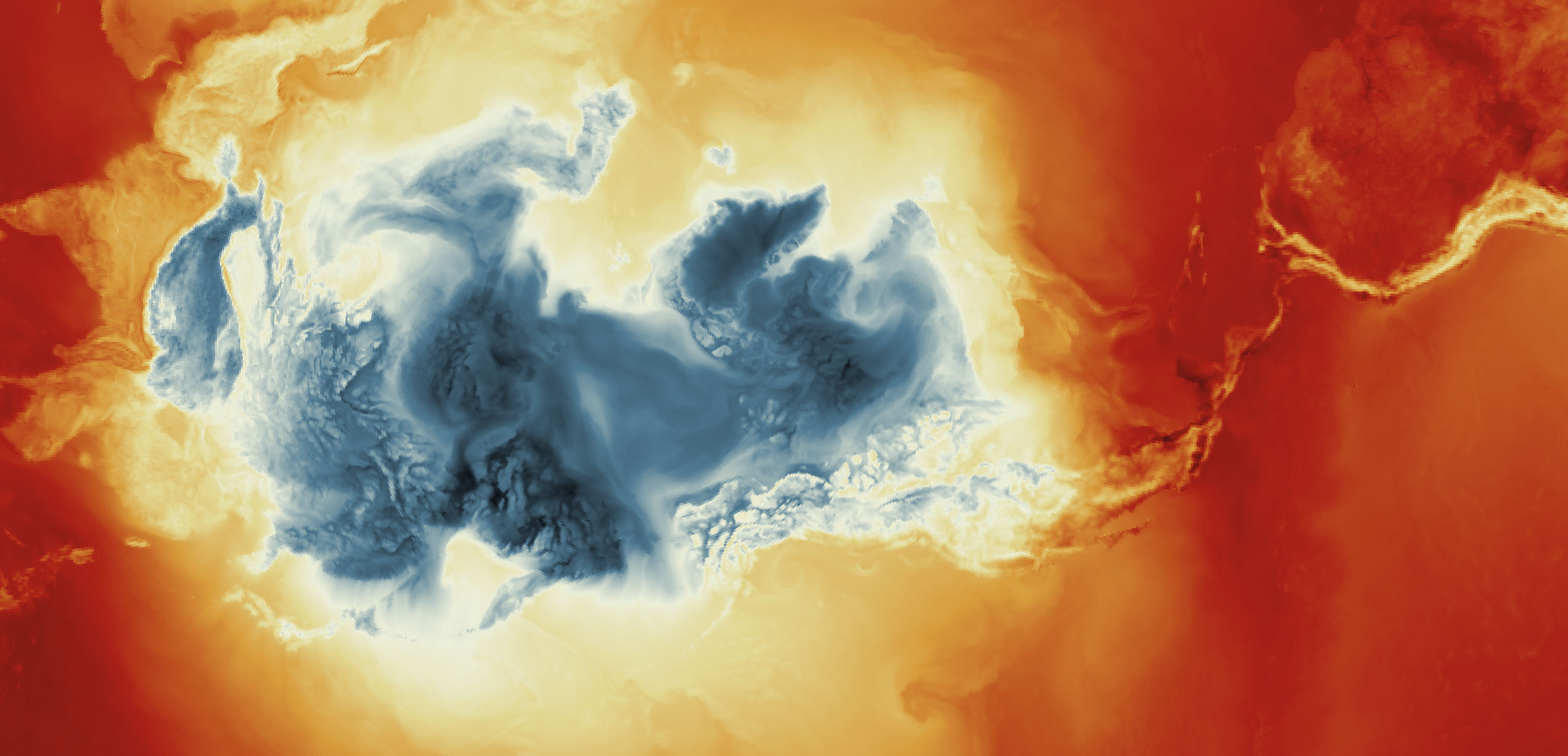
August: Incognito mode
August was a month completely dedicated to a long-term project I’ve been working on for over a year now. As I write this post at the end of November, my hopes are that we will be able to publish very soon. I think once we publish I’ll be able to make a long #infofails post with all the stuff we won’t use including things like this:
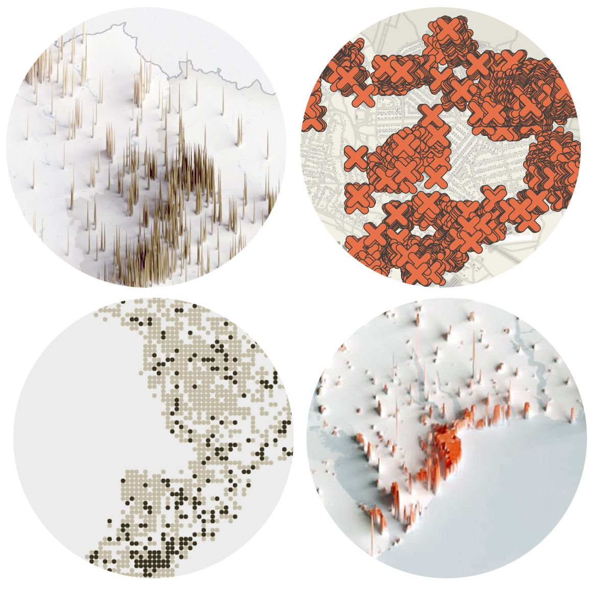
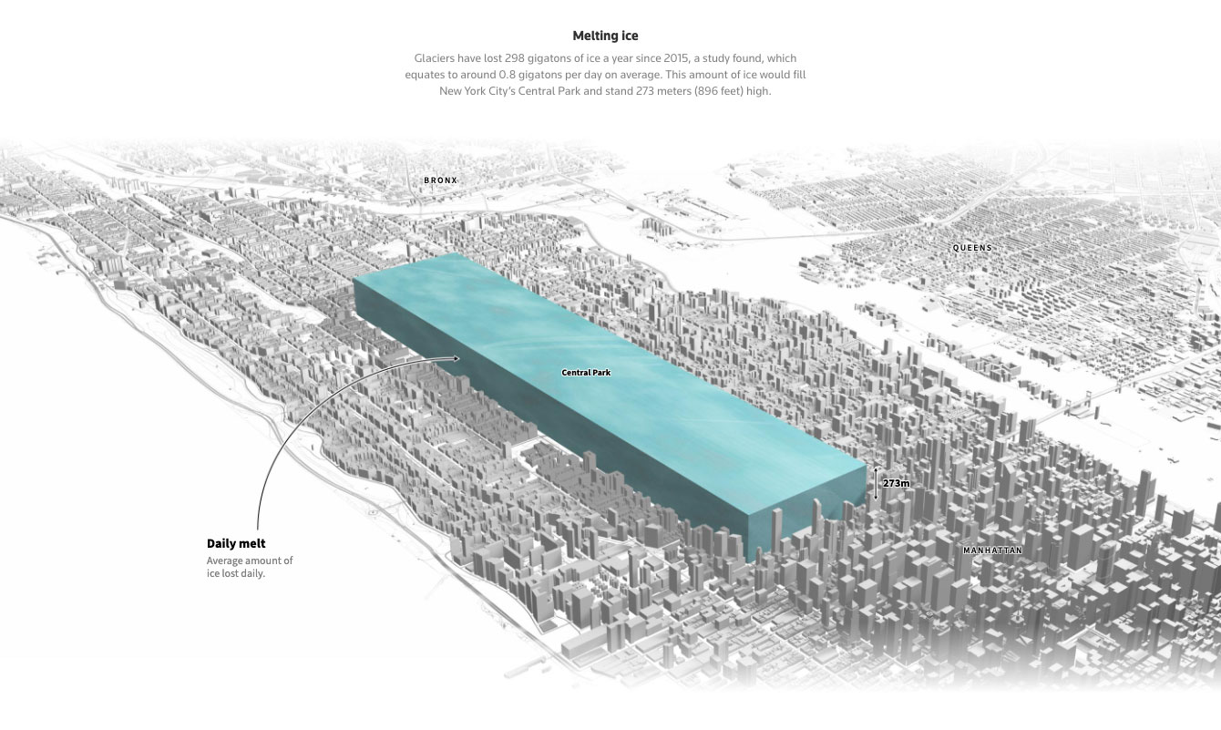
But since I still can’t share much about it, I leave you an image of something else from August:

––––––– :::: 🗓️ ::::: –––––––
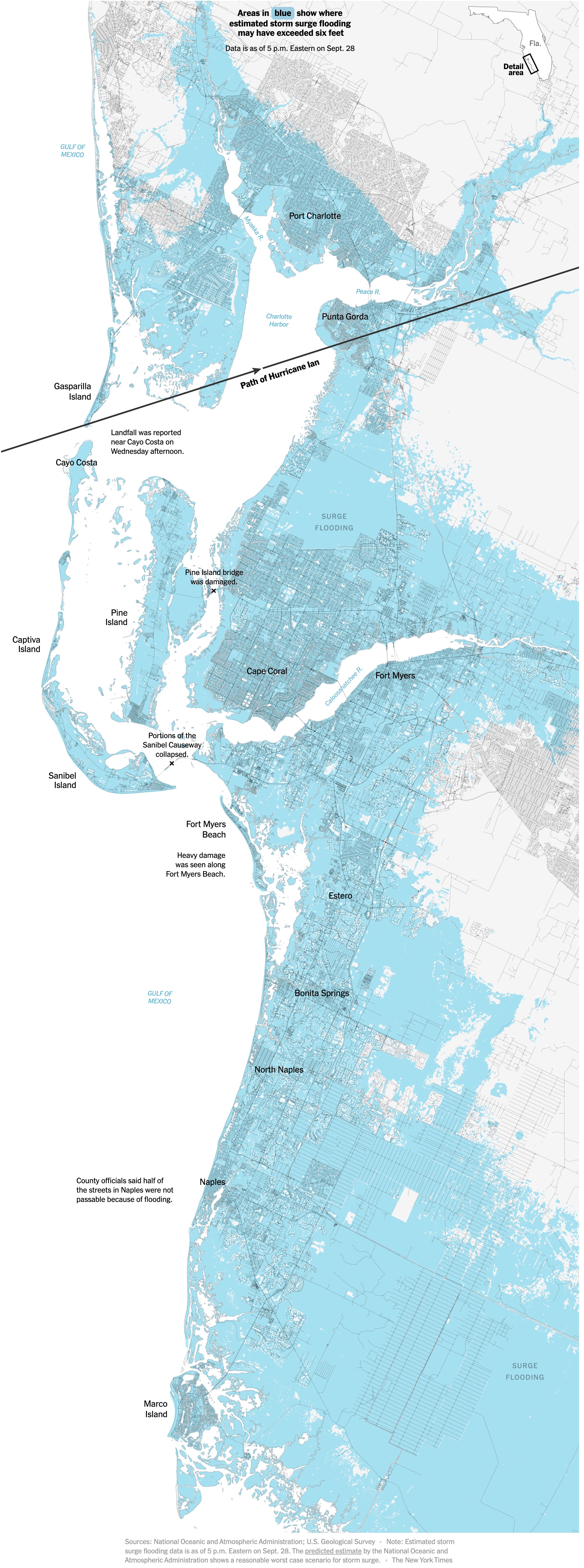
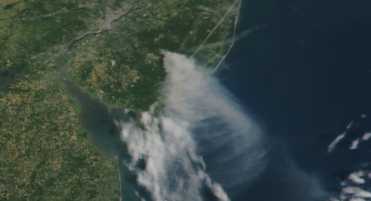
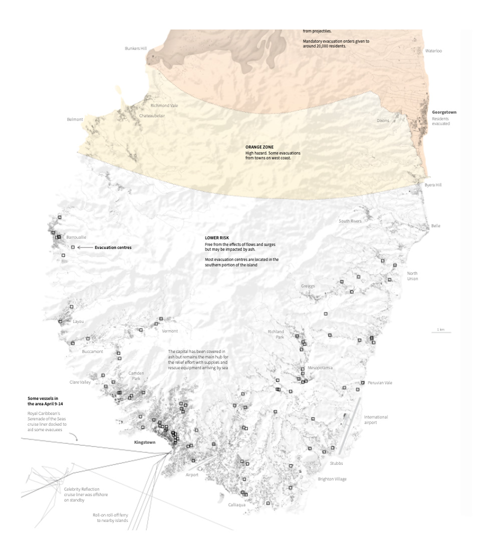
September: Natural Disasters
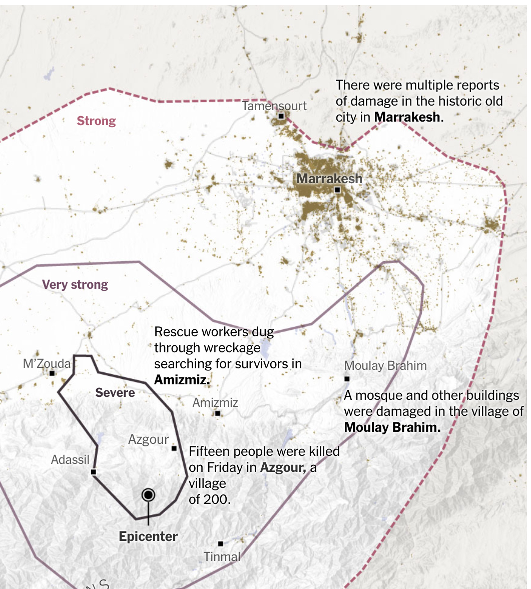
In the first week of September, an intense earthquake hit a mountainous region south of Marrakech, causing extensive damage to villages and leaving a high number of deaths and missing persons. During that weekend we made a series of maps to report the situation with various updates as we received updates.
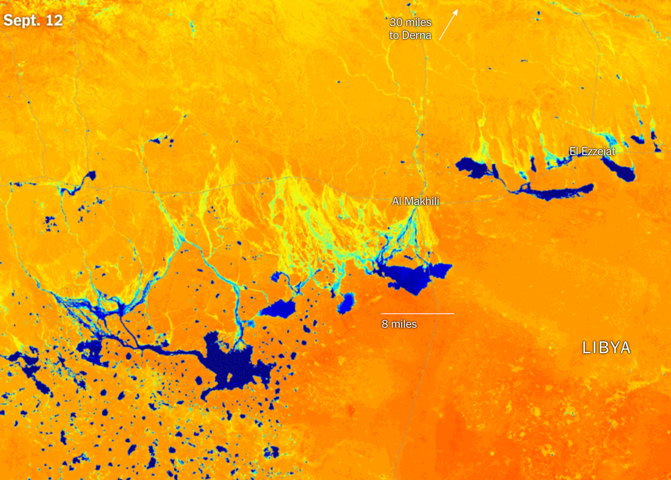
Just a few days later, a storm system over the Mediterranean Sea wreaked havoc in Libya, especially over the city of Derna where shocking images showed how the water swept away the city. The rains were so intense that huge temporary lakes formed in the desert, some big enough to be seen from space.
––––––– :::: 🗓️ ::::: –––––––
October: NY + Amsterdam
Reporting and preparing projects on Ukraine continued throughout this month. However, I was able to take made a quick pause to participate of Information Design Conference in Amsterdam for a few days. I shared a little about the work we do at the New York Times and my personal interests while I’m away from work.
But I have to say that the best part was the wonderful people I had the opportunity to meet there, including some well-known names in the data visualization field based in the Netherlands.
––––––– :::: 🗓️ ::::: –––––––
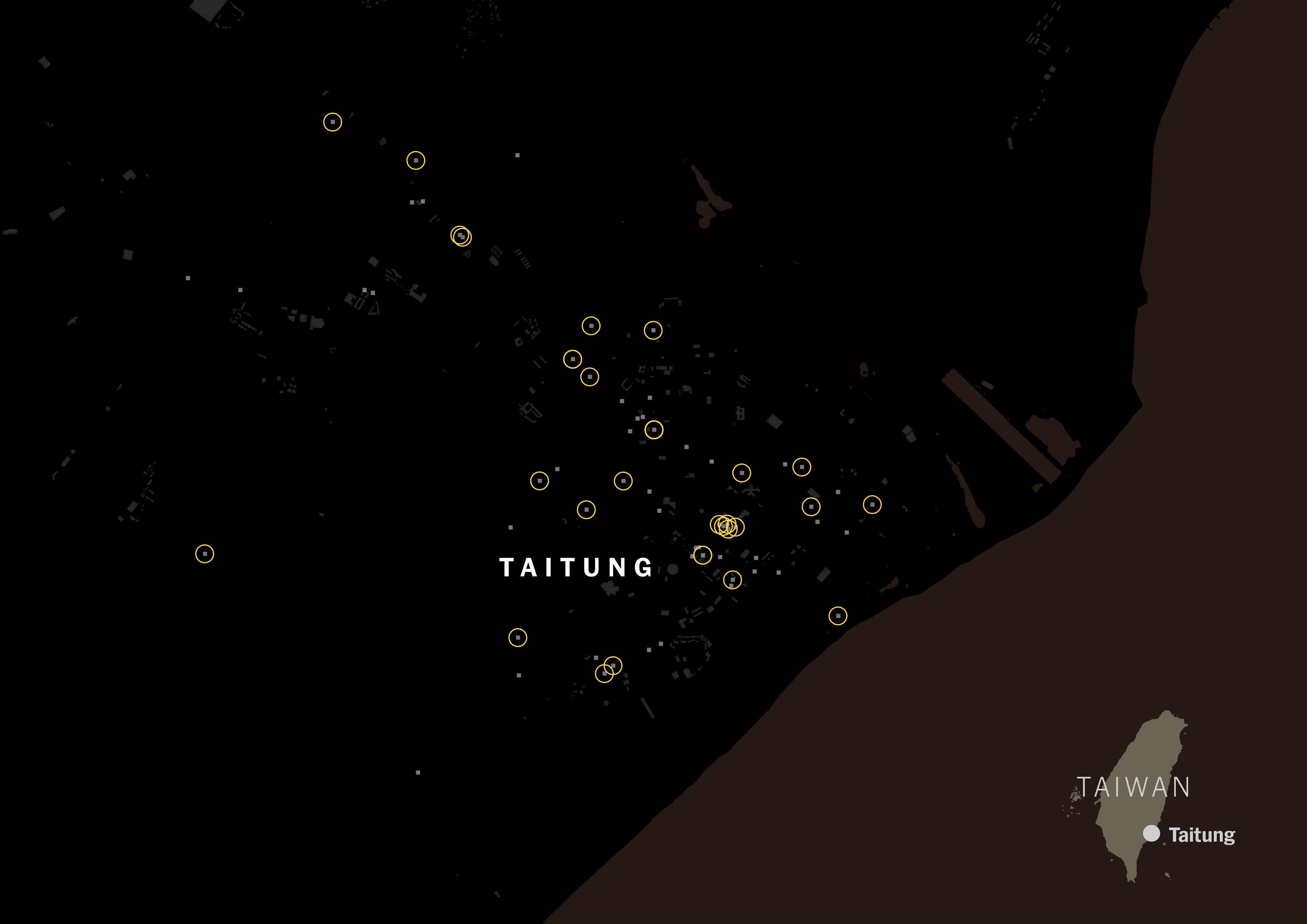
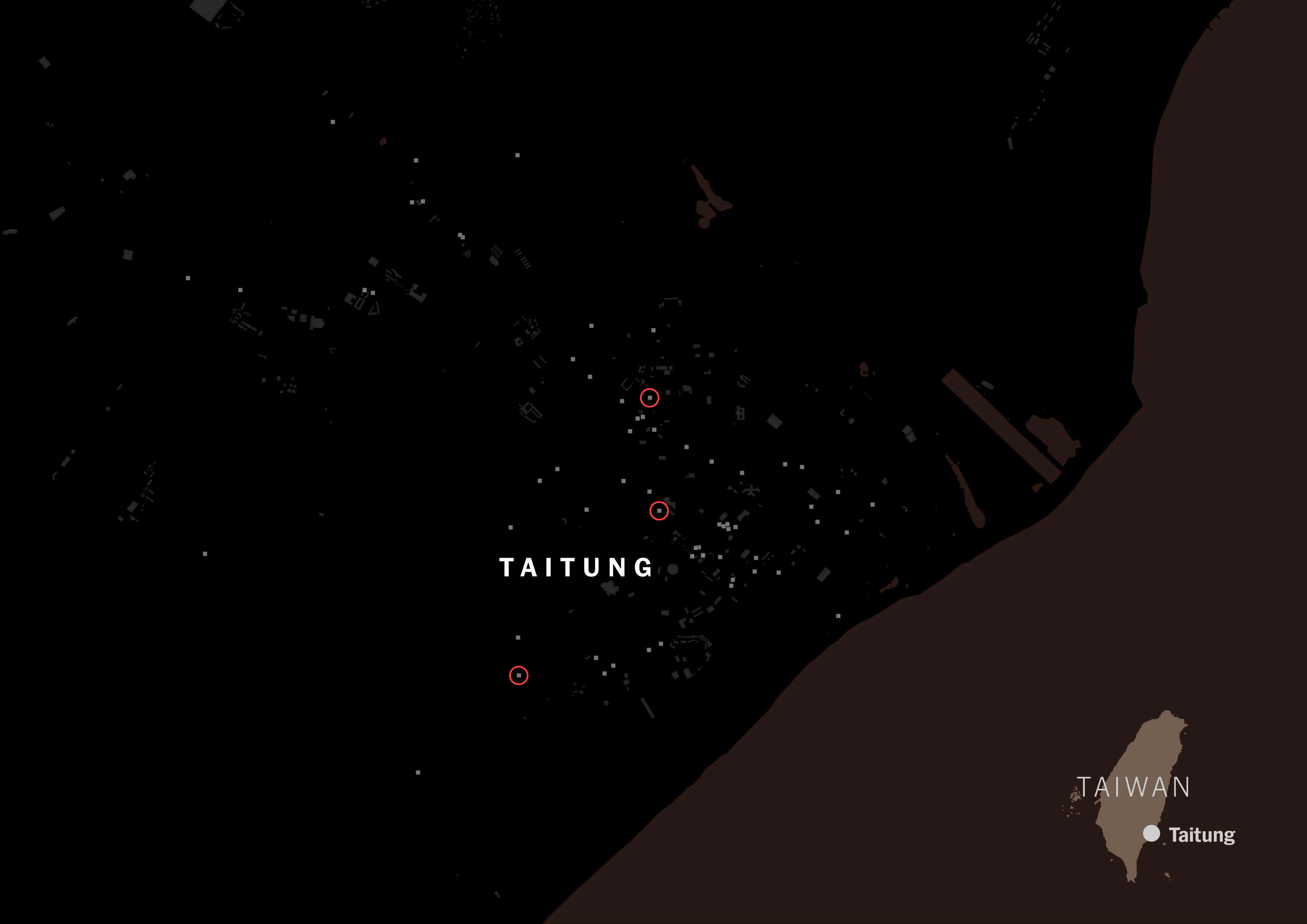
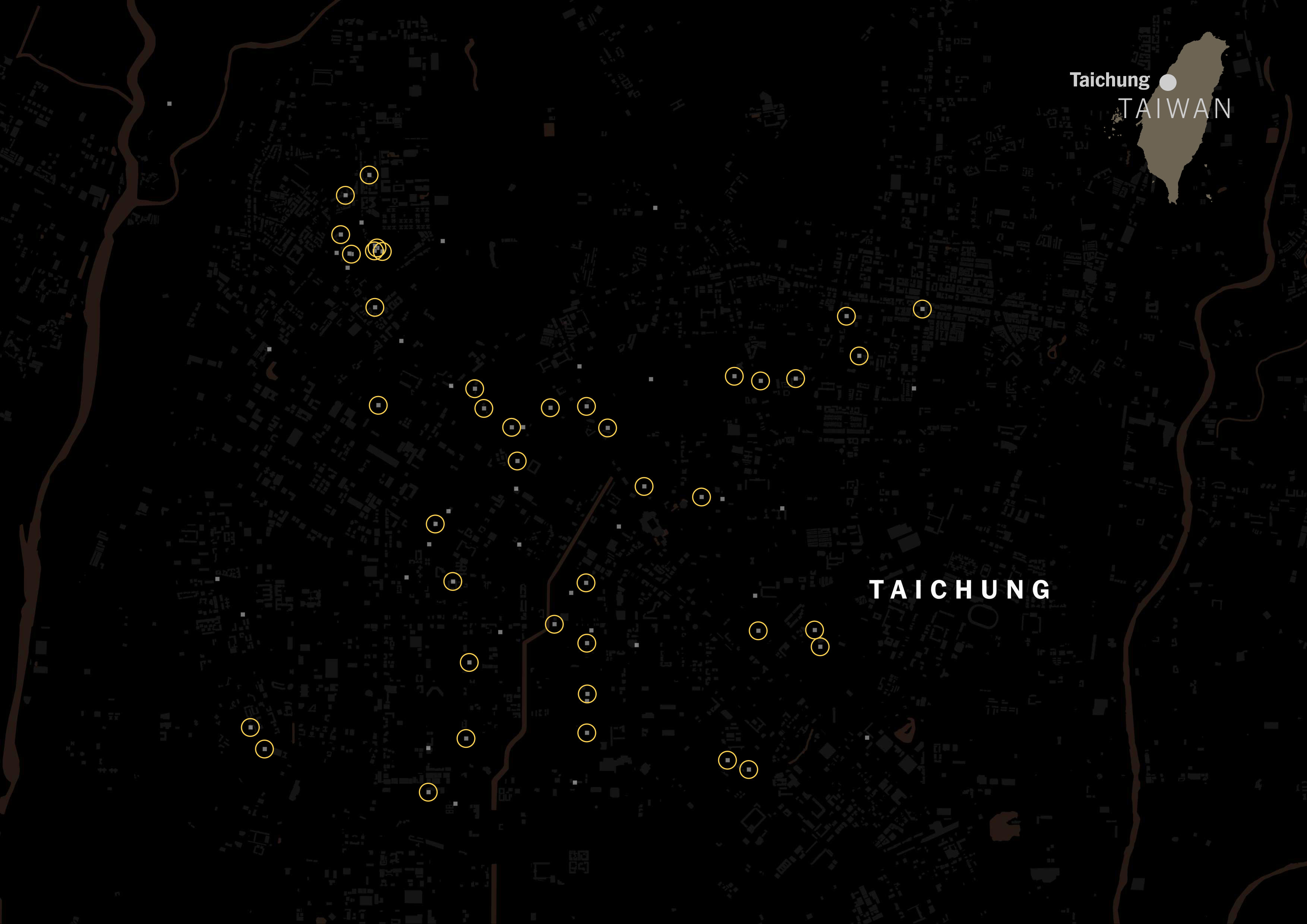
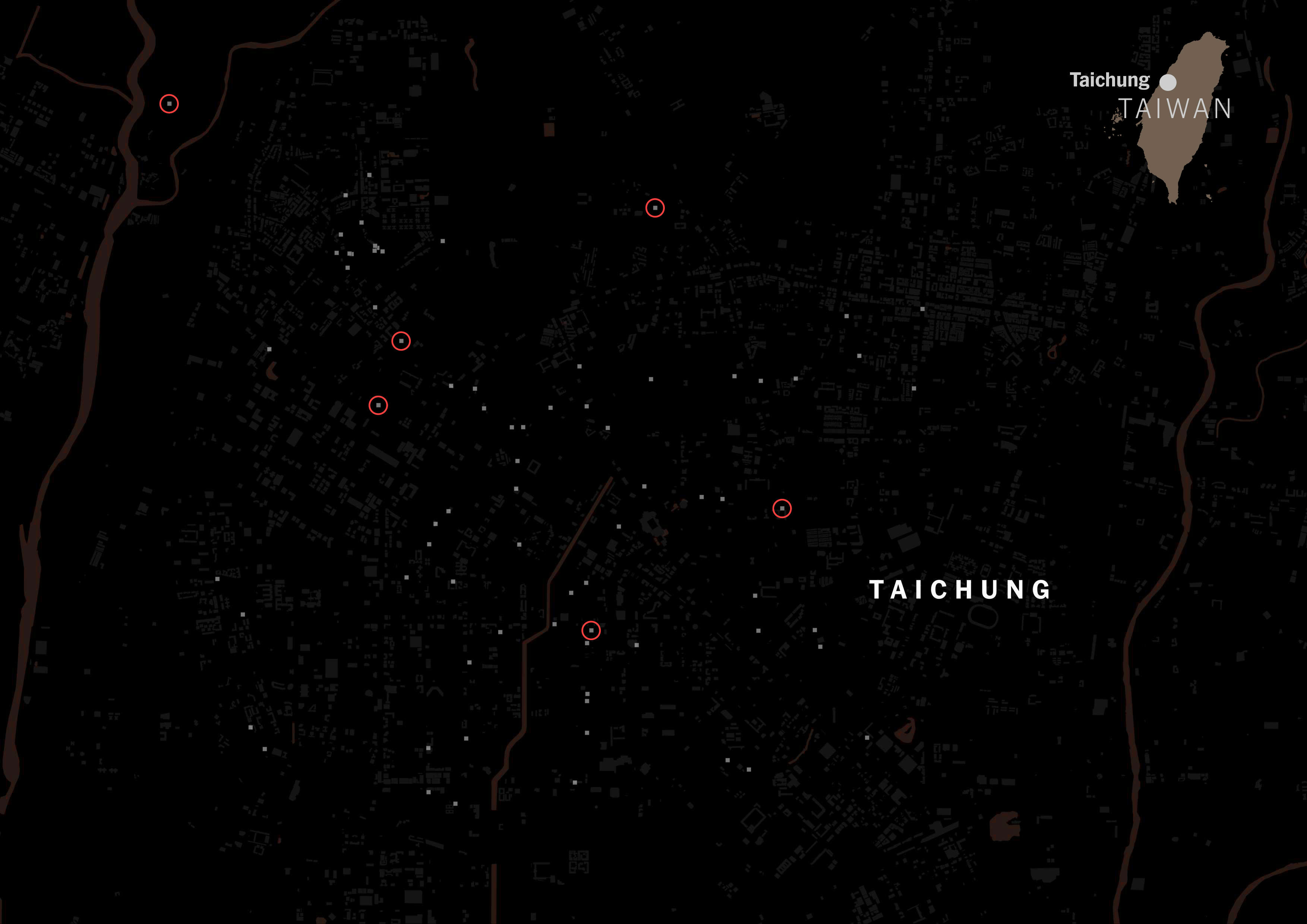
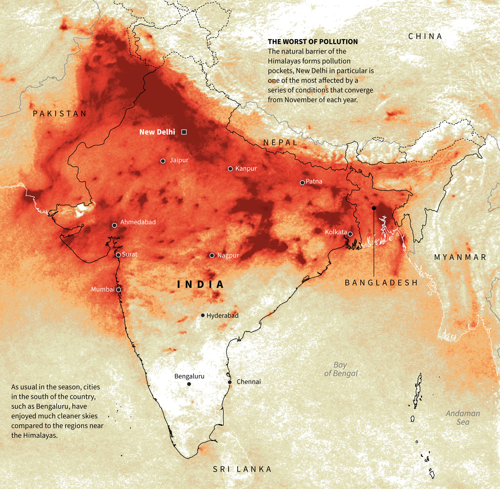
November: The war in Gaza
A conflict that has been active for many years intensified at the end of the 2023. It is a really complex and delicate topic, so it’s not wise to provide opinions behind it. However, in November we took the initiative to gather information to report on the structures that are under Gaza and that have been documented by various sources including both sides of this conflict.
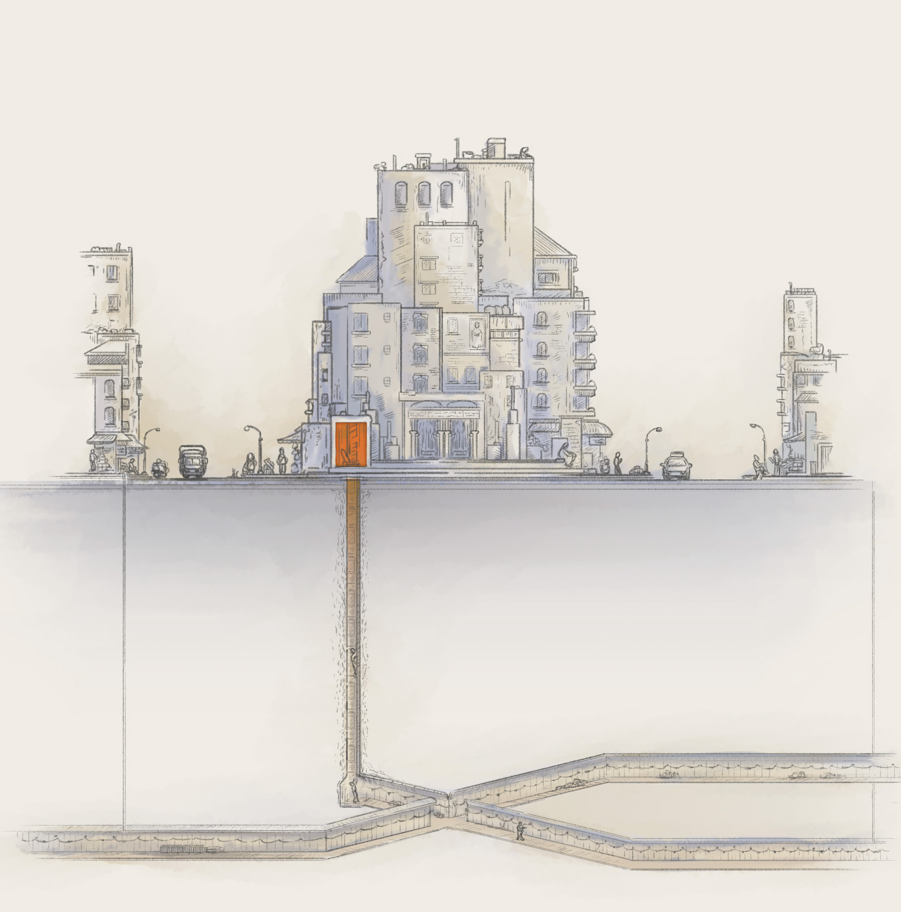
From the perspective of military experts, the piece shows the particularities of the tunnels in Gaza.
November also brought a very special moment for me as Ball State University invited me to their campus in Muncie, Indiana to receive the great honor of the Majeri Award.
Even though my trip began by forgetting my phone in a taxi in New York before entering the airport, the conferences with the students and every moment of that intense week were memorable.
––––––– :::: 🗓️ ::::: –––––––
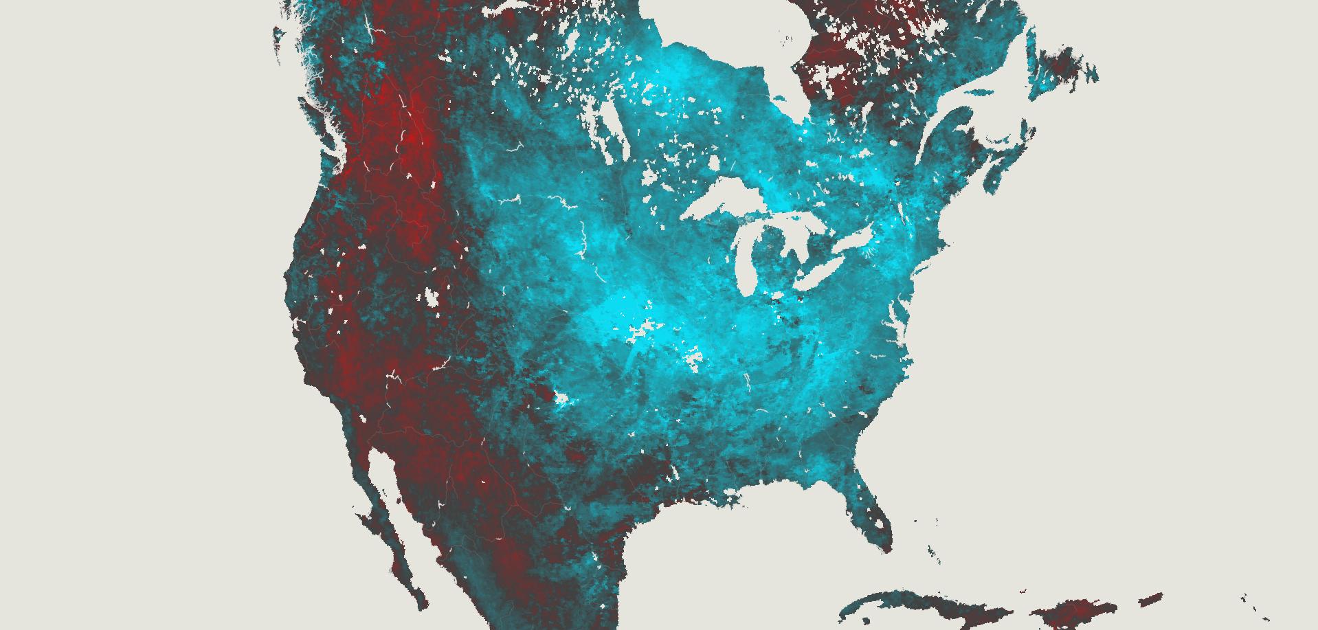
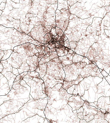
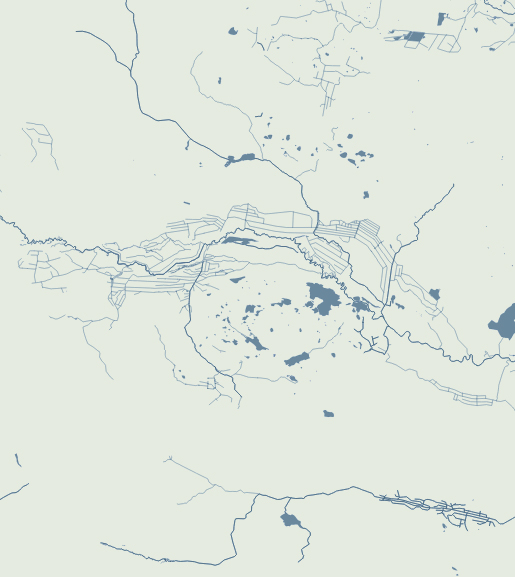
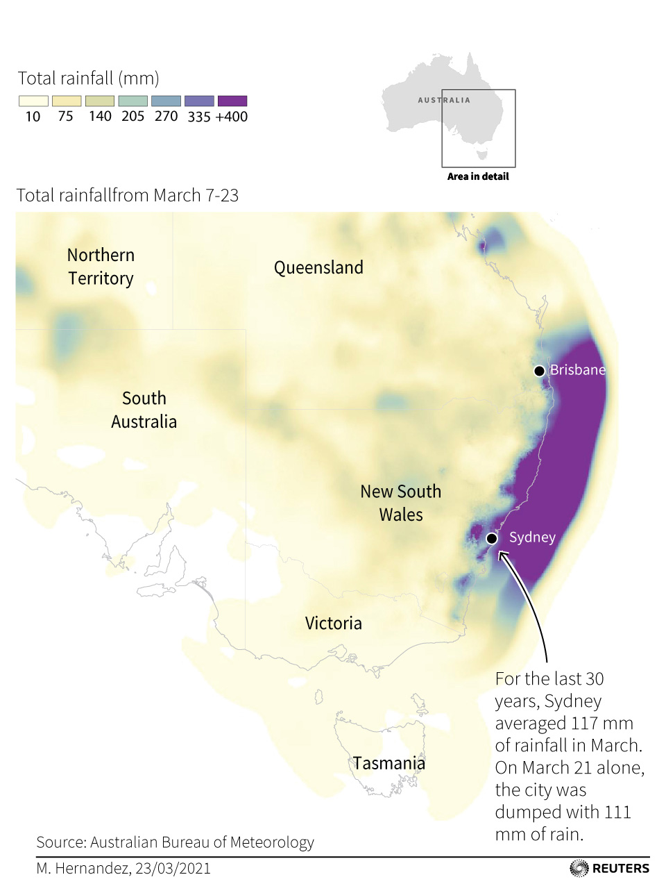
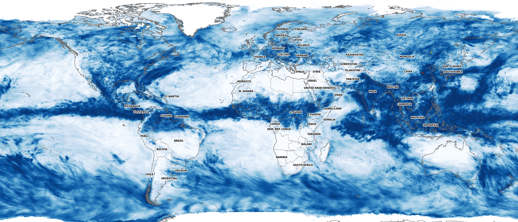
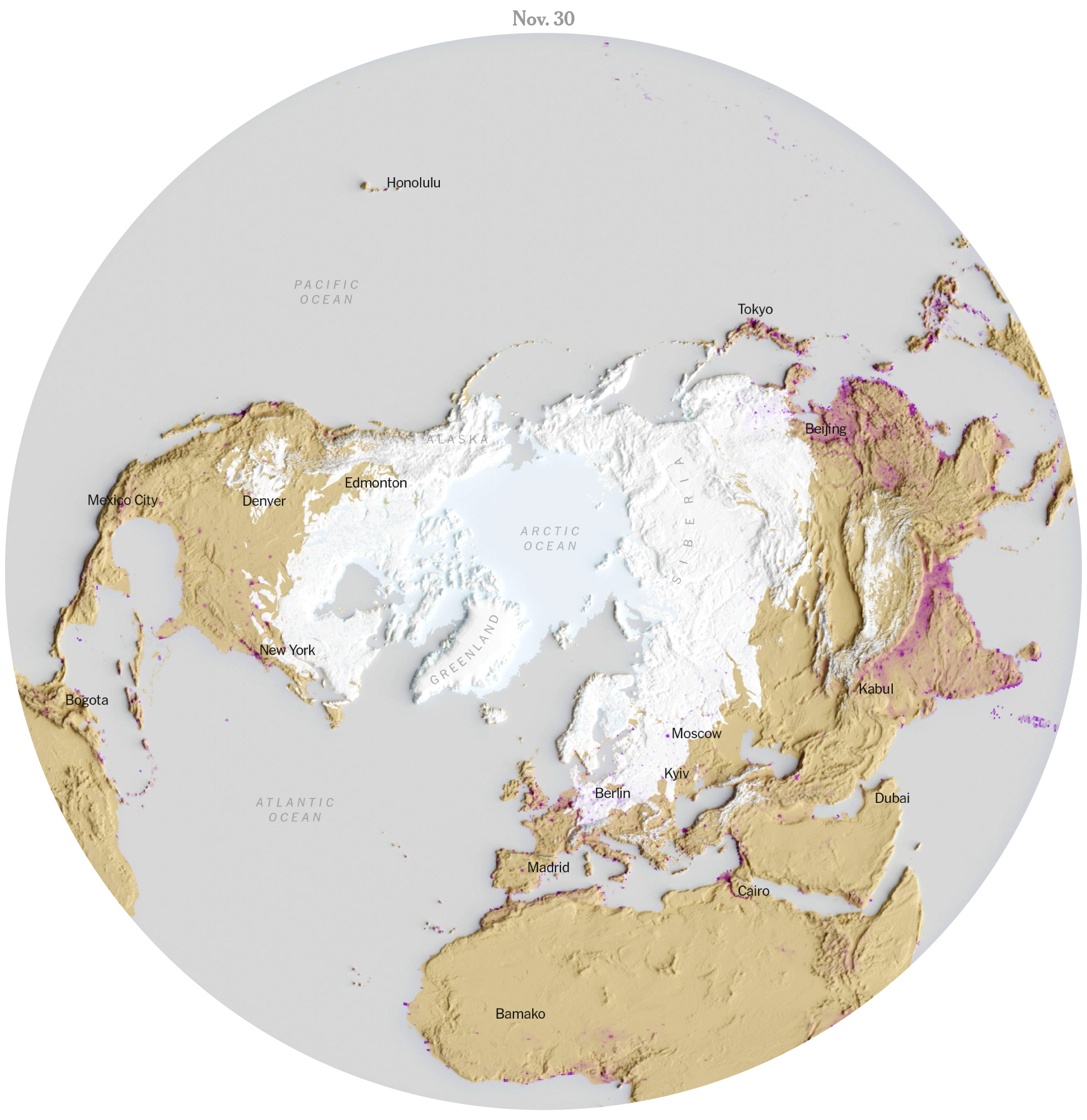
December: A chance for a snowy xmas
I’m not sure how intense this winter will be, I wrote this post at the end of November and we already saw a few snowflakes this week in New York City. Last year we barely saw snow in New York, the winter was very mild here, but maybe there is a chance for a white Christmas after all this 2023. I collected data from the US National Ice Center (usicecenter.gov) to make the map below showing the extent of the snow. The purple spots are population density from the SEDAC (sedac.ciesin.columbia.edu).
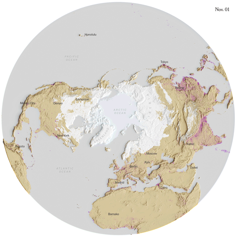
I promise I’ll make a tutorial to create snow visualizations soon. I did those maps above to see how the snow is already dancing around the north pole, but maybe we can run a story on snow if this winter turns out to be extreme (hopefully not).
Anyway, that was my 2023 in graphics.
Once again we say goodbye to the year, but before I switch into holidays mode, I want to thank all my colleagues at the Times, this was a great year, I couldn’t be more grateful to be able to share my days with all of you.
And to you all my www-friends, I wish you the best in this new beginning. Happy New Year!

See you all in 2024, Merry Christmas!
Some of my old collections
- mhinfographics: 2022: My Year in Graphics.
- mhinfographics: 2021: My fav little details of 2021 on Reuters.
- mhinfographics: 2020 in graphics: My favourite little details.
- mhinfographics: 2019: My sincere gratitude to the South China Morning Post.
- The New York Times: 2022: The Year in Visual Stories and Graphics.
- Reuters: 2020 – The year in graphics.
- South China Morning Post: 2018 highlights.