
I just realised that last time I did one of this chapters was last year, woow. My original idea was for me to publish one of these every three or four weeks … but reality has slapped me in the face: I don’t have time enough between projects.
Anyway, let’s talk about fails then.
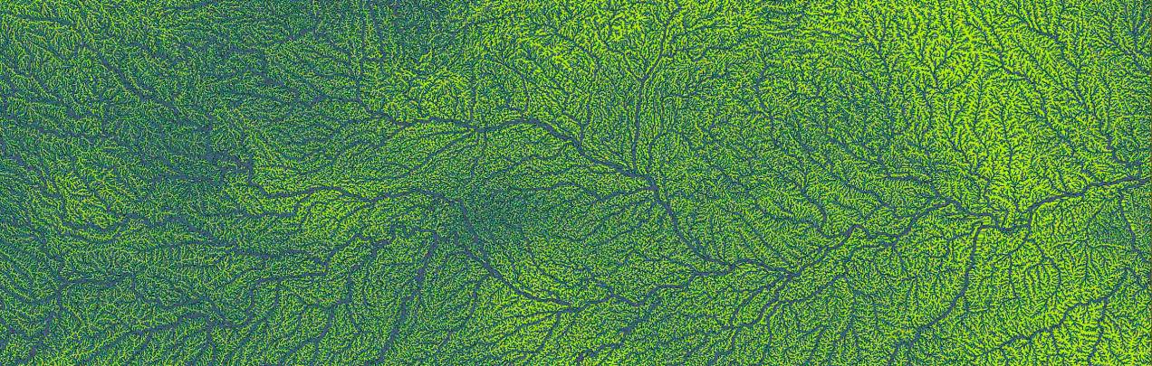
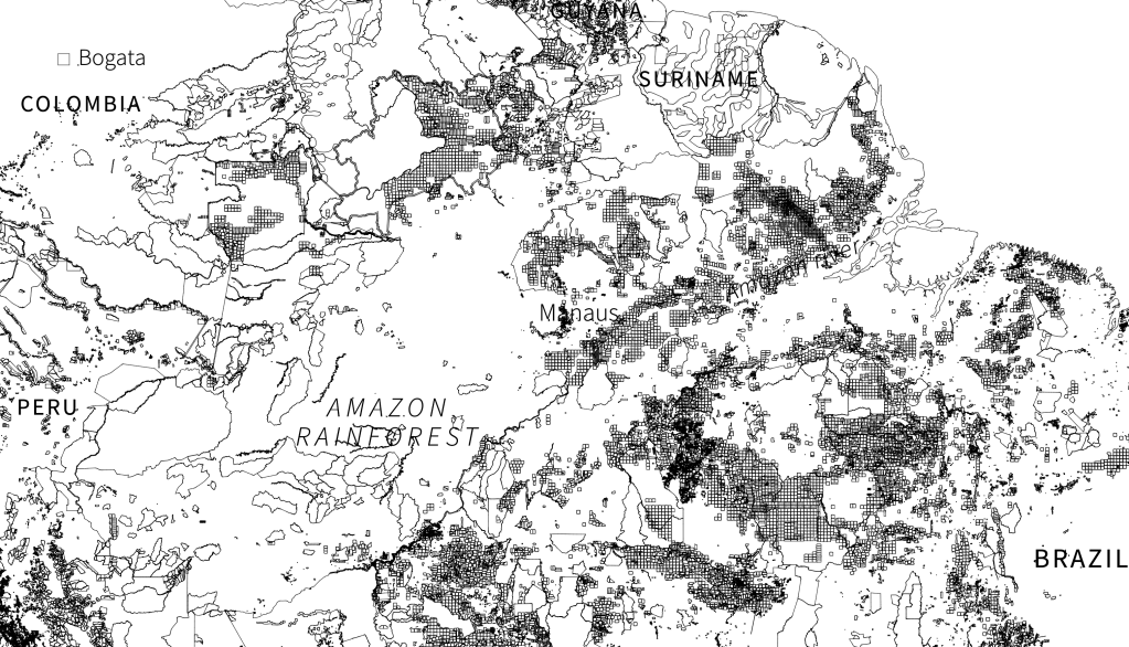
That image at the top of this post is a QGIS render of the Amazon Basin made with data from Hydrosheds. It is part of the geographic data from my latest project on Reuters. But you may have never saw that thing anywhere in the project, unless not like that.
The Amazon Gold Project have a mix of styles including 3D, traditional sketching, vector works…
The 3D stage
I did some early versions of the maps using layers rendered in QGIS, a layer for terrain, base colour areas, borders, rivers etc. Then I re-pack all in Cinema 4D to create some side illumination.
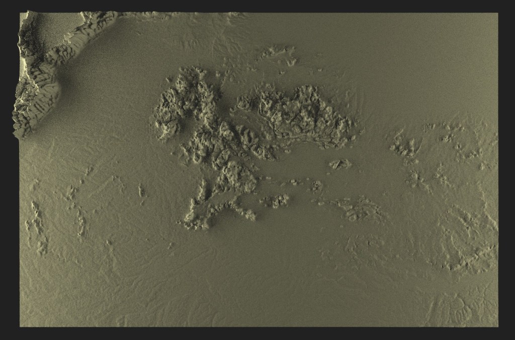
The idea was to try some alternative maps, at the end some illustrator labels and the dummy look something like this:
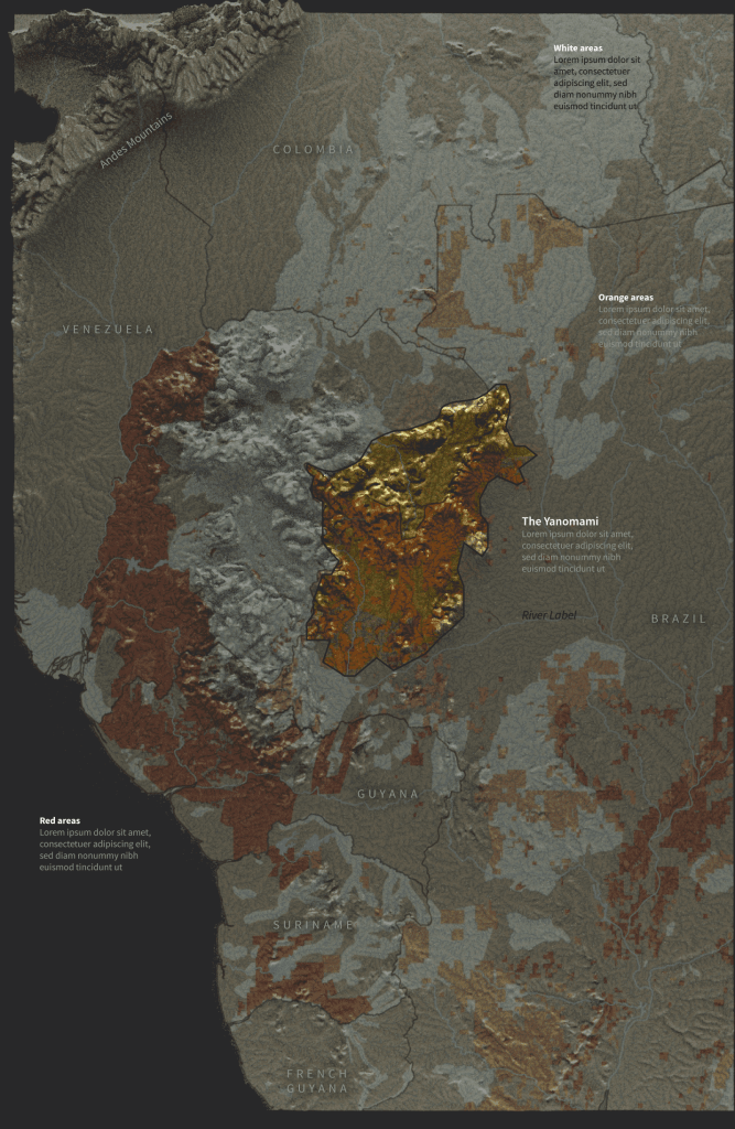
The 3D above was just a quick exercise while I was looking for styles. A bunch of images later, the things turned into flat images
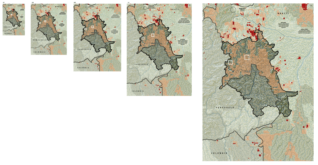
And then to flat vector, probably taking out stuff from the map from crowded to cleaner to whatever…
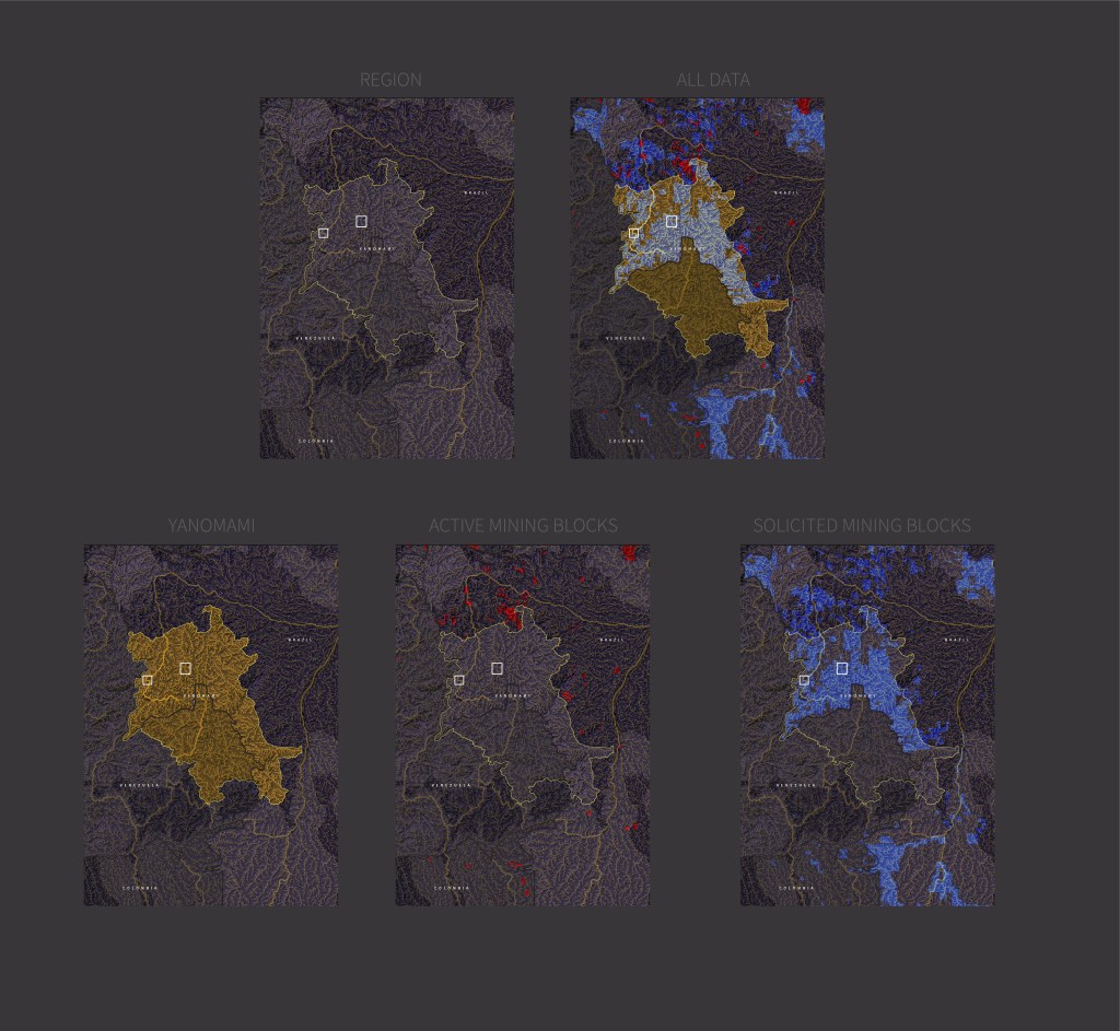
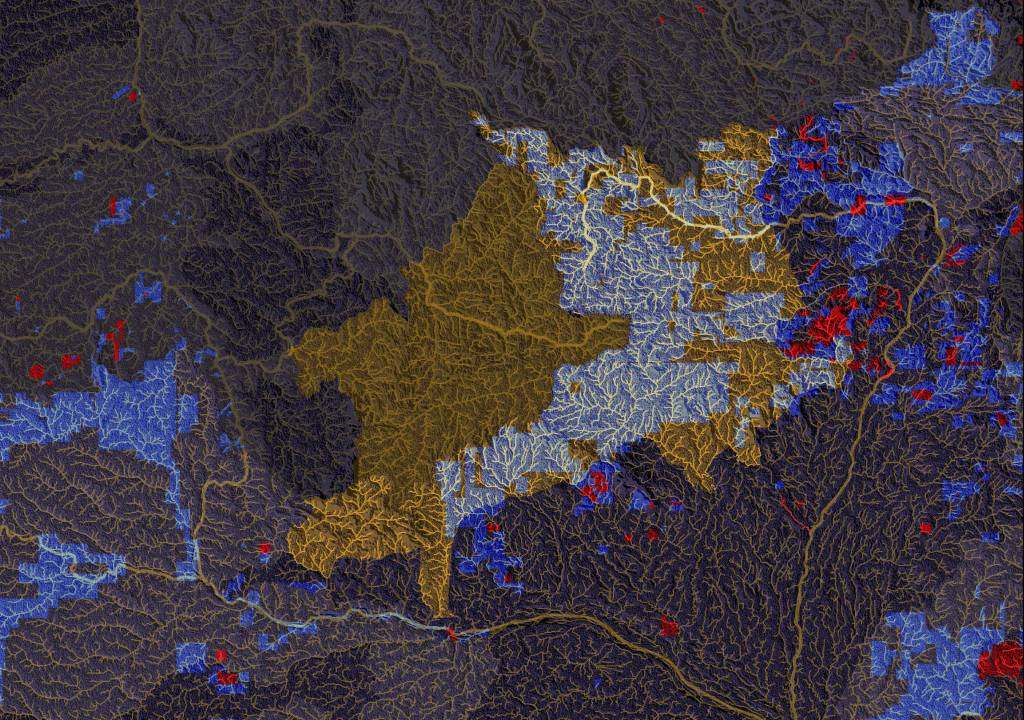
Maybe I went too far because I really like how this was looking in outlines preview… someone should stop me at that time!
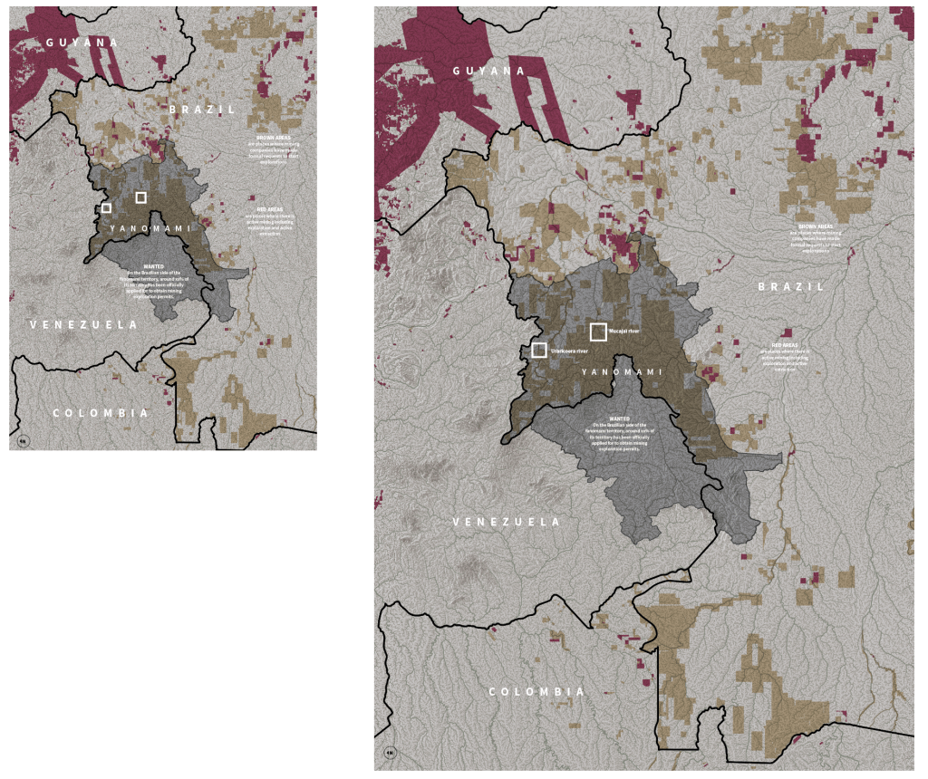
And it happened, in the end I went on to make other pieces putting pieces together on the page, bits of code, illustrations, etc.
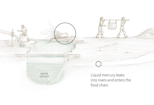
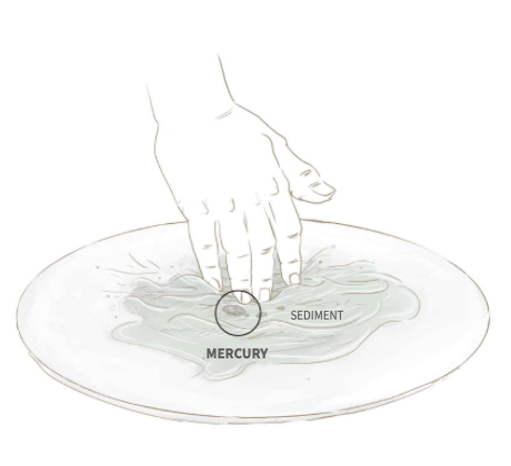
If you already saw this project, you know that it has some illustrations, pieces that explain how illegal miners extract gold and contaminate rivers and destroy forests in the process.
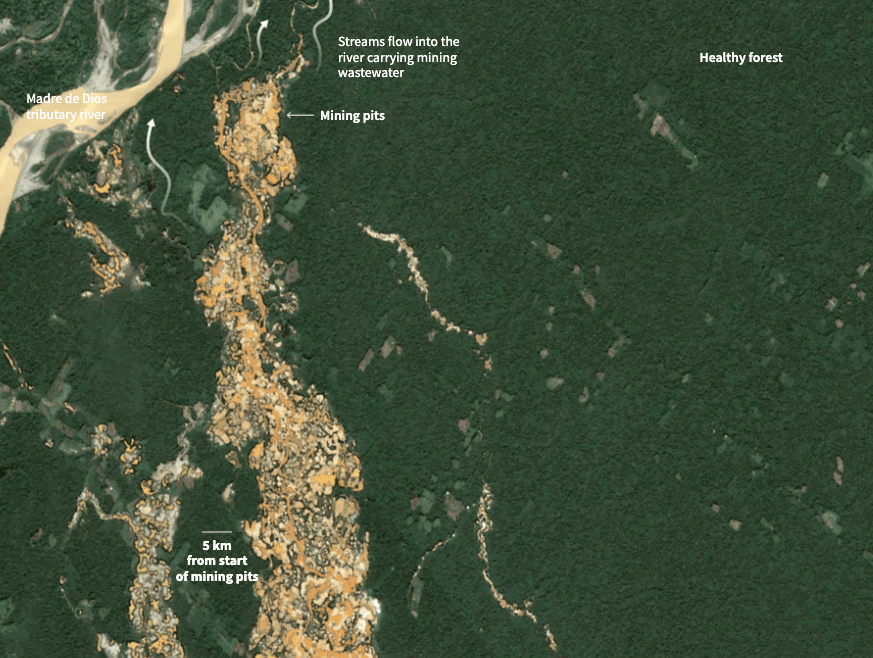
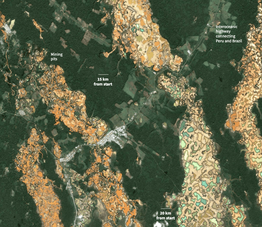
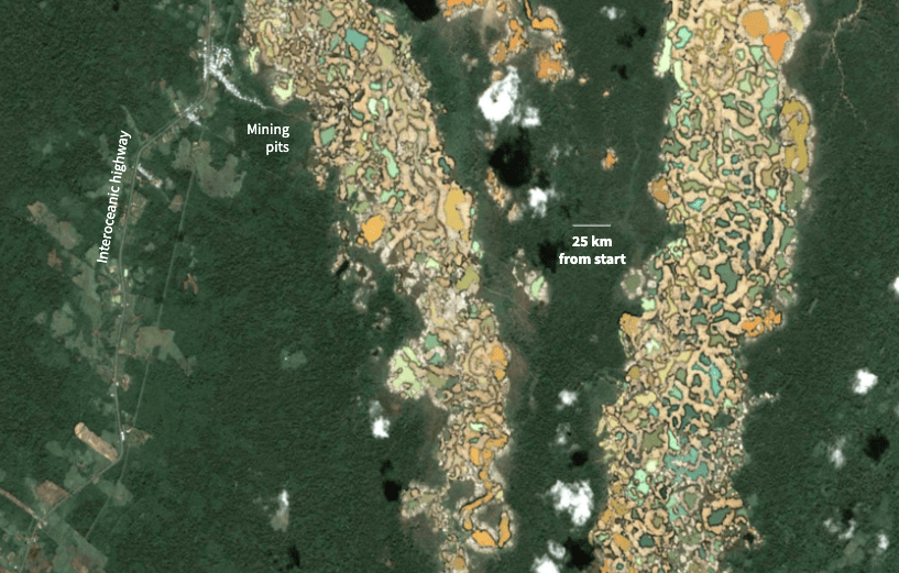
Meanwhile I was also processing some satellite images, adding labels and looking for evidence of the miners from the space, then I saw some websites talking about the situation in Peru, so I look up the area in Sentinel and wooow!
I stumbled upon this place near the Peru-Brazil-Bolivia, border. Kilometres and Kilometres of devastation by the gold miners, a strip of more than 30km into the forest and actually I saw it for first time in false color, in near infrared, so the image was shocking to me.
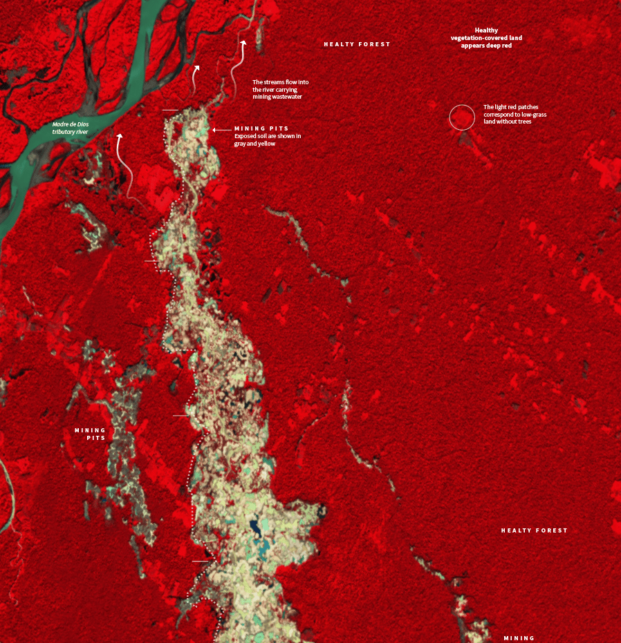
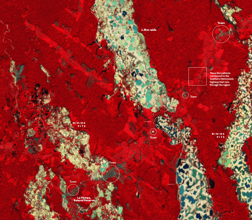
Later we move to true color, trying to match the other satellite images that we had chosen earlier for this project, but still you have the feeling of the immensity of the destruction of these sites. I think that images have an immense power to present the damage dimension
So, I’ll say, fails in here, YES, well I spend a lot of time looking for alternative styles, experimentation is nice I collected a lot of information, but maybe I went too far styling place holders… Anyway I enjoy a lot this project, but and I’m more than happy that is already over.
About #infofails post series:
I keep my beta graphics, those that never go public… Maybe they are tons of versions of a graphic or just a few concepts, part of my creative process. So, where all those things go? well, ends-up in #infofails –a collection of my fails at work.
Did you like #infofails?
Have a look to other #infofails Chapters here:
- Chapter One: Wildfires
- Chapter Two: Plastic bottles
- Chapter Three: Hong Kong protest
- Chapter Four: The Everest

Thanks for your work on this. Your efforts really help to communicate the issues.
LikeLike
Pingback: #Infofails: the world on fire | Marco Hernandez
Pingback: #infofails: A busy 2021 kick off | Marco Hernandez
Pingback: Olympic #infofails | Marco Hernandez
Pingback: 🎵 I can see clearly now the rain is gone… | Marco Hernandez
Pingback: Doodles for news | Marco Hernandez
Pingback: Random Details of Failed Maps | Marco Hernandez
Pingback: The mismatch | Marco Hernandez
Pingback: infofails: mapping Taiwanese food | Marco Hernandez
Pingback: infofails: 2024 mapping destruction across the U.S. | Marco Hernandez
Pingback: infofails: 30 days map challenge | Marco Hernandez