About #infofails post series:
I have a lot of beta graphics versions that never goes public. I do two or three versions of a graphic, sometimes just a concept as part of the creation process to get a better solution. Where all that material goes? well, ends-up in #infofails, a collection of my work fails.
This time I’ll like to share a little bit of the backstage of the plastic bottles project published a few days ago. If you haven’t seen it yet, Have a look here: https://tmsnrt.rs/2PDRvhd
The opening of this project is a short video of plastic bottles covering a garbage truck and a standing guy. To get that piece I did a few testing versions, all together neede almost 400 hours of rendering including the final piece.

Early attempt. The bottles just run away from the pile because of the friction and mass assigned
Just to keep a sense of scale I did also a few graphics for my self to be sure that all the calculations were correct and also to get a sense of what I was doing. But after talking with some experts and friends the numbers needed to be adjusted.
One of the thing that helps me a lot was a plug-in for Cinema 4D from Cesar Vonoc. I was chatting with my bosses about how difficult it was to calculate the volume of organic objects in C4D, for the next day they had found this tool that literally gives me the chance to make organic shapes and keep the accuracy needed too. Thanks Matthew and Simon.
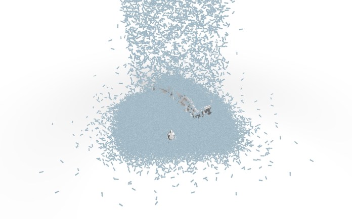
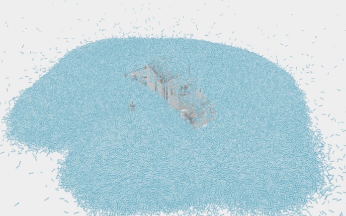
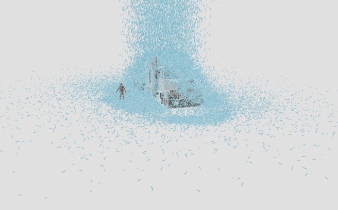
Here some ugly early testing drooping bottles and making piles:
Technical part for nerds
My first idea on Cinema 4D was to use an object cloner to create 1 million of copies of my original bottle, then adding dynamics to them let them fall in a cascade, testing with a few objects was ok, but then I wasn’t able to load more than half-million before the computer crashes so for big fail…
Particle emitter demo using 310,000 bottles
Render testing. The computer failed to render on the frame 267 of 1500
Cloner version, the computer crashed rendering any over 170,000 clones
Even using a very simple geometry for the bottles, my laptop wasn’t powerful enough to manage my crazy request, after I removed the fancy texture of each bottle it moved a little better, but not enough to reach 1 million of copies.
I solved the issue using a particle emitter for the 1 million objects during a little more than a minute, using a basic material to add textures and effects in after effects later, even with all these adjustments to the process the render took over one week to be completed. Lucky me my laptop is still alive!

Demo to show the number of plastic bottles sold every second.
Them some pile shapes and concepts of how it will look at the end. I was adjusting the behavior of the particles, some adjustments in the textures, lights, camera position… many aspects to present a nicer view of this to the readers
While the production continued, I did a second version of the website controlling the zoom of a giant render by scrolling the camera passing from the smaller pile of 1 second to the final visualization of 10 years. But the images were too big and the quality not good enough.
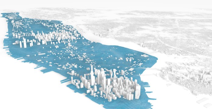
I have to say that this time I did around 22 versions of every single graphic, looking for the right elements, proportions… Every time I had a new version, we had a chat at the team to point out things that could be improved. Some just change shape, but others like the NYC model also change concepts.
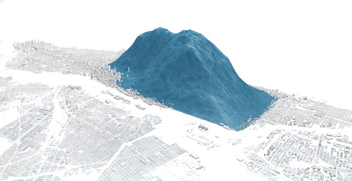
Testing textures for a plastic bottle pile over Manhattan.
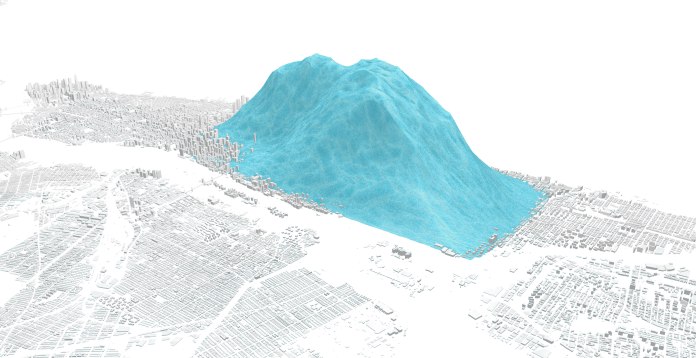
Testing textures for a plastic bottle pile over Manhattan.
An alternative version of the graphic using all the bottles spread out over Manhattan
An alternative version to visualize the bottles sold over the last 10 years
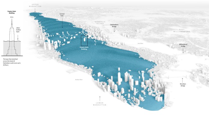
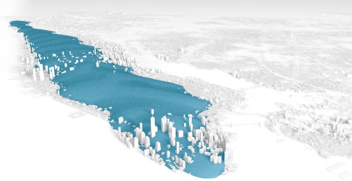
Uniform extension of the bottles sold over the last 10 years over Manhattan

A cutaway version to get a sense a deep
I did also an attempt to make all of the pieces in the same “3D look”, but at the time I was doing the information more confusing, finally, we just drop the idea and stay stuck to the original Sankey chart show what happened with the plastic created over the last 65 years
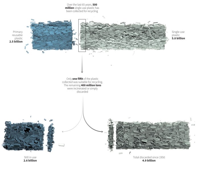
The fate of all plastic. Version 3.
This was an extremely interesting project, I experimented a lot with different things but maybe the time to verify each of the countless versions and polish the results really made the difference at the end. Thanks to my bosses Simon Scarr and Mathew Weber and my colleagues Manas Sharma and Alex Richardson who also contributed a lot to launch this project in good shape.
If you want to see the finished project and some other graphics, here is the link to the special feature on Reuters:
https://tmsnrt.rs/2PDRvhd
Or have a look to #infofails Chapter one:
https://mhinfographics.com/2019/09/03/infofails-chapter-01-pilot/