Late on March 2026 I published the first piece about the latest NASA’s mission to the moon. However, the planning behind started just when I came back from the holidays the first week of January.
We had a lot of meetings with editors to make a plan for all the pieces we wanted to do, but there was one in particular that took me into a wild ride that included a lot of documentation and manual crafts, here’s a little behind the scenes of that project to produce a ~2min video.
A spark of inspiration
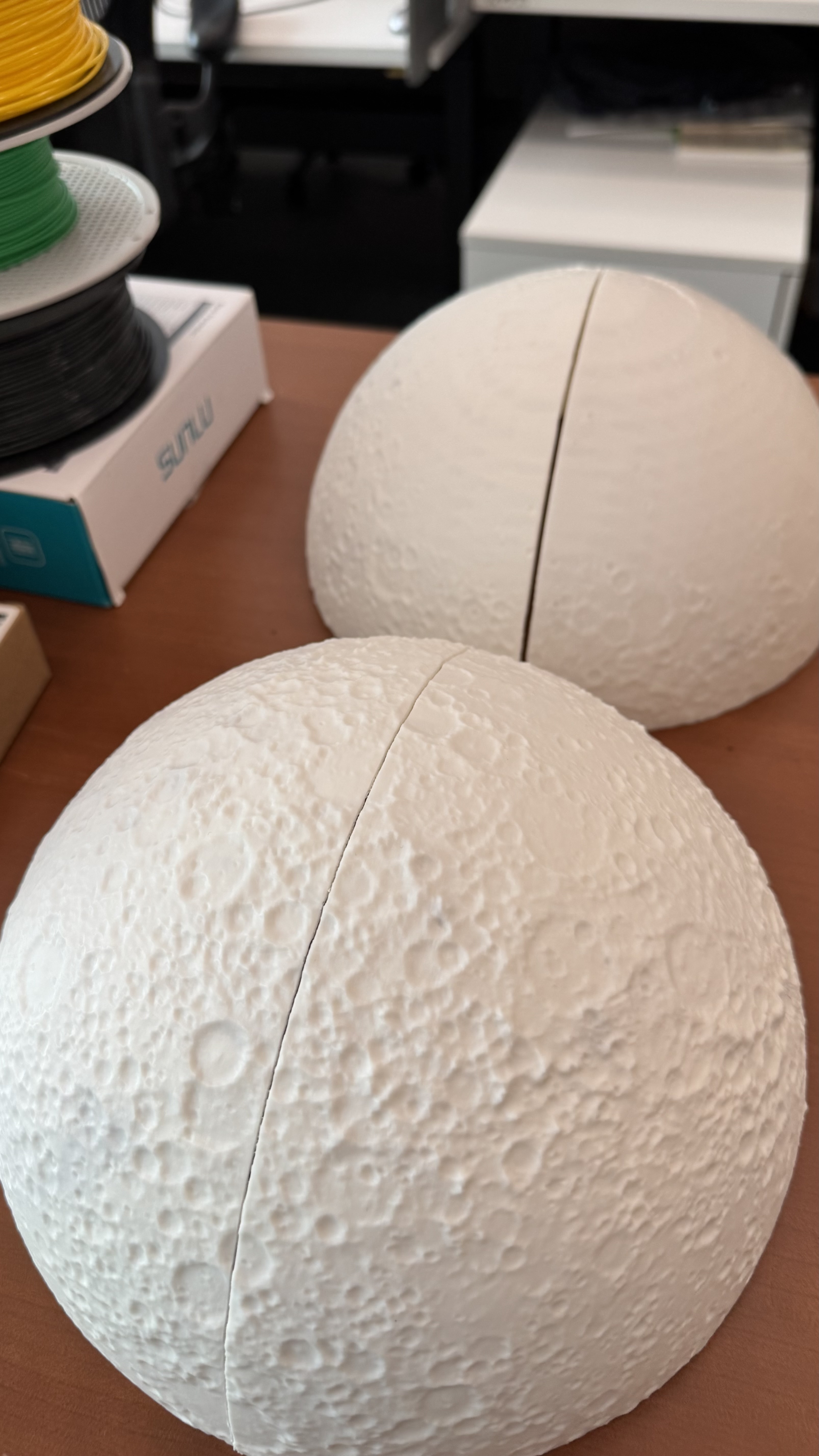
During a call with NASA’s PR team, they mentioned that the Moon will look about the size of a basketball held at arm’s length from the spacecraft window. This was mentioned repeatedly on various sites. I noted this down because I was already thinking to do a video explaining what astronauts will see while flying over the far side of the Moon, but after that statements, I was considering to use a printout of the Moon, the same size as the astronauts will see it, an sphere of about 9,4 inches.
Gathering data
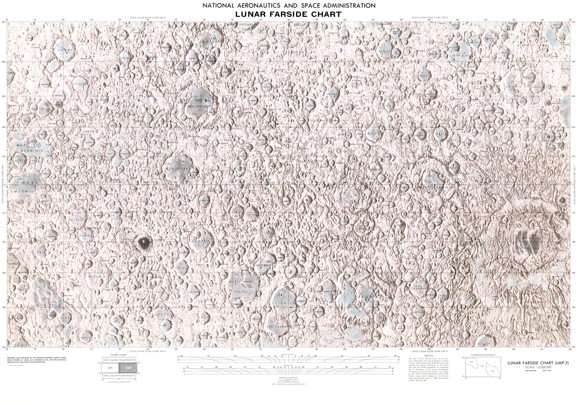
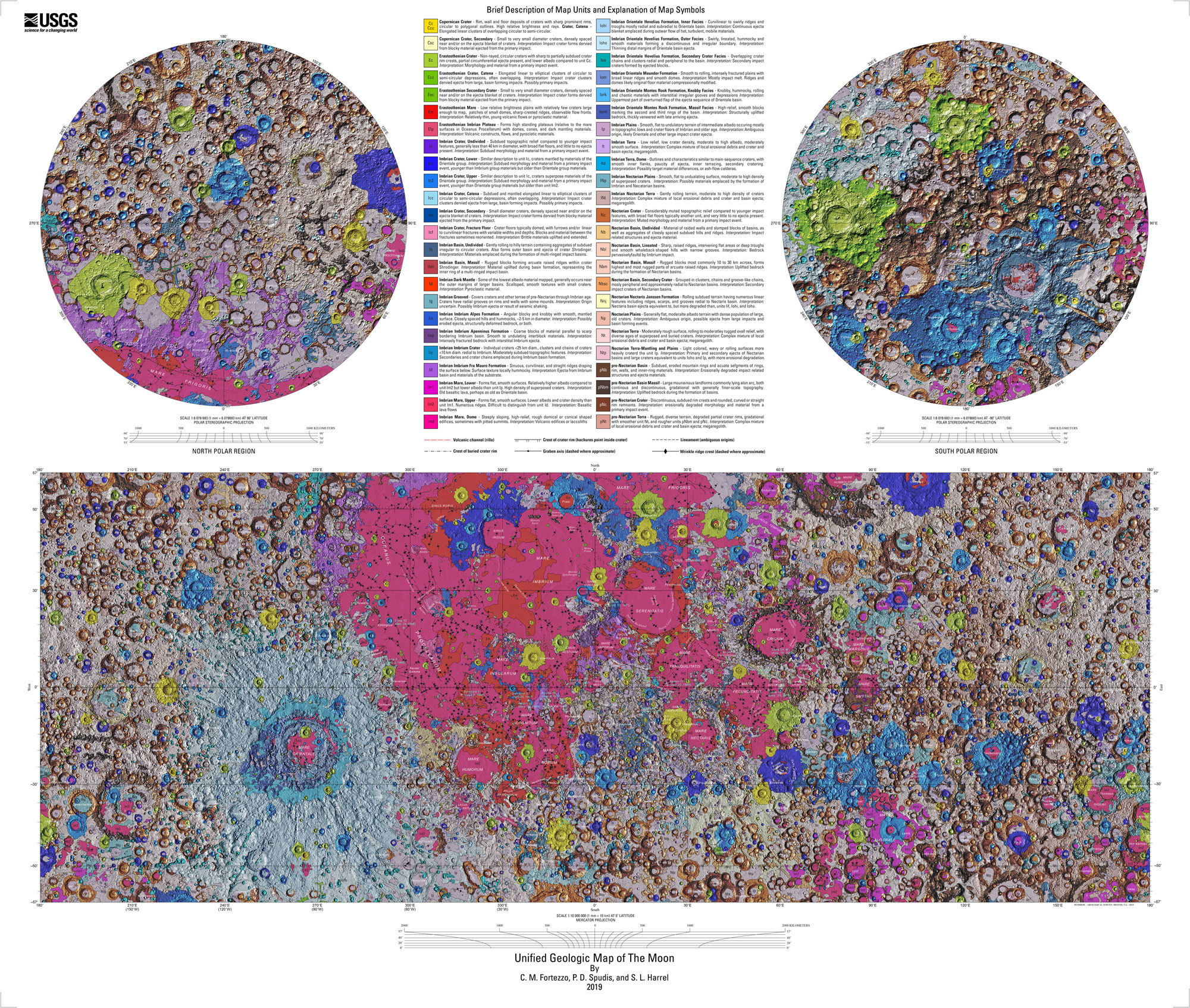
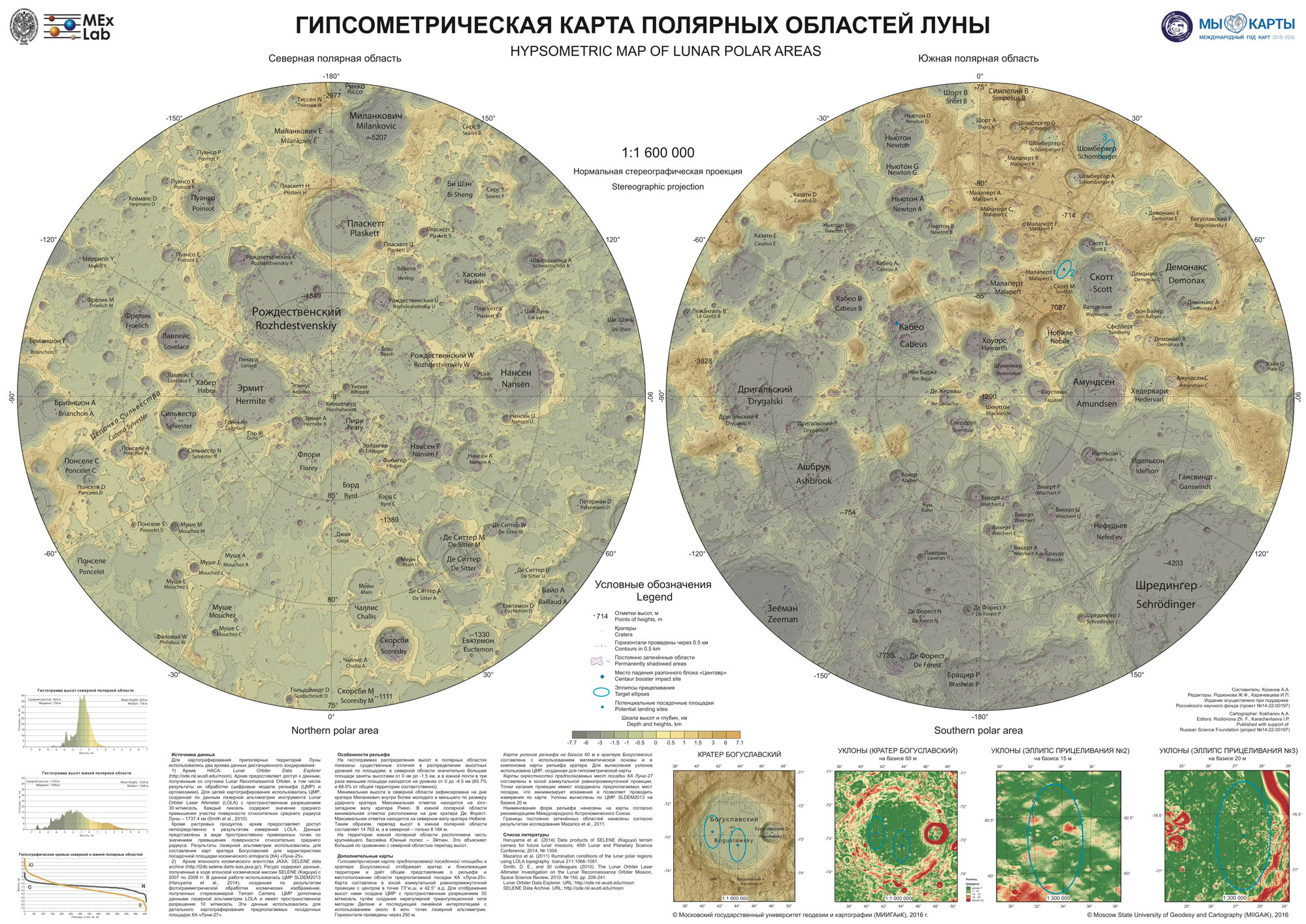
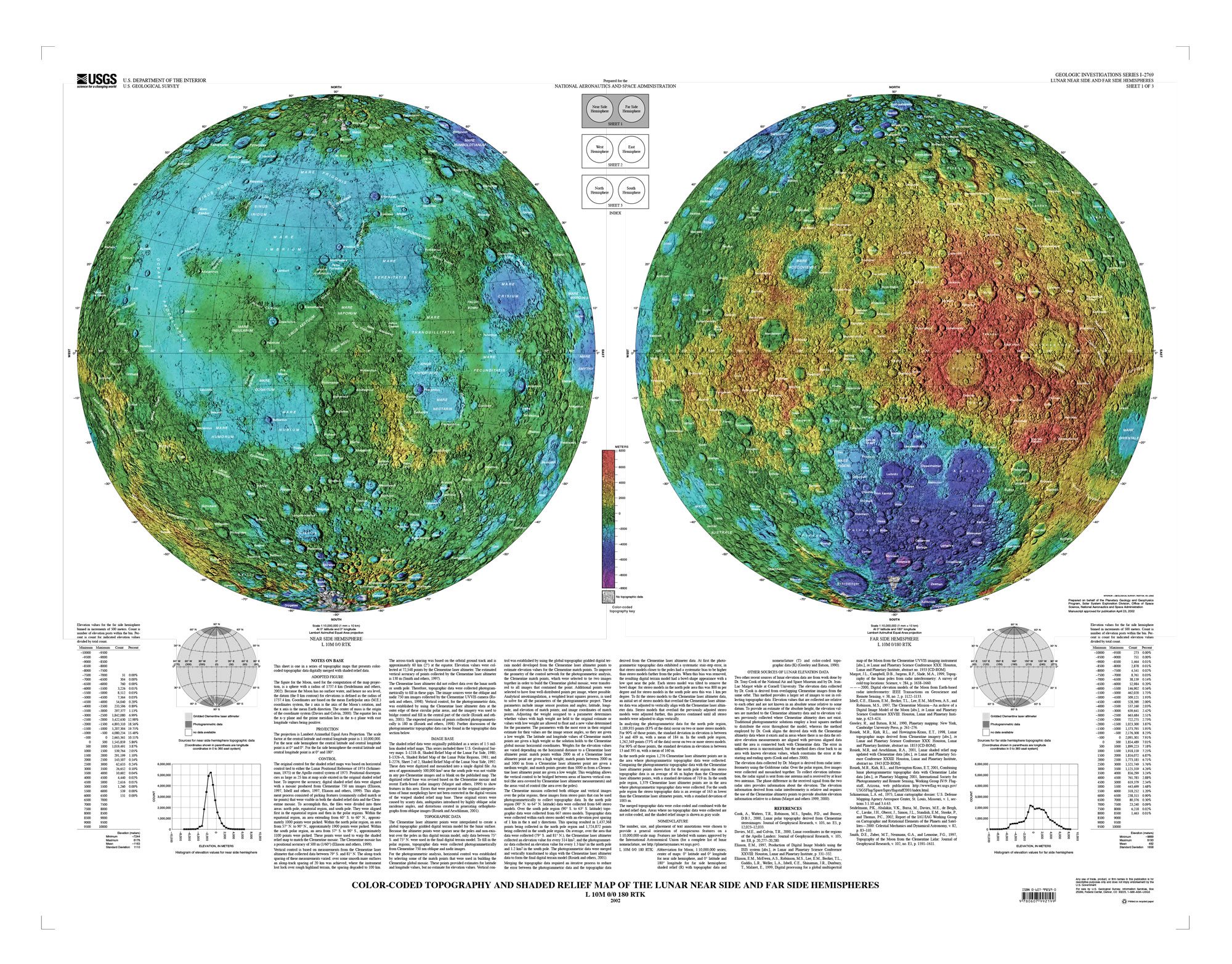
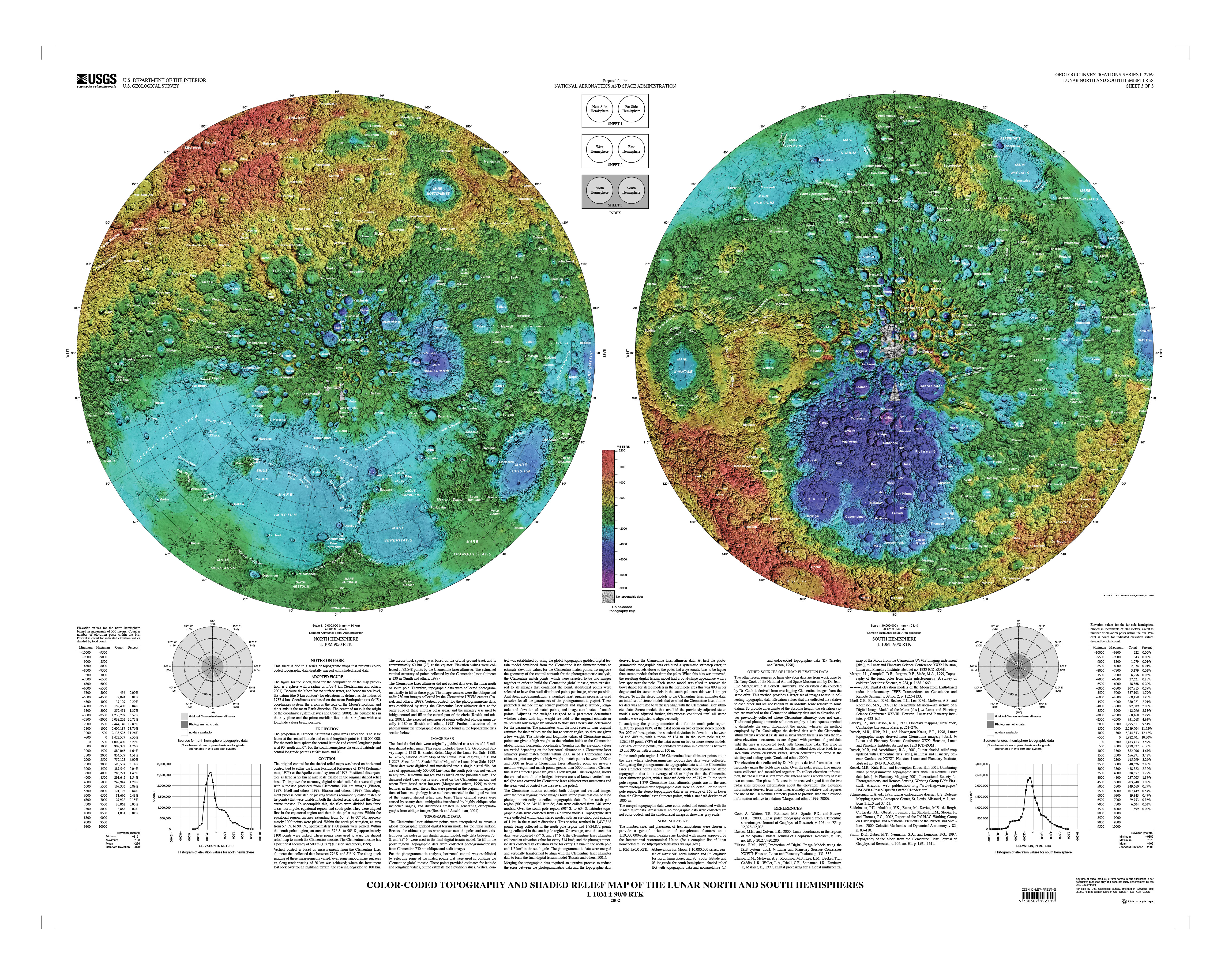
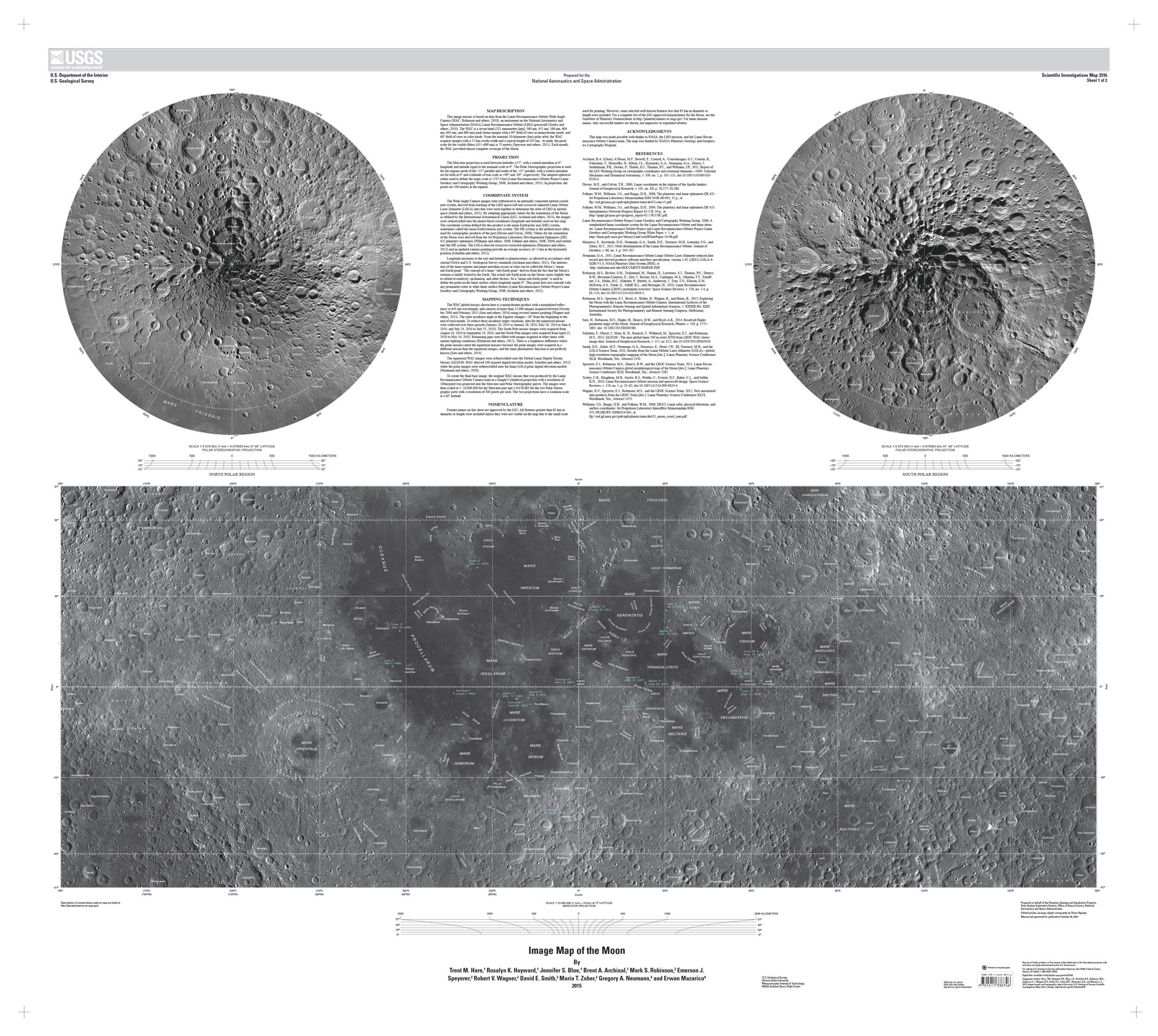
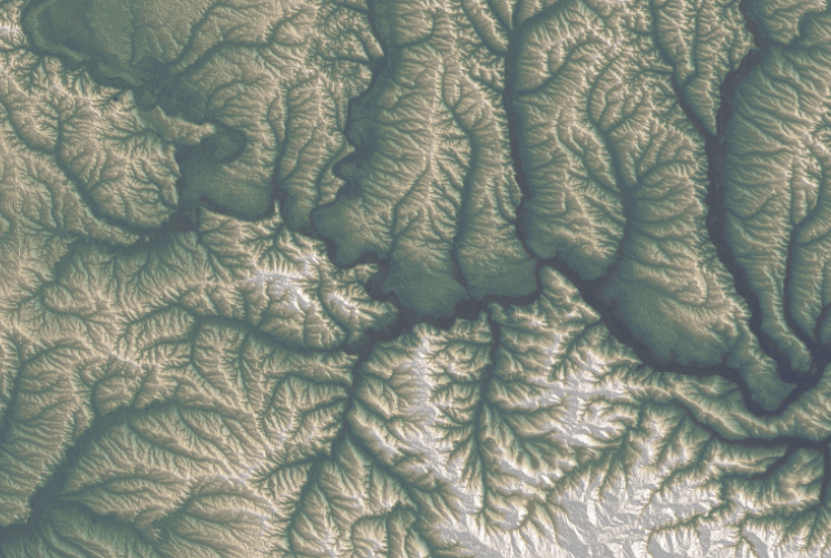
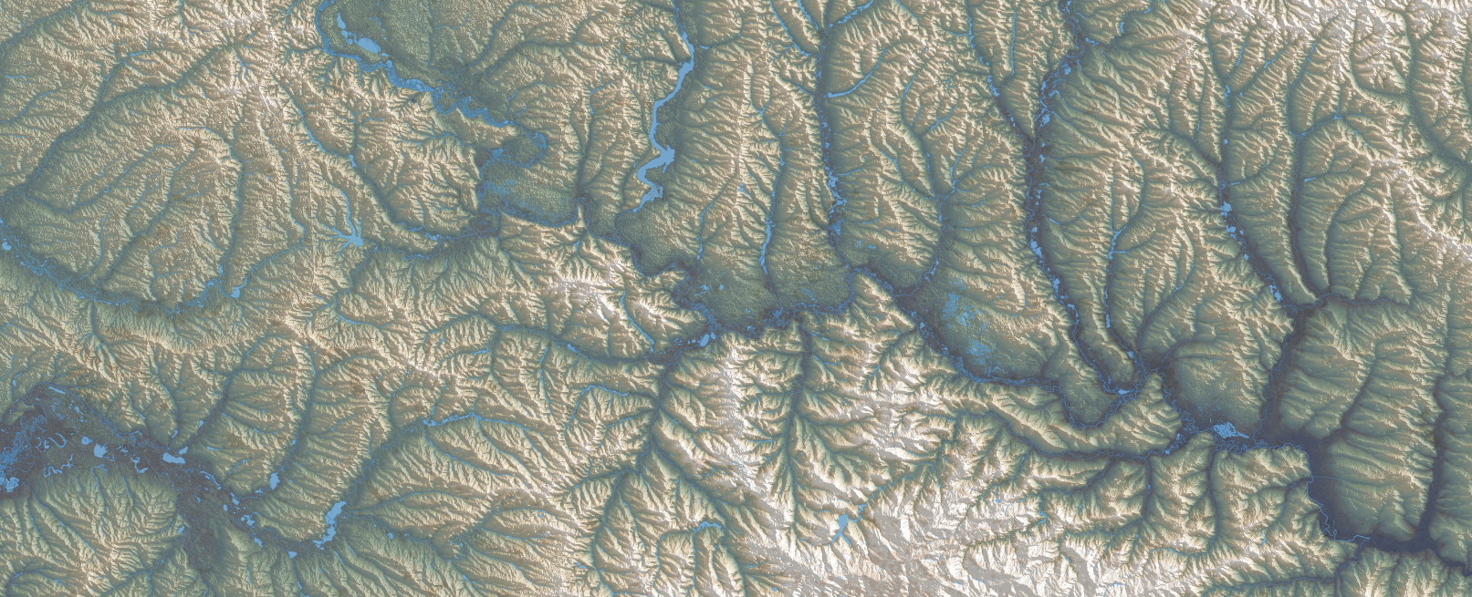
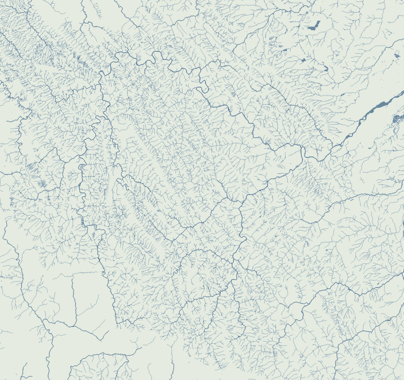
The first thing in my to-do list was to familiarize myself with the geography of the moon. NASA said that Artemis II astronauts took geology and cartography classes, so if I was meant to explain something to the readers, I probably should do something similar. So my ride started with the many USGS maps in different projections and themes.
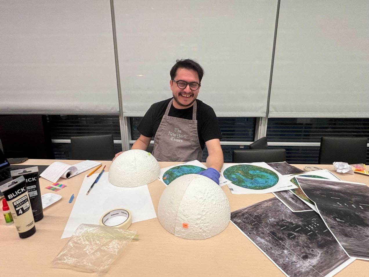
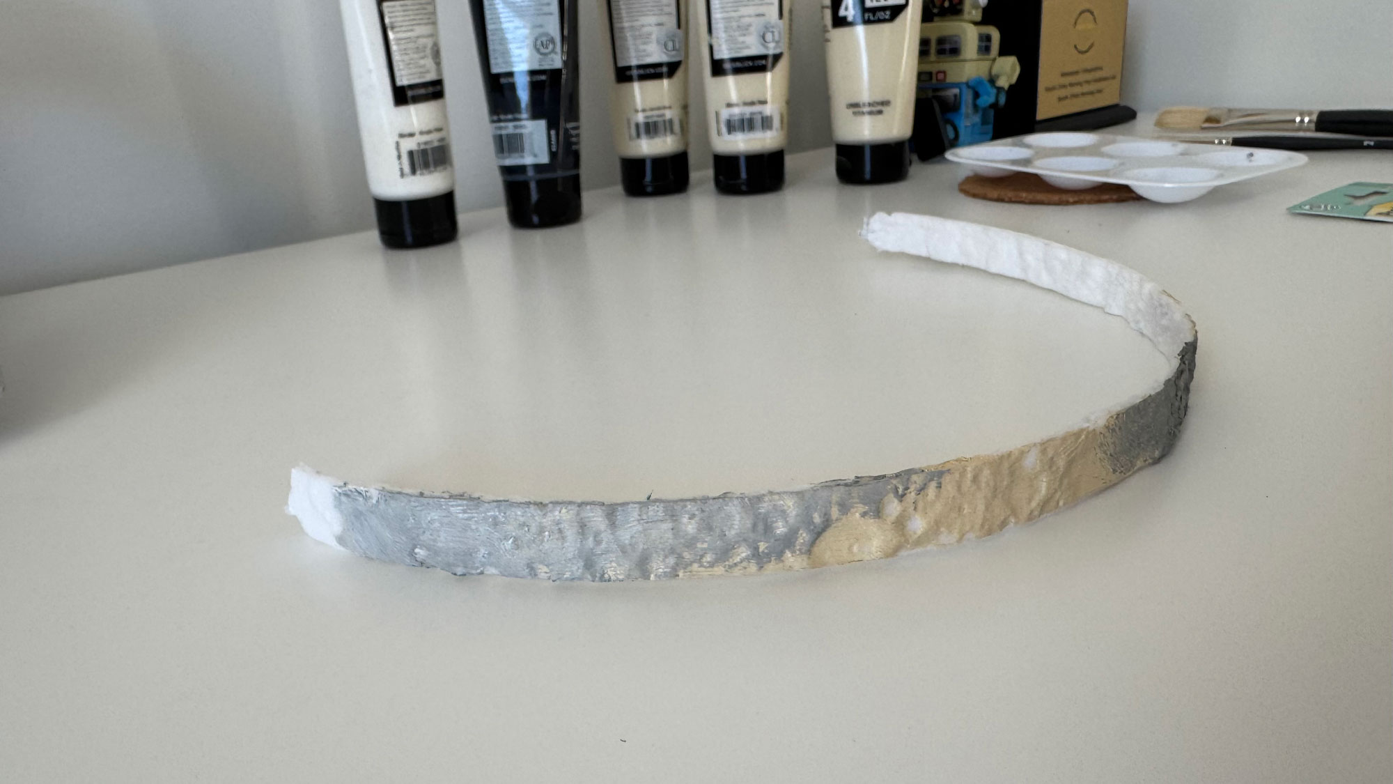
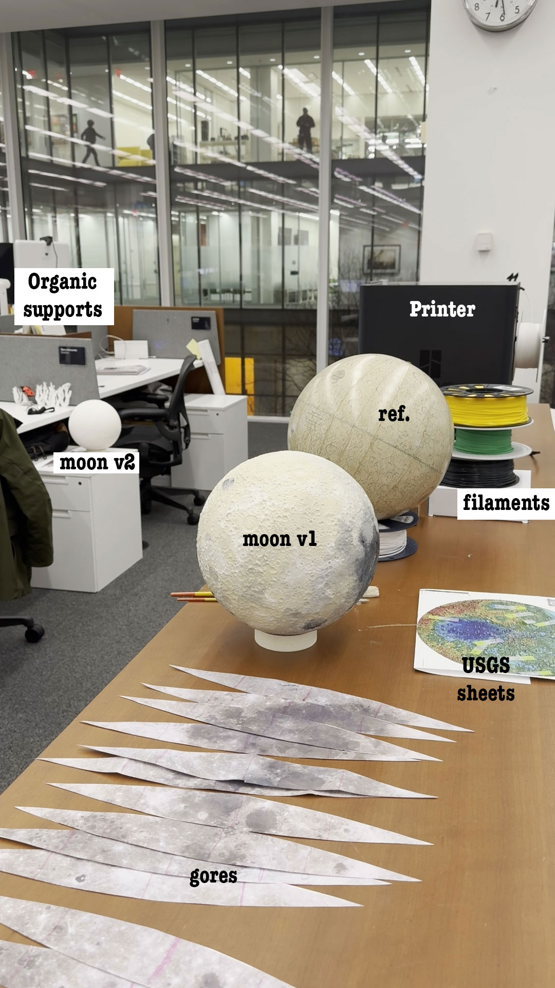
Some gigabytes and a few days later, I started to look at the 3d models with a little more of confidence, I made a small test printing a section of my model to try on the paint.
3D printing
Messing around with the 3D printer was a hoot! I hit a few bumps with the filaments, because our team has a Bambu Lab printer that feels like it has a mind of its own. I learned that generic filaments are great for tiny trinkets but a disaster if you leave the printer unsupervised for more than an hour. It was like leaving a toddler with a bowl of spaghetti; I had to stand by de-entangling the roll to get that first sample out. After a shopping spree for some new, tougher filaments, the drama was finally solved.
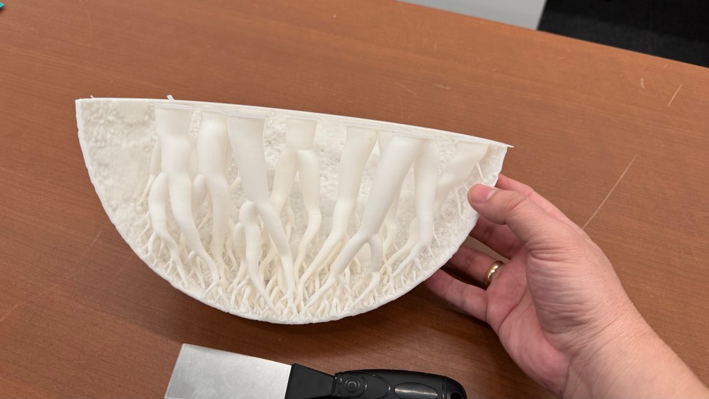
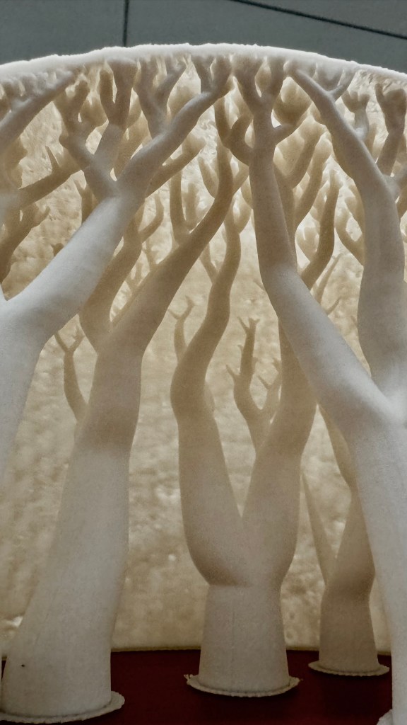
The printer comes with its own software that plays detective on your 3D model, helping you find those sneaky weak spots. These printers melt filaments and whip up thin layers to serve your model, so, if your model isn’t properly built, you may end up with miniature Swiss cheese holes or cantilevers that can potentially transform your model into a gooey glob that looks like it just lost a battle with a pack of chewing gum.
For the first full test, I printed out 4 wedges, I inspected the model and added organic supports to prevent the collapse of the model. The structure is actually very nice:
However, these organic supports only serve as support while the model is still hot. Once they cool down, you can just removed them. No one will see them because you have to glue them together.
How to paint it
Next step was to paint the model, pretty fun!
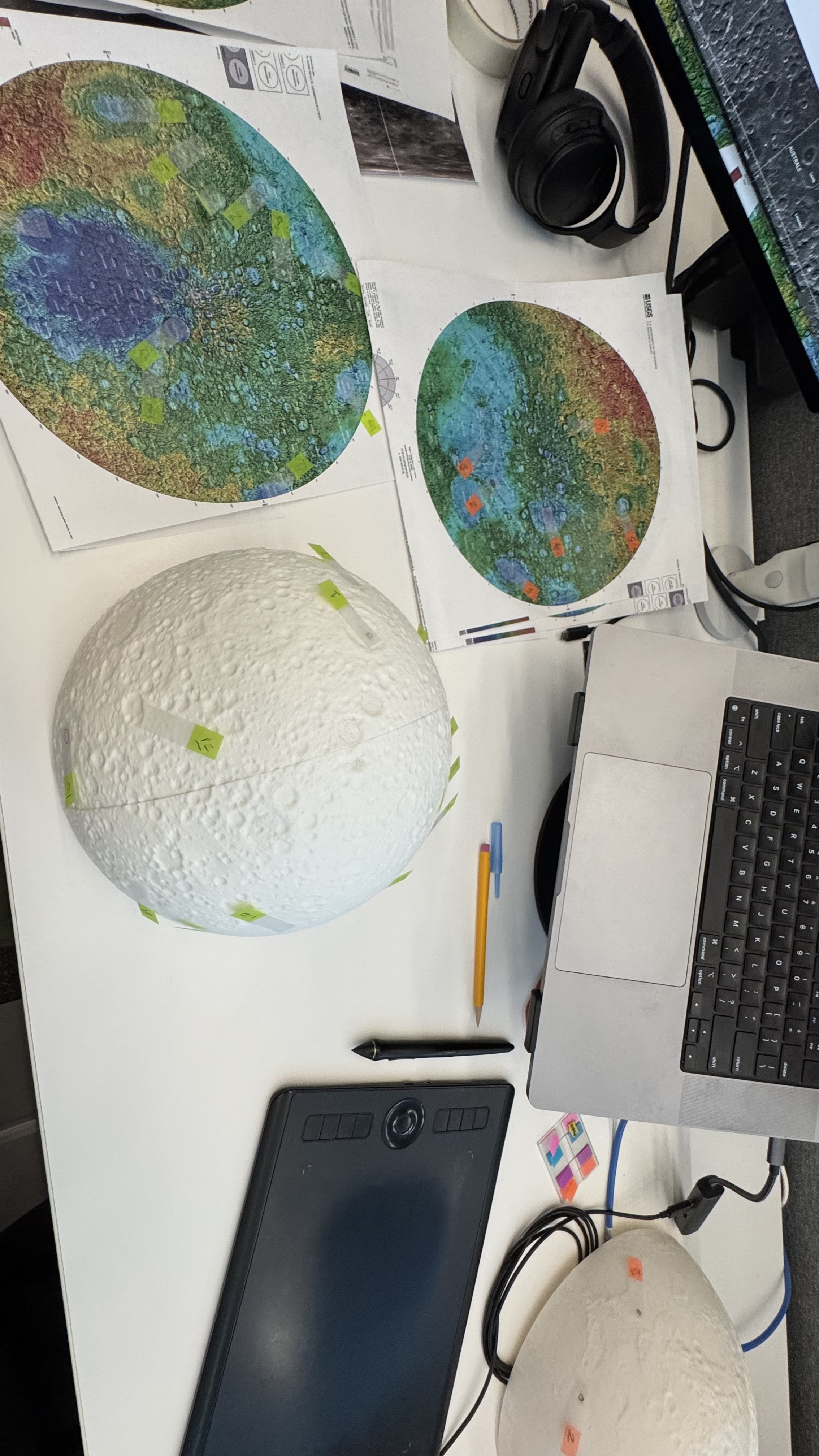
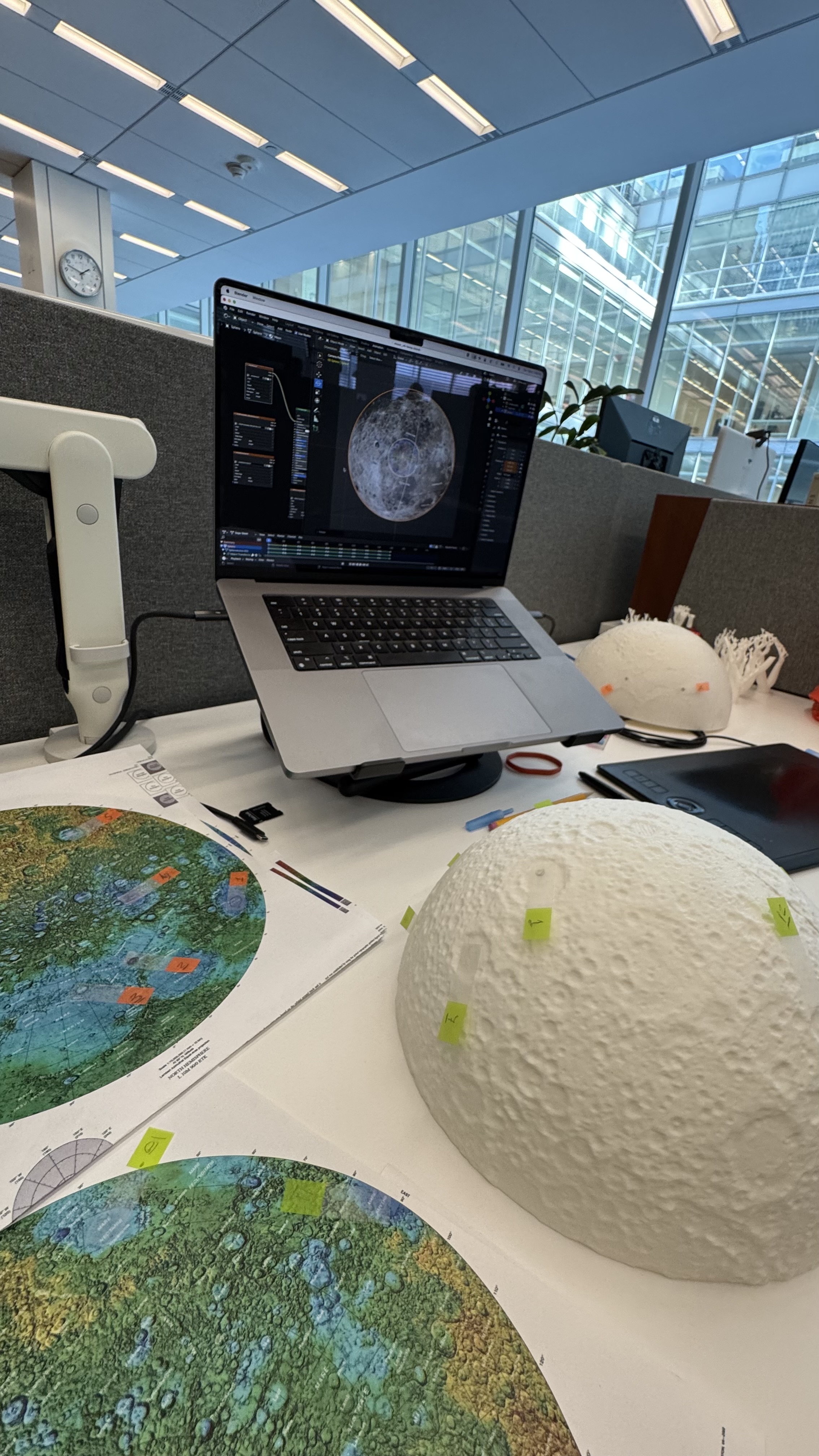
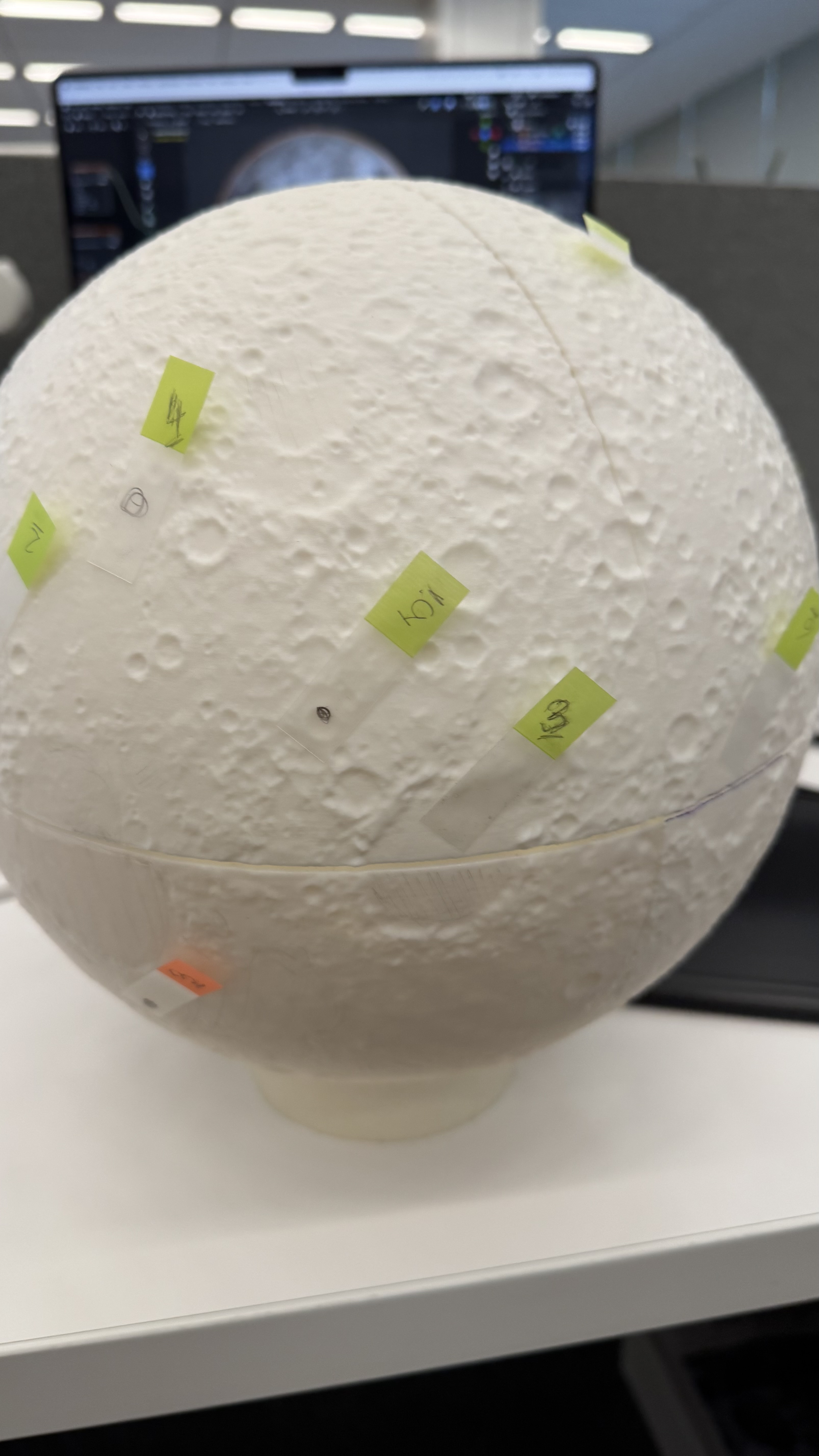
I used a bunch of different maps to be sure how to look and align the references to my model. I first tagged some craters and features just to be sure that I have the right alignment before jumping in with the brushes and acrylic paint.
Flat to Spheric
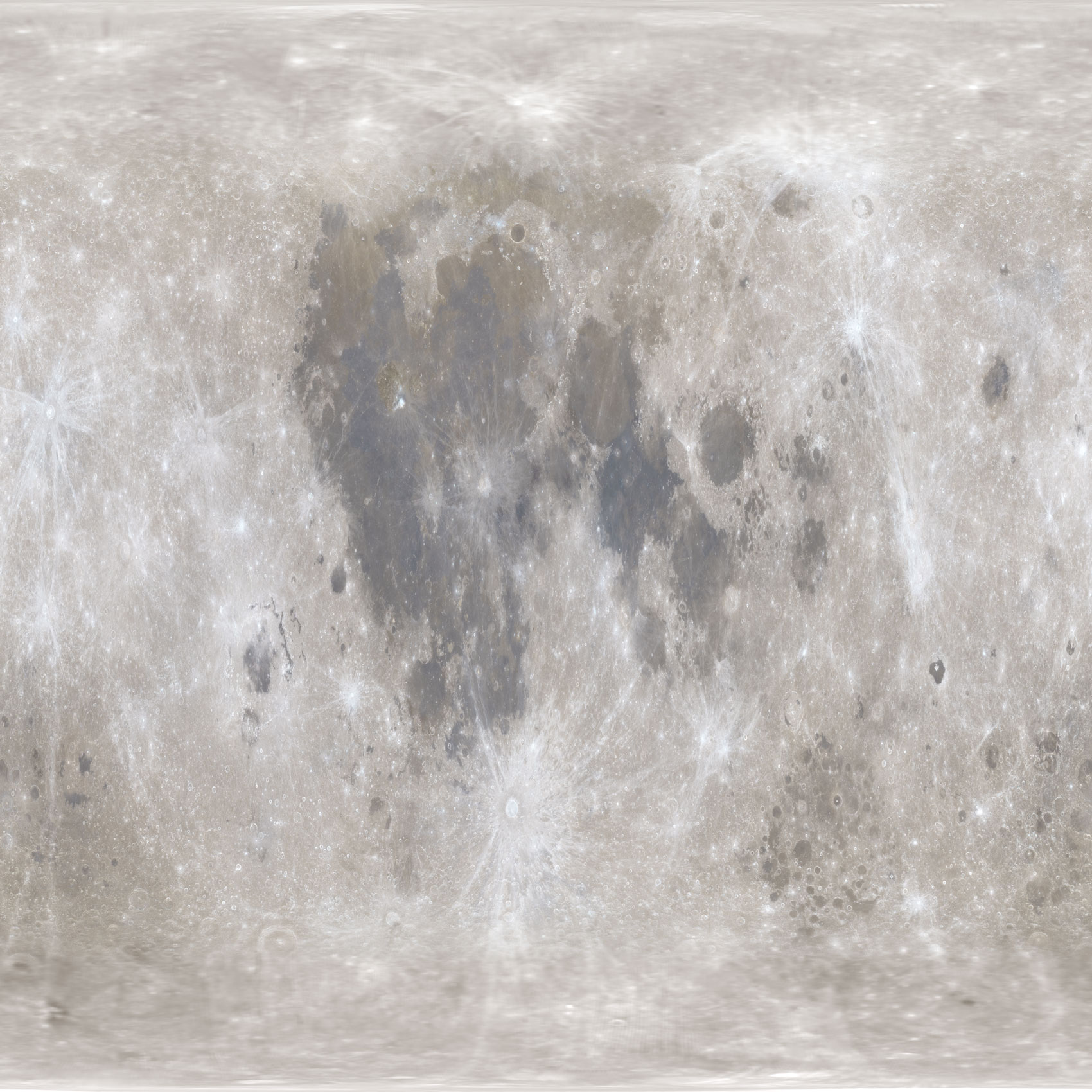
I used a equirectangular mosaic from NASA to get the base color guide, however to project that into my spheric model I need to process it like you will do to build an earth globe.
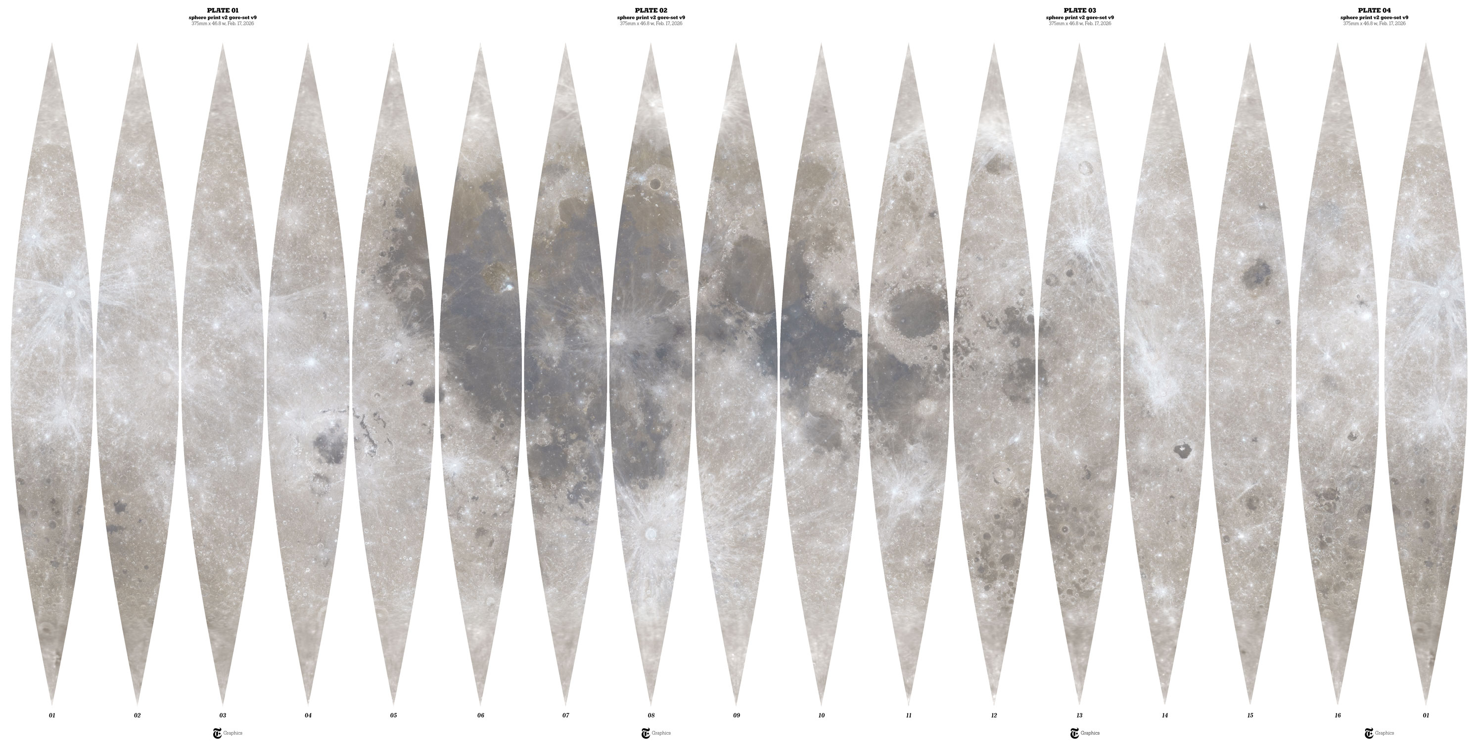
Equirectangular projection.
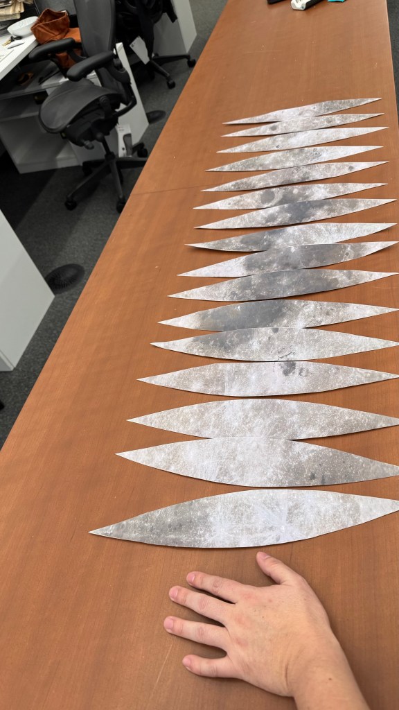
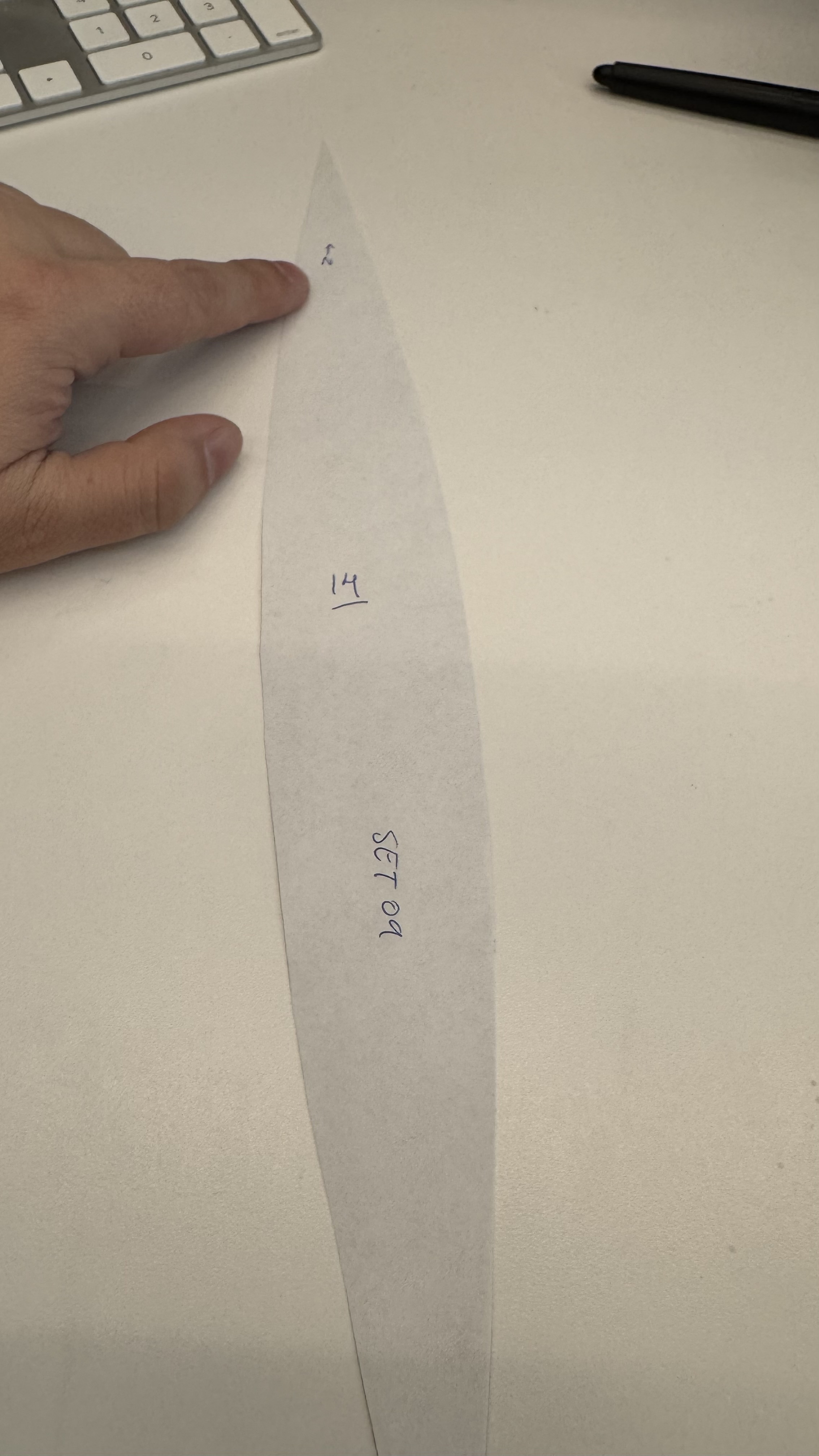
I used a custom Python script to slice, scale, and re-project the original equirectangular image. The script takes the original image and divides it by dividing it by the model’s circumference. Then slices the data into 16 gores. While increasing the number of gores would enhance the smoothness of the reference, this was just for me to make sure that the painting work was accureatly applied.
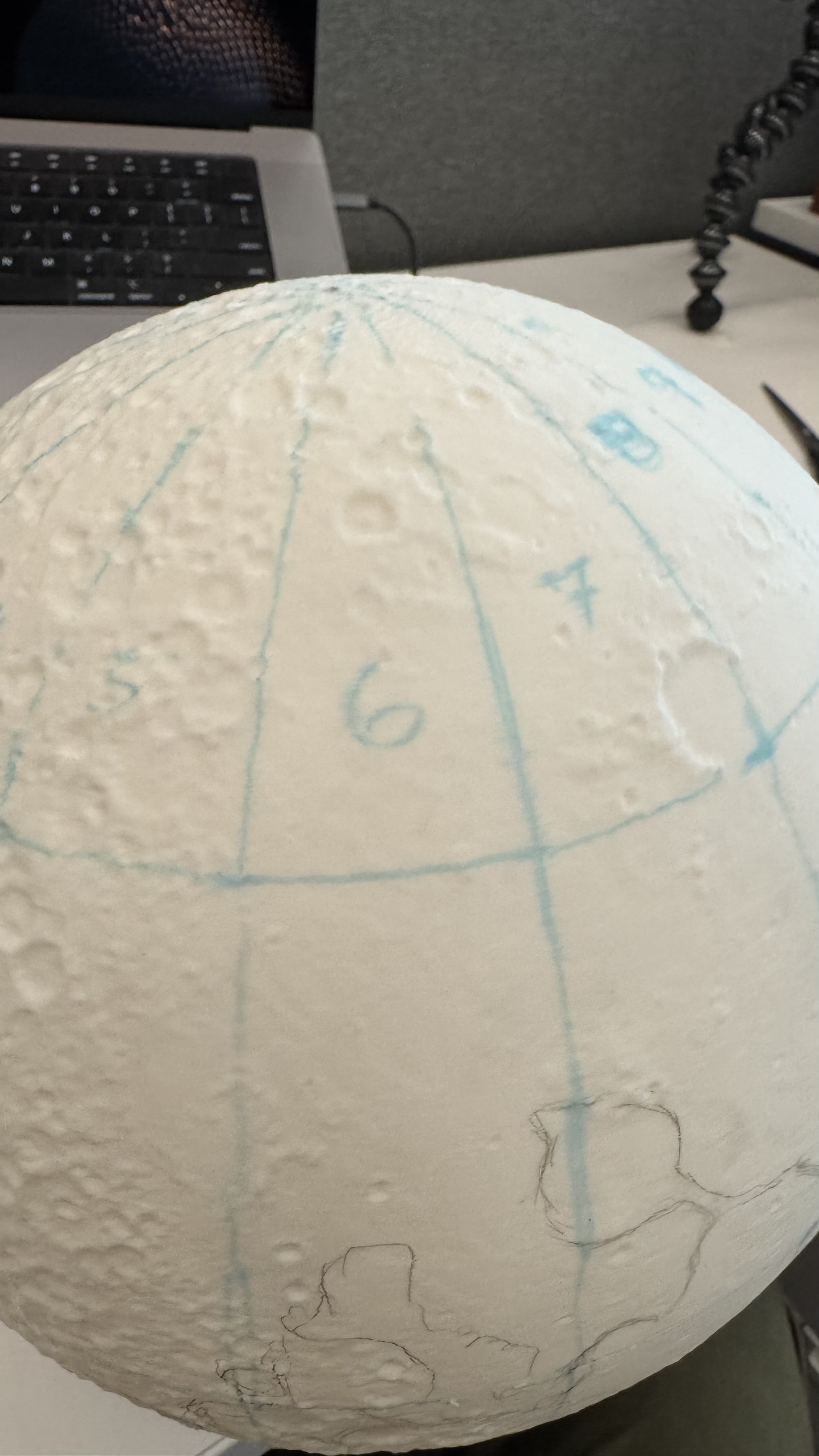
Moon gores
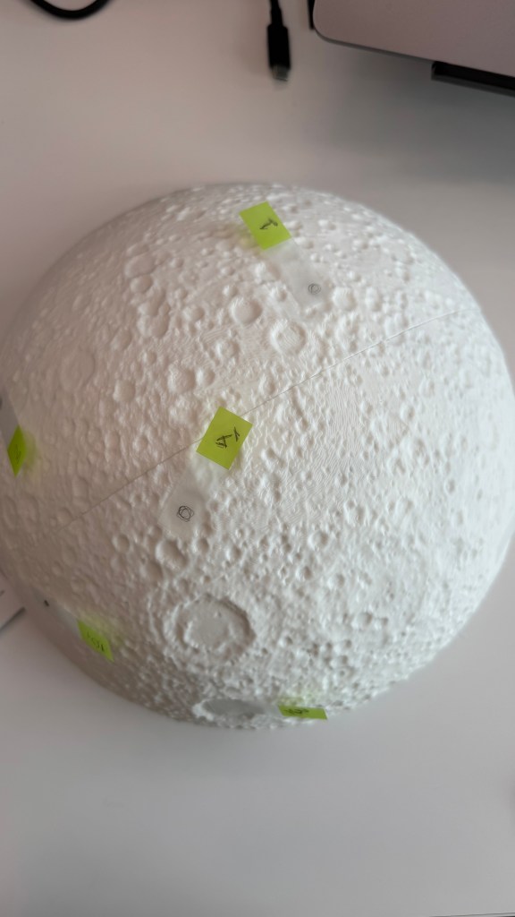
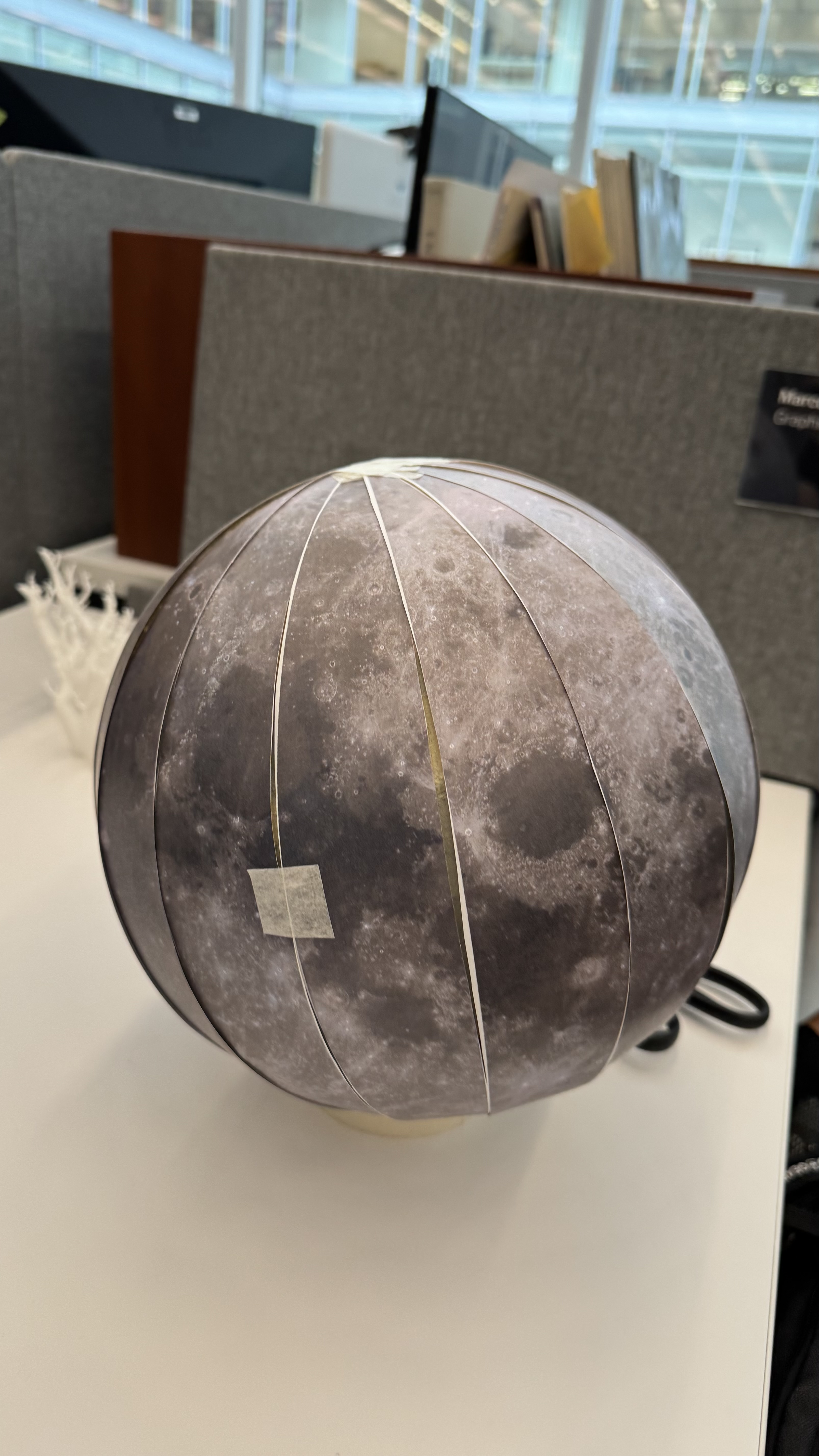
I added numbers to the back gores and draw some references with a marker on top of my model, that helped me to check the alignment of terrain and color.
Then it was like peeling an orange while adding color.
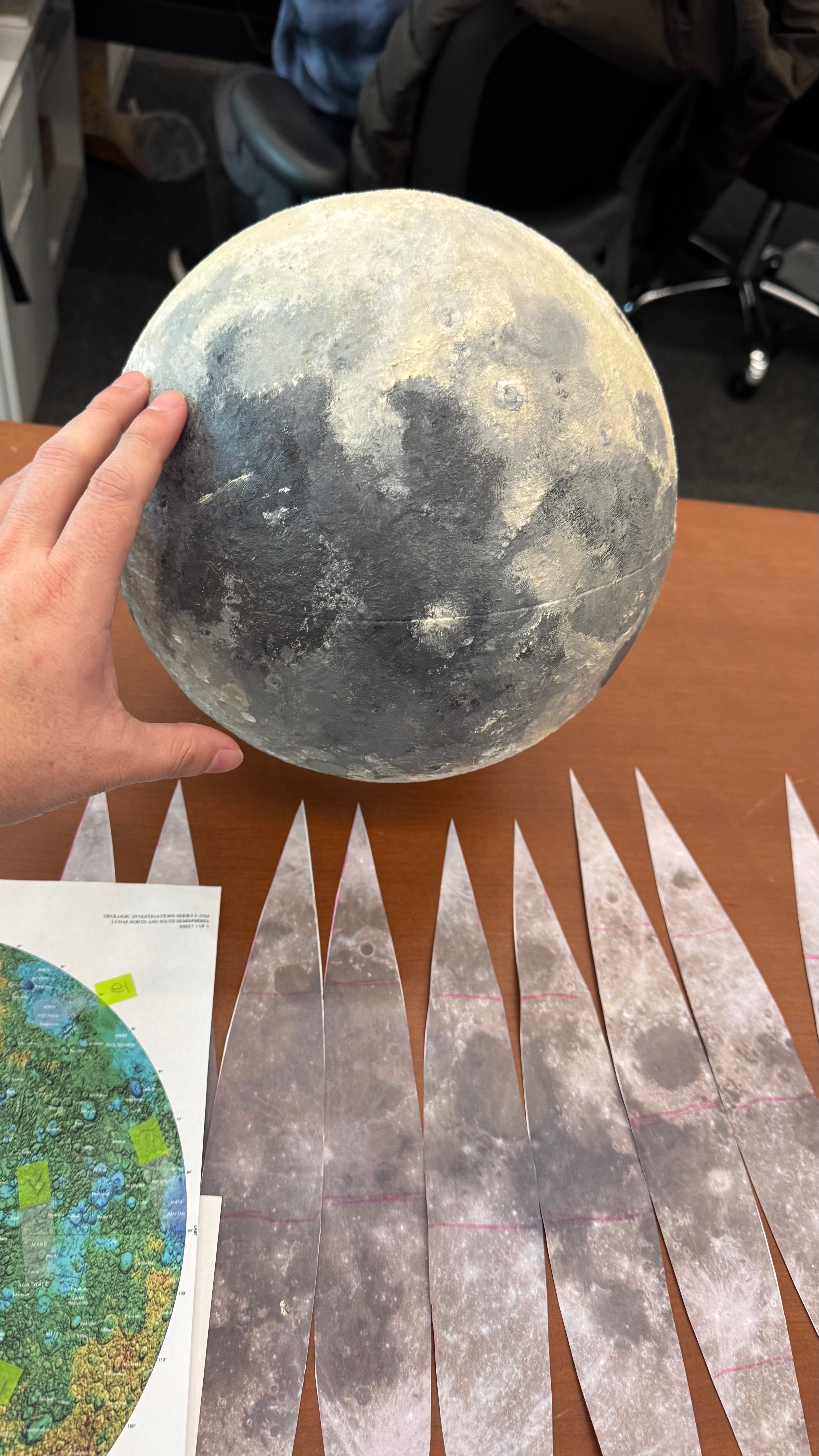
After I finish the first paint work, the model was almost there, but it was not perfect, the joints of each of the 4 wedges were not perfect, the color was also a little off in some areas, so I printed a second model and improved the process to make it crisp. Here’s a view of the working area around my desk. You can see a few of the white organic supports next to the version 2.0 and some other tools and things all over the place.
Once the moon was ready, I did a day of recording with the video folks in the studio. They did an amazing work editing the final piece, we used the model here, and here. I also posted a little timelapse showing the painting process, you can take a look here.
It is important to note that I worked all of these things while also working on six additional pieces that showed various aspects of the mission. The experience was both pleasant and quite exhausting.
This year I’ve found a lot of inspiration in various forms. There are so many professionals doing incredible things that I thought I’d create a special post to wrap up the year. I have something from out there, something from a colleague, something in paper, something of my own, something I found on social media, something from someone I admire and something that was recommended to me.
The composition of this piece not only captivates the viewer’s attention but also employs an unconventional format reminiscent of a comic strip. The narrative is compelling, effectively eliciting empathy for the individuals ensnared in this perilous predicament. Beautiful work to tell the horrors of abduction and scamming in a powerful way.
This piece successfully explains how quickly the dissemination of outbreaks can be under specific conditions. Unlike conventional explainers, it provides interactive simulations where you can edit the data and understand the effects in the outbreak, enabling a deeper comprehension of infectious diseases, vaccines, and related intricacies.
The topic is spicy and trendy. There’s an interactive version of the piece to explore some of the data, but I think the print is a great solution, great design to focus on the big picture. I think paper can make us better editors because of the nature of having limited space.
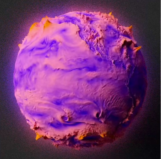
Scott always does very interesting things; this year he has posted many alternative ways to visualize winds, temperatures, and other atmospheric conditions in a really interesting way. Check this set of spheres driven by wind.
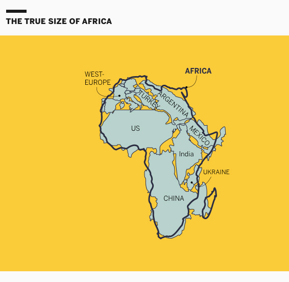
This project is exquisitely designed; every map, animation, and illustration is simply brilliant. The piece explains the details behind the distortions and biases in cartography within the framework of the African Union’s demand and initiative to promote maps that better reflect scale and proportions.
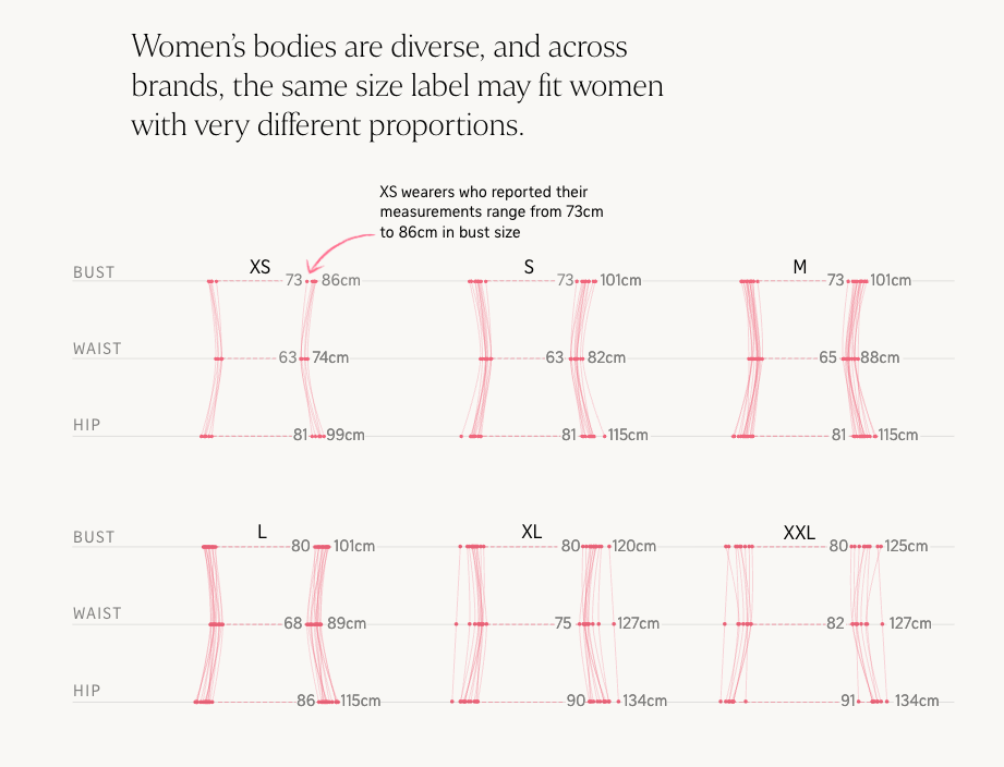
I asked colleagues for a little something (graphics/dataviz) they remember from 2025. Among the responses I received was this piece from the Straits Times, a very interesting analysis of women’s clothing sizes. To be honest, we’ve all been confused by clothing sizes at some point. A brilliant blend of graphics and personal experiences, wrapped in a highly engaging narrative. This piece is well worth reading again.
Image by The Straits Times.
What other memorable pieces from 2025 do you remember?
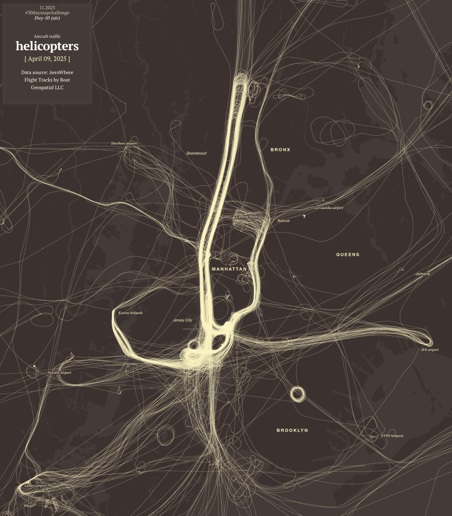
Every November map makers from all over the world join the challenge to create maps from a common thematic. The list of prompts is posted few weeks earlier in October I think. The initiative is similar to inktober, same idea but doing illustration which happens (yes, you guessed it) in October.
Both are things I’ve follow all the time and really enjoy; however, I never had the courage to join either for one simple reason: my obsession with commitments.
I love the work the creators do for both initiatives; I deeply admire people who can take one of these opportunities and successfully made it.
In October I told my family that I was thinking of joining this year’s map challenge. My son and wife saw me and said, “Okay, how many maps do you have already?” to which I enthusiastically replied, “One… maybe”. They know my obsessions so well that no more words were required.
😒
After a laugh, I told them I was worried about starting something like this because if I didn’t finish it, I’d be stressed. The days went on, and when November arrived, I didn’t have many more maps, so my attempt to join the maps celebration turned into one more episode of Infofails. And then here’s how it happened:
Day 1
The excitement was through the roof; my plan was to create a different styles for each map, I could also work on a different region with each day theme… Yeah, what a wonderful plan.
To kicked off, I went with a in minimalistic vector style, maybe places in the middle east? –I thought– So, I downloaded data points using the QGIS geoparquet plugin and set out to funny thematics.
Day 2
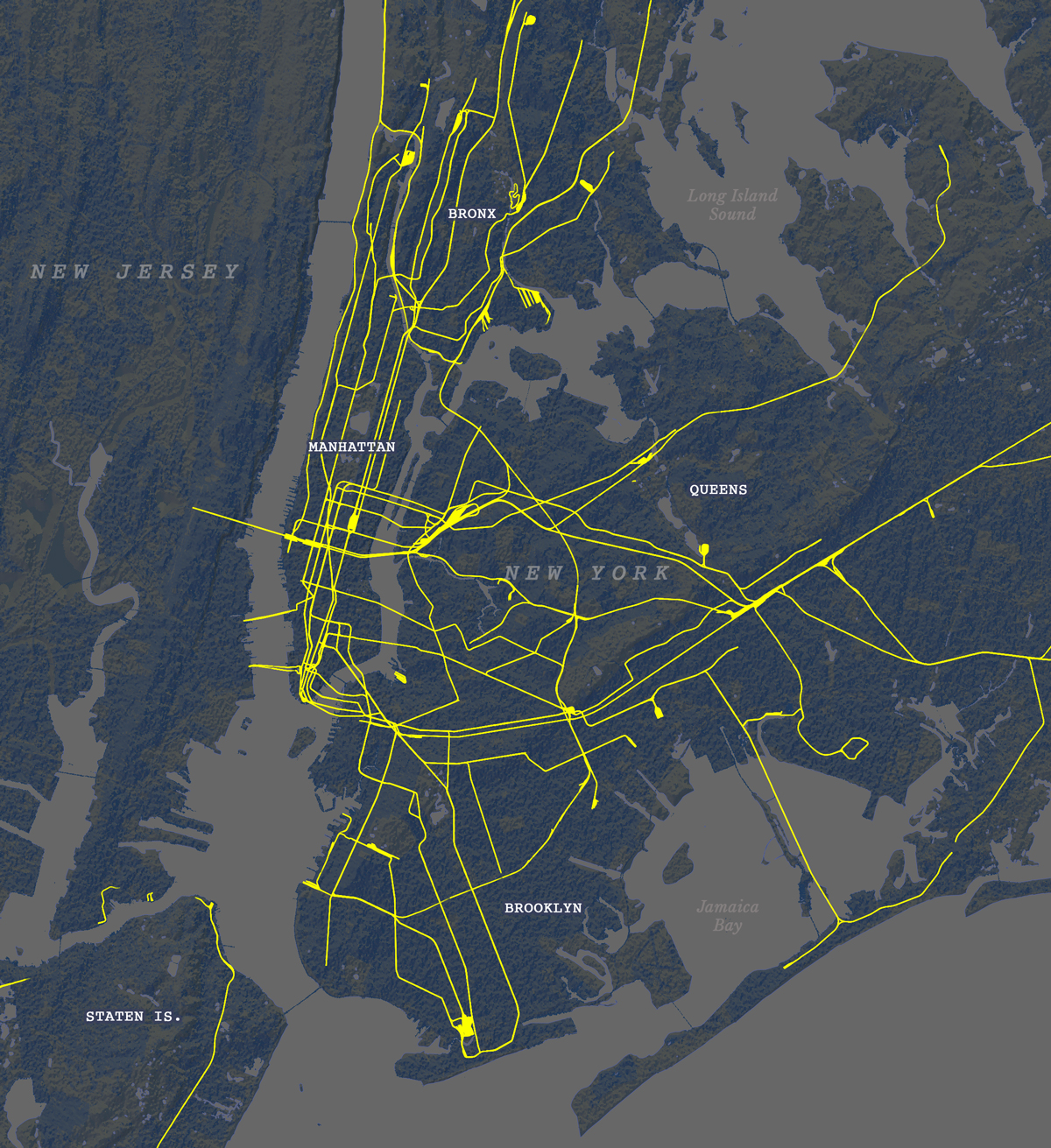
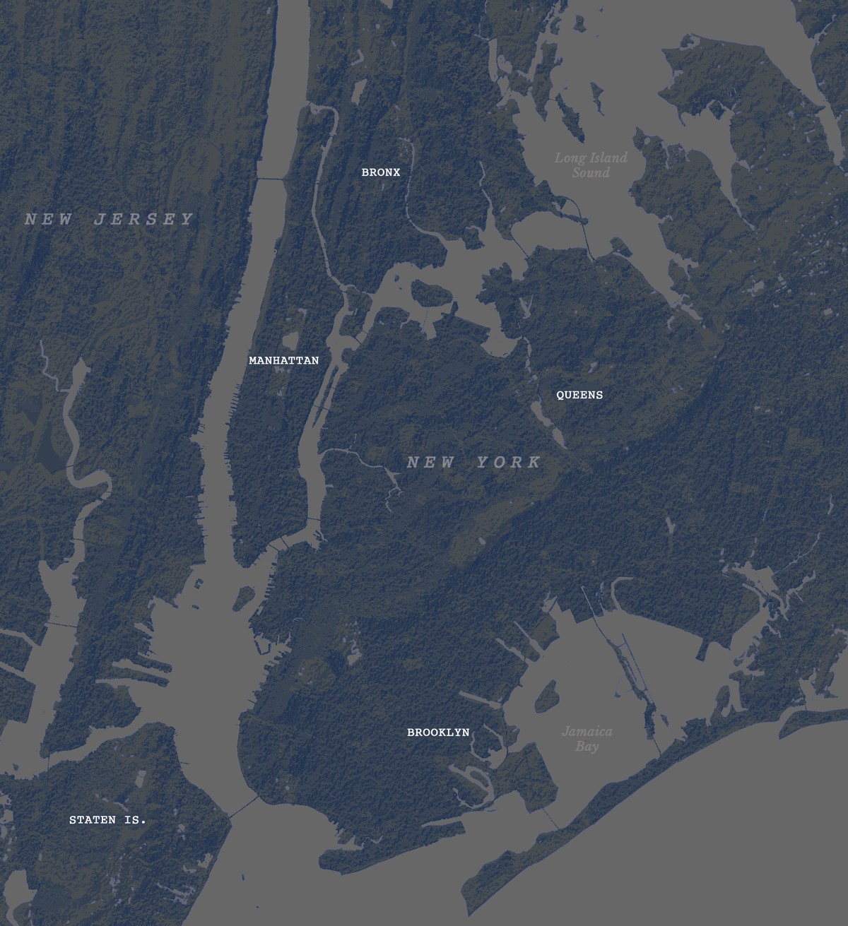
Second day theme was lines, so what about visualizing trains network in NYC? Here’s what I ended-up with:
But then, just like in cartoons, that little voice over my shoulder started saying: Don’t you think this wants to experiment a little with animation? Nothing complicated, perhaps one of the things you already have installed like MMQGIS… And so everything began to go off the rails.
Day 2 (take 2)
I turned that static map into a sequence of images using MMQGIS. With not much sense actually, but who cares? It’s all about having fun, isn’t?
Day 1 (take 2)
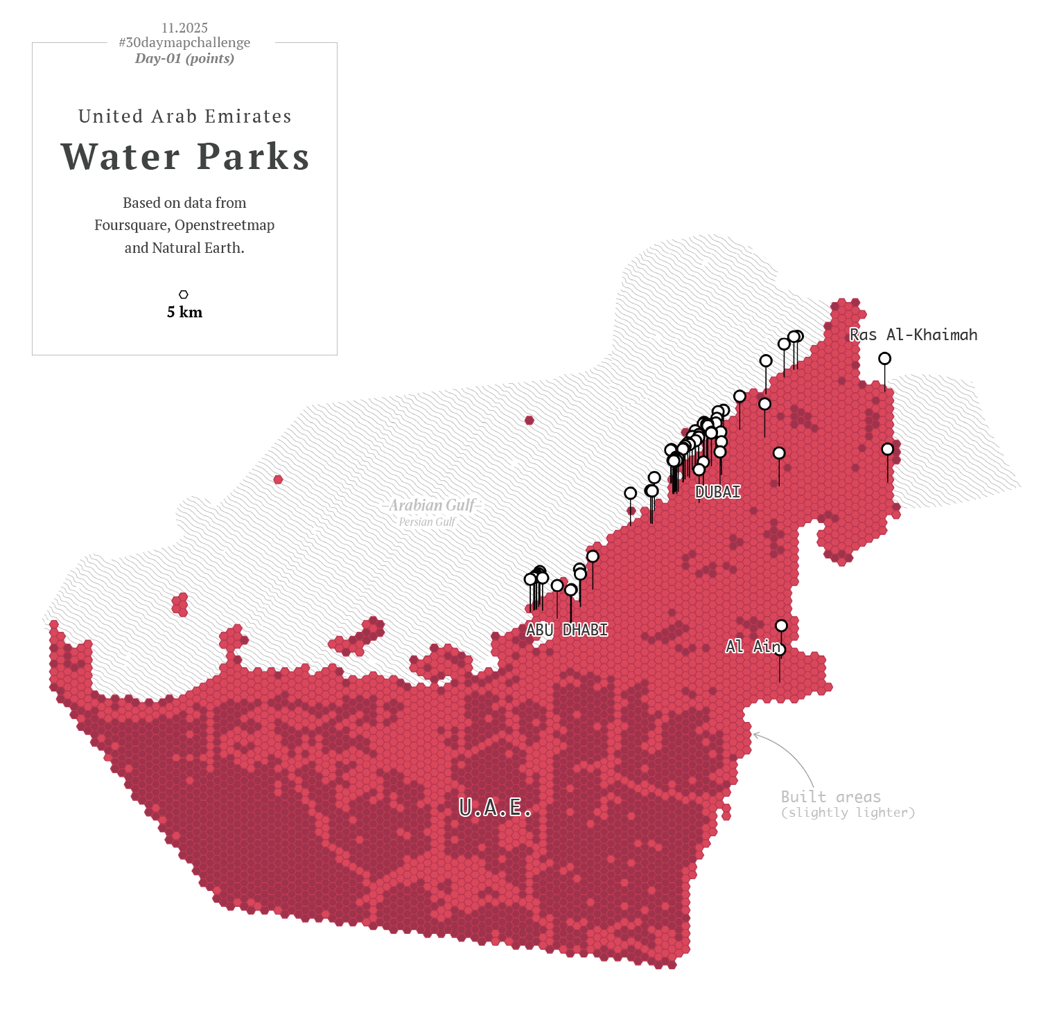
Then I thought, hey, I also have more points showing other things for that one map of the UAE, what if I revisit day one as well? So instead of having one map for day one and one for day two, I had 20 frames for the NY trains, and 12 maps of the UAE showing different things. Here you have some of those maps showing fun stuff:
Okay, no problem, there’s still plenty of time, I thought. Yes, of course, I’ll keep my anxiety quiet and make it simple with the others.
Day 3
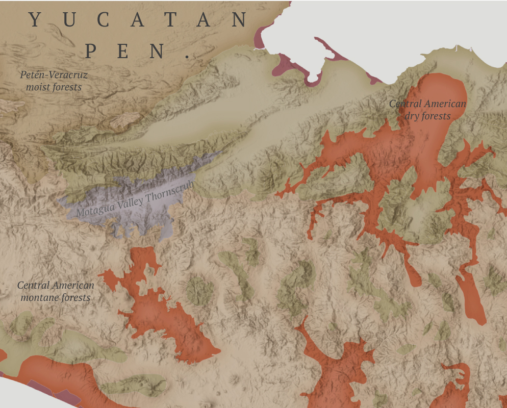
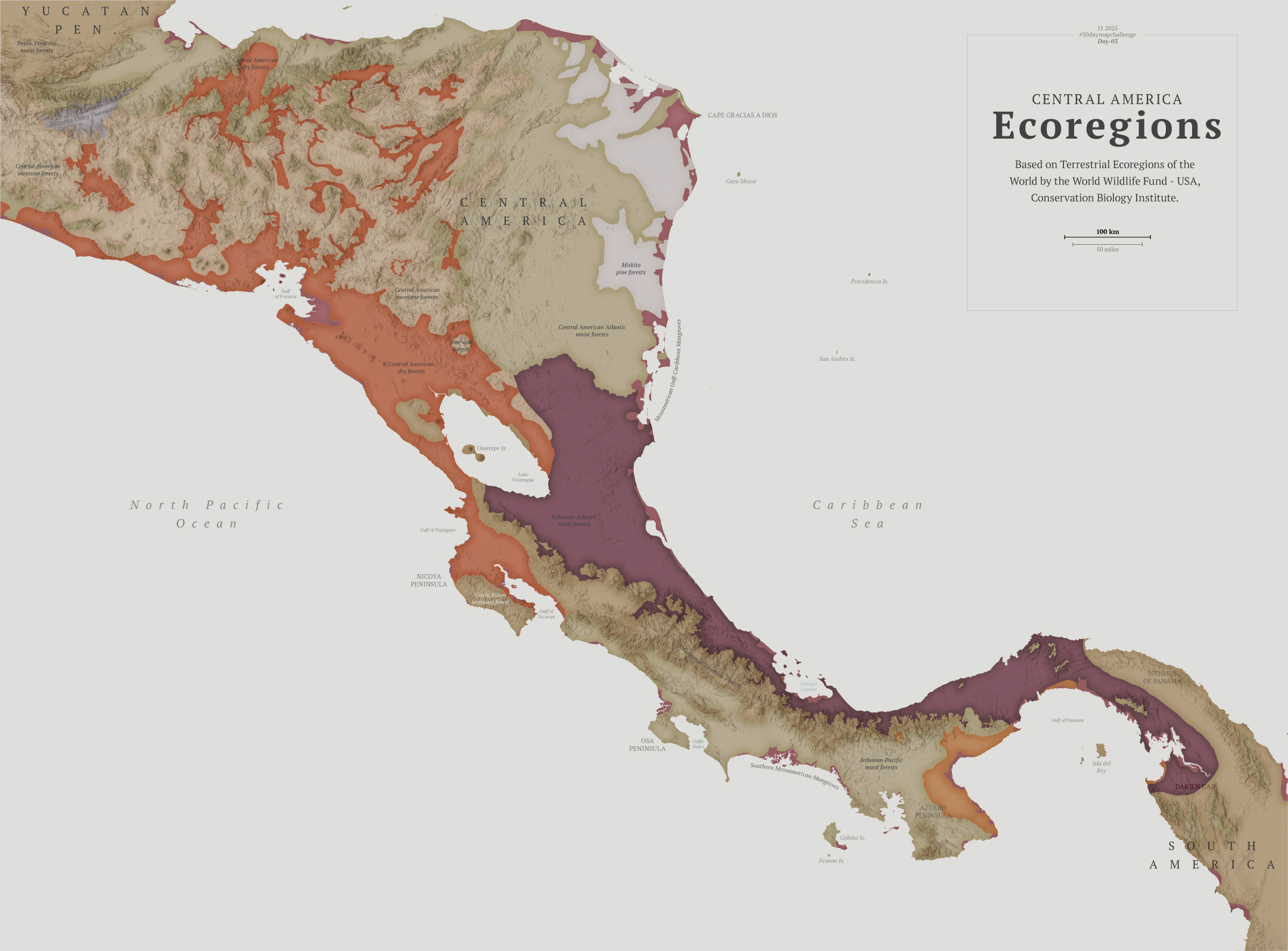
The next challenge was about polygons, so I chose to explore the biodiversity of Central America.
I think learning things is the fun part of doing these maps. To explore biological diversity the Conservation Biology Institute offers a great dataset. I actually learned about a thornscrub area in Guatemala that I didn’t know about before.
Detail showing the Motagua Valley thornscrub (in gray)
After pushing the limits a bit too much in the previous two maps, I kept this one pretty straightforward. Perhaps the #30daymapchallenge is about doing simple things that don’t require you to spend days and days searching for something.
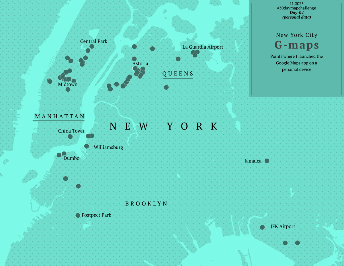
Day 4
Day four was about personal data, this was fun because I learned how to pull out data from my Google Maps app, simple yeah, but I never thought about this before.
I exported my data and grabbed all the locations where I launched google maps. Fun stuff, I selected 5 cities I visited this year and mapped out where I pulled my phone out to see a map and start navigating. Fun and creepy, not sure if you want this data to be publicly out even in an abstract way like in the map below, but it was a fun exercise.
Way too much fun. Again instead of 1 map, I ended up with 5.
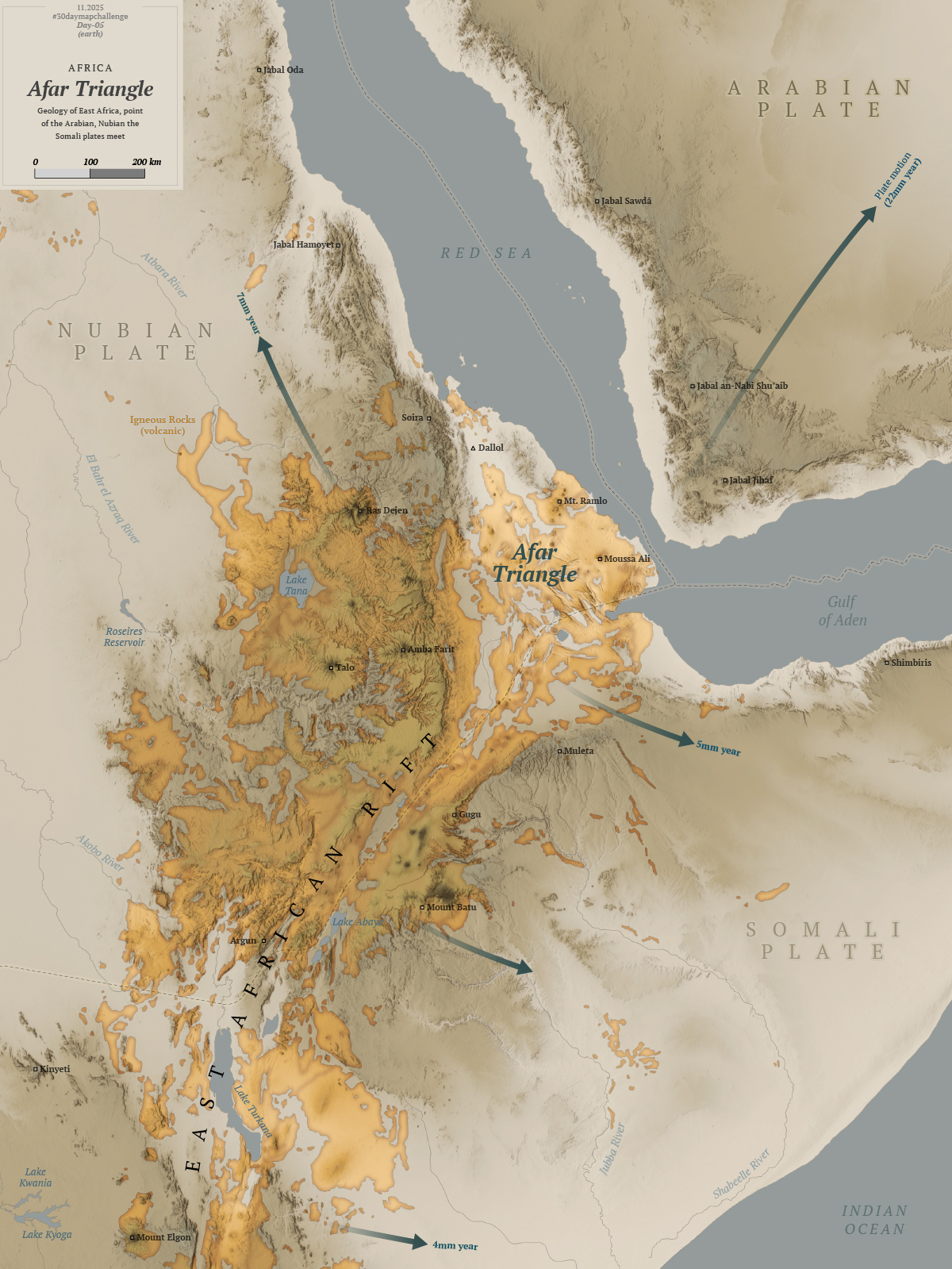
Day 5
For this one I wanted to do something in Africa, I started to explore the topography near Somalia in the search for a singularity with data enough to map.
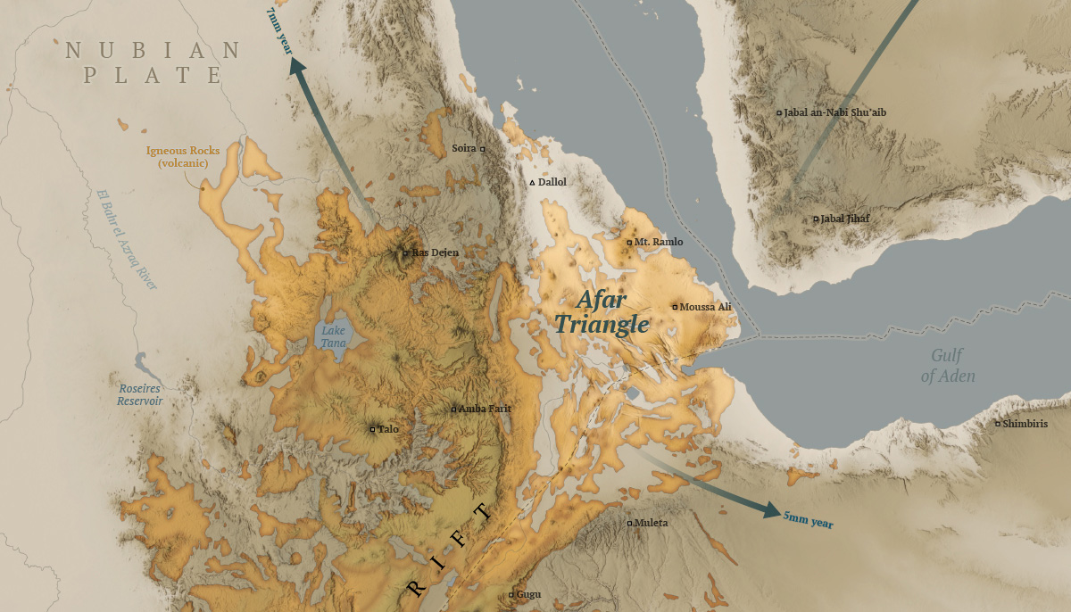
After looking a different sources and things from here and there, I decided to map the Afar Triangle, an extreme corner of the continent in the great rift valley in eastern Africa. There, a triple junction of plates pulls in opposite directions and different speeds, just to mention one extreme thing happening there.
Here’s my map of the Afar triangle:
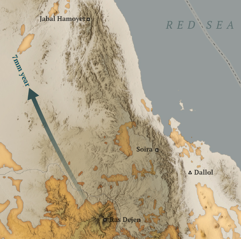
The northern point of the triangle is below 100m under the sea level, it’s also the hottest place on Earth and it has hypersaline hot lakes. What a place, it deserves more maps than I can do.
A view of the Dallol volcano in the northern area of the Afar Triangle where some of the hypersilane lakes are.
The region is also home of the oldest human ancestor, Lucy who died and probably lived its life in the Afar Triangle some 3 million years ago.
A detail of the Afar Triangle map showing the Dallol volcano in the picture further up in this post.
So far so good, I was having so much fun learning new things and procrastinating like a pro, then I looked at the calendar and November was almost here! 😳
Day 6
I was feeling a little more confident I thought I have learn the lesson with distractions. Maybe it’s not a big deal, maybe I take these things too seriously, because the thoughts that I’m running late or failing constantly haunt me. Sometimes I can’t sleep thinking I’m falling behind. Non sense I know.
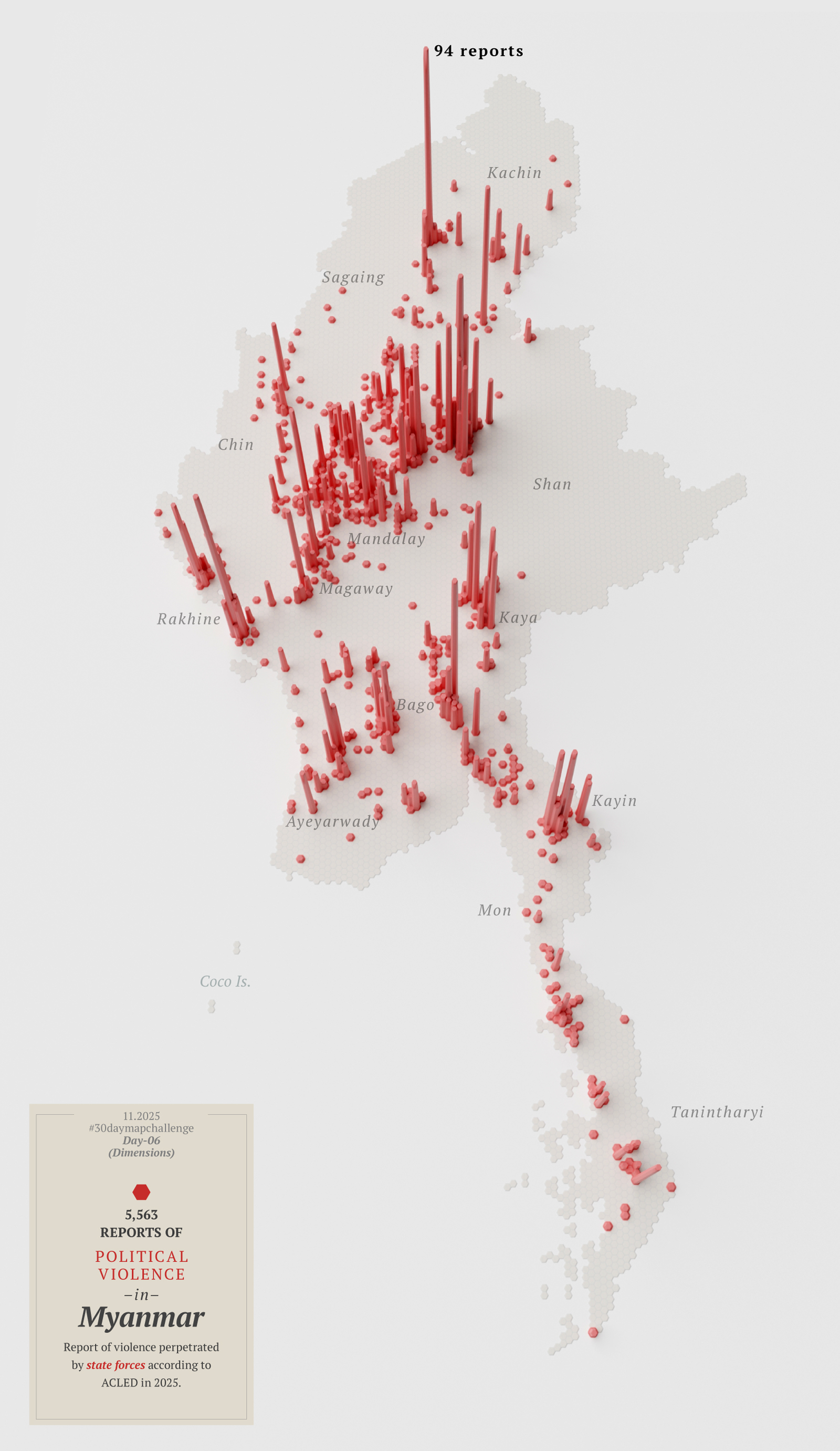
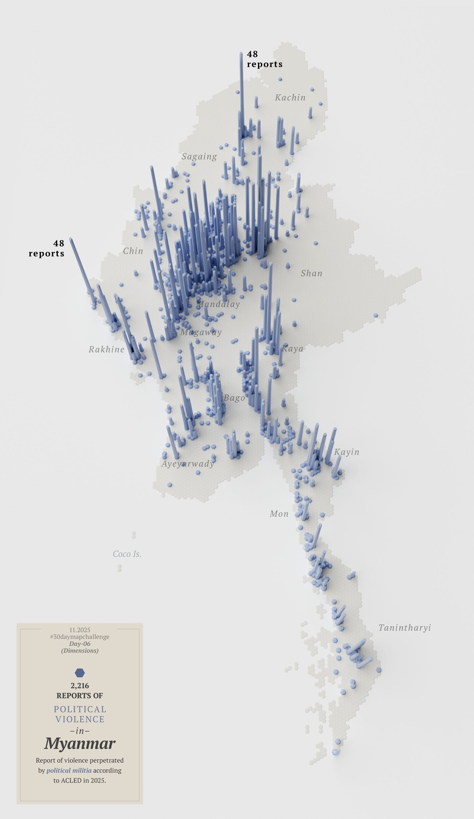
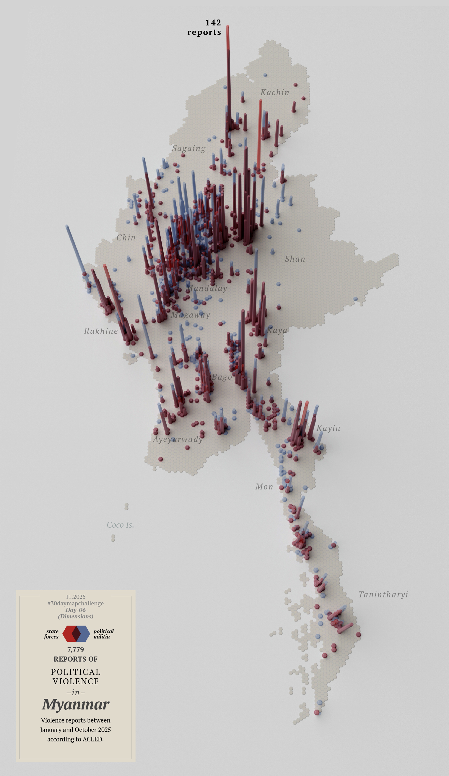
As November approached, I made day 6.
A map with dimensions to show political violence in Myanmar. Visualizing reports from ACLED to a 10km base grid.
Then I thought about looking at the other side of the coin; that map in red above represents violence perpetrated by state forces, so maybe I needed another map showing the counterpart…
Or perhaps I didn’t need two maps, but a single map that combined both reports. Then I noticed I had mixed up the data and perhaps I should start over with this map…
By this point I knew I‘ll never make it, so I decided to leave this one for a quick review later and bring it on tofuntography.
I posted some there already if you want to see them bigger or with a little more context.
Day 7
By day seven I reached the breaking point.
The calendar said November 3rd, and I hadn’t finished anything, I didn’t like that much the first 6 maps I did, and I was walking in circles thinking on how to re-do all of them.
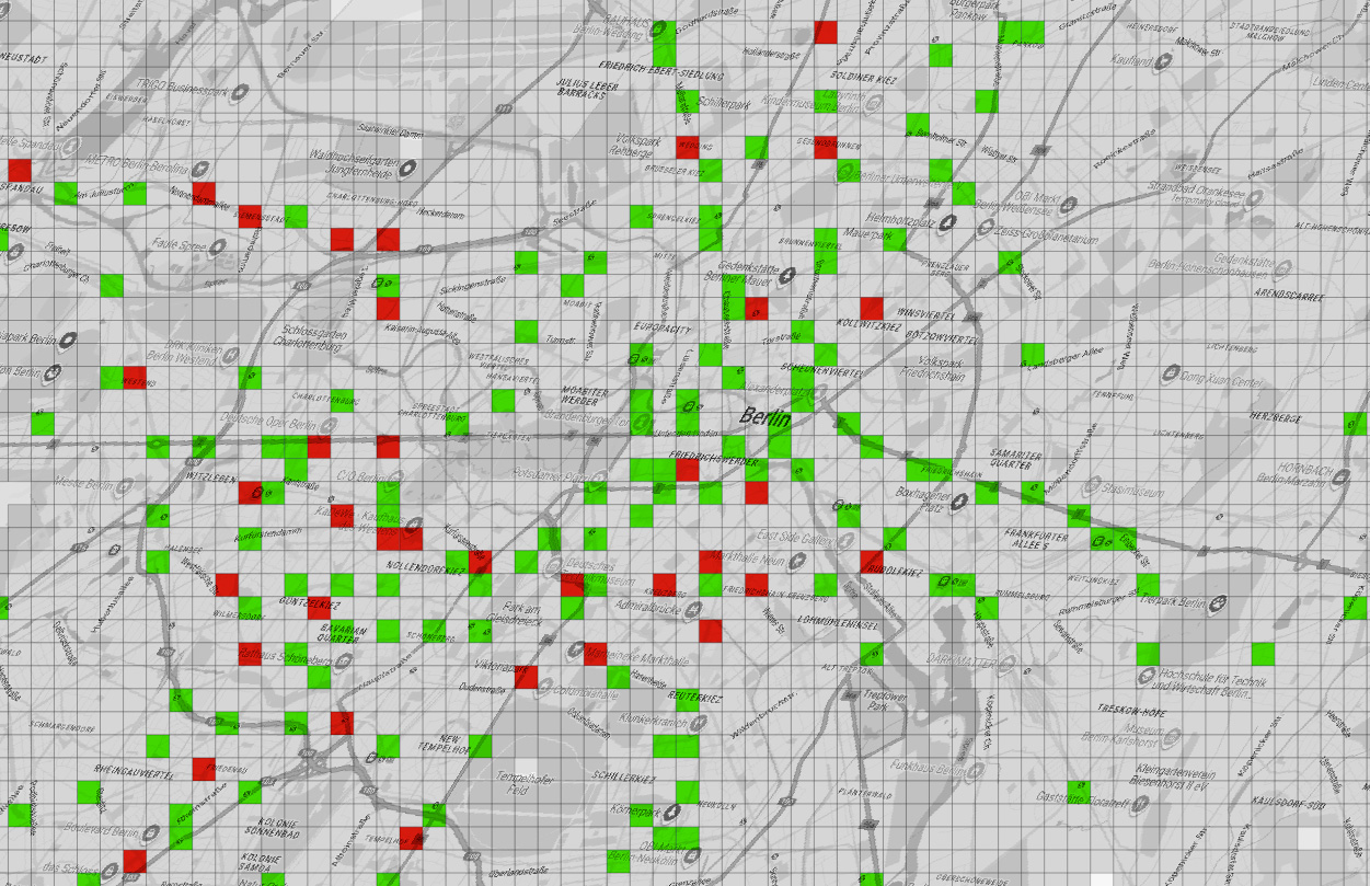
Feeling discouraged and frustrated, I gave free rein to one more idea—something between a poster and a map. I looked for train stations in several cities and finally decided on Berlin just to try a different location with available data.
My idea was to see where I could go within a 250m radius in a wheelchair using trains. I’ve never been to Berlin, so probably my idea is in the wrong approach, but I thought of dividing the city into 250x250m squares.
It’s very likely that wheelchair users travel distances greater than 250 meters (approximately 270 yards) as part of their routine, but it must be a tremendous effort to do so for half a kilometer (just 2 of my squares).
Green indicates accessible stations, red inaccessible stations, and gray areas are built-up areas that are out of reach.
There are some adjacent areas in green which is good, but also many red squares, meaning that if you go there in a wheelchair it’s almost a 50-50 chance that you’ll be able to get out of there where you need to. In short, it seemed to me that if you are limited to one or two squares, in the big picture, it’s more about where you can’t go than where you can go.
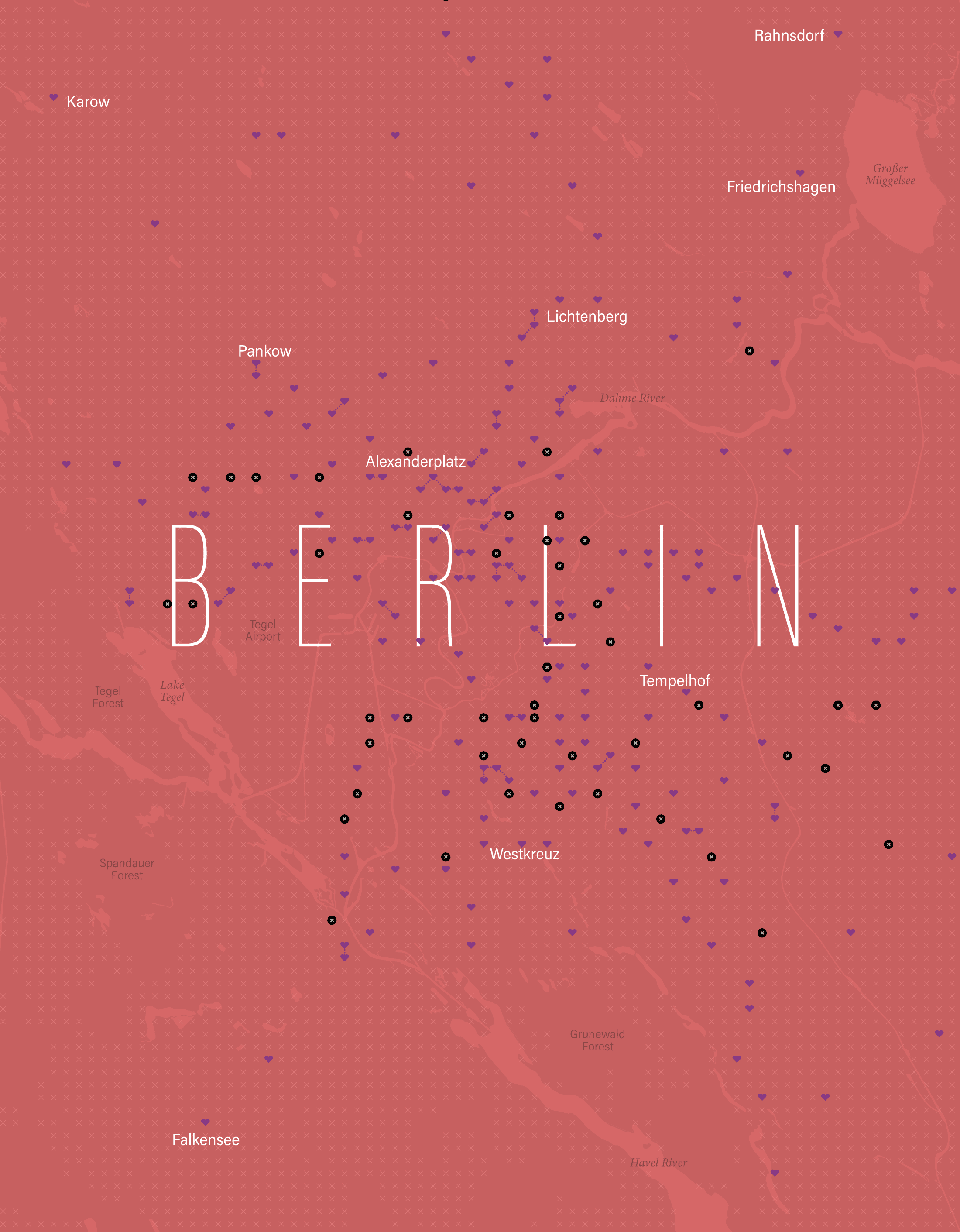
Here’s a version with a bit more context, a heart-shaped areas representing blocks with accessible stations, Black circles marked with x are stations without wheelchair access; all other x’s are areas where there are buildings, but without nearby access to a station. I added little dotted lines to the adjacent 250m blocks with accessible stations.
A detail of the accessibility map.
And the whole area with the broader region:
It must also be considered that the demand to access these places is not the same; the areas with more hearts, near the city center, are accessible and perhaps are the areas that people need access to the most.
For all these reasons, I abandoned the idea, got stuck trying to solve it, and ultimately ended up killing the idea of entering the #30daymapchallenge on time for each day.
The lessons I learned from this: [ 1. ] Keep your ambition in check if you want to achieve something bigger little by little.
[ 2. ] Avoiding procrastination is difficult, especially when you’re passionate but not good on something.
[ 3. ] An finally, I need more free time somehow. 😂
About infofails post series: I believe that failure is more important than success. No one sets to fail as a goal, but by embracing failure I have learned a lot in my quest to do something different. My infofails are a compendium of graphics that are never formally published by any media. These are perhaps many versions of a single graphic or some floating ideas that never landed.
In short, infofails are the result of my creative process and extensive failures at work… and I fail frecuently:
In November 2024 I launched a new website to put into a single place all the stuff on which I spent my time at work and in parallel activities like sketching things or mapping for fun. That last point was a fun thing I started to rescue from my external drives files that doesn’t fit into work nor doodles either.
Part of the plan for a new website is to have a space for these things that are lost in space/time. One of the things that makes me happy is making maps: mhinfographics.github.io/maps.html
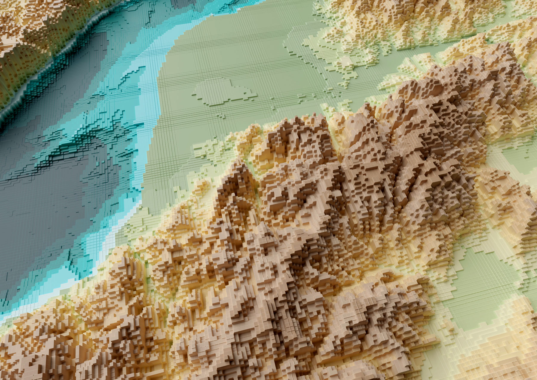
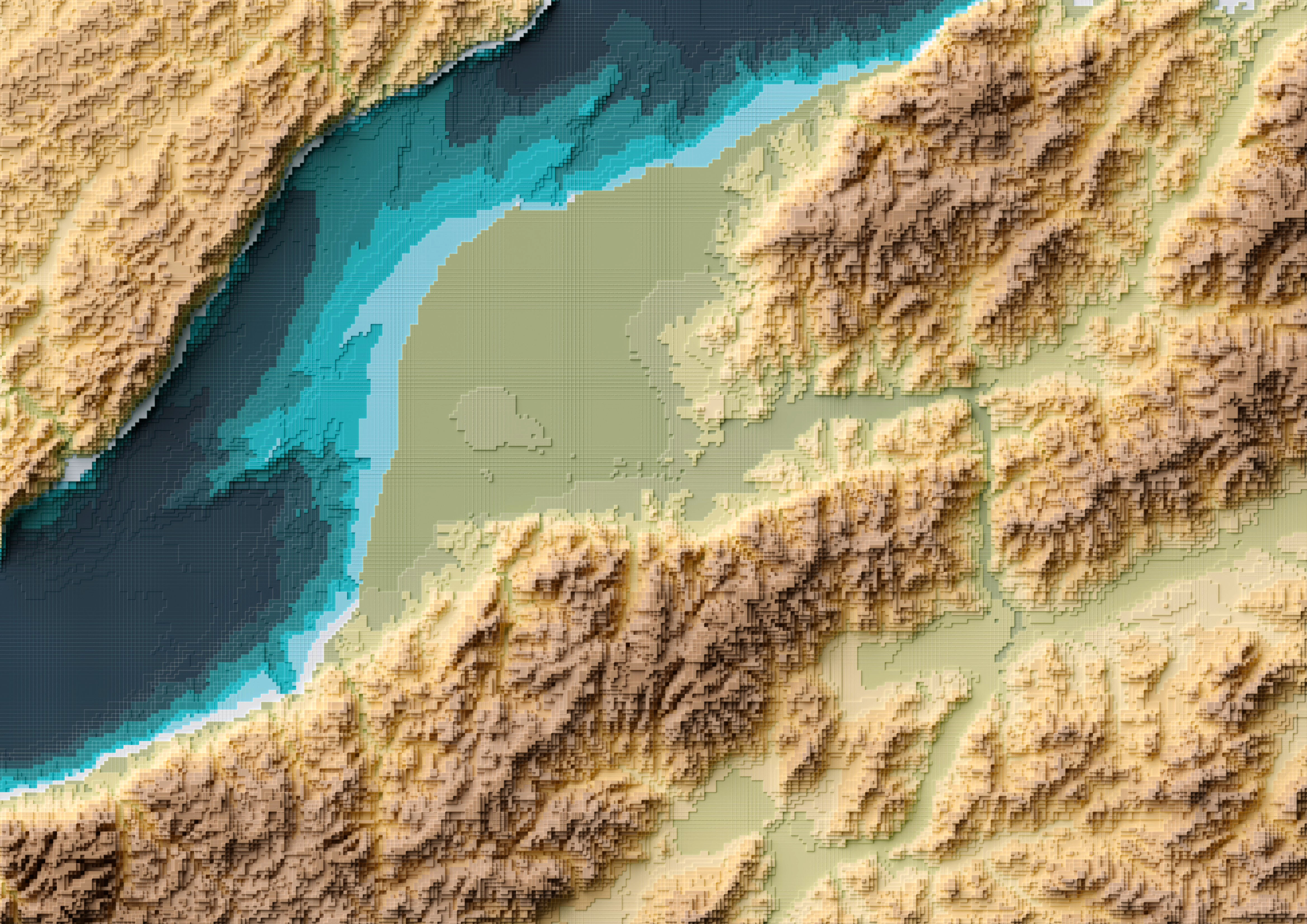
Eventually I was able to hang there a few more pieces, all in different styles from personal explorations of data and tools. This tutorial meant to explain how I used QGIS, Blender and little optional touches of Photoshop and Illustrator to create a voxel like map like the one below:
Please note that I’m doing this in good will, I’m not offering any corporate endorsements of the following procedure, software companies or resources, even on open source resources I mention here. Likewise I’m offering this without any warranties or compromise of further assistance.
🎁
Follow me step by step or get the files ready
Here you can find the files ready to use, download the packs and set you render to go, or follow me below to produce the data and render your own. If you are downloading the files, skip to the section titled “Set up the render” and choose either plugin or image input.
Defining the AOI and getting data
I usually start defining the are I want to work on adding first an xyz layer on my blank project on QGIS. If you don’t have that set up, check this link first, and then come back, it’s a quick set-up anyways. Once you have that done, zoom into the area you want to map, create a new scratch layer to define your area of interest (AOI), we will use it as a reference for many things.
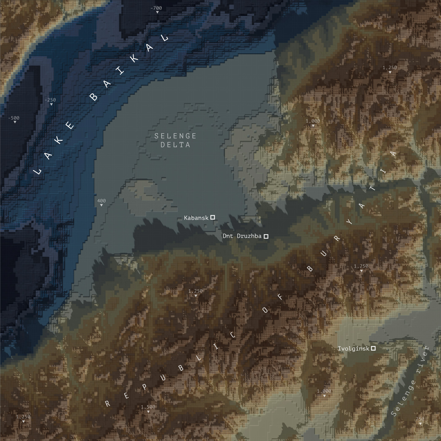
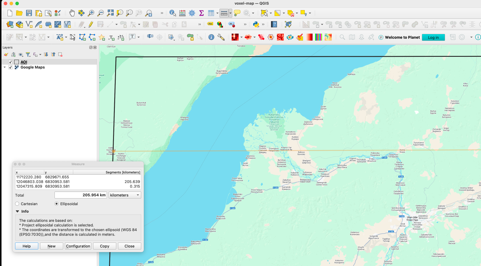
This’s the area I choose for the map above, a rectangle of roughly 120×200 km near the Lake Baikal.
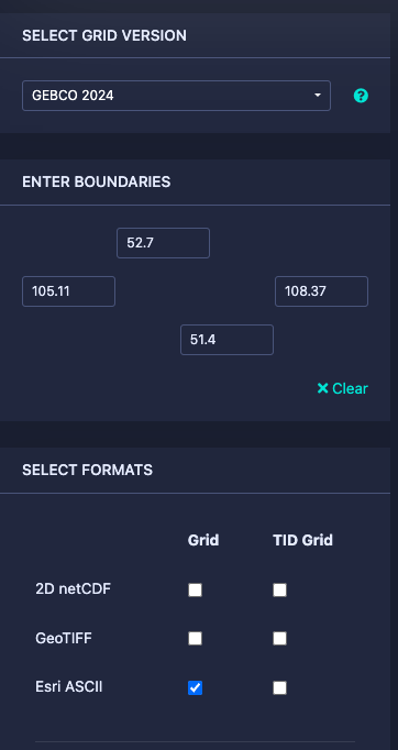
Next let’s download some DEM data for the project here https://download.gebco.net/ you will see a panel to the left with some options like in the image below, select a GEBCO data version, enter the coordinates as 52.7 for top; 51.4 for the bottom; 105.11 for left and 108.37 to the right, that would be enough to cover our AOI. I’ll use a ASCII grid, but Geotiff is also ok. Click “Add to the basket” then “View basket” and download the data.
Sampling a grid
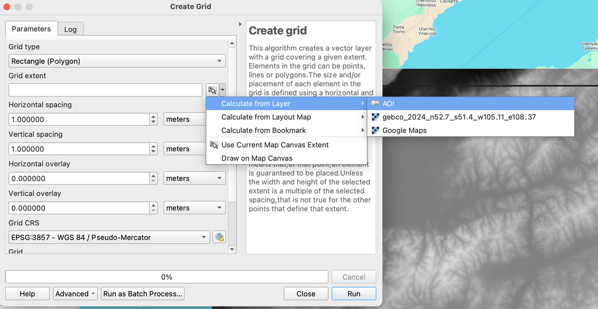
Now we need a grid to sample our new base, in QGIS go to vector/research tools/create grid. That would give you a pop-up window, select Rectangle for the option “grid type”, on grid extent use the drop-down menu to select the AOI layer we created earlier:
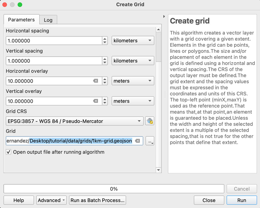
We want each rectangle to be 1km wide so select “Horizontal spacing” as 1 “kilometers” using the drop down menu, the default is 1 “meters” if you are using a EPSG:3857 projection. Do the same for the “Vertical spacing” option, we want squares of 1×1 kilometer.
Finally, we want some overlapping to prevent gaps in the render, so add “10” meters to the Horizontal and Vertical overlay.
Keep the CRS as the default EPSG:3857 and save the grid as a geojson using the dropdown menu option, your panel should look similar to this:
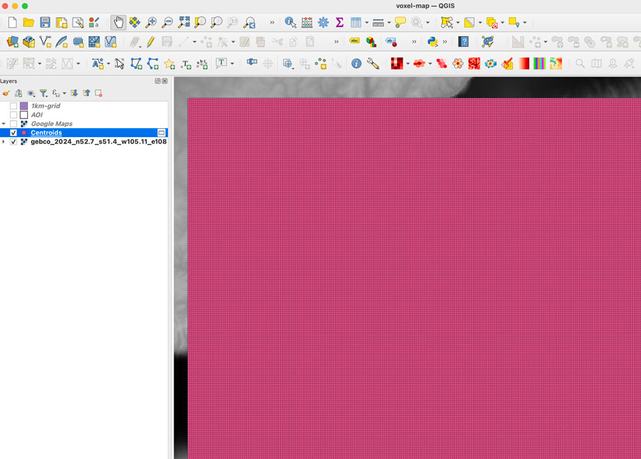
Once you click “run” after a few seconds an army of squares will fill-out your AOI, if you can see them, go to the menu Vector/Geometry Tools/Centroids to create points that would sample our DEM data. In the input layer choose the 1km-grid file we just created and leave the rest as it’s, that would give us a bunch of dots in the center of each square in a temporary layer.
Re-project the data
To extract the data samples, we will to make the GEBCO layer and the new centroids in the same projection. I’m using a pseudo-mercator projection EPSG:3857. But you can use whatever you prefer, just make sure both layers have the same projection.
GEBCO default projection is CRC84, is you are not sure what you layer projection is double click the layer and selection “source” that would show you the projection. If you need to change it, click the layer name, go to the menu Raster/Projections/Warp and create a temporary layer using EPSG:3857 as target, or what ever your preference is.
Sampling the new grid
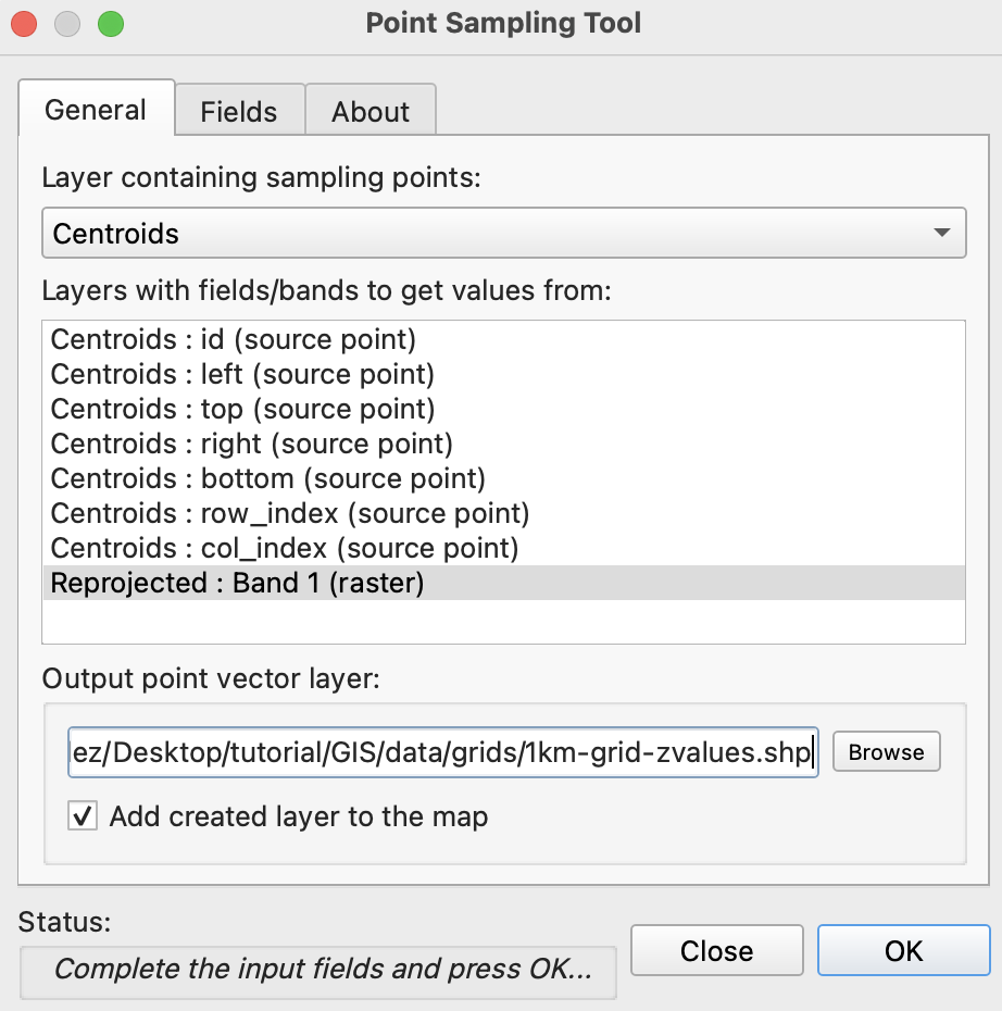
We will use a plugin to sample values from our raster into each dot, if you have the Point sampling tool plugin you’re ok, if not go to to the menu “Plugins/Manage and install…” click on ALL in the left panel and type “Point sampling tool” in the search field, install the plugin and close the Manager window.
To run de plugin go to the menu Plugins/Analyses/Point sampling tool in the pop-up window, select the centroids with the dropdown menu, and in the lower field click the GEBCO layer, finally click on Browse and navigate to your project folder and name the result file 1km-grid-zvalues.shp using the shapefile option there.
If you reprojected your raster, this is how the plugin window should look.
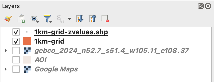
Once you executed the plugin, remove all temporary layers, you should have a layer with the new dots named “1km-grid-zvalues.shp” one layer with our 1km-grid, the AOI layer and the xyz google map layer.
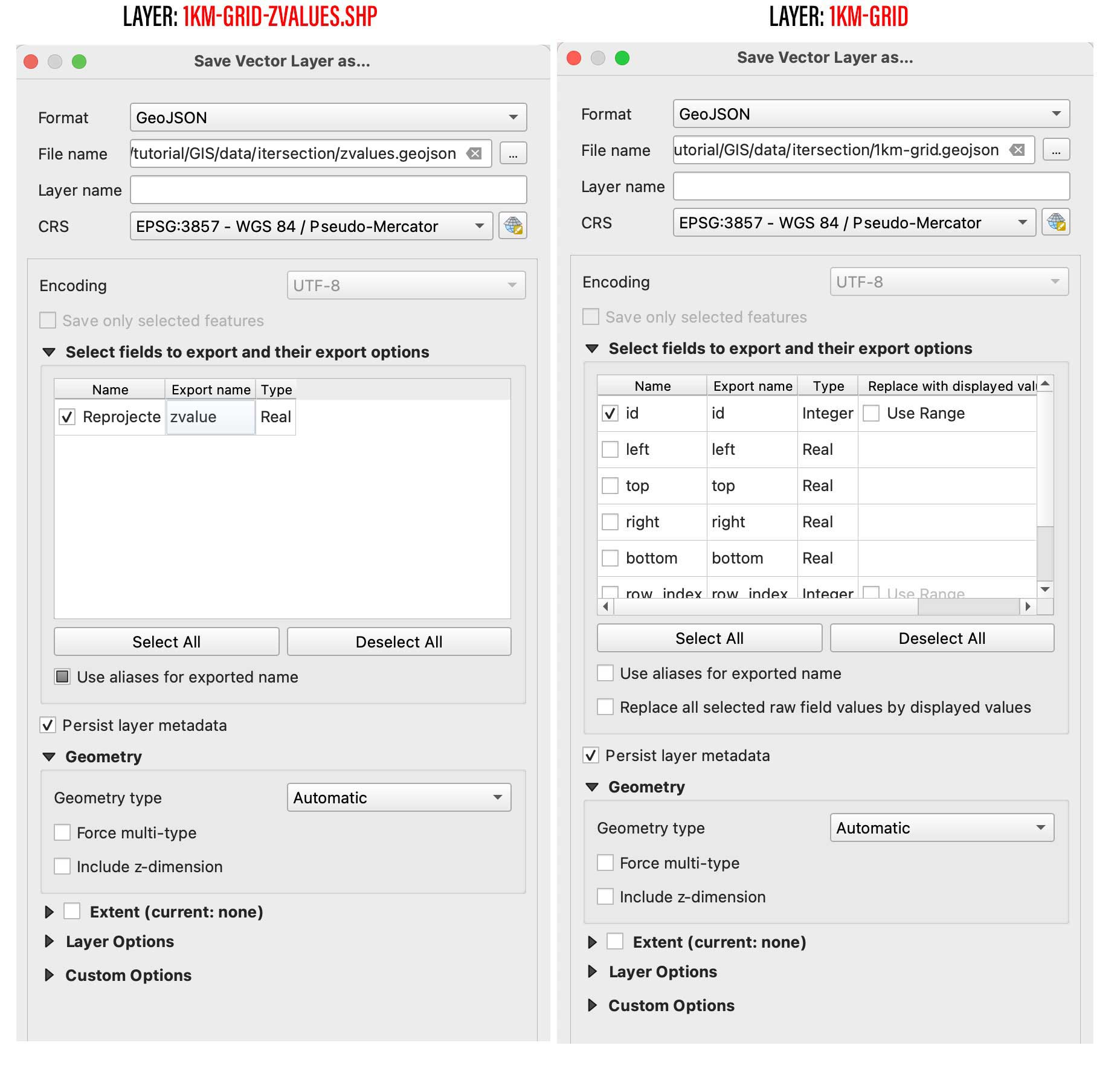
Next step is to create a spatial join, basically we will take the value of the dots to be the z value of each polygon in our 1km grid. You can use the QGIS join function from the menu Vector/Data Management Tools/Join Attributes by location, But be aware that would take a little while to process. I recommend to use a little custom python script instead. But to use it, you would need to export our 2 data layers out as geojson files, right click on them and select “export as”, while doing that you can turn off all the fields but the ID in the 1km-grid.
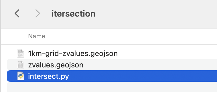
Save them into a new folder, I’ll call mine “intersection” and place this script next to it, name it whatever you like, but use .py so you can run it from your terminal window as ” python intersect.py “
Your folder with the following script and new geojson files.
# Ensure both layers have the same CRS if zvaluesLayer.crs != grid_layer.crs: zvaluesLayer = zvaluesLayer.to_crs(grid_layer.crs)
# Check if 'zvalues' field exists in zvaluesLayer if 'zvalue' not in zvaluesLayer.columns: raise ValueError("The 'zvalue' field is not present in zvalues.geojson")
# Remove duplicated features joined = joined.drop_duplicates(subset='geometry')
# Save the result to a new geojson file joined.to_file('1km-grid-zvalues.geojson', driver='GeoJSON')
Remember you can run this file from the terminal using the commend ” python intersect.py ” while in the folder we just created. Once you run this script a new file would be created next to the script, look for 1km-grid-zvalues.geojson and drag-and-drop it into QGIS.
Style your new grid
You would only need this new files we just created and the AOI layer, remove the rest of the layers if you like to have a clean panel before to continue.
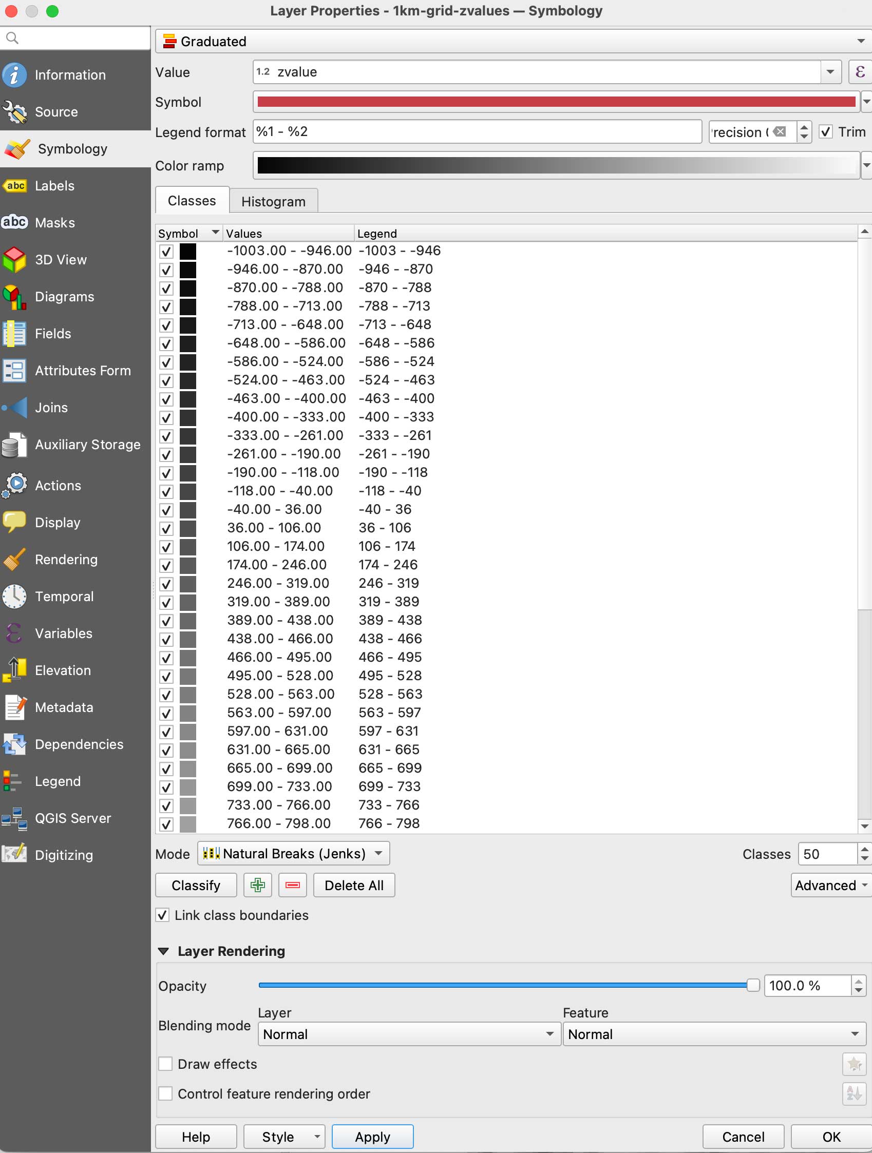
Double click the new 1km-grid layer, go to symbology and select Graduated in the top panel, set it to gray scale, use the mode natural breaks with some 50 classes, in the Value field pick zvalue and click apply. (be sure the negative values are assigned to black, if they are on white invert the ram using the dropdown menu.
Your new grid styles.
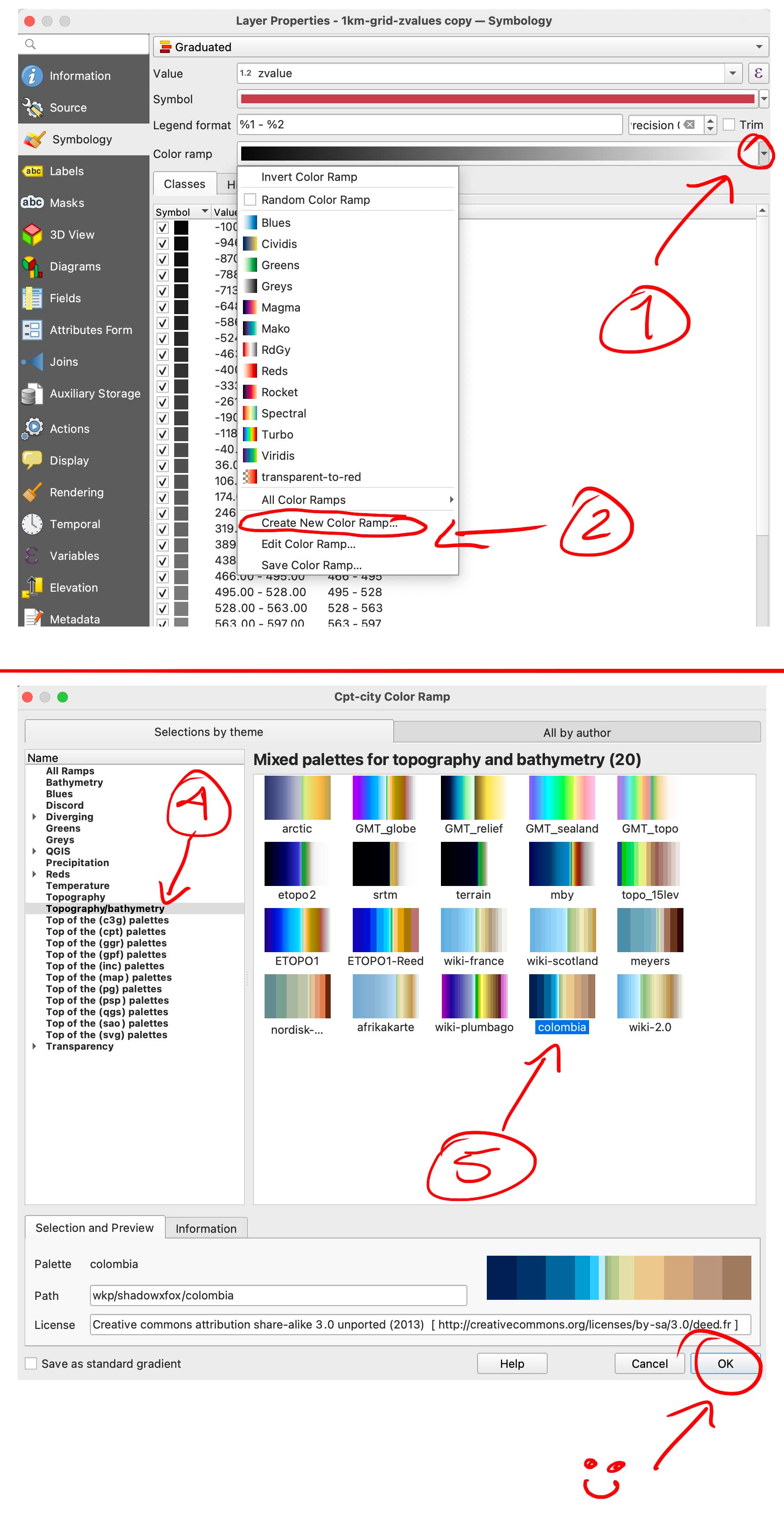
We are almost there with data process, here comes the fun part. We need basically 2 layers of data, this black and white layer we just created will serve as base for terrain, create a duplicate of it to make a color layer.
Double click that copy and go again to Symbology, but this time in the color ramp menu select “create a new color ramp, in the pop-up window you will see a few options, change it from gradient to “Catalog: cpt-city” and click ok. Navigate to Topography/bathymetry and select “colombia” that’s a blue-green-brown pallete that would assign a color range to differentiate our terrain from the lake.
You can also create your own gradient and make the value ranges as you like if you want to ink all the water blue for instance, but for the purpose of this exercise all keep the same classes and set up as we did for the BW image. (50 on Natural Breaks). You should have now a black and white layer and a color copy looking something like this:
Set up the render
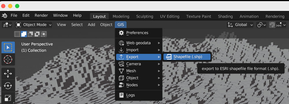
So, here you have 2 options, one is to export tif images out of QGIS to render the tiles, or export a shapefile to be used with the GIS blender plugin.
Option 1: Using the GIS plugin
If you are using the Blender GIS plugin, click in your 1km-grid-zvalues layer, choose export and select ESRI Shapefile. I have saved a copy of that file in the assets folder, the link is at the top of this page. The follow the instructions here to setup the plugin. If you need a litle more of explanation of how it works, this video has a great walk thru.
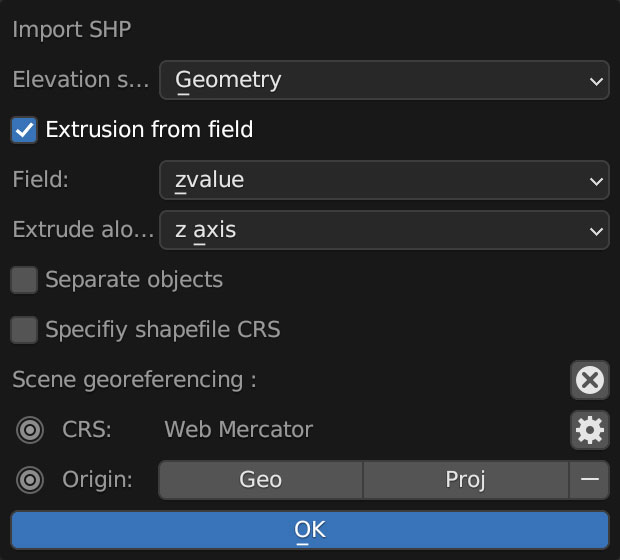
Once you are all set up with the plugin, you can import the shape file using the 3D viewport in object mode, use the GIS option there to get the shapefile in, just brow for the file we exported earlier from QGIS:
A little pop-up window emerges usually near the bottom right of you screen, you should select “extrusion from field” use the drop-down menu to find “zvalue” and apply it to the z-axis, leave everything else off, you don’t want to check “separate objects” because we are using a large scale object with a lot of polygons, that option come handy if you are importing smaller data sets to handle objects individually.
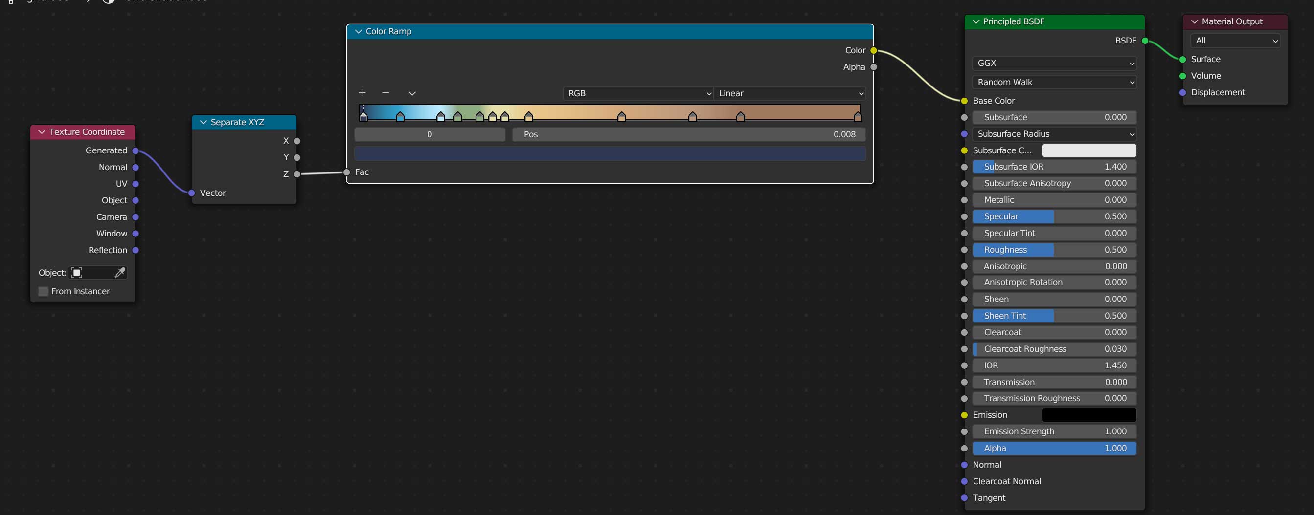
Once you are all set, you can create a new material for our terrain, use the z-coordinates to apply a color ramp, you basically need a “texture coordinate” node, a “z” selector, the ramp, which I basically copied color-values from QGIS, and link all that to the default material, here’s a little visual of the wiring:
Once you added a light on your preference angle and intensity, your render should look like the one below, if wyou want to save some time you can use the demo I left for you, I have there 2 cameras, one perspective camera for a close up, and one orthographic camera to get the whole map. Note that there are also 2 lights depending on what you want to render, but that’s just a personal preference.
Option 2: Using images from QGIS
If you opted not to install the plugin and render images, go to the folder named tiff-based. Let’s get those images out of QGIS first:
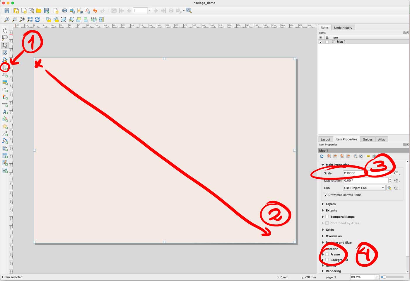
Enable only your AOI layer in QGIS, then go to the menu Project/New print layout and add an xxx name there, I did “selenga” for mine. You would get a empty layout window, select the “new map” feature in the left panel, click and drag in the canvas to create a preview, set the scale to 1110000 and turn off the background and frame options.
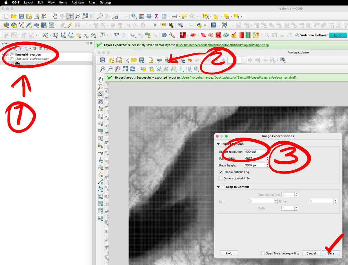
That set-up would give you a full end-to-end raster, turn off your AOI layer and turn on the color layer you have there. Export the layer as a tiff image using the picture icon next to the printer in the print layout. The do the same turning off the color, and turning on the gray scale image. Save both files next to your .blend file, i have called them selenga_color.tif and selenga_terrain.tif
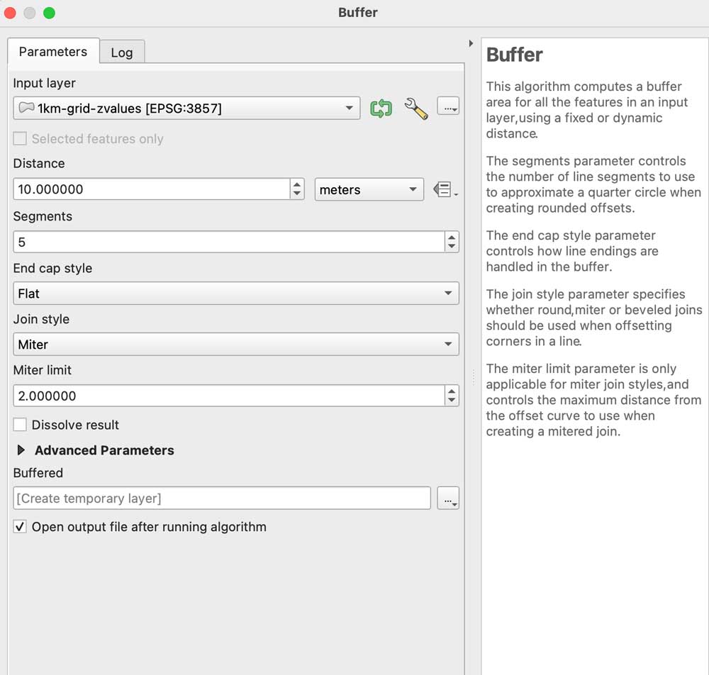
A little trick to prevent weird gaps between the tiles, even if they don’t have gaps the grid effect seems to create lines between the tiles, to prevent that run a buffer clicking the grayscale image, go to the menu Vector/Geoprocessing tools/Buffer add some 10m in the distance field set the caps to flat and miter in a temporary layer:
Leave that layer under your grayscale, copy and paste the styles to the buffered layer, leave that on only for the grayscale image before exporting. I have left both images in the demo folder so you can see the difference on rendering later.
Go to Blender
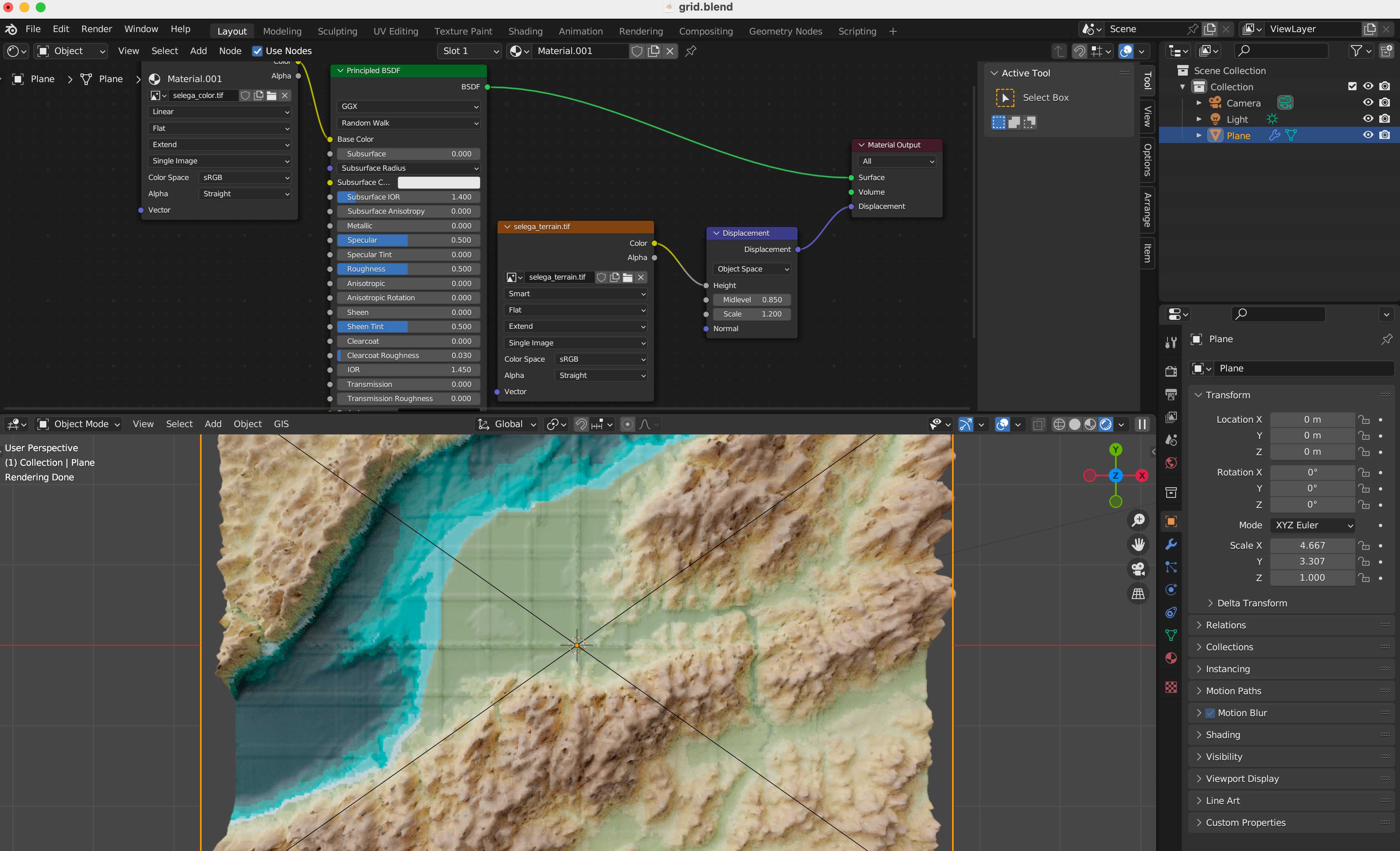
We are all set, now, go to the blender template. A few things you should be aware first, this blender file uses cycles render engine to get nicer shadows, and its set up to experimental. I’m using v 3.6.4. The print resolution (in the printer icon panel to the right) is the same as the original images we created in QGIS: 4677×3307 pixels. The plane used to load the textures should be scaled to fit those images too, so in the orange icon I have scale X as 4.667 by 3.307 note that’s correspondent to the image physical size. Finally in the camera, I’m using an orthographic camera, click the camera in the collection and then the little green camera icon in the panel below, use the scale field as double the size of the image, you can type there 4.667*2 so your camera resolution matches the plane size as 9.334. Keep that in mind if you want to use another image with different dimension, its all about the original asset.
Navigate to the textures folder and replace the color and displacement terrain accordingly in the shader editor.
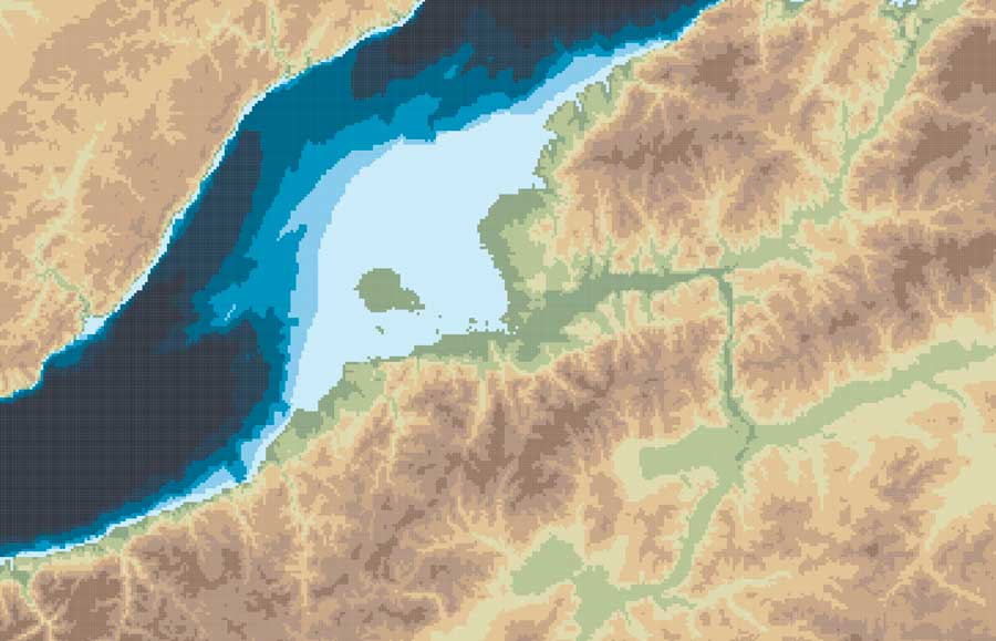
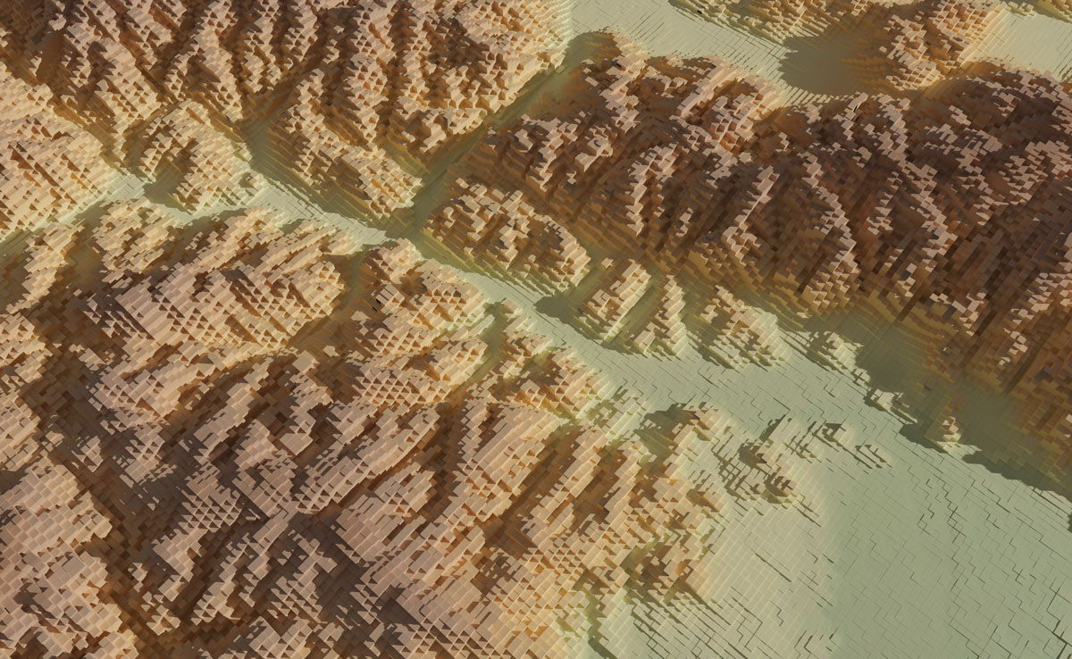
Your final render should look like these using the perspective-camera:
Or this if you are using the orthographic-camera:
Keep in mind I used photoshop to tweak a little the color hues in the original map I did in Fun-tography, I also added labels using illustrator. The nice thing about using the orthographic camera is you don’t loose the georeference from QGIS, so if you export labels from there you will get them in the accurate position into illustrator, Inkscape or any other software you use to add vector details on top of the renders.
I hope you can create beautiful maps, go crazy and do taller columns, play around with the color ramps… have fun!
Even if you don’t use this complex approach, you might gain experience familiarizing yourself with super powerful tools like QGIS and Blender.
At some point in 2022, I was collecting information about Taiwan and its national identity. Among many, I read some articles like this one and documented records about their increasing drive to identify themselves as Taiwanese and progressively distance themselves from the Chinese. The subject is very deep and tangled, I’m not going to pretend to understand it, but in short, Taiwan’s heritage is deeply tied to the mainland (PRC), and blends with many other influences from its diverse past. In such a way, its particular conditions have created some interesting things that have taken root in the simplest things of everyday life.
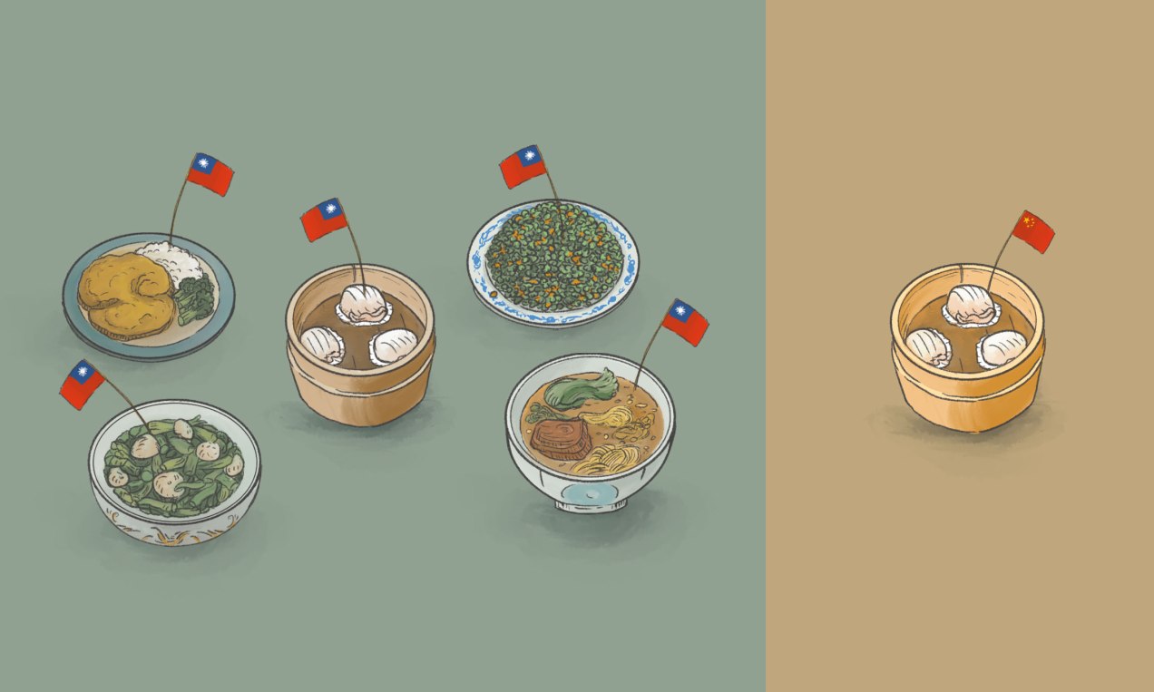
One of those things that any one can see on the streets is food. Not only its dishes that have evolved and conquered the world like the yummy Bubble Tea, but the simplest things like how the business are tagging their restaurants in food delivery platforms.
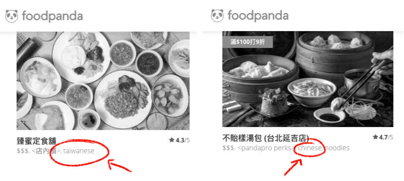
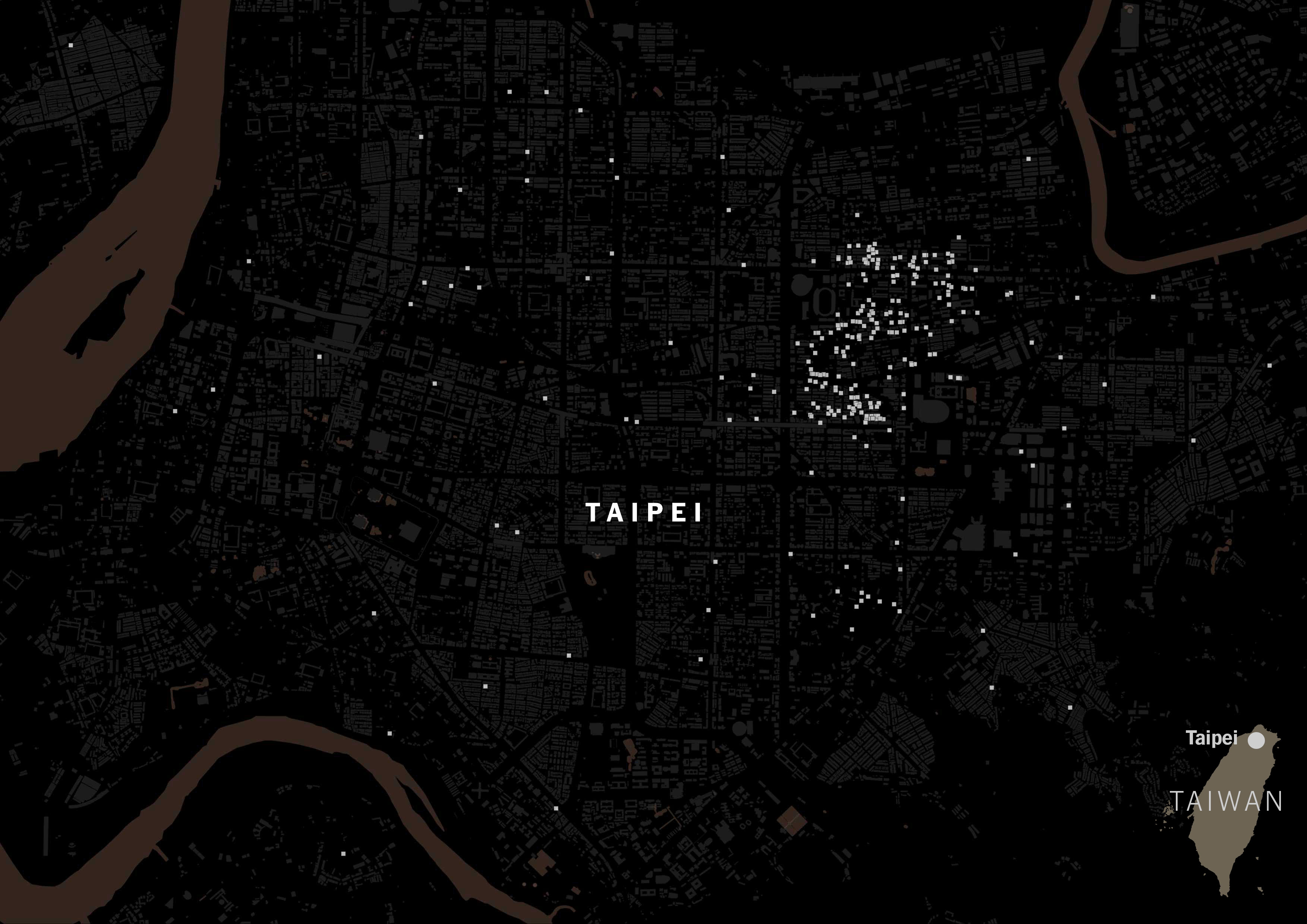
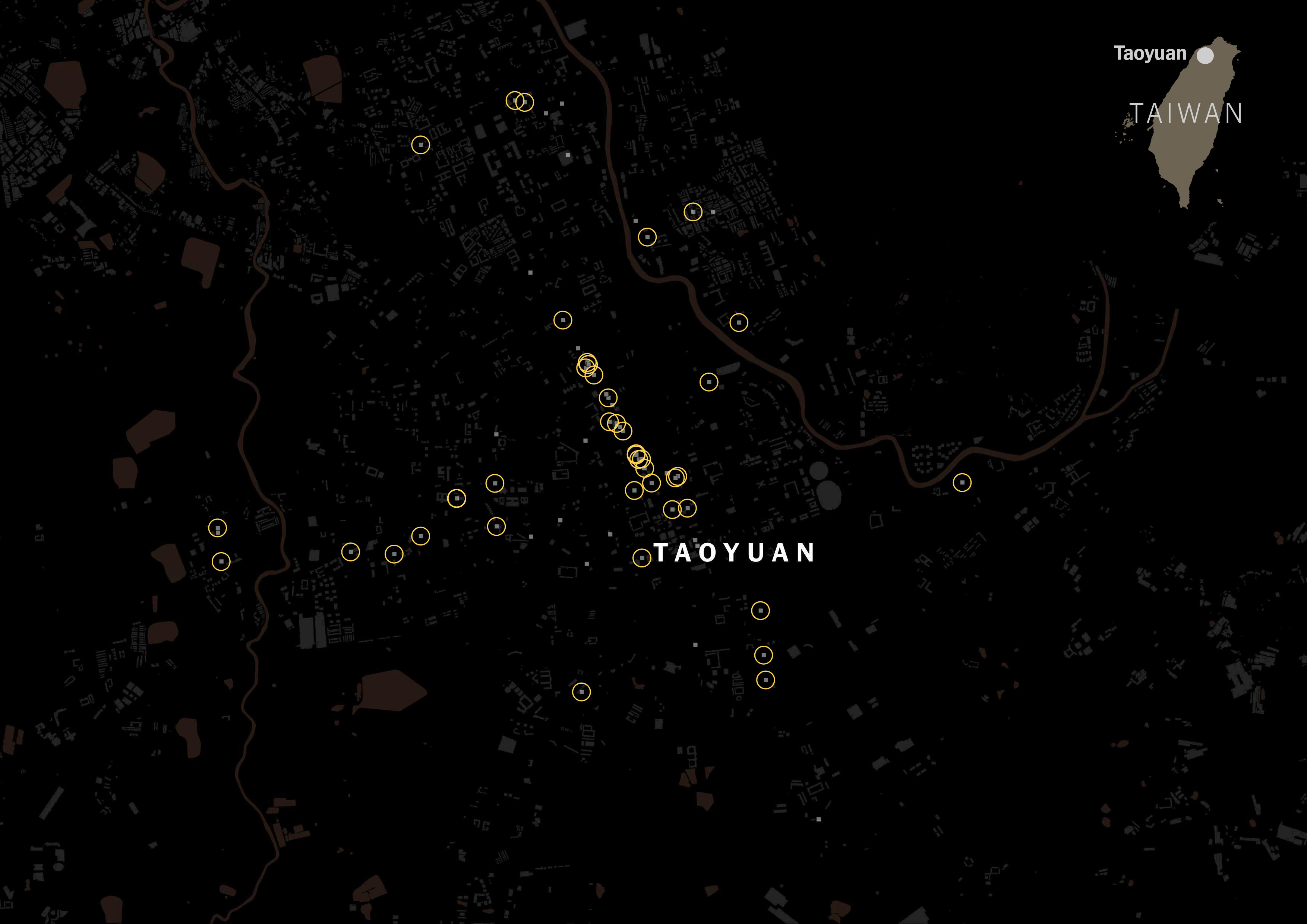
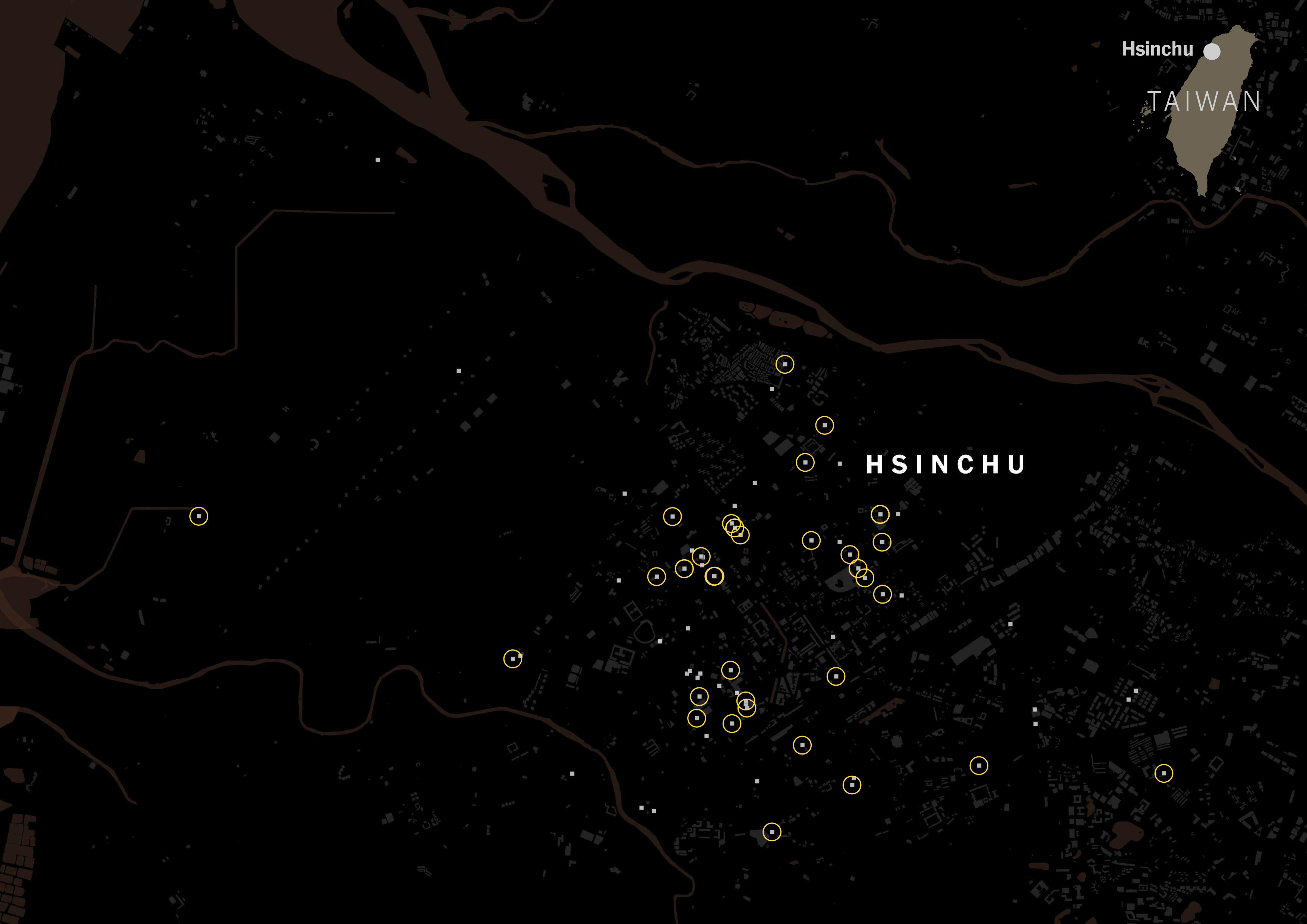
Uber Eats and Foodpanda use labels to make it easier to find what you’re looking for, just like any other platform you might be familiar with. In those “categories” you can find Japanese, American, Chinese, Thai, Taiwanese… I’m sure you know how it works, but just in case here’s a screenshot of what I mean:
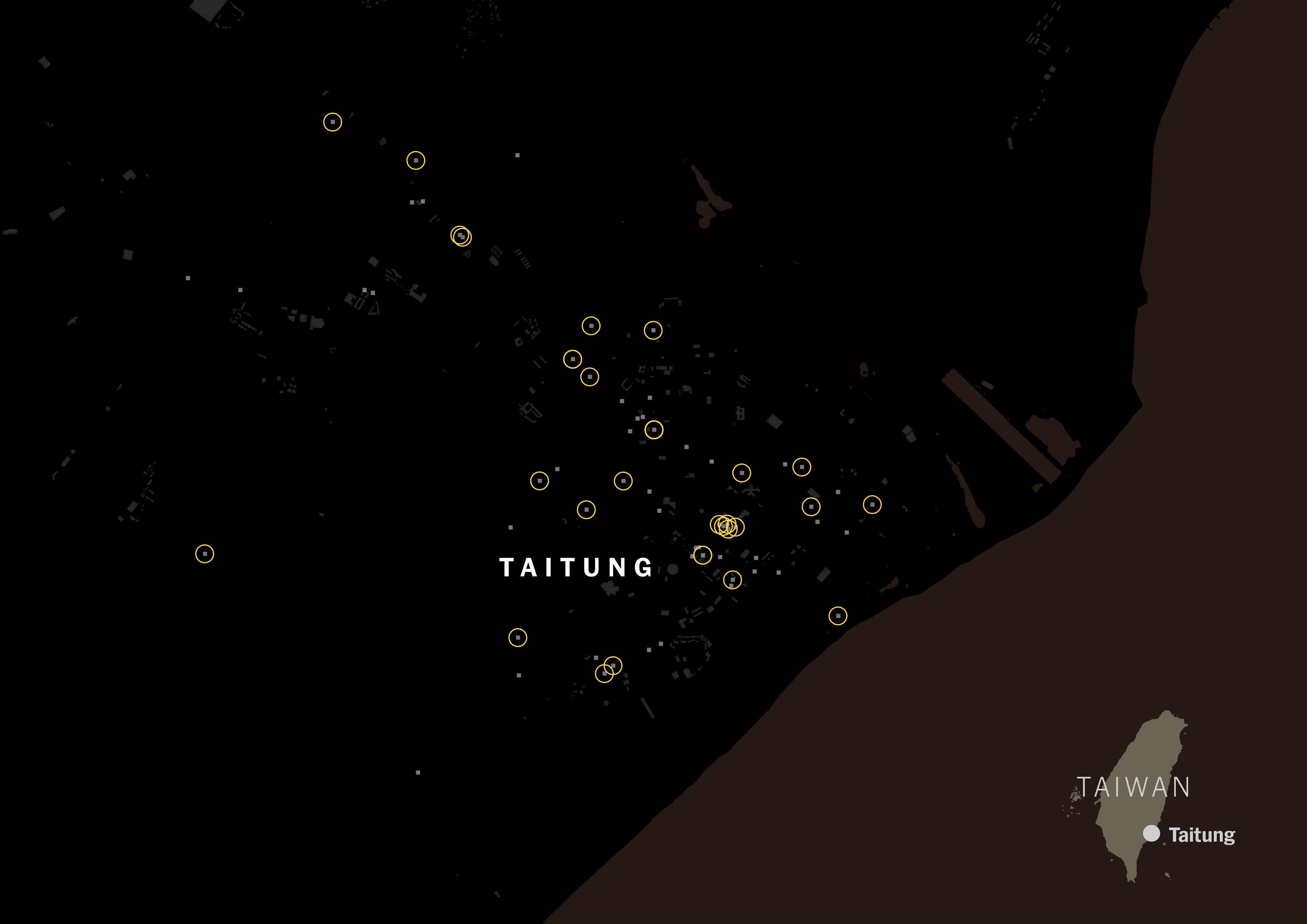
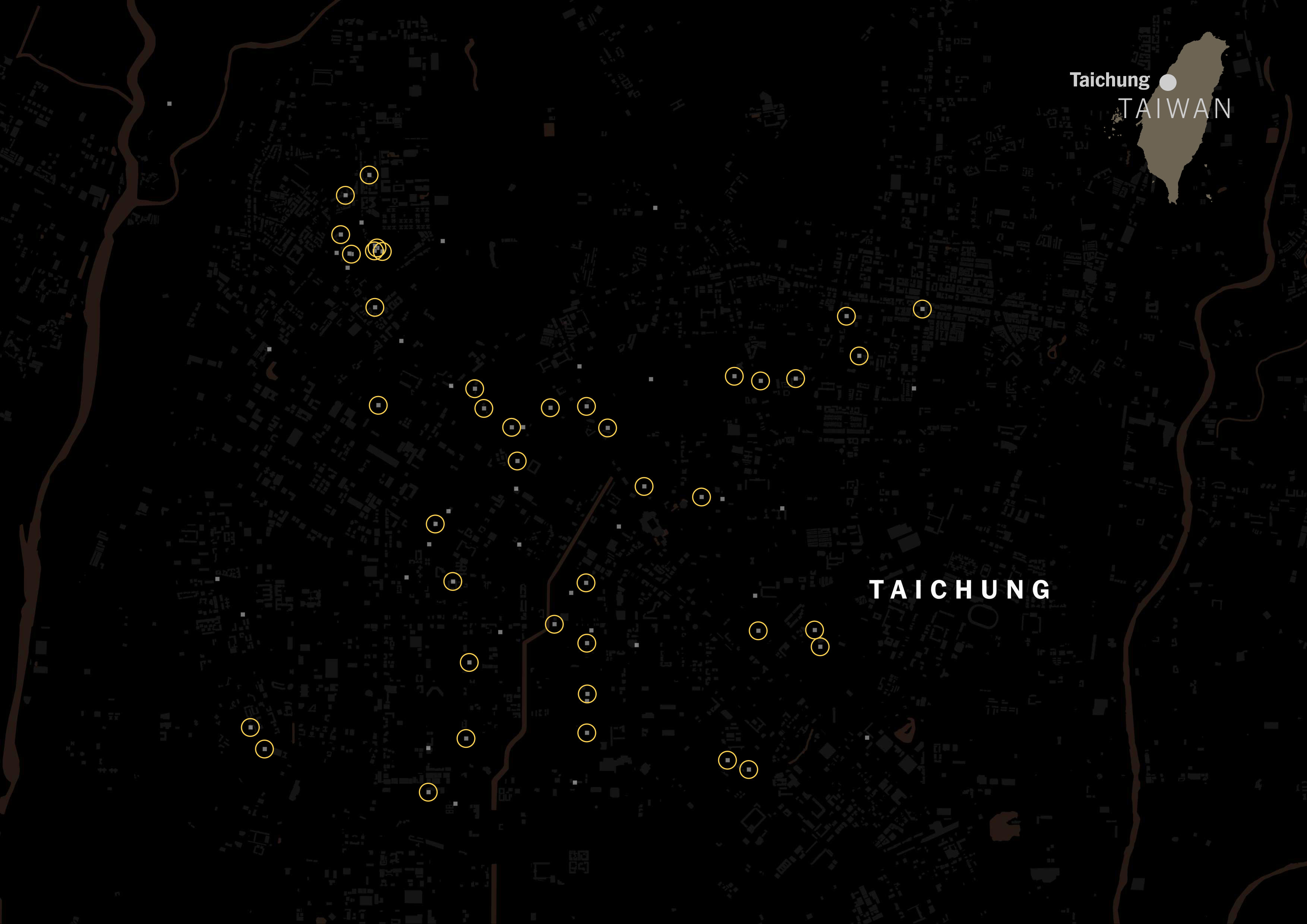
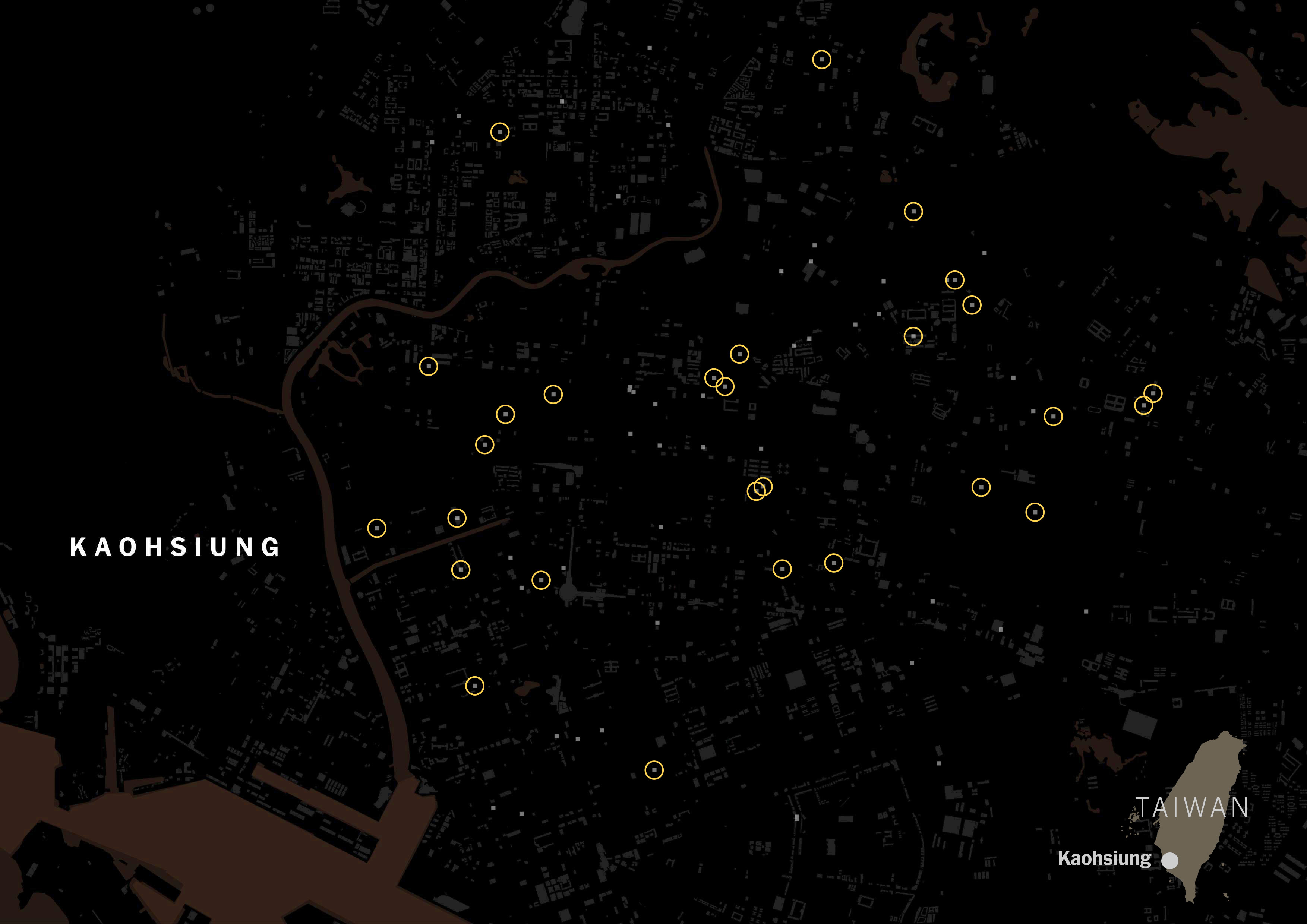
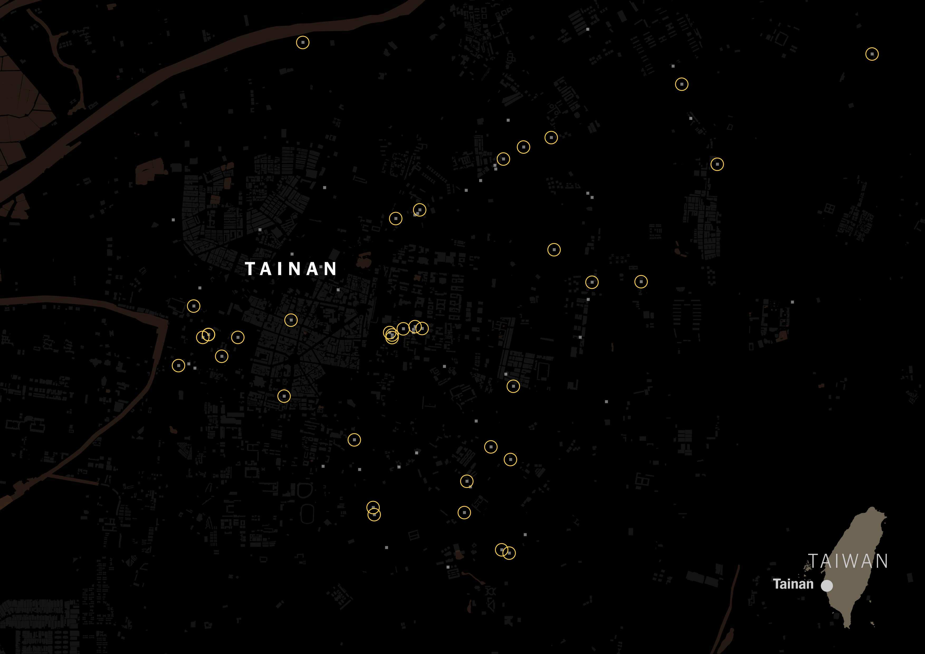
I scrapped that data just to see how popular the Taiwanese tagging versus Chinese tagging. The gray squares on the map below are restaurants listed on Foodpanda and Uber Eats in Taipei:
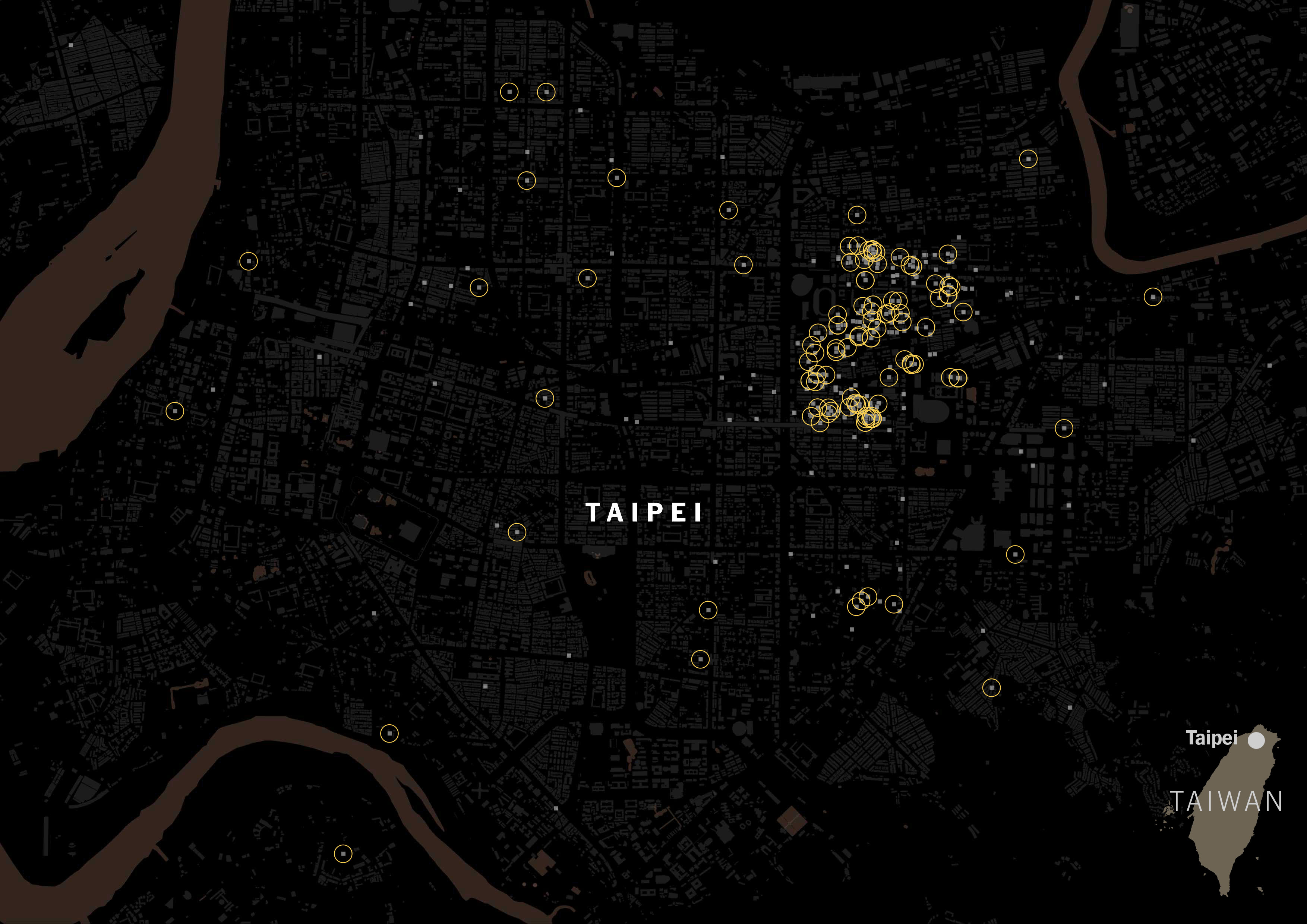
It was really interesting to see how numerous the places with Taiwanese tag were. Look at the same map, but with yellow circles for Taiwanese restaurants.
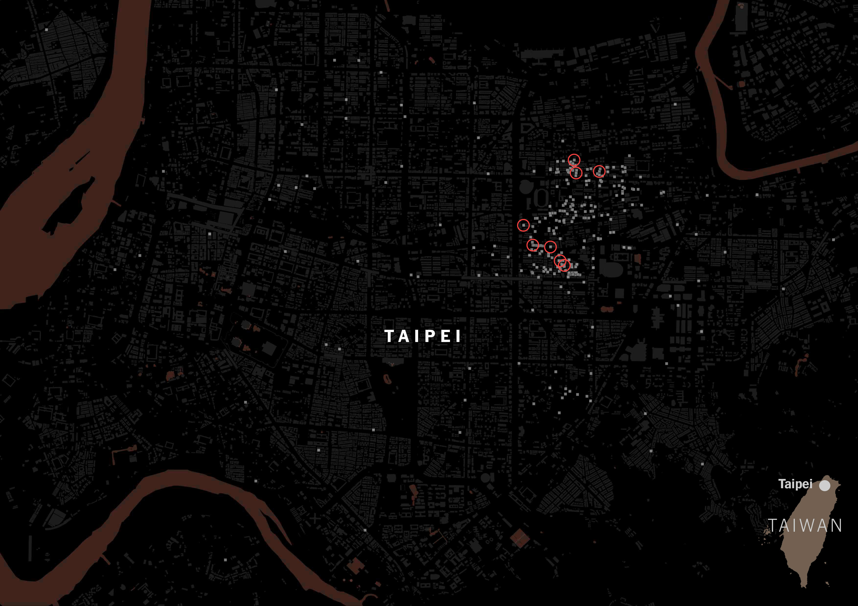
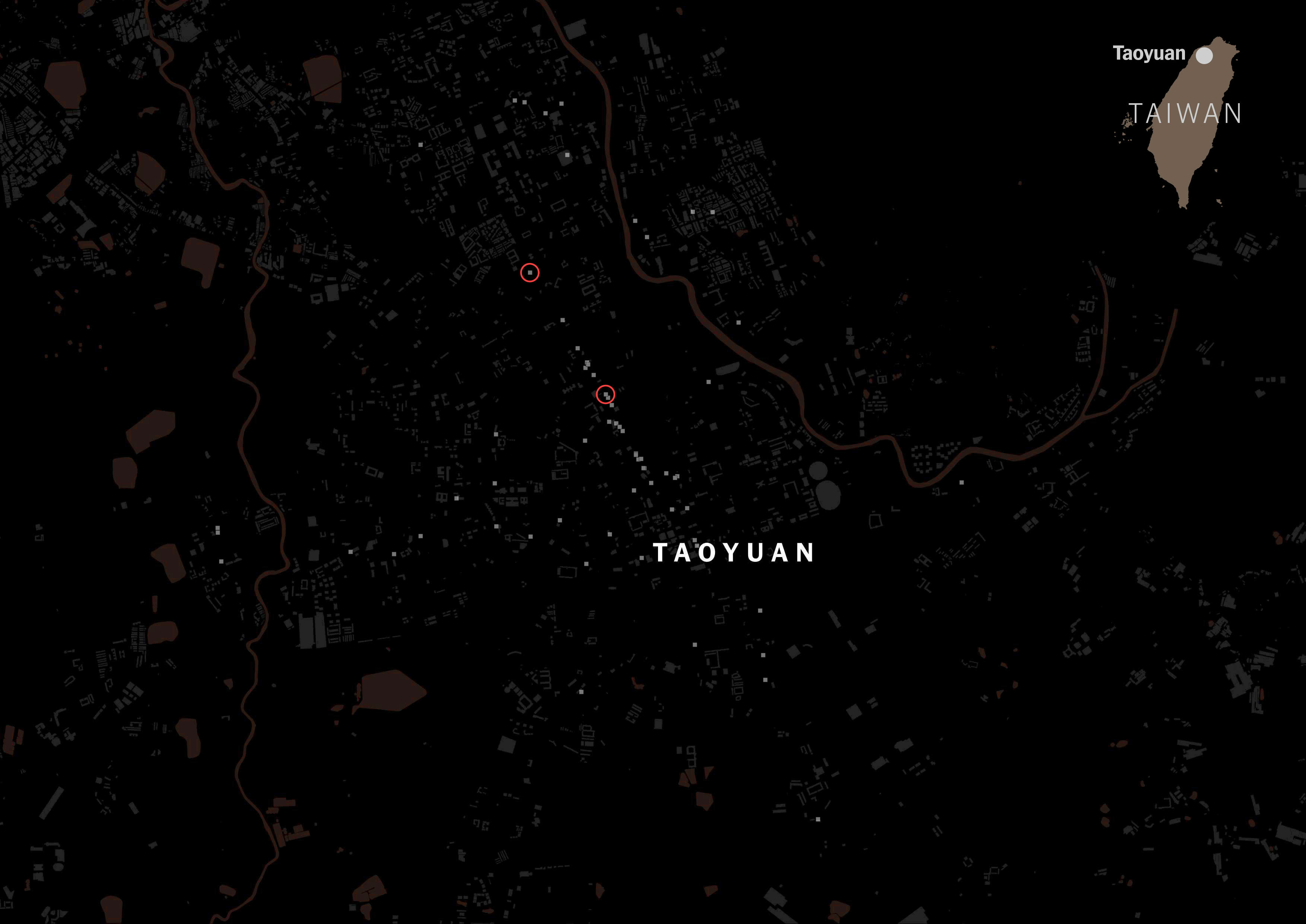
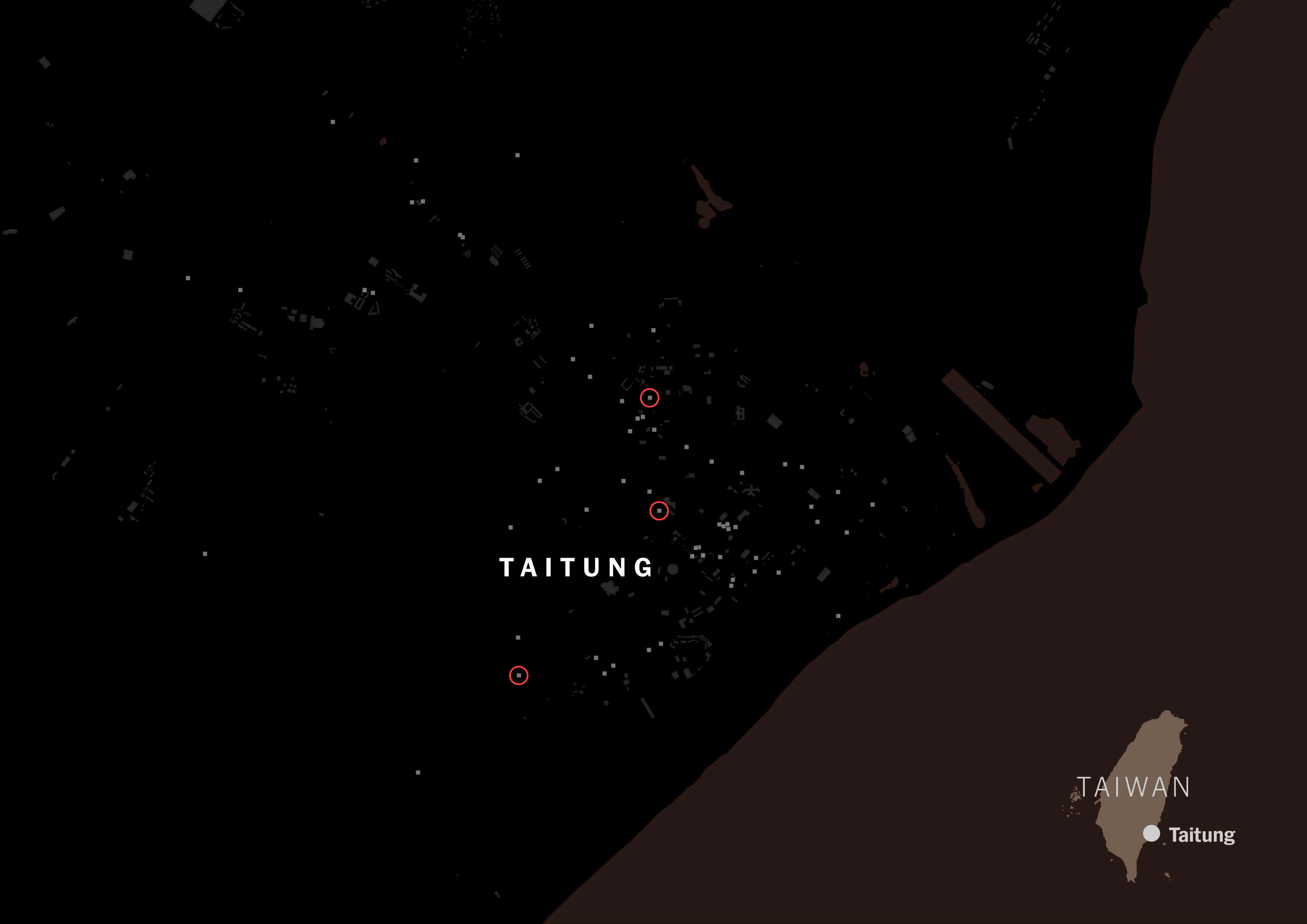
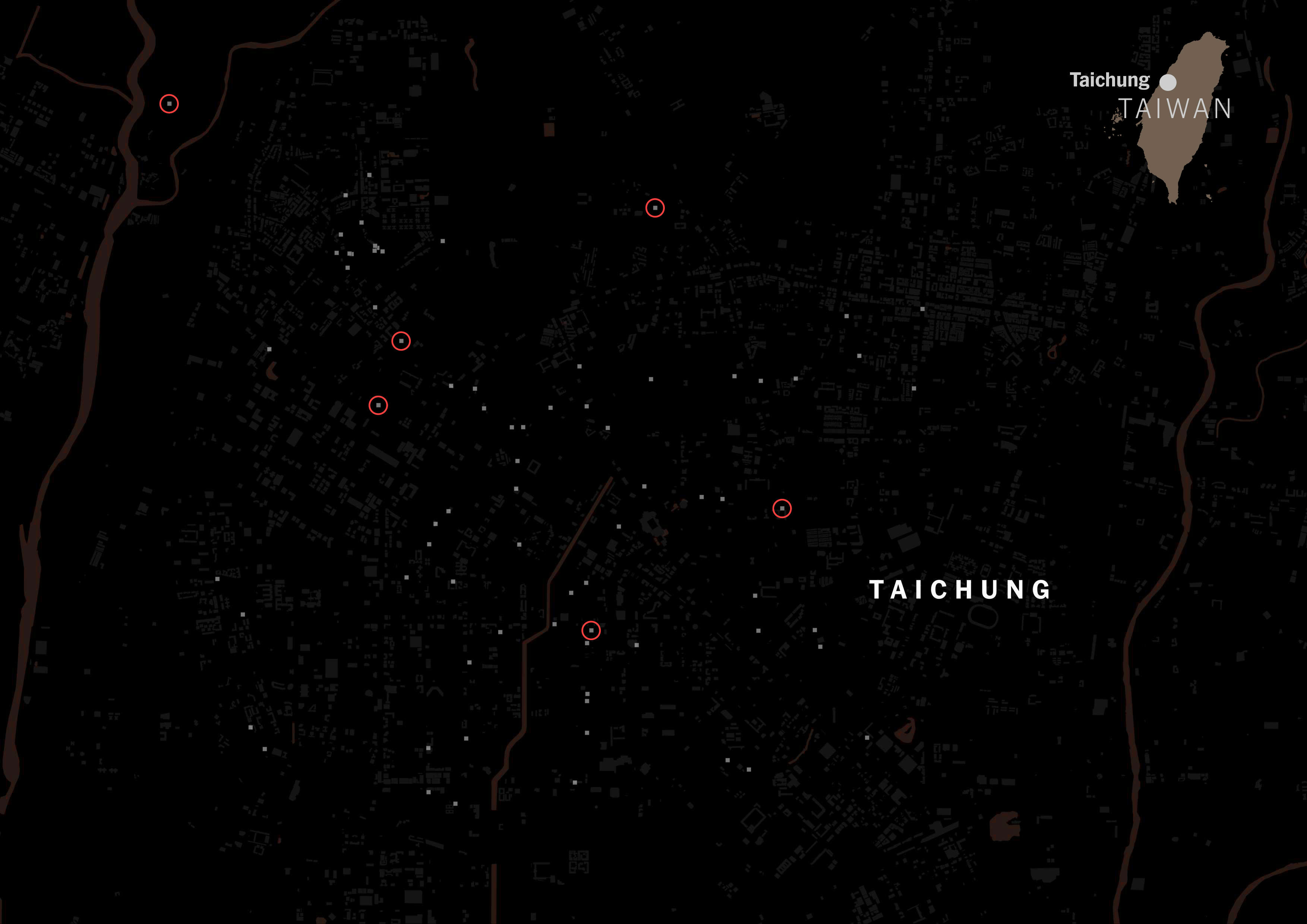
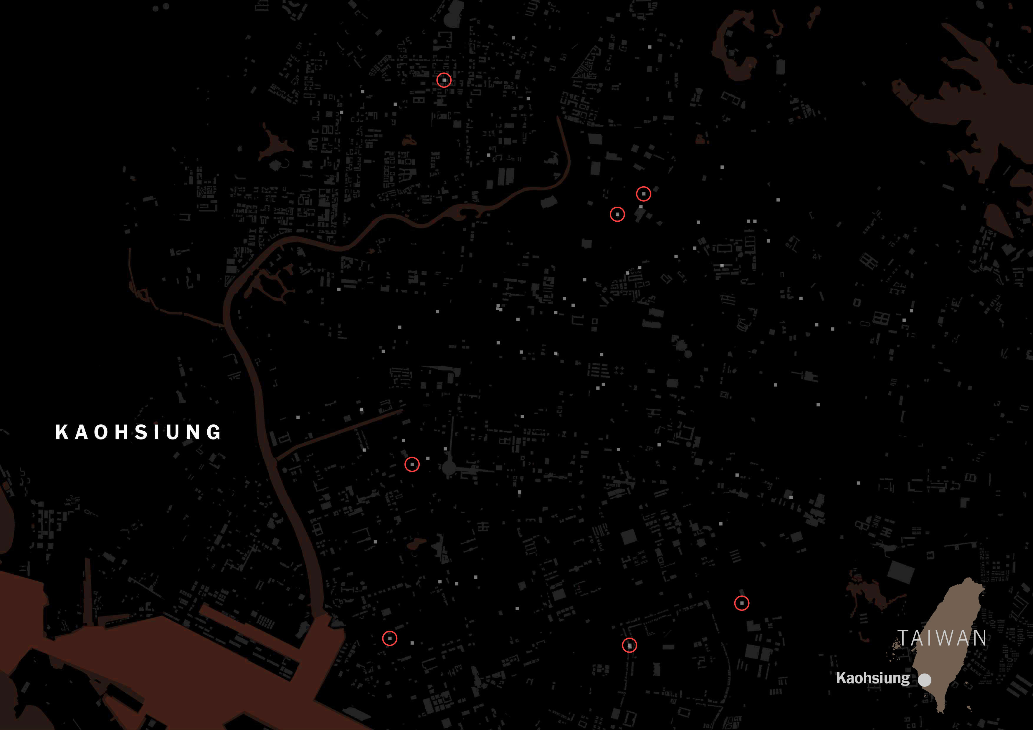
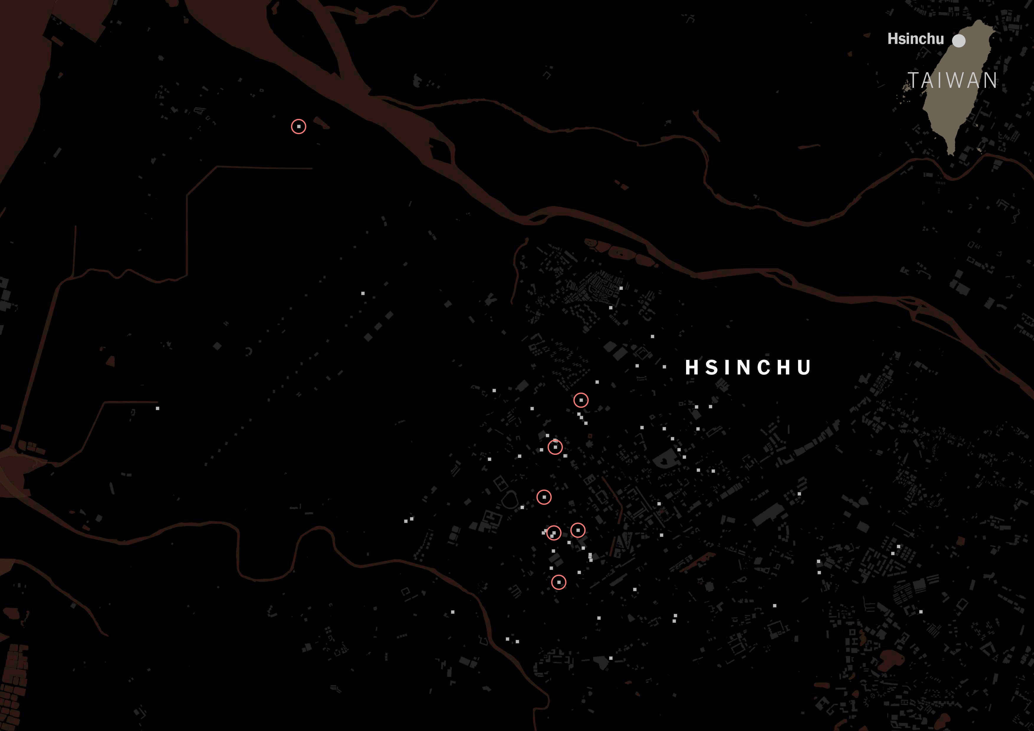
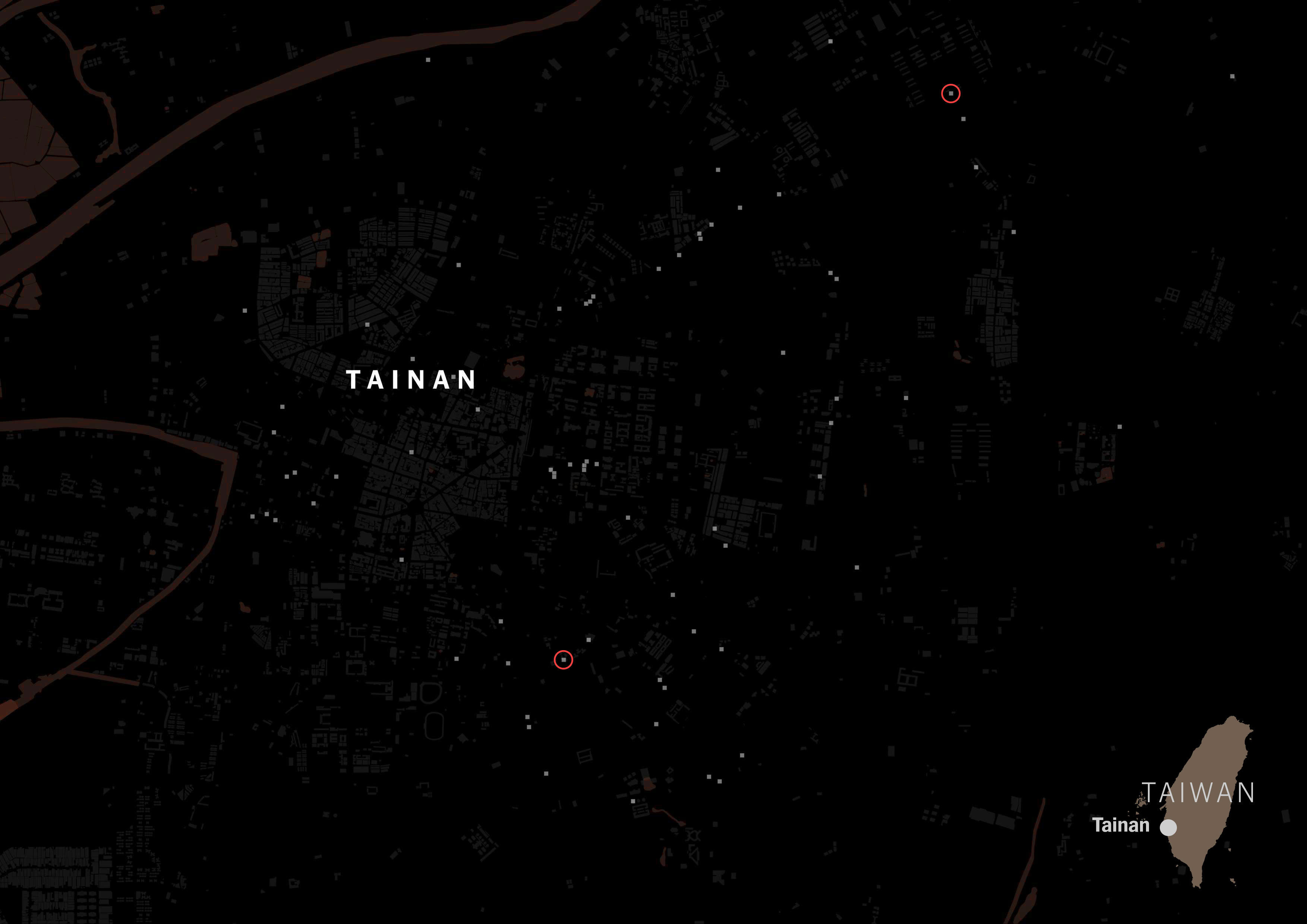
A massive difference with those showing Chinese tags on its categorization. Same map but red circles for Chinese tags.
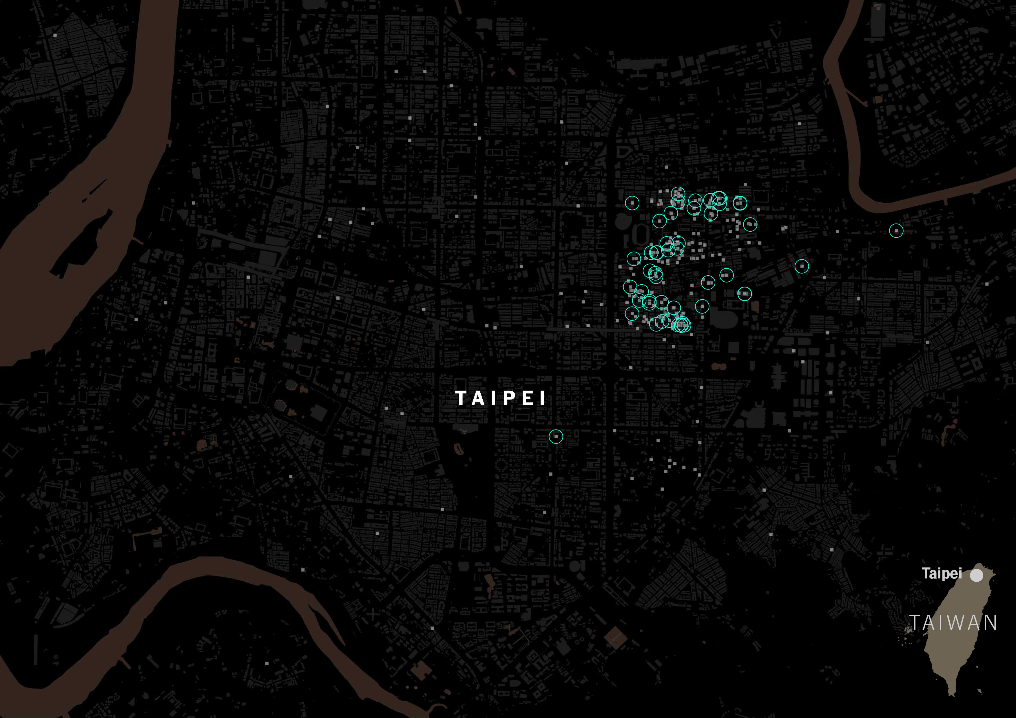
In fact, American tagging for restaurants is way more popular than the Chinese label in Taiwan. Green circles show restaurants with American tags:
I ran the same script for all of the listed cities in Taiwan for those food delivery services, and the story was similar no matter where you looked along the island. FoodPanda displayed about 4,000 restaurants across Taiwan, 36% of those were tagged as Taiwanese and less than 3% Chinese. Uber Eats followed the same trend, I pulled data for +600 restaurants and 6 of every 10 were Taiwanese, while only 1 or none was listed as Chinese.
I understand some restaurants use more than one tag, but looking at how many of them prefer to be labeled Taiwanese rather than Chinese says something about customer preferences.
They ideas never flourished, I was completely dedicated to Ukraine stories and the data just got older and older. Basically it lost momentum to gain a spot on the news, this happens very often actually, it seems that time is never enough to do all the stories you want to do.
Anyway it was a fun exercise pulling this data and see the trends.
About the data
I used a python script to pull data from Uber Eats and Foodpanda, I’m sure there’s a smarter way of collecting this data… I’m not a developer. But if you want to try your self like I did, you will need to collect all the urls from these companies, often offered by city, then add them into something like this:
from email.headerregistry import Address
from selenium import webdriver
from selenium.webdriver.common.by import By
from selenium.webdriver.chrome.options import Options

import pandas as pd
import csv


restaurantList = []
driver = webdriver.Chrome('/usr/local/bin/chromedriver')
driver.get("https://www.ubereats.com/tw-en/city/hsinchu-hsq")


name = [ e.text for e in driver.find_elements(By.XPATH, "//*[@id='main-content']/div[6]/div/div/div/a/h3")]
category = [ e.text for e in driver.find_elements(By.XPATH, "//*[@id='main-content']/div[6]/div/div/div/div/div/div[2]/div[2]")]
location = [ e.text for e in driver.find_elements(By.XPATH, "//*[@id='main-content']/div[6]/div/div/div/div/div/div[2]/div[4]")]

dtable = {'Name_ZH': name,'Category': category, 'Address': location}
df = pd.DataFrame(dtable)

df.to_csv('../data/uberEats-hsinchu.csv')

driver.quit()
Note that you may need to install a few dependencies to run this code, but eventually it will spit a lovely .csv file with a column for the restaurant name, a col for address and one more for category listed in Uber Eats. Food Panda uses a different structure, but the code is pretty much the same except by the urls and the targeting of fields.
If you are working on something similar, I’ll love to see the outcome, reach me out on Twitter.
About infofails post series: I believe that failure is more important than success. One doesn’t try to fail as a goal, but by embracing failure I have learned a lot in my quest to do something different. My infofails are a compendium of graphics that are never formally published by any media. These are perhaps many versions of a single graphic or some floating ideas that never landed.
In short, infofails are the result of my creative process and extensive failures at work.
Are you liking infofails?, have a look to previous ones:
This is what happens when you are out of sync. I just published one more entry of #infofails. If you’re not familiar with it, infofails is a summary of my creative process and extensive failures at work. Check it out here:https://t.co/jjWL8ydUPgpic.twitter.com/6VLu2XJDfo
This is a follow up to my previous tutorial for visualizing organic carbon. The process is more or less the same, but it uses a different dataset, which has some extra considerations. You can revisit it below:
Before continuing, to follow my guide and visualize global temperatures, you should be able to use your Terminal window, QGIS and optional Adobe After Effects or Photoshop.
About the data set
NASA’s Global Modeling and Assimilation Office Research Site (GMAO) provides a number of models from different data sets, this is basically a collection of data from many different services processed for historical records or forecast models. This data works well for a global picture or continent level even, but maybe isn’t a good idea to use this data for a country level analysis, for those uses you may want to check other sources of the data instead of GMAO models, like MODIS for instance if you you are looking for similar data.
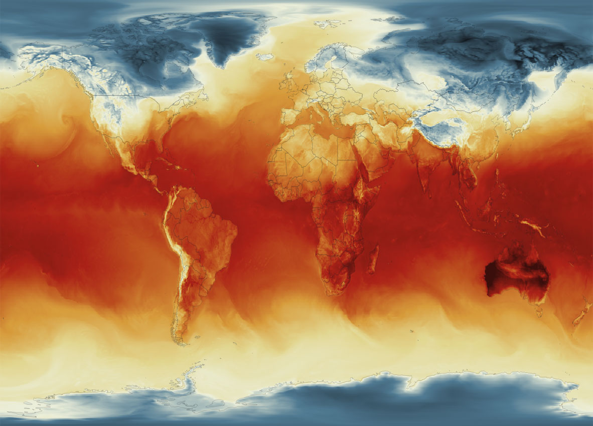
Global Surface Temperature average Jan. 4, 2023, 8am. || Data by GMAO / NASA.
SURFACE TEMPERATURE
There are a lot of different sets of products available at GMAO. For purposes of this tutorial, I’ll be focusing in the Surface Temperature which is stored into the inst1_2d_lfo_Nx set. That’s a GEOS5 time-averaged reading, which includes surface air temperature in Kelvin degrees in the 5th band of the files, there is some documentation available in this pdf. ( No worries if is this sounds too technical stay with me and keep going. )
These files are generated hourly, so a day of observations accounts for 24 files. This is great for animation because it would look smooth (even smother than the one we did for Organic Carbon before).
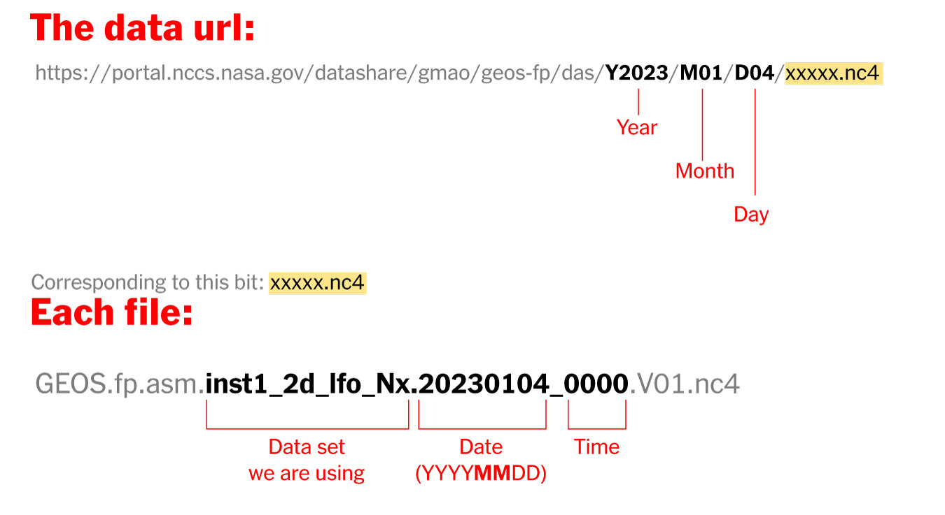
Where’s the data? and How it’s named?
The data is stored into this url. You can go into the folders and get all 24 files for each day manually if you like or get them with a command line using wget or curl into the terminal, I’ll recommend you the command line since it’s easier. Here’s how each file is named and stored:
Step 1. Get the data
Create a folder to store your files with some name like “data”
Once it reaches 100%, you would get a file named 20230104_0000.nc4 in you “data” folder: Note that I have renamed the output ( -o ) with a shorter name. The file will go to your folder ready to use into GQIS. Of course you will need a few more files to run an animation. Remember that this data is available for every hour every day, so you need to set the url and name for something like this:
00:00 MN >> 20230104_0000.V01.nc401:00 AM >> 20230104_0100.V01.nc402:00 AM >> 20230104_0200.V01.nc403:00 AM >> 20230104_0300.V01.nc4
...and so on...
08:00 PM >> 20230104_2000.V01.nc409:00 PM >> 20230104_2100.V01.nc410:00 PM >> 20230104_2200.V01.nc411:00 PM >> 20230104_2300.V01.nc4
Just create a text file listing all the urls you need and run the script into the terminal window with the same process:
curl-O [URL1] -O [URL2]
Each file is usually about 10MB, if there’s something wrong with the data the file will be created anyway but would be an empty file of just a few KB. Remember a full day accounts for 24 files but it starts from zero not 1.
Step 2. Loading the data into QGIS
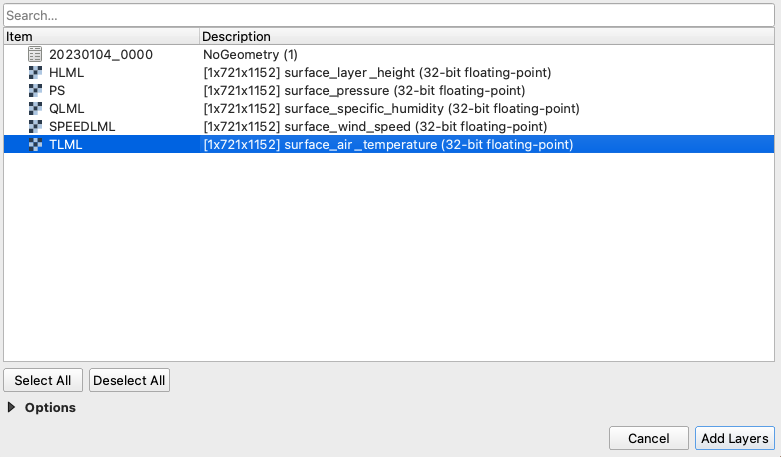
Once you have a nice folder with all the files you want, you can just drag and drop the .nc4 files into QGIS. We are looking for the 5th Band, TLML which is our Surface air temperature:
QGIS prompt window when you drop one of the file in.
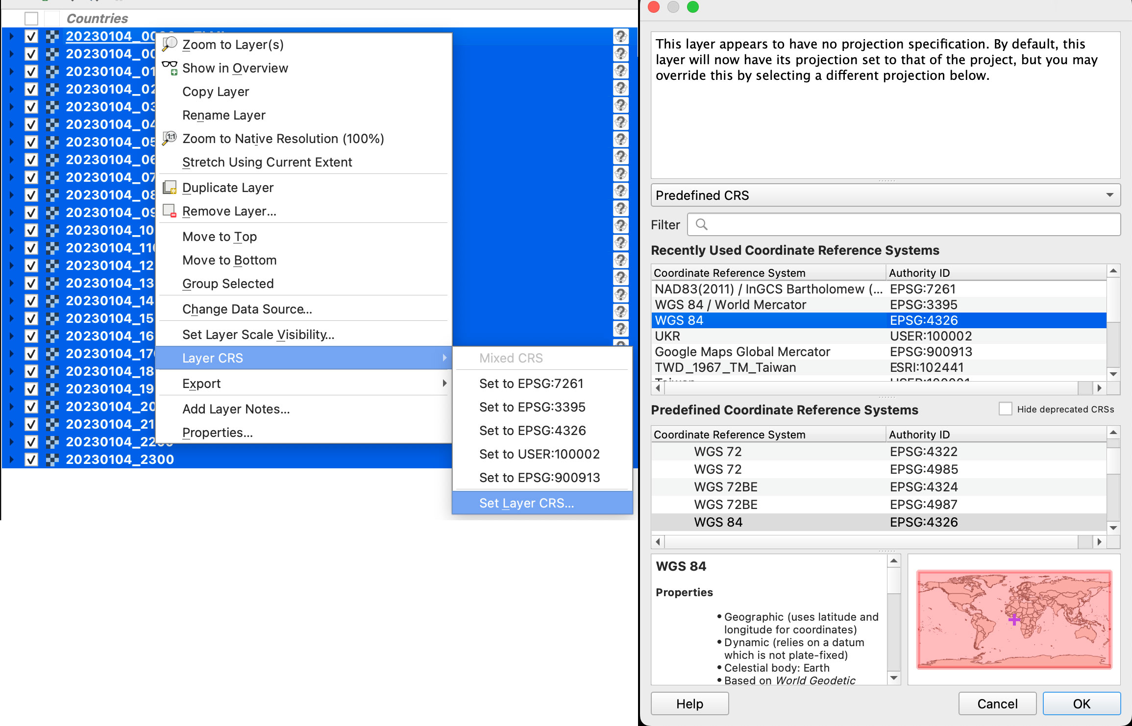
Once you have the data loaded, you want to set the data projection to WGS 84, this will enable the data layers to be re-projected later on. To do that, select all you data layers, right click on them, and select Layer CRS > Set Layer CRS > 4326. Be sure of selecting all the layers at once so you do this only one time. Otherwise you will need to doing over and over.
Data layers projection to WGS 84.
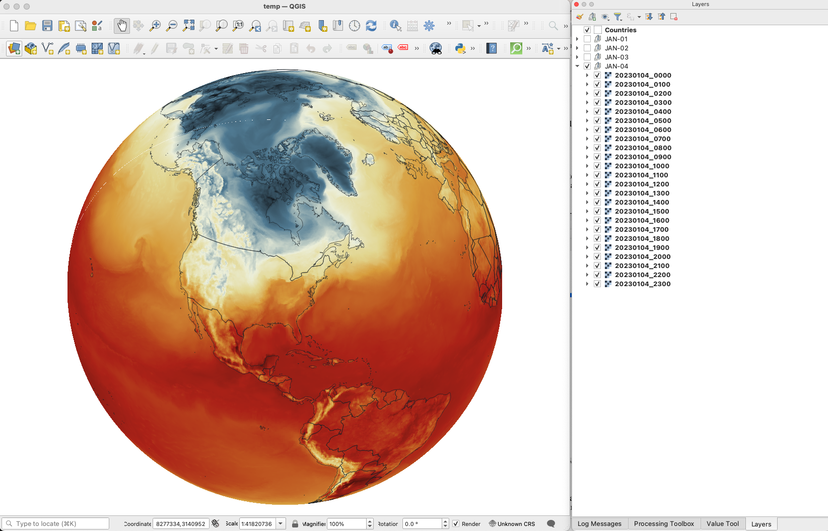
Since this is a good global data set, you may want to load a globe for reference, you can use your own custom projection, or use a plugin like globe builder:
Access Globe Builder from the plugins menu > Manage and Install > type: Globe.
Once installed, just run it from the little globe icon, or in the menu plugins > Globe builder > Build globe view. You have a few options there, play around with the center point lat/long. You can always return here and adjust the center by entering new numbers and clicking the button “Center”.
Step 3. Styling your map
The color ramp is important, you want to have a data layer and maybe a outline base map for countries, QGIS has some pre-built ramps for temperatures, you can check them out by clicking the ramp dropdown menu, select Create New Color Ramp and then select Catalog cpt-city.
Once you have your ideal color ramp for one layer, right click on that layer, go to Styles > Copy style. Then select all you temperature data layers at once, right click on them and select Styles > Paste Style.
I have created a ramp to fit better my data ranges and style a little the colors. If you not are using the optional ramp below, and want to proceed with the pre-built ramps skip this to step 4.
To use my ramp, copy and paste the following to a plain .txt file:
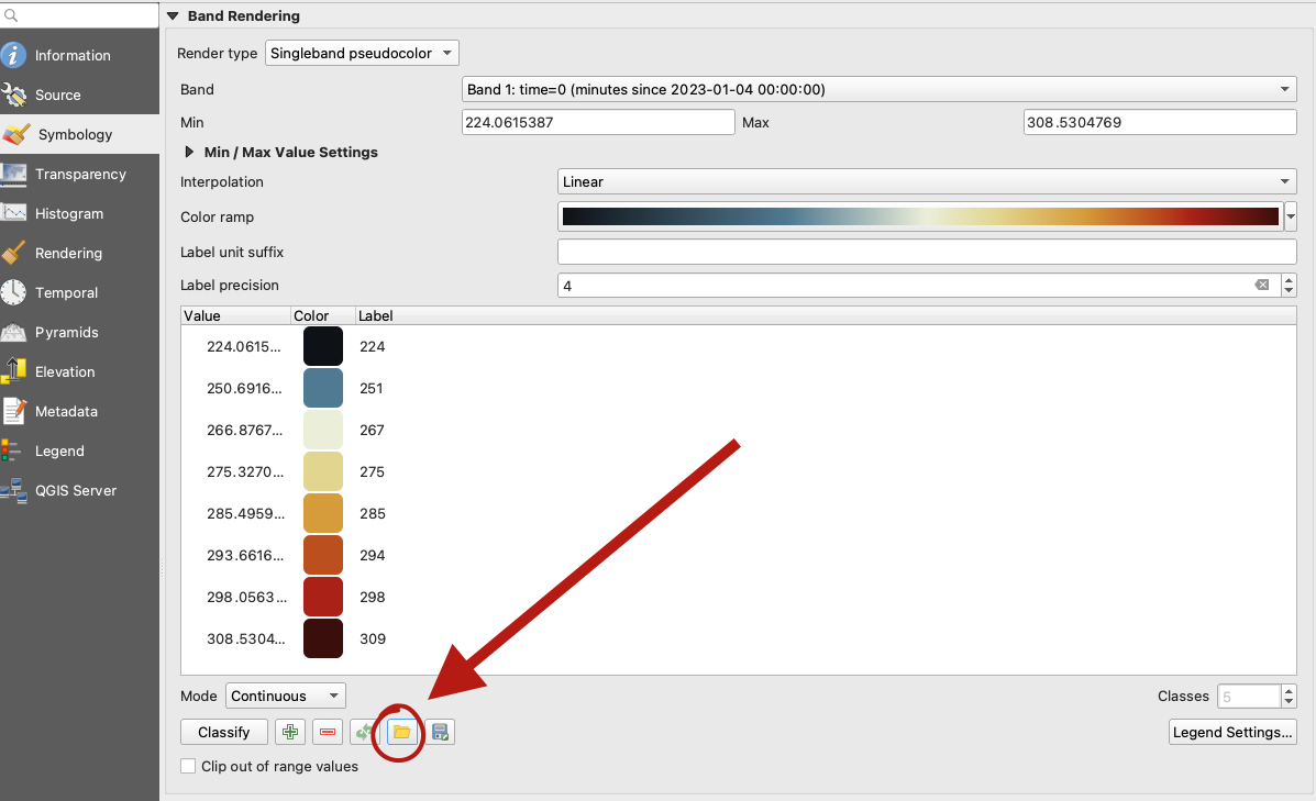
To apply the ramp to your layers, doble click one of the .nc4 files, and select Symbology in the options panel. Under render type, select Singleband pseudocolor, the look for the folder icon, click it and load your .txt file.
QGIS prompt to load a custom style.
Step 4. Preparing to export your map
You are almost done, by this point you can see how each data layer creates nice swirls, maybe some evolution of it too just by toggling the layers visibility. I like to have all the layers well organized so you can quick check the data. I’m maybe a little too obsessive but I usually rename all layers and groups to something like the image below, however this is just for me to know which files are on which day:
QGIS layers panel.
The name change works if you are using an automatic export of all layers, the script in the next step takes the name of the layer to name file output. But there are alternative ways to do this if you’re not as crazy as I’m and don’t want to spend time manually renaming.
Step 5. Export your map
There are many ways of doing this, you can set up the time for each layer by using the temporal controller, there’s a good guide here. That way you can get a mp4 video right away from QGIS, but you need to set up each data layer time manually.
You can also use a little code to export each layer into an image, which you can then import into After Effects. To do that, the first step of course, is to get the script. Download the files from my google drive HERE.
Now, go to the plugins menu at the top, there, you will see the Python console, go and click that, you will see this window popping-up:
Python console in QGIS.
Click the paper icon, then click the folder icon and select the python script you dowloaded above. Just be careful with the filePath option.
If you are on a mac, right click your output folder and hold the option key, that will allow you to copy the absolute path of you folder, paste that to replace the filePath field value (the green text in the image below). If you are on Windows, just make sure to get the absolute path and not a relative one.
I left some annotations on the script to better understand what each part is, it’s based on a script someone did with Vietnamese annotations, source and credit are in the drive link too.
Now just click the play button in the python console, seat back and look all the frames of your animation loading in the output folder you selected. You should see a file for each of your layers when the script finishes.
Step 6. Color key
The temperature in this set is provided in Kelvin degrees. The range of the data depends on your date / file set up. But if you are using the ramp I have provided above with data for Jan. 4, there’s a svg file named “scale.svg” in the drive folder within this range. I have nudge a little the color and ranges matching the map with nice round numbers.
For January 4, the data rages are about 224°K to 308°K, you can use google to covert that to Celsius or Fahrenheit depending on your needs. But basically you can take your Kelvins and subtract 273.15 to get Celsius. The min. Temperature would be ~ -49°C (224°K) and Max. ~34°C (308°K). If you are into Fahrenheit, I’m sorry the math would be a little more complex for you… go ahead and use google.
Step 7. Setup and export your animation
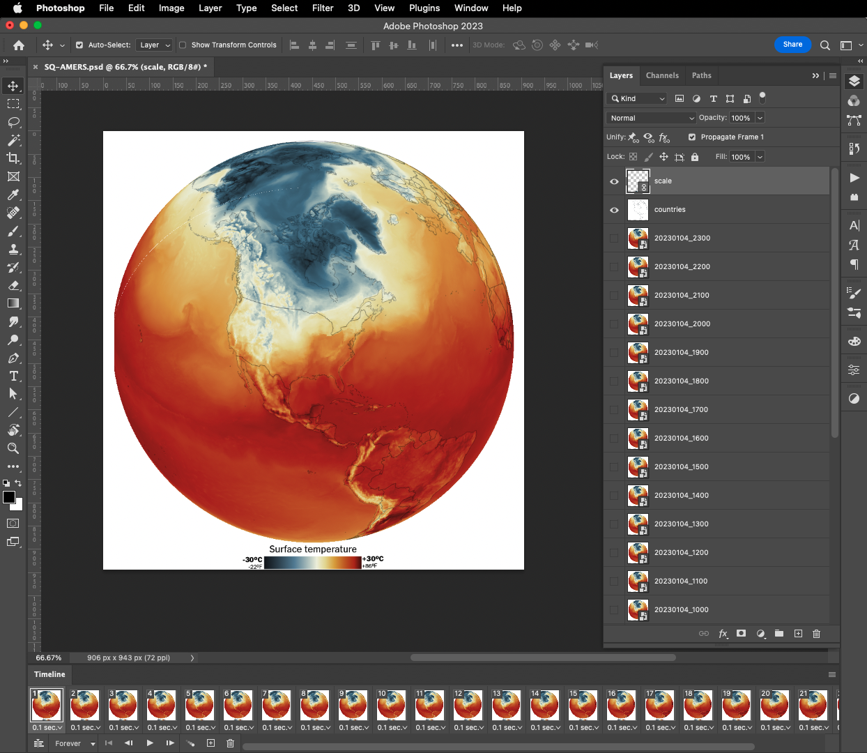
On my previous tutorial to visualize Organic Carbon, I used Adobe After effects to add the dates, you can use the same principle here, or using any other alternatives. For example, once you have the output files you can drop them all into photoshop. By going to the menu Window / Timeline you can add a frame animation, simply click the + icon in the timeline panel followed by turning one layer on at the time.
Adobe Photoshop frame animation.
If you are using Photoshop, pay attention to the order of the files, it should match the data dates from newest at the top to oldest at the bottom. Once you have you sequence ready, in the timeline panel menu, you will find a render option to export your animation as video, or you can create a gif animated by using the top menu File / Export / Save for Web or command + option + shift + s if you are on a mac.
Or something like this, if you have used the same data and ramp from this tutorial:
I love GMAO's data. This is yesterday's global temperature hourly averages. Note how the while the sun rises the surface temperatures create a "wave" from Brazil to North America #DataVisualizationpic.twitter.com/62CO1lMVdH
If any of this doesn’t make sense to you, or if you’re having trouble with a step, feel free to reach out to me on Twitteror MastodonI will be happy to hear from you.
Happy mapping!
Update
Using gdal to convert data to 180-180
Someone contacted me about this tutorial because they were having problems with the projection of the temperature data.
For some reason if your files are in 0-360 format instead of 180-180 you will usually see the globe aligned with the vector layers but not with the temperature rasters, which usually appears to the side in QGIS
If that’s happening to you, you may need to convert your data before dropping it into QGIS. Here’s a quick tip on how to fix that:
From your terminal window cd your folder like you did before, look for the directory where your temperature data is.
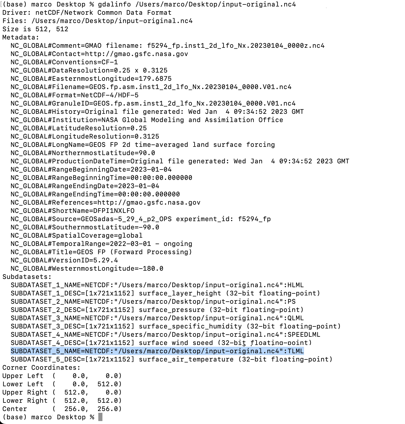
Type gdalinfo add an space and paste the file name it should look like this:
You will find the subdatasets. We are looking for TLML (temperatures) that highlight on blue above.
Gdal would help you to convert the data so you can use it, the command line looks like this:
***Note your file path will be different copy that from your terminal window (the blue highlight)
That will give you a new file in the directory of your choice (your/directory/output-filename.nc4) in this example there is a folder called directory inside a folder called your in which is the file called output-filename.nc4. Be careful when renaming files the dates are important to the animation process.
Earlier this year I spent some time learning about the world of phenology. After reading some scientific papers and doing some interviews with researchers, I just found myself getting more and more curious about it.
If you google Phenology it will return something like “Phenology is the study of periodic events in biological life cycles and how these are influenced by seasonal and inter-annual variations in climate, as well as habitat factors.”
Since we live in a single network, studying the effects of climate on species brings us closer to what will inevitably also affect us, but it’s also a way to connects us a little more with all those other living beings with whom we share this space.
“The love for all living creatures is the most noble attribute of man.”
Charles Darwin
Darwin was right, after talking to a lot of people and understanding their passion for plants and animals, it is easy to understand the concern about the changes that some species are facing.
But moving on, if you have visited this blog before you may know where this is heading to… yup, this is another #infofails story. Here’s how all went wrong:
An unfinished illo for a blooming/ecological mismatch project I tried to run.
The embarrassment
The most embarrassing part of my failures is not facing your editor with a dumb idea, the hard part is getting excited about the information from sources and interviews and then watching time go by without you being able to develop the story you had in mind, especially if the people who spoke to you were super collaborative.
My first source in this endeavor (with whom I’m still embarrassed) was an Ecologist with the USGS. She shared with me some info from studies in the Gulf of Maine where she studies seasonal disturbances in marine life. In fact, it was she who explained to me what Phenology is. –Explained by a scientist who works on it.
My embarrassment also is with Richard B. Primack. He’s a Biology Professor at Boston University, I had a great conversation with him, he shared tons of great data.
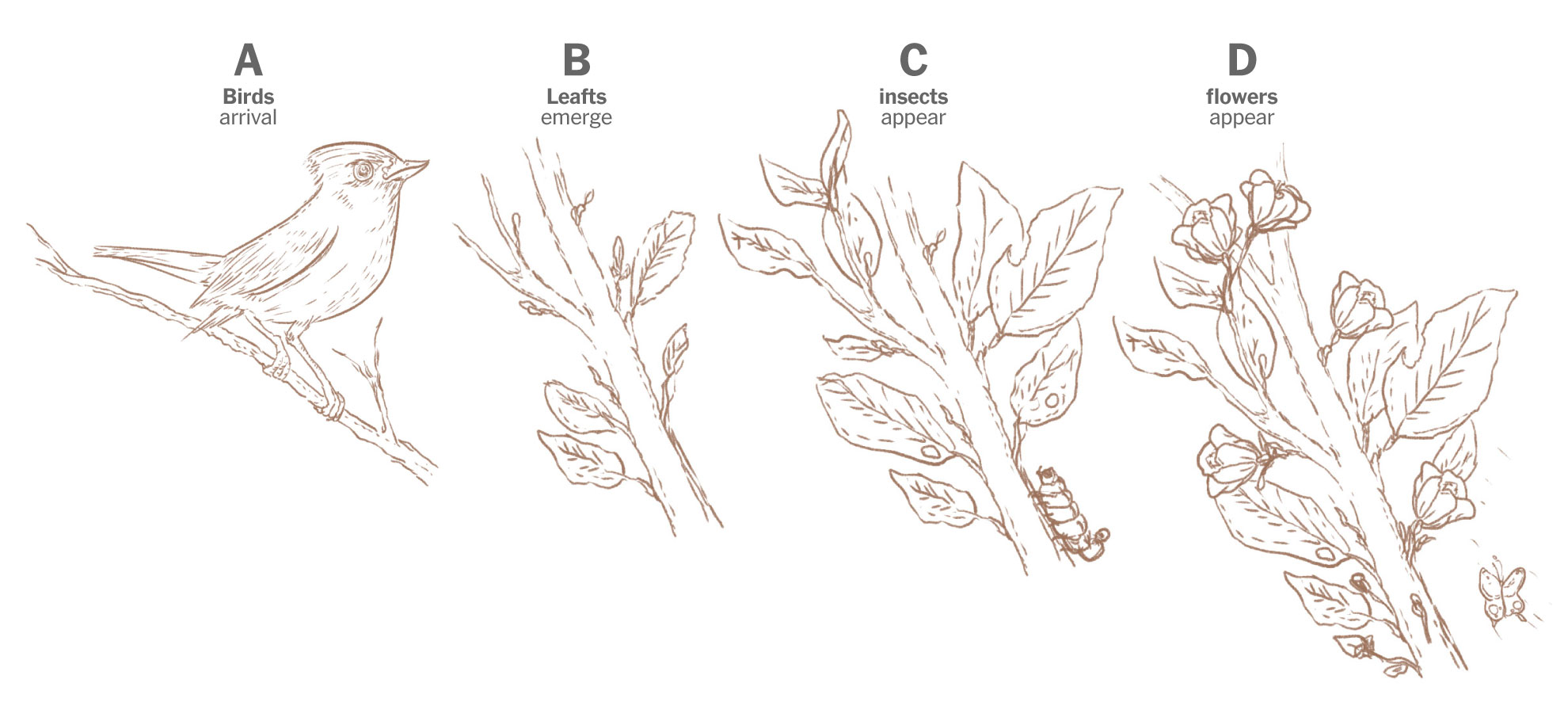
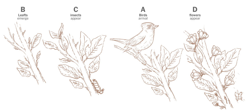
You see, Prof. Primack has been studying and documenting the ecological mismatch for years, in 2016 he published a study where he explained how some birds arrived late to forage because spring is starting earlier. He show this example comparing the spring in 1850 describing the natural flow: first birds arrive, then leafs come, then insects appear, and finally flowers pop. Here’s a quick draft I did based on his publication:
Sketches of the spring flow in 1850. Based on Prof. Primack’s paper published in American Scientist Magazine, 2016.
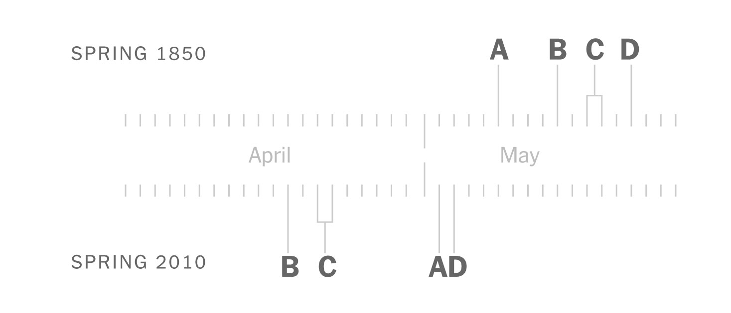
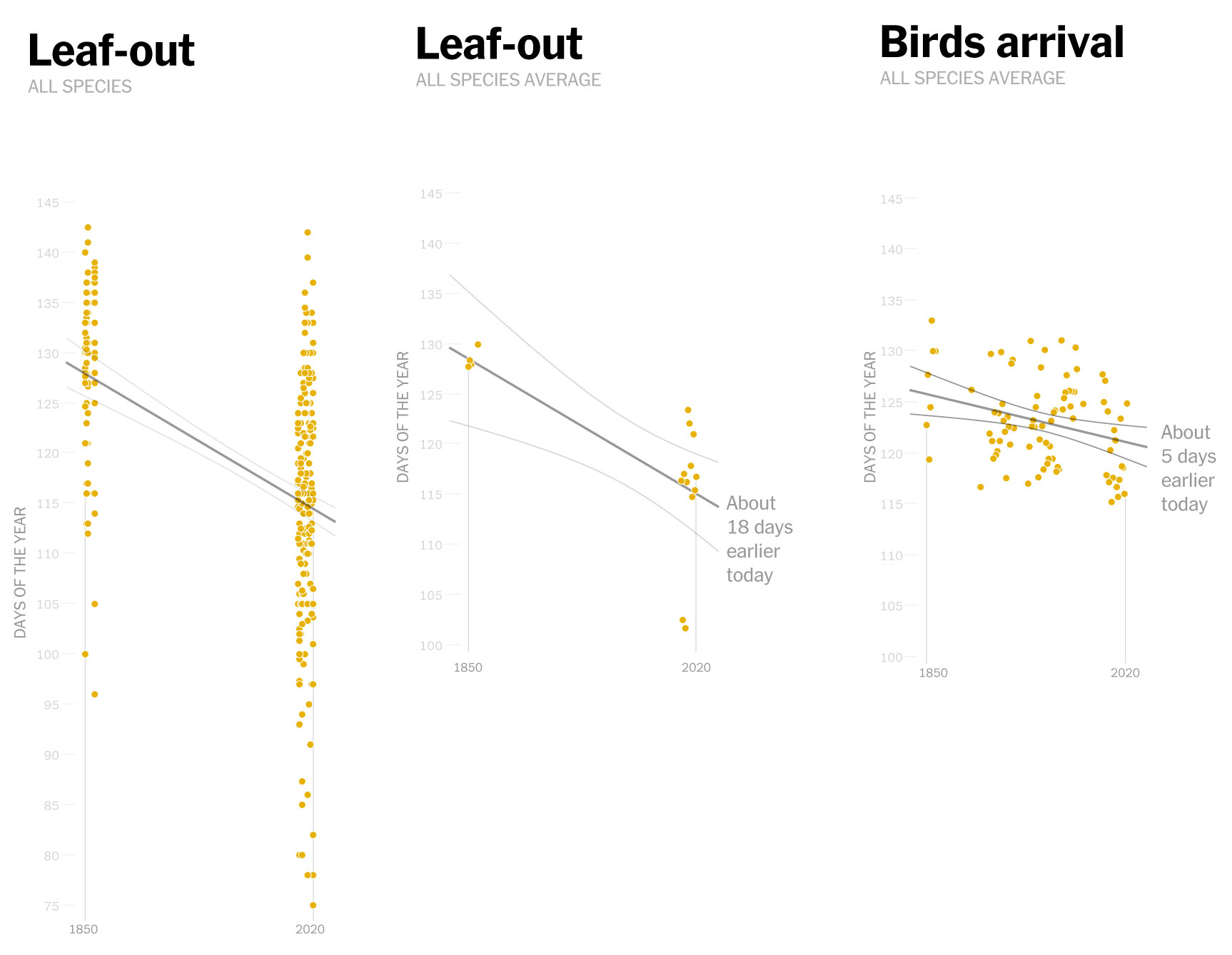
Makes sense doesn’t it? the observations show that these birds have continued to arrive on similar dates, but now spring is coming earlier. In 2010, for example, the leaves arrived earlier, so the insects also appeared earlier and spoiled the entire cycle for other species.
Staying with that same example from 2010, birds were observed arriving around the same date to find flowers when the insects should be just showing up. In other words, these days, for some species the natural flow looks something like this:
Sketches of the spring flow in 2010. Based on Prof. Primack’s paper published in American Scientist Magazine, 2016.
Prof. Primack along with many others researchers used Henry Thoreau’s observations to reconstruct the past of seasonal changes, that alone was a big story for me. So I went on and on, making more questions and asking for more data. And kindly they send me over tons of papers and tabular data.
Some of that data Prof. Primack shared with me included detailed records of plants and animals where he spotted those changes in spring and the struggling birds.
A data sketch I did with part of the data collected by Prof. Primack and a team of researchers merged with Thoreau’s records.
When I have a dataset that looks this interesting, I’m inevitably driven by ideas of how to show this in a story, it’s like a need of sketching data. At that point I need to somehow present this to my editors to push it forward and turn it into a story. Sometimes I spend time developing my ideas into sketches just to explain to editors what I’ve found interesting, but it’s not always as obvious to them as it is to me, so it’s necessary to write some paragraphs and accompany them with those images.
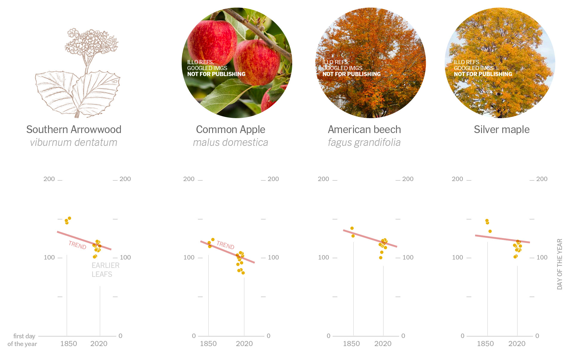
Some of the tree species that sprout leaves earlier. The steeper the slope of the red line, the earlier the leaves sprouted on average.
Just the right timing
That same process that I follow sometimes takes too long to put together a draft for my editors. When I came up with the proposal for this story, it was almost spring and it was hard to move a story past that window. That was just one of the things that spoiled the initiative I think.
It’s important to note that for those types of stories, I’m not developing the drafts over my daily work, but rather in free moments, which lengthens the process even more. But anyway, the lesson of this part was to keep an eye on your post window and not let your inner child distract you with what you find and diverge, maybe you’ll get the idea to the editors in time, it would be more easy for this to happen, who knows…
Adding more, more, more…
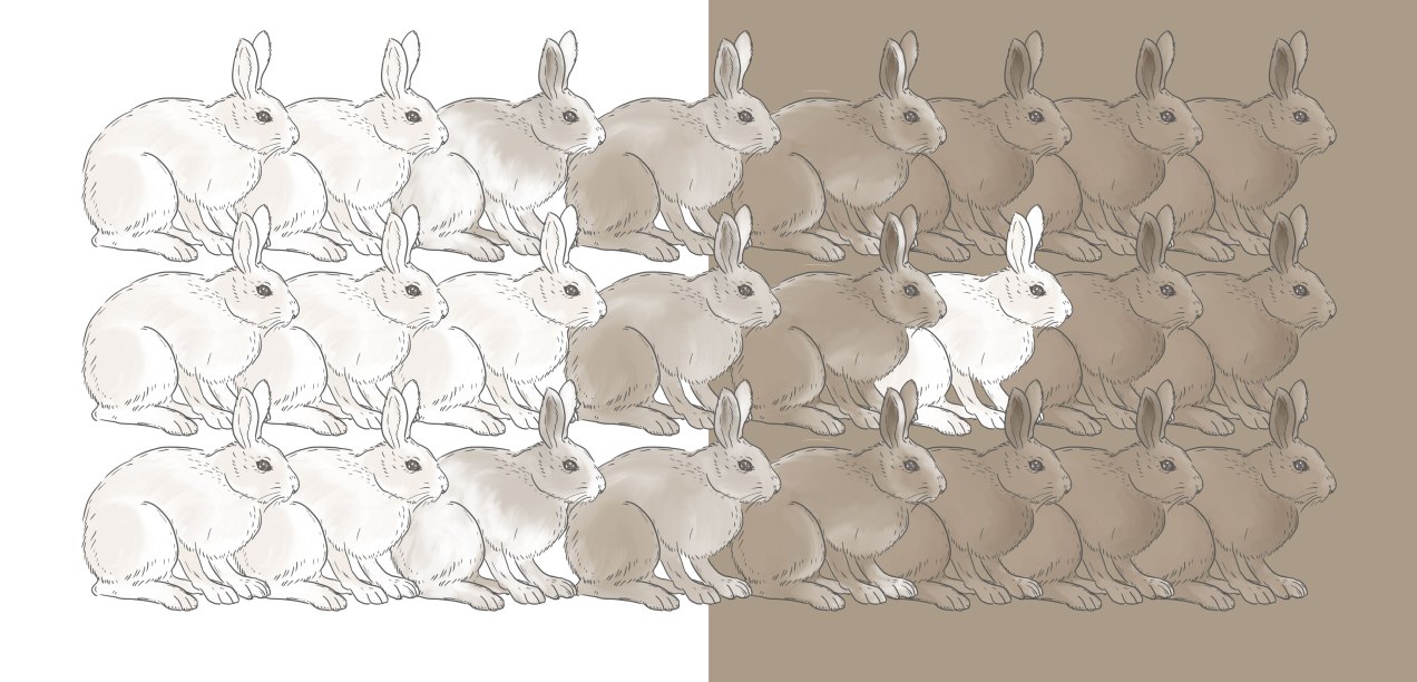
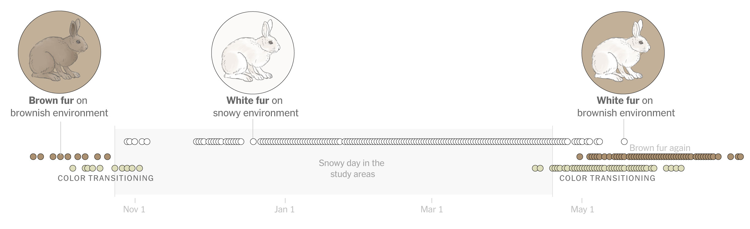
Certainly I was fascinated with the data and all the potential for a story, I was finding more and more data related to the same issue of animals struggling with the climate changes, the only problem was the this data was a little old already. Like this fascinating 2018 paper by Prof. Marketa Zimova + describing molting conditions in furry animals and how they struggle to survive when there is little snow and you are still covered in white fur. You may noticed the illustration at the top with a white hare on brown background which is kind of what they look to predators when there’s no snow around. Really sad the reality that these animals are going through, you know how it ends if you’re a white prey animal on a brown background.
A diagram based on the research data by Prof. Marketa from the University of Montana.
My second problem turned out to be that I was following the white rabbit into the world of tangencies. There is so much information on this that I started to integrate other studies and data, maps and things that led me to create a monster draft. A lot to digest from a news perspective maybe.
Earth temperature anomaly in April 2007. Based on NASA NEO. This event caused heavy damage to fruit tree crops during the spring of 2007.
A lesson from this would be to narrow the focus, crunching the idea down to its essentials can help early in the process. My mistake here was probably in choosing and editing the story I intended to show my editors. I added a thousandthings on it, including interesting but a bit old data, maybe not the best selection for a news story.
While not everything should be breaking news, at least the focus of the story should be less scattered and consequently better defined.
Don’t follow the white rabbit. They tend to show you things that lead to a spiral of tangencies. –A silly and perhaps inappropriate joke, sorry. I hope you get the idea anyway.
We are experiencing climate change in many ways. In fact it’s easy to find news and research papers on early blooming and animal habitats threatened by seasons arriving earlier or later than they used to be and so many other changes that every species on this planet (including us) must endure.
If you’re in to news, I encourage you to talk more about this topic, worst case scenario don’t publish your story, but at least you’ll meet amazing people along the way and learn a little more about the fascinating world between us.
About #infofails post series: I truly believe that failure is more important than success. One doesn’t try to fail as a goal, but by embracing failure I have learned a lot in my quest to do something different, or maybe it is because I have had few successes… it depends on how you look at it. Anyway, these posts are a compendium of graphics that are never formally published by any media. Those are maybe tons of versions of a single graphic or some floating concepts and ideas, all part of my creative process.
In short, #infofails are a summary of my creative process and extensive failures at work.
Are you liking #infofails?, have a look to previous ones:
I’m not as consistent as I wish but I hope you keep enjoying #infofails this time dedicated to #maps ‘Random Failed Map Details’ https://t.co/TxDcUTuYat
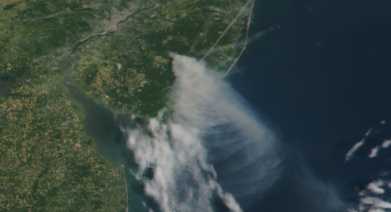
Long time ago someone on twitter ask me to do an explainer on how I did the “smoke” animations forthis Reuters piece. It has been a while since then, but maybe it would be useful for someone out there, even if that mean learning how NOT to do things.
Before continuing, to follow my guide and visualize organic carbon, you should be able to use your terminal window, QGIS and optional Adobe After Effects.
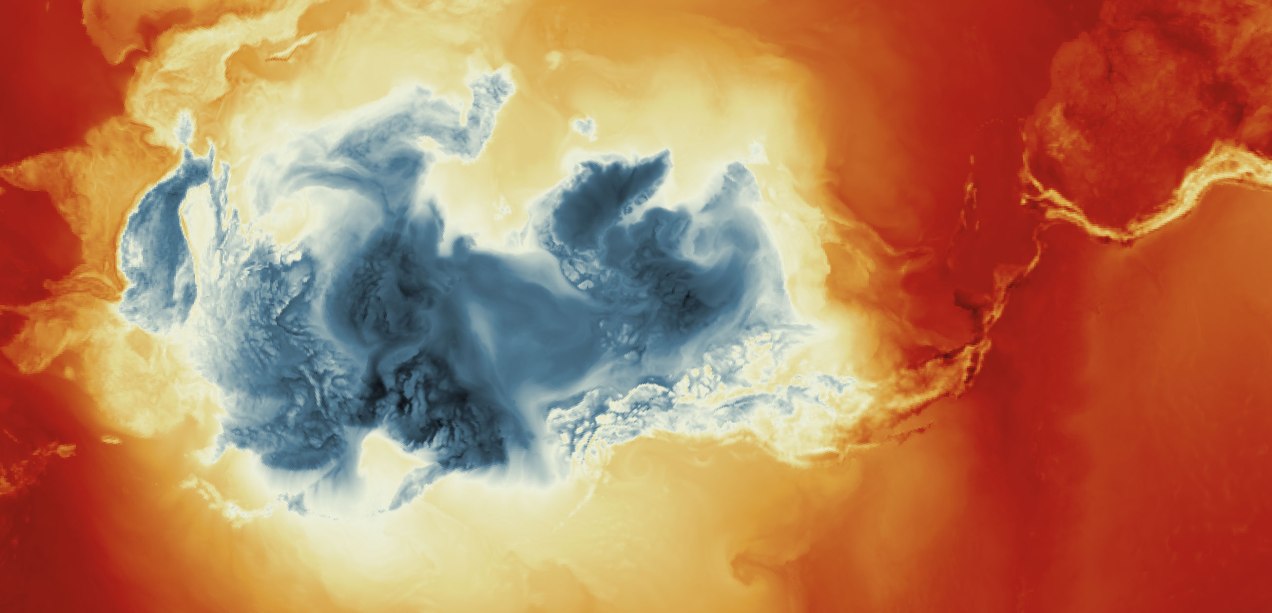
Organic carbon released into the atmosphere during the wildfires season in California in 2020
Let’s talk about this wonderful data first
NASA’s Global Modeling and Assimilation Office Research Site (GMAO) provides a number of models from different data sets, this is basically a collection of data from many different services processed for historical records or forecast models. This data works well for a global picture or continent level even, but maybe isn’t a good idea to use this data for a country level analysis, for those uses you may want to check other sources of the data instead of GMAO models, like MODIS for instance if you you are looking for similar data.
ORGANIC CARBON
There are a lot of different sets of products available at the GMAO servers, you can check details here, here and here. However for purposes of this practical guide, I’ll be focusing in the emissions of Organic Carbon which is stored into the tavg3_2d_aer_Nx set. That’s a GEOS5 FP 2d time-averaged primary aerosol diagnostics, which includes Organic Carbon Column mass density in the 38th band, there is some documentation available in this pdf. ( No worries if is this sounds too technical stay with me and keep going. )
A day of observations accounts for 8 files since this data is processed every 3 hours. This is great for animation because it would look smooth. Knowing that, let’s move to our guide.
Step 1. Get the data
The data is stored into this url. You can go into the folders and get all 8 files for each day manually if you like or get them with a command line using wget or curl into the terminal. You just need to know a little of the url structure:
GMAO organic carbon files and url structure
Create a folder to store your files with some name like data
Note that I have renamed the output ( -o ) with a shorter name. The file will go to your folder ready to use into GQIS. Of course you will need a few more files to run an animation. Remember that this data is available for every 3 hours daily, so you need to set the url and name for something like this:
01:30 AM >> 20220619_0130.V01.nc404:30 AM >> 20220619_0430.V01.nc407:30 AM >> 20220619_0730.V01.nc410:30 AM >> 20220619_1030.V01.nc401:30 PM >> 20220619_1330.V01.nc404:30 PM >> 20220619_1630.V01.nc407:30 PM >> 20220619_1930.V01.nc410:30 PM >> 20220619_2230.V01.nc4
Just create a text list with all the urls you need and run the script into the terminal window with the same process:
curl-O [URL1] -O [URL2]
Each file is usually about 120MB, if there’s something wrong with the data the file will be created anyway but would be an empty file of just a few KB. Do a day or two first and check, that’s 8-16 files, check them, if all looks good load a few more if you like.
Step 2. Loading the data
Once you have a nice folder with all the files you want, you can just drag and drop the .nc4 files into QGIS. We are looking for the 38th Band, OCCMASS which is our Organic Carbon Column mass:
QGIS prompt window when you drop one of the file in.
Once you have the data loaded, you want to set the data projection to WGS 84, this will enable the data layers to be re-projected later on. To do that, select all you data layers, right click on them, and select Layer CRS > Set Layer CRS > 4326. Be sure of selecting all the layers at once so you do this only one time. Otherwise you will need to doing over and over.
Data layers projection to WGS 84.
Since this is a good global data set, you may want to load a globe for reference, you can use your own custom projection, or use a plugin like globe builder:
Access Globe Builder from the plugins menu > Manage and Install > type: Globe.
Once installed, just run it from the little globe icon, or in the menu plugins > Globe builder > Build globe view. You have a few options there, play around with the center point lat/long. You will see that this data sets always have large concentrations of emissions in Africa, maybe that’s a great place to start. I’ll do a similar view to the California story for now.
Step 3. Styling your map
The color ramp is important, you want to have a data layer that can be overlayed in the base map, so you want to have white/black for the lower values and high contrast in the other end of the data, since we are working on white background I’m using white to black with yellow and brown stops. Check what are the highest values in your data set the style for on layer to something like this:
Number in the min/max will change depending on the highest values of your data and the style you want. This image is set for OCCMASS from June 19th, 2022, 4:30 pm.
Once you have the ideal color ramp for one layer, right click on that layer, go to Styles > Copy style. Then select all you carbon data layers, right click on them and select Styles > Paste Style.
Step 4. Preparing to export your map
You are almost done, by this point you can see how each data layer creates swirls in the atmosphere, maybe some evolution of it too just by toggling the layers visibility. I like to have all the layers well organized so you can quick check the data. I’m maybe a little too obsessive but I usually rename all layers and groups to something like this:
QGIS layers panel.
The name change works if you are using an automatic export of all layers, the script takes the name of the layer to save each file. But there are alternative ways to do this if you’re not as crazy as I am and don’t want to spend time manually renaming.
Step 5. Export your map
There are many ways of doing this, you can set up the time for each layer by using the temporal controller, there’s a good guide here. That way you can get a mp4 video right away from QGIS, but you need to set up each data layer time manually.
You can also use a little code to export each layer into an image, which you can then import into After Effects. To do that, the first step of course, is to get the script. Download the files HERE.
Now, go to the plugins menu at the top, there, you will see the Python console, go and click that, you will see this window popping-up:
Python console in QGIS.
Click the paper icon, then click the folder icon and select the python script you dowloaded above. Just be careful with the filePath option.
If you are on a mac, right click your output folder and hold the option key, that will allow you to copy the absolute path of you folder, paste that to replace the filePath field value (the green text in the image below). If you are on Windows, just make sure to get the absolute path and not a relative one.
I left some annotations on the script to better understand what each part is, it’s based on a script someone did with Vietnamese annotations, source and credit are in the drive link too.
Now just click the play button in the python console, seat back and look all the frames of your animation loading in the output folder you selected. You should see a file for each of your layers when the script finishes.
Step 6. Export your animation
Take all the files this into After Effects. First, add your carbon data as sequence (0001.png, 0002.png, 0003.png…), keep that in a sub-composition and use a multiply blend mode to overlay the layers, then add the countries/land and the optional halo.
Finally, in the drive folder you will see a .aep file, that’s a simple number animation to control dates, copy the text layer into your composition. You know when the data starts and when it ends, in the example is just 3 days 19-21, “June” is a different text layer, so add those numeric values to the keyframes into the text layer you have copied, and leave it at the very top:
Once you are all set, just export to media encoder to get you mp4 animation.
If any of this doesn’t make sense to you, or if you’re having trouble with a step, feel free to reach out to me on Twitter. I will be happy to hear from you.
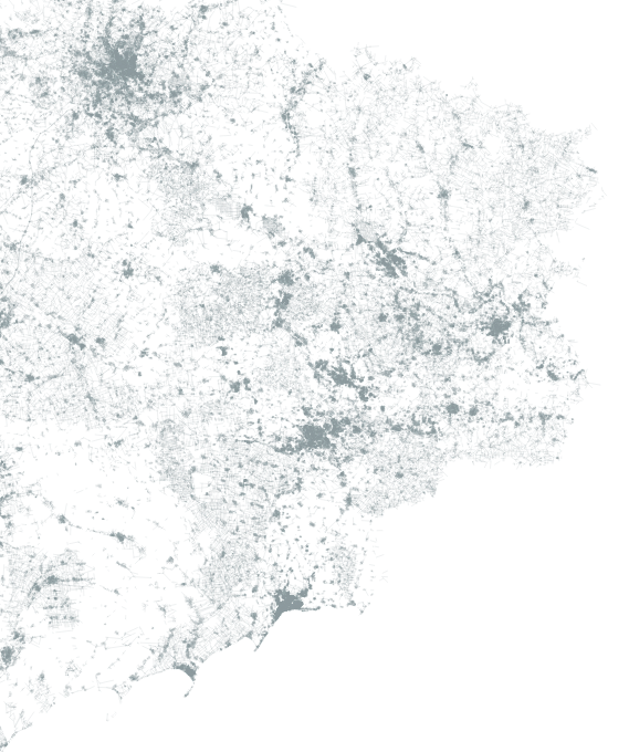
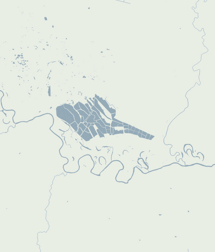
Recently I have been working on maps, maps and more maps. I really like the world of cartography, although I’m not a cartographer a lot of my work includes trying to make maps for news. –My apologies to my carto-friends who actually do this properly, I’m just an enthusiastic fan with perilous initiative. 🤣
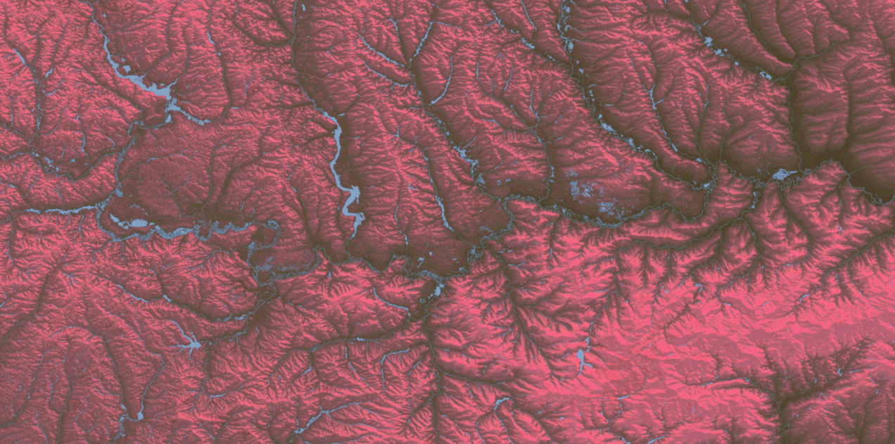
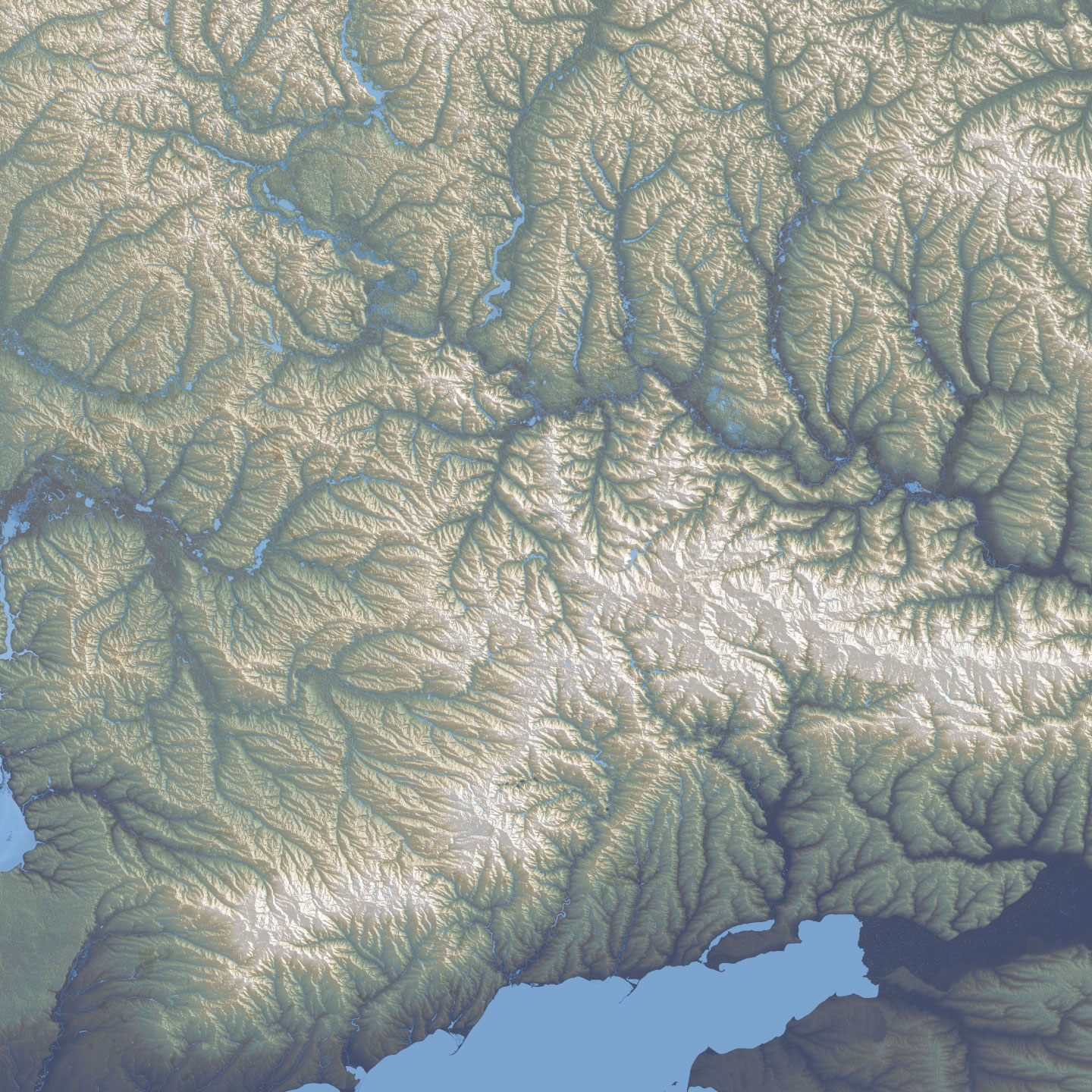
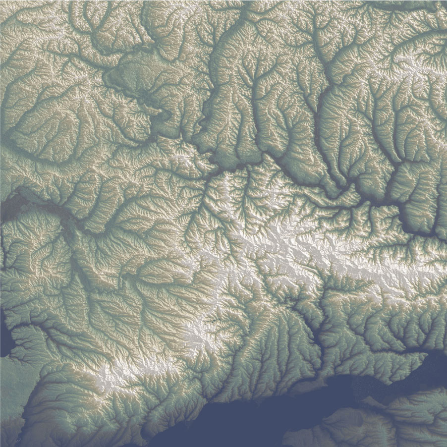
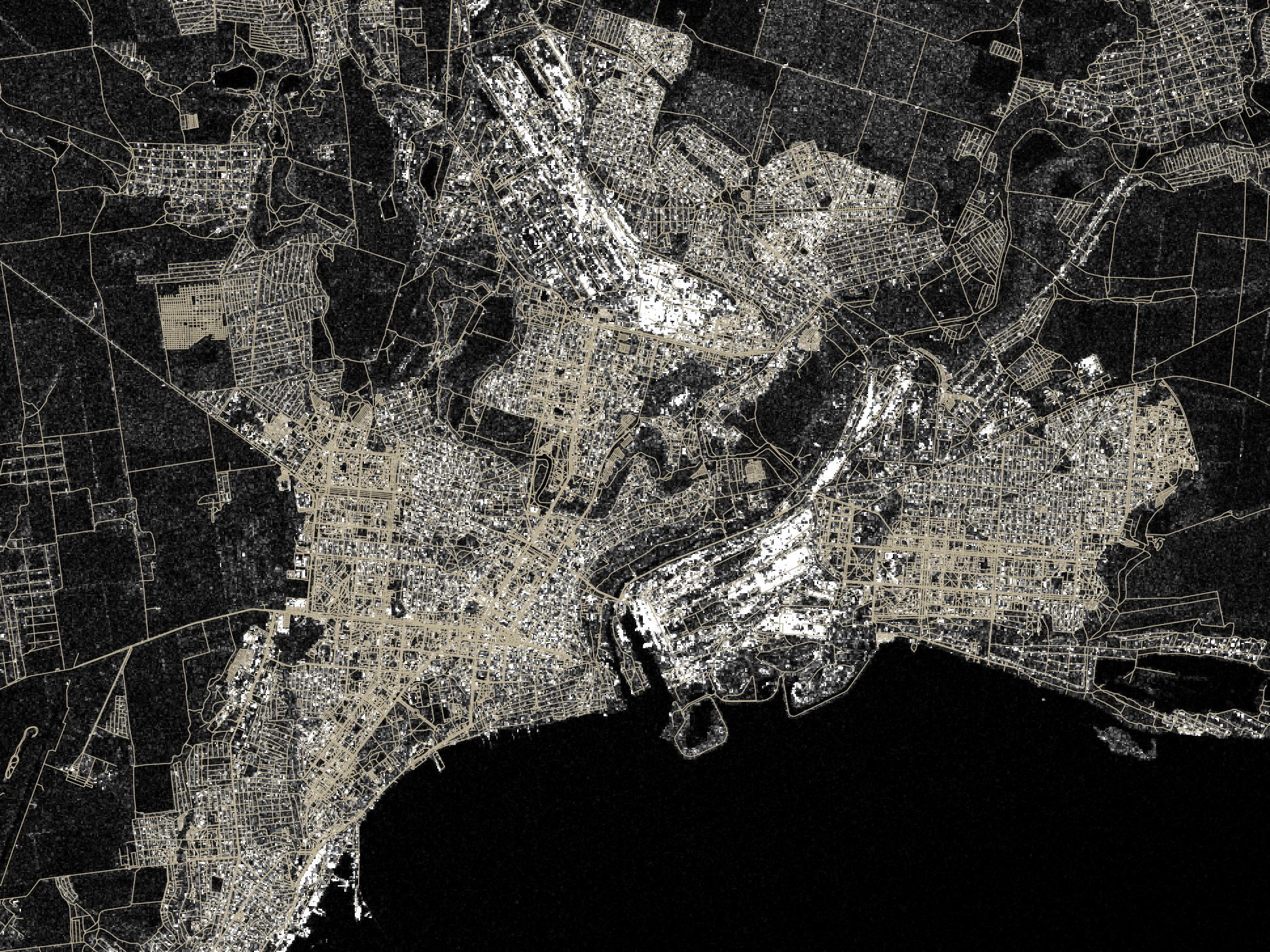
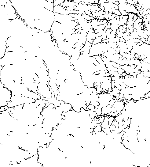
Since I moved to the NYT, I have been in a process of rebooting, adjusting myself to the new environment learning new stuff and understanding how things work in this side of the world. But as usual, while I’m executing random ideas I have left behind a bunch of un published visuals like the screengrab at the top of this entry which is a DEM of an area of eastern Ukraine.
For nerdy purposes, the image at the top and the following are SRTM elevation and Open Street Maps data processed with QGIS with a little color retouch in Photoshop.
A failed map of eastern Ukraine.
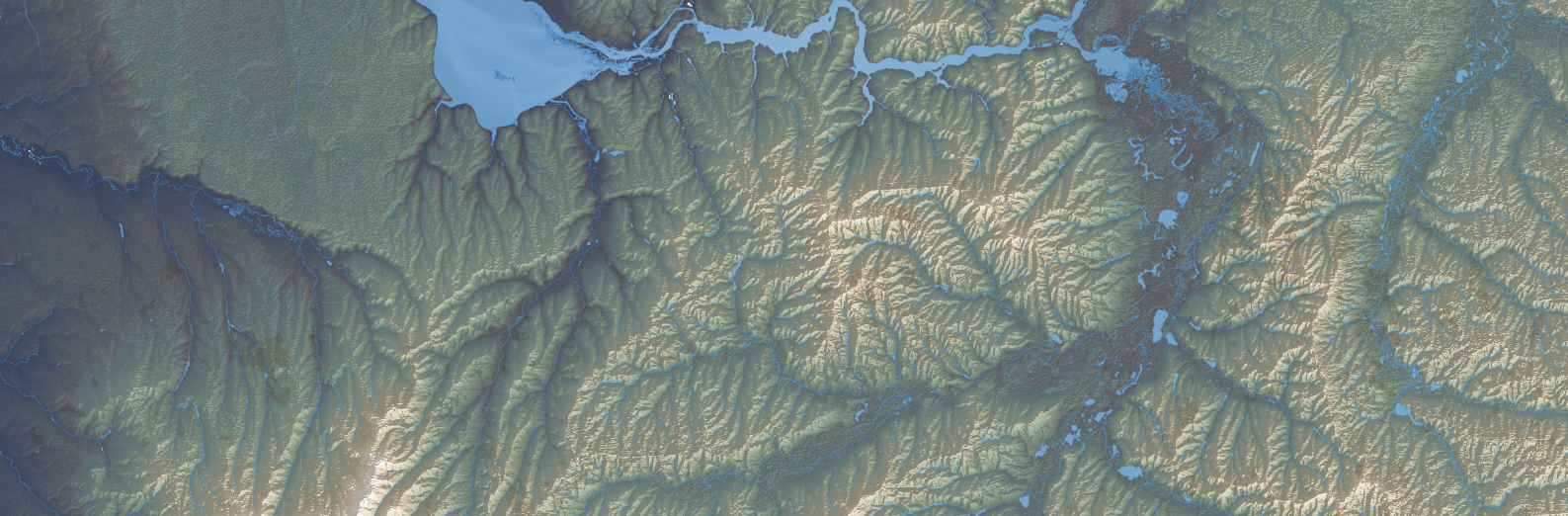
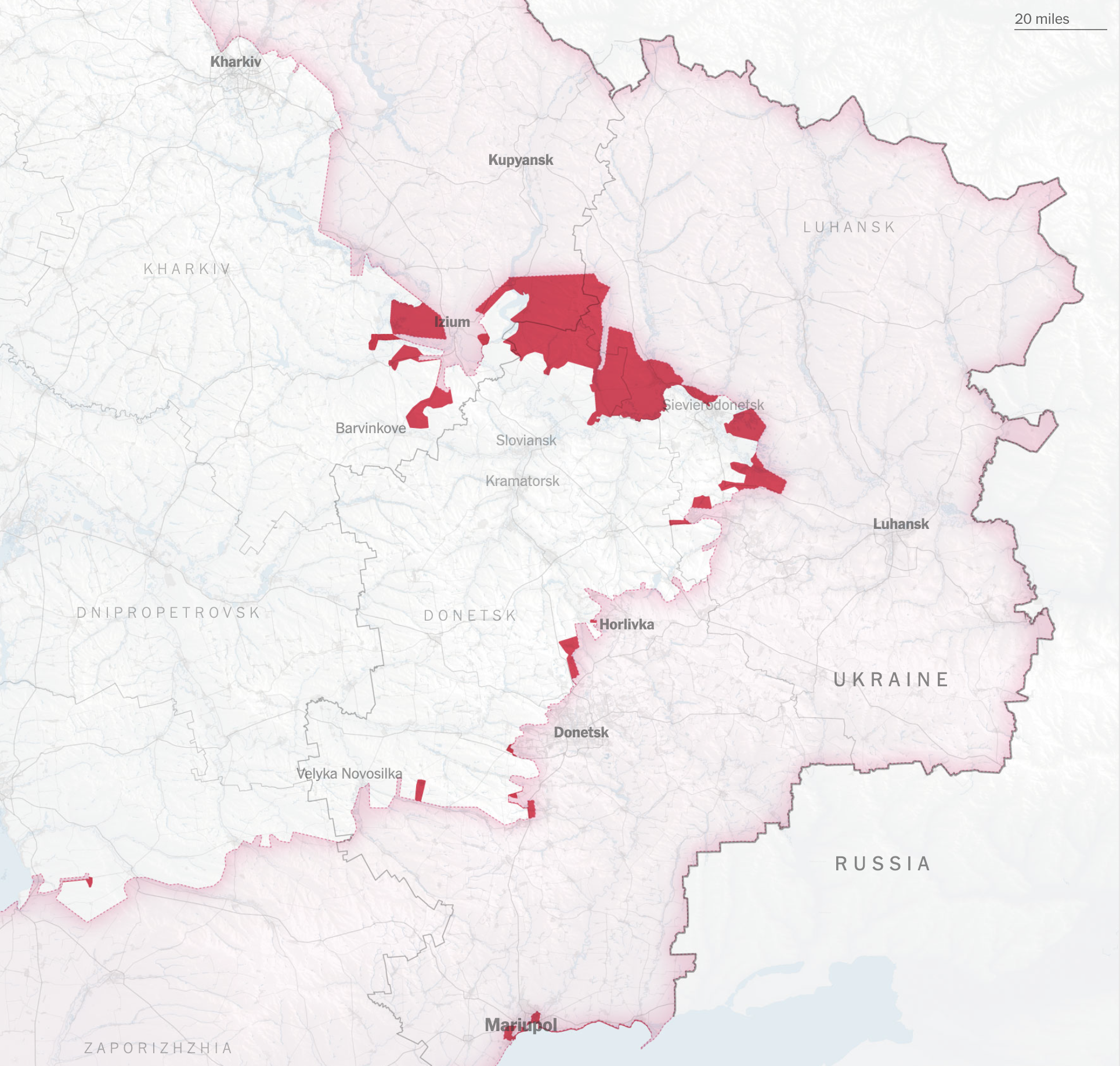
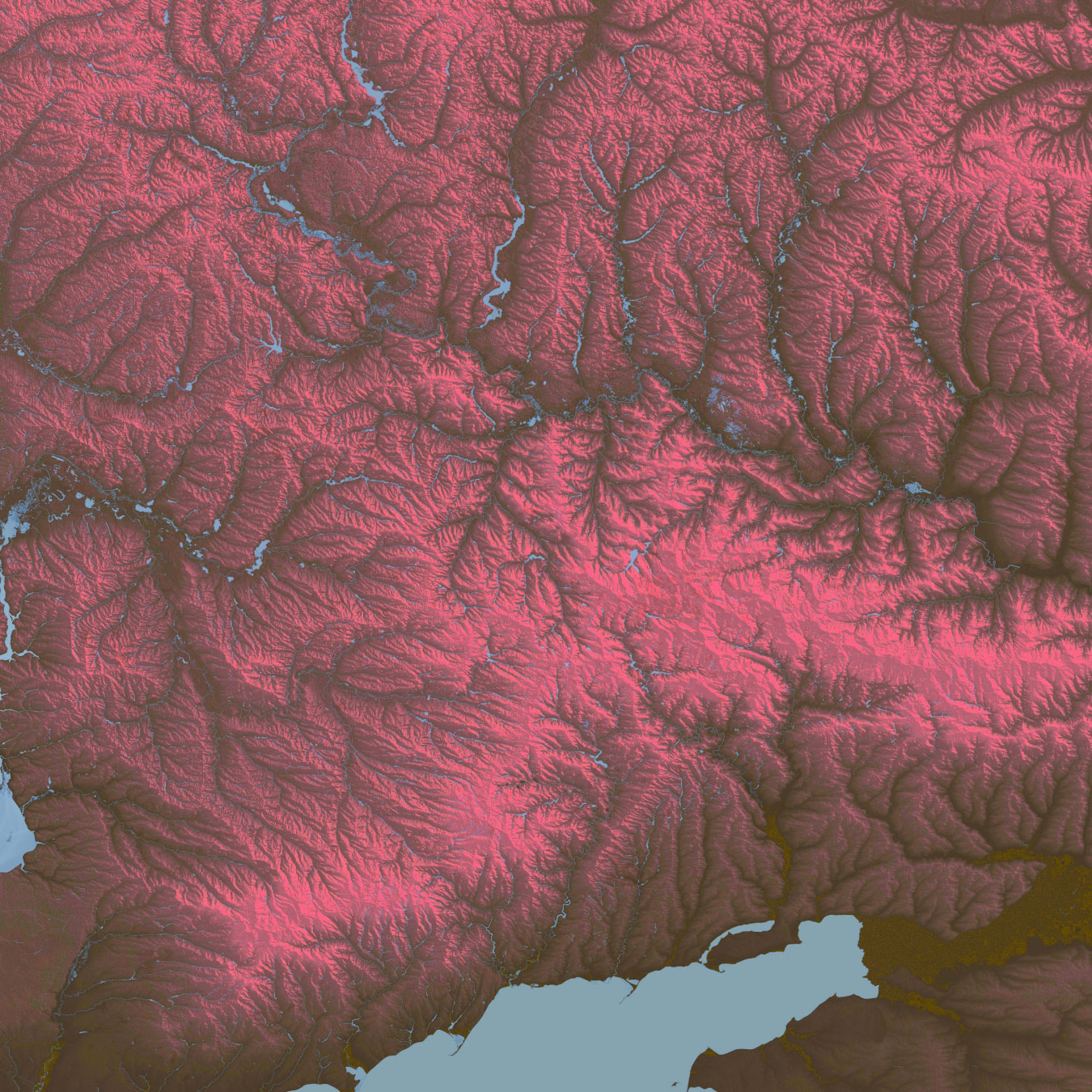
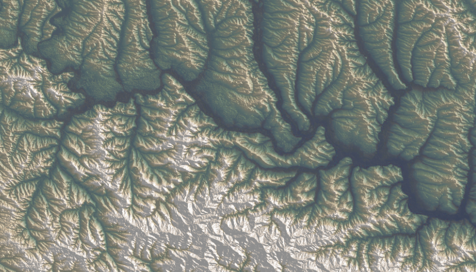
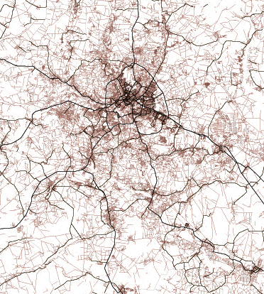
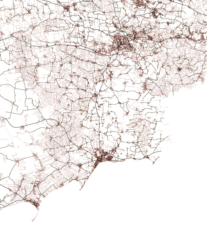
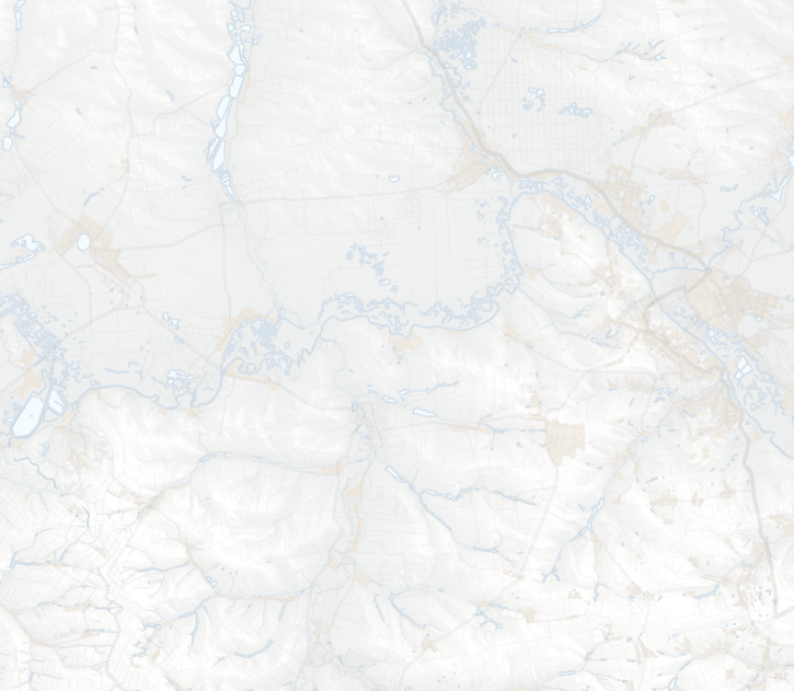
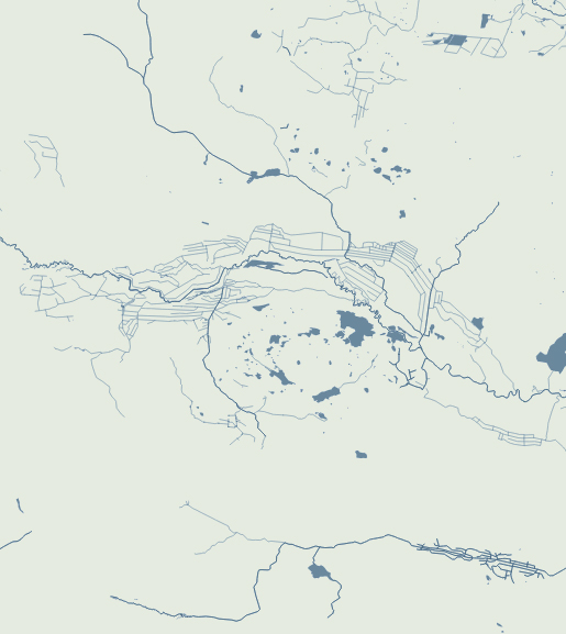
Of course these detailed images doesn’t work well for the purposes of the news story I was working on. If you have seen our Ukraine maps coverage, you’ll notice that while our maps have evolved, they also keep consistency somehow. To be honest, I made those alternate versions because I couldn’t stop thinking about how this would look in another style. You can see what I mean below, these are the same area in eastern Ukraine rendered for different purposes:
Alternative terrain section of eastern Ukraine including part of the Sea of Azov at the bottom
Screenshot of the piece published by the New York Times
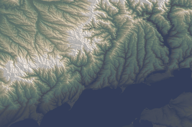
Alternative terrain section of eastern Ukraine including part of the Sea of Azov at the bottom
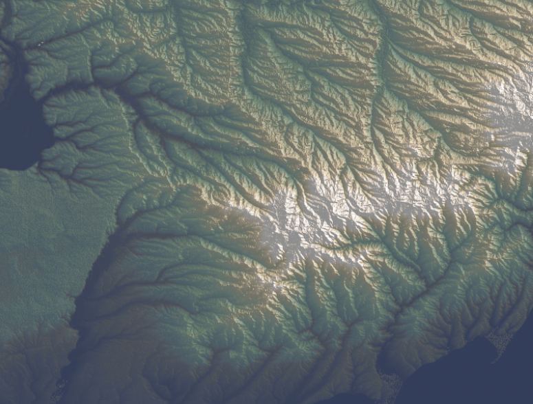
Here are some closer shots of that map above, the geography of this region of Ukraine is marvelous.
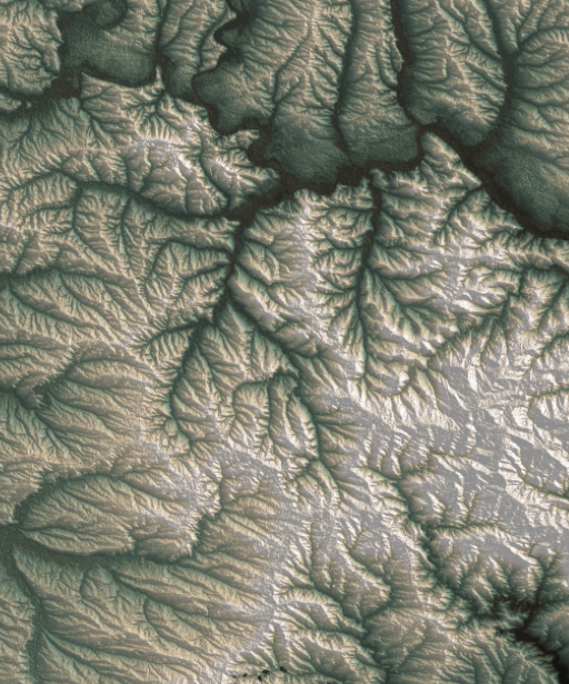
There are so many of these maps, I have literally spent months looking at the progress of the war with maps, many different approaches and a heavy editing process of what takes place until the final version of the story. It is a strenuous process but super interesting at the same time. I feel very grateful to be able to see all this and be part of the search for the truth to inform the readers of the NYT.
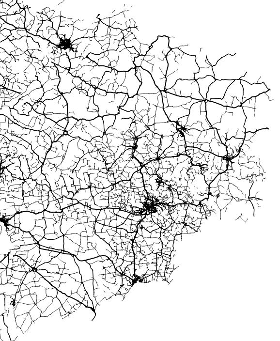
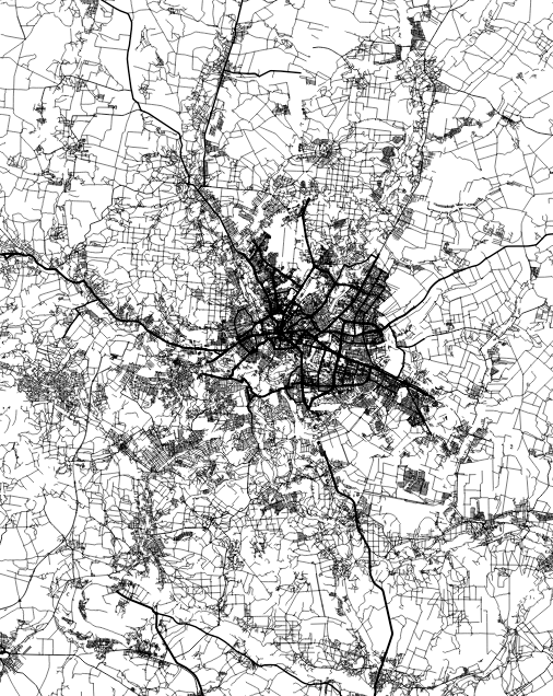
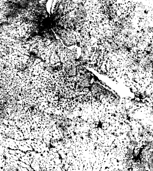
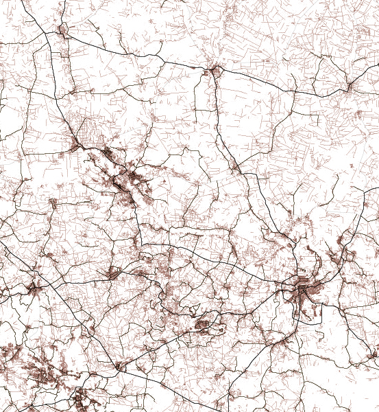
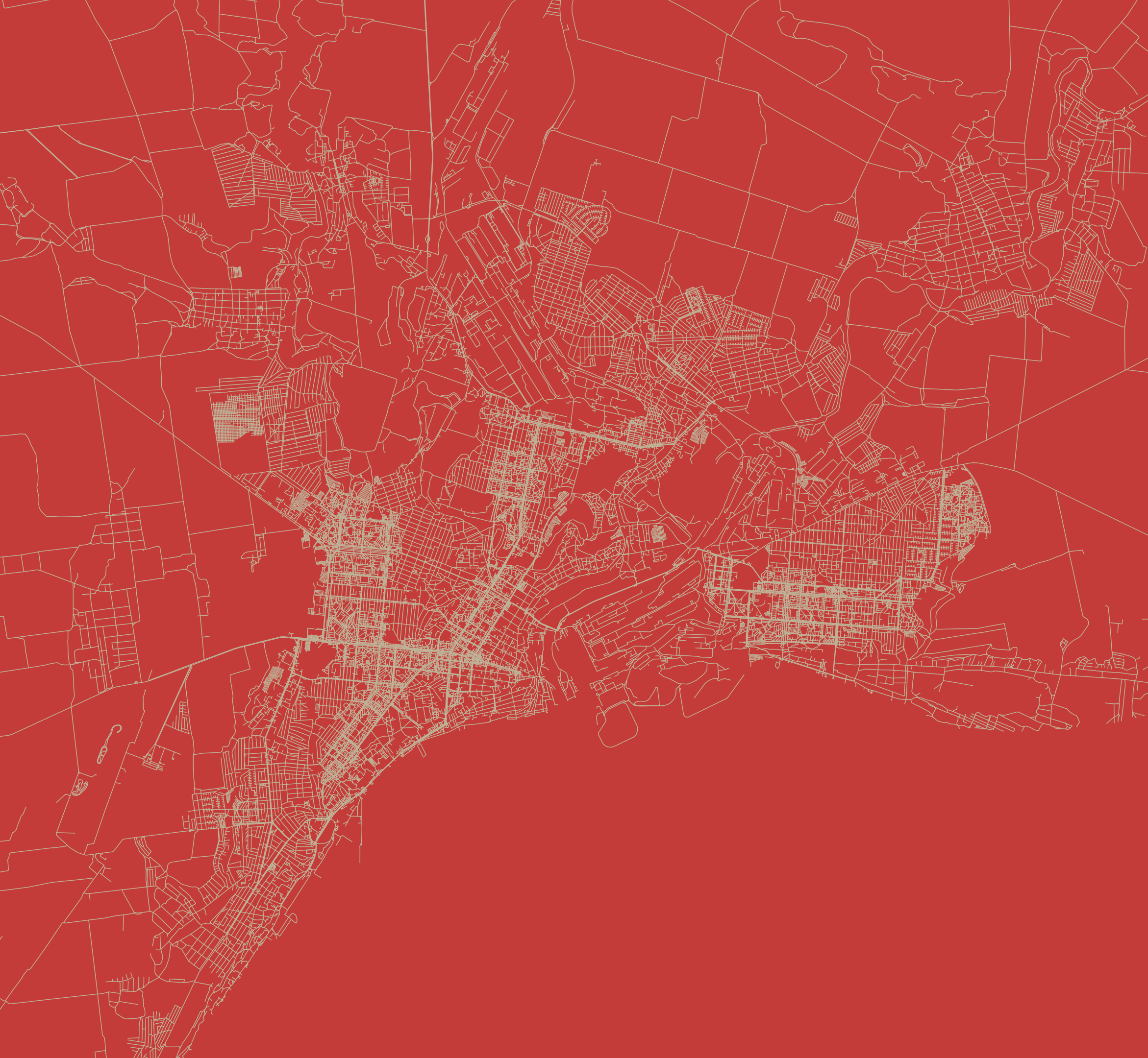
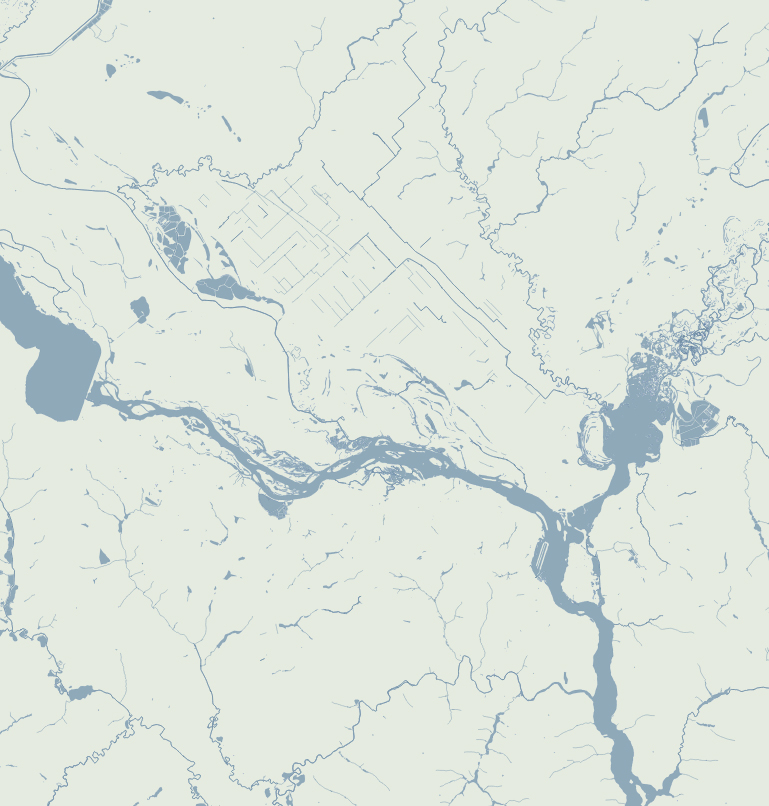
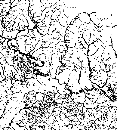
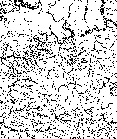
Basic vectors
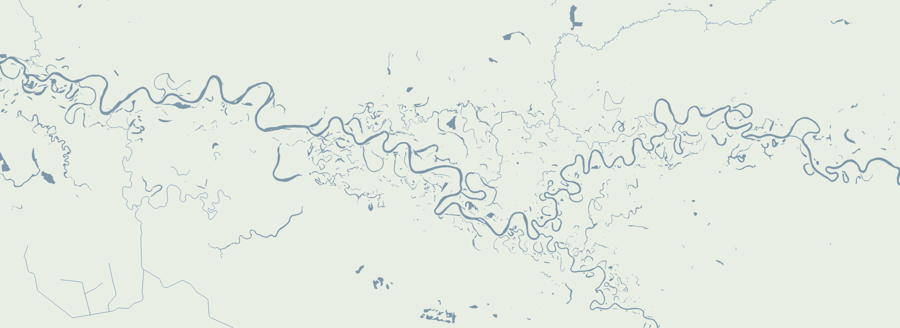
There’s something with the base layers, is amazing how you can see the population density of a place just by plotting roads. Some areas with certain road layers look like leaves or some kind of vein system. [ Click on the images to see a larger single image ]
The same thing happens looking at water features, some times you are able to see canals making geometric patterns in contrast to the organic river beds.
Since Ukraine has vast tracts of land dedicated to agriculture, those patterns are clearer in some regions, however the rivers and lakes are still fascinating as well.
About #infofails post series: I truly believe that failure is more important than success. One doesn’t try to fail as a goal, but by embracing failure I have learned a lot in my quest to do something different, or maybe it is because I have had few successes… it depends on how you look at it. Anyway, these posts are a compendium of graphics that are never formally published. Those are maybe tons of versions of a single graphic or some floating concepts and ideas, all part of my creative process.
In short, #infofails are a summary of my creative process and extensive failures at work.
Are you liking #infofails?, have a look to previous ones:
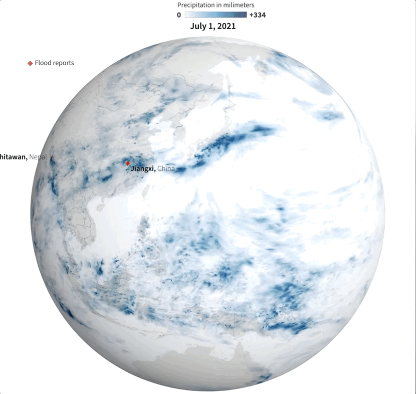
Last July was a crazy month full of flood news all over the world. I remember seeing impressive videos and images of the floods in China and Germany, and digging a little deeper I found many more reports about it from around the world. I tried to put some things together, but time and other projects played a trick and the project became material for #infofails.
Some times taking notes of things isn’t enough for me. One or two illustrator artboards with basic ideas have become the new “office whiteboard sessions” since we started remote work. Quick sketches and some data samples usually help me to organize myself better.
Sampling flood reports and daily precipitation data.
I collected some data from NASA including the PPS and MERRA-2 to visualize precipitation. It was so cool when I saw the data of total rainfall in a month over the planet. Is curious to see how dynamic our planet is isn’t?
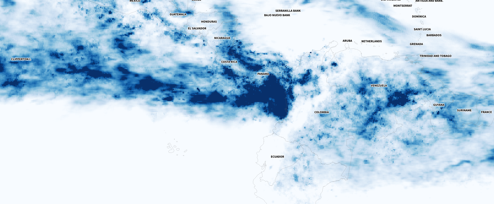
July’s total precipitation. Data by NASA’s Precipitation Processing System (PPS)
Whenever I have a global data set, I always look at how things are for my family and friends in Costa Rica. I remember that in July I had seen videos of flooded areas in Turrialba, a region in the Atlantic region of the country. And yes, the accumulated data showed that intense blue layer near the border with Panama.
Detail of the precipitation data. NASA PPS.
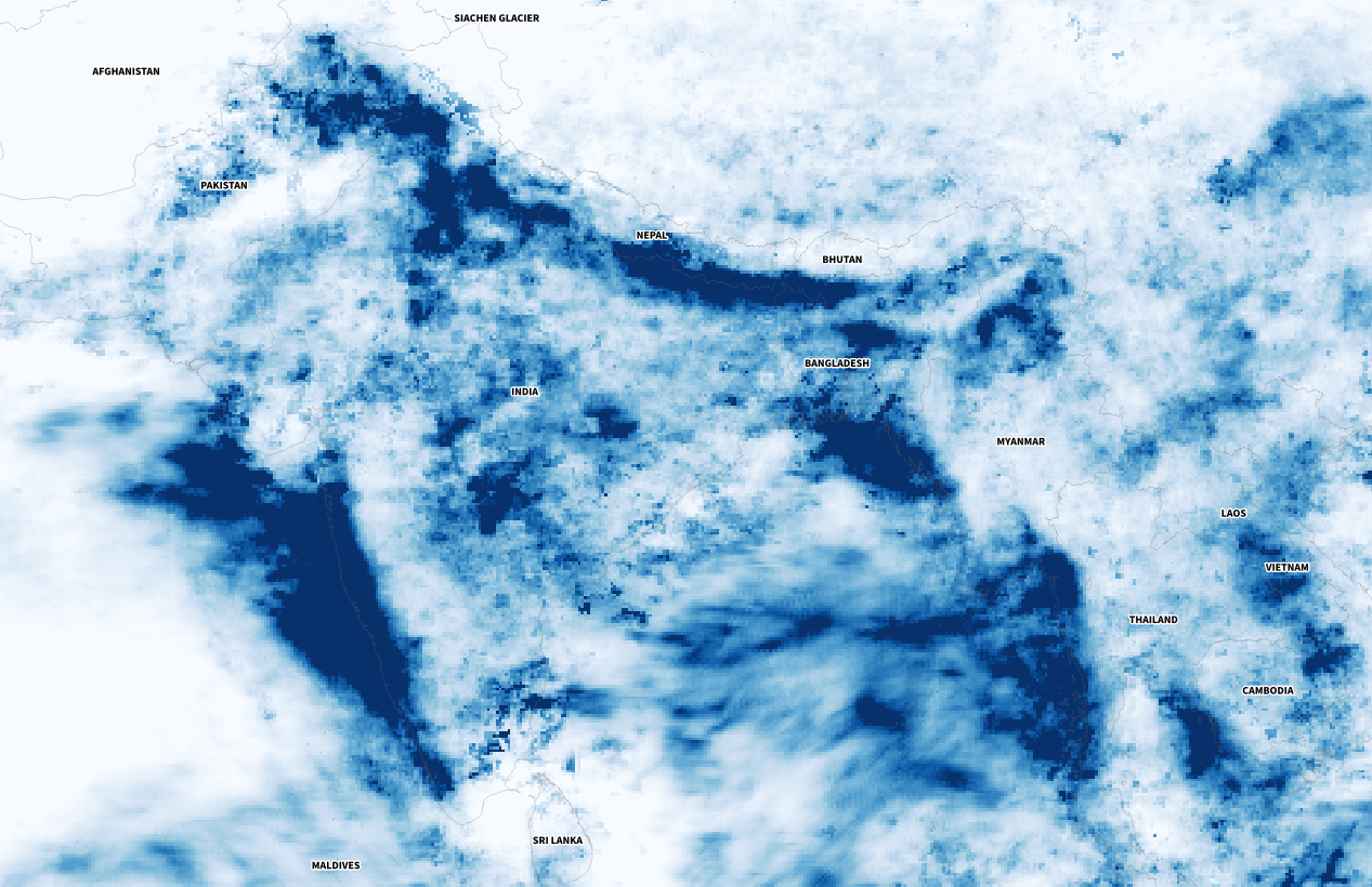
Of course, there were other much worse areas that saw terrifying amounts of precipitation causing dozens of deaths, western India for example was one of those areas. I continued to explore a bit more on the map and checking against the flood reports I found to find points of interest and to highlight later in the story.
Detail of the precipitation data. NASA PPS.
The testing continued
One aspect to consider was how to visualize the data in the end. There was even a 3D spinning globe in the process… As you can imagine it was chaos displaying flood reports, animated rain data, and 3D navigation all at the same time.
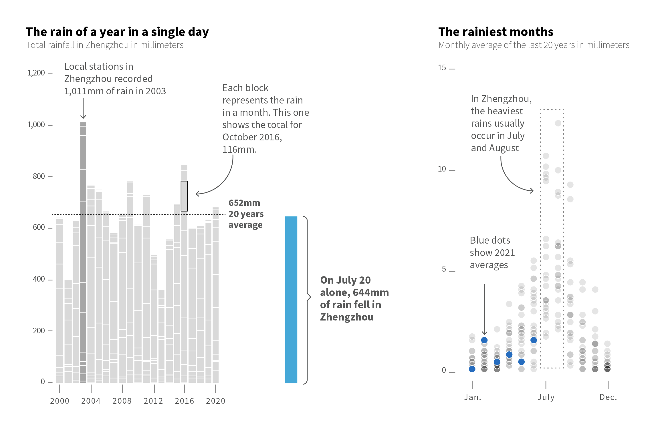
However, one of my favourite pieces was not the maps. There were some small graphics to condense powerful messages had something interesting too. Within them was this simple stacked bar chart where each block showed the total precipitation each month in Zhengzhou, just by putting the amount of water they received on July 20 next to it was really impressive. This is real evidence of how extreme our planet’s climate is becoming.
BTW, there’s also a great graphic from the South China Morning Post friends explaining the huge amount of water that Zhengzhou received over the downpours [ check that story here ]
Extremes
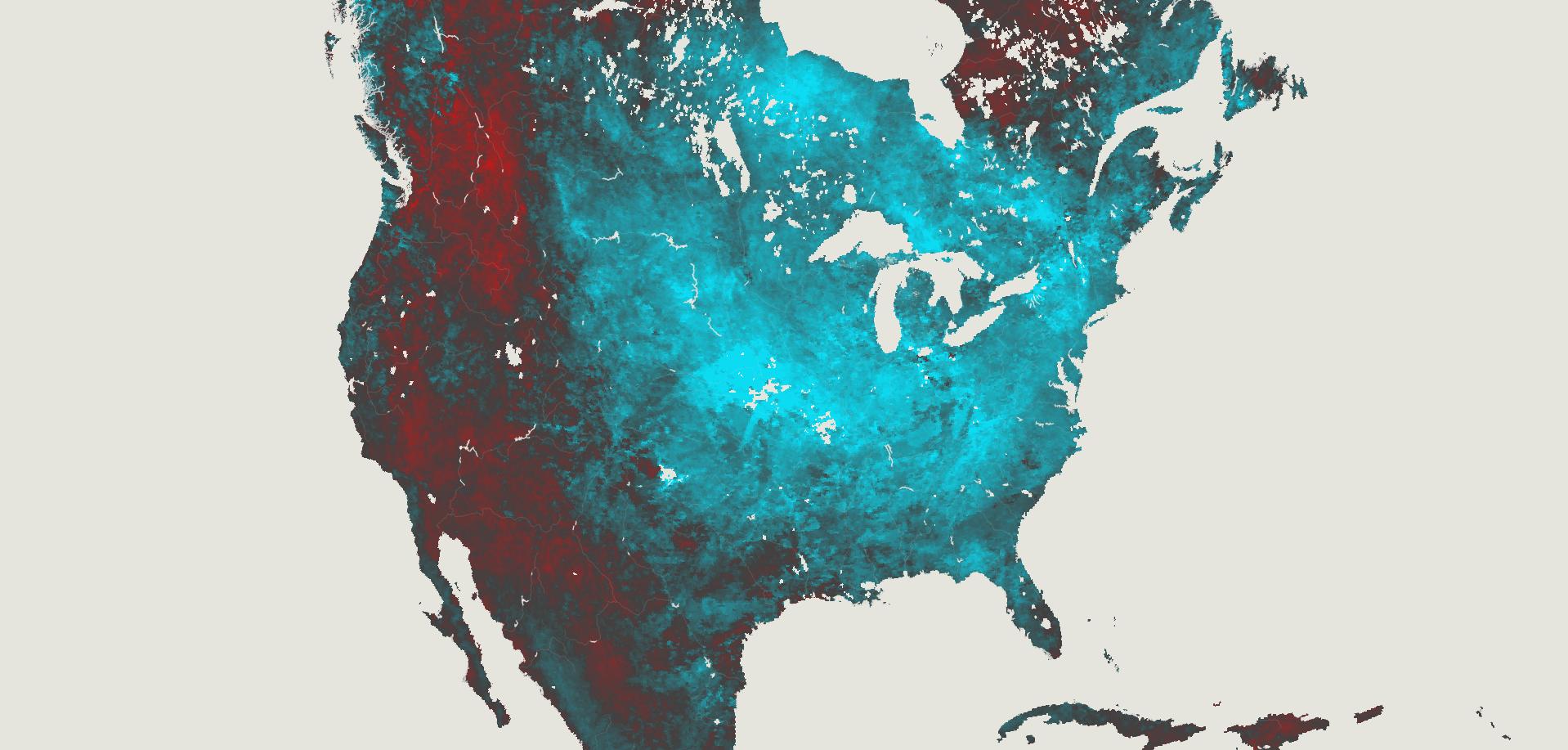
A few years ago I was working on a graphic about extreme temperatures of the earth, it was happening the 2019 polar vortex in the US and at the same time Australia was on 40° C on the other side. In my head, the perfect title was “Earth’s Goldilocks Climate.” It sounds crazy but it is actually very common, our planet is full of those strange contrasts all the time.
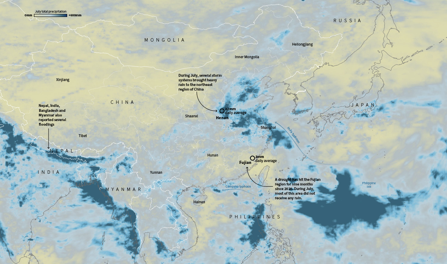
In July China was having its own ‘goldilocks’ event, or kind of, because wasn’t temperature. As enormous amount of water flooded train stations and caused chaos in Henan, south of there a nine-month drought hit Fujian province.
July total precipitation in China. Data by NASA PPS
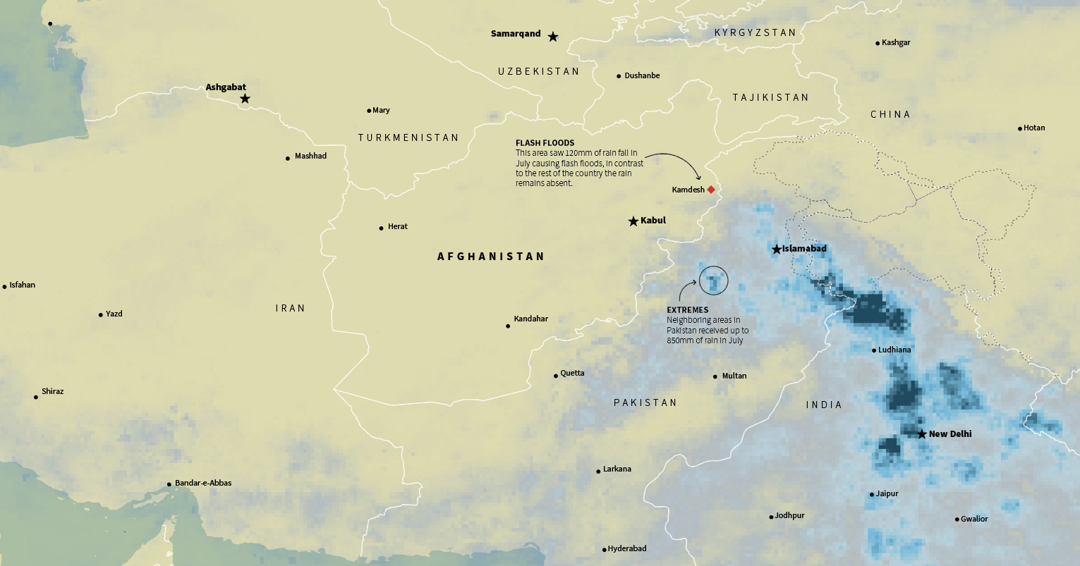
Similar situations occurred in the Middle East, in Afghanistan a long drought was worsening the already difficult situation of the Afghans. Ironically, extreme rains in the border areas also caused flash flooding, while the country as a whole has not seen any rain for months.
July total precipitation in the Middle East. Data by NASA PPS
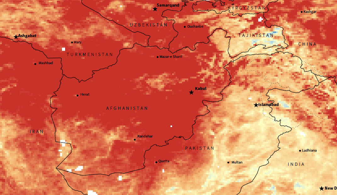
NASA’s MODIS/Terra offers also daily and monthly averages of surface temperature. This was some other stuff I was considering for this story. It’s incredible to see how high the temperatures go in the region. There’s also an other cool data set of monthly temp. anomalies here in case you want to explore the world too.
Temperature anomaly for Feb. 2021. Red areas show were the temp. was higher in comparison with the averages of 10 years ago. Afghanistan was about 12C warmer in average according to NASA Earth Observations data. LPDAAC and MODIS.
Anyway, none of these charts, maps or data made it into a true story on Reuters, but it was fun collecting, preparing and sketching ideas for it. And of course, in the end it became an average #infofails story here. Maybe later we will take back again this story, unfortunately extreme weather events are becoming more and more frequent
About #infofails post series: Graphics that are never formally published. Those are maybe tons of versions of a single graphic or some floating concepts and ideas, all part of my creative process. All wrapped up in #infofails, a compilation of my creative process and failures at work.
Did you like #infofails? Have a look to other #infofails 👇