Late on March 2026 I published the first piece about the latest NASA’s mission to the moon. However, the planning behind started just when I came back from the holidays the first week of January.
We had a lot of meetings with editors to make a plan for all the pieces we wanted to do, but there was one in particular that took me into a wild ride that included a lot of documentation and manual crafts, here’s a little behind the scenes of that project to produce a ~2min video.
A spark of inspiration
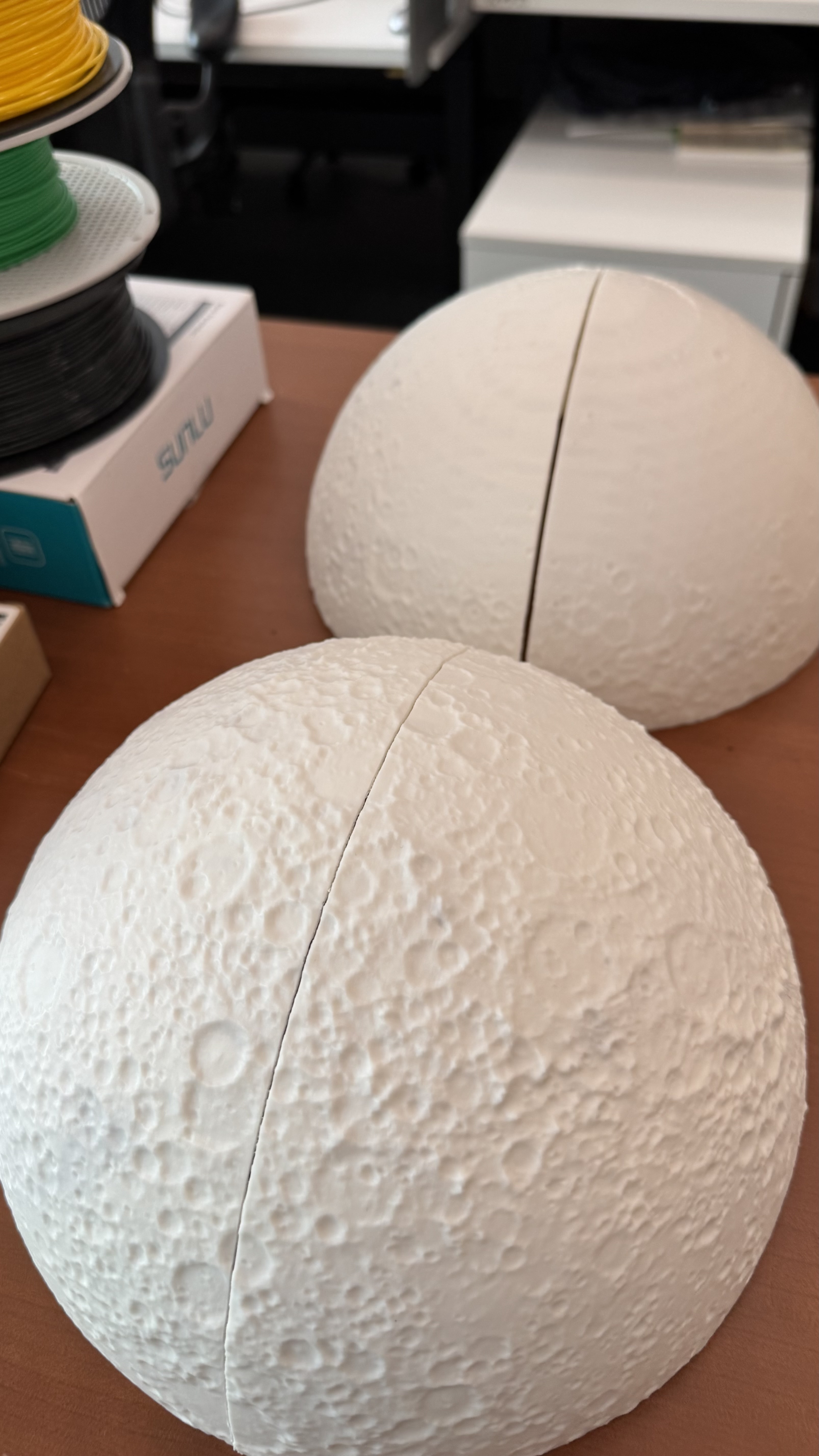
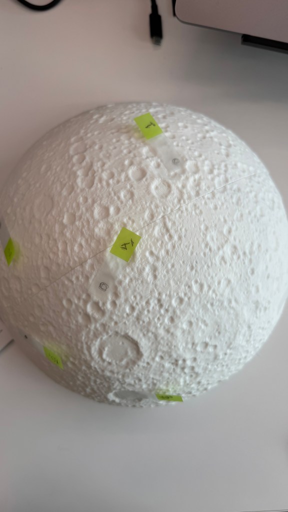
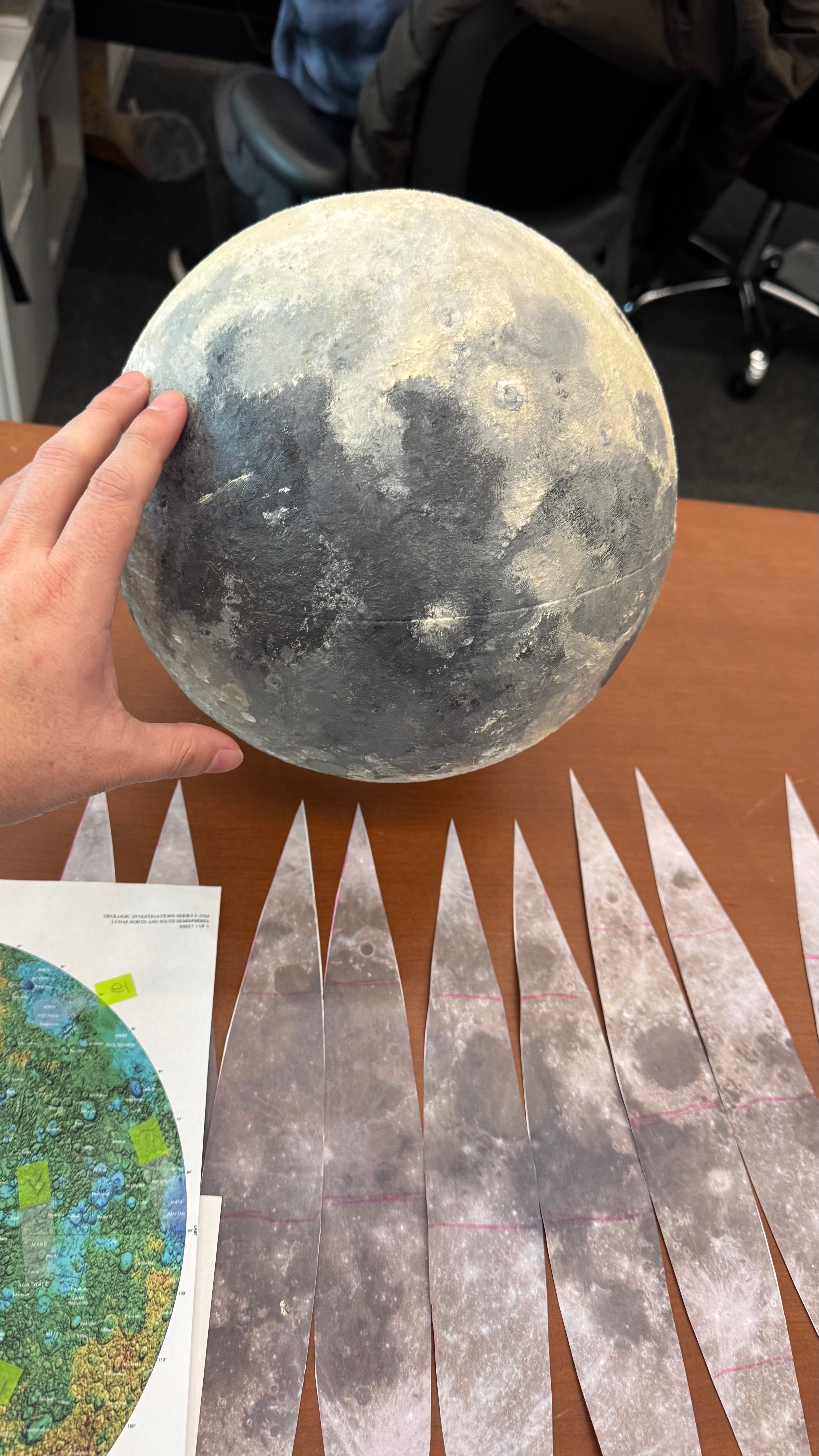
During a call with NASA’s PR team, they mentioned that the Moon will look about the size of a basketball held at arm’s length from the spacecraft window. This was mentioned repeatedly on various sites. I noted this down because I was already thinking to do a video explaining what astronauts will see while flying over the far side of the Moon, but after that statements, I was considering to use a printout of the Moon, the same size as the astronauts will see it, an sphere of about 9,4 inches.
Gathering data
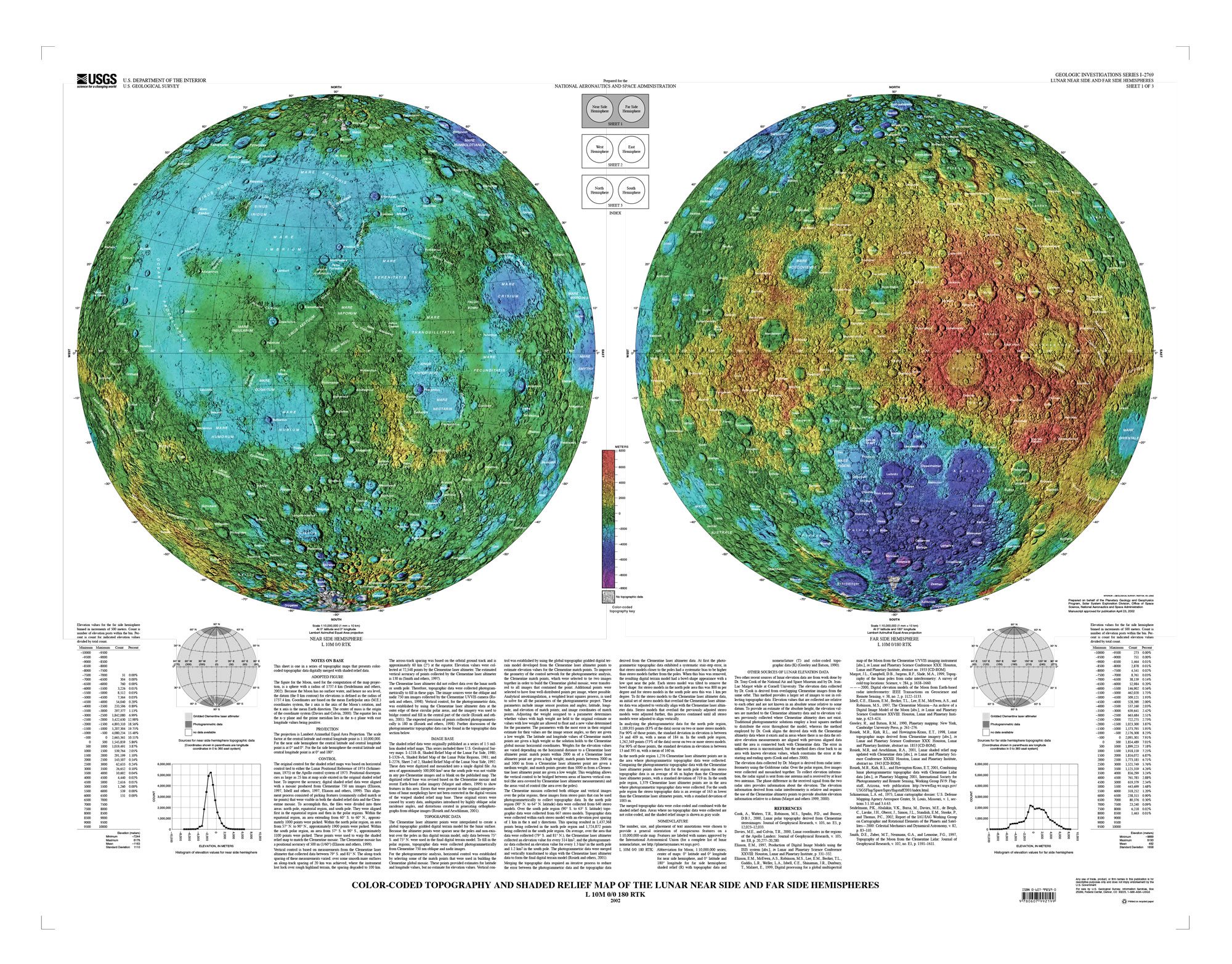
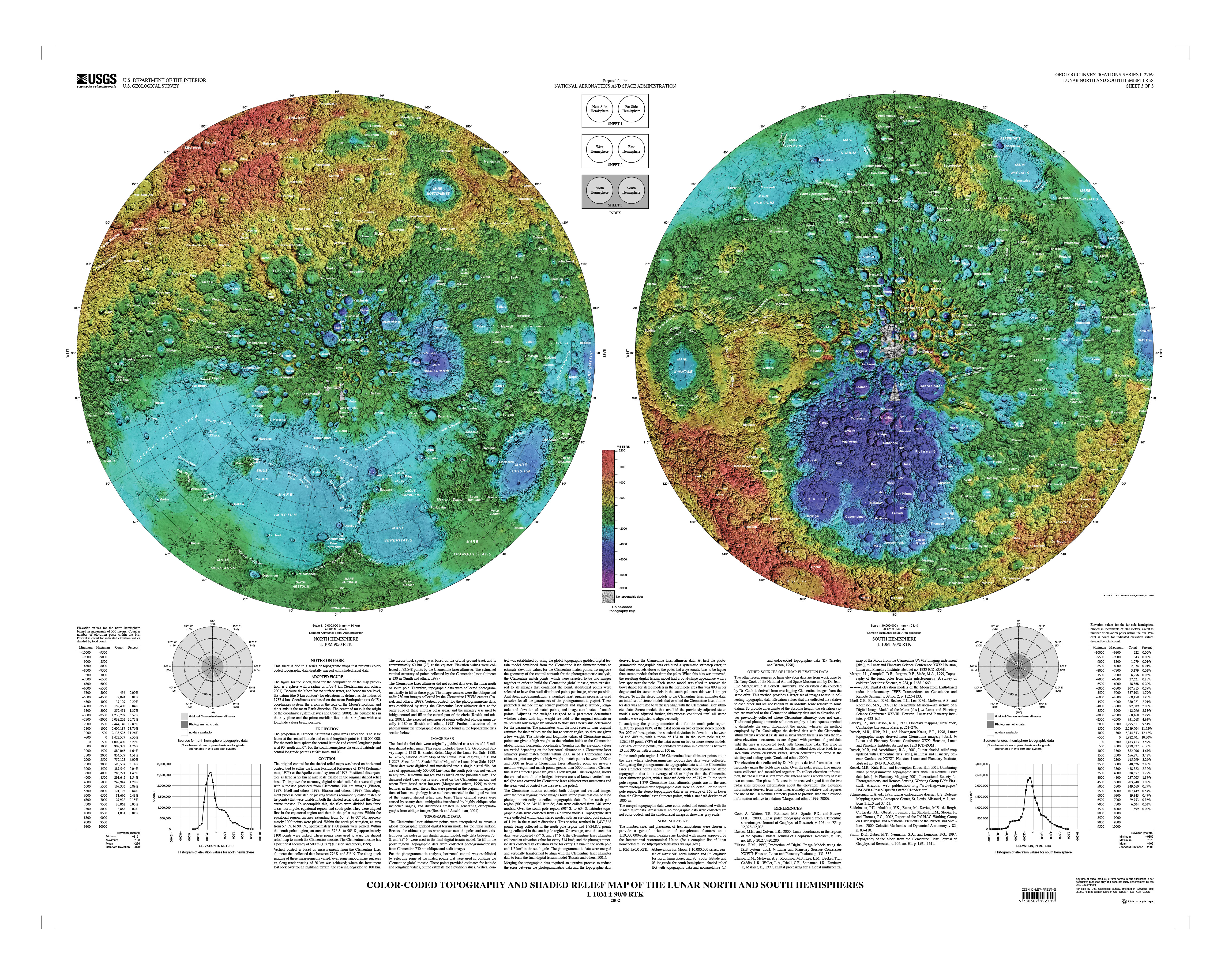
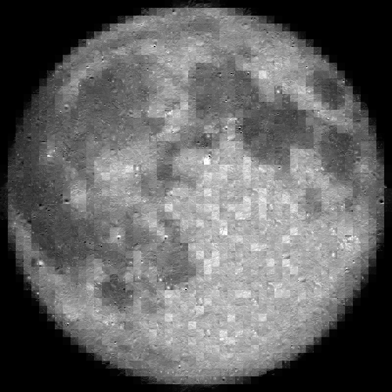
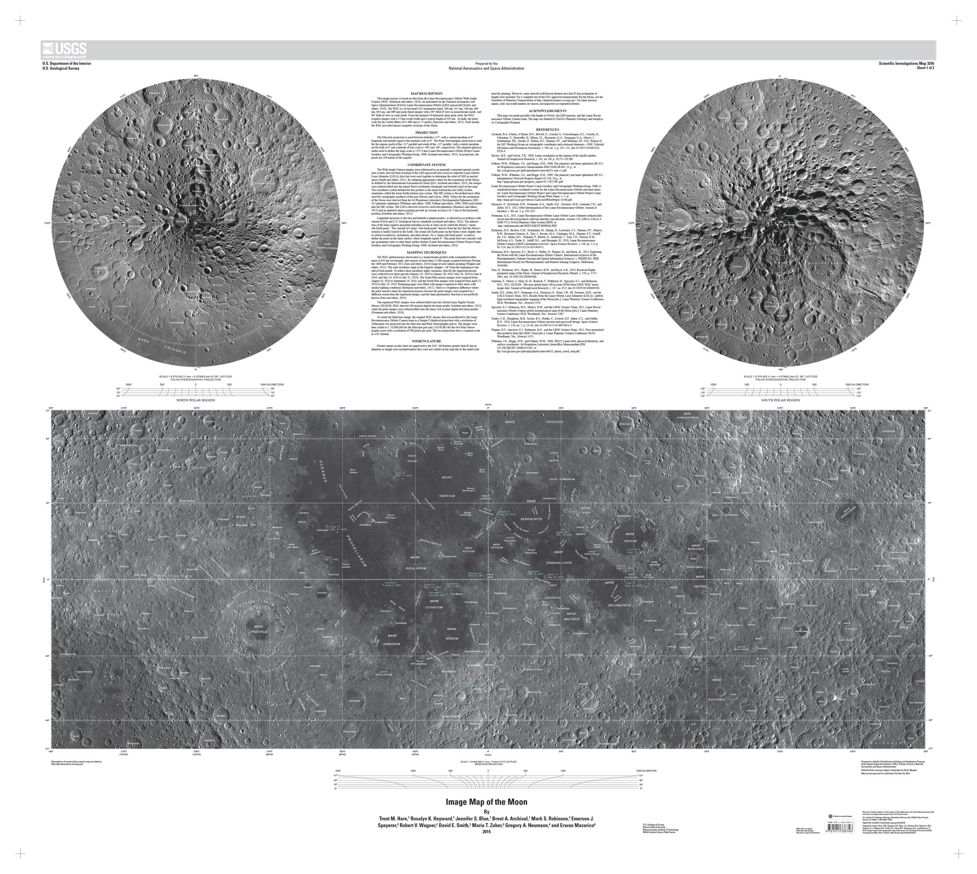
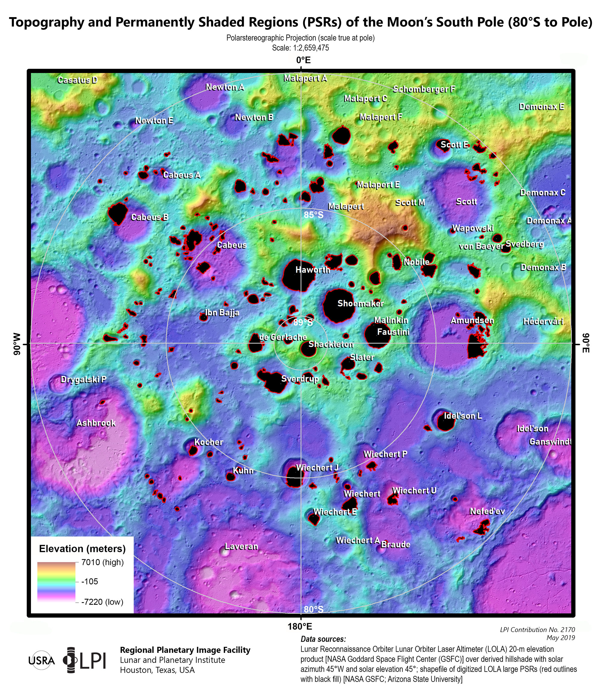
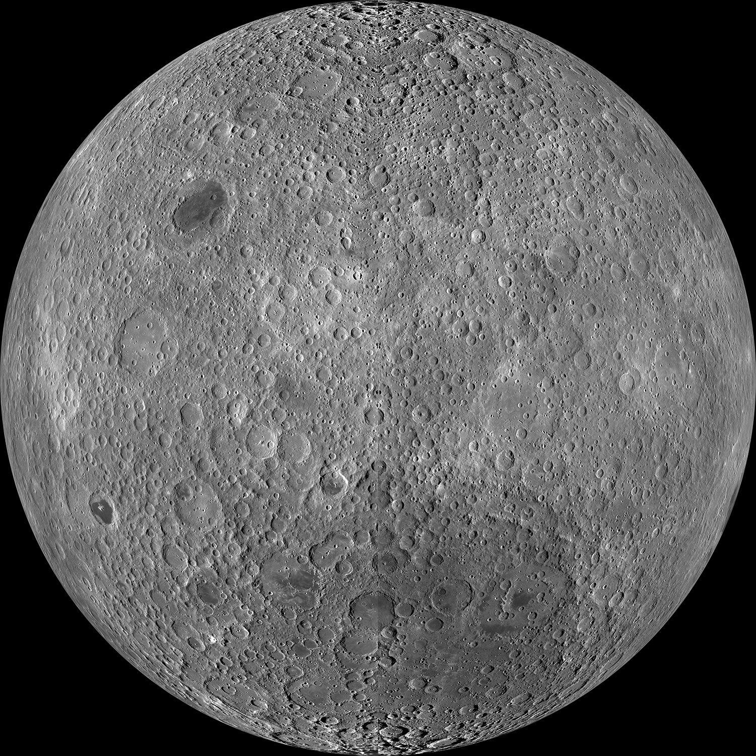
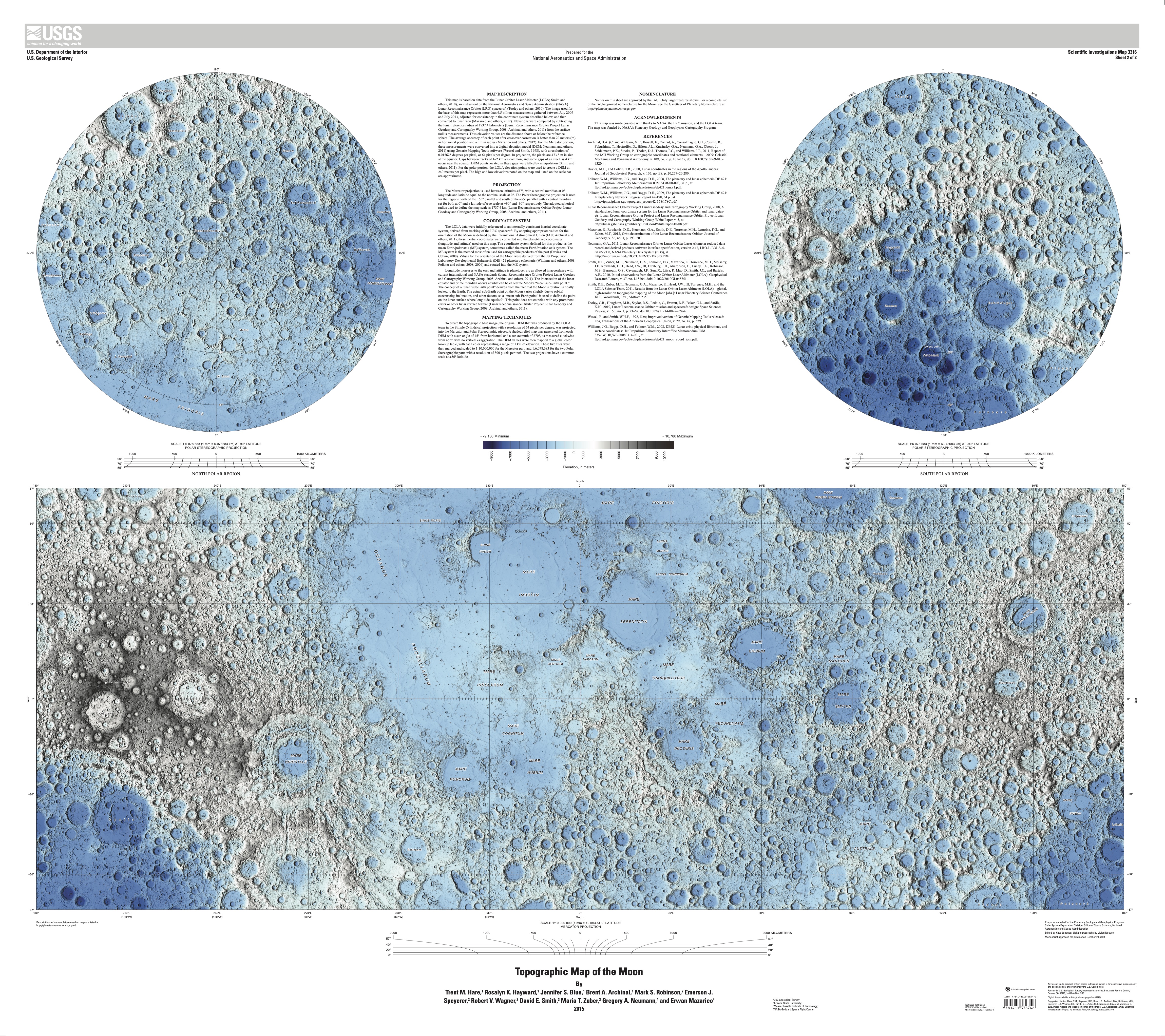
The first thing in my to-do list was to familiarize myself with the geography of the moon. NASA said that Artemis II astronauts took geology and cartography classes, so if I was meant to explain something to the readers, I probably should do something similar. So my ride started with the many USGS maps in different projections and themes.
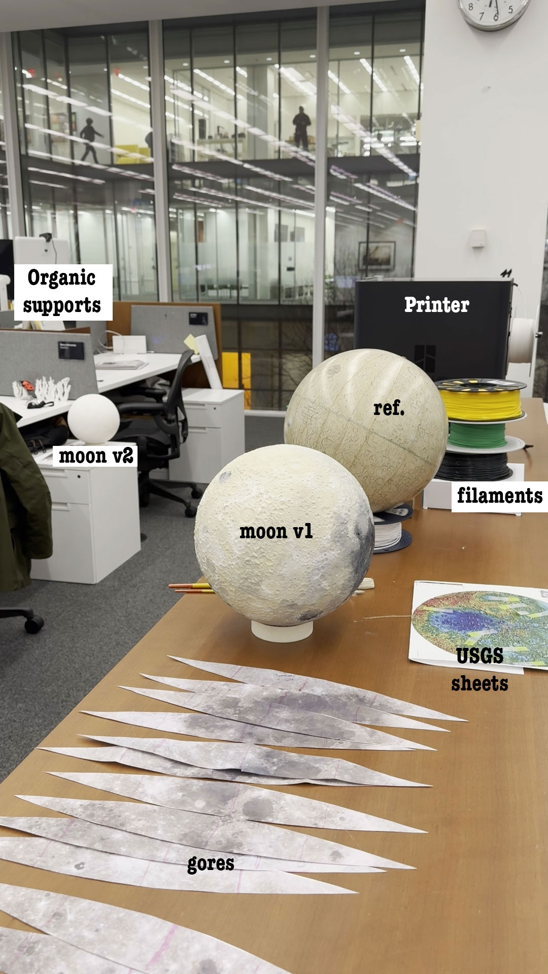
Some gigabytes and a few days later, I started to look at the 3d models with a little more of confidence, I made a small test printing a section of my model to try on the paint.
3D printing
Messing around with the 3D printer was a hoot! I hit a few bumps with the filaments, because our team has a Bambu Lab printer that feels like it has a mind of its own. I learned that generic filaments are great for tiny trinkets but a disaster if you leave the printer unsupervised for more than an hour. It was like leaving a toddler with a bowl of spaghetti; I had to stand by de-entangling the roll to get that first sample out. After a shopping spree for some new, tougher filaments, the drama was finally solved.
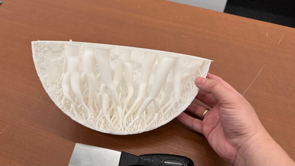
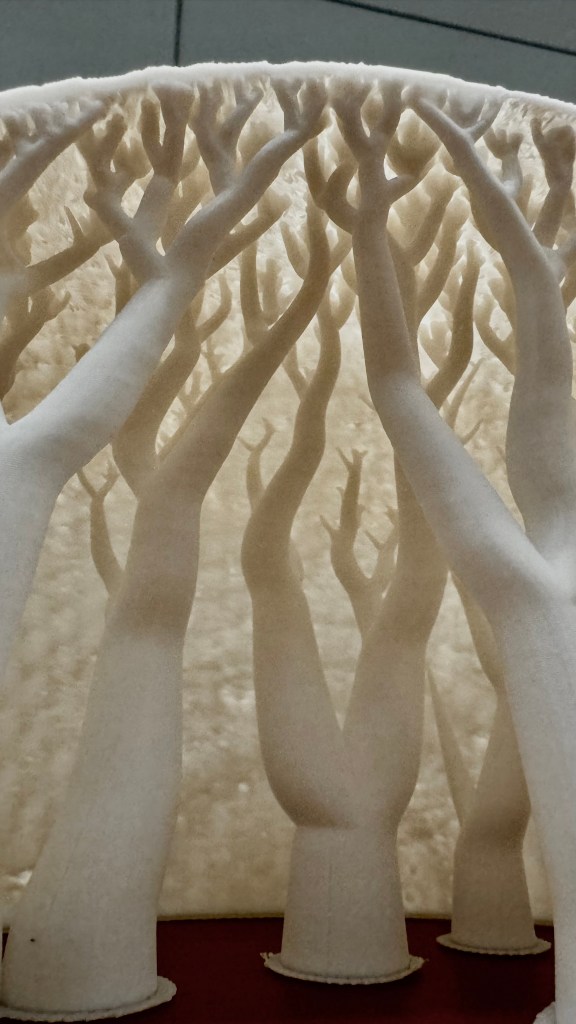
The printer comes with its own software that plays detective on your 3D model, helping you find those sneaky weak spots. These printers melt filaments and whip up thin layers to serve your model, so, if your model isn’t properly built, you may end up with miniature Swiss cheese holes or cantilevers that can potentially transform your model into a gooey glob that looks like it just lost a battle with a pack of chewing gum.
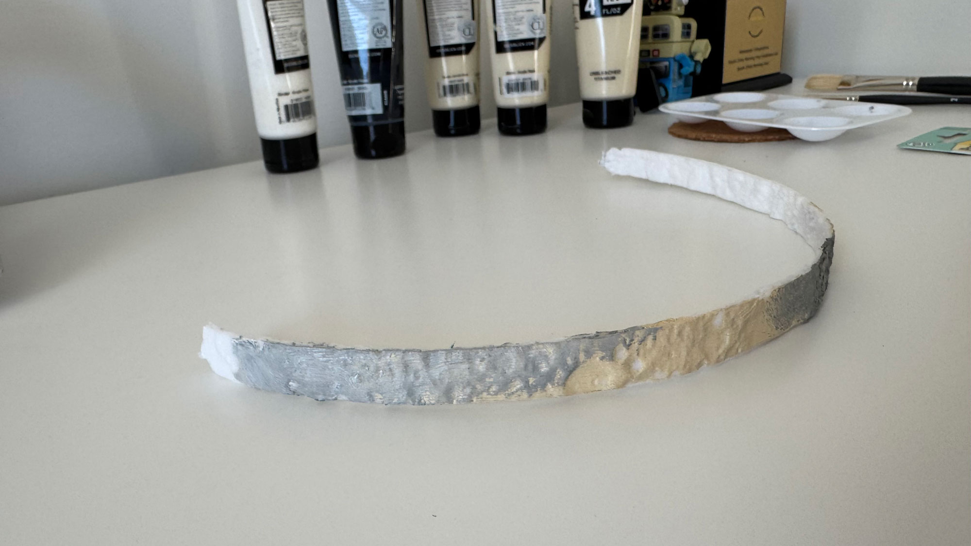
For the first full test, I printed out 4 wedges, I inspected the model and added organic supports to prevent the collapse of the model. The structure is actually very nice:
However, these organic supports only serve as support while the model is still hot. Once they cool down, you can just removed them. No one will see them because you have to glue them together.
How to paint it
Next step was to paint the model, pretty fun!
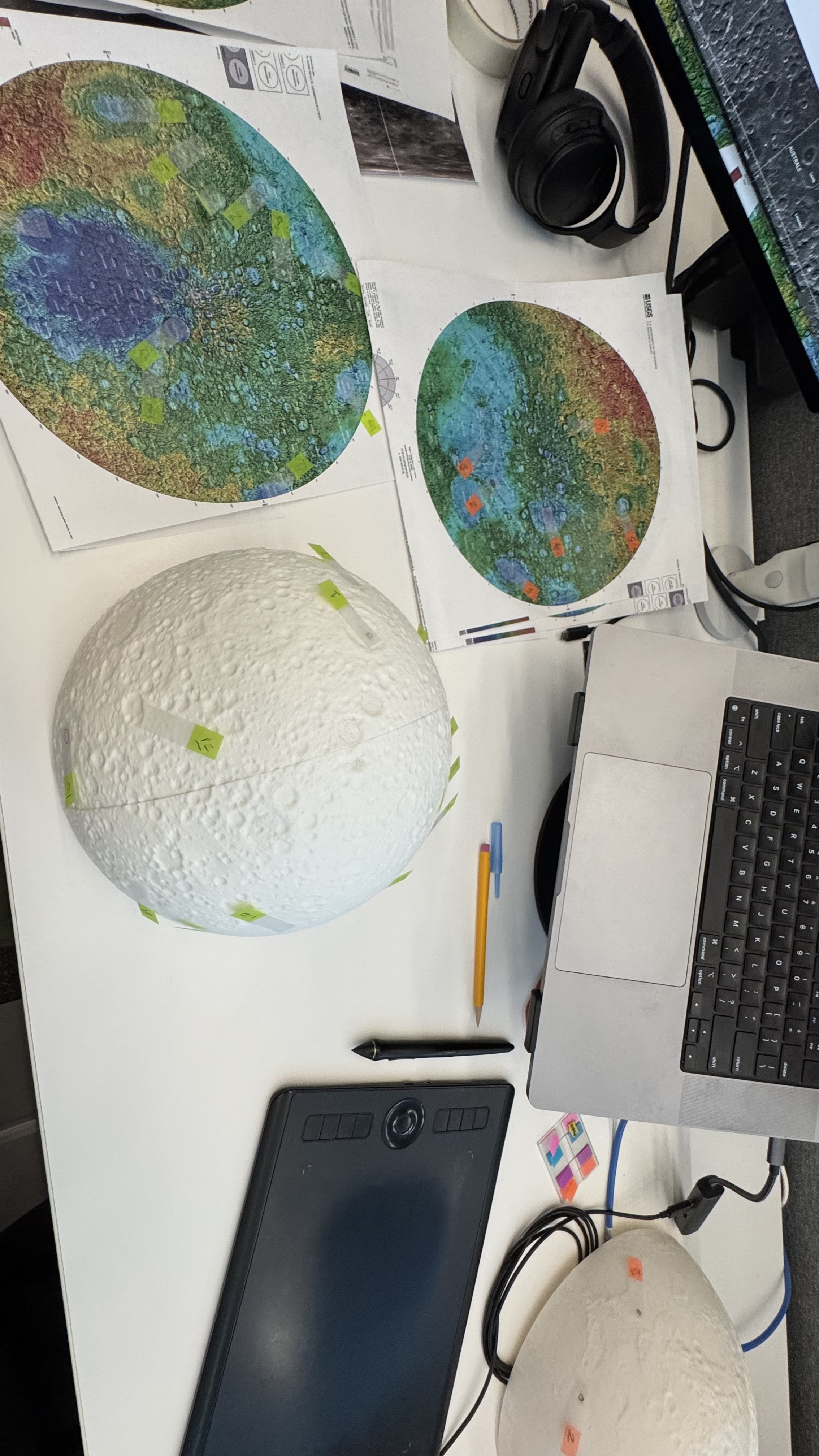
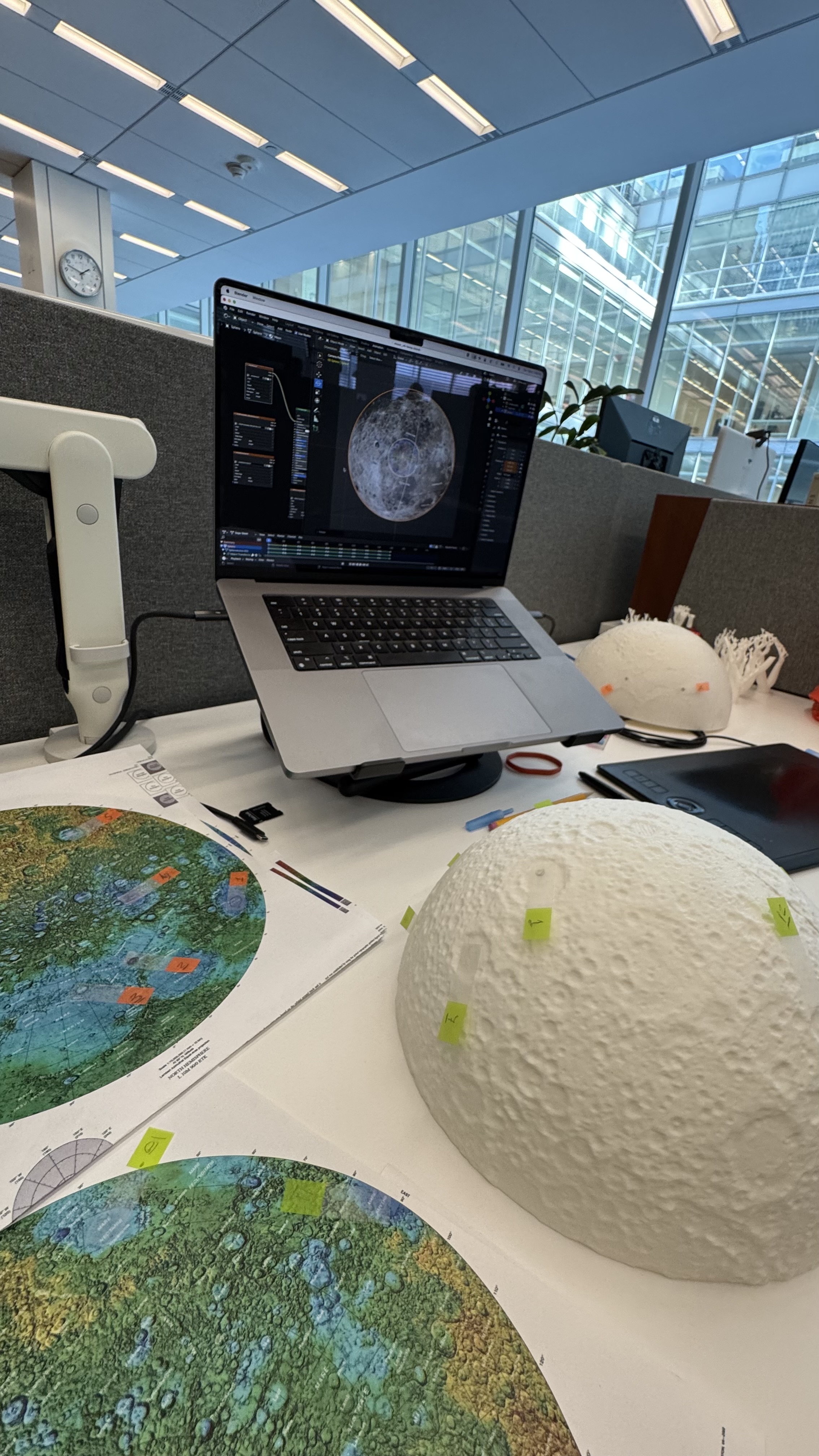
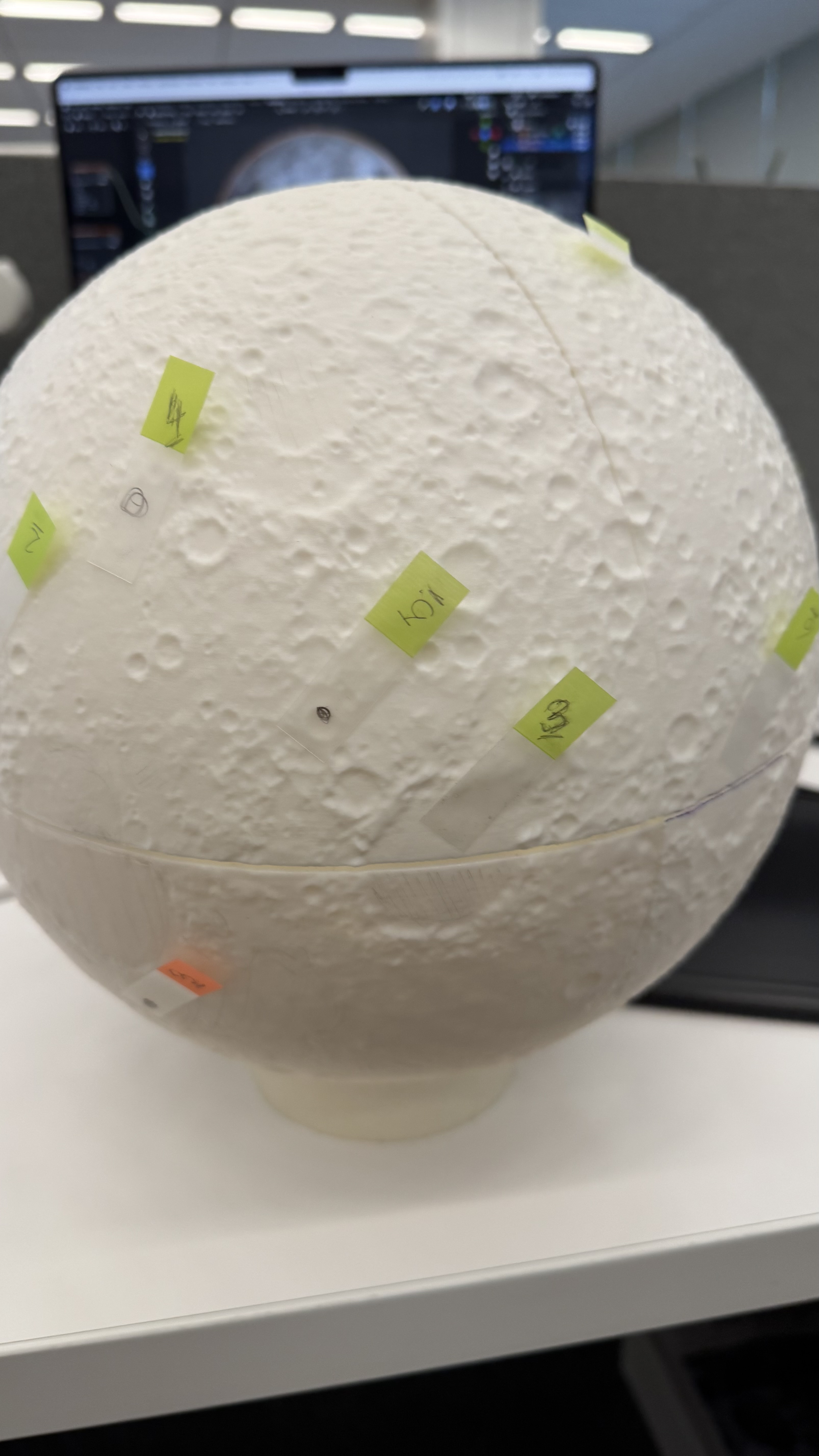
I used a bunch of different maps to be sure how to look and align the references to my model. I first tagged some craters and features just to be sure that I have the right alignment before jumping in with the brushes and acrylic paint.
Flat to Spheric
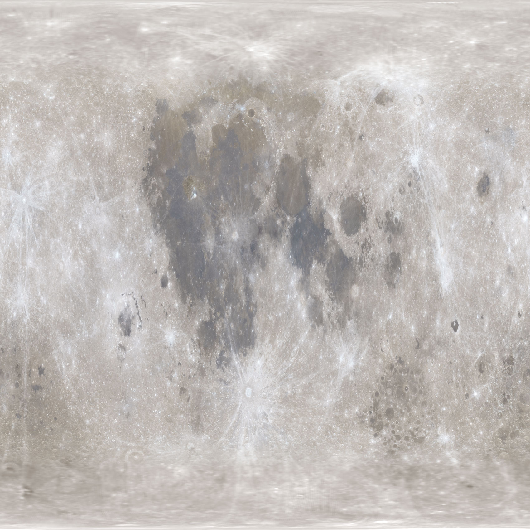
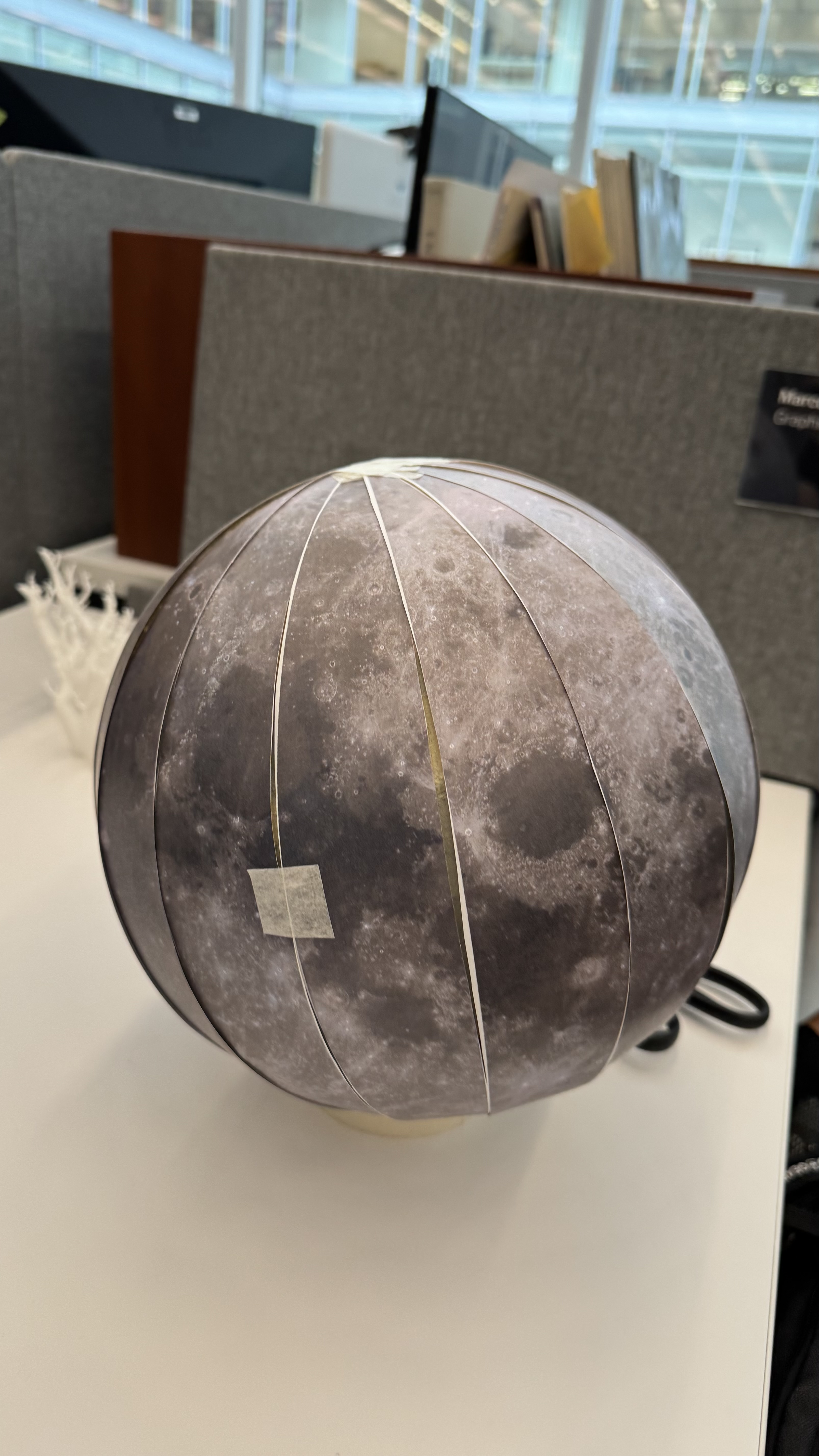
I used a equirectangular mosaic from NASA to get the base color guide, however to project that into my spheric model I need to process it like you will do to build an earth globe.
Equirectangular projection.
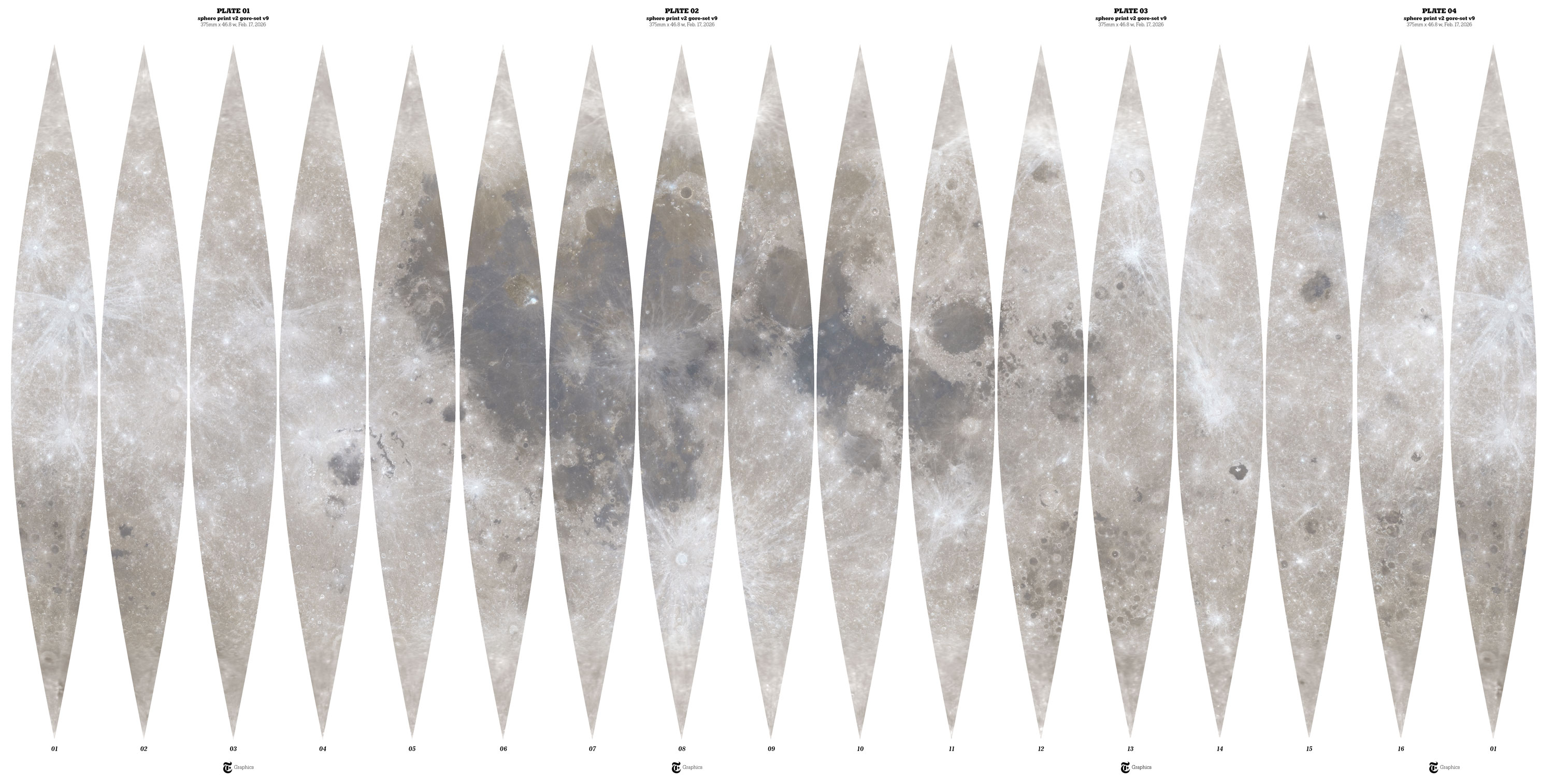
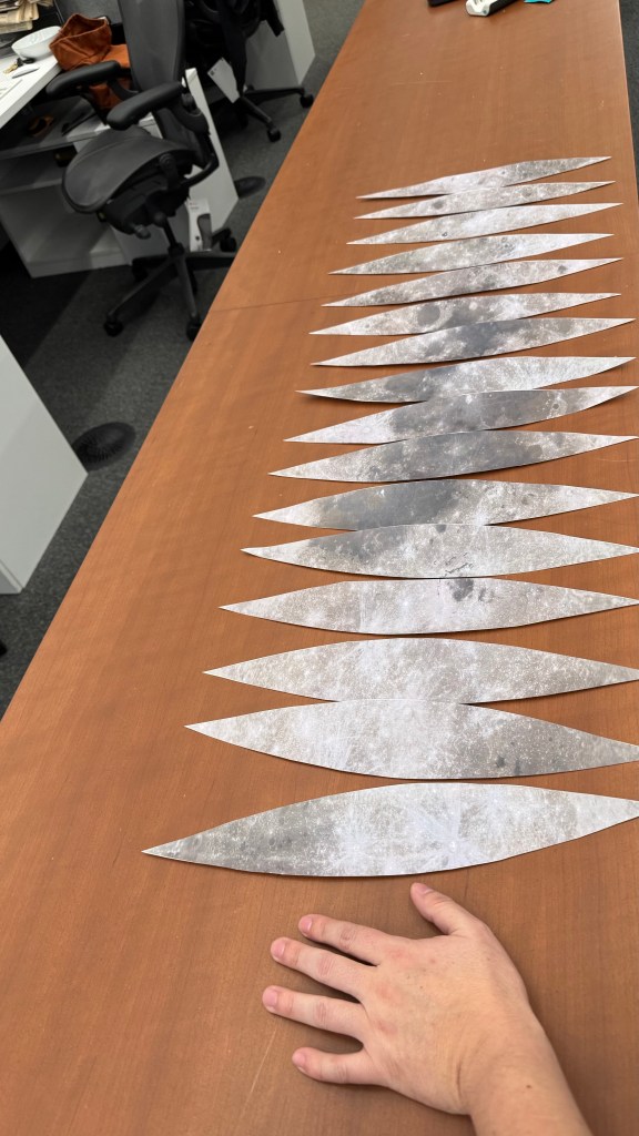
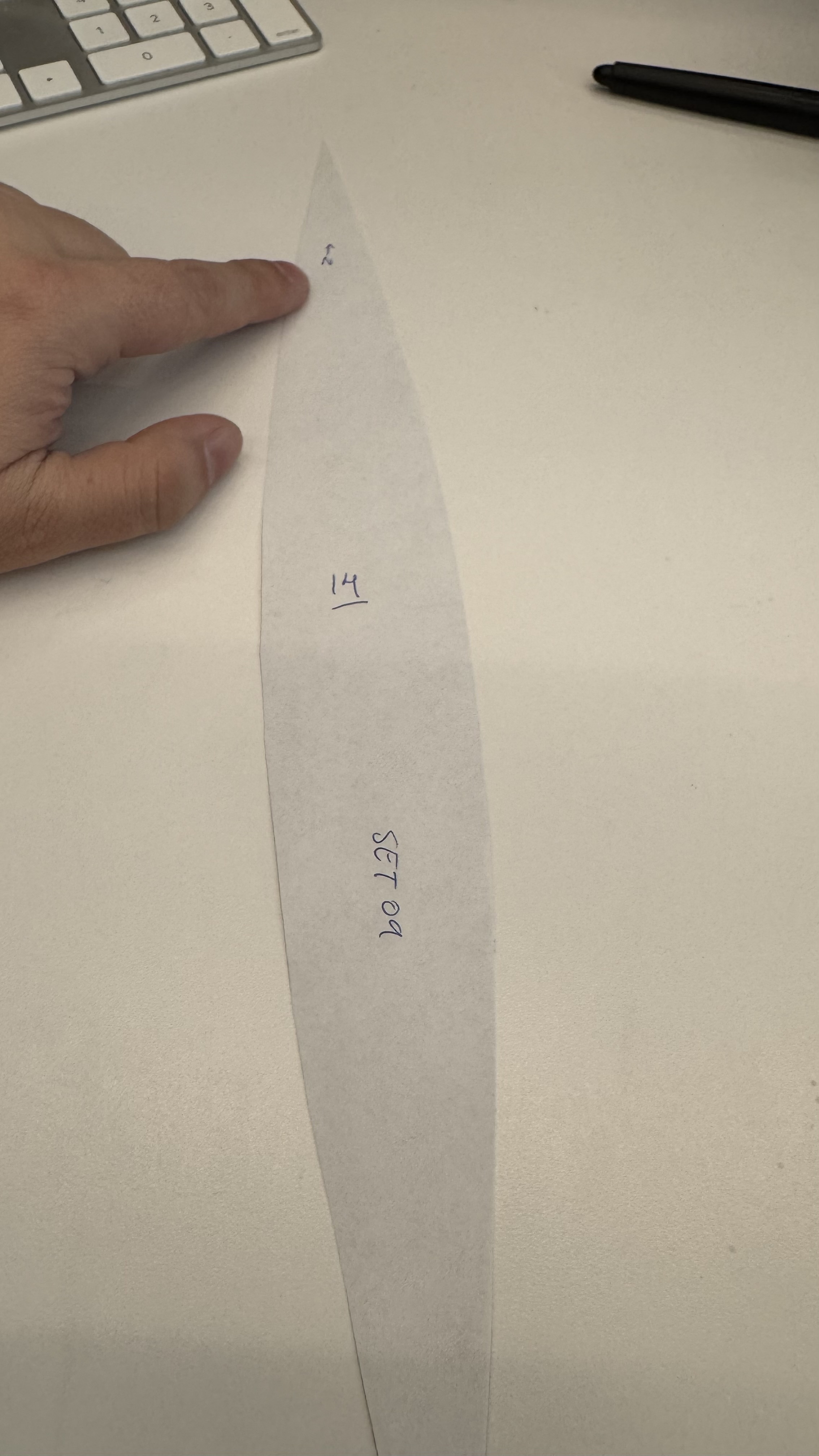
I used a custom Python script to slice, scale, and re-project the original equirectangular image. The script takes the original image and divides it by dividing it by the model’s circumference. Then slices the data into 16 gores. While increasing the number of gores would enhance the smoothness of the reference, this was just for me to make sure that the painting work was accureatly applied.
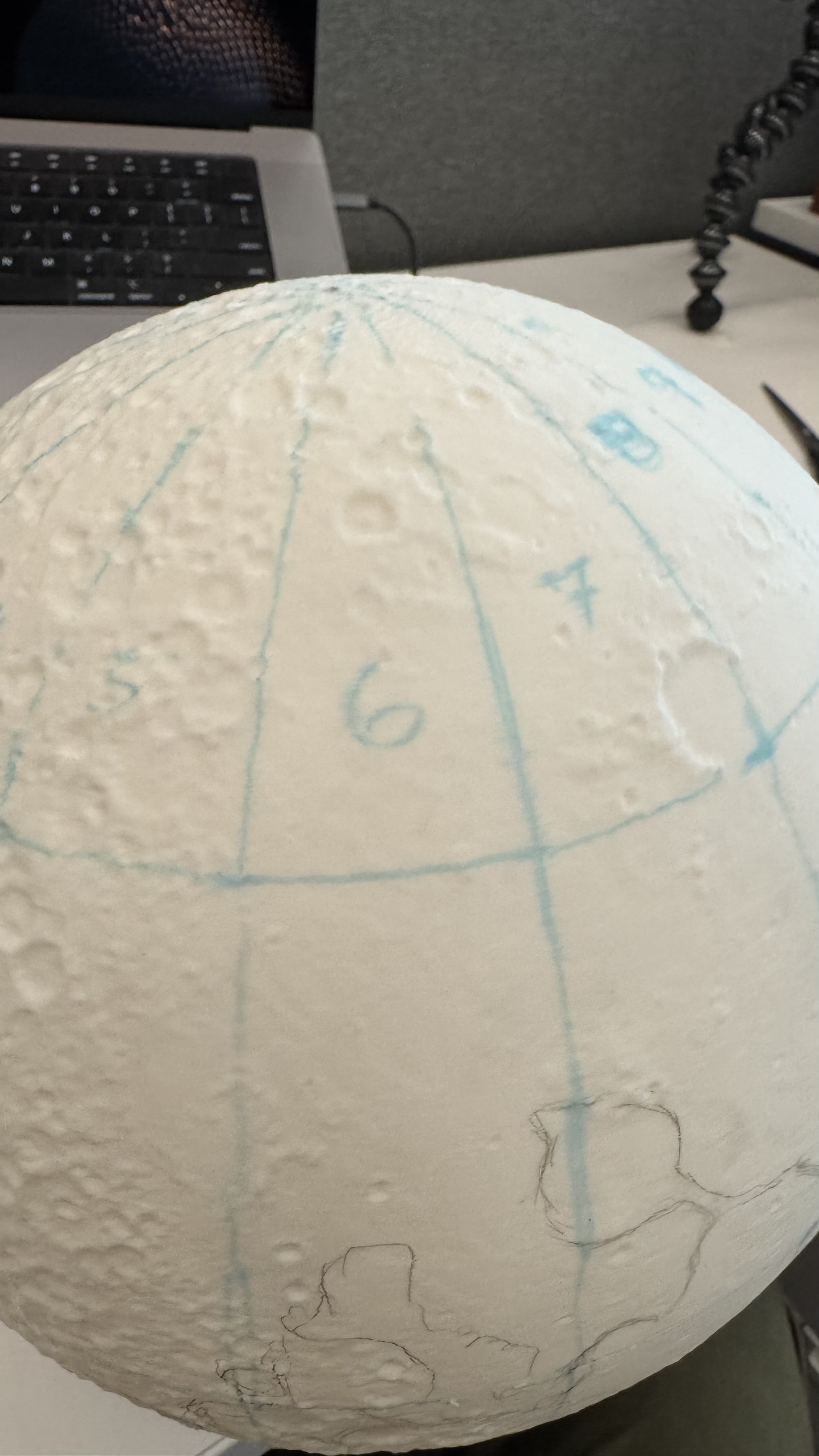
Moon gores
I added numbers to the back gores and draw some references with a marker on top of my model, that helped me to check the alignment of terrain and color.
Then it was like peeling an orange while adding color.
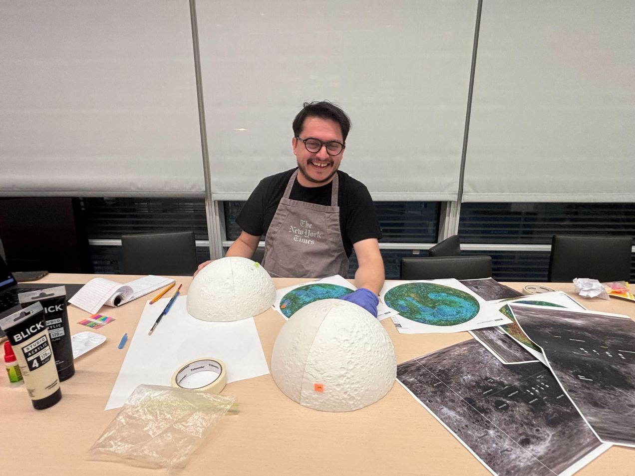
After I finish the first paint work, the model was almost there, but it was not perfect, the joints of each of the 4 wedges were not perfect, the color was also a little off in some areas, so I printed a second model and improved the process to make it crisp. Here’s a view of the working area around my desk. You can see a few of the white organic supports next to the version 2.0 and some other tools and things all over the place.
Once the moon was ready, I did a day of recording with the video folks in the studio. They did an amazing work editing the final piece, we used the model here, and here. I also posted a little timelapse showing the painting process, you can take a look here.
It is important to note that I worked all of these things while also working on six additional pieces that showed various aspects of the mission. The experience was both pleasant and quite exhausting.
This is a follow up to my previous tutorial for visualizing organic carbon. The process is more or less the same, but it uses a different dataset, which has some extra considerations. You can revisit it below:
Before continuing, to follow my guide and visualize global temperatures, you should be able to use your Terminal window, QGIS and optional Adobe After Effects or Photoshop.
About the data set
NASA’s Global Modeling and Assimilation Office Research Site (GMAO) provides a number of models from different data sets, this is basically a collection of data from many different services processed for historical records or forecast models. This data works well for a global picture or continent level even, but maybe isn’t a good idea to use this data for a country level analysis, for those uses you may want to check other sources of the data instead of GMAO models, like MODIS for instance if you you are looking for similar data.
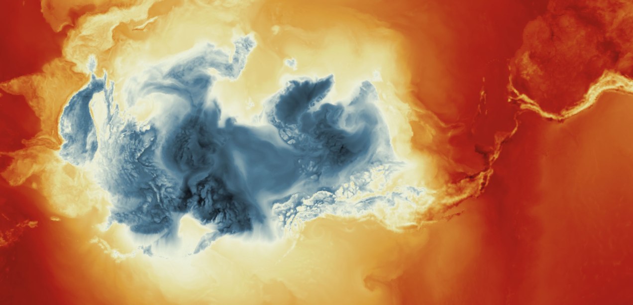
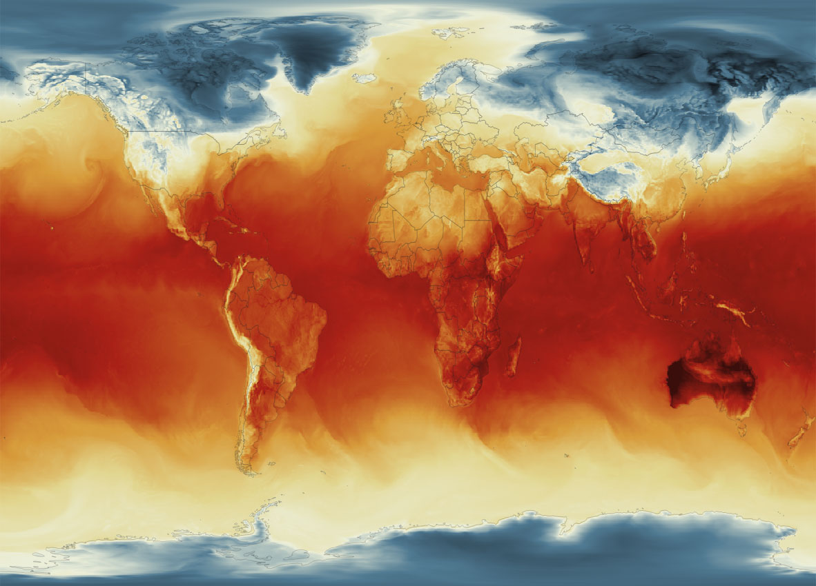
Global Surface Temperature average Jan. 4, 2023, 8am. || Data by GMAO / NASA.
SURFACE TEMPERATURE
There are a lot of different sets of products available at GMAO. For purposes of this tutorial, I’ll be focusing in the Surface Temperature which is stored into the inst1_2d_lfo_Nx set. That’s a GEOS5 time-averaged reading, which includes surface air temperature in Kelvin degrees in the 5th band of the files, there is some documentation available in this pdf. ( No worries if is this sounds too technical stay with me and keep going. )
These files are generated hourly, so a day of observations accounts for 24 files. This is great for animation because it would look smooth (even smother than the one we did for Organic Carbon before).
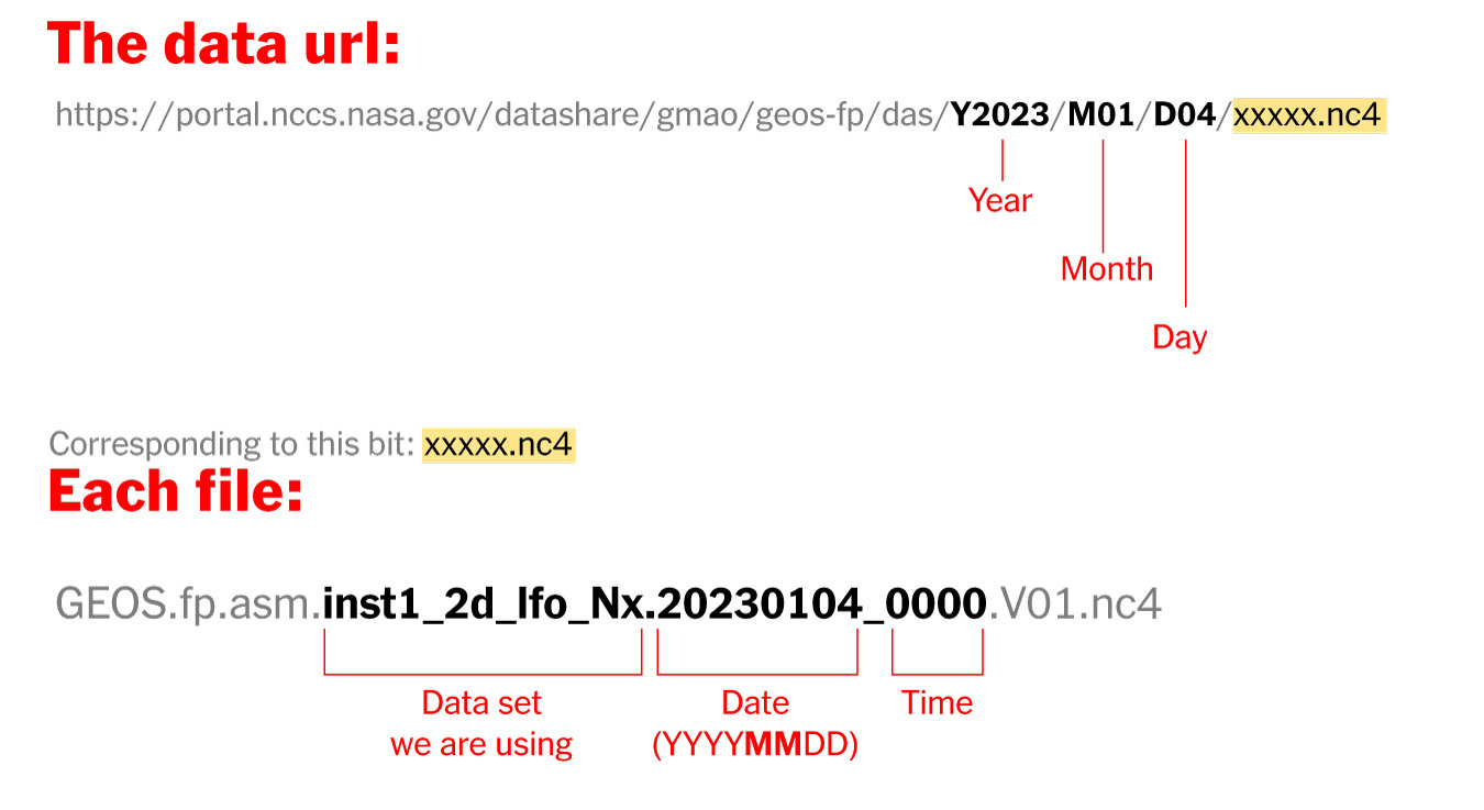
Where’s the data? and How it’s named?
The data is stored into this url. You can go into the folders and get all 24 files for each day manually if you like or get them with a command line using wget or curl into the terminal, I’ll recommend you the command line since it’s easier. Here’s how each file is named and stored:
Step 1. Get the data
Create a folder to store your files with some name like “data”
Once it reaches 100%, you would get a file named 20230104_0000.nc4 in you “data” folder: Note that I have renamed the output ( -o ) with a shorter name. The file will go to your folder ready to use into GQIS. Of course you will need a few more files to run an animation. Remember that this data is available for every hour every day, so you need to set the url and name for something like this:
00:00 MN >> 20230104_0000.V01.nc401:00 AM >> 20230104_0100.V01.nc402:00 AM >> 20230104_0200.V01.nc403:00 AM >> 20230104_0300.V01.nc4
...and so on...
08:00 PM >> 20230104_2000.V01.nc409:00 PM >> 20230104_2100.V01.nc410:00 PM >> 20230104_2200.V01.nc411:00 PM >> 20230104_2300.V01.nc4
Just create a text file listing all the urls you need and run the script into the terminal window with the same process:
curl-O [URL1] -O [URL2]
Each file is usually about 10MB, if there’s something wrong with the data the file will be created anyway but would be an empty file of just a few KB. Remember a full day accounts for 24 files but it starts from zero not 1.
Step 2. Loading the data into QGIS
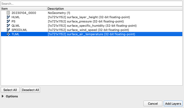
Once you have a nice folder with all the files you want, you can just drag and drop the .nc4 files into QGIS. We are looking for the 5th Band, TLML which is our Surface air temperature:
QGIS prompt window when you drop one of the file in.
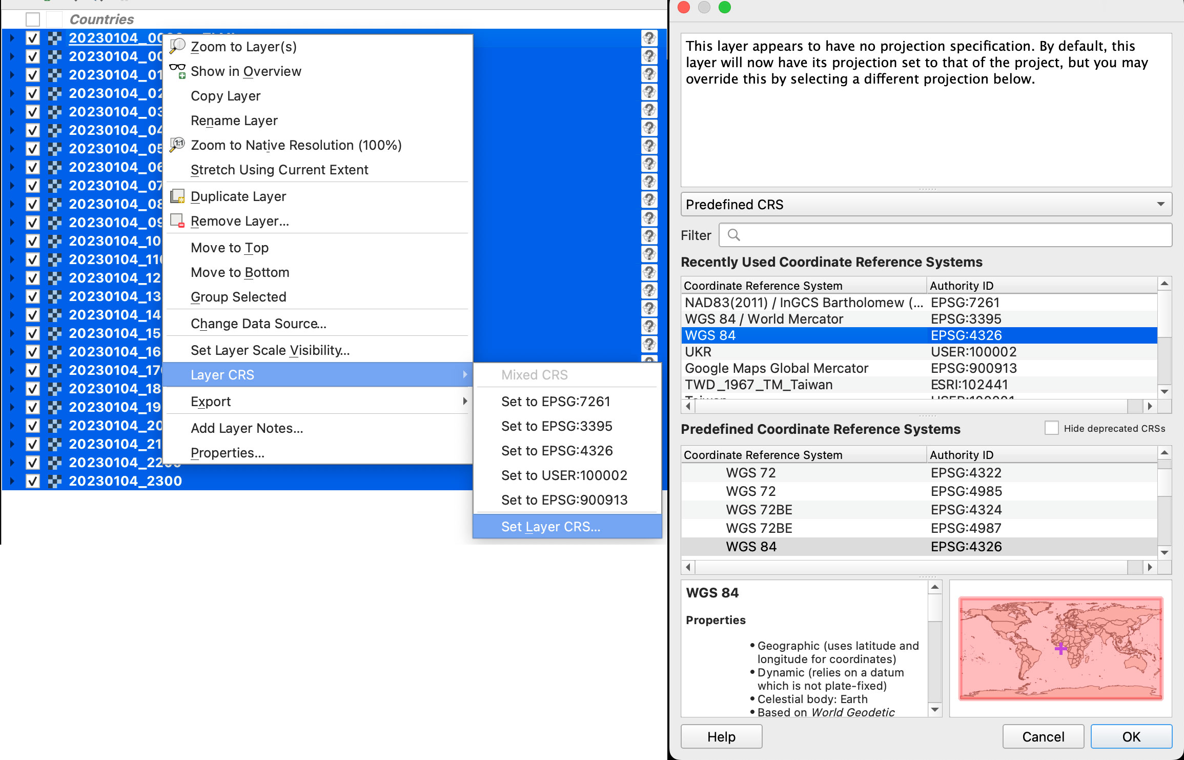
Once you have the data loaded, you want to set the data projection to WGS 84, this will enable the data layers to be re-projected later on. To do that, select all you data layers, right click on them, and select Layer CRS > Set Layer CRS > 4326. Be sure of selecting all the layers at once so you do this only one time. Otherwise you will need to doing over and over.
Data layers projection to WGS 84.
Since this is a good global data set, you may want to load a globe for reference, you can use your own custom projection, or use a plugin like globe builder:
Access Globe Builder from the plugins menu > Manage and Install > type: Globe.
Once installed, just run it from the little globe icon, or in the menu plugins > Globe builder > Build globe view. You have a few options there, play around with the center point lat/long. You can always return here and adjust the center by entering new numbers and clicking the button “Center”.
Step 3. Styling your map
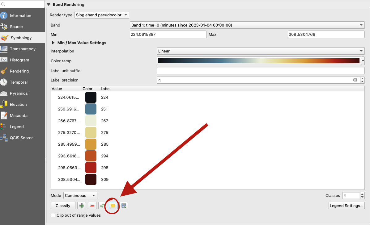
The color ramp is important, you want to have a data layer and maybe a outline base map for countries, QGIS has some pre-built ramps for temperatures, you can check them out by clicking the ramp dropdown menu, select Create New Color Ramp and then select Catalog cpt-city.
Once you have your ideal color ramp for one layer, right click on that layer, go to Styles > Copy style. Then select all you temperature data layers at once, right click on them and select Styles > Paste Style.
I have created a ramp to fit better my data ranges and style a little the colors. If you not are using the optional ramp below, and want to proceed with the pre-built ramps skip this to step 4.
To use my ramp, copy and paste the following to a plain .txt file:
To apply the ramp to your layers, doble click one of the .nc4 files, and select Symbology in the options panel. Under render type, select Singleband pseudocolor, the look for the folder icon, click it and load your .txt file.
QGIS prompt to load a custom style.
Step 4. Preparing to export your map
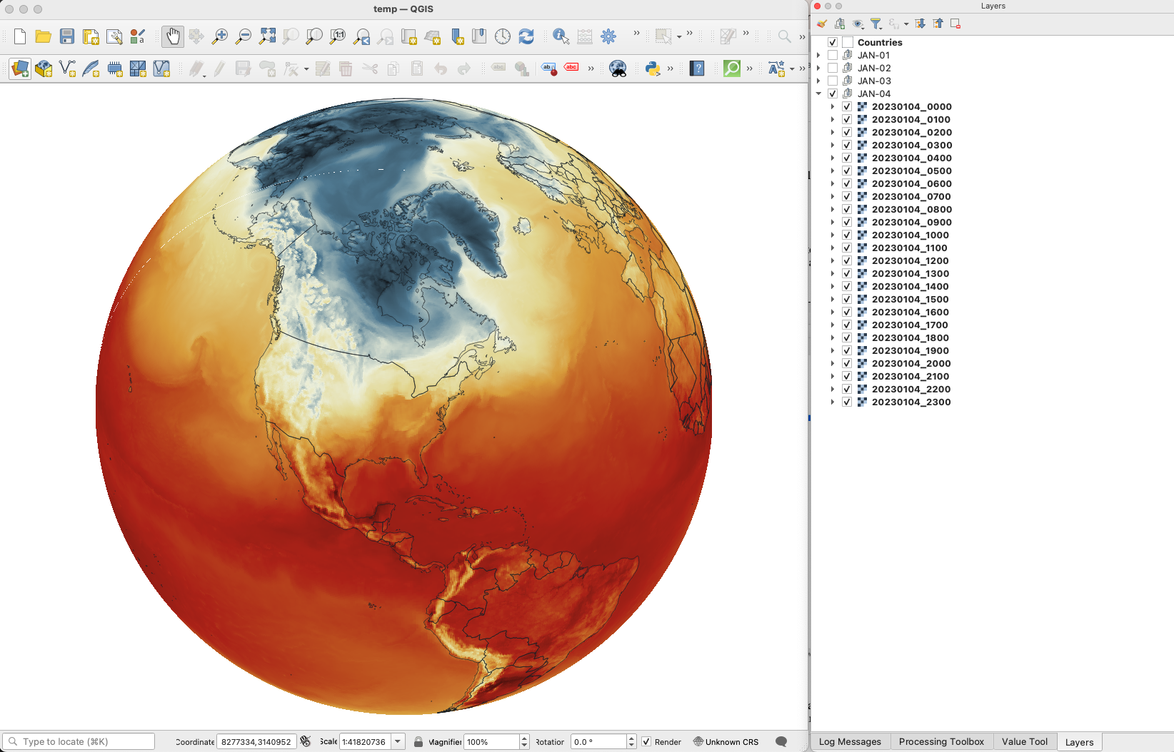
You are almost done, by this point you can see how each data layer creates nice swirls, maybe some evolution of it too just by toggling the layers visibility. I like to have all the layers well organized so you can quick check the data. I’m maybe a little too obsessive but I usually rename all layers and groups to something like the image below, however this is just for me to know which files are on which day:
QGIS layers panel.
The name change works if you are using an automatic export of all layers, the script in the next step takes the name of the layer to name file output. But there are alternative ways to do this if you’re not as crazy as I’m and don’t want to spend time manually renaming.
Step 5. Export your map
There are many ways of doing this, you can set up the time for each layer by using the temporal controller, there’s a good guide here. That way you can get a mp4 video right away from QGIS, but you need to set up each data layer time manually.
You can also use a little code to export each layer into an image, which you can then import into After Effects. To do that, the first step of course, is to get the script. Download the files from my google drive HERE.
Now, go to the plugins menu at the top, there, you will see the Python console, go and click that, you will see this window popping-up:
Python console in QGIS.
Click the paper icon, then click the folder icon and select the python script you dowloaded above. Just be careful with the filePath option.
If you are on a mac, right click your output folder and hold the option key, that will allow you to copy the absolute path of you folder, paste that to replace the filePath field value (the green text in the image below). If you are on Windows, just make sure to get the absolute path and not a relative one.
I left some annotations on the script to better understand what each part is, it’s based on a script someone did with Vietnamese annotations, source and credit are in the drive link too.
Now just click the play button in the python console, seat back and look all the frames of your animation loading in the output folder you selected. You should see a file for each of your layers when the script finishes.
Step 6. Color key
The temperature in this set is provided in Kelvin degrees. The range of the data depends on your date / file set up. But if you are using the ramp I have provided above with data for Jan. 4, there’s a svg file named “scale.svg” in the drive folder within this range. I have nudge a little the color and ranges matching the map with nice round numbers.
For January 4, the data rages are about 224°K to 308°K, you can use google to covert that to Celsius or Fahrenheit depending on your needs. But basically you can take your Kelvins and subtract 273.15 to get Celsius. The min. Temperature would be ~ -49°C (224°K) and Max. ~34°C (308°K). If you are into Fahrenheit, I’m sorry the math would be a little more complex for you… go ahead and use google.
Step 7. Setup and export your animation
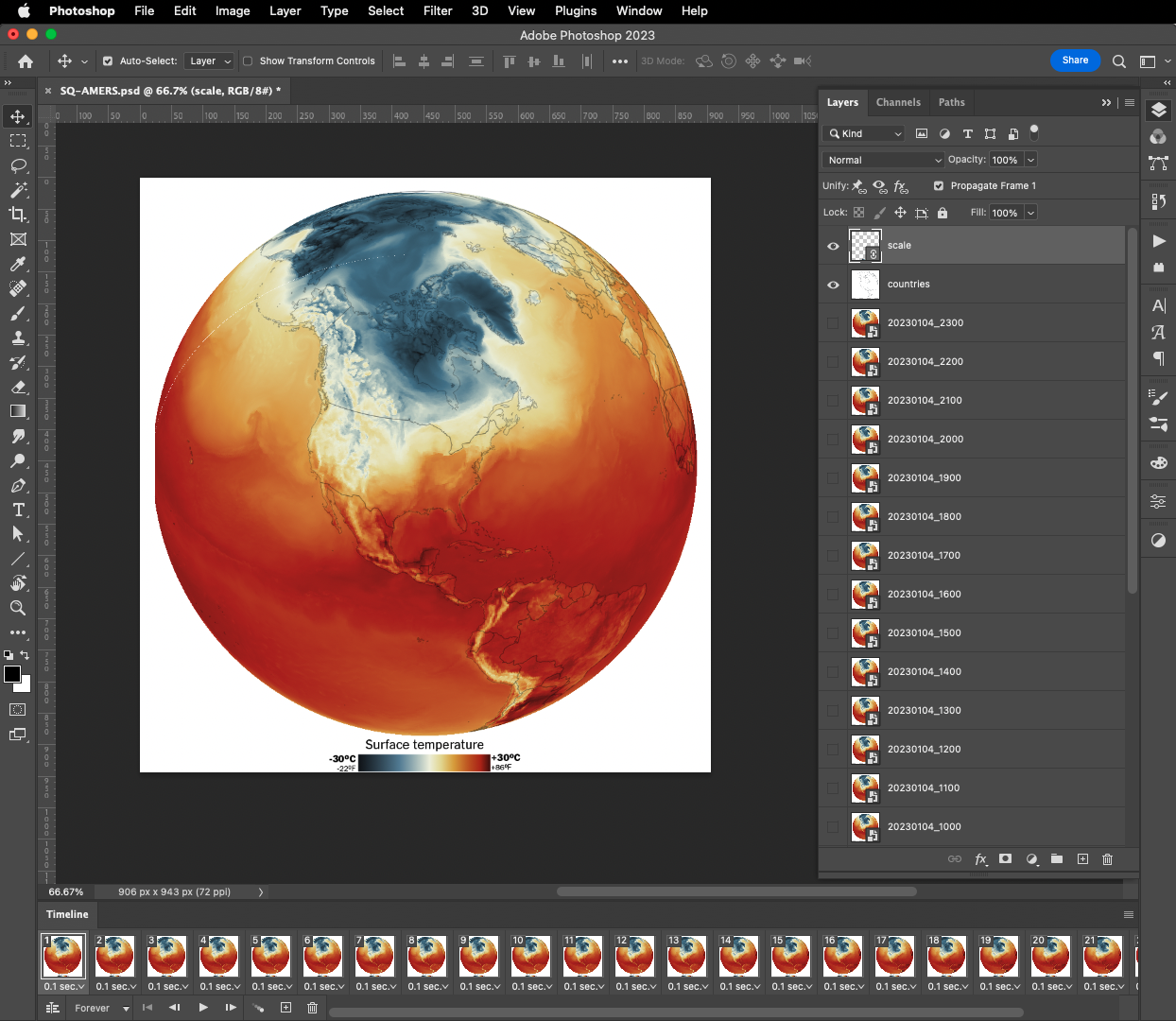
On my previous tutorial to visualize Organic Carbon, I used Adobe After effects to add the dates, you can use the same principle here, or using any other alternatives. For example, once you have the output files you can drop them all into photoshop. By going to the menu Window / Timeline you can add a frame animation, simply click the + icon in the timeline panel followed by turning one layer on at the time.
Adobe Photoshop frame animation.
If you are using Photoshop, pay attention to the order of the files, it should match the data dates from newest at the top to oldest at the bottom. Once you have you sequence ready, in the timeline panel menu, you will find a render option to export your animation as video, or you can create a gif animated by using the top menu File / Export / Save for Web or command + option + shift + s if you are on a mac.
Or something like this, if you have used the same data and ramp from this tutorial:
I love GMAO's data. This is yesterday's global temperature hourly averages. Note how the while the sun rises the surface temperatures create a "wave" from Brazil to North America #DataVisualizationpic.twitter.com/62CO1lMVdH
If any of this doesn’t make sense to you, or if you’re having trouble with a step, feel free to reach out to me on Twitteror MastodonI will be happy to hear from you.
Happy mapping!
Update
Using gdal to convert data to 180-180
Someone contacted me about this tutorial because they were having problems with the projection of the temperature data.
For some reason if your files are in 0-360 format instead of 180-180 you will usually see the globe aligned with the vector layers but not with the temperature rasters, which usually appears to the side in QGIS
If that’s happening to you, you may need to convert your data before dropping it into QGIS. Here’s a quick tip on how to fix that:
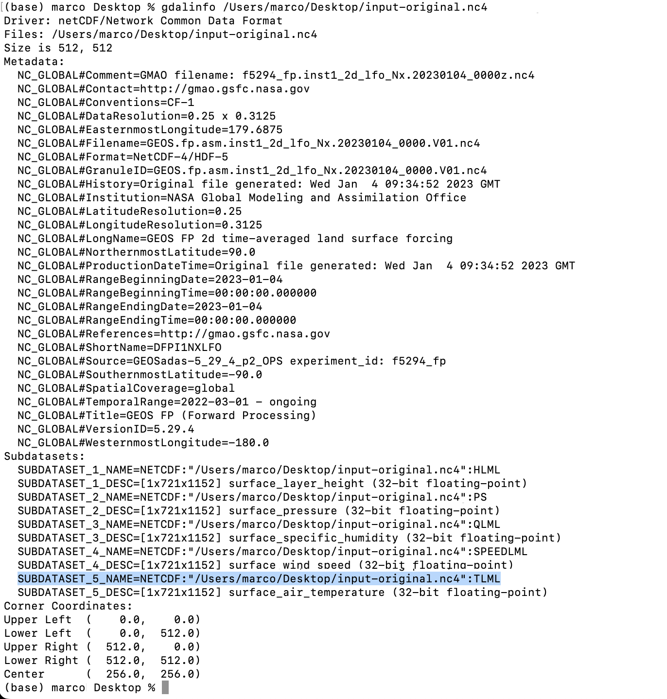
From your terminal window cd your folder like you did before, look for the directory where your temperature data is.
Type gdalinfo add an space and paste the file name it should look like this:
You will find the subdatasets. We are looking for TLML (temperatures) that highlight on blue above.
Gdal would help you to convert the data so you can use it, the command line looks like this:
***Note your file path will be different copy that from your terminal window (the blue highlight)
That will give you a new file in the directory of your choice (your/directory/output-filename.nc4) in this example there is a folder called directory inside a folder called your in which is the file called output-filename.nc4. Be careful when renaming files the dates are important to the animation process.
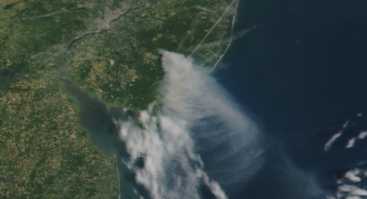
Long time ago someone on twitter ask me to do an explainer on how I did the “smoke” animations forthis Reuters piece. It has been a while since then, but maybe it would be useful for someone out there, even if that mean learning how NOT to do things.
Before continuing, to follow my guide and visualize organic carbon, you should be able to use your terminal window, QGIS and optional Adobe After Effects.
Organic carbon released into the atmosphere during the wildfires season in California in 2020
Let’s talk about this wonderful data first
NASA’s Global Modeling and Assimilation Office Research Site (GMAO) provides a number of models from different data sets, this is basically a collection of data from many different services processed for historical records or forecast models. This data works well for a global picture or continent level even, but maybe isn’t a good idea to use this data for a country level analysis, for those uses you may want to check other sources of the data instead of GMAO models, like MODIS for instance if you you are looking for similar data.
ORGANIC CARBON
There are a lot of different sets of products available at the GMAO servers, you can check details here, here and here. However for purposes of this practical guide, I’ll be focusing in the emissions of Organic Carbon which is stored into the tavg3_2d_aer_Nx set. That’s a GEOS5 FP 2d time-averaged primary aerosol diagnostics, which includes Organic Carbon Column mass density in the 38th band, there is some documentation available in this pdf. ( No worries if is this sounds too technical stay with me and keep going. )
A day of observations accounts for 8 files since this data is processed every 3 hours. This is great for animation because it would look smooth. Knowing that, let’s move to our guide.
Step 1. Get the data
The data is stored into this url. You can go into the folders and get all 8 files for each day manually if you like or get them with a command line using wget or curl into the terminal. You just need to know a little of the url structure:
GMAO organic carbon files and url structure
Create a folder to store your files with some name like data
Note that I have renamed the output ( -o ) with a shorter name. The file will go to your folder ready to use into GQIS. Of course you will need a few more files to run an animation. Remember that this data is available for every 3 hours daily, so you need to set the url and name for something like this:
01:30 AM >> 20220619_0130.V01.nc404:30 AM >> 20220619_0430.V01.nc407:30 AM >> 20220619_0730.V01.nc410:30 AM >> 20220619_1030.V01.nc401:30 PM >> 20220619_1330.V01.nc404:30 PM >> 20220619_1630.V01.nc407:30 PM >> 20220619_1930.V01.nc410:30 PM >> 20220619_2230.V01.nc4
Just create a text list with all the urls you need and run the script into the terminal window with the same process:
curl-O [URL1] -O [URL2]
Each file is usually about 120MB, if there’s something wrong with the data the file will be created anyway but would be an empty file of just a few KB. Do a day or two first and check, that’s 8-16 files, check them, if all looks good load a few more if you like.
Step 2. Loading the data
Once you have a nice folder with all the files you want, you can just drag and drop the .nc4 files into QGIS. We are looking for the 38th Band, OCCMASS which is our Organic Carbon Column mass:
QGIS prompt window when you drop one of the file in.
Once you have the data loaded, you want to set the data projection to WGS 84, this will enable the data layers to be re-projected later on. To do that, select all you data layers, right click on them, and select Layer CRS > Set Layer CRS > 4326. Be sure of selecting all the layers at once so you do this only one time. Otherwise you will need to doing over and over.
Data layers projection to WGS 84.
Since this is a good global data set, you may want to load a globe for reference, you can use your own custom projection, or use a plugin like globe builder:
Access Globe Builder from the plugins menu > Manage and Install > type: Globe.
Once installed, just run it from the little globe icon, or in the menu plugins > Globe builder > Build globe view. You have a few options there, play around with the center point lat/long. You will see that this data sets always have large concentrations of emissions in Africa, maybe that’s a great place to start. I’ll do a similar view to the California story for now.
Step 3. Styling your map
The color ramp is important, you want to have a data layer that can be overlayed in the base map, so you want to have white/black for the lower values and high contrast in the other end of the data, since we are working on white background I’m using white to black with yellow and brown stops. Check what are the highest values in your data set the style for on layer to something like this:
Number in the min/max will change depending on the highest values of your data and the style you want. This image is set for OCCMASS from June 19th, 2022, 4:30 pm.
Once you have the ideal color ramp for one layer, right click on that layer, go to Styles > Copy style. Then select all you carbon data layers, right click on them and select Styles > Paste Style.
Step 4. Preparing to export your map
You are almost done, by this point you can see how each data layer creates swirls in the atmosphere, maybe some evolution of it too just by toggling the layers visibility. I like to have all the layers well organized so you can quick check the data. I’m maybe a little too obsessive but I usually rename all layers and groups to something like this:
QGIS layers panel.
The name change works if you are using an automatic export of all layers, the script takes the name of the layer to save each file. But there are alternative ways to do this if you’re not as crazy as I am and don’t want to spend time manually renaming.
Step 5. Export your map
There are many ways of doing this, you can set up the time for each layer by using the temporal controller, there’s a good guide here. That way you can get a mp4 video right away from QGIS, but you need to set up each data layer time manually.
You can also use a little code to export each layer into an image, which you can then import into After Effects. To do that, the first step of course, is to get the script. Download the files HERE.
Now, go to the plugins menu at the top, there, you will see the Python console, go and click that, you will see this window popping-up:
Python console in QGIS.
Click the paper icon, then click the folder icon and select the python script you dowloaded above. Just be careful with the filePath option.
If you are on a mac, right click your output folder and hold the option key, that will allow you to copy the absolute path of you folder, paste that to replace the filePath field value (the green text in the image below). If you are on Windows, just make sure to get the absolute path and not a relative one.
I left some annotations on the script to better understand what each part is, it’s based on a script someone did with Vietnamese annotations, source and credit are in the drive link too.
Now just click the play button in the python console, seat back and look all the frames of your animation loading in the output folder you selected. You should see a file for each of your layers when the script finishes.
Step 6. Export your animation
Take all the files this into After Effects. First, add your carbon data as sequence (0001.png, 0002.png, 0003.png…), keep that in a sub-composition and use a multiply blend mode to overlay the layers, then add the countries/land and the optional halo.
Finally, in the drive folder you will see a .aep file, that’s a simple number animation to control dates, copy the text layer into your composition. You know when the data starts and when it ends, in the example is just 3 days 19-21, “June” is a different text layer, so add those numeric values to the keyframes into the text layer you have copied, and leave it at the very top:
Once you are all set, just export to media encoder to get you mp4 animation.
If any of this doesn’t make sense to you, or if you’re having trouble with a step, feel free to reach out to me on Twitter. I will be happy to hear from you.
Last year (2015) I start many new projects, some of them are still progress, but one of these are the quick graphics for social media.
At the unit of infographics and datavisualization, we spend many time in daily production and in special huge projects, I believe that we have enough time and muscle to produce frequently these small graphics, every single infographic must have a print version, desktop digital versión, mobile version but also, i like to choose some of these to develop a social media version, sometimes a gif, or an image or even a short video with a compact version of the main graphic.
So, here is some of my favorites picks:
The spooky asteroid:
In october 31, an asteroid pass near the earth (near in space terms), this asteroid was renamed “the spooky asteroid” and take the attention of the world by the time of his visit, so it was a nice opportunity for a quick graphic for social media:
Compact version for social media. Motion-Infographic by Marco Hernández.
Gif version for social media. Infographic by Marco Hernández.
Desktop digital version for article. Infographic by Marco Hernández.
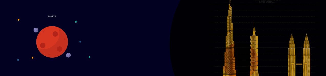
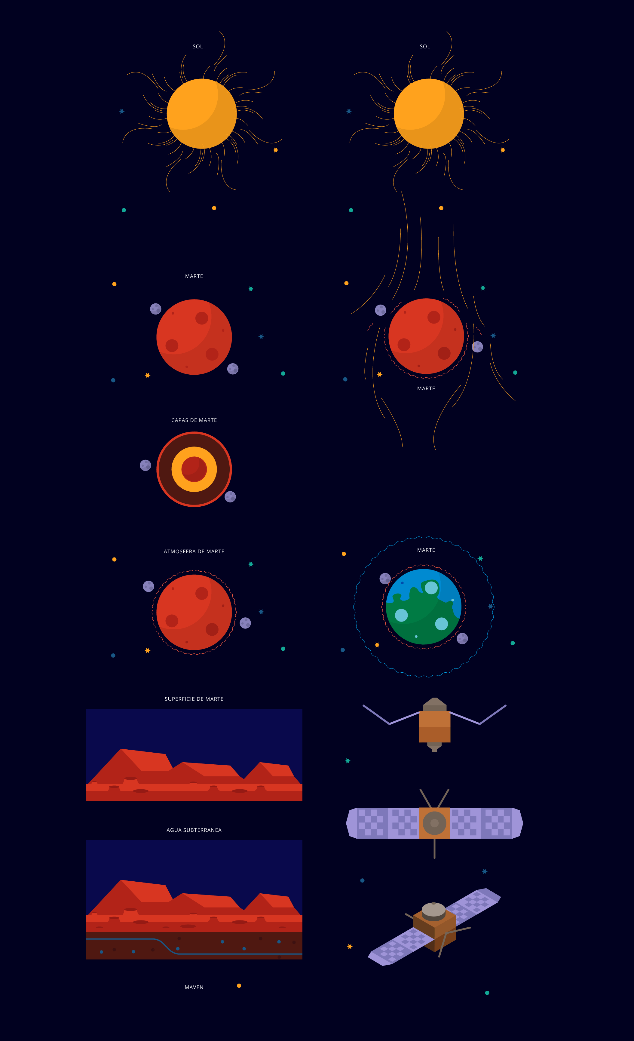
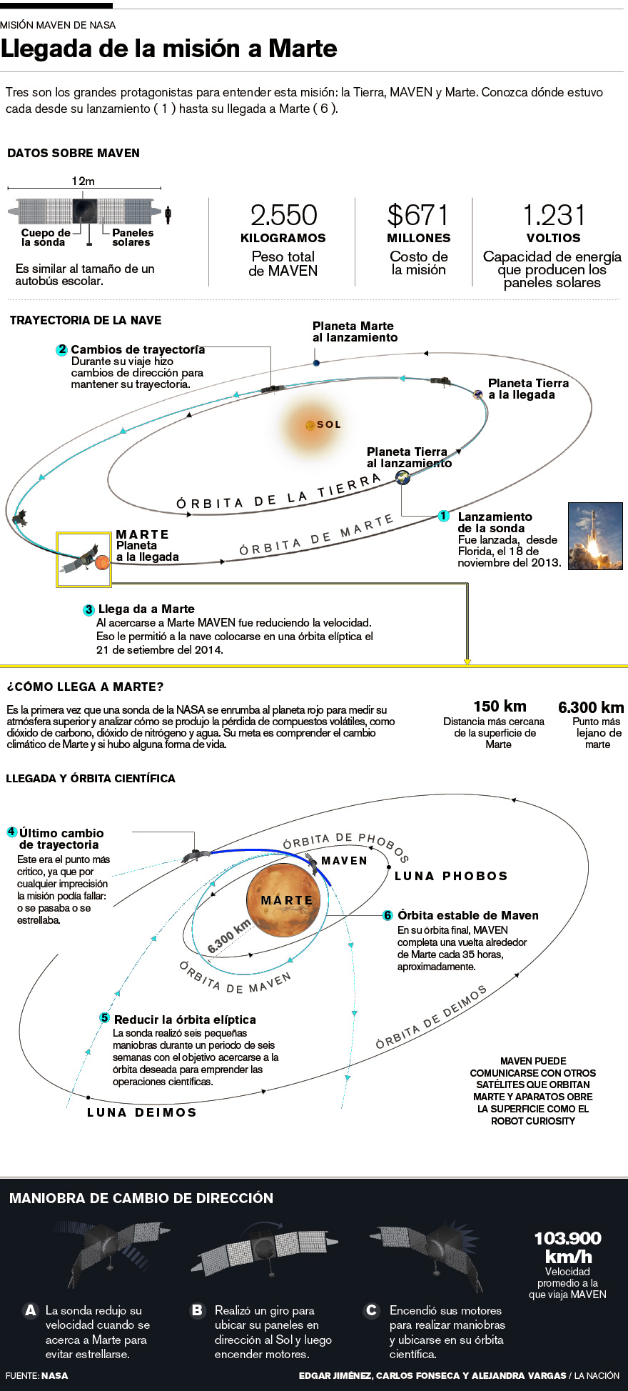
The MAVEN findings:
The NASA made the announcement of the Maven mission findings about what happened with the atmosphere and magnetic fields of the red planet. We are awaiting the press release with a stock of pieces to develop soon as we can a simply animation for social media:
Illustrations by Dominick Baltodano and Marco Hernández.
Compact version for social media. Motion-infographic by Marco Hernández.
Desktop version, infographic by Edgar Jiménez, Carlos Fonseca and Marco Hernández.
Hope in this 2016 have many more of these chances to create more quick graphics for social media, these are a great way to engage readers with content made exclusively for consumption on social networks.
A few days ago we released an special about the births of a century in Costa Rica, I had the chance to produce this motion for. It’s nice to get raw data and transform it in to visuals, alternative ways to see the past or future of a population, if you like to take a look in to the full site here http://bit.ly/1kpN45p you may use google chrome for translation from spanish 🙂
In the last weeks I’ been integrating the WebGL Technology to take advantage of the great skills of my partners of the infographics department here at nacion.com Daniel Solano and Edgar Jiménez both of them great artist´s, they works on Cinema 4D to produce print graphics for the regular editions of the news corporation, that kind of work it’s simply awesome and it’s a shame don’t use all his digital potential.
So, here’s a pair of work that we worked on together to improve the experiences for the readers.
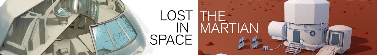
Lost in space for ever and ever
with Daniel Solano
This slideshow requires JavaScript.
On september 15th of 1965 Fox and CBS launch in USA the TV Show “Lost in space”, 50 years after, we wants to remember the serie, the main characters and vehicles that captivated audiences for decades beyond its premiere. Here’s an exclusive access to the 3D models, The Chariot, and The Jupiter 2.
Original feature
It’s really nice have the chance to work in this kind of topics, science and space are one of my all time favorites. if you want to know more about the graphic the original feature at nacion.com here.
Technology the leading actor
with Edgar Jiménez
NASA´s SEV Vehicle
At least nine of the technologies developed by NASA towards Mars space exploration are mentioned in the book and movie The Martian, this 3D infographic collects those coincidences.
Martian tech
I also want to add some short animations as gif files in the graphic to give support to the information and the whole infographic, Edgar and me develop this sort animations in After Effects.
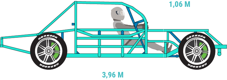
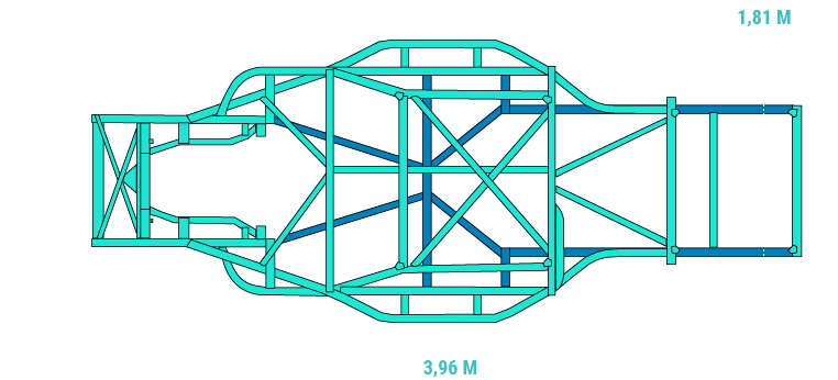
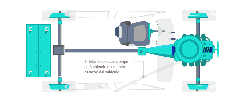
A few hours more than a full day of work takes to two co-workers and me, to release today this special feature about the V8 cars competition in the “Parque Viva” racetrack.
Animated graphics, details about the cars and restrictions and a complementary key note of Jose Luis Rodríguez fusioned together to create this digital experience.
I hope you will enjoy it!
Graphics inside the special
Graphics inside the special
Graphics inside the special
Graphics inside the special
Visite the special site of nacion.com here: http://goo.gl/gzjLYy
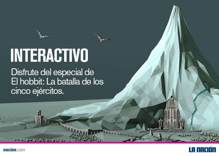
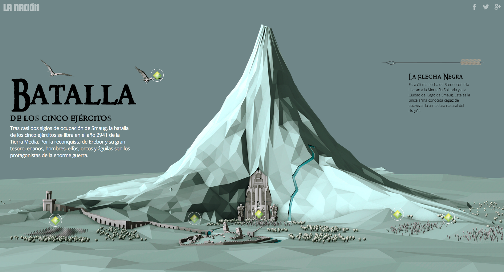
The gate of Erebor. 3D Model by Edgar Jiménez; Art direction by Marco Hernández and Manuel Canales.
In the eve of the final movie of the Hobbit trilogy, we decide to give to our readers at nacion.com a new perspective of the scenary. Edgar Jiménez an terrific 3D artist, Alexander Sánchez the journalist of films and myself works together to develop this special site of the Hobbit’s Lonely Mountain, the field of the Battle of the five armies.
This its part of the promotional pieces:
nacion.com post for social media
nacion.com post for social media
This site its a scroll controlled experience that allows to explore the Lonely Mountain and the city of Dwarves, Erebor. There you will find, besides, the 3d model, short texts hidden about key points of the movie. Hope you will enjoy it!
Here’s the link: http://goo.gl/8TMVKw