blogging, Digital pieces, Motion graphics

Building the moon

Late on March 2026 I published the first piece about the latest NASA’s mission to the moon. However, the planning behind started just when I came back from the holidays the first week of January.

We had a lot of meetings with editors to make a plan for all the pieces we wanted to do, but there was one in particular that took me into a wild ride that included a lot of documentation and manual crafts, here’s a little behind the scenes of that project to produce a ~2min video.

A spark of inspiration

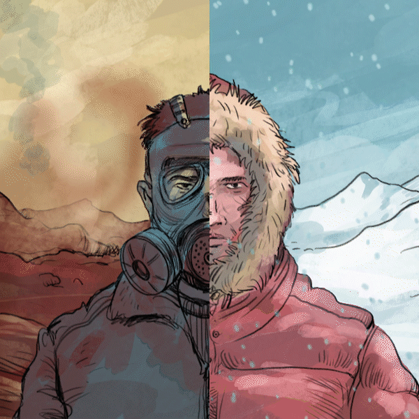
During a call with NASA’s PR team, they mentioned that the Moon will look about the size of a basketball held at arm’s length from the spacecraft window. This was mentioned repeatedly on various sites. I noted this down because I was already thinking to do a video explaining what astronauts will see while flying over the far side of the Moon, but after that statements, I was considering to use a printout of the Moon, the same size as the astronauts will see it, an sphere of about 9,4 inches.

Gathering data

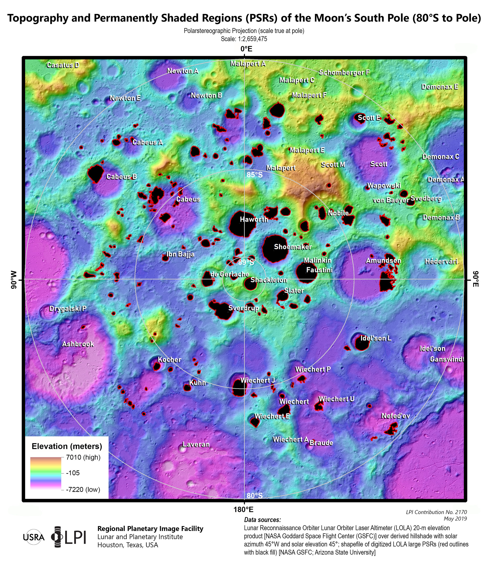
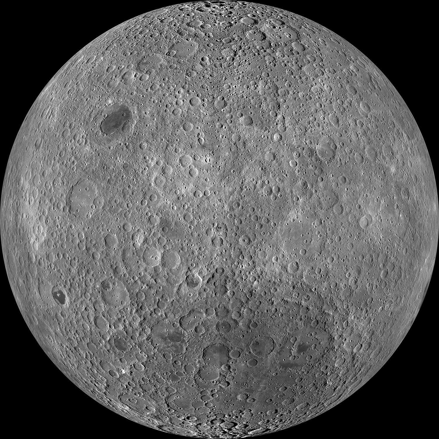
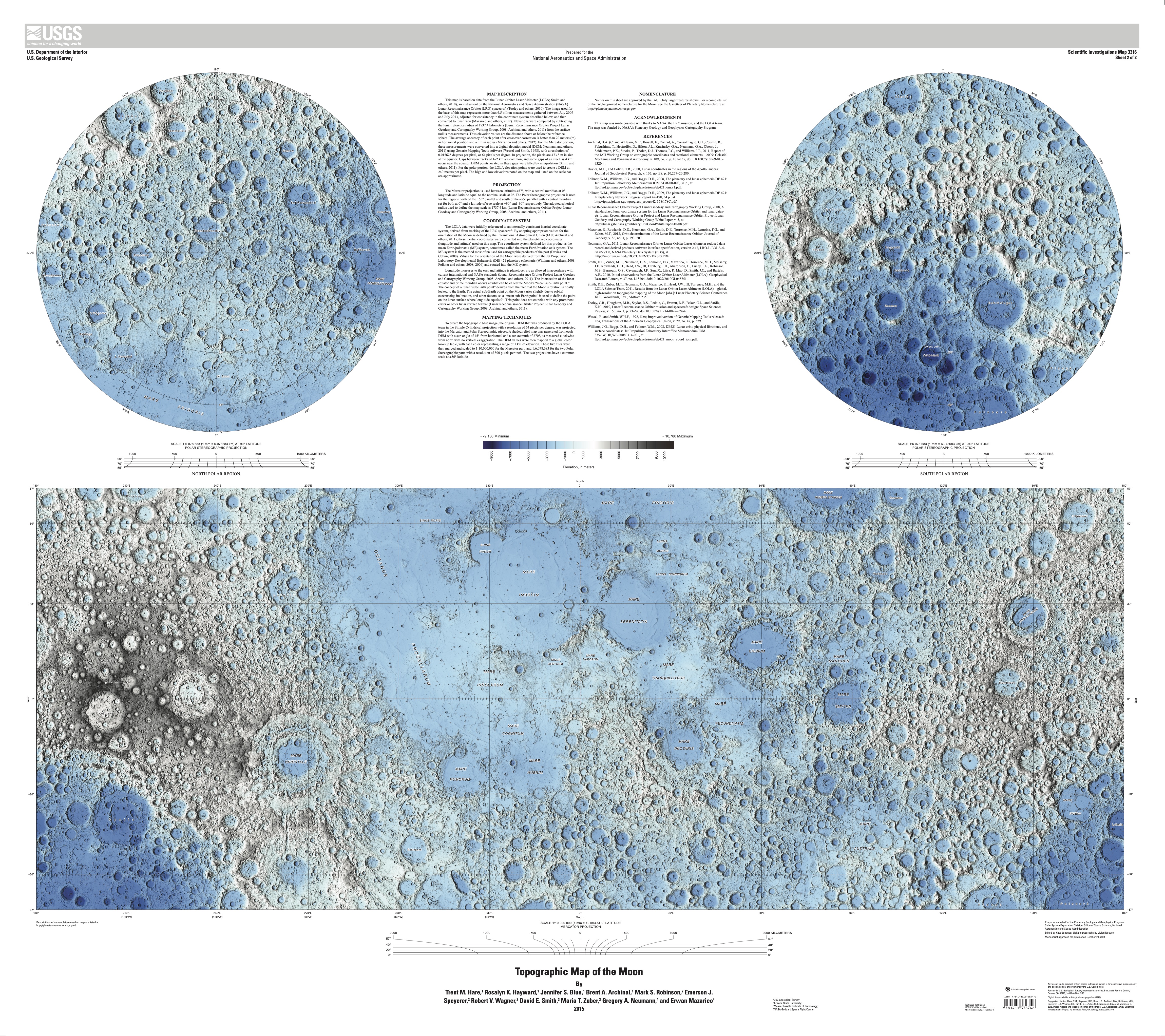
The first thing in my to-do list was to familiarize myself with the geography of the moon. NASA said that Artemis II astronauts took geology and cartography classes, so if I was meant to explain something to the readers, I probably should do something similar. So my ride started with the many USGS maps in different projections and themes.

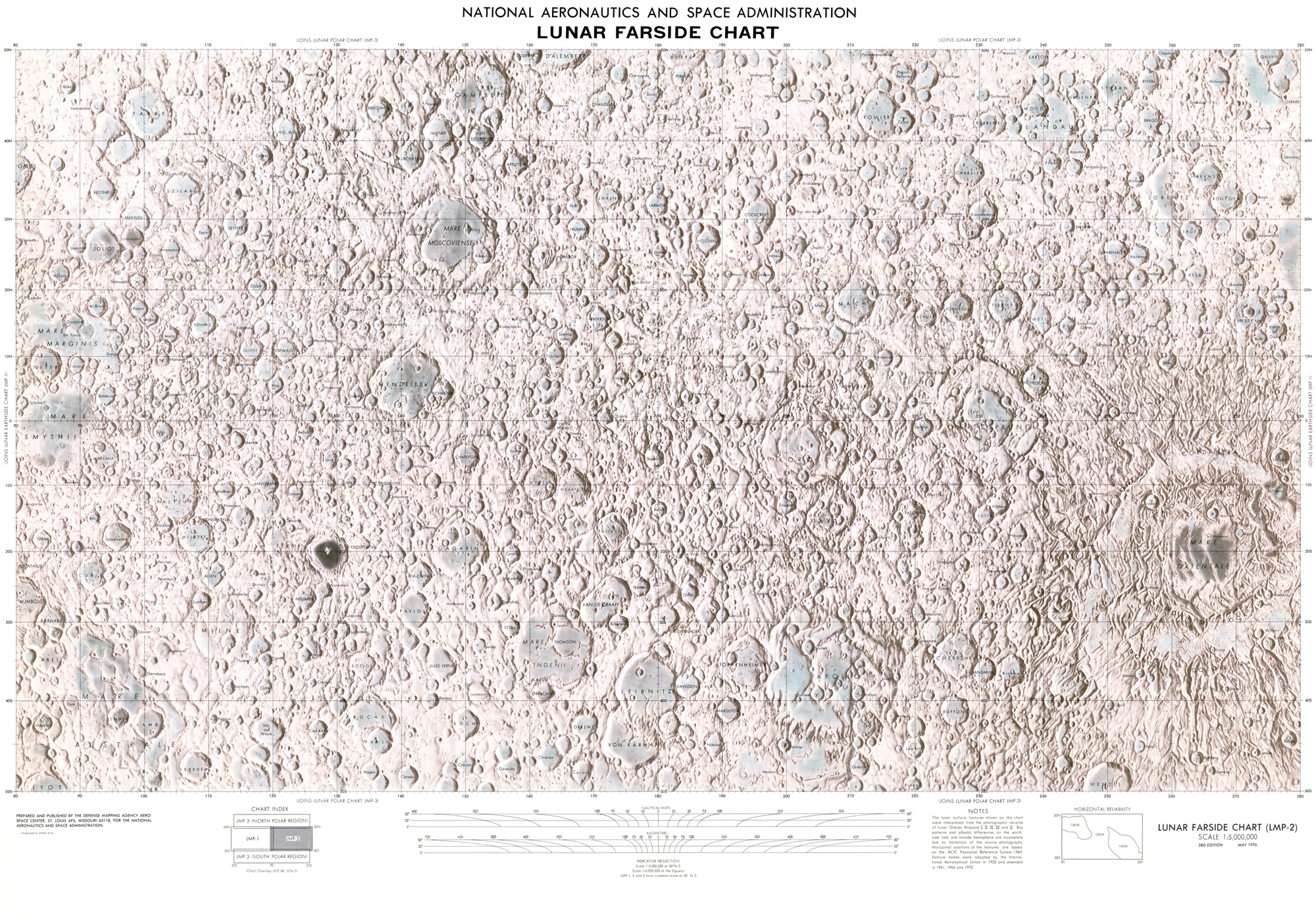
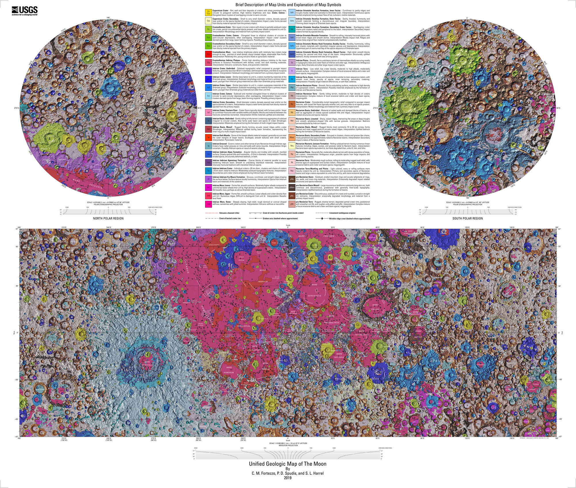
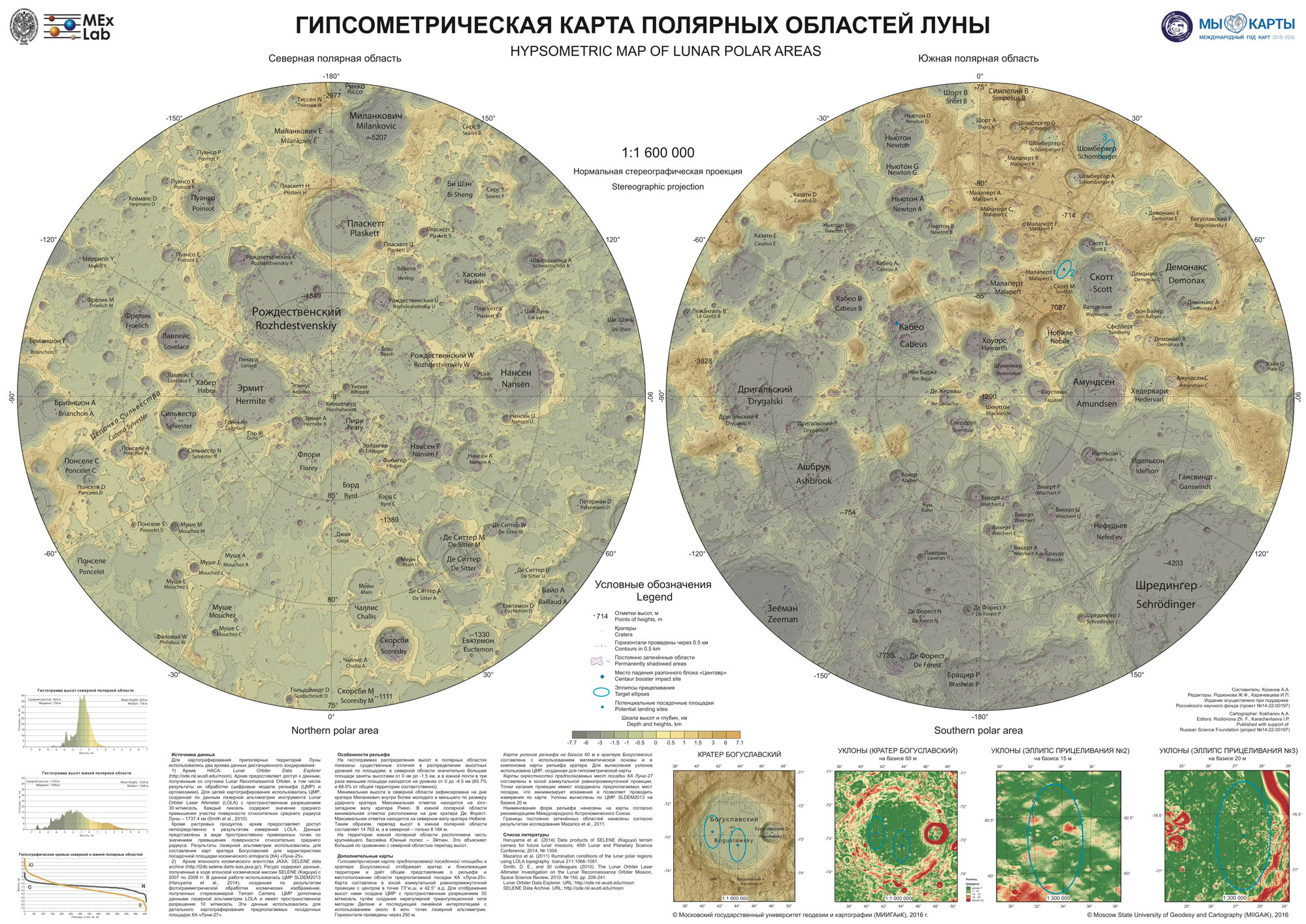
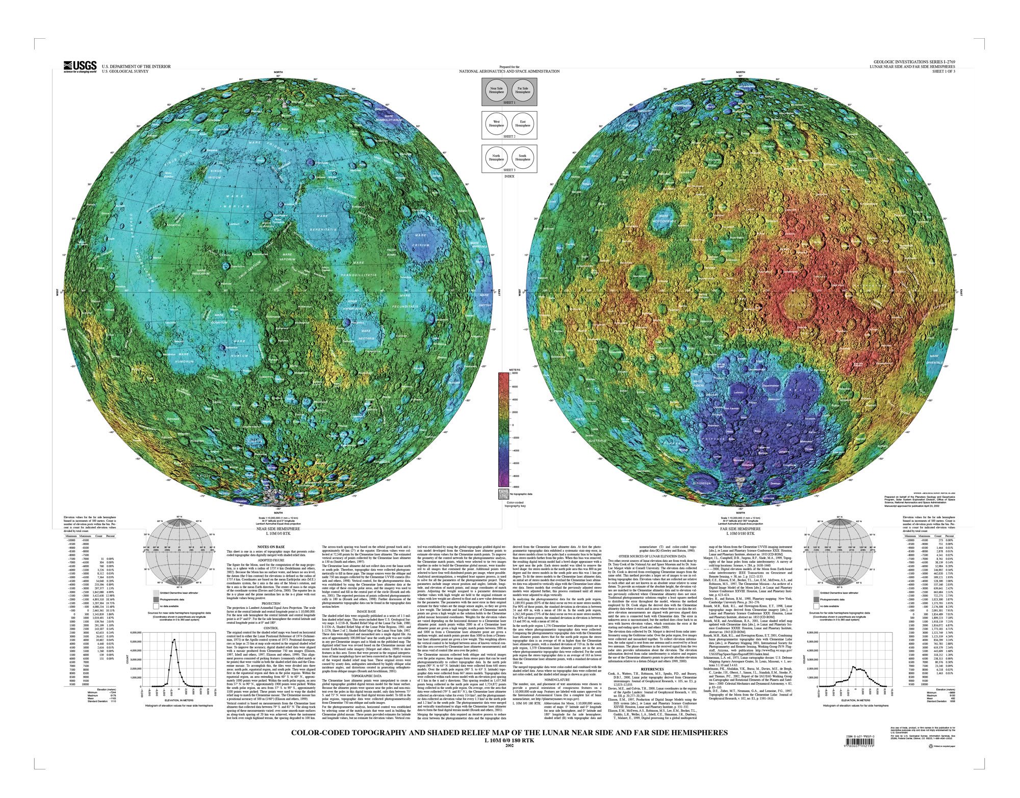
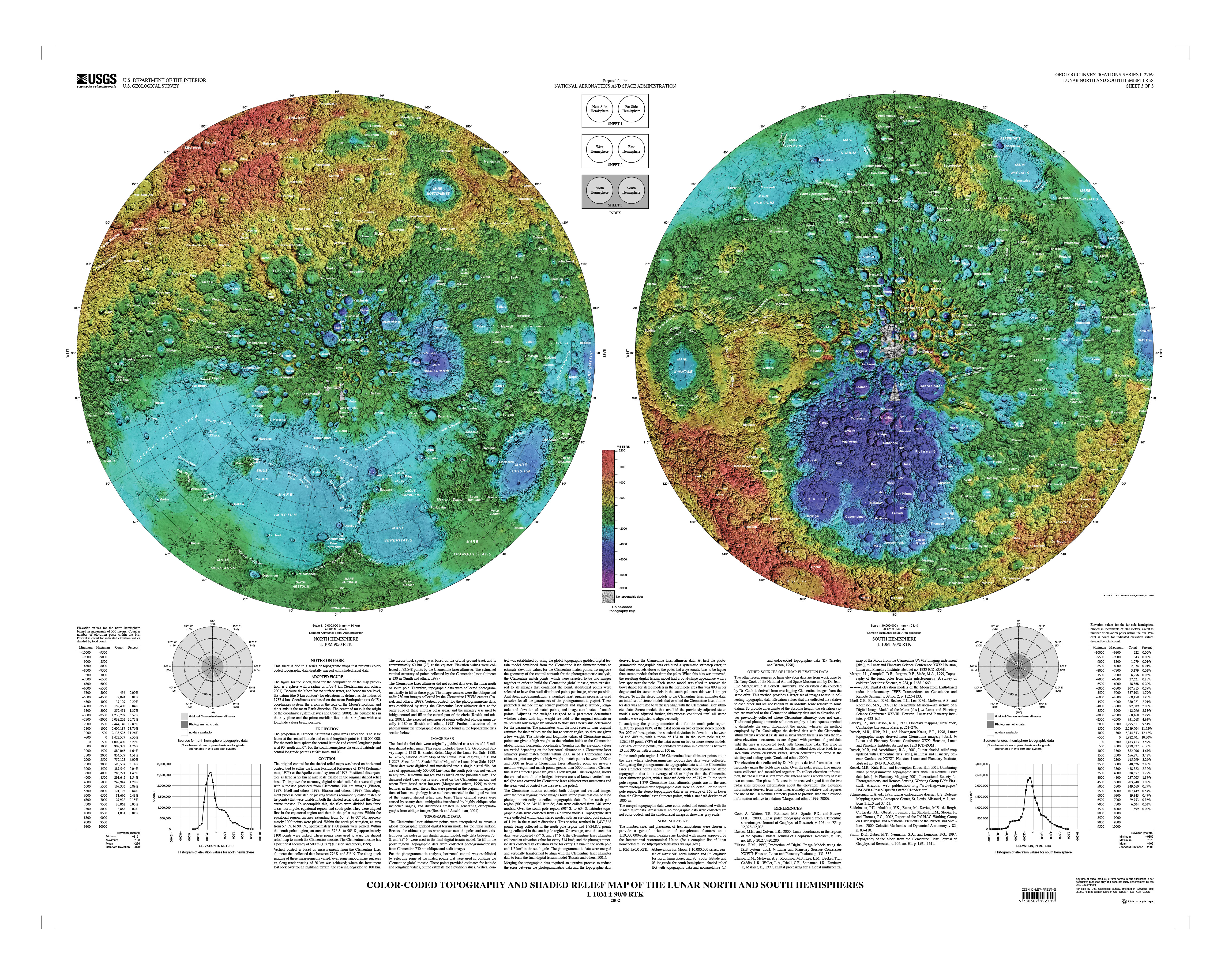
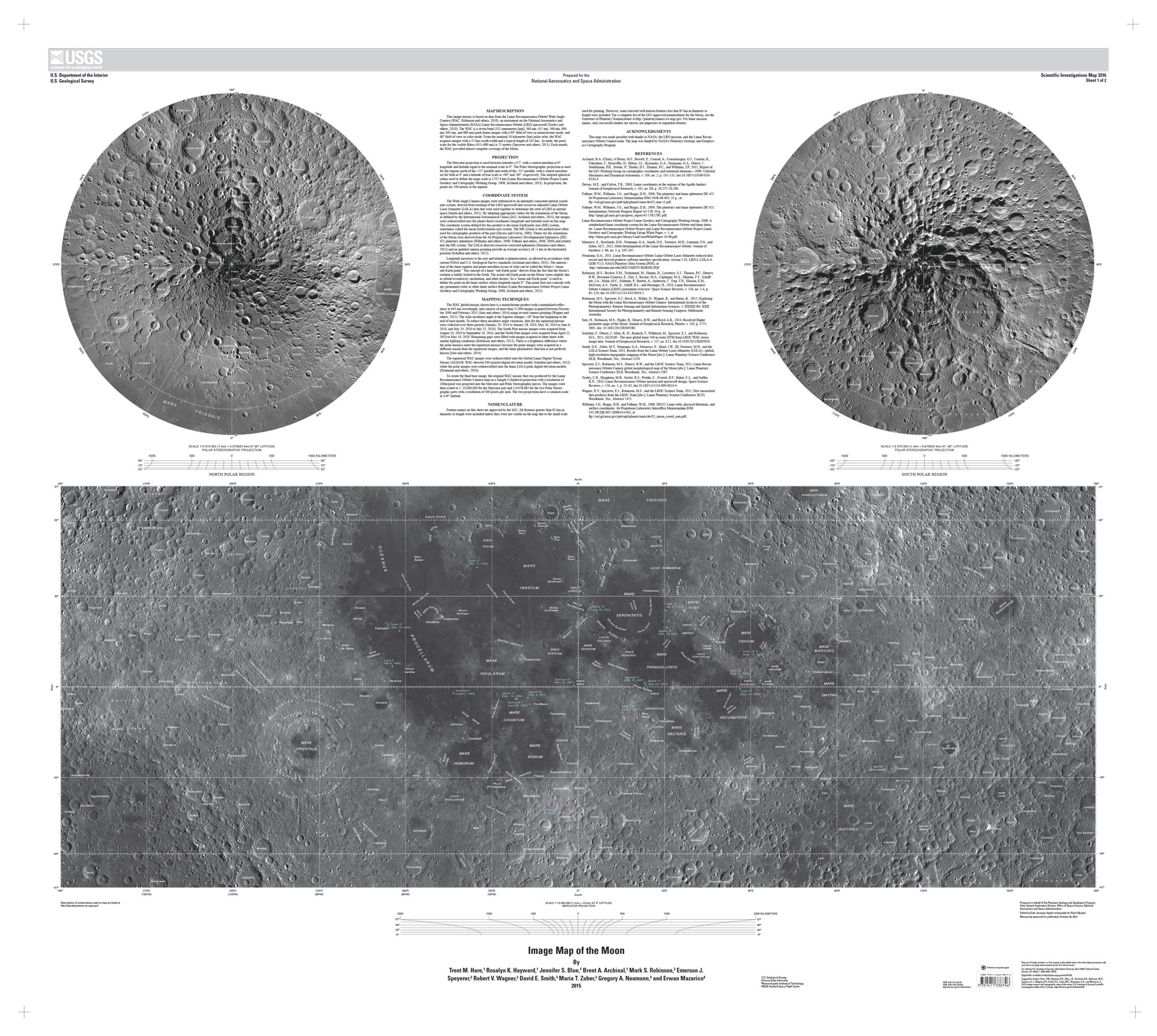
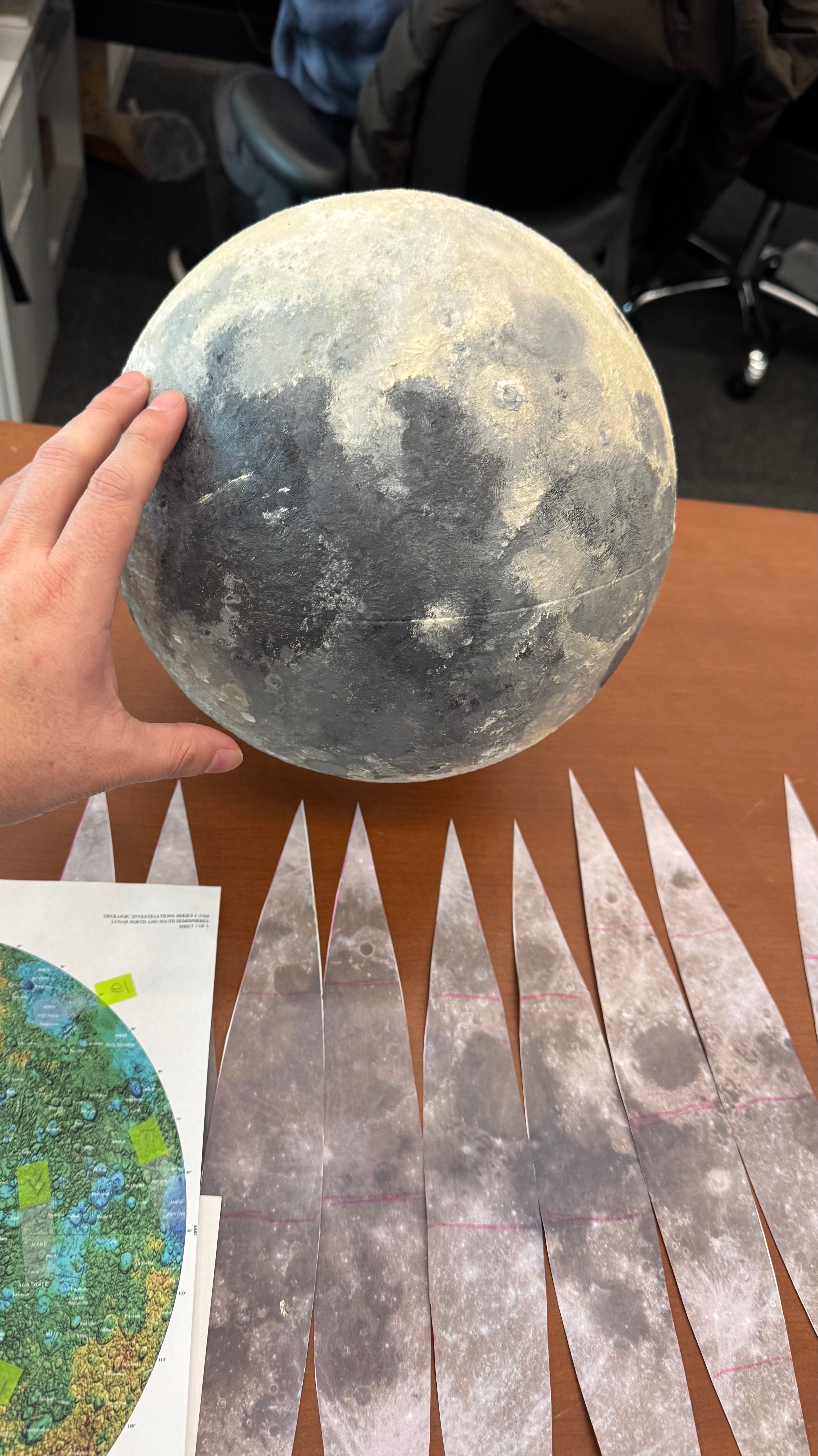
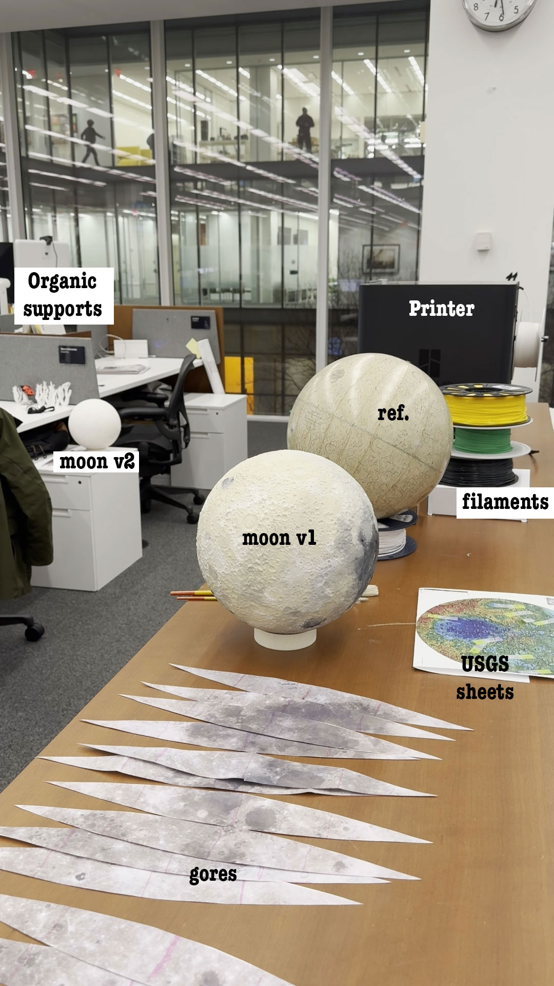
Some gigabytes and a few days later, I started to look at the 3d models with a little more of confidence, I made a small test printing a section of my model to try on the paint.

3D printing

Messing around with the 3D printer was a hoot! I hit a few bumps with the filaments, because our team has a Bambu Lab printer that feels like it has a mind of its own. I learned that generic filaments are great for tiny trinkets but a disaster if you leave the printer unsupervised for more than an hour. It was like leaving a toddler with a bowl of spaghetti; I had to stand by de-entangling the roll to get that first sample out. After a shopping spree for some new, tougher filaments, the drama was finally solved.

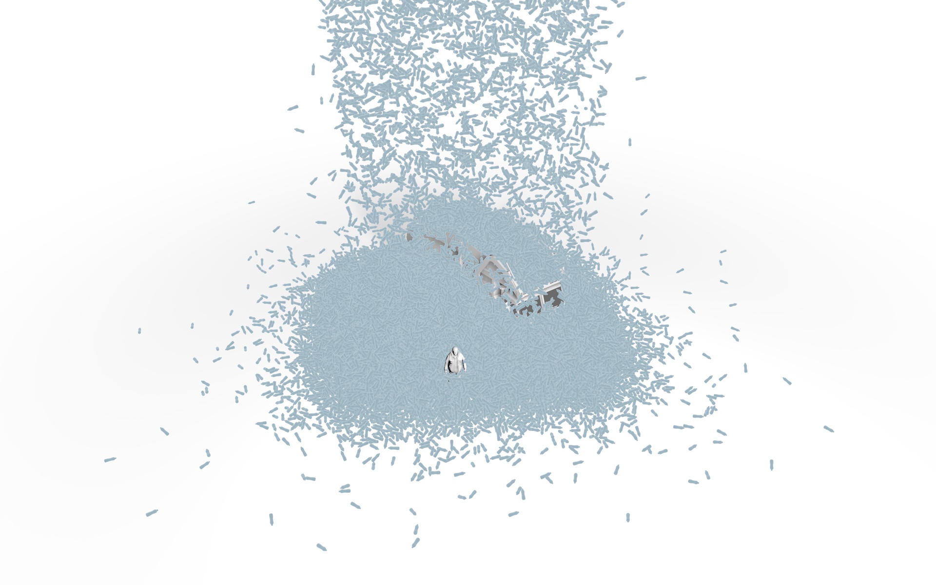
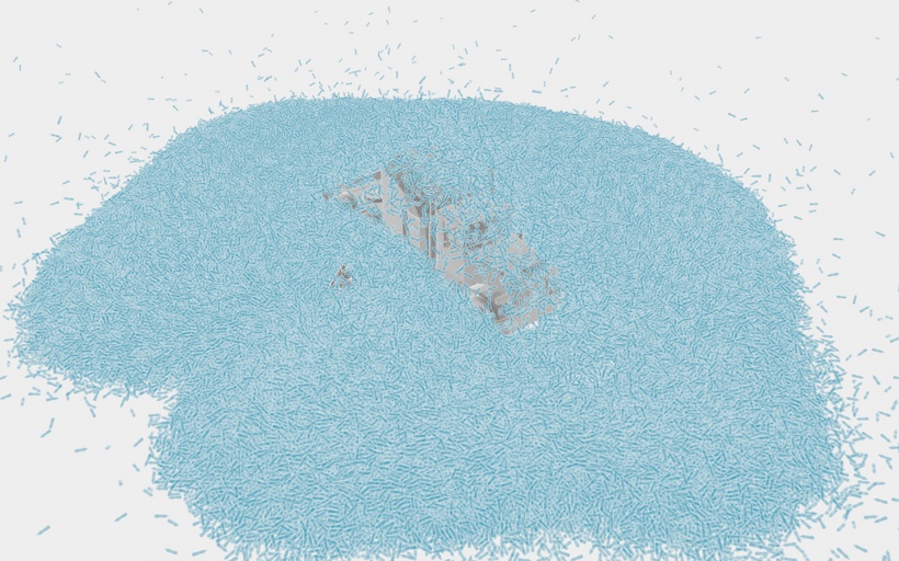
The printer comes with its own software that plays detective on your 3D model, helping you find those sneaky weak spots. These printers melt filaments and whip up thin layers to serve your model, so, if your model isn’t properly built, you may end up with miniature Swiss cheese holes or cantilevers that can potentially transform your model into a gooey glob that looks like it just lost a battle with a pack of chewing gum.

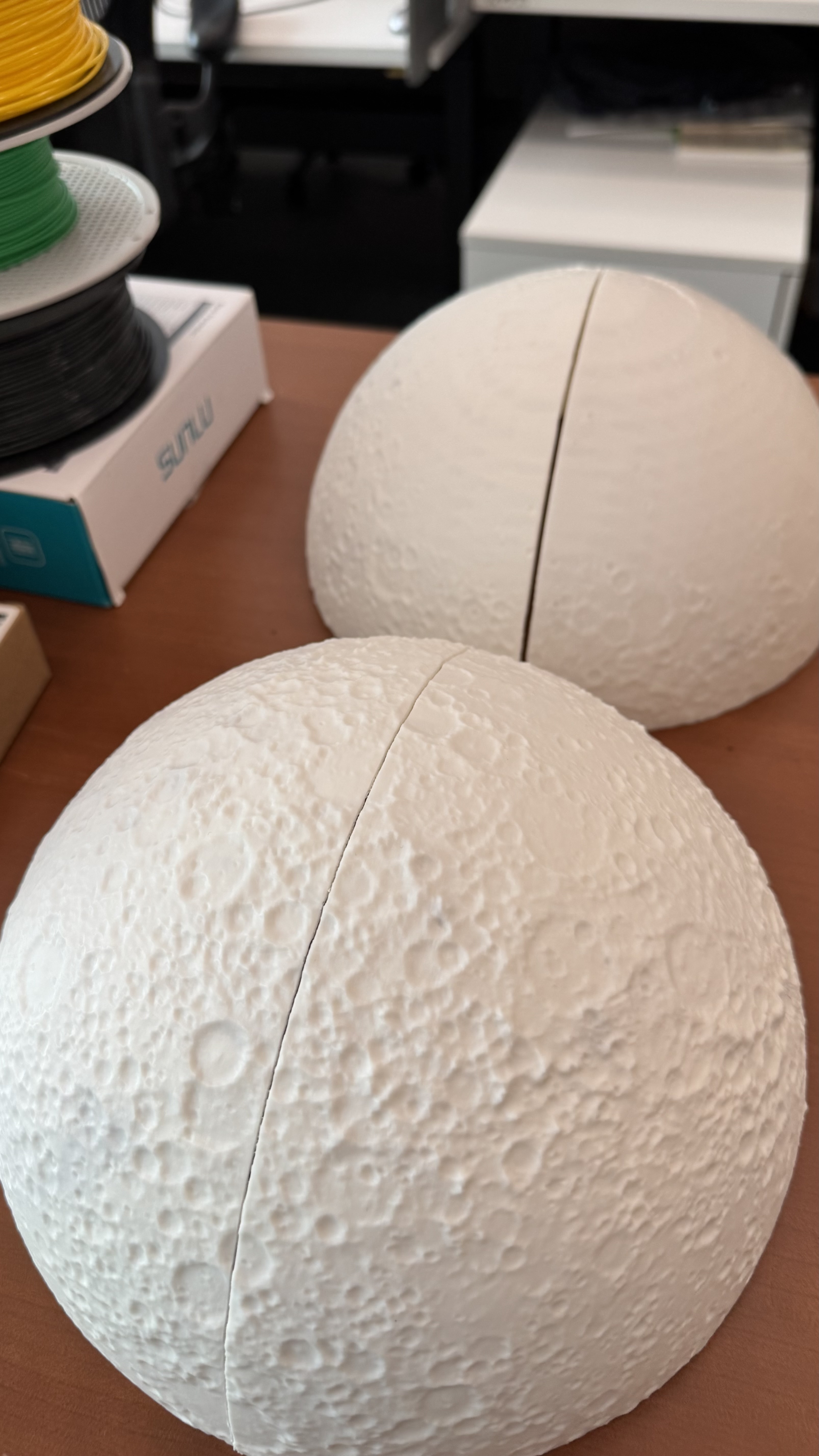
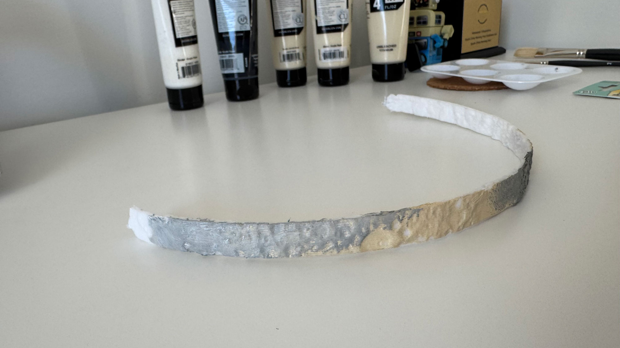
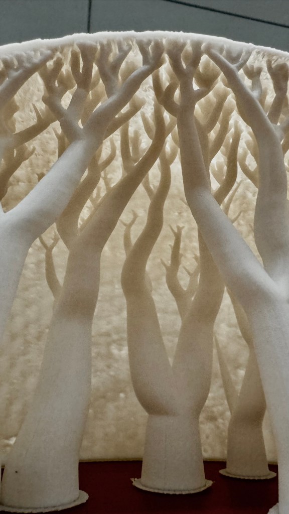
For the first full test, I printed out 4 wedges, I inspected the model and added organic supports to prevent the collapse of the model. The structure is actually very nice:

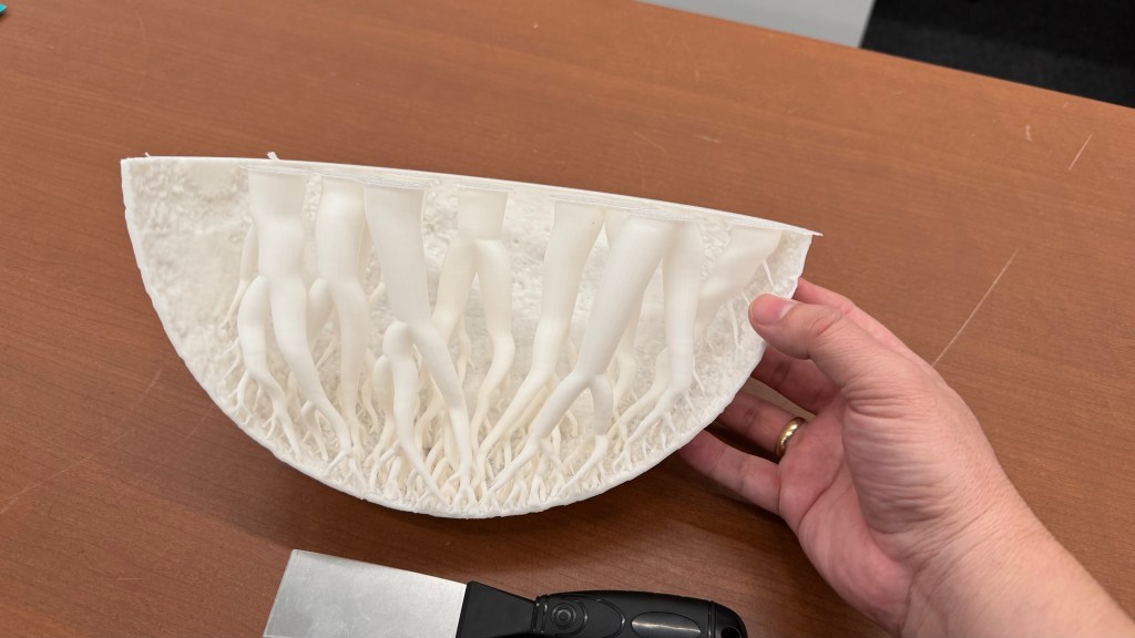
However, these organic supports only serve as support while the model is still hot. Once they cool down, you can just removed them. No one will see them because you have to glue them together.

How to paint it

Next step was to paint the model, pretty fun!

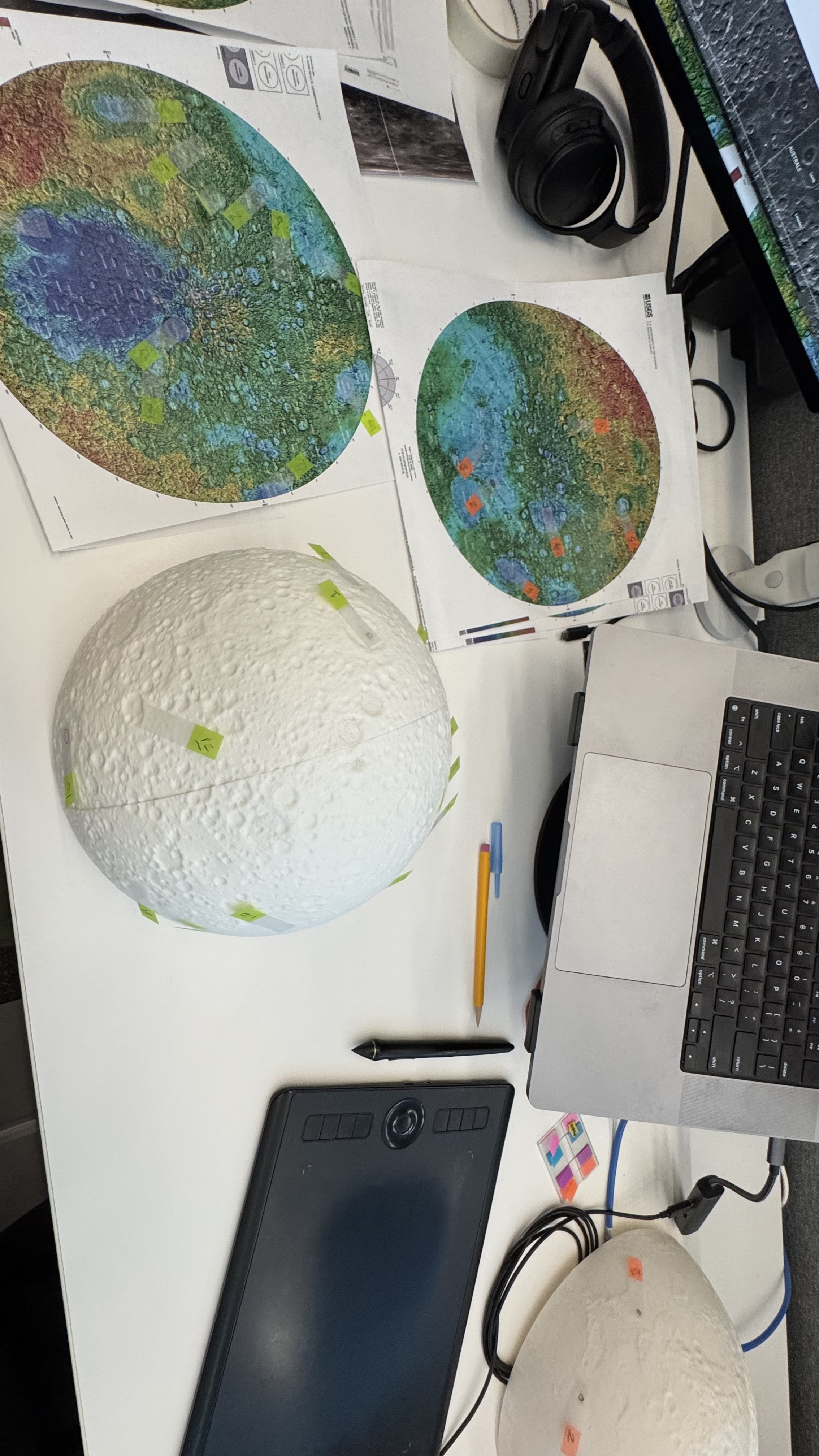
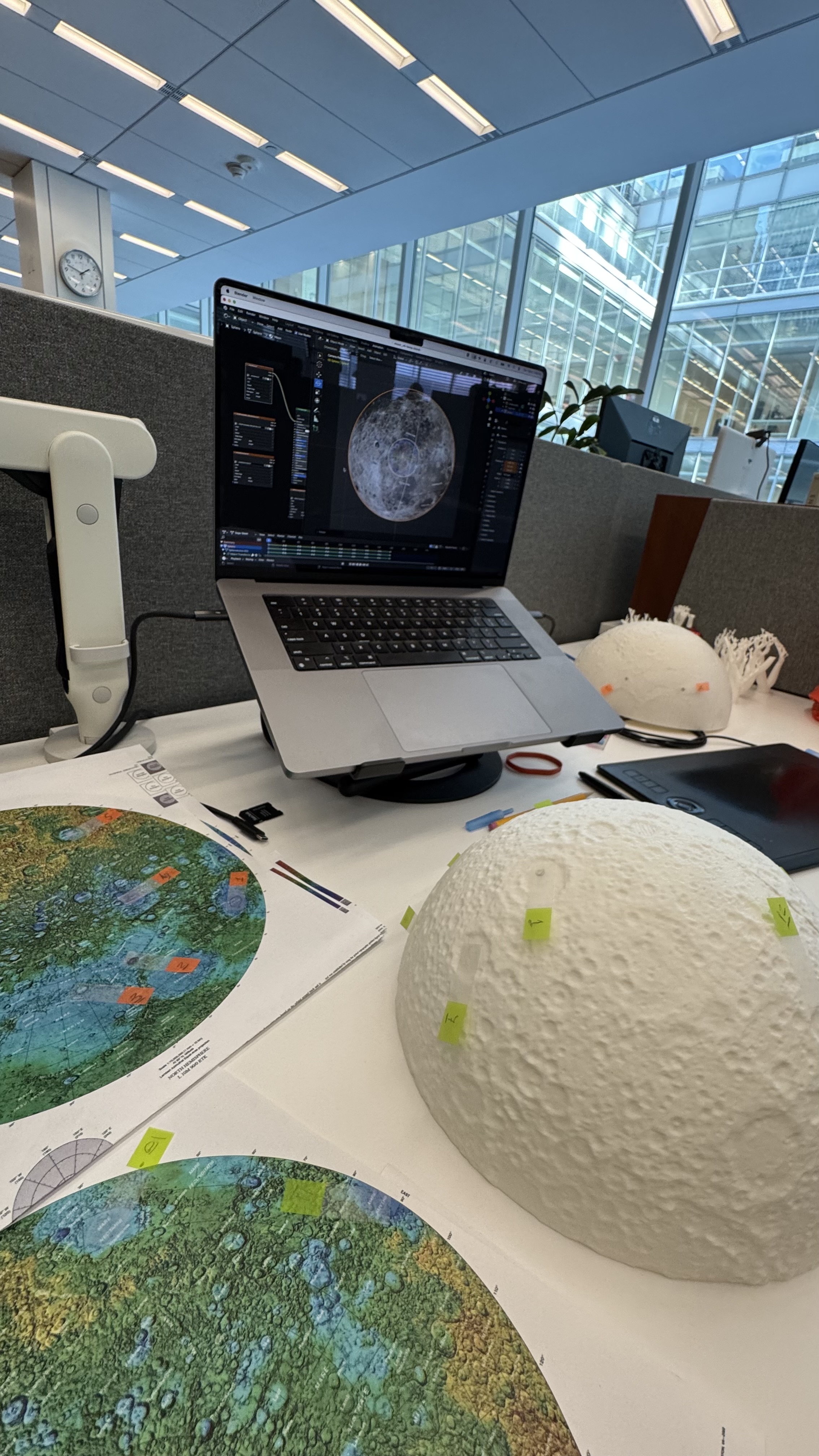
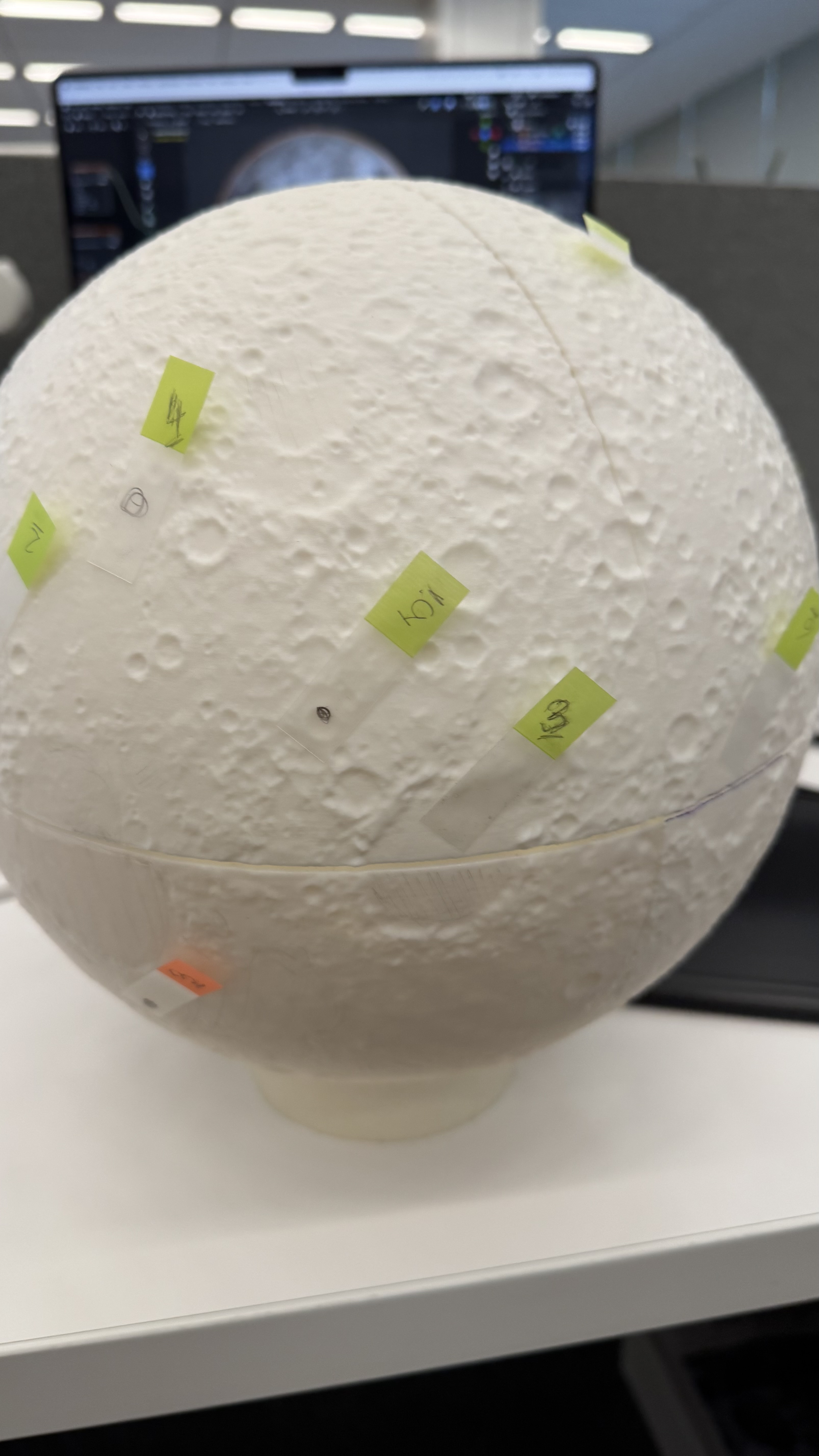
I used a bunch of different maps to be sure how to look and align the references to my model. I first tagged some craters and features just to be sure that I have the right alignment before jumping in with the brushes and acrylic paint.

Flat to Spheric

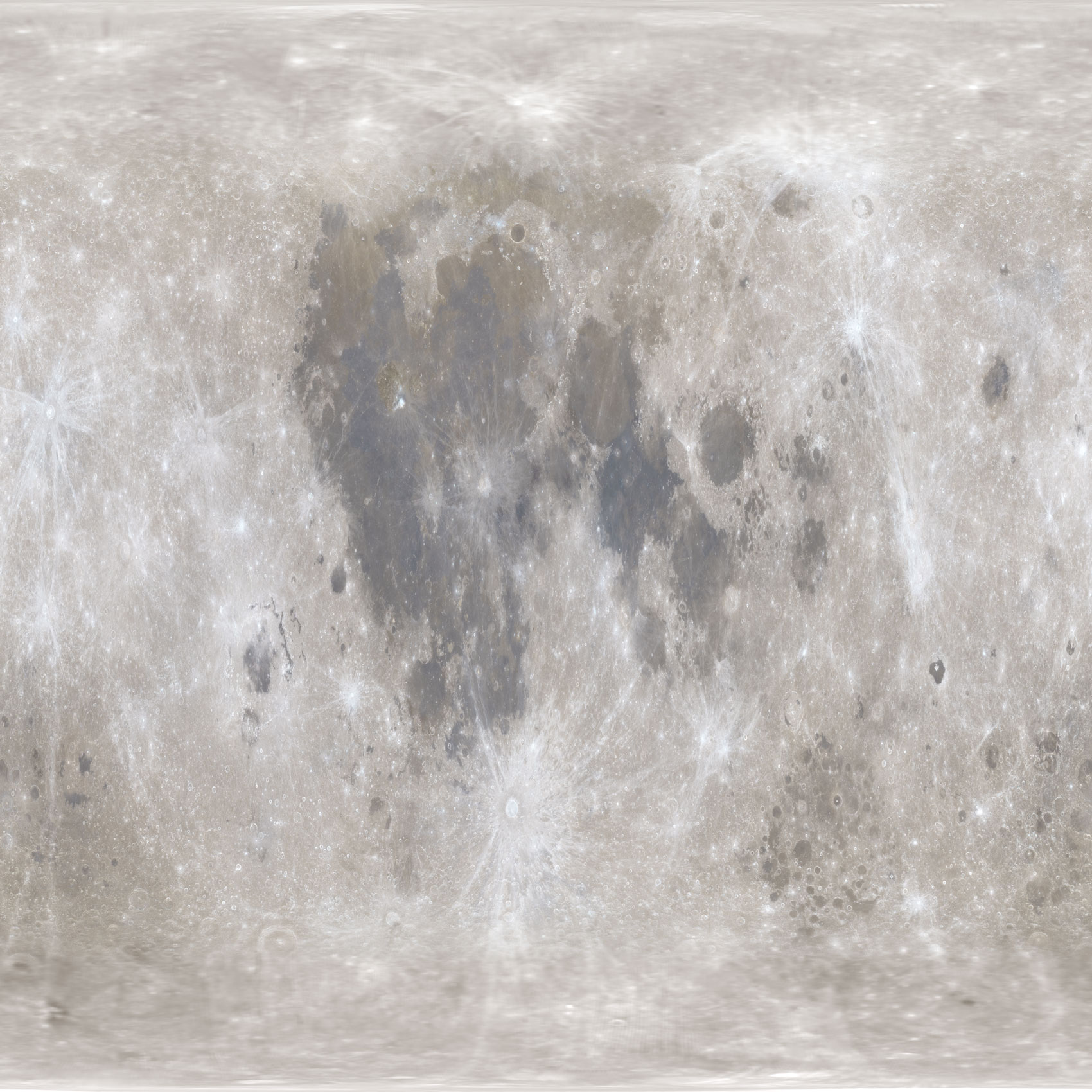
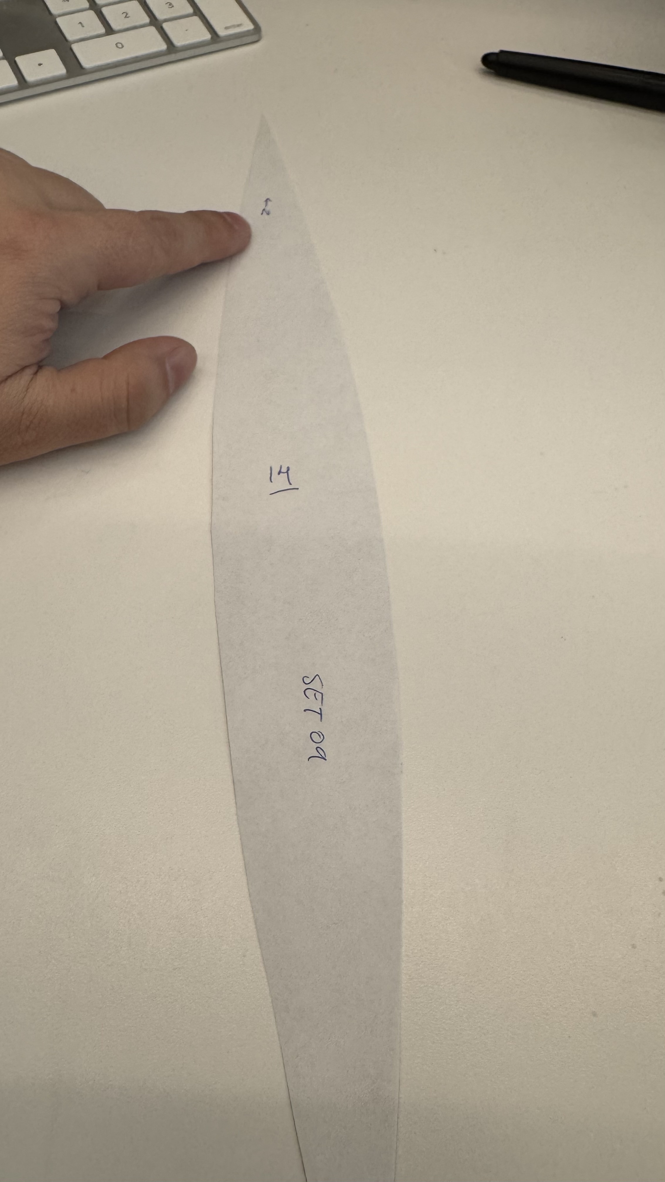
I used a equirectangular mosaic from NASA to get the base color guide, however to project that into my spheric model I need to process it like you will do to build an earth globe.

Equirectangular projection.

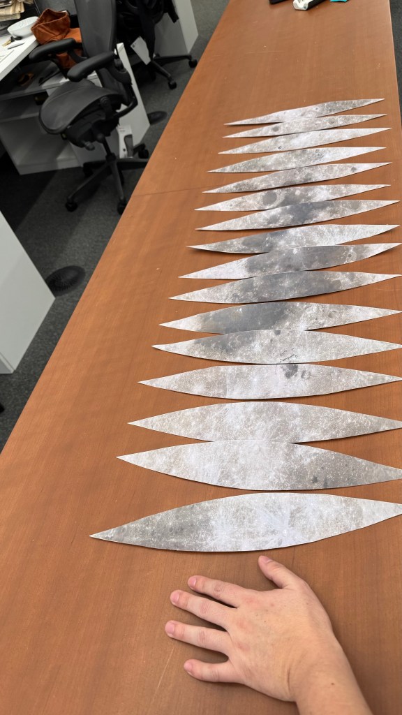
I used a custom Python script to slice, scale, and re-project the original equirectangular image. The script takes the original image and divides it by dividing it by the model’s circumference. Then slices the data into 16 gores. While increasing the number of gores would enhance the smoothness of the reference, this was just for me to make sure that the painting work was accureatly applied.
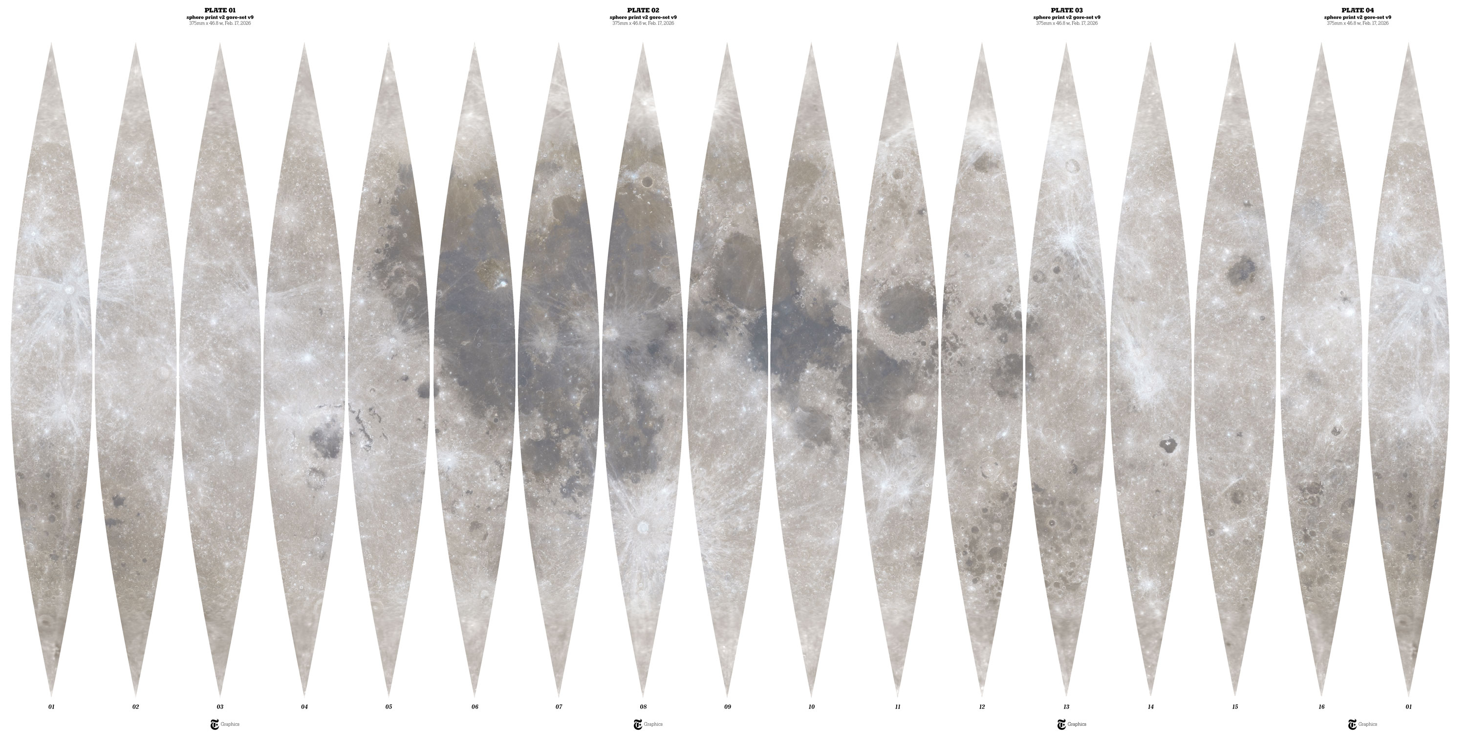
Moon gores

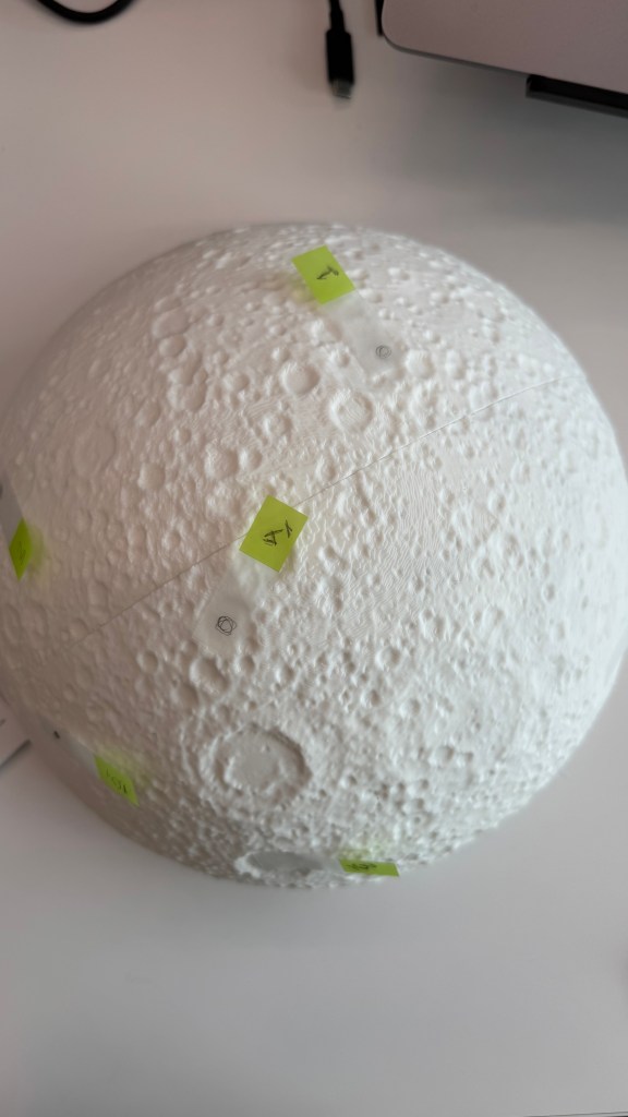
I added numbers to the back gores and draw some references with a marker on top of my model, that helped me to check the alignment of terrain and color.

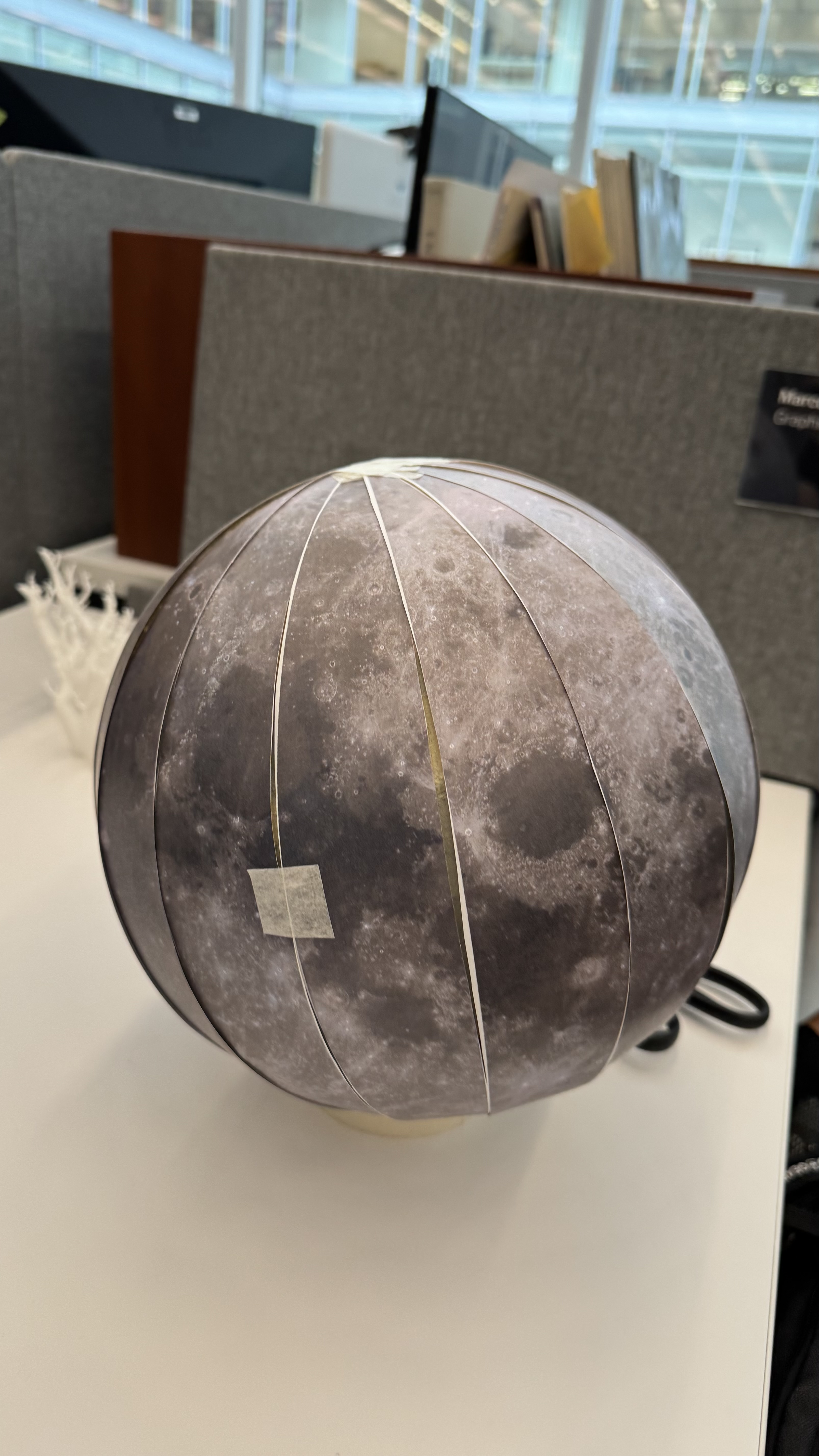
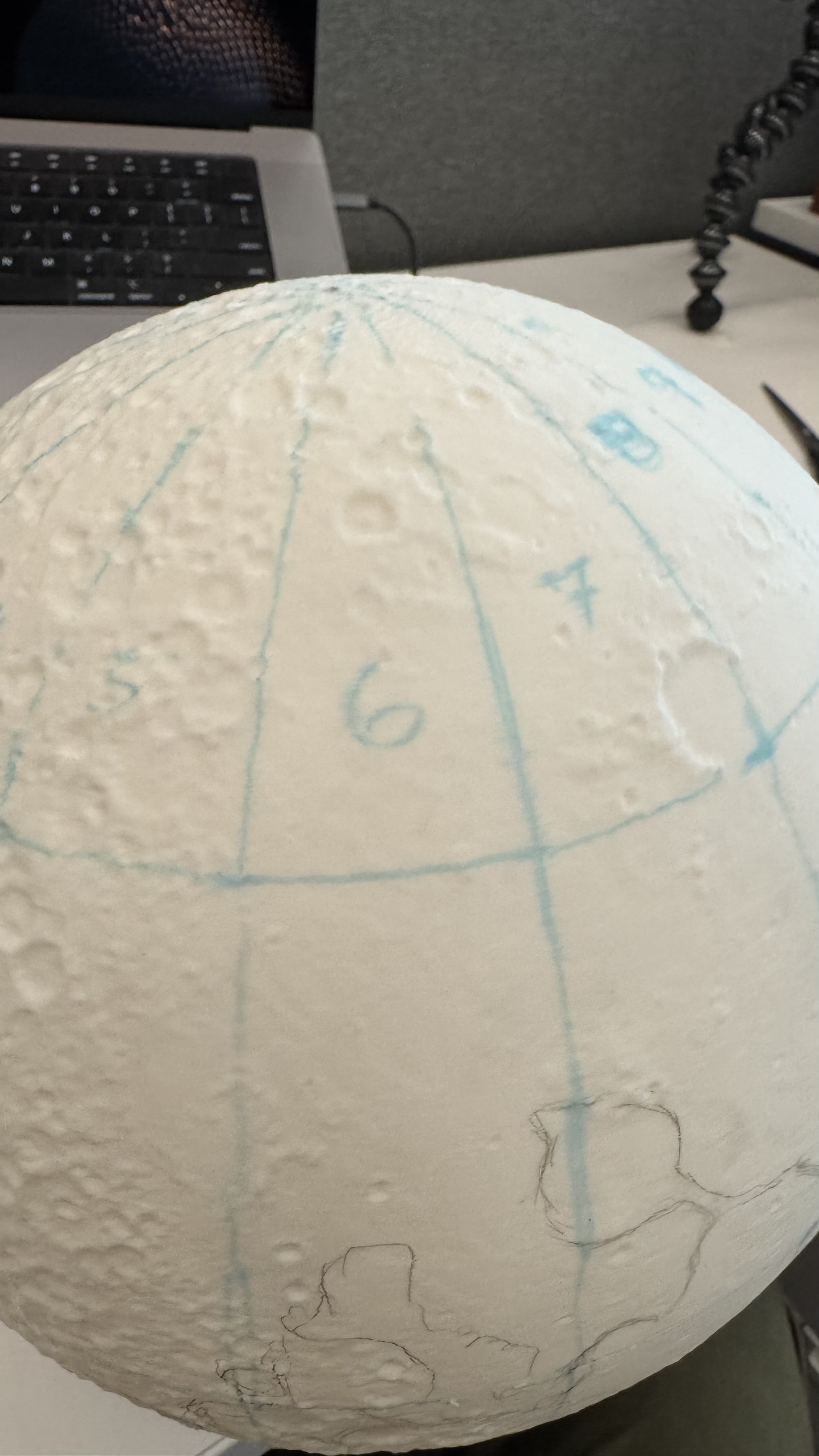
Then it was like peeling an orange while adding color.

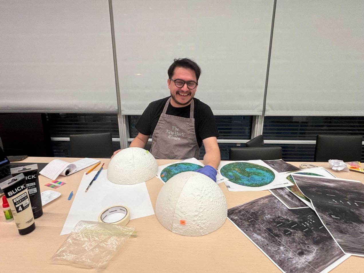
After I finish the first paint work, the model was almost there, but it was not perfect, the joints of each of the 4 wedges were not perfect, the color was also a little off in some areas, so I printed a second model and improved the process to make it crisp. Here’s a view of the working area around my desk. You can see a few of the white organic supports next to the version 2.0 and some other tools and things all over the place.

Once the moon was ready, I did a day of recording with the video folks in the studio. They did an amazing work editing the final piece, we used the model here, and here. I also posted a little timelapse showing the painting process, you can take a look here.

It is important to note that I worked all of these things while also working on six additional pieces that showed various aspects of the mission. The experience was both pleasant and quite exhausting.

Thanks for reading!

Standard
infofails, Motion graphics

#infofails chapter 02 (plastic bottles)


About #infofails post series:

I have a lot of beta graphics versions that never goes public. I do two or three versions of a graphic, sometimes just a concept as part of the creation process to get a better solution. Where all that material goes?  well, ends-up in #infofails, a collection of my work fails.

This time I’ll like to share a little bit of the backstage of the plastic bottles project published a few days ago. If you haven’t seen it yet, Have a look here: https://tmsnrt.rs/2PDRvhd

The opening of this project is a short video of plastic bottles covering a garbage truck and a standing guy. To get that piece I did a few testing versions, all together neede almost 400 hours of rendering including the final piece.

demo_192

Early attempt. The bottles just run away from the pile because of the friction and mass assigned

Just to keep a sense of scale I did also a few graphics for my self to be sure that all the calculations were correct and also to get a sense of what I was doing. But after talking with some experts and friends the numbers needed to be adjusted.

This slideshow requires JavaScript.

One of the thing that helps me a lot was a plug-in for Cinema 4D from Cesar Vonoc. I was chatting with my bosses about how difficult it was to calculate the volume of organic objects in C4D, for the next day they had found this tool that literally gives me the chance to make organic shapes and keep the accuracy needed too. Thanks Matthew and Simon.

Here some ugly early testing drooping bottles and making piles:

This slideshow requires JavaScript.

Technical part for nerds

My first idea on Cinema 4D was to use an object cloner to create 1 million of copies of my original bottle, then adding dynamics to them let them fall in a cascade, testing with a few objects was ok, but then I wasn’t able to load more than half-million before the computer crashes so for big fail…

1m_EMTT_0286

Particle emitter demo using 310,000 bottles

demo_0267

Render testing. The computer failed to render on the frame 267 of 1500

clons_160k_055

Cloner version, the computer crashed rendering any over 170,000 clones

Even using a very simple geometry for the bottles, my laptop wasn’t powerful enough to manage my crazy request, after I removed the fancy texture of each bottle it moved a little better, but not enough to reach 1 million of copies.

I solved the issue using a particle emitter for the 1 million objects during a little more than a minute, using a basic material to add textures and effects in after effects later, even with all these adjustments to the process the render took over one week to be completed. Lucky me my laptop is still alive!

clons

Demo to show the number of plastic bottles sold every second.

Them some pile shapes and concepts of how it will look at the end. I was adjusting the behavior of the particles, some adjustments in the textures, lights, camera position… many aspects to present a nicer view of this to the readers

This slideshow requires JavaScript.


While the production continued, I did a second version of the website controlling the zoom of a giant render by scrolling the camera passing from the smaller pile of 1 second to the final visualization of 10 years. But the images were too big and the quality not good enough.


I have to say that this time I did around 22 versions of every single graphic, looking for the right elements, proportions… Every time I had a new version, we had a chat at the team to point out things that could be improved. Some just change shape, but others like the NYC model also change concepts.

v17_static_NYC

Testing textures for a plastic bottle pile over Manhattan.

static_NYC_v11

Testing textures for a plastic bottle pile over Manhattan.

tenYears_layer

An alternative version of the graphic using all the bottles spread out over Manhattan

v19_static_NYC

An alternative version to visualize the bottles sold over the last 10 years

v18_static_NYC

Uniform extension of the bottles sold over the last 10 years over Manhattan

city.png

A cutaway version to get a sense a deep

I did also an attempt to make all of the pieces in the same “3D look”, but at the time I was doing the information more confusing, finally, we just drop the idea and stay stuck to the original Sankey chart show what happened with the plastic created over the last 65 years

fate_v2

The fate of all plastic. Version 3.

This was an extremely interesting project, I experimented a lot with different things but maybe the time to verify each of the countless versions and polish the results really made the difference at the end. Thanks to my bosses Simon Scarr and Mathew Weber and my colleagues Manas Sharma and Alex Richardson who also contributed a lot to launch this project in good shape.

If you want to see the finished project and some other graphics, here is the link to the special feature on Reuters:
https://tmsnrt.rs/2PDRvhd

Or have a look to #infofails Chapter one:
https://mhinfographics.com/2019/09/03/infofails-chapter-01-pilot/

Standard
Digital pieces, Motion graphics, Print graphics

My sincere gratitude to the South China Morning Post

Back in 2016, I was moving from Costa Rica to Hong Kong to face a new challenge. Full of dreams and hungry of learning, I arrived at the South China Morning Post doors. There I found new friends and colleagues and learn a lot from all of them. Today I have the same feeling once again, and I want to say thanks to all that people that I meet here in Hong Kong because they change in a way or another my professional and personal life, I really can’t mention names because there are many people and I don’t want to leave anyone out

In three years at the South China Morning Post, I collaborate in 30 print pages and I have good memories for all of them, some remind me of a trip with a friend to collect information in China, a rush hour with a piece of breaking news, or a long project that I only talk about day after day (oh poor friends of mine, I’m sorry )

Bellow, some of the print graphics memories I create at the South China Morning Post

This slideshow requires JavaScript.

I had fun doing full-page graphics at the South China Morning Post print ed, and the online was an awesome sandbox where I found the freedom to test and play with pretty much all the topics that come to my mind, my first graphics as stand-alone were the Statues Graphic and the lightning project

process_2

Statues drawings

And some of those first steps at the South China Morning Post

This slideshow requires JavaScript.

But maybe the more recent ones were the most I enjoy because of the diversity of ways to work, some times doing projects by my self and some others collaborating in bigger projects with the other artist, visual journalist and designers. That’s the case of the Forbidden City series collecting data and working in graphics on for a year

The biggest project that I ever did up to today, and at the same time one I enjoy the most was the Forbidden City, below the Part One print version. To be honest, I’m very bad doing drawings, but since I get here I face a lot of projects where the drawings were the essence of the graphic, like this all manually made:

The-cricket-cage

Forbidden City series, part one for the print

And the extended digital chapters, which in my case covered the architecture aspects of the Forbidden City in Beijing:

Maybe the most exhaustive part was the built of the of the VR feature in the second chapter made with Cinema 4D:

c4d

Here the output on youtube 360/VR:

…and some more of the stuff of the Forbidden City Series, small animations and graphics

I can say that I try pretty much all kind of topics in the South China Morning Post from many soccer graphics to the architecture ones, Chinese projects like the new the Silk Road (OBOR), of the perception of the rule of law, explosionsweather conditions, the moon events, crazy aircraft stories, game-like graphics about food, vessel tragedies like the Aulac and the Sanchi tanker, trend games like Pokemons hunting, a lot of Trump, and the Brexit, automobile technology, and snakes, my fascination with Asians anatomy, always nice to have some time off so I also did one about holidays; if you want to know where you can go with your documents and how much it cost I did one about the passports too; graphics about Chinese cities, Hong Kong’s ageing population, war vehicles, why no toilets too; the Golden Globe Awards, celebrations like San Valentine, or where the Asians lives in the US; all about North Korea in 15 graphics, the evolution of Peral River Delta considered the Chinese silicon valley; Spanish Galleons crossing the Pacific heading to China’s goods; Thai kids trapped in a cave; automation and industrial robots and many many more that I can’t remember now. All those with a nice touch of memories because work at the South China Morning Post graphics team was more about have fun with the stuff you love to do rather than just work

This slideshow requires JavaScript.

My last project with the South China Morning Post was the Tibet permafrost, and there wasn’t a better way to finish my time there like doing one last project with my teammates like the ones I enjoy for 3 years

cover_SQUARE_50

Permafrost cover

coverpermafrost02_W

Cover illustration by Adolfo Arranz

tibet-plateau

Permafrost extension in the northern hemisphere

For the print, I split the project into two backpages, so I can make a more specific topic on extreme temperatures, on my point of view a Goldilocks place were the temperature is too hot in one place and incredible cold in the other

Extreme Earth is blowing hot and cold

My last page at the South China Morning Post, published in February 2019.

As I set in the title of this post, this is just to say thanks to all you guys that help me to evolve and create more and more. Thanks to the Hispanic gang of the South China Morning Post; thanks to my British boss today a good friend, to the friends at Hong Kong University, The Hong Kong Polytechnic University, the Hong Kong Design Institute and the Baptist University that also open their doors to me, all my Hongkongneer friends and all the South China Morning Post family that let me be part of that amazing experience

From now on, my graphics will appear in the Reuters pages, lucky me to work there with more good friends. Hope to come back soon here, to my website, to write about some new graphics and backstages made for the world

Standard
Digital pieces, Motion graphics

Quick graphics for social networks

Last year (2015) I start many new projects, some of them are still progress, but one of these are the quick graphics for social media.

At the unit of infographics and datavisualization, we spend many time in daily production and in special huge projects, I believe that we have enough time and muscle to produce frequently these small graphics,  every single infographic must have a print version, desktop digital versión, mobile version but also, i like to choose some of these to develop a social media version, sometimes a gif, or an image or even a short video with a compact version of the main graphic.

So, here is some of my favorites picks:

The spooky asteroid:

In october 31, an asteroid pass near the earth (near in space terms), this asteroid was renamed “the spooky asteroid” and take the attention of the world by the time of his visit, so it was a nice opportunity for a quick graphic for social media:


Compact version for social media. Motion-Infographic by Marco Hernández.

spooky

Gif version for social media. Infographic by Marco Hernández.

pesoInfo_spooky

Desktop digital version for article. Infographic by Marco Hernández.

The MAVEN findings:

The NASA made the announcement of the Maven mission findings about what happened with the atmosphere and magnetic fields of the red planet. We are awaiting the press release with a stock of pieces to develop soon as we can a simply animation for social media:

ARTpieces

Illustrations by Dominick Baltodano and Marco Hernández.


Compact version for social media. Motion-infographic by Marco Hernández.

MAVEN-Marte_LNCIMA20151105_0084_1

Desktop version, infographic by Edgar Jiménez, Carlos Fonseca and Marco Hernández.

Hope in this 2016 have many more of these chances to create more quick graphics for social media, these are a great way to engage readers with content made exclusively for consumption on social networks.

Standard

A few days ago we released an special about the births of a century in Costa Rica, I had the chance to produce this motion for. It’s nice to get raw data and transform it in to visuals, alternative ways to see the past or future of a population, if you like to take a look in to the full site here http://bit.ly/1kpN45p you may use google chrome for translation from spanish 🙂