
Around the world millions of people are still at home, waiting for this and other measures to take effect to face the coronavirus outbreak that has affected us for months now. From the perspective of those of us who work in the media, these have been exhausting days.
In my particular case, this week, from my chair at home, I published two projects related to the virus and there are still many more waiting. You can have a look here: https://reut.rs/3cnZ7e8 and here: https://reut.rs/3etB13s
How coronavirus hitched a ride through China
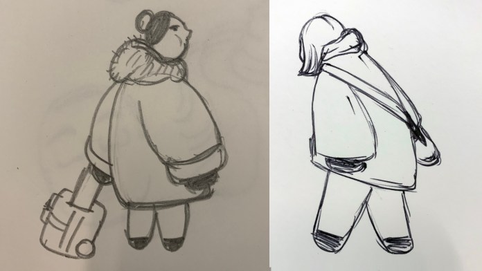
For the first project I did a lot of illustrations, but also a bunch of graphics that you may not notice, there are about 135 maps (including different device sizes), also there are about 37,324 human icons, illustrator was about to set on fire my laptop while editing those icons 😂
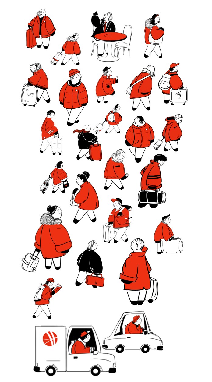
And some of the thousands of humans featured in the story:
![]()
A breath of fresh air
The second project was a little different. Around the first week of February, I was curious about air quality in China and what could cause the lockdown, I discussed it with my boss the idea, but we never had time to go further and analyse the data. Few days later I did a quick search just to see if there was something interesting there:
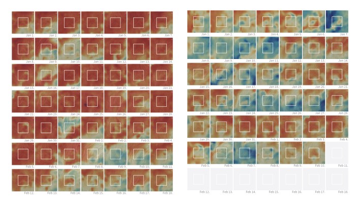
Surface NO2 captures from earth.nullschool.net | on the right January 2020 day by day, at the left, February same logic. (Not for publish just to see what’s going on back then)
Then, I saw some other media and people doing nice stories about nitrogen dioxide, so, the idea stay in the back of my mind for a while. Finally, when April arrived, I was able to resume the project, and I took on the task of generating some basic visualisations and charts to share the idea with the team and a series of scientists from various disciplines.
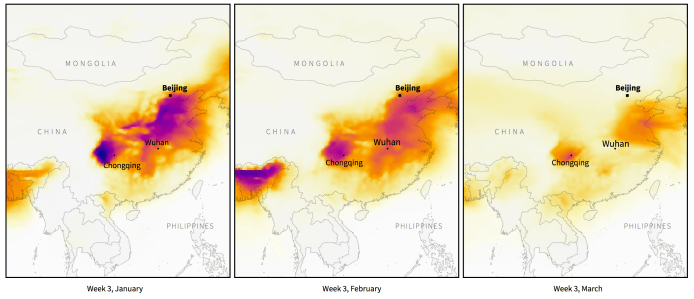
Part of the maps shown in Reuters story.
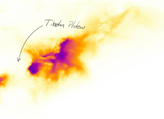
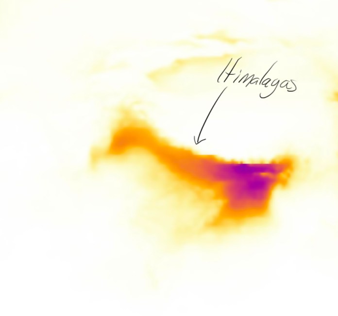
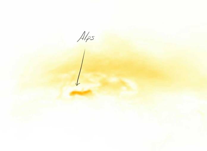
Of all this latest project, what I enjoyed the most was seeing the maps.
The pollution spots draw the high mountains in different parts of the world. I find it hypnotic to see those patterns without any labels or borders, just the data giving shape to the mountains, plateaus…
Anyway, I hope you enjoy these projects as much as I enjoy creating them.
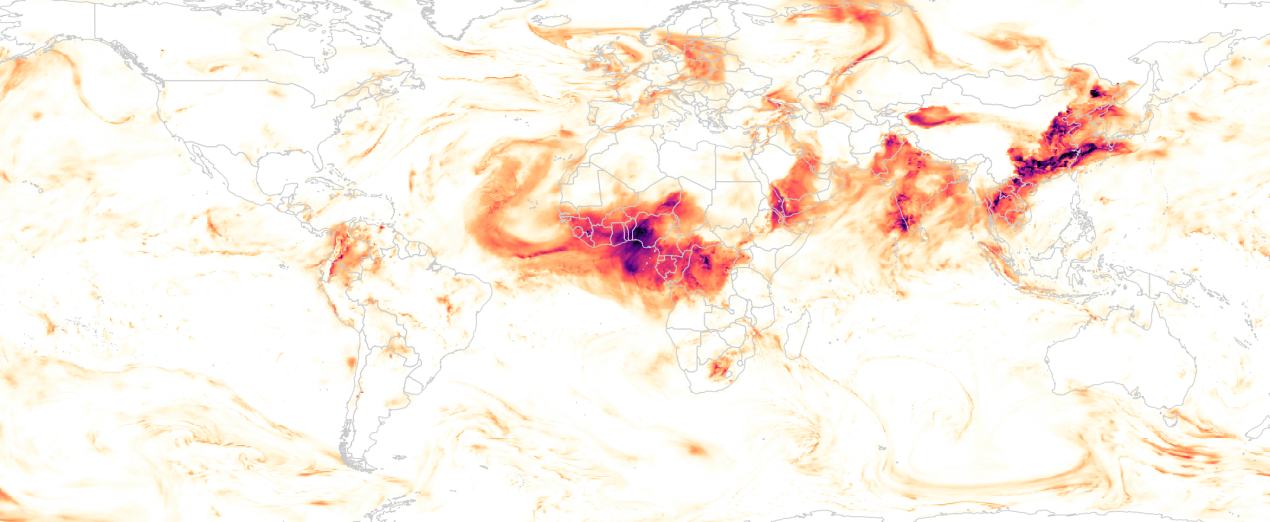
One last note: The map on top of this post is about optical aerosol (AOD), based in data of GMAO/NASA. Picture of the day (March 01, 2020).
Many thanks to all the scientist and experts that help us to get that story out on time!
