Digital works

My fav little details of 2021 on Reuters

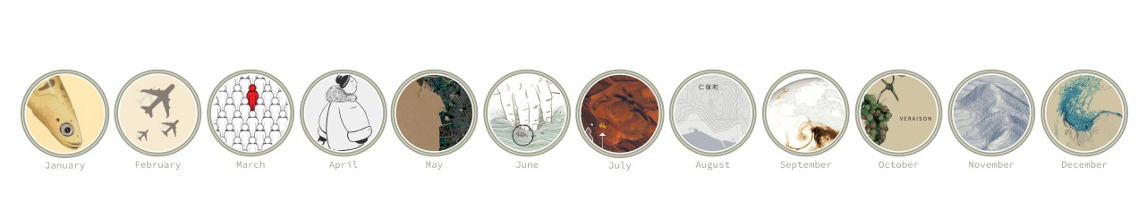
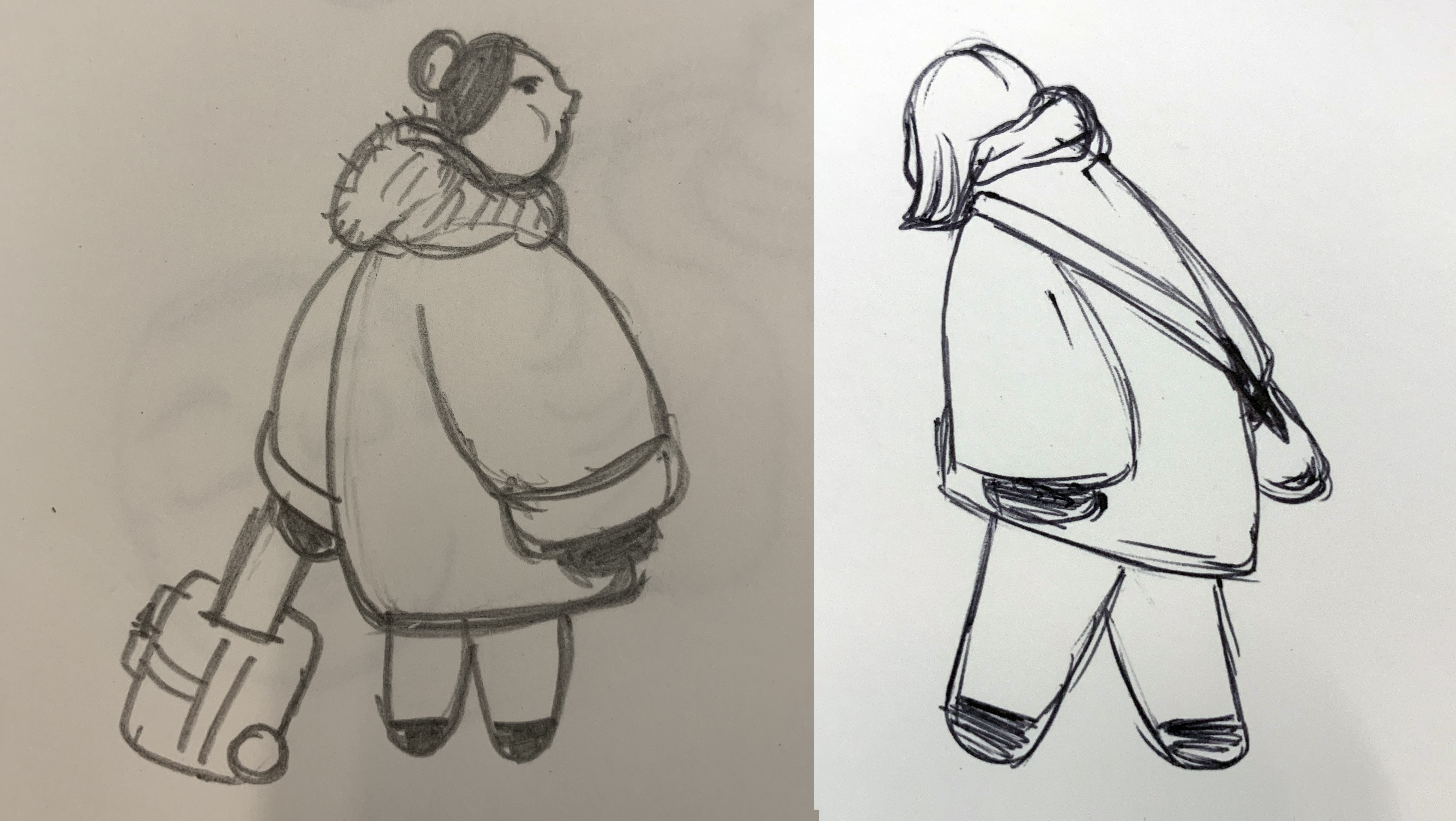
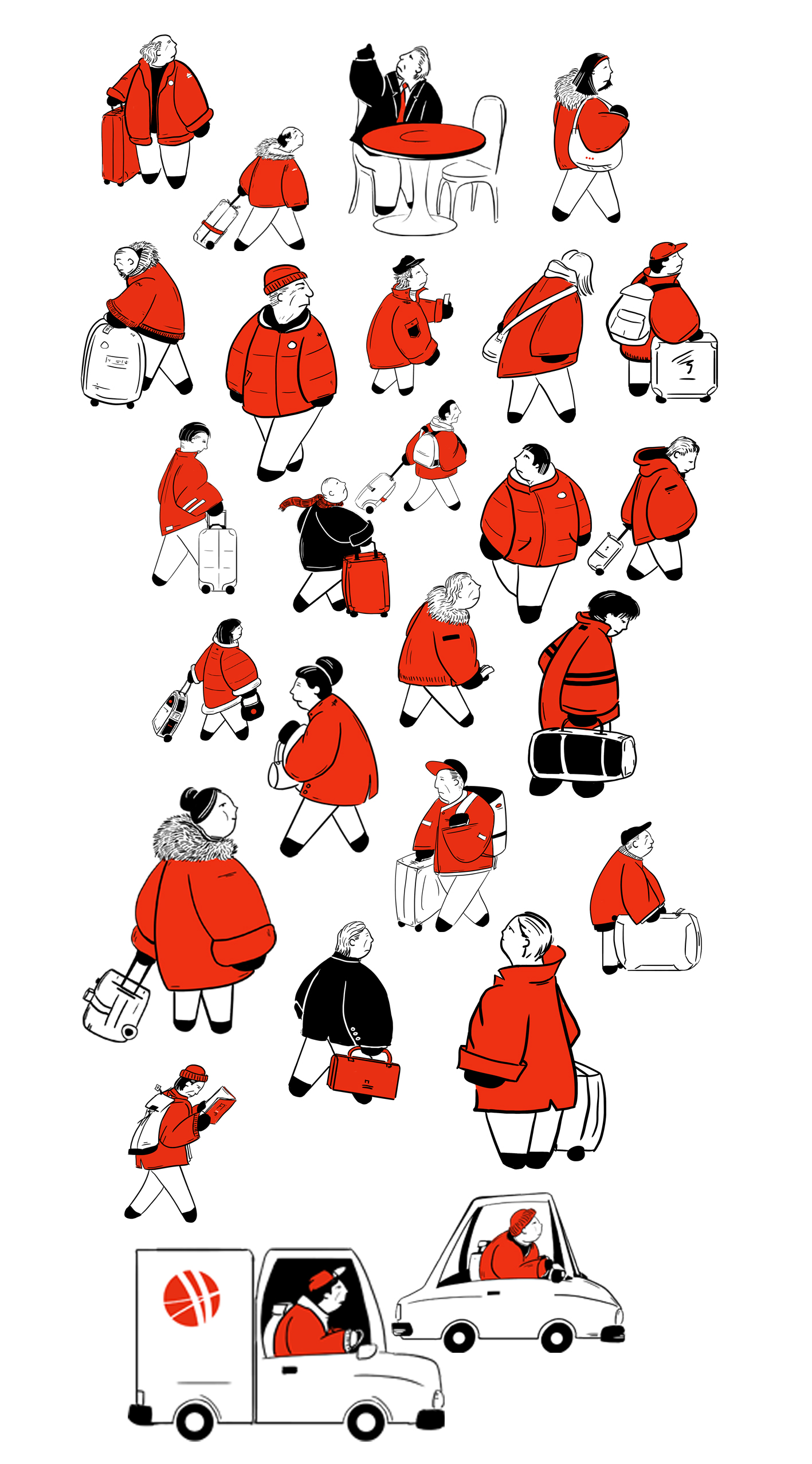
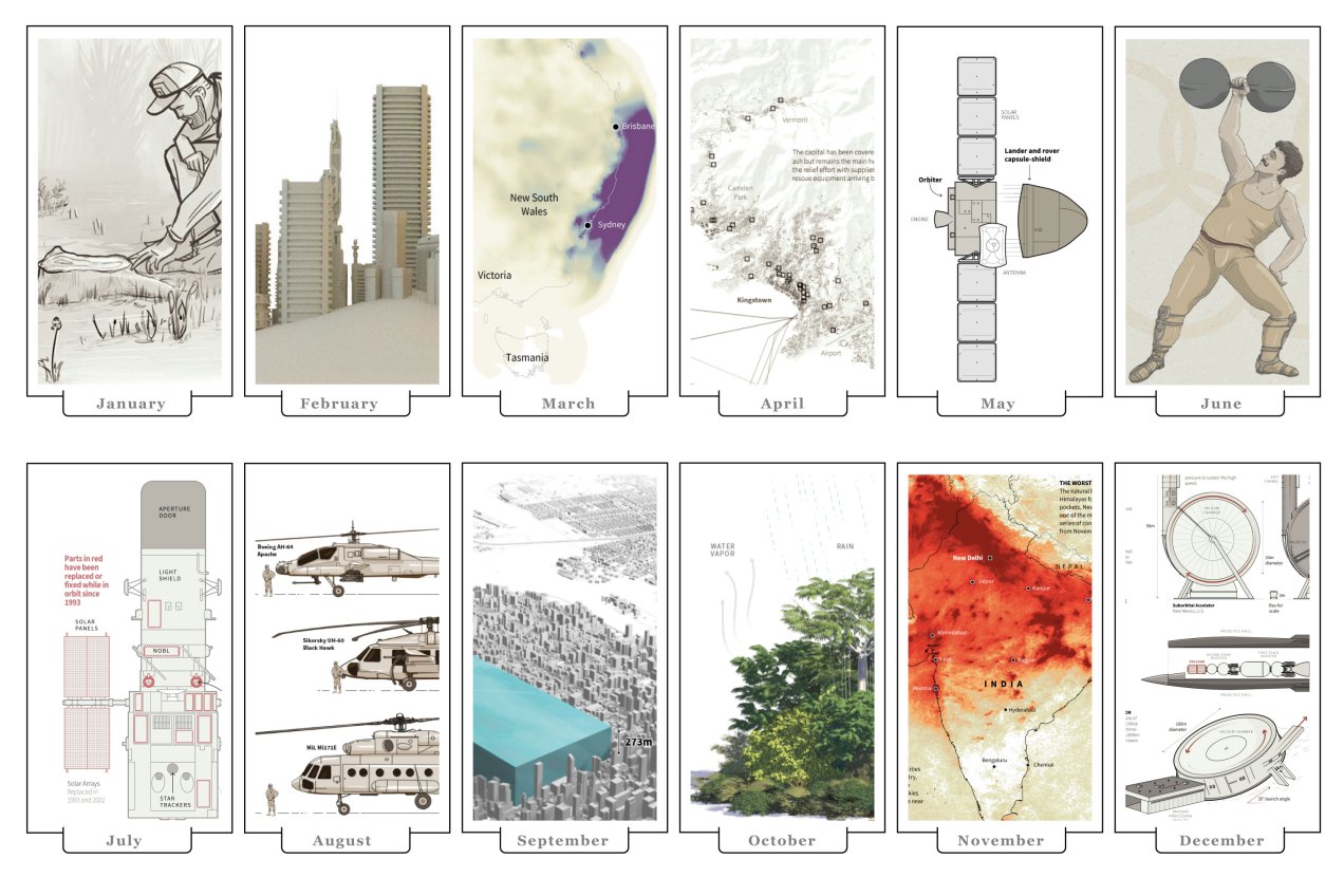
That time of year has come once again, the best of the year in my opinion. All us is doing the list of the best of the year to give a glimpse of what 2021 was like and, of course, to give a final push to their stories as well. So, like last year, I want to do a quick rundown of my favourite details of the 2021 projects. Keep in mind the pieces in this entry are out of context and you may want to take a look into the full story for better understanding.


January: The amazing Amazon rainforest

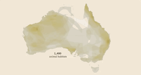
The 2021 kicked off strongly, during the first month of the year I worked various projects including some breaking news. My favourite details of January was a small graphic part of the project titled “Jungle Lab”. The graphic itself isn’t a super complex visualisation, actually it’s just a simple illustration, but the message behind it is very powerful. It makes you realise the relevance of the virgin rainforest right away. I truly believe that our work on infographics is not about fancy effects but powerful messages to our readers.

January highlight [ link HERE ]

OTHER JANUARY PROJECTS

As I said before, January was a busy month. Here are some other details that I also enjoyed working on, mostly breaking news.

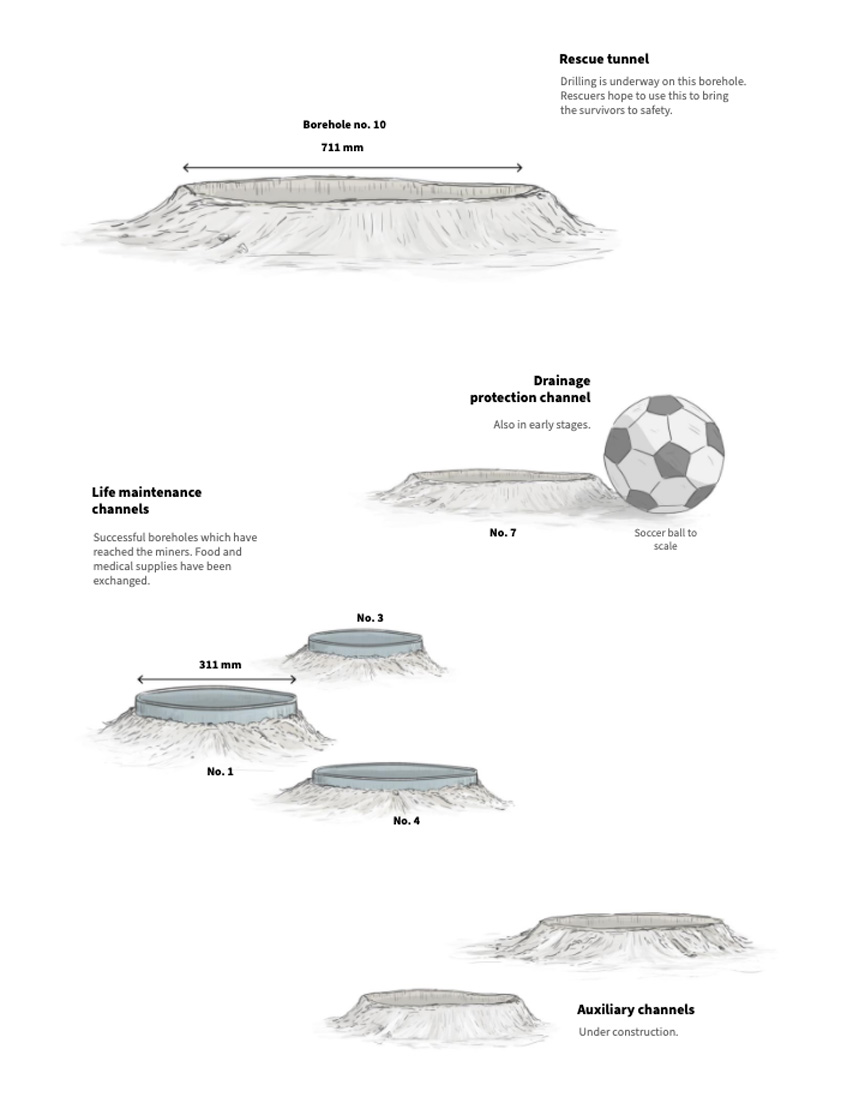
You may remember the story of miners who were trapped in a mine after an explosion in Northeast China [link here]. There’s a small graphic showing dimensions of the rescue shafts dug by rescuers, that’s something really difficult to imagine without a familiar reference.

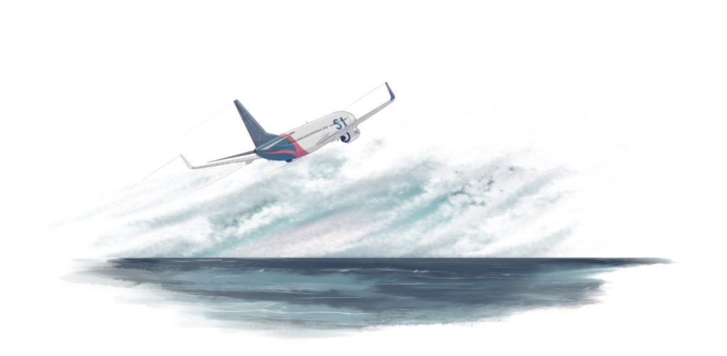
Aside from the miners, you may also remember the tragic accident of the Indonesian flight SJ182 [link here]. I recon working with those bathymetric maps helped to explain why recovering the black boxes was a difficult operation. Also kind of shocking to see a few incidents of airplanes around the same area.


February: Sand.

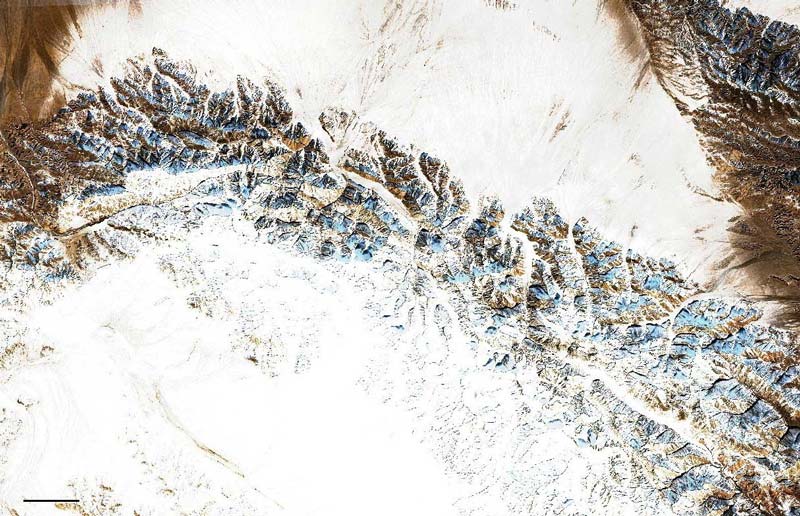
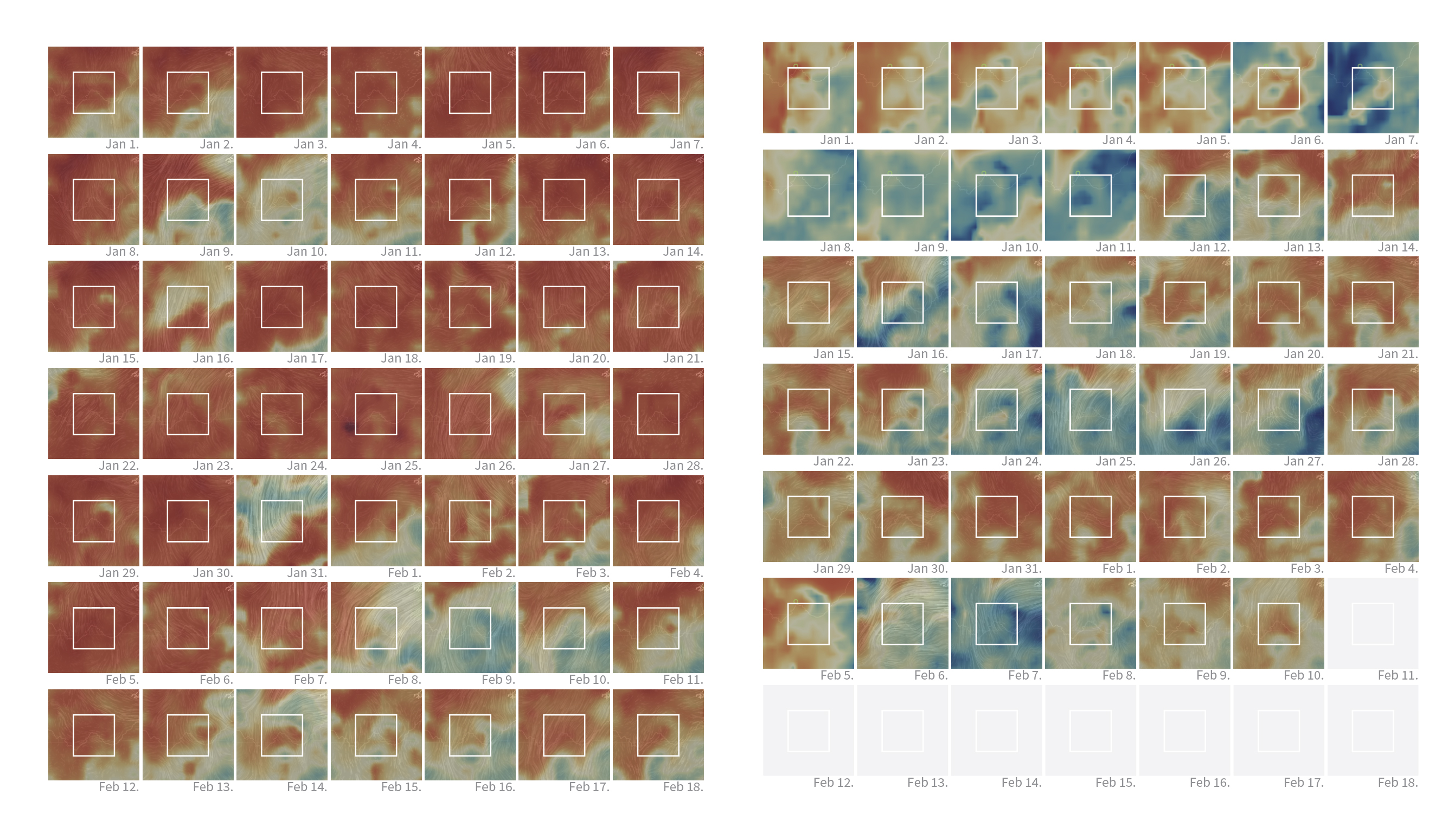
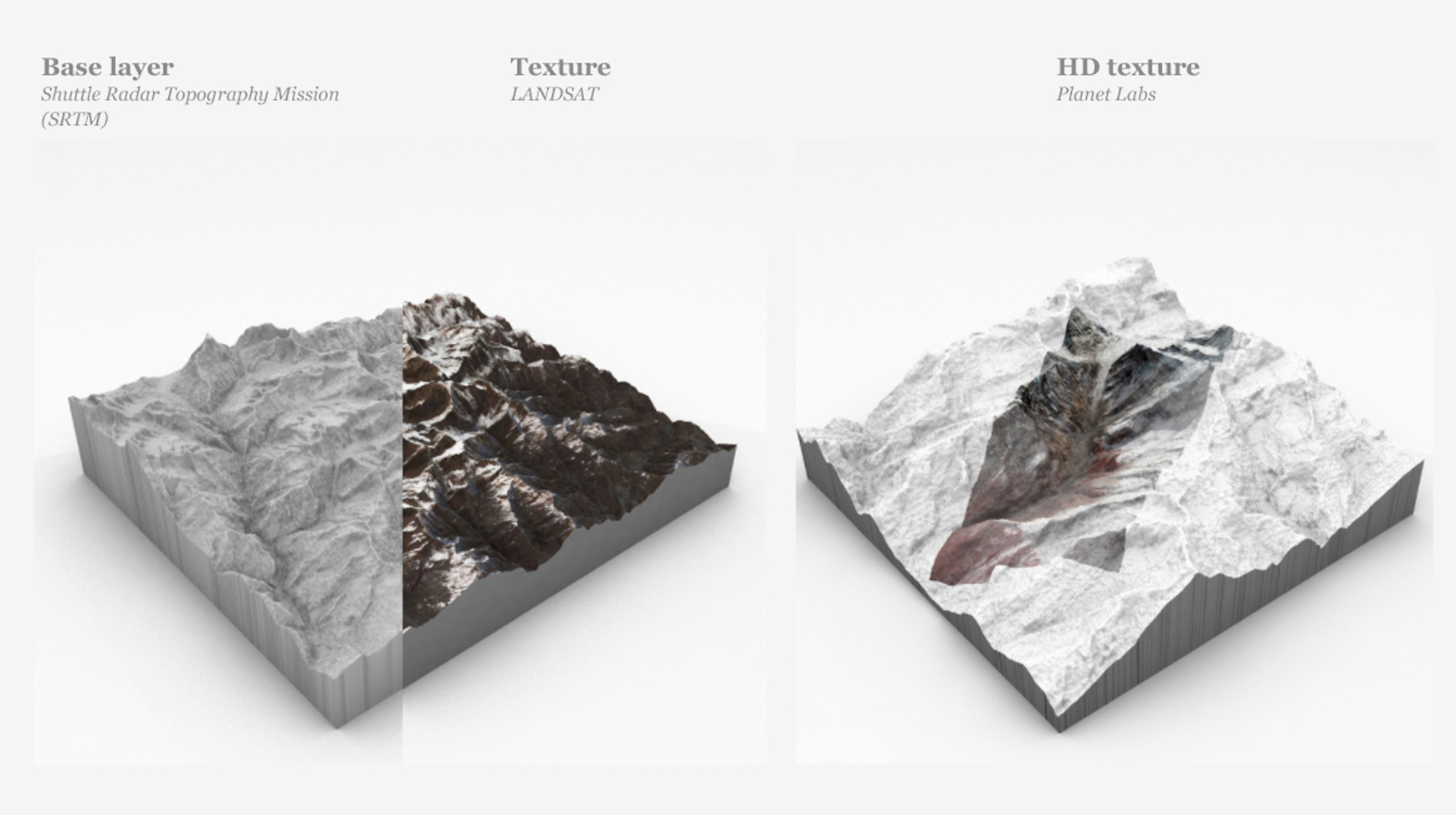
After a tight January, news continued to pop up everywhere, lots of stories with great potential for a visual project. I have the opportunity to do some experimentation with 3D assets using amazing high resolution images courtesy of Planet Labs. We created a detailed story of the massive landslide in India [link here]. Here’s also a short recording of the piece running in C4D: [Drive video].

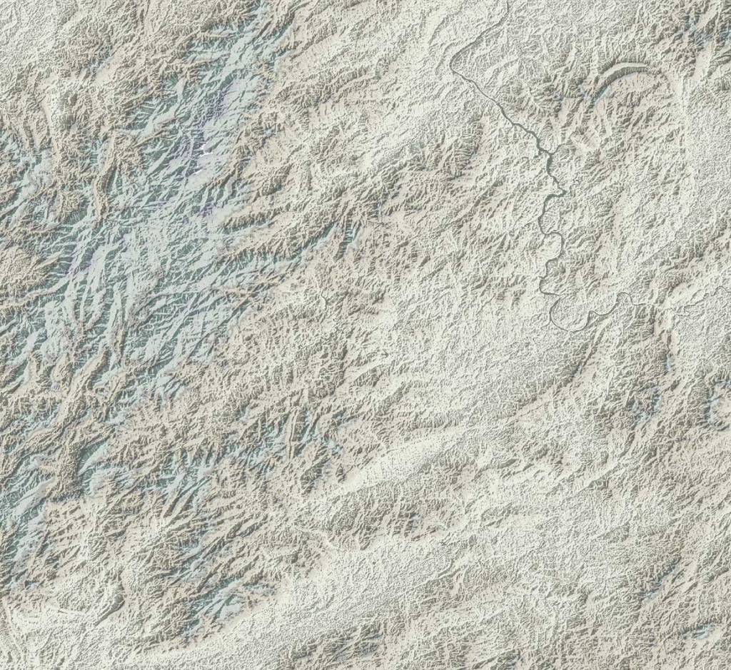
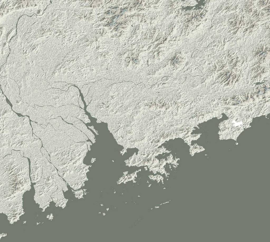
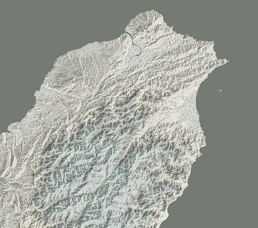
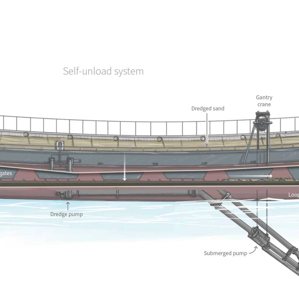
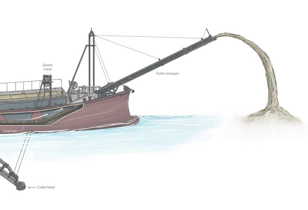
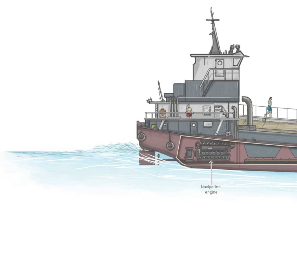
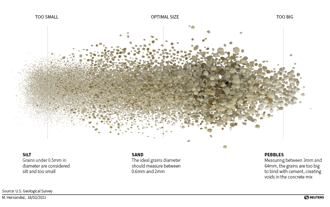
However, a much larger project was published in February. For a long time we worked on a series of projects on a topic that impressed me. To be honest, I never thought about it before: Sand mining.

Sand mining and trade is a whole world itself, this commodity is unnoticed present in our daily lives. It have a dark side of illegal trafficking and mafias too and even it have sparked diplomatic issues for some countries.

But one key thing that came to mind when I started working on this was this: Why we don’t use desert sand to feed our huge demand? There’s plenty of it!

Well… the explanation is a little more complex, but in short, desert sand grains are too small and rounded. That is why we are dredging rivers, digging abysses in mountains and making beaches disappear.

February highlight [ link HERE ]


March: Rain.

2021 broke some records with extreme weather events, in fact I did an entry here about a 2021 failed project on floods. You probably remember the floods in Germany and China, but there were many more events like that throughout the year.

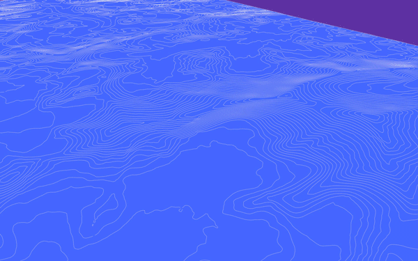
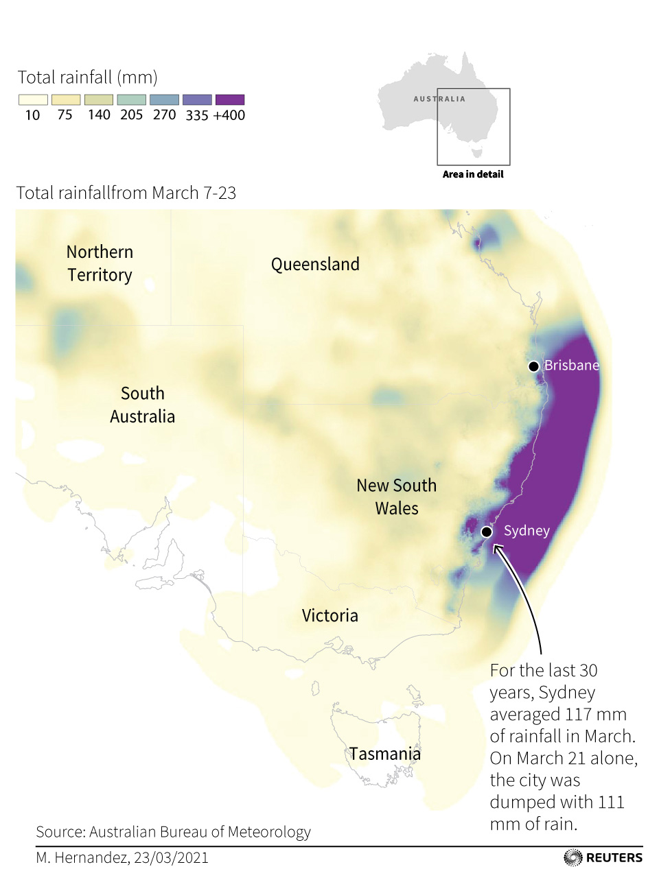
In March, eastern Australia suffered what the Australian government called the worst flooding in 60 years. That week I was working in a daily-graphics shift, so I did a quick small map to visualise the event, here’s a small part of the graphic:

Also in March, I did a small collaboration on the nice project “Bats and the Origin of Outbreaks”. I really enjoyed working on that piece in every aspect, from the story angle to the opportunity to work with a custom style. You may also want to take a look at that piece:


April: Volcanoes awakening.

April surprised us with a breaking news story, the Le Soufriere volcano violently covered St. Vicent island in ash, devastating the island infrastructure and prompting a sea and land evacuation of thousands of residents. It also released emissions at spectacular heights into the atmosphere. It was like the omen of a year full of massive volcanic eruptions around the world.

I collaborated in the story with different pieces, but my favourite piece was Simon’s map showing buildings, shelters and risk areas among others. Here is a small detail of that map:

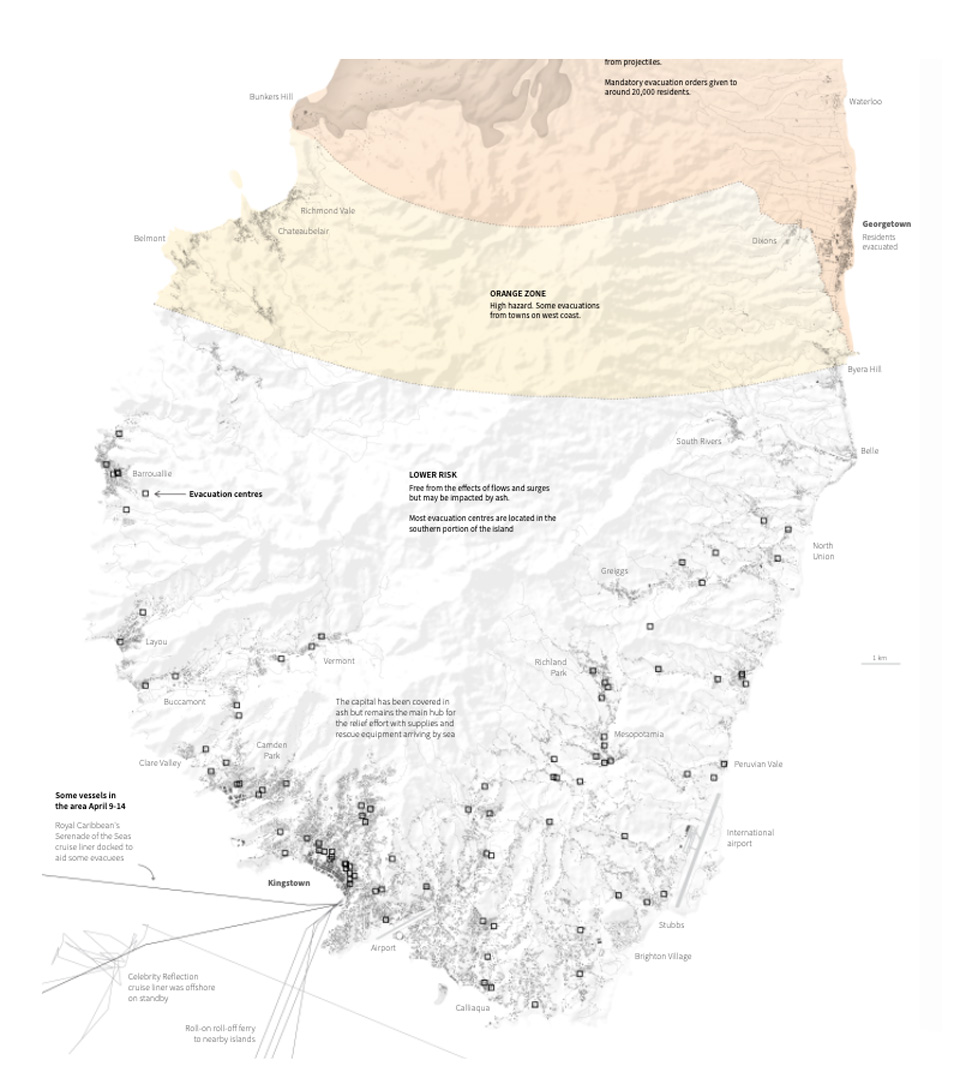
April highlight [ link HERE ]
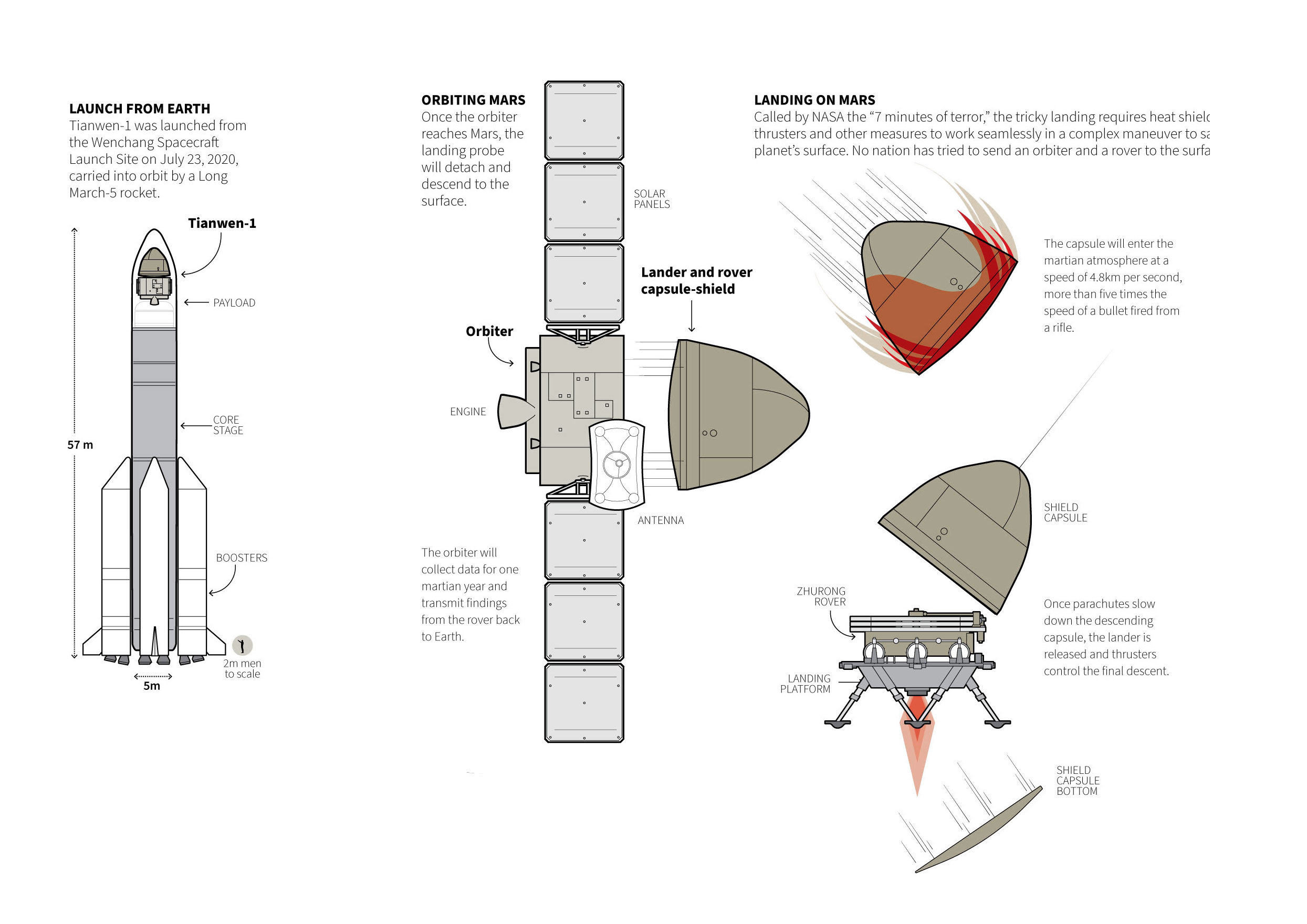

May: Space!

One other frequent topic on my daily work this year was space exploration. I did a good amount of small pieces on telescopes, comets, asteroids and spacecraft.

May saw the landing of the Martian explorer ‘Tianwen-1’ develop and successfully landed in the red planet by the Chinese. Here is a little detail of that graphic:
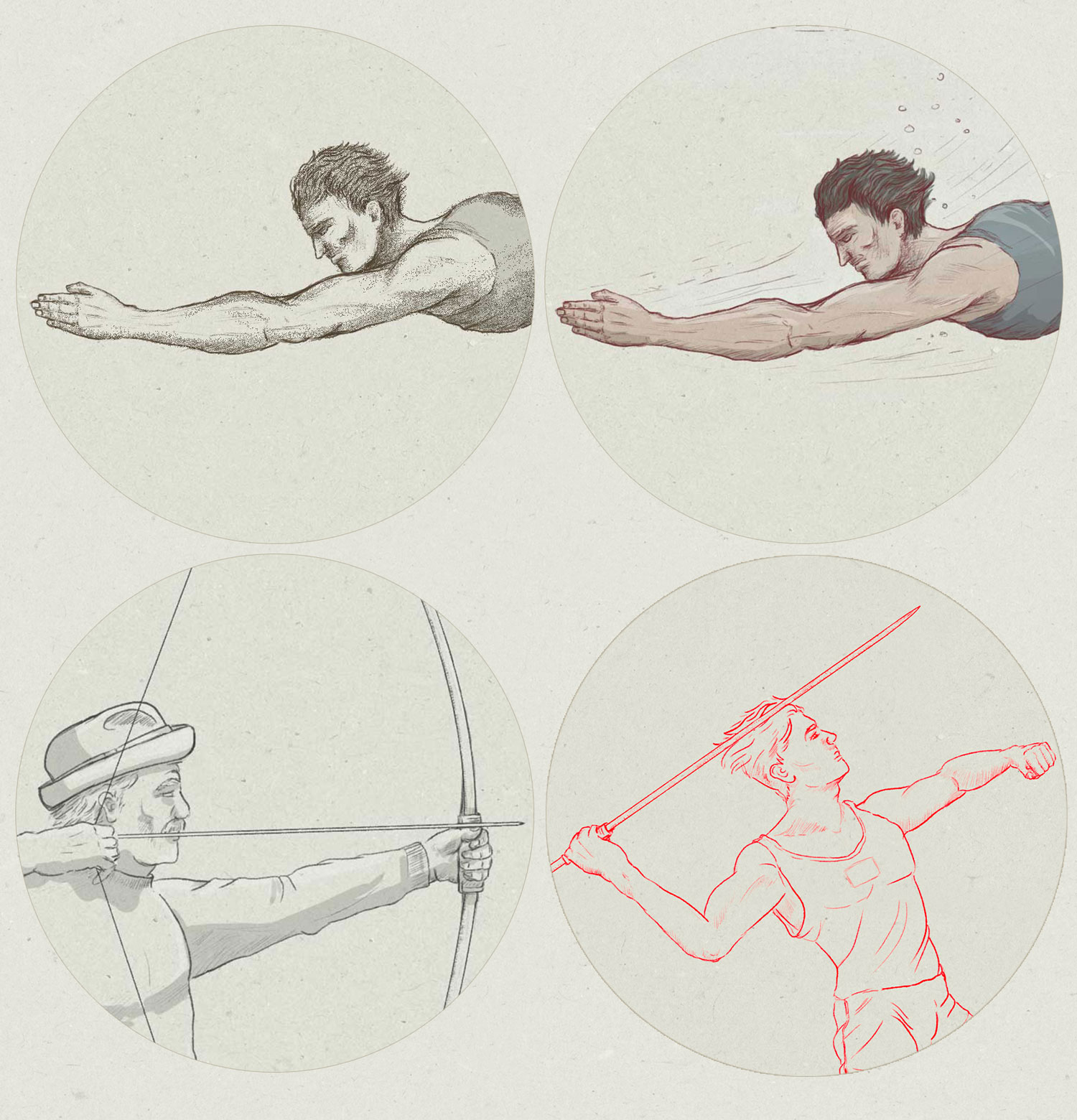
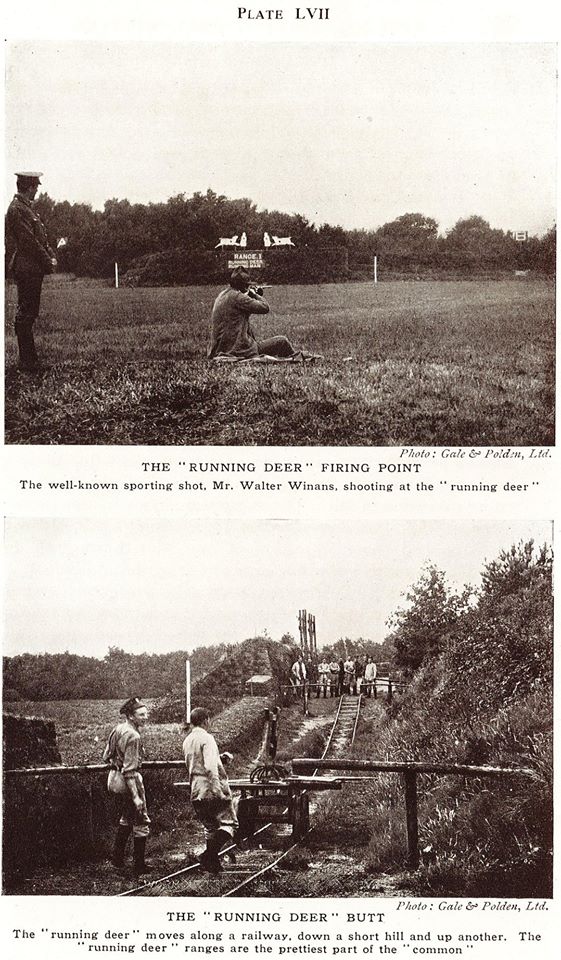
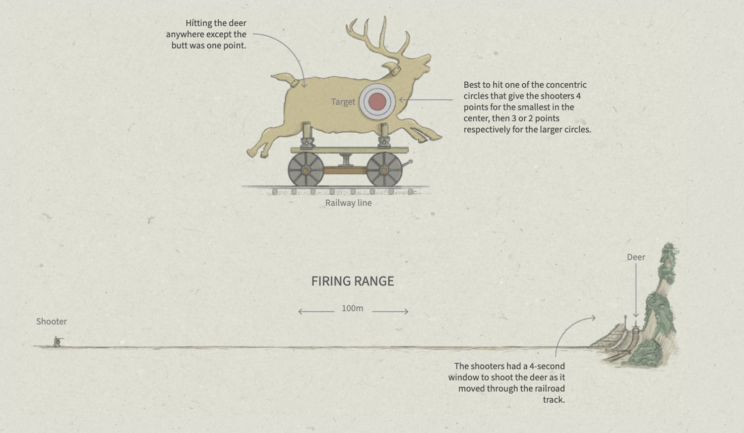
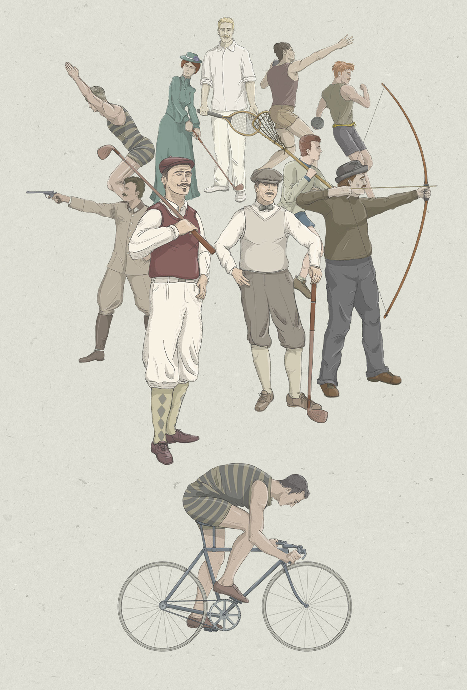
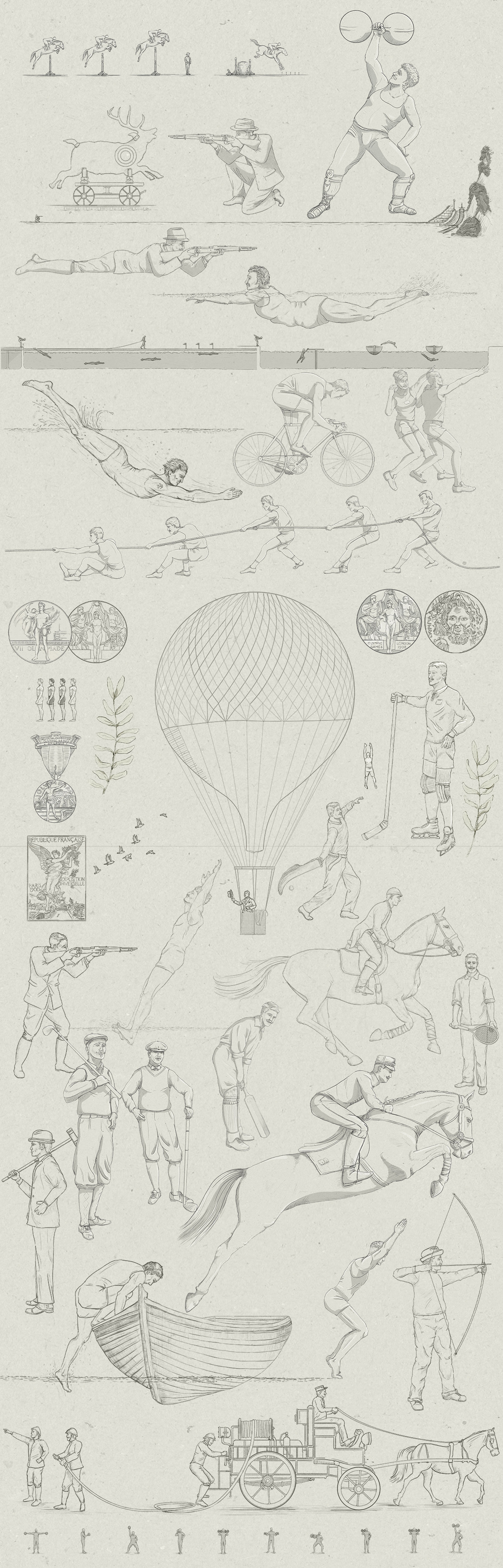

June: Olympics.

My favourite from June was the singular Olympic sports story. Can’t imagine the adrenaline rush of a 200m obstacle swimming competition. Jumping over boats and diving again to be the fastest hurdle swimmer of all times, they sure had a lot of fun there.

Here’s a small diagram of the course of the Paris games of the year 1900:

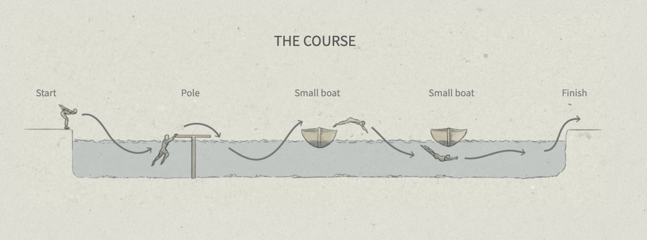
June highlight [ link HERE ]


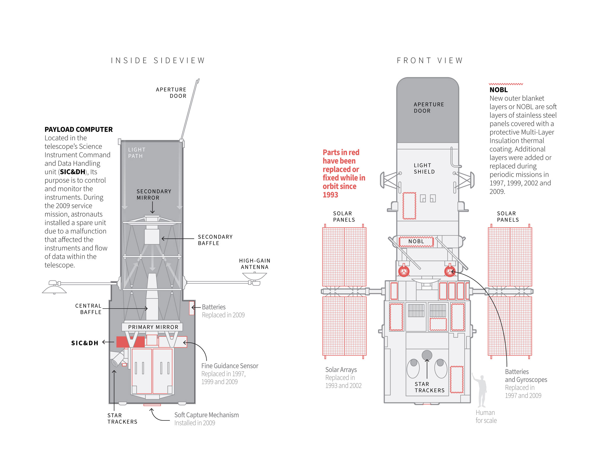
July: Space! (again)

By mid year the news put me back thinking in the outer space. The Hubble Telescope was literally an eye-opening for the scientific community and for all of us in general. Even more so if you stop to think that this magnificent achievement of science was designed with technology from the 80’s. I can’t believe how the old computer from the 80’s still worked there. Here’s a small detail from a daily basis graphic that explains where the telescope problem was. ( The 80’s computer SIC&DH )

This 2021, I spent a little more time making small single-day graphics. I enjoyed the small break from big projects, and the quick and intensive research part you have to do to get it done in a single day. However, I think the best part was going back to the long-medium term projects that were almost done to finish them, with my mind clear and fresh.


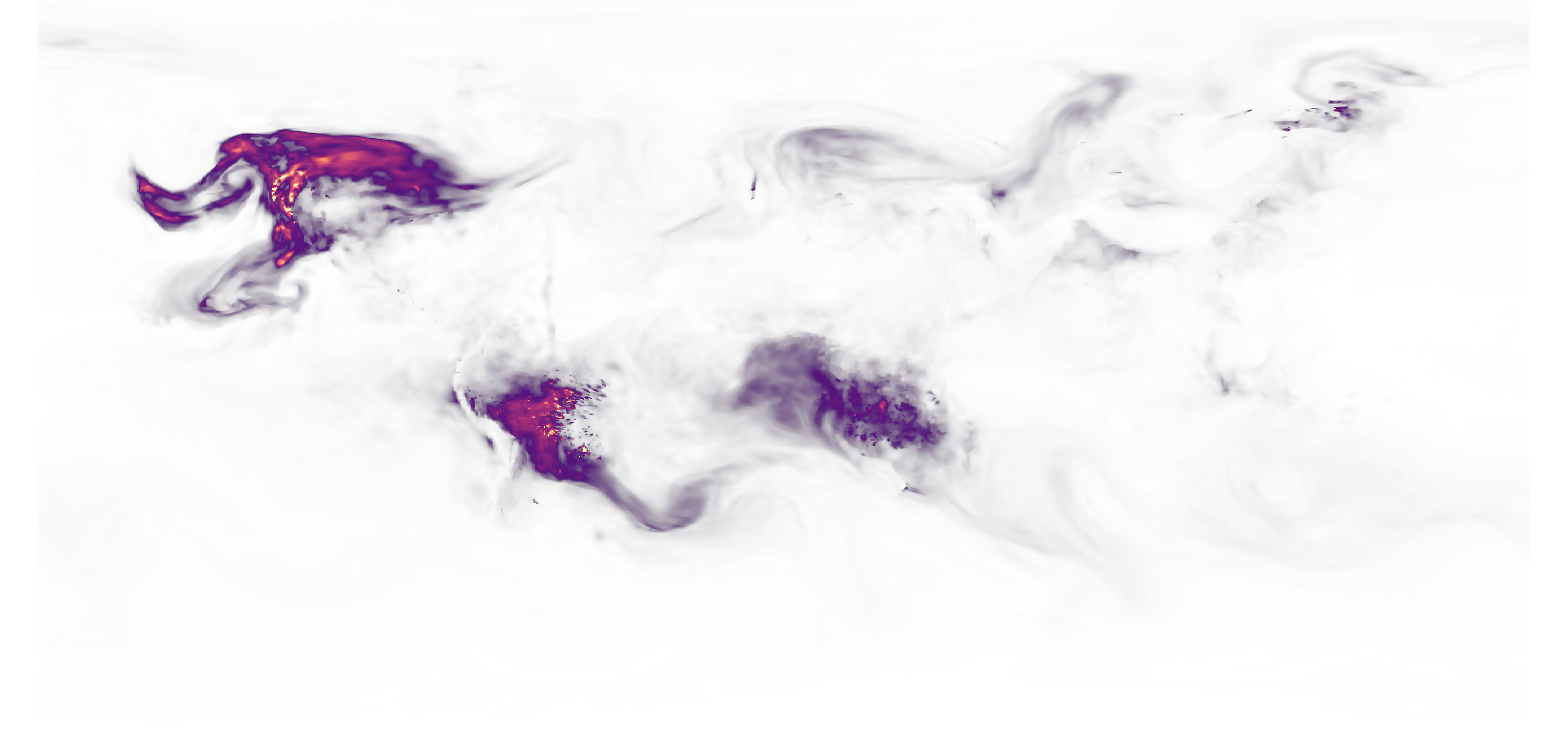
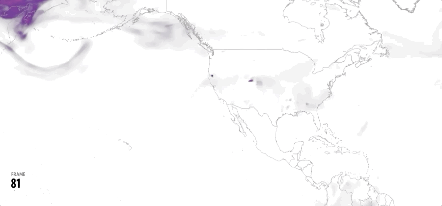
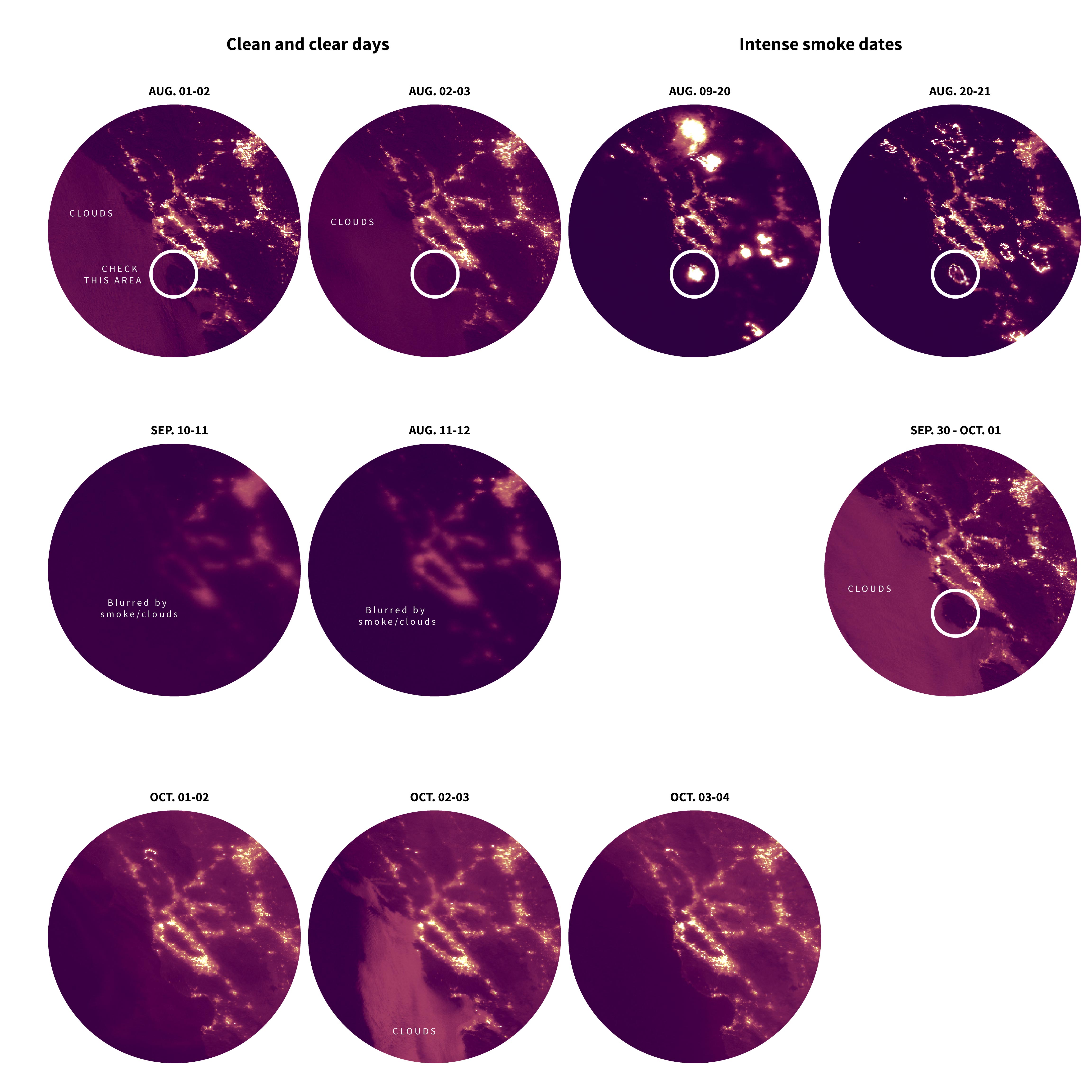
August: Wildfires & aircraft data

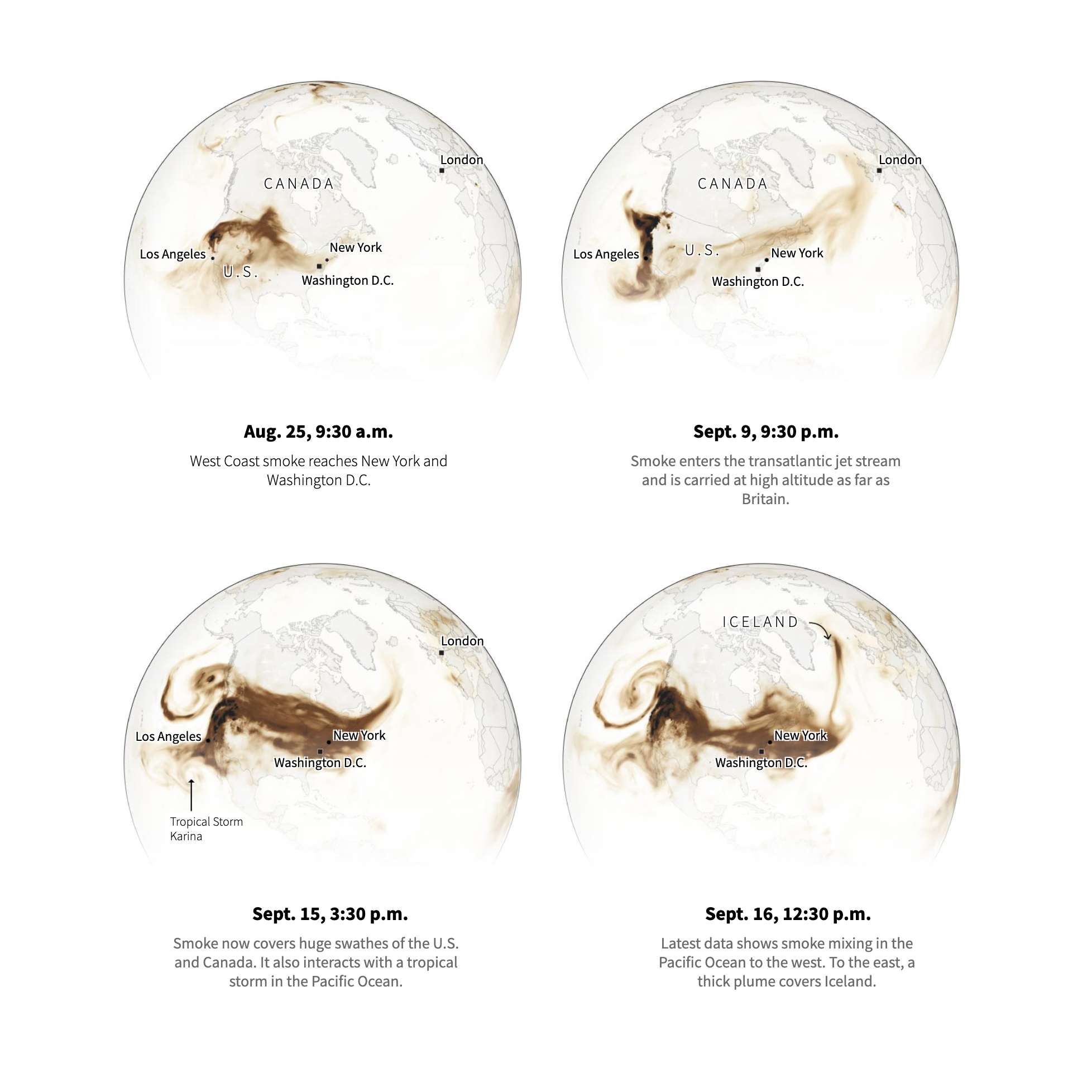
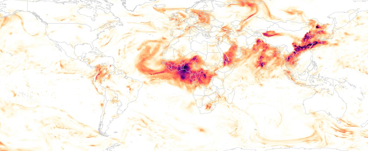
August was a very busy month too. One of my favourite pieces was this sad new record: For the first time in the records, smoke from the fires reached the north pole. Check out the graphics thread below. There’s a third graphic in that thread, click on it if you want to see some temperature records too:

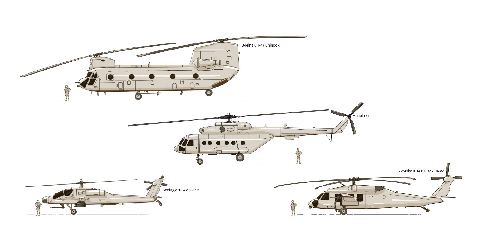
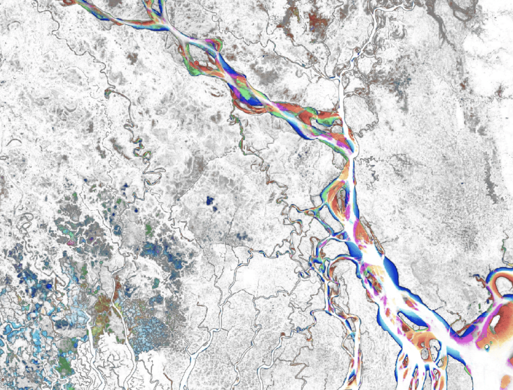
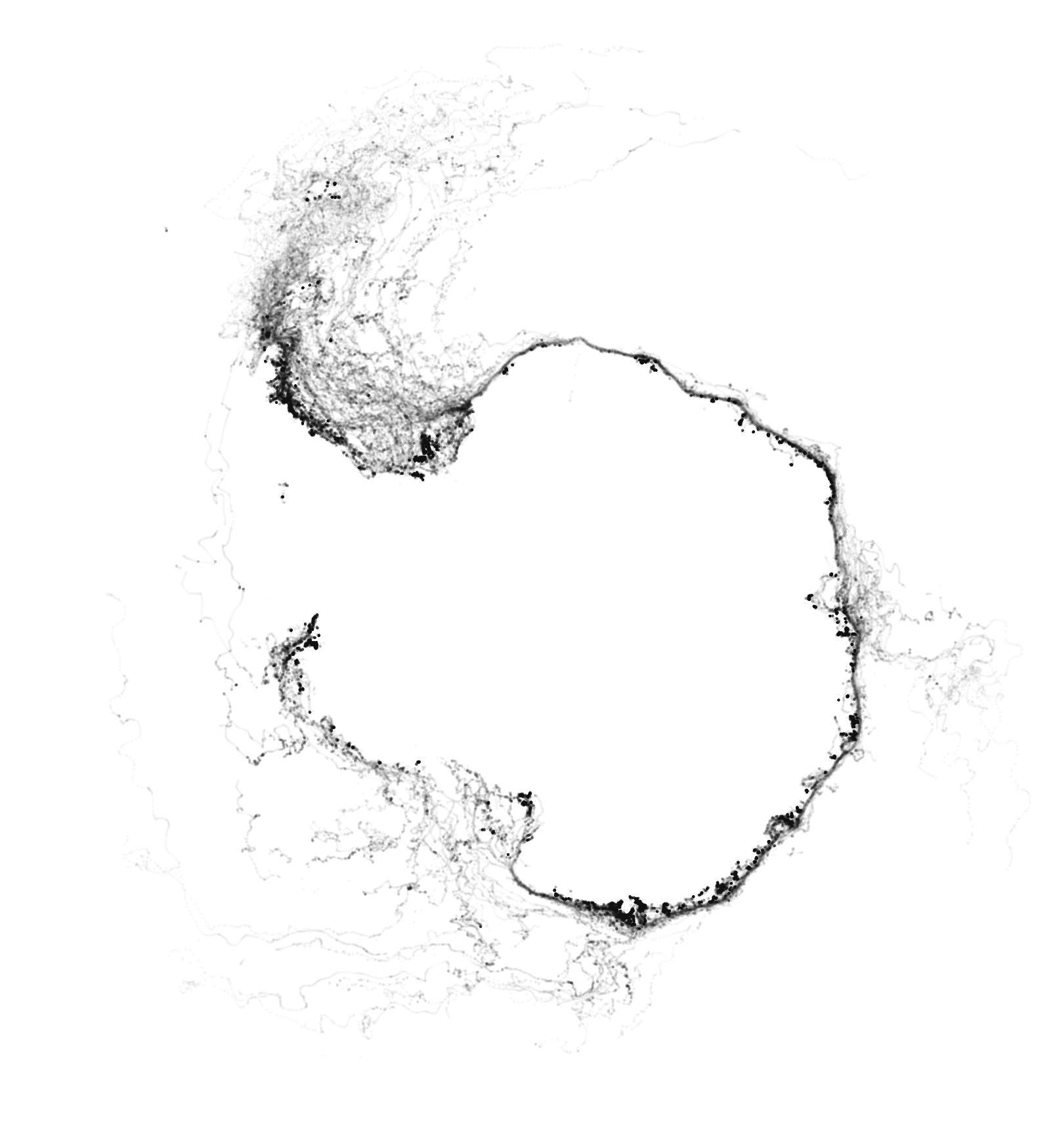
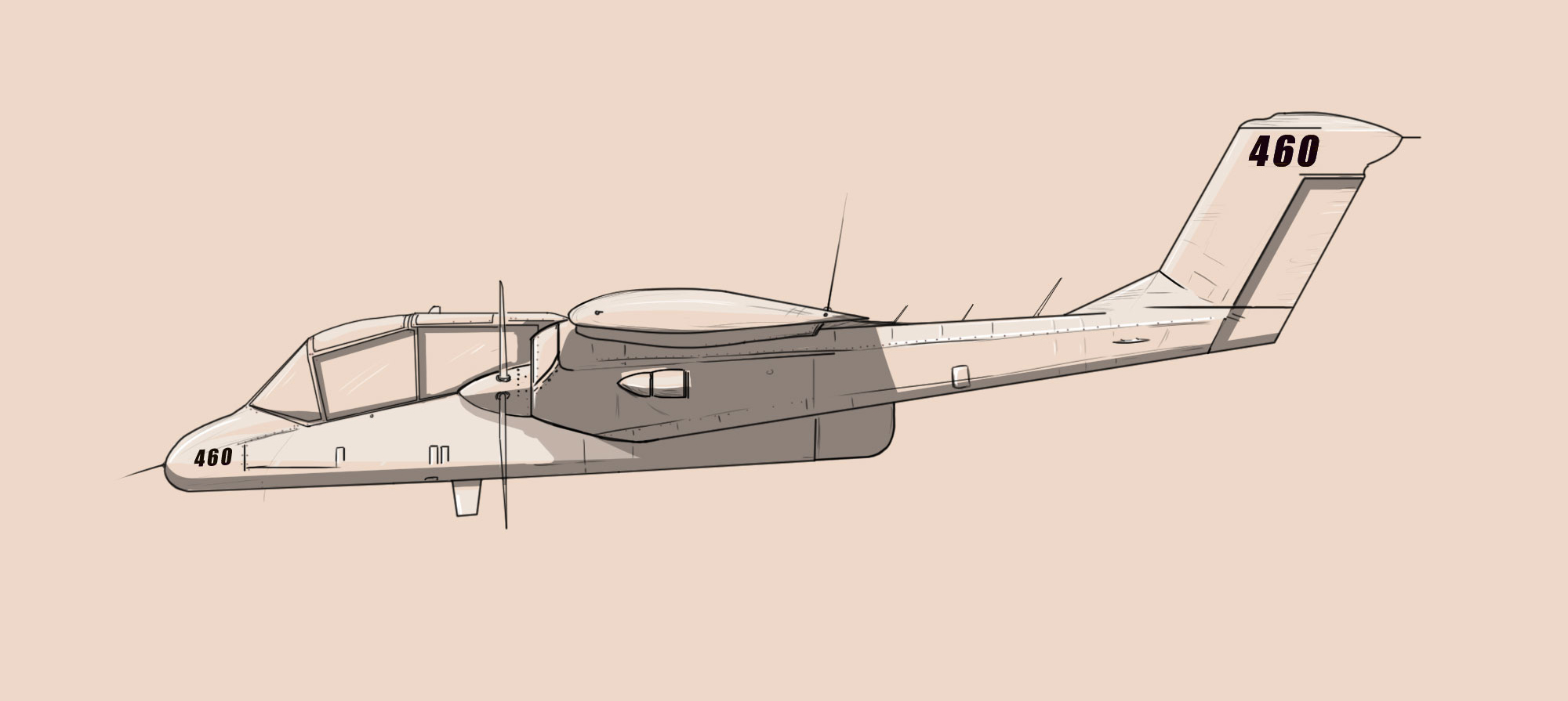
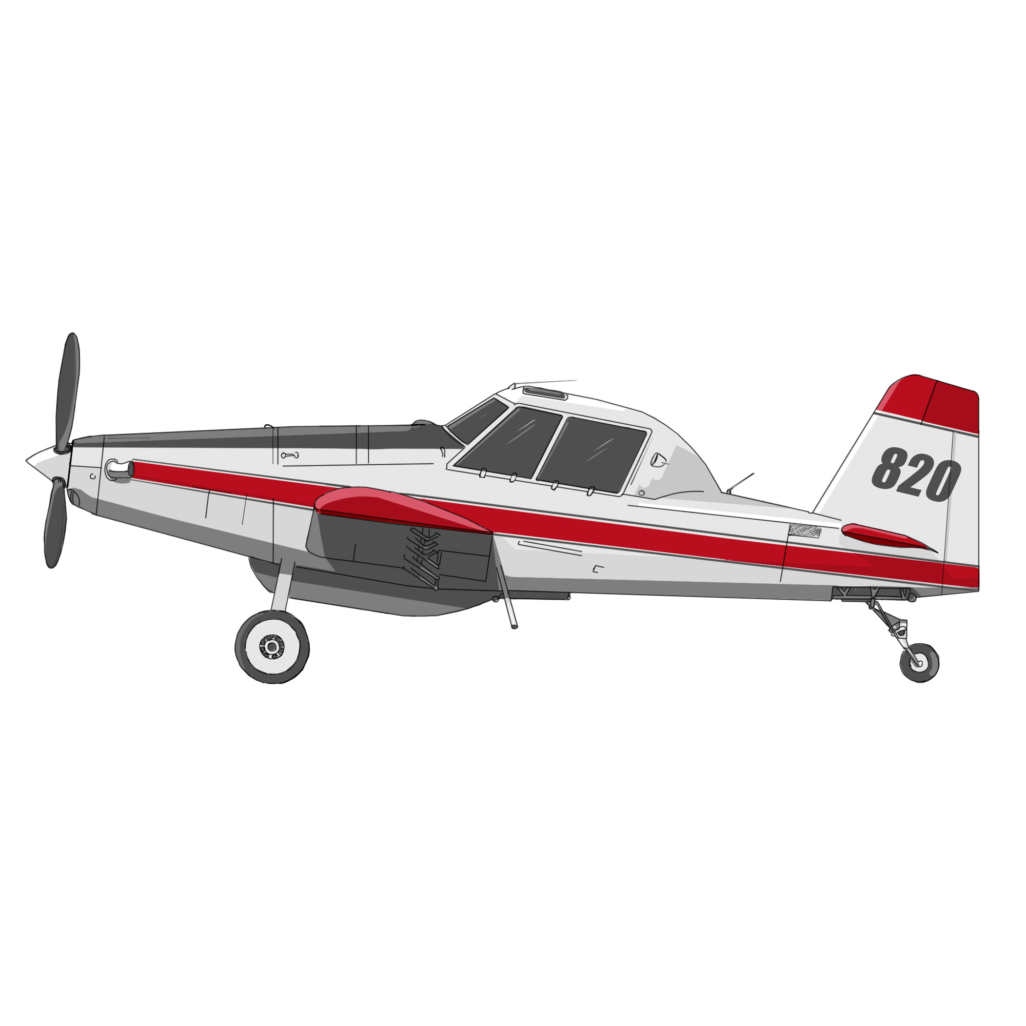
The second part of the month was infused with the chaos surrounding the US departure from Afghanistan. We did a few pieces on this, overall my favourite was the spaghetti drawn by the aircraft around the airport. It’s really cool how when you are digging into the data many stories pop up, and often many questions more.

August highlight [ link HERE ]
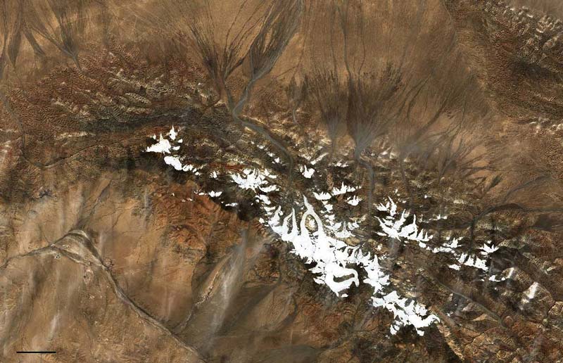
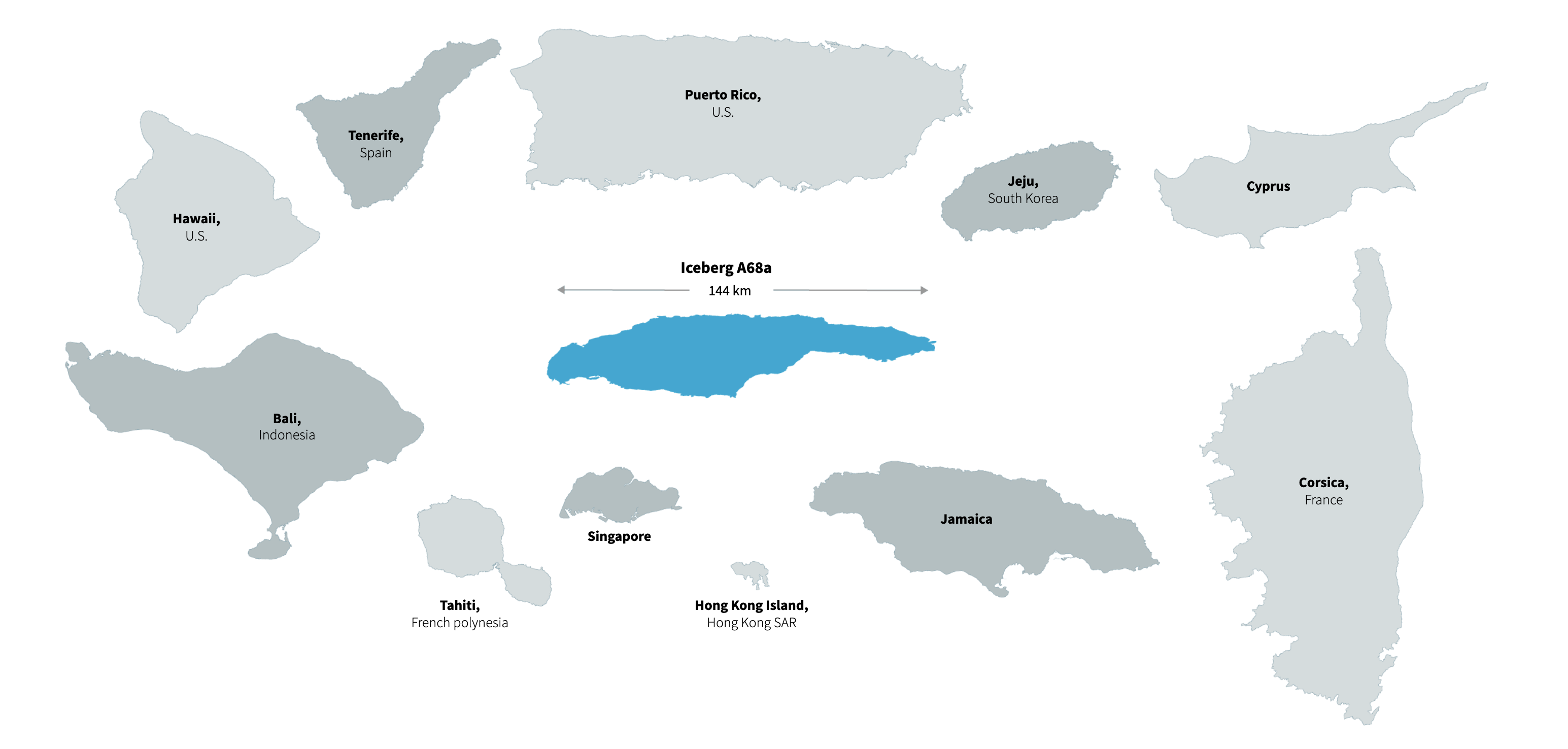

September: Ice.

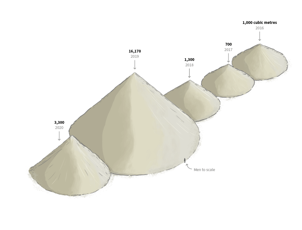
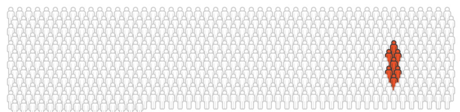
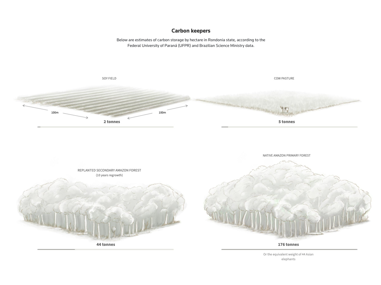
Like what happened to me this year with the sand, there are things that you never expect to be so interesting. Ice is more than frozen water, ice cores are cool stuff. These things can help to retrieve ancient records, they are like windows to the past of our planet. On September we published this story about that.

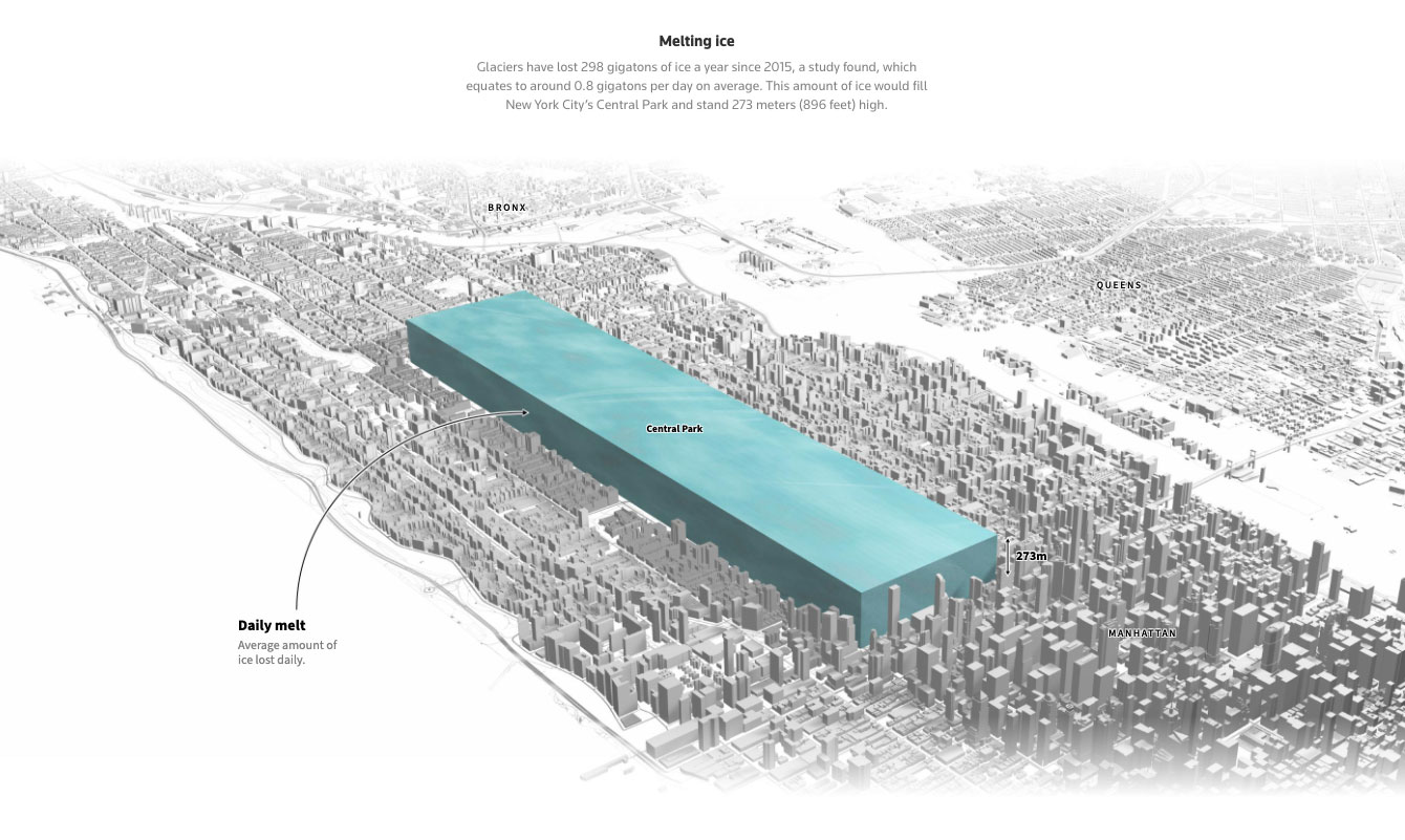
The sad part is that we are loosing those records due global warming, and it’s not slowly loosing them, it happens at freaking vertiginous fast speed. The graphic above shows the average of how much ice melts in the world EVERY DAY! The amount is equivalent of placing a gigantic 273m-high ice cube in NY’s Central Park.

September highlight [ link HERE ]


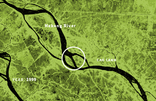
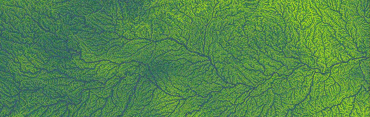
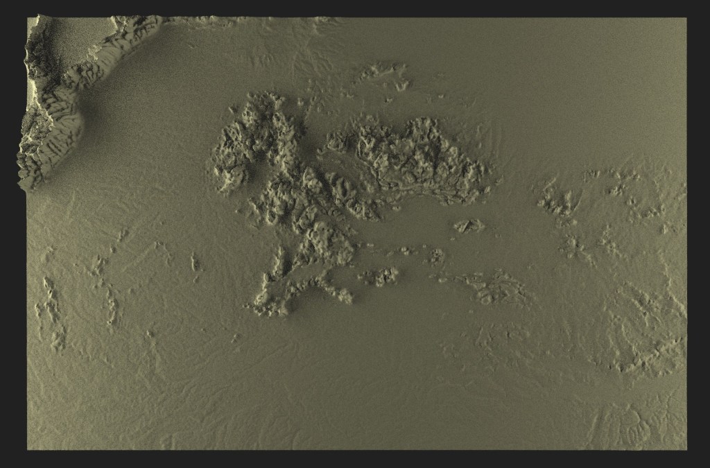
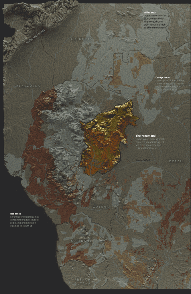
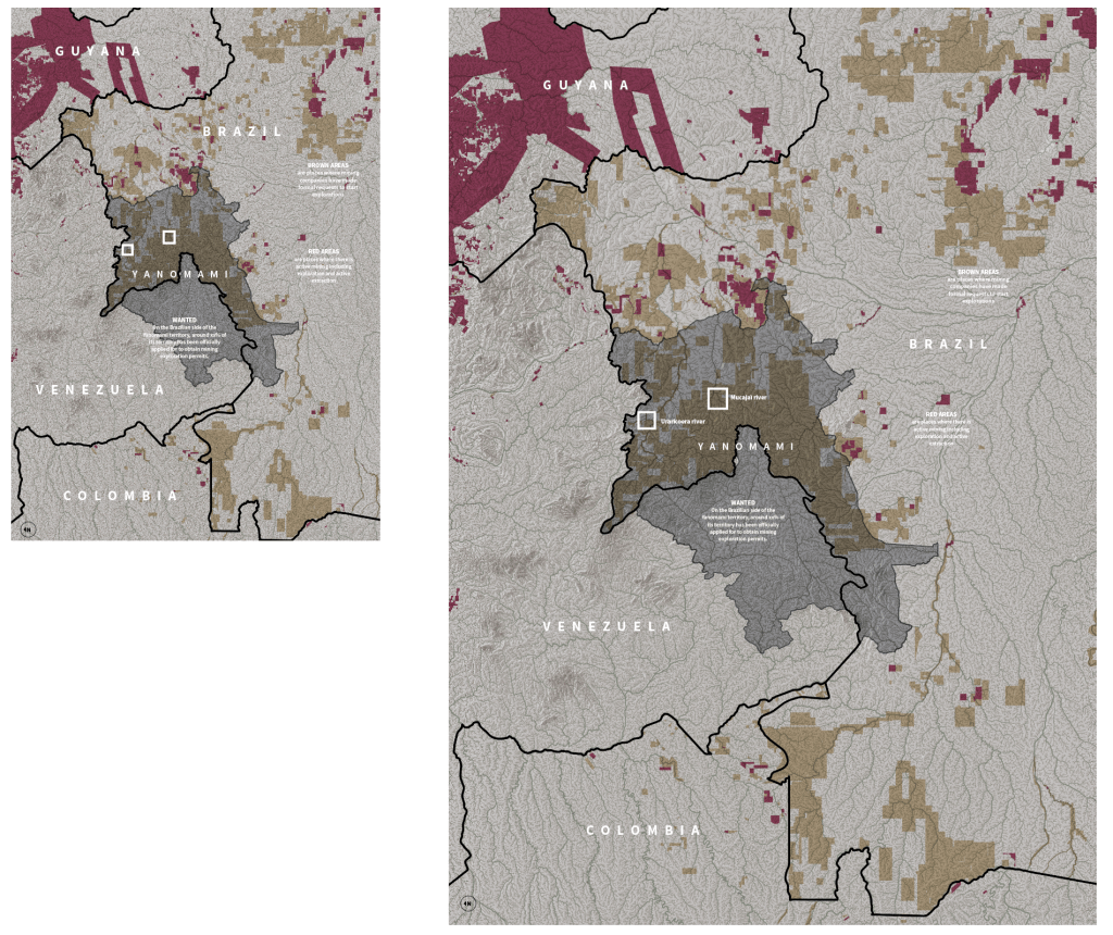
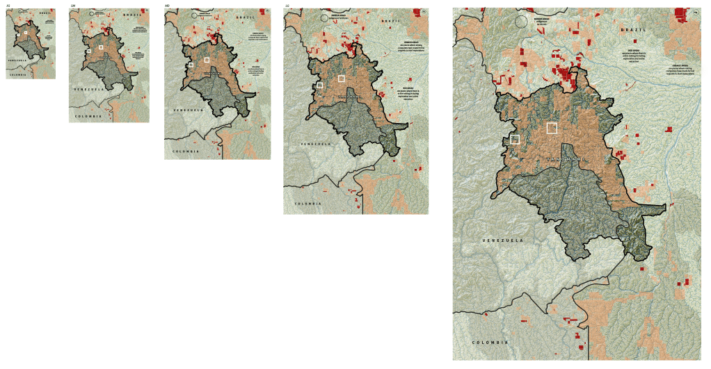
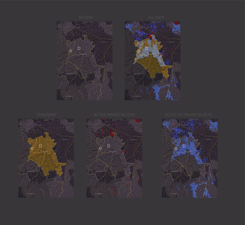
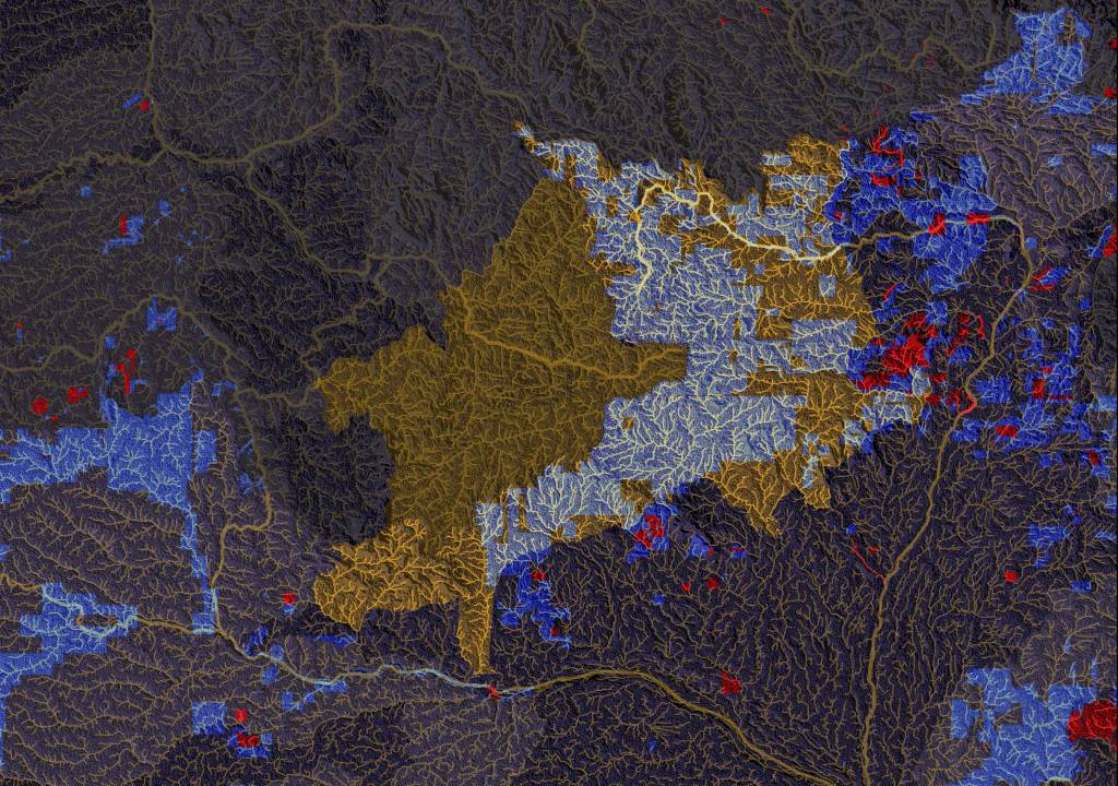
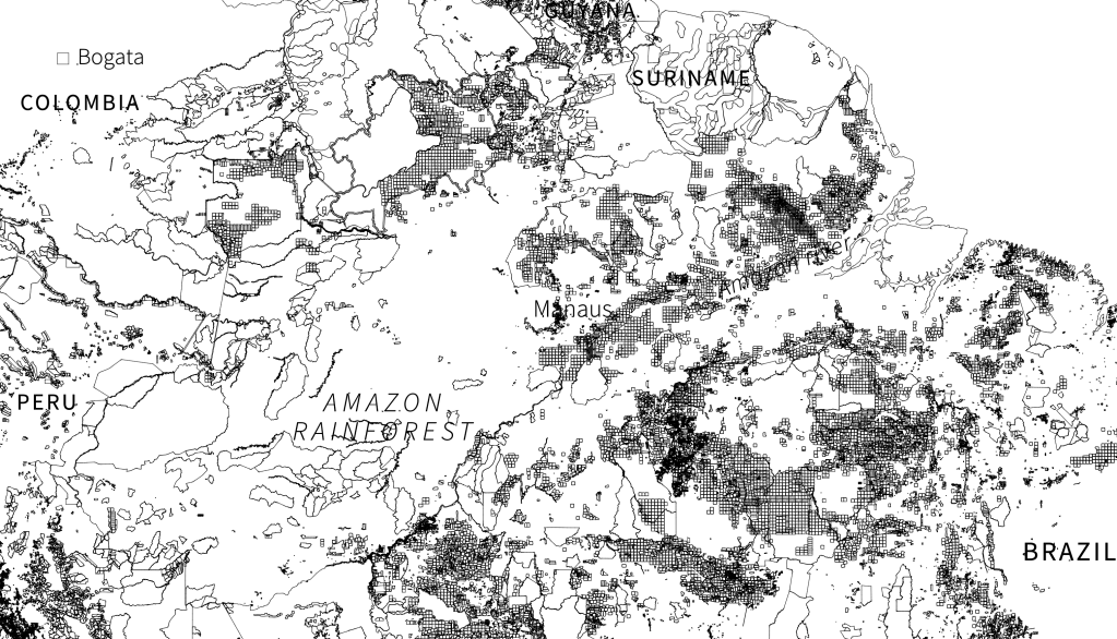
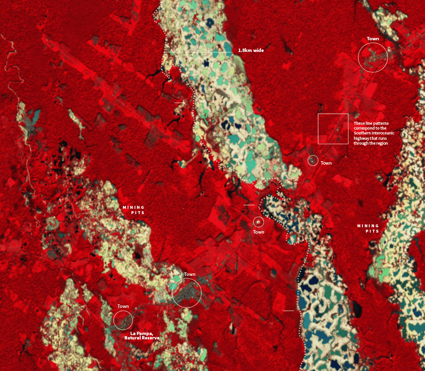
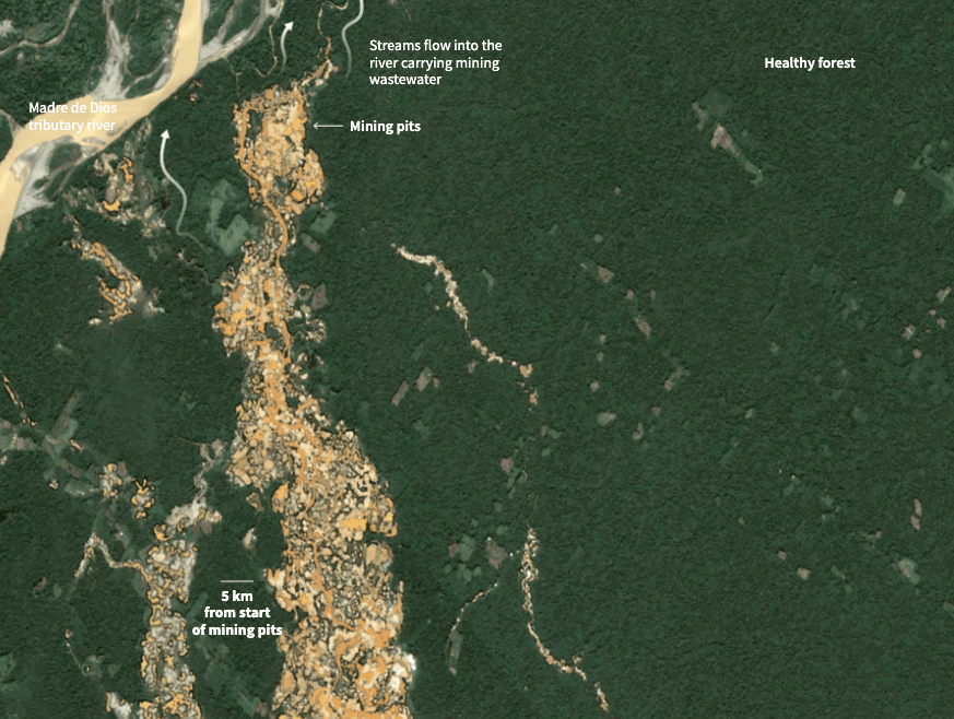
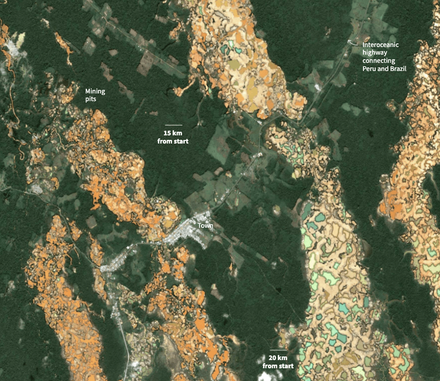
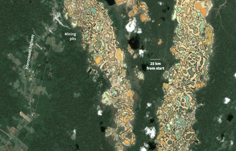
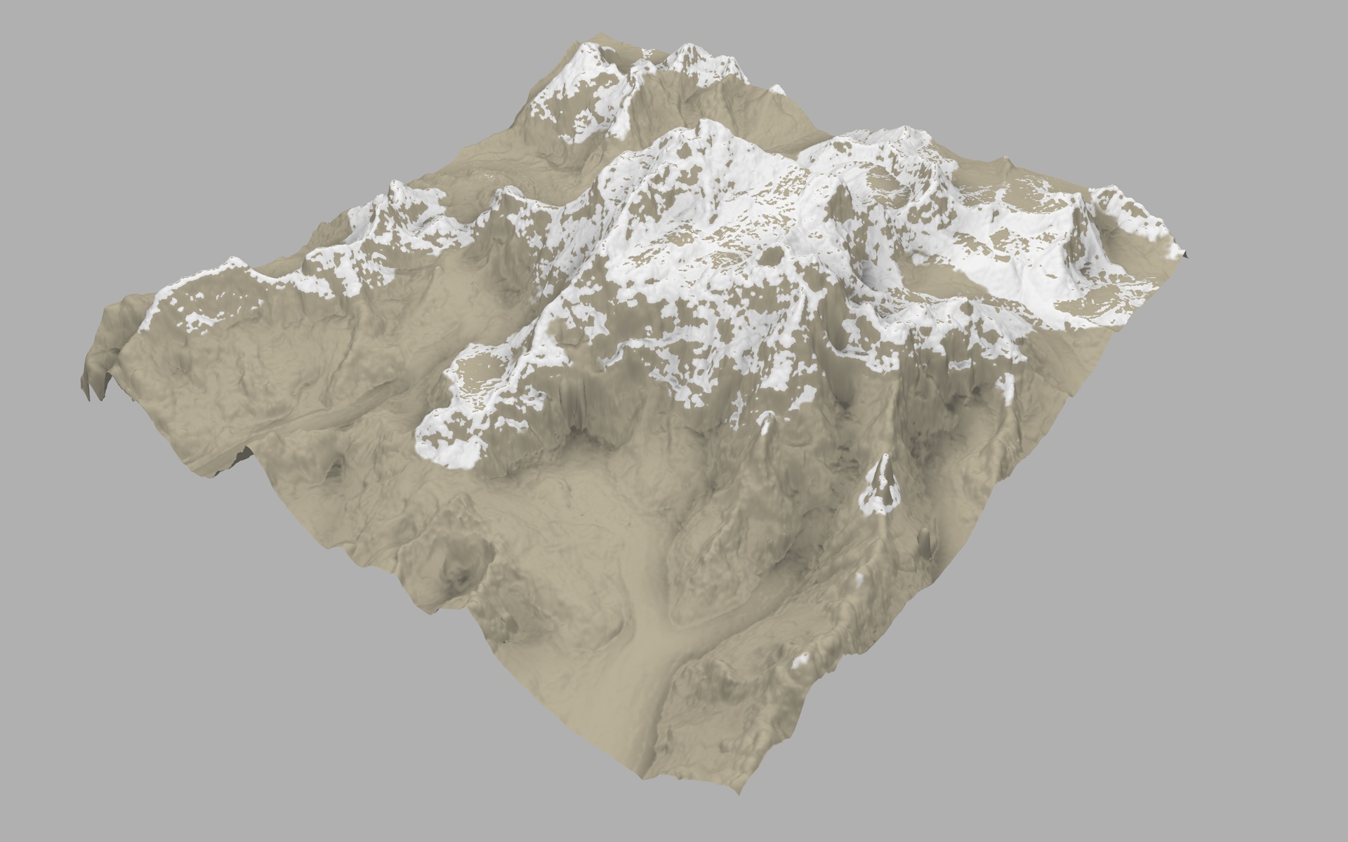
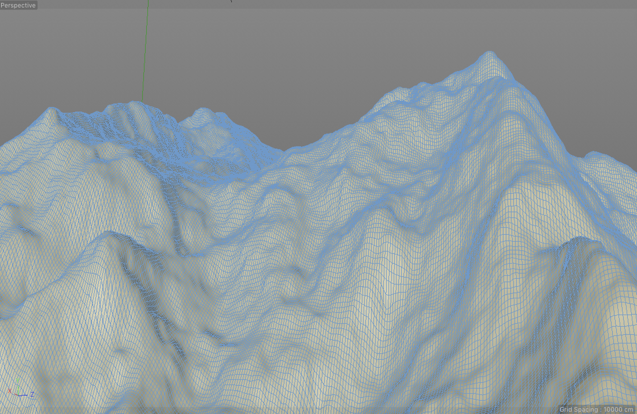
October: Rainforest.

The forests stories returned in October. This project took many days of 3D scene testing, hundreds of calculations to put thousands upon thousands of trees in place, modelling objects and illuminating leaves to show how quickly we are removing the things that are keeping us alive. We are nuts isn’t?

Not just ice, but we are also losing trees on an incredible rate. On average, 67,000sqm of rainforest is lost EVERY MINUTE. The following video begins at ground level, right in front of 3 people and a logging tractor, all to scale. In order to see the portion of the forest that we lose, you see people and tractors as ants.

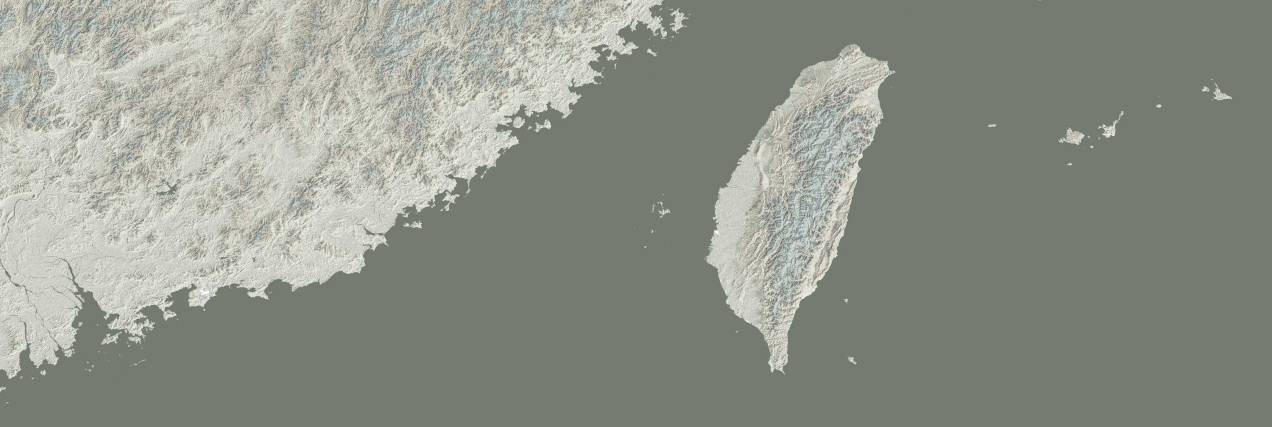
There were also other quick projects on this month, one of them was the story of the Chinese incursions on the Taiwanese ADIZ. Since then, many more events had happened and tensions only continued to escalate between both sides. Thinking about the region that has been my home for so many years, I hope this doesn’t go any further. Unfortunately, there are always chances that this will get out of control.

October highlight [ link HERE ]


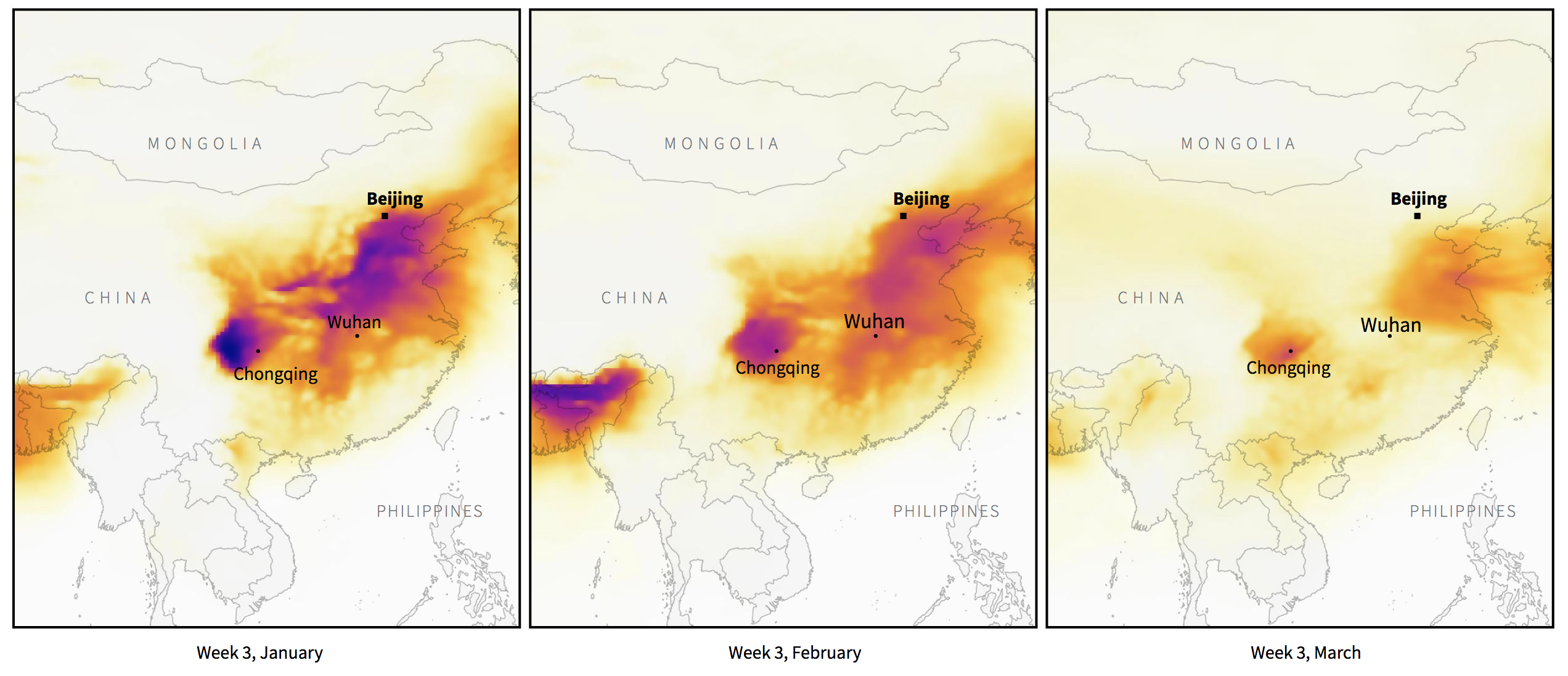
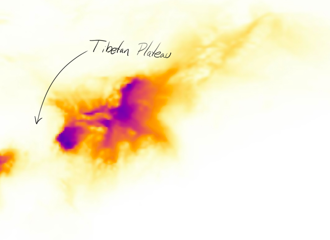
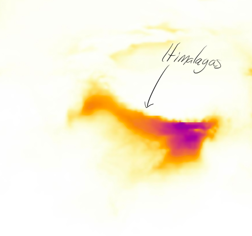
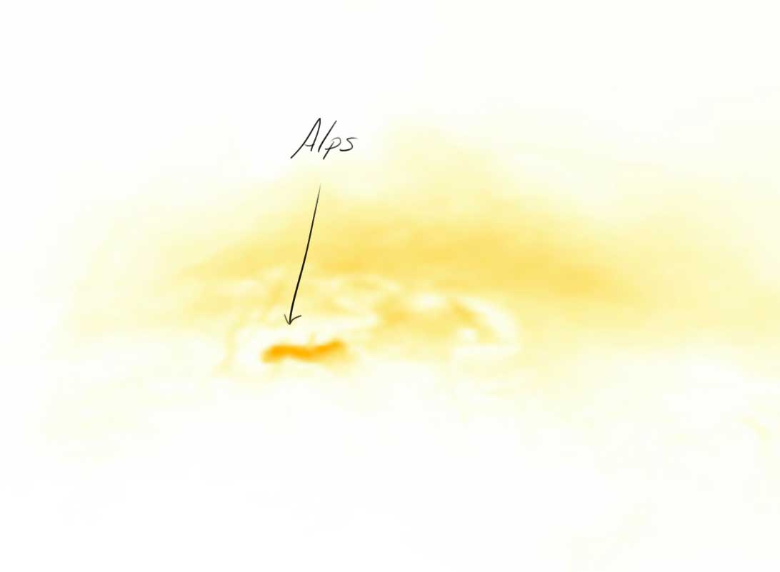
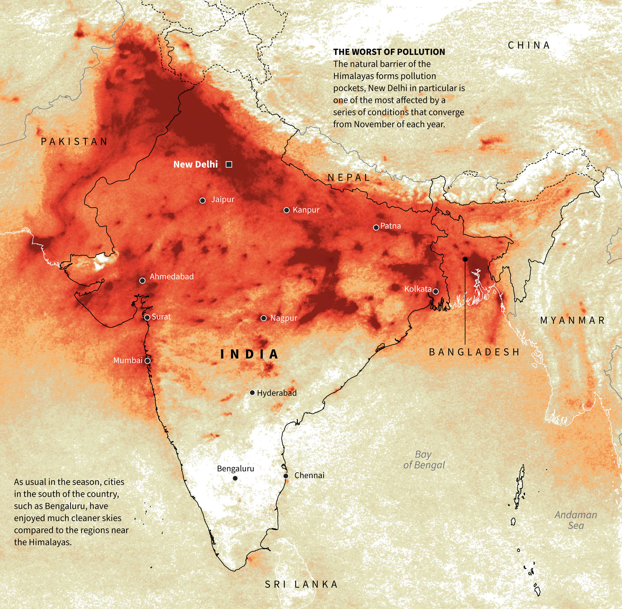
November: Pollution.

India is a very particular place. During the last months of each year, northern cities are suffocated by pollution trapped at the foot of the Himalayas. There are many reasons behind this such as seasonal crop fires, fireworks celebrations, and many others. However, southern cities avoid polluted skies. That was the subject of a one-day quick map, here’s a detail of it:


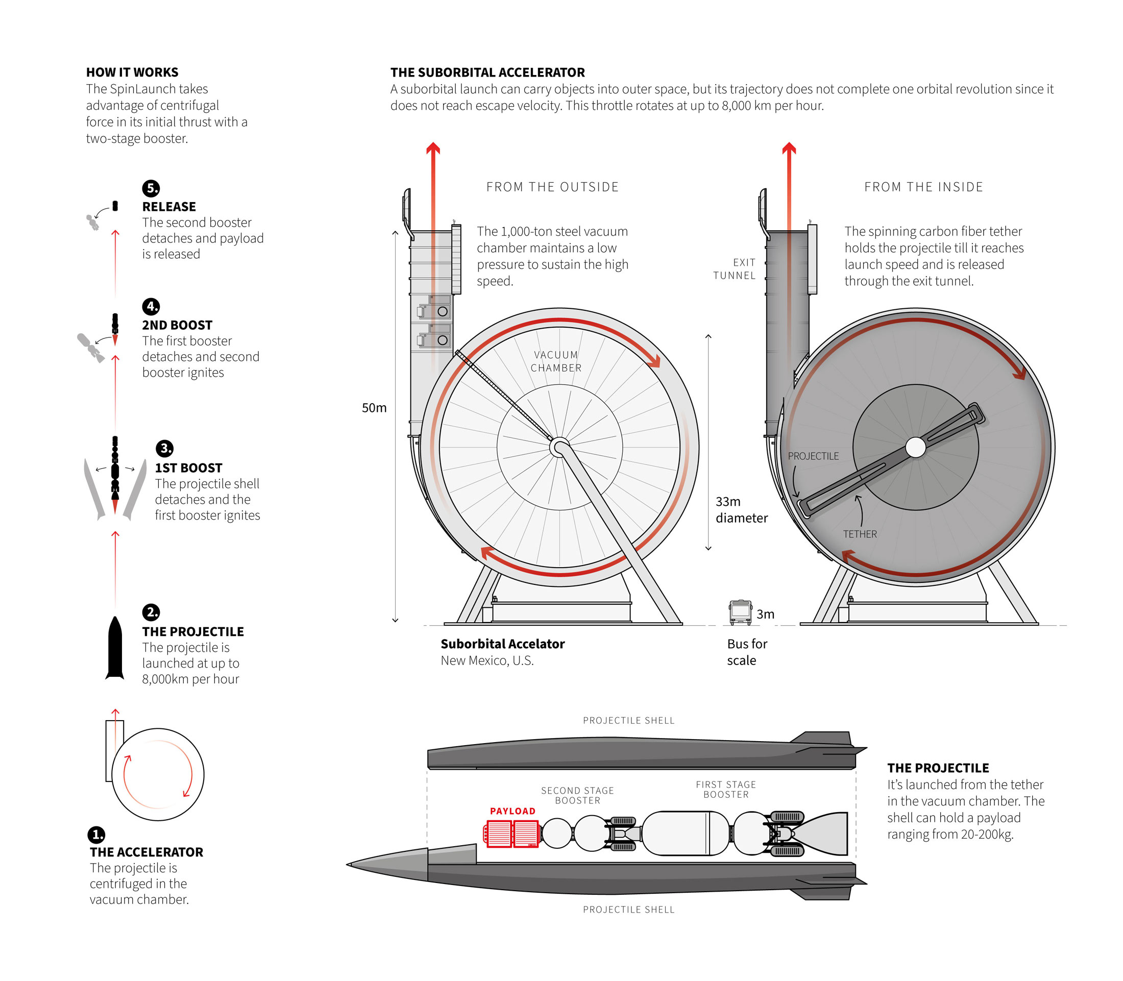
December: spin, spin and throw it.

Back to outer space news! …or kind of.

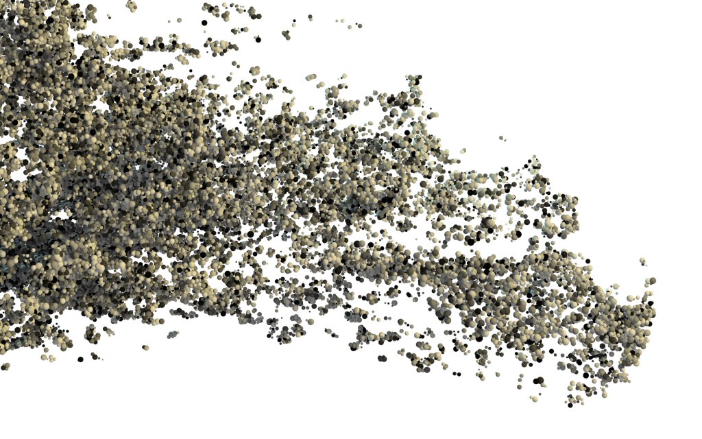
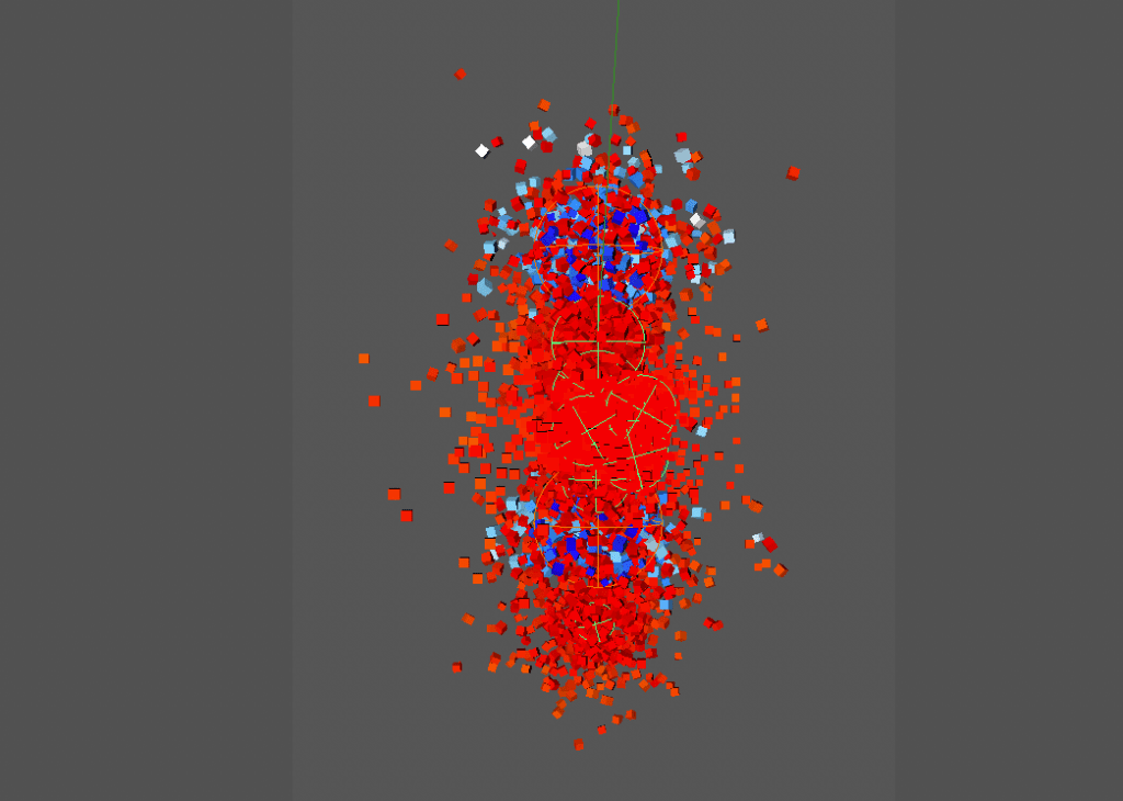
Near the end of last month (Nov.) I was working in one more of those small pieces for the daily basis. This time my mind blowed up with this idea of launching things into space without rockets.

The idea is to spin a projectile in a vacuum chamber, gain momentum, and propel it into orbit around the Earth. I imagine something like throwing a hammer at the Olympics, but on an enormous scale. Here is a small detail of the graphic in mention:


My 2021 list of graphics

Just a few days more of the 2021 are left, so many stories have crossed under my Wacom and keyboard, it was a great year. Hope you enjoyed this sneak pick of all the stuff I worked on over the year. I hope you also considered visiting the stories mentioned, just hit the link at the end of each month’s entry to get a better context of each of the details highlighted here.

2021 was a great year, I’m very grateful to Reuters for all the good things, also to my teammates, for everything we did together and how much I learned. There is no better way to say goodbye to this year.

Animation by @Kirun via Giphy


See you all in 2022, Merry Christmas!

Advertisement
Standard
infofails

Doodles for news

August 2021 saw a tsunami of stories from Afghanistan in the news. Apart from a bunch of small graphics, I participated with Chaos in Kabul and Flights over Kabul both stories related to the Afghan skies and the complex situation lived there after the US troops withdraw. At Reuters, we did a good long list of potential stories, even I did a few kickoffs of some, but a packed agenda of long term projects for this year left most of them out.

Boeing Chinook CH-47, Mi171E, Sikorsky UH-60, Black Hawk, Boeing AH-64 Apache
illos published at the story “flights over Kabul” Aug. 2021 | Reuters graphics.
Globemaster III

Have you ever felt that you need a few copies of your self to materialise all the stuff in your mind? no? well maybe just me weirdo but I do. I would have loved to have some copies of me working on a few more stories from Afghanistan to get them in time to publish back then.

Those aircraft illos above are from stories that do made it, but you know I love to share pieces from under the rug, so… here you go:

US Humvee vehicle
D30 Howitzer illustration

For a day or two my desktop was full of guns blueprints, aircraft dossiers, technical documents of military equipment, tons of field photographs from our news feed, news articles… The home screen of photoshop and illustrator slowly turned red.

I usually start these things in photoshop, drawing outlines, then a base colour layer, a layer shadows and one more of lights on top. All always to scale and 2.5x the size I’ll need in the final version.

MD530
M16 illustration

The cool stuff related to my job. ❤

The night vision googles were my favourites, weird device actually. I learn some of them are like a video game with this cool display of augmented reality. The visuals looks really nice, check this story from The Washington Post [ here ] or just google “US army augmented reality night vision goggles” you will see.

BNVD googles

I love to learn new things, that’s one of the best things of my job actually. You never know what’s waiting for you tomorrow, what new curiosities are waiting there for you. And even if they don’t get published for sure you will learn something new.

Guns illustration. M9, G19 pistols. M4, M16, Dragunov rifles. RPK7, M249, M240, NSV12 machine guns. Mortar

The grey area of working in news

Beyond the research for the illustrations and the drawing itself, I made some maps and videos on a demo page with the proposal. Maybe all of this was pointing too high in the little time we had at the time since all the rest of the work has to be considered to complete the story.

Sometimes news are a bit cruel, you must do everything quickly before it’s no longer news. The tricky part of it is that most of us in this industry think quickly of the same things. It’s like a race against the clock, so, unless you can distinguish your story from others that have been already published, things are doomed, and may end here on my blog… which is fine, but of course it’s a sad thing to bring potential stories to the graveyard.

Humvee, Ford ranger, M113A2, MRAP vehicles.
Hercules C130, Mi17 Helicopter, MD530 Helicopter, A29 Tucano, C208

The summary of this failed idea contains a fair amount of learning, a lot of cool nerd stuff is on my head now. Although unfortunately none of this was published, it was not a complete waste of time either as I did not work on this exclusively. There are many other interesting things in the pipeline, some almost done, so enthusiasm always remains high.

About #infofails post series:
Graphics that are never formally published. Those are maybe tons of versions of a single graphic or some floating concepts and ideas, all part of my creative process. All wrapped up in #infofails, a compilation of my creative process and failures at work.

Did you like #infofails?
Have a look to other #infofails 👇

1: Wildfires
2: Plastic bottles
3: Hong Kong protest
4: The Everest
5: Amazon gold
6: The world on fire
7: A busy 2021 kick off
8: Olympics
9: Floods

Standard
Digital works, infofails

Olympic #infofails

If you’ve seen my #infofails before, you might already know that it’s about the things I create for news and some of the mess in between. Here’s the link [ The Forgotten Olympic Events ] of the project related to this post if you want to have a look first and then come back here to get a better sense of what’s this about.

It’s a bit strange to say that we are about to see the start of the Tokyo 2020 Olympics in the summer of 2021 (if Covid-19 allows the games to go on anyway) but whatever the case, this is one of the most popular events in the world and we couldn’t let it go without a special story.

The idea of doing a story on unusual sports came first in April from my editor Simon Scarr. Later, I started reading old Olympics reports, books and websites to get good references of events that seem a bit unusual in a list of sports/discipline/events from the International Olympic Committee.

Some of the reports and books consulted for the project.

Once we had a good list of curiosities, I started doing some tests for the illustration style. It is not usual to find a solution quickly as I like to try alternatives. However on this particular project the style quickly established, and a few days later I had a lot of illustrations with many of those sporting events to display in the opening of each section.

Top images are part of the concept illustrations, I choose to go with colour as in the top right. The 2 bottom images are part of events the were left out of the story.

I can say that part was relatively easy, the difficult thing was to obtain visual references of the events where you could see how things were prepared for each event, or at least, a detailed written description. I probably spent more time looking for those things rather than writing or sketching.

A reference of the firing range setup for the running deer shooting event
A detail of the rifle shooting section in the project

This project lasted about three months, however I didn’t dedicate myself exclusively to it, but I did spend a few days here and there trying to obtain reliable sources that would explain these singular Olympic events and their rules.

Some references were harder to find than others. For example, the way of placing the wooden birds for the archery events was one of those difficult ones.

I did a drawing of Hubert Van Innis, an Olympic archer who won six medals in the 1900 and 1920 games, but then I found mixed references on how arrows were shoot in the moving bird events, probably my illustration had the wrong pose. I think that’s part of the process, many times I corroborate the references and sources and all makes sense, then something else comes along and the piece becomes a wrong interpretation. So it’s important to check not once but as many times as you can.

Cherry picking

Apart from little difficulties like that one of the moving bird event in archery, the main problem turned out to be too many nice things. It was necessary to take a decision to prevent a never ending story so we took off some events in the list giving priority to the ones with good references and “colourful facts”.

Some events sound very interesting by name, so we chose them for the first list of curious possibilities. A good example of this is the two-handed discus throw, digging a bit further I found that it wasn’t a very creative way of holding the record with both hands as it sounds, but two discus throws, first using the left hand and then the right hand… 😦

Some of the events that I considered within the initial list of Olympic curiosities, but that didn’t make it to the final version. Among them, a 12-hour bike race and army pistol shooting.

It was a very fun story to do, a really enjoyed to read the reports and references. I filled out my mind for a few days of images of how the people saw the games and how different are today.

Here’s a crazy collage with some of the drawings of the project.

collage
Some of the drawings of the project.

A funny project that looks like a huge illustration, but in fact, it has a lot of data behind, a lot of text/data documents, hundreds of old pictures and references of poses developed in 3D. One nice tool that help me a lot to create diverse poses was Magic Poser, this is open web-based 3D environment where you can set a model to any position you need. Here’s the link in case you get in trouble with anatomy or just need some help with pose models.

The folder with the production files of this project. I usually only have 4 or 5 projects on my computer. I guess otherwise it might not move at all 😆

About #infofails post series:
Graphics that are never formally published. Those are maybe tons of versions of a single graphic or some floating concepts and ideas, all part of my creative process. All wrapped up in #infofails, a compilation of my creative process and failures at work.

Did you like #infofails?
Have a look to other #infofails 👇

1: Wildfires
2: Plastic bottles
3: Hong Kong protest
4: The Everest
5: Amazon gold

6: The world on fire
7: A busy 2021 kick off

Standard
Digital works

#infofails: A busy 2021 kick off

Yup, a new crazy and very busy year have started. So, let’s kick off a new season of #infofails from recent months:

Sand mining projects

To be honest, I never thought about sand before this series of projects. However, sand is the planet’s most mined material, some 50 billion tons are extracted from lakes, riverbeds, coastlines and deltas each year, according to the UNEP. All around this topic is fascinating from a visual journalism perspective, the figures are huge and so scary and sad at the same time. –So, ideal for some good stories right?

Early in February, we did this story on how Chinese dredging ships are swarming Taiwan’s Matsu Islands. If you haven’t see it yet, please have a look first and comeback to this post. [ link here too: https://tmsnrt.rs/39OYbAZ ]

I did some stuff that we didn’t use because we turned into another direction, like the map of Taiwan at the top of this post, I was experimenting a little bit with colour schemes and the way of the relief, below are shown some closer details of Taiwan, Hunan-China, Hong Kong…

I also spent some time trying to understand how these strange dredge boats dig into the seabed, scoop up the sand, and then spit the material through a conveyor somewhere else. It seems that the Chinese used this type of boat often according to what I could see in many photographs of the Taiwanese islands affected by mining. But at the end we keep it simple with just the outside diagram of the boat as you can see in the page. Here’s a little detail of the inside that I didn’t finish completely:

I also got some estimated figures from Taiwan’s Ocean Affairs Council about how much sand the Chinese boats have take over the last five years. In the end we didn’t use it for the story, but the idea was to model piles with the same estimated volume and use the same style as the sand dredger above alongside a 2-meter man to give a better understanding of the amount of sand extracted. .

Some nice data I also was looking into was the GLAD ( Global Surface Water Dynamics ) those data sets are based in Landsat 5, 7, and 8 scenes, and they are so cool but didn’t use for the project. In that DB, you can see how rivers and water bodies in general have changed their shapes since 1999. I was looking at the Mekong river, but the data coverage is global and there are some really nice parts like this section of in Bangladesh:

In fact, I played a lot with these sand projects. From particles to animations, maps, illustrations … I made some fading castles for the top image before it ended up in a city made of sand as shown now. I made sand elephants, particles to see how different the grains are … LOTS of exploration to better understand the subject and I can say that anyone can spend years making visual stories about sand.

Other projects

I’ll keep this short since I already wrote down a lot about sand, let’s consider this tiny section as a bonus track 😆

Also in early January, we saw the story of the Chinese miners trapped inside a deep mine, it may looks like a huge simple illustration, but it has a lot of research behind to make it as much accurate as a breaking news story can be.

Illustrations sometimes can be way much more complicated than dataviz graphics I think. That, because you can’t argue with data, or print your own perceptions into something that it’s already simplified to dots and lines. Let’s make a little parenthesis here:

The illustrated graphics are more humanistic yes, but also complicated because you cannot detach yourself from those same parts that connect you with the information, those that you use to "humanise the information". I mean, you can't control what the people will see there, because it opens a wide range of interpretation. Not like strait forward dataviz isn't? Well, maybe not even in dataviz, everything have exceptions. Just look at [ this ] tweets by Francis Gagnon that sparked a lot of opinions in the visual journalism community about how cold and inhuman are "dots" representing people in a NYT graphic in the print front page. 

Ok, turning back to #infofails, in January also I worked in the Sriwijaya crash story, a straightforward breaking news story. The opening image saw some versions as we tried to tackle a sensitive topic and not give the wrong message to the readers at the very top of the story.

Some times I just want to run away from noisy things, have a look to the most basic and elemental thing in the visual I’m creating. So then I can go and add little clues for the eye. Doing that I think, we can find what’s needed to be highlighted, we can also understand what we know, but maybe not the reader isn’t understanding at the first instance by looking the graphic.

A map of Antarctica’s icebergs, just icebergs. Not land, sea or labels. Based on data from BYU Antarctic Iceberg Database

About #infofails post series:
I keep my beta graphics, those that never go public… Maybe they are tons of versions of a graphic or just a few concepts, part of my creative process. So, where all those things go? well, ends-up in #infofails –a collection of my fails at work.

Did you like #infofails?
Have a look to other #infofails Chapters here:

1: Wildfires
2: Plastic bottles
3: Hong Kong protest
4: The Everest
5: Amazon gold

6: The world on fire

Standard
blogging, Digital works

2020 in graphics: My favourite little details

That time of year is back, most infographic teams look back, making lists of work that left the year and highlighting their best stories.

I decided to make my own list of favourite details in the projects that I work on throughout 2020. But, before jumping in, keep in mind these are my opinions on small details out of context. Those little bricks are part of a bigger story.


January

I spent the first month of 2020 covering the Australian bushfires and little stories of a “new mystery virus”. If I need to pick just one single detail of those projects from January I’ll say the opening map of the story entitled Assessing Australia’s “ecological disaster”.

This map shows the habitats of 1,400 species in Australia.

The map is superposition of the habitats species in Australia, follow by the areas burned by wildfires in 2019. I like this little details because at the end of the animation you can see how all the habitats blends and some white areas a left in the map as well, turning this map into a map of Australian wildlife diversity and the fires threatening the animals’ territories.

January highlight link HERE.


February

We knew very little about the virus back in February, not many people was worried about it and the major threat may was the people returning home from “ground zero”. Countries started to evacuate their citizens from Wuhan and later on from China. My favourite detail was this simple diagram I work on about each country evacuees known at the moment.

565 Japanese were evacuated from China on early February.

Among the Japanese evacuees, them 7 tested positive while in quarantine. I guess uncertain is the worst feeling while you are isolated with other people who could be positive, especially if you are “locked in” with a lot of people. This little diagram transmits a bit more than just a visualisation of “how many of them”…

February highlight link HERE.


March

No surprise: A little more about COVID-19 stories in March.

Anyway one of the most choking stories happened in South Korea. The “michin ajumma” was all over the news in Asia because the incredible level of negligence of this woman. South Koreans called this woman “michin ajumma” or “crazy auntie” in english becase she was a virus super-spreader including records of contacts for more than one thousand people while she was sick.

Diagram of the Korean patient #31.

I like this diagram because allow you to see how this person went in and out from hospital for different reasons, including the need to attend a buffet in a hotel.

March highlight link HERE.


April

Some stories take more time than other to hatch, we need to take our time to conceptualise, produce, corroborate, edit, polish, promote… But among all the stories of the year, none took more time than “How coronavirus hitched a ride through China“. This crazy COVID ride across the vast lands of China reveal series of mind-blowing little stories to explain how the first cases of the virus arrived to each province of China.

My favourite little story, because the implications of the travel, is this 3,600km train-trip that Mr. Zhang did from Wuhan to Lhasa. Can you imagine be in a train for 3 days traveling sick and sharing a small place with many other people around? I guess no one knew anything about risk back then. This little story in itself could be a Hollywood movie.

April highlight link HERE.


May

Some events in our blue marble are big enough to be seen from space.

My favourite detail in May was one of the images we spotted with the Sentinel satellite. The image shows a bunch of cruise ships anchored in the Philippines with no guest but hundreds of crew still on board, trapped without a job guarantee; just waiting in limbo of the world’s largest cruise parking lot.

May highlight link HERE.


June

By mid year I turned my attention to other problems occurring in South America.

Illegal mining that tears down vast tracts of the Amazon rainforest threatens indigenous peoples and their way of life. Even illegal miners themselves endanger themselves by inhaling highly toxic waste from using mercury, even handling it with their bare hands.

My favourite details are those little illustration blocks explaining part of the problems. Staggering satellite images are proof of the magnitude of the problem in the region.

June highlight link HERE.


July

Have you ever see an ant farm as a kid? It was amazing isn’t? you can imagine what’s going on in the little world down there, all that crazy movement and structures rising trough the time.

If you don’t know what I’m talking about you may need to see this piece we did in August about the mining sites of Rio Tinto in Australia.

Mining Australia’s sacred sites” was a very serious topic actually. Some fo the destroyed areas have heritage history of over 20,000 years. The state-approved destruction carried out by the mining company sparked anger from indigenous landowners.

In this case, satellites were useful to provide evidence of the expansion of the mines. My favourite detail is the timelapse of Brockman 4 mine, because it looks just like an ant farm.

Satellite image timelapse: Sentinel 2, European Space Agency.

July highlight link HERE.


August

Many many things happened in August, we covered some breaking stories like Beirut’s explosion, and the Japanese bulk carrier Wakashio which got struck a coral reef on the paradisiac island of Mauritius. But my favourite among all of them is a completely different story.

August marked the 75th anniversary of the Hiroshima and Nagasaki A-bombs. We took the opportunity to create a visual explainer of what happened in a document style adapted to the time. You may notice the special typography and a particular style on the maps too. But the best thing about this project was the Japanese version that was published shortly after.

You can compare the English version here with the Japanese version here, you will noticed that some of the pieces are different too, so, isn’t exactly the same experience.


September

The ninth month of the year was all about wildfires again. Just like we kicked off the year, but this time the flames were consuming the North American forest. We did some different pieces, but one of the most popular was the smoke story.

The globe animation at the top of the page was very popular on Twitter, for some reason that kind of visual is always popular… But among all the pieces, my favourites are the small multiples further down the page.

Those images frozen in time are some of the most relevant moments of the smoke dimensions. Something that you maybe miss in the animation if you don’t pay attention enough.

September highlight link HERE.


October

For a long time I wanted to do some graphic on wine, something about varieties, process, climate or so… But, I never tough that the chance will come because the vineyards were on fire.

Up in smoke” is a story to visualise the damage caused by the fires in one of the most iconic wine regions of the world. Using some maps, dataviz, images and illustrations we tried to show what was going on there.

Doing research is a normal thing in all of our projects. But I guess because I really like wine, my favourite part of this project was the research phase. Reading so many articles, collecting so much data from everywhere, learn a lot to be able to explain later… and all that was about wine!

Yup, it was a nice experience, sad yes, but I learned a lot.

September highlight link HERE.


November

I really like to find the “woow” trigger in the stories. The “woow” happens when you give a little of context and show a visual of something that the reader wasn’t expecting, or even you in first instance.

In last November we were working in this story about the glaciers in the Tibet region. The page shows impressive drone images and how the glaciers are retreating rapidly, but my favourite part of this is to realise how much changes the region over a year. The original loop show a whole year of transition, below are shown just the extremes:

Landsat-8 satellite. Oct. 2020 vs Dec. 2019

November highlight link HERE.


December

What a year!
By December I was calculating which one of the projects I have the queue will see the light before the end of the year.

The monster-sized A68a iceberg that has been wandering in the ocean since 2017 made headlines when it began approaching an island full of penguins and other species. By then I already had some data sets in my “sources folder”. So in record time, we finished what turned out to be my favourite story of the month.

I knew the iceberg was huge, but one of the things that was spinning in my head was how much?
Probably bigger than many islands or even countries!

That’s why size comparisons are my favourites in this story, it’s not just about saying it’s massive, but about demonstrating it by showing evidence and references.

December highlight link HERE.


My 2020 list of graphics

Just a few days more of this crazy year are left, so many extreme stories have happened. This list is actually just a sneak pick of all the stuff we did over the year.

As I said at the beginning of this post, the little details in this list were pulled from the original context, I really encourage you to visit the full stories in the link at the end of each month’s entry to get a better understanding of the information.

See you all in 2021, Merry Christmas!

(Gif animated by @Kirun via Giphy)

Standard
Digital works, infofails

#Infofails: the world on fire

2020 kicked off with record-breaking wildfires in Australia, the hatching a global pandemic, and later the a new wildfires season turning into ashes thousands of sqkm of the U.S. West Coast, then Trump again… you know all that right?

In the middle of all that craziness, we were juggling to cover the events with visual stories. As usual, I did a little more than necessary in order to explore and get details relevant to our stories… and well, not all of them worked out…

Where there is fire, there is smoke

Some events on our planet reach sufficient dimensions to be easily seen from space, wildfires are one of them.

Mercator projected snapshot of organic carbon data on September 16th, 2020. Data from NASA-GMAO

I had work with GMAO data many times before, it’s a good source to see a model of aerosols and other specific data on a large scale, works very well for continental areas, not too much for a closer zoom like country level.

Anyway, the idea of this. visualisation was very clear, it was about to show the large dimension of the smoke caused by the wildfires in the US. West Coast.

One by one in QGIS, I did a series of renderings like the one shown above with data between June and mid-September (around 100 days), which is probably not too much, but the data is collected every 3 hours so I manually processed about 400 files to get a smooth animation.

Animation test v1.

To get control of the style without coming again to QGIS, I did the series of data only, a layer with the country borders, a layer with labels and so on… I also did one version with the same idea but in a globe.

Style test. v4.

I often try different versions of my graphics, On my team here at Reuters, we often joke that until we get to the twentieth version we won’t be close to finishing … Although in some cases that joke does come true.

The final version ended up looking a bit different. I controlled the final style in Illustrator, Photoshop and After Effects.

Final version. ( v.11 )

There are many more pieces in that story, including a really cool cutaway of the smoke made by my teammate Manas Sharma with data from NASA’s Calipso mission. You can have a look to the full story here: https://tmsnrt.rs/3nkkOkX.

But the wildfires continued to break historical records and turning the city’s skies orange-red. There were many other stories on that tragedy waiting to be told, even though the stories of the covid-19 did not stop harassing us either.

An aircraft swarm

OV-10 “Bronco” sketch test for the Cal Fire aircraft story.

Air attack was one of those stories we worked on in the middle of this year, the main idea was to show the impressive deployment and coordination of planes to deal with the fires in California. Just doing the planes was very enthusiastic, the main issue was how to pick the right ones.

Cal-Fire has on hand an extensive fleet of planes, tankers and helicopters, some in heavy operation, others less so. However, the flight and route logs from FlightRadar24 gave us an outlet to filter the aircraft.

Cal Fire aircraft sketches for the story.

You may have noticed some airplanes in the image above that aren’t in the final story. The AT-802A were used to guide tankers in the old days, they are probably still in use elsewhere, I think you can see them in the Pixar movie “Planes”.

That was one of the “unnecessary resources” that I created, thinking that it might have been nice to show how things have evolved over the years, but it was not the case. You can read the story through the following link: https://tmsnrt.rs/2Iy2K7W

Wine and ashes

There’s one thing you should know about me: I love wine.

I usually work colour at the end. More versions to test and try keeping outlines or light-shadows intact.

Most of the stories I’ve made in the last year or two are sad, some about environmental disasters, people in danger, dying, or losing everything.

Like many, this story came with some mixed feelings. I think it was the first time that I had the opportunity to do something about wine, and it involved the destruction of hundreds of vineyards.

Although I really enjoy to do reporting, create a map, draw a diagram, or write a story draft, those same stories always bring me a strange mix of joy in doing my job and the sadness of understanding the dimensions of a problem or event. I’m not complaining, I keep my job at the office, but it’s curious I guess.

You can have a look to the wine story here: https://tmsnrt.rs/3eZnWQ9

There’s no time enough in the world

Not matter how much time I can have, there’s always one more thing I’ll like to explore. Nice thing is you can save the idea in the bucket for next time. And the fires coverage wasn’t an exception.

Screenshot of the VIRS brightness data over California. Night time Aug. 03, 2020.

Around mid year, I was exploring at VIIRS/NPP data, this data contains 26 data sets including radiance sensors, shortwave IR radiance, earth’s brightness and temperatures etc.

That data can give you a daily quick look of lights and temperatures of the planet’s surface, of course if clouds play nice and go away from your interest area.

After downloading the data for a few days in the area, I noticed some bright areas that turned on and off depending on the day, probably fires that were seen burning from space at night.

The lights were so intense that you can easily mistake them for city lights. Check the white circles bellow:


About #infofails post series:
I keep my beta graphics, those that never go public… Maybe they are tons of versions of a graphic or just a few concepts, part of my creative process. So, where all those things go? well, ends-up in #infofails –a collection of my fails at work.

Did you like #infofails?
Have a look to other #infofails Chapters here:

1: Wildfires
2: Plastic bottles
3: Hong Kong protest
4: The Everest
5: Amazon gold

Standard
Digital works, infofails

#Infofails: Chapter 05, gold rush

I just realised that last time I did one of this chapters was last year, woow. My original idea was for me to publish one of these every three or four weeks … but reality has slapped me in the face: I don’t have time enough between projects.

Anyway, let’s talk about fails then.

That image at the top of this post is a QGIS render of the Amazon Basin made with data from Hydrosheds. It is part of the geographic data from my latest project on Reuters. But you may have never saw that thing anywhere in the project, unless not like that.

The Amazon Gold Project have a mix of styles including 3D, traditional sketching, vector works…

The 3D stage

I did some early versions of the maps using layers rendered in QGIS, a layer for terrain, base colour areas, borders, rivers etc. Then I re-pack all in Cinema 4D to create some side illumination.

Cycles C4D
Terrain layer test imported from QGIS, then rendered alone in C4D / Cycles

The idea was to try some alternative maps, at the end some illustrator labels and the dummy look something like this:

Map dummy with false text annotations

The 3D above was just a quick exercise while I was looking for styles. A bunch of images later, the things turned into flat images

And then to flat vector, probably taking out stuff from the map from crowded to cleaner to whatever…

Maybe I went too far because I really like how this was looking in outlines preview… someone should stop me at that time!

And it happened, in the end I went on to make other pieces putting pieces together on the page, bits of code, illustrations, etc.

If you already saw this project, you know that it has some illustrations, pieces that explain how illegal miners extract gold and contaminate rivers and destroy forests in the process.

Meanwhile I was also processing some satellite images, adding labels and looking for evidence of the miners from the space, then I saw some websites talking about the situation in Peru, so I look up the area in Sentinel and wooow!

I stumbled upon this place near the Peru-Brazil-Bolivia, border. Kilometres and Kilometres of devastation by the gold miners, a strip of more than 30km into the forest and actually I saw it for first time in false color, in near infrared, so the image was shocking to me.

Madre de Dios mining pits. Sentinel Hub, false color, near infrared.
Madre de Dios mining pit. Sentinel Hub, false color, near infrared.

Later we move to true color, trying to match the other satellite images that we had chosen earlier for this project, but still you have the feeling of the immensity of the destruction of these sites. I think that images have an immense power to present the damage dimension

5-6 km long section of mining pits at Madre de Dios. (Sentinel Hub, True color)
Sentinel Hub, true color.

So, I’ll say, fails in here, YES, well I spend a lot of time looking for alternative styles, experimentation is nice I collected a lot of information, but maybe I went too far styling place holders… Anyway I enjoy a lot this project, but and I’m more than happy that is already over.

About #infofails post series:
I keep my beta graphics, those that never go public… Maybe they are tons of versions of a graphic or just a few concepts, part of my creative process. So, where all those things go? well, ends-up in #infofails –a collection of my fails at work.

Did you like #infofails?
Have a look to other #infofails Chapters here:

Standard
Digital works

Crazy week of covid-19 stories

Around the world millions of people are still at home, waiting for this and other measures to take effect to face the coronavirus outbreak that has affected us for months now.  From the perspective of those of us who work in the media, these have been exhausting days.

In my particular case, this week, from my chair at home, I published two projects related to the virus and there are still many more waiting. You can have a look here: https://reut.rs/3cnZ7e8 and here: https://reut.rs/3etB13s

characters_draf
How coronavirus hitched a ride through China
For the first project I did a lot of illustrations, but also a bunch of graphics that you may not notice, there are about 135 maps (including different device sizes), also there are about 37,324 human icons, illustrator was about to set on fire my laptop while editing those icons 😂
characters

And some of the thousands of humans featured in the story:

icons


A breath of fresh air

The second project was a little different. Around the first week of February, I was curious about air quality in China and what could cause the lockdown, I discussed it with my boss the idea, but we never had time to go further and analyse the data. Few days later I did a quick search just to see if there was something interesting there:

nitrogen

Surface NO2 captures from earth.nullschool.net | on the right January 2020 day by day, at the left, February same logic. (Not for publish just to see what’s going on back then)

Then, I saw some other media and people doing nice stories about nitrogen dioxide, so, the idea stay in the back of my mind for a while. Finally, when April arrived, I was able to resume the project, and I took on the task of generating some basic visualisations and charts to share the idea with the team and a series of scientists from various disciplines.

final_mapseries

Part of the maps shown in Reuters story.

Of all this latest project, what I enjoyed the most was seeing the maps.

The pollution spots draw the high mountains in different parts of the world. I find it hypnotic to see those patterns without any labels or borders, just the data giving shape to the mountains, plateaus…

TIBETANPLATEAUHIMALAYASALPS

Anyway, I hope you enjoy these projects as much as I enjoy creating them.

One last note: The map on top of this post is about optical aerosol (AOD), based in data of GMAO/NASA. Picture of the day (March 01, 2020).
Many thanks to all the scientist and experts that help us to get that story out on time!

Standard
blogging, Digital works, infofails

The last chapter of #infofails… [of 2019]

About #infofails post series: I have a lot of beta graphics that never go public, it can be tons of versions of a graphic or just a few concepts as part of my creative process. So, where all those things go? well, ends-up in #infofails –a collection of my fails at work.

This 2019 is almost gone, big media is doing their “year in graphics” collections, meanwhile I’m in the rush hour trying to fit one more graphic in this year. I’m looking back trough this year, and it has been a crazy one; many unexpected things and lots of changes for me. That’s the case of this project I want to share with you, is one of those unexpected results, or un-result to be accurate.

himalayas

Death rates at the Himalayas peaks

The Mount Everest project (screengrab above) started as a great opportunity for a data narrative, the story behind was the bloom in the climbers amount, many times resulting deathly for them; the whole team was doing pieces to get this story online, if you didn’t saw it, here’s the final result of the project: CLICK HERE. Have a look first, then come back to this story for a better context.


The fail story

My fails begun when I was trying to get an accurate model of the mountain, I first tried doing some elevation curves map, like the one on top of this entry. The main problem here was to get a good resolution, I was taking as base a 90m DEM produced by NASA, the files are great and works most of the times, but not to the level of detail I was looking for.

himalayas.jpg

90m DEM by SRTM/NASA. This was the starting point.


This thing works for a general overview of the whole mountain system of the Himalayas. To me, it was look in a good shape. By exaggerating the elevation, the idea was to add a color range or some other texture to visualize the heights, so then point out the mountains other than the Everest were the climbers usually go.

elevation profile.jpg

Version #1 Himalayas peaks

You maybe noticed that usually I do 1-5 versions of the images to try different ideas, in this case, I didn’t went any further because in the middle of the production some other projects came in. Fortunately my teammates got some other ideas, they took the project from this stage forward. I just jumped in again at the end to collaborate with the finishing touches and adjustments, so I can’t take any credit.

But going back to my fails, I did a few more pieces before the no return point in this project, one of them, a preview of the contours growing-up:

elevation.gif

Everest and surroundings, model based in 90m data by SRTM/NASA.

Also I try some more realistic look using a 30M DEM from the Shuttle Radar Topography Mission. That one was looking better, but I was already out of time:

crop06_0090.jpg

C4D textured model based on 30m DEM data by SRTM/NASA

basic_gshade.pn

Basic shading. C4D model based in 30m DEM by SRTM/NASA

wiref_01

Color ramp by height, Himalayas system. C4D model based in 30m DEM by SRTM/NASA

wiref_04

Mount Everest close-up. C4D model based in 30m DEM by SRTM/NASA

There was also an other idea to show in this graphic. I was thinking that maybe will be nice to show the equipment that modern climbers uses today in comparison with the equipment of explorers from 60 yeas ago when the mountains were the final frontiers of the unknown. Is incredible that teams went there with heavy and basic equipment and yet make it to the mountain (with great help from the Sherpas of course).

50s_sketch.jpg

Climbers equipment detail. Based in documentation of the British expedition of 1950.

Not sure if this graphic of comparisons will be published or not, so I’ll upload just a tiny little part without information or details, but who knows, you maybe see it next year either at Reuters website, or here as another of my fails for your entertainment haha.

It has been a pleasure to have your comments and readings this year, I hope we will read each other soon.

Happy holidays!

________
Did you like #infofails?
Have a look to other #infofails Chapters here:

–Chapter One
–Chapter Two
–Chapter Three 

Stay tuned for the next chapter in 2020! 🥳

Standard