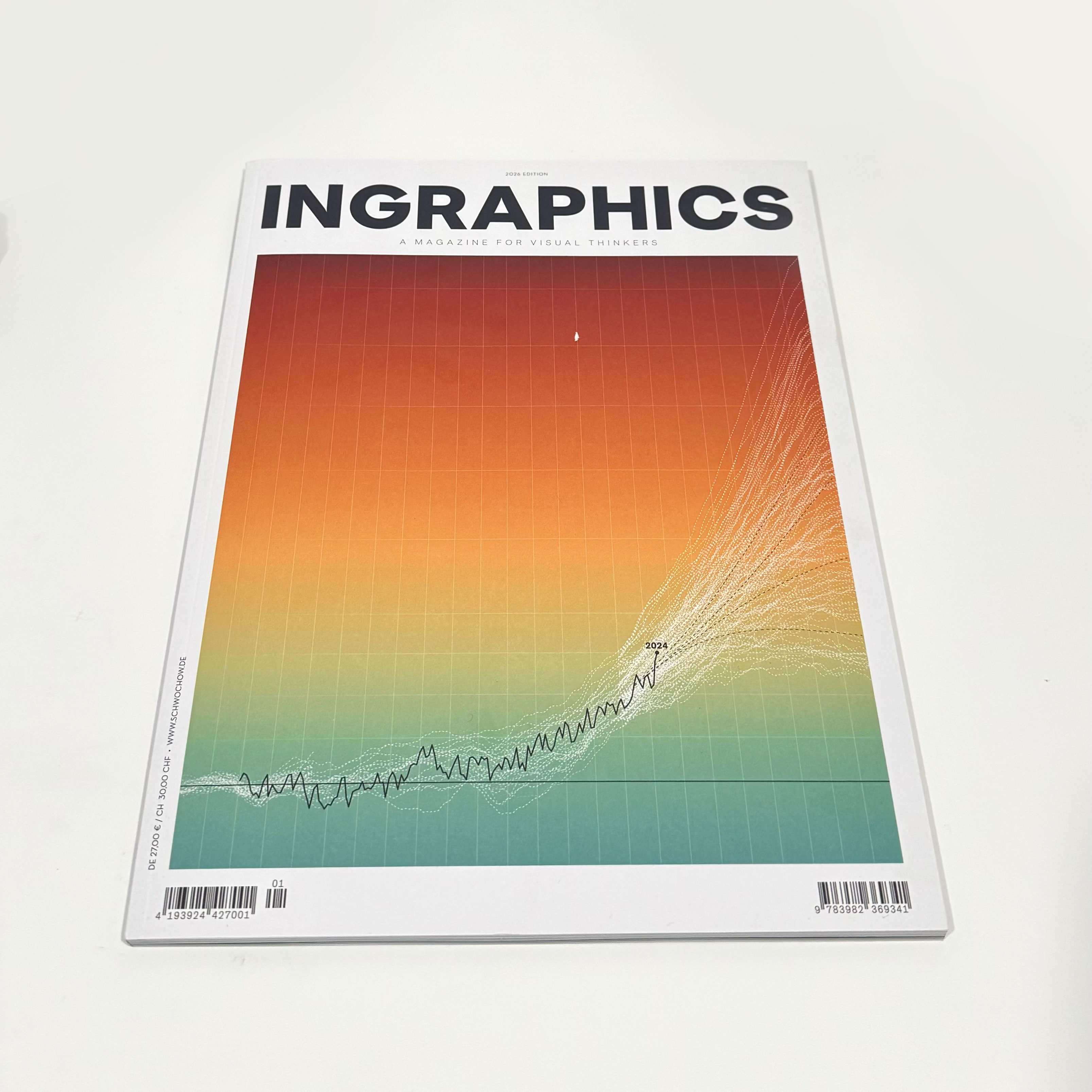
More than a decade ago, I bought a series of magazines by this German designer that were a great inspiration in my career. Today, I received a copy of Jan Schwochow latest edition in my mailbox, in which I had the great honor of participating in.
One of my pieces in this magazine has a very personal touch.
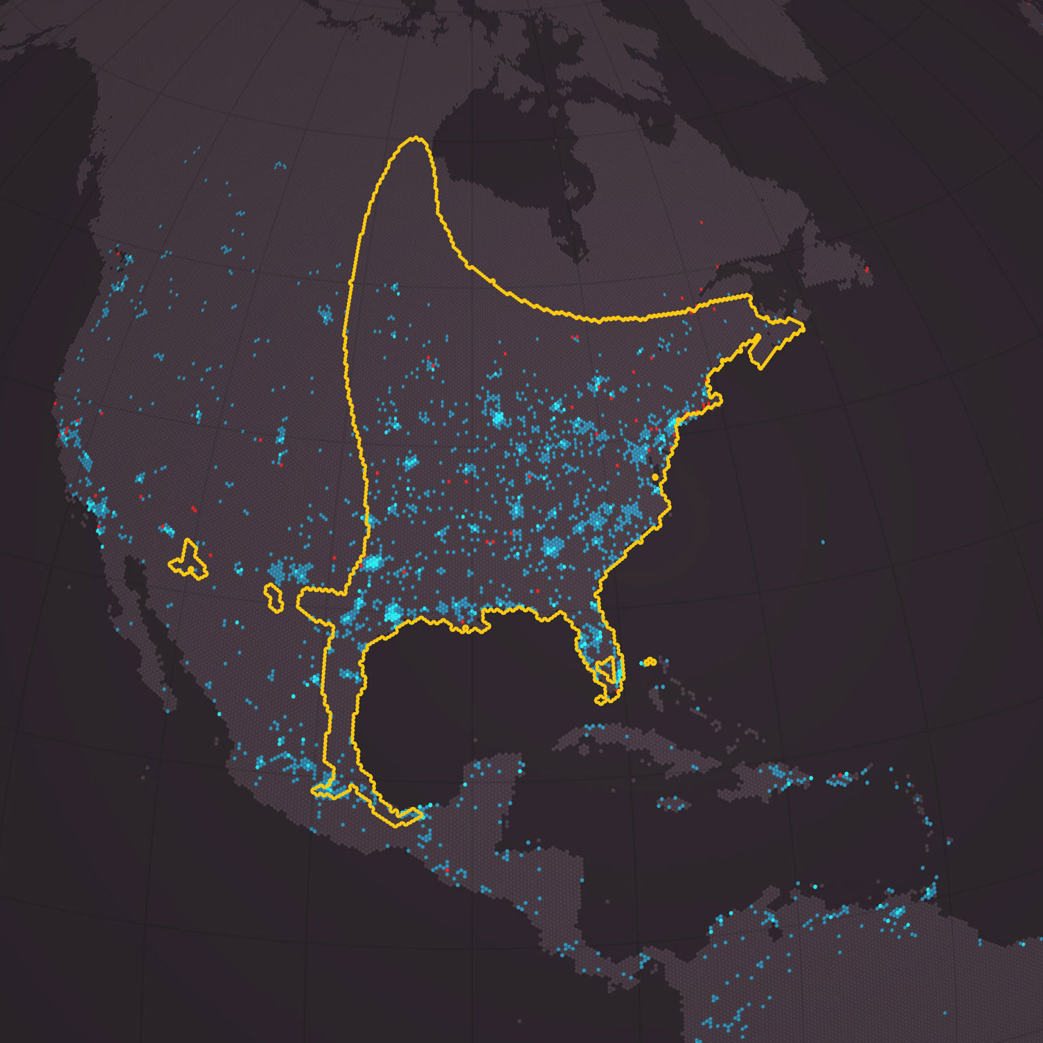
As a child in Costa Rica, I remember seeing the cow pastures filled with dancing lights. At night, my town was very dark, and on a moonless night, on a nearby creek, you could clearly see the edge of the Milky Way merging with the lights of the fireflies dancing all around you… magic.
It doesn’t look like that anymore, and not just in my town, but all over the world.
That motivated me to visualize the phenomenon to spread the message of what we are losing. My 17-year-old son has never seen what, for me, was the most impressive immersive light show. If you’ve never seen anything like it, you may never see it, or not anytime soon, if our cities continue to get brighter every day.
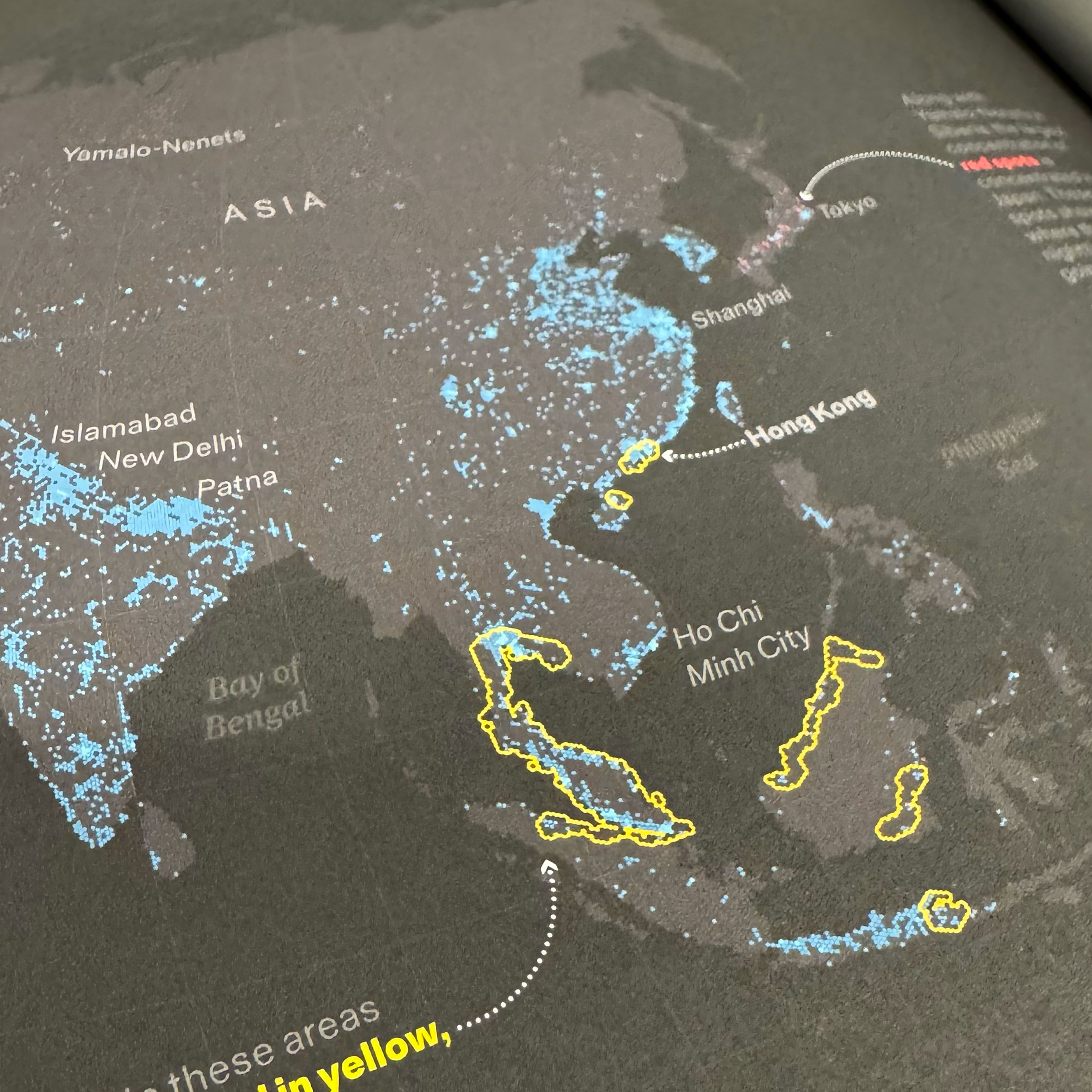
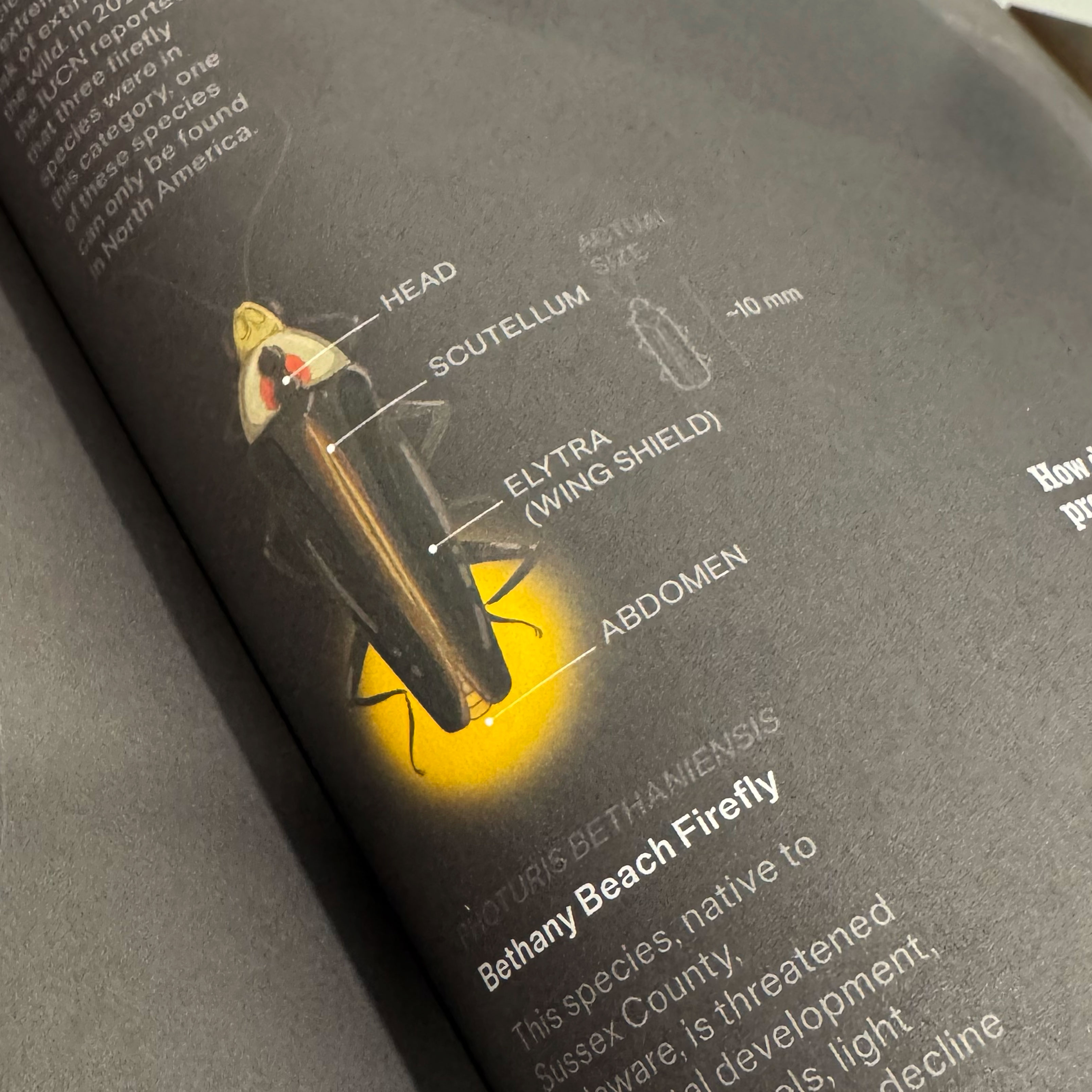
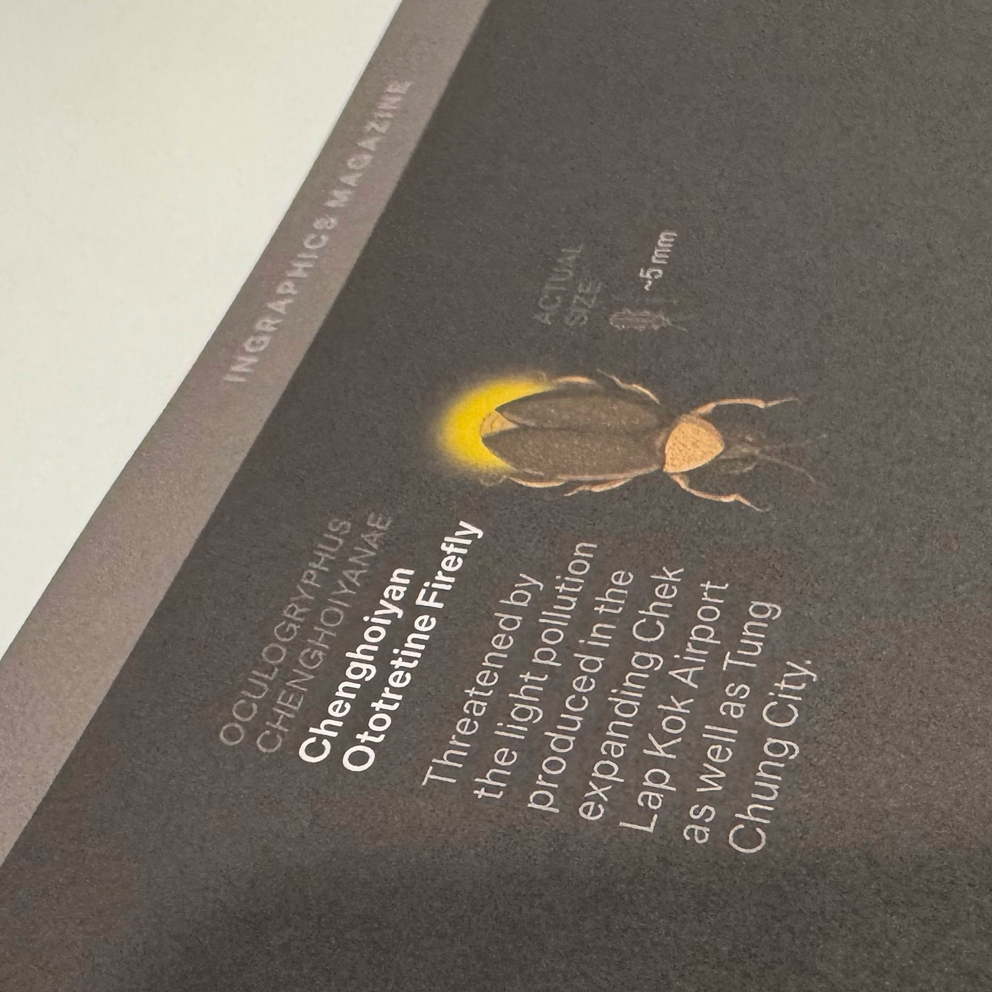
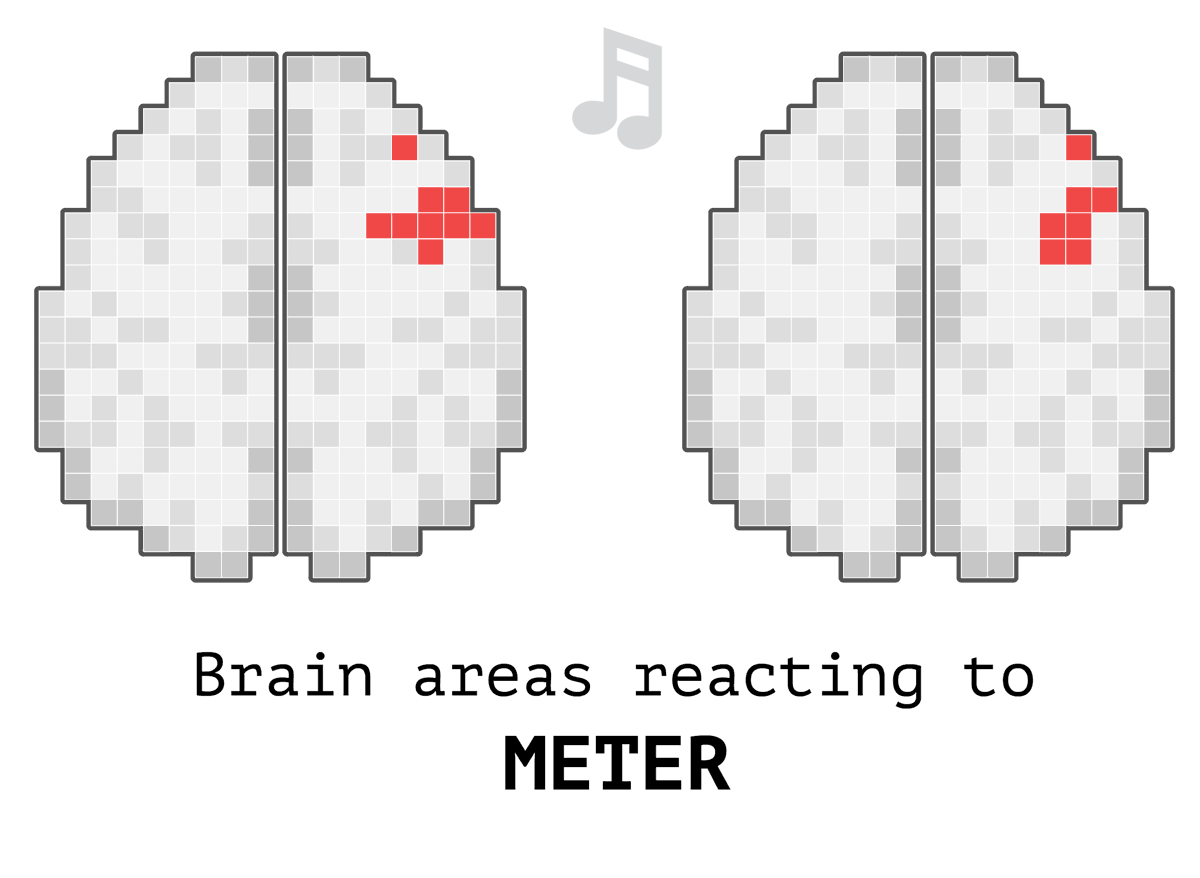
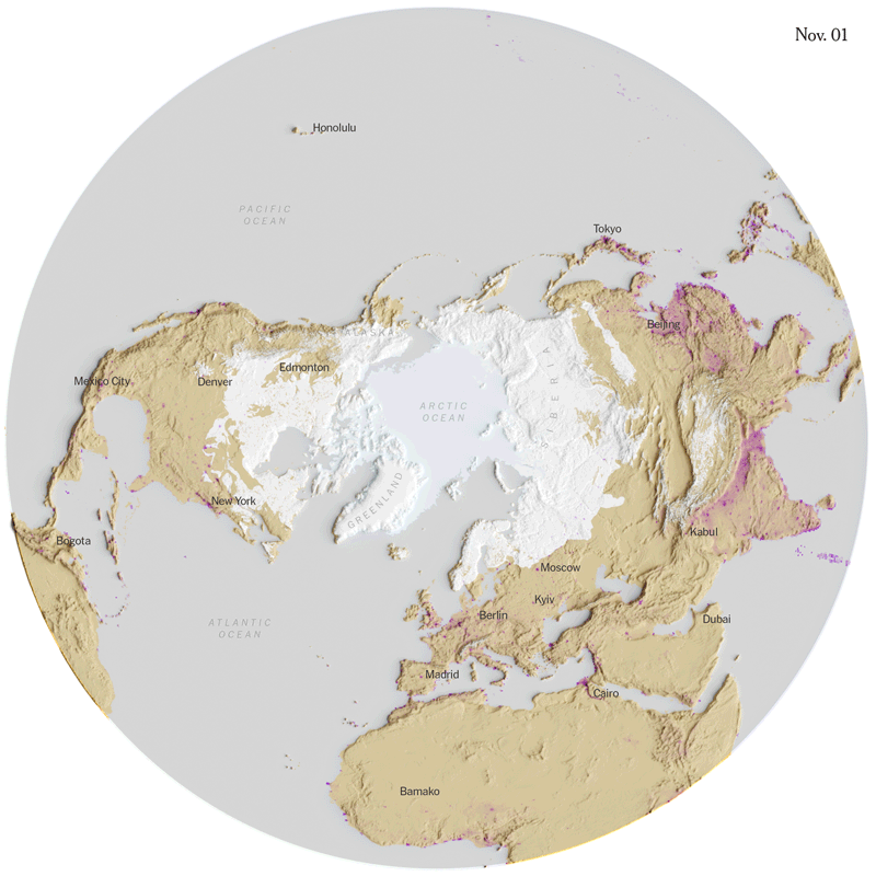
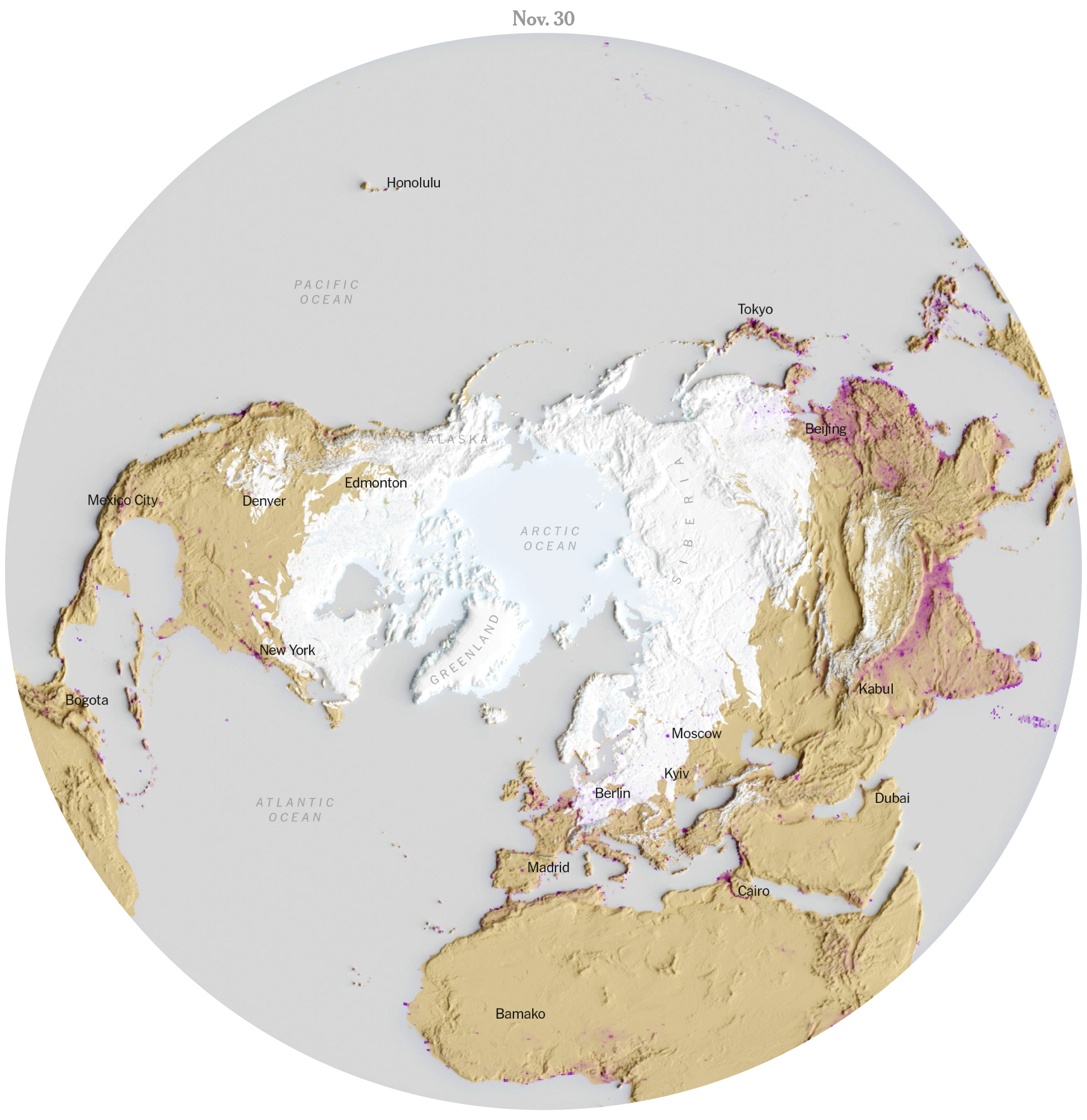
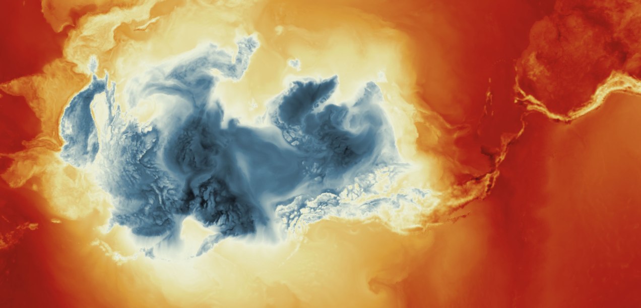
The piece shows areas around the world where some species of fireflies are disappearing and, at the same time, where city lights are brighter today than they were 20 years ago. It is designed on a dark background, and some of the text is blurred, a metaphor for what we are losing.
In a way, these pages are a portrait of what is fading into the void in the face of our progress as a species.
The yellow areas show where the fireflies are on a critical thread; the blue dots are lights brighter than they were 20 years ago.
However, if you know me, you know I can’t be serious for very long.
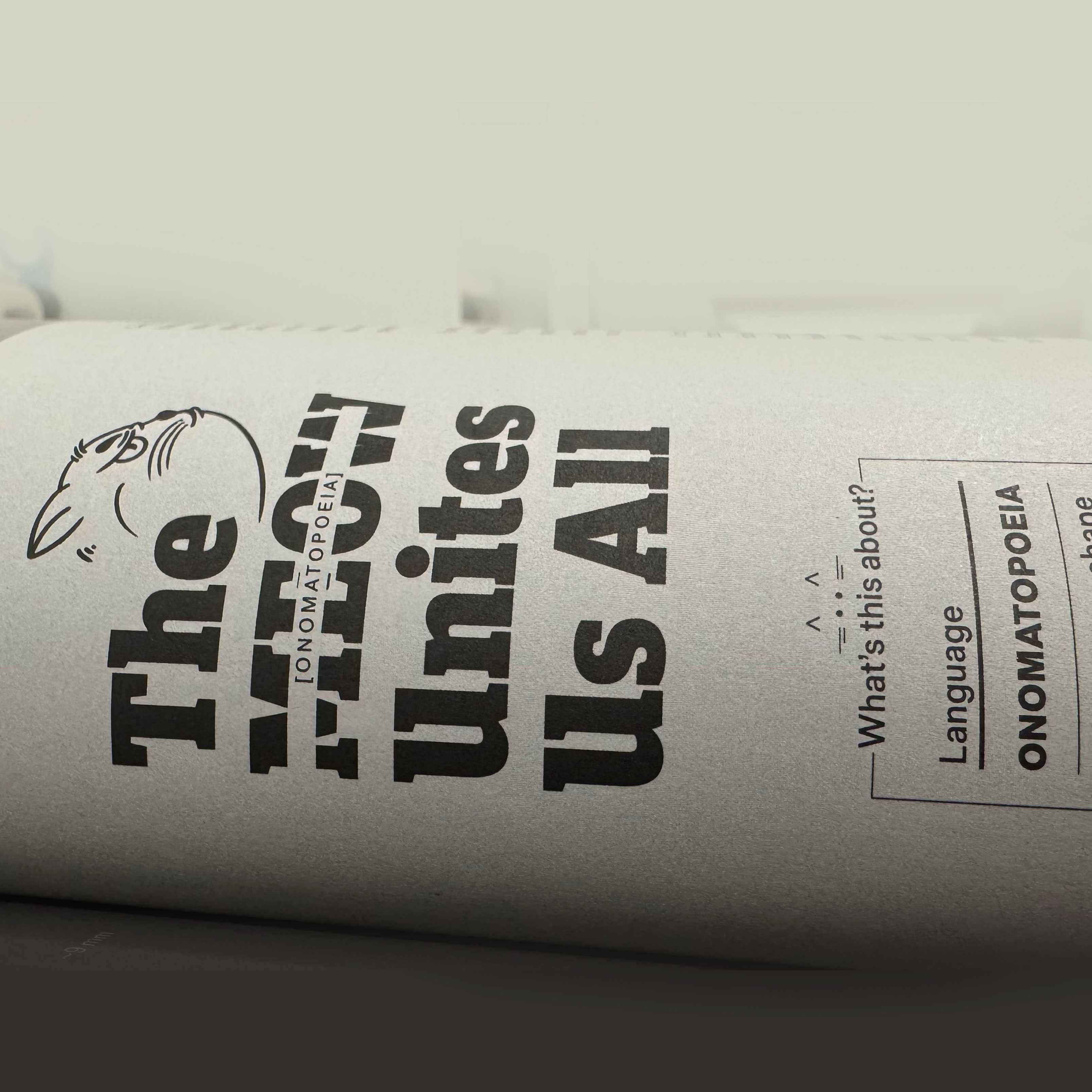
Ingraphics Magazine is somehow a white canvas, and Jan has managed to create a great diversity in this latest edition of the magazine. He even opened the door for me to sneak in one more page with something I’d wanted to do for a long time.
It’s a page about onomatopoeia, and it shows how, even though we speak different languages around the world, there are many things that bring us together; in the end, we’re not so different after all.
A close up of the onomatopoeias graphic for Ingraphics Magazine.
For this piece, I spoke with several people who are fluent in languages other than English and Spanish, and although it’s based on serious research, it also has a touch of humor. –I hope you can enjoye it as well.
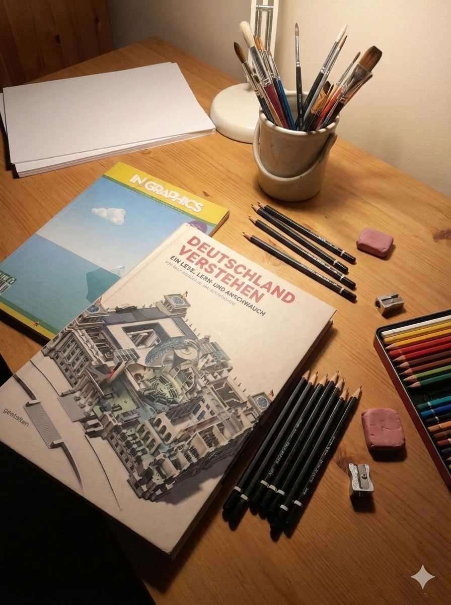
Some of the illustrations used in the Magazine.
Ingraphics Magazine means a lot to me. In fact, more than a decade ago, I bought other books by Jan just to enjoy the pages and their beautiful design, even though they were in German, a language I don’t speak, and back then, Google Translate wasn’t an option.
Some of my inspirational books that I still keep in Costa Rica
Being a part of this revival of the magazine is a great honor, there are people with brilliant pieces and it’s truly an honor to be alongside people who have been an inspiration in my career, such as Frederik Ruys, John Grimwade, Jaime Serra, Nigel Holmes, and Nathan Yau.
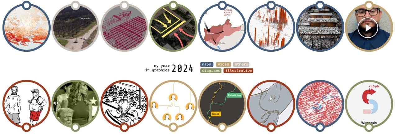
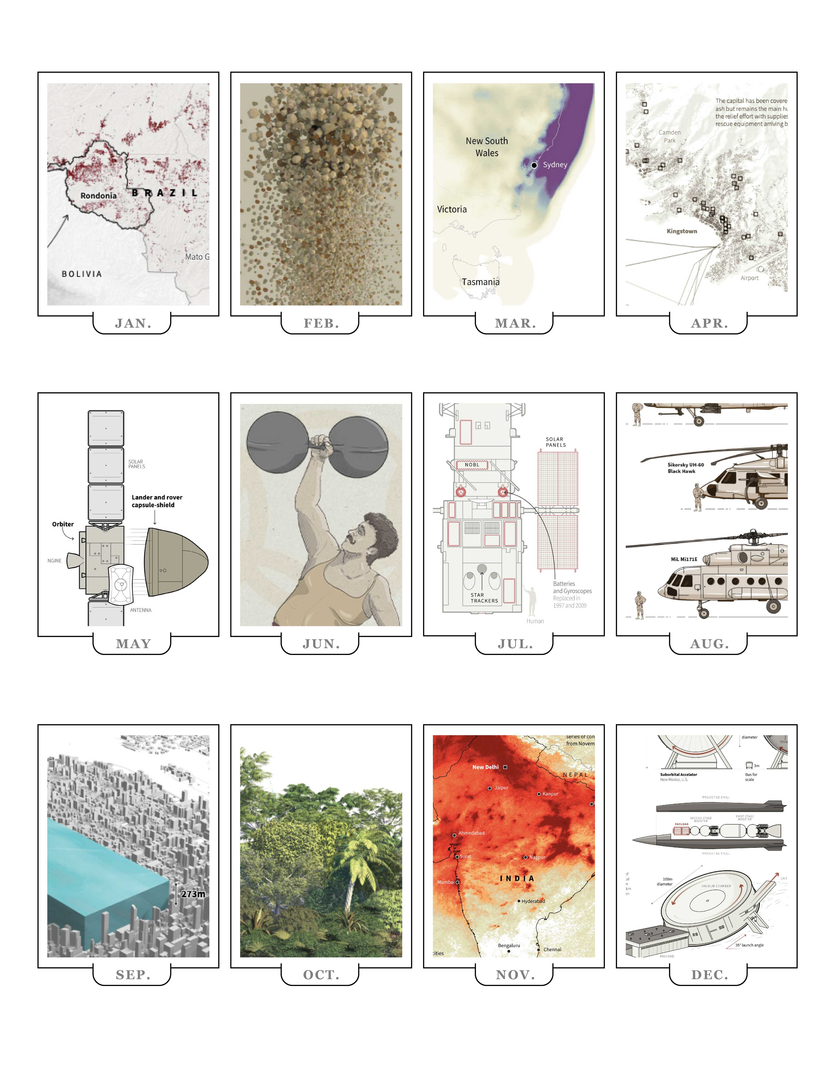
This year I’ve found a lot of inspiration in various forms. There are so many professionals doing incredible things that I thought I’d create a special post to wrap up the year. I have something from out there, something from a colleague, something in paper, something of my own, something I found on social media, something from someone I admire and something that was recommended to me.
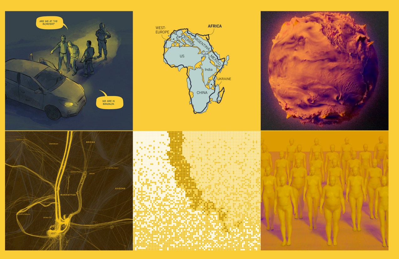
The composition of this piece not only captivates the viewer’s attention but also employs an unconventional format reminiscent of a comic strip. The narrative is compelling, effectively eliciting empathy for the individuals ensnared in this perilous predicament. Beautiful work to tell the horrors of abduction and scamming in a powerful way.
This piece successfully explains how quickly the dissemination of outbreaks can be under specific conditions. Unlike conventional explainers, it provides interactive simulations where you can edit the data and understand the effects in the outbreak, enabling a deeper comprehension of infectious diseases, vaccines, and related intricacies.
The topic is spicy and trendy. There’s an interactive version of the piece to explore some of the data, but I think the print is a great solution, great design to focus on the big picture. I think paper can make us better editors because of the nature of having limited space.
Scott always does very interesting things; this year he has posted many alternative ways to visualize winds, temperatures, and other atmospheric conditions in a really interesting way. Check this set of spheres driven by wind.
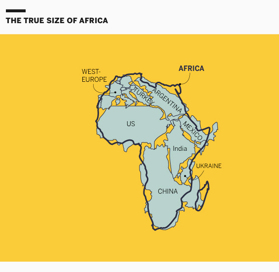
This project is exquisitely designed; every map, animation, and illustration is simply brilliant. The piece explains the details behind the distortions and biases in cartography within the framework of the African Union’s demand and initiative to promote maps that better reflect scale and proportions.
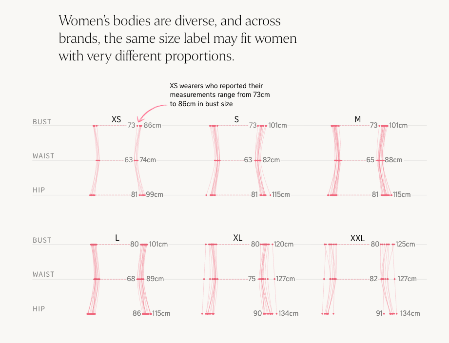
I asked colleagues for a little something (graphics/dataviz) they remember from 2025. Among the responses I received was this piece from the Straits Times, a very interesting analysis of women’s clothing sizes. To be honest, we’ve all been confused by clothing sizes at some point. A brilliant blend of graphics and personal experiences, wrapped in a highly engaging narrative. This piece is well worth reading again.
Image by The Straits Times.
What other memorable pieces from 2025 do you remember?
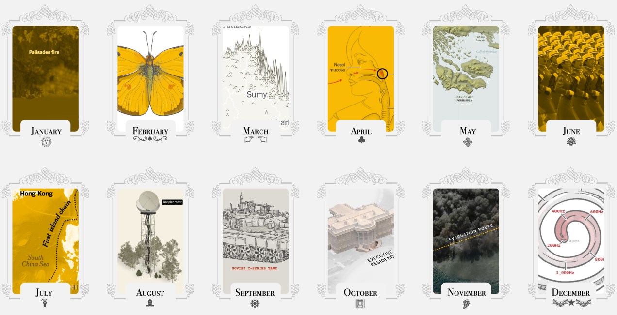
For the past few years, I’ve celebrated December by reflecting on what I saw, what I shared, the places I was invited to, and what I created throughout the year. I like to look back, remember the lessons I’ve learned and revisit the good times before starting a new cycle. So here we go once more:
–Jamaica, L.A. & Washington D.C.–
2025 was a fund and extreme year. I spent the first few days of the year on the warm beaches of Jamaica trying to escape the cold of New York. News were just around the corner, waiting for me to kick off a busy year…
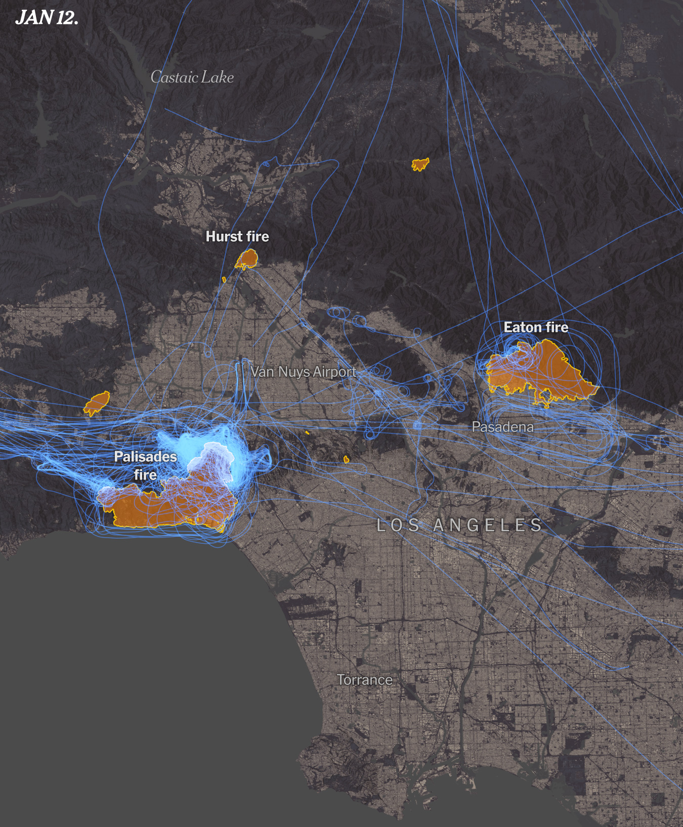
Just a few days into the 2025 large areas around L.A. went into flames, we did a few stories around it including this story looking at critical 24 hours of emergency there. I did so many maps and visualizations for it that I even made an entry on my blog about it, scroll down and click the “load more” button until you reach entry number 10 to see some animations and aircraft visualizations like the one above.
January also saw another emergency when an American Airlines plane crashed with a military helicopter. I jumped in with some quick maps and reporting alongside my colleagues. Life sometimes is ironic, after starting this way the year, I think this was one of the years where I travel the most both locally and internationally. Luckily for me I did not got exposed to any dangerous situation… not even turbulence.
–Gaining momentum in NYC–
Being the shortest month, February really flies by! I spend most of the month planning projects and looking close to a range of things like data centers, the role of AI, the transformations in the battle fronts in Ukraine and even patterns in the butterflies populations. I don’t feel totally safe sharing a screenshot of my calendar, but it’s crazy to look back and see the many diverse meetings I had in February to chat about these and some other projects.
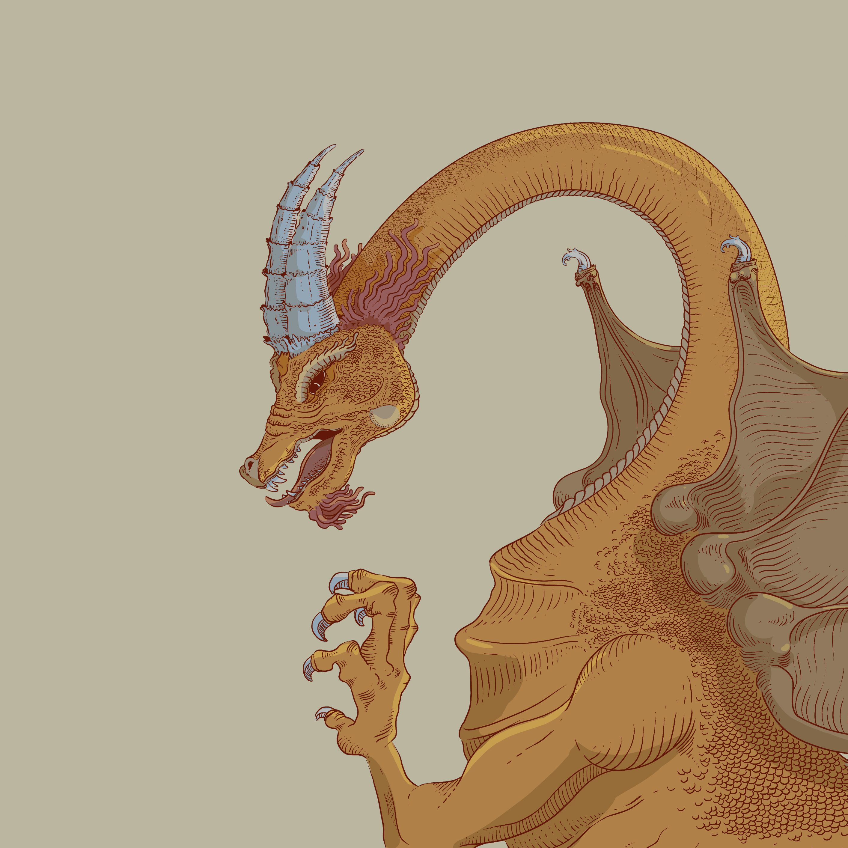
The dragon above (Víbra) This year I wrapped out my second year of my Sunday sketching exercise. That was a fun project for fun I did every Sunday, but after getting myself into way too many things I paused for a while after finishing it last summer. The image above belongs to week 87 of the project!!! (35 of the second cycle). The plan is to bring it back once I finish a few other fun projects that I’m cooking.
February might looks a little empty here, but it was super intense too. The first things I published in March (first story the 3rd) was all made through this intense a diverse planning in February.
It’s kind of funny to look back and remember moments by looking an old calendar. Give it try!
February was also the start of planning an SND project that I thought I could easily get off the ground; however, the initiative to create the SND mentoring program took me a few more months, as you will see later here.
–War, Butterflies, city spheres, Artificial Intelligence & Boston–
March was the month to collect the harvest. Just 3 days into March I published this story showing how the front lines in Ukraine changed with the intensification of drones as a main weapon. Drones have taken land, air and sea as main drivers of fight, so we used testimonials, maps, illustrations, videos, photos and more all packed into a tight piece in collaboration with the International desk. I work a lot with them, not just because of the visual potential in these stories but because of the smooth relationship to create pieces together.
Just 3 days after that war story, I did a little collaboration looking at butterflies and how their populations are declining or proliferating (spoiler, mostly declining). The project was super fun, but I did not had the chance to do all the stuff I wanted to do since a source provided a ton of good material.
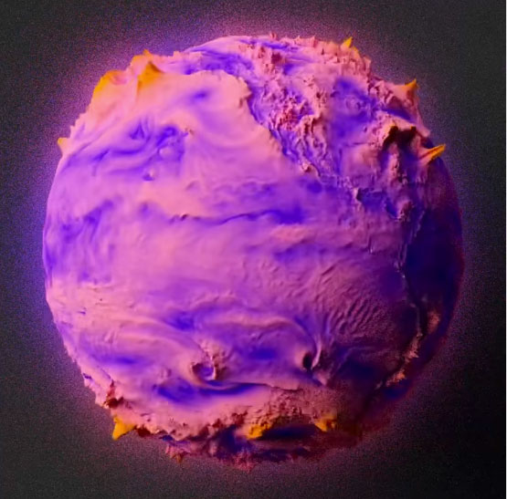
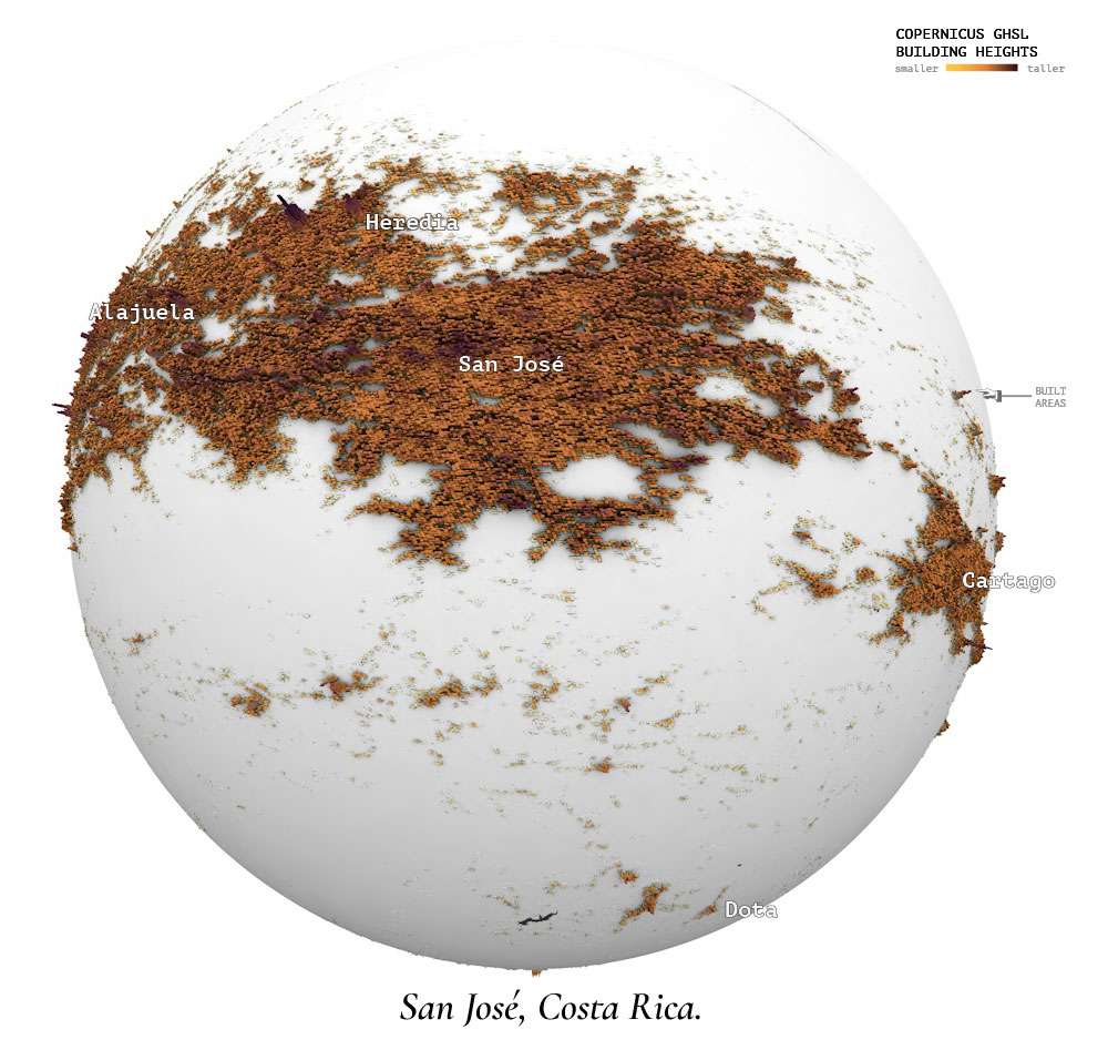
In March I also published a personal little project to my carto blog, funtography. The ideas was simple, grab a piece of a city and make it its own little planet. Each sphere is a sample of about 80 km2 of various datasets. I choose a few cities with some particular meaning to me and render out a few of these just for fun:
After all, what’s life if you need to be serious and narrow your focus to work only. Take a look to entry 11 of my maps blog to learn more about that project.
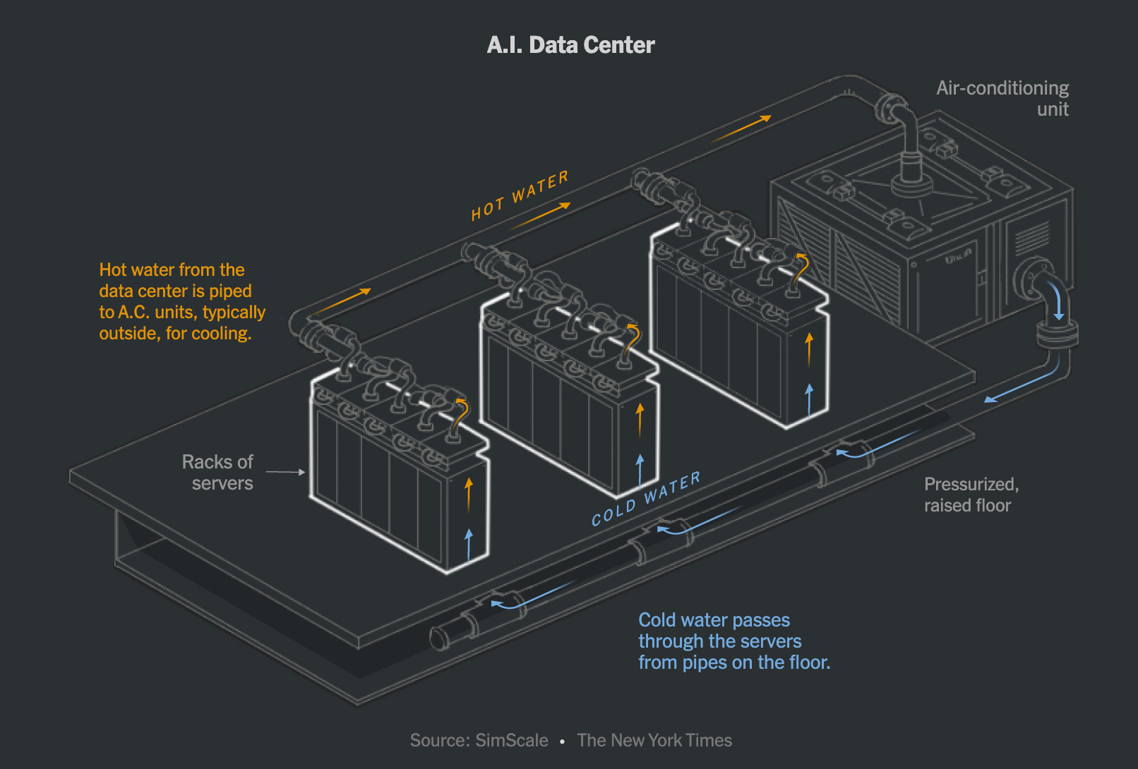
After the war and butterflies stories went out, a week later the piece about artificial intelligence was also published. I used a bunch of different techniques to explain how the surge of A.I. changed data centers and many other things around. This story includes hand-drawn maps that I made frame by frame to create a spinning globe in combination with some video assets. I also used animated gifs to explain computer processing, diagrams like the one above to show readers how the data centers are also changing and a few other things there too. It was a fun story to produce, take a look if you have time for a fun experience: How A.I. Is Changing the Way the World Builds Computers.
Hello Boston! In March I also went to Northeastern University in Boston where I shared a little bit with students of design and journalism for a series of talk they do with professionals called IDDV360. I had a good time in Boston earlier this year.
In March I also showed up as guest speaker to a class at the School of Design of the Hong Kong Polytechnic University. I like to share experiences and exchange ideas as much as possible, specially with students.
–Health coverage & SND Minneapolis–
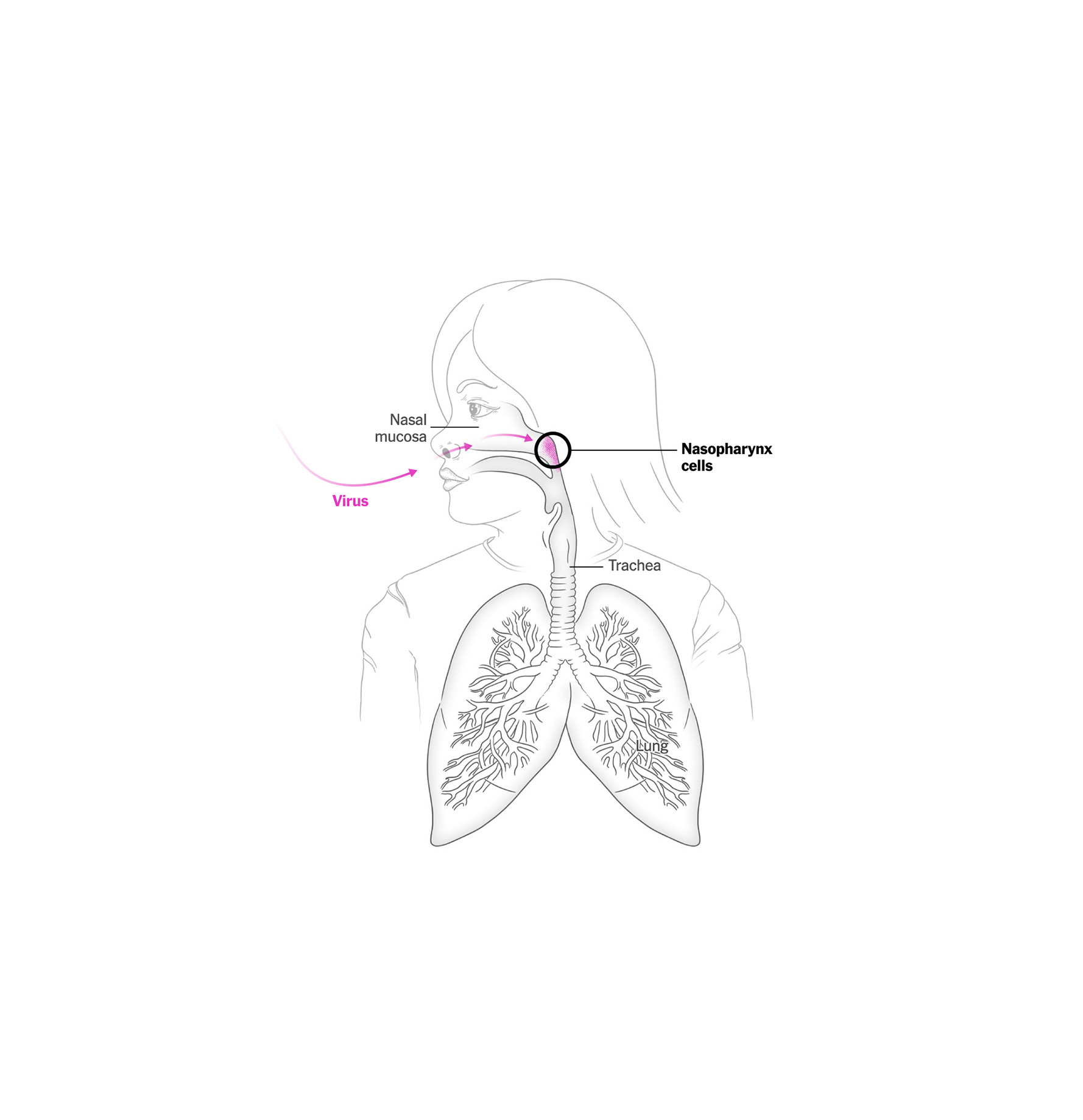
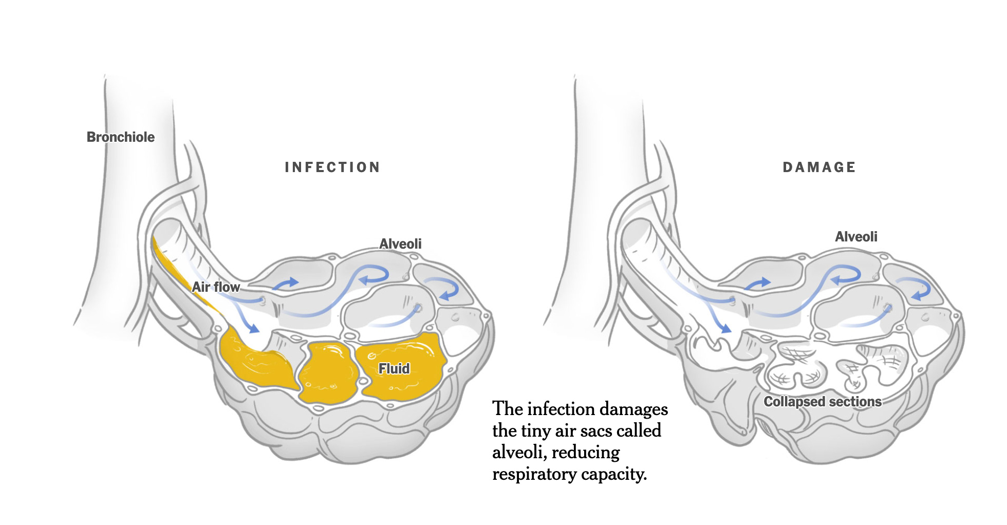
After a crazy busy March, I entered a new project to respond to the measles outbreak in the U.S.
This disease is simply terrible. The effects it has on the human body are devastating, and to make matters worse, children are often highly vulnerable if they don’t receive a vaccine, as is the case for many children in the south of this country.
Hello Minneapolis! It’s funny how many times I have visited Minneapolis for different reasons and 2025 was not the exception. The SND annual competition, the board’s in-person meeting and a short workshop was hosted in the QH of the Star Tribune. These trips have many cool things blended. So many friends come together, there’s also the inspiring portion of seeing some of the best pieces of journalism that media produces all over the world over a year, great views of the host city, of course time for museums and social life too. You go back fully reloaded to get back on your own pieces.
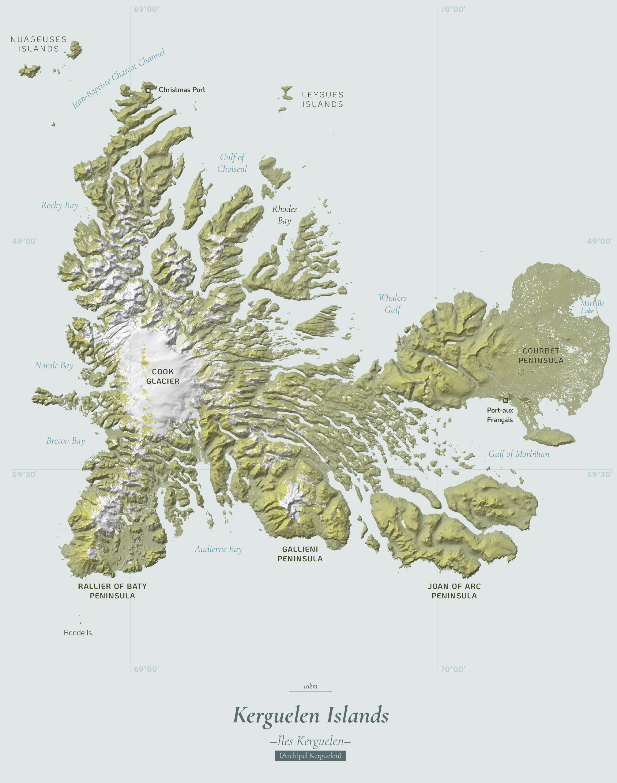
In May, I pushed to my cartography blog a new entry about the Kerguelen Islands (scroll down to entry number 12), there’s something in the geography of this place that is so appealing for maps, I have seen a lot of good professional cartographers doing great stuff with these islands.
In May, there was another slowdown for planning, some projects materialized, and others were canceled; meanwhile, I virtually presented to students from South America some of the work we do at the Times and how my passion for graphics led me to this company. I feel joy in sharing with students, I would like to travel to South America sometime and do this in person perhaps.
By May I was in week 99 (or 47th of the second cycle) of my sketching project looking at the Qatari “lord of the sea”, the light at the end of the tunnel was almost there!
In May I speak to a class of design from Belgrano University in Argentina. I was nice to see so many students gathering for the presentation, organizers told me that some +100 students joined both in person and virtually.
–Breaking news, military parades, Florida and South Korea –
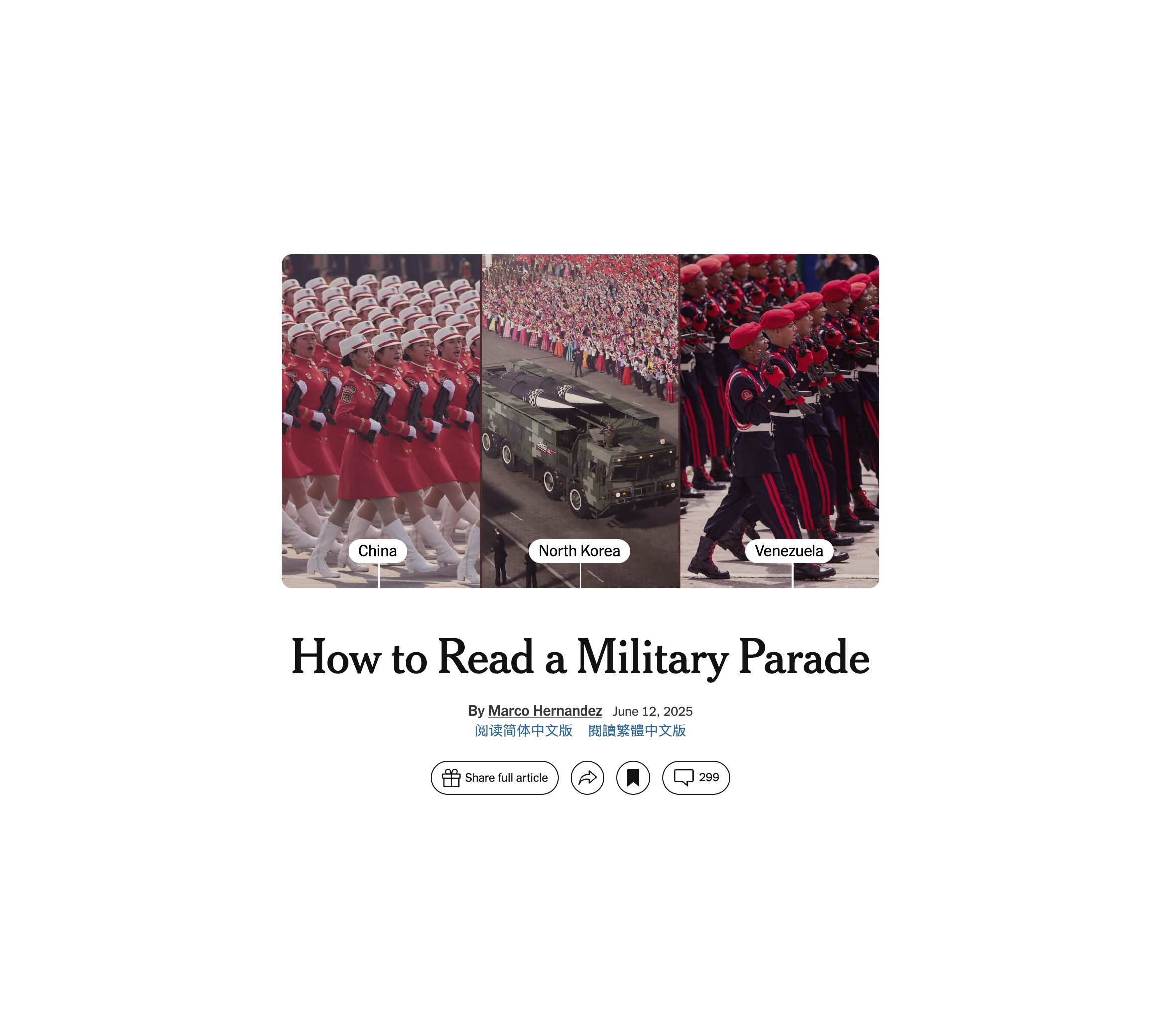
June was super intense and exiting, one of the first thing I did was a piece showing how regimens use military parades for different purposes, from diplomacy to the show of muscle, to leaders glorification, to acrobatics and pride… all in the eve of a celebration of a new parade in the United States for the first time in a long time.
Early in June I also went to Florida to attend the Outlier as speaker where I shared a bit of my career and the stuff I’ve doing in the last 20 years of my life. The organizers recorded the presentation and it’s free to play in youtube now. Take a look below if you have 30min to spare.
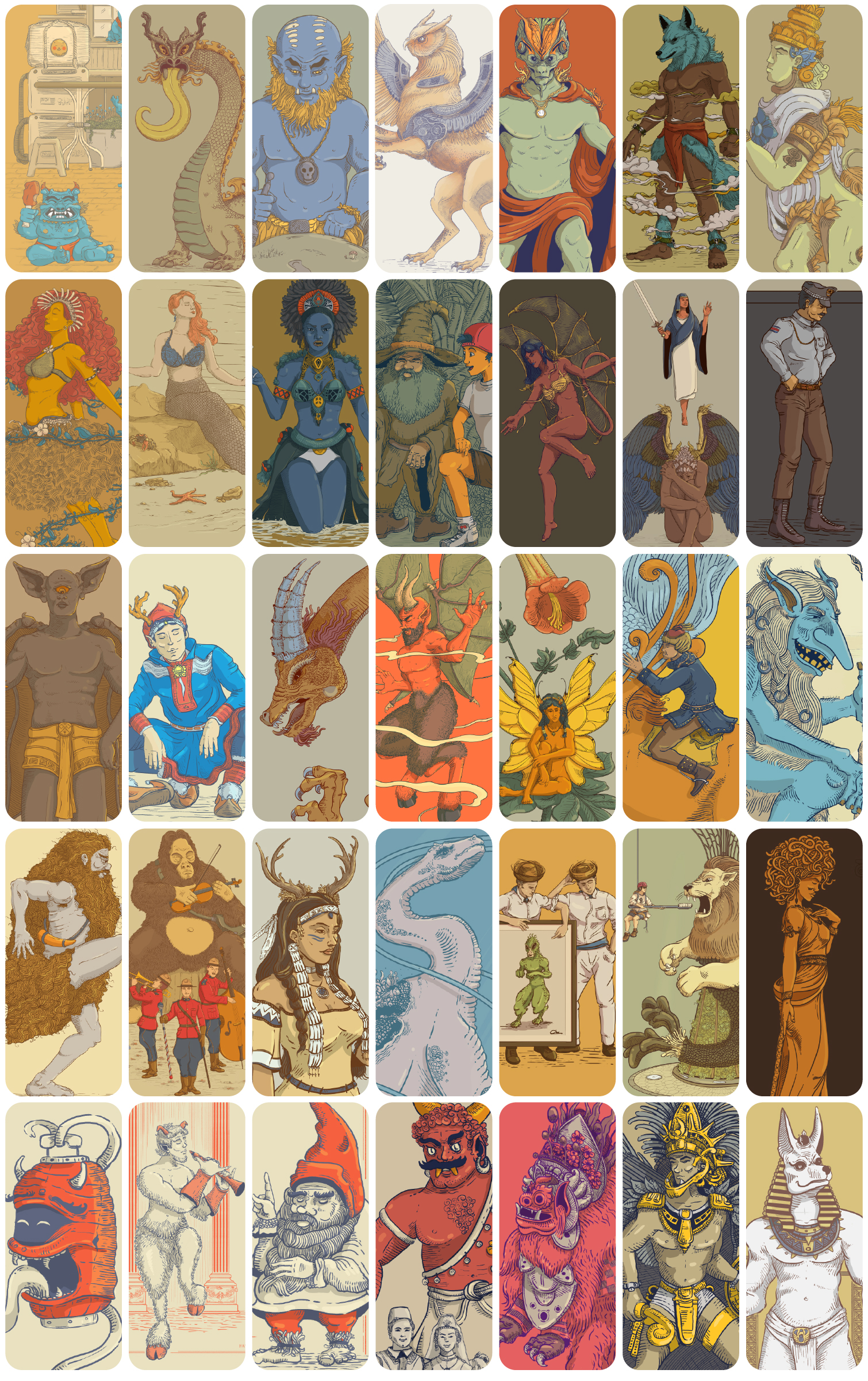
No more mythical creatures! In June I also wrapped out my second year of doodles, a project in which I dedicated every single Sunday for 2 years finally came to a break to re invent. 104 entries later I finally paused this crazy idea posting nonsense illos just to give room to other projects.
I have some plans to retake this into a different shape, if you follow me in social media you might hear about a new crazy idea involving illustrations soon.
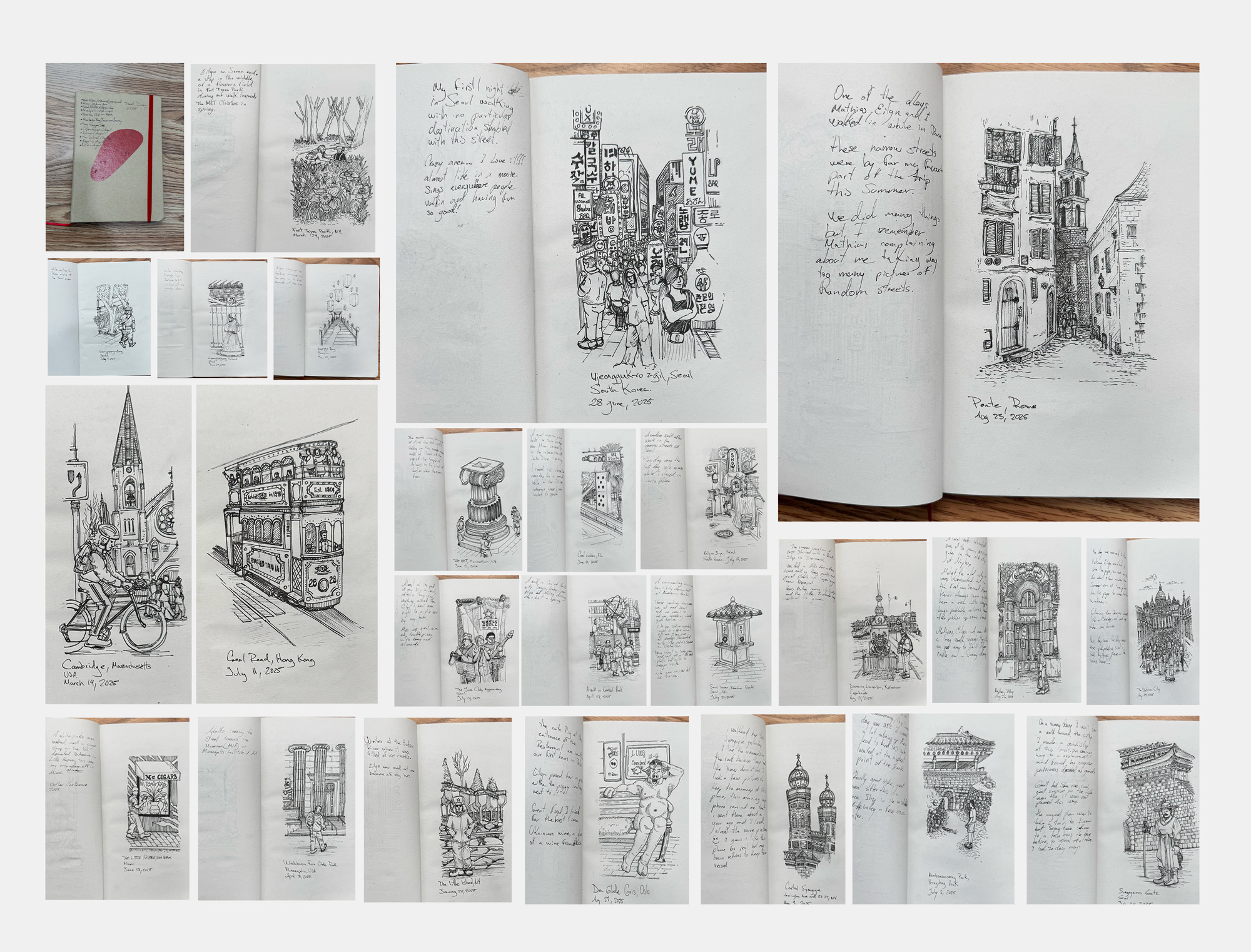
Hello Seoul! After I finished my silly illustrations cycle, published a few pieces on the news, did a conference in Florida, visited the Little Habana and celebrated some birthdays with my family, I packed my bags for an assignment in South Korea. That was my first time in Seoul, I got the chance to meet almost all the colleagues working at the NYT Korean Bureau and prepared myself to explore the place, learn from the team and enjoy Seoul.
While I was in South Korea, I started one more personal project, like if I had a lot of free time to divide my attention… I was waiting for my colleague Pablo to come over to the parking lot in the office and started to sketch passing by people, really quick. Then I thought, hey… would be nice if I do this in every city I have been this year? A quick sketch, probably imperfect, but just to remember fragments of my travels and special moments. I’ve done several, but time has caught up with me… In some places, I couldn’t sit down to get out my sketchbook.
Some pages of my 2025 travel journal
Perhaps I’ll try to finish my 2025 travel journal in the last days of December, although it wasn’t the original idea to do them while I was there. Maybe next year, hehe.
Hello again HK! During my assignment in South Korea in July, I took a weekend trip to Hong Kong to visit friends. I had left the city more than six years before, but it was wonderful to return: the sounds of the traffic lights, the trams, the subway announcements, people speaking Cantonese… Everything was so familiar and pleasant that it brought back so many good memories.
After my short visit to Hong Kong I returned to finish my work in South Korea, but I went back so nostalgic. I visited my old neighborhood, took the same ferry I used to take every day, saw old friends in the same spots we used to visit regularly… I guess the nostalgia came to me because when I left the city in my head it would be so difficult to comeback that it was never a real opportunity or idea in my head… and suddenly I was there again! ❤️
–The weather and a little summer break–
In August I finally published this piece we delayed for so long… Many reasons hold the piece, but it was meant to explain the vast symphony of instruments necessary to get you the forecast in your phone using some 3D animations, audio and data into a swipe story format.
I think that one of the most important assets of the meteorological industry is the people behind all these instruments, the scientists who have dedicated their lives to processing data and providing information that makes it possible to know when it’s going to rain, as well as the extreme weather alerts that save millions of lives.
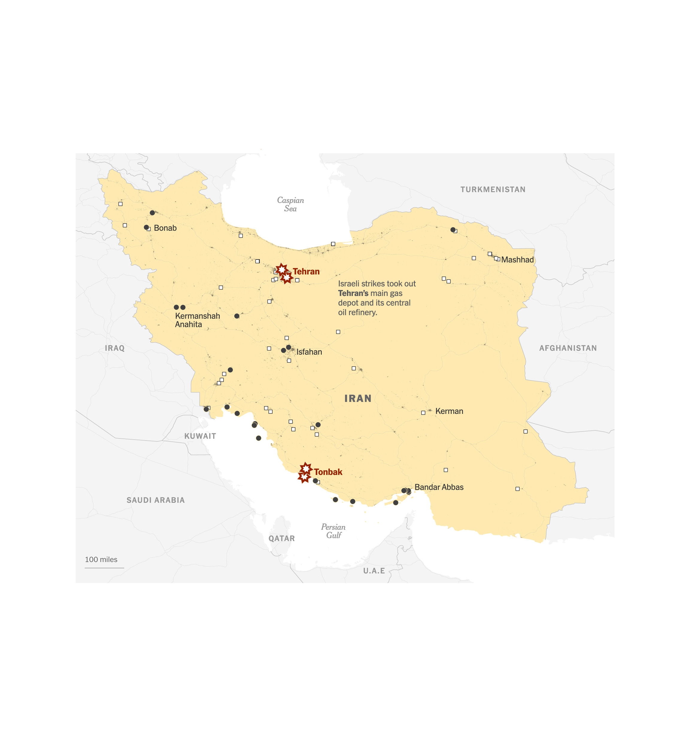
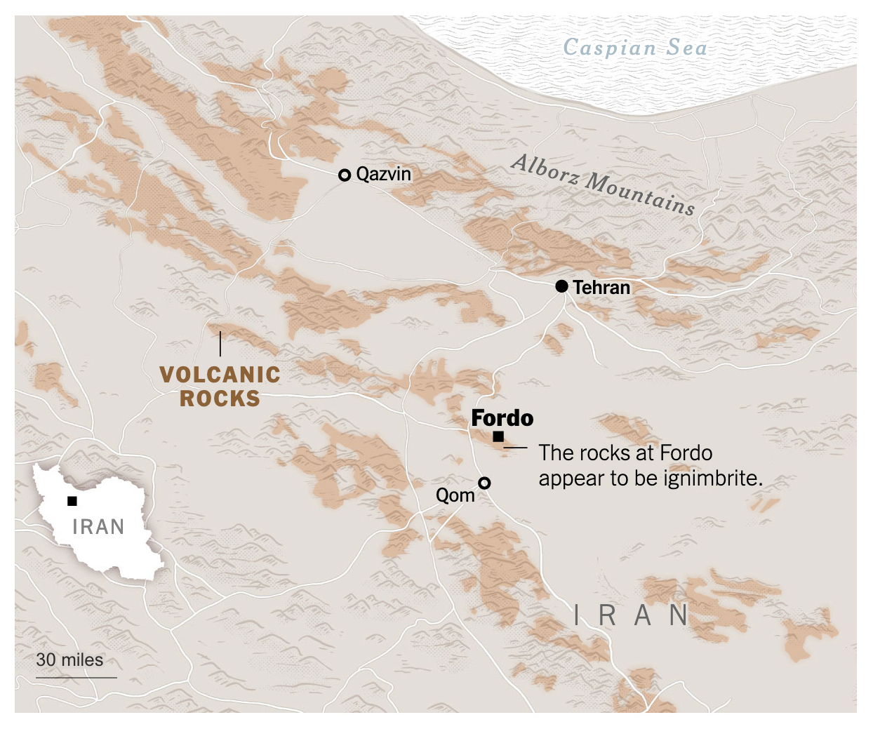
In August I also contributed with my colleagues of International to put together a piece explaining why it was so difficult to asses the damage caused to Iran’s nuclear facilities after the U.S. attacks. Fordo is a facility burred depth into the heart of a mountain, very little was known about the facilities it self so it’s hard to tell if the bombing of it was efficient or not.
Then summer arrived. My son has very little time to completely disconnect from his responsibilities, so at the end of August I took the opportunity to go on a short trip 100% dedicated to history (he’s a huge history buff). It was great spending a few days exploring historical sites and thinking only about what would be good to eat in Europe.
During September I turned back my attention to the war in Ukraine, I partnered with Thomas Gibbons-Neff to do a piece looking at how tanks are changing in due to the extensive use of drones. I did a backstage story here to look at the process behind and a little bit of the context if you want to review it once more.
September is also the month to celebrate of my natal country, along with many other countries in Latam, Costa Rica celebrates it’s independence of Spain in September 15, since I’m far away from my land, I did a little map in my blog. Look at entry 13 for the full version of it.
–Washington D.C. and giving back to the community–
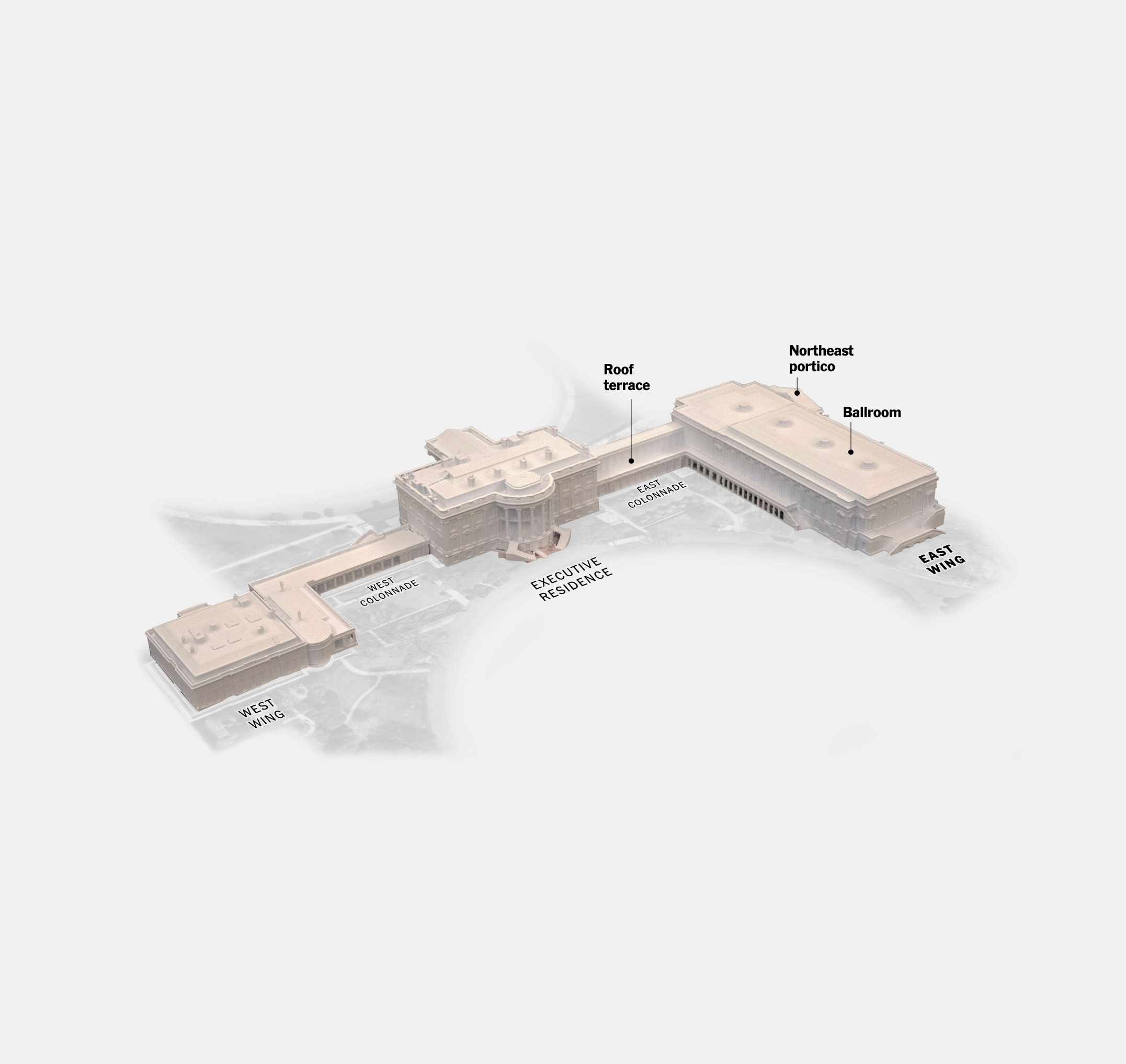
In October things got crazy with a few projects, mostly in response to the renovations in the White House. This was part of a large project we spent some time working on, but with the rush of the news and the demolition of the east wing, the project broke apart into smaller pieces.
Since my work responds to whatever is in the news, sometimes I have to do stuff related to politics. But as I state in my NYT byline page, I don’t participate in any political parties in the United States or abroad, and I choose to remain neutral on political matters.
September 2025 was also important for my alter-ego personality, I joined the SND Board of Directors with one mission in my head only. Help others involved in areas like news, arts, design and communication and narrow the distance between students and professionals around the world in those areas.
One way of doing it was to push an idea through the SND to create a free mentorship program with Universities in North and South America, Asia, Europe and more. The initiative officially launched in Nov. 2025, but we will see results until next year.
I hope this program can keep going for many years more to reach as many people as possible. Learn more about it on SND’s website at snd.org/join-the-snd-challenge/
In October I did 2 presentations for students, one virtually as guest speaker to ‘Semana del Diseño’ from the Peruvian University of Sciences (UPC), by invitation of UPC school of Design. Then a second session in person here in New York to a Datavis class at the Cooper Union for the Advancement of Science and Art.
–sky, water, maps–
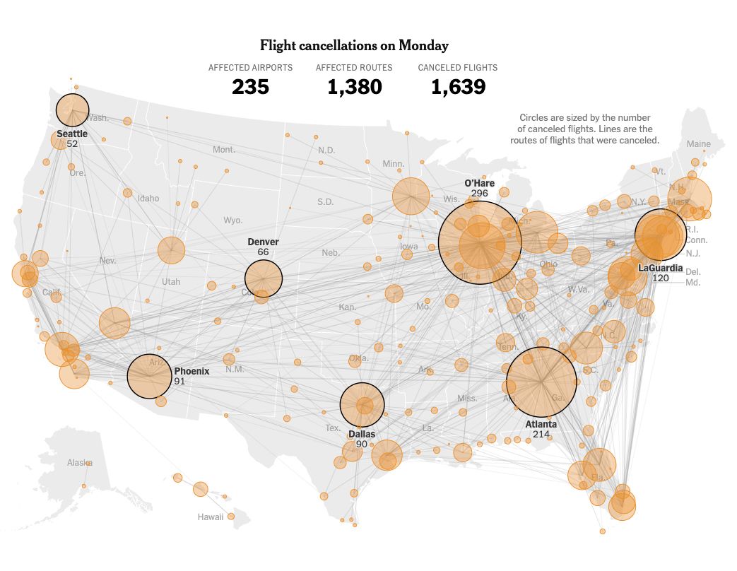
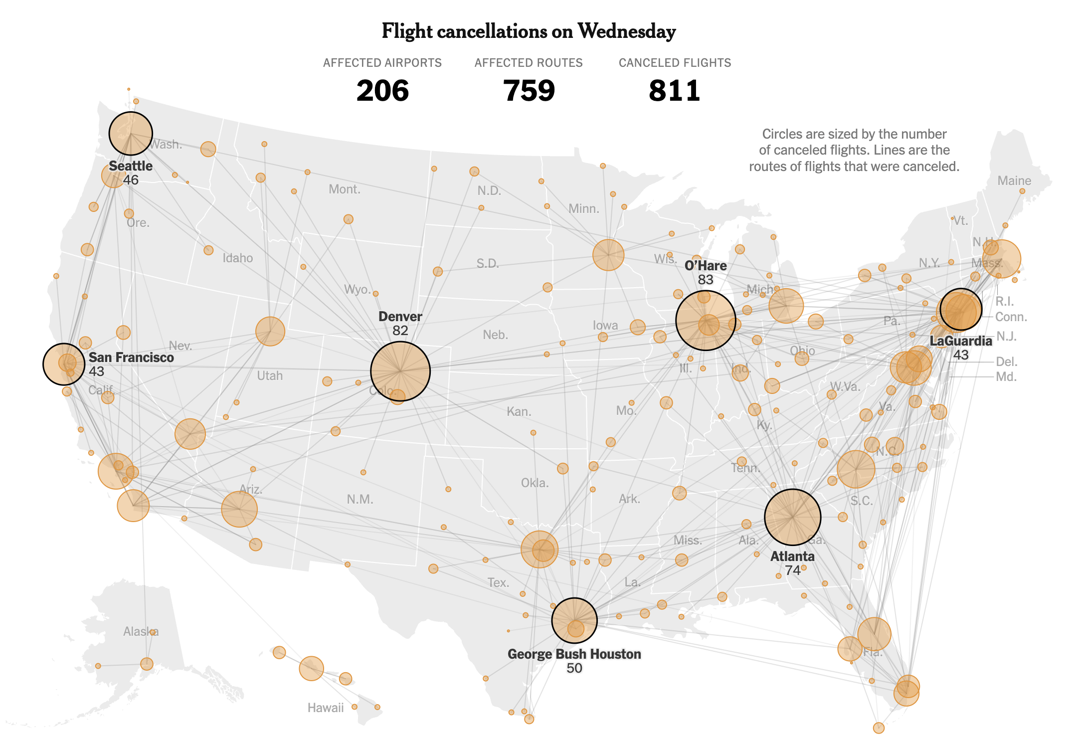
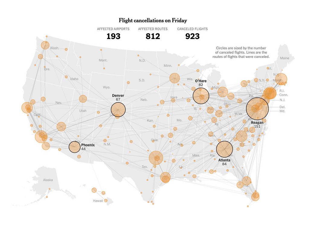
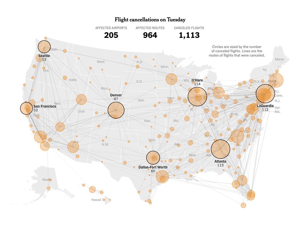
November started with news from the U.S. Federal Aviation Administration responding to the Government shutdown and preparing the people for delays and cancelations across the U.S., I spend a few days preparing data updating maps and sketching ideas to react to the event. Eventually another project pull off from the effort but my colleagues continued to update the story for about a week, some days even with updates in the morning and in the afternoon.
A bunch of colleague and I jumped into the most rushed project I have worked this year so far.
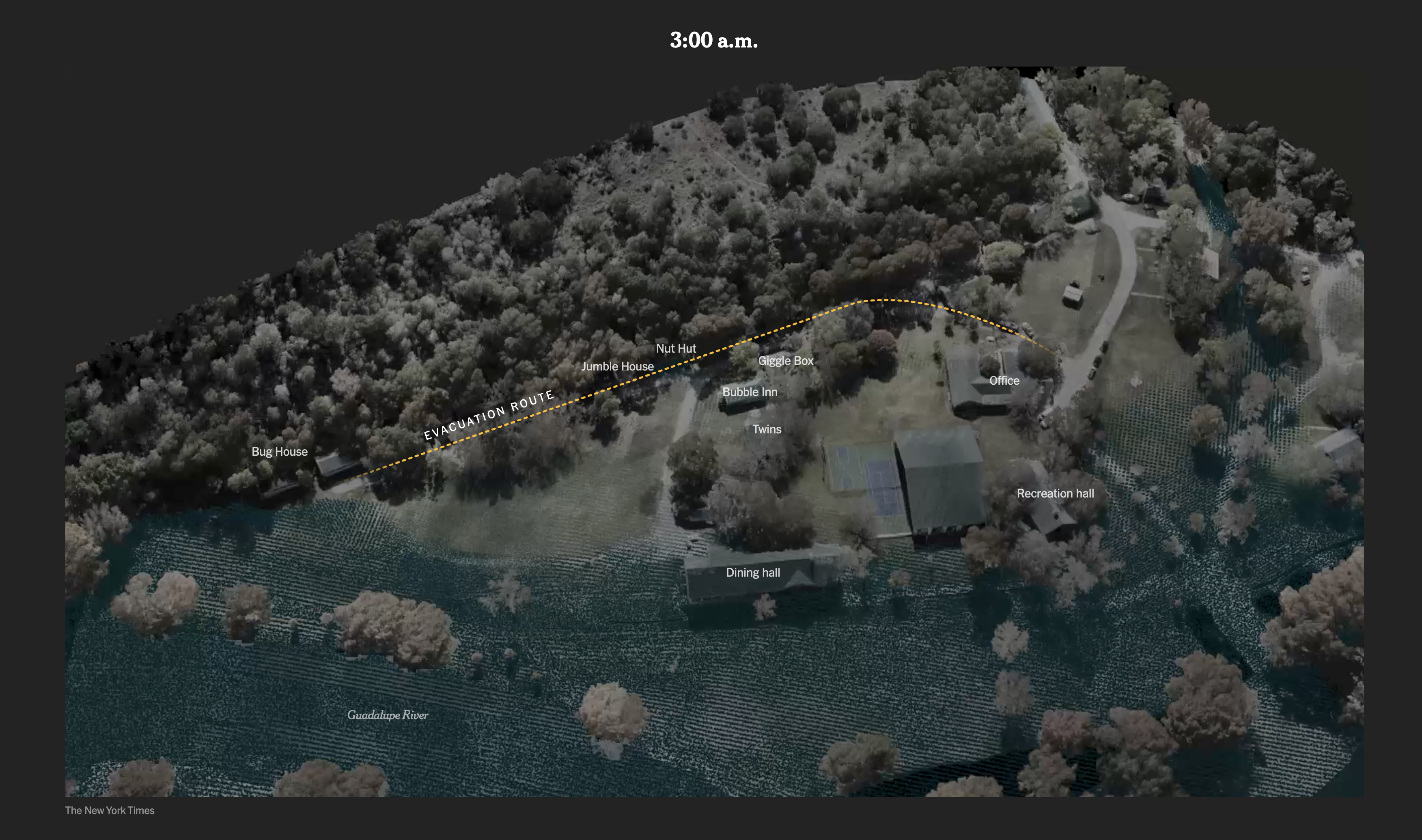
Earlier this year, while I was on assignment in Korea, I collaborated to a breaking news piece looking at the flash flood that killed several in a camp site in Texas. After that, some of my colleagues continued to look into data simulating the water levels of that night.
However, the rush begun when the lawyers send a heads-up to the Times saying they were suing the camp for what happened there. Basically we talk to both sides and got access to exclusive information with way details that we know before. All of this under one condition, whatever we publish, we have only 5 days to do it before all the material become public.
In such a rush, a few of us rushed to the camp to fly drones collecting lidar to create a 3D model of Camp Mystic, take photos, do interviews, process data, create animations, maps and setting everything that usually would take minimum a month.
It was a tremendous effort from my colleagues, I helped a little bit putting together pieces and helping construct the narrative, I think now days my roll is less and less in the heavy production and more into the support of others helping with concepts. You can take a look to the piece here.
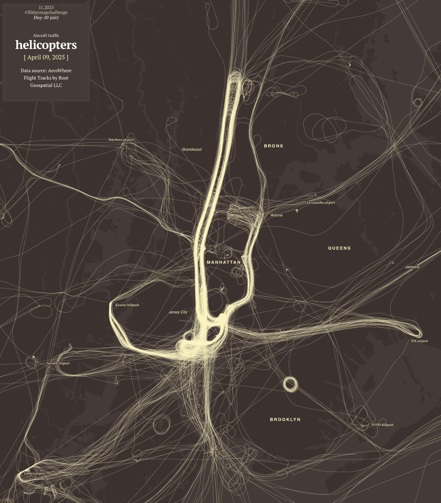
November was also the moth for the map challenge, yeah one more challenge, why not?
I was in the mood to do the whole challenge following the prompts they publish earlier. However, things rarely go as planned. My own curiosity and procrastination caused my to derail from the goal, and projects like the Texas flood reconstruct added the final stone to the idea. You can read a little about me setting obstructions to this idea in one of my infofails post here.
Anyway I managed to do a few maps to join the celebrations. Of course, not on time nor the whole series. I like the one about aircraft because it has additional context, not just a map, but a little story behind. You can read about it in my mapping blog here, just look for entry number 16.
Some other maps like the one of Myanmar’s political violence also made it, that one was in the highlights of Datawrapper’s Dispatch. It was nice to see it there because even tho the whole thing did not ended up like I wanted to, some people appreciated the few pieces I managed to do.
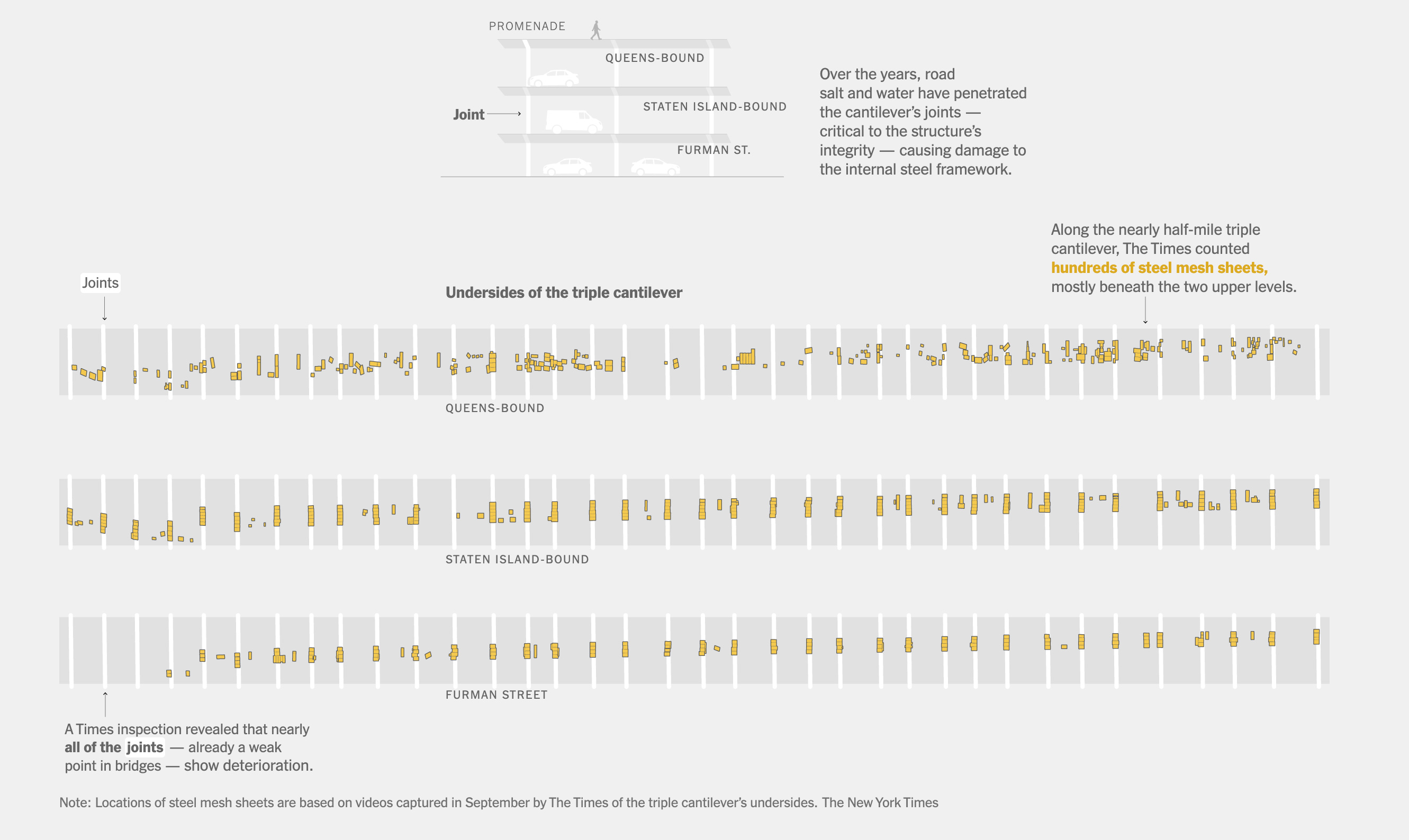
November was heavily packed. In the last week of November we published one more piece looking at the situation of one the city’s biggest headaches, the Cantilever section of the Brooklyn-Queens Expressway. It’s a section of road carrying 130,000 vehicles every day, today is 70-years-old, it’s falling apart and to this date (Nov. 30, 2025) there’s no consensus on how to fit it.
The piece is full of 3D renderings, maps, video, photo and illustrations, but one of the things that I enjoyed the most was to conduct a visual survey of the piece. We rented a car and drove up and down in the crumbling structure to document with 360 footage every single patch that the city has installed to prevent pieces of the cantilever to fall on top of passing-by vehicles. It was almost like our own version of google street view but way more detailed and in crazy high resolution. You can see a glimpse of the 3d footage in this promo video we did.
In November I jumped into the scenario once more for a live interview with Reuters reporter Ben Welsh. The interview went around our practices in journalism, trust in data, collaborative reporting and a touch of the surge in artificial intelligence. The event was organized by the School of Visual Arts, SVA in the frame of the launch of their new Data Visualization and Communication program. Here’s a recording of the interview:
Students, Rhythm and Ballrooms
December kicked off with a talk to a class from the Craig Newmark Graduate School of Journalism at the City University of New York (CUNY) hosted by The New York Times. It’s nice to wrap-up the year with one more session for students.
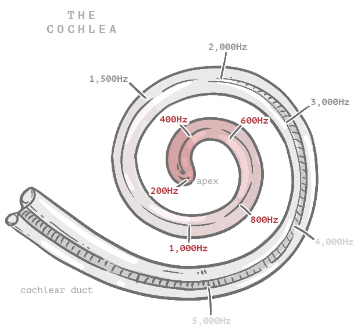
This month I’m adding a new section to my website, I’m adding little stories with interactive features, some animations and touches of humor. It’s like a playground to me where I want to put stuff I found interesting about random things. You can dive in with me into some slightly nerdy topics on my website; this month I’ve prepared a story about sounds and rhythm.
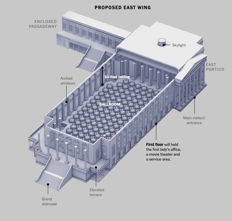
Before the year ended, discussions about White House renovations resurfaced. The first of the month concerned the details of the ballroom renovation plan, after the president announced he would change the architectural firm in charge following constant disagreements.
You can take a look to some 3D models we did here to show the latest know about the multi-million project of the Trump administration for the White House.
In the next few days we will be publishing one last story to close out the year and get some rest. Meanwhile, I wish you all the best in this new beginning and a productive and prosperous 2026!
In November 2024 I launched a new website to put into a single place all the stuff on which I spent my time at work and in parallel activities like sketching things or mapping for fun. That last point was a fun thing I started to rescue from my external drives files that doesn’t fit into work nor doodles either.
Part of the plan for a new website is to have a space for these things that are lost in space/time. One of the things that makes me happy is making maps: mhinfographics.github.io/maps.html
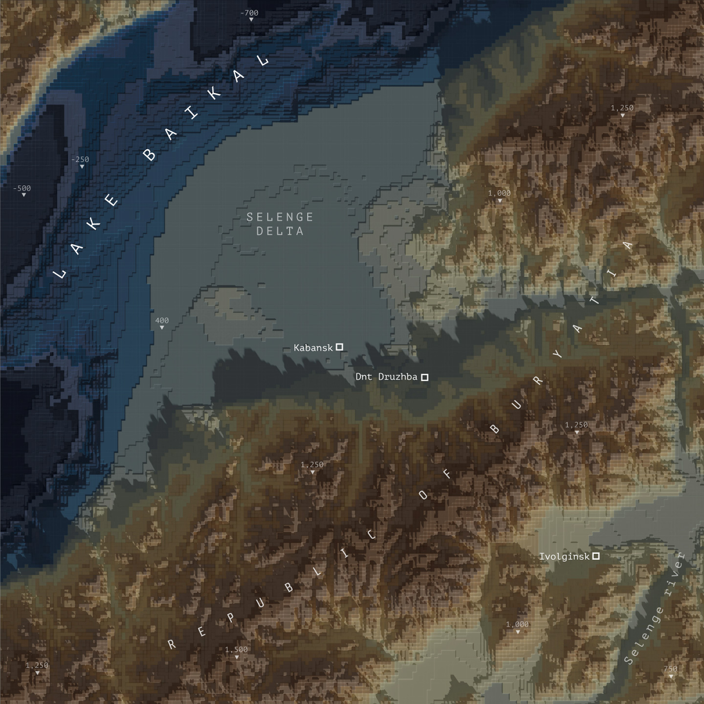
Eventually I was able to hang there a few more pieces, all in different styles from personal explorations of data and tools. This tutorial meant to explain how I used QGIS, Blender and little optional touches of Photoshop and Illustrator to create a voxel like map like the one below:
Please note that I’m doing this in good will, I’m not offering any corporate endorsements of the following procedure, software companies or resources, even on open source resources I mention here. Likewise I’m offering this without any warranties or compromise of further assistance.
🎁
Follow me step by step or get the files ready
Here you can find the files ready to use, download the packs and set you render to go, or follow me below to produce the data and render your own. If you are downloading the files, skip to the section titled “Set up the render” and choose either plugin or image input.
Defining the AOI and getting data
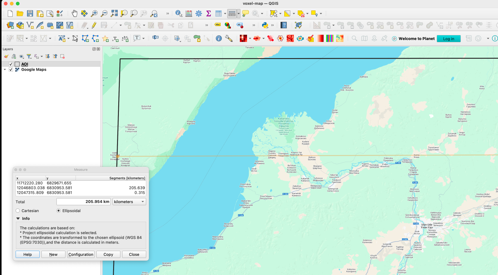
I usually start defining the are I want to work on adding first an xyz layer on my blank project on QGIS. If you don’t have that set up, check this link first, and then come back, it’s a quick set-up anyways. Once you have that done, zoom into the area you want to map, create a new scratch layer to define your area of interest (AOI), we will use it as a reference for many things.
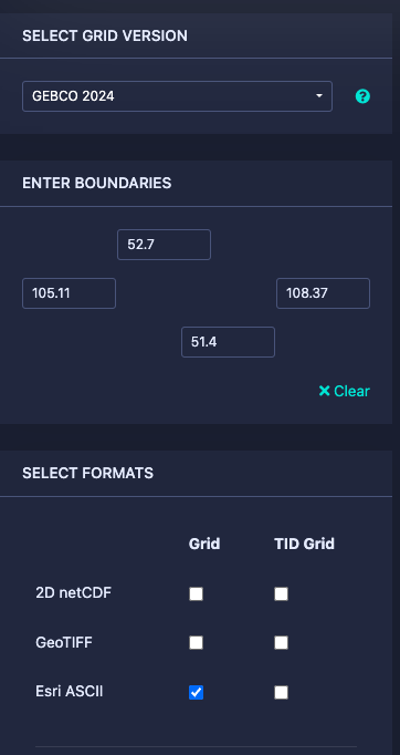
This’s the area I choose for the map above, a rectangle of roughly 120×200 km near the Lake Baikal.
Next let’s download some DEM data for the project here https://download.gebco.net/ you will see a panel to the left with some options like in the image below, select a GEBCO data version, enter the coordinates as 52.7 for top; 51.4 for the bottom; 105.11 for left and 108.37 to the right, that would be enough to cover our AOI. I’ll use a ASCII grid, but Geotiff is also ok. Click “Add to the basket” then “View basket” and download the data.
Sampling a grid
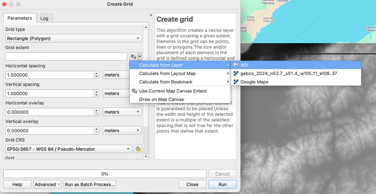
Now we need a grid to sample our new base, in QGIS go to vector/research tools/create grid. That would give you a pop-up window, select Rectangle for the option “grid type”, on grid extent use the drop-down menu to select the AOI layer we created earlier:
We want each rectangle to be 1km wide so select “Horizontal spacing” as 1 “kilometers” using the drop down menu, the default is 1 “meters” if you are using a EPSG:3857 projection. Do the same for the “Vertical spacing” option, we want squares of 1×1 kilometer.
Finally, we want some overlapping to prevent gaps in the render, so add “10” meters to the Horizontal and Vertical overlay.
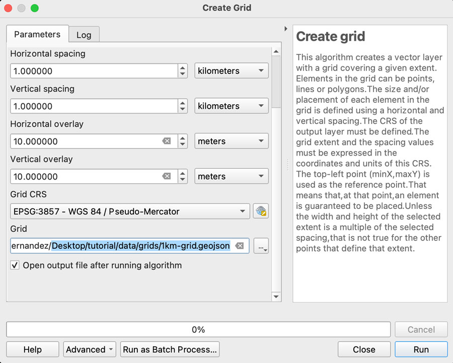
Keep the CRS as the default EPSG:3857 and save the grid as a geojson using the dropdown menu option, your panel should look similar to this:
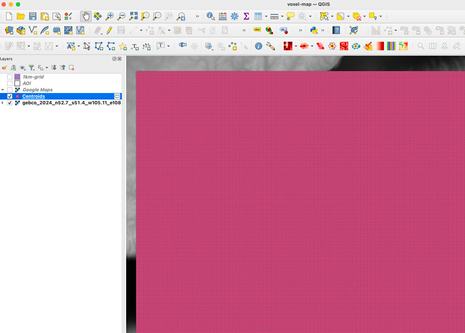
Once you click “run” after a few seconds an army of squares will fill-out your AOI, if you can see them, go to the menu Vector/Geometry Tools/Centroids to create points that would sample our DEM data. In the input layer choose the 1km-grid file we just created and leave the rest as it’s, that would give us a bunch of dots in the center of each square in a temporary layer.
Re-project the data
To extract the data samples, we will to make the GEBCO layer and the new centroids in the same projection. I’m using a pseudo-mercator projection EPSG:3857. But you can use whatever you prefer, just make sure both layers have the same projection.
GEBCO default projection is CRC84, is you are not sure what you layer projection is double click the layer and selection “source” that would show you the projection. If you need to change it, click the layer name, go to the menu Raster/Projections/Warp and create a temporary layer using EPSG:3857 as target, or what ever your preference is.
Sampling the new grid
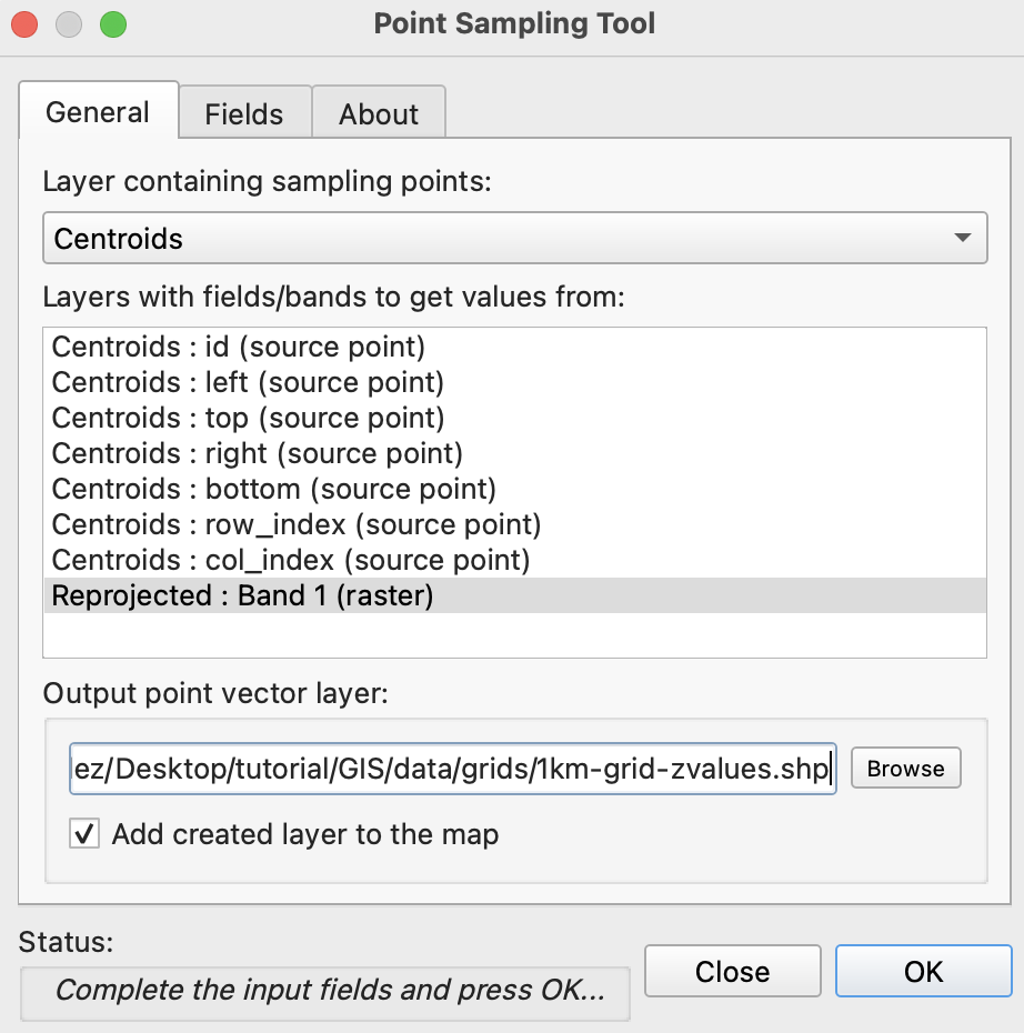
We will use a plugin to sample values from our raster into each dot, if you have the Point sampling tool plugin you’re ok, if not go to to the menu “Plugins/Manage and install…” click on ALL in the left panel and type “Point sampling tool” in the search field, install the plugin and close the Manager window.
To run de plugin go to the menu Plugins/Analyses/Point sampling tool in the pop-up window, select the centroids with the dropdown menu, and in the lower field click the GEBCO layer, finally click on Browse and navigate to your project folder and name the result file 1km-grid-zvalues.shp using the shapefile option there.
If you reprojected your raster, this is how the plugin window should look.
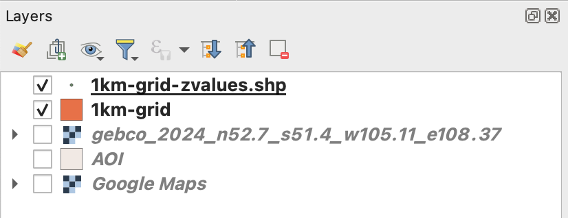
Once you executed the plugin, remove all temporary layers, you should have a layer with the new dots named “1km-grid-zvalues.shp” one layer with our 1km-grid, the AOI layer and the xyz google map layer.
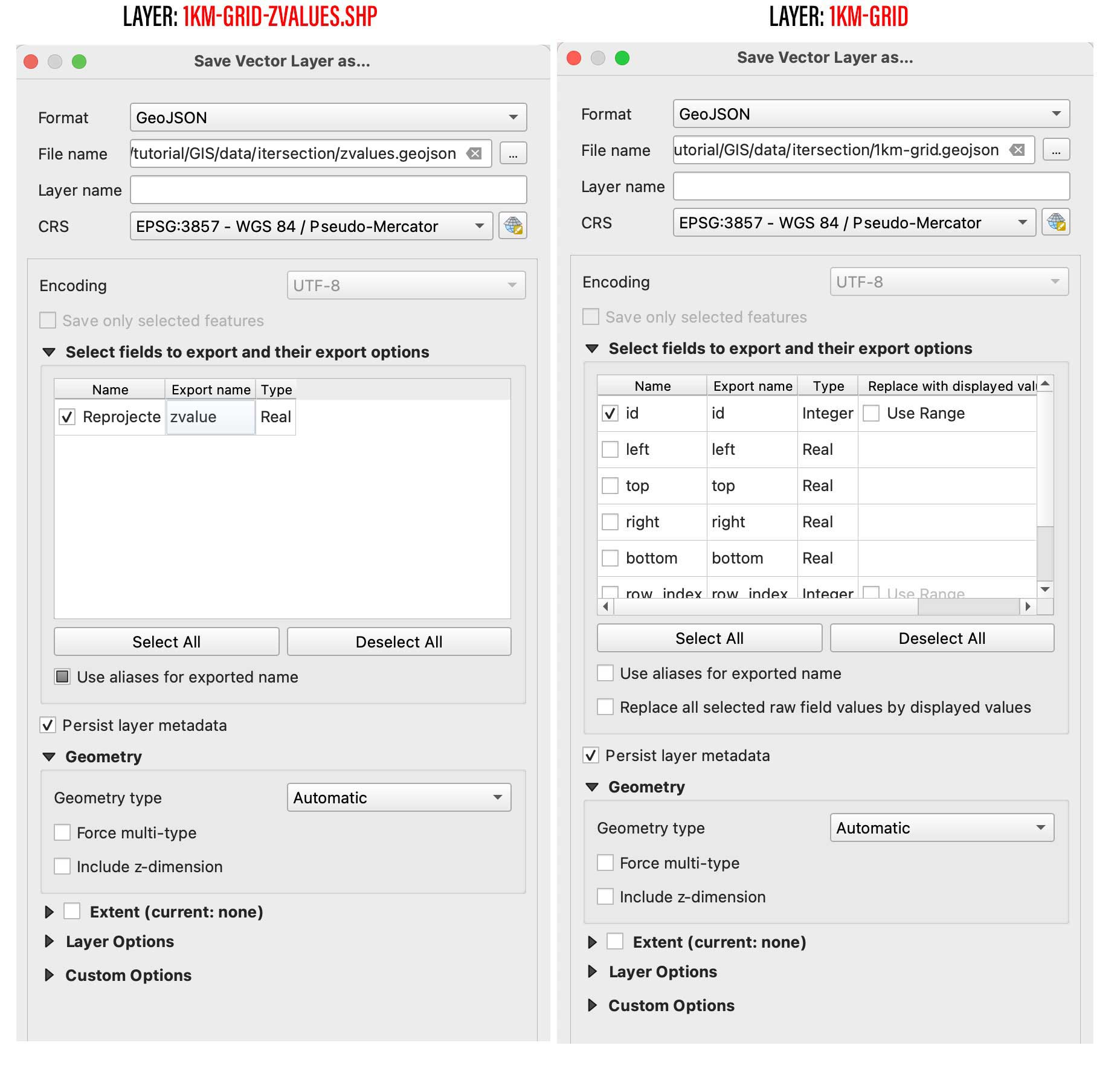
Next step is to create a spatial join, basically we will take the value of the dots to be the z value of each polygon in our 1km grid. You can use the QGIS join function from the menu Vector/Data Management Tools/Join Attributes by location, But be aware that would take a little while to process. I recommend to use a little custom python script instead. But to use it, you would need to export our 2 data layers out as geojson files, right click on them and select “export as”, while doing that you can turn off all the fields but the ID in the 1km-grid.
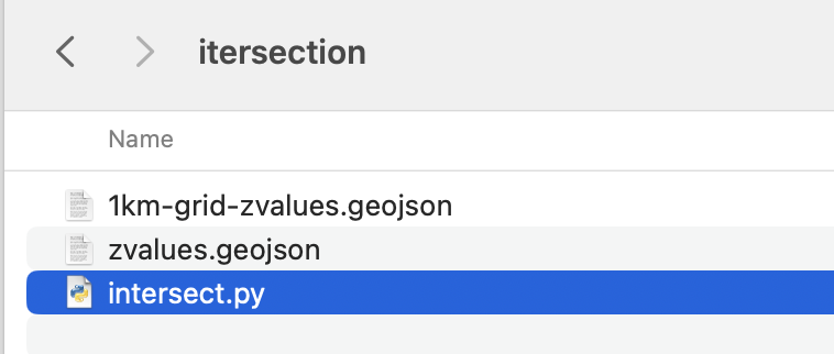
Save them into a new folder, I’ll call mine “intersection” and place this script next to it, name it whatever you like, but use .py so you can run it from your terminal window as ” python intersect.py “
Your folder with the following script and new geojson files.
# Ensure both layers have the same CRS if zvaluesLayer.crs != grid_layer.crs: zvaluesLayer = zvaluesLayer.to_crs(grid_layer.crs)
# Check if 'zvalues' field exists in zvaluesLayer if 'zvalue' not in zvaluesLayer.columns: raise ValueError("The 'zvalue' field is not present in zvalues.geojson")
# Remove duplicated features joined = joined.drop_duplicates(subset='geometry')
# Save the result to a new geojson file joined.to_file('1km-grid-zvalues.geojson', driver='GeoJSON')
Remember you can run this file from the terminal using the commend ” python intersect.py ” while in the folder we just created. Once you run this script a new file would be created next to the script, look for 1km-grid-zvalues.geojson and drag-and-drop it into QGIS.
Style your new grid
You would only need this new files we just created and the AOI layer, remove the rest of the layers if you like to have a clean panel before to continue.
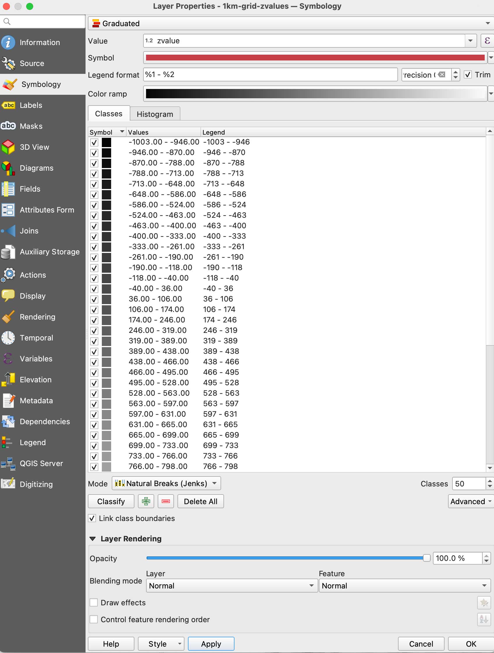
Double click the new 1km-grid layer, go to symbology and select Graduated in the top panel, set it to gray scale, use the mode natural breaks with some 50 classes, in the Value field pick zvalue and click apply. (be sure the negative values are assigned to black, if they are on white invert the ram using the dropdown menu.
Your new grid styles.
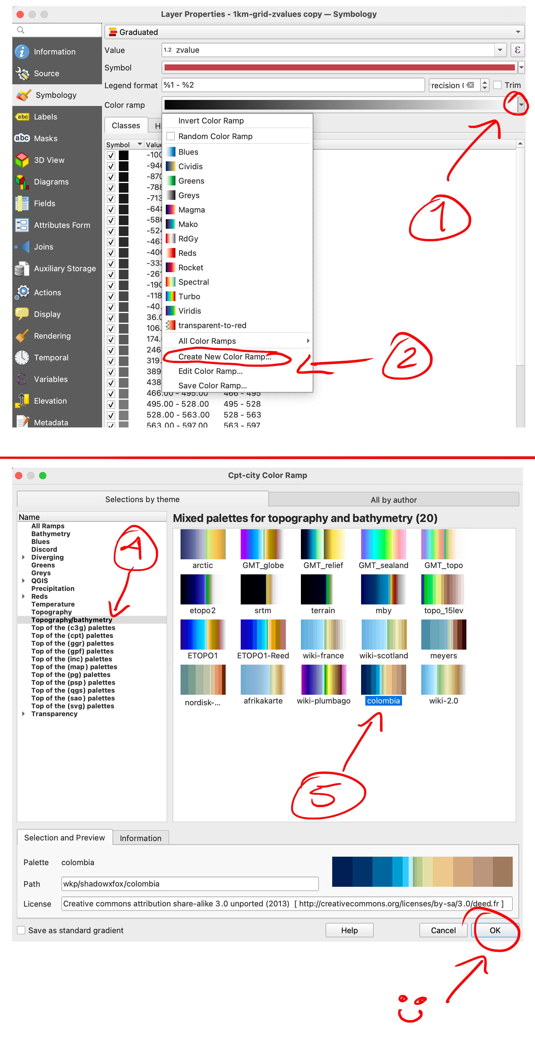
We are almost there with data process, here comes the fun part. We need basically 2 layers of data, this black and white layer we just created will serve as base for terrain, create a duplicate of it to make a color layer.
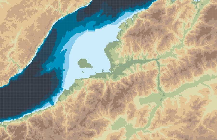
Double click that copy and go again to Symbology, but this time in the color ramp menu select “create a new color ramp, in the pop-up window you will see a few options, change it from gradient to “Catalog: cpt-city” and click ok. Navigate to Topography/bathymetry and select “colombia” that’s a blue-green-brown pallete that would assign a color range to differentiate our terrain from the lake.
You can also create your own gradient and make the value ranges as you like if you want to ink all the water blue for instance, but for the purpose of this exercise all keep the same classes and set up as we did for the BW image. (50 on Natural Breaks). You should have now a black and white layer and a color copy looking something like this:
Set up the render
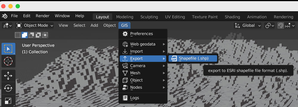
So, here you have 2 options, one is to export tif images out of QGIS to render the tiles, or export a shapefile to be used with the GIS blender plugin.
Option 1: Using the GIS plugin
If you are using the Blender GIS plugin, click in your 1km-grid-zvalues layer, choose export and select ESRI Shapefile. I have saved a copy of that file in the assets folder, the link is at the top of this page. The follow the instructions here to setup the plugin. If you need a litle more of explanation of how it works, this video has a great walk thru.
Once you are all set up with the plugin, you can import the shape file using the 3D viewport in object mode, use the GIS option there to get the shapefile in, just brow for the file we exported earlier from QGIS:
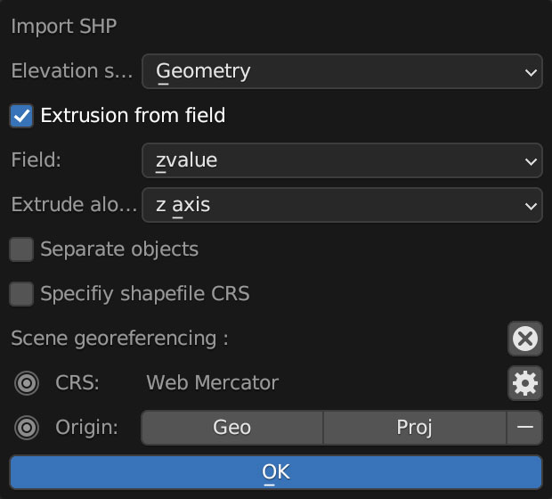
A little pop-up window emerges usually near the bottom right of you screen, you should select “extrusion from field” use the drop-down menu to find “zvalue” and apply it to the z-axis, leave everything else off, you don’t want to check “separate objects” because we are using a large scale object with a lot of polygons, that option come handy if you are importing smaller data sets to handle objects individually.
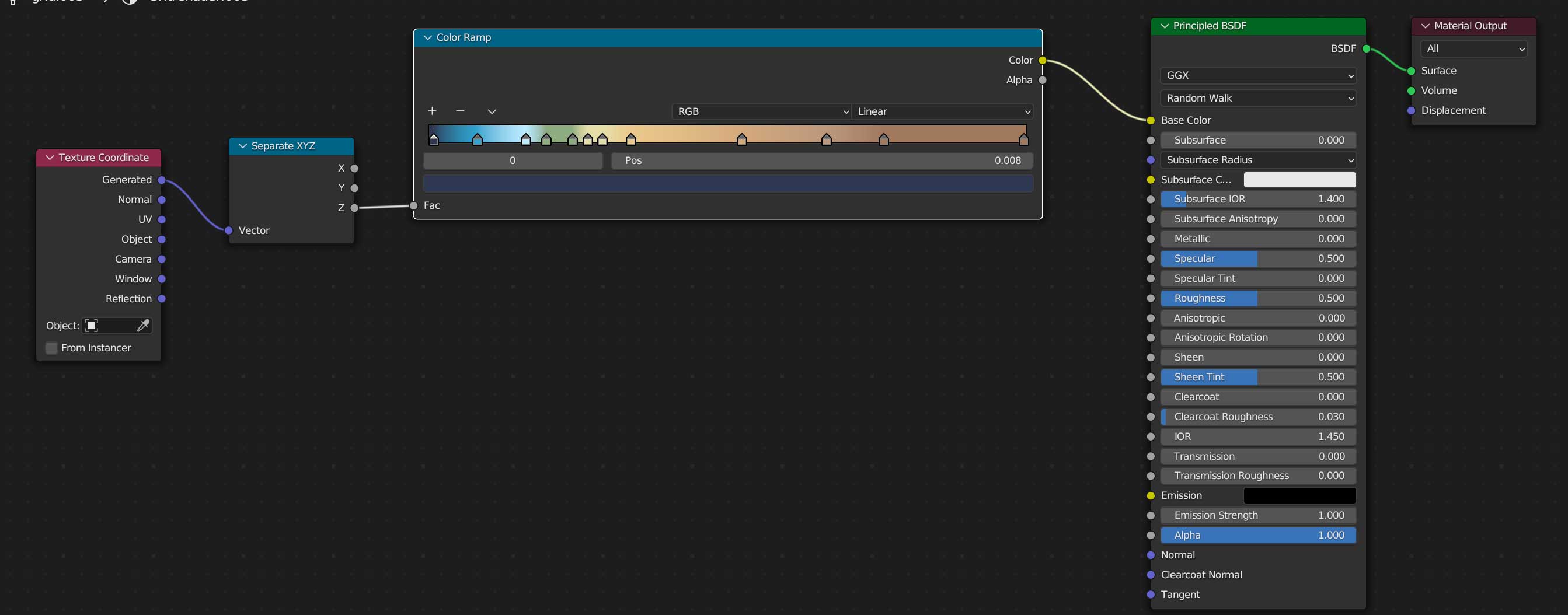
Once you are all set, you can create a new material for our terrain, use the z-coordinates to apply a color ramp, you basically need a “texture coordinate” node, a “z” selector, the ramp, which I basically copied color-values from QGIS, and link all that to the default material, here’s a little visual of the wiring:
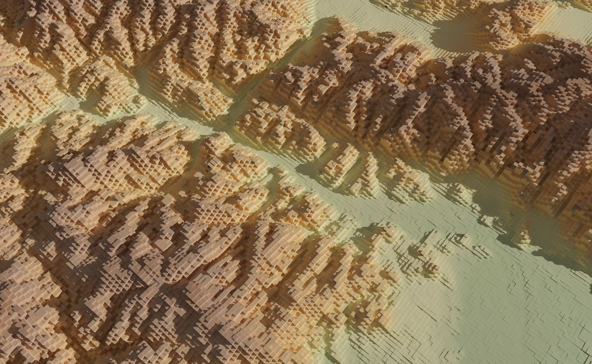
Once you added a light on your preference angle and intensity, your render should look like the one below, if wyou want to save some time you can use the demo I left for you, I have there 2 cameras, one perspective camera for a close up, and one orthographic camera to get the whole map. Note that there are also 2 lights depending on what you want to render, but that’s just a personal preference.
Option 2: Using images from QGIS
If you opted not to install the plugin and render images, go to the folder named tiff-based. Let’s get those images out of QGIS first:
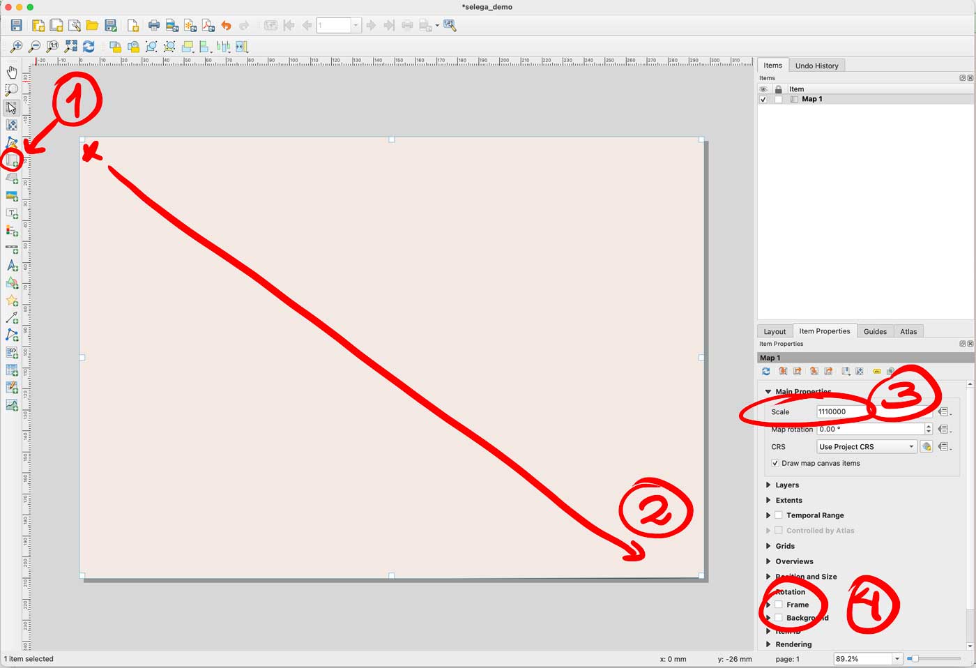
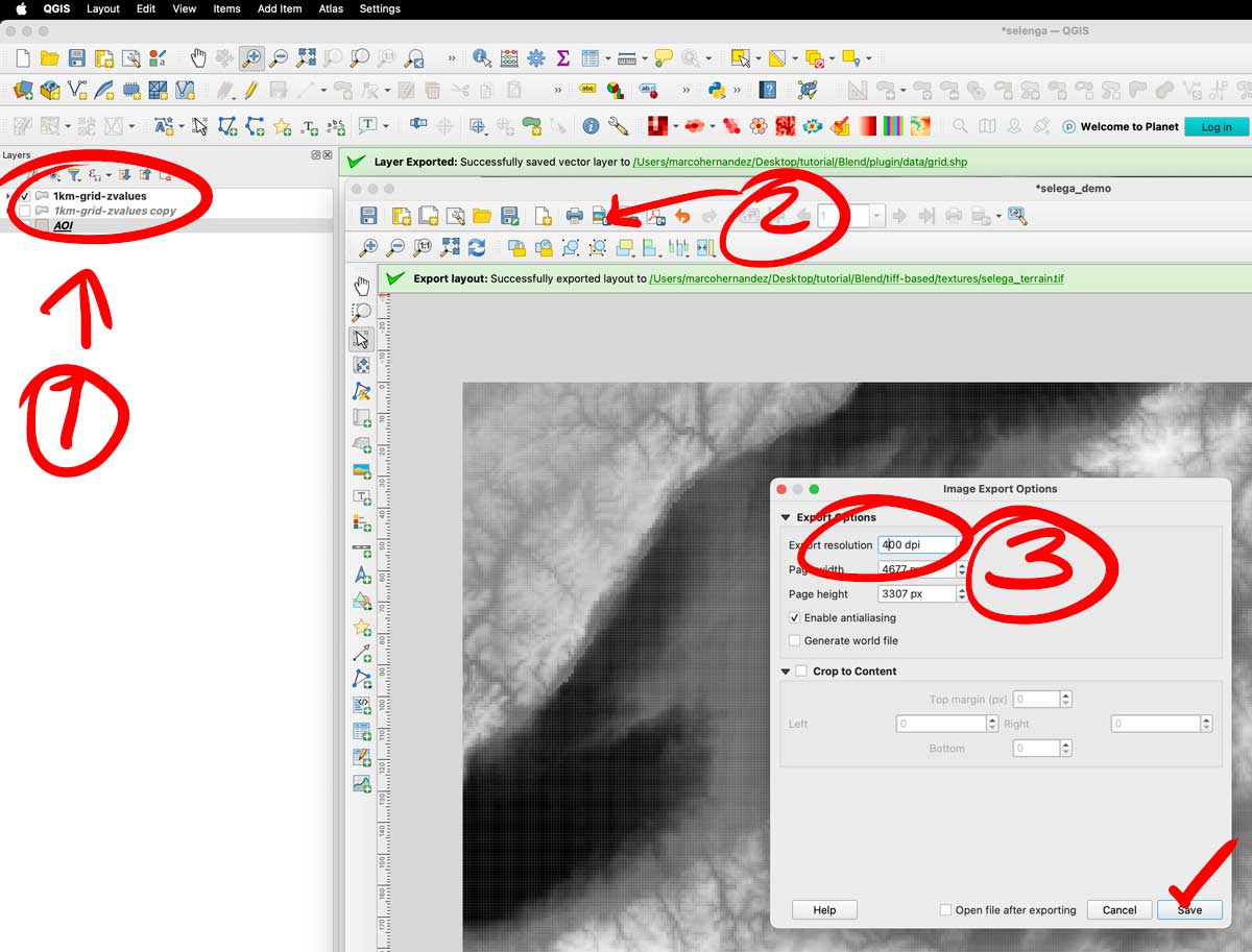
Enable only your AOI layer in QGIS, then go to the menu Project/New print layout and add an xxx name there, I did “selenga” for mine. You would get a empty layout window, select the “new map” feature in the left panel, click and drag in the canvas to create a preview, set the scale to 1110000 and turn off the background and frame options.
That set-up would give you a full end-to-end raster, turn off your AOI layer and turn on the color layer you have there. Export the layer as a tiff image using the picture icon next to the printer in the print layout. The do the same turning off the color, and turning on the gray scale image. Save both files next to your .blend file, i have called them selenga_color.tif and selenga_terrain.tif
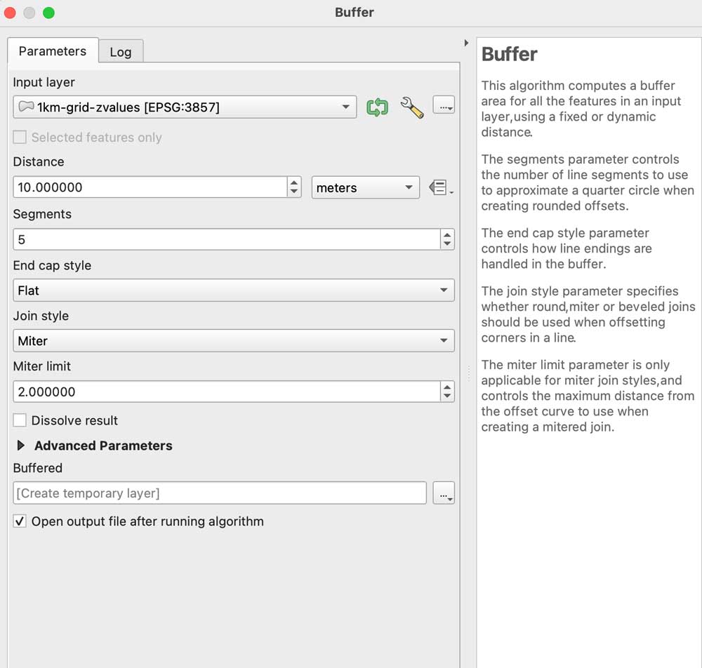
A little trick to prevent weird gaps between the tiles, even if they don’t have gaps the grid effect seems to create lines between the tiles, to prevent that run a buffer clicking the grayscale image, go to the menu Vector/Geoprocessing tools/Buffer add some 10m in the distance field set the caps to flat and miter in a temporary layer:
Leave that layer under your grayscale, copy and paste the styles to the buffered layer, leave that on only for the grayscale image before exporting. I have left both images in the demo folder so you can see the difference on rendering later.
Go to Blender
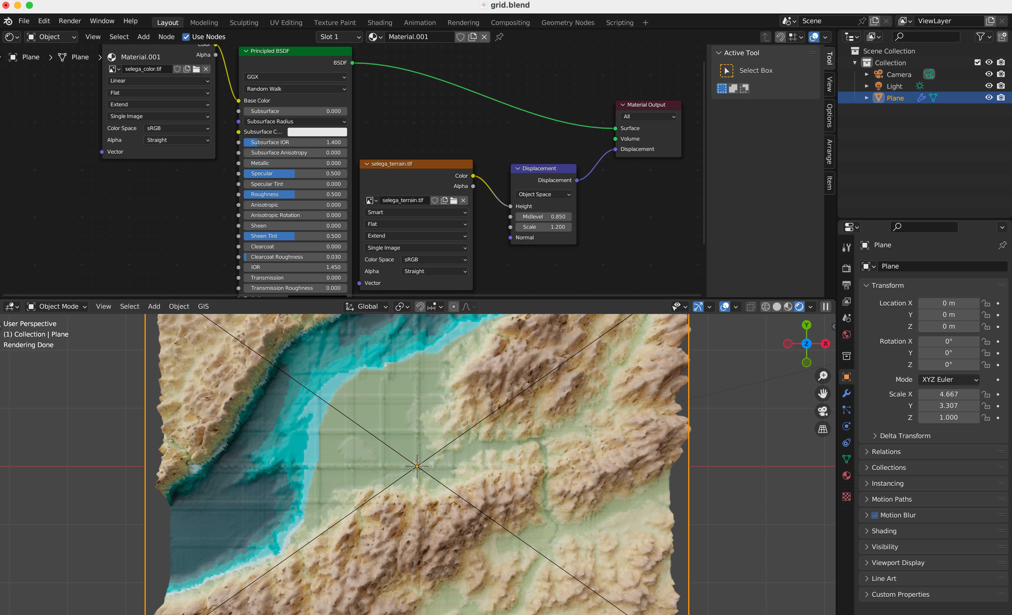
We are all set, now, go to the blender template. A few things you should be aware first, this blender file uses cycles render engine to get nicer shadows, and its set up to experimental. I’m using v 3.6.4. The print resolution (in the printer icon panel to the right) is the same as the original images we created in QGIS: 4677×3307 pixels. The plane used to load the textures should be scaled to fit those images too, so in the orange icon I have scale X as 4.667 by 3.307 note that’s correspondent to the image physical size. Finally in the camera, I’m using an orthographic camera, click the camera in the collection and then the little green camera icon in the panel below, use the scale field as double the size of the image, you can type there 4.667*2 so your camera resolution matches the plane size as 9.334. Keep that in mind if you want to use another image with different dimension, its all about the original asset.
Navigate to the textures folder and replace the color and displacement terrain accordingly in the shader editor.
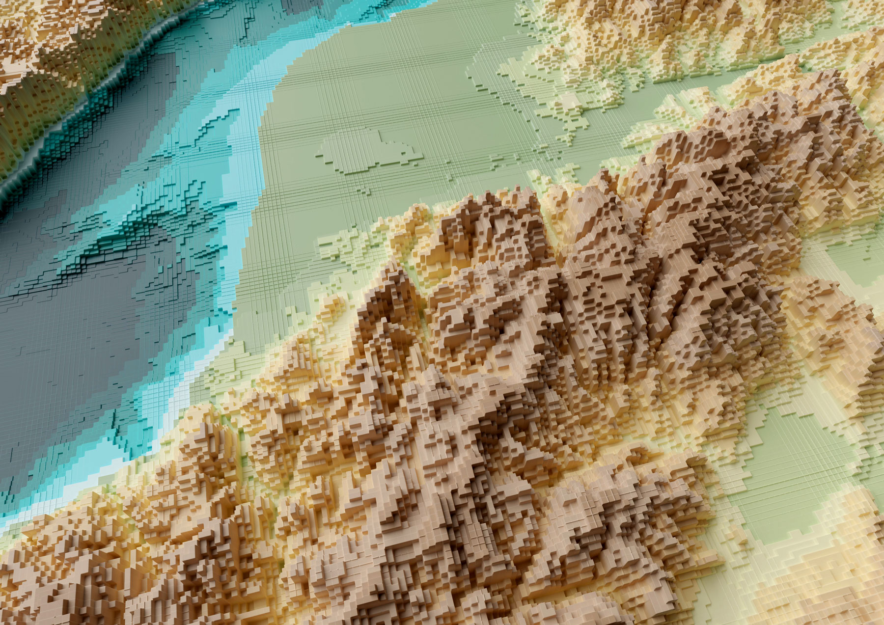
Your final render should look like these using the perspective-camera:
Or this if you are using the orthographic-camera:
Keep in mind I used photoshop to tweak a little the color hues in the original map I did in Fun-tography, I also added labels using illustrator. The nice thing about using the orthographic camera is you don’t loose the georeference from QGIS, so if you export labels from there you will get them in the accurate position into illustrator, Inkscape or any other software you use to add vector details on top of the renders.
I hope you can create beautiful maps, go crazy and do taller columns, play around with the color ramps… have fun!
Even if you don’t use this complex approach, you might gain experience familiarizing yourself with super powerful tools like QGIS and Blender.
We’re leaving another year behind, and as usual, I like to close it with a summary of what I’ve seen, shared and created during the last year, so here we go:
––––––– :::: 🗓️ ::::: –––––––
January: Santa’s surprise visit
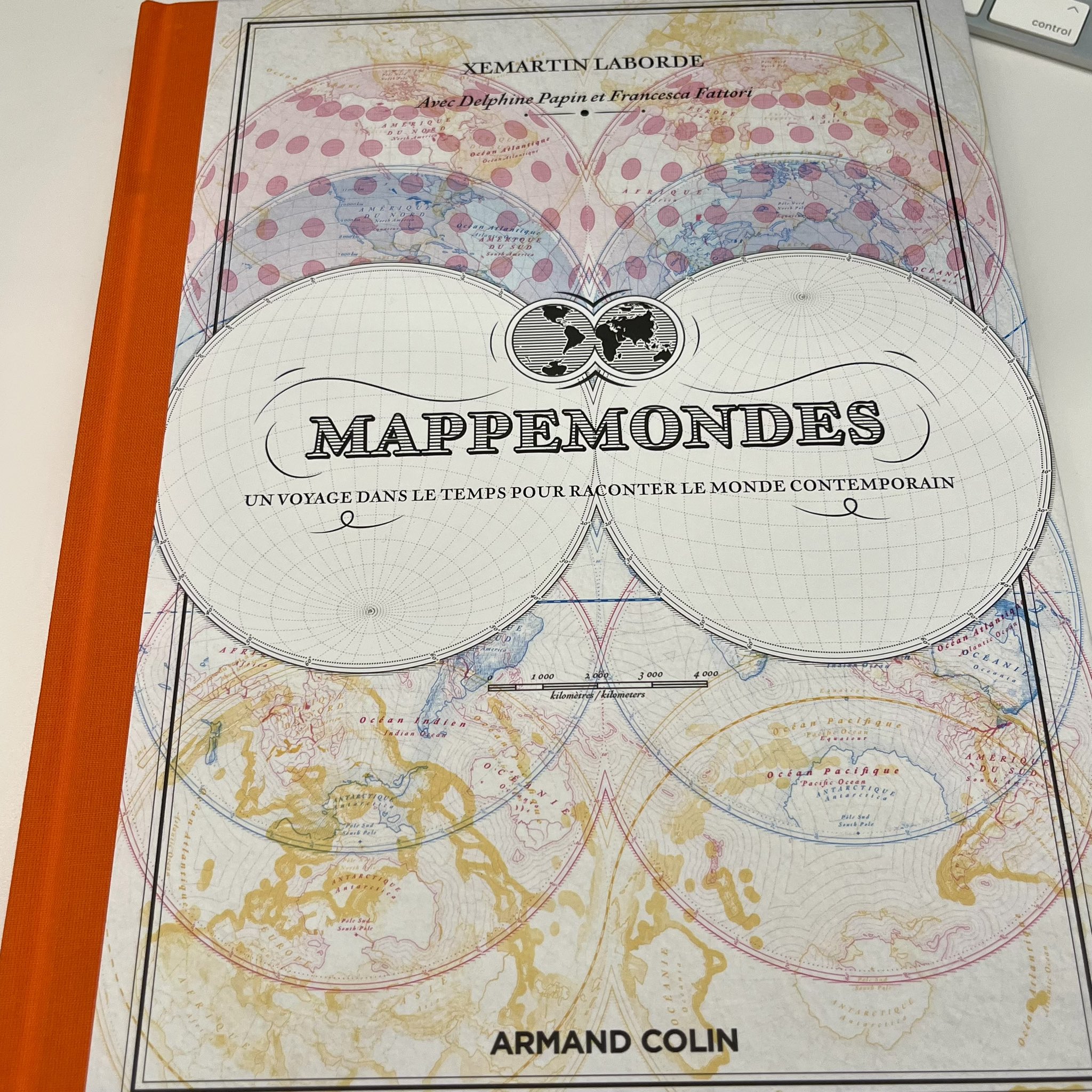
2024 started slowly for me. In the middle of the snowy days, I did a quick trip to DC to boost my inspiration with the museums of the city and of course meet some good friends who live there. But one of the most delightful moments of last January was when I returned to the office on the first day after vacation. That day there was a mysterious package on my desk, it felt like a late visit from Santa, a wonderful book compiling cartographic works of Xemartin Laborde. I enjoyed a lot looking at the maps that Xemartin kindly shared with me.
The rest of January I spent it doing research on extreme weather events. And of course, looking a few times more Mappemondes and talking about geography with my son. Once more thanks Xemartin!
––––––– :::: 🗓️ ::::: –––––––
February: Satellites
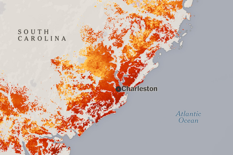
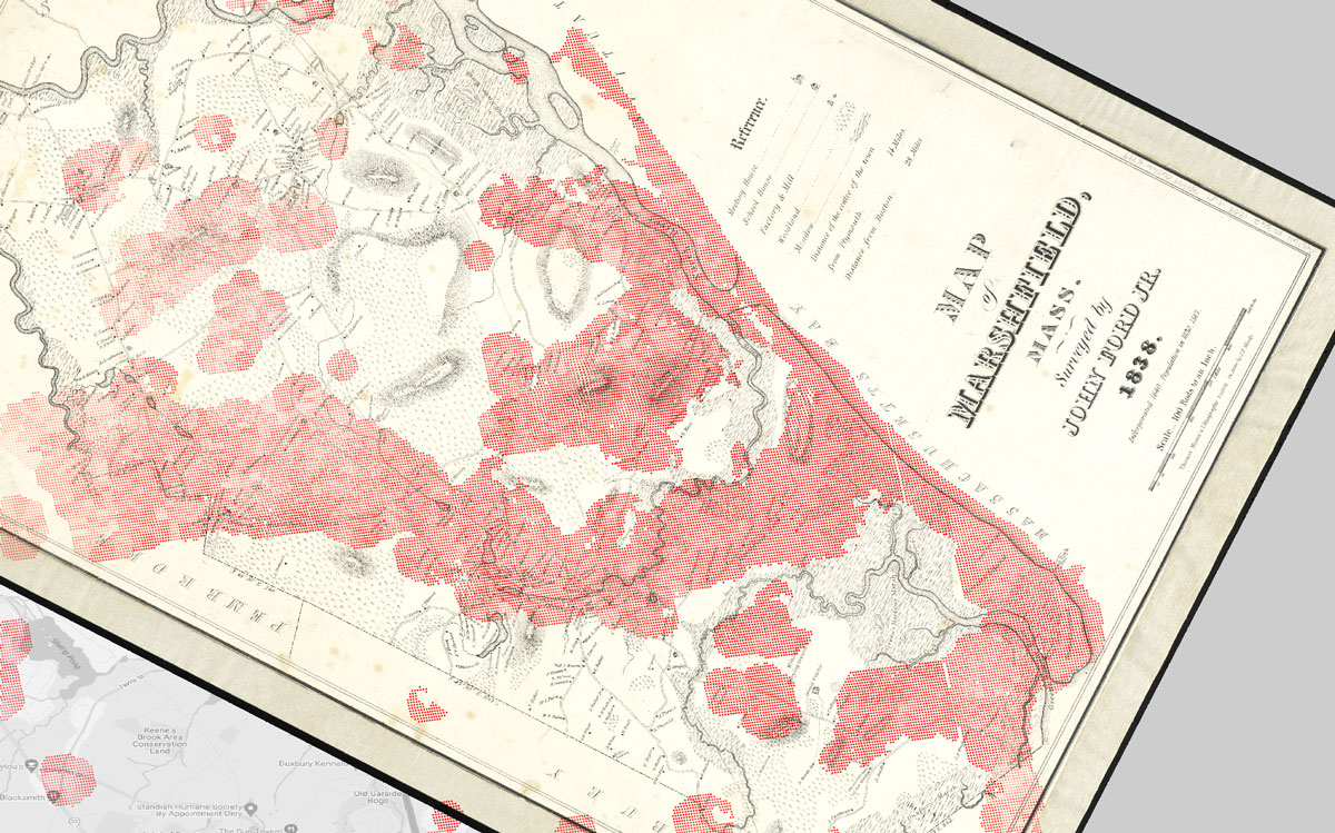
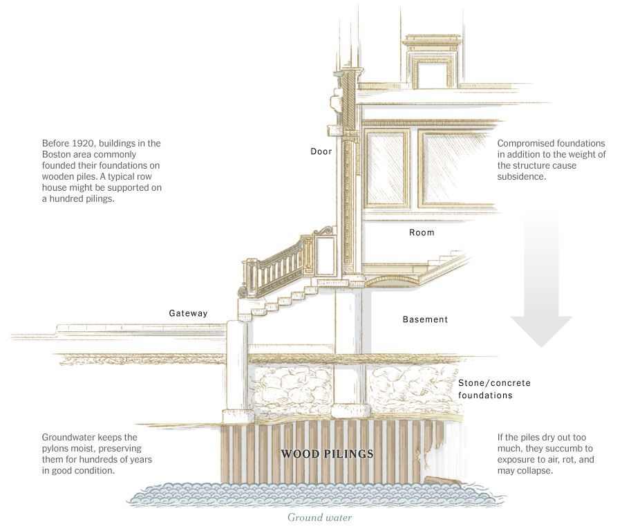
Back in February I was collaborating with the Climate team, Mira Rojanasakul and I did this pieceexplaining how the US East Coast is sinking, based on a recent study using radar technology onboard of the Sentinel constellation. I did a lot of iterations for this project, from maps styles to charts, illustrations and following up interviews with the scientist too. I spent some time looking closely at this data, looking for AOIs in various forms including levees, roads, bridges… I even looked at old records like this area of Massachusetts mapped in 1838 to which I overlaid SAR detections (in red) to see where the land is sinking:
I had a lot of nerdy fun with this project, here’s a piece we did not used explaining one of the many issues this phenomena causes, copy was not proofread as you might note:
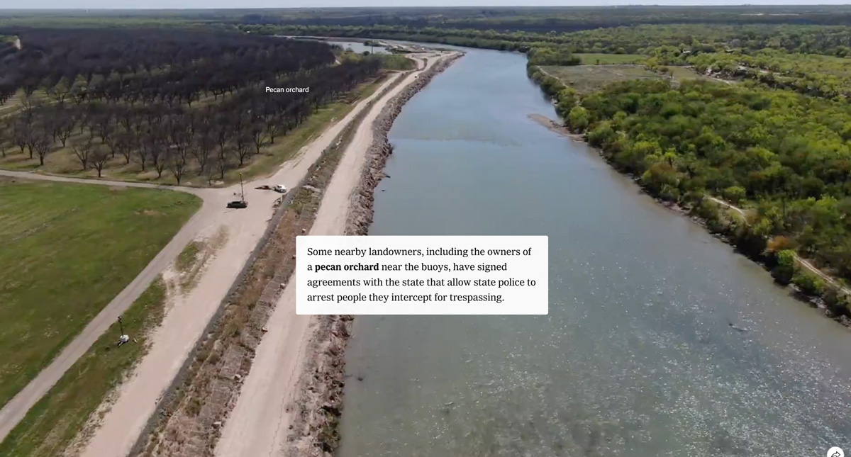
We used a drone to fly over the Rio Grande in the area controlled by the military, we also spoke to locals to see how their routines had changed after the waves of immigrants and the military presence. 2024 was an intense year for immigration issues and it is likely that this coming year I will do some more reports on the subject.
––––––– :::: 🗓️ ::::: –––––––
April: Gaza & Georgia
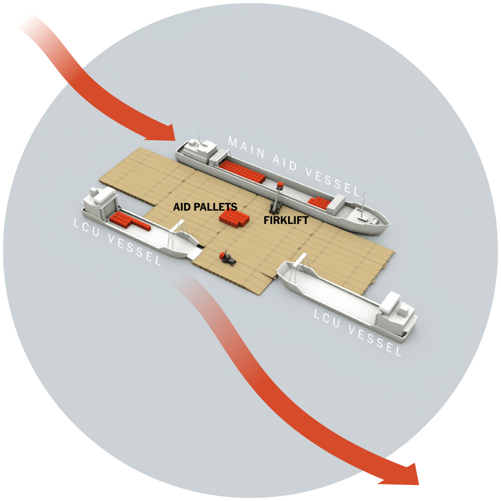
In April we kept an eye on the situation in Gaza, and I was part of a team tasked with investigating the deployment of the floating dock that the US intended to put at the disposal of Gaza to facilitate the entry of humanitarian aid. The project failed and ended up being dismantled. You can read more about that story here.
For that project I was working with Cinema 4D, but I’m using Blender more and more. That was the last thing I did in C4D in 2024, not sure if I would need it again in 2025. Should we all move to Blender anyways?
At the end of April I took a few days off and went with my family to northern Georgia and North Carolina, we spent some great days near Chatuge Lake and in the town of Helen GA, a super nice short vacation in the mountains.
That month I also took the initiative to travel on my own to Minneapolis to be inspired by the best of the Design Society that held its annual competition there, but also to see so many friends and colleagues who came together for a few days in this city from different continents.
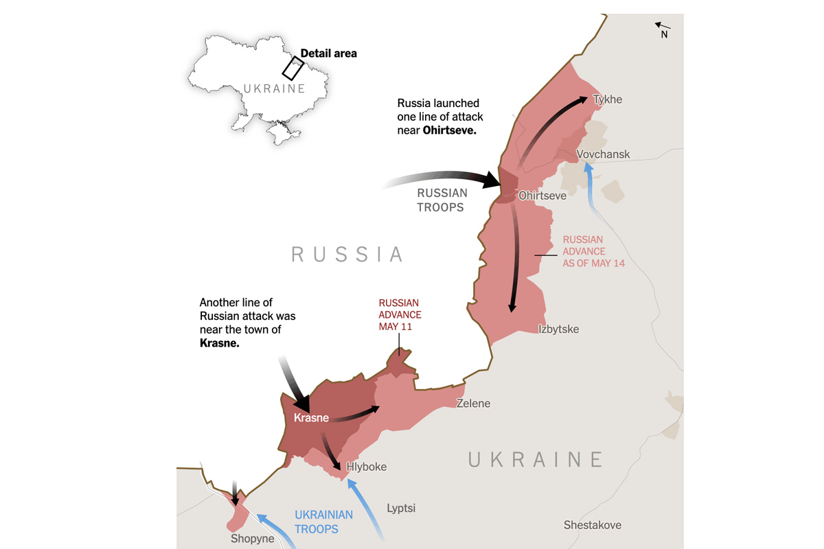
May was also a month to monitor the development of the war in Ukraine, in the middle of the month Russian troops made an incursion near Kharkiv, I reported it with a map of the area showing Russia’s sudden push across Ukrainian lines.
––––––– :::: 🗓️ ::::: –––––––
June: Ukraine
If you know me, you know that since I joined the Times I’ve spent a lot of time reporting on the war in Ukraine, I’ve made hundreds of maps, charts, diagrams and so many other things, but finally publishing this project that we had in our hands for about two years was felt really good.
Hello Chicago! In June I also traveled to Chicago to attend for the first time The Outlier, a conference organized by the Dataviz Society. I really liked it because of its diversity. You can find people from very diverse sectors with great energy it’s a great community. Of course, what we all there had in common there was that we all work with data to tell stories. If you also work with data and want to see for yourself, in 2025 it will be in Miami, I’m sure it will be great again.
Love to see an screenshot of my map at Kuhu Gupta talk at #outlier2024 we add those little things to provide a better context to our readers of what they are looking at.
This year I have traveled a lot within the US. At the beginning of July I was in Hollywood giving a workshop at the annual conference of the Association of Hispanic Journalists (NAHJ). I’m very pleased to know that many attendees started to use the tools and sources that we shared. Helping others who are at the beginning their careers is very gratifying for me.
Run Marco, run! Upon my rushed return to New York over a weekend, the very next day I grabbed my Secret Service credentials and prepared to travel to the Republican National Convention in Wisconsin. The Times sends several reporters and photographers to these events, so it doesn’t make much sense for us to do exactly the same stories, so we focus on doing pieces with a twist.
My colleague Ashley Wu and I went there to listen, interview, and sketch scenes we encountered at the convention to capture the atmosphere of the convention un-staged, you can see all 20 scenes here.
––––––– :::: 🗓️ ::::: –––––––
August: Back to Chicago
In August I was back in Chicago, and my colleague Ashley and I traveled to the DNC to replicate the same format we published with the RNC. The experience was a bit different as expected, but it was an interesting exercise. You can see all the 20 scenes we captured from the Democratic National Convention here.
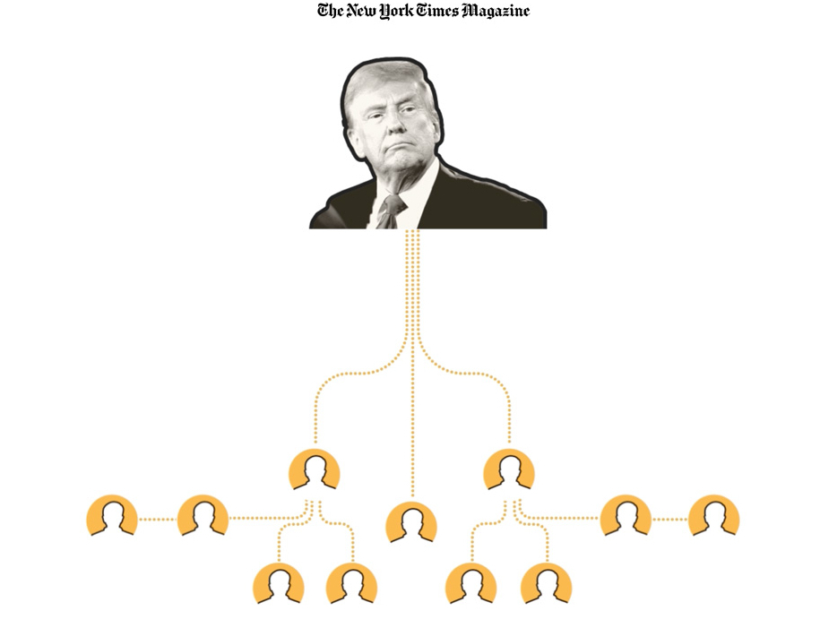
During September I collaborated with colleagues from Times Magazine, basically we were investigating the actions that Trump had described up to that point to use the judicial system and other methods against his political adversaries. Here’s a nerdy fact: This scroll-driven piece was built with After Effects and an internal tool that spits out json files, those files are then interpreted by Svelte components to generate the story you can see. If you want to read more about that story here: “Trump Wants to Jail His Political Adversaries. Here’s How He Could Do It“.
Hello Boston! I spent the last days of September in Boston with my family. We walked a lot to enjoy the magnificent architecture of the city and its museums. I already have plans to go back there to share some slides and stories from my work with the students at Northeastern University.
––––––– :::: 🗓️ ::::: –––––––
October: Roads & Whales
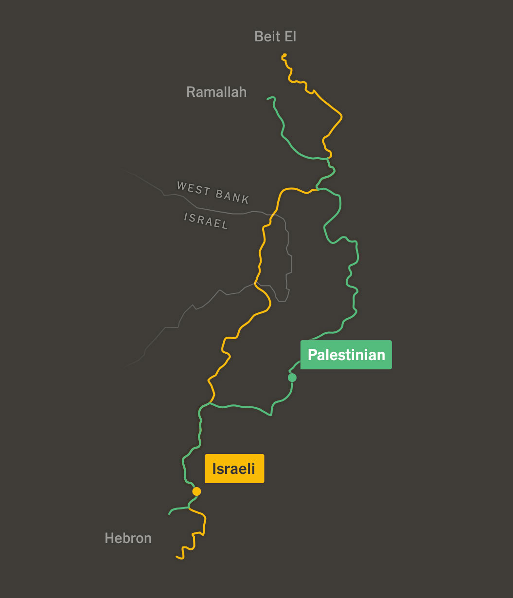
In October I collaborated with the talented Leanne Abraham and a few other colleagues on this story about how things are much more difficult if you are a Palestinian driving on the streets of the West Bank than if you are an Israeli. You can read more about this story here. My role this time was very much tied to narrative analysis and video editing, but I loved seeing Leanne’s process, I have a lot to learn from her to make better maps.
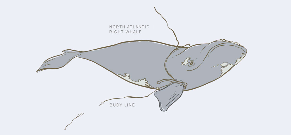
In October I did a quick collaboration with the Climate Desk to tell the story of Squilla, one of the last remaining right whales, and the challenges her species faces. Learn more about Squilla here.
––––––– :::: 🗓️ ::::: –––––––
November: Polls time
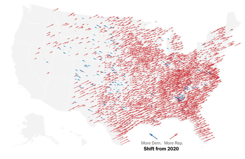
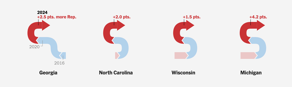
In my case, it was weeks of preparation, hundreds of graphics, concepts and templates that I created in anticipation of the first US results coming in. Personally, I was astonished at how quickly things moved, as all the maps quickly turned red… and you know the rest of the story. The first thing my team published was this piece showing the trend of shifting to the right, that’s the screenshot above.
I did a lot of pre-sketching to conceptualize those graphics using test data, but it’s hard to predict what the final result would be, a lot of the pieces we designed and programmed weren’t used, but it was necessary “just in case”.
A new website Shortly after the elections, I launched a new website too.
I'm starting a new page to put all my mess in one place. I added a bit of humor with little illos all around. The plan is to have an arcade of pieces I've worked on, illustrations and maps from my blogs and some other stuff. You can check it out here: mhinfographics.github.io
I’ve been working on this for a while because I felt like everything was so scattered here and there. I’m still making improvements and I hope to eventually consolidate everything into one place so I don’t have so many separate domains, but I think it will take me more time.
––––––– :::: 🗓️ ::::: –––––––
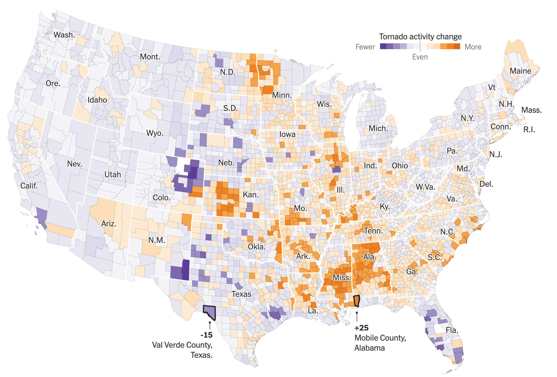
December: tornadoes
Earlier this year I went down a rabbit hole to understand the data behind tornadoes a little better. Shortly after, by coincidence, I also stumbled upon a company that does damage analysis after natural disasters; the data was just astounding, so I held onto it for a while before pitching the idea with the goal of coming up with a slightly more solid draft with some real data, aerial imagery, and maybe even a super detailed graphic of all the destruction from the year across the U.S., or that was my idea in my head, you might saw the story of how that went few days ago.
But anyway, the story turned a little bit into a more specific and narrower angle, I had the opportunity to learn a lot from many researchers I spoke with, it was a nice way to close the year doing maps and charts. You can read the piece here if you want to learn more about it, its an unlocked link for you. I still have a few more things in the works, but since vacation mode is coming, these projects probably would be in my 2025 year in graphics, leading January as the new beginning.
2024 was a wild year at work, I wish you the best in this new beginning.
As we prepare for the next year, it’s always nice to remember what we spent our time on during the latest Earth’s lap across the orbit. So, here’s a collection of my favorite details at work and other things I have done in 2023.
January: Wild weather
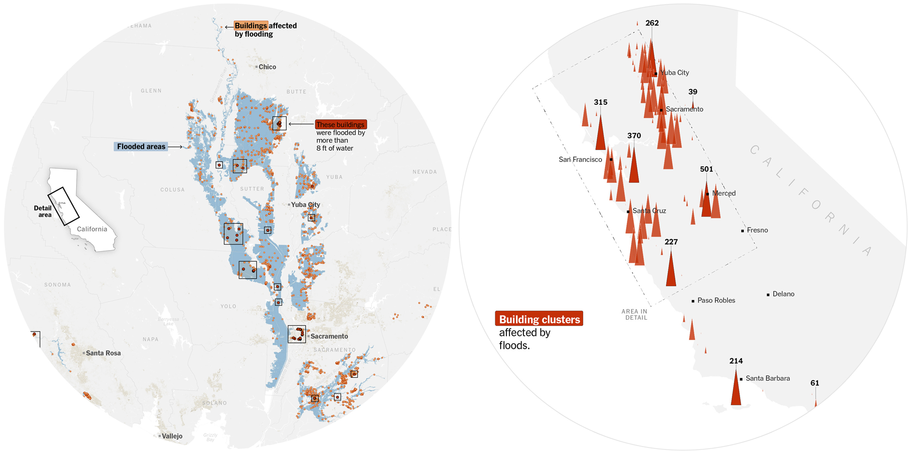
The beginning of the year was full of extreme weather events. We covered some, including the flooding in California, I was immersed in the coverage of the war in Ukraine, but, I did some maps that were not published, among them, a flood map showing the extent of the water using SAR data, and a count of buildings affected by the flood.
January was a month to think about all that I do, and no one sees. I thought that maybe, some of that stuff could be helpful to students or other professionals who are starting their careers. So I made a post showing how to visualize global temperature with data provided by NASA. Quickly I started to receive questions about it, so, I did my best to answer them all. Thanks all of you who reached out.
Later I learned some journalists around the world published stories with visualizations using my tutorial. It was very nice to know that I was able to help and I would love to do more of this next year when my other responsibilities allow me.
––––––– :::: 🗓️ ::::: –––––––
February: The next stage of the war in Ukraine
At the beginning of the year we were trying to find clues about where the war in Ukraine was going. Military analysts gave us some opinions as to what the objectives of both sides could be for the spring, although none of the forecasts were accurate, we were able to create a series of maps explaining the aims of both sides.
I always make basic maps and draw things on top of them, like when you use a marker to explain ideas to your colleagues. My editor saw that and convinced me to publish a version of the maps with marker-like styles. You can see the piece at the following link without a paywall: The War’s violent Next Stage.
––––––– :::: 🗓️ ::::: –––––––
March: War and Basketball
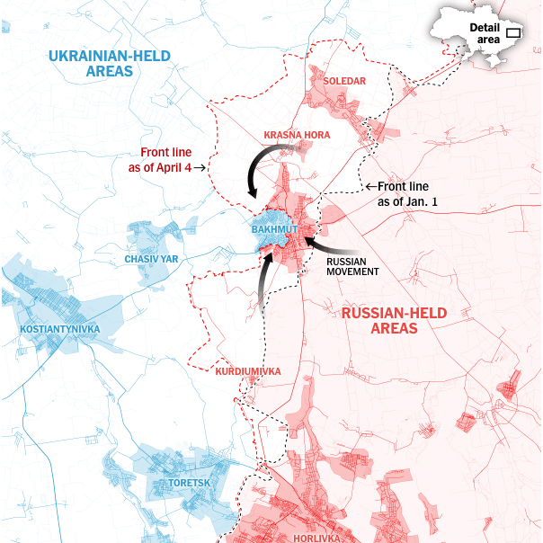
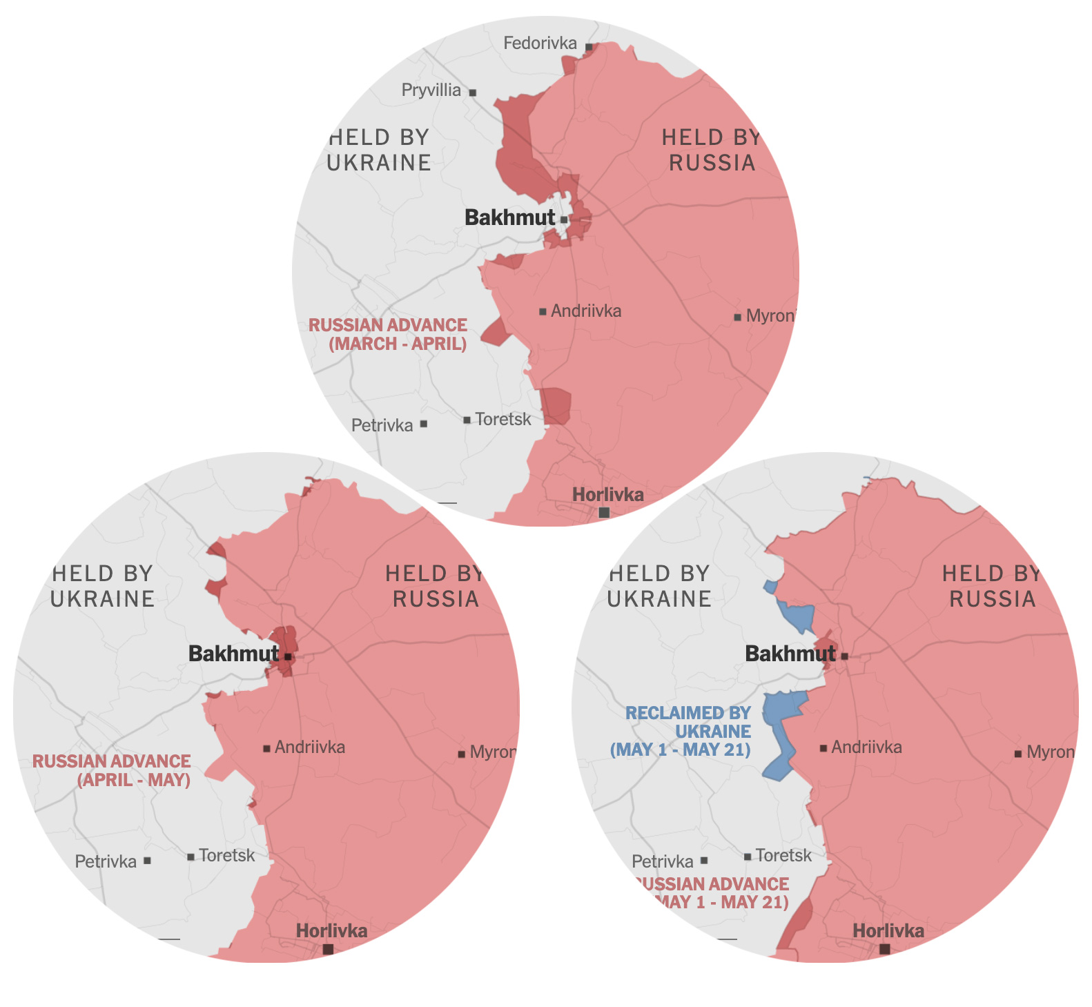
Earlier this year, all eyes were on Bakhmut. I did some pieces about how the Russians were slowly advancing from the east towards the city while the satellites captured the destruction caused by the fierce battle that the Ukrainians fought trying to maintain their positions.
But small projects also come while we are doing some other long or mid-term stories, like this one I helped with to cover college basketball player Caitlin Clark. The main visuals in the piece are photocompositions showing several of the player’s many shots. The images show the distance and position of each shot as if it were captured in a single photo.
––––––– :::: 🗓️ ::::: –––––––
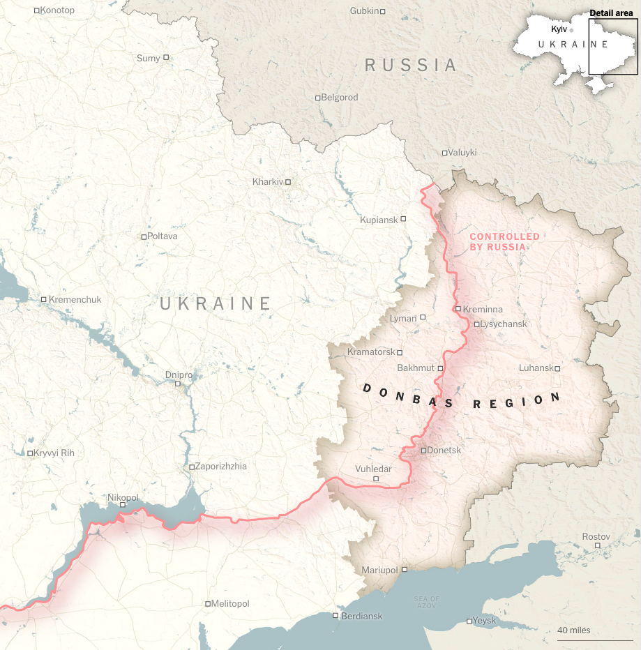
April: The fierce battles in the Donbas
After months of pouring resources into the war, we analyzed the progress of Russia in Ukraine in 2023, the declarations of taking over the Donbas were not accomplished, and in fact, the progress was reduced to just 4 small settlements. I particularly liked the concept of inking the streets according to whether they were either Russian or Ukrainian held, highlighting the urban areas a little better.
In May, the battle for the city of Bakhmut that we had covered for almost a year finally reached a favorable outcome for the Russians when they managed to take the center of the city. We made a series of maps showing how the Russian forces slowly moved to engulf the city.
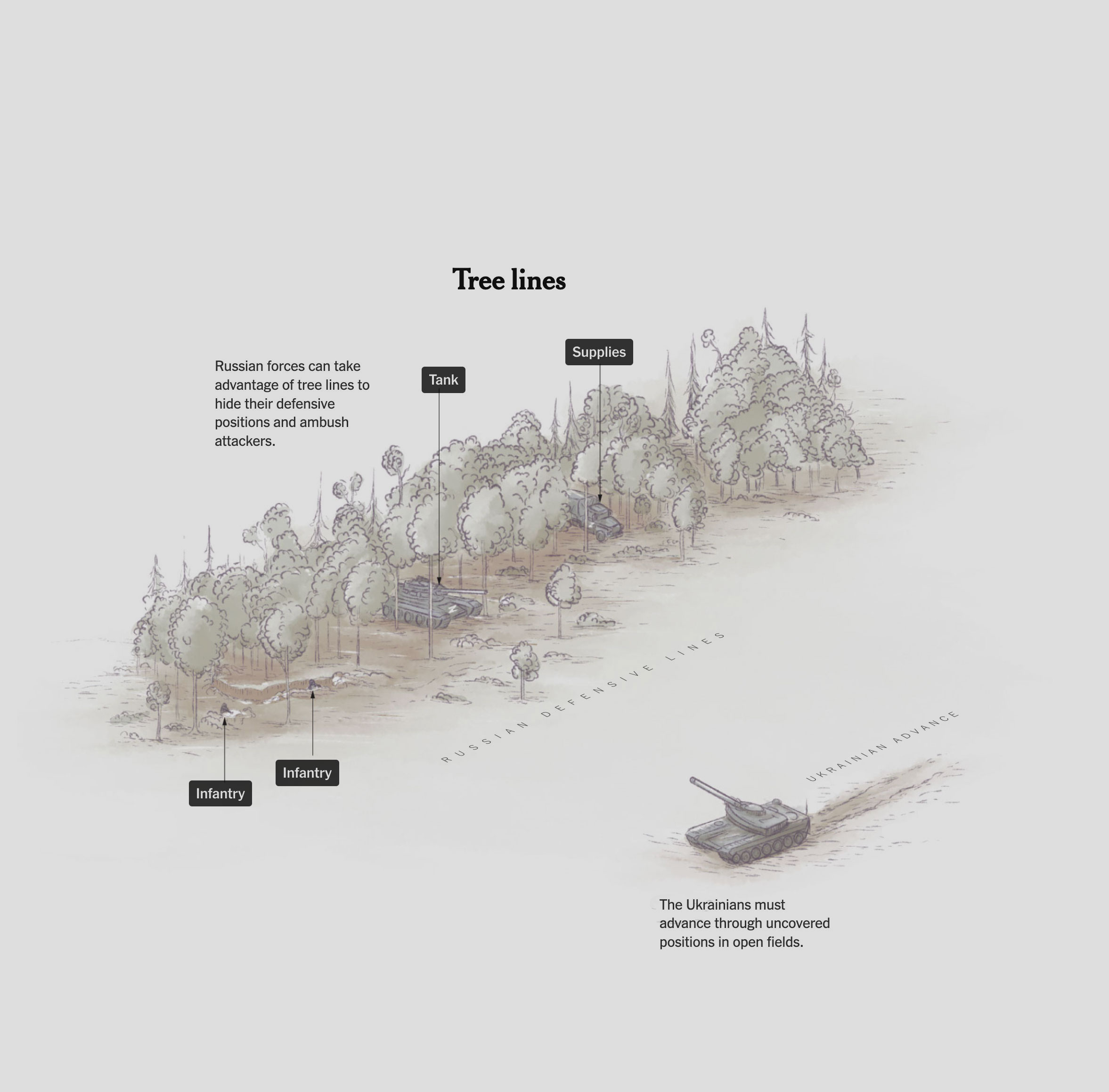
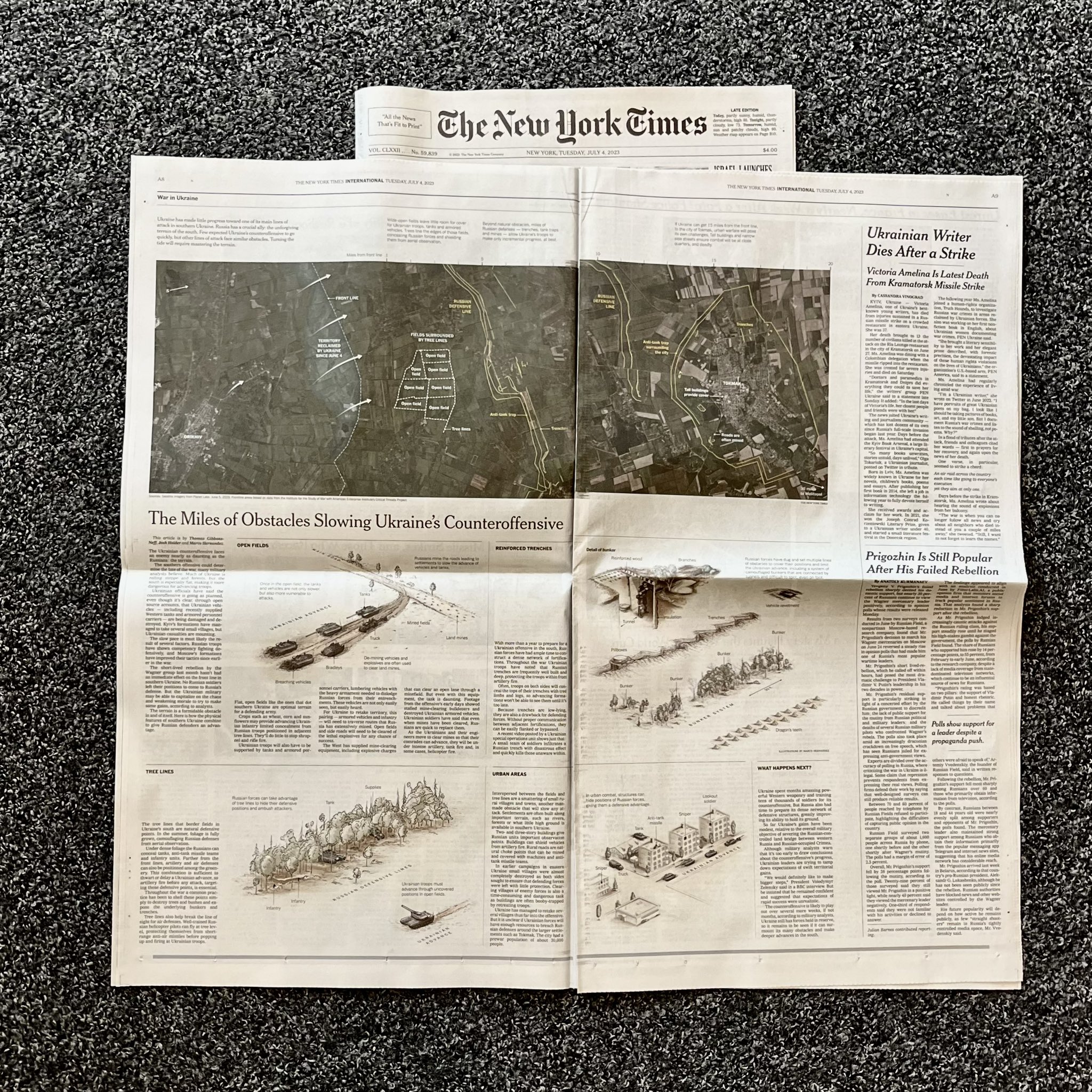
Almost at the end of June, we published an analysis of the challenges that Ukrainians face in their counter-offensive in the south of their country. The story shows some of the obstacles along a strategic 21-mile stretch that the Ukrainians must navigate if they wish to make their counteroffensive effective.
––––––– :::: 🗓️ ::::: –––––––
July: Paper editions
The print edition always comes after we publish our stories online. And since the story of those 21 miles of obstacles was published near the end of June, it wasn’t until July that the paper version was published with the help of the print editors.
July was also a special month, I also received my copy of Nightingale magazine, where I contributed with an article about my reflections on things I have learned in these twenty years making graphics in different media/continents.
August was a month completely dedicated to a long-term project I’ve been working on for over a year now. As I write this post at the end of November, my hopes are that we will be able to publish very soon. I think once we publish I’ll be able to make a long #infofails post with all the stuff we won’t use including things like this:
But since I still can’t share much about it, I leave you an image of something else from August:
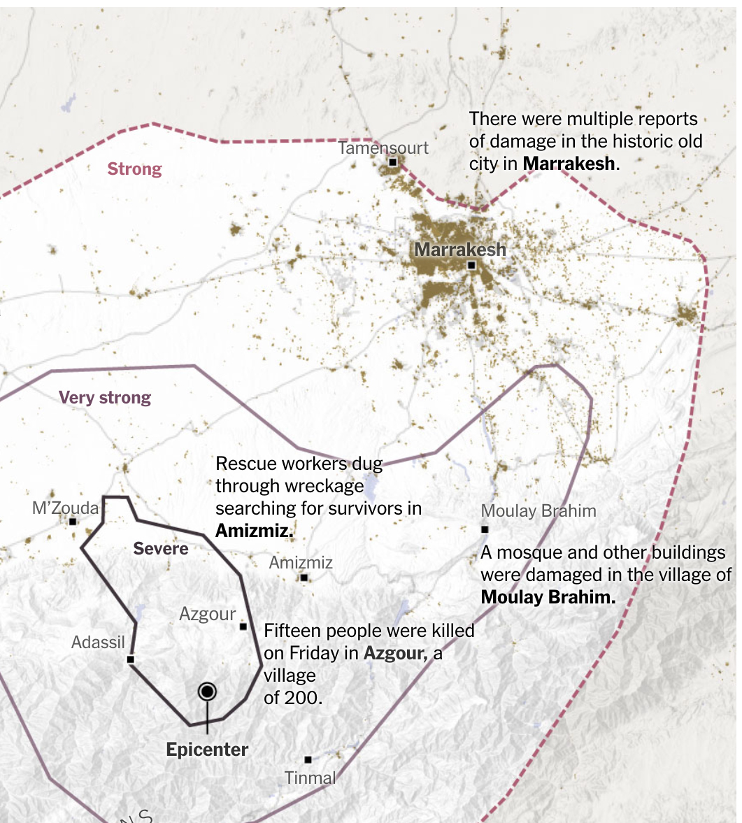
In the first week of September, an intense earthquake hit a mountainous region south of Marrakech, causing extensive damage to villages and leaving a high number of deaths and missing persons. During that weekend we made a series of maps to report the situation with various updates as we received updates.
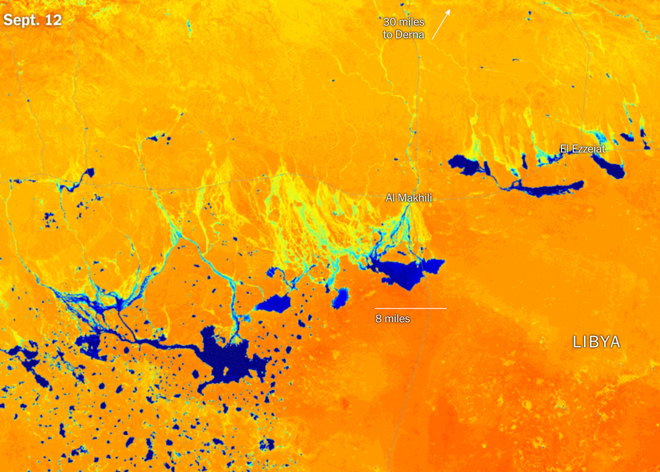
Just a few days later, a storm system over the Mediterranean Sea wreaked havoc in Libya, especially over the city of Derna where shocking images showed how the water swept away the city. The rains were so intense that huge temporary lakes formed in the desert, some big enough to be seen from space.
––––––– :::: 🗓️ ::::: –––––––
October: NY + Amsterdam
Reporting and preparing projects on Ukraine continued throughout this month. However, I was able to take made a quick pause to participate of Information Design Conference in Amsterdam for a few days. I shared a little about the work we do at the New York Times and my personal interests while I’m away from work.
But I have to say that the best part was the wonderful people I had the opportunity to meet there, including some well-known names in the data visualization field based in the Netherlands.
––––––– :::: 🗓️ ::::: –––––––
November: The war in Gaza
A conflict that has been active for many years intensified at the end of the 2023. It is a really complex and delicate topic, so it’s not wise to provide opinions behind it. However, in November we took the initiative to gather information to report on the structures that are under Gaza and that have been documented by various sources including both sides of this conflict.
Even though my trip began by forgetting my phone in a taxi in New York before entering the airport, the conferences with the students and every moment of that intense week were memorable.
––––––– :::: 🗓️ ::::: –––––––
December: A chance for a snowy xmas
I’m not sure how intense this winter will be, I wrote this post at the end of November and we already saw a few snowflakes this week in New York City. Last year we barely saw snow in New York, the winter was very mild here, but maybe there is a chance for a white Christmas after all this 2023. I collected data from the US National Ice Center (usicecenter.gov) to make the map below showing the extent of the snow. The purple spots are population density from the SEDAC (sedac.ciesin.columbia.edu).
I promise I’ll make a tutorial to create snow visualizations soon. I did those maps above to see how the snow is already dancing around the north pole, but maybe we can run a story on snow if this winter turns out to be extreme (hopefully not).
Anyway, that was my 2023 in graphics.
Once again we say goodbye to the year, but before I switch into holidays mode, I want to thank all my colleagues at the Times, this was a great year, I couldn’t be more grateful to be able to share my days with all of you.
And to you all my www-friends, I wish you the best in this new beginning. Happy New Year!
This is a follow up to my previous tutorial for visualizing organic carbon. The process is more or less the same, but it uses a different dataset, which has some extra considerations. You can revisit it below:
Before continuing, to follow my guide and visualize global temperatures, you should be able to use your Terminal window, QGIS and optional Adobe After Effects or Photoshop.
About the data set
NASA’s Global Modeling and Assimilation Office Research Site (GMAO) provides a number of models from different data sets, this is basically a collection of data from many different services processed for historical records or forecast models. This data works well for a global picture or continent level even, but maybe isn’t a good idea to use this data for a country level analysis, for those uses you may want to check other sources of the data instead of GMAO models, like MODIS for instance if you you are looking for similar data.
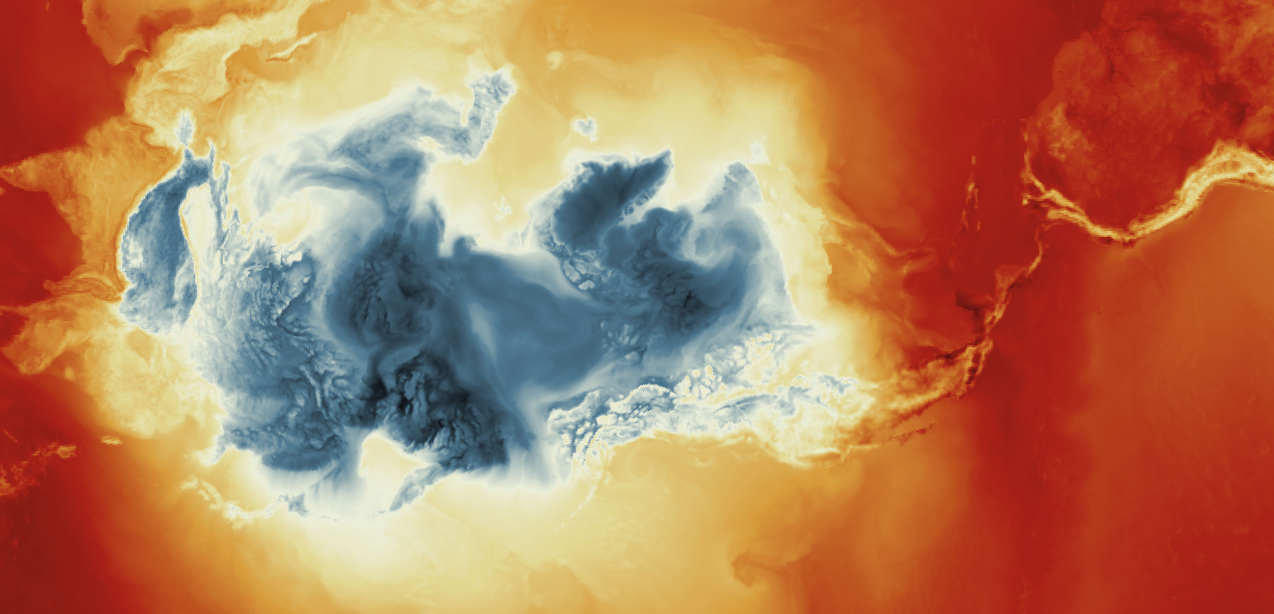
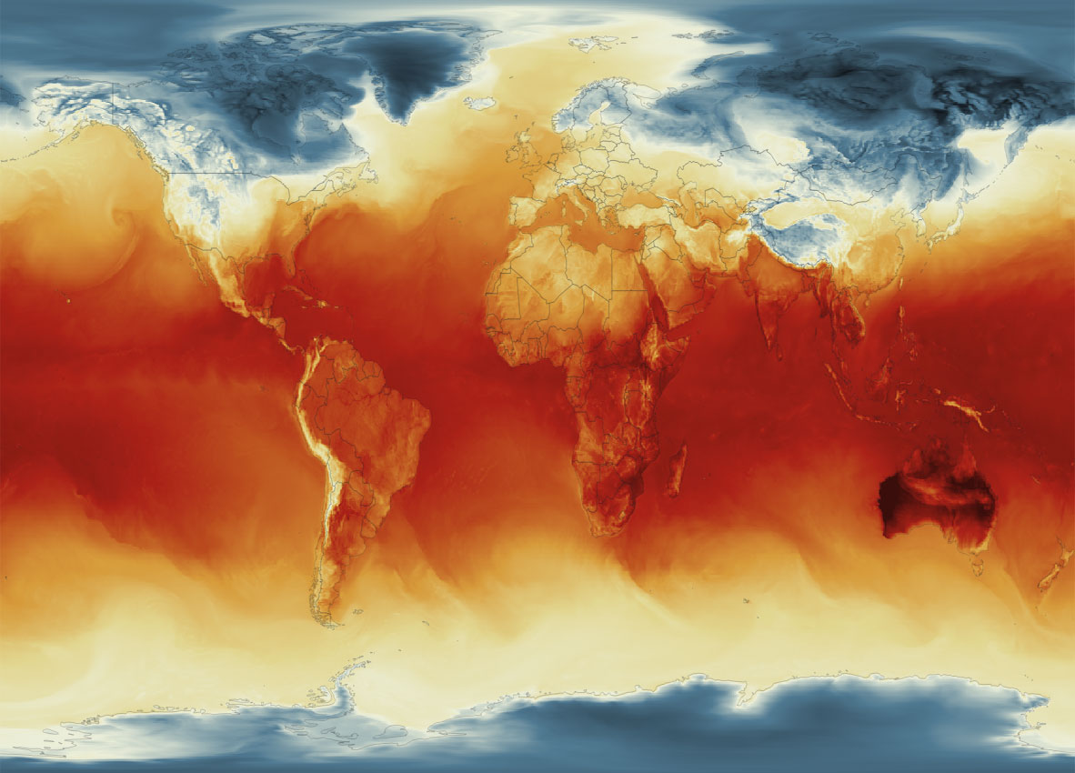
Global Surface Temperature average Jan. 4, 2023, 8am. || Data by GMAO / NASA.
SURFACE TEMPERATURE
There are a lot of different sets of products available at GMAO. For purposes of this tutorial, I’ll be focusing in the Surface Temperature which is stored into the inst1_2d_lfo_Nx set. That’s a GEOS5 time-averaged reading, which includes surface air temperature in Kelvin degrees in the 5th band of the files, there is some documentation available in this pdf. ( No worries if is this sounds too technical stay with me and keep going. )
These files are generated hourly, so a day of observations accounts for 24 files. This is great for animation because it would look smooth (even smother than the one we did for Organic Carbon before).
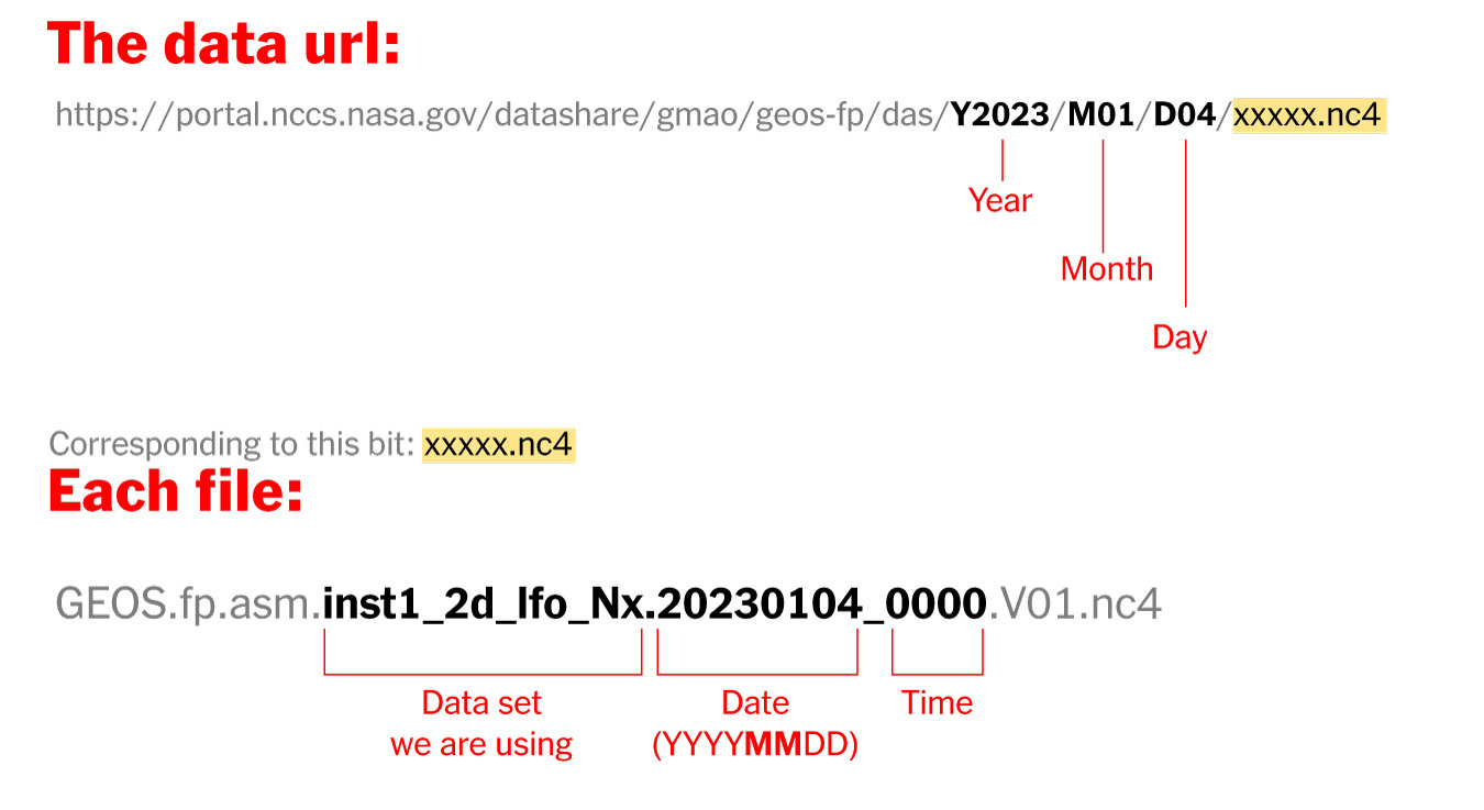
Where’s the data? and How it’s named?
The data is stored into this url. You can go into the folders and get all 24 files for each day manually if you like or get them with a command line using wget or curl into the terminal, I’ll recommend you the command line since it’s easier. Here’s how each file is named and stored:
Step 1. Get the data
Create a folder to store your files with some name like “data”
Once it reaches 100%, you would get a file named 20230104_0000.nc4 in you “data” folder: Note that I have renamed the output ( -o ) with a shorter name. The file will go to your folder ready to use into GQIS. Of course you will need a few more files to run an animation. Remember that this data is available for every hour every day, so you need to set the url and name for something like this:
00:00 MN >> 20230104_0000.V01.nc401:00 AM >> 20230104_0100.V01.nc402:00 AM >> 20230104_0200.V01.nc403:00 AM >> 20230104_0300.V01.nc4
...and so on...
08:00 PM >> 20230104_2000.V01.nc409:00 PM >> 20230104_2100.V01.nc410:00 PM >> 20230104_2200.V01.nc411:00 PM >> 20230104_2300.V01.nc4
Just create a text file listing all the urls you need and run the script into the terminal window with the same process:
curl-O [URL1] -O [URL2]
Each file is usually about 10MB, if there’s something wrong with the data the file will be created anyway but would be an empty file of just a few KB. Remember a full day accounts for 24 files but it starts from zero not 1.
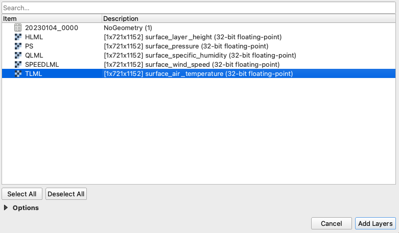
Step 2. Loading the data into QGIS
Once you have a nice folder with all the files you want, you can just drag and drop the .nc4 files into QGIS. We are looking for the 5th Band, TLML which is our Surface air temperature:
QGIS prompt window when you drop one of the file in.
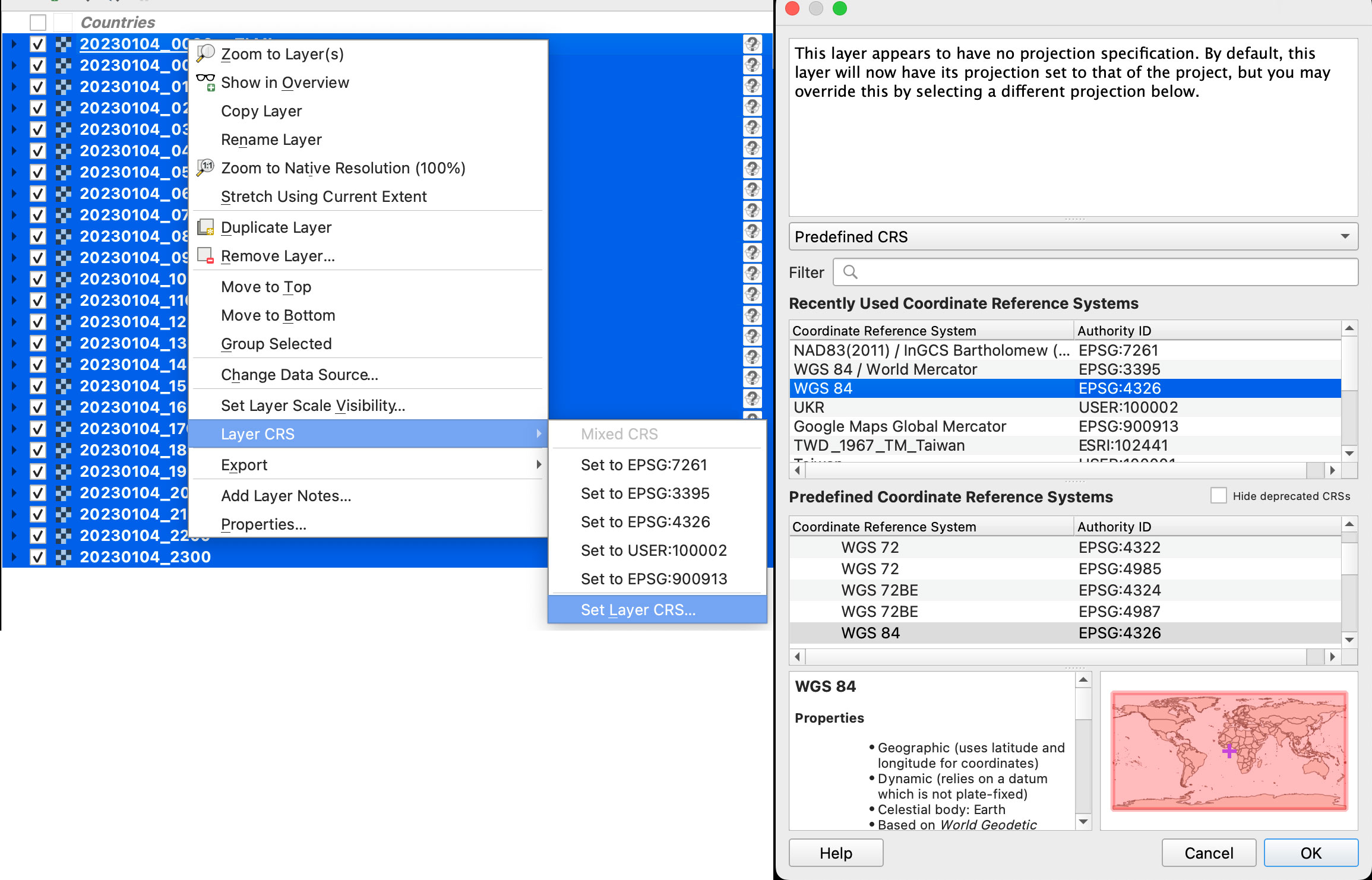
Once you have the data loaded, you want to set the data projection to WGS 84, this will enable the data layers to be re-projected later on. To do that, select all you data layers, right click on them, and select Layer CRS > Set Layer CRS > 4326. Be sure of selecting all the layers at once so you do this only one time. Otherwise you will need to doing over and over.
Data layers projection to WGS 84.
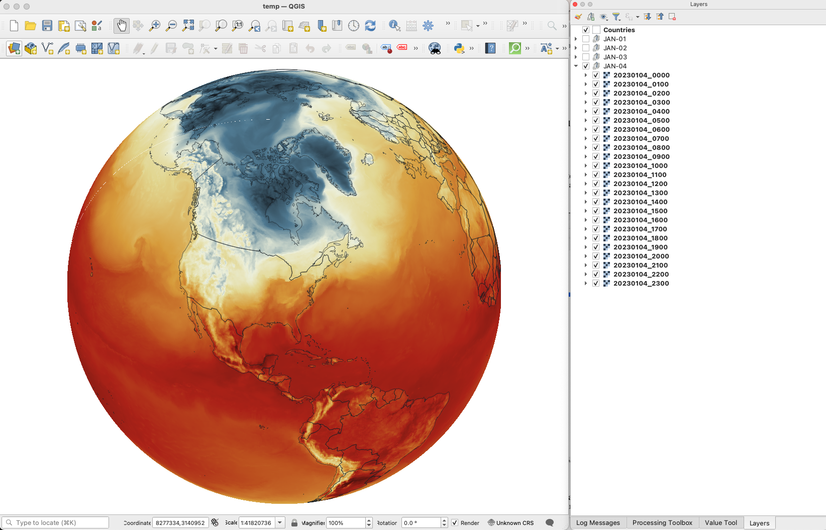
Since this is a good global data set, you may want to load a globe for reference, you can use your own custom projection, or use a plugin like globe builder:
Access Globe Builder from the plugins menu > Manage and Install > type: Globe.
Once installed, just run it from the little globe icon, or in the menu plugins > Globe builder > Build globe view. You have a few options there, play around with the center point lat/long. You can always return here and adjust the center by entering new numbers and clicking the button “Center”.
Step 3. Styling your map
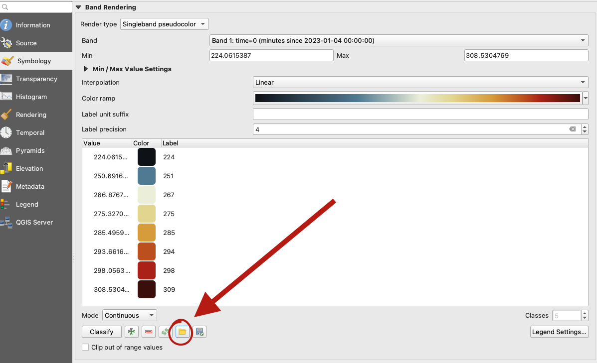
The color ramp is important, you want to have a data layer and maybe a outline base map for countries, QGIS has some pre-built ramps for temperatures, you can check them out by clicking the ramp dropdown menu, select Create New Color Ramp and then select Catalog cpt-city.
Once you have your ideal color ramp for one layer, right click on that layer, go to Styles > Copy style. Then select all you temperature data layers at once, right click on them and select Styles > Paste Style.
I have created a ramp to fit better my data ranges and style a little the colors. If you not are using the optional ramp below, and want to proceed with the pre-built ramps skip this to step 4.
To use my ramp, copy and paste the following to a plain .txt file:
To apply the ramp to your layers, doble click one of the .nc4 files, and select Symbology in the options panel. Under render type, select Singleband pseudocolor, the look for the folder icon, click it and load your .txt file.
QGIS prompt to load a custom style.
Step 4. Preparing to export your map
You are almost done, by this point you can see how each data layer creates nice swirls, maybe some evolution of it too just by toggling the layers visibility. I like to have all the layers well organized so you can quick check the data. I’m maybe a little too obsessive but I usually rename all layers and groups to something like the image below, however this is just for me to know which files are on which day:
QGIS layers panel.
The name change works if you are using an automatic export of all layers, the script in the next step takes the name of the layer to name file output. But there are alternative ways to do this if you’re not as crazy as I’m and don’t want to spend time manually renaming.
Step 5. Export your map
There are many ways of doing this, you can set up the time for each layer by using the temporal controller, there’s a good guide here. That way you can get a mp4 video right away from QGIS, but you need to set up each data layer time manually.
You can also use a little code to export each layer into an image, which you can then import into After Effects. To do that, the first step of course, is to get the script. Download the files from my google drive HERE.
Now, go to the plugins menu at the top, there, you will see the Python console, go and click that, you will see this window popping-up:
Python console in QGIS.
Click the paper icon, then click the folder icon and select the python script you dowloaded above. Just be careful with the filePath option.
If you are on a mac, right click your output folder and hold the option key, that will allow you to copy the absolute path of you folder, paste that to replace the filePath field value (the green text in the image below). If you are on Windows, just make sure to get the absolute path and not a relative one.
I left some annotations on the script to better understand what each part is, it’s based on a script someone did with Vietnamese annotations, source and credit are in the drive link too.
Now just click the play button in the python console, seat back and look all the frames of your animation loading in the output folder you selected. You should see a file for each of your layers when the script finishes.
Step 6. Color key
The temperature in this set is provided in Kelvin degrees. The range of the data depends on your date / file set up. But if you are using the ramp I have provided above with data for Jan. 4, there’s a svg file named “scale.svg” in the drive folder within this range. I have nudge a little the color and ranges matching the map with nice round numbers.
For January 4, the data rages are about 224°K to 308°K, you can use google to covert that to Celsius or Fahrenheit depending on your needs. But basically you can take your Kelvins and subtract 273.15 to get Celsius. The min. Temperature would be ~ -49°C (224°K) and Max. ~34°C (308°K). If you are into Fahrenheit, I’m sorry the math would be a little more complex for you… go ahead and use google.
Step 7. Setup and export your animation
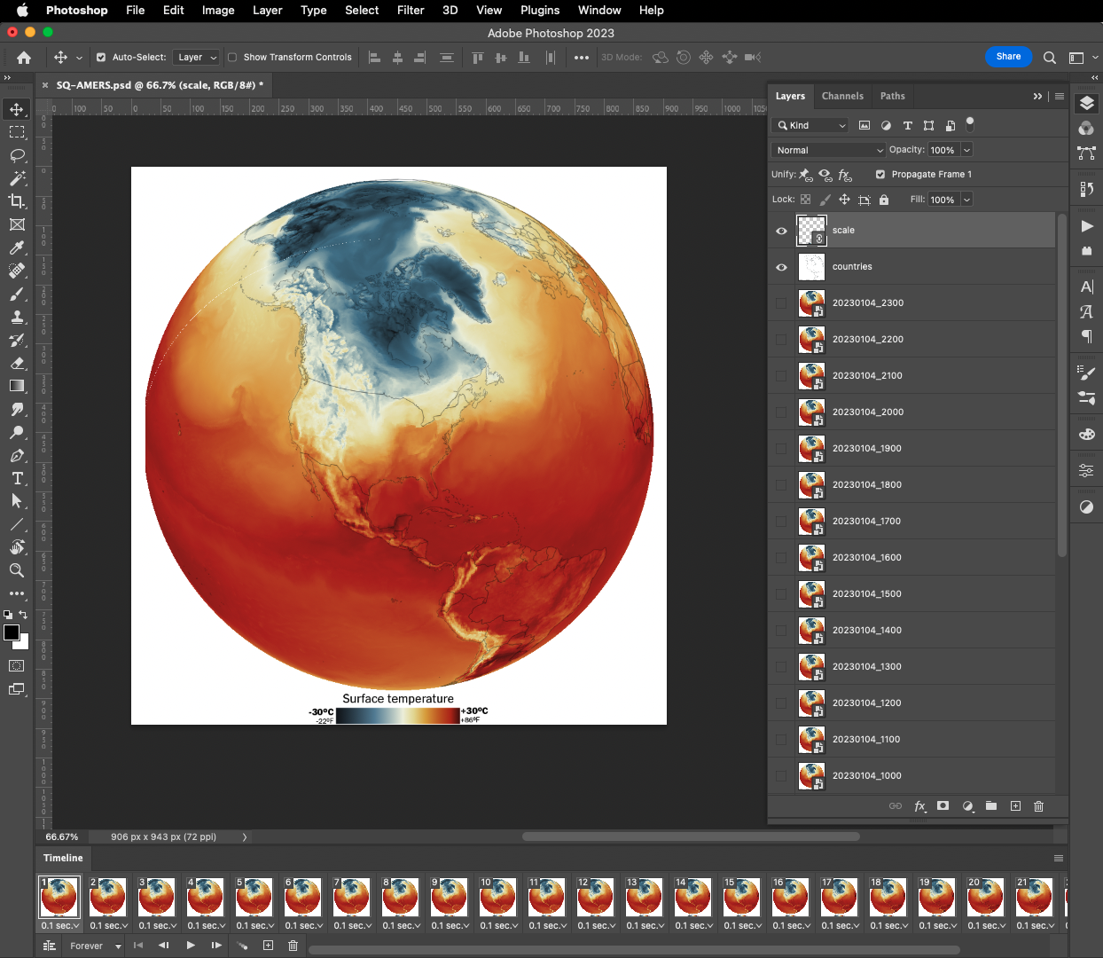
On my previous tutorial to visualize Organic Carbon, I used Adobe After effects to add the dates, you can use the same principle here, or using any other alternatives. For example, once you have the output files you can drop them all into photoshop. By going to the menu Window / Timeline you can add a frame animation, simply click the + icon in the timeline panel followed by turning one layer on at the time.
Adobe Photoshop frame animation.
If you are using Photoshop, pay attention to the order of the files, it should match the data dates from newest at the top to oldest at the bottom. Once you have you sequence ready, in the timeline panel menu, you will find a render option to export your animation as video, or you can create a gif animated by using the top menu File / Export / Save for Web or command + option + shift + s if you are on a mac.
Or something like this, if you have used the same data and ramp from this tutorial:
I love GMAO's data. This is yesterday's global temperature hourly averages. Note how the while the sun rises the surface temperatures create a "wave" from Brazil to North America #DataVisualizationpic.twitter.com/62CO1lMVdH
If any of this doesn’t make sense to you, or if you’re having trouble with a step, feel free to reach out to me on Twitteror MastodonI will be happy to hear from you.
Happy mapping!
Update
Using gdal to convert data to 180-180
Someone contacted me about this tutorial because they were having problems with the projection of the temperature data.
For some reason if your files are in 0-360 format instead of 180-180 you will usually see the globe aligned with the vector layers but not with the temperature rasters, which usually appears to the side in QGIS
If that’s happening to you, you may need to convert your data before dropping it into QGIS. Here’s a quick tip on how to fix that:
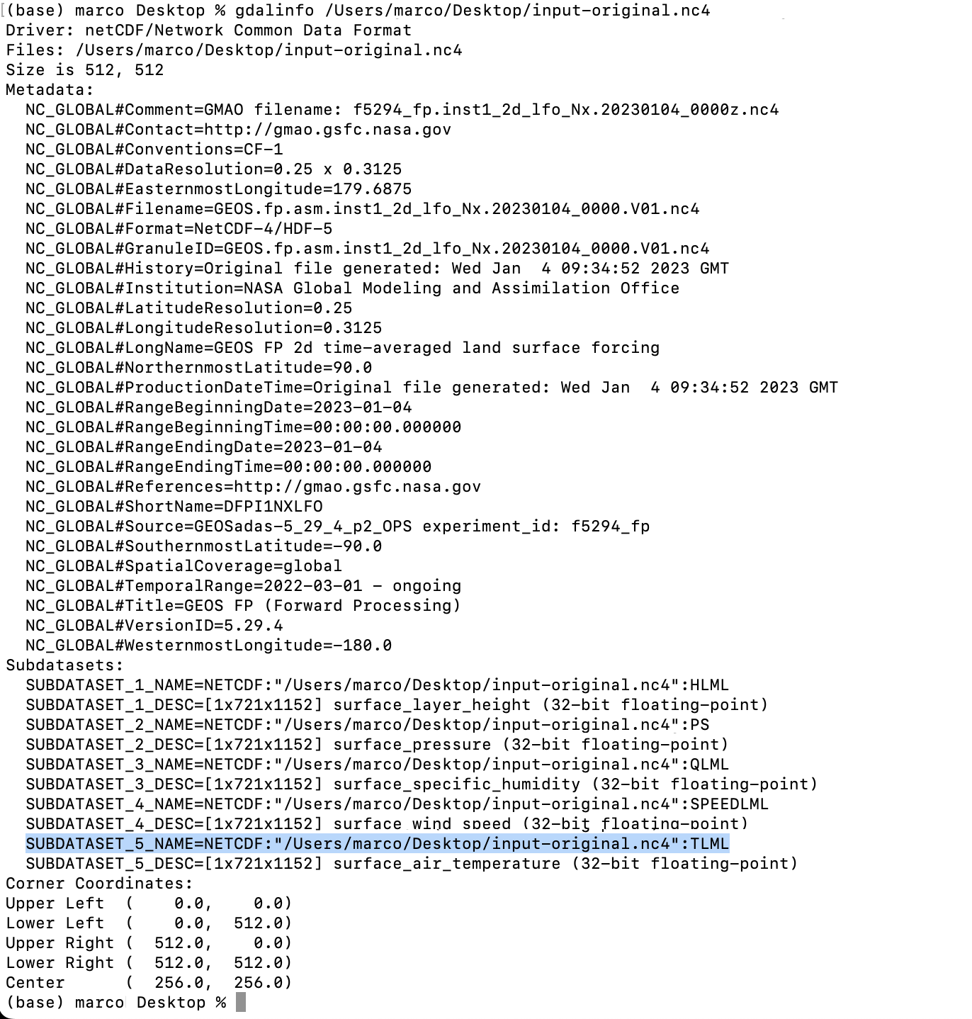
From your terminal window cd your folder like you did before, look for the directory where your temperature data is.
Type gdalinfo add an space and paste the file name it should look like this:
You will find the subdatasets. We are looking for TLML (temperatures) that highlight on blue above.
Gdal would help you to convert the data so you can use it, the command line looks like this:
***Note your file path will be different copy that from your terminal window (the blue highlight)
That will give you a new file in the directory of your choice (your/directory/output-filename.nc4) in this example there is a folder called directory inside a folder called your in which is the file called output-filename.nc4. Be careful when renaming files the dates are important to the animation process.
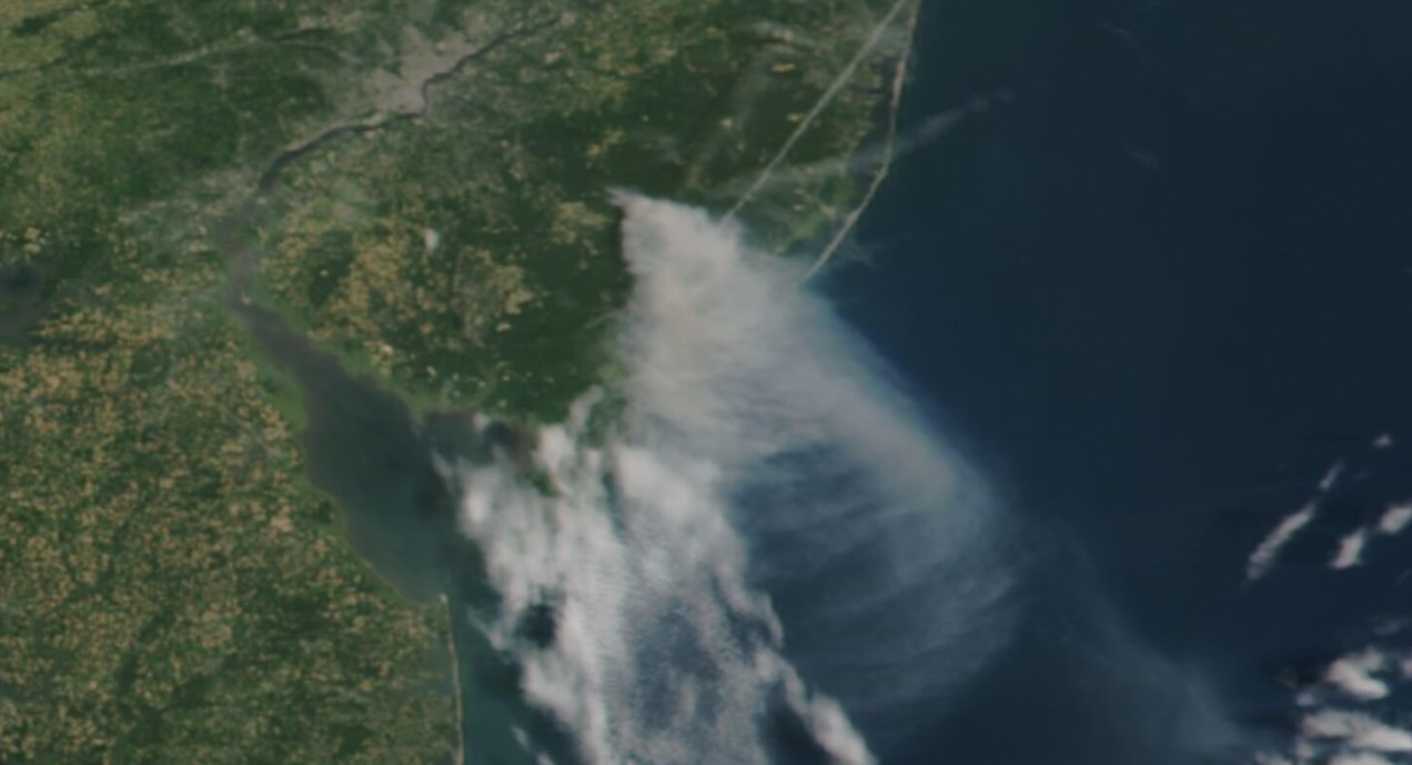
Long time ago someone on twitter ask me to do an explainer on how I did the “smoke” animations forthis Reuters piece. It has been a while since then, but maybe it would be useful for someone out there, even if that mean learning how NOT to do things.
Before continuing, to follow my guide and visualize organic carbon, you should be able to use your terminal window, QGIS and optional Adobe After Effects.
Organic carbon released into the atmosphere during the wildfires season in California in 2020
Let’s talk about this wonderful data first
NASA’s Global Modeling and Assimilation Office Research Site (GMAO) provides a number of models from different data sets, this is basically a collection of data from many different services processed for historical records or forecast models. This data works well for a global picture or continent level even, but maybe isn’t a good idea to use this data for a country level analysis, for those uses you may want to check other sources of the data instead of GMAO models, like MODIS for instance if you you are looking for similar data.
ORGANIC CARBON
There are a lot of different sets of products available at the GMAO servers, you can check details here, here and here. However for purposes of this practical guide, I’ll be focusing in the emissions of Organic Carbon which is stored into the tavg3_2d_aer_Nx set. That’s a GEOS5 FP 2d time-averaged primary aerosol diagnostics, which includes Organic Carbon Column mass density in the 38th band, there is some documentation available in this pdf. ( No worries if is this sounds too technical stay with me and keep going. )
A day of observations accounts for 8 files since this data is processed every 3 hours. This is great for animation because it would look smooth. Knowing that, let’s move to our guide.
Step 1. Get the data
The data is stored into this url. You can go into the folders and get all 8 files for each day manually if you like or get them with a command line using wget or curl into the terminal. You just need to know a little of the url structure:
GMAO organic carbon files and url structure
Create a folder to store your files with some name like data
Note that I have renamed the output ( -o ) with a shorter name. The file will go to your folder ready to use into GQIS. Of course you will need a few more files to run an animation. Remember that this data is available for every 3 hours daily, so you need to set the url and name for something like this:
01:30 AM >> 20220619_0130.V01.nc404:30 AM >> 20220619_0430.V01.nc407:30 AM >> 20220619_0730.V01.nc410:30 AM >> 20220619_1030.V01.nc401:30 PM >> 20220619_1330.V01.nc404:30 PM >> 20220619_1630.V01.nc407:30 PM >> 20220619_1930.V01.nc410:30 PM >> 20220619_2230.V01.nc4
Just create a text list with all the urls you need and run the script into the terminal window with the same process:
curl-O [URL1] -O [URL2]
Each file is usually about 120MB, if there’s something wrong with the data the file will be created anyway but would be an empty file of just a few KB. Do a day or two first and check, that’s 8-16 files, check them, if all looks good load a few more if you like.
Step 2. Loading the data
Once you have a nice folder with all the files you want, you can just drag and drop the .nc4 files into QGIS. We are looking for the 38th Band, OCCMASS which is our Organic Carbon Column mass:
QGIS prompt window when you drop one of the file in.
Once you have the data loaded, you want to set the data projection to WGS 84, this will enable the data layers to be re-projected later on. To do that, select all you data layers, right click on them, and select Layer CRS > Set Layer CRS > 4326. Be sure of selecting all the layers at once so you do this only one time. Otherwise you will need to doing over and over.
Data layers projection to WGS 84.
Since this is a good global data set, you may want to load a globe for reference, you can use your own custom projection, or use a plugin like globe builder:
Access Globe Builder from the plugins menu > Manage and Install > type: Globe.
Once installed, just run it from the little globe icon, or in the menu plugins > Globe builder > Build globe view. You have a few options there, play around with the center point lat/long. You will see that this data sets always have large concentrations of emissions in Africa, maybe that’s a great place to start. I’ll do a similar view to the California story for now.
Step 3. Styling your map
The color ramp is important, you want to have a data layer that can be overlayed in the base map, so you want to have white/black for the lower values and high contrast in the other end of the data, since we are working on white background I’m using white to black with yellow and brown stops. Check what are the highest values in your data set the style for on layer to something like this:
Number in the min/max will change depending on the highest values of your data and the style you want. This image is set for OCCMASS from June 19th, 2022, 4:30 pm.
Once you have the ideal color ramp for one layer, right click on that layer, go to Styles > Copy style. Then select all you carbon data layers, right click on them and select Styles > Paste Style.
Step 4. Preparing to export your map
You are almost done, by this point you can see how each data layer creates swirls in the atmosphere, maybe some evolution of it too just by toggling the layers visibility. I like to have all the layers well organized so you can quick check the data. I’m maybe a little too obsessive but I usually rename all layers and groups to something like this:
QGIS layers panel.
The name change works if you are using an automatic export of all layers, the script takes the name of the layer to save each file. But there are alternative ways to do this if you’re not as crazy as I am and don’t want to spend time manually renaming.
Step 5. Export your map
There are many ways of doing this, you can set up the time for each layer by using the temporal controller, there’s a good guide here. That way you can get a mp4 video right away from QGIS, but you need to set up each data layer time manually.
You can also use a little code to export each layer into an image, which you can then import into After Effects. To do that, the first step of course, is to get the script. Download the files HERE.
Now, go to the plugins menu at the top, there, you will see the Python console, go and click that, you will see this window popping-up:
Python console in QGIS.
Click the paper icon, then click the folder icon and select the python script you dowloaded above. Just be careful with the filePath option.
If you are on a mac, right click your output folder and hold the option key, that will allow you to copy the absolute path of you folder, paste that to replace the filePath field value (the green text in the image below). If you are on Windows, just make sure to get the absolute path and not a relative one.
I left some annotations on the script to better understand what each part is, it’s based on a script someone did with Vietnamese annotations, source and credit are in the drive link too.
Now just click the play button in the python console, seat back and look all the frames of your animation loading in the output folder you selected. You should see a file for each of your layers when the script finishes.
Step 6. Export your animation
Take all the files this into After Effects. First, add your carbon data as sequence (0001.png, 0002.png, 0003.png…), keep that in a sub-composition and use a multiply blend mode to overlay the layers, then add the countries/land and the optional halo.
Finally, in the drive folder you will see a .aep file, that’s a simple number animation to control dates, copy the text layer into your composition. You know when the data starts and when it ends, in the example is just 3 days 19-21, “June” is a different text layer, so add those numeric values to the keyframes into the text layer you have copied, and leave it at the very top:
Once you are all set, just export to media encoder to get you mp4 animation.
If any of this doesn’t make sense to you, or if you’re having trouble with a step, feel free to reach out to me on Twitter. I will be happy to hear from you.
That time of year has come once again, the best of the year in my opinion. All us is doing the list of the best of the year to give a glimpse of what 2021 was like and, of course, to give a final push to their stories as well. So, like last year, I want to do a quick rundown of my favourite details of the 2021 projects. Keep in mind the pieces in this entry are out of context and you may want to take a look into the full story for better understanding.
January: The amazing Amazon rainforest
The 2021 kicked off strongly, during the first month of the year I worked various projects including some breaking news. My favourite details of January was a small graphic part of the project titled “Jungle Lab”. The graphic itself isn’t a super complex visualisation, actually it’s just a simple illustration, but the message behind it is very powerful. It makes you realise the relevance of the virgin rainforest right away. I truly believe that our work on infographics is not about fancy effects but powerful messages to our readers.
Researchers soaked in sweat tore trees limb from limb, drilled into the soil and sprayed paint across tree trunks. It’s all in the name of science https://t.co/X4c6pfUUjJ via @jakespring
As I said before, January was a busy month. Here are some other details that I also enjoyed working on, mostly breaking news.
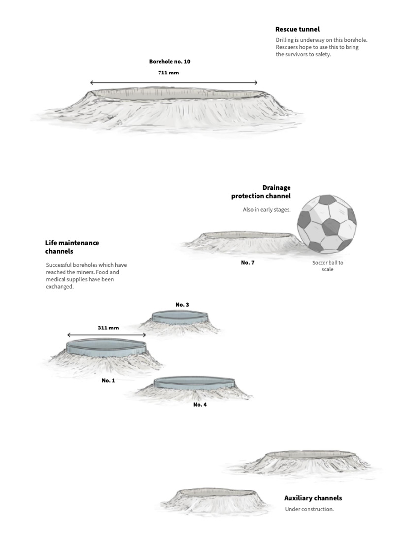
You may remember the story of miners who were trapped in a mine after an explosion in Northeast China [link here]. There’s a small graphic showing dimensions of the rescue shafts dug by rescuers, that’s something really difficult to imagine without a familiar reference.
Aside from the miners, you may also remember the tragic accident of the Indonesian flight SJ182 [link here]. I recon working with those bathymetric maps helped to explain why recovering the black boxes was a difficult operation. Also kind of shocking to see a few incidents of airplanes around the same area.
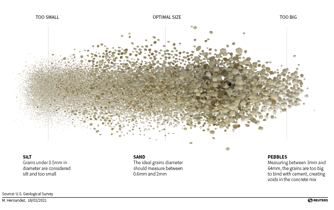
February: Sand.
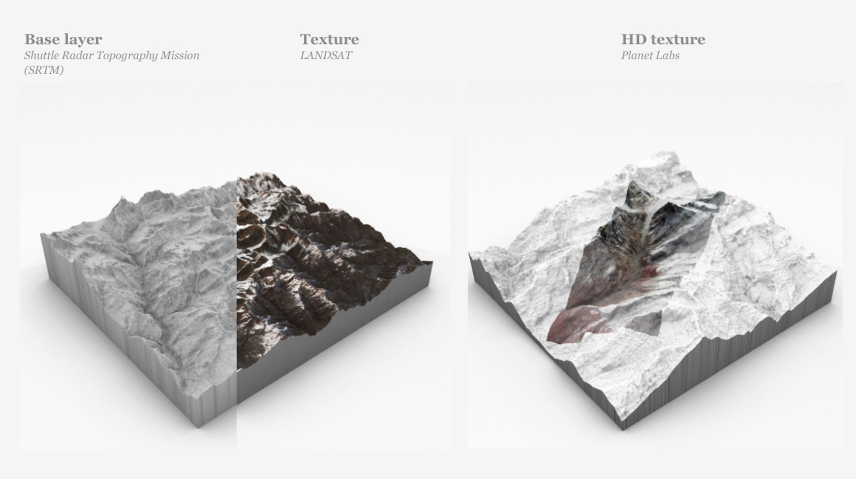
After a tight January, news continued to pop up everywhere, lots of stories with great potential for a visual project. I have the opportunity to do some experimentation with 3D assets using amazing high resolution images courtesy of Planet Labs. We created a detailed story of the massive landslide in India [link here]. Here’s also a short recording of the piece running in C4D: [Drive video].
However, a much larger project was published in February. For a long time we worked on a series of projects on a topic that impressed me. To be honest, I never thought about it before: Sand mining.
Sand mining and trade is a whole world itself, this commodity is unnoticed present in our daily lives. It have a dark side of illegal trafficking and mafias too and even it have sparked diplomatic issues for some countries.
But one key thing that came to mind when I started working on this was this: Why we don’t use desert sand to feed our huge demand? There’s plenty of it!
Well… the explanation is a little more complex, but in short, desert sand grains are too small and rounded. That is why we are dredging rivers, digging abysses in mountains and making beaches disappear.
Sand is the planet’s most mined material, with some 50 billion tons extracted from lakes, riverbeds, coastlines and deltas each year, according to the United Nations Environment Programme. Per person, that’s more than an elephant’s weight in sand. (2/7) pic.twitter.com/ykk9nBqDAe
2021 broke some records with extreme weather events, in fact I did an entry here about a 2021 failed project on floods. You probably remember the floods in Germany and China, but there were many more events like that throughout the year.
In March, eastern Australia suffered what the Australian government called the worst flooding in 60 years. That week I was working in a daily-graphics shift, so I did a quick small map to visualise the event, here’s a small part of the graphic:
Also in March, I did a small collaboration on the nice project “Bats and the Origin of Outbreaks”. I really enjoyed working on that piece in every aspect, from the story angle to the opportunity to work with a custom style. You may also want to take a look at that piece:
According to the latest report from the WHO's Joint Mission, the intermediate host which passed the novel #coronavirus from 🦇 bats to🧍humans is still to be identified. Here we explain zoonotic viruses and why bats carry so many of them. #COVID19https://t.co/b4Sc2fauOU
April surprised us with a breaking news story, the Le Soufriere volcano violently covered St. Vicent island in ash, devastating the island infrastructure and prompting a sea and land evacuation of thousands of residents. It also released emissions at spectacular heights into the atmosphere. It was like the omen of a year full of massive volcanic eruptions around the world.
I collaborated in the story with different pieces, but my favourite piece was Simon’s map showing buildings, shelters and risk areas among others. Here is a small detail of that map:
Explaining the series of eruptions from #LaSoufrière which have devastated St Vincent's infrastructure and prompted a sea and land evacuation of thousands of residents. #StVincenthttps://t.co/AbMEFswvGw
One other frequent topic on my daily work this year was space exploration. I did a good amount of small pieces on telescopes, comets, asteroids and spacecraft.
May saw the landing of the Martian explorer ‘Tianwen-1’ develop and successfully landed in the red planet by the Chinese. Here is a little detail of that graphic:
June: Olympics.
My favourite from June was the singular Olympic sports story. Can’t imagine the adrenaline rush of a 200m obstacle swimming competition. Jumping over boats and diving again to be the fastest hurdle swimmer of all times, they sure had a lot of fun there.
Here’s a small diagram of the course of the Paris games of the year 1900:
There are many disciplines and events long forgotten by today’s generation of Olympic spectators. Here's a look at some of the most interesting and obscure events that did not stand the test of time and no longer feature in the #Olympicshttps://t.co/U0k69vLirDpic.twitter.com/E7OvMBtml0
By mid year the news put me back thinking in the outer space. The Hubble Telescope was literally an eye-opening for the scientific community and for all of us in general. Even more so if you stop to think that this magnificent achievement of science was designed with technology from the 80’s. I can’t believe how the old computer from the 80’s still worked there. Here’s a small detail from a daily basis graphic that explains where the telescope problem was. ( The 80’s computer SIC&DH )
This 2021, I spent a little more time making small single-day graphics. I enjoyed the small break from big projects, and the quick and intensive research part you have to do to get it done in a single day. However, I think the best part was going back to the long-medium term projects that were almost done to finish them, with my mind clear and fresh.
August: Wildfires & aircraft data
August was a very busy month too. One of my favourite pieces was this sad new record: For the first time in the records, smoke from the fires reached the north pole. Check out the graphics thread below. There’s a third graphic in that thread, click on it if you want to see some temperature records too:
The second part of the month was infused with the chaos surrounding the US departure from Afghanistan. We did a few pieces on this, overall my favourite was the spaghetti drawn by the aircraft around the airport. It’s really cool how when you are digging into the data many stories pop up, and often many questions more.
When Afghanistan’s government collapsed and the Taliban began to roll into Kabul, a huge multinational evacuation began. Here is a look at what is flying and what they might be up to:https://t.co/pLKk5XPVSj
Like what happened to me this year with the sand, there are things that you never expect to be so interesting. Ice is more than frozen water, ice cores are cool stuff. These things can help to retrieve ancient records, they are like windows to the past of our planet. On September we published this story about that.
The sad part is that we are loosing those records due global warming, and it’s not slowly loosing them, it happens at freaking vertiginous fast speed. The graphic above shows the average of how much ice melts in the world EVERY DAY! The amount is equivalent of placing a gigantic 273m-high ice cube in NY’s Central Park.
Ice provides historical records about climate cycles, and as #glaciers melt, scientists are working to collect ice cores from them before it's too late. Learn more @Reuters: https://t.co/bLtLzpClBo.
The forests stories returned in October. This project took many days of 3D scene testing, hundreds of calculations to put thousands upon thousands of trees in place, modelling objects and illuminating leaves to show how quickly we are removing the things that are keeping us alive. We are nuts isn’t?
Not just ice, but we are also losing trees on an incredible rate. On average, 67,000sqm of rainforest is lost EVERY MINUTE. The following video begins at ground level, right in front of 3 people and a logging tractor, all to scale. In order to see the portion of the forest that we lose, you see people and tractors as ants.
There were also other quick projects on this month, one of them was the story of the Chinese incursions on the Taiwanese ADIZ. Since then, many more events had happened and tensions only continued to escalate between both sides. Thinking about the region that has been my home for so many years, I hope this doesn’t go any further. Unfortunately, there are always chances that this will get out of control.
India is a very particular place. During the last months of each year, northern cities are suffocated by pollution trapped at the foot of the Himalayas. There are many reasons behind this such as seasonal crop fires, fireworks celebrations, and many others. However, southern cities avoid polluted skies. That was the subject of a one-day quick map, here’s a detail of it:
December: spin, spin and throw it.
Back to outer space news! …or kind of.
Near the end of last month (Nov.) I was working in one more of those small pieces for the daily basis. This time my mind blowed up with this idea of launching things into space without rockets.
The idea is to spin a projectile in a vacuum chamber, gain momentum, and propel it into orbit around the Earth. I imagine something like throwing a hammer at the Olympics, but on an enormous scale. Here is a small detail of the graphic in mention:
My 2021 list of graphics
Just a few days more of the 2021 are left, so many stories have crossed under my Wacom and keyboard, it was a great year. Hope you enjoyed this sneak pick of all the stuff I worked on over the year. I hope you also considered visiting the stories mentioned, just hit the link at the end of each month’s entry to get a better context of each of the details highlighted here.
2021 was a great year, I’m very grateful to Reuters for all the good things, also to my teammates, for everything we did together and how much I learned. There is no better way to say goodbye to this year.
Rendered view of the World rank of rule of law 2016
This is a project based in data of the “World Justice Project Rule Of Law Index, 2016″ by the SCMP infographics team. Our goal was to show the information in a simply visual interactive tool, to give our readers also a perspective of Hong Kong and the world overview.
This was a very fast-build graphic, the idea was to show the world rank moving up and down from the last year to this year and also a visual report of each country/region.
Country report assets. The graphic is generated by json data thought js, this svg assets are rotated, scaled and positioned according the country data.
This graphic is a combination of css, svg, js, and json data. But only uses 8 files of a simply vector shape, so load very fast. The main idea was to give a comparison tool, to view the countries of interest side-by-side but also their position related to other countries in the region, that is the irregular shape, according to the scale, the average of each of the 7 regions is added via js to every country.
Seven region average index layers
The graphics evolved to an more effective visual representation, in my work is usual to create at less five previous concepts, from data reports like excel pivot tables to paper concepts and finally to vector graphics. The most effective way to show the data, some times come on the fifth or seventh iteration, but is the best way to create some informative and usable infographic.
Early concepts for the Rule of Law global index
Also, maybe thats the reason of some mistakes in the data, text or color codes in this images, the building up of this graphics always have the main ideas to guide the next versions, so it needs the text and visuals in more than simply Lorem Ipsum