Back in 2013, I start as a lecturer of information design at the Science and Arts University from Costa Rica. Many students come to my class, more than a hundred of them went their way after receiving an initiation into the world of infographics and data visualization.
I enjoyed a lot the experience to share knowledge, but the time to move on has come. I will be focus in the finish of other personal projects as a collection of infographics from places and native things in my town, and also the finishing and publishing of my book about infographics.
As a closure of this period, I want to make a tour for the results of work of my students, starting in 2013, the results of the fist class:
In 2013, I try to make some conclusions about my class to improve it, with all the data collected I made this pieces:
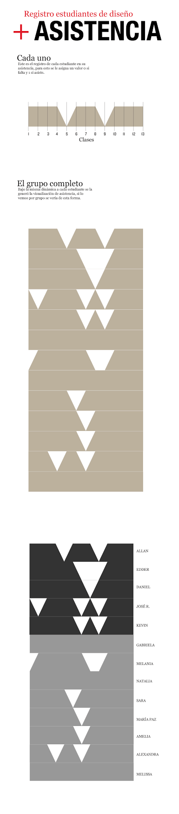
Students attendance individually records
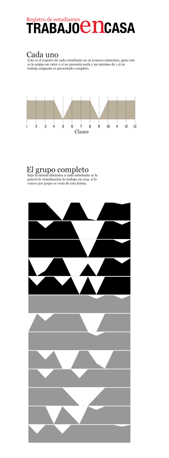
Homework records
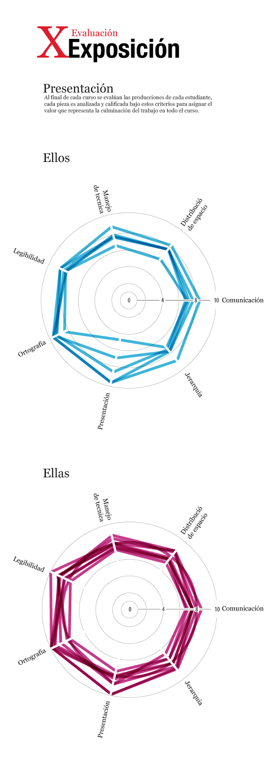
This was the final report about their performance in my class
Here is the full story at visual744 (use chrome for translation)
http://visual744.blogspot.com/2013/04/xx-vs-xy.html
Late in 2013, I published some highlighted works of students, many of them find a new passion in infographics design, they enjoy all the process from the research, write, sketch, design, and publish. Here is some works, and also the full story of the projects (also in spanish) http://visual744.blogspot.com/2013/12/una-nueva-camada-de-visualizadores.html
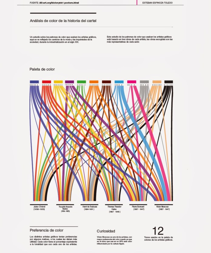
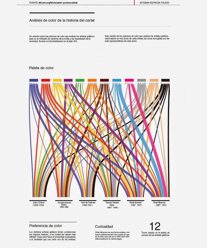
The color palette poster artist, infographic by Esteban Espinoza.
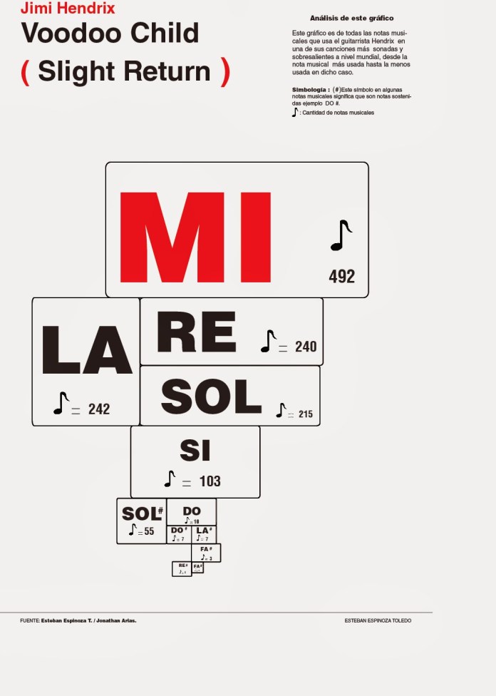
Voodoo Child, infographic by Esteban Espinoza.
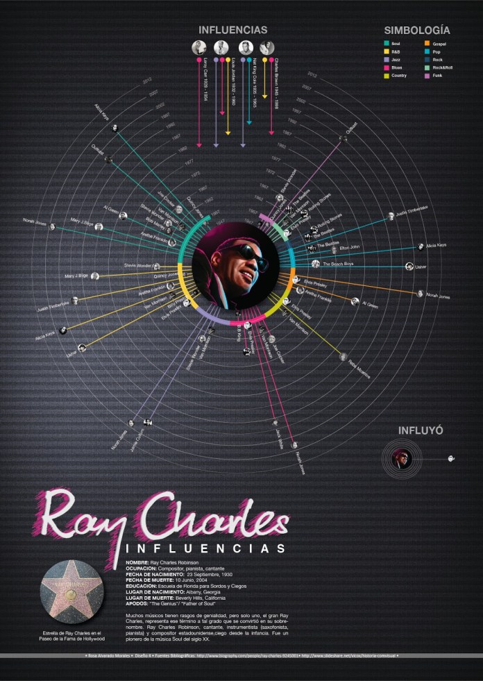
Ray Charles influences, infographic by Rosa Alvarado.
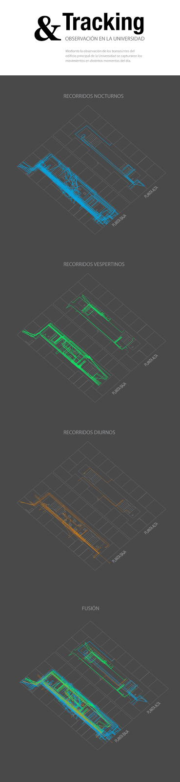
The 2013 was ended, and the new year comes with new ideas, I made always different topics to investigate and develop projects at the University, and thats why in the early 2014 my students was started to collect data on field, to visualice it, beyond just make a research. The first class of 2014 worked with data tracking and field research.
This is the full story abuot: http://visual744.blogspot.com/2014/04/visualizacion-indoor.html
Also in 2014, but in the next cycle of my class, the topics change again, this time the main focus was isometric structures of historic buildings from Costa Rica, and a little complement in data-viz about the posters artist.
The full story about this period: http://visual744.blogspot.com/2014/08/ciclo-ii-2014-en-la-universidad-de-las.html
And some works also:
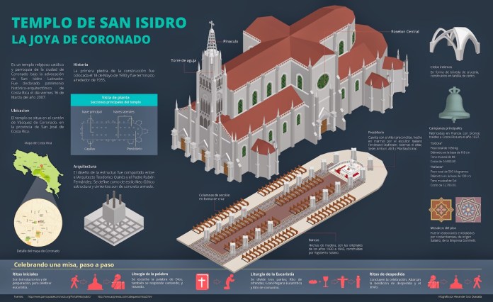
The church of Coronado, infographic Alexander Soto.
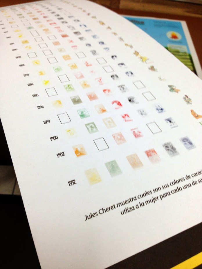
Detail: Analysis of the work of Cheret. Infographic: Daniela Rojas.
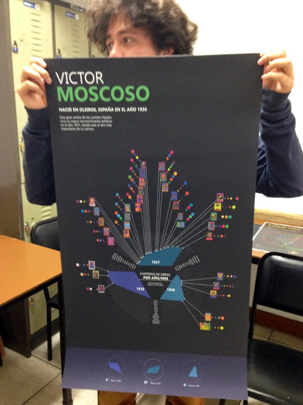
Displaying the work of Victor Moscoso. Nohelia Mora infographic.
For the 2015, the first class start with a dataviz project about the things in the moon, tons of data about spacecrafts, natural features and some other stuff related.
Every cycle of my class contains at less 3 projects, but many time the students have nice results on one o two of these, not because a skill thing I suppose, it is more a issue related in time to dedicate between my class and the other things that they are doing.
Here is some works and the link in visual744 with all details http://visual744.blogspot.com/2015/04/un-ciclo-mas-de-dataviz.html
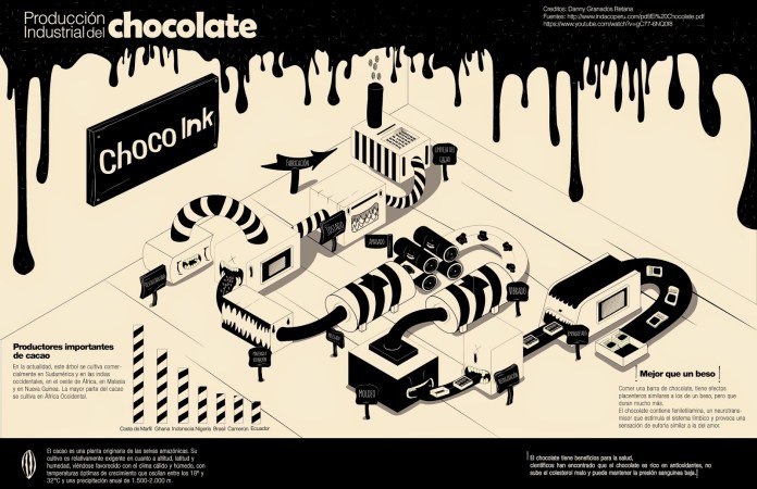
The chocolate factory. Infographic by Danny Granados. Universidad de las Ciencias y el Arte, Abril 2015.
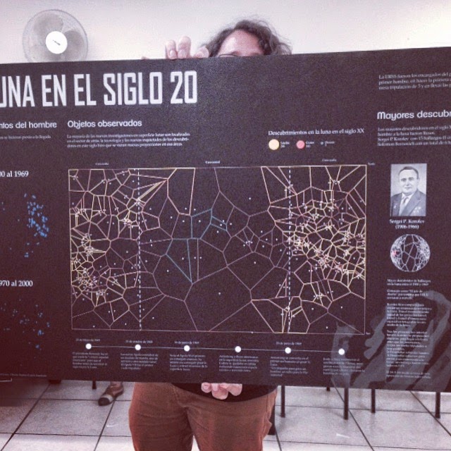
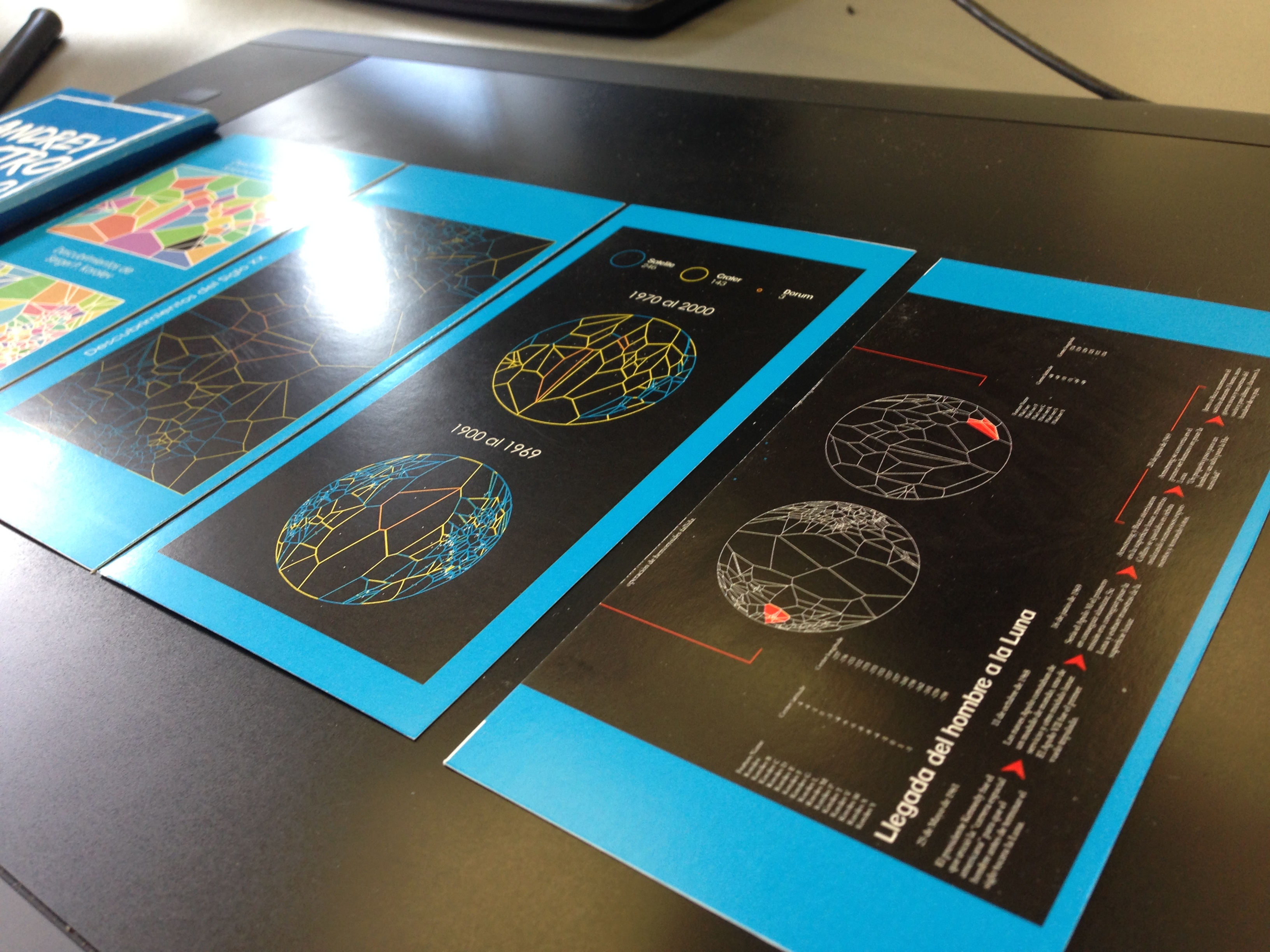
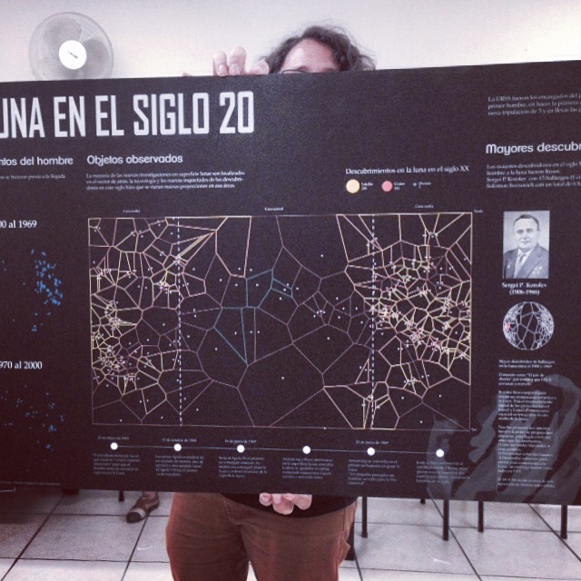
The moon in the 20th century, infographic by Andrey Castro, information design student. University of Science and Arts, in April 2015.

Detail of the Andrey Castro daily work, for his project “The Moon in the 20th century” University of Science and Arts, in April 2015.
The next cycle of my class was dedicated to visualice classic books and the process of some systems inside the human body, in 2015 the students show some nice graphics also, take a look in to the full story here: http://visual744.blogspot.com/2015/08/ds4-agosto.html
And off course, here is some of they spotted works:
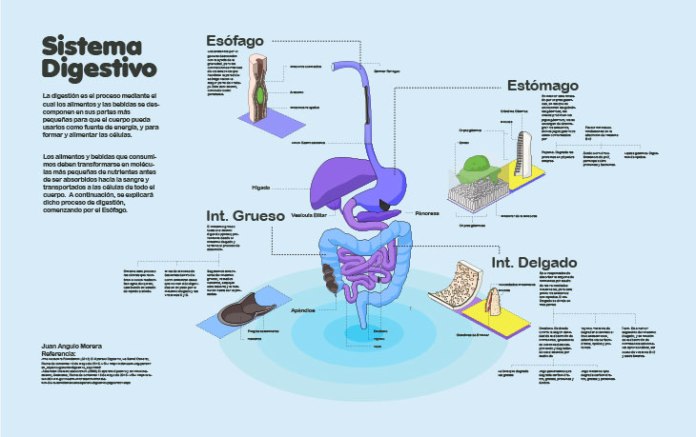
The digestive system. Project 1. infographic by Juan Angulo.
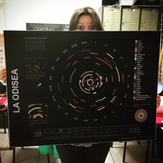
Homer’s Odyssey, Project 2. infographic by Inger Araya
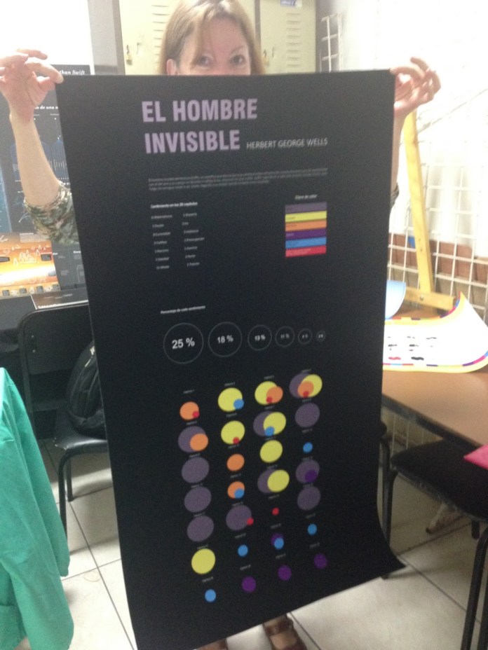
The Invisible Man, Project 2. Infographic by Indira Cascante
The 2015 was concluded with an new project of extra points, the last class of the year have the chance to make analogous weekly vizualizations in a half letter cardboard, they also made the classic 3 projects, and also gives nice results, here is the story http://visual744.blogspot.com/2015/12/introduccion-al-diseno-de-informacion.html and some projects:
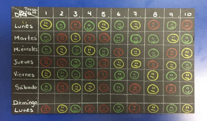
The response of an strange to a smile of me on a week. Social project for extra points by Kristel Mora.
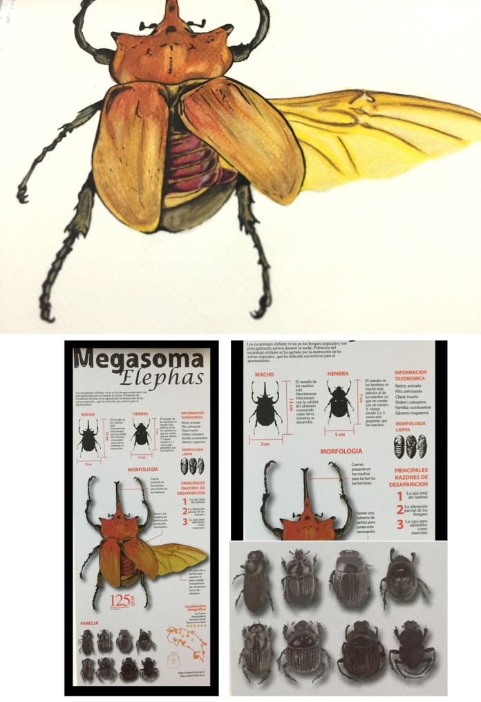
The Megasoma Elephas. infographic by Pablo Soto.
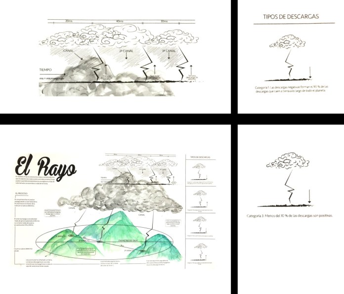
where the lightning comes from? infographic by Kevin Salazar
Finally, the last week my students present the results of the first cycle of the 2016, the first for the year and last for me. I hope these years in the classrooms of the University have been of benefit to all who crossed their training with my participation period of this wonderful experience of my life. I hope that at some point after finishing my projects I can share again with future professionals in this or another university and follow them sharing the passion for infographics.
Last night, from simply analogous 5inches #graphics to 80inches #infographics from my students of information design pic.twitter.com/aaZHquigMs
— Marco Hernandez (@TmarcoH) April 15, 2016
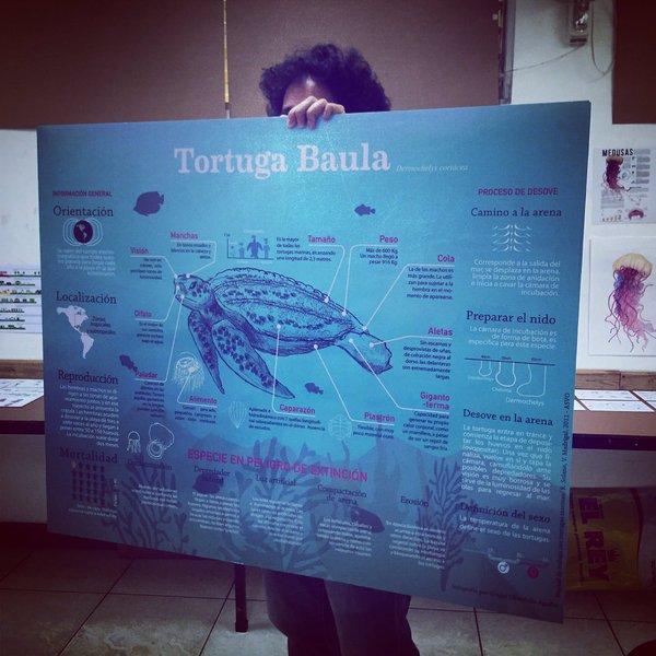
The Baula turtle. Infographic by Ginger Chinchilla