Every November map makers from all over the world join the challenge to create maps from a common thematic. The list of prompts is posted few weeks earlier in October I think. The initiative is similar to inktober, same idea but doing illustration which happens (yes, you guessed it) in October.
Both are things I’ve follow all the time and really enjoy; however, I never had the courage to join either for one simple reason: my obsession with commitments.
I love the work the creators do for both initiatives; I deeply admire people who can take one of these opportunities and successfully made it.
In October I told my family that I was thinking of joining this year’s map challenge. My son and wife saw me and said, “Okay, how many maps do you have already?” to which I enthusiastically replied, “One… maybe”. They know my obsessions so well that no more words were required.
😒
After a laugh, I told them I was worried about starting something like this because if I didn’t finish it, I’d be stressed. The days went on, and when November arrived, I didn’t have many more maps, so my attempt to join the maps celebration turned into one more episode of Infofails. And then here’s how it happened:
Day 1
The excitement was through the roof; my plan was to create a different styles for each map, I could also work on a different region with each day theme… Yeah, what a wonderful plan.
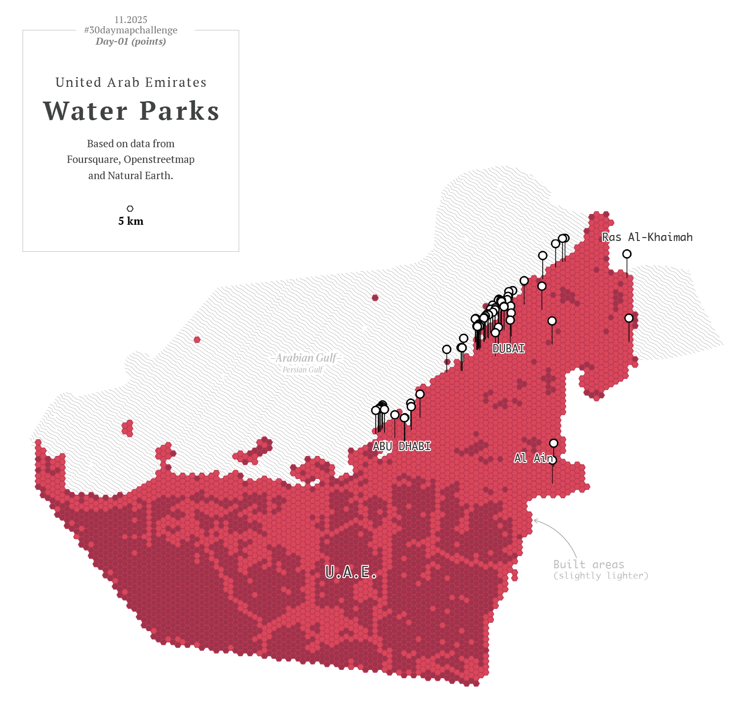
To kicked off, I went with a in minimalistic vector style, maybe places in the middle east? –I thought– So, I downloaded data points using the QGIS geoparquet plugin and set out to funny thematics.

Day 2
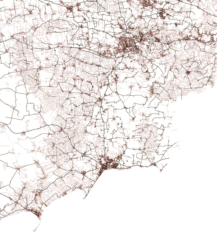
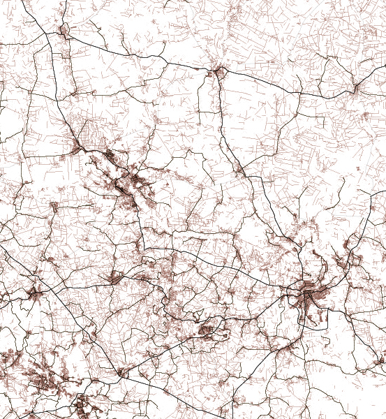
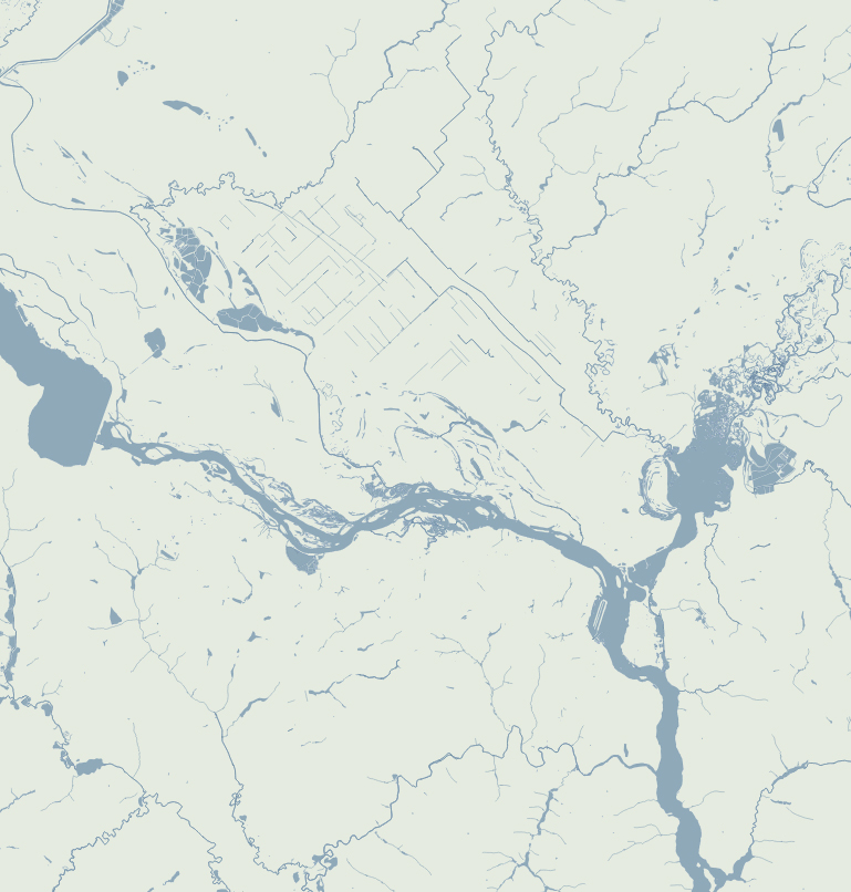
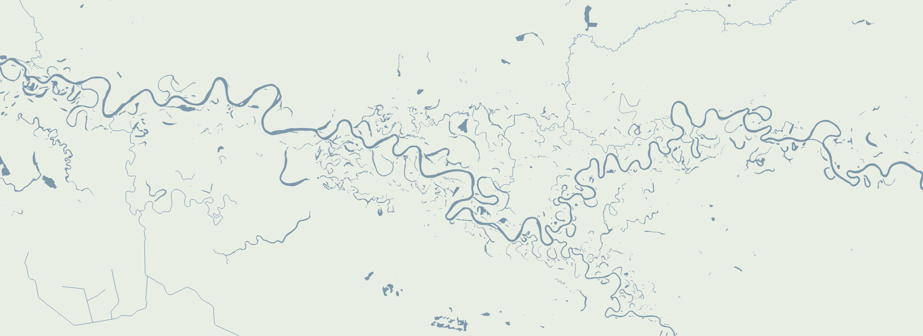
Second day theme was lines, so what about visualizing trains network in NYC? Here’s what I ended-up with:
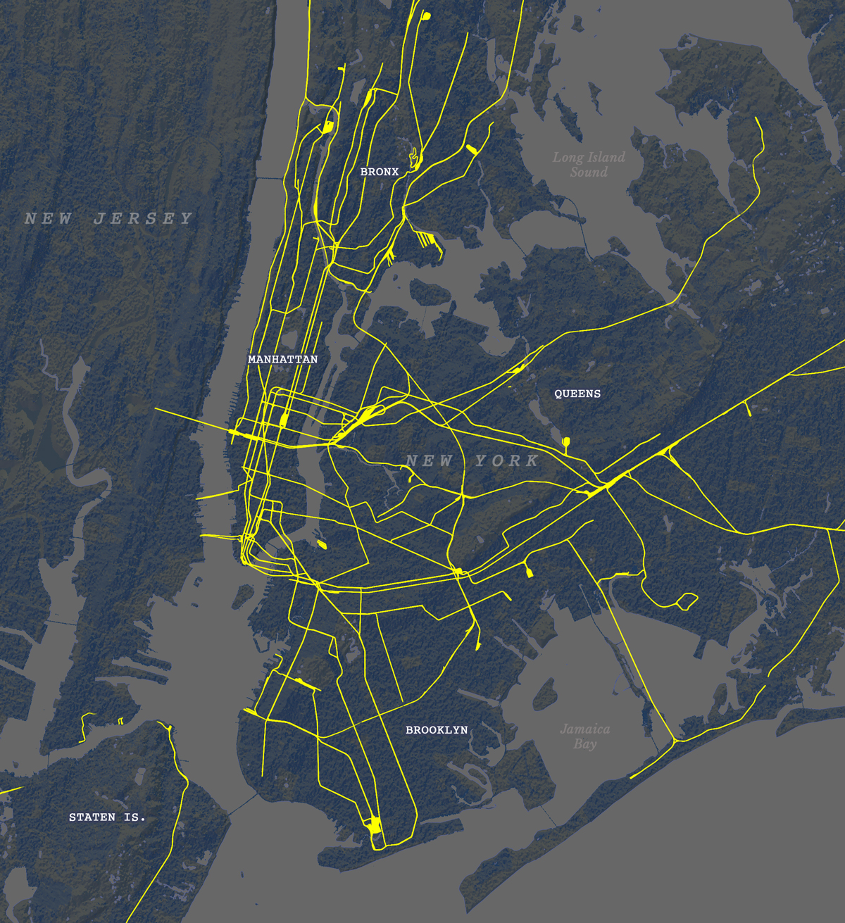
But then, just like in cartoons, that little voice over my shoulder started saying: Don’t you think this wants to experiment a little with animation? Nothing complicated, perhaps one of the things you already have installed like MMQGIS… And so everything began to go off the rails.
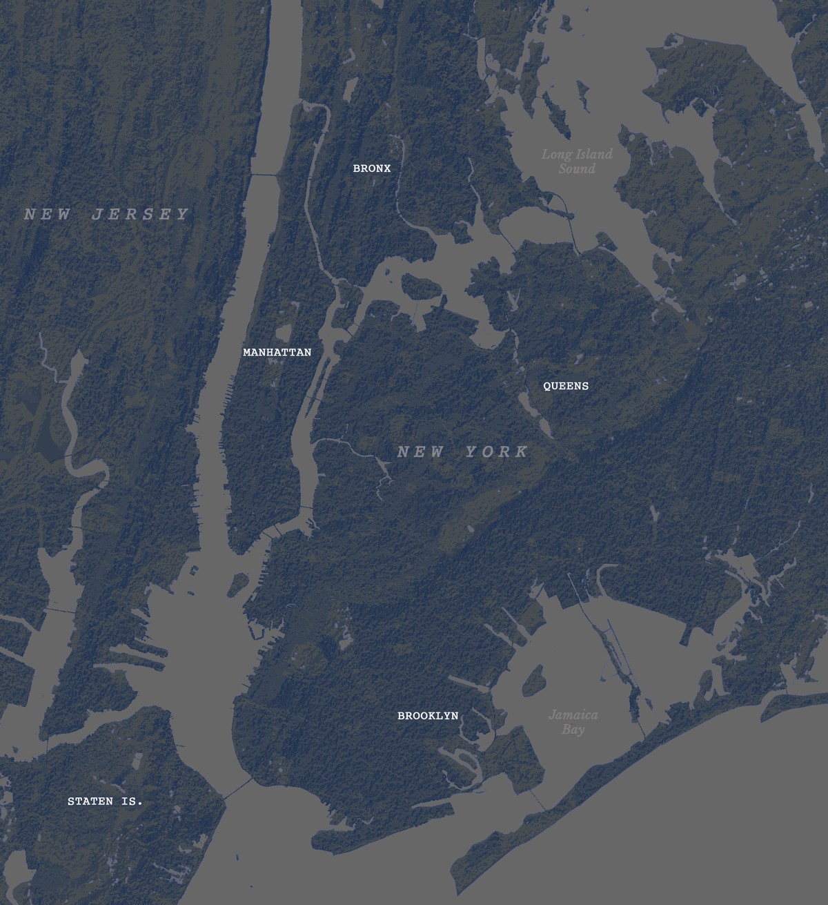
Day 2 (take 2)
I turned that static map into a sequence of images using MMQGIS. With not much sense actually, but who cares? It’s all about having fun, isn’t?
Day 1 (take 2)
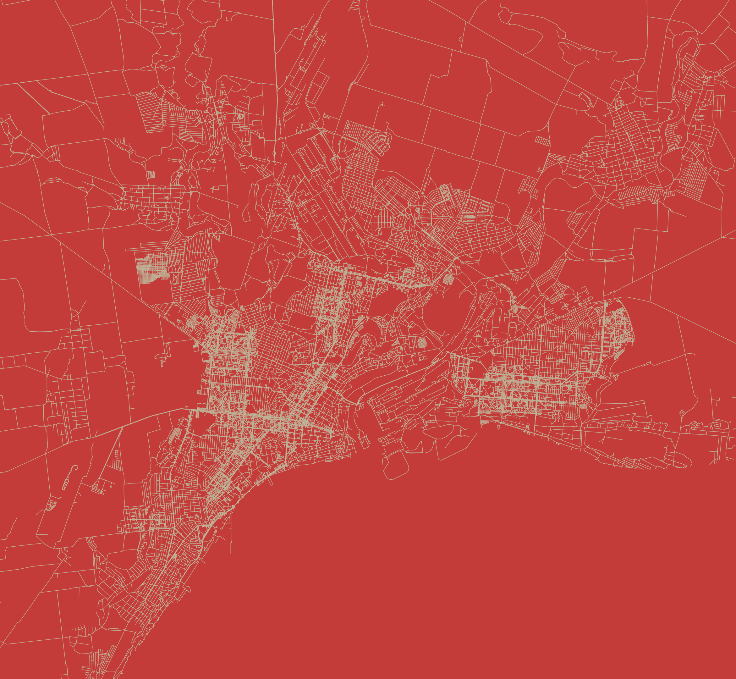
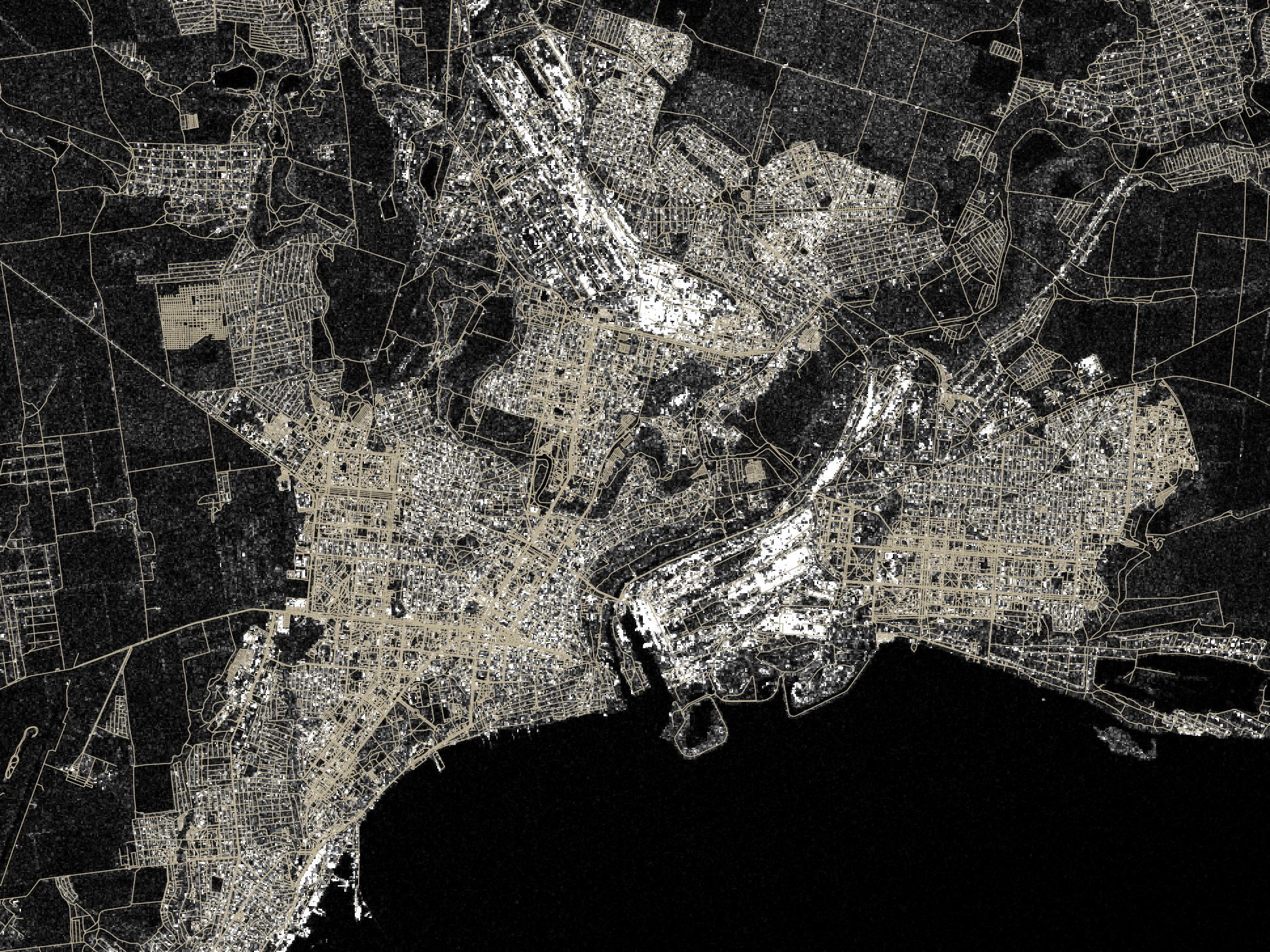
Then I thought, hey, I also have more points showing other things for that one map of the UAE, what if I revisit day one as well? So instead of having one map for day one and one for day two, I had 20 frames for the NY trains, and 12 maps of the UAE showing different things. Here you have some of those maps showing fun stuff:
Okay, no problem, there’s still plenty of time, I thought. Yes, of course, I’ll keep my anxiety quiet and make it simple with the others.
Day 3
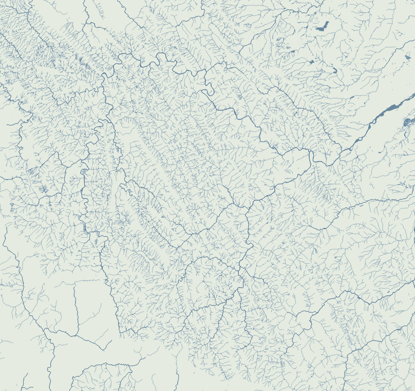
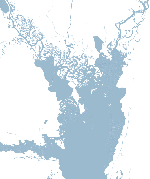
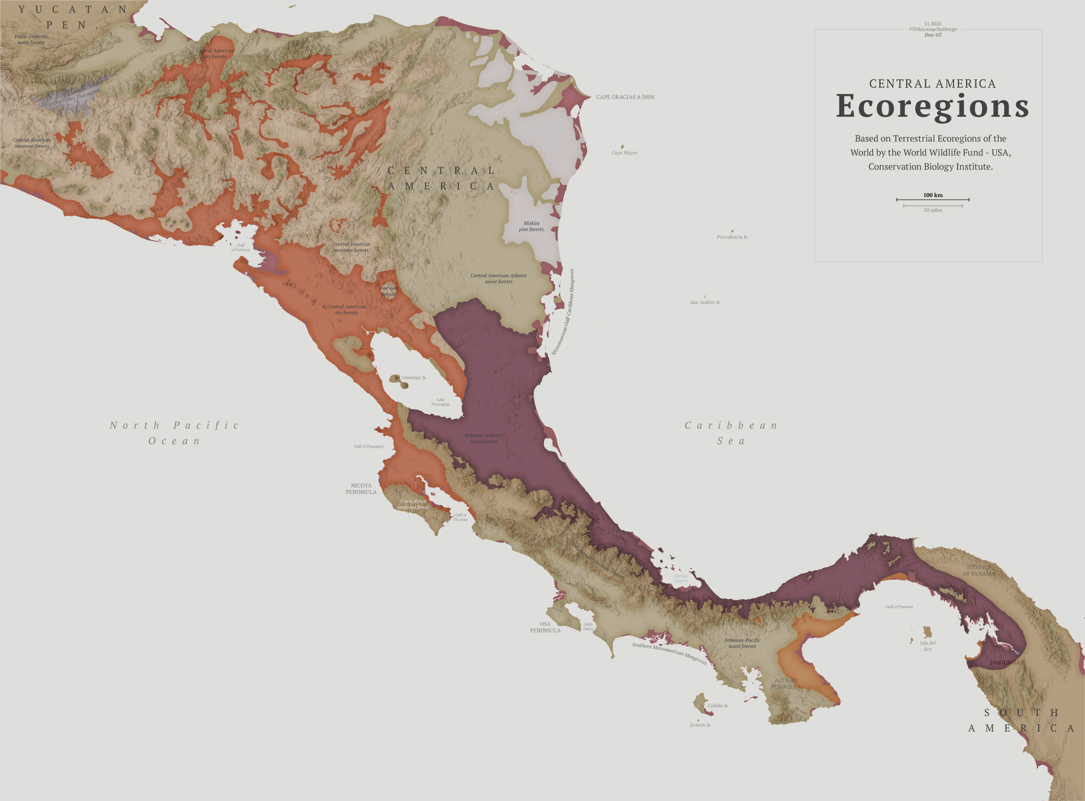
The next challenge was about polygons, so I chose to explore the biodiversity of Central America.
I think learning things is the fun part of doing these maps. To explore biological diversity the Conservation Biology Institute offers a great dataset. I actually learned about a thornscrub area in Guatemala that I didn’t know about before.
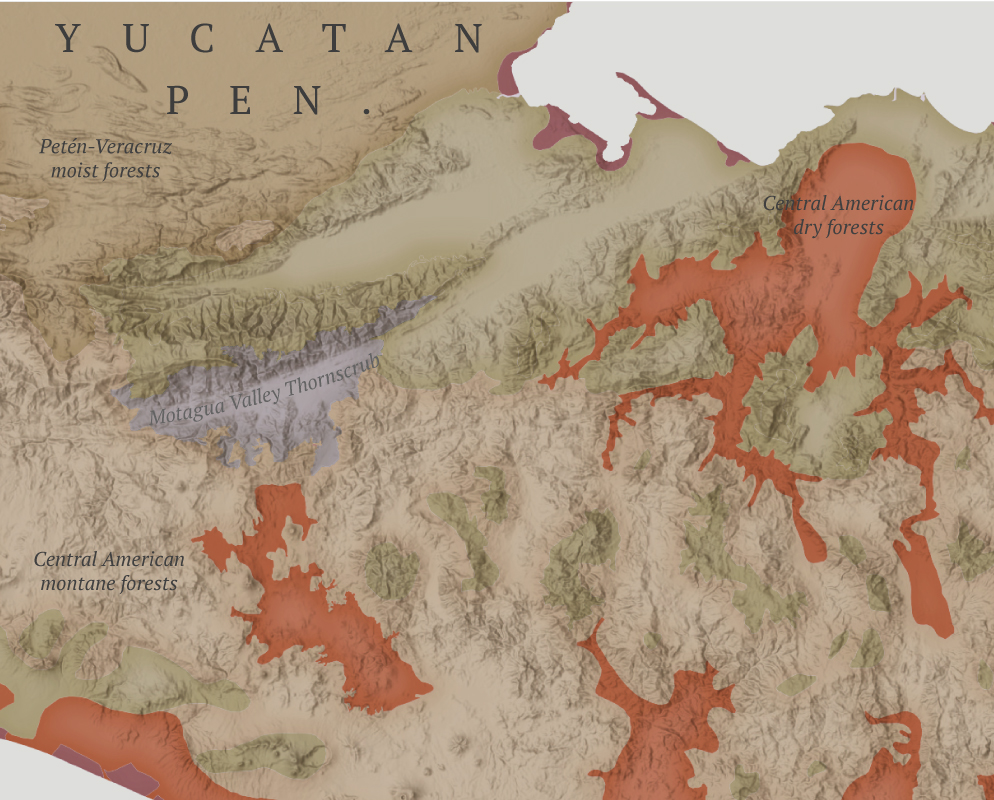
After pushing the limits a bit too much in the previous two maps, I kept this one pretty straightforward. Perhaps the #30daymapchallenge is about doing simple things that don’t require you to spend days and days searching for something.
Day 4
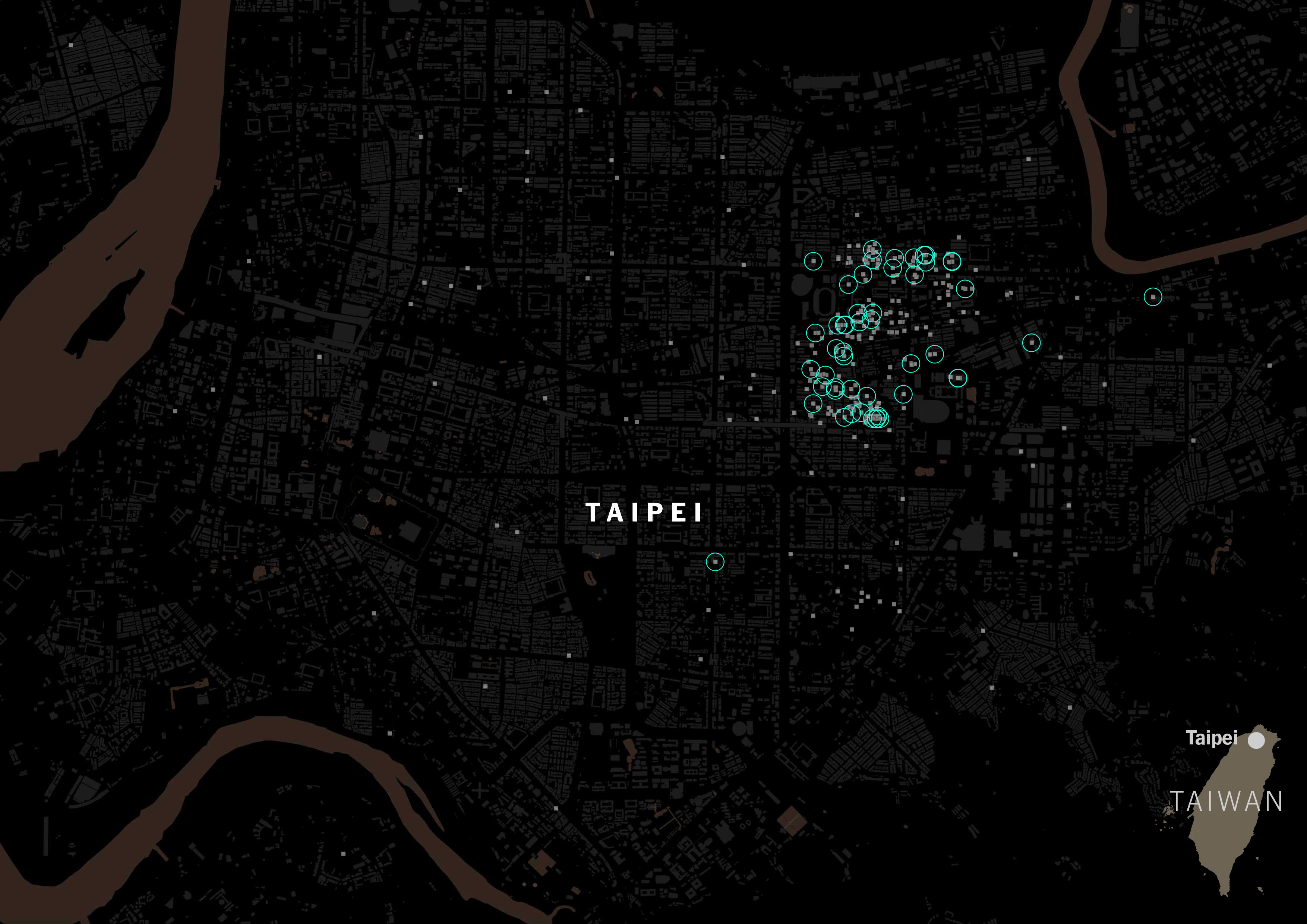
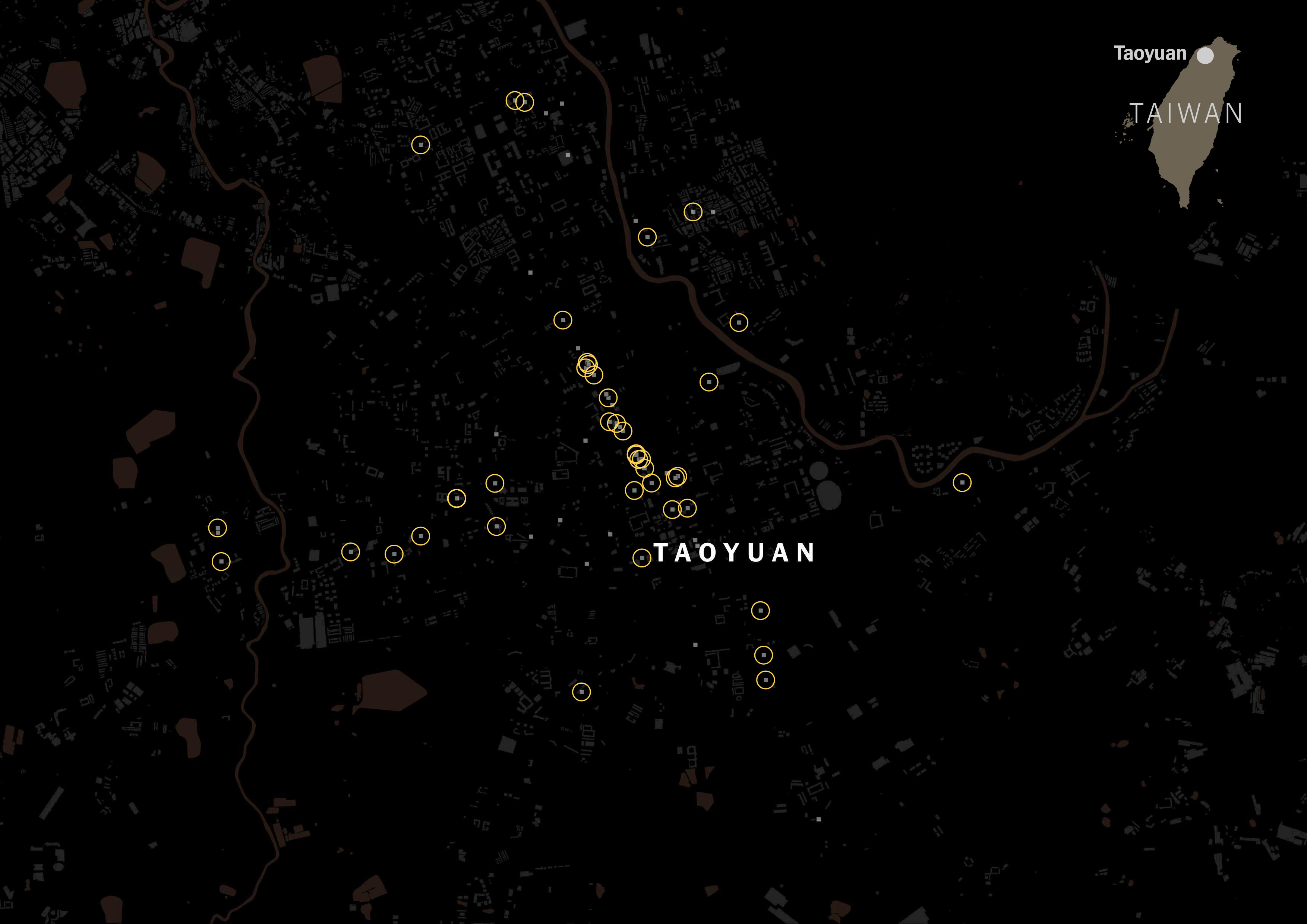
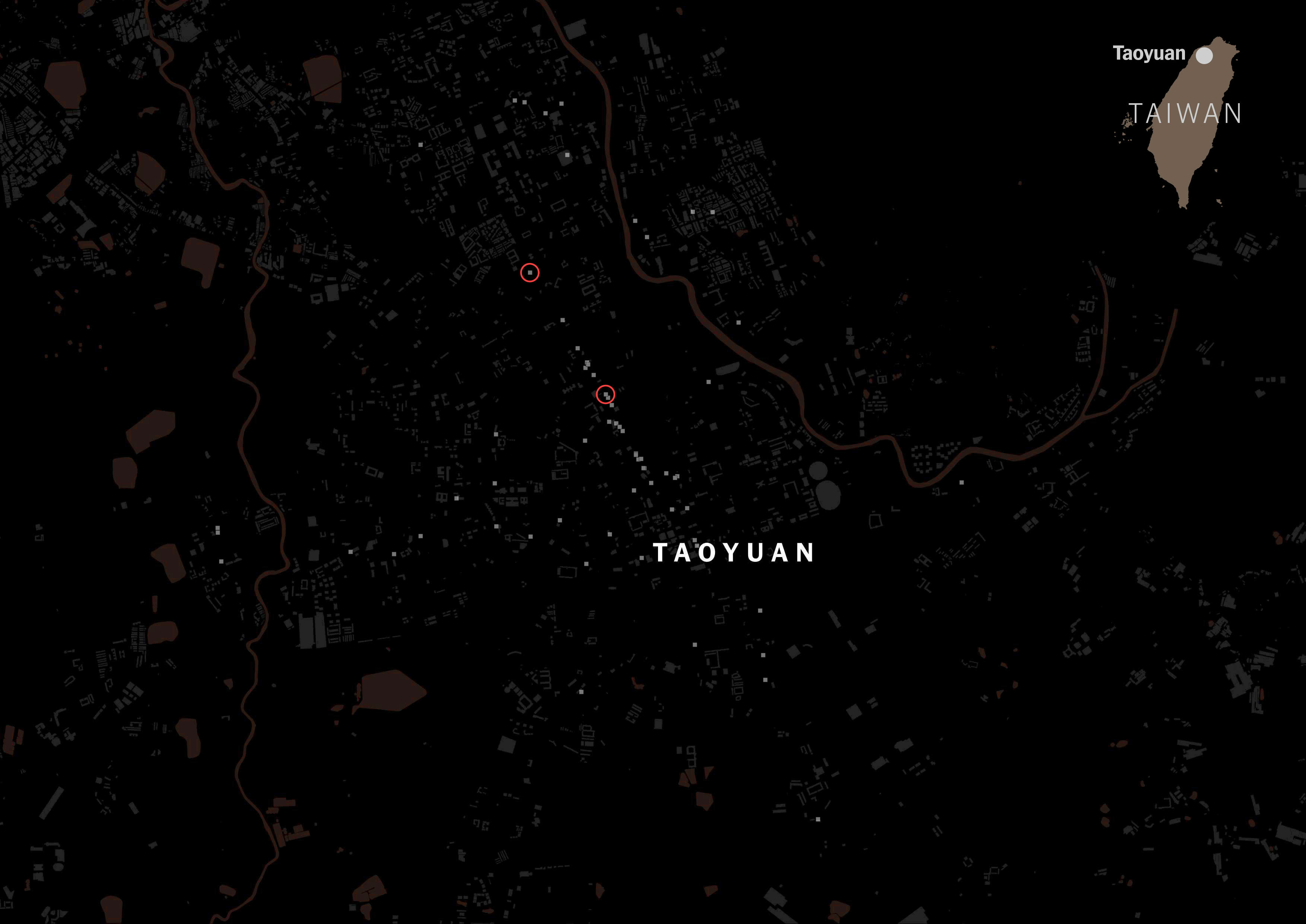
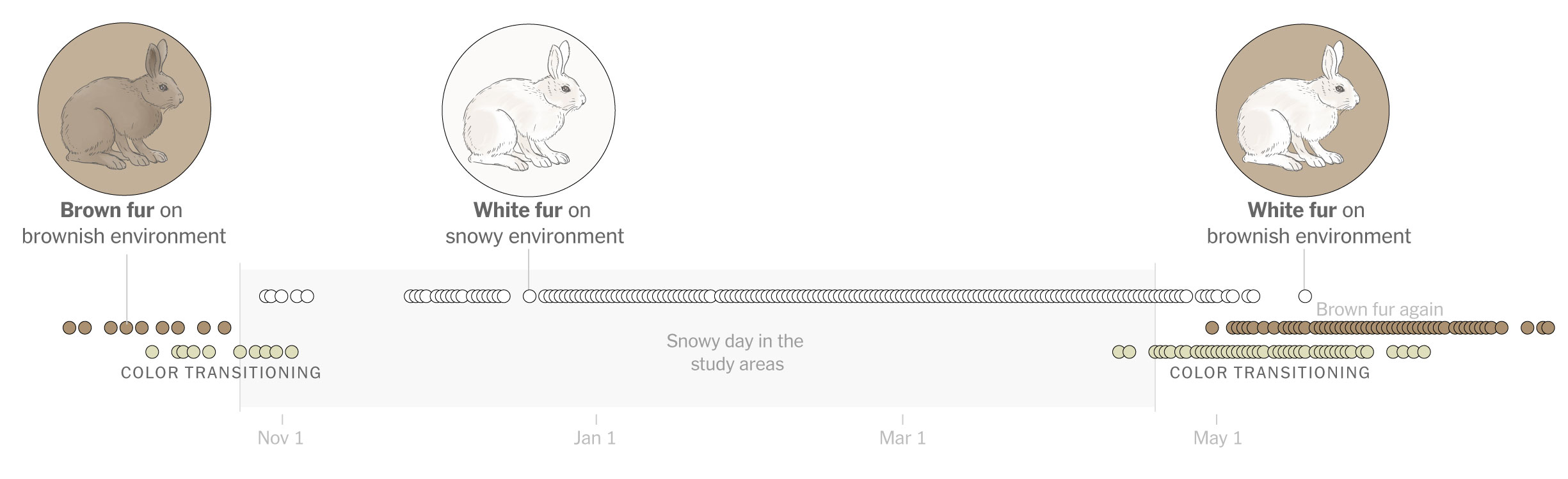
Day four was about personal data, this was fun because I learned how to pull out data from my Google Maps app, simple yeah, but I never thought about this before.
I exported my data and grabbed all the locations where I launched google maps. Fun stuff, I selected 5 cities I visited this year and mapped out where I pulled my phone out to see a map and start navigating. Fun and creepy, not sure if you want this data to be publicly out even in an abstract way like in the map below, but it was a fun exercise.
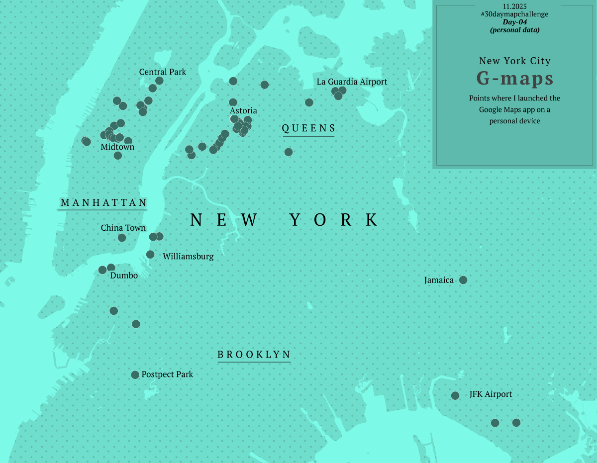
Way too much fun. Again instead of 1 map, I ended up with 5.
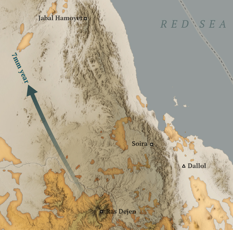
Day 5
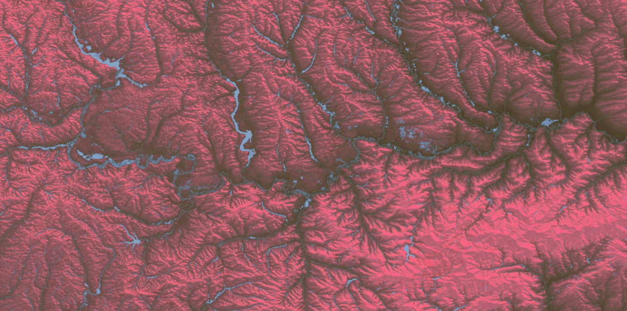
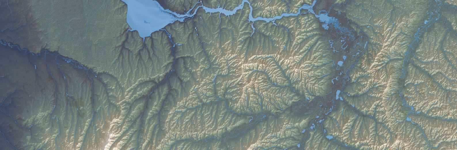
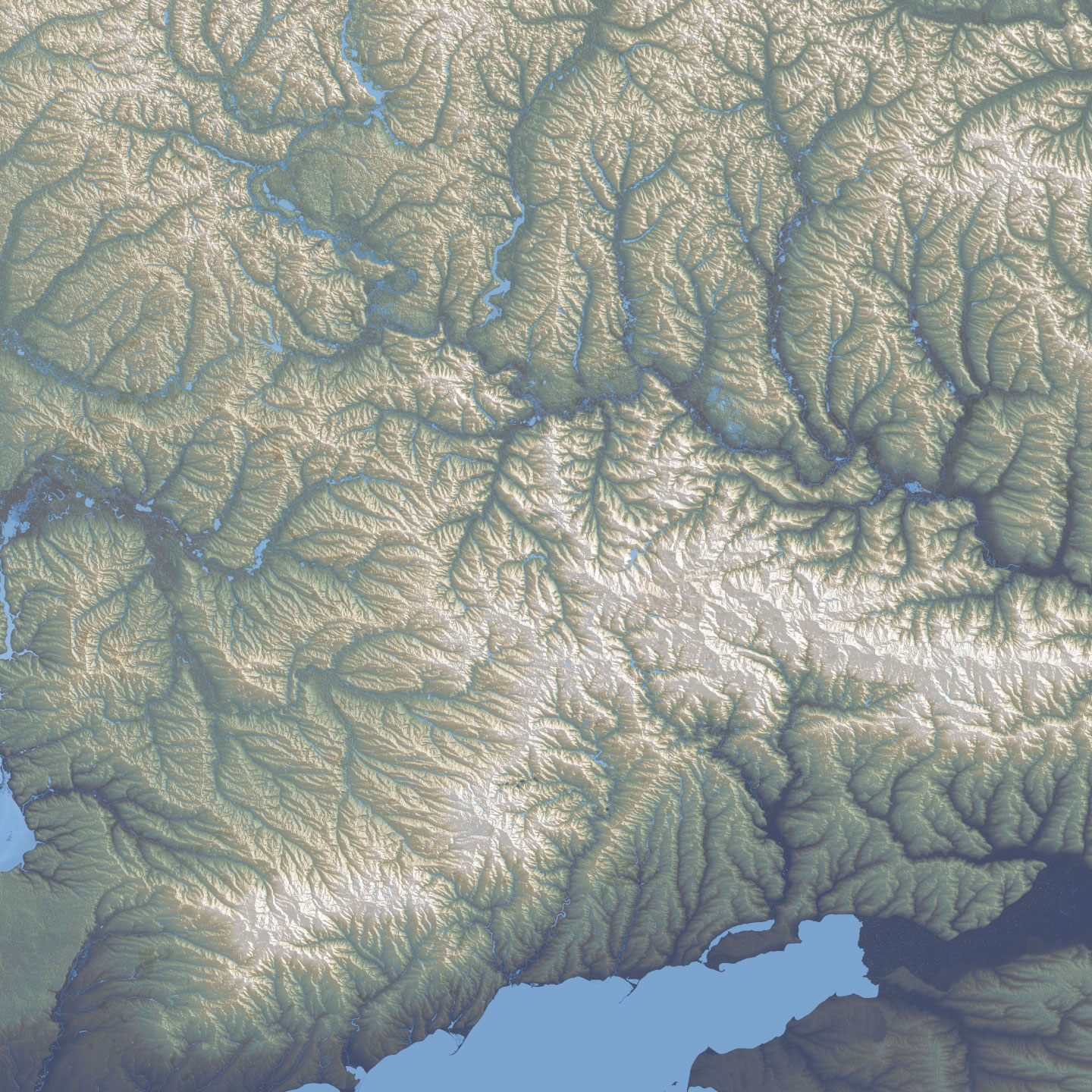
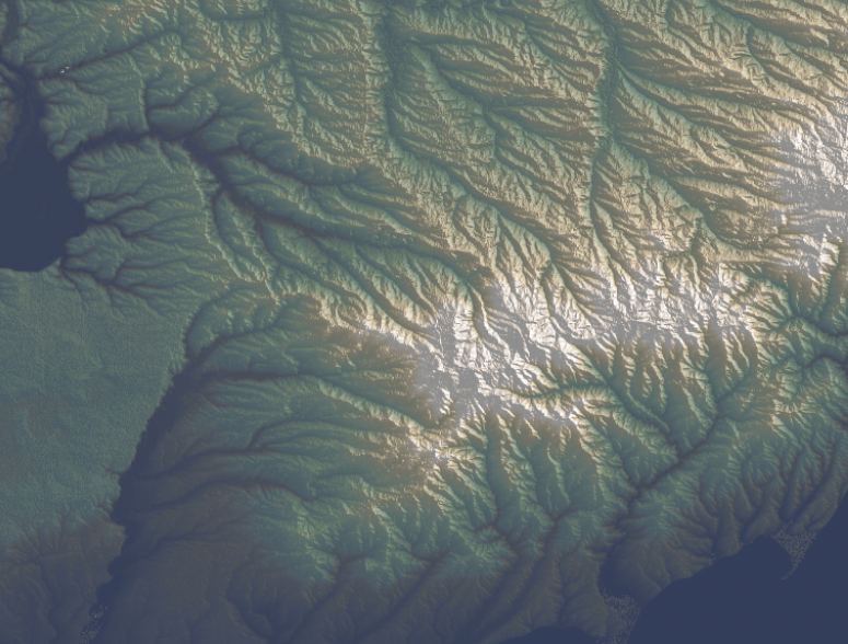
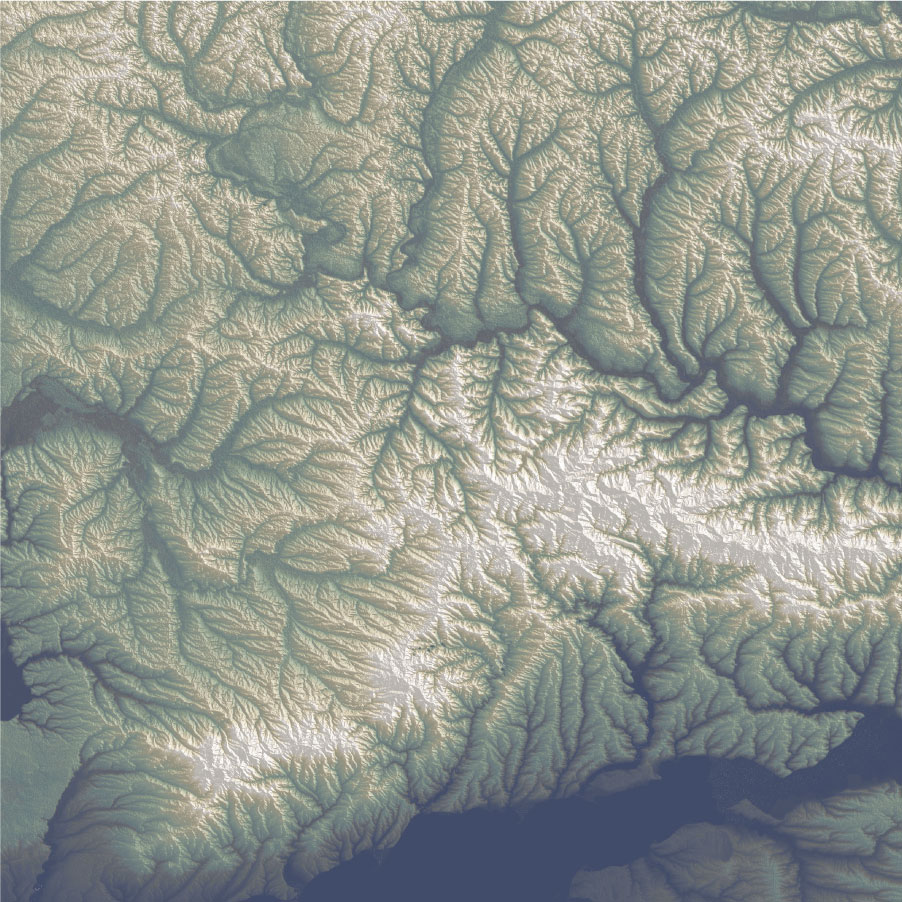
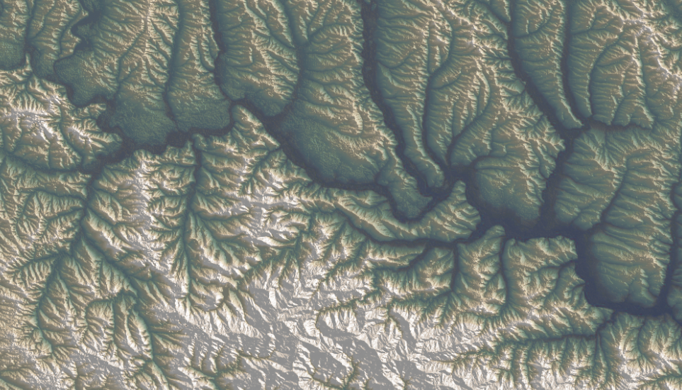
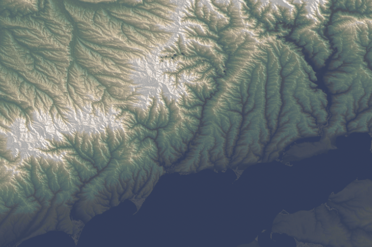
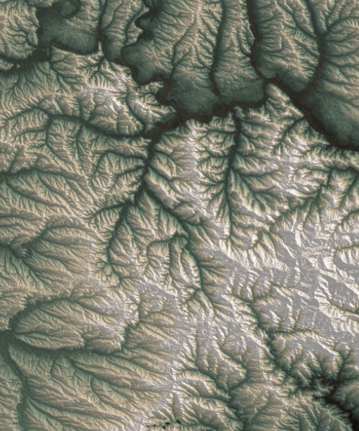
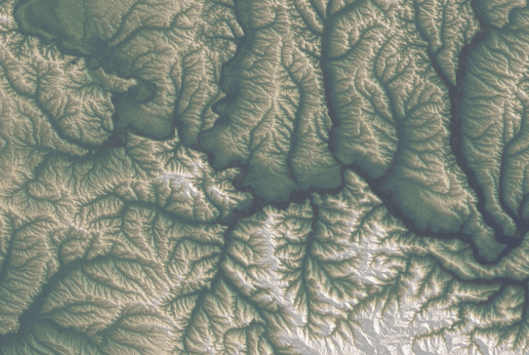
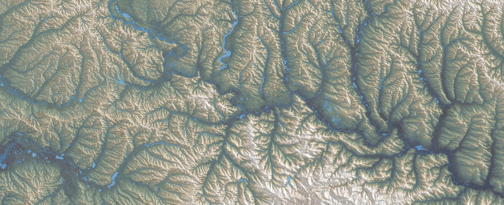
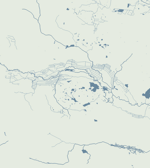
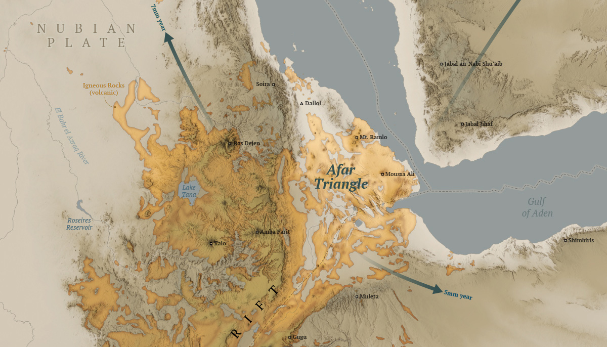
For this one I wanted to do something in Africa, I started to explore the topography near Somalia in the search for a singularity with data enough to map.
After looking a different sources and things from here and there, I decided to map the Afar Triangle, an extreme corner of the continent in the great rift valley in eastern Africa. There, a triple junction of plates pulls in opposite directions and different speeds, just to mention one extreme thing happening there.
Here’s my map of the Afar triangle:
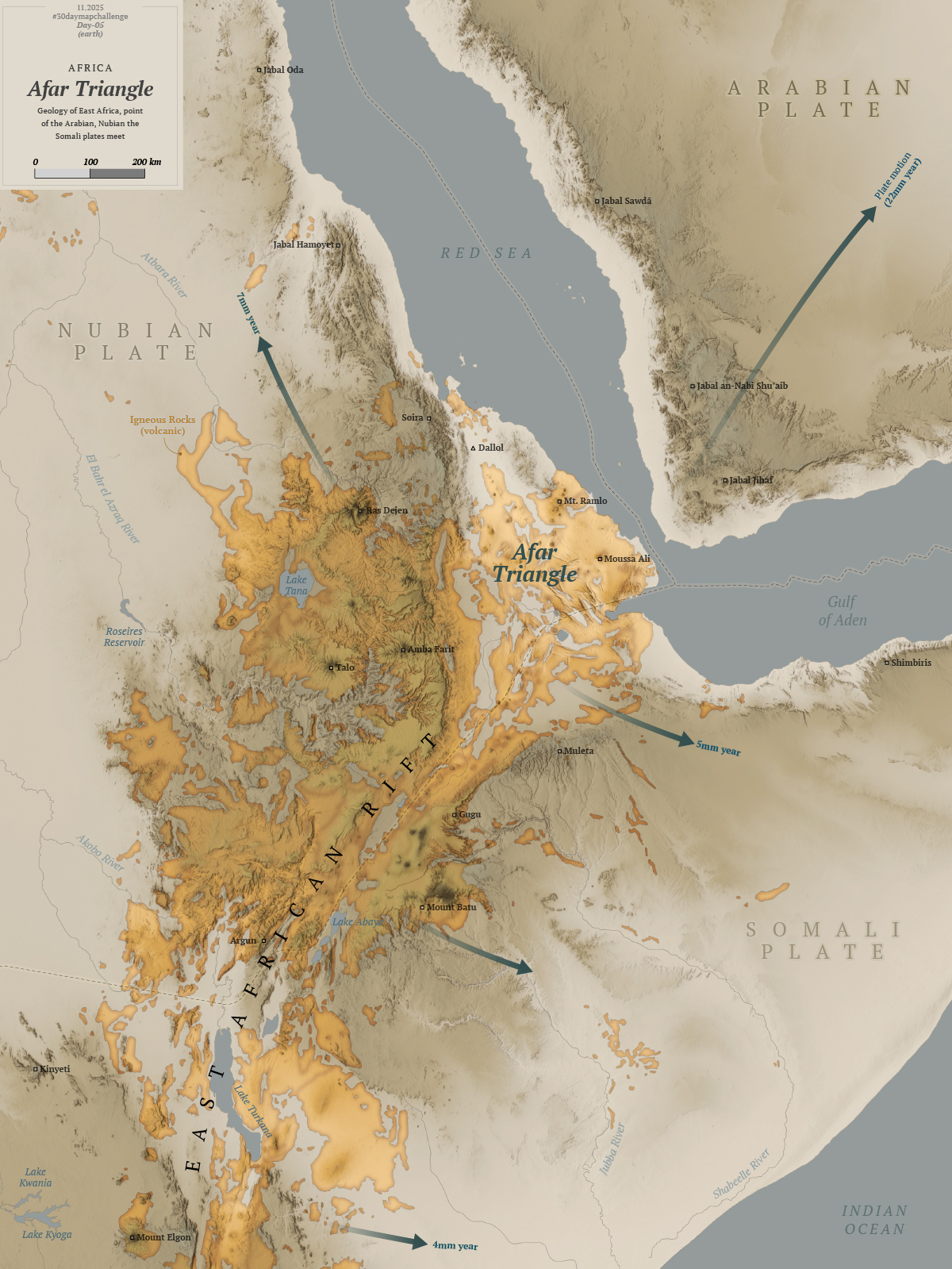
The northern point of the triangle is below 100m under the sea level, it’s also the hottest place on Earth and it has hypersaline hot lakes. What a place, it deserves more maps than I can do.

The region is also home of the oldest human ancestor, Lucy who died and probably lived its life in the Afar Triangle some 3 million years ago.
So far so good, I was having so much fun learning new things and procrastinating like a pro, then I looked at the calendar and November was almost here! 😳
Day 6
I was feeling a little more confident I thought I have learn the lesson with distractions. Maybe it’s not a big deal, maybe I take these things too seriously, because the thoughts that I’m running late or failing constantly haunt me. Sometimes I can’t sleep thinking I’m falling behind. Non sense I know.
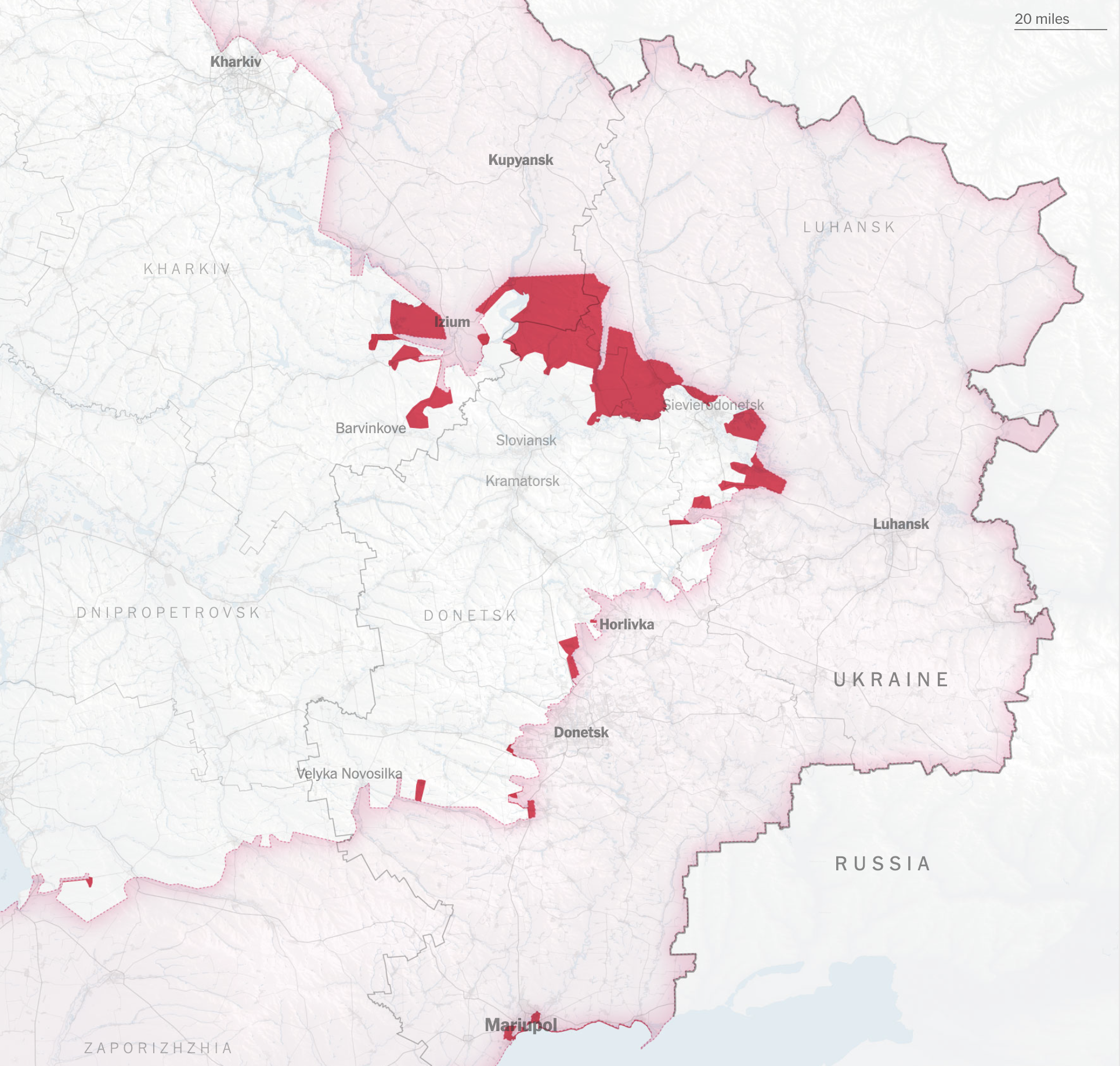
As November approached, I made day 6.
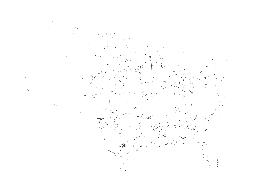
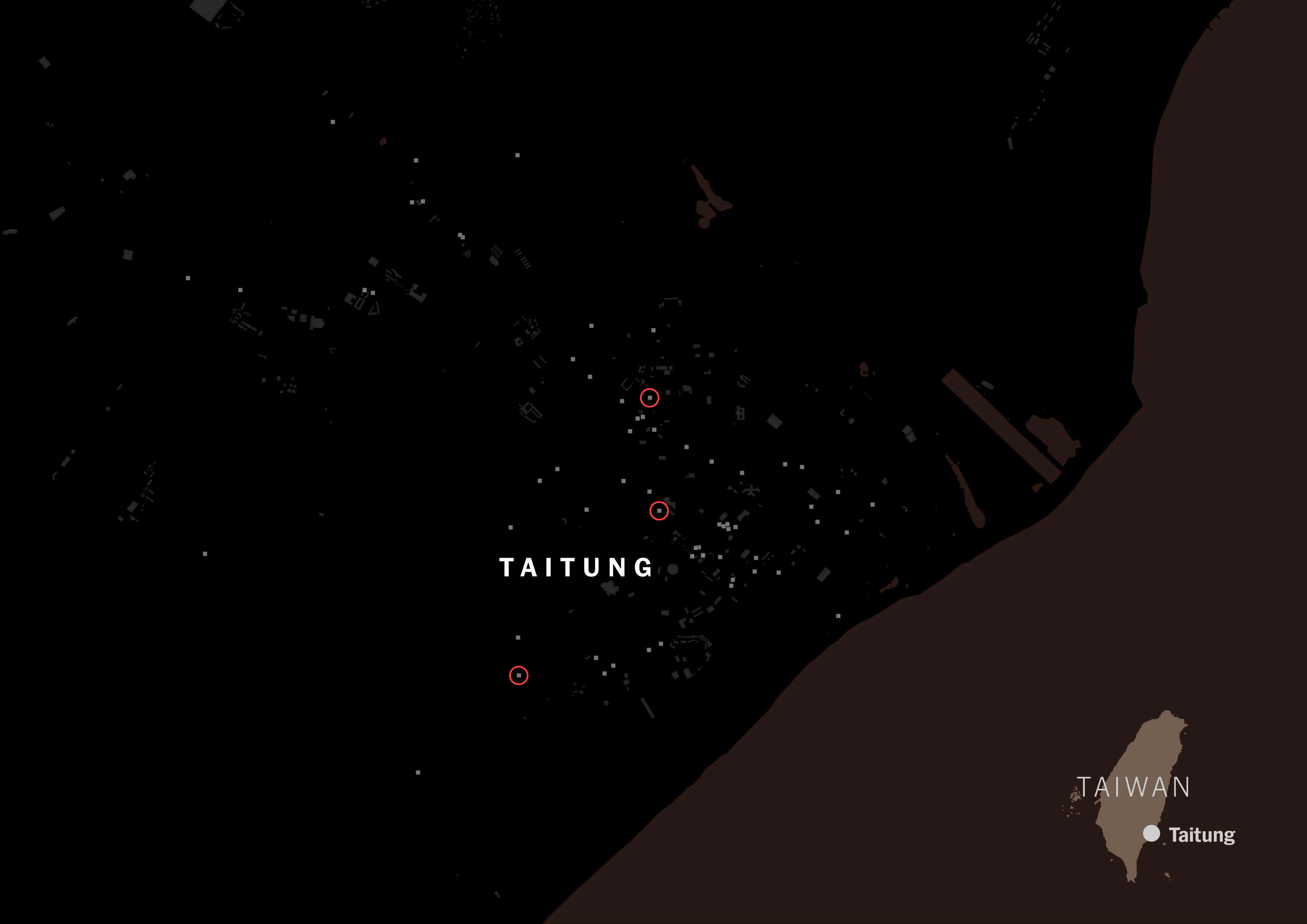
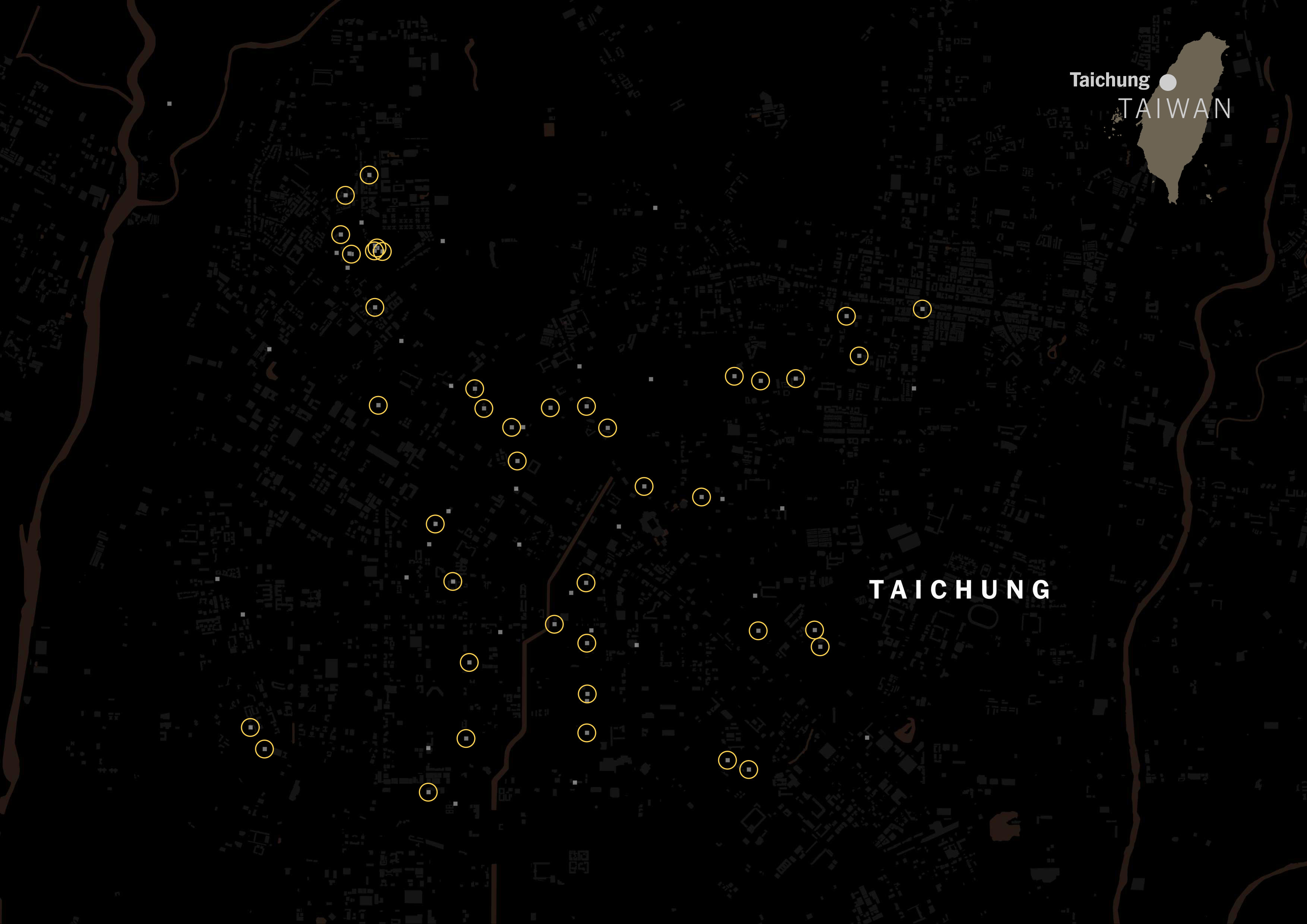
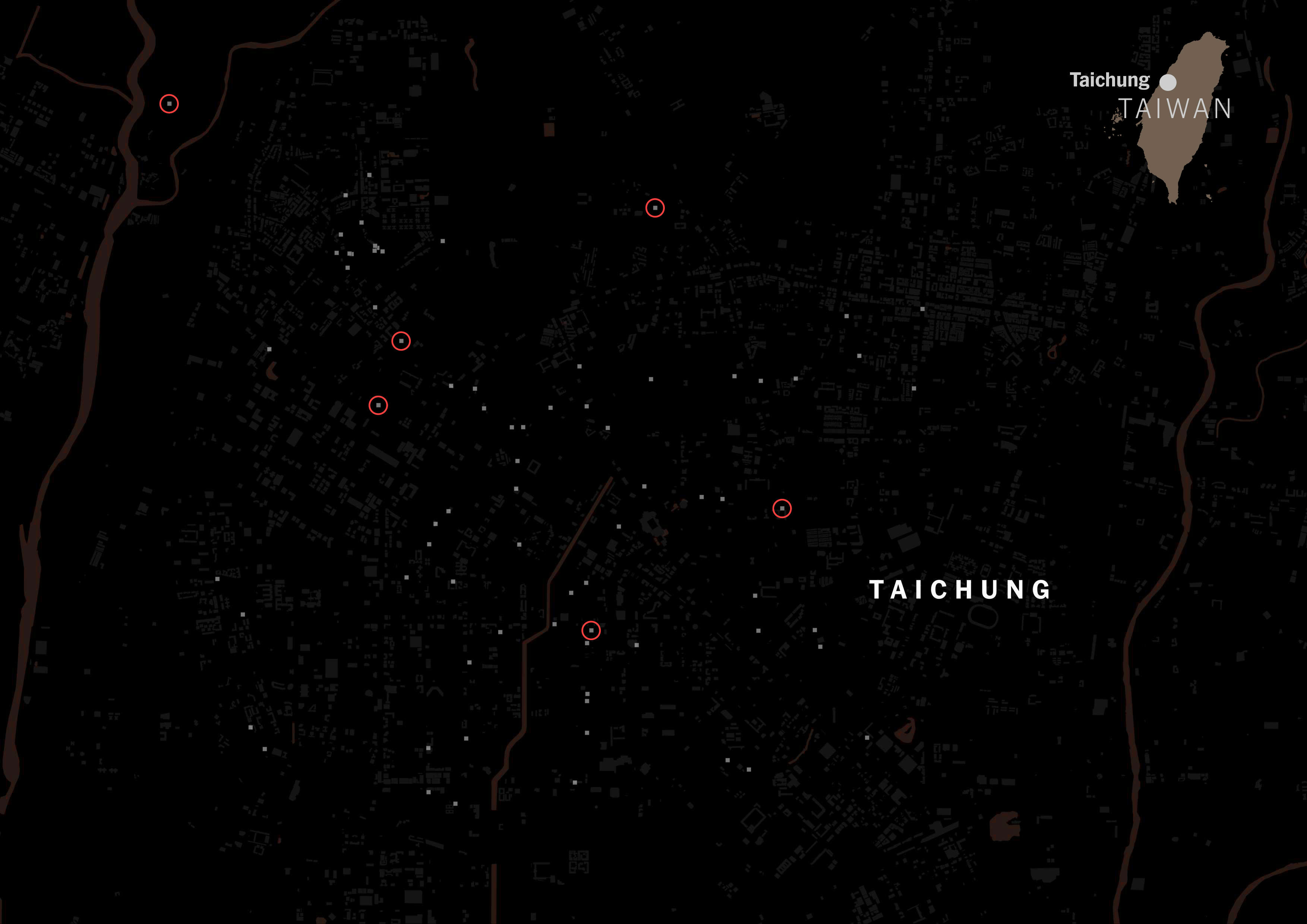
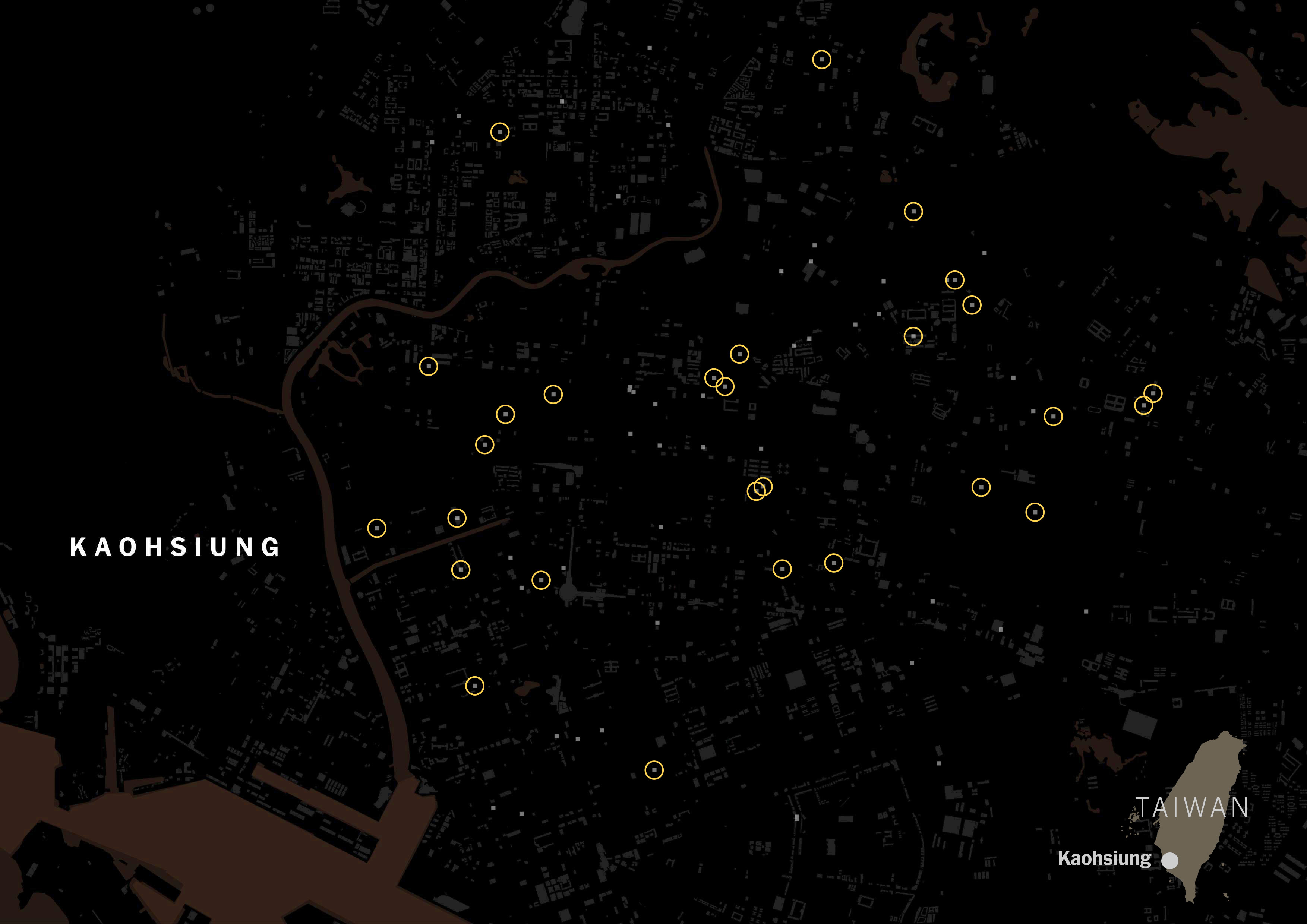
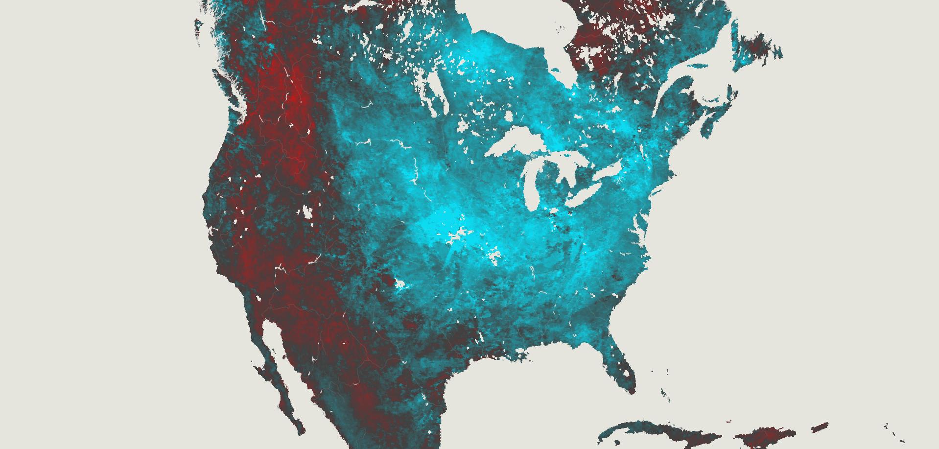
A map with dimensions to show political violence in Myanmar. Visualizing reports from ACLED to a 10km base grid.
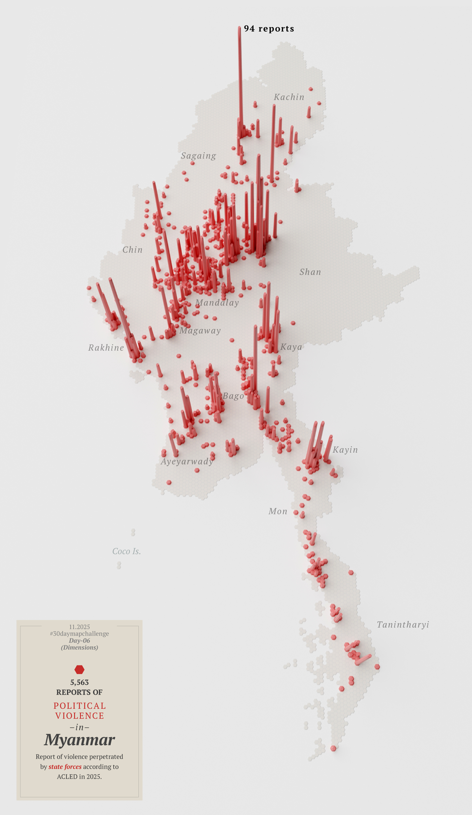
Then I thought about looking at the other side of the coin; that map in red above represents violence perpetrated by state forces, so maybe I needed another map showing the counterpart…
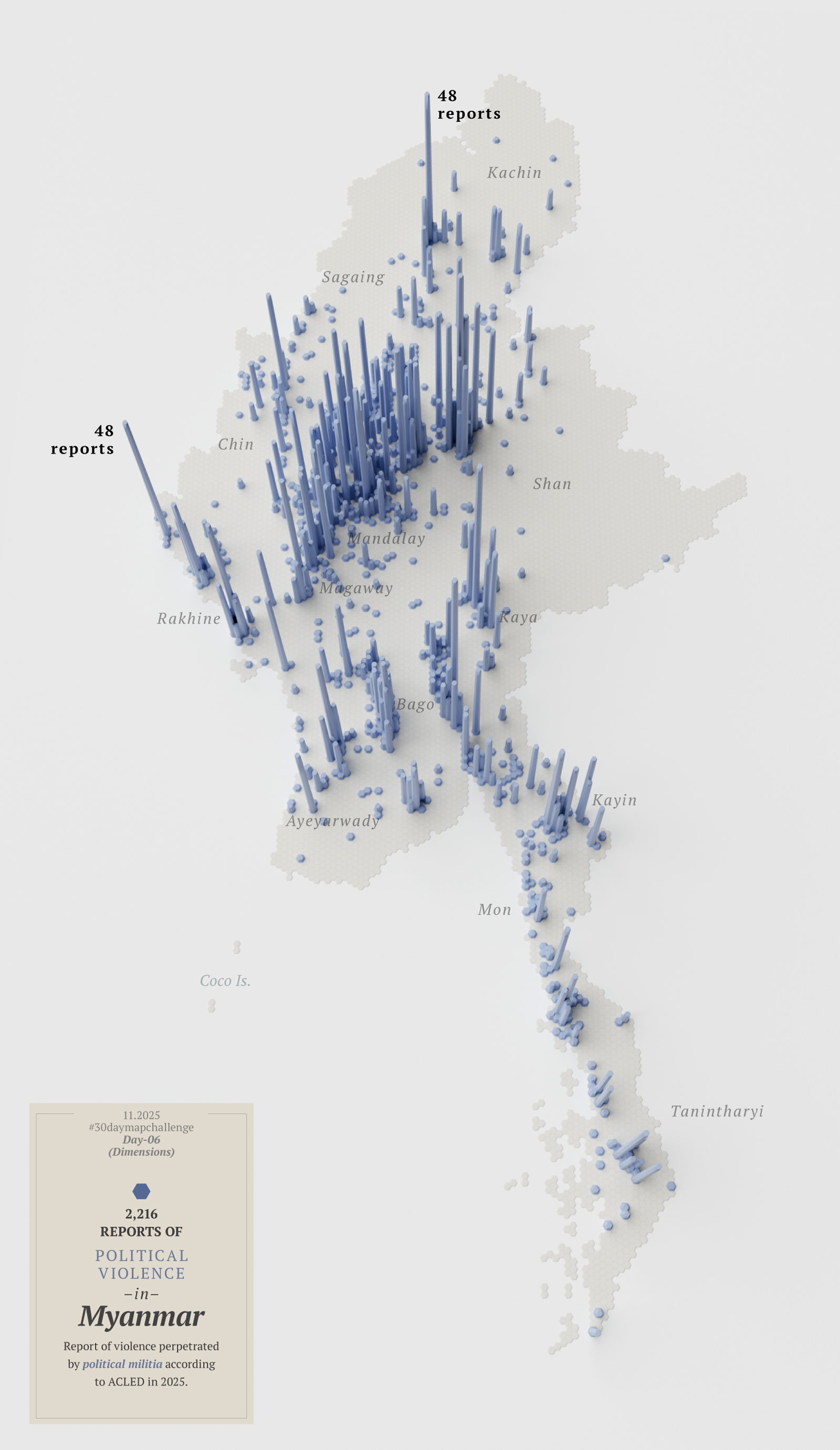
Or perhaps I didn’t need two maps, but a single map that combined both reports. Then I noticed I had mixed up the data and perhaps I should start over with this map…
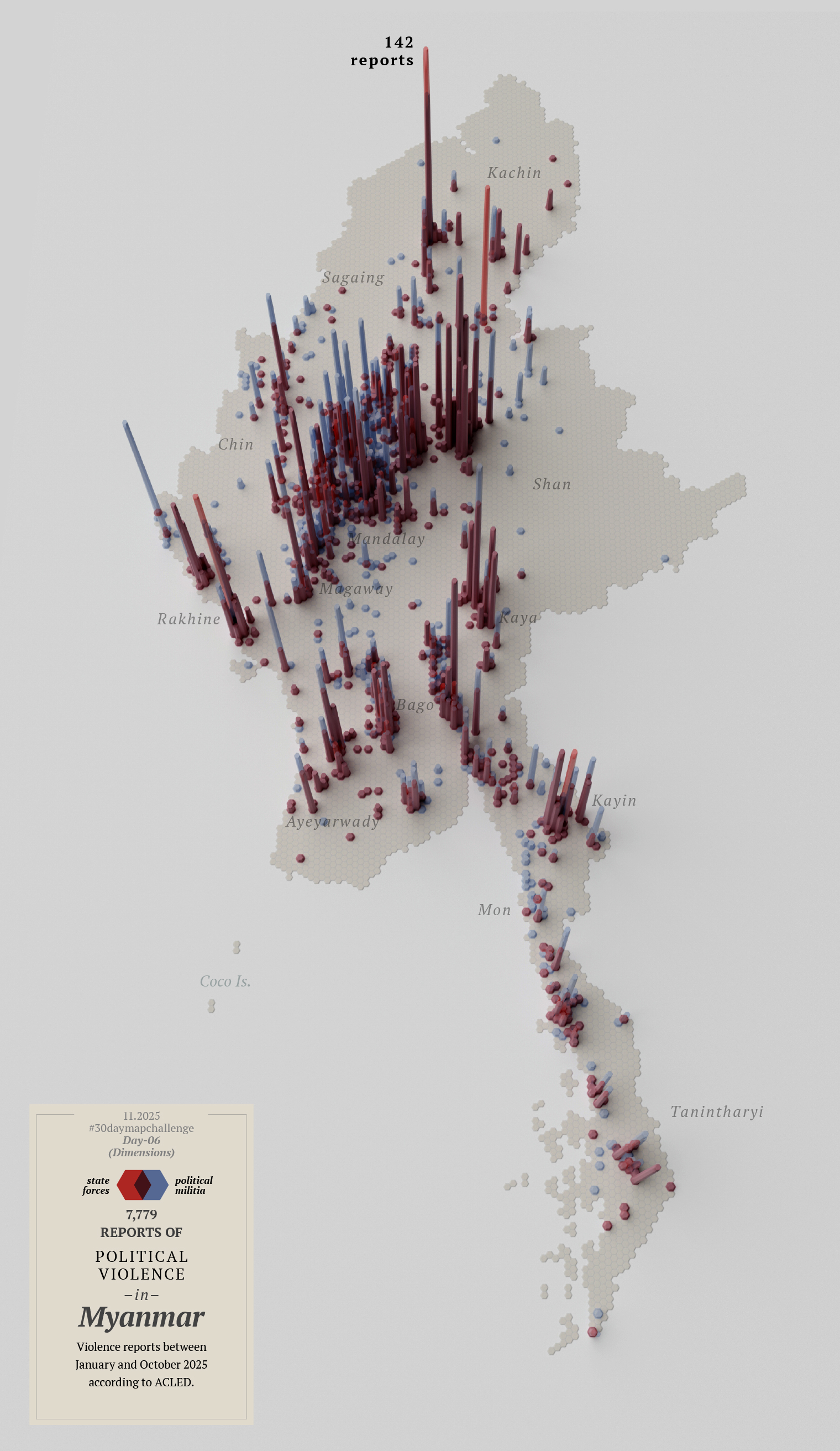
By this point I knew I‘ll never make it, so I decided to leave this one for a quick review later and bring it on to funtography.
I posted some there already if you want to see them bigger or with a little more context.
Day 7
By day seven I reached the breaking point.
The calendar said November 3rd, and I hadn’t finished anything, I didn’t like that much the first 6 maps I did, and I was walking in circles thinking on how to re-do all of them.
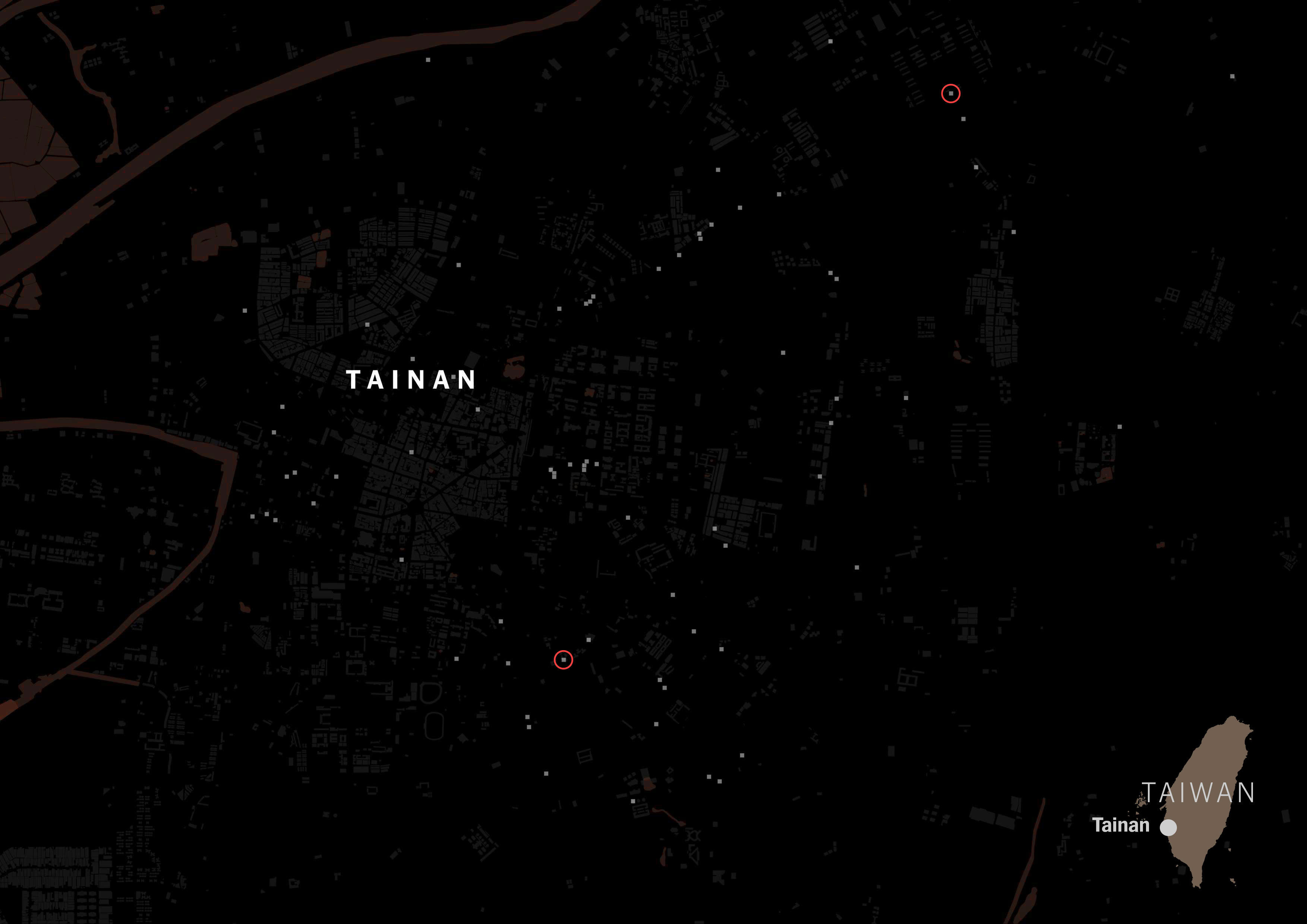
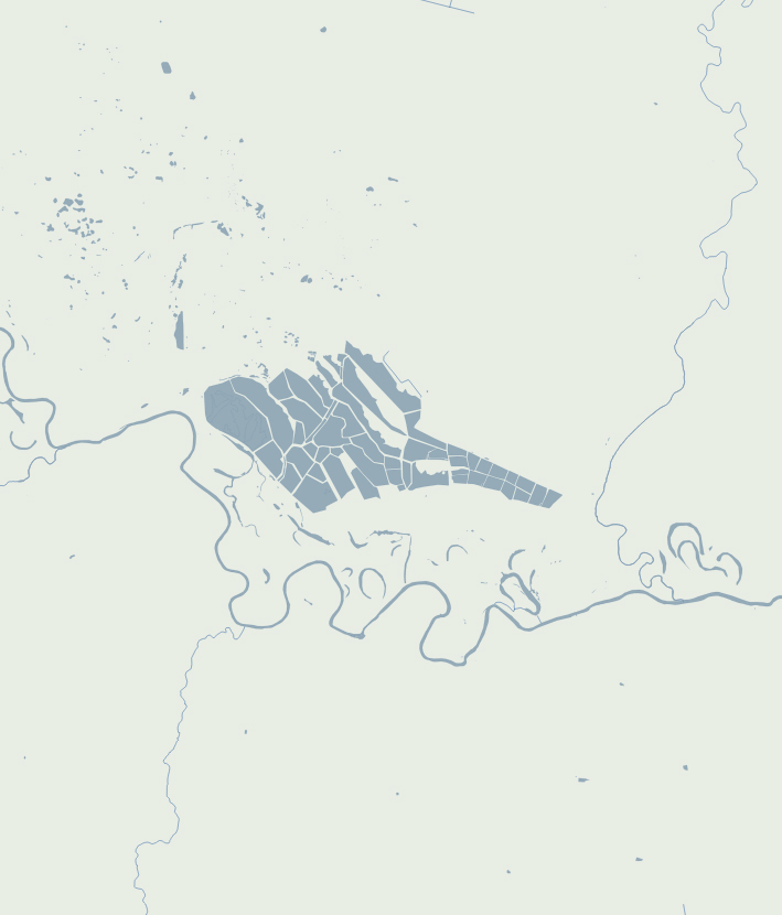
Feeling discouraged and frustrated, I gave free rein to one more idea—something between a poster and a map. I looked for train stations in several cities and finally decided on Berlin just to try a different location with available data.
My idea was to see where I could go within a 250m radius in a wheelchair using trains. I’ve never been to Berlin, so probably my idea is in the wrong approach, but I thought of dividing the city into 250x250m squares.
It’s very likely that wheelchair users travel distances greater than 250 meters (approximately 270 yards) as part of their routine, but it must be a tremendous effort to do so for half a kilometer (just 2 of my squares).
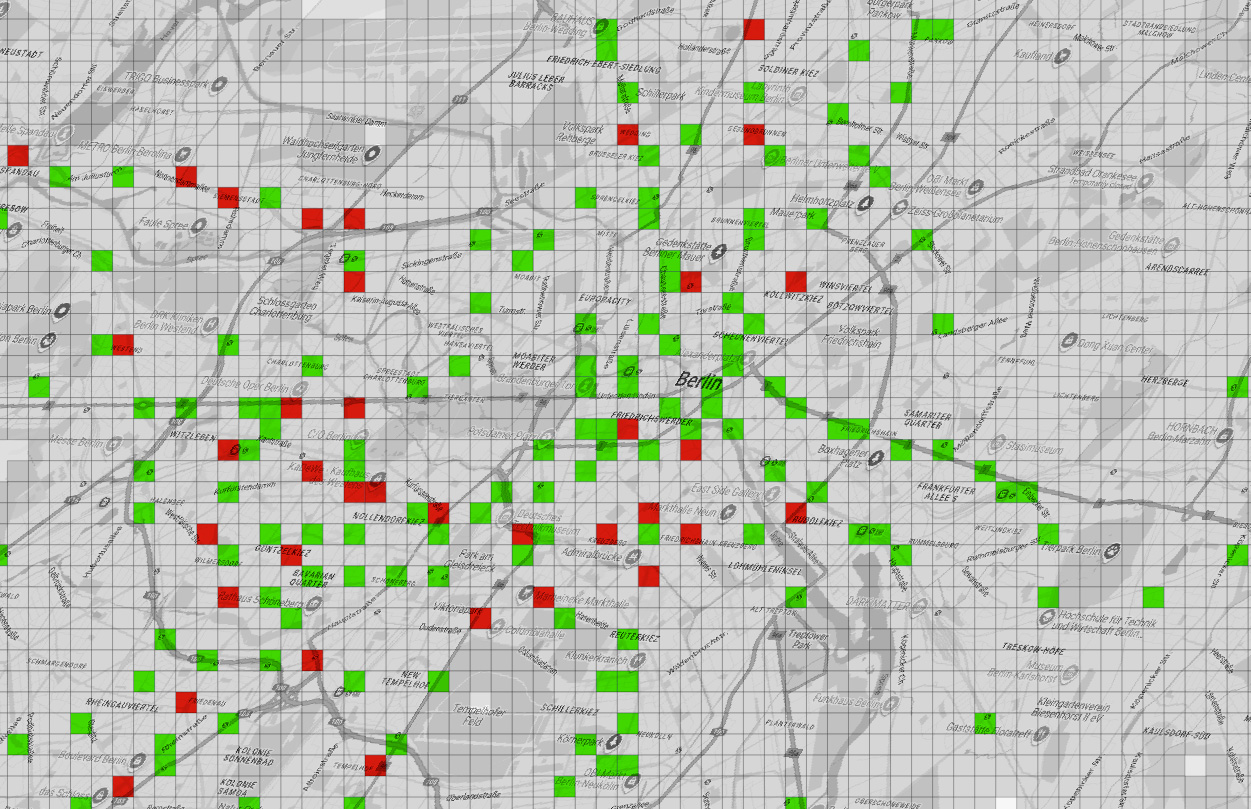
There are some adjacent areas in green which is good, but also many red squares, meaning that if you go there in a wheelchair it’s almost a 50-50 chance that you’ll be able to get out of there where you need to. In short, it seemed to me that if you are limited to one or two squares, in the big picture, it’s more about where you can’t go than where you can go.
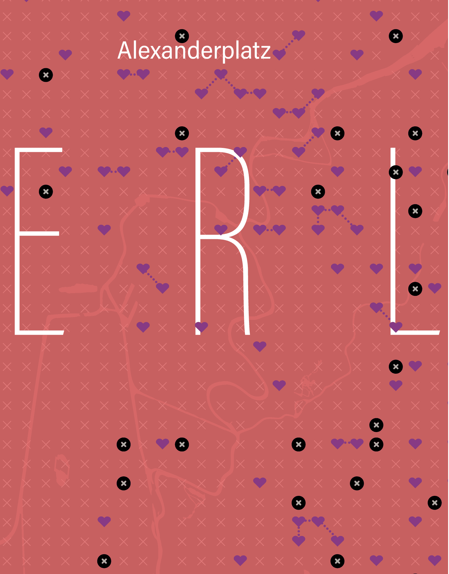
Here’s a version with a bit more context, a heart-shaped areas representing blocks with accessible stations, Black circles marked with x are stations without wheelchair access; all other x’s are areas where there are buildings, but without nearby access to a station. I added little dotted lines to the adjacent 250m blocks with accessible stations.
And the whole area with the broader region:
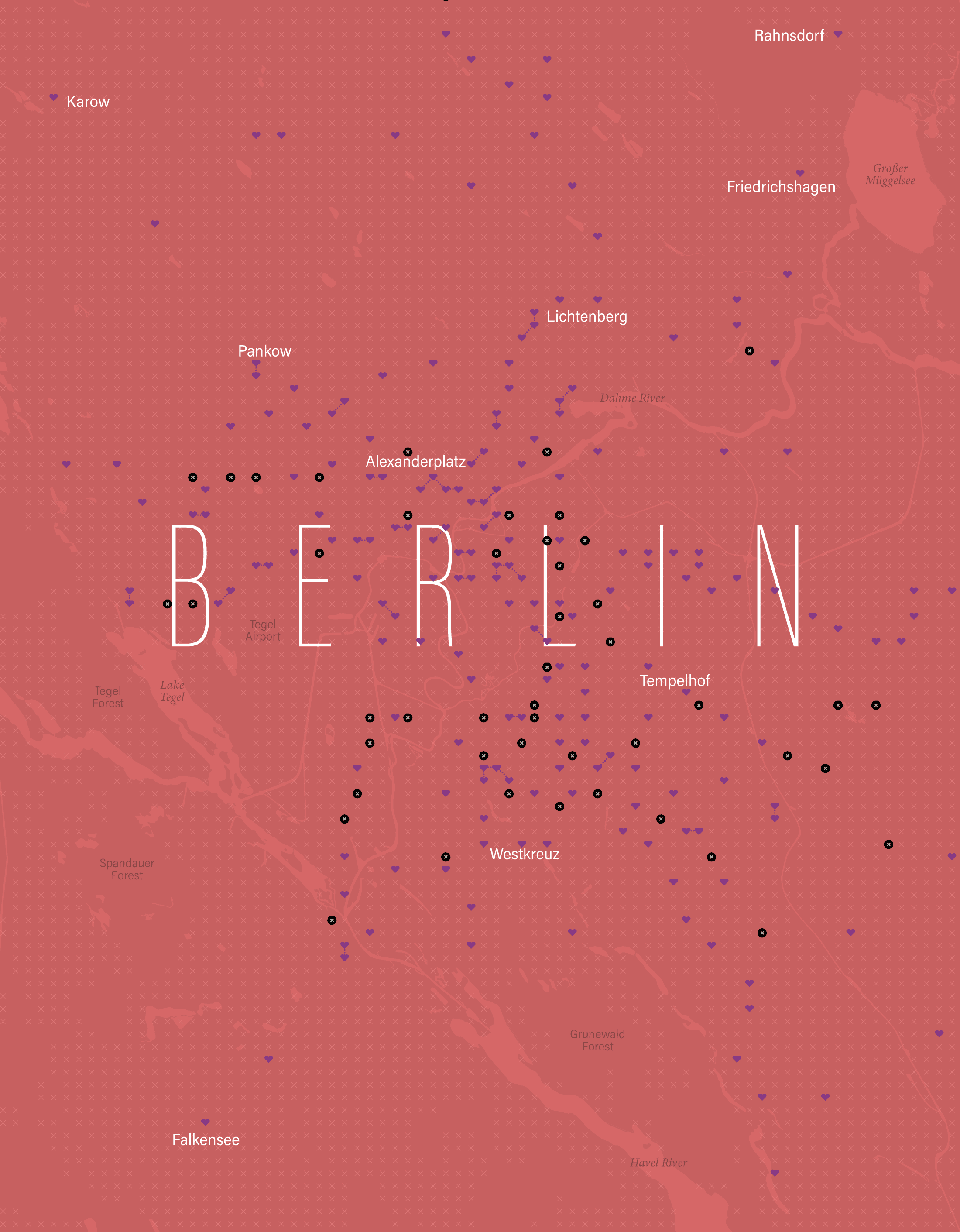
It must also be considered that the demand to access these places is not the same; the areas with more hearts, near the city center, are accessible and perhaps are the areas that people need access to the most.
For all these reasons, I abandoned the idea, got stuck trying to solve it, and ultimately ended up killing the idea of entering the #30daymapchallenge on time for each day.
The lessons I learned from this:
[ 1. ] Keep your ambition in check if you want to achieve something bigger little by little.
[ 2. ] Avoiding procrastination is difficult, especially when you’re passionate but not good on something.
[ 3. ] An finally, I need more free time somehow. 😂
About infofails post series:
I believe that failure is more important than success. No one sets to fail as a goal, but by embracing failure I have learned a lot in my quest to do something different. My infofails are a compendium of graphics that are never formally published by any media. These are perhaps many versions of a single graphic or some floating ideas that never landed.
In short, infofails are the result of my creative process and extensive failures at work… and I fail frecuently:
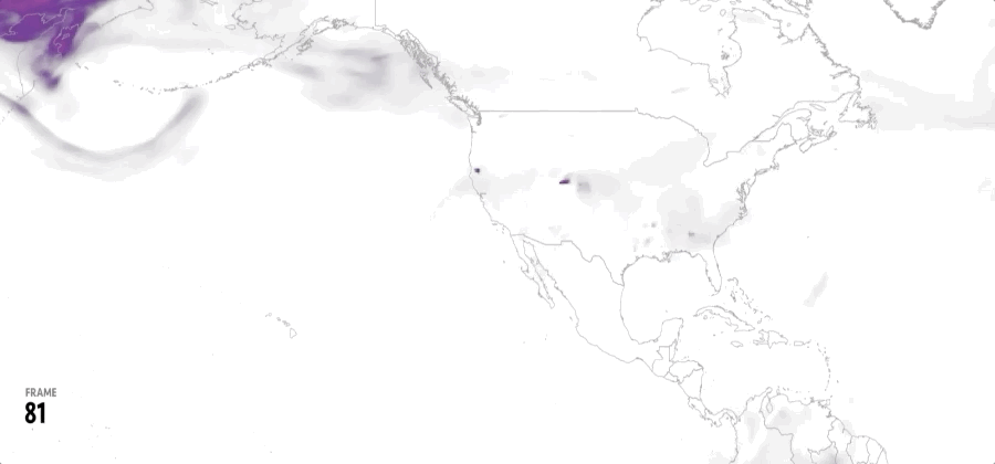
01: Wildfires
02: Plastic bottles
03: Hong Kong protest
04: The Everest
05: Amazon gold
06: The world on fire
07: A busy 2021 kick off
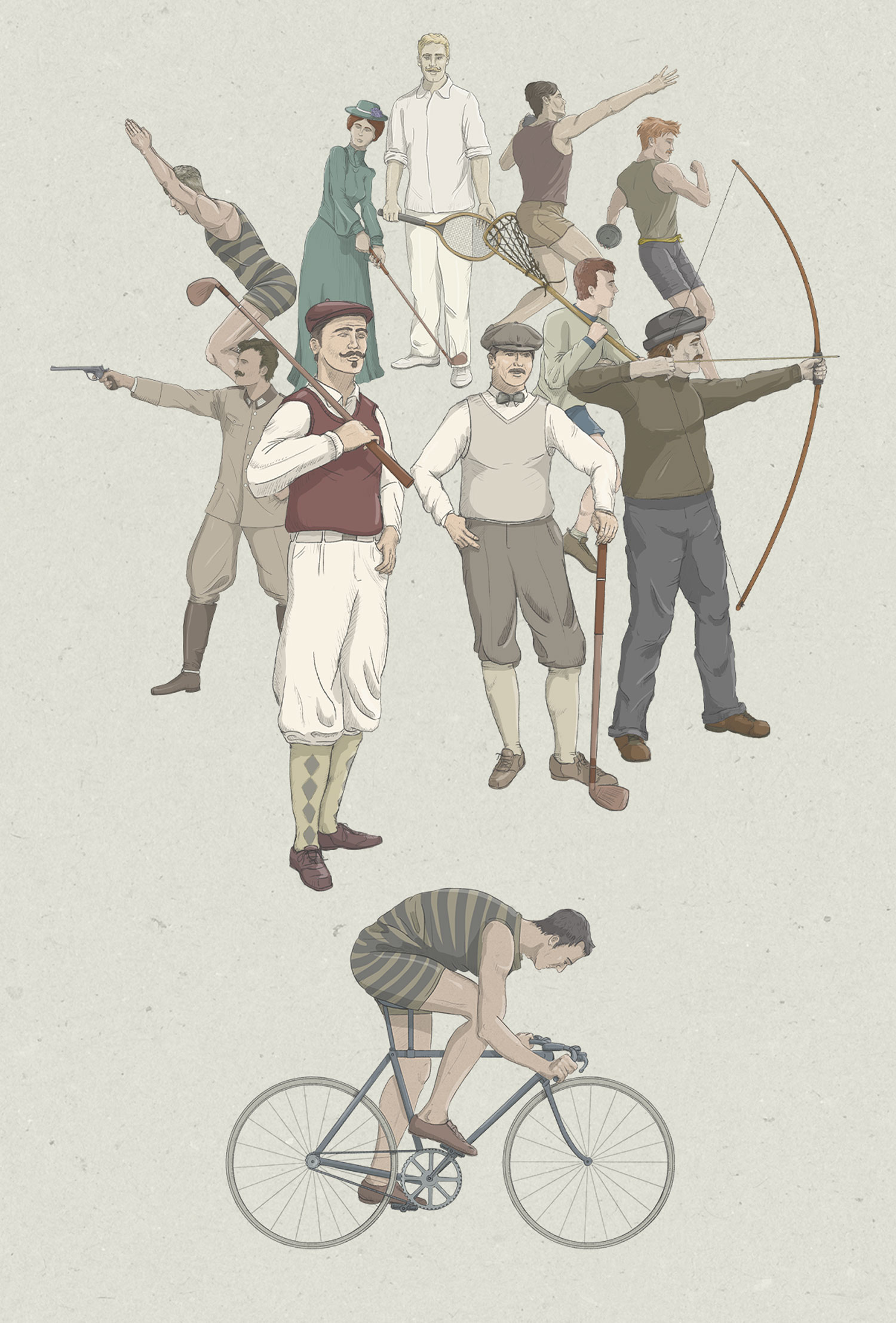
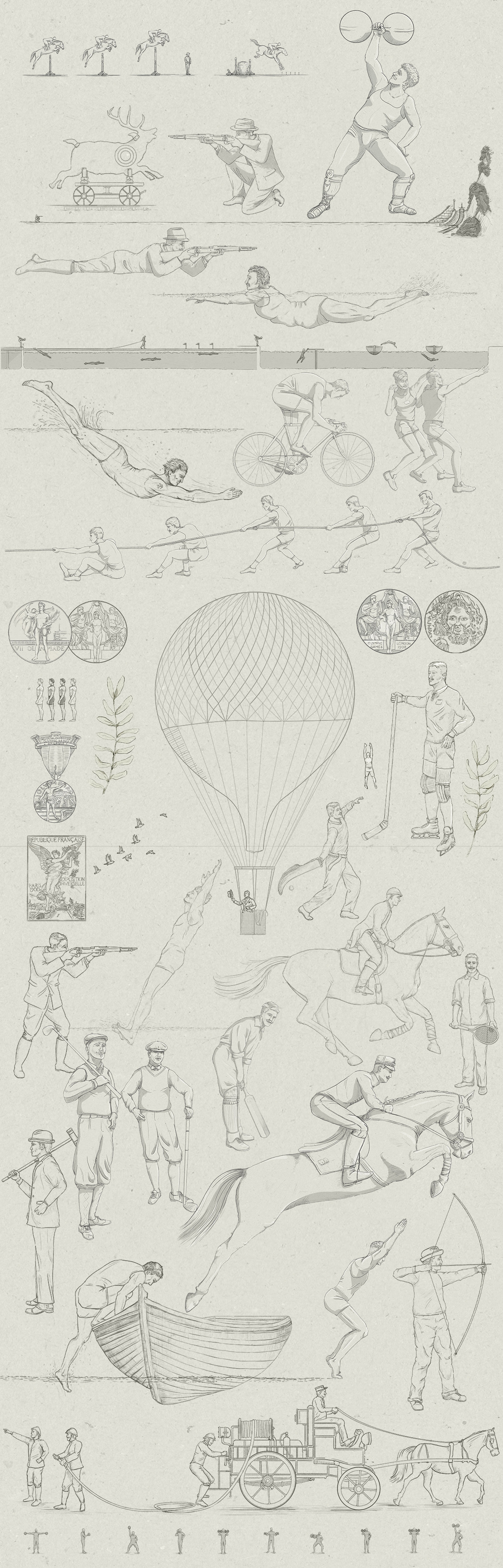
08: Olympics
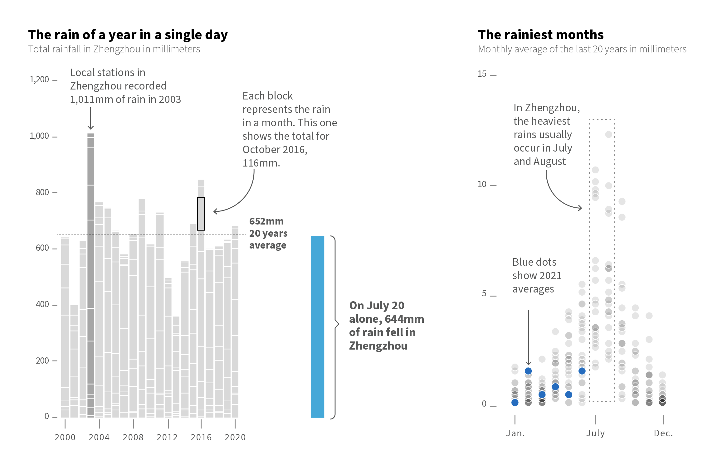
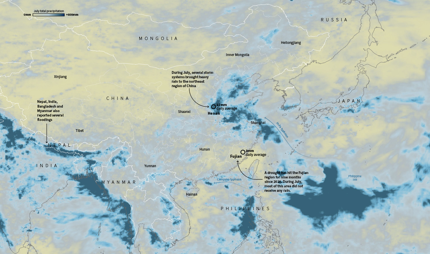
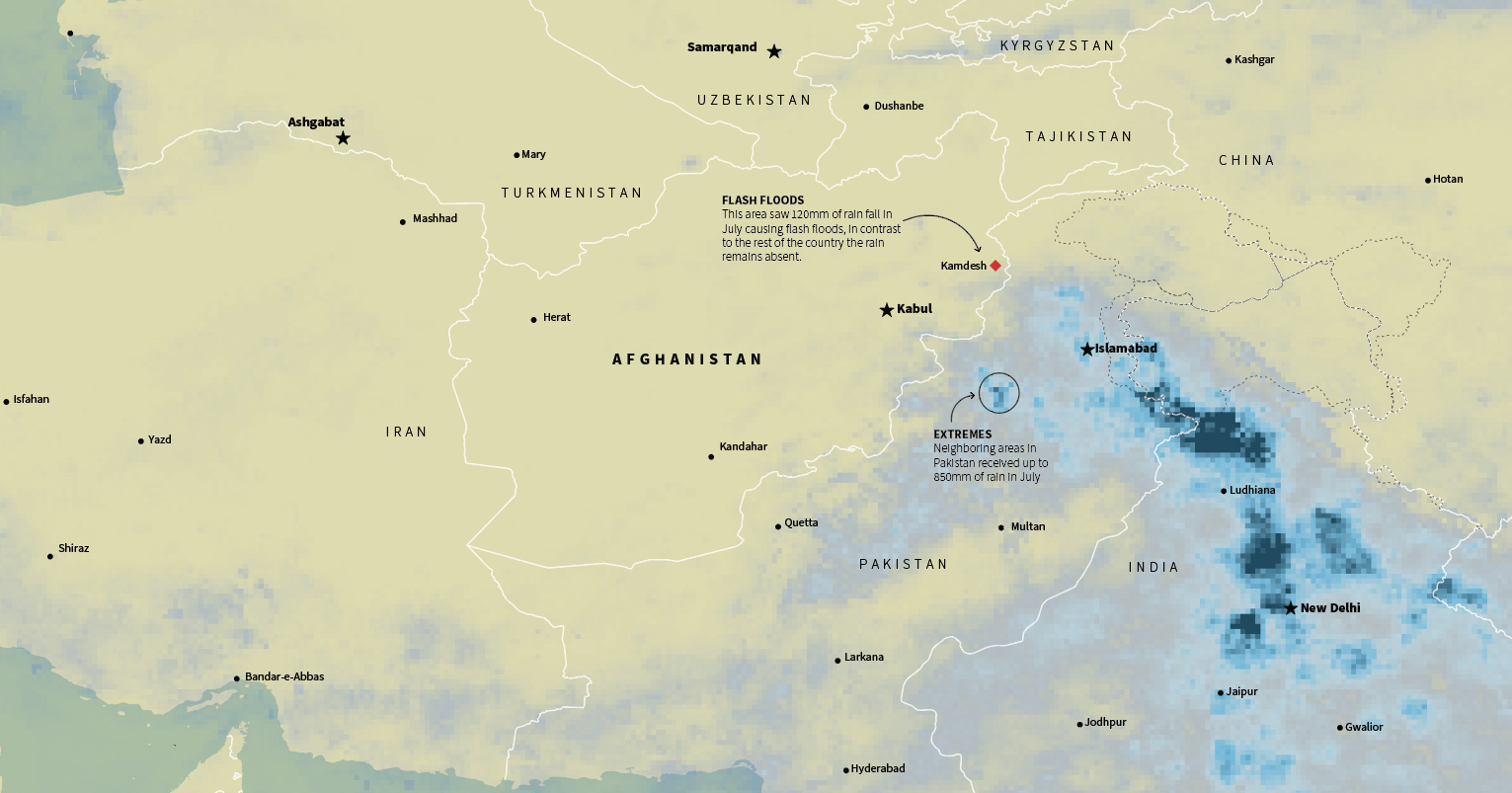
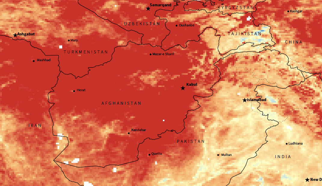
09: Floods
10: Doodles for news
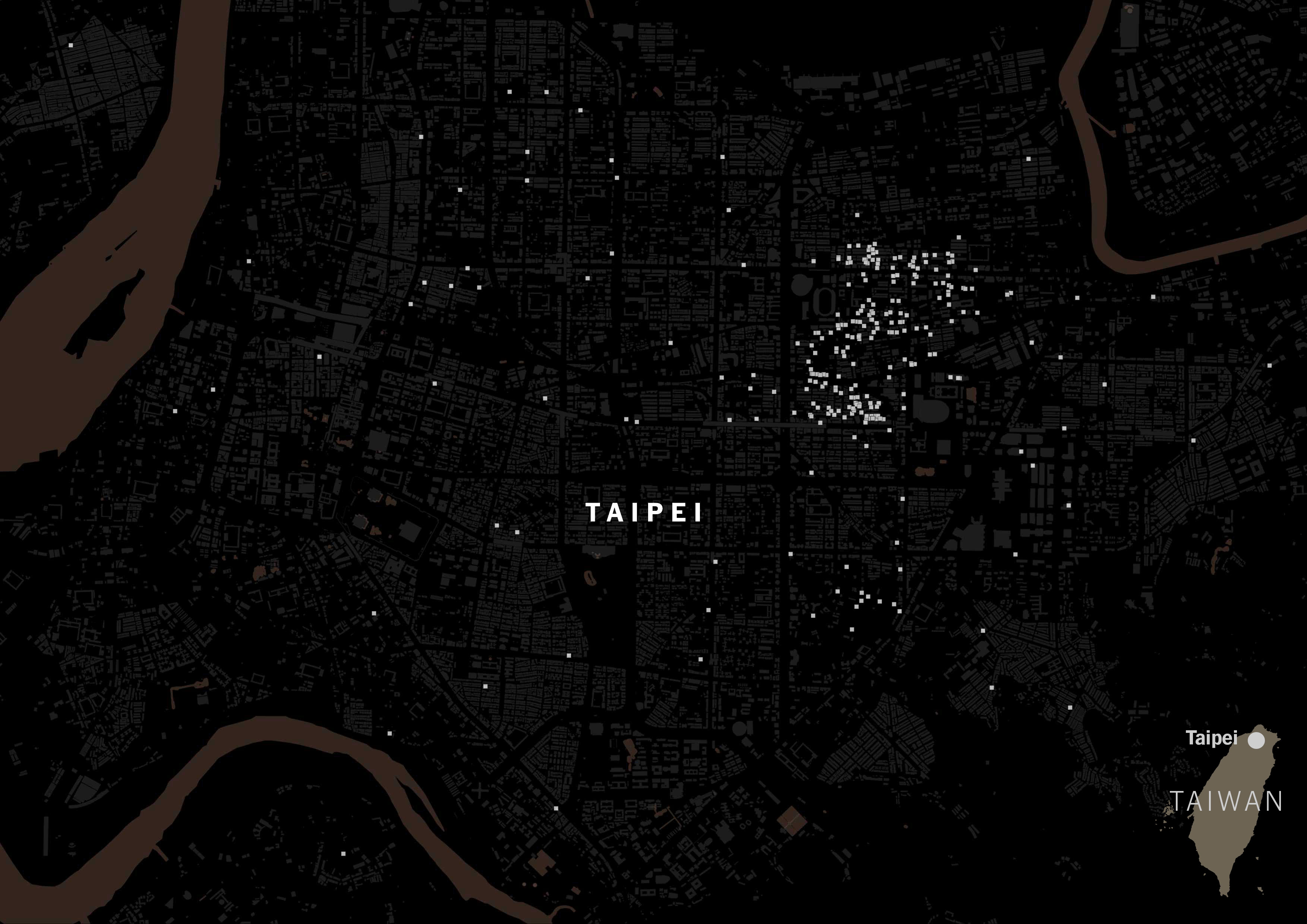
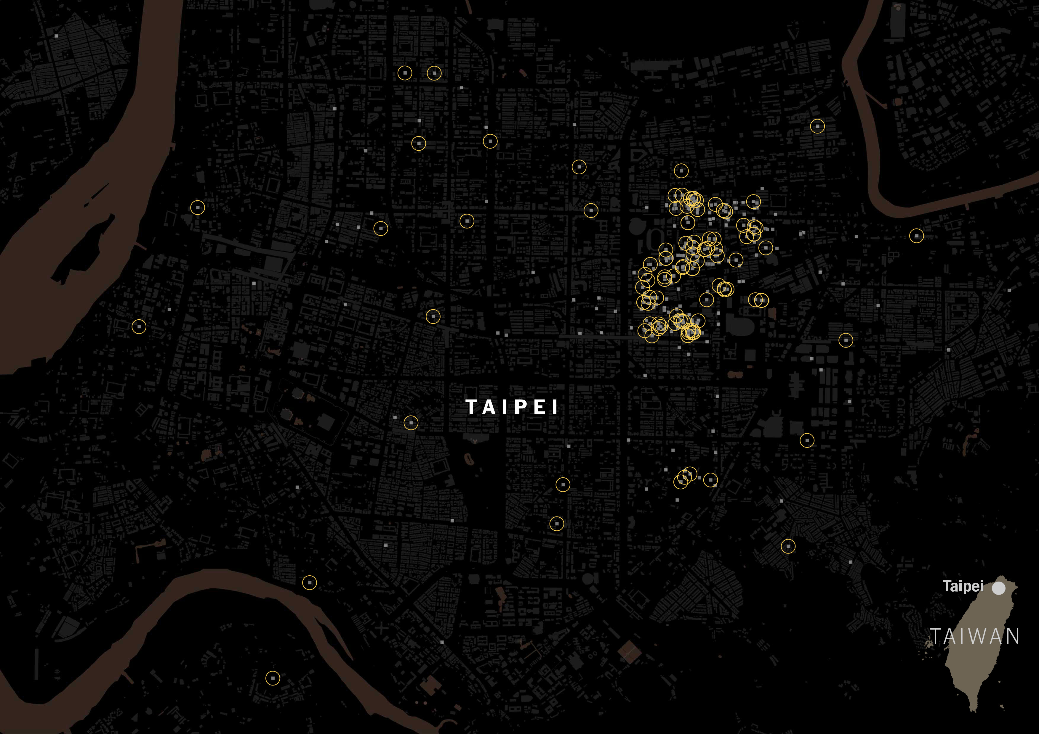
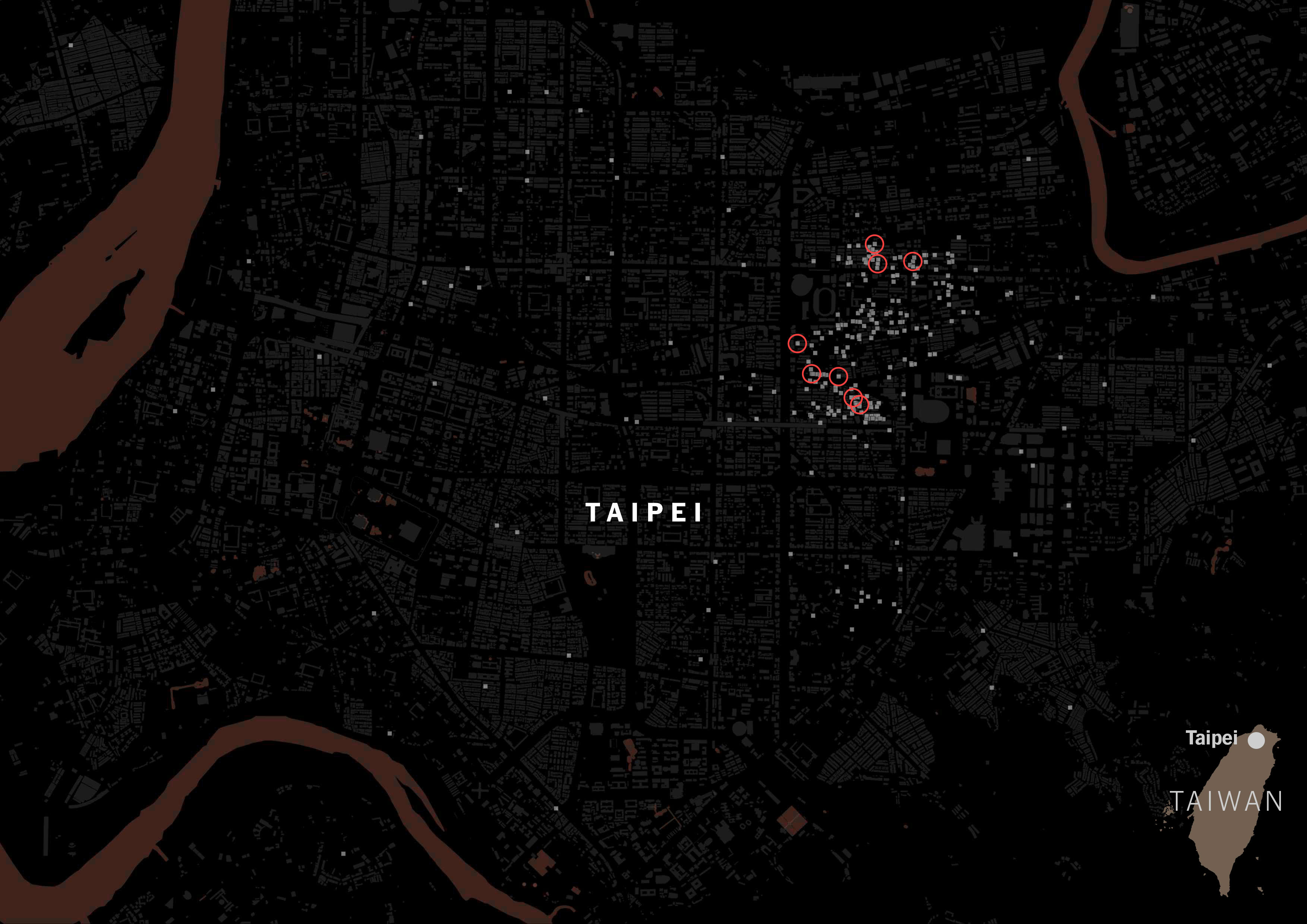
11: Random Failed Maps
12: The Mismatch
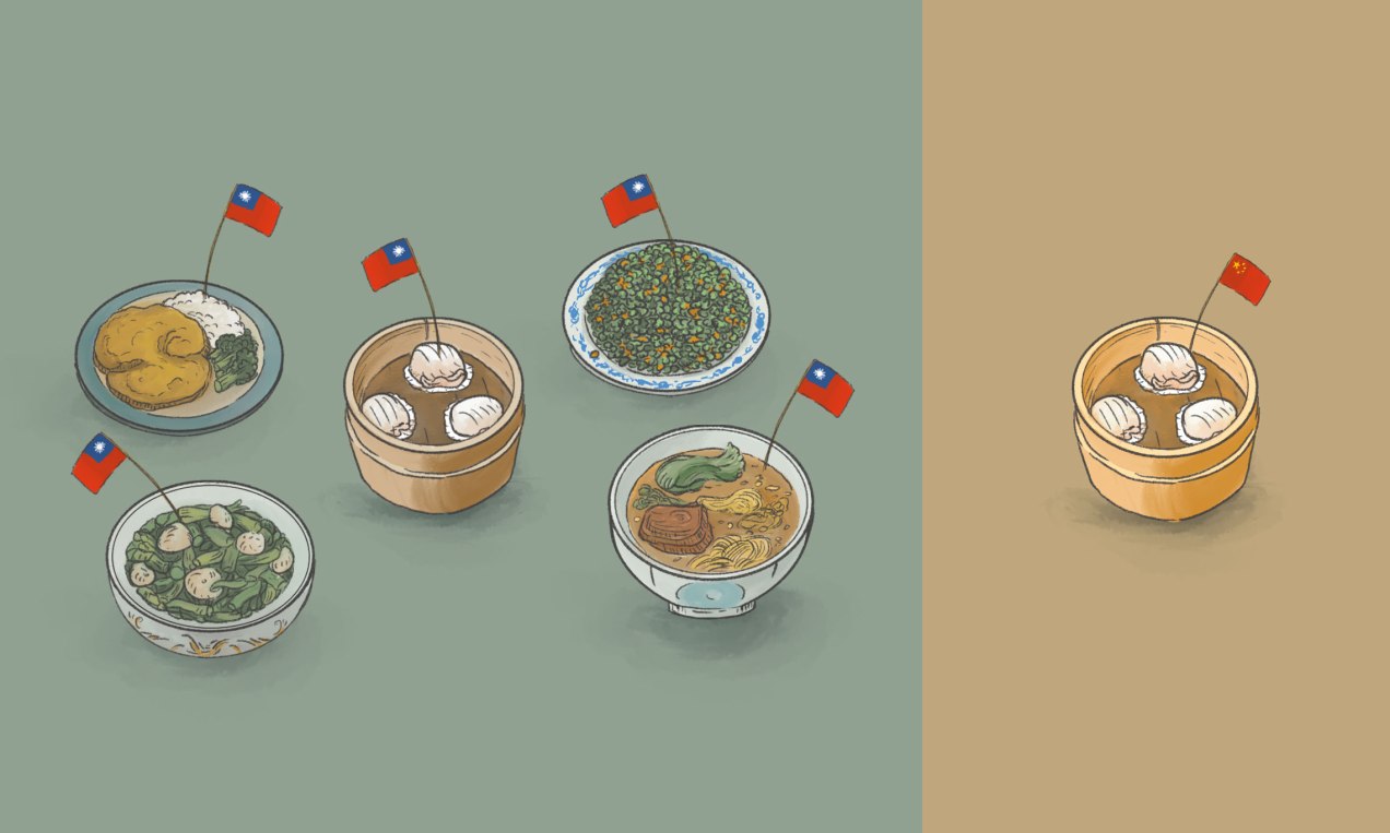
13: Mapping Taiwanese Food
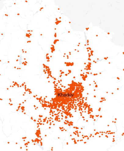
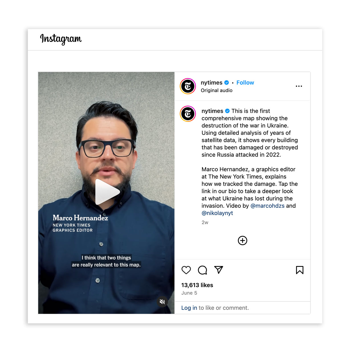
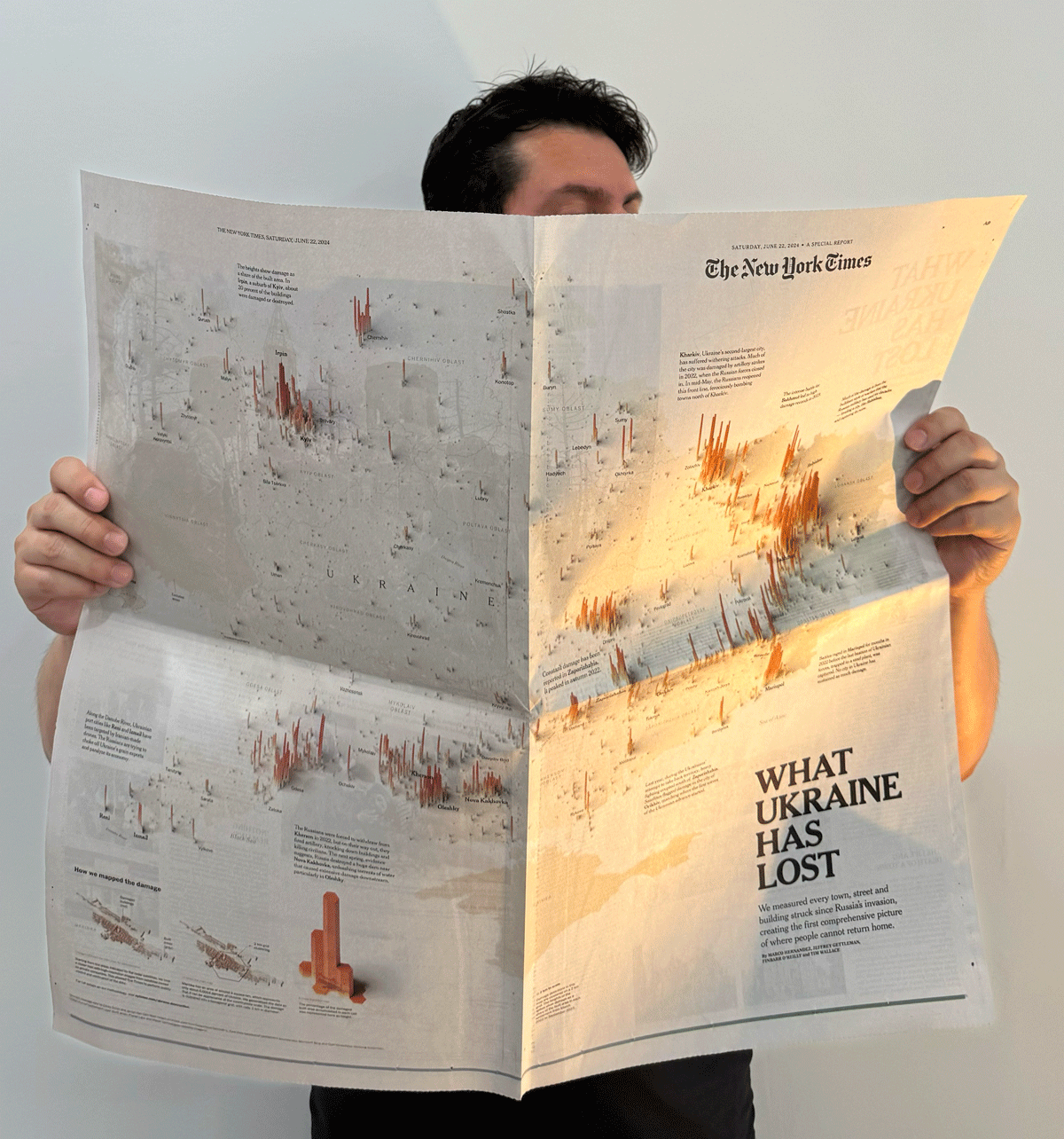
14: Mapping Damage in Ukraine
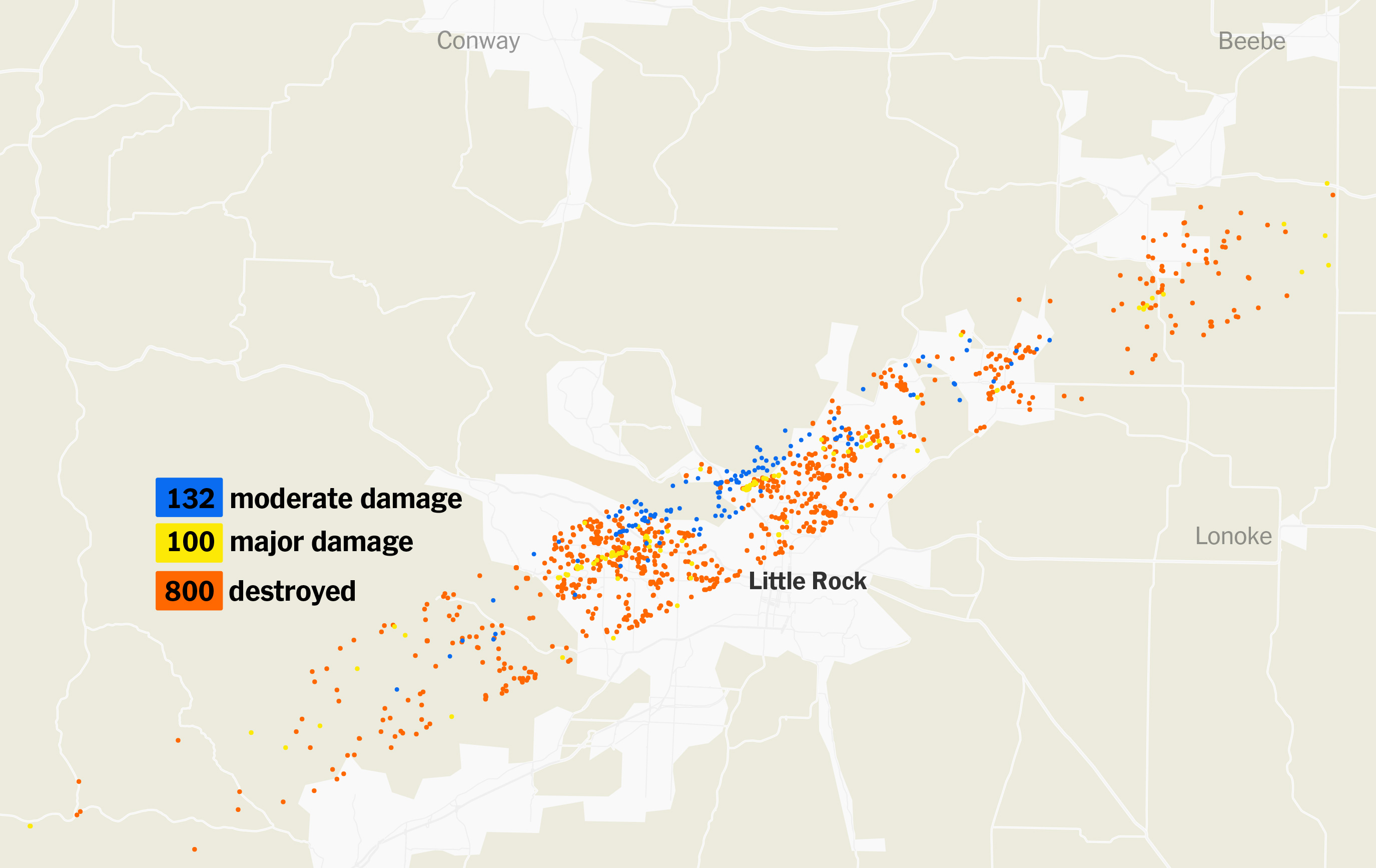
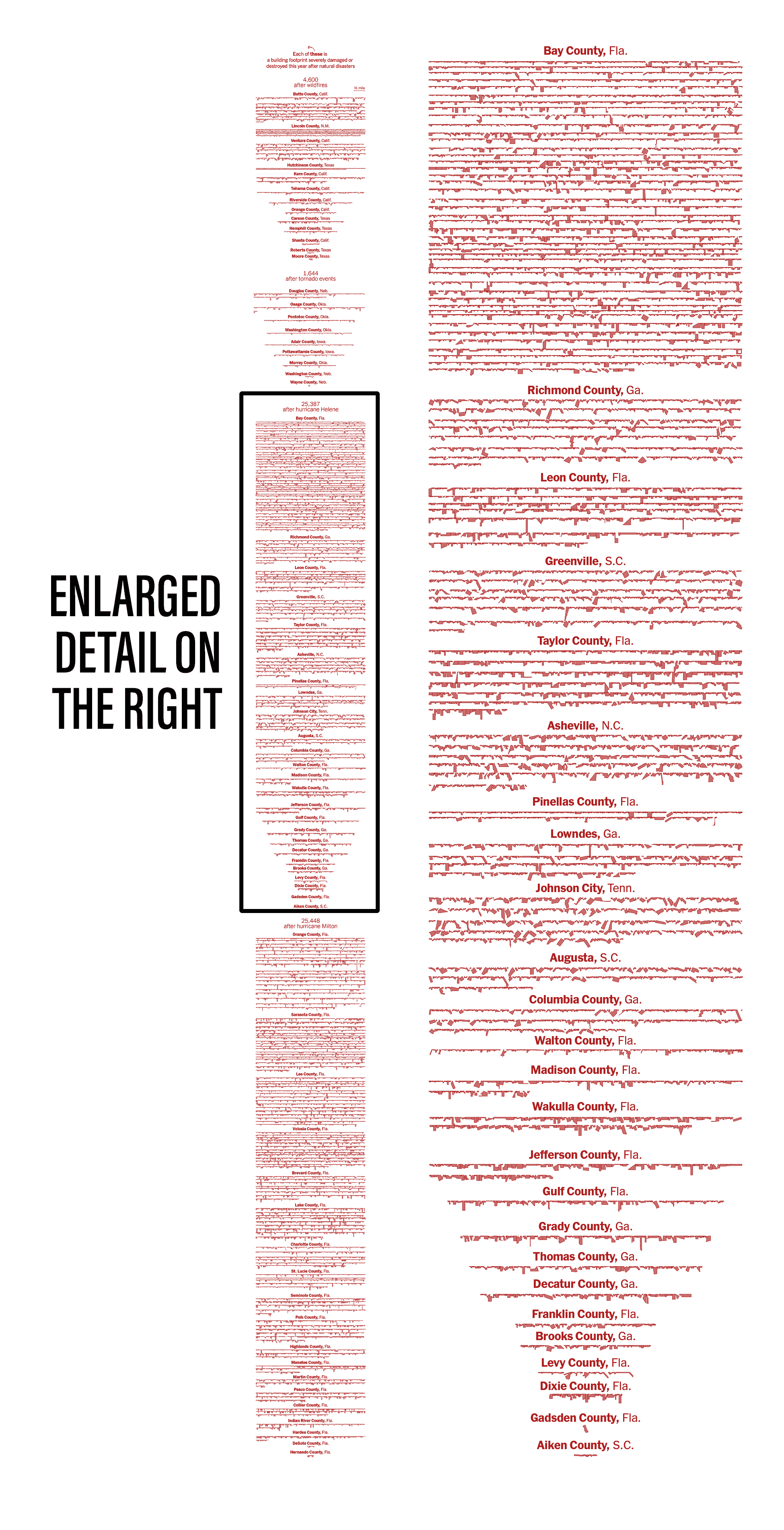
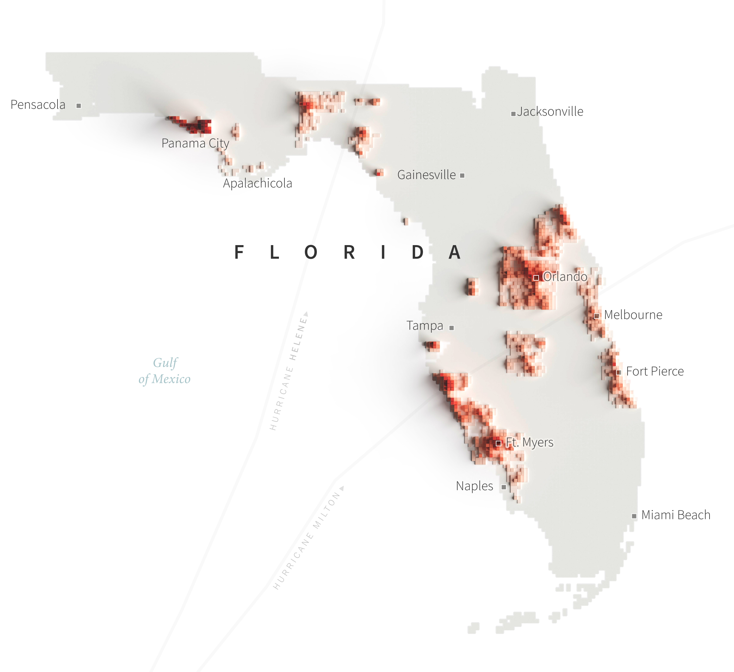
15: Mapping destruction across the U.S. in 2024