About #infofails post series:
I have a lot of beta graphics that never go public, it can be tons of versions of a graphic or just a few concepts as part of my creative process. So, where all those things go? well, ends-up in #infofails –a collection of my fails at work.
This time I’ll like to share a little bit of the backstage of the Hong Kong raising violence project. If you haven’t seen it yet, Have a look here first and come back to the article later to get a better context of this:
This year in the Asia Pacific region, one of the strongest topics of every day in the news is the protest in Hong Kong. Every newsroom here has been doing a lot of related work to the situation, and only seems to be worse and worse through the time.

Screenshot of the section dedicated to the use of tear gas by the Hong Kong Police.
We spend a lot of time checking the information with the Police press releases and many different sources just to get simple charts to show/prove if the violence is increasing or not. I guess we spend more time taking care of little details rather than doing the visual display of the piece. That’s one of the best things I can highlight on the Reuters graphics team.

Concepts for the Police equipment display
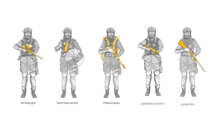
Final version show in the story
It’s funny how this year I been doing so many illustrations for projects. I don’t see myself as an artist. In fact, I feel sorrow about my sketches because the quality of my drawings is not good enough, in part because I have friends with huge skills like Adolfo Arranz and Daniel Solano but, talking about graphics, I feel that I should try things outside my comfort zone, no matter if it’s a 3D tool, hand made sketches, vector graphics or the result a few lines of code… It is an endless search for new ways to effectively communicate our stories.
The following concept of a graphic about the water cannon truck of Hong Kong Police is a piece I started for this project. The issue here was that the story was getting longer and longer, so, the editor decided to drop out the graphic. I always keep a folder with every version, sources and other related material, because you never know if you will need something of that later.
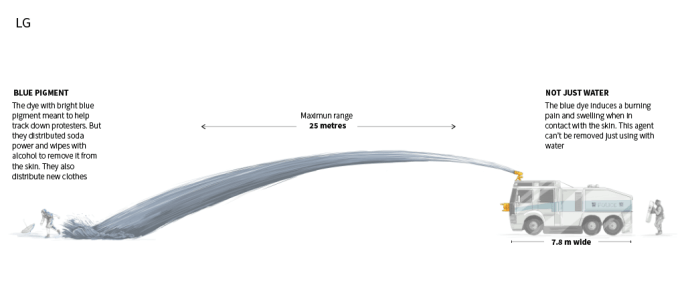
Large desktop version // ai2html L artboard
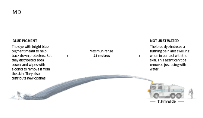
medium version // ai2html MD artboard
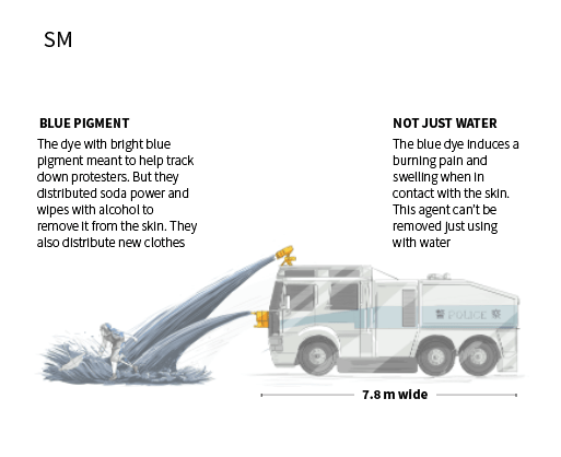
devices version // ai2html SM artboard
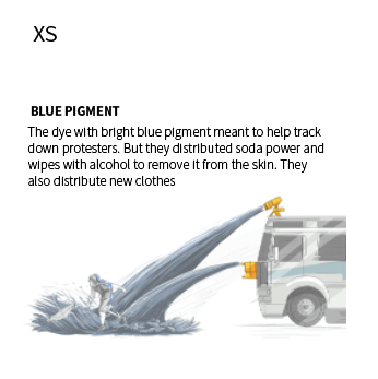
Small devices version // ai2html XS artboard
Finally, we use that same illustration in a launcher, with some minor adjustments in the amount of water released by the cannon. That’s the image at the top of this publication, on the right the original illustration, and on the left, the edited version for banners.
Something else in this project with a lot of versions was the opening illustration, just a few of the was about color, I have clear that color must match with the bar charts in the story, but anyway I like to give a try to some variations, that helps sometimes to go back a do little retouches to the final piece.
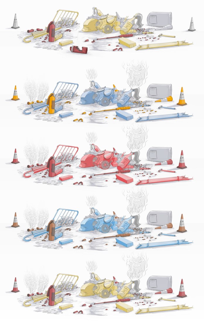
Opening color variations.
The most complicated thing to solve was smoke. It really asked me a lot to achieve the effects indicated there. We were looking for a subtle effect, otherwise will go as plain static cover image (which also was good) but I like to complicate my self for some reason:

Opening loop, final version. (v14)
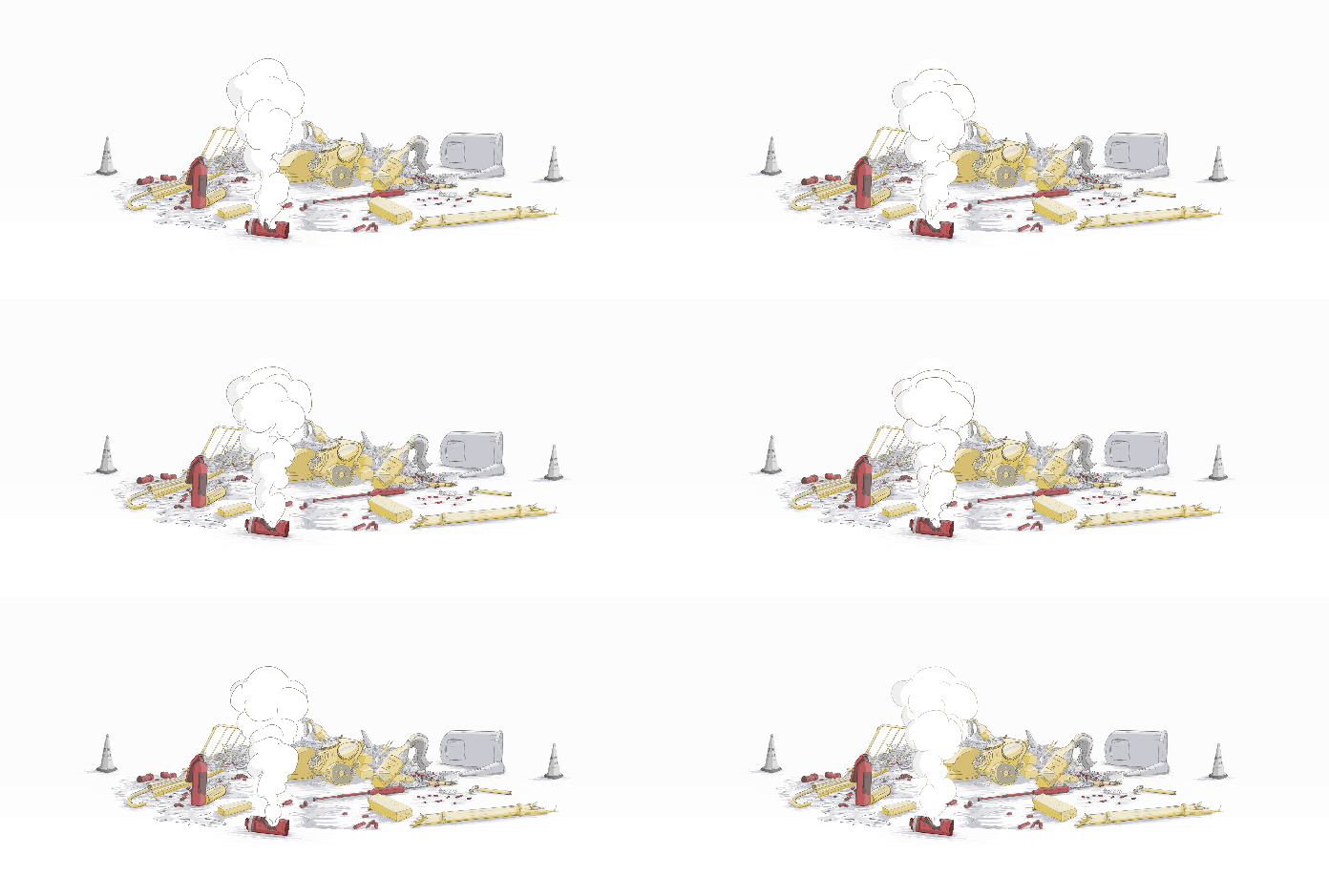
Version 13
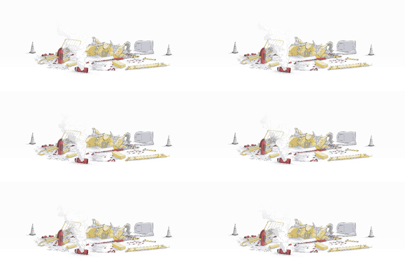
Version 7.2
I like to think that little visual details make a big difference in the final product. So it’s fine if I spend a little more of time doing some variations and taking care of my stuff, even I do that in my time off. Literally, I can’t sleep if I haven’t solved an issue with a graphic… I know, I have a problem hahaha.
________
Did you like #infofails?
Have a look to other #infofails Chapters here:
And Stay tuned for the next chapter 🙂


Pingback: The last chapter of #infofails… [of 2019] | Marco Hernandez
Pingback: #Infofails: Chapter 05, gold fever | Marco Hernandez
Pingback: #Infofails: the world on fire | Marco Hernandez
Pingback: #infofails: A busy 2021 kick off | Marco Hernandez
Pingback: Olympic #infofails | Marco Hernandez
Pingback: 🎵 I can see clearly now the rain is gone… | Marco Hernandez
Pingback: Doodles for news | Marco Hernandez
Pingback: Random Details of Failed Maps | Marco Hernandez
Pingback: The mismatch | Marco Hernandez
Pingback: infofails: mapping Taiwanese food | Marco Hernandez
Pingback: infofails: 2024 mapping destruction across the U.S. | Marco Hernandez
Pingback: infofails: 30 days map challenge | Marco Hernandez