
This is a follow up to my previous tutorial for visualizing organic carbon. The process is more or less the same, but it uses a different dataset, which has some extra considerations. You can revisit it below:
Before continuing, to follow my guide and visualize global temperatures, you should be able to use your Terminal window, QGIS and optional Adobe After Effects or Photoshop.
About the data set
NASA’s Global Modeling and Assimilation Office Research Site (GMAO) provides a number of models from different data sets, this is basically a collection of data from many different services processed for historical records or forecast models. This data works well for a global picture or continent level even, but maybe isn’t a good idea to use this data for a country level analysis, for those uses you may want to check other sources of the data instead of GMAO models, like MODIS for instance if you you are looking for similar data.
SURFACE TEMPERATURE
There are a lot of different sets of products available at GMAO. For purposes of this tutorial, I’ll be focusing in the Surface Temperature which is stored into the inst1_2d_lfo_Nx set. That’s a GEOS5 time-averaged reading, which includes surface air temperature in Kelvin degrees in the 5th band of the files, there is some documentation available in this pdf. ( No worries if is this sounds too technical stay with me and keep going. )
These files are generated hourly, so a day of observations accounts for 24 files. This is great for animation because it would look smooth (even smother than the one we did for Organic Carbon before).
Where’s the data? and How it’s named?
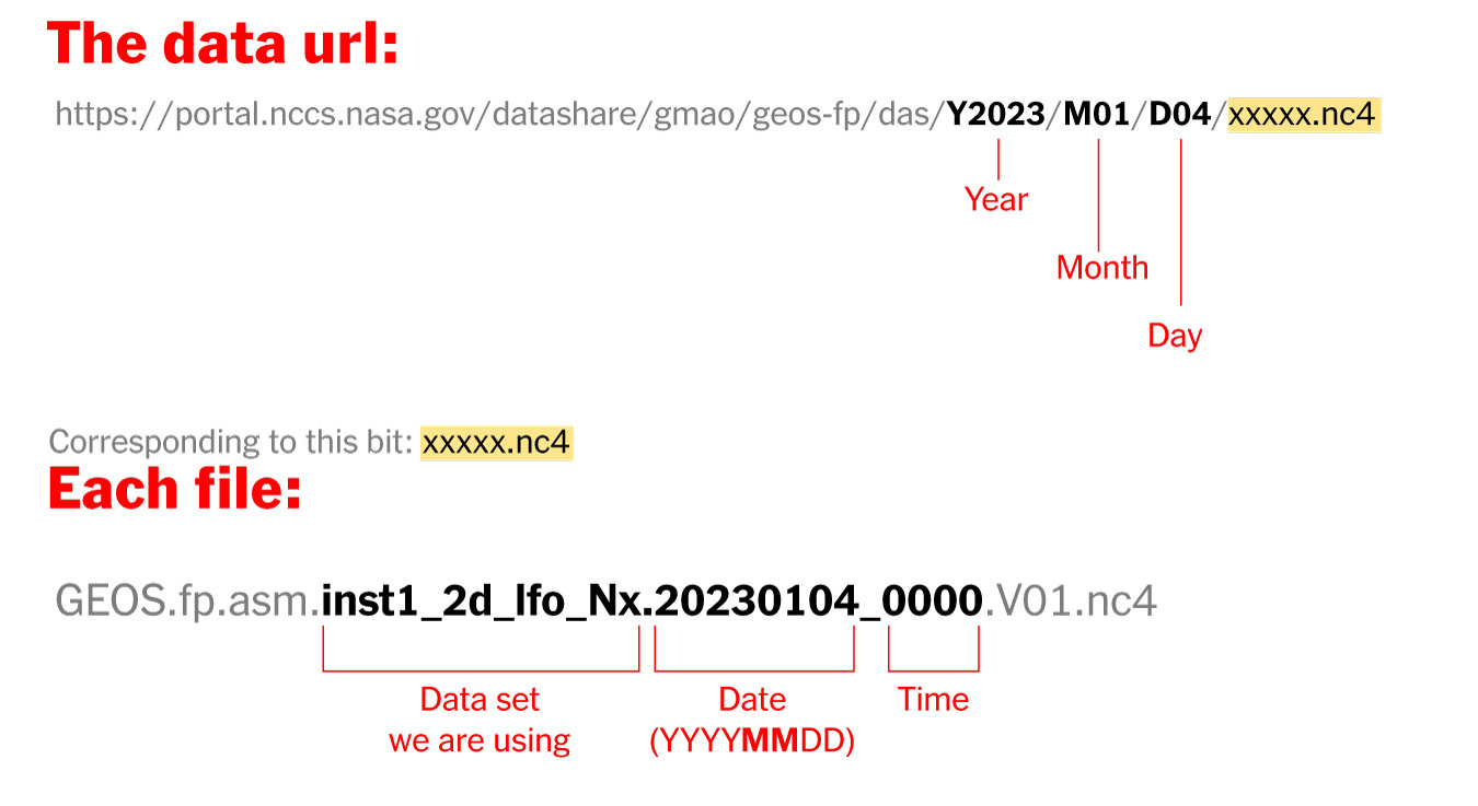
The data is stored into this url. You can go into the folders and get all 24 files for each day manually if you like or get them with a command line using wget or curl into the terminal, I’ll recommend you the command line since it’s easier. Here’s how each file is named and stored:
Step 1. Get the data
- Create a folder to store your files with some name like “data”
- Open your terminal window
- Type cd in the terminal window followed by an space
- Drag and drop the folder you created inside the terminal window:

Then copy+paste the following command line in your terminal window and hit enter:
curl https://portal.nccs.nasa.gov/datashare/gmao/geos-fp/das/Y2023/M01/D04/GEOS.fp.asm.inst1_2d_lfo_Nx.20230104_0000.V01.nc4 -o 20230104_0000.nc4Once it reaches 100%, you would get a file named 20230104_0000.nc4 in you “data” folder: Note that I have renamed the output ( -o ) with a shorter name. The file will go to your folder ready to use into GQIS. Of course you will need a few more files to run an animation. Remember that this data is available for every hour every day, so you need to set the url and name for something like this:
00:00 MN >> 20230104_0000.V01.nc4
01:00 AM >> 20230104_0100.V01.nc4
02:00 AM >> 20230104_0200.V01.nc4
03:00 AM >> 20230104_0300.V01.nc4
...and so on...
08:00 PM >> 20230104_2000.V01.nc4
09:00 PM >> 20230104_2100.V01.nc4
10:00 PM >> 20230104_2200.V01.nc4
11:00 PM >> 20230104_2300.V01.nc4
Just create a text file listing all the urls you need and run the script into the terminal window with the same process:
curl -O [URL1] -O [URL2]Each file is usually about 10MB, if there’s something wrong with the data the file will be created anyway but would be an empty file of just a few KB. Remember a full day accounts for 24 files but it starts from zero not 1.
Step 2. Loading the data into QGIS
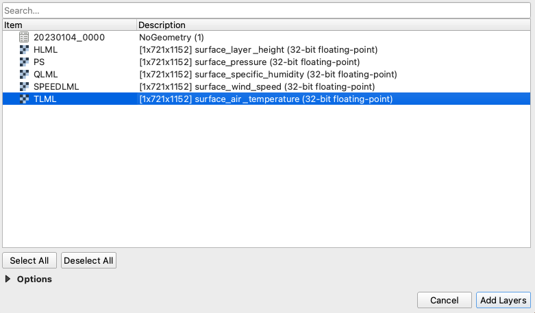
Once you have a nice folder with all the files you want, you can just drag and drop the .nc4 files into QGIS. We are looking for the 5th Band, TLML which is our Surface air temperature:
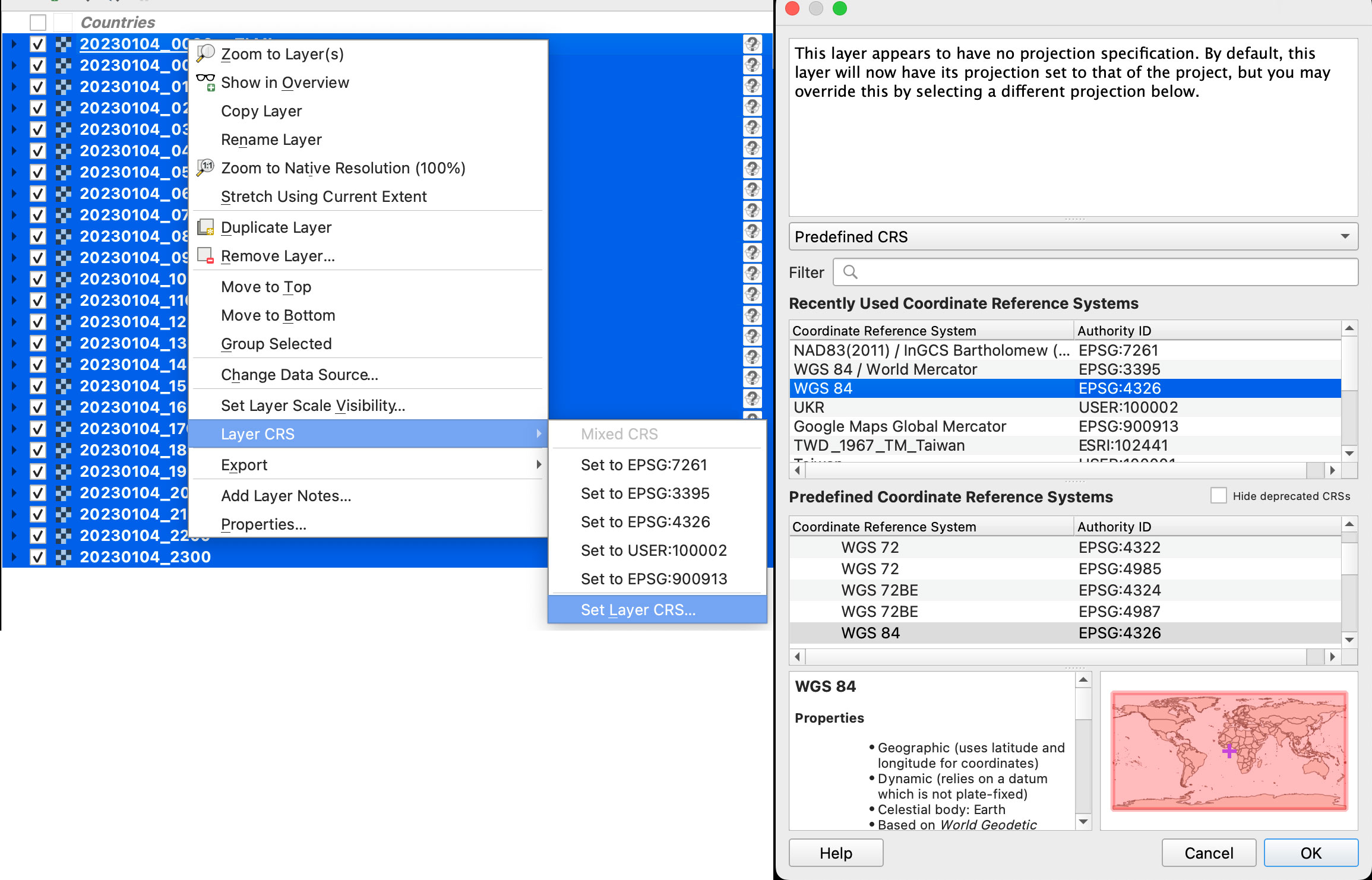
Once you have the data loaded, you want to set the data projection to WGS 84, this will enable the data layers to be re-projected later on. To do that, select all you data layers, right click on them, and select Layer CRS > Set Layer CRS > 4326. Be sure of selecting all the layers at once so you do this only one time. Otherwise you will need to doing over and over.
Since this is a good global data set, you may want to load a globe for reference, you can use your own custom projection, or use a plugin like globe builder:

Once installed, just run it from the little globe icon, or in the menu plugins > Globe builder > Build globe view. You have a few options there, play around with the center point lat/long. You can always return here and adjust the center by entering new numbers and clicking the button “Center”.

Step 3. Styling your map
The color ramp is important, you want to have a data layer and maybe a outline base map for countries, QGIS has some pre-built ramps for temperatures, you can check them out by clicking the ramp dropdown menu, select Create New Color Ramp and then select Catalog cpt-city.
Once you have your ideal color ramp for one layer, right click on that layer, go to Styles > Copy style. Then select all you temperature data layers at once, right click on them and select Styles > Paste Style.
I have created a ramp to fit better my data ranges and style a little the colors. If you not are using the optional ramp below, and want to proceed with the pre-built ramps skip this to step 4.
To use my ramp, copy and paste the following to a plain .txt file:
# QGIS Generated Color Map Export File
INTERPOLATION:INTERPOLATED
224.0615386962890625,14,17,21,255,224
250.69161088155439643,80,122,146,255,251
266.87675076104915206,235,238,217,255,267
275.3270921245858176,225,213,143,255,275
285.49591601205395364,214,155,59,255,285
293.66160637639046627,187,80,30,255,294
298.05635745871836662,170,33,23,255,298
308.53047691588960788,58,14,11,255,309
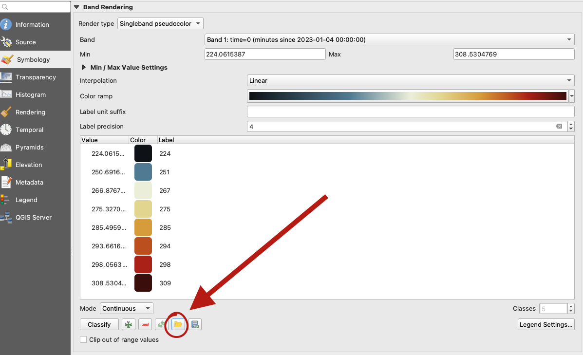
To apply the ramp to your layers, doble click one of the .nc4 files, and select Symbology in the options panel. Under render type, select Singleband pseudocolor, the look for the folder icon, click it and load your .txt file.
Step 4. Preparing to export your map
You are almost done, by this point you can see how each data layer creates nice swirls, maybe some evolution of it too just by toggling the layers visibility. I like to have all the layers well organized so you can quick check the data. I’m maybe a little too obsessive but I usually rename all layers and groups to something like the image below, however this is just for me to know which files are on which day:
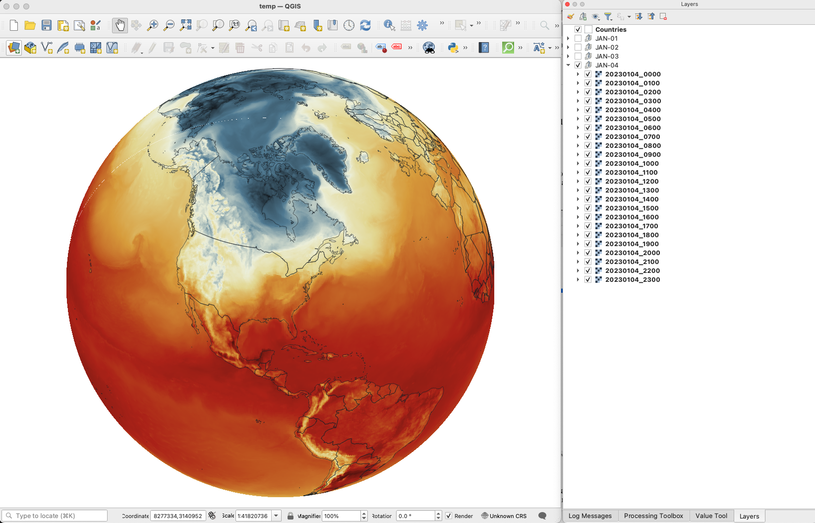
The name change works if you are using an automatic export of all layers, the script in the next step takes the name of the layer to name file output. But there are alternative ways to do this if you’re not as crazy as I’m and don’t want to spend time manually renaming.
Step 5. Export your map
There are many ways of doing this, you can set up the time for each layer by using the temporal controller, there’s a good guide here. That way you can get a mp4 video right away from QGIS, but you need to set up each data layer time manually.
You can also use a little code to export each layer into an image, which you can then import into After Effects. To do that, the first step of course, is to get the script. Download the files from my google drive HERE.
Now, go to the plugins menu at the top, there, you will see the Python console, go and click that, you will see this window popping-up:

Click the paper icon, then click the folder icon and select the python script you dowloaded above. Just be careful with the filePath option.
If you are on a mac, right click your output folder and hold the option key, that will allow you to copy the absolute path of you folder, paste that to replace the filePath field value (the green text in the image below). If you are on Windows, just make sure to get the absolute path and not a relative one.

I left some annotations on the script to better understand what each part is, it’s based on a script someone did with Vietnamese annotations, source and credit are in the drive link too.
Now just click the play button in the python console, seat back and look all the frames of your animation loading in the output folder you selected. You should see a file for each of your layers when the script finishes.
Step 6. Color key
The temperature in this set is provided in Kelvin degrees. The range of the data depends on your date / file set up. But if you are using the ramp I have provided above with data for Jan. 4, there’s a svg file named “scale.svg” in the drive folder within this range. I have nudge a little the color and ranges matching the map with nice round numbers.
For January 4, the data rages are about 224°K to 308°K, you can use google to covert that to Celsius or Fahrenheit depending on your needs. But basically you can take your Kelvins and subtract 273.15 to get Celsius. The min. Temperature would be ~ -49°C (224°K) and Max. ~34°C (308°K). If you are into Fahrenheit, I’m sorry the math would be a little more complex for you… go ahead and use google.
Step 7. Setup and export your animation
On my previous tutorial to visualize Organic Carbon, I used Adobe After effects to add the dates, you can use the same principle here, or using any other alternatives. For example, once you have the output files you can drop them all into photoshop. By going to the menu Window / Timeline you can add a frame animation, simply click the + icon in the timeline panel followed by turning one layer on at the time.
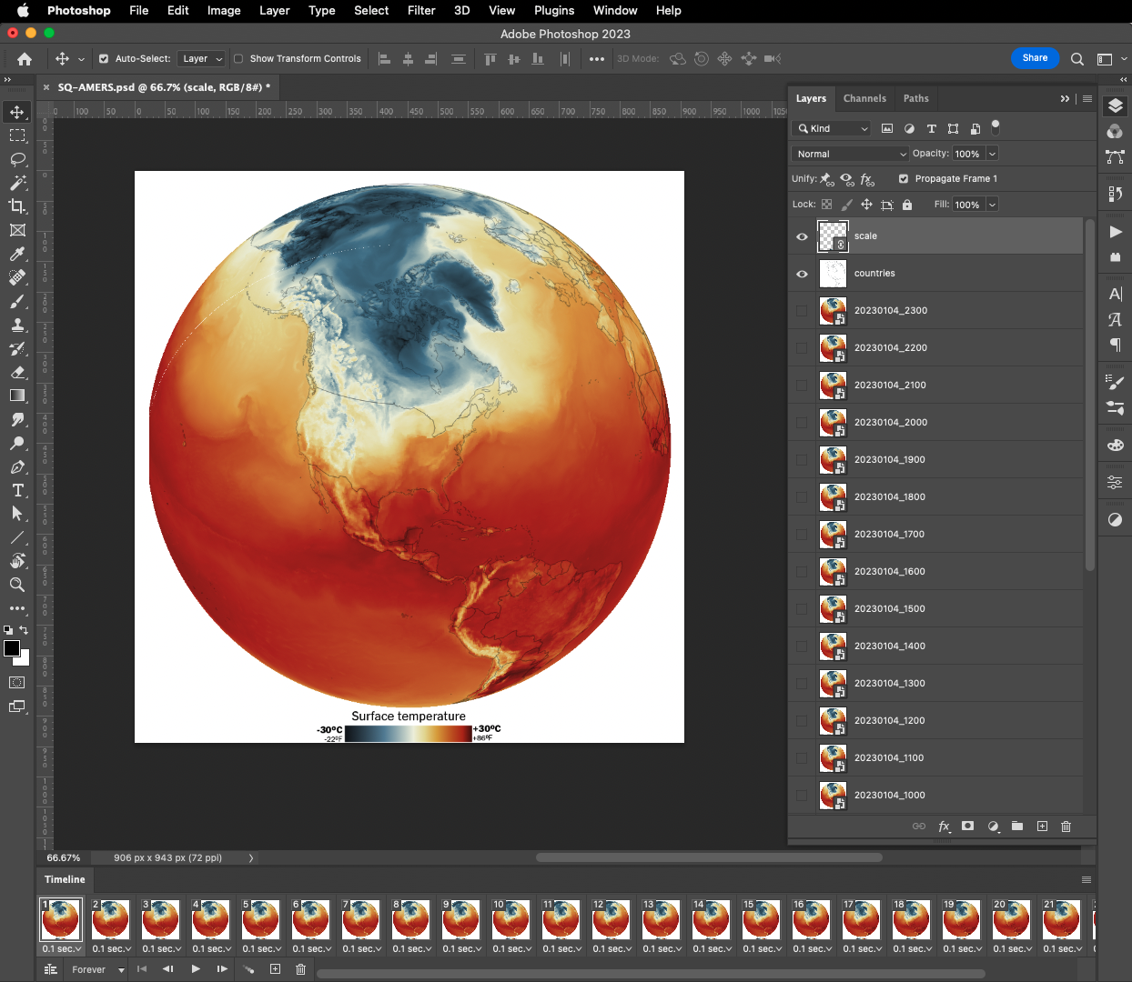
If you are using Photoshop, pay attention to the order of the files, it should match the data dates from newest at the top to oldest at the bottom. Once you have you sequence ready, in the timeline panel menu, you will find a render option to export your animation as video, or you can create a gif animated by using the top menu File / Export / Save for Web or command + option + shift + s if you are on a mac.
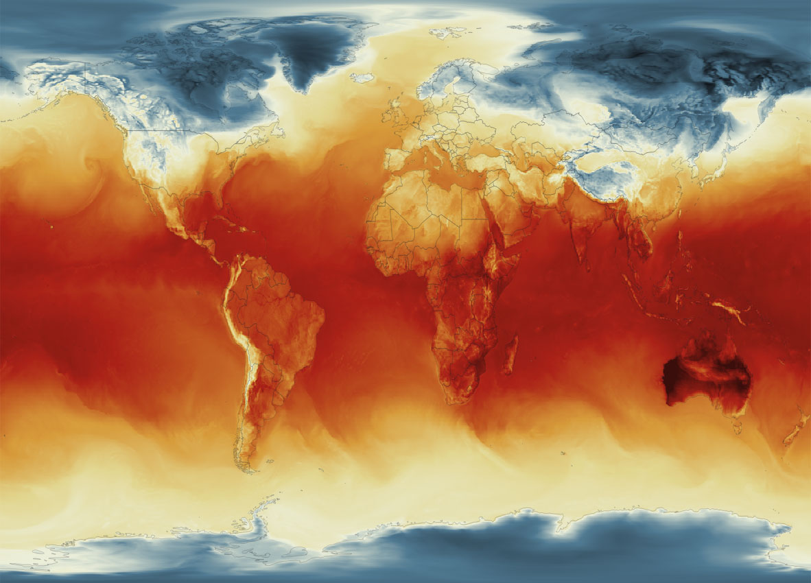
Your animation should be smooth and nice, something similar to this great story from NASA’s Earth Observatory
Or something like this, if you have used the same data and ramp from this tutorial:
If any of this doesn’t make sense to you, or if you’re having trouble with a step, feel free to reach out to me on Twitter or Mastodon I will be happy to hear from you.
Happy mapping!
Update
Using gdal to convert data to 180-180
Someone contacted me about this tutorial because they were having problems with the projection of the temperature data.
For some reason if your files are in 0-360 format instead of 180-180 you will usually see the globe aligned with the vector layers but not with the temperature rasters, which usually appears to the side in QGIS
If that’s happening to you, you may need to convert your data before dropping it into QGIS. Here’s a quick tip on how to fix that:
- From your terminal window cd your folder like you did before, look for the directory where your temperature data is.
- Type gdalinfo add an space and paste the file name it should look like this:
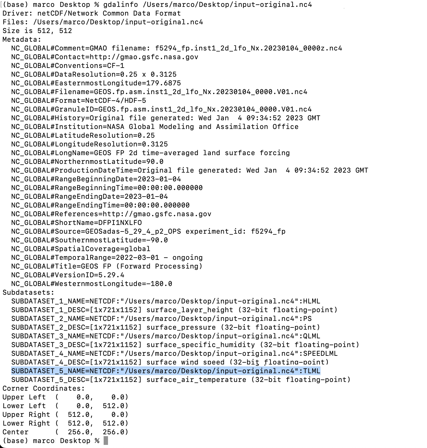
- You will find the subdatasets. We are looking for TLML (temperatures) that highlight on blue above.
- Gdal would help you to convert the data so you can use it, the command line looks like this:
gdal_translate -of netCDF -co WRITE_BOTTOMUP=YES NETCDF:"/Users/marco/Desktop/input-original.nc4":TLML your/directory/output-file-name.nc4
***Note your file path will be different copy that from your terminal window (the blue highlight)
That will give you a new file in the directory of your choice (your/directory/output-filename.nc4) in this example there is a folder called directory inside a folder called your in which is the file called output-filename.nc4. Be careful when renaming files the dates are important to the animation process.

Pingback: 2023: The year in graphics | Marco Hernandez
Pingback: Dual heat domes hit Europe and US – Financial Rush