That time of year is back, most infographic teams look back, making lists of work that left the year and highlighting their best stories.
I decided to make my own list of favourite details in the projects that I work on throughout 2020. But, before jumping in, keep in mind these are my opinions on small details out of context. Those little bricks are part of a bigger story.
January
I spent the first month of 2020 covering the Australian bushfires and little stories of a “new mystery virus”. If I need to pick just one single detail of those projects from January I’ll say the opening map of the story entitled Assessing Australia’s “ecological disaster”.
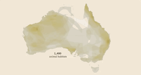
The map is superposition of the habitats species in Australia, follow by the areas burned by wildfires in 2019. I like this little details because at the end of the animation you can see how all the habitats blends and some white areas a left in the map as well, turning this map into a map of Australian wildlife diversity and the fires threatening the animals’ territories.
January highlight link HERE.
February
We knew very little about the virus back in February, not many people was worried about it and the major threat may was the people returning home from “ground zero”. Countries started to evacuate their citizens from Wuhan and later on from China. My favourite detail was this simple diagram I work on about each country evacuees known at the moment.
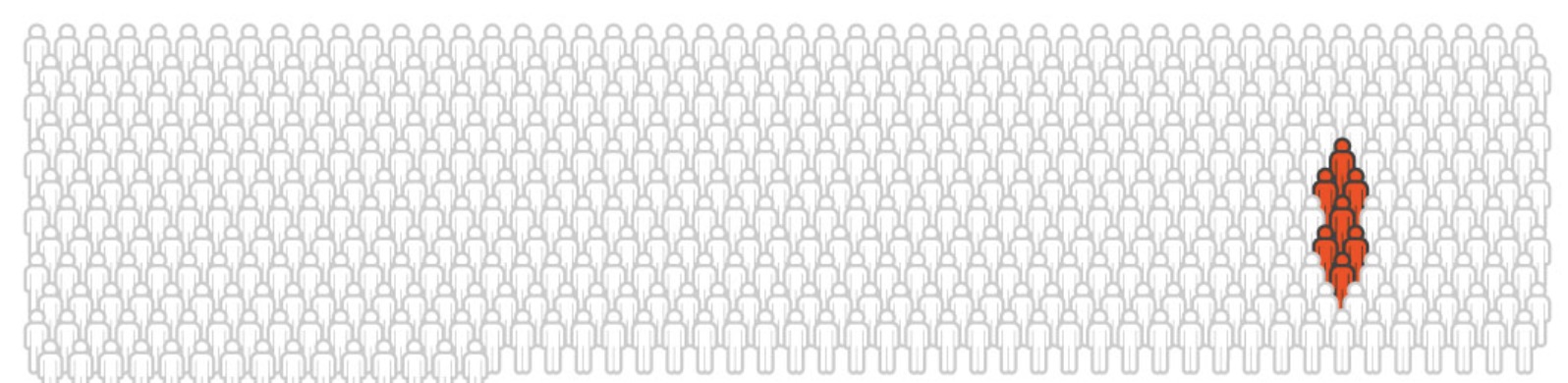
Among the Japanese evacuees, them 7 tested positive while in quarantine. I guess uncertain is the worst feeling while you are isolated with other people who could be positive, especially if you are “locked in” with a lot of people. This little diagram transmits a bit more than just a visualisation of “how many of them”…
February highlight link HERE.
March
No surprise: A little more about COVID-19 stories in March.
Anyway one of the most choking stories happened in South Korea. The “michin ajumma” was all over the news in Asia because the incredible level of negligence of this woman. South Koreans called this woman “michin ajumma” or “crazy auntie” in english becase she was a virus super-spreader including records of contacts for more than one thousand people while she was sick.
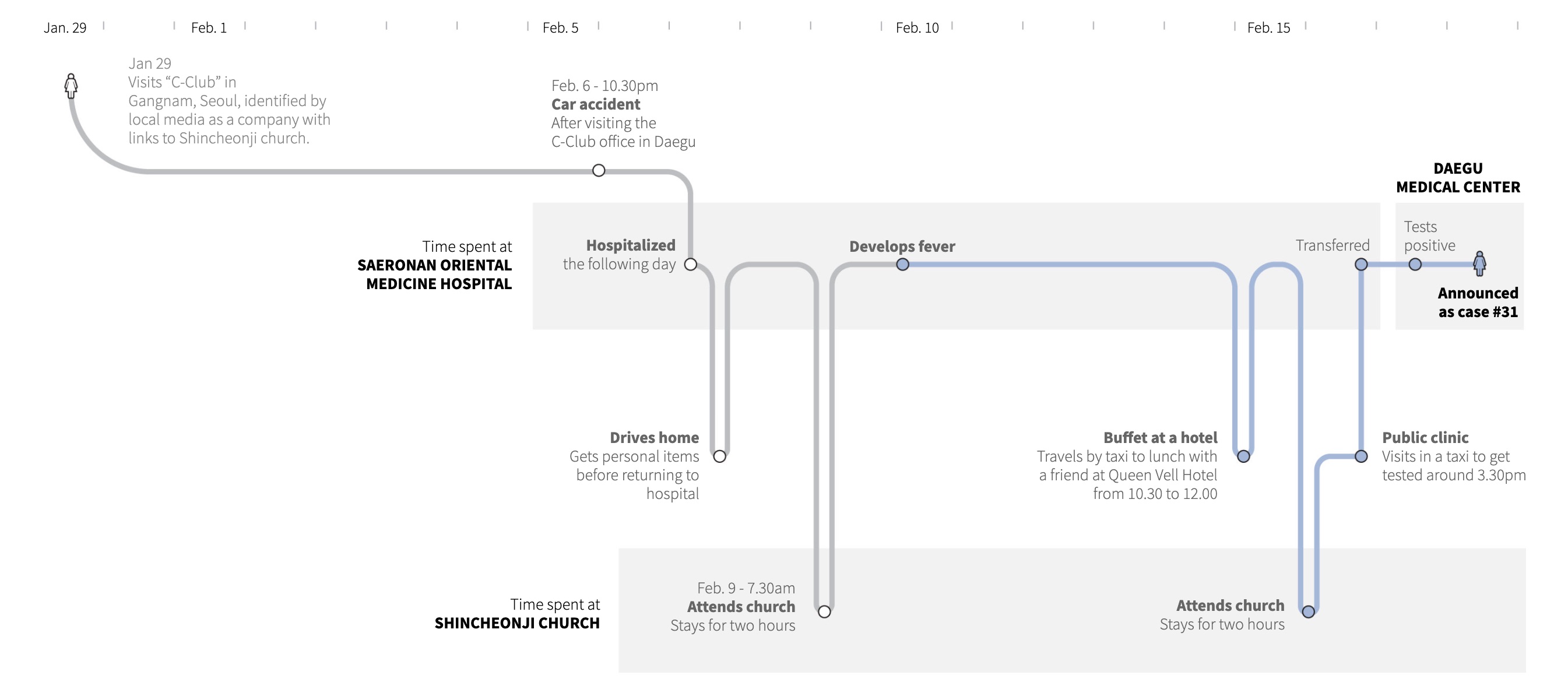
I like this diagram because allow you to see how this person went in and out from hospital for different reasons, including the need to attend a buffet in a hotel.
March highlight link HERE.
April
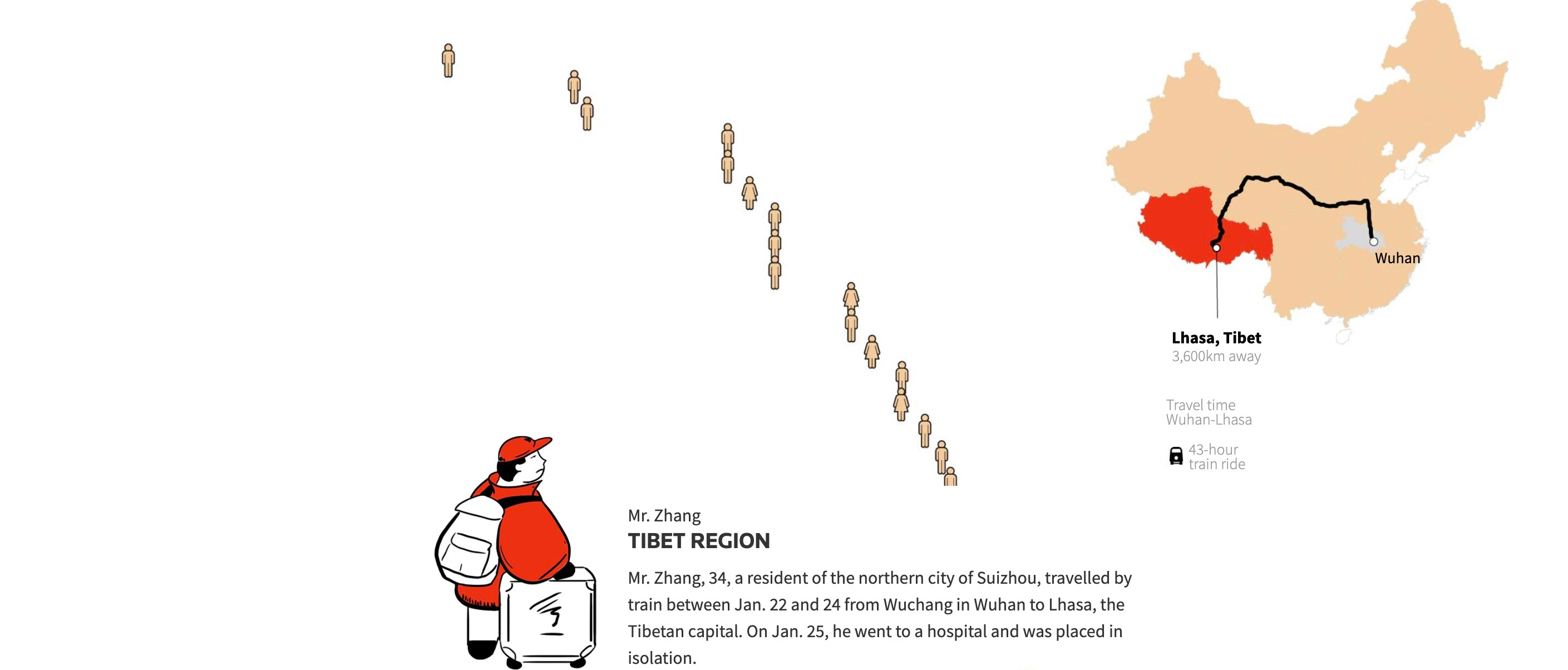
Some stories take more time than other to hatch, we need to take our time to conceptualise, produce, corroborate, edit, polish, promote… But among all the stories of the year, none took more time than “How coronavirus hitched a ride through China“. This crazy COVID ride across the vast lands of China reveal series of mind-blowing little stories to explain how the first cases of the virus arrived to each province of China.

My favourite little story, because the implications of the travel, is this 3,600km train-trip that Mr. Zhang did from Wuhan to Lhasa. Can you imagine be in a train for 3 days traveling sick and sharing a small place with many other people around? I guess no one knew anything about risk back then. This little story in itself could be a Hollywood movie.
May
Some events in our blue marble are big enough to be seen from space.
My favourite detail in May was one of the images we spotted with the Sentinel satellite. The image shows a bunch of cruise ships anchored in the Philippines with no guest but hundreds of crew still on board, trapped without a job guarantee; just waiting in limbo of the world’s largest cruise parking lot.
June
By mid year I turned my attention to other problems occurring in South America.
Illegal mining that tears down vast tracts of the Amazon rainforest threatens indigenous peoples and their way of life. Even illegal miners themselves endanger themselves by inhaling highly toxic waste from using mercury, even handling it with their bare hands.
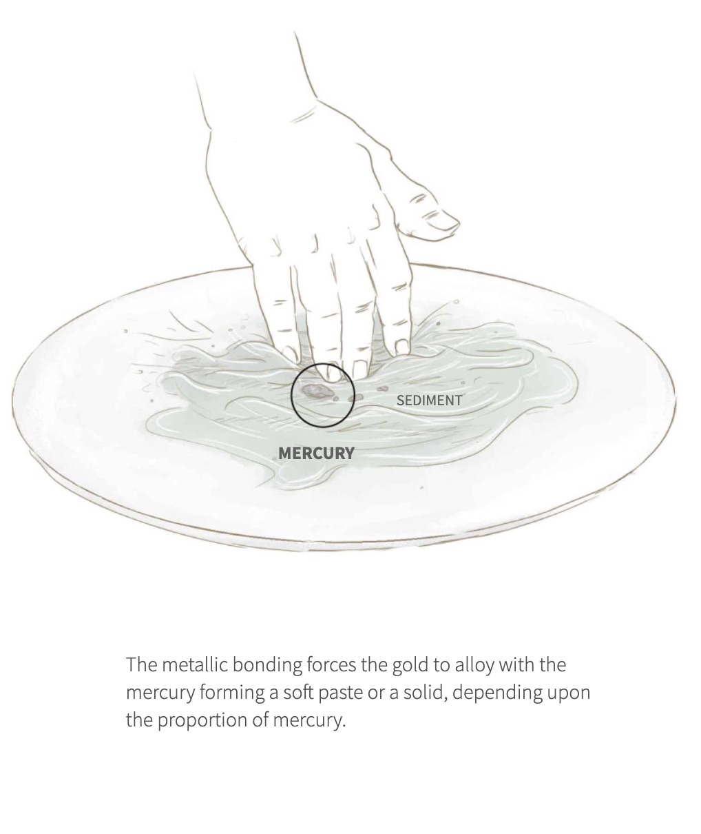
My favourite details are those little illustration blocks explaining part of the problems. Staggering satellite images are proof of the magnitude of the problem in the region.
June highlight link HERE.
July
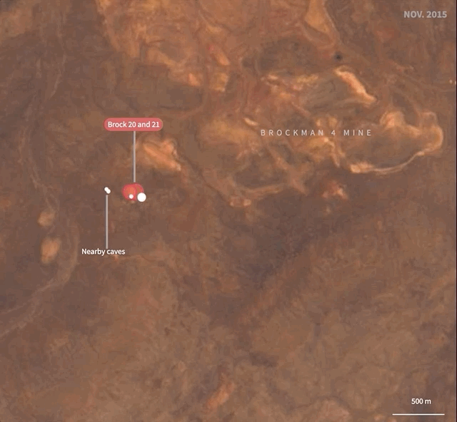
Have you ever see an ant farm as a kid? It was amazing isn’t? you can imagine what’s going on in the little world down there, all that crazy movement and structures rising trough the time.
If you don’t know what I’m talking about you may need to see this piece we did in August about the mining sites of Rio Tinto in Australia.
“Mining Australia’s sacred sites” was a very serious topic actually. Some fo the destroyed areas have heritage history of over 20,000 years. The state-approved destruction carried out by the mining company sparked anger from indigenous landowners.
In this case, satellites were useful to provide evidence of the expansion of the mines. My favourite detail is the timelapse of Brockman 4 mine, because it looks just like an ant farm.
July highlight link HERE.
August
Many many things happened in August, we covered some breaking stories like Beirut’s explosion, and the Japanese bulk carrier Wakashio which got struck a coral reef on the paradisiac island of Mauritius. But my favourite among all of them is a completely different story.
August marked the 75th anniversary of the Hiroshima and Nagasaki A-bombs. We took the opportunity to create a visual explainer of what happened in a document style adapted to the time. You may notice the special typography and a particular style on the maps too. But the best thing about this project was the Japanese version that was published shortly after.
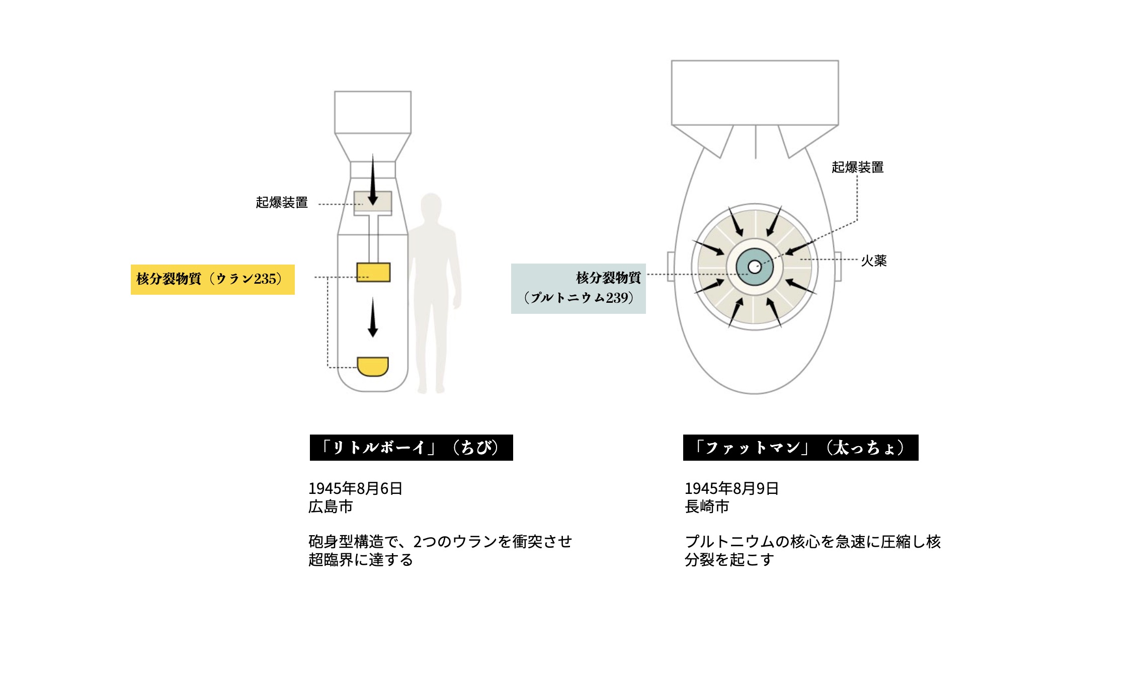
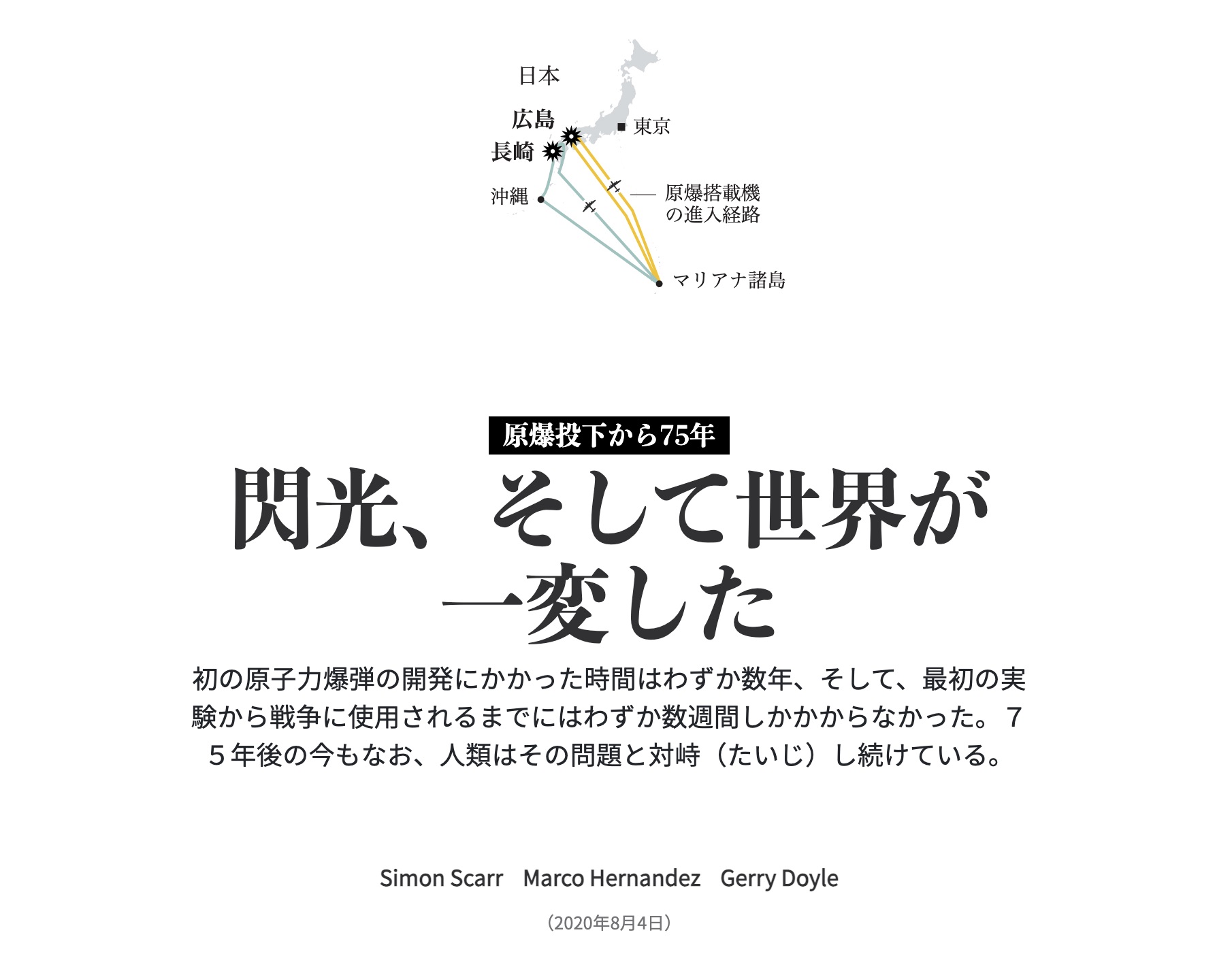
You can compare the English version here with the Japanese version here, you will noticed that some of the pieces are different too, so, isn’t exactly the same experience.
September
The ninth month of the year was all about wildfires again. Just like we kicked off the year, but this time the flames were consuming the North American forest. We did some different pieces, but one of the most popular was the smoke story.
The globe animation at the top of the page was very popular on Twitter, for some reason that kind of visual is always popular… But among all the pieces, my favourites are the small multiples further down the page.
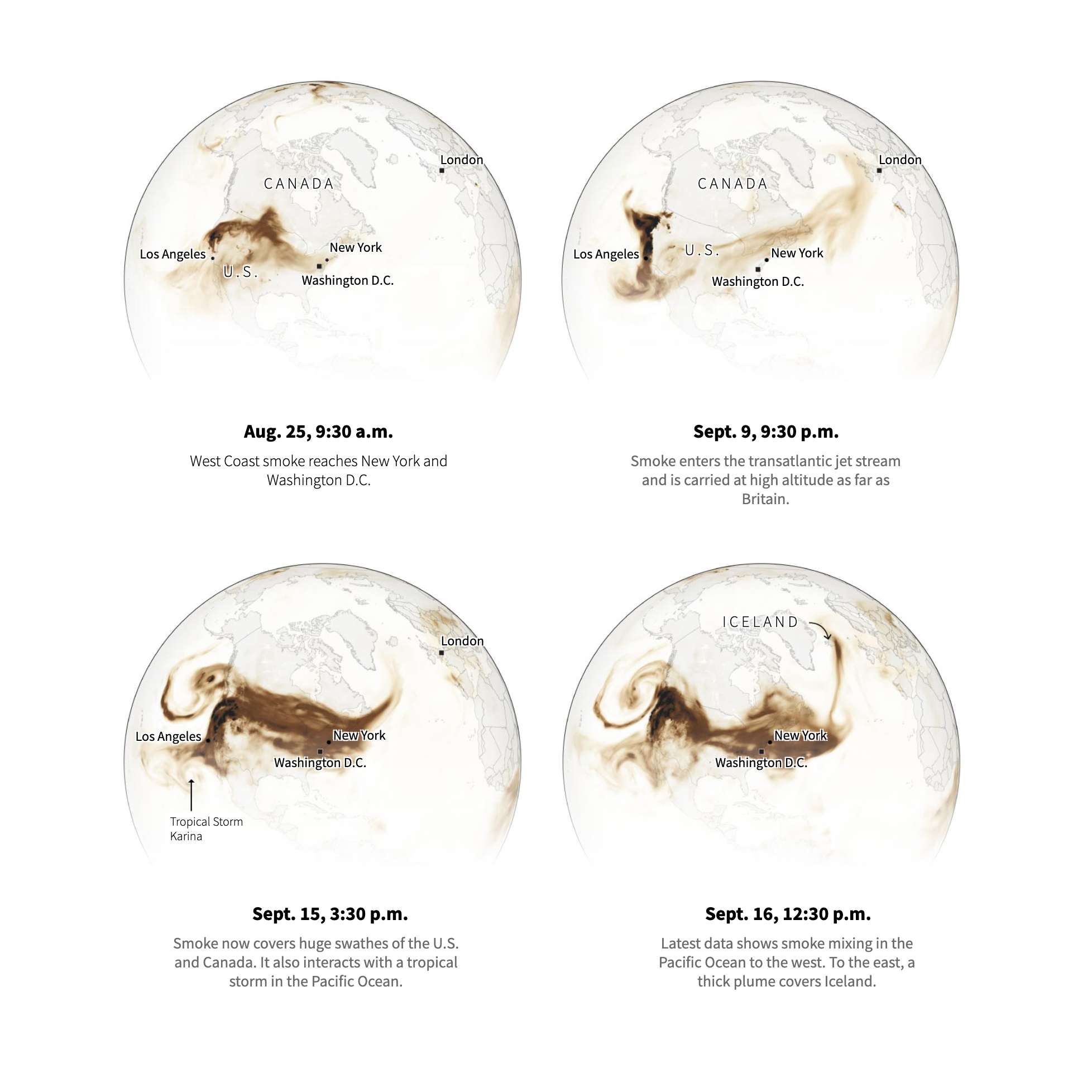
Those images frozen in time are some of the most relevant moments of the smoke dimensions. Something that you maybe miss in the animation if you don’t pay attention enough.
September highlight link HERE.
October
For a long time I wanted to do some graphic on wine, something about varieties, process, climate or so… But, I never tough that the chance will come because the vineyards were on fire.
“Up in smoke” is a story to visualise the damage caused by the fires in one of the most iconic wine regions of the world. Using some maps, dataviz, images and illustrations we tried to show what was going on there.


Doing research is a normal thing in all of our projects. But I guess because I really like wine, my favourite part of this project was the research phase. Reading so many articles, collecting so much data from everywhere, learn a lot to be able to explain later… and all that was about wine!
Yup, it was a nice experience, sad yes, but I learned a lot.
September highlight link HERE.
November
I really like to find the “woow” trigger in the stories. The “woow” happens when you give a little of context and show a visual of something that the reader wasn’t expecting, or even you in first instance.
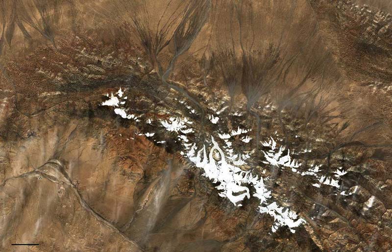
In last November we were working in this story about the glaciers in the Tibet region. The page shows impressive drone images and how the glaciers are retreating rapidly, but my favourite part of this is to realise how much changes the region over a year. The original loop show a whole year of transition, below are shown just the extremes:
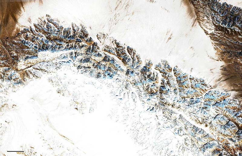
November highlight link HERE.
December
What a year!
By December I was calculating which one of the projects I have the queue will see the light before the end of the year.
The monster-sized A68a iceberg that has been wandering in the ocean since 2017 made headlines when it began approaching an island full of penguins and other species. By then I already had some data sets in my “sources folder”. So in record time, we finished what turned out to be my favourite story of the month.
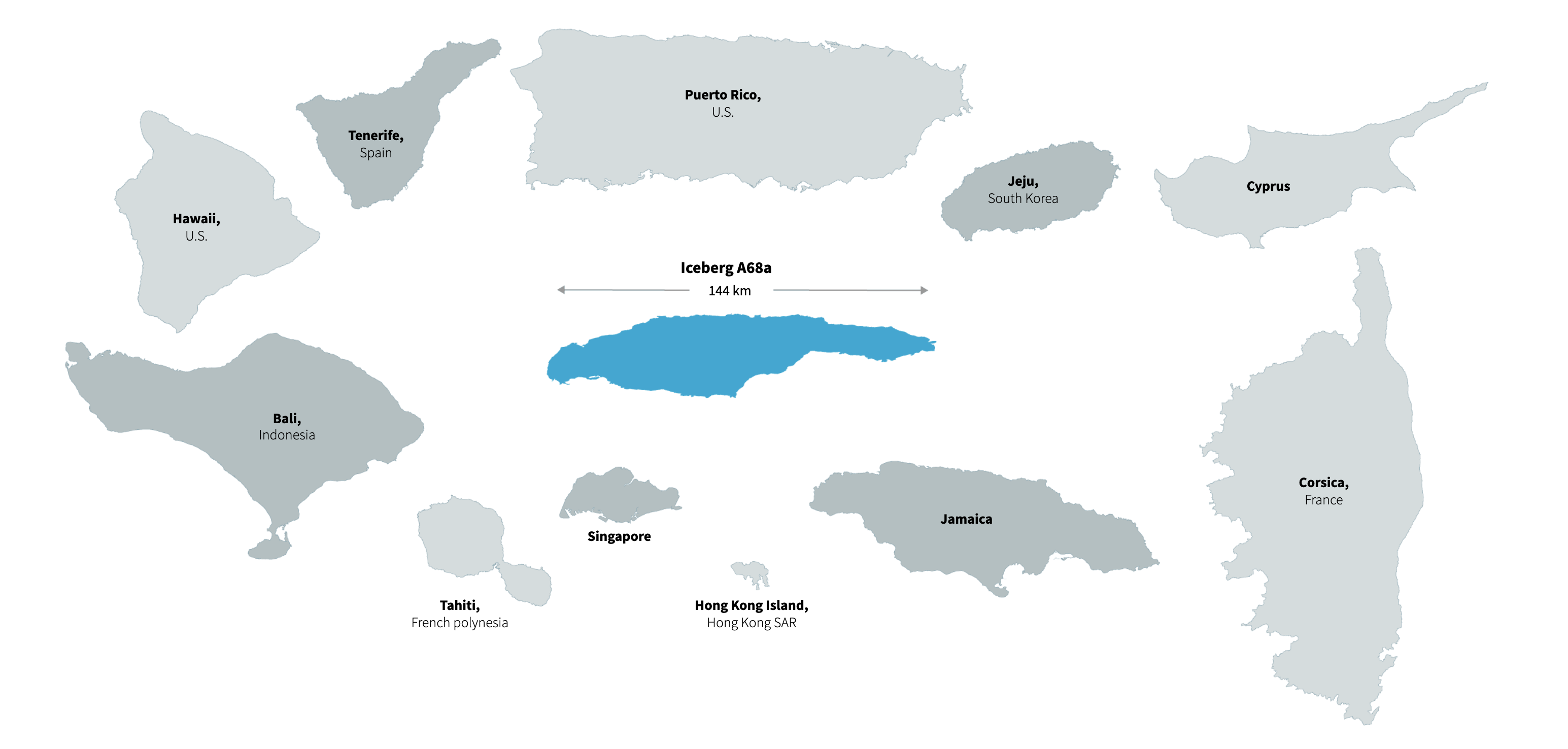
I knew the iceberg was huge, but one of the things that was spinning in my head was how much?
Probably bigger than many islands or even countries!
That’s why size comparisons are my favourites in this story, it’s not just about saying it’s massive, but about demonstrating it by showing evidence and references.
December highlight link HERE.
My 2020 list of graphics
Just a few days more of this crazy year are left, so many extreme stories have happened. This list is actually just a sneak pick of all the stuff we did over the year.
As I said at the beginning of this post, the little details in this list were pulled from the original context, I really encourage you to visit the full stories in the link at the end of each month’s entry to get a better understanding of the information.
See you all in 2021, Merry Christmas!