
About #infofails post series: I have a lot of beta graphics that never go public, it can be tons of versions of a graphic or just a few concepts as part of my creative process. So, where all those things go? well, ends-up in #infofails –a collection of my fails at work.
This 2019 is almost gone, big media is doing their “year in graphics” collections, meanwhile I’m in the rush hour trying to fit one more graphic in this year. I’m looking back trough this year, and it has been a crazy one; many unexpected things and lots of changes for me. That’s the case of this project I want to share with you, is one of those unexpected results, or un-result to be accurate.
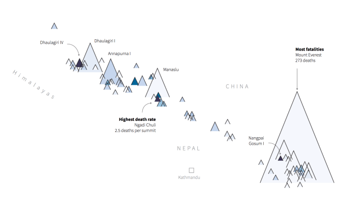
Death rates at the Himalayas peaks
The Mount Everest project (screengrab above) started as a great opportunity for a data narrative, the story behind was the bloom in the climbers amount, many times resulting deathly for them; the whole team was doing pieces to get this story online, if you didn’t saw it, here’s the final result of the project: CLICK HERE. Have a look first, then come back to this story for a better context.
The fail story
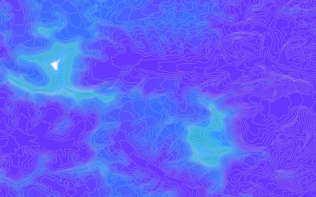
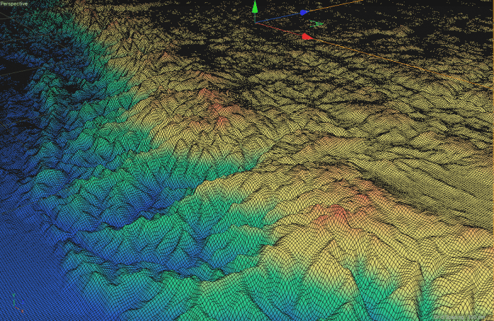
My fails begun when I was trying to get an accurate model of the mountain, I first tried doing some elevation curves map, like the one on top of this entry. The main problem here was to get a good resolution, I was taking as base a 90m DEM produced by NASA, the files are great and works most of the times, but not to the level of detail I was looking for.

90m DEM by SRTM/NASA. This was the starting point.
This thing works for a general overview of the whole mountain system of the Himalayas. To me, it was look in a good shape. By exaggerating the elevation, the idea was to add a color range or some other texture to visualize the heights, so then point out the mountains other than the Everest were the climbers usually go.
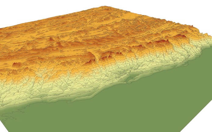
Version #1 Himalayas peaks
You maybe noticed that usually I do 1-5 versions of the images to try different ideas, in this case, I didn’t went any further because in the middle of the production some other projects came in. Fortunately my teammates got some other ideas, they took the project from this stage forward. I just jumped in again at the end to collaborate with the finishing touches and adjustments, so I can’t take any credit.
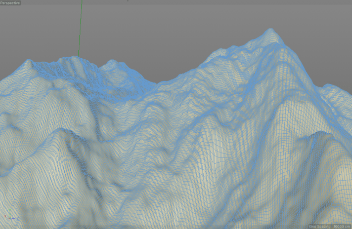
But going back to my fails, I did a few more pieces before the no return point in this project, one of them, a preview of the contours growing-up:
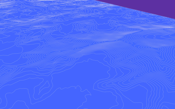
Everest and surroundings, model based in 90m data by SRTM/NASA.
Also I try some more realistic look using a 30M DEM from the Shuttle Radar Topography Mission. That one was looking better, but I was already out of time:
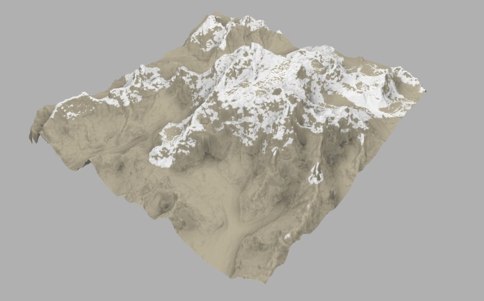
C4D textured model based on 30m DEM data by SRTM/NASA
Basic shading. C4D model based in 30m DEM by SRTM/NASA
Color ramp by height, Himalayas system. C4D model based in 30m DEM by SRTM/NASA
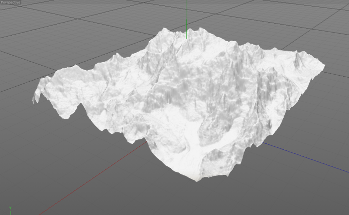
Mount Everest close-up. C4D model based in 30m DEM by SRTM/NASA
There was also an other idea to show in this graphic. I was thinking that maybe will be nice to show the equipment that modern climbers uses today in comparison with the equipment of explorers from 60 yeas ago when the mountains were the final frontiers of the unknown. Is incredible that teams went there with heavy and basic equipment and yet make it to the mountain (with great help from the Sherpas of course).
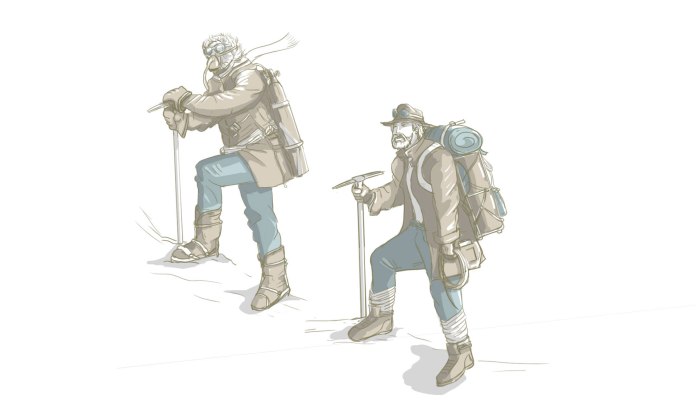
Climbers equipment detail. Based in documentation of the British expedition of 1950.
Not sure if this graphic of comparisons will be published or not, so I’ll upload just a tiny little part without information or details, but who knows, you maybe see it next year either at Reuters website, or here as another of my fails for your entertainment haha.
It has been a pleasure to have your comments and readings this year, I hope we will read each other soon.
Happy holidays!
________
Did you like #infofails?
Have a look to other #infofails Chapters here:
–Chapter One
–Chapter Two
–Chapter Three
Stay tuned for the next chapter in 2020! 🥳
