
I have a lot of beta graphics versions that never goes public. I do two or three versions of a graphic, sometimes just a concept as part of the creation process to get a better solution. So, I want to start a new series of #infofails with all that material. Someone once said:
nobody learns from the mistakes of someone else
Of course, this is a statement to make your own mistakes but is sooo funny to see how someone else fails too 😁 so here my fails at work:
My first entry on #infofails is about this project we run a few days ago about the wildfires near the Arctic.
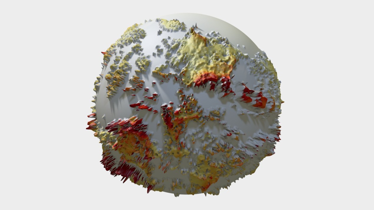
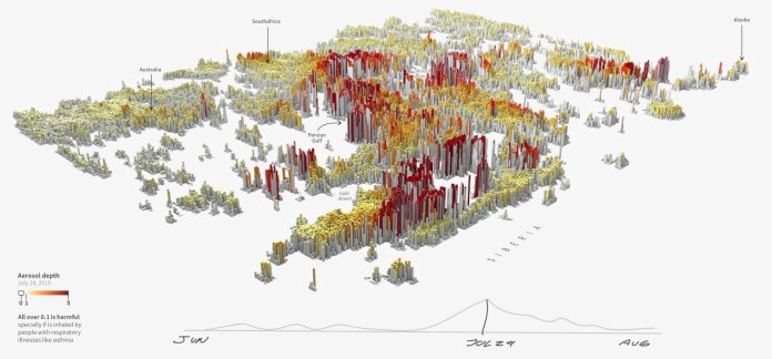
Wildfires project. 3D wold map or aerosol. Version 01
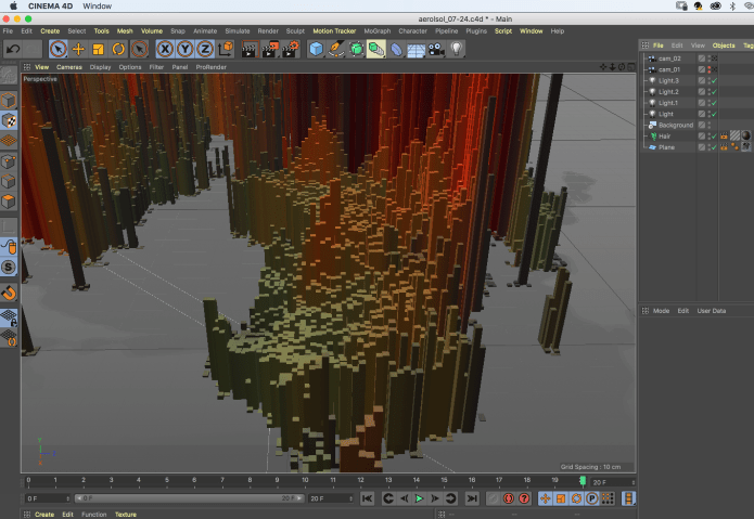
The map above is a Cinema 4D render, it was made based on NASA data of aerosol, basically, I took the GeoTIFF provided by NASA and using the hair module I create using that reference. Basically, each of the pillars in the map is hair:
Cinema 4D, hair map by July 24, 2019. Based on NASA’s aerosol data.
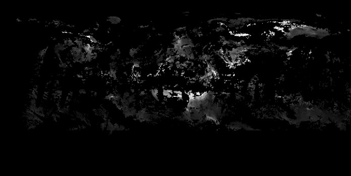
Screenshot of the Geotiff of July 24. This determinated how high and where the pillar will rise.
My first idea on this project was to show the readers how the fires boosted up the aerosol levels and how it spread out around the world. the first version you saw on top was an attempt to show a little of that story. Later I move on an animated version of the map, as you saw bellow.
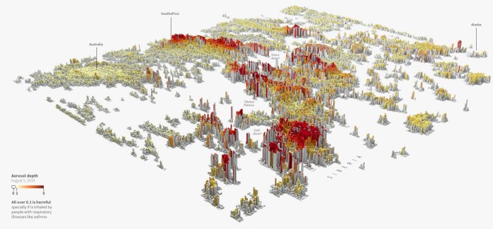
Wildfires project. 3D wold map or aerosol. Version 01.2
I was very happy with the look, but then I try to explain the map to the people and no one got it right. Also when you add “NASA data”, “3D model” and interactive in the same sentence things tend to become harder to explain in a quick and easy way.
I think the best feedback I get in the testing versions was that the earth map was too difficult to recognize. So I did some other versions.
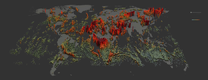
Wildfires project. 3D wold map or aerosol. Version 02
Then I got the idea to change the data, thinking that carbon monoxide maybe will be something more familiar, easier to explain and communicate. So another version using different data come-up.
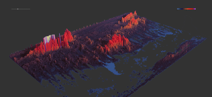
Wildfires project. 3D wold map or carbon monoxide. Version 02
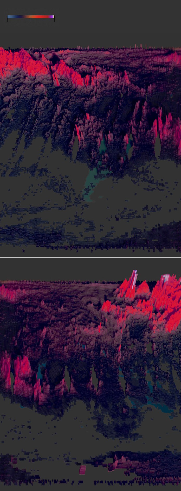
But doing this I returned back to the main issue of the map, how to explain this map, the data and the main story here… too much to do it effectively.
I think this time I was trying to show something different and a little attached to use this technique. On top of that, I was working with dense data trying to say “hey look here, near Siberia, see how crazy it goes“ but most of the people stay only trying to figure out the map…
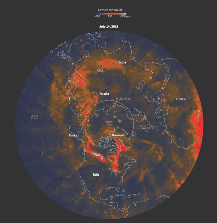
Final version. Carbon data polar projection.
I end up using a polar projection on a regular map to tell my story. The map above is a frame of the animation, then I separate 3 key points at the bottom with little comments. I think now the story is clearer. I have to say that my editors made good points when they had a look into this project.
If you want to see full project and some other graphics, here is the link to the special feature on Reuters:
https://tmsnrt.rs/2PCvoYD
Stay tuned for the next #infofails

Pingback: #infofails chapter 02 (plastic bottles) | Marco Hernandez
Pingback: Violence in Hong Kong // chapter 03 #infofails | Marco Hernandez
Pingback: The last chapter of #infofails… [of 2019] | Marco Hernandez
Pingback: #Infofails: Chapter 05, gold fever | Marco Hernandez
Pingback: #Infofails: Chapter 05, gold rush | Marco Hernandez
Pingback: #Infofails: the world on fire | Marco Hernandez
Pingback: #infofails: A busy 2021 kick off | Marco Hernandez
Pingback: Olympic #infofails | Marco Hernandez
Pingback: 🎵 I can see clearly now the rain is gone… | Marco Hernandez
Pingback: Doodles for news | Marco Hernandez
Pingback: Random Details of Failed Maps | Marco Hernandez
Pingback: The mismatch | Marco Hernandez
Pingback: infofails: mapping Taiwanese food | Marco Hernandez
Pingback: infofails: 2024 mapping destruction across the U.S. | Marco Hernandez
Pingback: infofails: 30 days map challenge | Marco Hernandez