

2020 kicked off with record-breaking wildfires in Australia, the hatching a global pandemic, and later the a new wildfires season turning into ashes thousands of sqkm of the U.S. West Coast, then Trump again… you know all that right?
In the middle of all that craziness, we were juggling to cover the events with visual stories. As usual, I did a little more than necessary in order to explore and get details relevant to our stories… and well, not all of them worked out…
Where there is fire, there is smoke
Some events on our planet reach sufficient dimensions to be easily seen from space, wildfires are one of them.
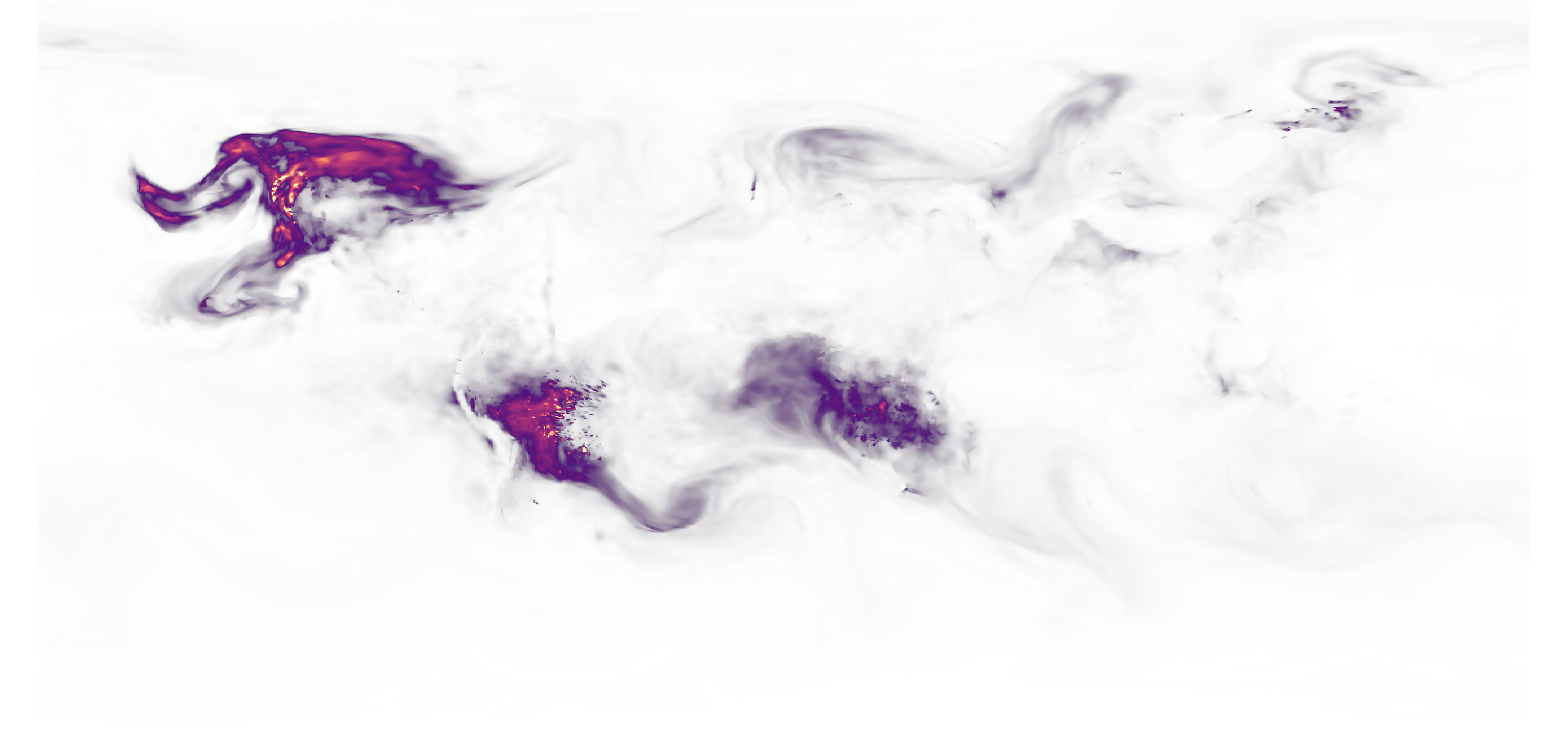
I had work with GMAO data many times before, it’s a good source to see a model of aerosols and other specific data on a large scale, works very well for continental areas, not too much for a closer zoom like country level.
Anyway, the idea of this. visualisation was very clear, it was about to show the large dimension of the smoke caused by the wildfires in the US. West Coast.
One by one in QGIS, I did a series of renderings like the one shown above with data between June and mid-September (around 100 days), which is probably not too much, but the data is collected every 3 hours so I manually processed about 400 files to get a smooth animation.
To get control of the style without coming again to QGIS, I did the series of data only, a layer with the country borders, a layer with labels and so on… I also did one version with the same idea but in a globe.

I often try different versions of my graphics, On my team here at Reuters, we often joke that until we get to the twentieth version we won’t be close to finishing … Although in some cases that joke does come true.
The final version ended up looking a bit different. I controlled the final style in Illustrator, Photoshop and After Effects.

There are many more pieces in that story, including a really cool cutaway of the smoke made by my teammate Manas Sharma with data from NASA’s Calipso mission. You can have a look to the full story here: https://tmsnrt.rs/3nkkOkX.
But the wildfires continued to break historical records and turning the city’s skies orange-red. There were many other stories on that tragedy waiting to be told, even though the stories of the covid-19 did not stop harassing us either.
An aircraft swarm
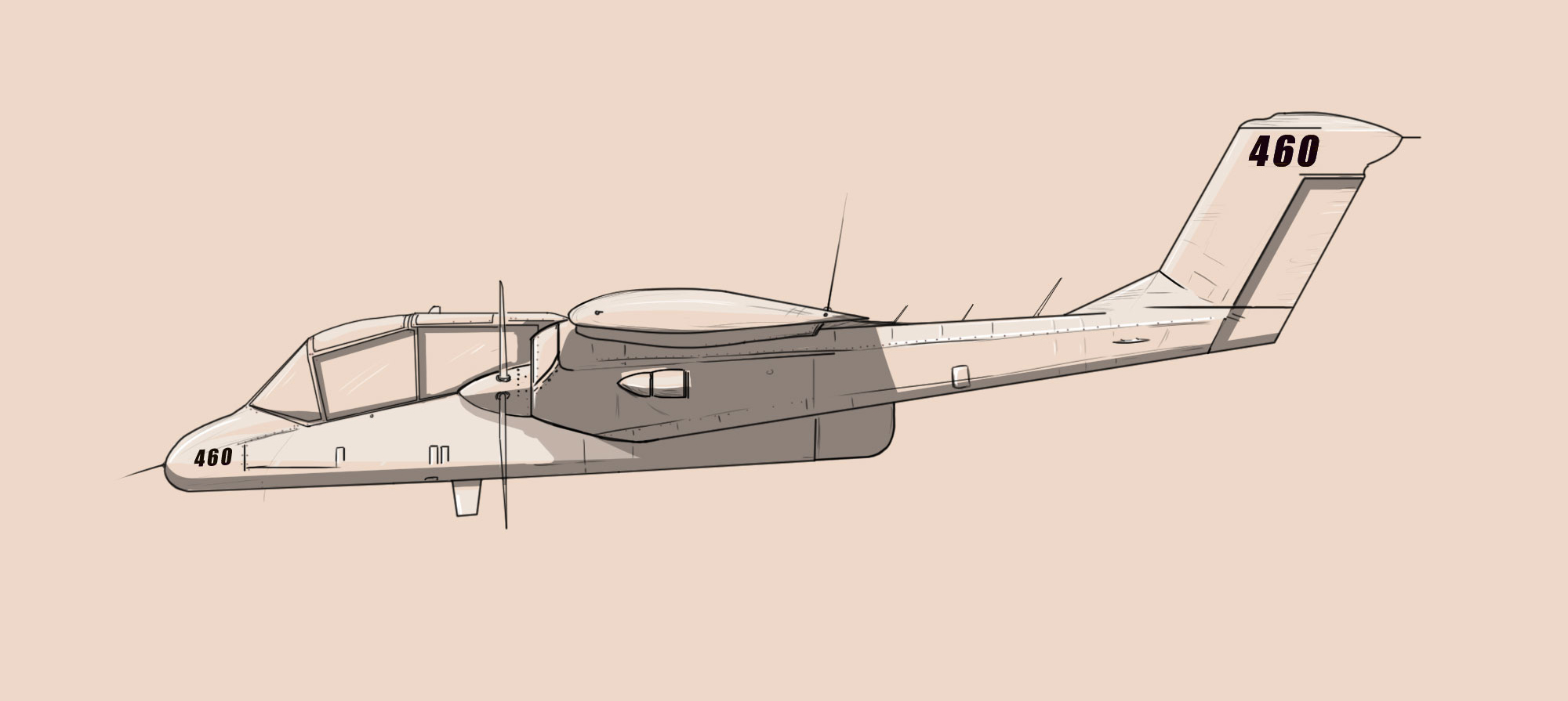
Air attack was one of those stories we worked on in the middle of this year, the main idea was to show the impressive deployment and coordination of planes to deal with the fires in California. Just doing the planes was very enthusiastic, the main issue was how to pick the right ones.
Cal-Fire has on hand an extensive fleet of planes, tankers and helicopters, some in heavy operation, others less so. However, the flight and route logs from FlightRadar24 gave us an outlet to filter the aircraft.
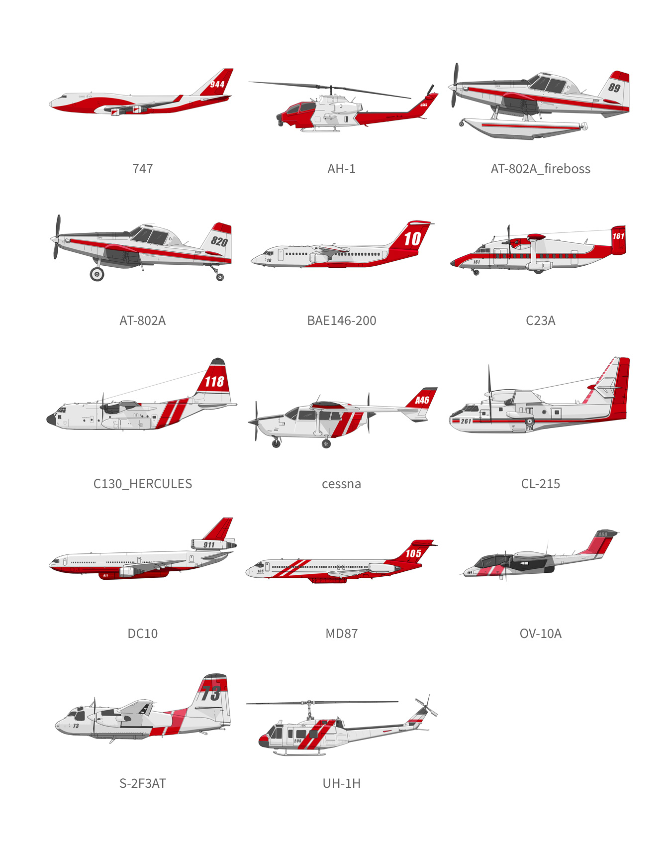
You may have noticed some airplanes in the image above that aren’t in the final story. The AT-802A were used to guide tankers in the old days, they are probably still in use elsewhere, I think you can see them in the Pixar movie “Planes”.
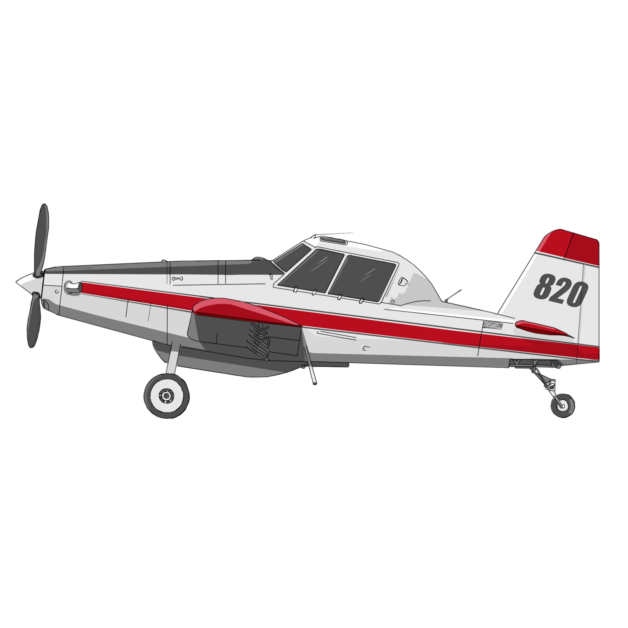
That was one of the “unnecessary resources” that I created, thinking that it might have been nice to show how things have evolved over the years, but it was not the case. You can read the story through the following link: https://tmsnrt.rs/2Iy2K7W
Wine and ashes
There’s one thing you should know about me: I love wine.

Most of the stories I’ve made in the last year or two are sad, some about environmental disasters, people in danger, dying, or losing everything.
Like many, this story came with some mixed feelings. I think it was the first time that I had the opportunity to do something about wine, and it involved the destruction of hundreds of vineyards.

Although I really enjoy to do reporting, create a map, draw a diagram, or write a story draft, those same stories always bring me a strange mix of joy in doing my job and the sadness of understanding the dimensions of a problem or event. I’m not complaining, I keep my job at the office, but it’s curious I guess.
You can have a look to the wine story here: https://tmsnrt.rs/3eZnWQ9
There’s no time enough in the world
Not matter how much time I can have, there’s always one more thing I’ll like to explore. Nice thing is you can save the idea in the bucket for next time. And the fires coverage wasn’t an exception.
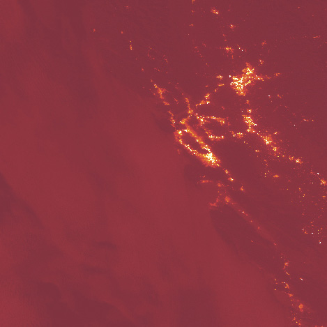
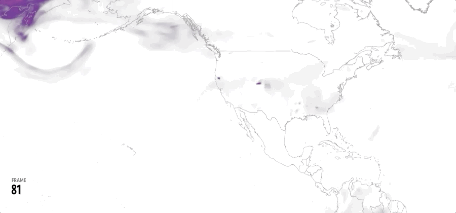
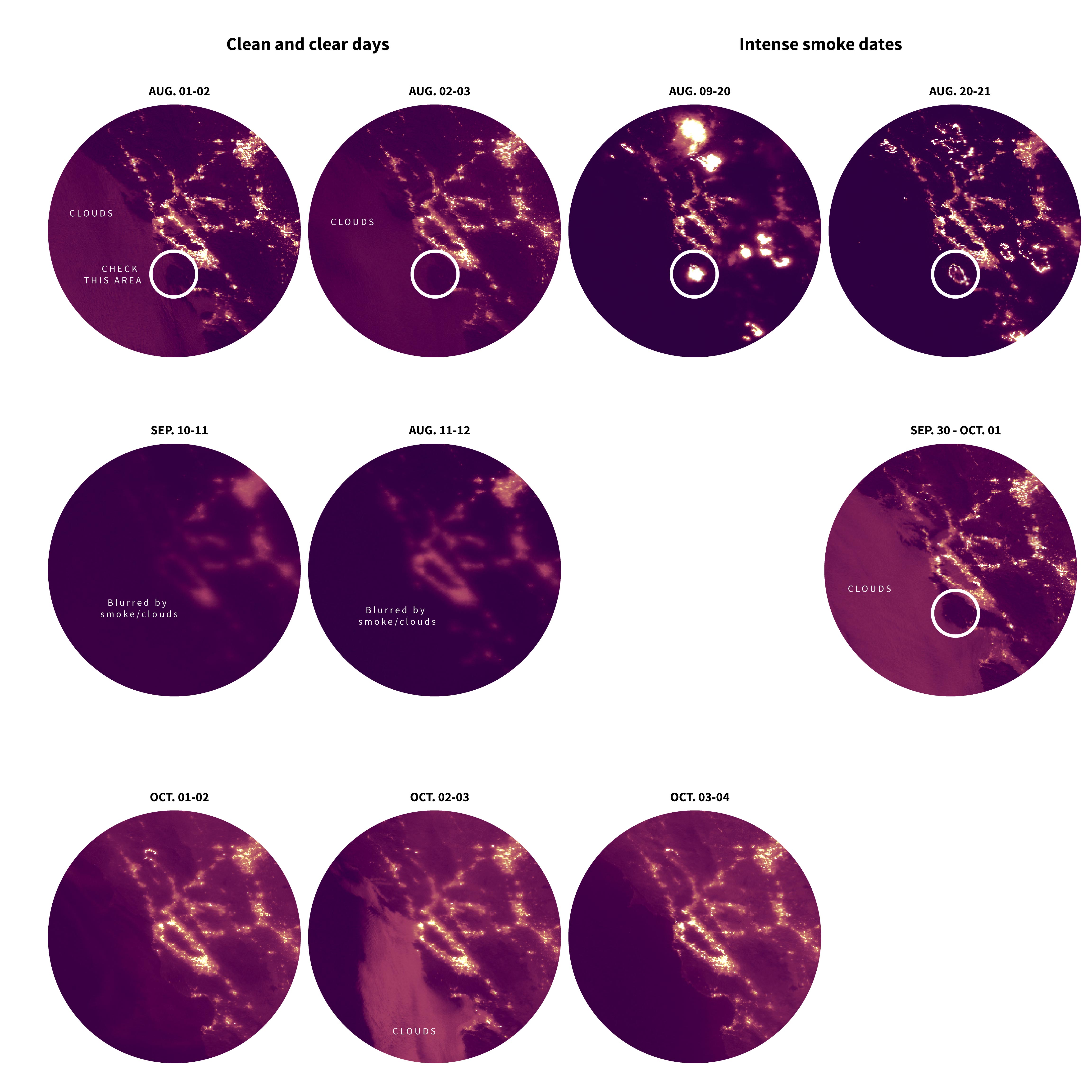
Around mid year, I was exploring at VIIRS/NPP data, this data contains 26 data sets including radiance sensors, shortwave IR radiance, earth’s brightness and temperatures etc.
That data can give you a daily quick look of lights and temperatures of the planet’s surface, of course if clouds play nice and go away from your interest area.
After downloading the data for a few days in the area, I noticed some bright areas that turned on and off depending on the day, probably fires that were seen burning from space at night.
The lights were so intense that you can easily mistake them for city lights. Check the white circles bellow:
About #infofails post series:
I keep my beta graphics, those that never go public… Maybe they are tons of versions of a graphic or just a few concepts, part of my creative process. So, where all those things go? well, ends-up in #infofails –a collection of my fails at work.
Did you like #infofails?
Have a look to other #infofails Chapters here:
1: Wildfires
2: Plastic bottles
3: Hong Kong protest
4: The Everest
5: Amazon gold

Pingback: Striking the balance between graphic design and data journalism: “Design is a conversation” | Online Journalism Blog
Pingback: Striking the balance between graphic design and data journalism: “Design is a conversation” – BUZZINCLICK
Pingback: Striking the balance between graphic design and data journalism: “Design is a conversation” – Totally news
Pingback: #infofails: A busy 2021 kick off | Marco Hernandez
Pingback: Olympic #infofails | Marco Hernandez
Pingback: 🎵 I can see clearly now the rain is gone… | Marco Hernandez
Pingback: Doodles for news | Marco Hernandez
Pingback: Random Details of Failed Maps | Marco Hernandez
Pingback: The mismatch | Marco Hernandez
Pingback: infofails: mapping Taiwanese food | Marco Hernandez
Pingback: infofails: 2024 mapping destruction across the U.S. | Marco Hernandez
Pingback: infofails: 30 days map challenge | Marco Hernandez