
Recently I have been working on maps, maps and more maps. I really like the world of cartography, although I’m not a cartographer a lot of my work includes trying to make maps for news. –My apologies to my carto-friends who actually do this properly, I’m just an enthusiastic fan with perilous initiative. 🤣
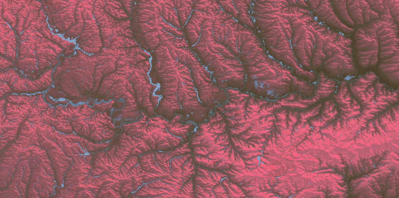
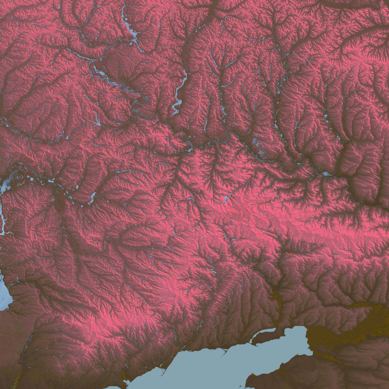
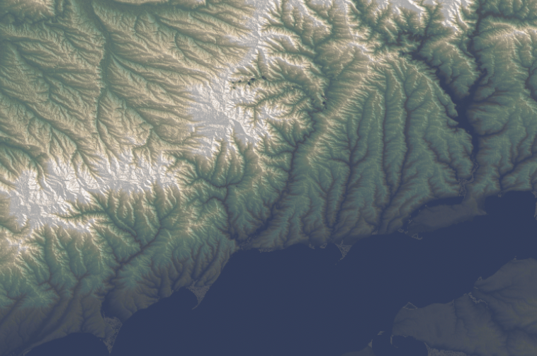
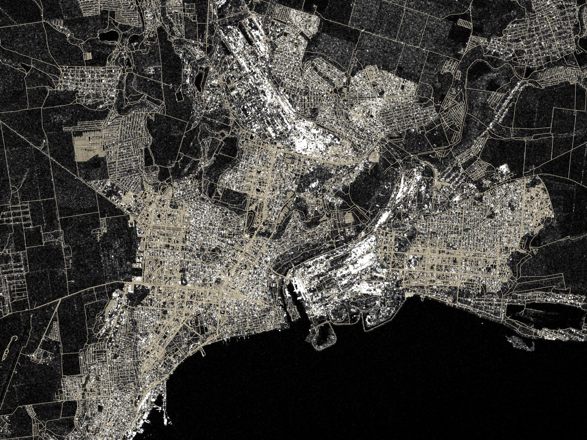
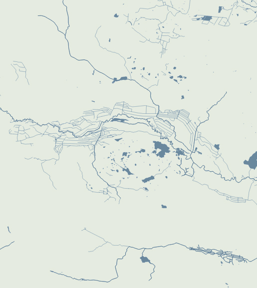
Since I moved to the NYT, I have been in a process of rebooting, adjusting myself to the new environment learning new stuff and understanding how things work in this side of the world. But as usual, while I’m executing random ideas I have left behind a bunch of un published visuals like the screengrab at the top of this entry which is a DEM of an area of eastern Ukraine.
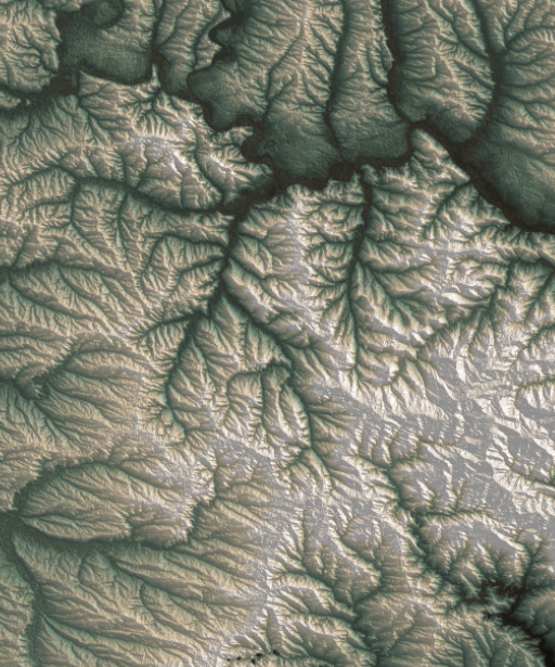
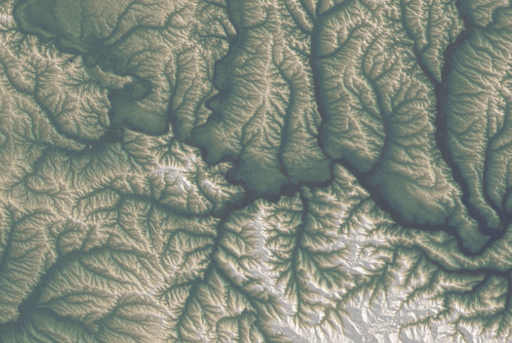
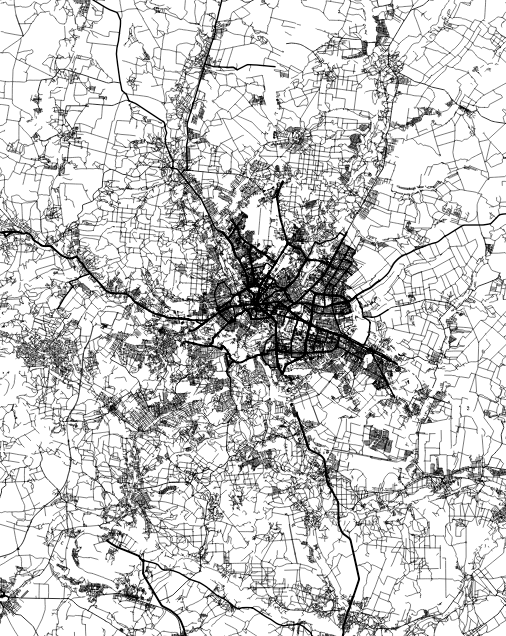
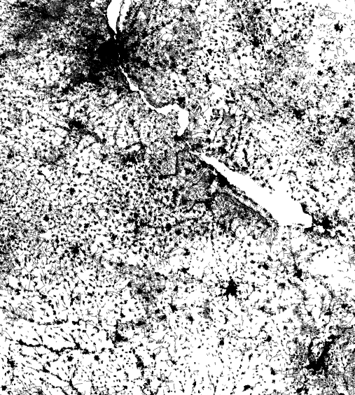
For nerdy purposes, the image at the top and the following are SRTM elevation and Open Street Maps data processed with QGIS with a little color retouch in Photoshop.
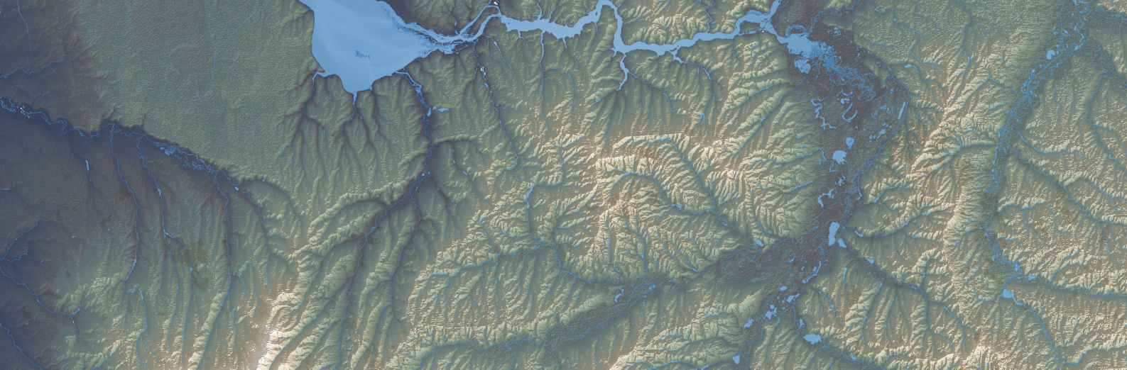
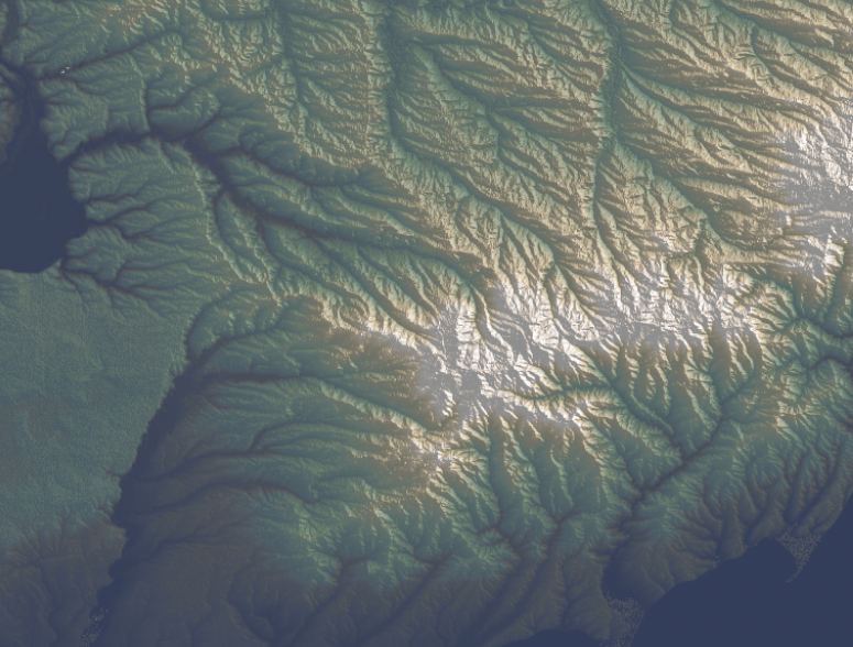
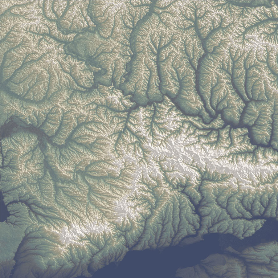
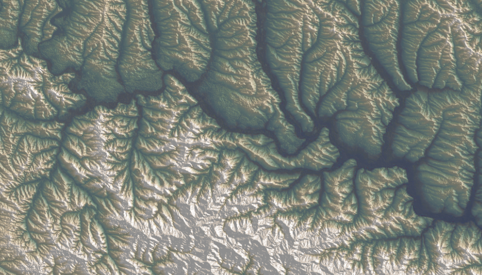
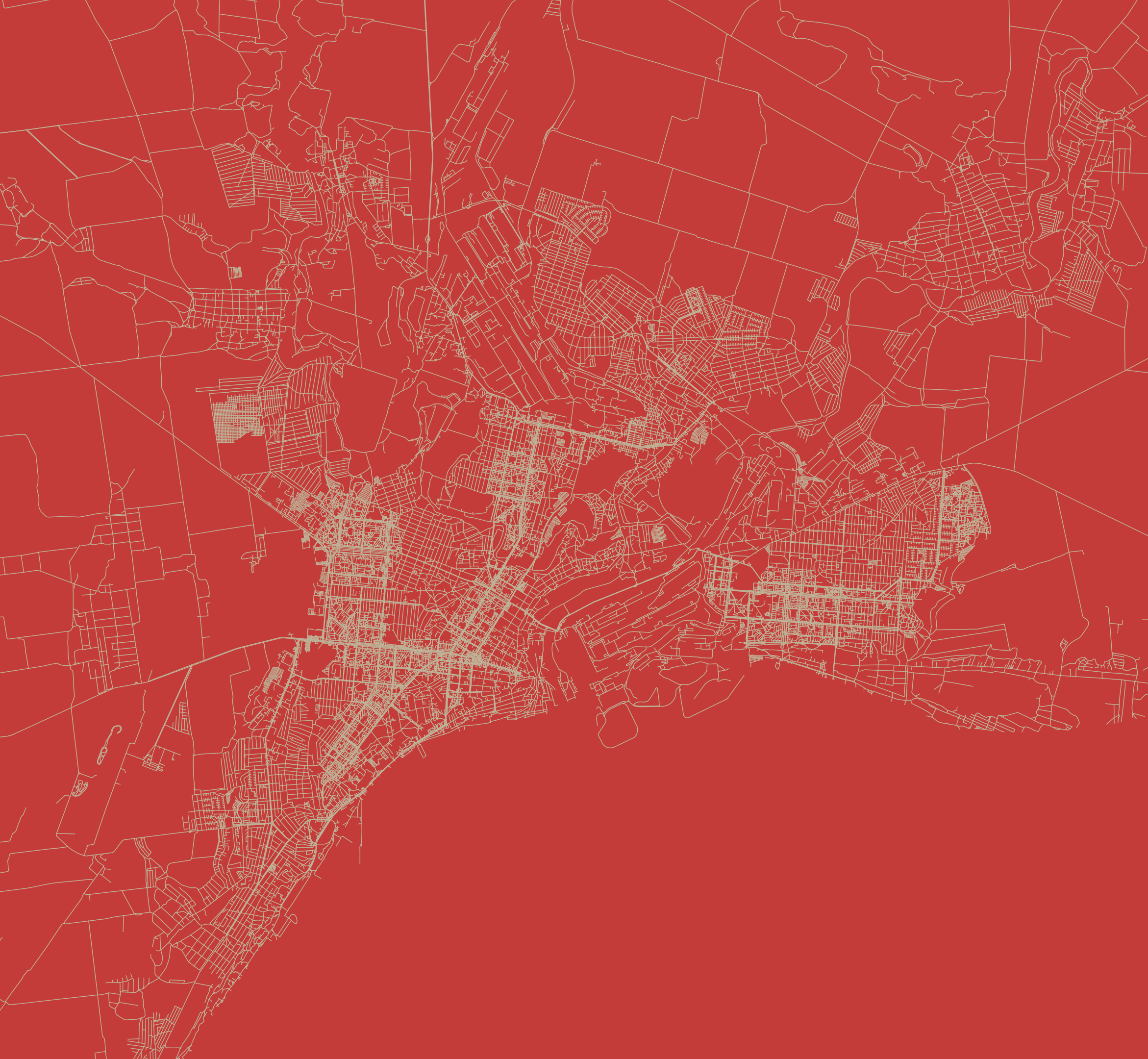
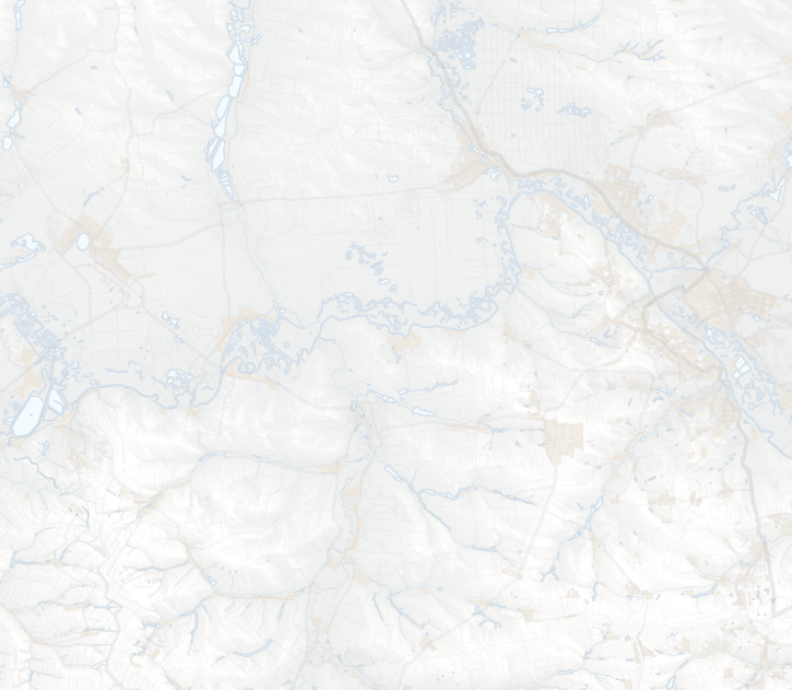
Of course these detailed images doesn’t work well for the purposes of the news story I was working on. If you have seen our Ukraine maps coverage, you’ll notice that while our maps have evolved, they also keep consistency somehow. To be honest, I made those alternate versions because I couldn’t stop thinking about how this would look in another style. You can see what I mean below, these are the same area in eastern Ukraine rendered for different purposes:
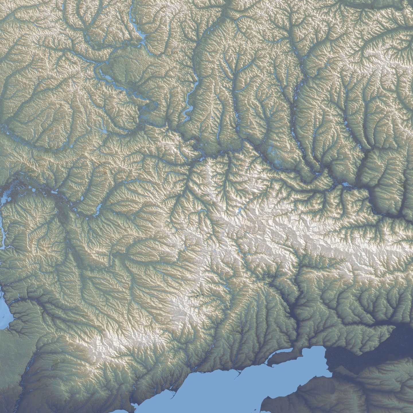
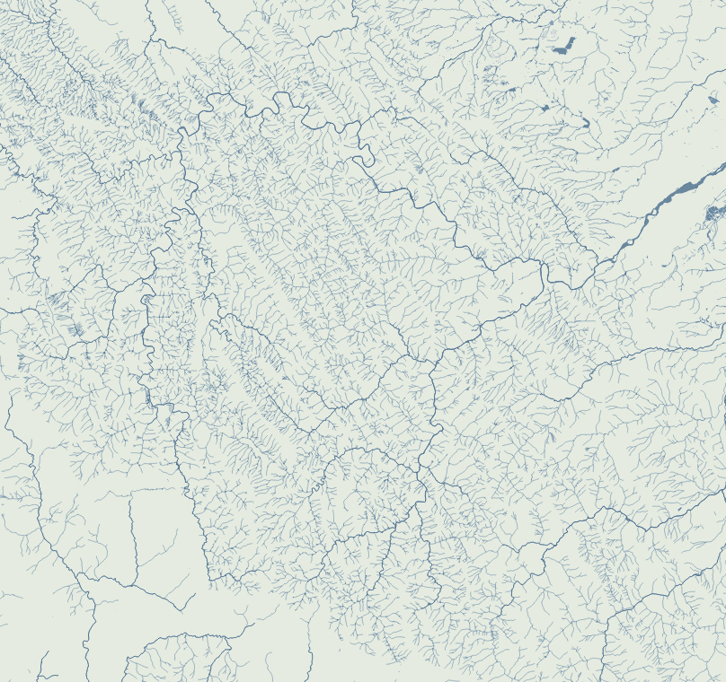
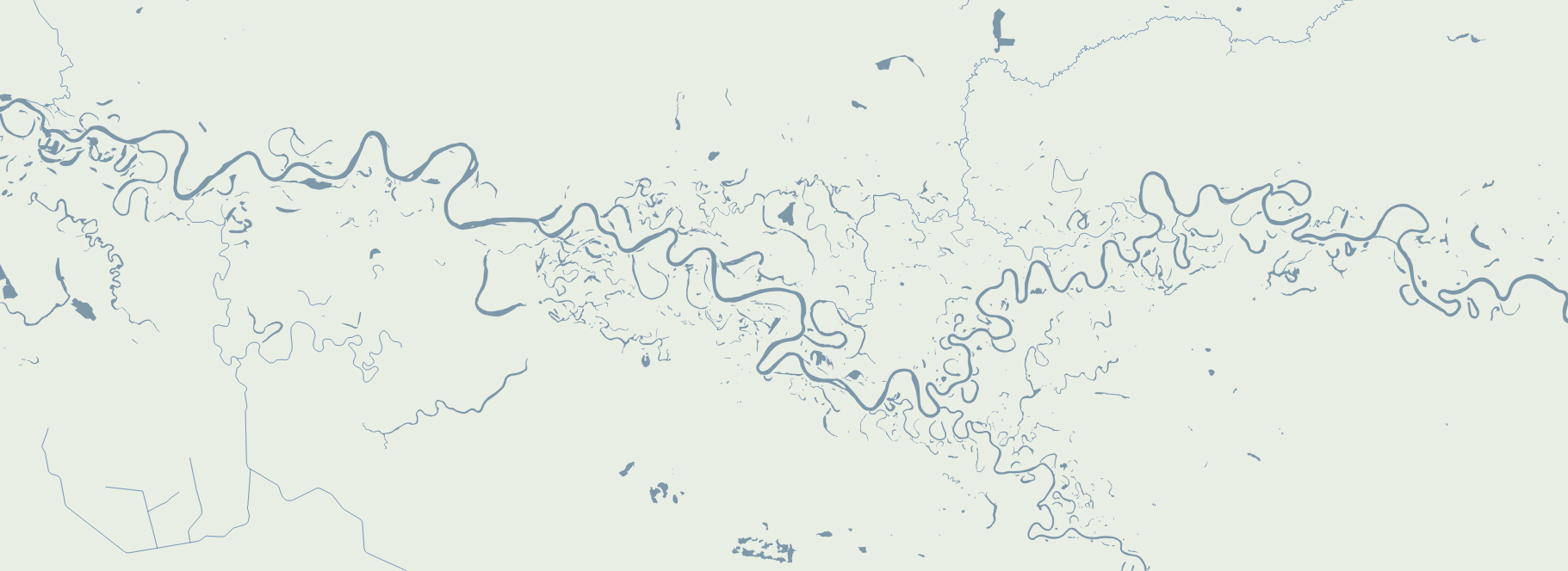
Here are some closer shots of that map above, the geography of this region of Ukraine is marvelous.
There are so many of these maps, I have literally spent months looking at the progress of the war with maps, many different approaches and a heavy editing process of what takes place until the final version of the story. It is a strenuous process but super interesting at the same time. I feel very grateful to be able to see all this and be part of the search for the truth to inform the readers of the NYT.
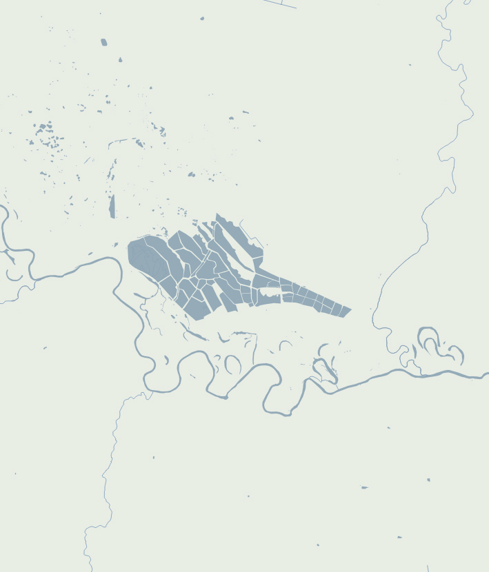
Basic vectors
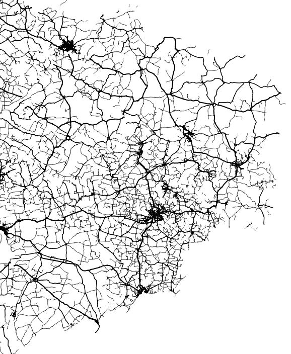
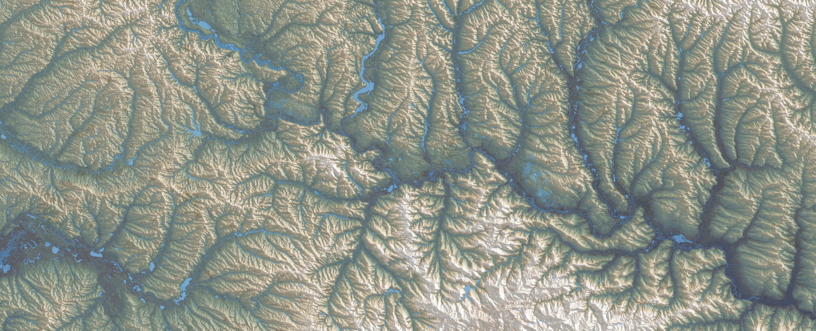
There’s something with the base layers, is amazing how you can see the population density of a place just by plotting roads. Some areas with certain road layers look like leaves or some kind of vein system.
[ Click on the images to see a larger single image ]

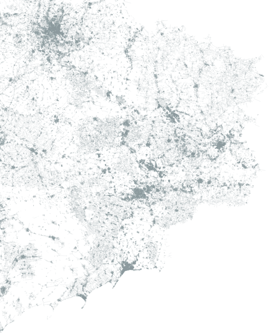
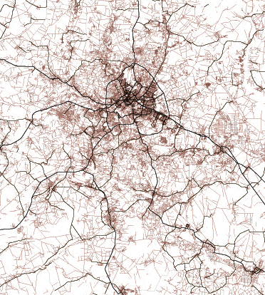
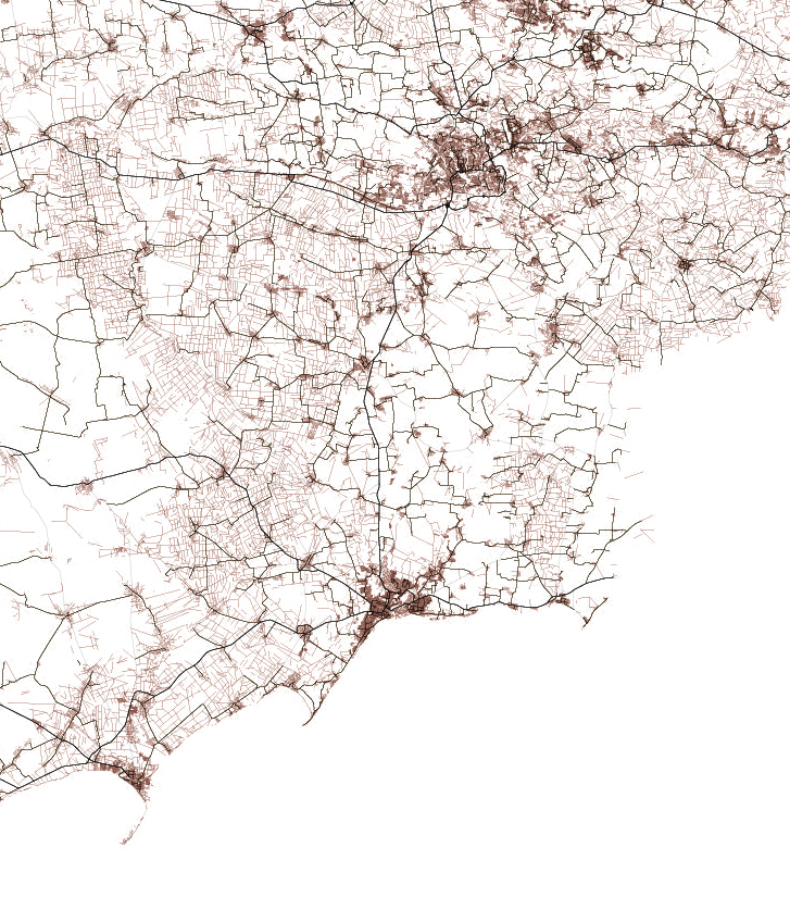
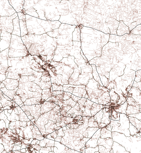
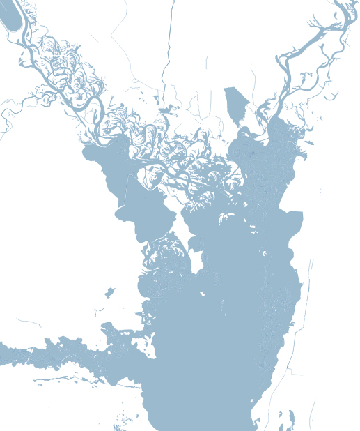
The same thing happens looking at water features, some times you are able to see canals making geometric patterns in contrast to the organic river beds.
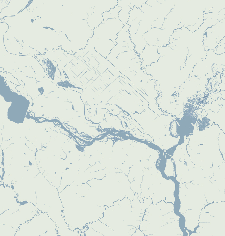
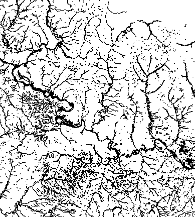
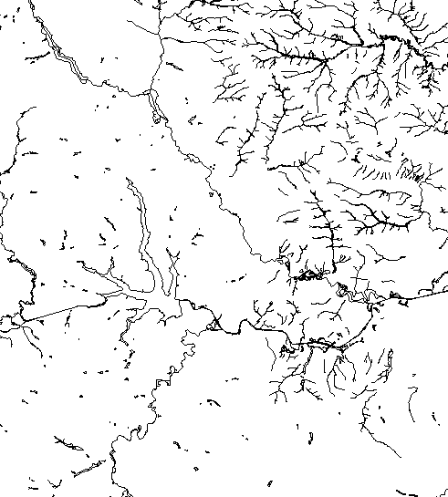
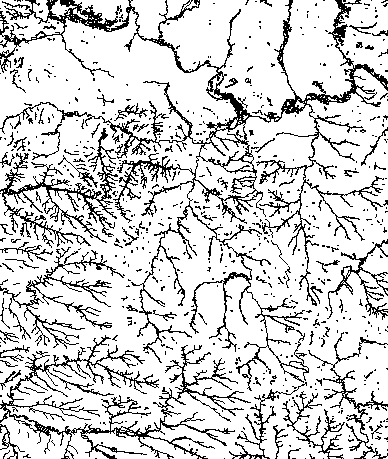
Since Ukraine has vast tracts of land dedicated to agriculture, those patterns are clearer in some regions, however the rivers and lakes are still fascinating as well.
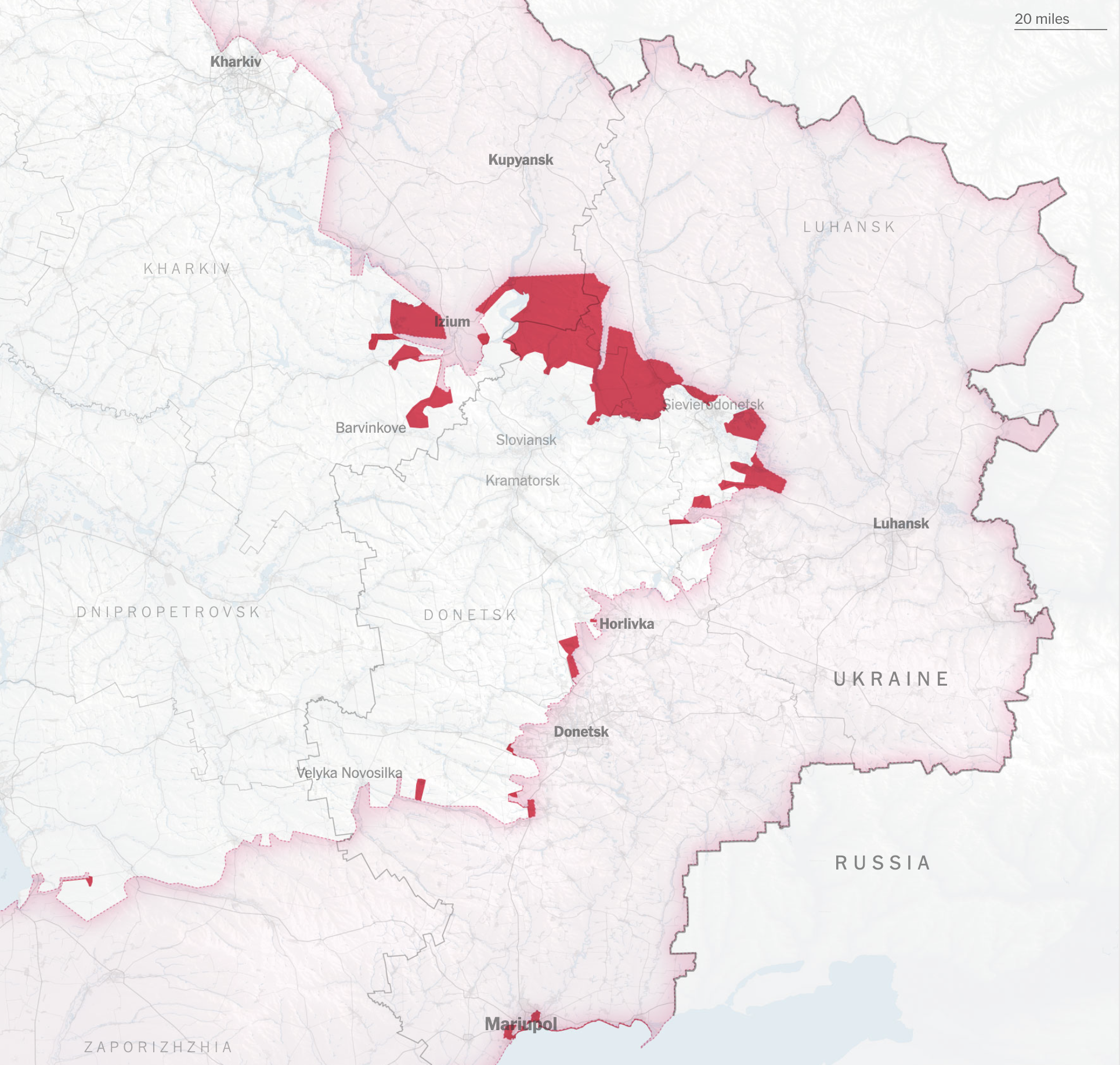
As of the date of publication of this entry, I have worked on about 15 pieces with some kind of map of some region of Ukraine analyzing all kinds of approaches, such as the strategy to isolate Ukrainian forces in the east, aerial bombardment, the damage in the port city of Mariupol, and fighting reports all in a day cycle. More recently we have focused on deeper stories like the battle in the Donbas region that we just published where most of this entry’s images came from. (There are some more map stories coming soon).
About #infofails post series:
I truly believe that failure is more important than success. One doesn’t try to fail as a goal, but by embracing failure I have learned a lot in my quest to do something different, or maybe it is because I have had few successes… it depends on how you look at it. Anyway, these posts are a compendium of graphics that are never formally published. Those are maybe tons of versions of a single graphic or some floating concepts and ideas, all part of my creative process.
In short, #infofails are a summary of my creative process and extensive failures at work.
Are you liking #infofails?, have a look to previous ones:
01: Wildfires
02: Plastic bottles
03: Hong Kong protest
04: The Everest
05: Amazon gold
06: The world on fire
07: A busy 2021 kick off
08: Olympics
09: Floods
10: Doodles for news
