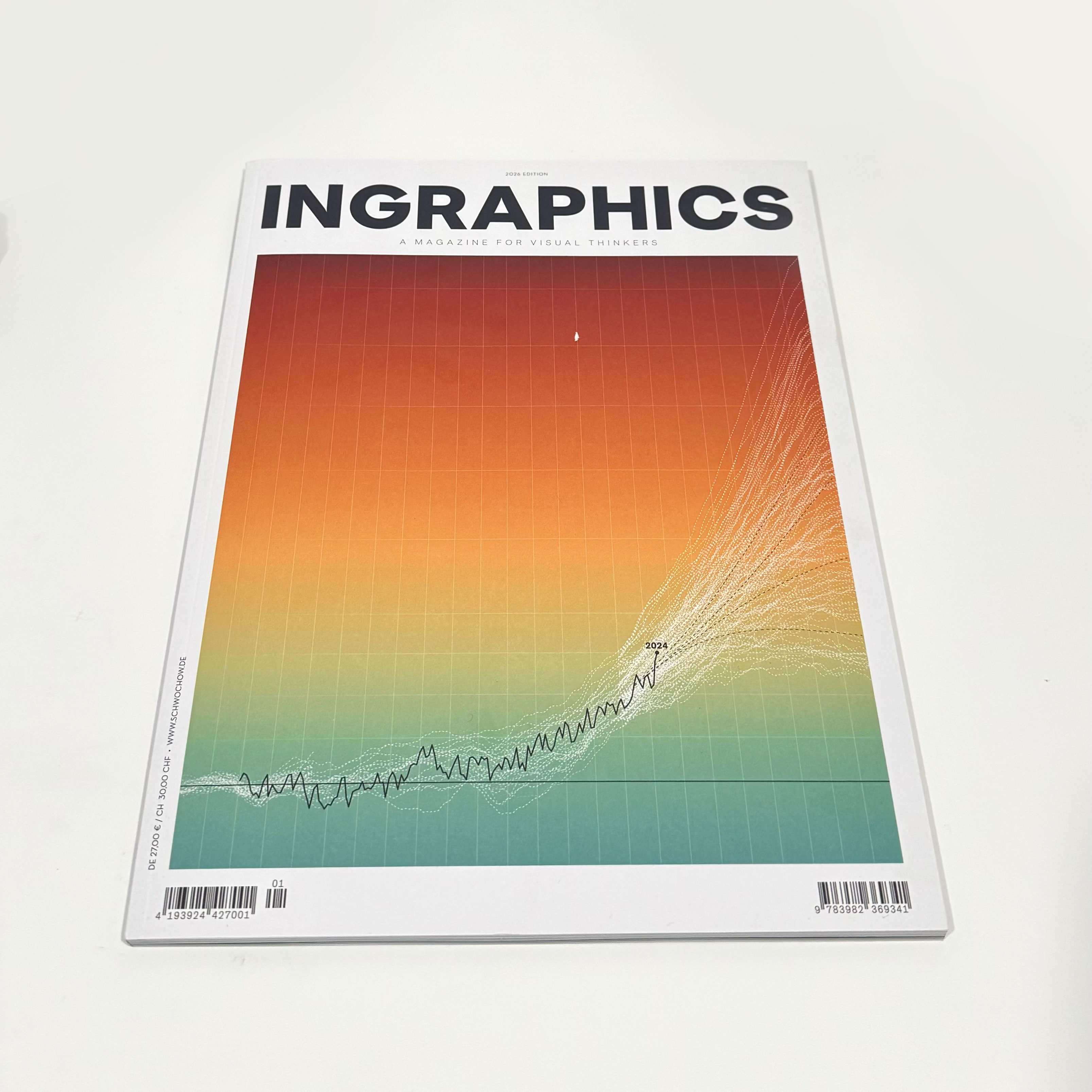
More than a decade ago, I bought a series of magazines by this German designer that were a great inspiration in my career. Today, I received a copy of Jan Schwochow latest edition in my mailbox, in which I had the great honor of participating in.
One of my pieces in this magazine has a very personal touch.
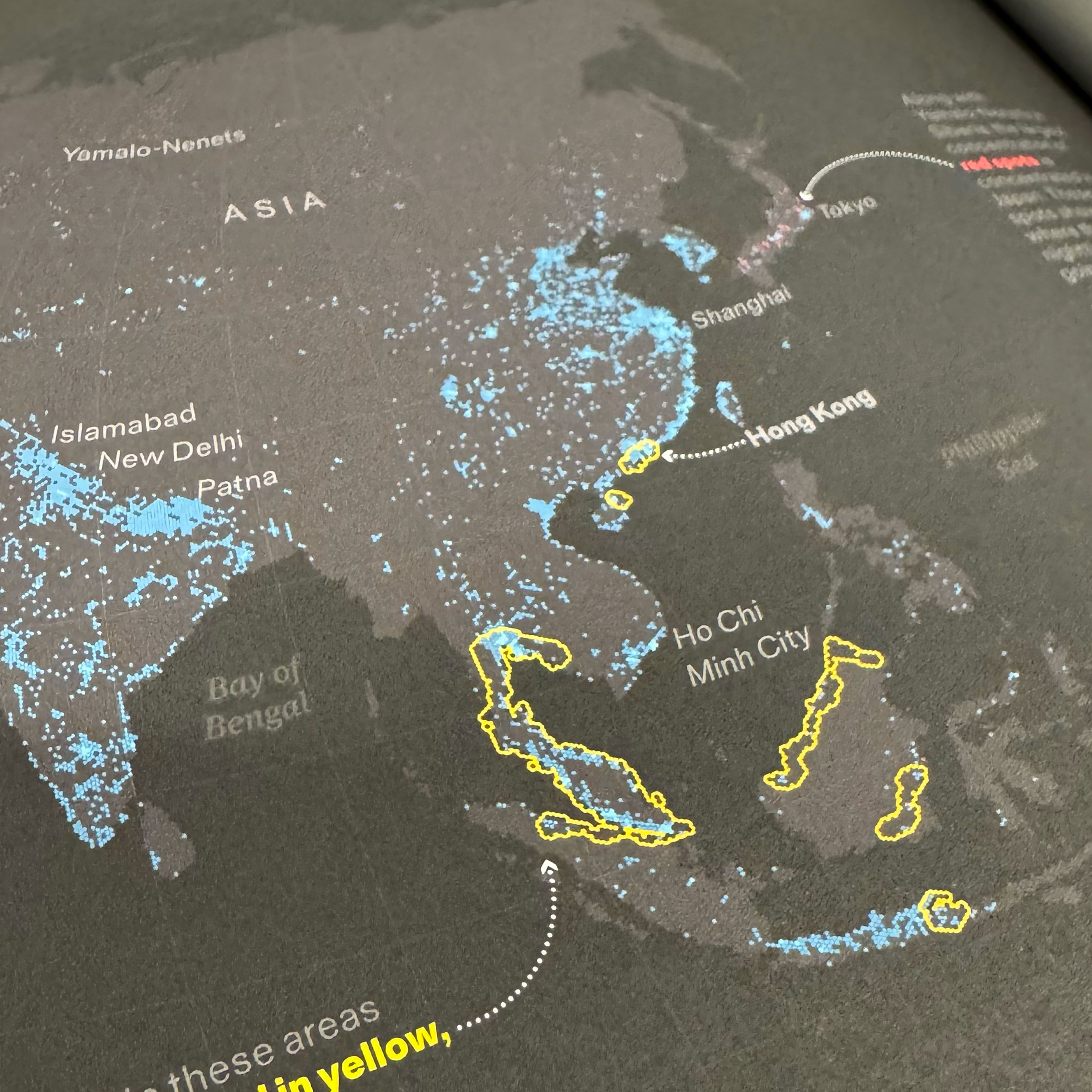
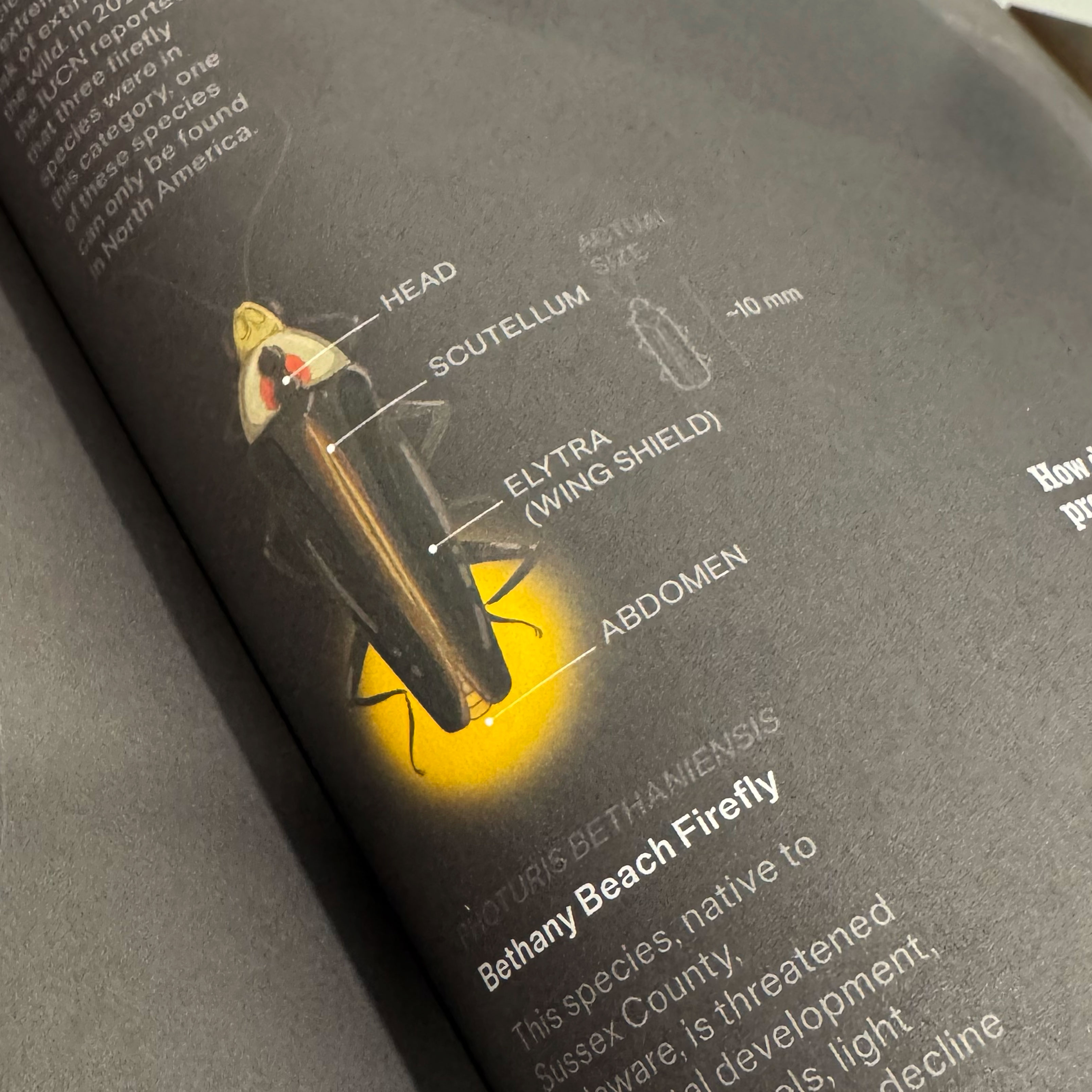
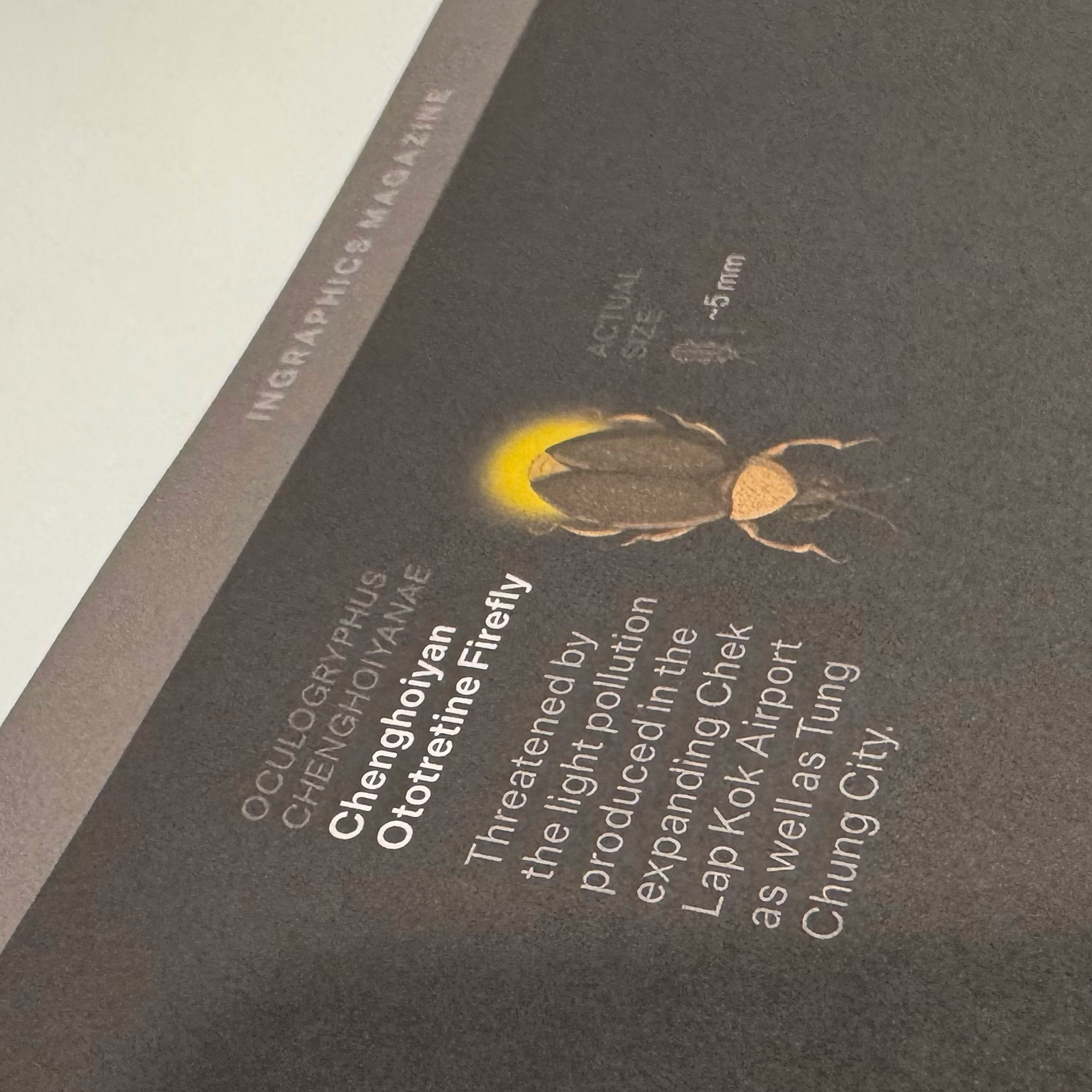
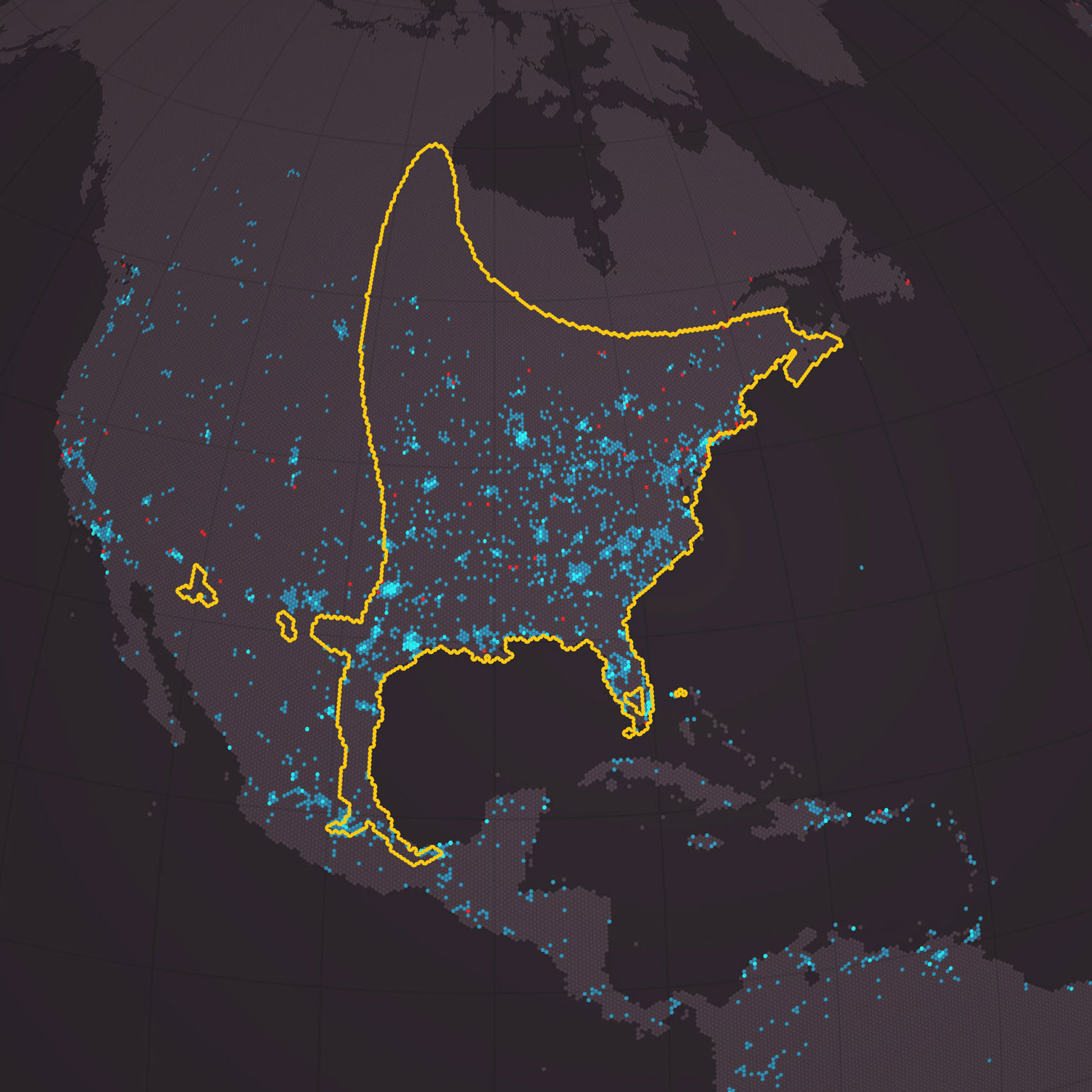
As a child in Costa Rica, I remember seeing the cow pastures filled with dancing lights. At night, my town was very dark, and on a moonless night, on a nearby creek, you could clearly see the edge of the Milky Way merging with the lights of the fireflies dancing all around you… magic.
It doesn’t look like that anymore, and not just in my town, but all over the world.
That motivated me to visualize the phenomenon to spread the message of what we are losing. My 17-year-old son has never seen what, for me, was the most impressive immersive light show. If you’ve never seen anything like it, you may never see it, or not anytime soon, if our cities continue to get brighter every day.
The piece shows areas around the world where some species of fireflies are disappearing and, at the same time, where city lights are brighter today than they were 20 years ago. It is designed on a dark background, and some of the text is blurred, a metaphor for what we are losing.
In a way, these pages are a portrait of what is fading into the void in the face of our progress as a species.
The yellow areas show where the fireflies are on a critical thread; the blue dots are lights brighter than they were 20 years ago.
However, if you know me, you know I can’t be serious for very long.
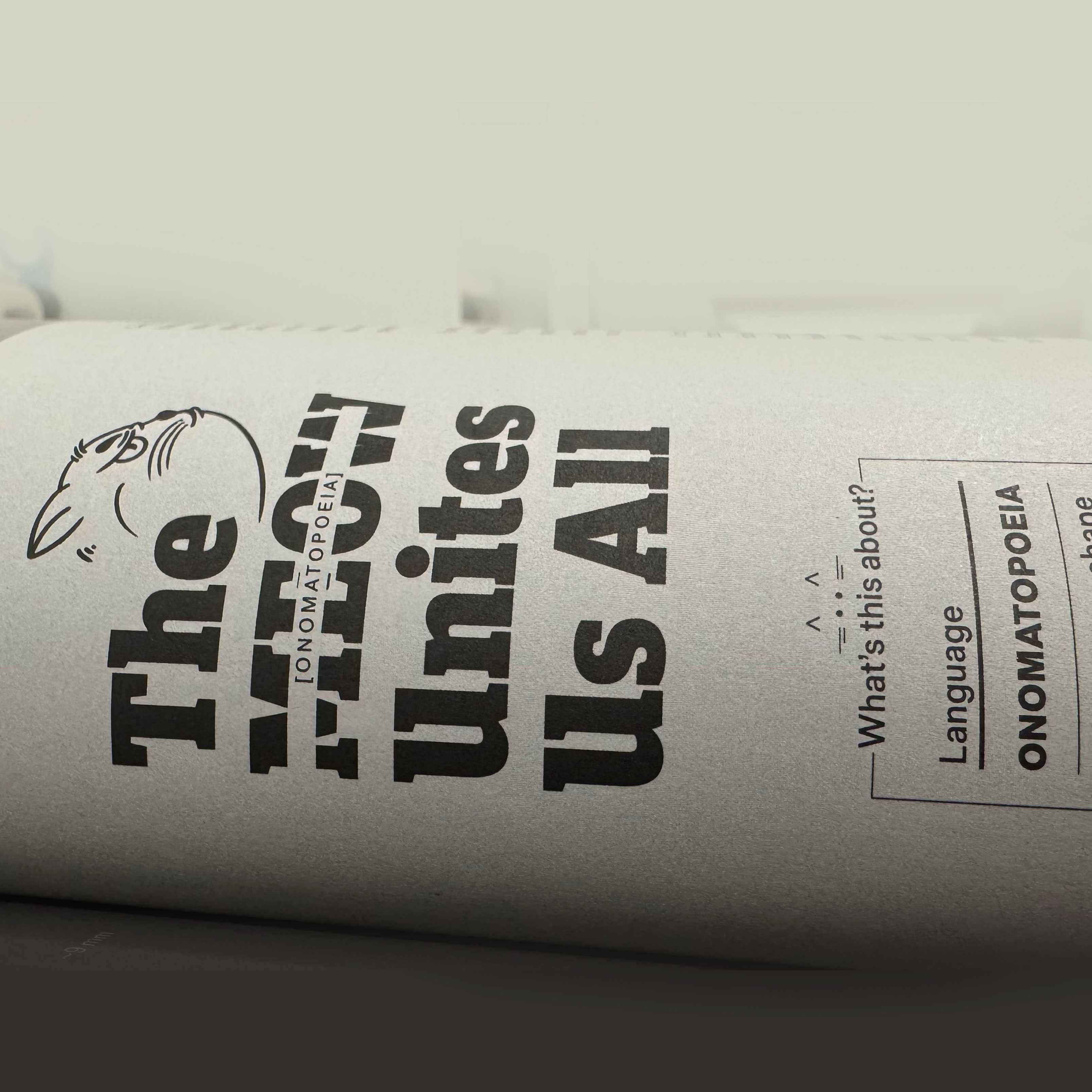
Ingraphics Magazine is somehow a white canvas, and Jan has managed to create a great diversity in this latest edition of the magazine. He even opened the door for me to sneak in one more page with something I’d wanted to do for a long time.
It’s a page about onomatopoeia, and it shows how, even though we speak different languages around the world, there are many things that bring us together; in the end, we’re not so different after all.
A close up of the onomatopoeias graphic for Ingraphics Magazine.
For this piece, I spoke with several people who are fluent in languages other than English and Spanish, and although it’s based on serious research, it also has a touch of humor. –I hope you can enjoye it as well.
Some of the illustrations used in the Magazine.
Ingraphics Magazine means a lot to me. In fact, more than a decade ago, I bought other books by Jan just to enjoy the pages and their beautiful design, even though they were in German, a language I don’t speak, and back then, Google Translate wasn’t an option.
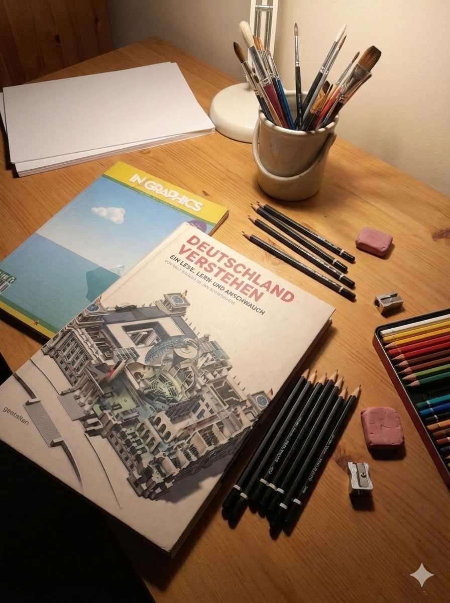
Some of my inspirational books that I still keep in Costa Rica
Being a part of this revival of the magazine is a great honor, there are people with brilliant pieces and it’s truly an honor to be alongside people who have been an inspiration in my career, such as Frederik Ruys, John Grimwade, Jaime Serra, Nigel Holmes, and Nathan Yau.
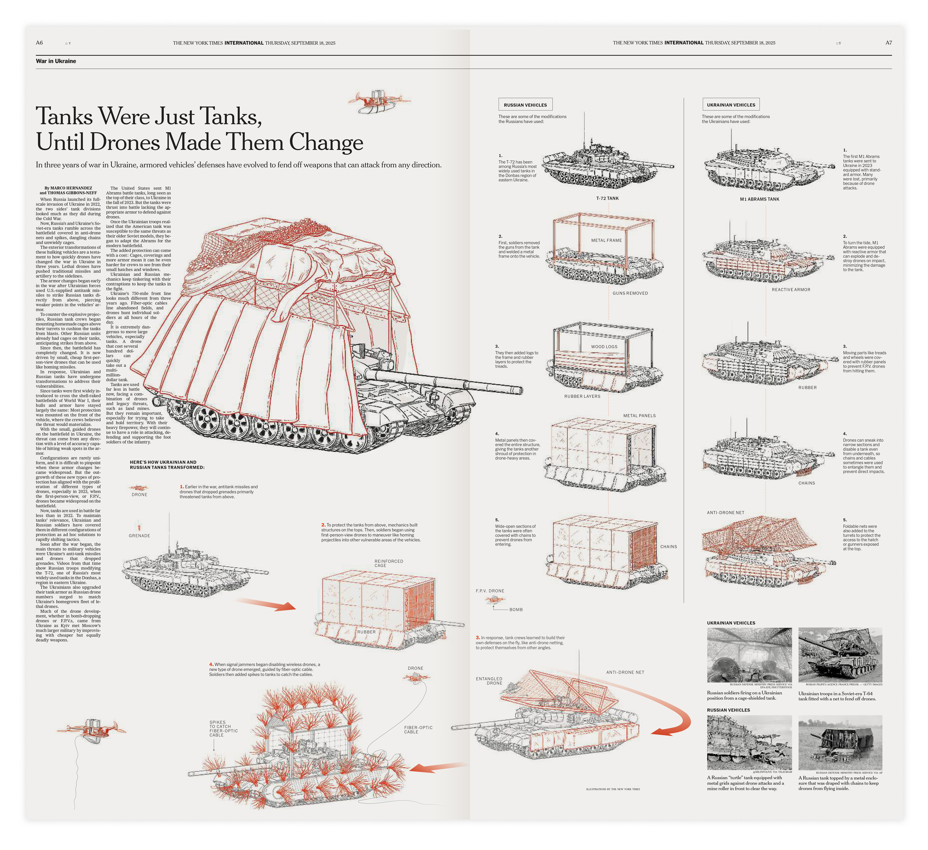
I’ve reported on different aspects of the war in Ukraine since I joined the New York Times. I have done hundreds of maps and gathered my thoughts with documents, interviews from experts, and chats with my colleagues about many aspects of what’s been going on in Ukraine for years.
You would be surprised about the many pieces projects leave behind in the sake of editing. But sometimes those “unseen” elements can come back, maybe even as a whole new story, and that’s exactly what happened recently with this piece we published titled “Tanks Were Just Tanks, Until Drones Made Them Change”. Take a look there if you haven’t seen it already, then come back here if you want learn more on how that piece was born.
The New War in Ukraine(Feb. 2025)
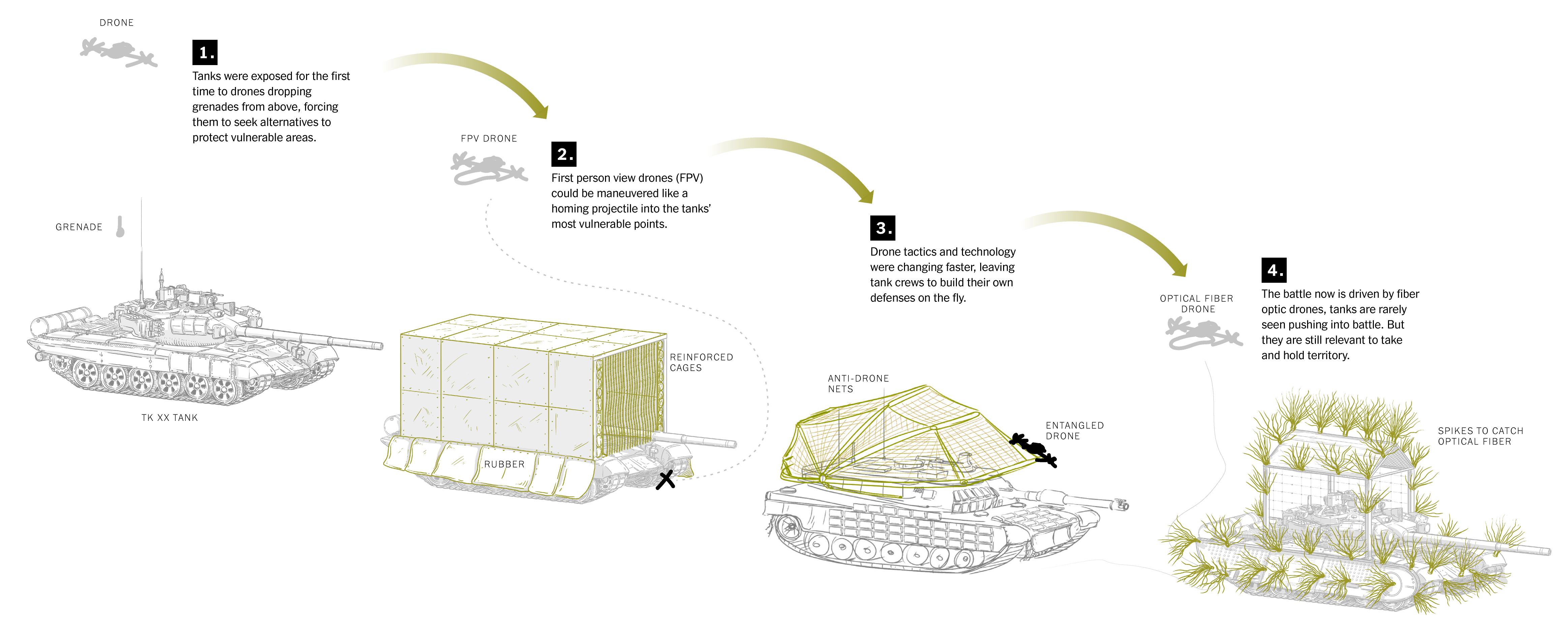
Back in February, I was working on a piece to show how the battlefields in Ukraine were changing due to the intense use of small drones. The introduction of those little unmanned attack units changed completely how the front lines look.
The New York Times.
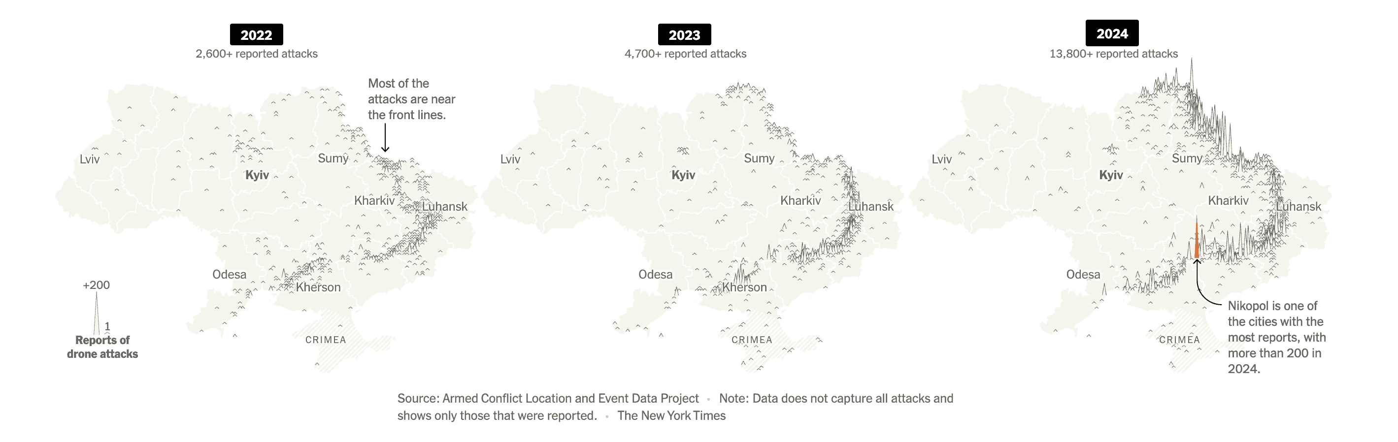
It’s true that drones have been around for a long time; they are not a “last-year” innovation, but they have never before been used as intensively as in Ukraine. The war now is fought mostly with First Person View (FPV) drones and many other unmanned vehicles.
Ukraine maps from Feb. 2025 story about drone attacks.The New York Times.
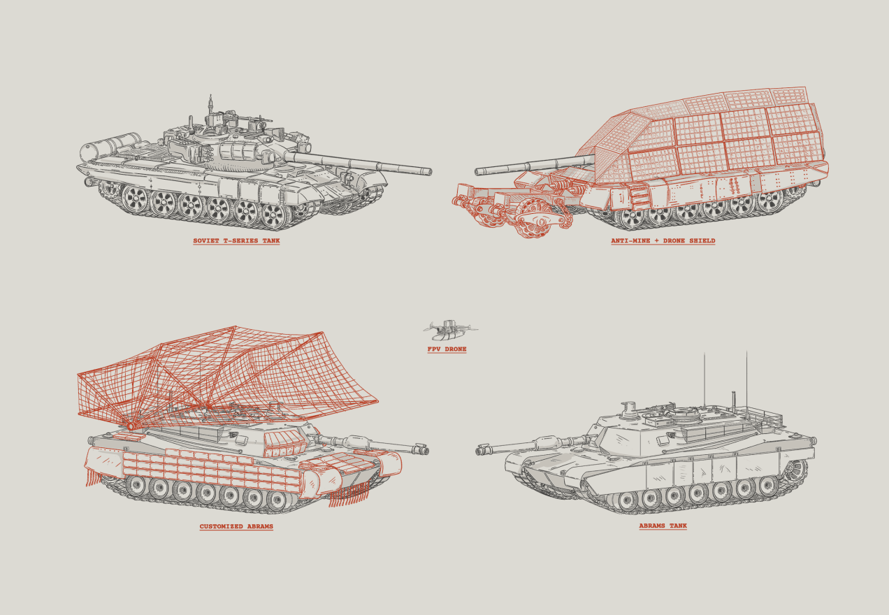
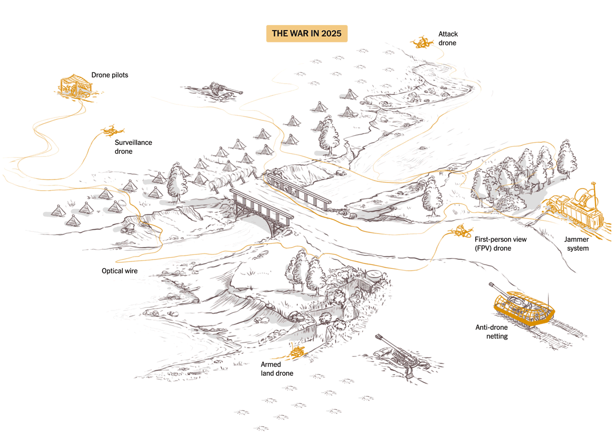
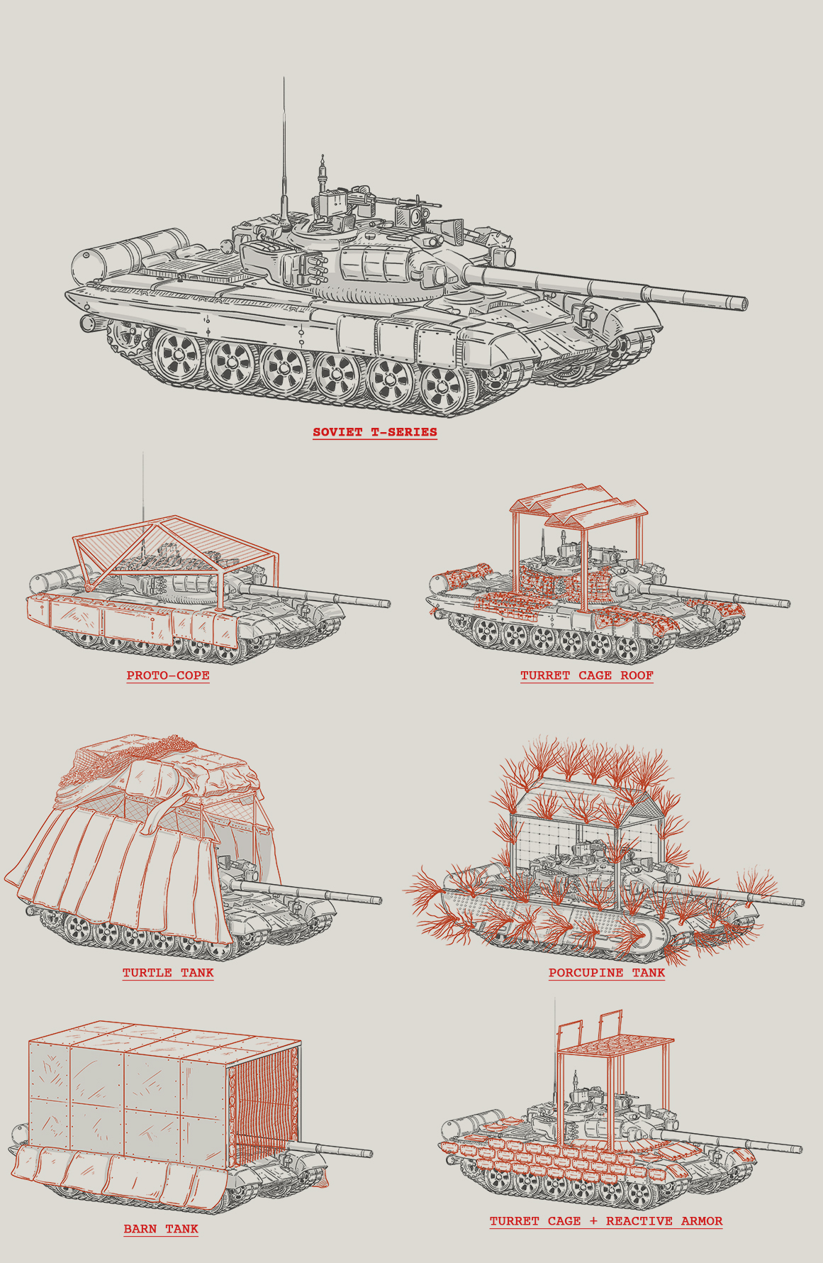
That piece from February touches slightly on how tanks started to appear with improvised structures on top. Known as “turtle tanks”, they look nothing like a regular tank; soldiers added structures on top as a way to reduce damage from drone attacks.
We used photos on that story to illustrate the turtle tanks.
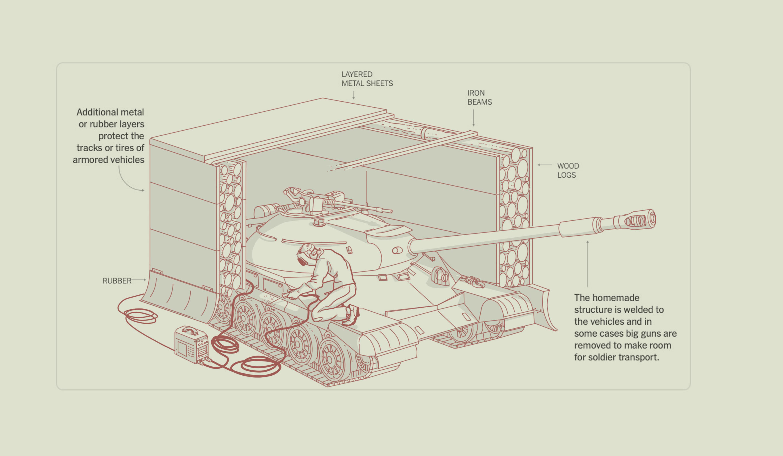
Among the many materials we got access to, I saw videos of a Russian workshop showing how tanks were being repurposed to become transport vehicles. The inside was just a box with layers and layers of protection, including even tree logs to shield from the drone bombs. Really fascinating aspect on how vehicles were dealing with the increase in drone attacks. I did a quick doodle to describe that, but since the piece’s focus was a little different, I actually cut it off since the photo was serving the same purpose.
Unpublished doodle of a repurposed tank, Feb 2025 Story, [ SQ. reference #1 ] The New York Times.
Then jammers came in to tackle down wireless drones from the skies, so pilots started to use miles and miles of optic fiber directly connected to the drones so they can keep control of them and get over the jammers… And there is where things get wild once more for big targets like tanks and vehicles in general.
I was involved in other projects, and the time went on, but the idea came back after a conversation with one of our correspondents who has been to the Ukrainian battlefields many times. Thomas (TM) has a lot of experience when talking about guns and war in general. He was a Marine himself. TM continued to think about the various types of tanks and vehicles in Ukraine, and with his expertise on the subject, it was easy to convince me to take a closer look. I did some cursory research and found a wealth of material.
The hunt for turtle tanks (Aug. 2025)
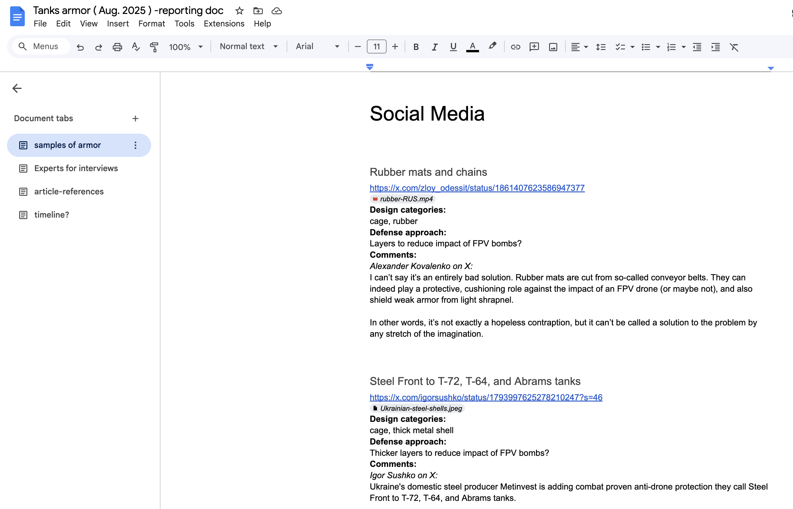
In my regular process, I start with a text document where I add links, notes on elements relevant to the story, visual references, names and emails of potential experts to interview, references to similar articles, and in some cases, some draft paragraphs that could later help define the structure of the story. Then I add everything to a drive folder to keep the reporting doc alongside PDFs, videos, photos, and any other material I might need later. I keep everything I find forever… or maybe until something extraordinary happens.
An screenshot of my reporting doc. The New York Times
Visual references are very important. Social media like X and Telegram are good ways to improve the understanding of the structures. I often keep every link with a little context of what it is about, the original link, and some sort of initial categorization that might help to group things later. As a visual storyteller, I think it’s important to explore themes for your sections. Perhaps things can be grouped by common characteristics, chronology, aspect, or function. That kind of grouping, if possible, helps give a sense of harmony to the story.
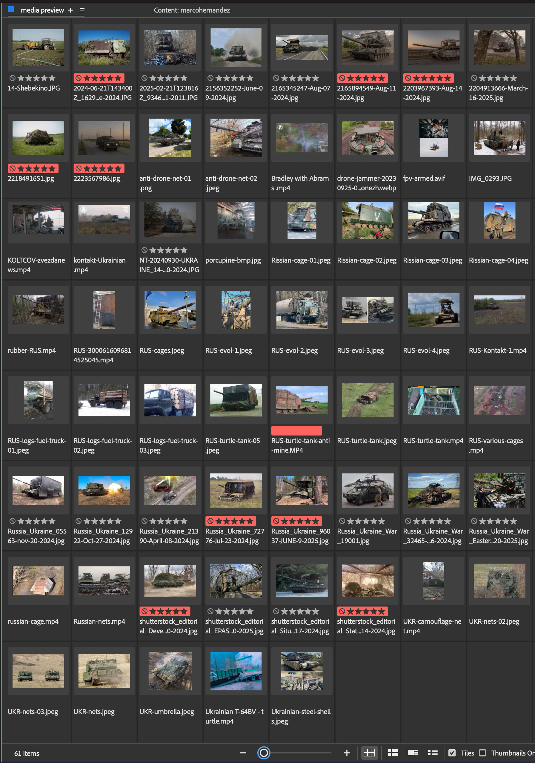
Perhaps the only downside to social media material is that it takes time to verify it. You must navigate through many precautions, including copyright, veracity, the tone and source in which it was shared, among others. I spent about 2 days chasing links and references this way. Below is a mix of some of the references (both social and wire-sourced) I used for the drawings and the article itself. At the end, I discarded about 80 images and videos from social media for diverse reasons.
Some references from photos and videos about turtle tanks and vehicles with additional protective structres. The New York Times
Luckily for me, our correspondents and news agencies have extensively documented the turtle tanks, and I only spent a few hours searching the archives for verified images from photographers I could use in the story. Way easier, but I think it’s always necessary to check as many places as possible before actually starting the production.
Drafts for a new story
Once the research phase was over, I dedicated myself to making a very basic structure with some doodles for some visual moments in the piece and writing some paragraphs to guide the narrative.
Projects at the New York Times require a google document where we drop text and parameters for components, it’s mostly Svelte and Archie Markup Language(AML). The tanks project looks like the image below from the main driving document and its wired to a package of local code files with a back-up in Github.
We use the same document to write the text and manage the components, including the visuals and any other features or functionality we add to the page. My role often includes creating a draft with the basic ideas written down to serve as a guide if I’m collaborating with someone else, as in this case. Of course, as you can see here, my expertise is not writing, but it helps to wrap up the ideas to engage better with the story. Sometimes, I do the whole piece on my own, including the words (my apologies to the copy editors who might have headaches with my text). However in this case, TM would be the one writing the final copy, so I didn’t want to interfere too much with the text anyway.
Hands on doodles!
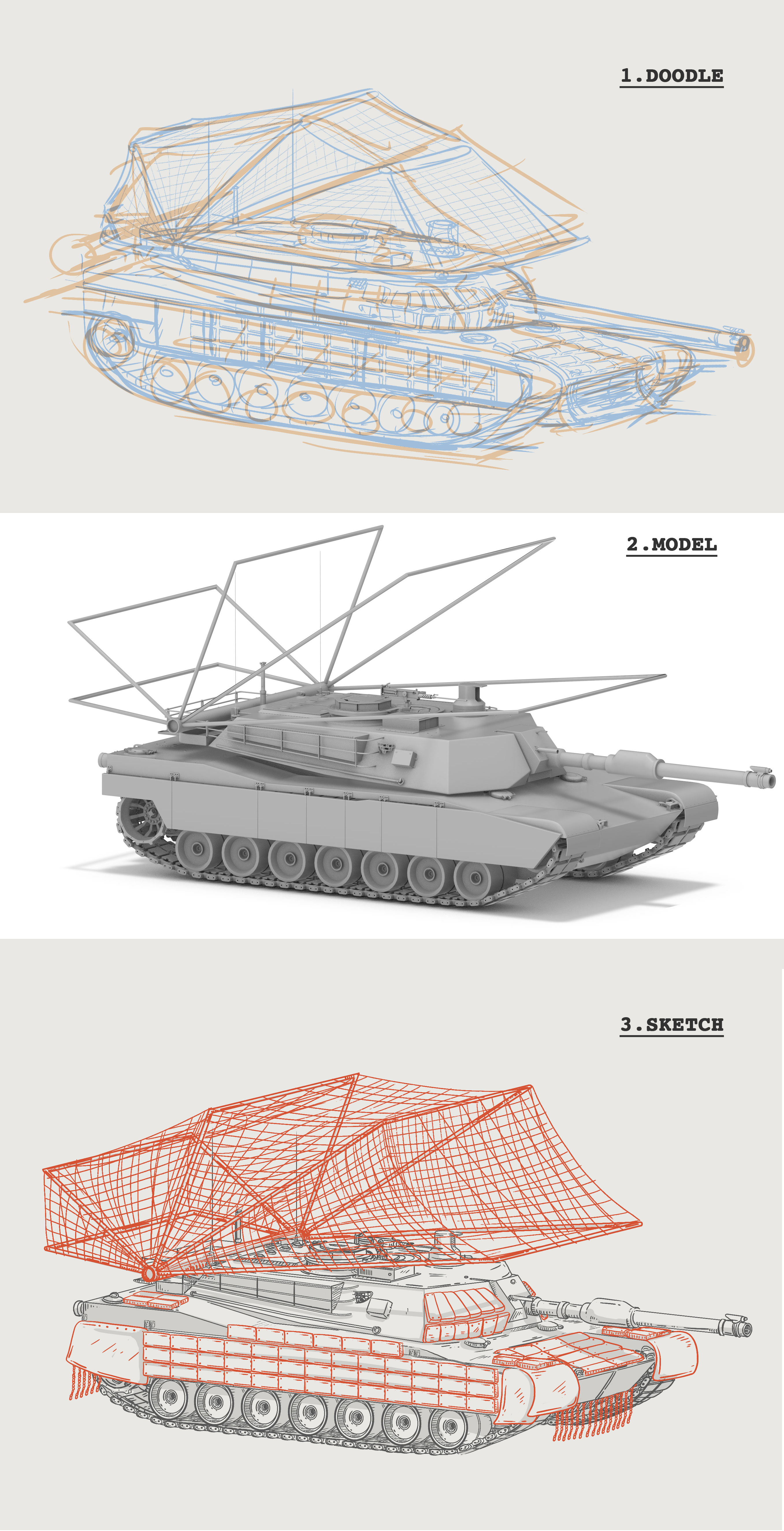
About a week later the next stage began, up to this point I hadn’t even seriously touched my Wacom to start sketching. But it’s impossible to start that without doing research, adding a structure, and connecting some web components first.
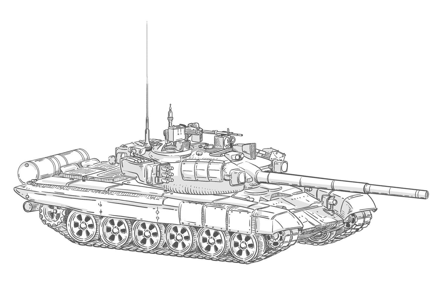
I defined the tank models I would need based on the references, documents, and stories I found during my previous process. I needed at least one Soviet T-series tank and an Abrams to reflect what had happened on both sides of the battle. Even with the intention of making the piece interpretive, the first step for me was to make some rough doodles, then model some guidelines for the illustrations using Cinema 4D, then returns to photoshop and finally to illustrator for labels and other stuff.
Preliminary drafts and renders, Photoshop > Cinema 4D > Photoshop. The New York Times
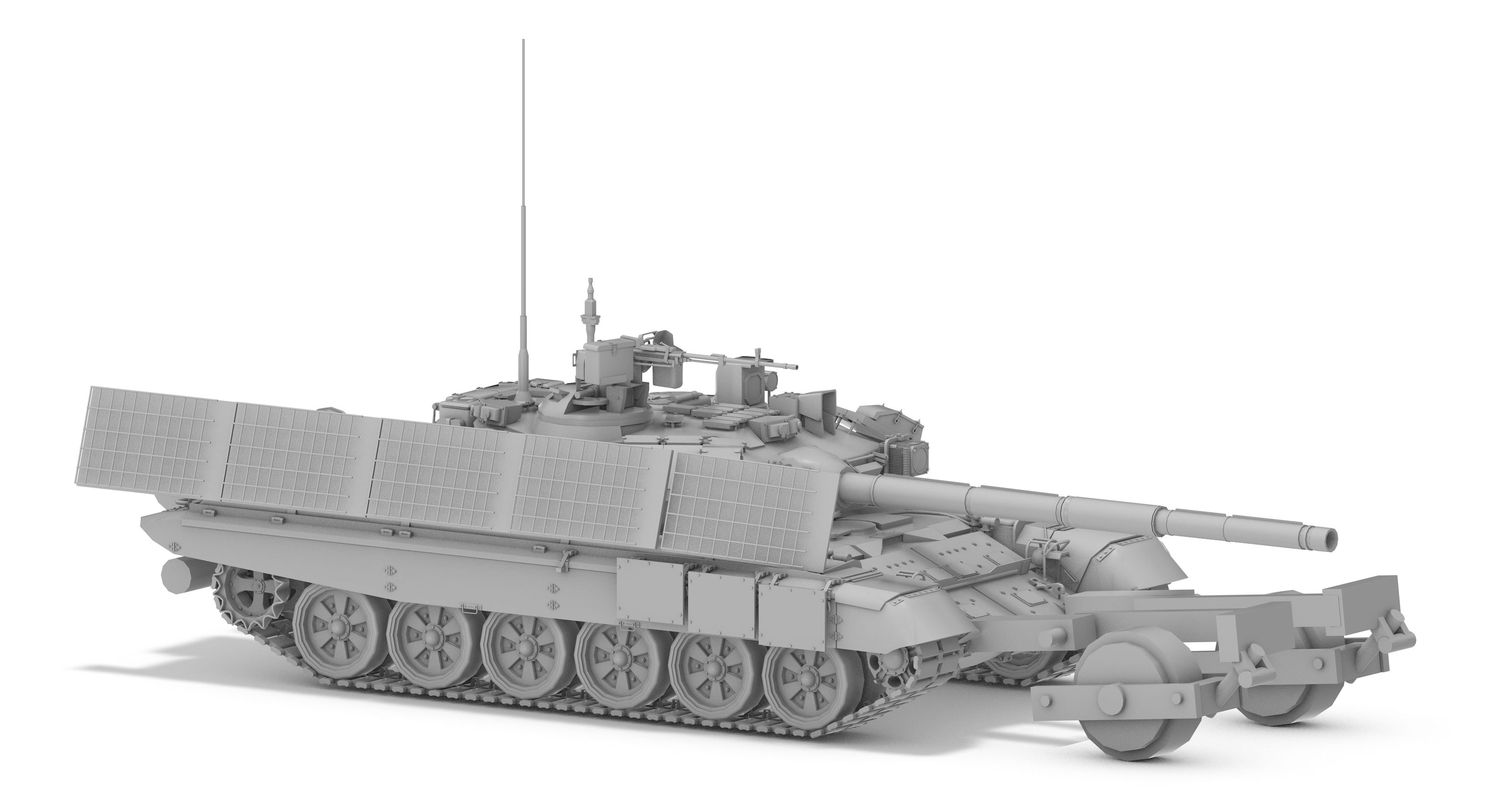
I didn’t model all the structures, just basic guides to maintain proportions. Here you can see how I did some basic geometry to guide myself later in photoshop on the free hand-drawing.
A render ref for the soviet tank made with Cinema 4D. The New York Times
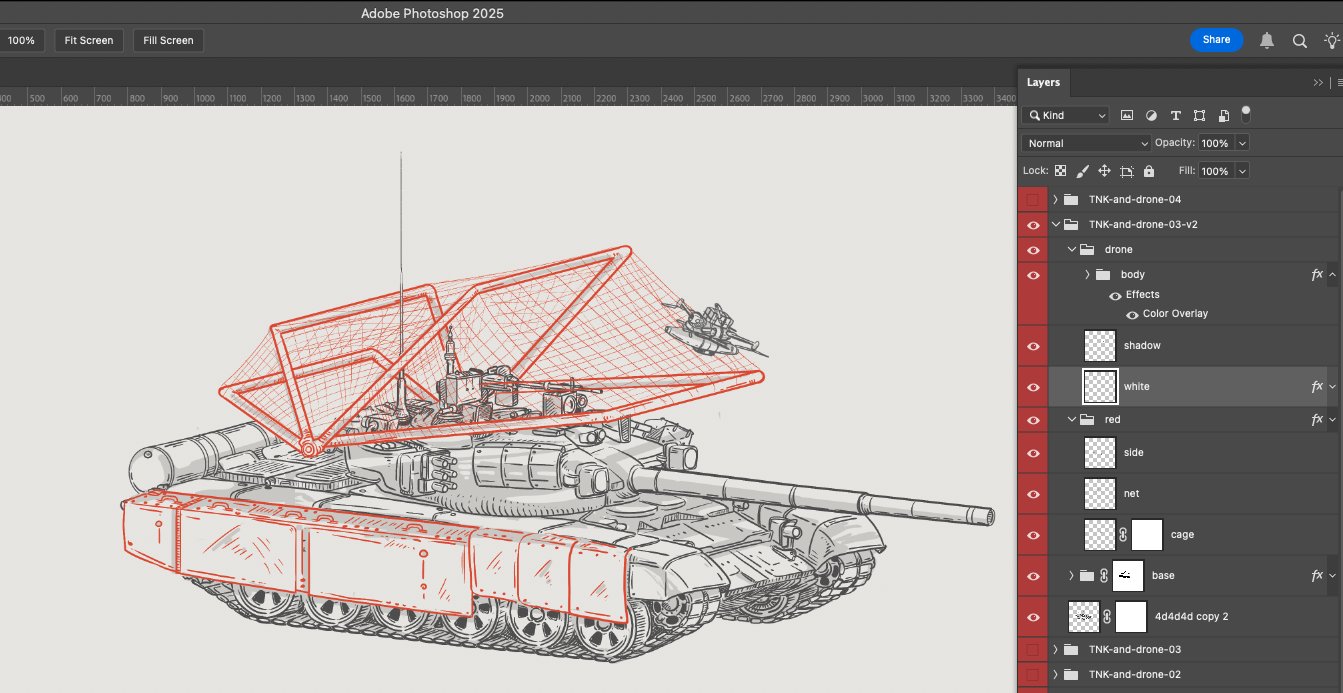
Then, with the images I collected, I gradually drew the improvisations the soldiers had made on the corresponding tanks. The final versions were sketched in Photoshop, 3 times the size of the publication to gain some detail in the final result.
I usually sketch using photoshop, I have some sets of custom brushes and define layers for each piece separately. Overlaying color by layer also helps to highlight parts of the sketches. Here’s a view of the master document for the soviet tank modifications. The New York Times.
Finally one more step to add labels and play around with the layout and text blocks if required. Below an early version of one of the graphics.
The New York Times.
This was going to be an illustrated piece; I was clear about that from the start of the conversation. Illustrations, in general, help unify a piece visually. While it’s true that not every story can be solved with drawings, sometimes the abstraction of doodles and even their imperfections provide the reader with a bit of room for interpretation.
However, it’s good to accompany these types of pieces with some photos to show the real evidence. After all, it’s not that I’m imagining these vehicles; each one must come from reality. That ethic still distances us from artificial intelligence, even if only temporarily.
Some of the tanks in the piece published. The New York Times
If you look back to the top of this article and find SQ. reference #1 you will see the the diagram we did not used in the February story, in the most recent piece I turned that into a scrolly explaining how the modifications transformed the T-Series tank into a troop-transport vehicle.
Published version of the SQ. reference #1 above. The New York Times
Because of the way our team works, once the pieces are published online, I have to move on to the next project. Part of the graphics team at the Times is dedicated exclusively to graphics for the print version.
That means I have to prepare pieces for one of my colleagues in that group, along with another editor. The text is repurposed so it makes sense on paper. Occasionally, I have to produce additional asset at a different resolution or with particular specifications, like when I use animation, but often I’m already working on another project, as was the case with this one.
Print edition of the New York Times, Sept. 18, 2025.
The print version was published today in the US, you can take a look to the double page and a little detail in the front page if you have access to the paper.
Thanks for reading, and see you next time!
Note: –Although the images in this post are part of my production process, they are property of the New York Times.–
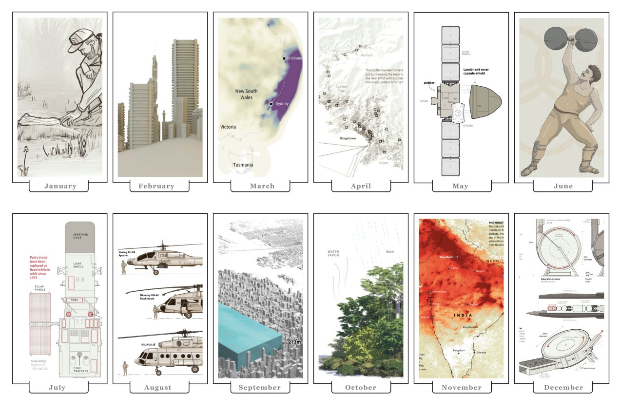
That time of year has come once again, the best of the year in my opinion. All us is doing the list of the best of the year to give a glimpse of what 2021 was like and, of course, to give a final push to their stories as well. So, like last year, I want to do a quick rundown of my favourite details of the 2021 projects. Keep in mind the pieces in this entry are out of context and you may want to take a look into the full story for better understanding.
January: The amazing Amazon rainforest
The 2021 kicked off strongly, during the first month of the year I worked various projects including some breaking news. My favourite details of January was a small graphic part of the project titled “Jungle Lab”. The graphic itself isn’t a super complex visualisation, actually it’s just a simple illustration, but the message behind it is very powerful. It makes you realise the relevance of the virgin rainforest right away. I truly believe that our work on infographics is not about fancy effects but powerful messages to our readers.
Researchers soaked in sweat tore trees limb from limb, drilled into the soil and sprayed paint across tree trunks. It’s all in the name of science https://t.co/X4c6pfUUjJ via @jakespring
As I said before, January was a busy month. Here are some other details that I also enjoyed working on, mostly breaking news.
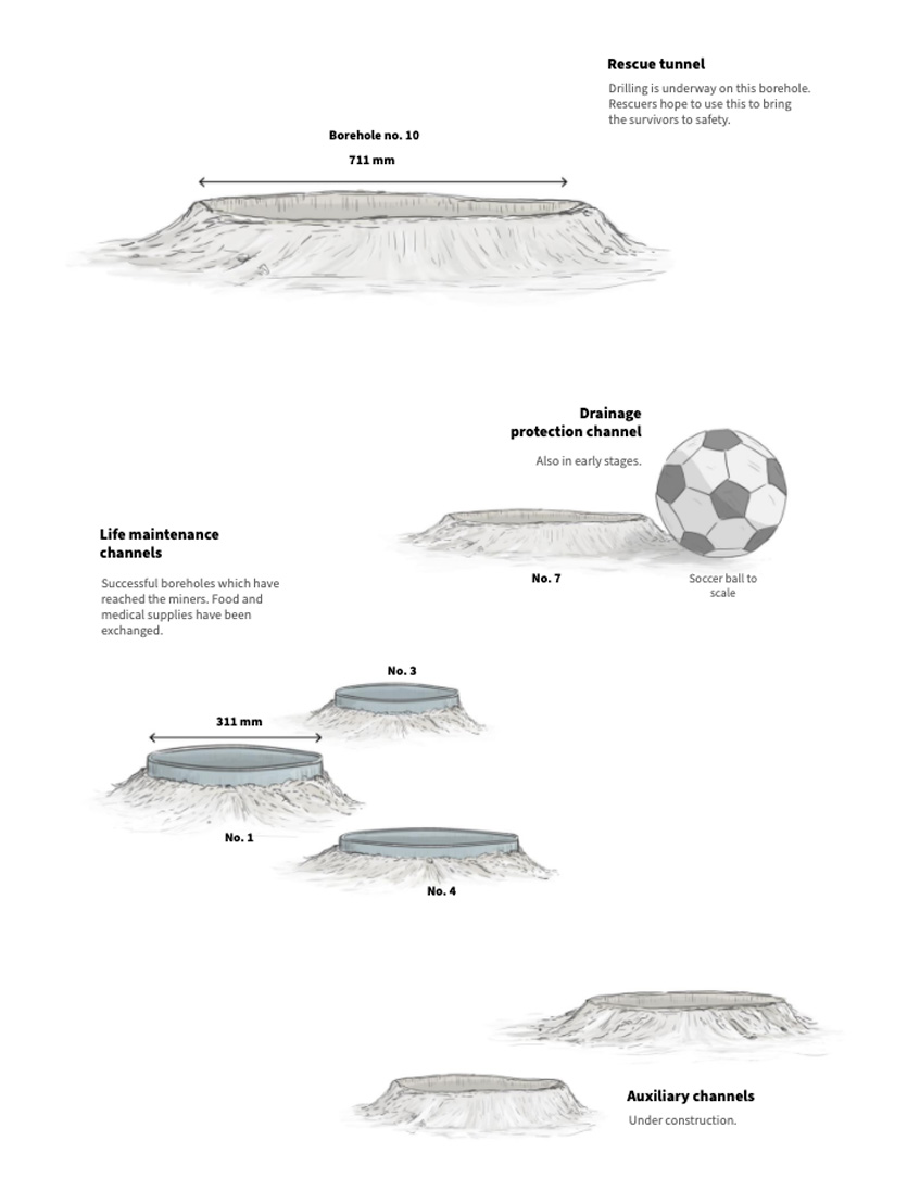
You may remember the story of miners who were trapped in a mine after an explosion in Northeast China [link here]. There’s a small graphic showing dimensions of the rescue shafts dug by rescuers, that’s something really difficult to imagine without a familiar reference.
Aside from the miners, you may also remember the tragic accident of the Indonesian flight SJ182 [link here]. I recon working with those bathymetric maps helped to explain why recovering the black boxes was a difficult operation. Also kind of shocking to see a few incidents of airplanes around the same area.
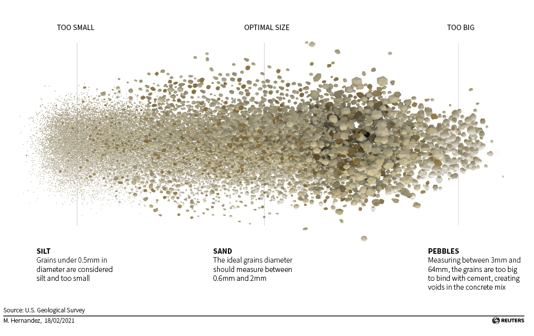
February: Sand.
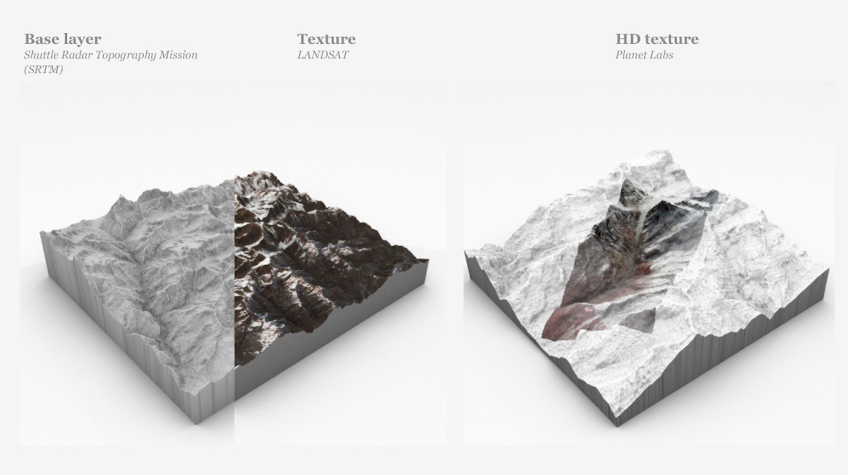
After a tight January, news continued to pop up everywhere, lots of stories with great potential for a visual project. I have the opportunity to do some experimentation with 3D assets using amazing high resolution images courtesy of Planet Labs. We created a detailed story of the massive landslide in India [link here]. Here’s also a short recording of the piece running in C4D: [Drive video].
However, a much larger project was published in February. For a long time we worked on a series of projects on a topic that impressed me. To be honest, I never thought about it before: Sand mining.
Sand mining and trade is a whole world itself, this commodity is unnoticed present in our daily lives. It have a dark side of illegal trafficking and mafias too and even it have sparked diplomatic issues for some countries.
But one key thing that came to mind when I started working on this was this: Why we don’t use desert sand to feed our huge demand? There’s plenty of it!
Well… the explanation is a little more complex, but in short, desert sand grains are too small and rounded. That is why we are dredging rivers, digging abysses in mountains and making beaches disappear.
Sand is the planet’s most mined material, with some 50 billion tons extracted from lakes, riverbeds, coastlines and deltas each year, according to the United Nations Environment Programme. Per person, that’s more than an elephant’s weight in sand. (2/7) pic.twitter.com/ykk9nBqDAe
2021 broke some records with extreme weather events, in fact I did an entry here about a 2021 failed project on floods. You probably remember the floods in Germany and China, but there were many more events like that throughout the year.
In March, eastern Australia suffered what the Australian government called the worst flooding in 60 years. That week I was working in a daily-graphics shift, so I did a quick small map to visualise the event, here’s a small part of the graphic:
Also in March, I did a small collaboration on the nice project “Bats and the Origin of Outbreaks”. I really enjoyed working on that piece in every aspect, from the story angle to the opportunity to work with a custom style. You may also want to take a look at that piece:
According to the latest report from the WHO's Joint Mission, the intermediate host which passed the novel #coronavirus from 🦇 bats to🧍humans is still to be identified. Here we explain zoonotic viruses and why bats carry so many of them. #COVID19https://t.co/b4Sc2fauOU
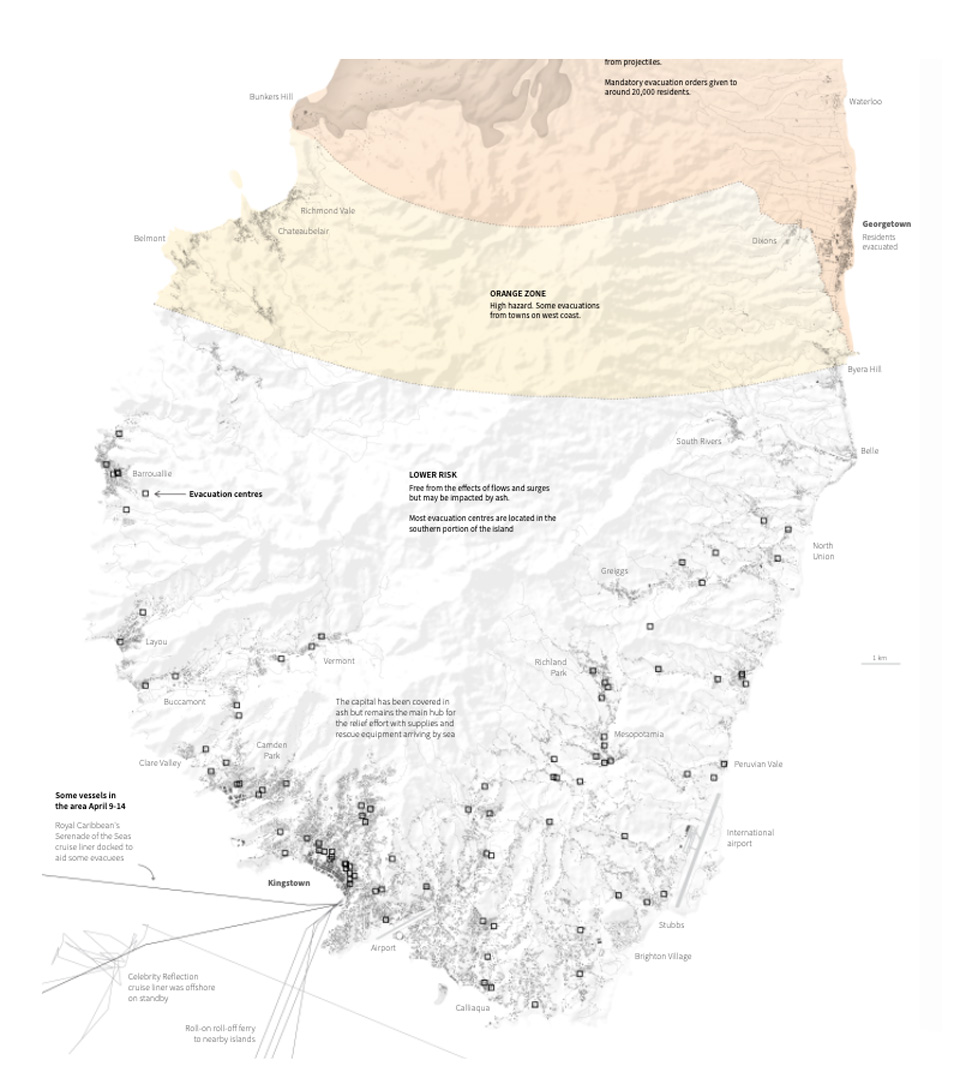
April surprised us with a breaking news story, the Le Soufriere volcano violently covered St. Vicent island in ash, devastating the island infrastructure and prompting a sea and land evacuation of thousands of residents. It also released emissions at spectacular heights into the atmosphere. It was like the omen of a year full of massive volcanic eruptions around the world.
I collaborated in the story with different pieces, but my favourite piece was Simon’s map showing buildings, shelters and risk areas among others. Here is a small detail of that map:
Explaining the series of eruptions from #LaSoufrière which have devastated St Vincent's infrastructure and prompted a sea and land evacuation of thousands of residents. #StVincenthttps://t.co/AbMEFswvGw
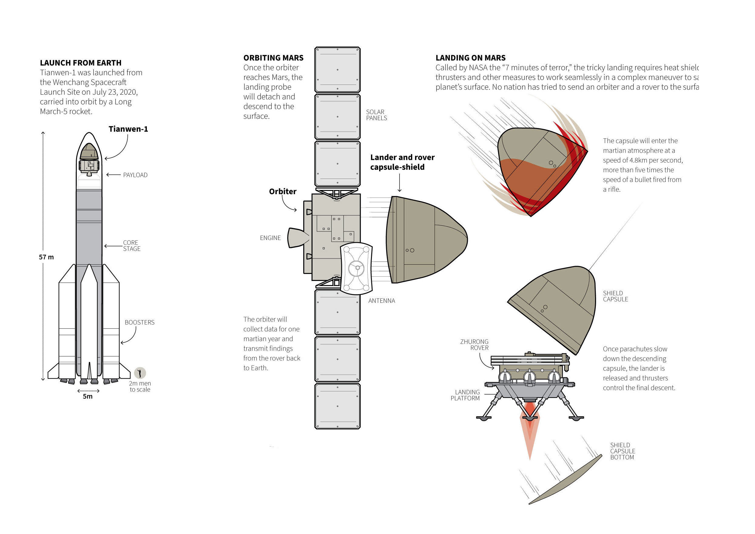
One other frequent topic on my daily work this year was space exploration. I did a good amount of small pieces on telescopes, comets, asteroids and spacecraft.
May saw the landing of the Martian explorer ‘Tianwen-1’ develop and successfully landed in the red planet by the Chinese. Here is a little detail of that graphic:
June: Olympics.
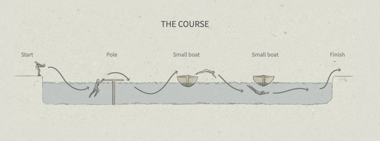
My favourite from June was the singular Olympic sports story. Can’t imagine the adrenaline rush of a 200m obstacle swimming competition. Jumping over boats and diving again to be the fastest hurdle swimmer of all times, they sure had a lot of fun there.
Here’s a small diagram of the course of the Paris games of the year 1900:
There are many disciplines and events long forgotten by today’s generation of Olympic spectators. Here's a look at some of the most interesting and obscure events that did not stand the test of time and no longer feature in the #Olympicshttps://t.co/U0k69vLirDpic.twitter.com/E7OvMBtml0
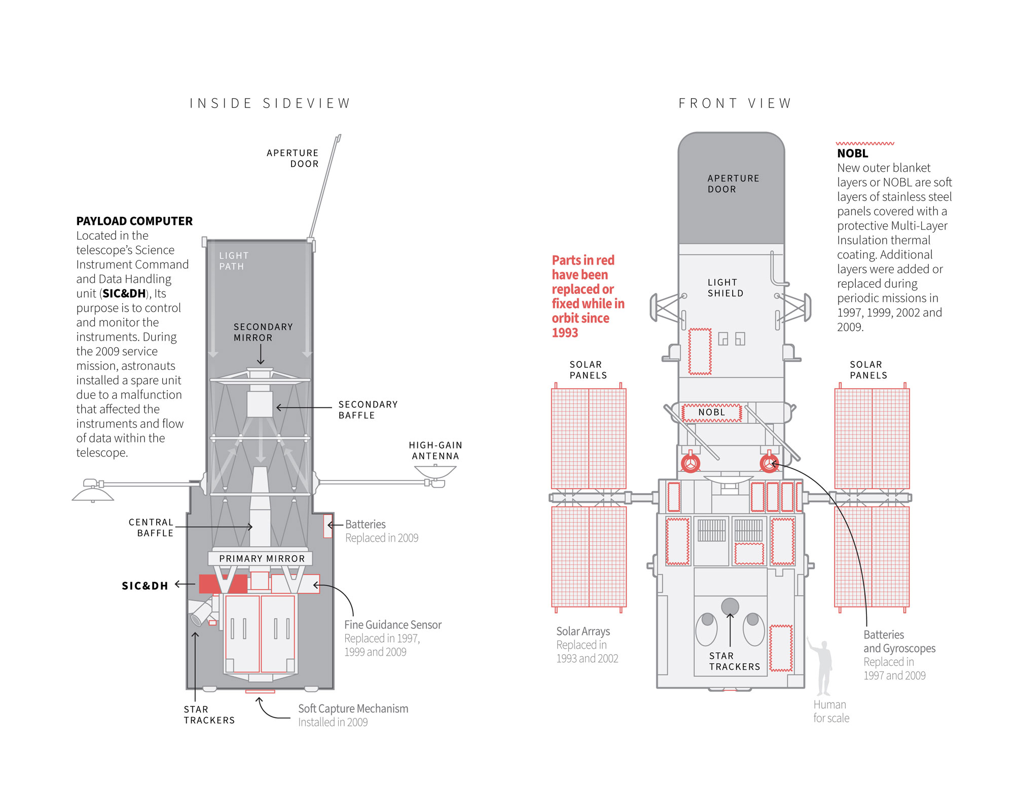
By mid year the news put me back thinking in the outer space. The Hubble Telescope was literally an eye-opening for the scientific community and for all of us in general. Even more so if you stop to think that this magnificent achievement of science was designed with technology from the 80’s. I can’t believe how the old computer from the 80’s still worked there. Here’s a small detail from a daily basis graphic that explains where the telescope problem was. ( The 80’s computer SIC&DH )
This 2021, I spent a little more time making small single-day graphics. I enjoyed the small break from big projects, and the quick and intensive research part you have to do to get it done in a single day. However, I think the best part was going back to the long-medium term projects that were almost done to finish them, with my mind clear and fresh.
August: Wildfires & aircraft data
August was a very busy month too. One of my favourite pieces was this sad new record: For the first time in the records, smoke from the fires reached the north pole. Check out the graphics thread below. There’s a third graphic in that thread, click on it if you want to see some temperature records too:
The second part of the month was infused with the chaos surrounding the US departure from Afghanistan. We did a few pieces on this, overall my favourite was the spaghetti drawn by the aircraft around the airport. It’s really cool how when you are digging into the data many stories pop up, and often many questions more.
When Afghanistan’s government collapsed and the Taliban began to roll into Kabul, a huge multinational evacuation began. Here is a look at what is flying and what they might be up to:https://t.co/pLKk5XPVSj
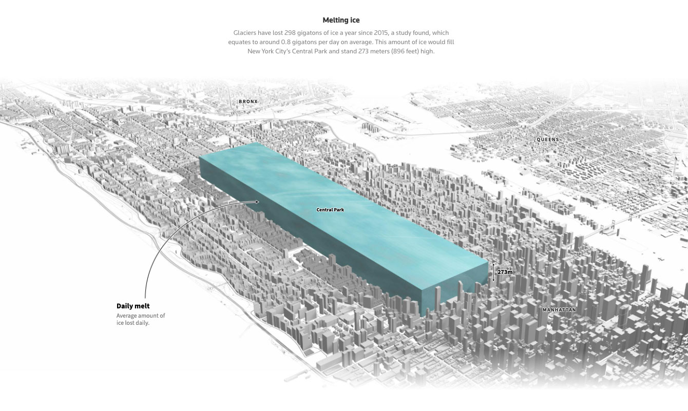
Like what happened to me this year with the sand, there are things that you never expect to be so interesting. Ice is more than frozen water, ice cores are cool stuff. These things can help to retrieve ancient records, they are like windows to the past of our planet. On September we published this story about that.
The sad part is that we are loosing those records due global warming, and it’s not slowly loosing them, it happens at freaking vertiginous fast speed. The graphic above shows the average of how much ice melts in the world EVERY DAY! The amount is equivalent of placing a gigantic 273m-high ice cube in NY’s Central Park.
Ice provides historical records about climate cycles, and as #glaciers melt, scientists are working to collect ice cores from them before it's too late. Learn more @Reuters: https://t.co/bLtLzpClBo.
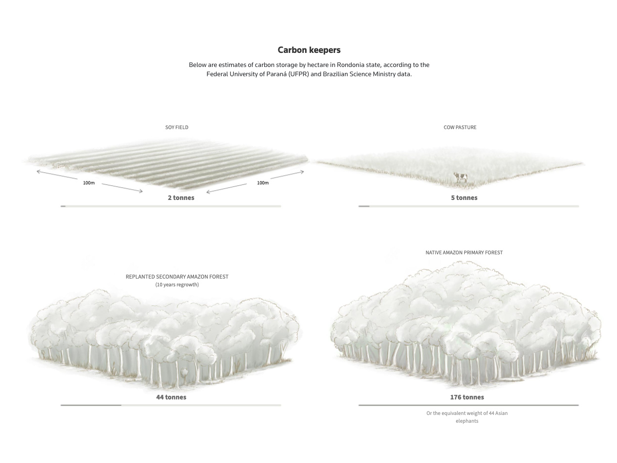
The forests stories returned in October. This project took many days of 3D scene testing, hundreds of calculations to put thousands upon thousands of trees in place, modelling objects and illuminating leaves to show how quickly we are removing the things that are keeping us alive. We are nuts isn’t?
Not just ice, but we are also losing trees on an incredible rate. On average, 67,000sqm of rainforest is lost EVERY MINUTE. The following video begins at ground level, right in front of 3 people and a logging tractor, all to scale. In order to see the portion of the forest that we lose, you see people and tractors as ants.
There were also other quick projects on this month, one of them was the story of the Chinese incursions on the Taiwanese ADIZ. Since then, many more events had happened and tensions only continued to escalate between both sides. Thinking about the region that has been my home for so many years, I hope this doesn’t go any further. Unfortunately, there are always chances that this will get out of control.
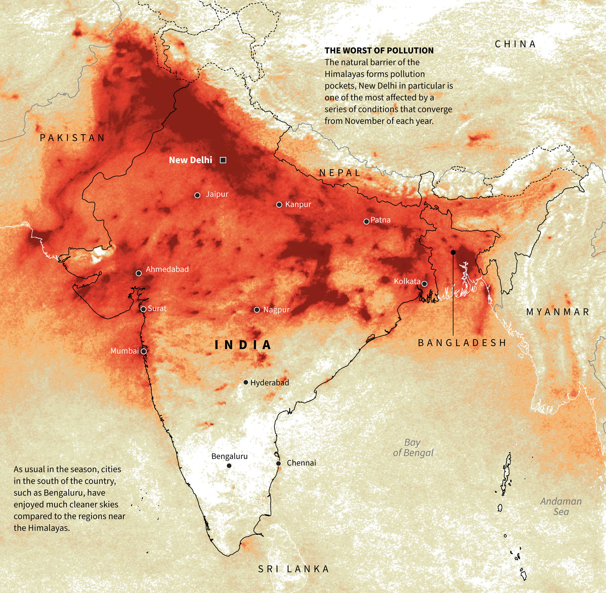
India is a very particular place. During the last months of each year, northern cities are suffocated by pollution trapped at the foot of the Himalayas. There are many reasons behind this such as seasonal crop fires, fireworks celebrations, and many others. However, southern cities avoid polluted skies. That was the subject of a one-day quick map, here’s a detail of it:
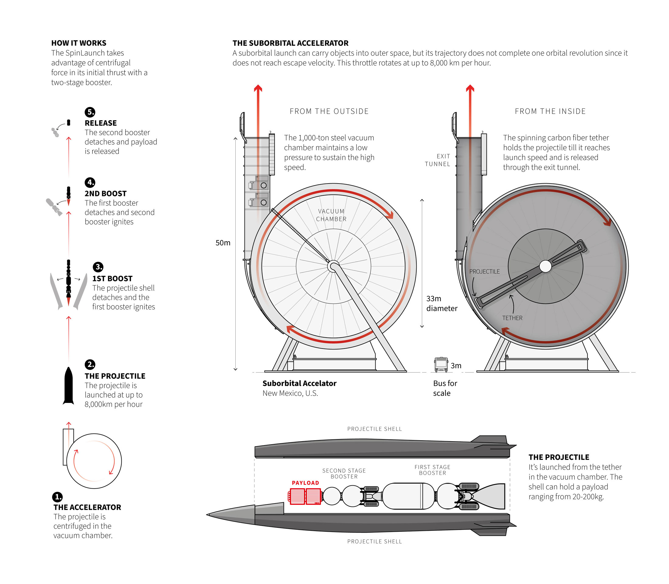
December: spin, spin and throw it.
Back to outer space news! …or kind of.
Near the end of last month (Nov.) I was working in one more of those small pieces for the daily basis. This time my mind blowed up with this idea of launching things into space without rockets.
The idea is to spin a projectile in a vacuum chamber, gain momentum, and propel it into orbit around the Earth. I imagine something like throwing a hammer at the Olympics, but on an enormous scale. Here is a small detail of the graphic in mention:
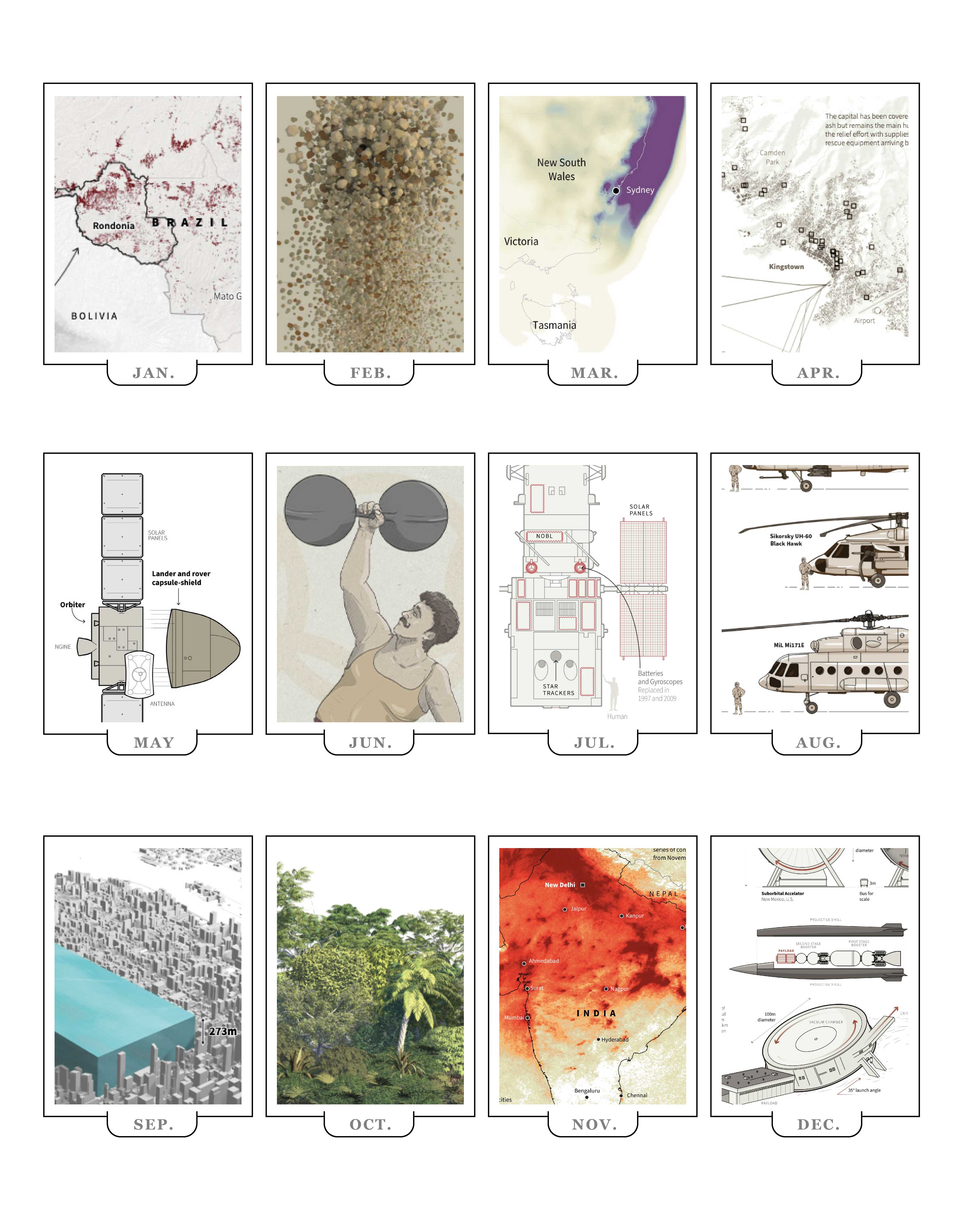
My 2021 list of graphics
Just a few days more of the 2021 are left, so many stories have crossed under my Wacom and keyboard, it was a great year. Hope you enjoyed this sneak pick of all the stuff I worked on over the year. I hope you also considered visiting the stories mentioned, just hit the link at the end of each month’s entry to get a better context of each of the details highlighted here.
2021 was a great year, I’m very grateful to Reuters for all the good things, also to my teammates, for everything we did together and how much I learned. There is no better way to say goodbye to this year.
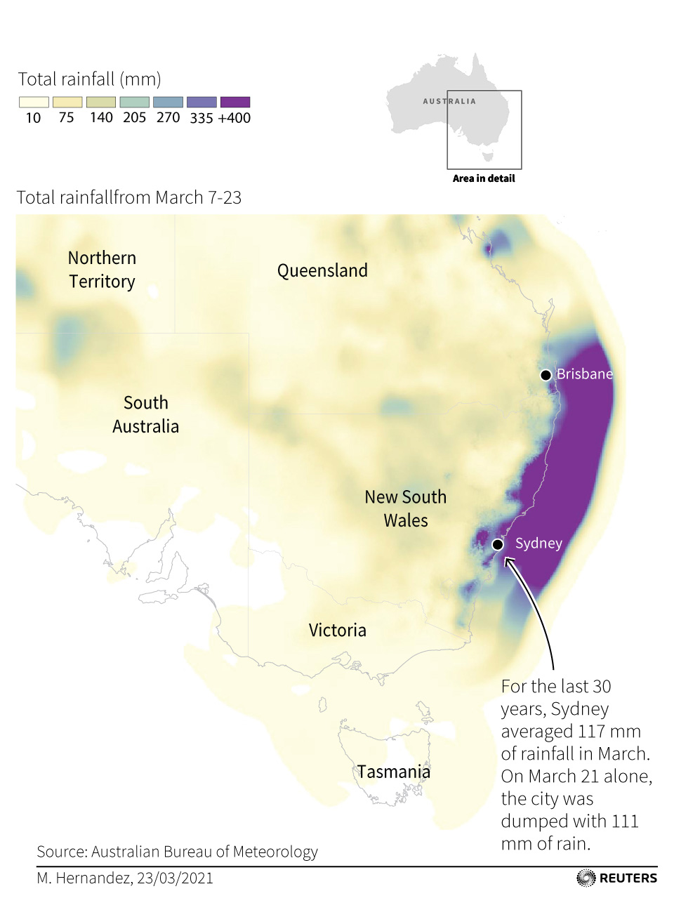
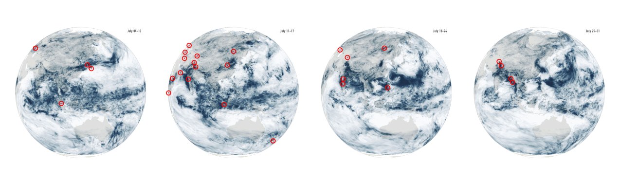
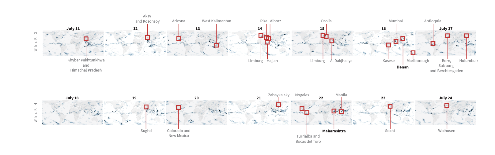
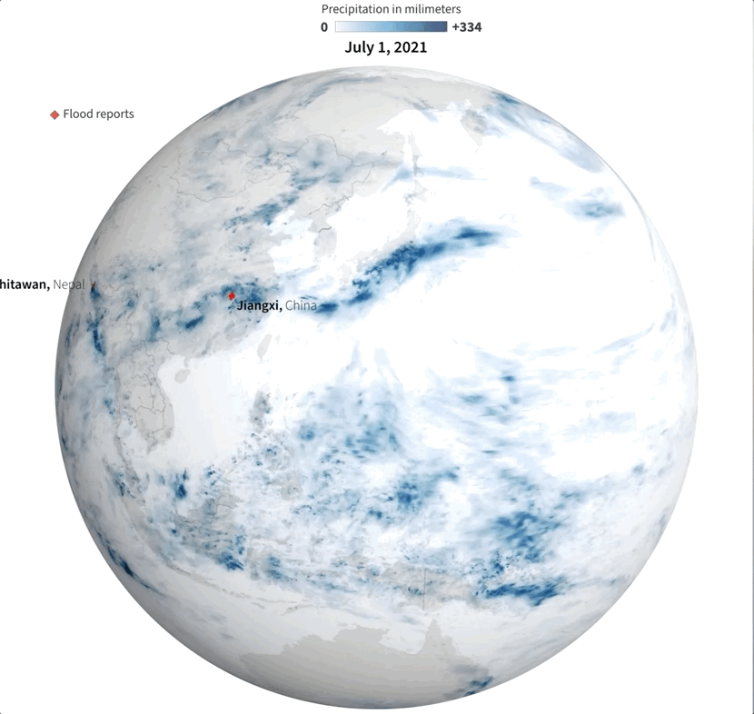
Last July was a crazy month full of flood news all over the world. I remember seeing impressive videos and images of the floods in China and Germany, and digging a little deeper I found many more reports about it from around the world. I tried to put some things together, but time and other projects played a trick and the project became material for #infofails.
Some times taking notes of things isn’t enough for me. One or two illustrator artboards with basic ideas have become the new “office whiteboard sessions” since we started remote work. Quick sketches and some data samples usually help me to organize myself better.
Sampling flood reports and daily precipitation data.
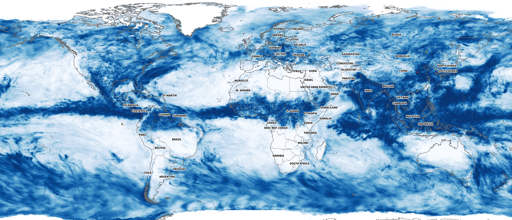
I collected some data from NASA including the PPS and MERRA-2 to visualize precipitation. It was so cool when I saw the data of total rainfall in a month over the planet. Is curious to see how dynamic our planet is isn’t?
July’s total precipitation. Data by NASA’s Precipitation Processing System (PPS)
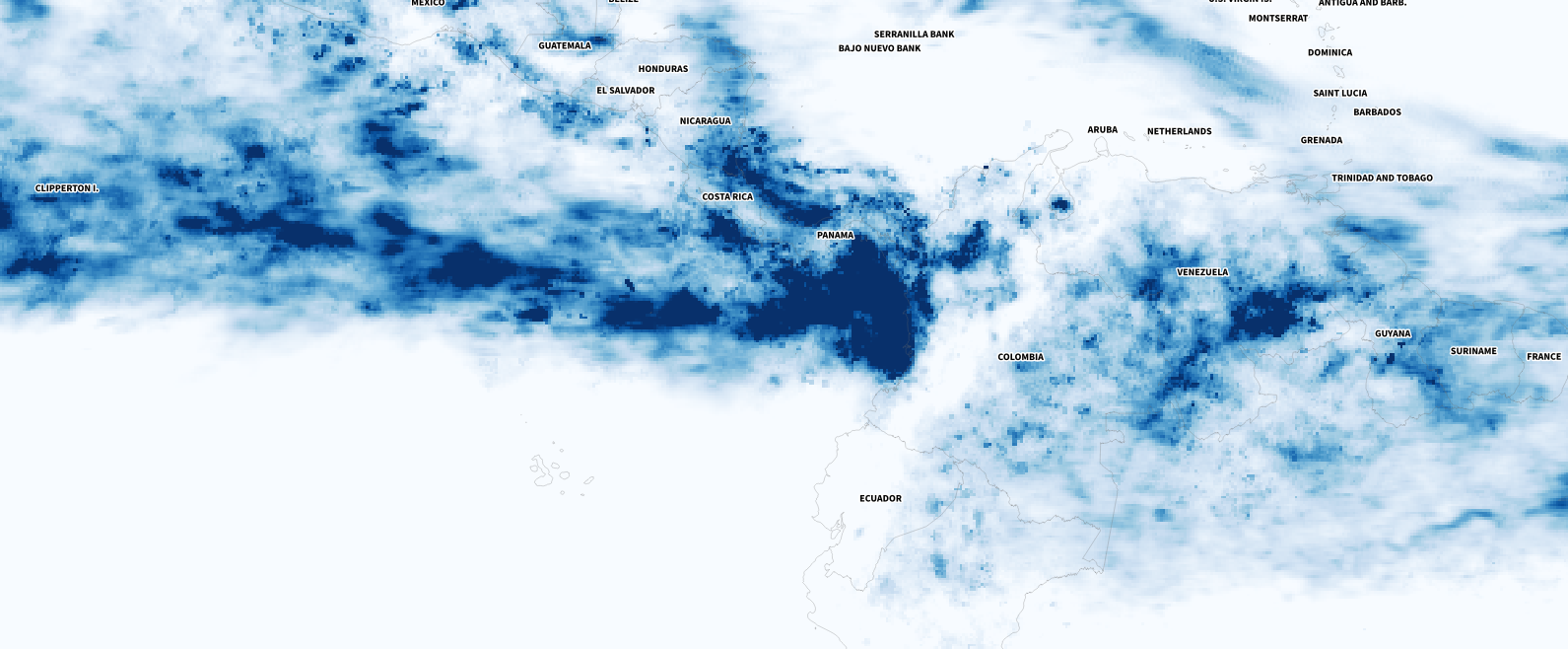
Whenever I have a global data set, I always look at how things are for my family and friends in Costa Rica. I remember that in July I had seen videos of flooded areas in Turrialba, a region in the Atlantic region of the country. And yes, the accumulated data showed that intense blue layer near the border with Panama.
Detail of the precipitation data. NASA PPS.
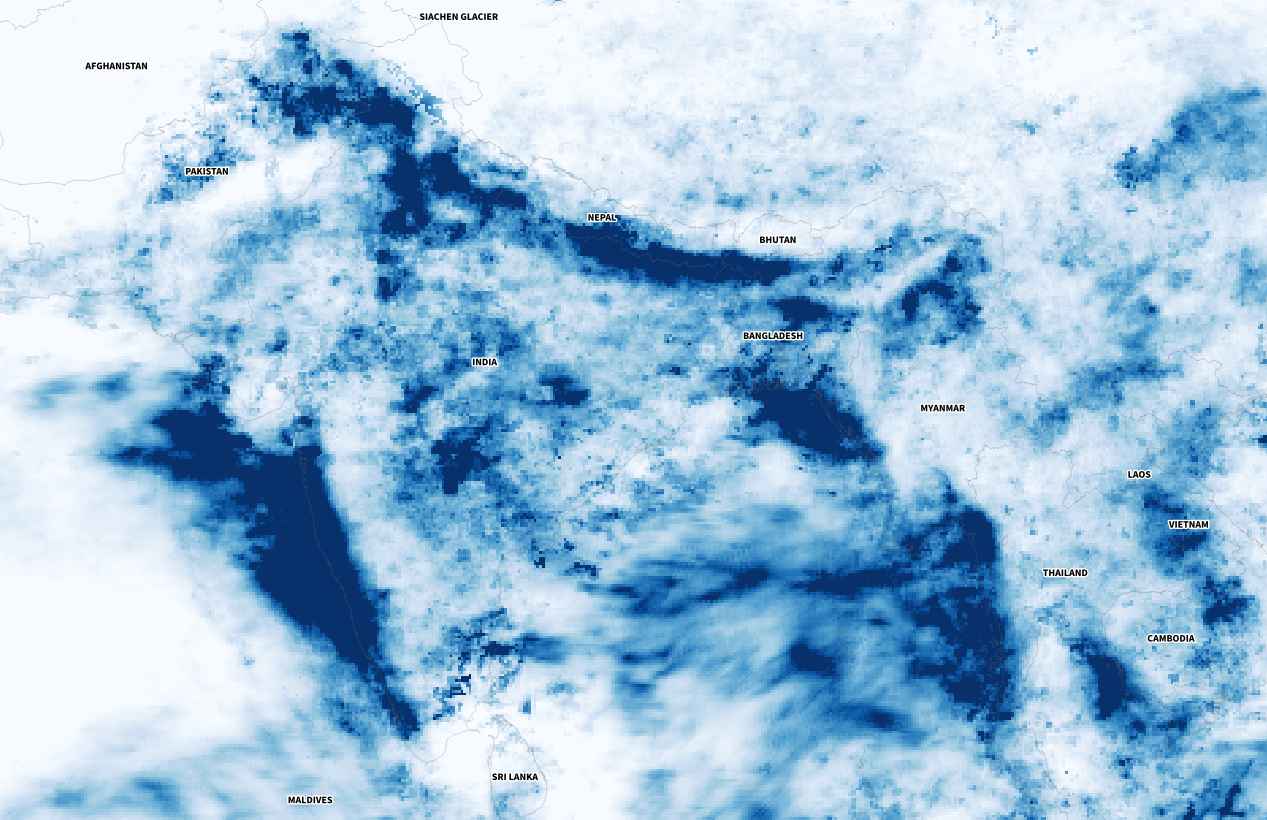
Of course, there were other much worse areas that saw terrifying amounts of precipitation causing dozens of deaths, western India for example was one of those areas. I continued to explore a bit more on the map and checking against the flood reports I found to find points of interest and to highlight later in the story.
Detail of the precipitation data. NASA PPS.
The testing continued
One aspect to consider was how to visualize the data in the end. There was even a 3D spinning globe in the process… As you can imagine it was chaos displaying flood reports, animated rain data, and 3D navigation all at the same time.
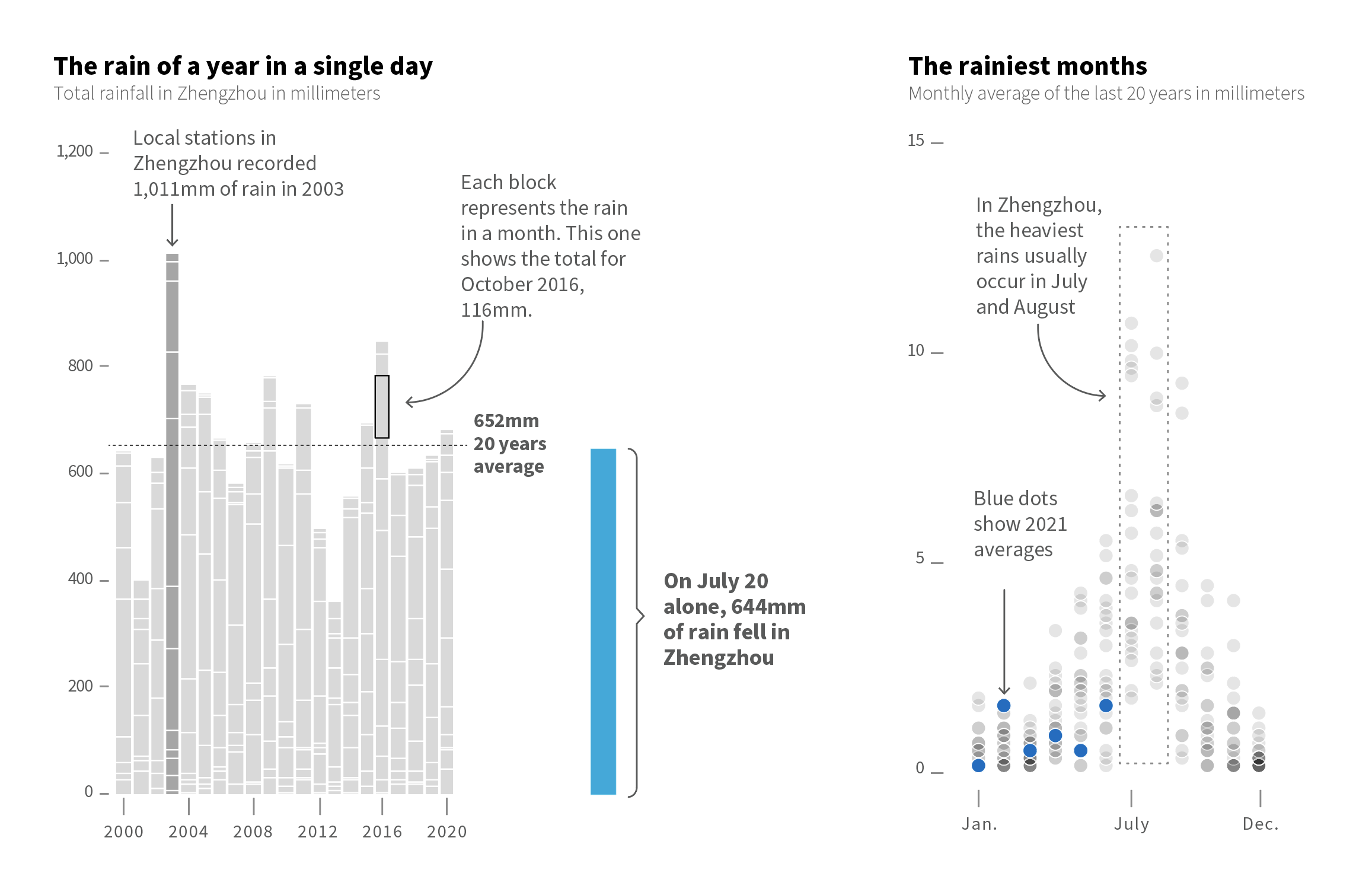
However, one of my favourite pieces was not the maps. There were some small graphics to condense powerful messages had something interesting too. Within them was this simple stacked bar chart where each block showed the total precipitation each month in Zhengzhou, just by putting the amount of water they received on July 20 next to it was really impressive. This is real evidence of how extreme our planet’s climate is becoming.
BTW, there’s also a great graphic from the South China Morning Post friends explaining the huge amount of water that Zhengzhou received over the downpours [ check that story here ]
Extremes
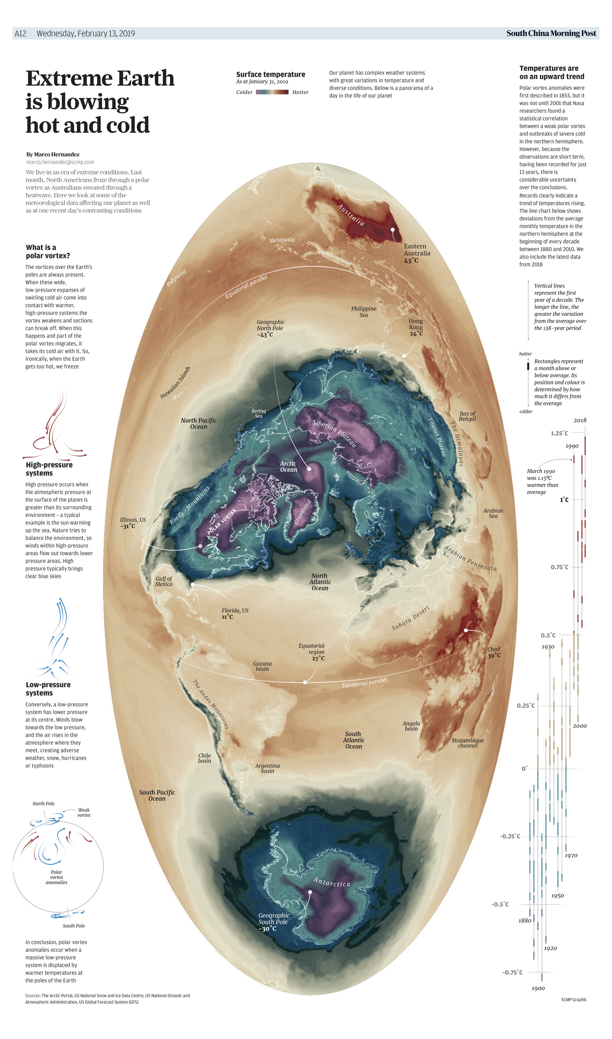
A few years ago I was working on a graphic about extreme temperatures of the earth, it was happening the 2019 polar vortex in the US and at the same time Australia was on 40° C on the other side. In my head, the perfect title was “Earth’s Goldilocks Climate.” It sounds crazy but it is actually very common, our planet is full of those strange contrasts all the time.
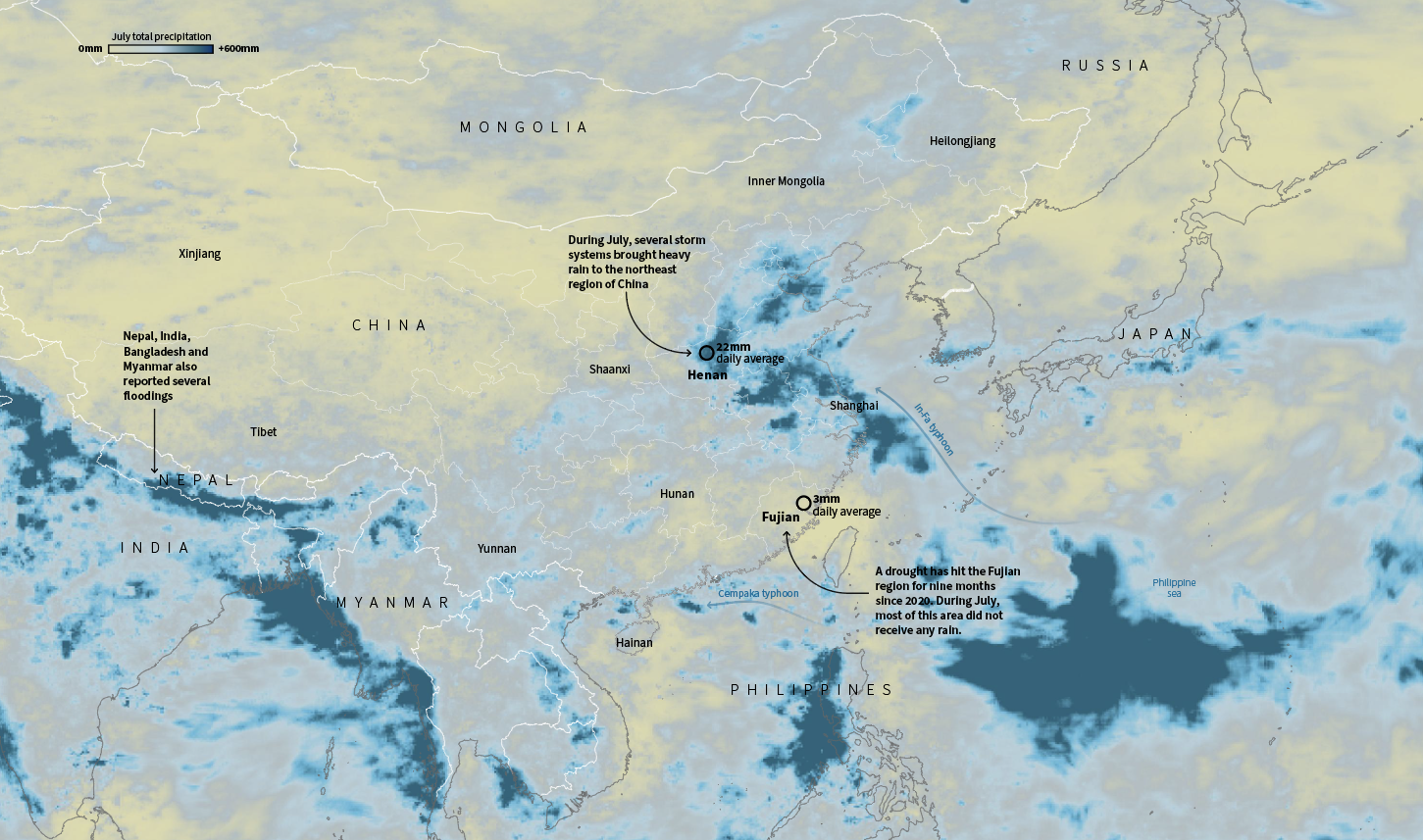
In July China was having its own ‘goldilocks’ event, or kind of, because wasn’t temperature. As enormous amount of water flooded train stations and caused chaos in Henan, south of there a nine-month drought hit Fujian province.
July total precipitation in China. Data by NASA PPS
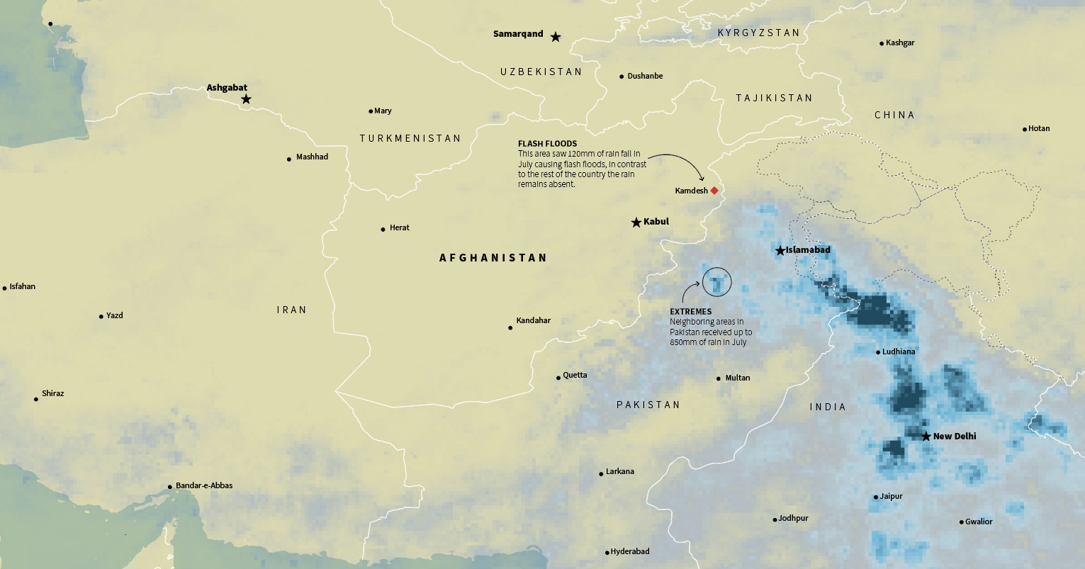
Similar situations occurred in the Middle East, in Afghanistan a long drought was worsening the already difficult situation of the Afghans. Ironically, extreme rains in the border areas also caused flash flooding, while the country as a whole has not seen any rain for months.
July total precipitation in the Middle East. Data by NASA PPS
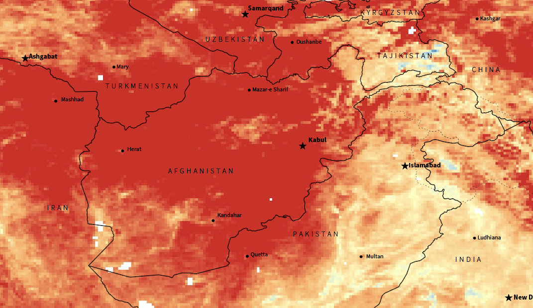
NASA’s MODIS/Terra offers also daily and monthly averages of surface temperature. This was some other stuff I was considering for this story. It’s incredible to see how high the temperatures go in the region. There’s also an other cool data set of monthly temp. anomalies here in case you want to explore the world too.
Temperature anomaly for Feb. 2021. Red areas show were the temp. was higher in comparison with the averages of 10 years ago. Afghanistan was about 12C warmer in average according to NASA Earth Observations data. LPDAAC and MODIS.
Anyway, none of these charts, maps or data made it into a true story on Reuters, but it was fun collecting, preparing and sketching ideas for it. And of course, in the end it became an average #infofails story here. Maybe later we will take back again this story, unfortunately extreme weather events are becoming more and more frequent
About #infofails post series: Graphics that are never formally published. Those are maybe tons of versions of a single graphic or some floating concepts and ideas, all part of my creative process. All wrapped up in #infofails, a compilation of my creative process and failures at work.
Did you like #infofails? Have a look to other #infofails 👇
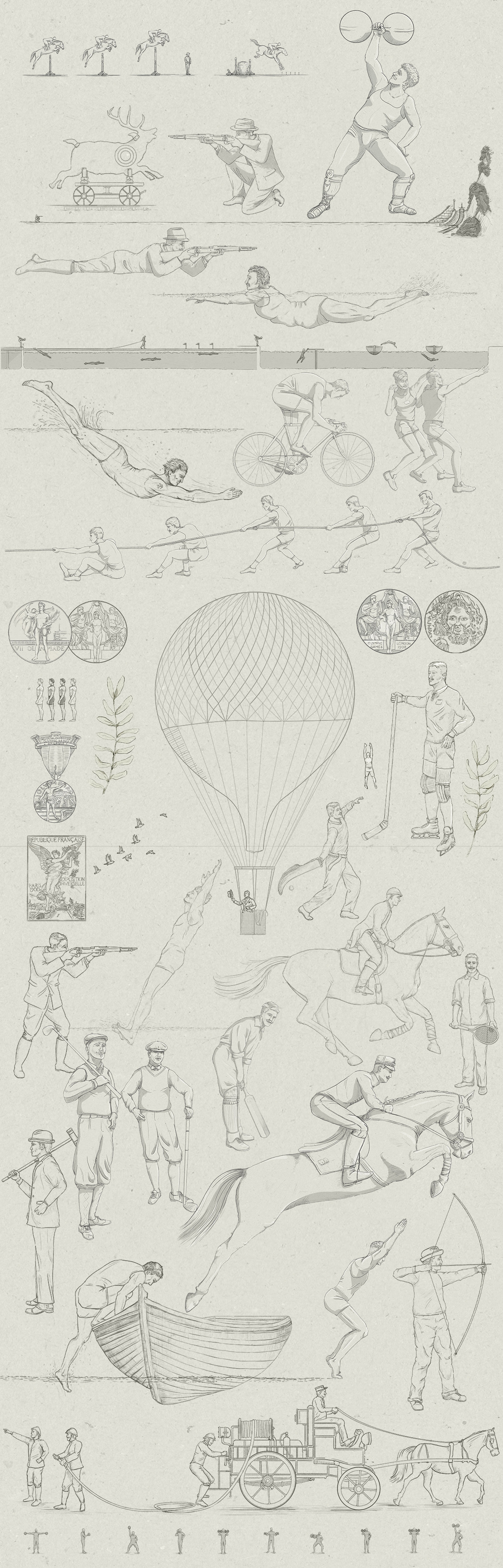
If you’ve seen my #infofails before, you might already know that it’s about the things I create for news and some of the mess in between. Here’s the link [ The Forgotten Olympic Events ] of the project related to this post if you want to have a look first and then come back here to get a better sense of what’s this about.
It’s a bit strange to say that we are about to see the start of the Tokyo 2020 Olympics in the summer of 2021 (if Covid-19 allows the games to go on anyway) but whatever the case, this is one of the most popular events in the world and we couldn’t let it go without a special story.
The idea of doing a story on unusual sports came first in April from my editor Simon Scarr. Later, I started reading old Olympics reports, books and websites to get good references of events that seem a bit unusual in a list of sports/discipline/events from the International Olympic Committee.
Some of the reports and books consulted for the project.
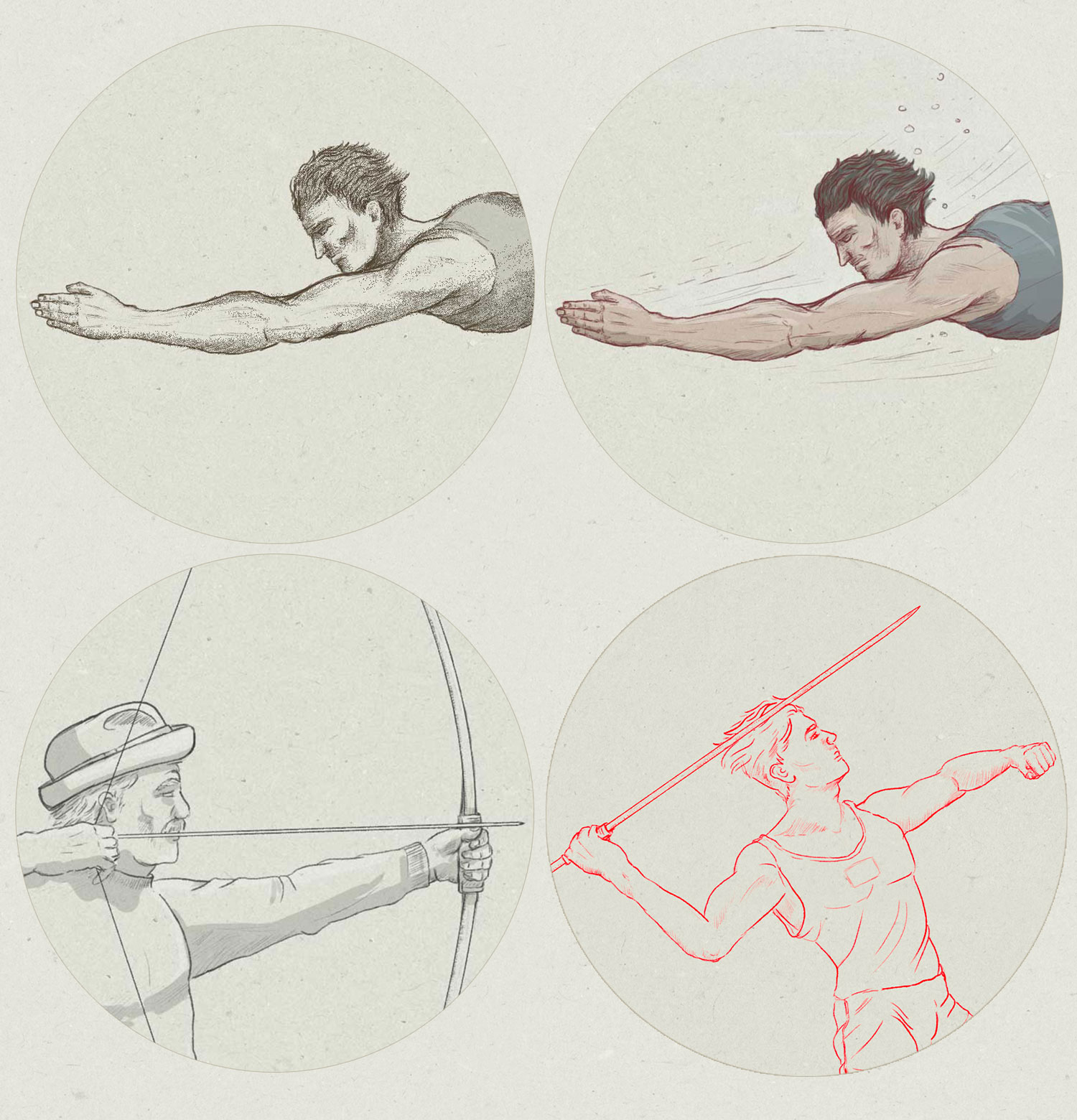
Once we had a good list of curiosities, I started doing some tests for the illustration style. It is not usual to find a solution quickly as I like to try alternatives. However on this particular project the style quickly established, and a few days later I had a lot of illustrations with many of those sporting events to display in the opening of each section.
Top images are part of the concept illustrations, I choose to go with colour as in the top right. The 2 bottom images are part of events the were left out of the story.
I can say that part was relatively easy, the difficult thing was to obtain visual references of the events where you could see how things were prepared for each event, or at least, a detailed written description. I probably spent more time looking for those things rather than writing or sketching.
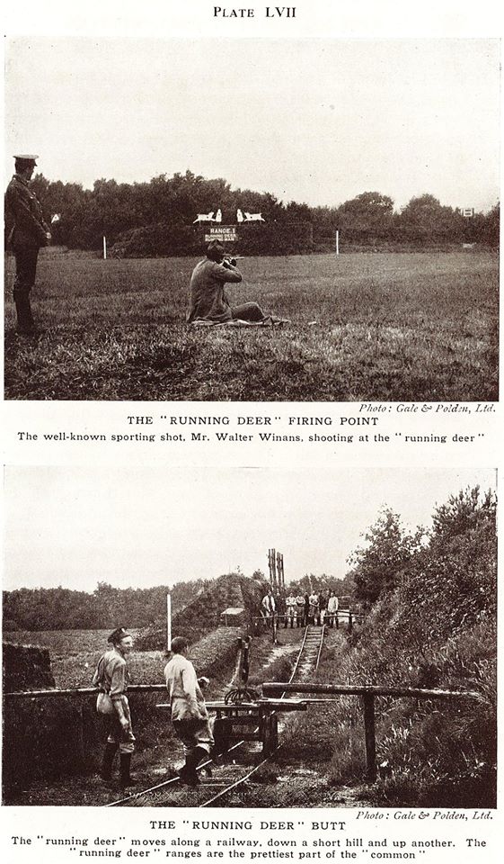
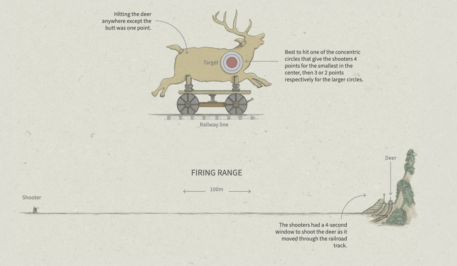
A reference of the firing range setup for the running deer shooting event
A detail of the rifle shooting section in the project
This project lasted about three months, however I didn’t dedicate myself exclusively to it, but I did spend a few days here and there trying to obtain reliable sources that would explain these singular Olympic events and their rules.
Some references were harder to find than others. For example, the way of placing the wooden birds for the archery events was one of those difficult ones.
I did a drawing of Hubert Van Innis, an Olympic archer who won six medals in the 1900 and 1920 games, but then I found mixed references on how arrows were shoot in the moving bird events, probably my illustration had the wrong pose. I think that’s part of the process, many times I corroborate the references and sources and all makes sense, then something else comes along and the piece becomes a wrong interpretation. So it’s important to check not once but as many times as you can.
Cherry picking
Apart from little difficulties like that one of the moving bird event in archery, the main problem turned out to be too many nice things. It was necessary to take a decision to prevent a never ending story so we took off some events in the list giving priority to the ones with good references and “colourful facts”.
Some events sound very interesting by name, so we chose them for the first list of curious possibilities. A good example of this is the two-handed discus throw, digging a bit further I found that it wasn’t a very creative way of holding the record with both hands as it sounds, but two discus throws, first using the left hand and then the right hand… 😦
Some of the events that I considered within the initial list of Olympic curiosities, but that didn’t make it to the final version. Among them, a 12-hour bike race and army pistol shooting.
It was a very fun story to do, a really enjoyed to read the reports and references. I filled out my mind for a few days of images of how the people saw the games and how different are today.
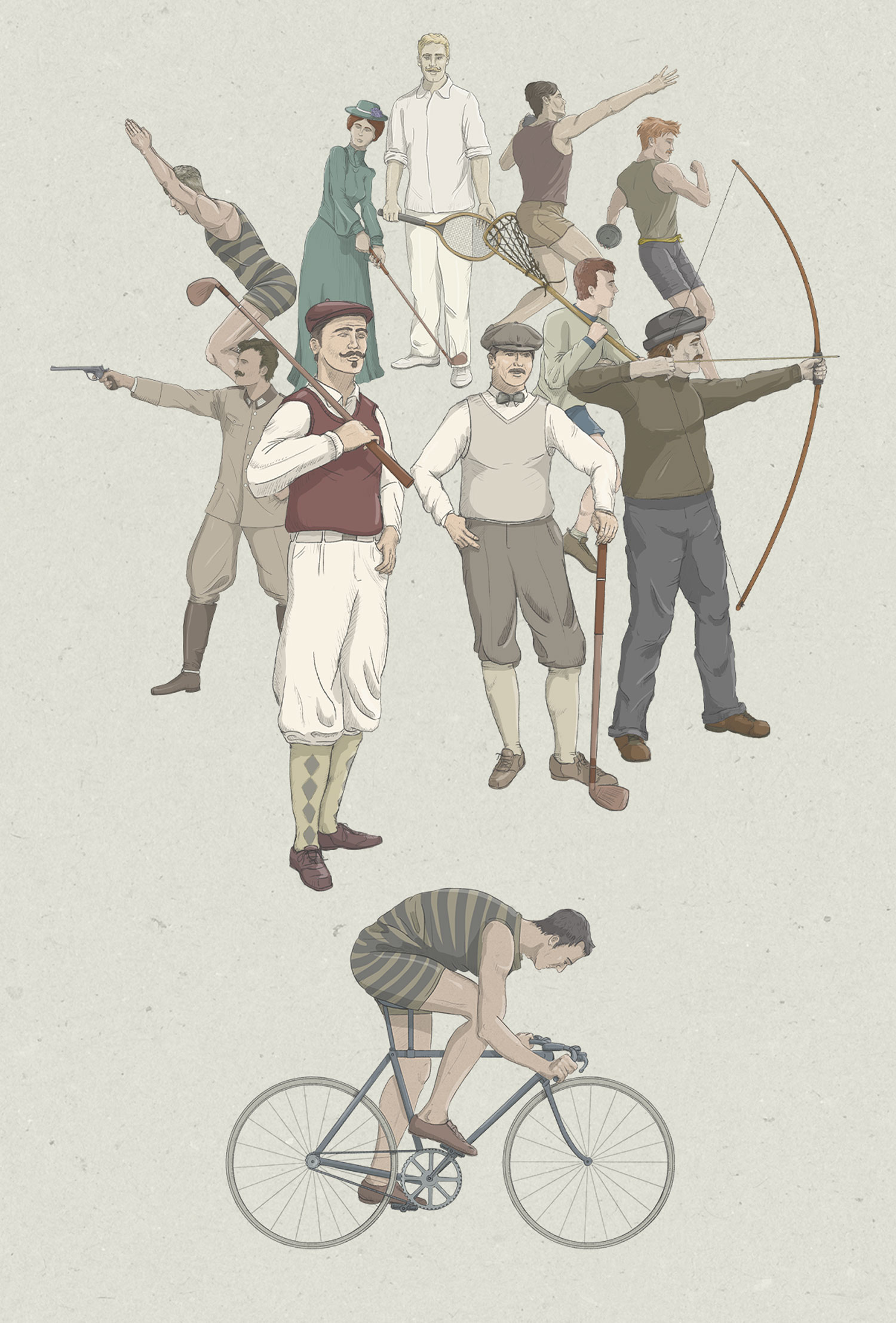
Here’s a crazy collage with some of the drawings of the project.
Some of the drawings of the project.
A funny project that looks like a huge illustration, but in fact, it has a lot of data behind, a lot of text/data documents, hundreds of old pictures and references of poses developed in 3D. One nice tool that help me a lot to create diverse poses was Magic Poser, this is open web-based 3D environment where you can set a model to any position you need. Here’s the link in case you get in trouble with anatomy or just need some help with pose models.
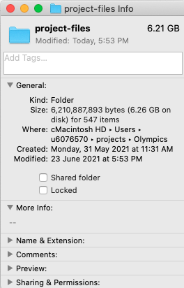
The folder with the production files of this project. I usually only have 4 or 5 projects on my computer. I guess otherwise it might not move at all 😆
About #infofails post series: Graphics that are never formally published. Those are maybe tons of versions of a single graphic or some floating concepts and ideas, all part of my creative process. All wrapped up in #infofails, a compilation of my creative process and failures at work.
Did you like #infofails? Have a look to other #infofails 👇
Back in 2016, I was moving from Costa Rica to Hong Kong to face a new challenge. Full of dreams and hungry of learning, I arrived at the South China Morning Post doors. There I found new friends and colleagues and learn a lot from all of them. Today I have the same feeling once again, and I want to say thanks to all that people that I meet here in Hong Kong because they change in a way or another my professional and personal life, I really can’t mention names because there are many people and I don’t want to leave anyone out
In three years at the South China Morning Post, I collaborate in 30 print pages and I have good memories for all of them, some remind me of a trip with a friend to collect information in China, a rush hour with a piece of breaking news, or a long project that I only talk about day after day (oh poor friends of mine, I’m sorry )
Bellow, some of the print graphics memories I create at the South China Morning Post
This slideshow requires JavaScript.
I had fun doing full-page graphics at the South China Morning Post print ed, and the online was an awesome sandbox where I found the freedom to test and play with pretty much all the topics that come to my mind, my first graphics as stand-alone were the Statues Graphic and the lightning project
Statues drawings
And some of those first steps at the South China Morning Post
This slideshow requires JavaScript.
But maybe the more recent ones were the most I enjoy because of the diversity of ways to work, some times doing projects by my self and some others collaborating in bigger projects with the other artist, visual journalist and designers. That’s the case of the Forbidden City series collecting data and working in graphics on for a year
in field annotations
in field annotations
Drawings for the print version
In field annotations
in field annotations
Drawings for the print version
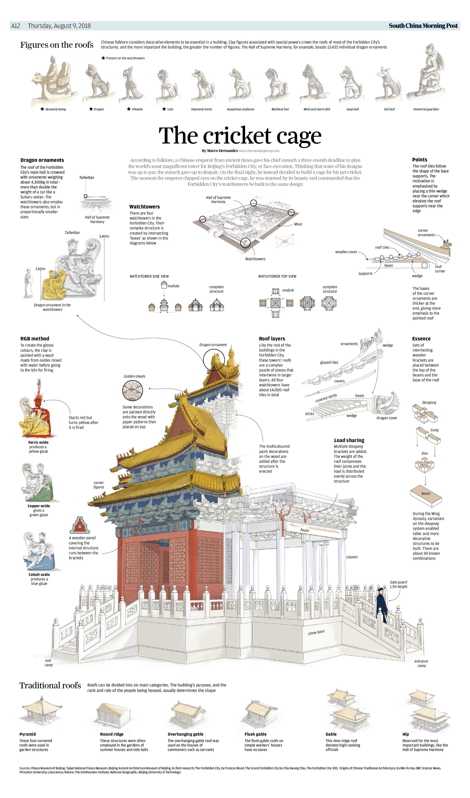
The biggest project that I ever did up to today, and at the same time one I enjoy the most was the Forbidden City, below the Part One print version. To be honest, I’m very bad doing drawings, but since I get here I face a lot of projects where the drawings were the essence of the graphic, like this all manually made:
Forbidden City series, part one for the print
And the extended digital chapters, which in my case covered the architecture aspects of the Forbidden City in Beijing:
Maybe the most exhaustive part was the built of the of the VR feature in the second chapter made with Cinema 4D:
Here the output on youtube 360/VR:
…and some more of the stuff of the Forbidden City Series, small animations and graphics
Architecture: Chapter 3 cover
Architecture: Chapter 1 cover
Architecture: Chapter 3, earthquakes
Architecture: Chapter 1 detail
Architecture: Chapter 2 detail
I can say that I try pretty much all kind of topics in the South China Morning Post from many soccer graphics to the architecture ones, Chinese projects like the new the Silk Road (OBOR), of the perception of the rule of law, explosions, weather conditions, the moon events, crazy aircraft stories, game-like graphics about food, vessel tragedies like the Aulac and the Sanchi tanker, trend games like Pokemons hunting, a lot of Trump, and the Brexit, automobile technology, and snakes, my fascination with Asians anatomy, always nice to have some time off so I also did one about holidays; if you want to know where you can go with your documents and how much it cost I did one about the passports too; graphics about Chinese cities, Hong Kong’s ageing population, war vehicles, why no toilets too; the Golden Globe Awards, celebrations like San Valentine, or where the Asians lives in the US; all about North Korea in 15 graphics, the evolution of Peral River Delta considered the Chinese silicon valley; Spanish Galleons crossing the Pacific heading to China’s goods; Thai kids trapped in a cave; automation and industrial robots and many many more that I can’t remember now. All those with a nice touch of memories because work at the South China Morning Post graphics team was more about have fun with the stuff you love to do rather than just work
This slideshow requires JavaScript.
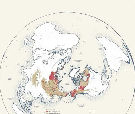
My last project with the South China Morning Post was the Tibet permafrost, and there wasn’t a better way to finish my time there like doing one last project with my teammates like the ones I enjoy for 3 years
Permafrost cover
Cover illustration by Adolfo Arranz
Permafrost extension in the northern hemisphere
For the print, I split the project into two backpages, so I can make a more specific topic on extreme temperatures, on my point of view a Goldilocks place were the temperature is too hot in one place and incredible cold in the other
My last page at the South China Morning Post, published in February 2019.
As I set in the title of this post, this is just to say thanks to all you guys that help me to evolve and create more and more. Thanks to the Hispanic gang of the South China Morning Post; thanks to my British boss today a good friend, to the friends at Hong Kong University, The Hong Kong Polytechnic University, the Hong Kong Design Institute and the Baptist University that also open their doors to me, all my Hongkongneer friends and all the South China Morning Post family that let me be part of that amazing experience
From now on, my graphics will appear in the Reuters pages, lucky me to work there with more good friends. Hope to come back soon here, to my website, to write about some new graphics and backstages made for the world
Two of our digital works published at nacion.com wins an Award Of Excellence in the 2015 edition of the contest. The first one is the project in celebration of the “75th anniversary of the National Symphonic Orchestra” the design and development of this projects set a starting point to the trends of our unit.
The second project awarded this February in Washington D.C. was the “Birth of a Century“, I was invited to work in this project for the unit of Data from La Nación, and I have the fortune of the collaboration of the development unit as the artist Augusto Ramírez.
I have to say that I’m very very happy to get this awards of the Society for News Design in his digital contest, but this is a team work, and I must say thanks to my partners in the infographics unit, the Data Team of LN, the Development area, my Editors, and many many people who supports me last year.
Last year (2015) I start many new projects, some of them are still progress, but one of these are the quick graphics for social media.
At the unit of infographics and datavisualization, we spend many time in daily production and in special huge projects, I believe that we have enough time and muscle to produce frequently these small graphics, every single infographic must have a print version, desktop digital versión, mobile version but also, i like to choose some of these to develop a social media version, sometimes a gif, or an image or even a short video with a compact version of the main graphic.
So, here is some of my favorites picks:
The spooky asteroid:
In october 31, an asteroid pass near the earth (near in space terms), this asteroid was renamed “the spooky asteroid” and take the attention of the world by the time of his visit, so it was a nice opportunity for a quick graphic for social media:
Compact version for social media. Motion-Infographic by Marco Hernández.
Gif version for social media. Infographic by Marco Hernández.
Desktop digital version for article. Infographic by Marco Hernández.
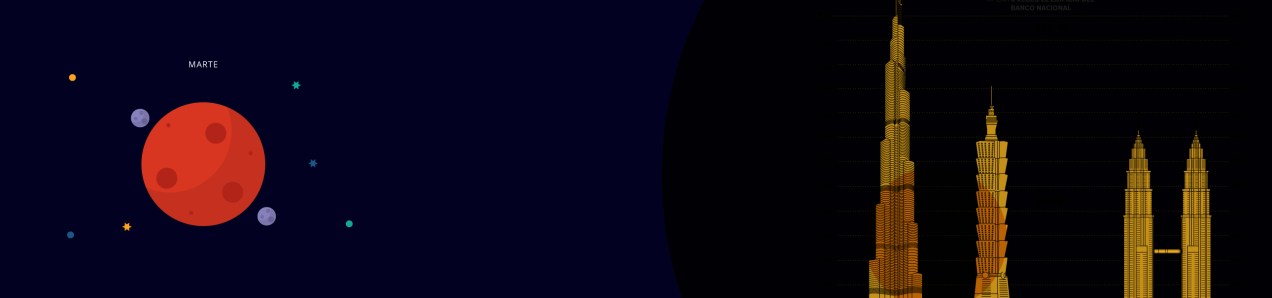
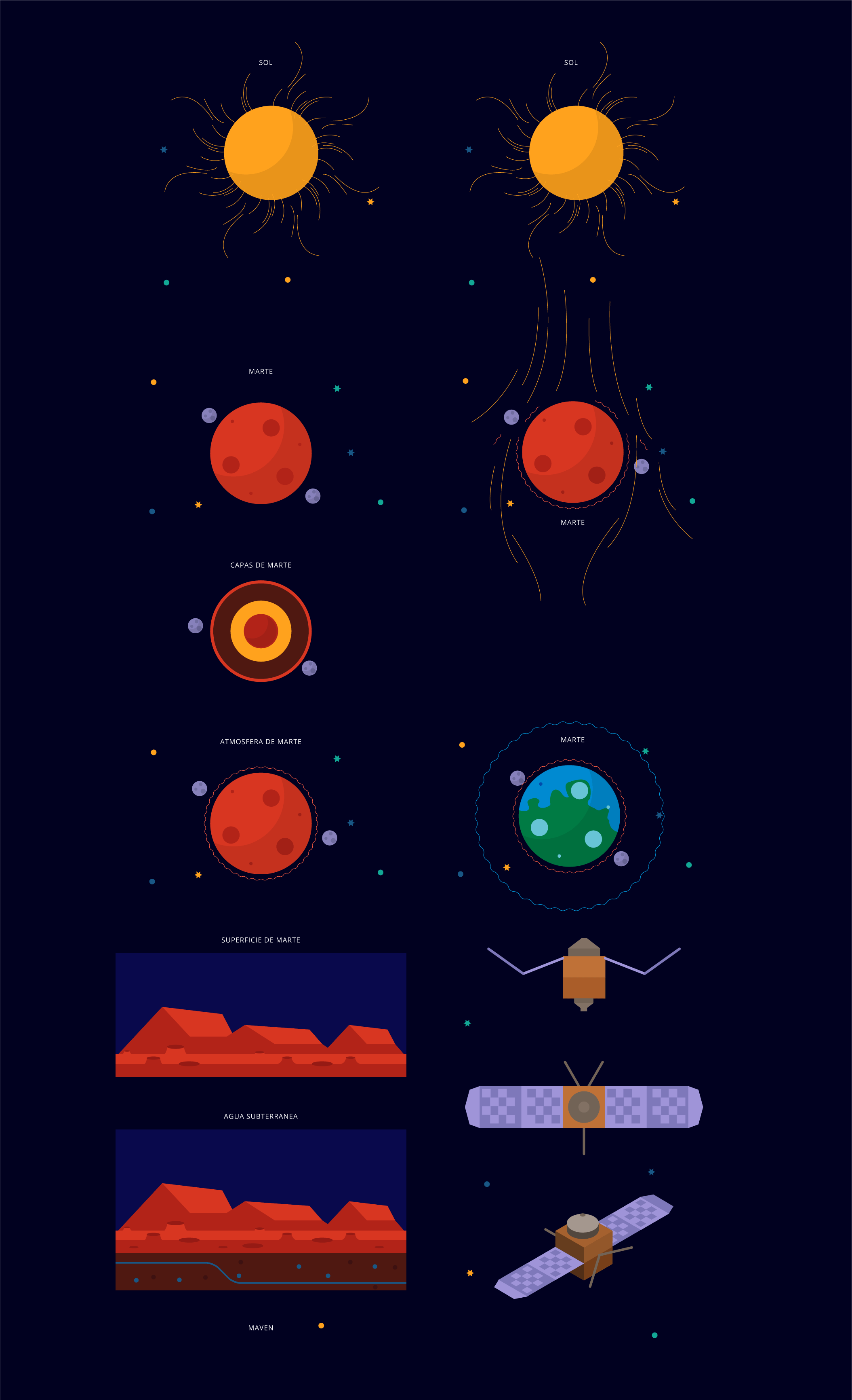
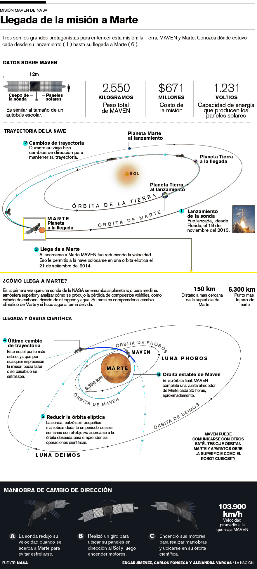
The MAVEN findings:
The NASA made the announcement of the Maven mission findings about what happened with the atmosphere and magnetic fields of the red planet. We are awaiting the press release with a stock of pieces to develop soon as we can a simply animation for social media:
Illustrations by Dominick Baltodano and Marco Hernández.
Compact version for social media. Motion-infographic by Marco Hernández.
Desktop version, infographic by Edgar Jiménez, Carlos Fonseca and Marco Hernández.
Hope in this 2016 have many more of these chances to create more quick graphics for social media, these are a great way to engage readers with content made exclusively for consumption on social networks.
I have been teaching the course of information design for over two years now, and as I always say, my greatest satisfaction is to take a tour of the good things that these boys and girls have achieved with their projects change each cycle.
For this opportunity, my students worked on three projects, the first was the creation of pieces focusing on processes, for this I left them some issues to assist in the process and make more effective taking a decision, the second project was the creation of an analysis of literary works, in this case the intention was that from some books that previously chose to give them a pdf of these works, the students seek ways to visualize related to such works topics, the latest project was a a little free theme, with this the idea was to make a graphic interpretation of a classic tale, fairy tales that end up being interpreted with certain rules of any visual form.
This slideshow requires JavaScript.
interesting ways of looking at information through the eyes of my students, I invite you to see the whole pot with the description of the work and others at visual744 here: http://bit.ly/1hf7UlF use google chrome for translation from Spanish.
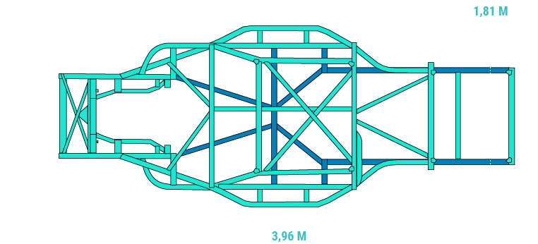
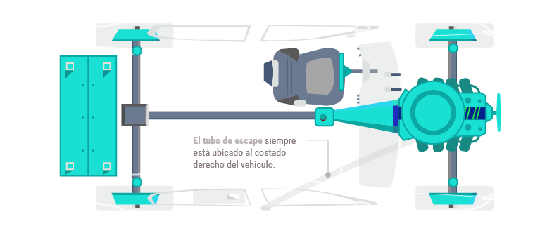
A few hours more than a full day of work takes to two co-workers and me, to release today this special feature about the V8 cars competition in the “Parque Viva” racetrack.
Animated graphics, details about the cars and restrictions and a complementary key note of Jose Luis Rodríguez fusioned together to create this digital experience.
I hope you will enjoy it!
Graphics inside the special
Graphics inside the special
Graphics inside the special
Graphics inside the special
Visite the special site of nacion.com here: http://goo.gl/gzjLYy