Digital pieces

2025: the year in graphics

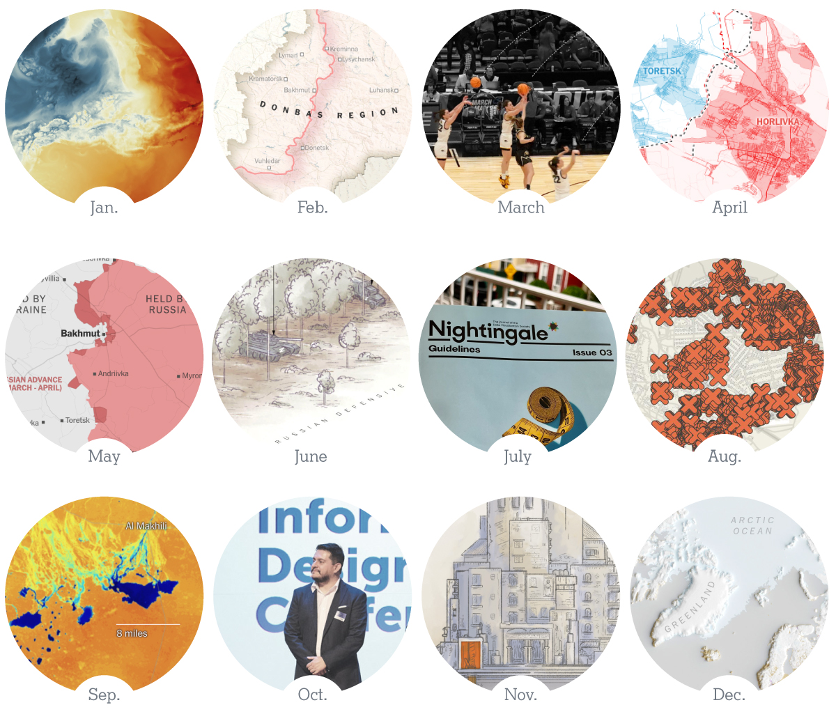
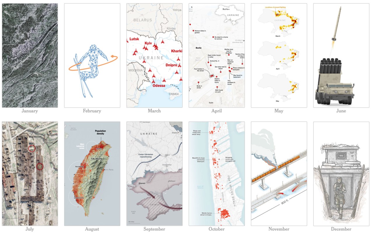
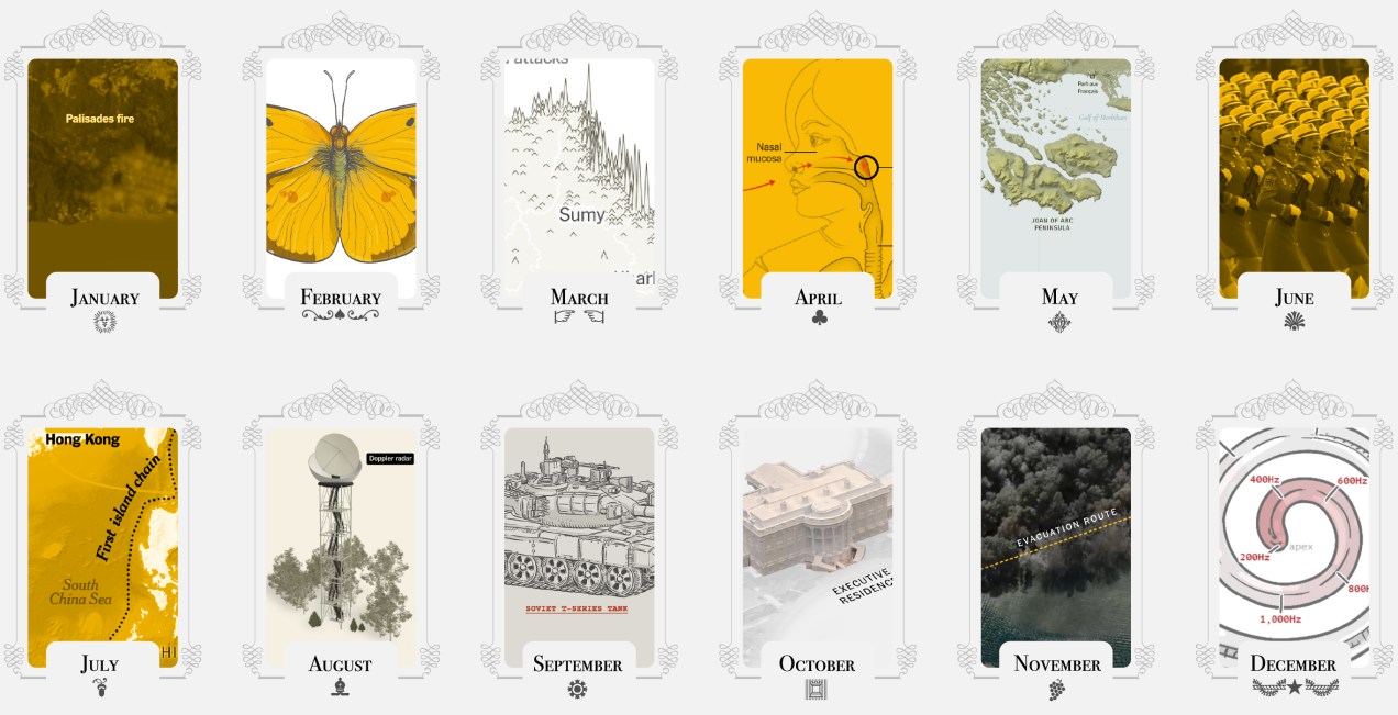
For the past few years, I’ve celebrated December by reflecting on what I saw, what I shared, the places I was invited to, and what I created throughout the year. I like to look back, remember the lessons I’ve learned and revisit the good times before starting a new cycle. So here we go once more:

–Jamaica, L.A. & Washington D.C.–

A map of aircraft response over the city of Los Angeles after the wildfires in Jan 2025

2025 was a fund and extreme year. I spent the first few days of the year on the warm beaches of Jamaica trying to escape the cold of New York. News were just around the corner, waiting for me to kick off a busy year…

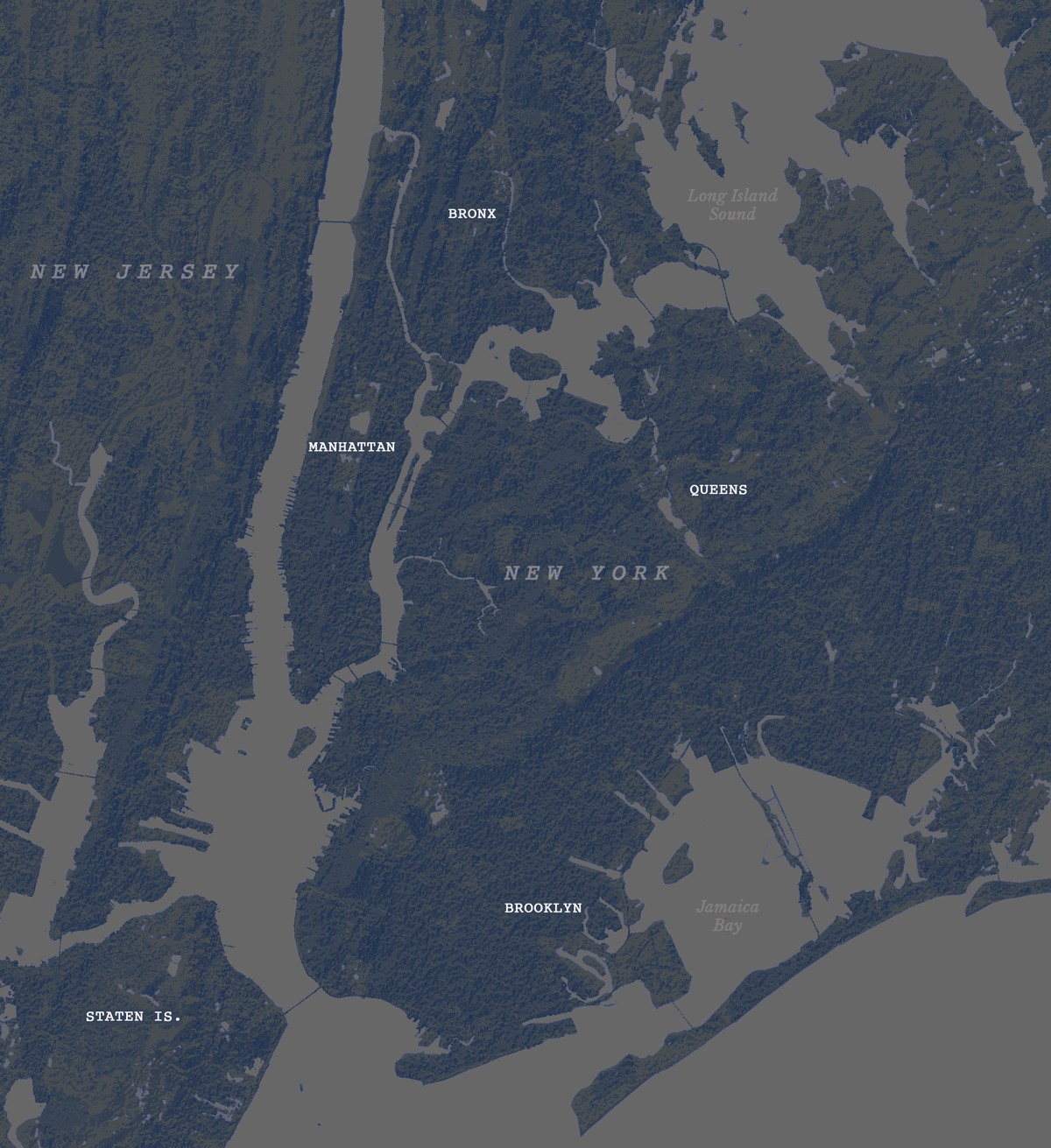
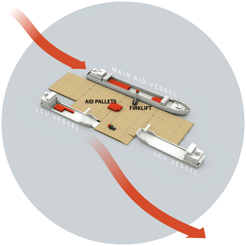
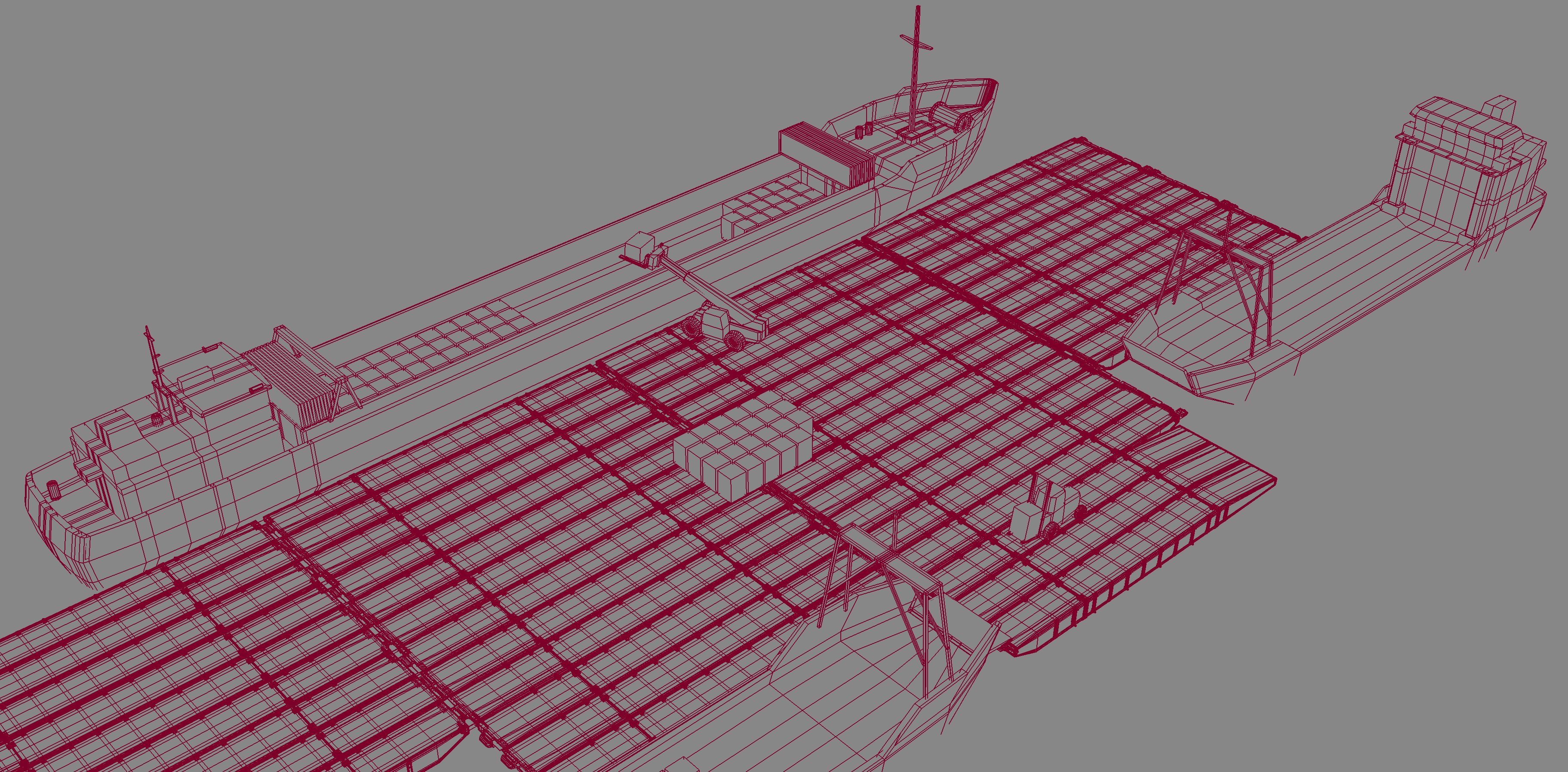
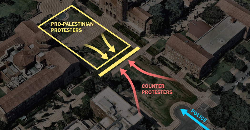
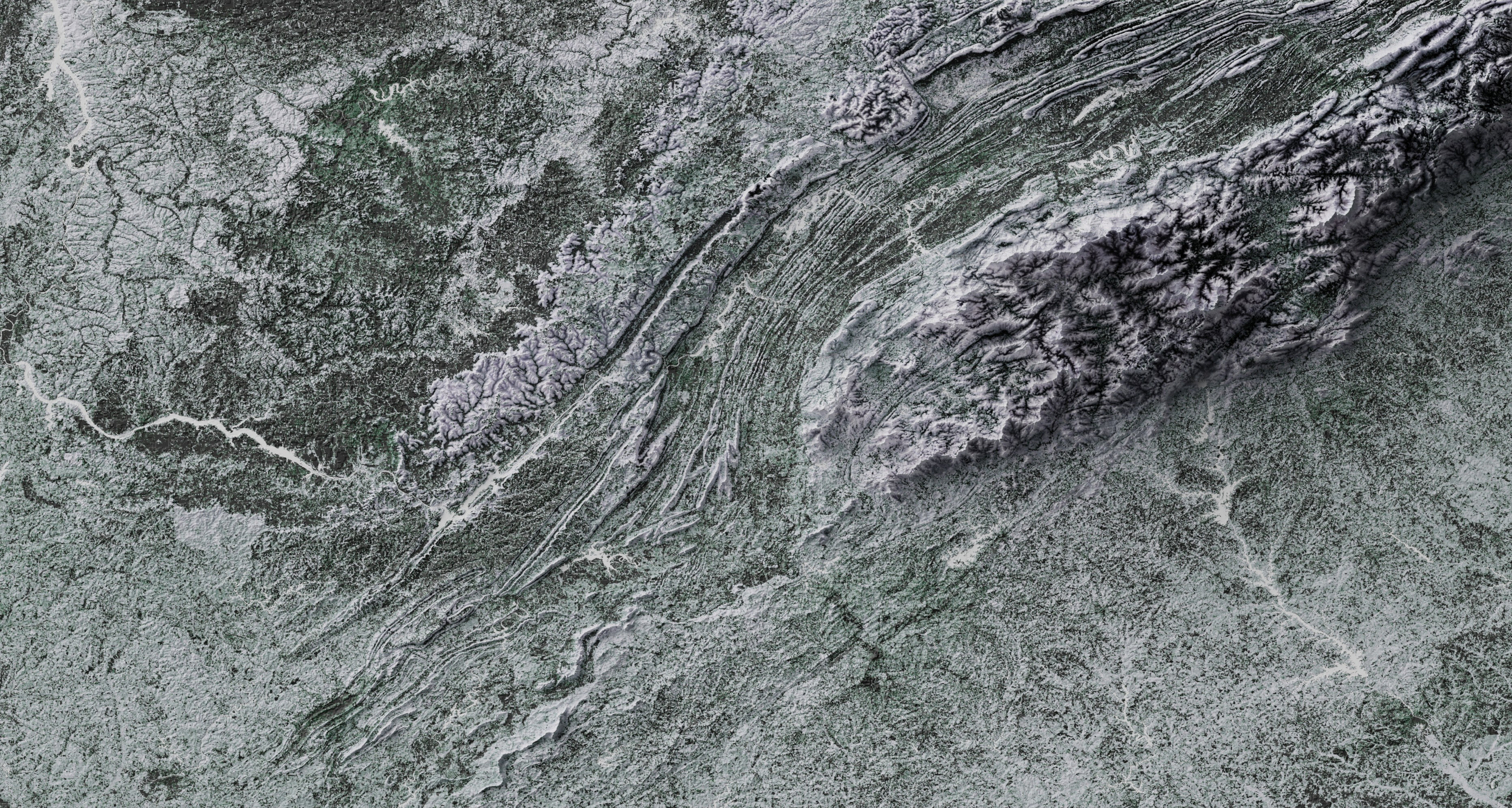
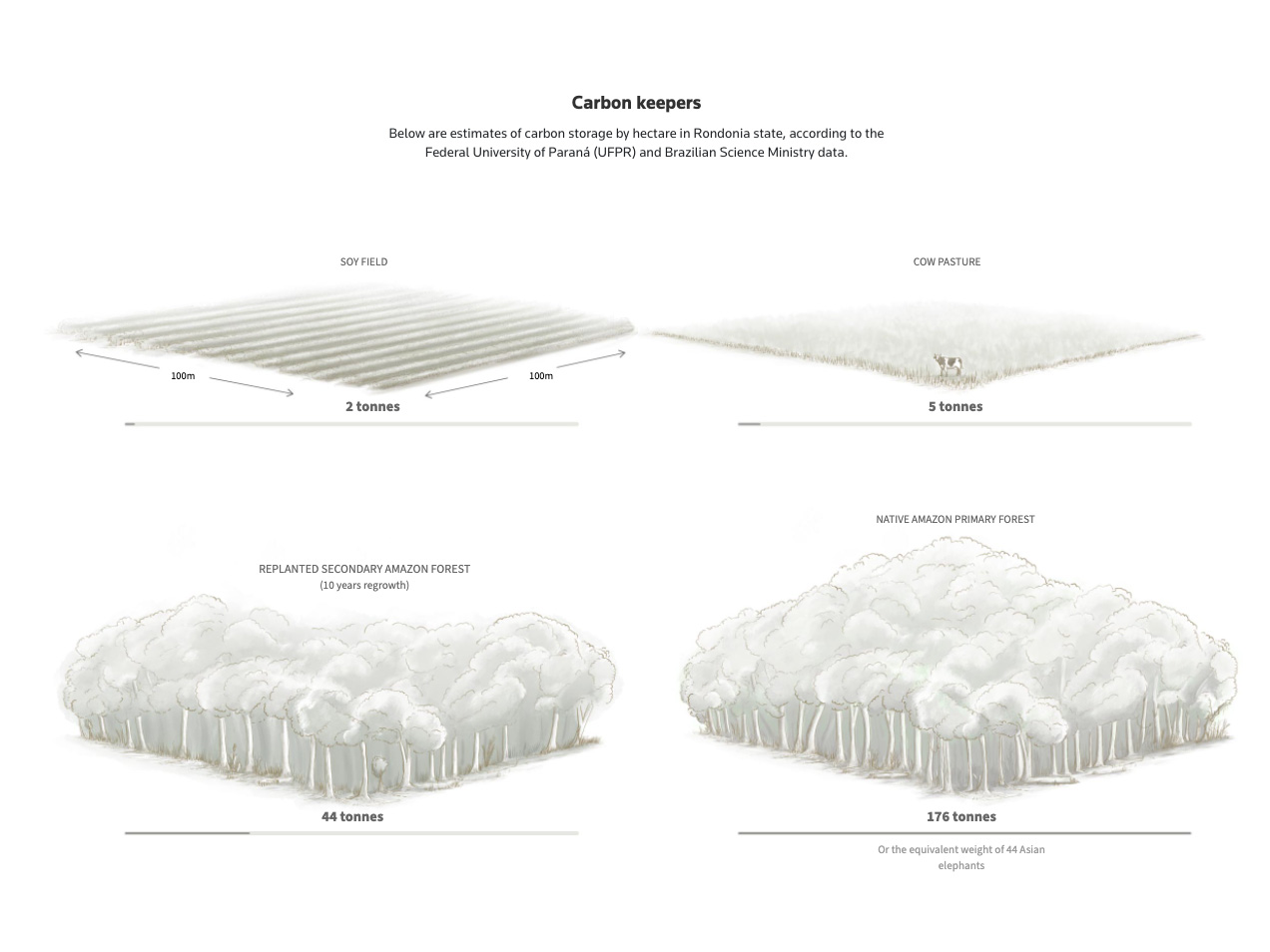
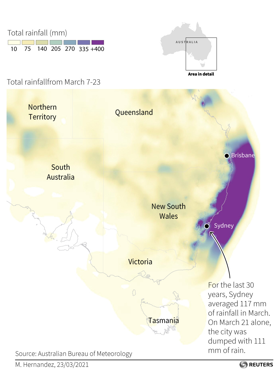
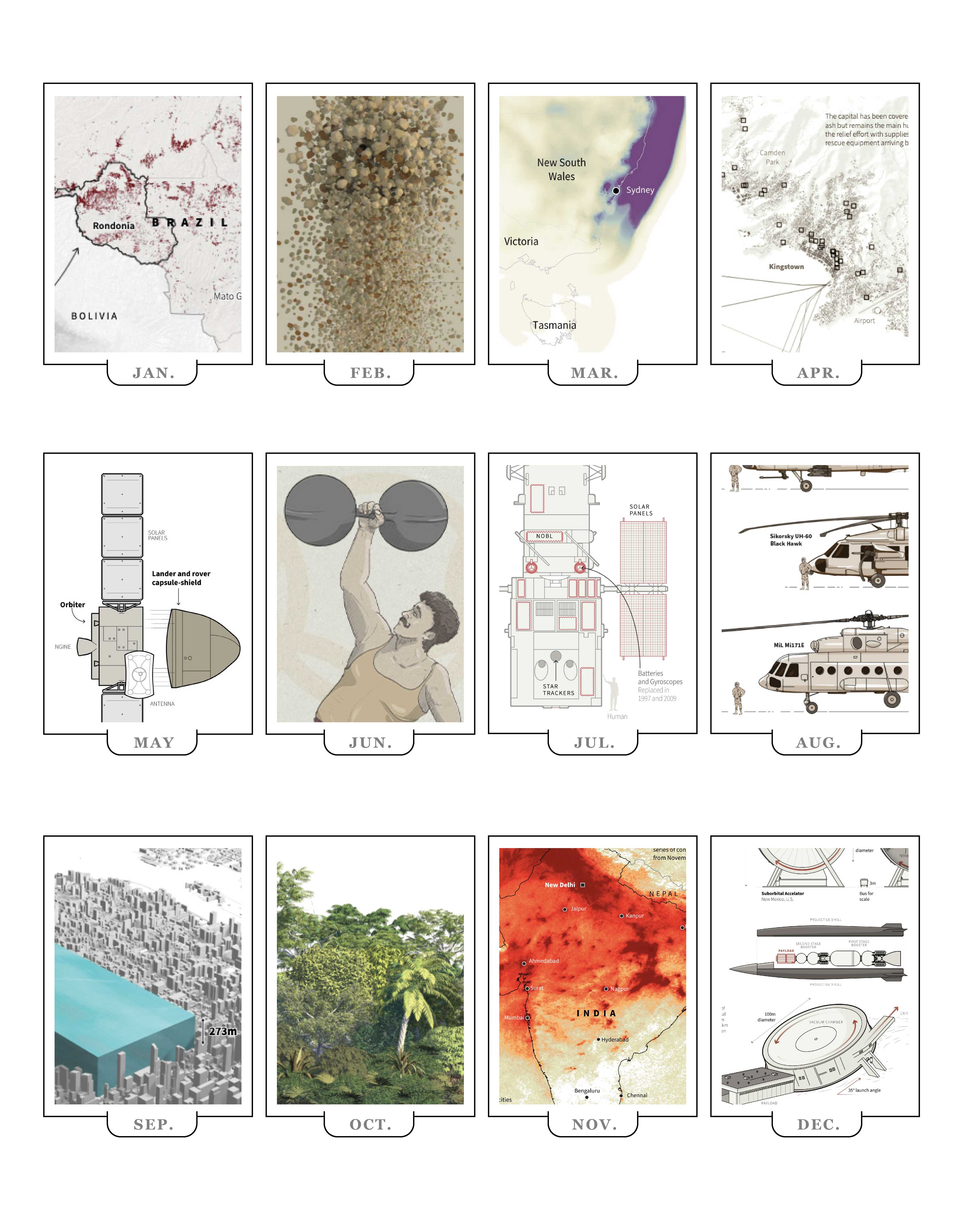
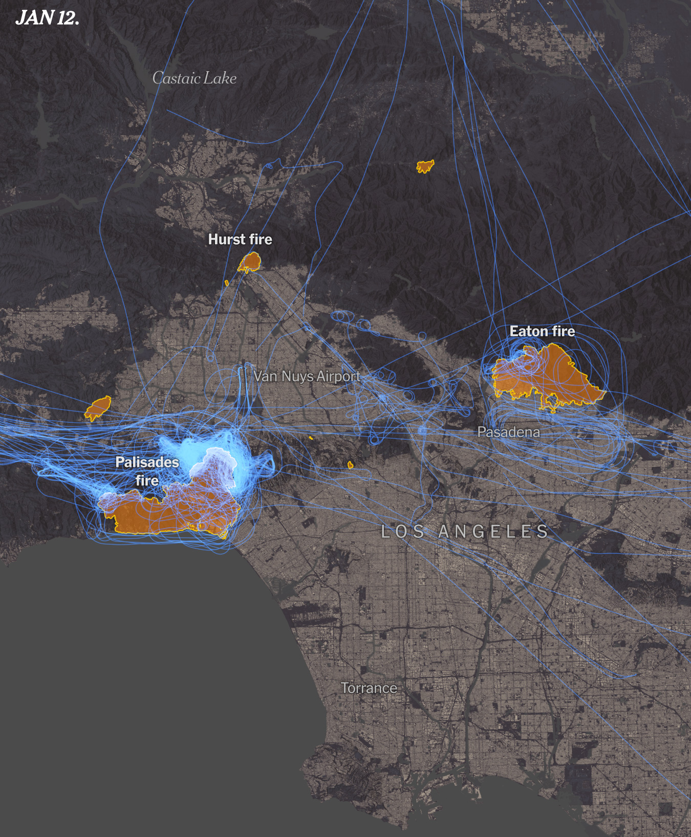
Just a few days into the 2025 large areas around L.A. went into flames, we did a few stories around it including this story looking at critical 24 hours of emergency there. I did so many maps and visualizations for it that I even made an entry on my blog about it, scroll down and click the “load more” button until you reach entry number 10 to see some animations and aircraft visualizations like the one above.

A map of the American Airlines plane that crashed with the Army helicopter in Washington D.C. in Jan 2025

January also saw another emergency when an American Airlines plane crashed with a military helicopter. I jumped in with some quick maps and reporting alongside my colleagues. Life sometimes is ironic, after starting this way the year, I think this was one of the years where I travel the most both locally and internationally. Luckily for me I did not got exposed to any dangerous situation… not even turbulence.

–Gaining momentum in NYC–

Being the shortest month, February really flies by!
I spend most of the month planning projects and looking close to a range of things like data centers, the role of AI, the transformations in the battle fronts in Ukraine and even patterns in the butterflies populations. I don’t feel totally safe sharing a screenshot of my calendar, but it’s crazy to look back and see the many diverse meetings I had in February to chat about these and some other projects.

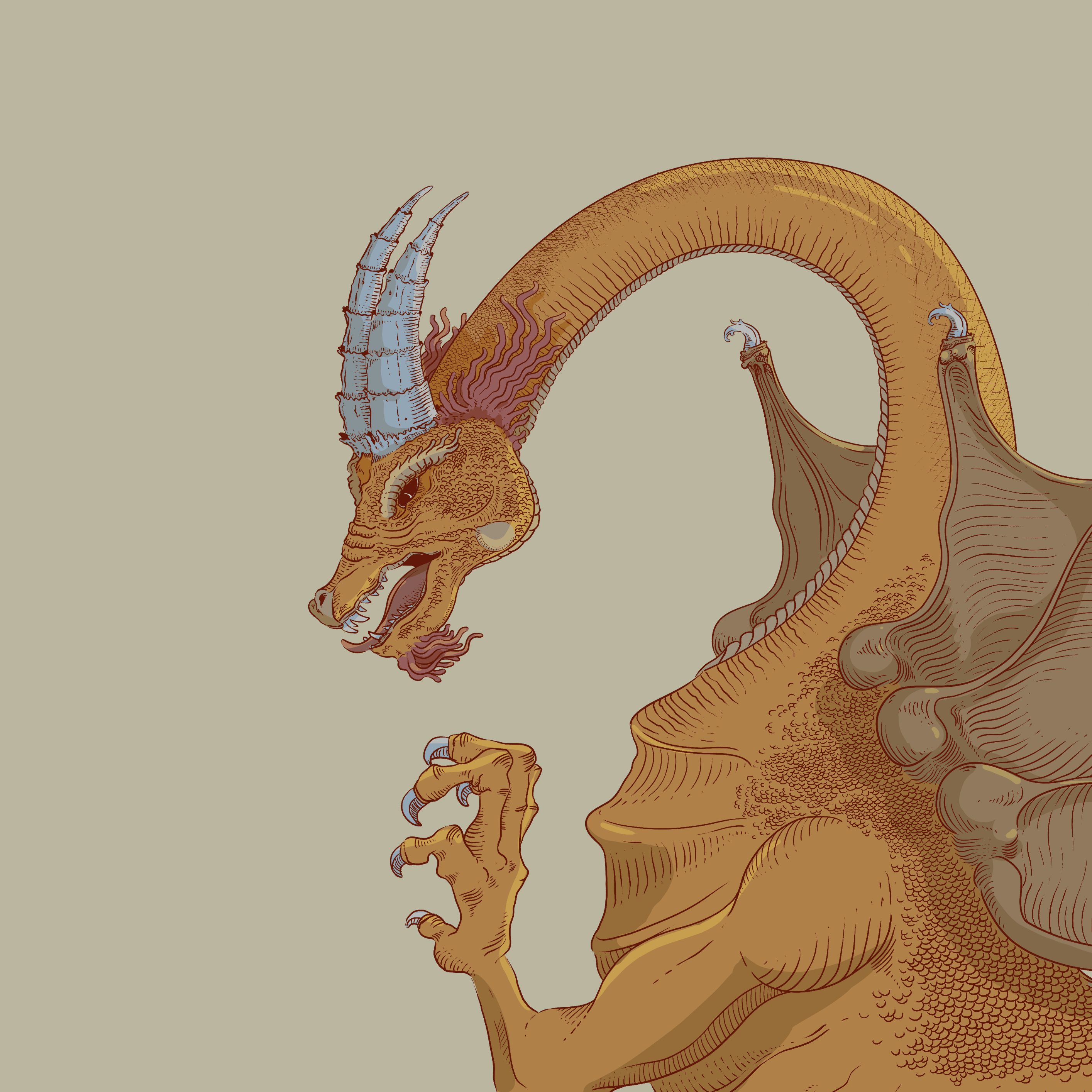
The dragon above (Víbra)
This year I wrapped out my second year of my Sunday sketching exercise. That was a fun project for fun I did every Sunday, but after getting myself into way too many things I paused for a while after finishing it last summer. The image above belongs to week 87 of the project!!! (35 of the second cycle). The plan is to bring it back once I finish a few other fun projects that I’m cooking.

February might looks a little empty here, but it was super intense too. The first things I published in March (first story the 3rd) was all made through this intense a diverse planning in February.

It’s kind of funny to look back and remember moments by looking an old calendar. Give it try!

February was also the start of planning an SND project that I thought I could easily get off the ground; however, the initiative to create the SND mentoring program took me a few more months, as you will see later here.

–War, Butterflies, city spheres, Artificial Intelligence & Boston–

A sketch to explain how the frontlines in Ukraine evolved after the extensive use of drones.

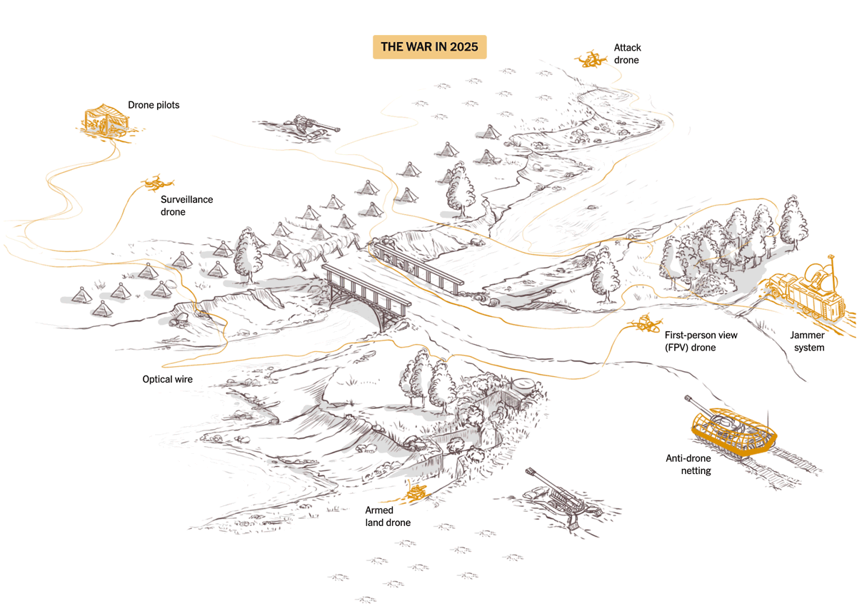
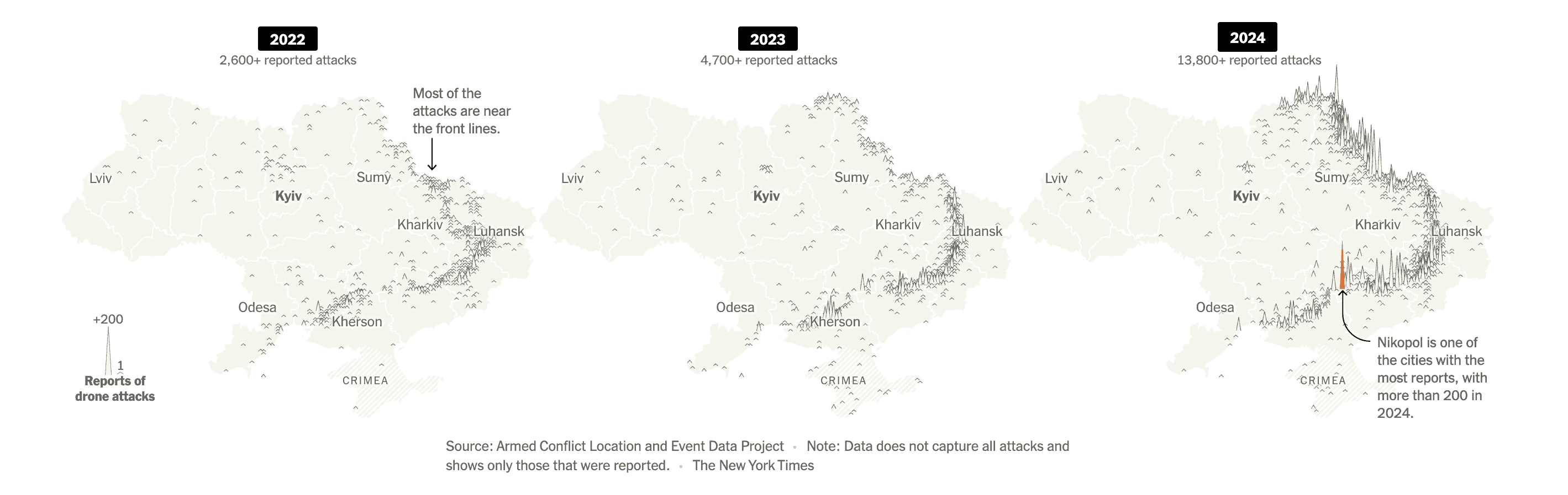
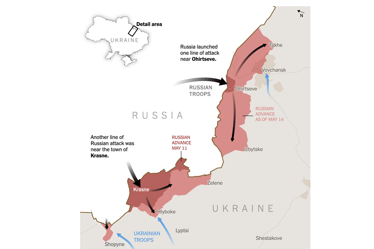
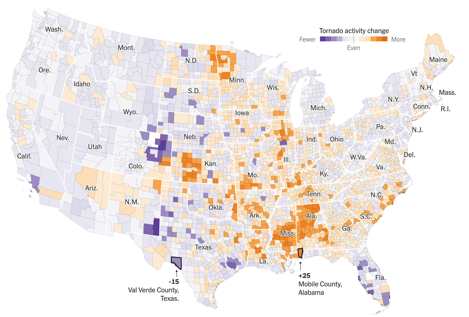
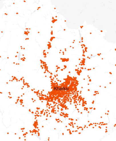
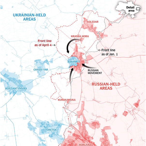
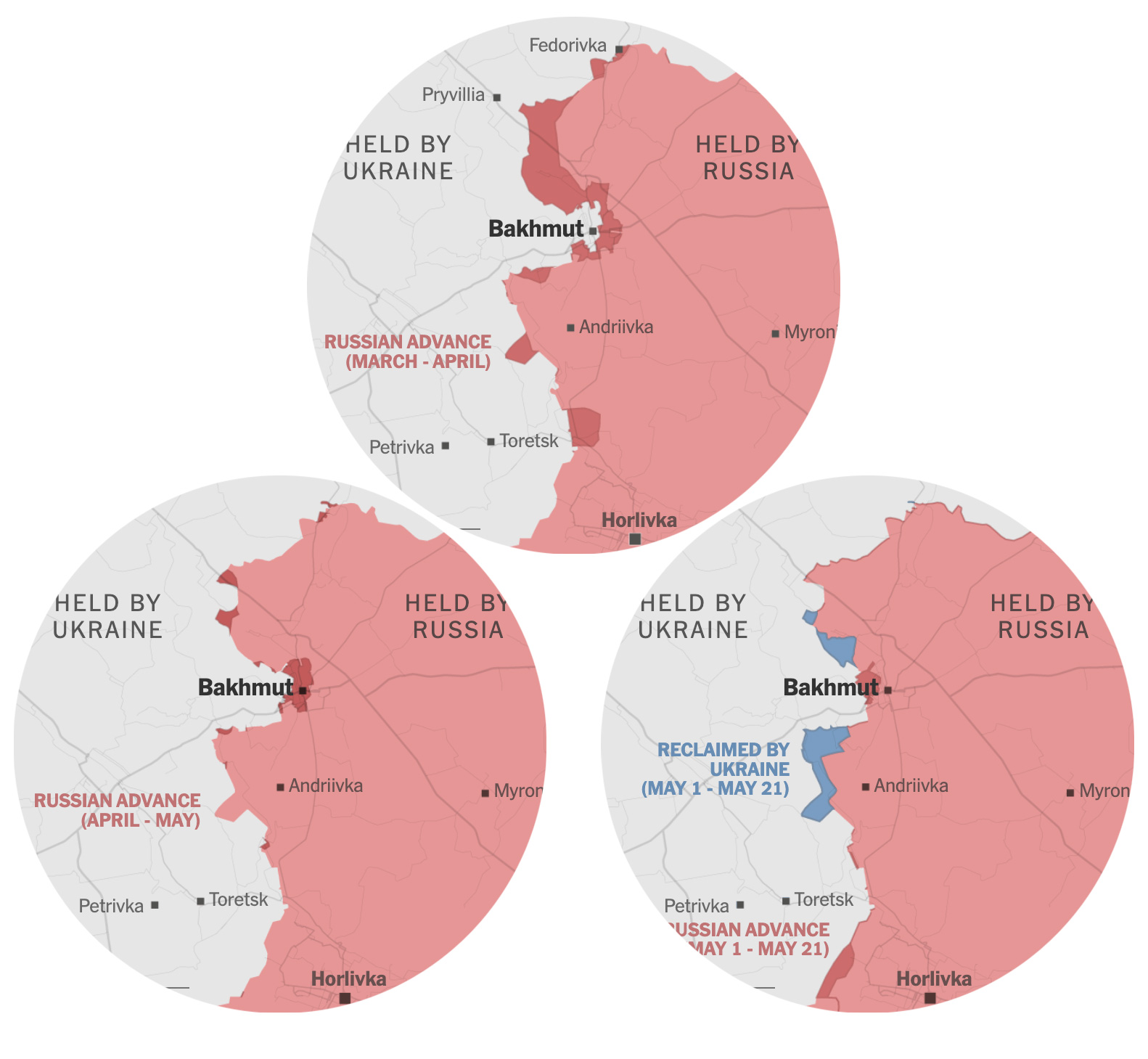
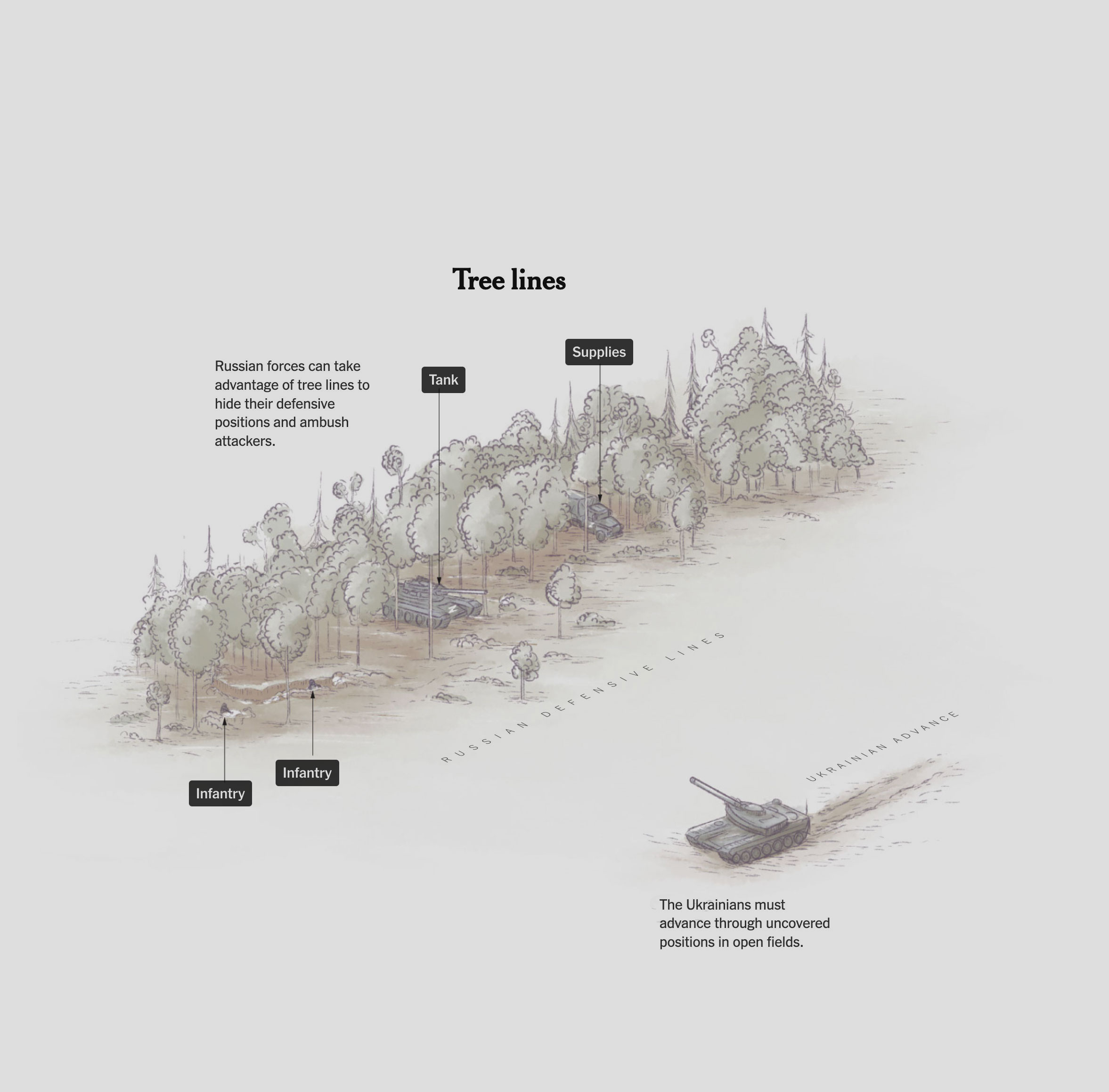
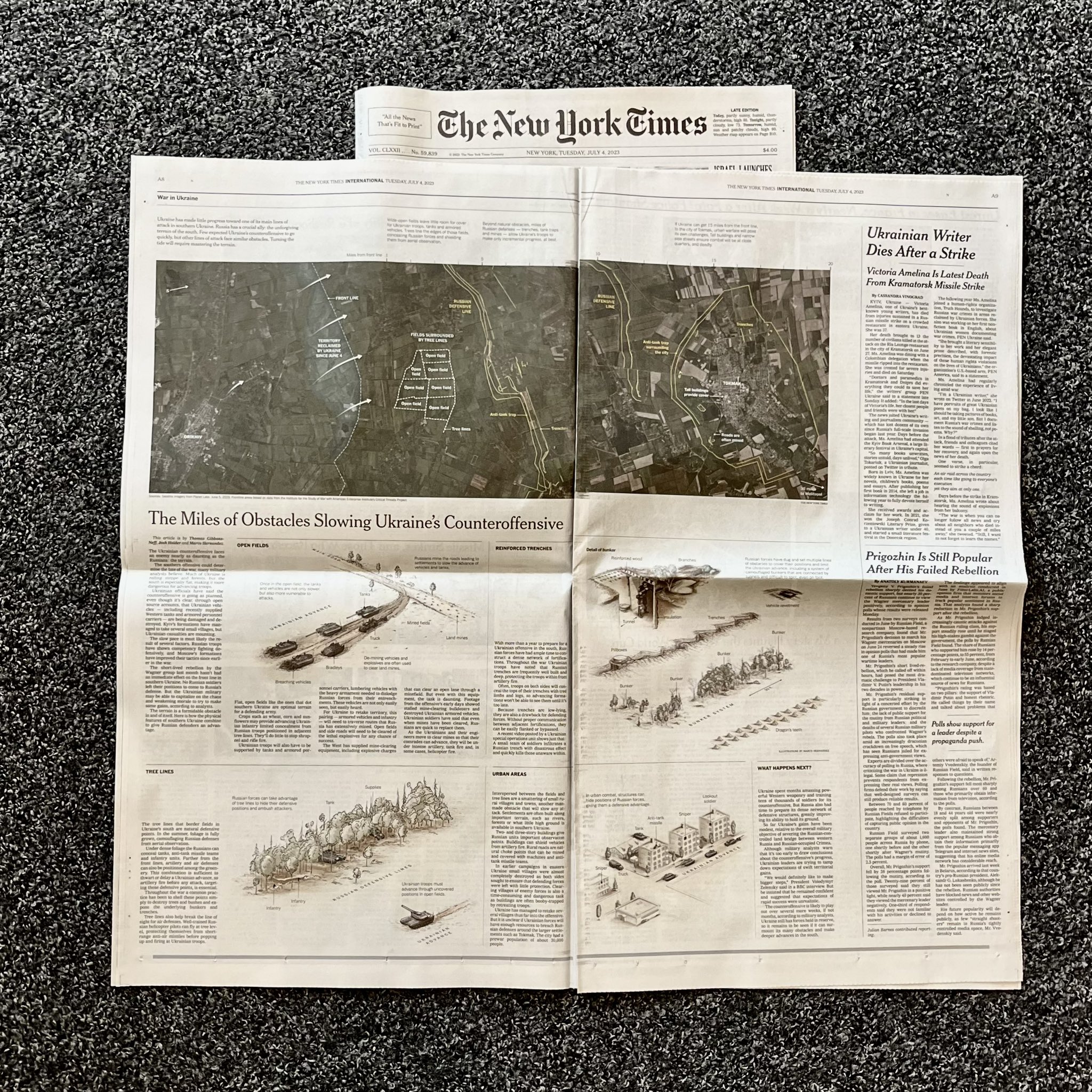
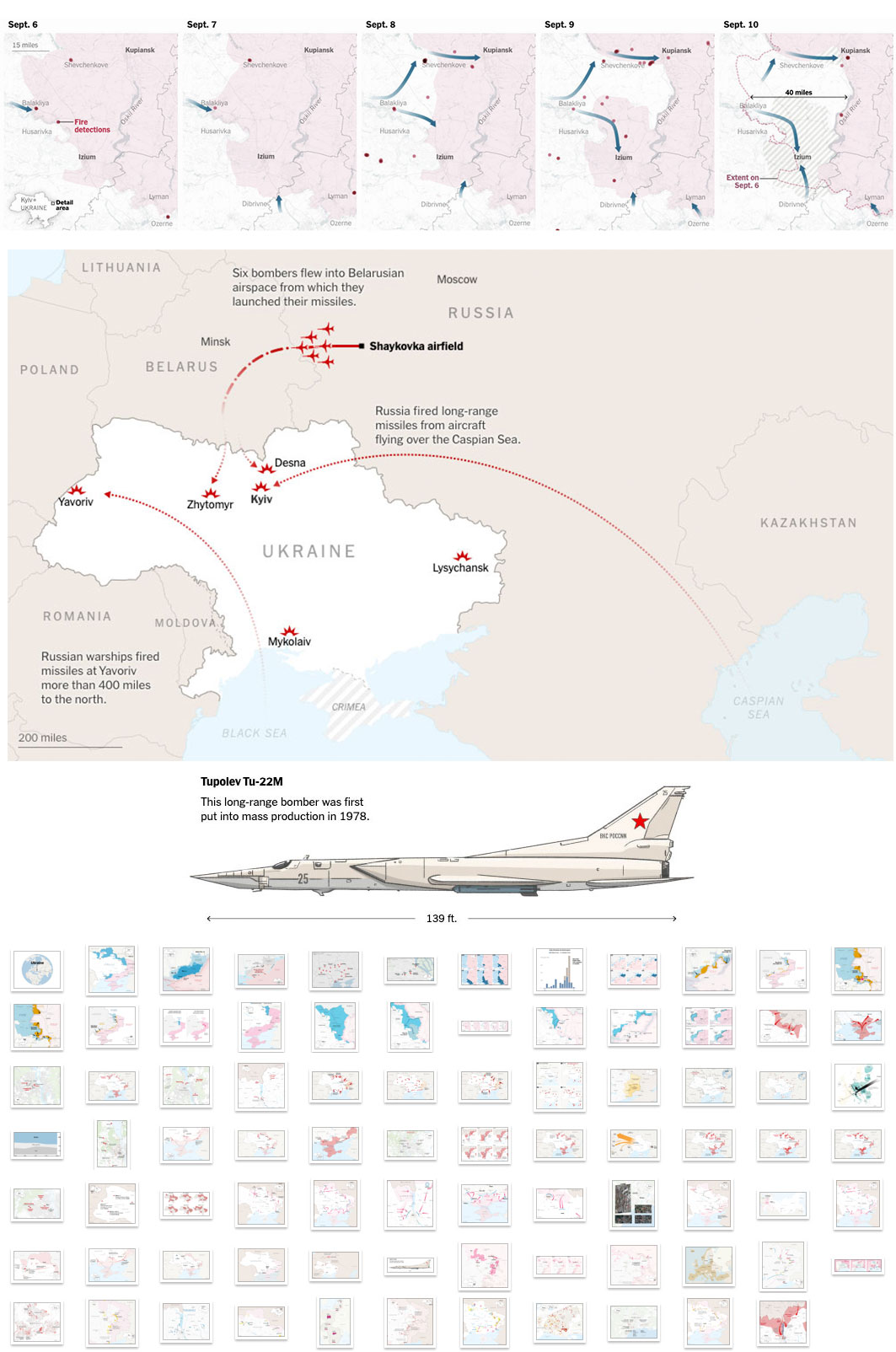
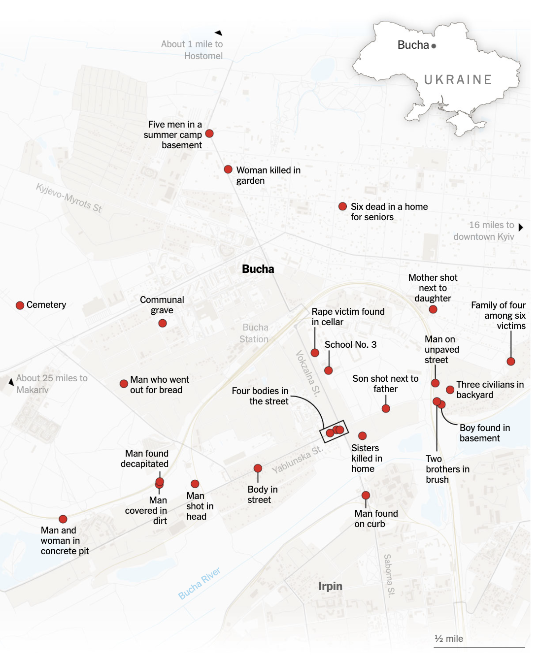
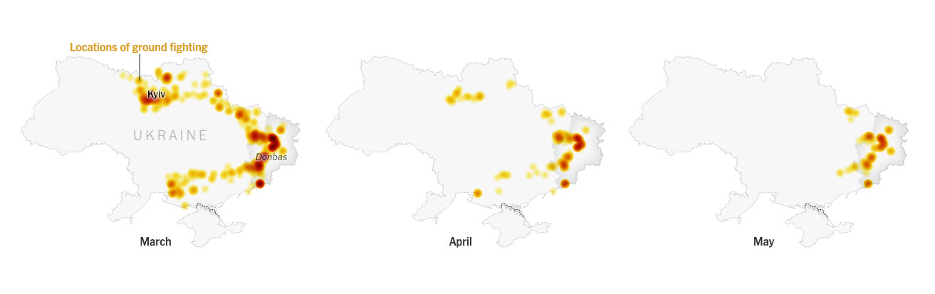
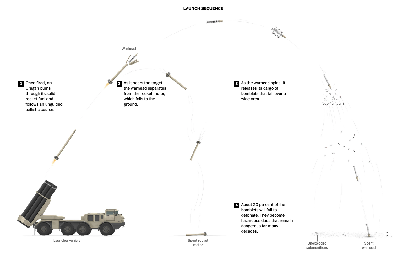
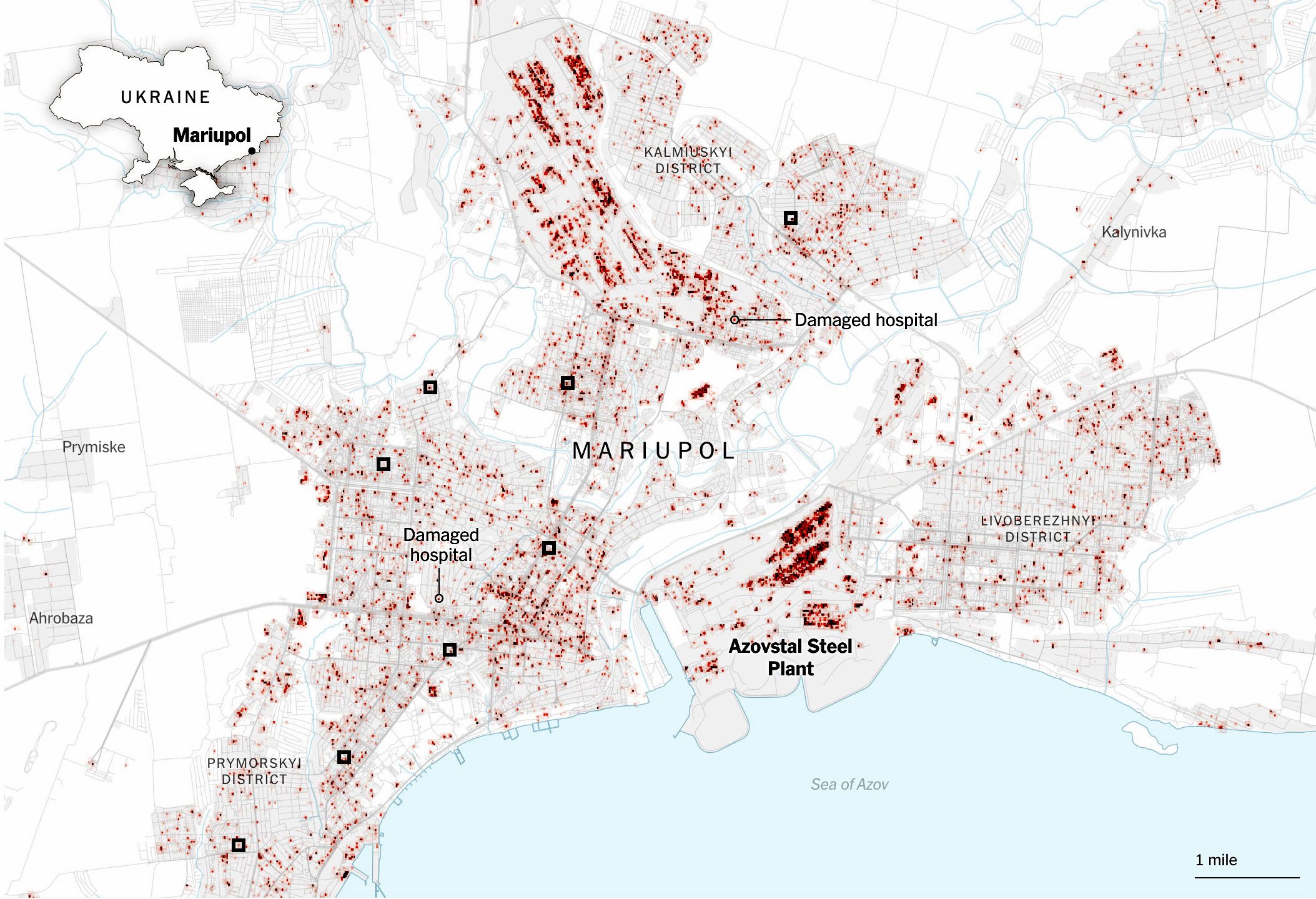
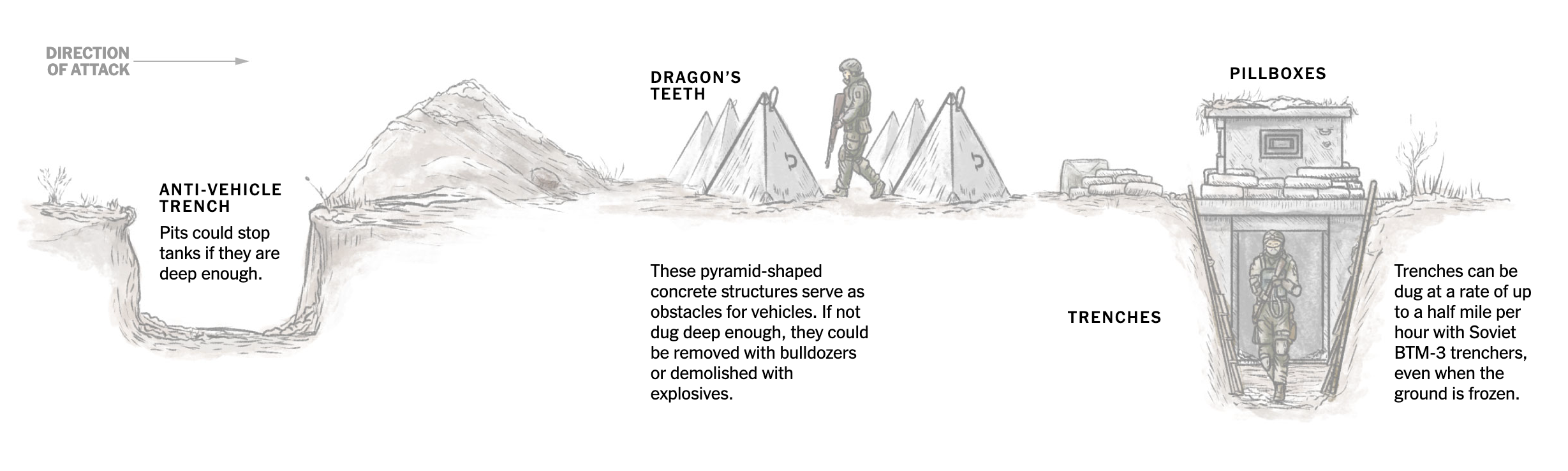
March was the month to collect the harvest. Just 3 days into March I published this story showing how the front lines in Ukraine changed with the intensification of drones as a main weapon. Drones have taken land, air and sea as main drivers of fight, so we used testimonials, maps, illustrations, videos, photos and more all packed into a tight piece in collaboration with the International desk. I work a lot with them, not just because of the visual potential in these stories but because of the smooth relationship to create pieces together.

A butterfly doodle

Just 3 days after that war story, I did a little collaboration looking at butterflies and how their populations are declining or proliferating (spoiler, mostly declining). The project was super fun, but I did not had the chance to do all the stuff I wanted to do since a source provided a ton of good material.

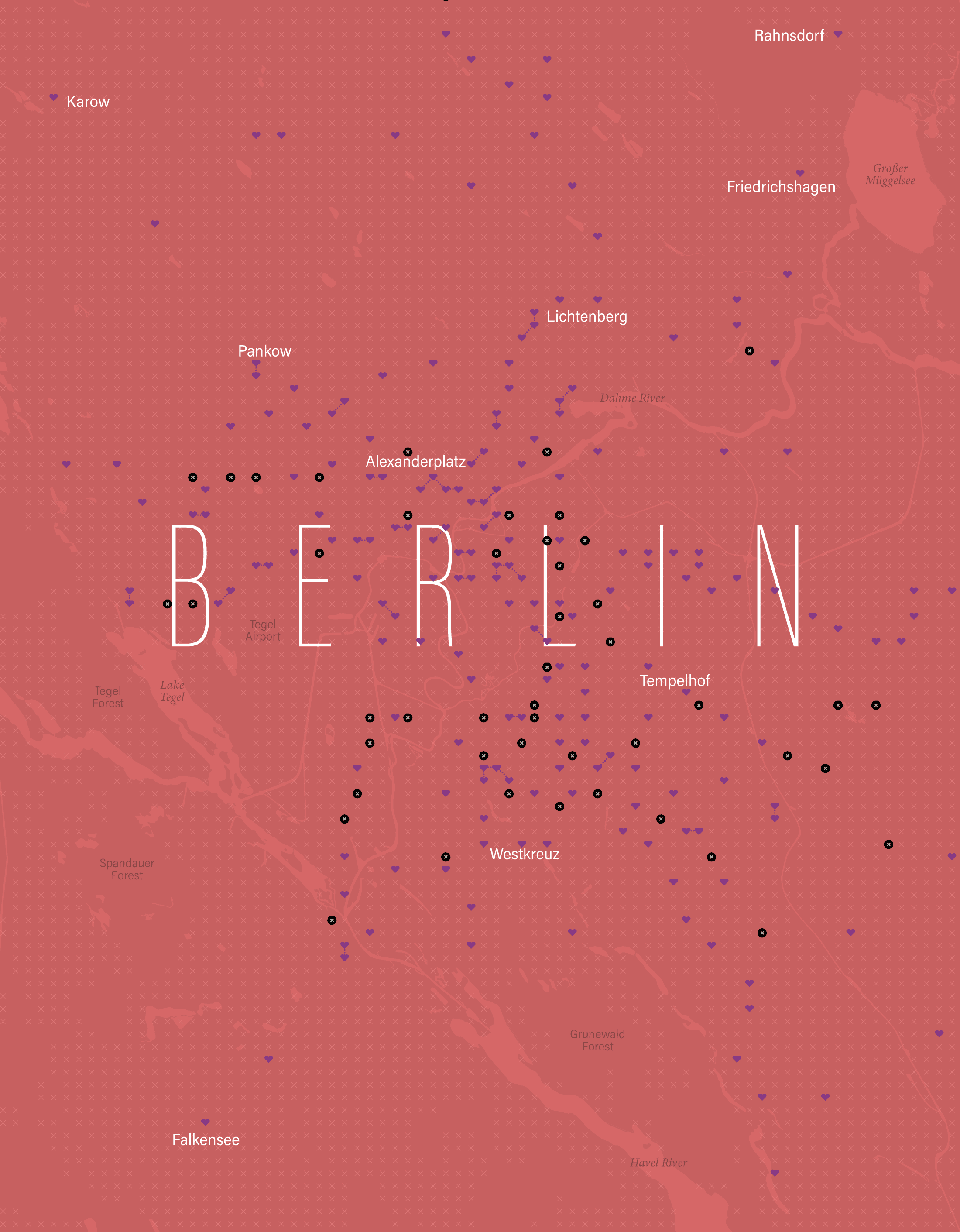
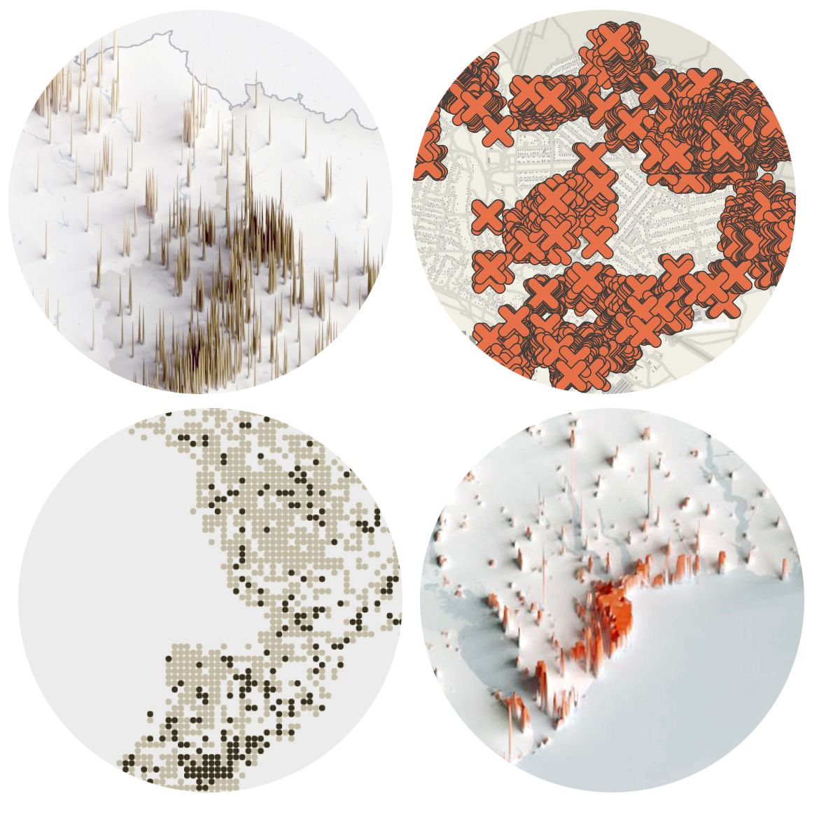
In March I also published a personal little project to my carto blog, funtography. The ideas was simple, grab a piece of a city and make it its own little planet. Each sphere is a sample of about 80 km2 of various datasets. I choose a few cities with some particular meaning to me and render out a few of these just for fun:

A map of the central valley of Costa Rica showing built areas as an sphere rendering

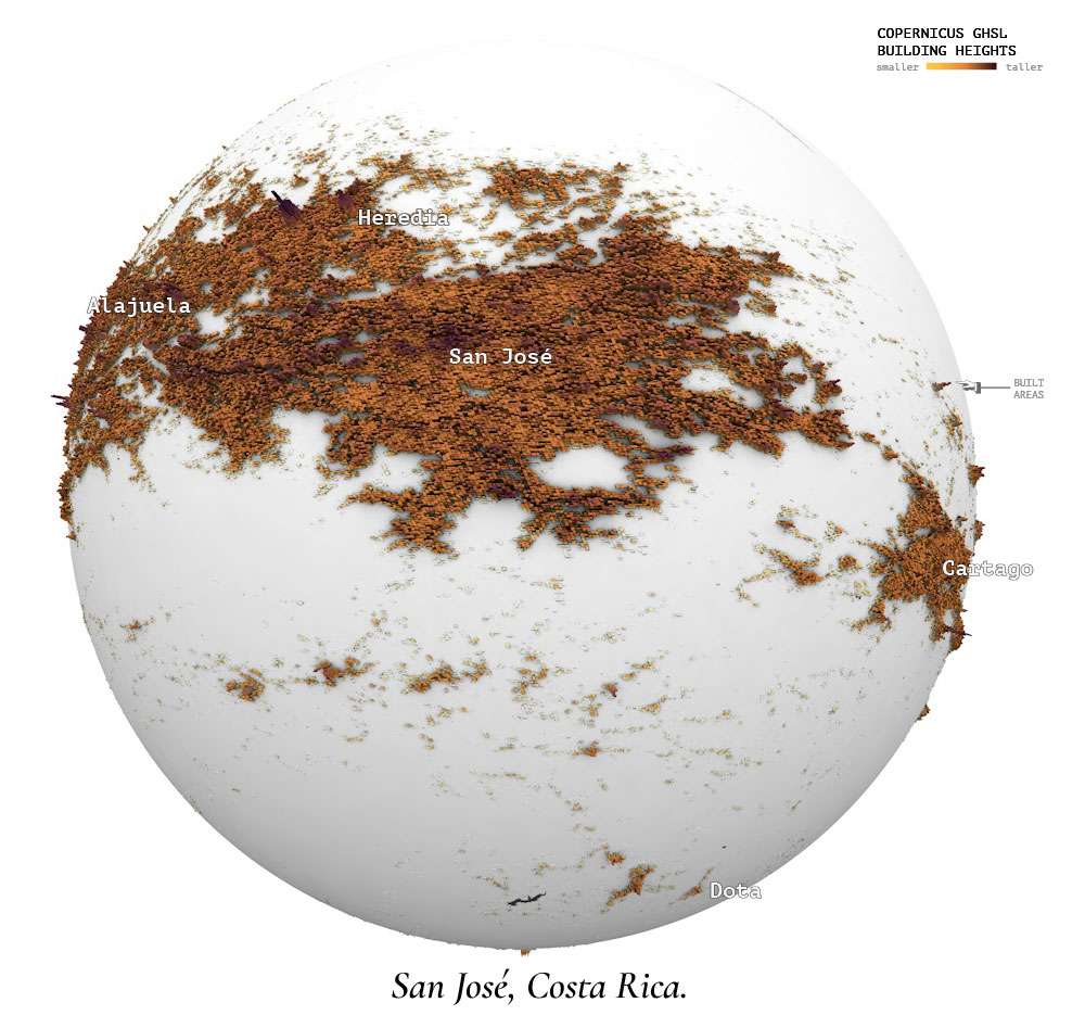
After all, what’s life if you need to be serious and narrow your focus to work only. Take a look to entry 11 of my maps blog to learn more about that project.

A diagram of a datacenter cooling system

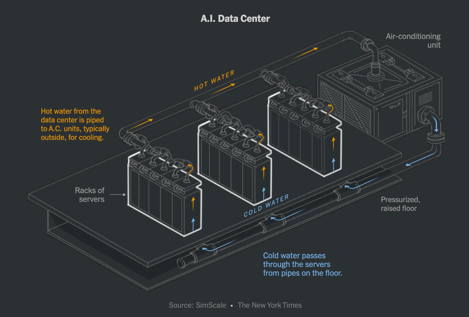
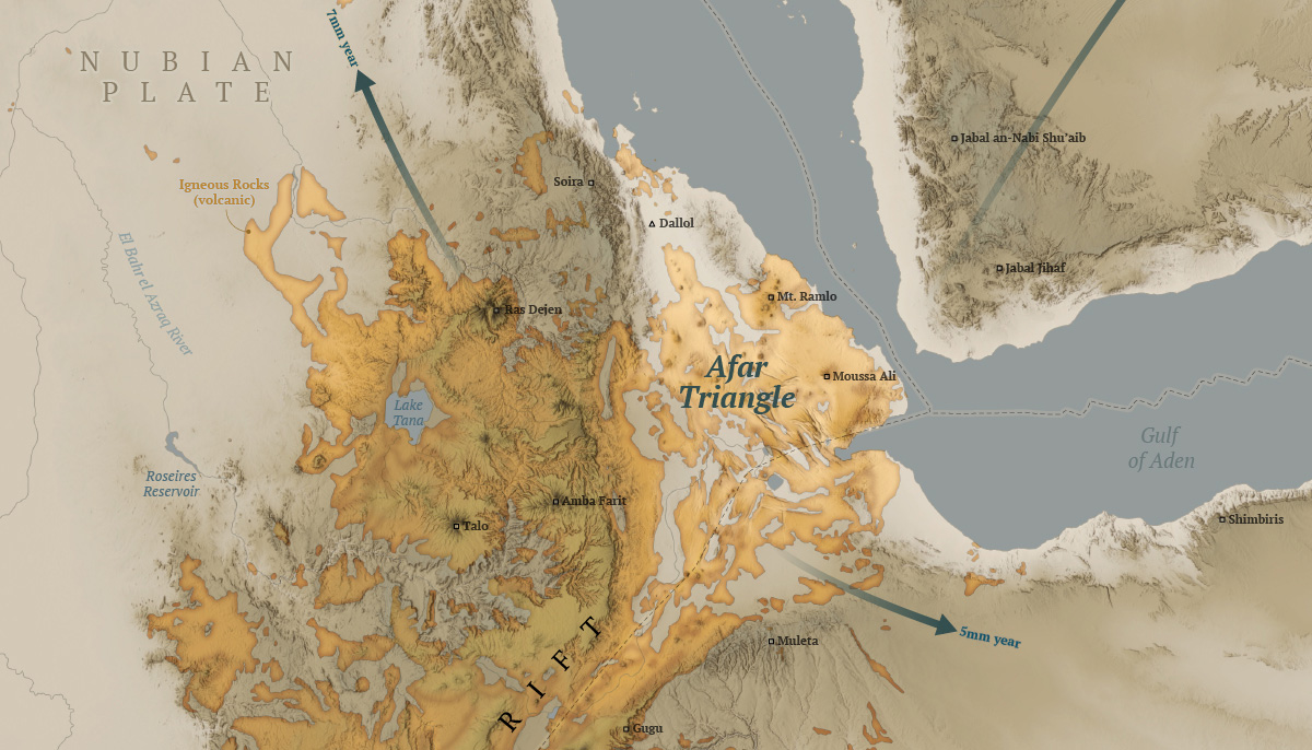
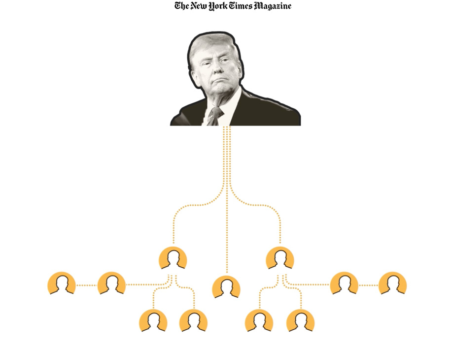
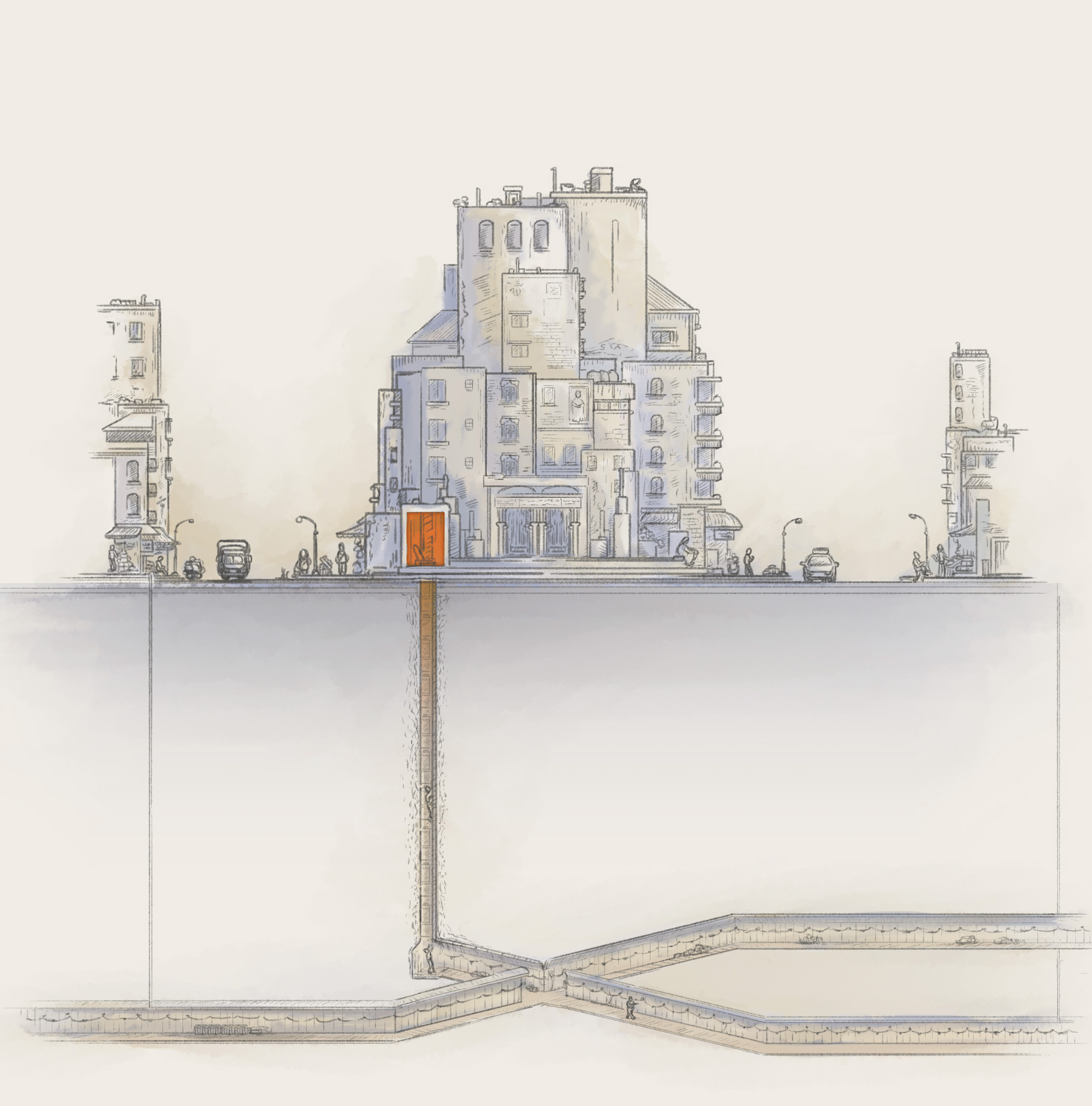
After the war and butterflies stories went out, a week later the piece about artificial intelligence was also published. I used a bunch of different techniques to explain how the surge of A.I. changed data centers and many other things around. This story includes hand-drawn maps that I made frame by frame to create a spinning globe in combination with some video assets. I also used animated gifs to explain computer processing, diagrams like the one above to show readers how the data centers are also changing and a few other things there too. It was a fun story to produce, take a look if you have time for a fun experience: How A.I. Is Changing the Way the World Builds Computers .

Hello Boston!
In March I also went to Northeastern University in Boston where I shared a little bit with students of design and journalism for a series of talk they do with professionals called IDDV360. I had a good time in Boston earlier this year.

In March I also showed up as guest speaker to a class at the School of Design of the Hong Kong Polytechnic University. I like to share experiences and exchange ideas as much as possible, specially with students.

–Health coverage & SND Minneapolis–

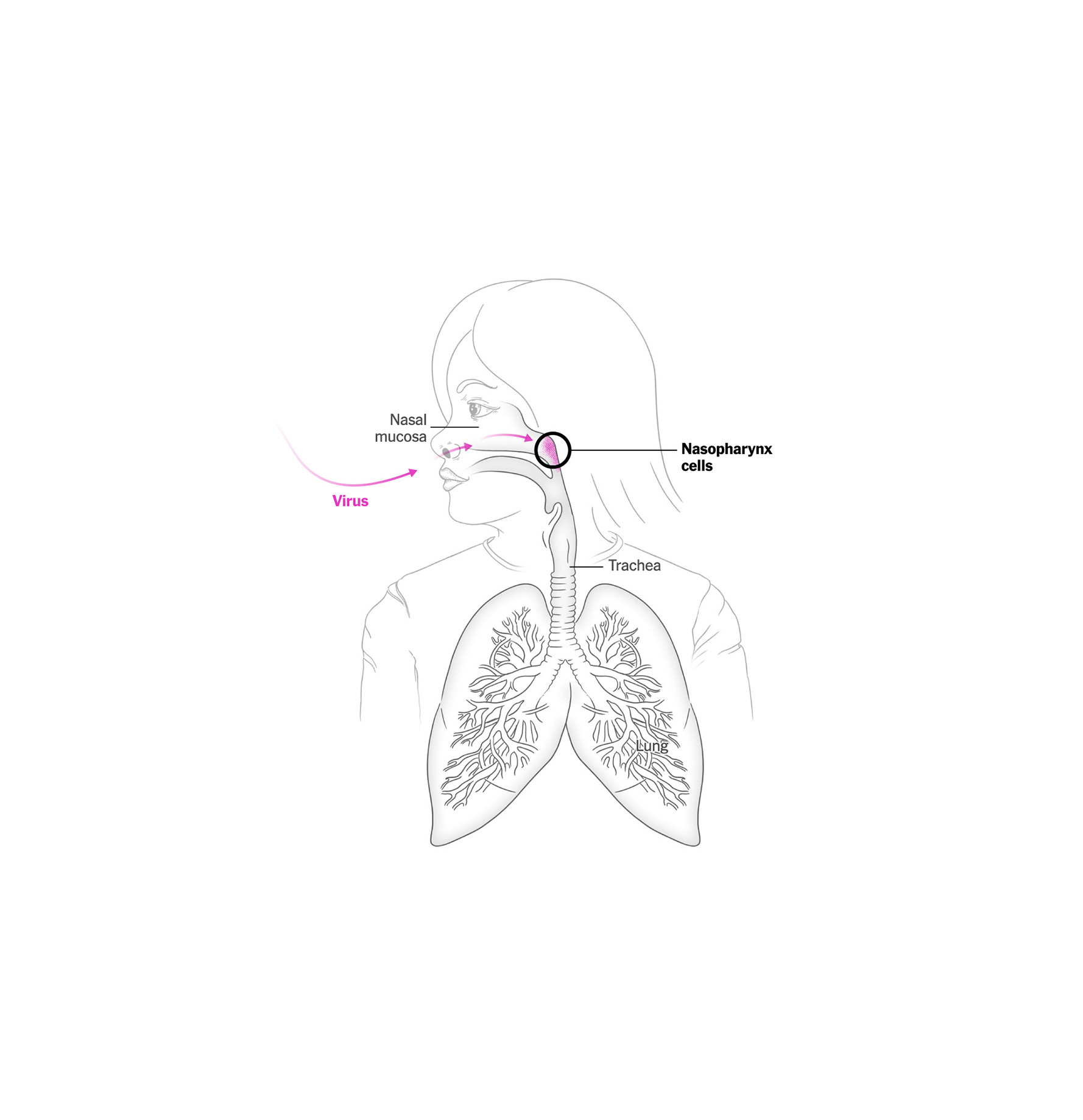
After a crazy busy March, I entered a new project to respond to the measles outbreak in the U.S.

This disease is simply terrible. The effects it has on the human body are devastating, and to make matters worse, children are often highly vulnerable if they don’t receive a vaccine, as is the case for many children in the south of this country.

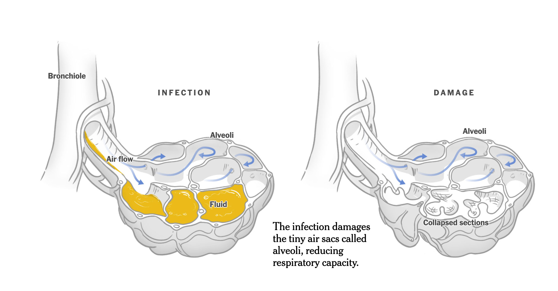
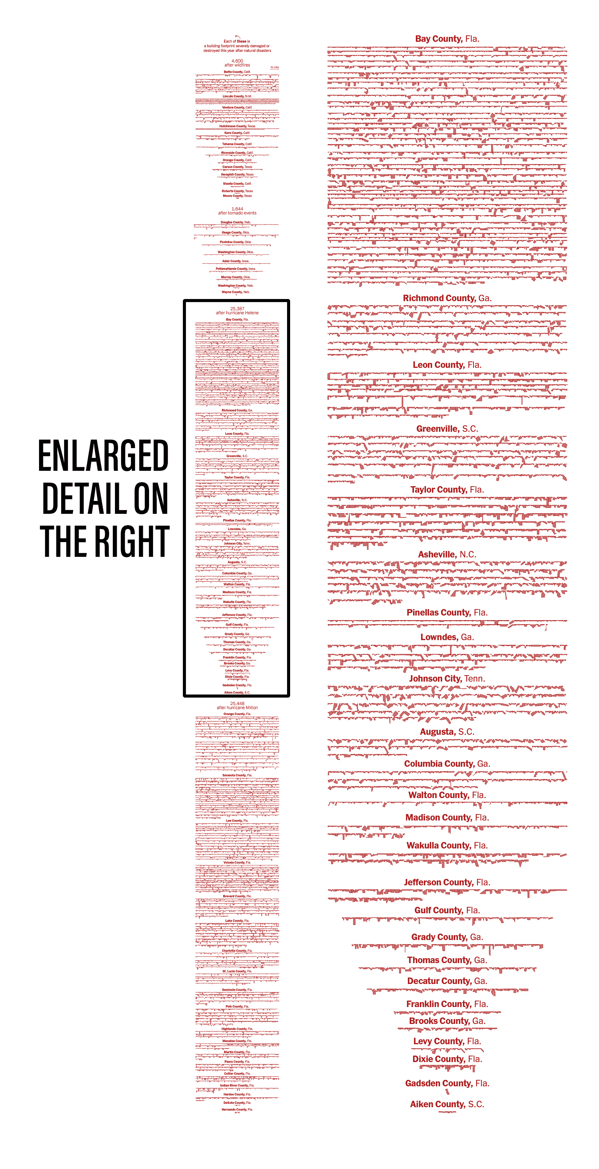
The piece I did aimed to show how measles attacks the body and that, in many cases, after prolonged suffering, death is common. When I published this piece, there were nearly 700 cases; today, the tracker has doubled that number and continues to report more and more.

Hello Minneapolis!
It’s funny how many times I have visited Minneapolis for different reasons and 2025 was not the exception. The SND annual competition, the board’s in-person meeting and a short workshop was hosted in the QH of the Star Tribune. These trips have many cool things blended. So many friends come together, there’s also the inspiring portion of seeing some of the best pieces of journalism that media produces all over the world over a year, great views of the host city, of course time for museums and social life too. You go back fully reloaded to get back on your own pieces.

–Planning, sketches and virtual tour to Peru–

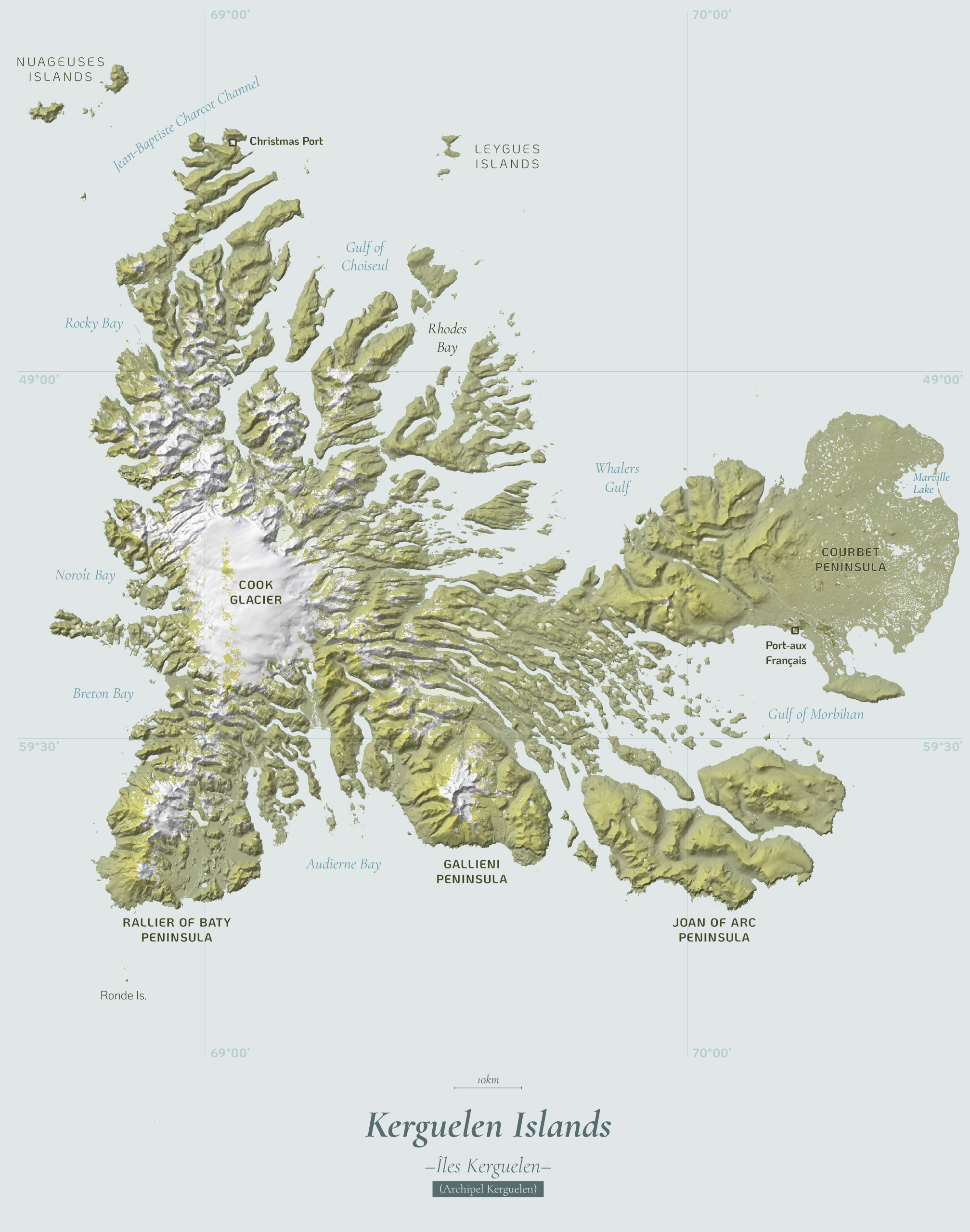
In May, I pushed to my cartography blog a new entry about the Kerguelen Islands (scroll down to entry number 12), there’s something in the geography of this place that is so appealing for maps, I have seen a lot of good professional cartographers doing great stuff with these islands.

In May, there was another slowdown for planning, some projects materialized, and others were canceled; meanwhile, I virtually presented to students from South America some of the work we do at the Times and how my passion for graphics led me to this company. I feel joy in sharing with students, I would like to travel to South America sometime and do this in person perhaps.

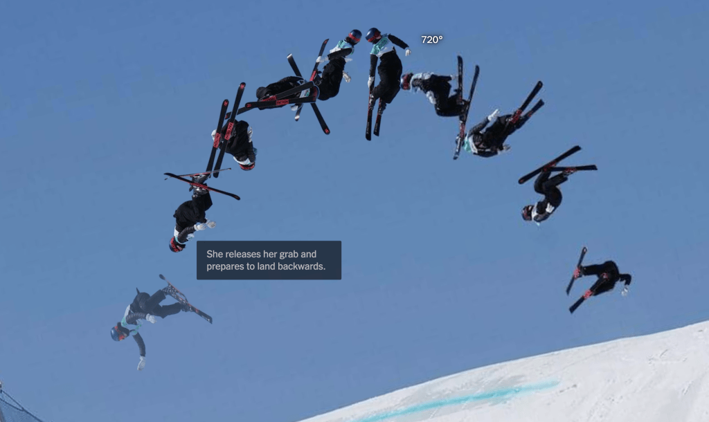
By May I was in week 99 (or 47th of the second cycle) of my sketching project looking at the Qatari “lord of the sea”, the light at the end of the tunnel was almost there!

In May I speak to a class of design from Belgrano University in Argentina. I was nice to see so many students gathering for the presentation, organizers told me that some +100 students joined both in person and virtually.

–Breaking news, military parades, Florida and South Korea –

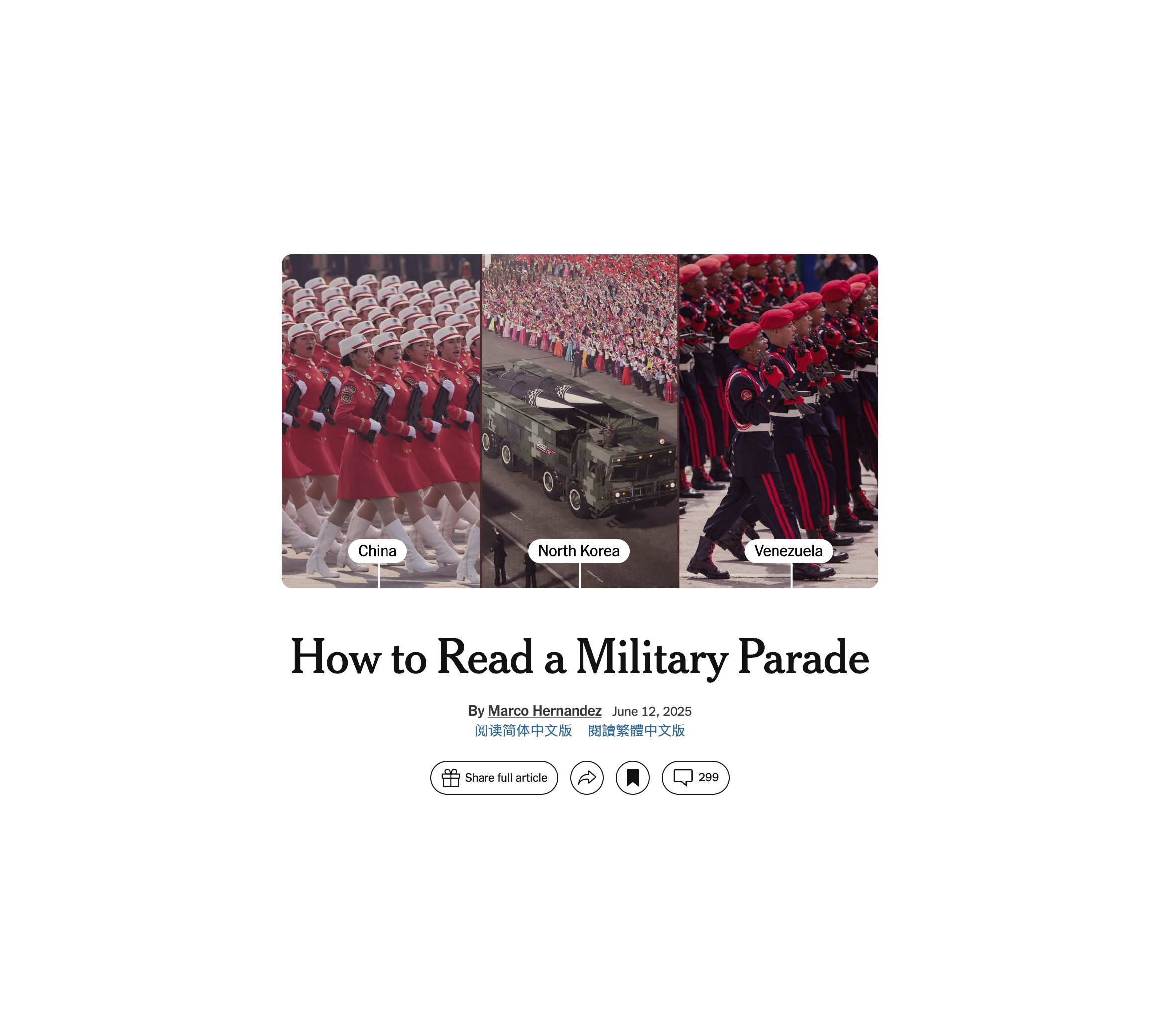
June was super intense and exiting, one of the first thing I did was a piece showing how regimens use military parades for different purposes, from diplomacy to the show of muscle, to leaders glorification, to acrobatics and pride… all in the eve of a celebration of a new parade in the United States for the first time in a long time.

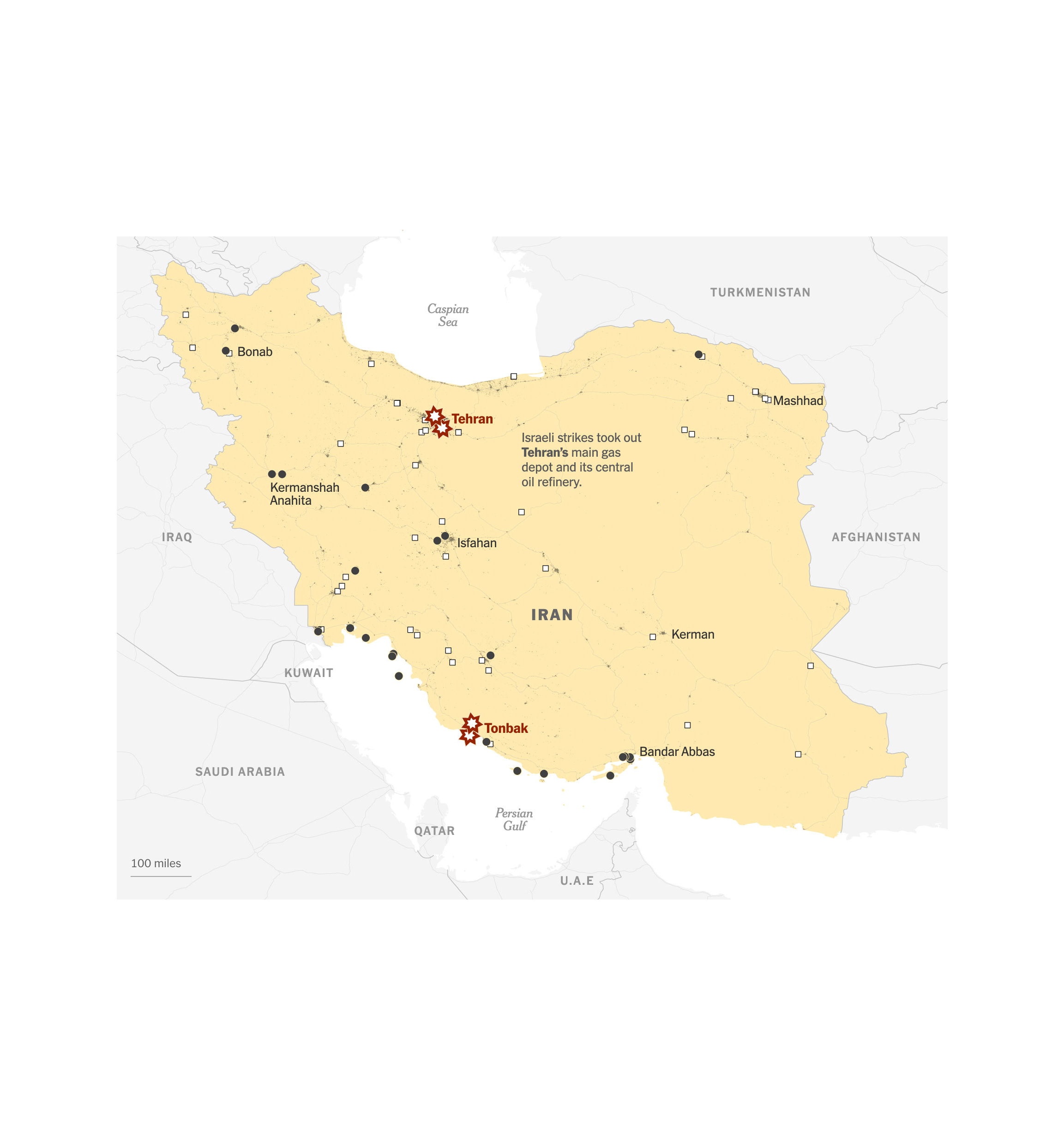
Then I collaborated in the rush of the breaking news when the U.S. stroked Iran’s facilites, and a follow-up to the damage caused to strategic infrastructures. Just a day or so later, I also contributed to visualize the impact of a bomb into Iran’s Nuclear Facilities and the difficulties around it.

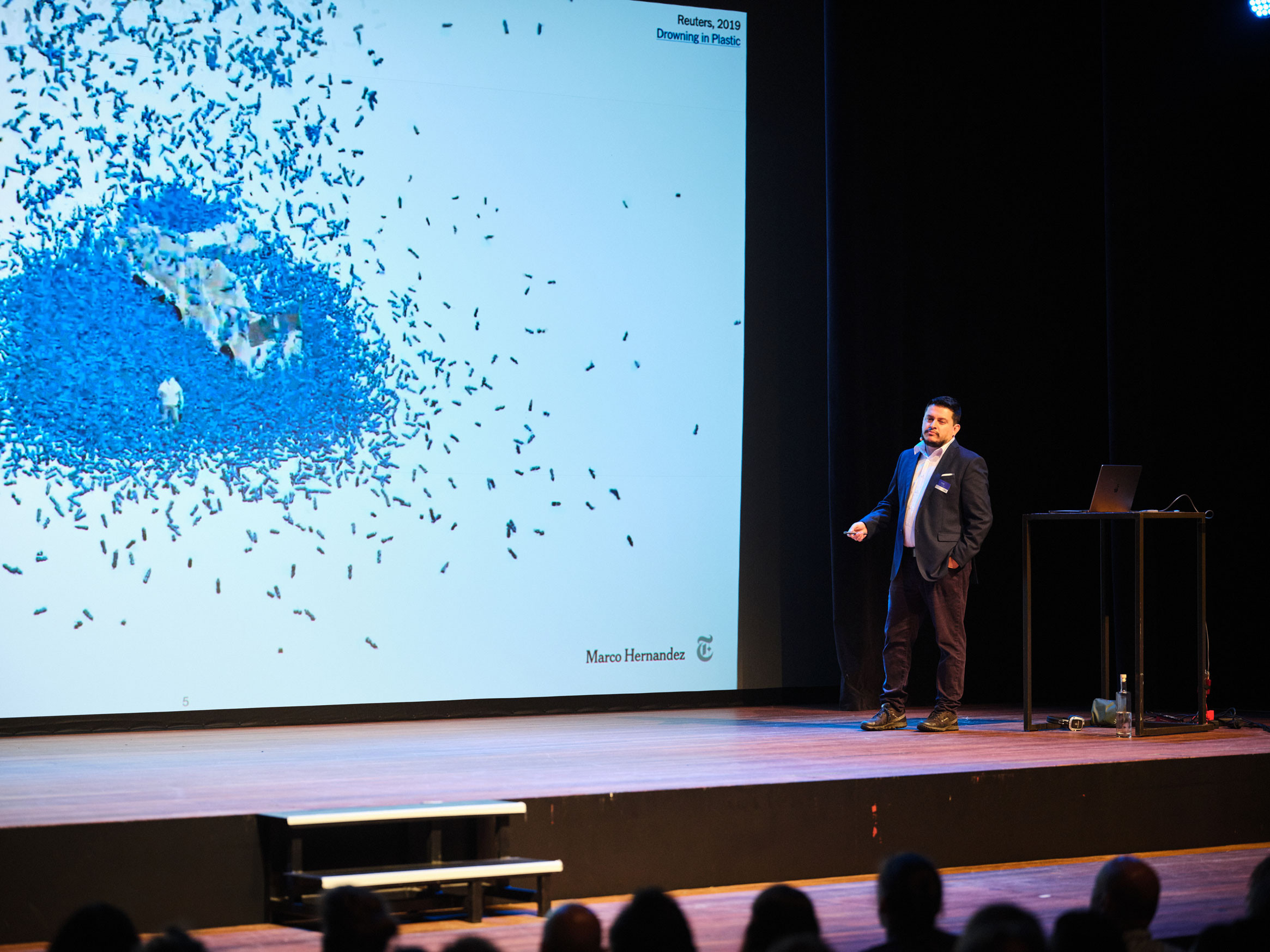
Early in June I also went to Florida to attend the Outlier as speaker where I shared a bit of my career and the stuff I’ve doing in the last 20 years of my life. The organizers recorded the presentation and it’s free to play in youtube now. Take a look below if you have 30min to spare.

No more mythical creatures!
In June I also wrapped out my second year of doodles, a project in which I dedicated every single Sunday for 2 years finally came to a break to re invent. 104 entries later I finally paused this crazy idea posting nonsense illos just to give room to other projects.

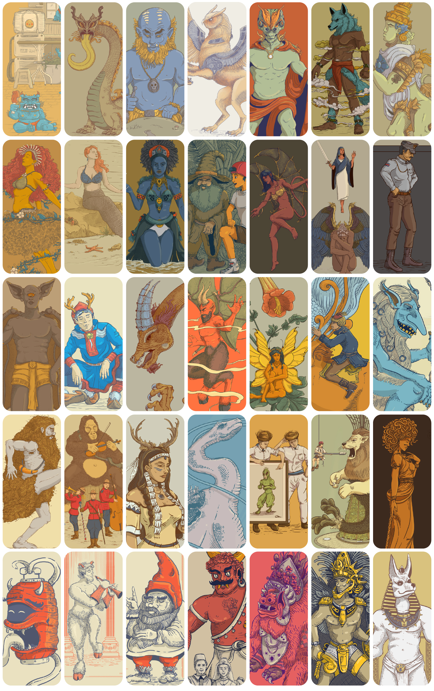
I have some plans to retake this into a different shape, if you follow me in social media you might hear about a new crazy idea involving illustrations soon.

Hello Seoul!
After I finished my silly illustrations cycle, published a few pieces on the news, did a conference in Florida, visited the Little Habana and celebrated some birthdays with my family, I packed my bags for an assignment in South Korea. That was my first time in Seoul, I got the chance to meet almost all the colleagues working at the NYT Korean Bureau and prepared myself to explore the place, learn from the team and enjoy Seoul.

While I was in South Korea, I started one more personal project, like if I had a lot of free time to divide my attention… I was waiting for my colleague Pablo to come over to the parking lot in the office and started to sketch passing by people, really quick. Then I thought, hey… would be nice if I do this in every city I have been this year? A quick sketch, probably imperfect, but just to remember fragments of my travels and special moments. I’ve done several, but time has caught up with me… In some places, I couldn’t sit down to get out my sketchbook.

My 2025 travel journal
Some pages of my 2025 travel journal

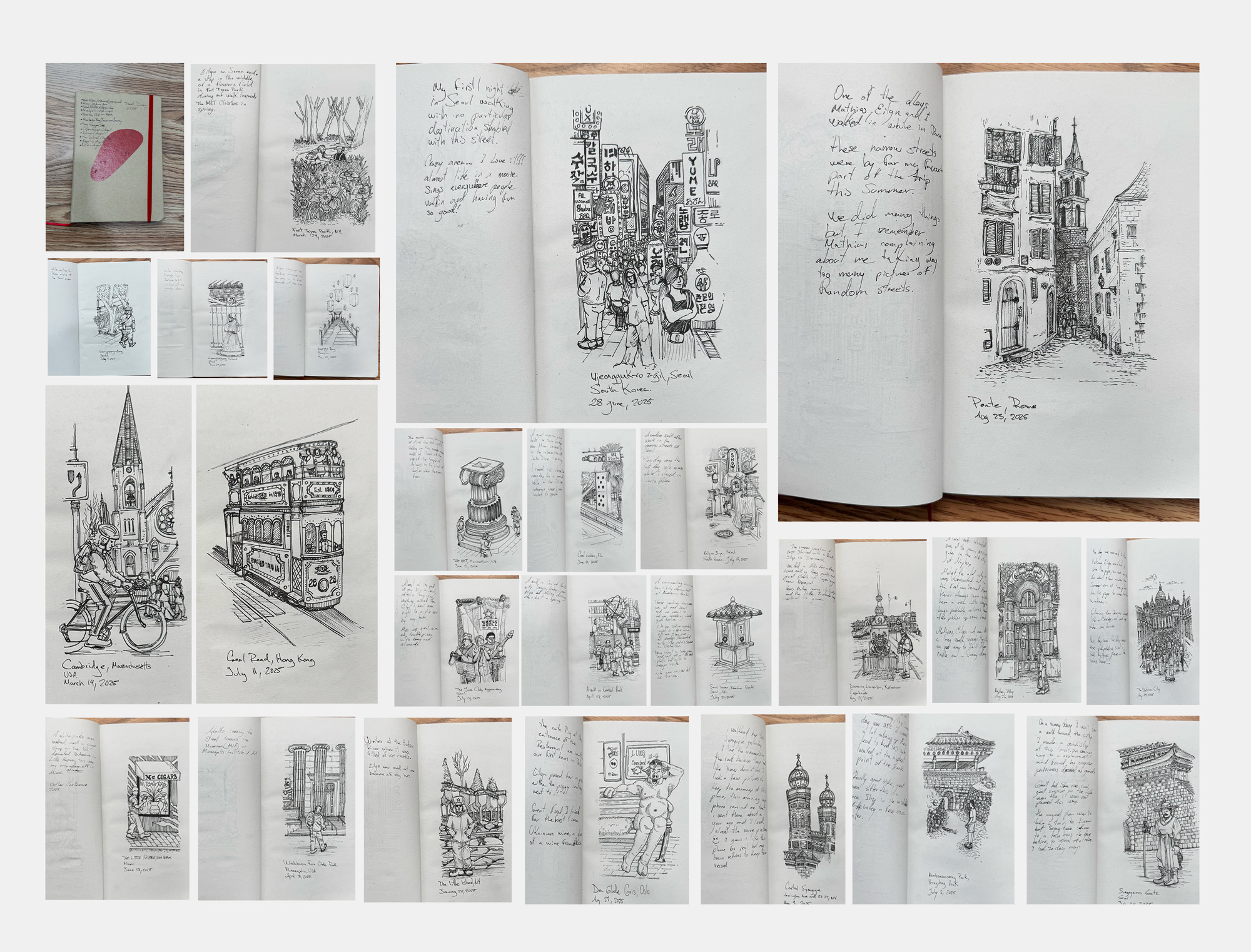
Perhaps I’ll try to finish my 2025 travel journal in the last days of December, although it wasn’t the original idea to do them while I was there. Maybe next year, hehe.

–Seoul & Hong Kong–

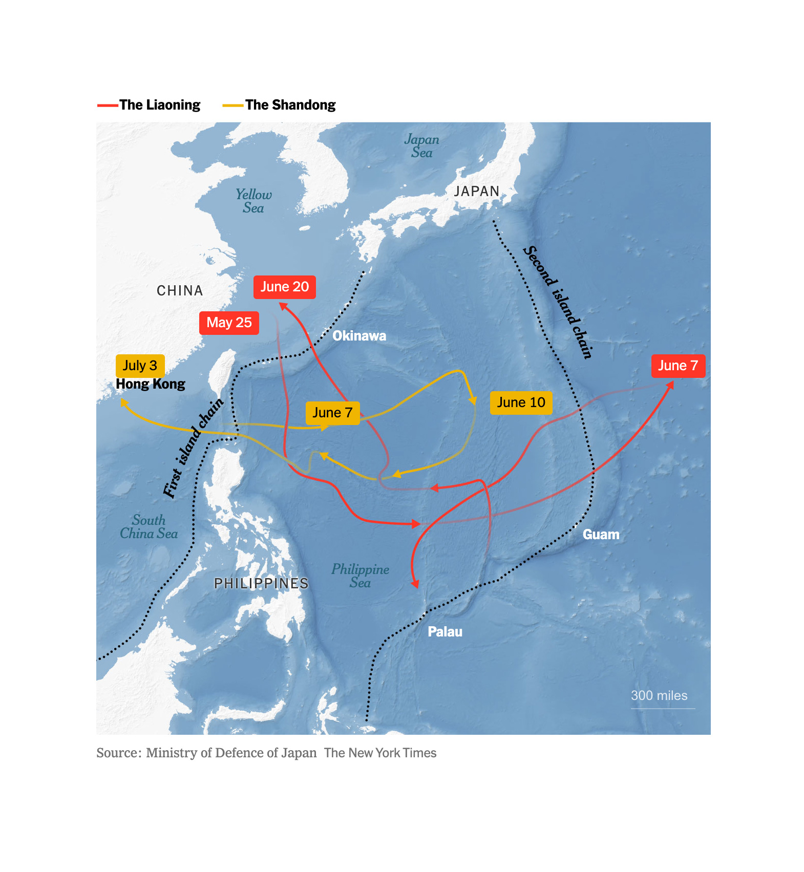
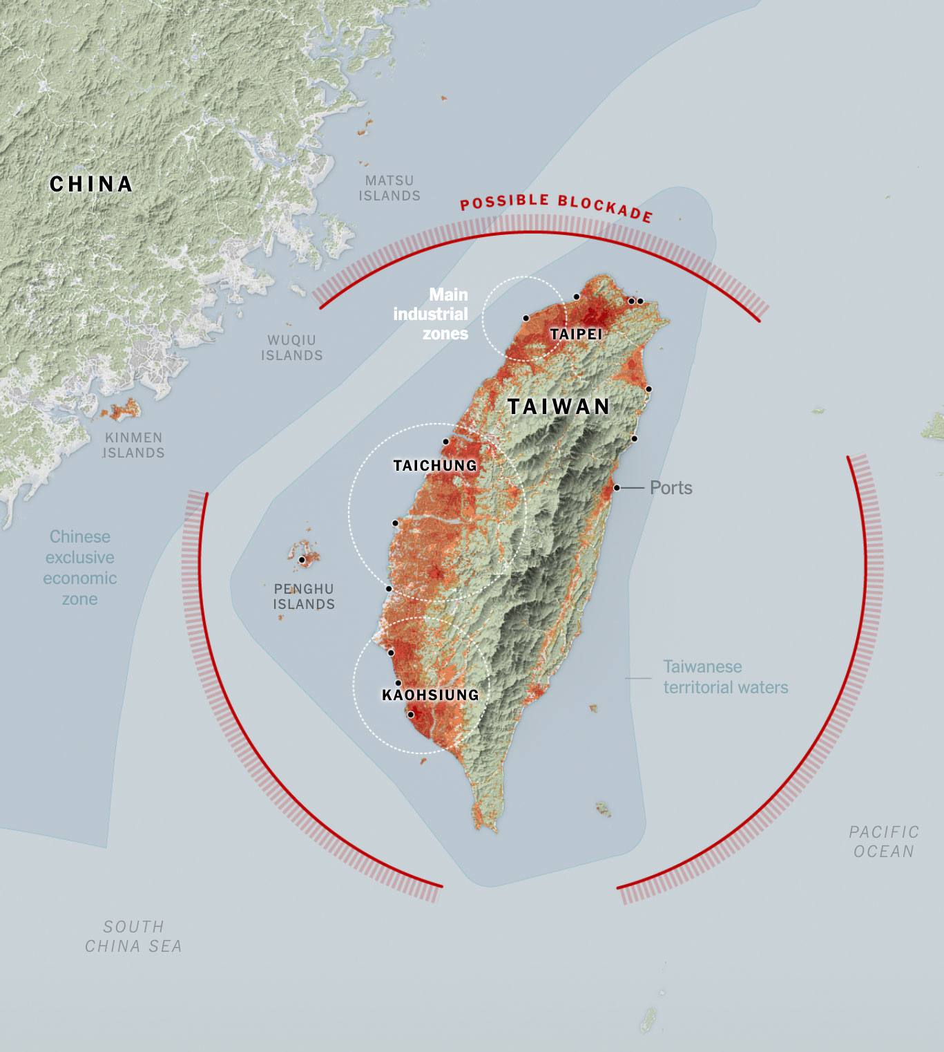
During July I continued to prepare stuff for future projects, but I did a quick map and a series of little illustrations to compare the Chinese aircraft carriers with some of the biggest warships from other countries. This due to the increase of the Chinese activity in the Pacific waters near strategic U.S. and allies bases.

Hello again HK!
During my assignment in South Korea in July, I took a weekend trip to Hong Kong to visit friends. I had left the city more than six years before, but it was wonderful to return: the sounds of the traffic lights, the trams, the subway announcements, people speaking Cantonese… Everything was so familiar and pleasant that it brought back so many good memories.

After my short visit to Hong Kong I returned to finish my work in South Korea, but I went back so nostalgic. I visited my old neighborhood, took the same ferry I used to take every day, saw old friends in the same spots we used to visit regularly… I guess the nostalgia came to me because when I left the city in my head it would be so difficult to comeback that it was never a real opportunity or idea in my head… and suddenly I was there again! ❤️

–The weather and a little summer break–

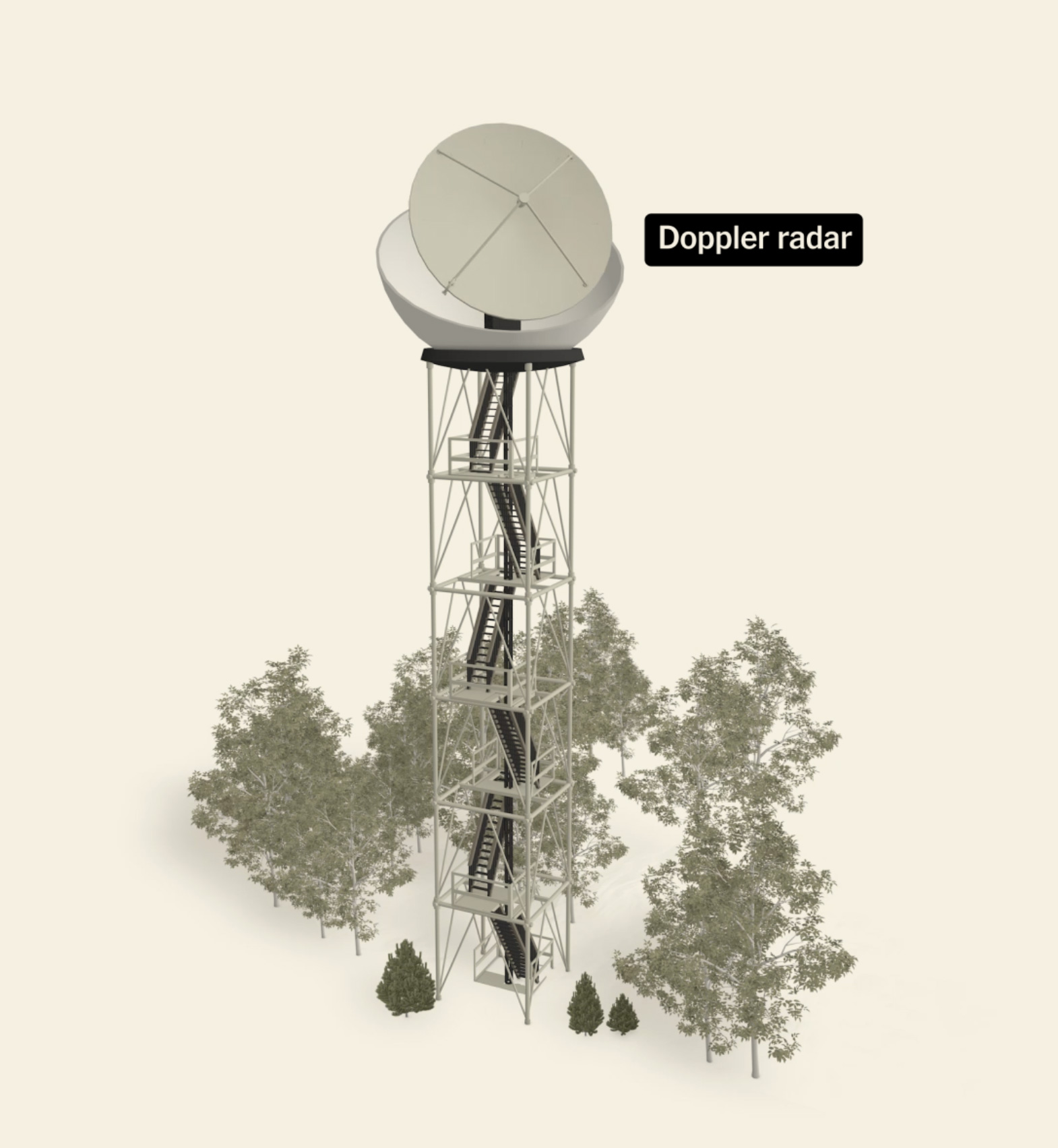
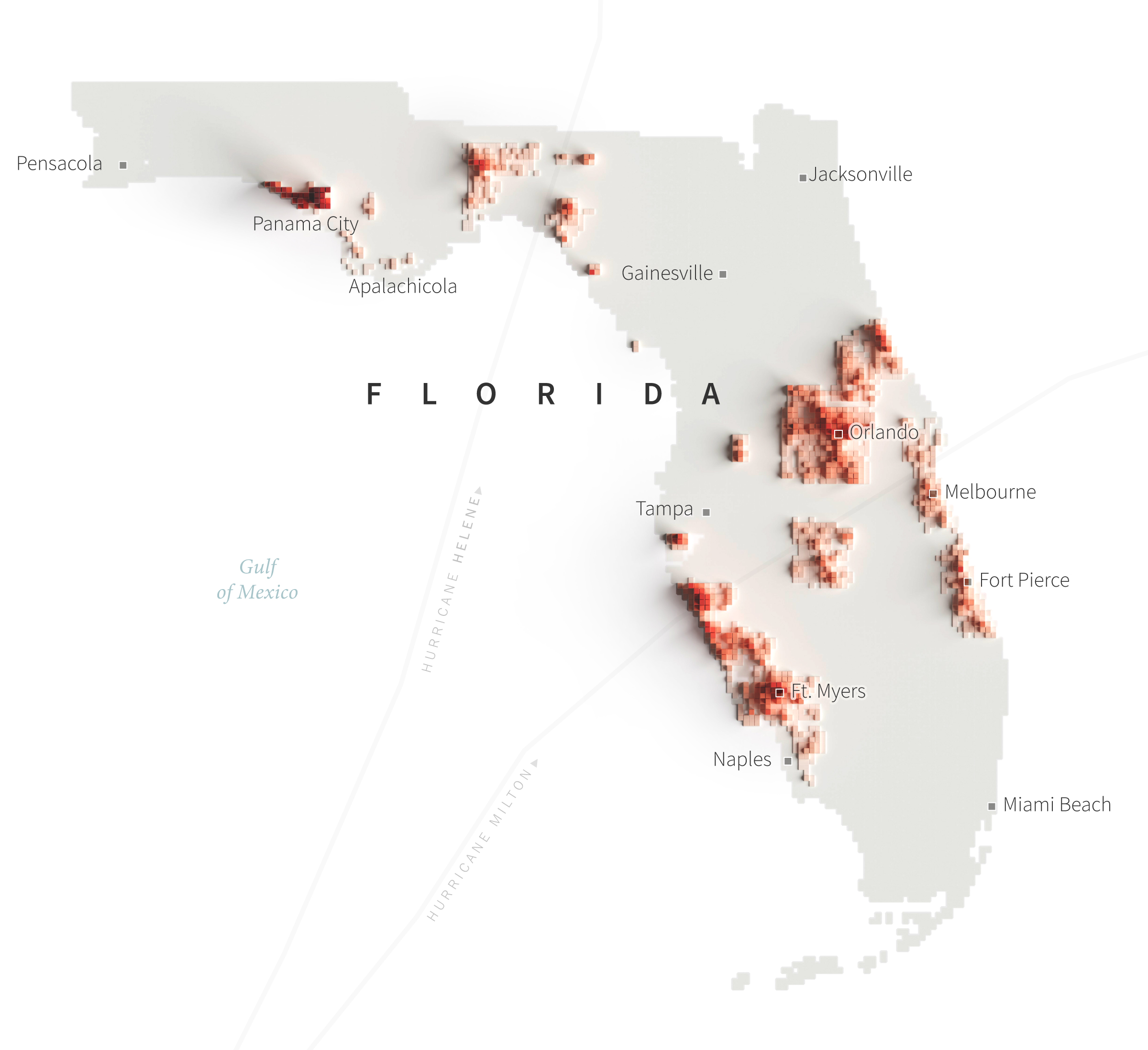
In August I finally published this piece we delayed for so long… Many reasons hold the piece, but it was meant to explain the vast symphony of instruments necessary to get you the forecast in your phone using some 3D animations, audio and data into a swipe story format.

I think that one of the most important assets of the meteorological industry is the people behind all these instruments, the scientists who have dedicated their lives to processing data and providing information that makes it possible to know when it’s going to rain, as well as the extreme weather alerts that save millions of lives.

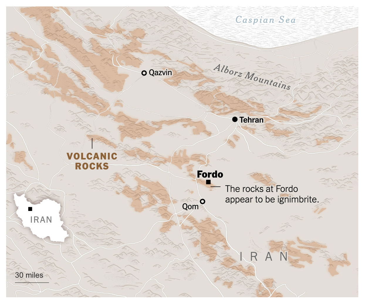
In August I also contributed with my colleagues of International to put together a piece explaining why it was so difficult to asses the damage caused to Iran’s nuclear facilities after the U.S. attacks. Fordo is a facility burred depth into the heart of a mountain, very little was known about the facilities it self so it’s hard to tell if the bombing of it was efficient or not.

Then summer arrived. My son has very little time to completely disconnect from his responsibilities, so at the end of August I took the opportunity to go on a short trip 100% dedicated to history (he’s a huge history buff). It was great spending a few days exploring historical sites and thinking only about what would be good to eat in Europe.

–Ukraine & Costa Rica–

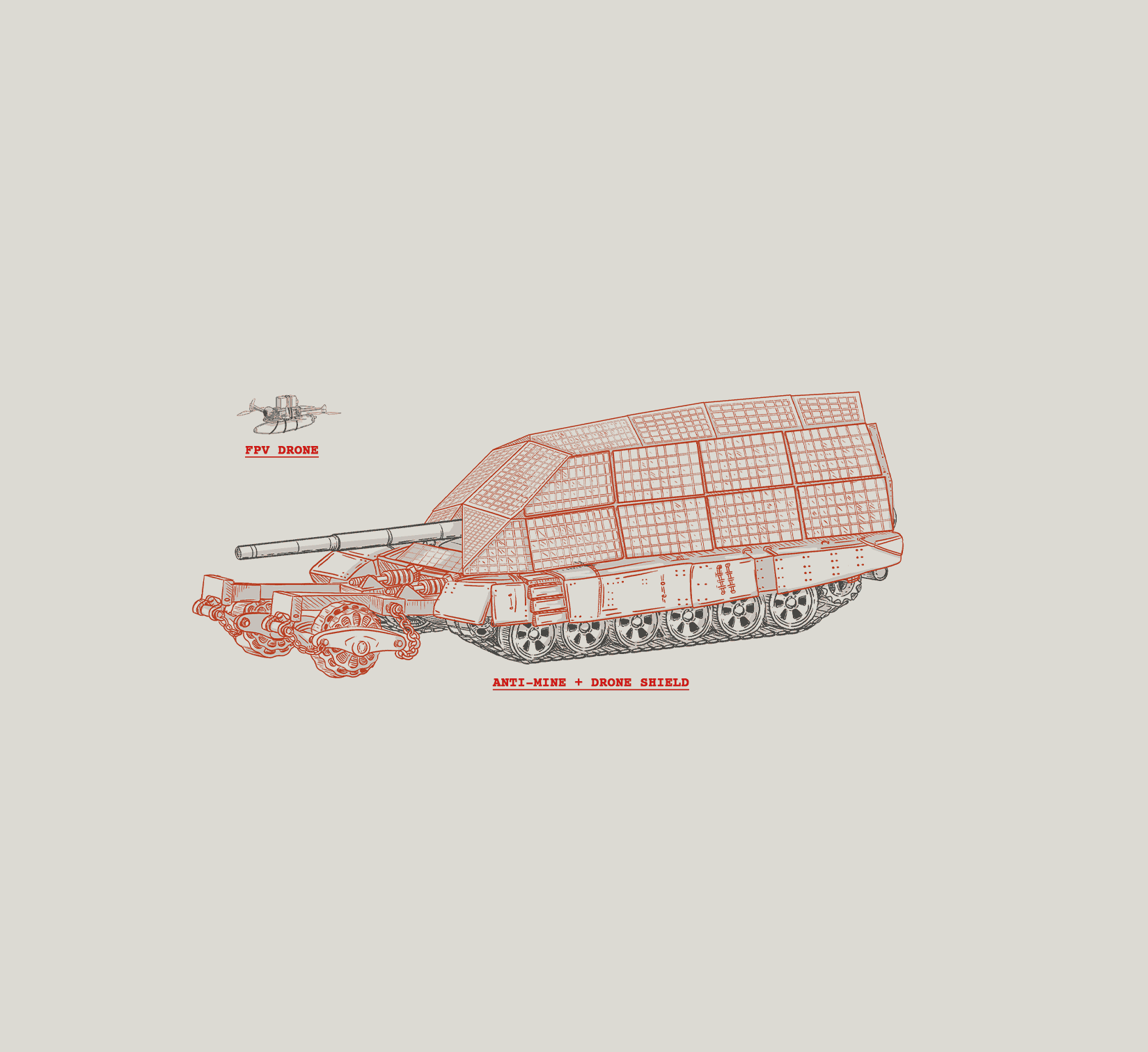
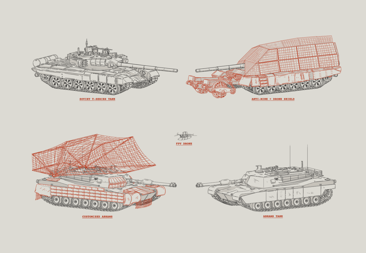
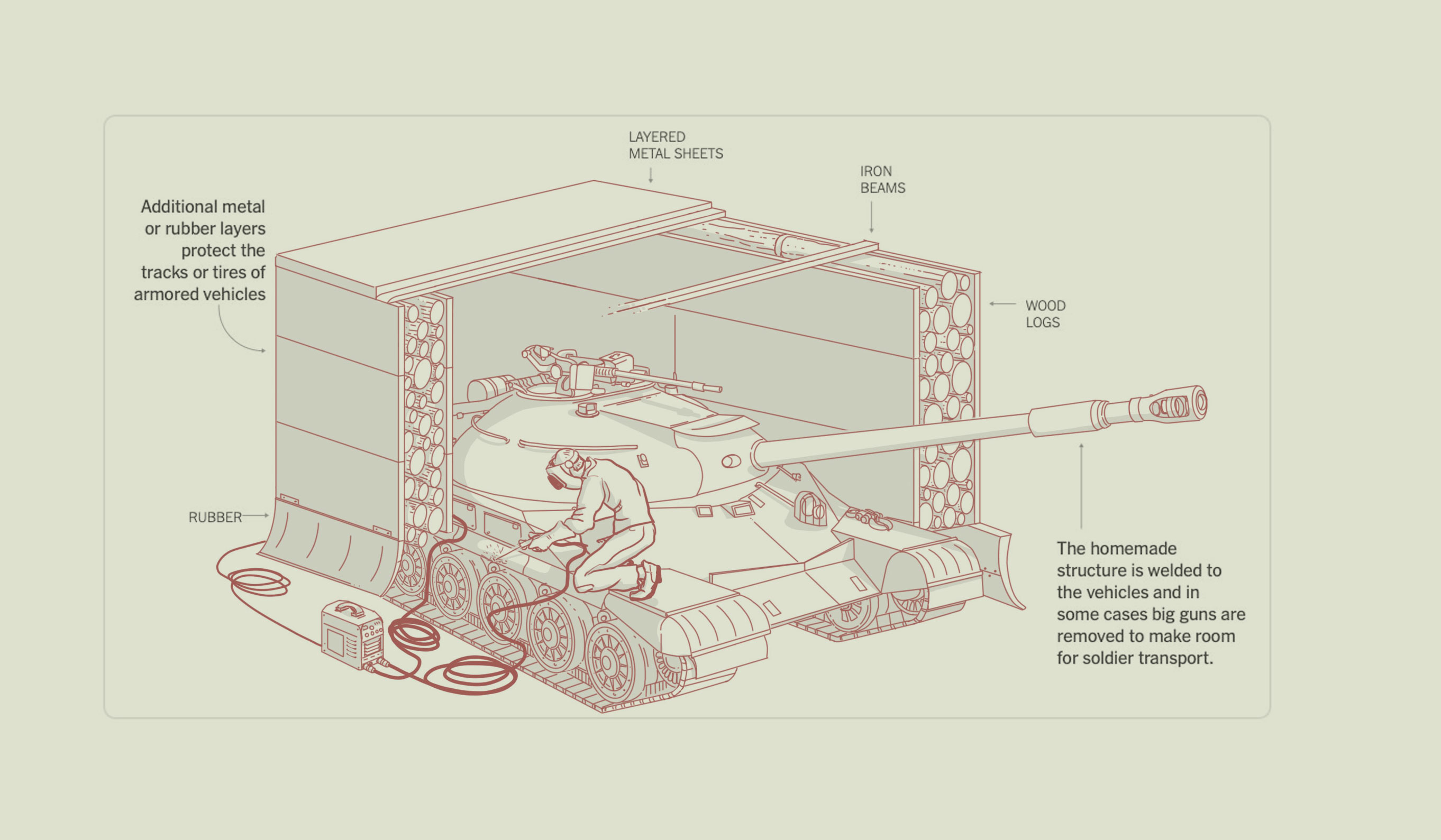
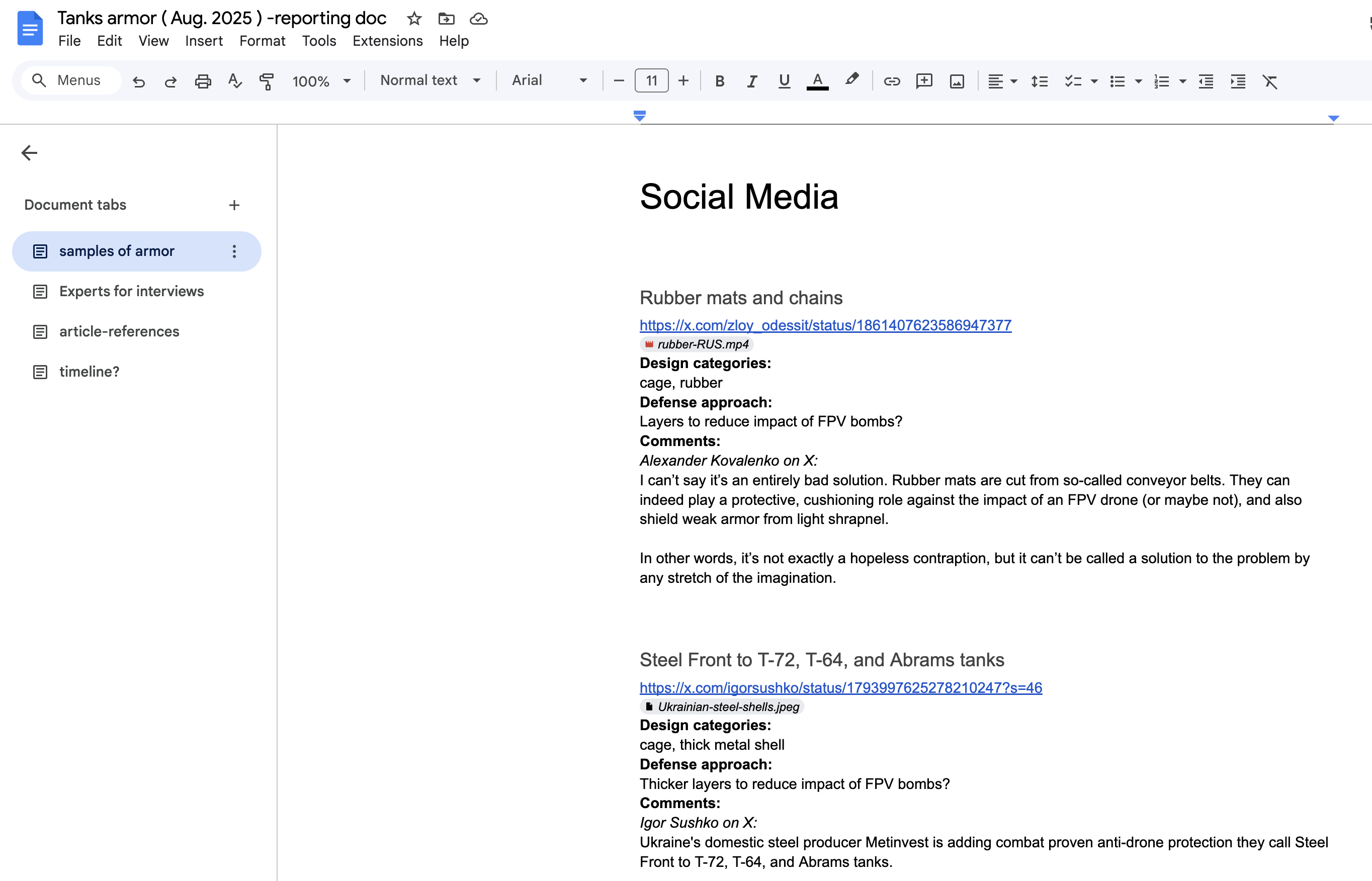
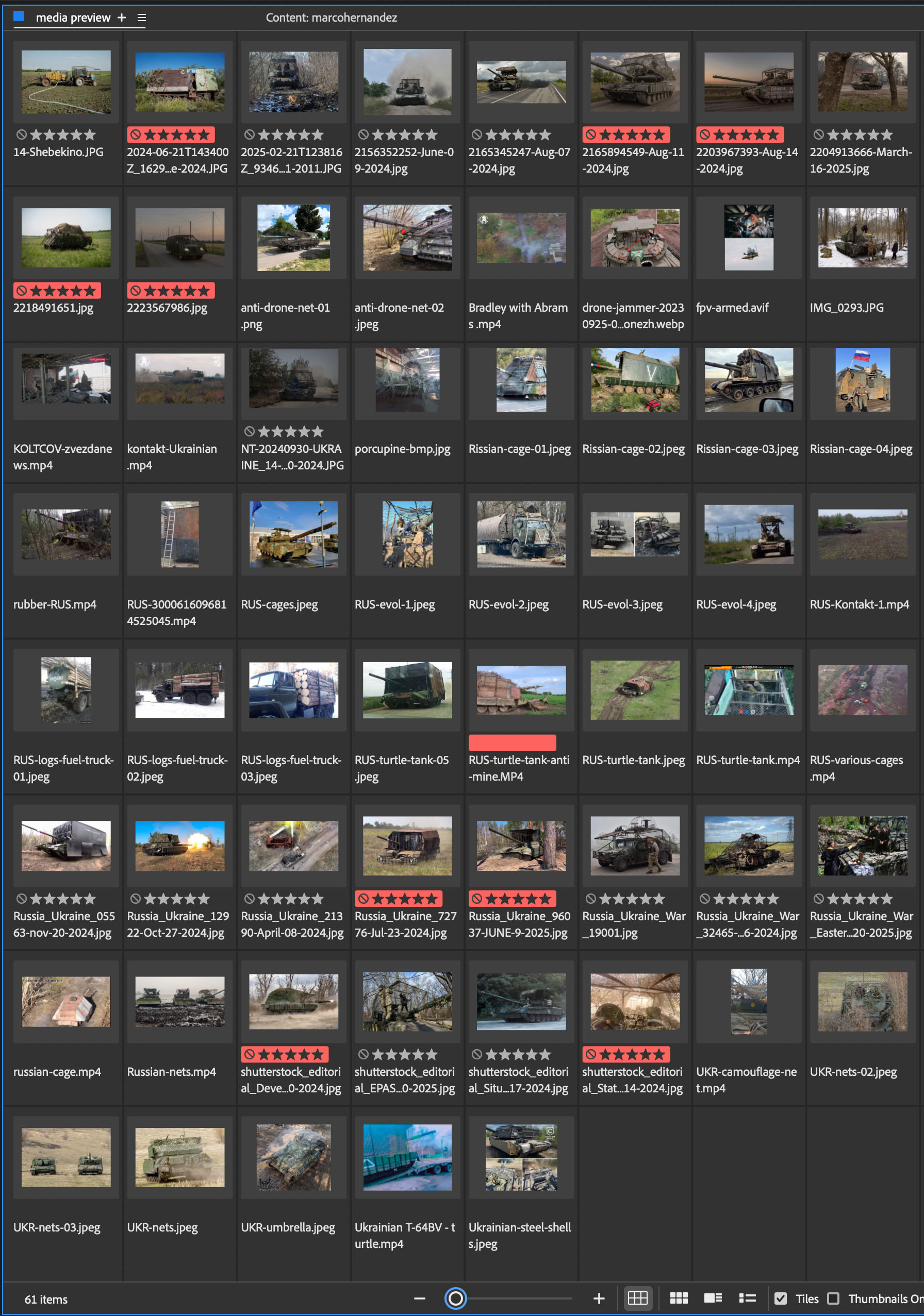
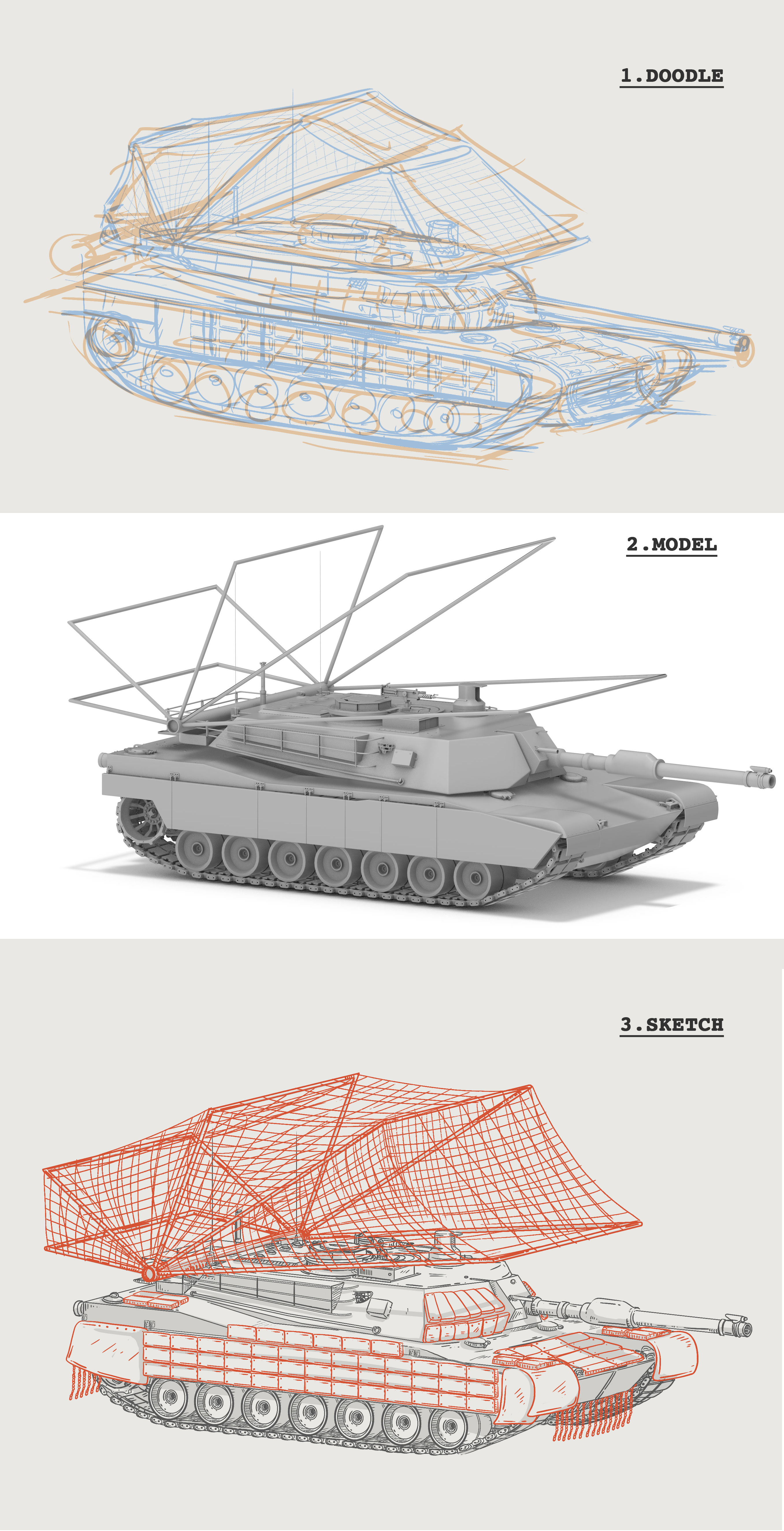
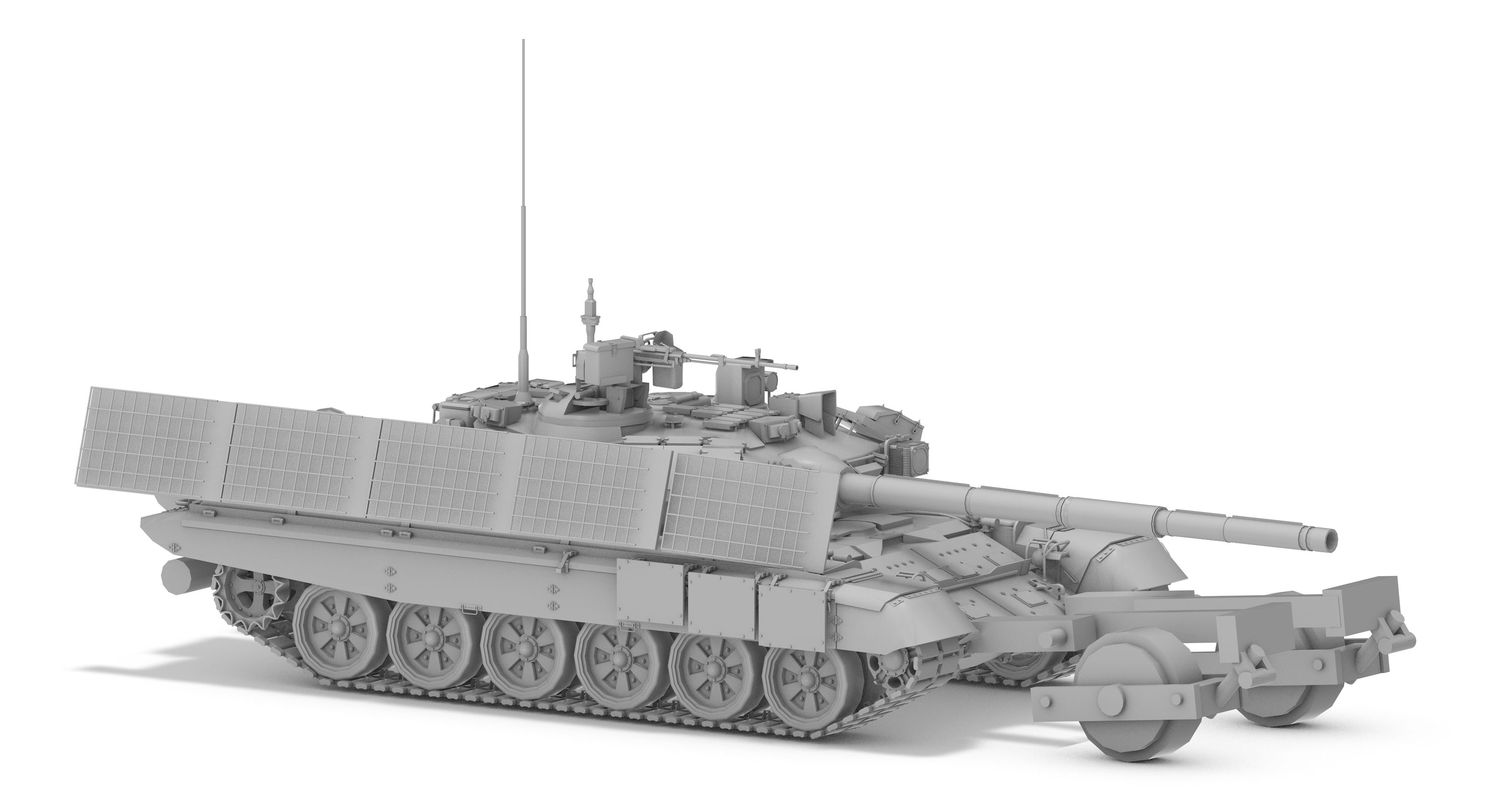
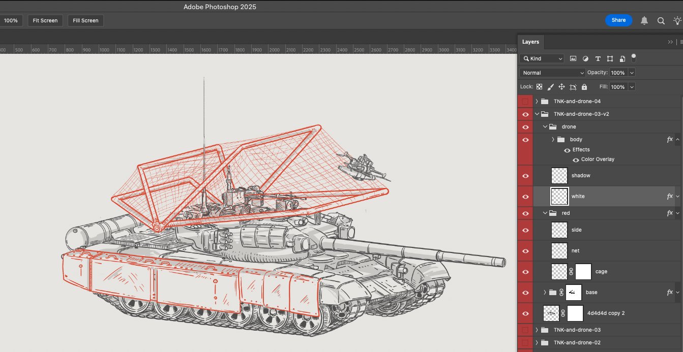
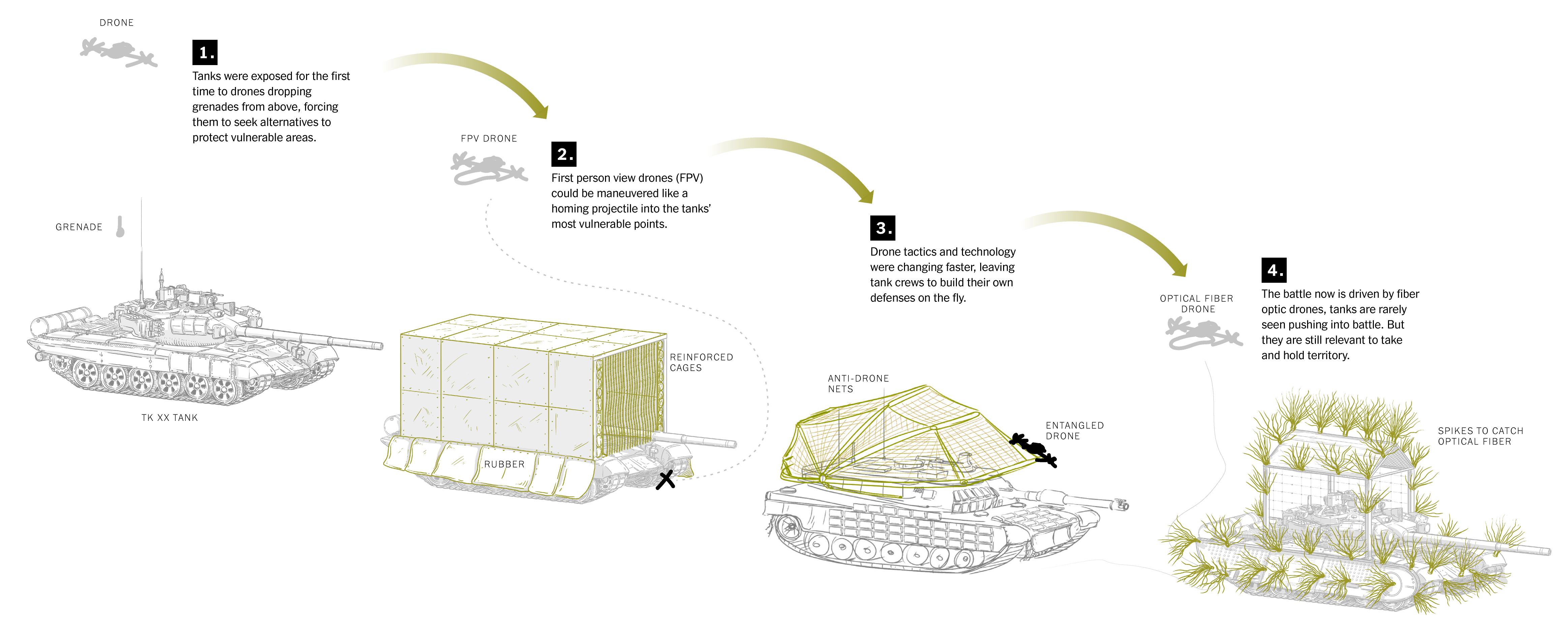
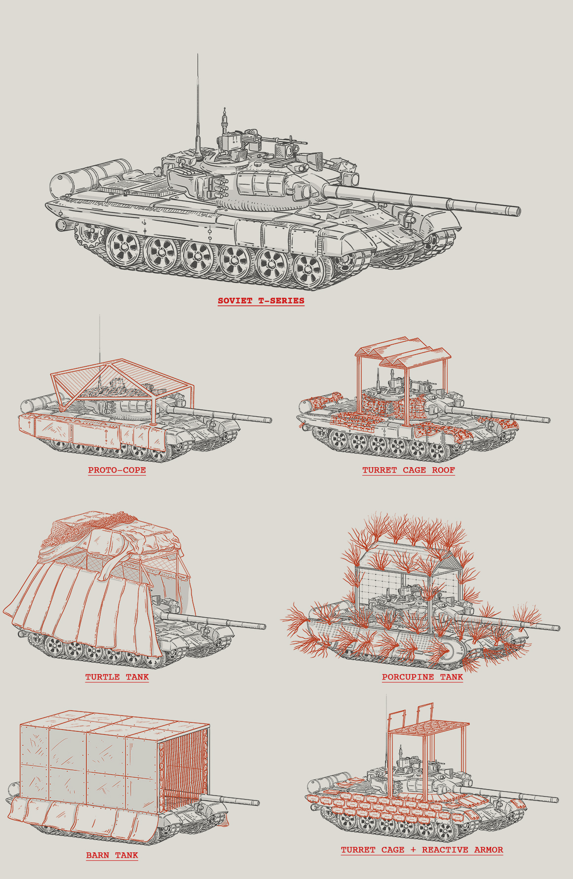
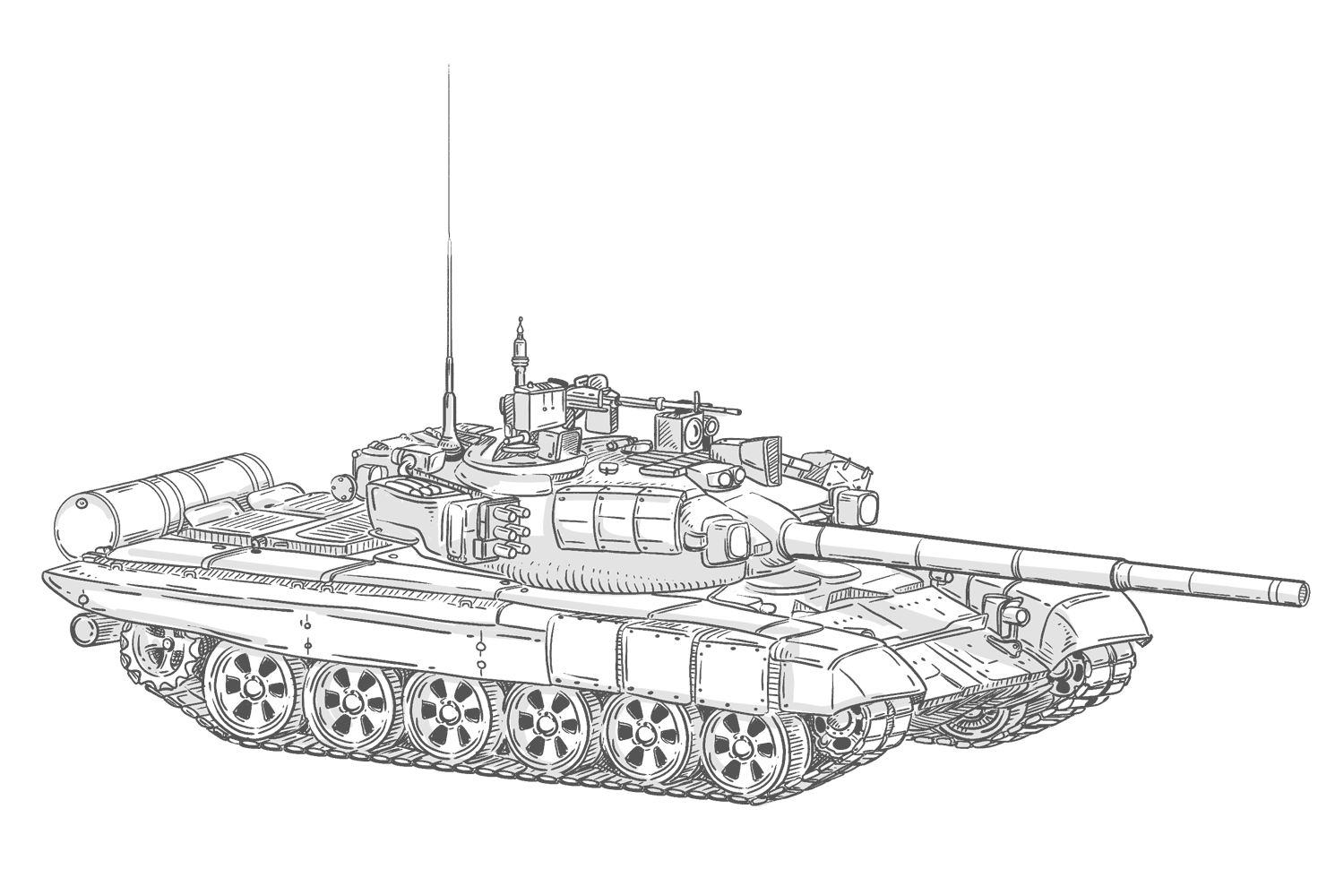
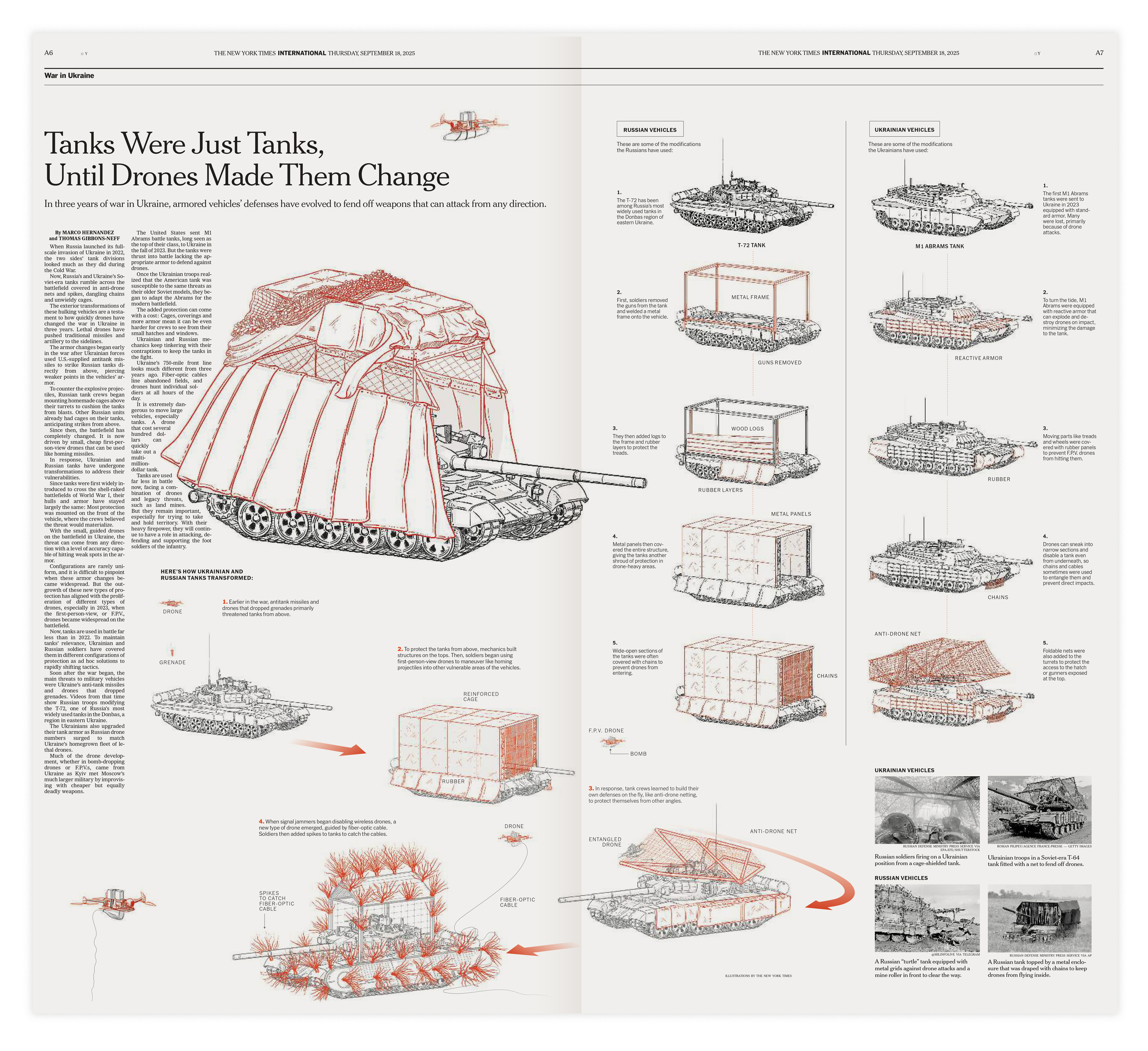
During September I turned back my attention to the war in Ukraine, I partnered with Thomas Gibbons-Neff to do a piece looking at how tanks are changing in due to the extensive use of drones. I did a backstage story here to look at the process behind and a little bit of the context if you want to review it once more.

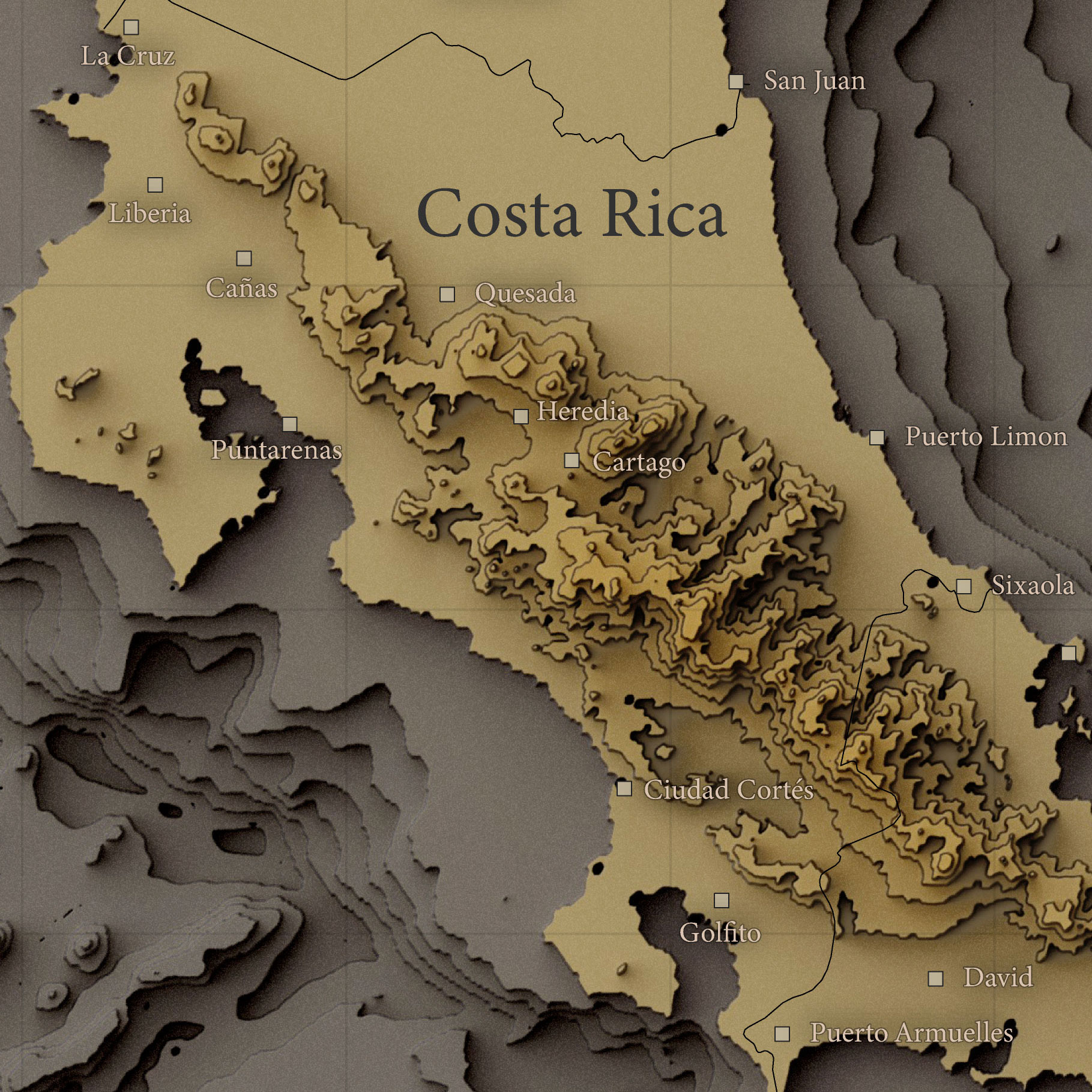
September is also the month to celebrate of my natal country, along with many other countries in Latam, Costa Rica celebrates it’s independence of Spain in September 15, since I’m far away from my land, I did a little map in my blog. Look at entry 13 for the full version of it.

–Washington D.C. and giving back to the community–

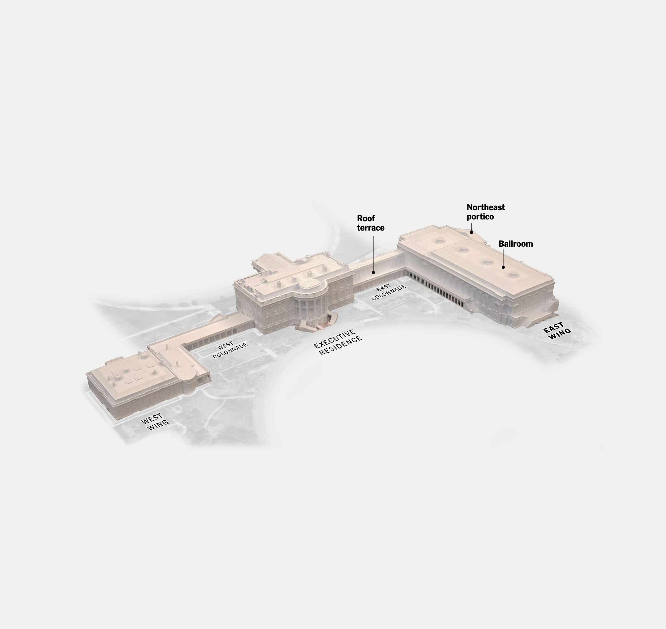
In October things got crazy with a few projects, mostly in response to the renovations in the White House. This was part of a large project we spent some time working on, but with the rush of the news and the demolition of the east wing, the project broke apart into smaller pieces.

The first was a highlight to 5 major renovations of the White House. Then some notes on the envisions of Mr. Trump after the demolition of the east wing, and finally one more looking at the evolution of the plans the White House presented for the future of the east wing.

Since my work responds to whatever is in the news, sometimes I have to do stuff related to politics. But as I state in my NYT byline page, I don’t participate in any political parties in the United States or abroad, and I choose to remain neutral on political matters.

September 2025 was also important for my alter-ego personality, I joined the SND Board of Directors with one mission in my head only. Help others involved in areas like news, arts, design and communication and narrow the distance between students and professionals around the world in those areas.

One way of doing it was to push an idea through the SND to create a free mentorship program with Universities in North and South America, Asia, Europe and more. The initiative officially launched in Nov. 2025, but we will see results until next year.

I hope this program can keep going for many years more to reach as many people as possible. Learn more about it on SND’s website at snd.org/join-the-snd-challenge/

In October I did 2 presentations for students, one virtually as guest speaker to ‘Semana del Diseño’ from the Peruvian University of Sciences (UPC), by invitation of UPC school of Design. Then a second session in person here in New York to a Datavis class at the Cooper Union for the Advancement of Science and Art.

–sky, water, maps–

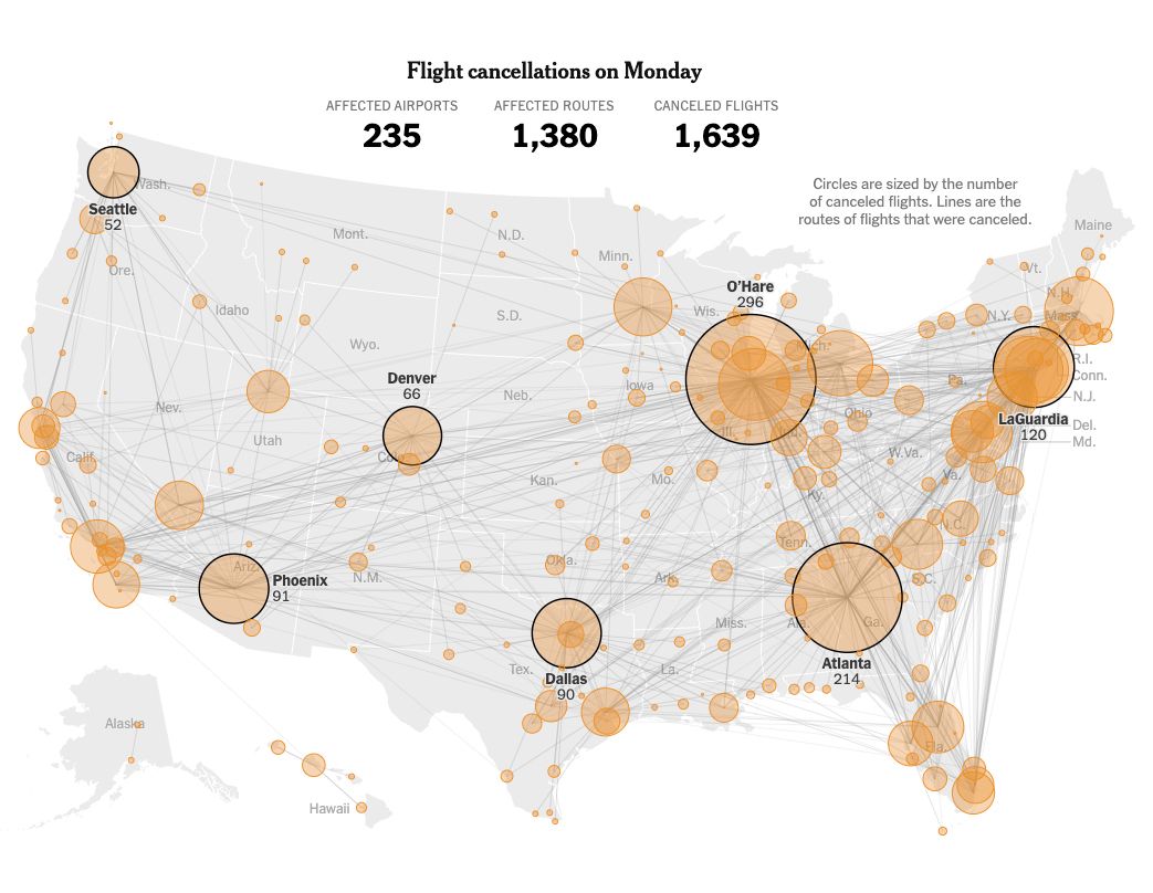
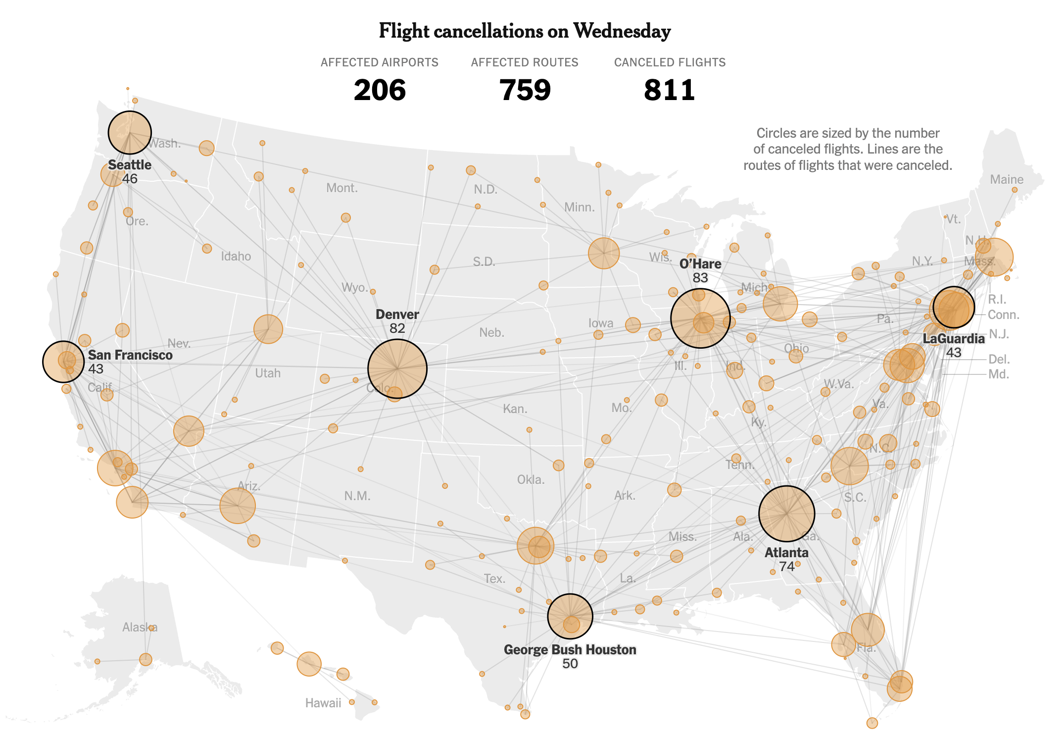
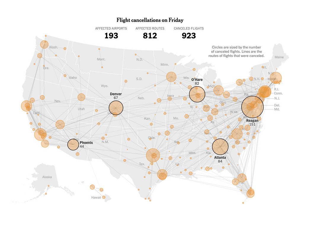
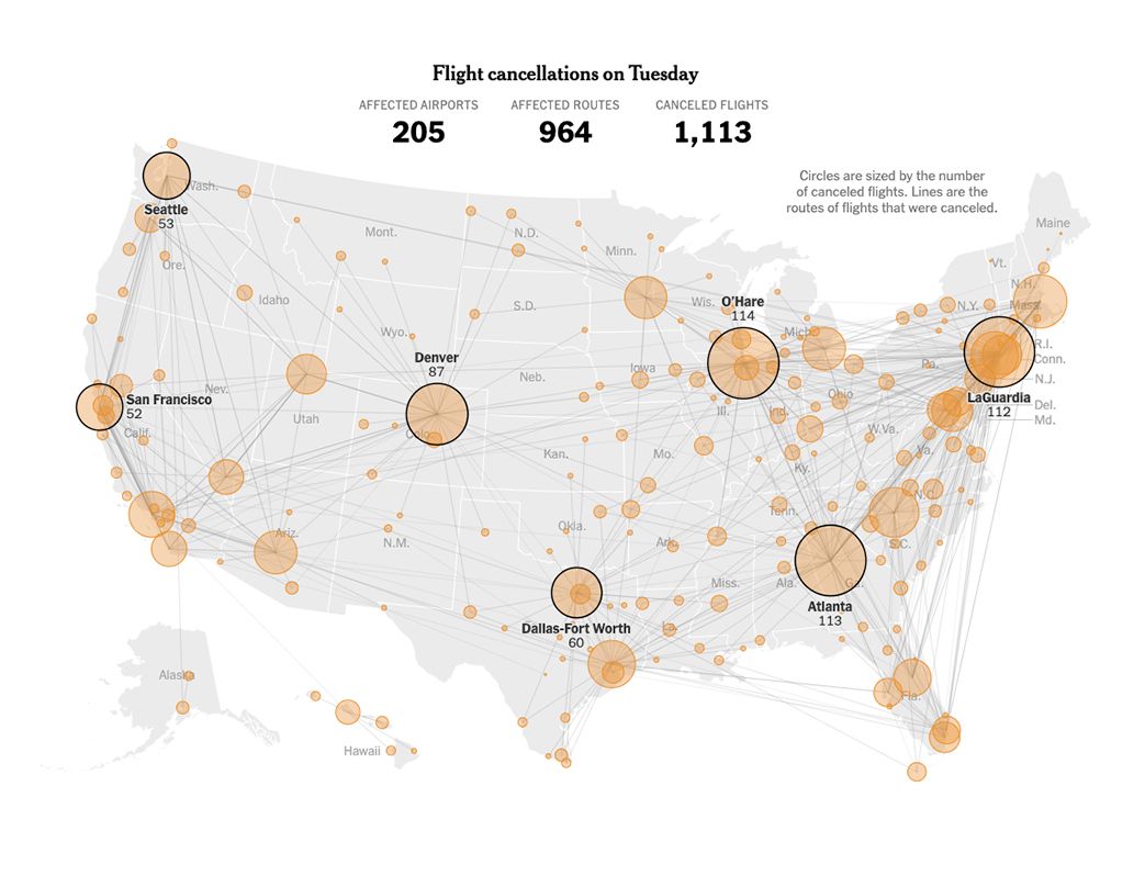
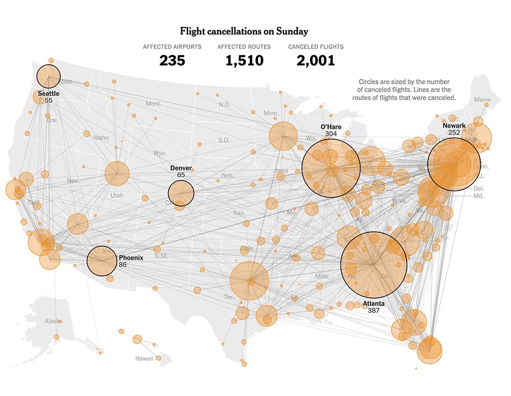
November started with news from the U.S. Federal Aviation Administration responding to the Government shutdown and preparing the people for delays and cancelations across the U.S., I spend a few days preparing data updating maps and sketching ideas to react to the event. Eventually another project pull off from the effort but my colleagues continued to update the story for about a week, some days even with updates in the morning and in the afternoon.

A bunch of colleague and I jumped into the most rushed project I have worked this year so far.

Earlier this year, while I was on assignment in Korea, I collaborated to a breaking news piece looking at the flash flood that killed several in a camp site in Texas. After that, some of my colleagues continued to look into data simulating the water levels of that night.

However, the rush begun when the lawyers send a heads-up to the Times saying they were suing the camp for what happened there. Basically we talk to both sides and got access to exclusive information with way details that we know before. All of this under one condition, whatever we publish, we have only 5 days to do it before all the material become public.

In such a rush, a few of us rushed to the camp to fly drones collecting lidar to create a 3D model of Camp Mystic, take photos, do interviews, process data, create animations, maps and setting everything that usually would take minimum a month.

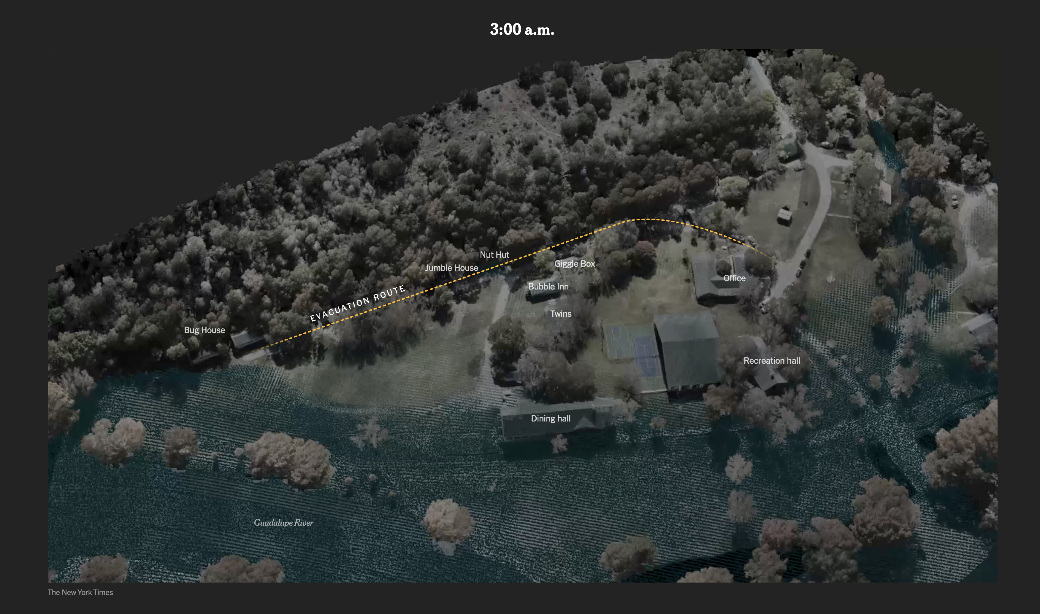
It was a tremendous effort from my colleagues, I helped a little bit putting together pieces and helping construct the narrative, I think now days my roll is less and less in the heavy production and more into the support of others helping with concepts. You can take a look to the piece here.

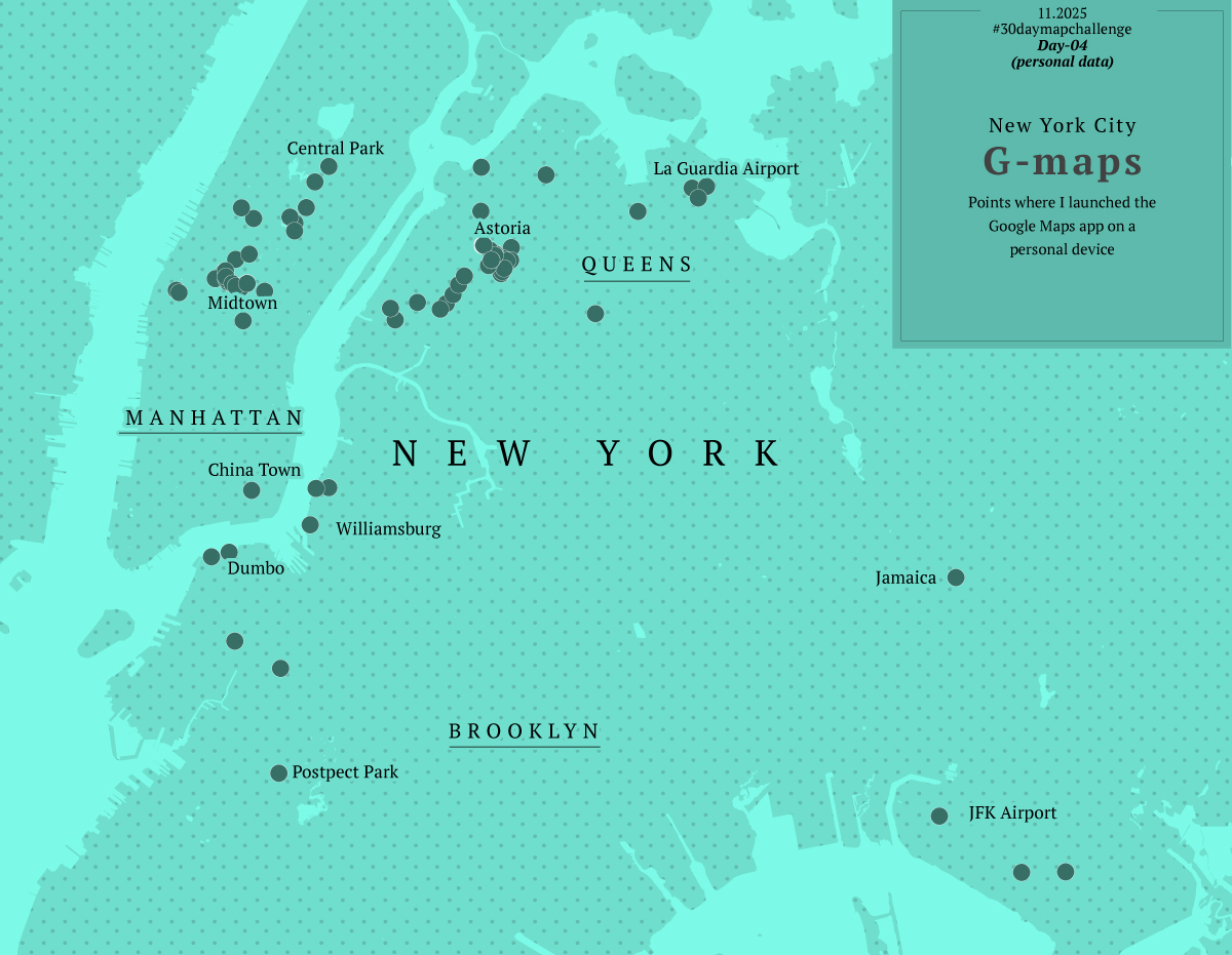
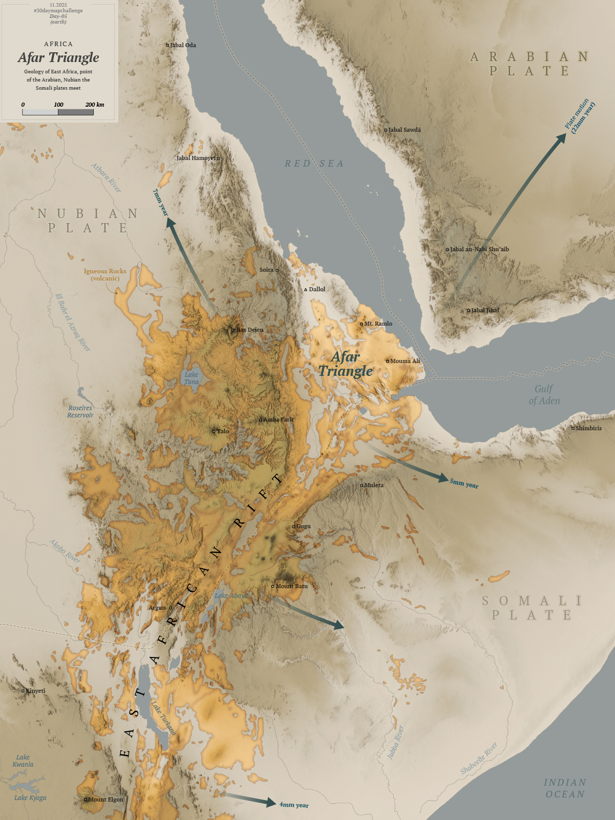
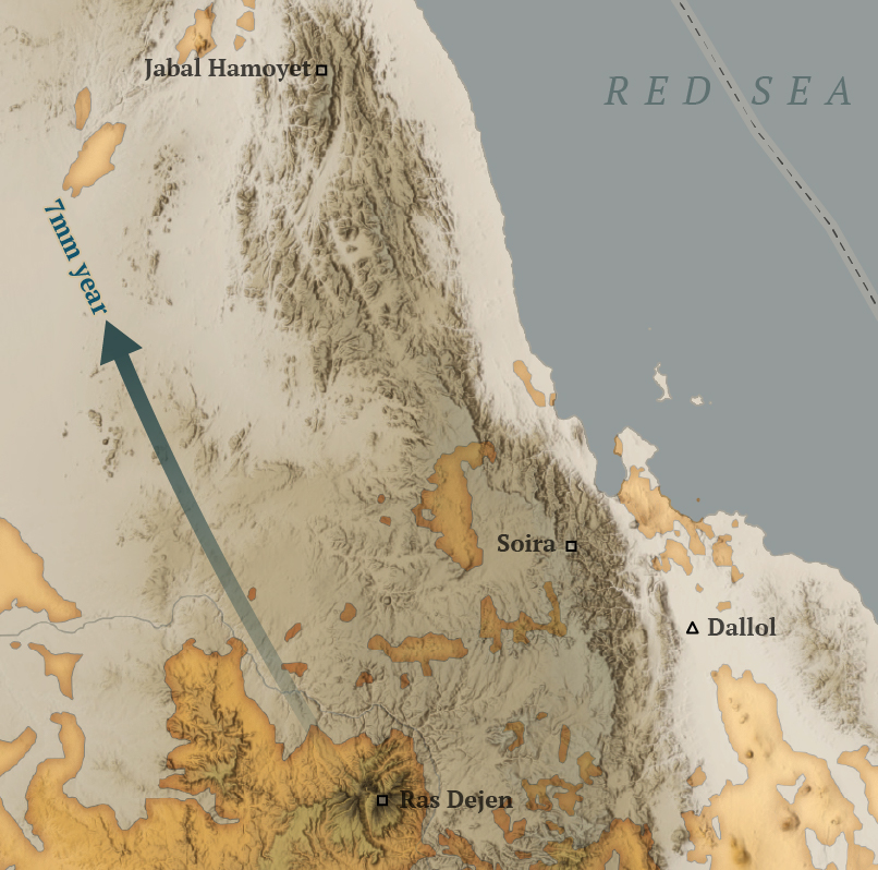
November was also the moth for the map challenge, yeah one more challenge, why not?

I was in the mood to do the whole challenge following the prompts they publish earlier. However, things rarely go as planned. My own curiosity and procrastination caused my to derail from the goal, and projects like the Texas flood reconstruct added the final stone to the idea. You can read a little about me setting obstructions to this idea in one of my infofails post here.

Anyway I managed to do a few maps to join the celebrations. Of course, not on time nor the whole series. I like the one about aircraft because it has additional context, not just a map, but a little story behind. You can read about it in my mapping blog here, just look for entry number 16.

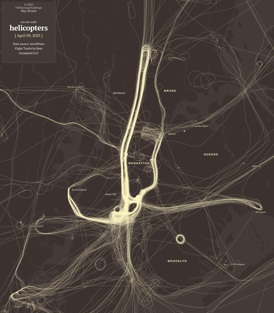
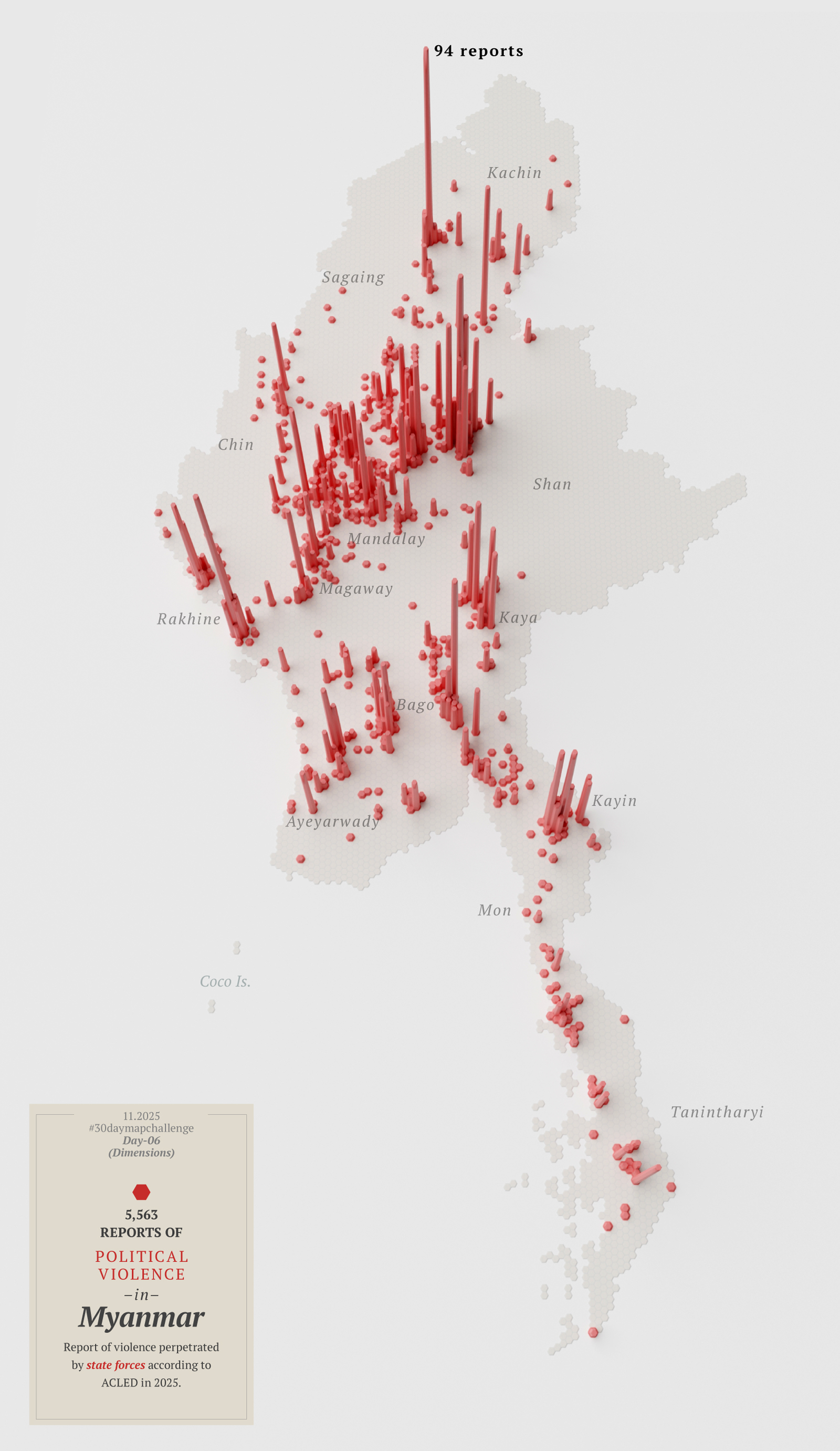
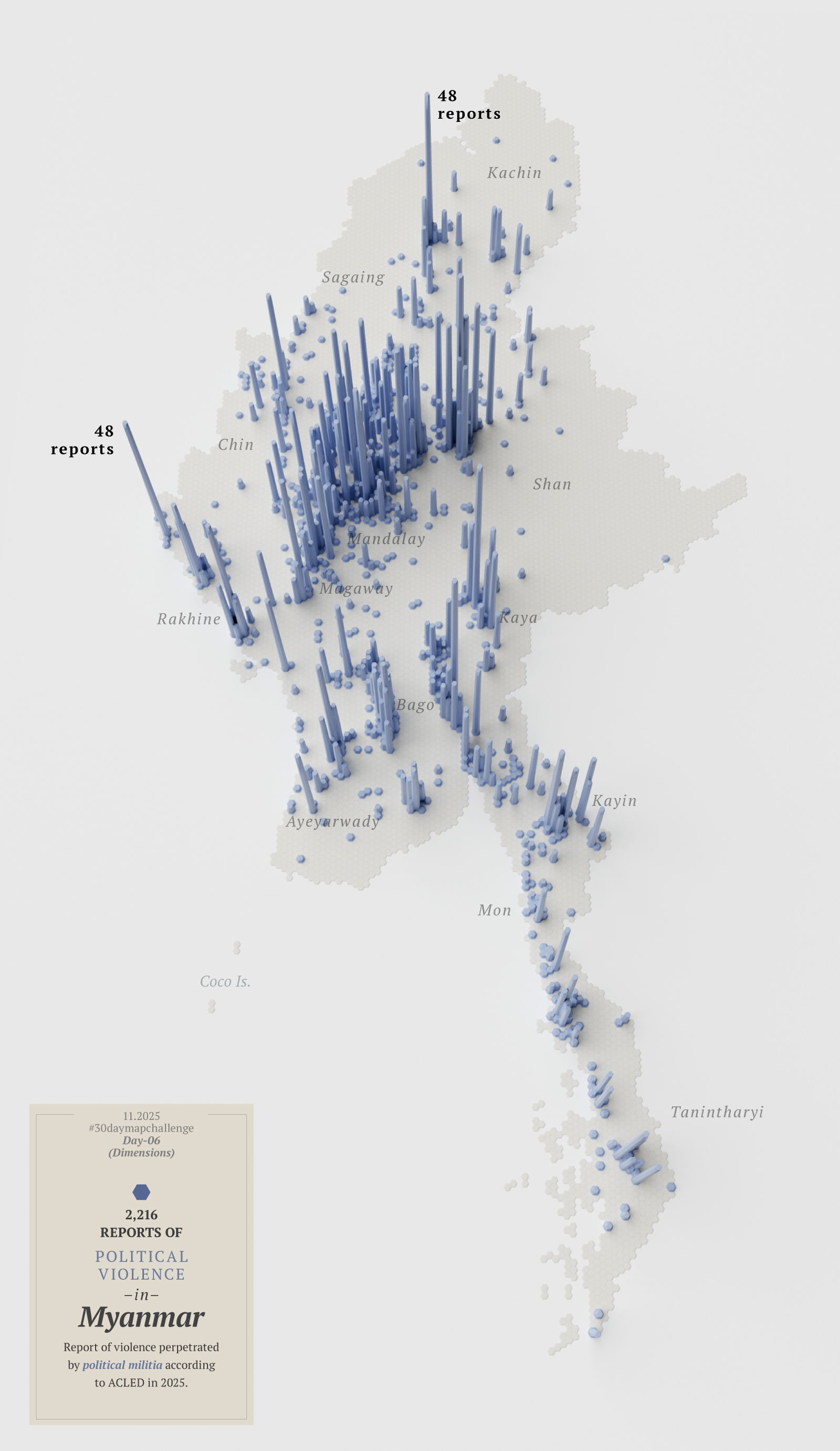
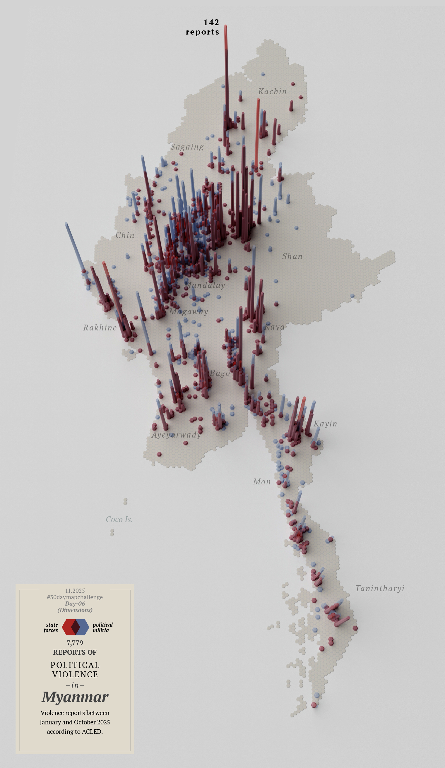
Some other maps like the one of Myanmar’s political violence also made it, that one was in the highlights of Datawrapper’s Dispatch. It was nice to see it there because even tho the whole thing did not ended up like I wanted to, some people appreciated the few pieces I managed to do.

November was heavily packed. In the last week of November we published one more piece looking at the situation of one the city’s biggest headaches, the Cantilever section of the Brooklyn-Queens Expressway. It’s a section of road carrying 130,000 vehicles every day, today is 70-years-old, it’s falling apart and to this date (Nov. 30, 2025) there’s no consensus on how to fit it.

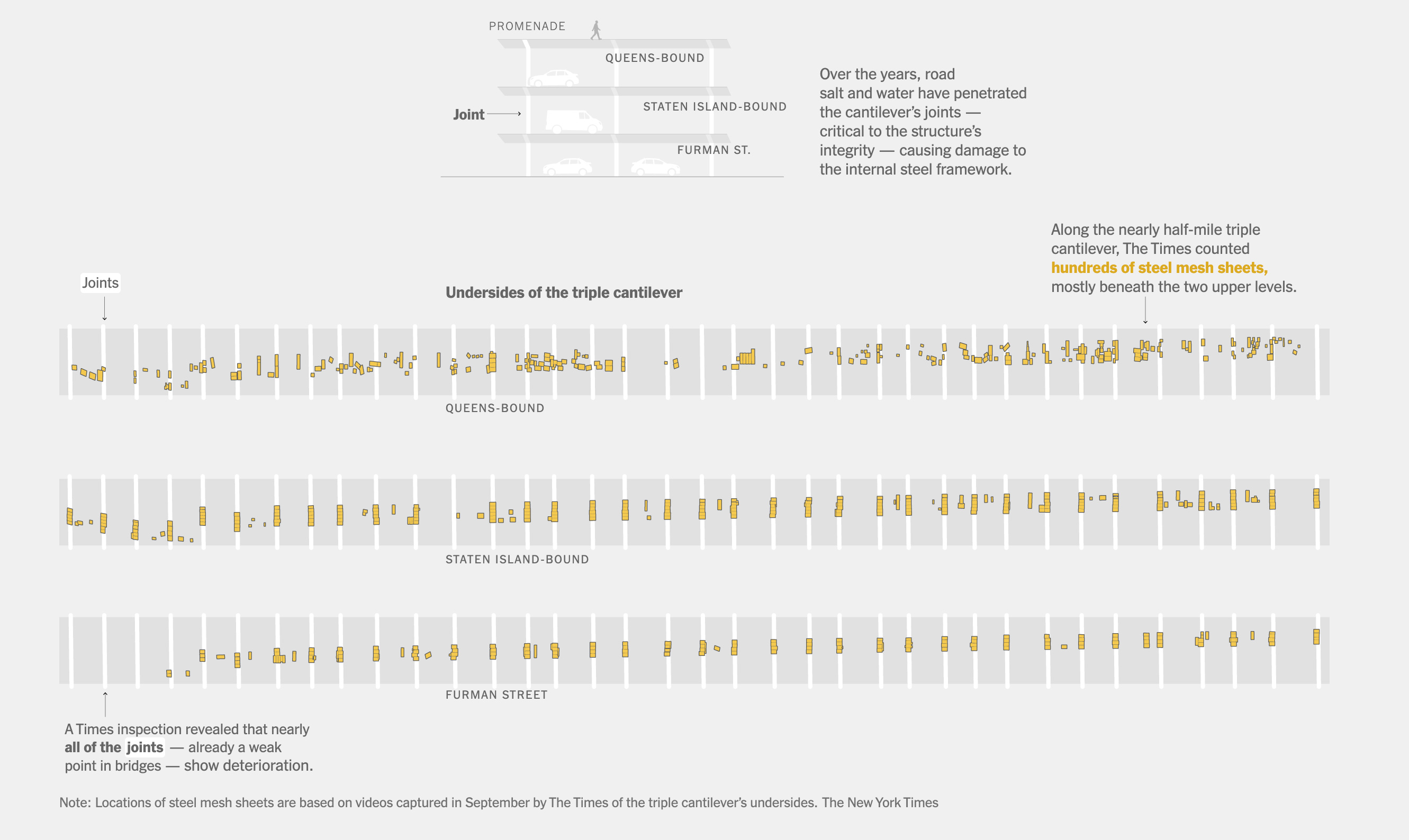
The piece is full of 3D renderings, maps, video, photo and illustrations, but one of the things that I enjoyed the most was to conduct a visual survey of the piece. We rented a car and drove up and down in the crumbling structure to document with 360 footage every single patch that the city has installed to prevent pieces of the cantilever to fall on top of passing-by vehicles. It was almost like our own version of google street view but way more detailed and in crazy high resolution. You can see a glimpse of the 3d footage in this promo video we did.

In November I jumped into the scenario once more for a live interview with Reuters reporter Ben Welsh. The interview went around our practices in journalism, trust in data, collaborative reporting and a touch of the surge in artificial intelligence. The event was organized by the School of Visual Arts, SVA in the frame of the launch of their new Data Visualization and Communication program. Here’s a recording of the interview:

Students, Rhythm and Ballrooms

December kicked off with a talk to a class from the Craig Newmark Graduate School of Journalism at the City University of New York (CUNY) hosted by The New York Times. It’s nice to wrap-up the year with one more session for students.

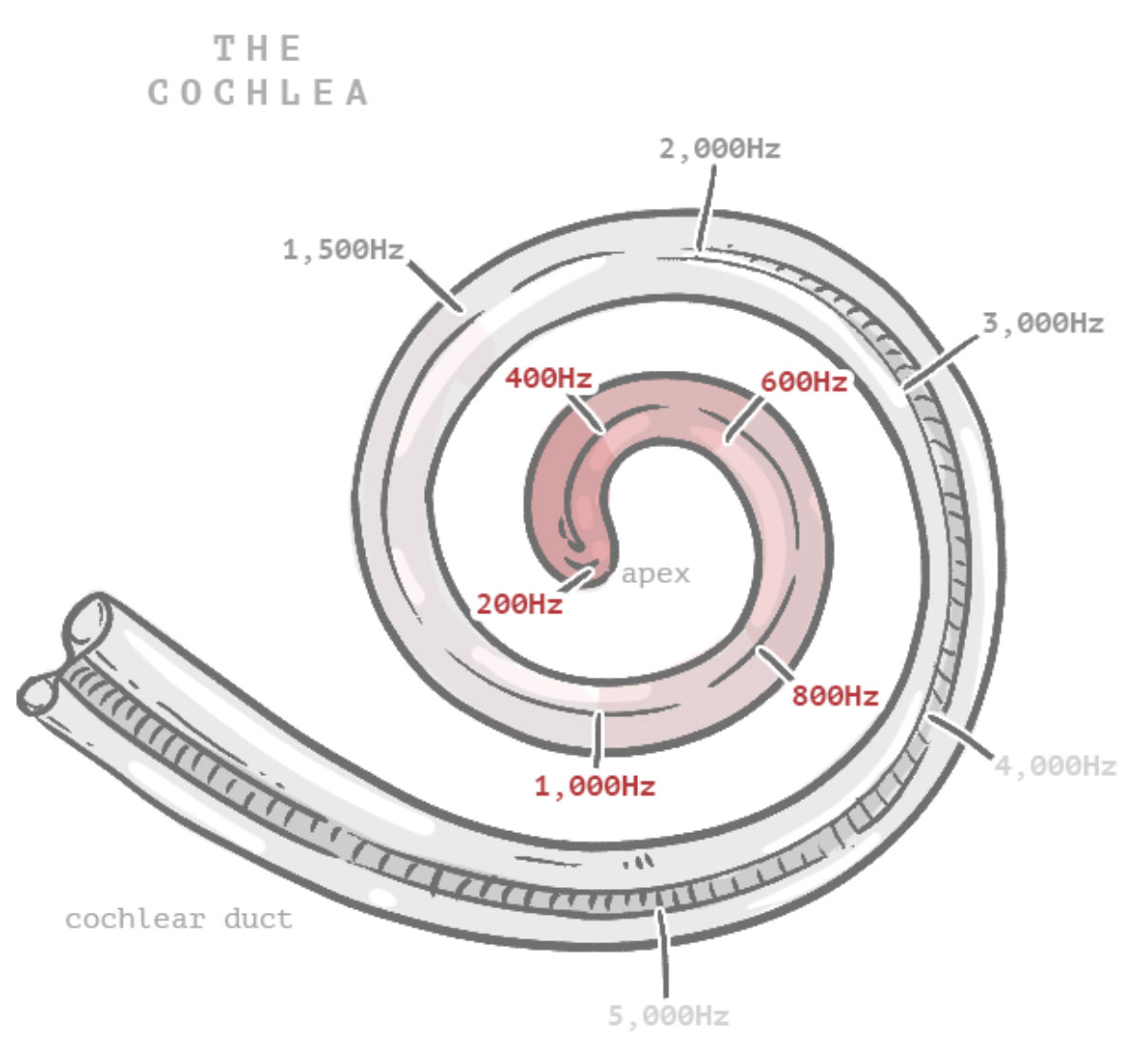
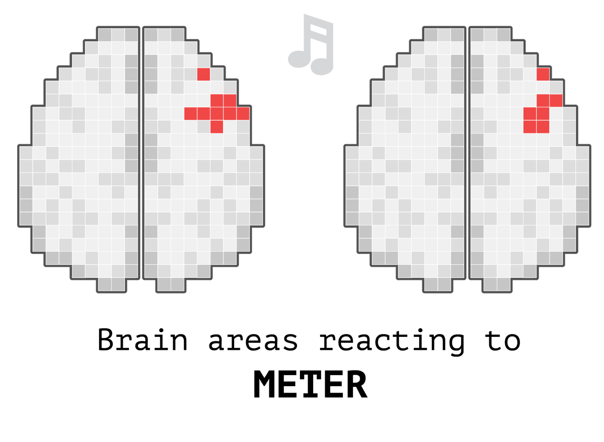
This month I’m adding a new section to my website, I’m adding little stories with interactive features, some animations and touches of humor. It’s like a playground to me where I want to put stuff I found interesting about random things. You can dive in with me into some slightly nerdy topics on my website; this month I’ve prepared a story about sounds and rhythm.

–Rhythm. MH Playground.

Before the year ended, discussions about White House renovations resurfaced. The first of the month concerned the details of the ballroom renovation plan, after the president announced he would change the architectural firm in charge following constant disagreements.

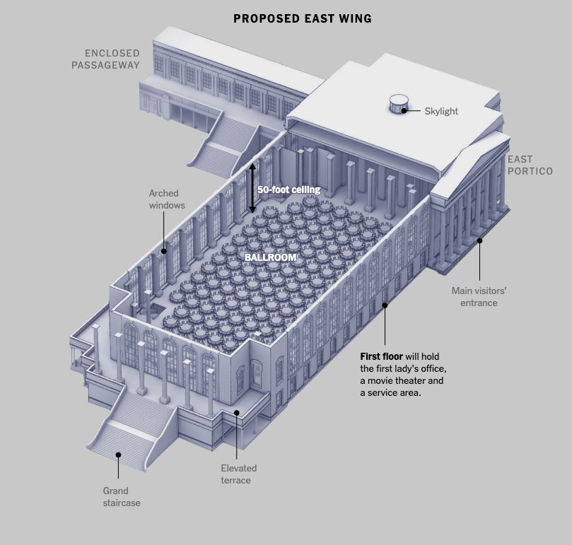
You can take a look to some 3D models we did here to show the latest know about the multi-million project of the Trump administration for the White House.

In the next few days we will be publishing one last story to close out the year and get some rest. Meanwhile, I wish you all the best in this new beginning and a productive and prosperous 2026!

…see you in 2026, ho ho ho.

Some collections along the same line:
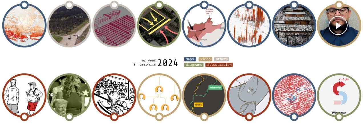
Standard
A detail of a map showing the Afar Triangle in Africa
blogging, Digital pieces, infofails

infofails: how to fail at the 30-day-map-challenge in 2025

Every November map makers from all over the world join the challenge to create maps from a common thematic. The list of prompts is posted few weeks earlier in October I think. The initiative is similar to inktober, same idea but doing illustration which happens (yes, you guessed it) in October.

An image from Inktober2025
An Illustration from Inktober2025 posted in the inktober Substack, [image by @angelo_dimartino_art]
A map posted to the #30daymapchallenge 2025 [ A map by @Michael Pincus ]

Both are things I’ve follow all the time and really enjoy; however, I never had the courage to join either for one simple reason: my obsession with commitments.

I love the work the creators do for both initiatives; I deeply admire people who can take one of these opportunities and successfully made it.

In October I told my family that I was thinking of joining this year’s map challenge. My son and wife saw me and said, “Okay, how many maps do you have already?” to which I enthusiastically replied, “One… maybe”. They know my obsessions so well that no more words were required.

😒

After a laugh, I told them I was worried about starting something like this because if I didn’t finish it, I’d be stressed. The days went on, and when November arrived, I didn’t have many more maps, so my attempt to join the maps celebration turned into one more episode of Infofails. And then here’s how it happened:

Day 1

The excitement was through the roof; my plan was to create a different styles for each map, I could also work on a different region with each day theme… Yeah, what a wonderful plan.

To kicked off, I went with a in minimalistic vector style, maybe places in the middle east? –I thought– So, I downloaded data points using the QGIS geoparquet plugin and set out to funny thematics.

Day 2

Second day theme was lines, so what about visualizing trains network in NYC? Here’s what I ended-up with:

But then, just like in cartoons, that little voice over my shoulder started saying: Don’t you think this wants to experiment a little with animation? Nothing complicated, perhaps one of the things you already have installed like MMQGIS… And so everything began to go off the rails.

Day 2 (take 2)

I turned that static map into a sequence of images using MMQGIS. With not much sense actually, but who cares? It’s all about having fun, isn’t?

Day 1 (take 2)

Then I thought, hey, I also have more points showing other things for that one map of the UAE, what if I revisit day one as well? So instead of having one map for day one and one for day two, I had 20 frames for the NY trains, and 12 maps of the UAE showing different things. Here you have some of those maps showing fun stuff:

Okay, no problem, there’s still plenty of time, I thought. Yes, of course, I’ll keep my anxiety quiet and make it simple with the others.

Day 3

The next challenge was about polygons, so I chose to explore the biodiversity of Central America.

I think learning things is the fun part of doing these maps. To explore biological diversity the Conservation Biology Institute offers a great dataset. I actually learned about a thornscrub area in Guatemala that I didn’t know about before.

Detail showing the Motagua Valley thornscrub (in gray)

After pushing the limits a bit too much in the previous two maps, I kept this one pretty straightforward. Perhaps the #30daymapchallenge is about doing simple things that don’t require you to spend days and days searching for something.

A map of Eco-regions in Central America

Day 4

Day four was about personal data, this was fun because I learned how to pull out data from my Google Maps app, simple yeah, but I never thought about this before.

I exported my data and grabbed all the locations where I launched google maps. Fun stuff, I selected 5 cities I visited this year and mapped out where I pulled my phone out to see a map and start navigating. Fun and creepy, not sure if you want this data to be publicly out even in an abstract way like in the map below, but it was a fun exercise.

Way too much fun. Again instead of 1 map, I ended up with 5.

Day 5

For this one I wanted to do something in Africa, I started to explore the topography near Somalia in the search for a singularity with data enough to map.

After looking a different sources and things from here and there, I decided to map the Afar Triangle, an extreme corner of the continent in the great rift valley in eastern Africa. There, a triple junction of plates pulls in opposite directions and different speeds, just to mention one extreme thing happening there.

Here’s my map of the Afar triangle:

A map of the Afar Triangle in Africa

The northern point of the triangle is below 100m under the sea level, it’s also the hottest place on Earth and it has hypersaline hot lakes. What a place, it deserves more maps than I can do.

A view of the Dallol volcano in the northern area of the Afar Triangle where some of the hypersilane lakes are.

The region is also home of the oldest human ancestor, Lucy who died and probably lived its life in the Afar Triangle some 3 million years ago.

A detail of the Afar Triangle map showing the Dallol volcano in the picture further up in this post.

So far so good, I was having so much fun learning new things and procrastinating like a pro, then I looked at the calendar and November was almost here! 😳

Day 6

I was feeling a little more confident I thought I have learn the lesson with distractions. Maybe it’s not a big deal, maybe I take these things too seriously, because the thoughts that I’m running late or failing constantly haunt me. Sometimes I can’t sleep thinking I’m falling behind. Non sense I know.

As November approached, I made day 6.

A map with dimensions to show political violence in Myanmar. Visualizing reports from ACLED to a 10km base grid.

Then I thought about looking at the other side of the coin; that map in red above represents violence perpetrated by state forces, so maybe I needed another map showing the counterpart…

Or perhaps I didn’t need two maps, but a single map that combined both reports. Then I noticed I had mixed up the data and perhaps I should start over with this map…

By this point I knew I‘ll never make it, so I decided to leave this one for a quick review later and bring it on to funtography.

I posted some there already if you want to see them bigger or with a little more context.

Day 7

By day seven I reached the breaking point.

The calendar said November 3rd, and I hadn’t finished anything, I didn’t like that much the first 6 maps I did, and I was walking in circles thinking on how to re-do all of them.

Feeling discouraged and frustrated, I gave free rein to one more idea—something between a poster and a map. I looked for train stations in several cities and finally decided on Berlin just to try a different location with available data.

My idea was to see where I could go within a 250m radius in a wheelchair using trains. I’ve never been to Berlin, so probably my idea is in the wrong approach, but I thought of dividing the city into 250x250m squares.

It’s very likely that wheelchair users travel distances greater than 250 meters (approximately 270 yards) as part of their routine, but it must be a tremendous effort to do so for half a kilometer (just 2 of my squares).

Green indicates accessible stations, red inaccessible stations, and gray areas are built-up areas that are out of reach.

There are some adjacent areas in green which is good, but also many red squares, meaning that if you go there in a wheelchair it’s almost a 50-50 chance that you’ll be able to get out of there where you need to. In short, it seemed to me that if you are limited to one or two squares, in the big picture, it’s more about where you can’t go than where you can go.

Here’s a version with a bit more context, a heart-shaped areas representing blocks with accessible stations, Black circles marked with x are stations without wheelchair access; all other x’s are areas where there are buildings, but without nearby access to a station. I added little dotted lines to the adjacent 250m blocks with accessible stations.

A detail of the accessibility map.

And the whole area with the broader region:

It must also be considered that the demand to access these places is not the same; the areas with more hearts, near the city center, are accessible and perhaps are the areas that people need access to the most.

For all these reasons, I abandoned the idea, got stuck trying to solve it, and ultimately ended up killing the idea of ​​entering the #30daymapchallenge on time for each day.

The lessons I learned from this:
[ 1. ] Keep your ambition in check if you want to achieve something bigger little by little.

[ 2. ] Avoiding procrastination is difficult, especially when you’re passionate but not good on something.

[ 3. ] An finally, I need more free time somehow. 😂


About infofails post series:
I believe that failure is more important than success. No one sets to fail as a goal, but by embracing failure I have learned a lot in my quest to do something different. My infofails are a compendium of graphics that are never formally published by any media. These are perhaps many versions of a single graphic or some floating ideas that never landed.

In short, infofails are the result of my creative process and extensive failures at work… and I fail frecuently:

01: Wildfires
02: Plastic bottles
03: Hong Kong protest
04: The Everest
05: Amazon gold
06: The world on fire
07: A busy 2021 kick off
08: Olympics
09: Floods
10: Doodles for news
11: Random Failed Maps

12: The Mismatch
13: Mapping Taiwanese Food
14: Mapping Damage in Ukraine
15: Mapping destruction across the U.S. in 2024

Standard
Soviet T-Series tank with modifications and Abrams tank with anti-drone custom protections
Digital pieces

Backstory: Mad Max-style vehicles on the front lines

I’ve reported on different aspects of the war in Ukraine since I joined the New York Times. I have done hundreds of maps and gathered my thoughts with documents, interviews from experts, and chats with my colleagues about many aspects of what’s been going on in Ukraine for years.

You would be surprised about the many pieces projects leave behind in the sake of editing. But sometimes those “unseen” elements can come back, maybe even as a whole new story, and that’s exactly what happened recently with this piece we published titled “Tanks Were Just Tanks, Until Drones Made Them Change”. Take a look there if you haven’t seen it already, then come back here if you want learn more on how that piece was born.

The New War in Ukraine (Feb. 2025)

Back in February, I was working on a piece to show how the battlefields in Ukraine were changing due to the intense use of small drones. The introduction of those little unmanned attack units changed completely how the front lines look.

The New York Times.

It’s true that drones have been around for a long time; they are not a “last-year” innovation, but they have never before been used as intensively as in Ukraine. The war now is fought mostly with First Person View (FPV) drones and many other unmanned vehicles.

Ukraine maps from Feb. 2025 story about drone attacks. The New York Times. 

That piece from February touches slightly on how tanks started to appear with improvised structures on top. Known as “turtle tanks”, they look nothing like a regular tank; soldiers added structures on top as a way to reduce damage from drone attacks.

We used photos on that story to illustrate the turtle tanks. 

Among the many materials we got access to, I saw videos of a Russian workshop showing how tanks were being repurposed to become transport vehicles. The inside was just a box with layers and layers of protection, including even tree logs to shield from the drone bombs. Really fascinating aspect on how vehicles were dealing with the increase in drone attacks. I did a quick doodle to describe that, but since the piece’s focus was a little different, I actually cut it off since the photo was serving the same purpose.

Unpublished doodle of a repurposed tank, Feb 2025 Story, [ SQ. reference #1 ] The New York Times.

Then jammers came in to tackle down wireless drones from the skies, so pilots started to use miles and miles of optic fiber directly connected to the drones so they can keep control of them and get over the jammers… And there is where things get wild once more for big targets like tanks and vehicles in general.

I was involved in other projects, and the time went on, but the idea came back after a conversation with one of our correspondents who has been to the Ukrainian battlefields many times. Thomas (TM) has a lot of experience when talking about guns and war in general. He was a Marine himself. TM continued to think about the various types of tanks and vehicles in Ukraine, and with his expertise on the subject, it was easy to convince me to take a closer look. I did some cursory research and found a wealth of material.

The hunt for turtle tanks (Aug. 2025)

In my regular process, I start with a text document where I add links, notes on elements relevant to the story, visual references, names and emails of potential experts to interview, references to similar articles, and in some cases, some draft paragraphs that could later help define the structure of the story. Then I add everything to a drive folder to keep the reporting doc alongside PDFs, videos, photos, and any other material I might need later. I keep everything I find forever… or maybe until something extraordinary happens.

An screenshot of my reporting doc. The New York Times

Visual references are very important. Social media like X and Telegram are  good ways to improve the understanding of the structures. I often keep every link with a little context of what it is about, the original link, and some sort of initial categorization that might help to group things later. As a visual storyteller, I think it’s important to explore themes for your sections. Perhaps things can be grouped by common characteristics, chronology, aspect, or function. That kind of grouping, if possible, helps give a sense of harmony to the story.

Perhaps the only downside to social media material is that it takes time to verify it. You must navigate through many precautions, including copyright, veracity, the tone and source in which it was shared, among others. I spent about 2 days chasing links and references this way. Below is a mix of some of the references (both social and wire-sourced) I used for the drawings and the article itself. At the end, I discarded about 80 images and videos from social media for diverse reasons.

thumbnails of photos and videos from various sources
Some references from photos and videos about turtle tanks and vehicles with additional protective structres. The New York Times

Luckily for me, our correspondents and news agencies have extensively documented the turtle tanks, and I only spent a few hours searching the archives for verified images from photographers I could use in the story. Way easier, but I think it’s always necessary to check as many places as possible before actually starting the production.

Drafts for a new story

Once the research phase was over, I dedicated myself to making a very basic structure with some doodles for some visual moments in the piece and writing some paragraphs to guide the narrative.

Projects at the New York Times require a google document where we drop text and parameters for components, it’s mostly Svelte and Archie Markup Language (AML). The tanks project looks like the image below from the main driving document and its wired to a package of local code files with a back-up in Github.

We use the same document to write the text and manage the components, including the visuals and any other features or functionality we add to the page. My role often includes creating a draft with the basic ideas written down to serve as a guide if I’m collaborating with someone else, as in this case. Of course, as you can see here, my expertise is not writing, but it helps to wrap up the ideas to engage better with the story. Sometimes, I do the whole piece on my own, including the words (my apologies to the copy editors who might have headaches with my text). However in this case, TM would be the one writing the final copy, so I didn’t want to interfere too much with the text anyway.

Hands on doodles!

About a week later the next stage began, up to this point I hadn’t even seriously touched my Wacom to start sketching. But it’s impossible to start that without doing research, adding a structure, and connecting some web components first.

I defined the tank models I would need based on the references, documents, and stories I found during my previous process. I needed at least one Soviet T-series tank and an Abrams to reflect what had happened on both sides of the battle. Even with the intention of making the piece interpretive, the first step for me was to make some rough doodles, then model some guidelines for the illustrations using Cinema 4D, then returns to photoshop and finally to illustrator for labels and other stuff.

A doodle of the piece, 3d model and final sketch.
Preliminary drafts and renders, Photoshop > Cinema 4D > Photoshop. The New York Times

I didn’t model all the structures, just basic guides to maintain proportions. Here you can see how I did some basic geometry to guide myself later in photoshop on the free hand-drawing.

A render ref for the soviet tank made with Cinema 4D. The New York Times

Then, with the images I collected, I gradually drew the improvisations the soldiers had made on the corresponding tanks. The final versions were sketched in Photoshop, 3 times the size of the publication to gain some detail in the final result.

I usually sketch using photoshop, I have some sets of custom brushes and define layers for each piece separately. Overlaying color by layer also helps to highlight parts of the sketches. Here’s a view of the master document for the soviet tank modifications. The New York Times.

Finally one more step to add labels and play around with the layout and text blocks if required. Below an early version of one of the graphics.

The New York Times.

This was going to be an illustrated piece; I was clear about that from the start of the conversation. Illustrations, in general, help unify a piece visually. While it’s true that not every story can be solved with drawings, sometimes the abstraction of doodles and even their imperfections provide the reader with a bit of room for interpretation.

However, it’s good to accompany these types of pieces with some photos to show the real evidence. After all, it’s not that I’m imagining these vehicles; each one must come from reality. That ethic still distances us from artificial intelligence, even if only temporarily.

Some of the tanks in the piece published. The New York Times

If you look back to the top of this article and find SQ. reference #1 you will see the the diagram we did not used in the February story, in the most recent piece I turned that into a scrolly explaining how the modifications transformed the T-Series tank into a troop-transport vehicle.

Published version of the SQ. reference #1 above. The New York Times

Because of the way our team works, once the pieces are published online, I have to move on to the next project. Part of the graphics team at the Times is dedicated exclusively to graphics for the print version. 

That means I have to prepare pieces for one of my colleagues in that group, along with another editor. The text is repurposed so it makes sense on paper. Occasionally, I have to produce additional asset at a different resolution or with particular specifications, like when I use animation, but often I’m already working on another project, as was the case with this one.

Print edition of the New York Times, Sept. 18, 2025.

The print version was published today in the US, you can take a look to the double page and a little detail in the front page if you have access to the paper.

Thanks for reading, and see you next time!

Note:
–Although the images in this post are part of my production process, they are property of the New York Times.–

Standard
Digital pieces, infofails

infofails: 2024 mapping destruction across the U.S.

A while ago I started to look at the API of a company that does high res aerial imagery overlapped with FEMA’s damage reports. Truly it’s a great and detailed resource, here’s an example of the data, each dot here is a building classified by FEMA after a weather disaster, in this case a 2023 tornado in Little Rock, AR:

Data sample from VEXCEL API.

My original idea was to putt together all the destruction in 2024 across the US. And to some extent, I managed to extract all the information and create some visualizations that look like pages from a book written in an ancient language. Below is an unpublished piece with buildings damaged throughout 2024 by natural disasters such as hurricanes, fires and tornadoes, the area in detail is the just the ones affected by 2024’s hurricane Helene:

A detail of the non-published piece “footprints of damage”

The abstraction of taking footprints out of the map was a fun idea, I think that shape allows you to see beyond the location, you can compare buildings, some states show larger damaged buildings, others are super tiny, also you can notice that there are places with larger clusters of damage due to certain events, works well to show scale of damage, but it’s a quite deep graphic with many layers of information.

I learned a lot from this project, for example I printed out SVG maps with the building footprint by county. But the dilemma was how to take each polygon and reposition it into line-blocks without changing the scale… That to thousands of polygons in different files. Python and js helped me out to read each of the 73 maps I got and align groups of buildings into these blocks.

I wrote my own script using svg.js, then a colleague sent me over this other nice way to re-arrange svg shapes using SVGnest, so fun! maybe this can help you if you are trying to achieve something similar.

An example of SVGnest.

However, looking at where all that happened is interesting, so I did a series of state maps to visualize clusters of damage. I created grids of 5km and counted how many buildings fall into each quadrant using one of the point analysis tools in QGIS. Then I took the result to blender to create one map per state like the one of Florida below.

The animation showed one of these maps per state while counting the cumulative number of damaged buildings each time a new state was added until each record for 2024 was complete. That for +57,000 footprints.

Focus shift

In a turn, I found that 2024 was a very active year for tornadoes, I did some interviews to researchers in different universities and found out more and more interesting data on these events, so the story went from mapping damage across the US to report on how intense the tornado season was in 2024.

All tornado tracks in the US between 1980 and 2023. Based on data from NOAA. (Green the most recent 20 years, gray the oldest. Same data as the one at the top of this article but in single shot.

I did used a little fraction of the footprints I prepared for the original story, but I guess this reflects how sometimes the stories can evolve into something else, talking to people might make you realize that there’s another interesting angle of things.

You can read more about the company providing the data for footprints and HD imagery on the tornado story I published at the Times here: [ UNLOCKED STORY LINK ]

A screenshot of the published page at the NY Times, Dec. 2024.

Tornadoes turned out to be super interesting, there a lot of caveats on this data from NOAA, the CDC, FEMA and the private company doing the imagery. I guess my infofail here was spending too much time trying to map every damaged building in the U.S.

Digging into the data a little more and talking to experts can save you time and maybe, as it did for me, even give you a new perspective on a story you want to tell.


About infofails post series:
I believe that failure is more important than success. One doesn’t try to fail as a goal, but by embracing failure I have learned a lot in my quest to do something different. My infofails are a compendium of graphics that are never formally published by any media. These are perhaps many versions of a single graphic or some floating ideas that never landed.

In short, infofails are the result of my creative process and extensive failures at work.

Are you liking infofails?, have a look to previous ones:

01: Wildfires
02: Plastic bottles
03: Hong Kong protest
04: The Everest
05: Amazon gold
06: The world on fire
07: A busy 2021 kick off
08: Olympics
09: Floods
10: Doodles for news
11: Random Failed Maps

12: The Mismatch
13: Mapping Taiwanese Food
14: Mapping Damage in Ukraine

Standard
Digital pieces

2024: The year in graphics

We’re leaving another year behind, and as usual, I like to close it with a summary of what I’ve seen, shared and created during the last year, so here we go:

––––––– :::: 🗓️ ::::: –––––––

January: Santa’s surprise visit

2024 started slowly for me. In the middle of the snowy days, I did a quick trip to DC to boost my inspiration with the museums of the city and of course meet some good friends who live there. But one of the most delightful moments of last January was when I returned to the office on the first day after vacation. That day there was a mysterious package on my desk, it felt like a late visit from Santa, a wonderful book compiling cartographic works of Xemartin Laborde. I enjoyed a lot looking at the maps that Xemartin kindly shared with me.

The rest of January I spent it doing research on extreme weather events. And of course, looking a few times more Mappemondes and talking about geography with my son. Once more thanks Xemartin!

––––––– :::: 🗓️ ::::: –––––––

February: Satellites

Back in February I was collaborating with the Climate team, Mira Rojanasakul and I did this piece explaining how the US East Coast is sinking, based on a recent study using radar technology onboard of the Sentinel constellation. I did a lot of iterations for this project, from maps styles to charts, illustrations and following up interviews with the scientist too. I spent some time looking closely at this data, looking for AOIs in various forms including levees, roads, bridges… I even looked at old records like this area of ​​Massachusetts mapped in 1838 to which I overlaid SAR detections (in red) to see where the land is sinking:

I had a lot of nerdy fun with this project, here’s a piece we did not used explaining one of the many issues this phenomena causes, copy was not proofread as you might note:

––––––– :::: 🗓️ ::::: –––––––

March: A trip to Texas

In March, I made a trip to the border with Mexico with a couple of colleagues to report on the takeover of a section of the border by the National Guard. The story was titled “See How Texas is Testing the Limits of State-Run Border Control“.

We used a drone to fly over the Rio Grande in the area controlled by the military, we also spoke to locals to see how their routines had changed after the waves of immigrants and the military presence. 2024 was an intense year for immigration issues and it is likely that this coming year I will do some more reports on the subject.

––––––– :::: 🗓️ ::::: –––––––

April: Gaza & Georgia

In April we kept an eye on the situation in Gaza, and I was part of a team tasked with investigating the deployment of the floating dock that the US intended to put at the disposal of Gaza to facilitate the entry of humanitarian aid. The project failed and ended up being dismantled. You can read more about that story here.

For that project I was working with Cinema 4D, but I’m using Blender more and more. That was the last thing I did in C4D in 2024, not sure if I would need it again in 2025. Should we all move to Blender anyways?

At the end of April I took a few days off and went with my family to northern Georgia and North Carolina, we spent some great days near Chatuge Lake and in the town of Helen GA, a super nice short vacation in the mountains.

––––––– :::: 🗓️ ::::: –––––––

May: UCLA & Minneapolis

In May I collaborated with the Times Visual Investigations team to produce this breaking news piece showing How Counterprotesters at U.C.L.A. Provoked Violence, Unchecked for Hours.

That month I also took the initiative to travel on my own to Minneapolis to be inspired by the best of the Design Society that held its annual competition there, but also to see so many friends and colleagues who came together for a few days in this city from different continents.

May was also a month to monitor the development of the war in Ukraine, in the middle of the month Russian troops made an incursion near Kharkiv, I reported it with a map of the area showing Russia’s sudden push across Ukrainian lines.

––––––– :::: 🗓️ ::::: –––––––

June: Ukraine

If you know me, you know that since I joined the Times I’ve spent a lot of time reporting on the war in Ukraine, I’ve made hundreds of maps, charts, diagrams and so many other things, but finally publishing this project that we had in our hands for about two years was felt really good.

In addition to the main story, we published a few other pieces like this video where I give a little more context to what we did, and if you follow this blog, of course you’ll remember the backstage story I posted here.

Hello Chicago!
In June I also traveled to Chicago to attend for the first time The Outlier, a conference organized by the Dataviz Society. I really liked it because of its diversity. You can find people from very diverse sectors with great energy it’s a great community. Of course, what we all there had in common there was that we all work with data to tell stories. If you also work with data and want to see for yourself, in 2025 it will be in Miami, I’m sure it will be great again.

Love to see an screenshot of my map at Kuhu Gupta talk at #outlier2024 we add those little things to provide a better context to our readers of what they are looking at.

Marco Hernández (@mhernandez.bsky.social) 2024-06-13T15:27:46.252Z

––––––– :::: 🗓️ ::::: –––––––

July: Los Angeles & Milwaukee

This year I have traveled a lot within the US. At the beginning of July I was in Hollywood giving a workshop at the annual conference of the Association of Hispanic Journalists (NAHJ). I’m very pleased to know that many attendees started to use the tools and sources that we shared. Helping others who are at the beginning their careers is very gratifying for me.

Run Marco, run!
Upon my rushed return to New York over a weekend, the very next day I grabbed my Secret Service credentials and prepared to travel to the Republican National Convention in Wisconsin. The Times sends several reporters and photographers to these events, so it doesn’t make much sense for us to do exactly the same stories, so we focus on doing pieces with a twist.

My colleague Ashley Wu and I went there to listen, interview, and sketch scenes we encountered at the convention to capture the atmosphere of the convention un-staged, you can see all 20 scenes here.

––––––– :::: 🗓️ ::::: –––––––

August: Back to Chicago

In August I was back in Chicago, and my colleague Ashley and I traveled to the DNC to replicate the same format we published with the RNC. The experience was a bit different as expected, but it was an interesting exercise. You can see all the 20 scenes we captured from the Democratic National Convention here.

––––––– :::: 🗓️ ::::: –––––––

September: Scrolling & a train to Boston

During September I collaborated with colleagues from Times Magazine, basically we were investigating the actions that Trump had described up to that point to use the judicial system and other methods against his political adversaries. Here’s a nerdy fact: This scroll-driven piece was built with After Effects and an internal tool that spits out json files, those files are then interpreted by Svelte components to generate the story you can see. If you want to read more about that story here: Trump Wants to Jail His Political Adversaries. Here’s How He Could Do It“.

Hello Boston!
I spent the last days of September in Boston with my family. We walked a lot to enjoy the magnificent architecture of the city and its museums. I already have plans to go back there to share some slides and stories from my work with the students at Northeastern University.

––––––– :::: 🗓️ ::::: –––––––

October: Roads & Whales

In October I collaborated with the talented Leanne Abraham and a few other colleagues on this story about how things are much more difficult if you are a Palestinian driving on the streets of the West Bank than if you are an Israeli. You can read more about this story here. My role this time was very much tied to narrative analysis and video editing, but I loved seeing Leanne’s process, I have a lot to learn from her to make better maps.

In October I did a quick collaboration with the Climate Desk to tell the story of Squilla, one of the last remaining right whales, and the challenges her species faces. Learn more about Squilla here.

––––––– :::: 🗓️ ::::: –––––––

November: Polls time

In my case, it was weeks of preparation, hundreds of graphics, concepts and templates that I created in anticipation of the first US results coming in. Personally, I was astonished at how quickly things moved, as all the maps quickly turned red… and you know the rest of the story. The first thing my team published was this piece showing the trend of shifting to the right, that’s the screenshot above.

Then the following day we published a second piece looking closer to the decisions made by different groups in swing states. We introduced these “snake” graphics in the piece titled “See the Voting Groups That Swung to the Right in The 2024 Vote

I did a lot of pre-sketching to conceptualize those graphics using test data, but it’s hard to predict what the final result would be, a lot of the pieces we designed and programmed weren’t used, but it was necessary “just in case”.

A new website
Shortly after the elections, I launched a new website too.

I'm starting a new page to put all my mess in one place. I added a bit of humor with little illos all around. The plan is to have an arcade of pieces I've worked on, illustrations and maps from my blogs and some other stuff. You can check it out here: mhinfographics.github.io

Marco Hernández (@mhernandez.bsky.social) 2024-11-08T22:49:37.797Z

I’ve been working on this for a while because I felt like everything was so scattered here and there. I’m still making improvements and I hope to eventually consolidate everything into one place so I don’t have so many separate domains, but I think it will take me more time.

––––––– :::: 🗓️ ::::: –––––––

December: tornadoes

Earlier this year I went down a rabbit hole to understand the data behind tornadoes a little better. Shortly after, by coincidence, I also stumbled upon a company that does damage analysis after natural disasters; the data was just astounding, so I held onto it for a while before pitching the idea with the goal of coming up with a slightly more solid draft with some real data, aerial imagery, and maybe even a super detailed graphic of all the destruction from the year across the U.S., or that was my idea in my head, you might saw the story of how that went few days ago.

But anyway, the story turned a little bit into a more specific and narrower angle, I had the opportunity to learn a lot from many researchers I spoke with, it was a nice way to close the year doing maps and charts. You can read the piece here if you want to learn more about it, its an unlocked link for you. I still have a few more things in the works, but since vacation mode is coming, these projects probably would be in my 2025 year in graphics, leading January as the new beginning.

2024 was a wild year at work, I wish you the best in this new beginning.

See you all in 2025, Merry Christmas!

Some collections from previous years

Standard
Digital pieces, infofails

Visualizing the destruction in Ukraine: A years-long project following satellite clues

In June 2022, with a very basic understanding of the SAR technology, I started to use Sentinel-1 data to report on the progression of damage in Ukraine. Shortly after, Tim Wallace, our Editor for Geography connected me with Oregon State University, Jamon Van Den Hoek and City University of New York, Corey Scher, two leading researchers in the field of InSar sensing. They have been using this technology for a long time and were also exploring its use in Ukraine shortly after the beginning of the war. They have also help us to analyze the development of destruction in Gaza more recently.

Corey and Jamon help us to process terabytes of data to flag areas where structural changes happened. The first rounds were a challenge, the data is so sensitive that it was influenced by things like vegetation, soil conditions and snow. Things like mining activity, construction areas and train stations represented a challenge too.

A mine in Poltava. Red marks flag changes happening in the surface. BASE IMG BY PLANET LABS.
A port area in Odesa, red flags showed up probably due to vegetation and the moving shipping containers. IMG BY PLANET LABS.

Somehow we needed to filter out all of those things. I was doing a roll of analyst testing the data the researchers provide with HD satellite images. I spent weeks looking at the areas flagged to find things that maybe interesting to highlight later, but I also encountered weird stuff, which is normal in early stages of data analysis.

The image below is an screenshot of one of the many QGIS files I created to explore things in different ways, the rectangles there are areas I flagged for myself to follow closer.

While exploring the data, I also noticed these long straight lines, which seemed to be the data tiles overlapping or something.

Looking down from space

I used QGIS, the Planet explorer, Maxar imagery and Google earth to crosscheck the data and be sure we were pointing at real damage related to the war and not something else.

Hundreds of buildings destroyed block after block after the battle for Mariupol, this is a detail of one of those blocks. IMG BY MAXAR, May 2022.

Every corner of the country had its own story to tell, some bettern known like the case of Mariupol, but during my exploration I learned about many places I had never heard of before, many villages that were destroyed far from the media spotlight.

A destroyed school in Izium. IMG BY PLANET LABS, March 2022.

In the satellite image below, the town of Kamyanka, in Kharkiv, shows the remains of what were once homes. When you look closely, you can notice the multiple craters, presumably caused by explosions.

IMG BY MAXAR VIA GOOGLE EARTH. March 2022.

Google has being updating imagery in Ukraine, this is one of those places you can easily see with Google Earth. As I’m writing this post the buildings are still in ruins accordingly to the image from August 29, 2022.

Damaged buildings… but what type: houses? stores? military?

I used OpenStreetMap to identify some of the damaged buildings, however, even tho OSM has a lot of good data, I needed more to fill the gaps.

Around June 2023, Microsoft Bing released a great data set of millions of structures in Ukraine, so I merged it with my existing OSM records, and ended up processing +17 million of building footprints. But it was also a nightmare, I tried to use Google Cloud and a few more things to get overlapping records with the damage flags, short story… all collapsed. –I probably set it up all wrong.

Finally I found a quicker way using a script python, reducing the time of cross check from weeks to a few hours running the code in my laptop overnight.

After overcoming that hurdle, I began collecting evidence of sensitive damaged locations.

I first identified schools, but I accumulated hundreds of these images for hospitals and churches too.

New data sets were back and forth, from that first version to a better, more precise and clearer one including additional months of data. Meanwhile I was going through hundreds of photos, fighting and shelling reports and other damaged related information. We accumulated so much data since the war started that it took me weeks to classify all of it and get a better sense of the mayor events happening in different cities.

Photos from our correspondents in the ground and wire providers also provided dates and places to confirm damaged records in certain locations.
I also explored social media for evidence of damage, like this footage of a warehouse in Partyzanske in Mykolaiv Oblast, media by Мужской Клуб Донбасса via Telegram here: https://t.me/donbass_mens_club/3691

A dosage of ‘infofails’

If you have read my blog before, you know what an infofail is. But just in case, I tend to save pretty much all the stuff I do, even if it’s just for my own understanding of the information. Here’s a little of a wonderful date set I spent a lot of time in, but we left out of the project.

I did a lot of sketches to understand the data we have from fires, some seemed to align to the front lines after plotting the data like in the image below showing clusters of fire detections in a year.

Fire detections from various satellites clustered in grid cells, the darker the cell the more fires registered. Front lines data via ISW.

As I mentioned, we abandoned this data for editing reasons, but also because some months showed some sort of alignment with war events, and others just weren’t very clear. One idea I have was to use the large amount of photos we have showing explosions/fire in certain locations where the satellite also picked up a thermal signature.

I also rendered a 2022 country wide “calendar of fires” (see below), there’s one row per month, taller and warmer colors represent more fire activity, some months match intense battles around the country, unfortunately other seasonal fires were also blended in the data.

From a csv file with values of thermal detections, rendered in Blender.

In the image above, January is at top, note the 3rd line were the columns are taller and warmer. That matches when Russia launched its full scale offensive over Ukraine.

But the data also slightly varies by region, so I also did 2d graphics looking a different locations, including a few more data and in different sorting of time.

Sketching data

As time went on, I continued sketching maps and other visualizations for this project. This was not full-time dedication, while working on this project, I published 17 other projects and explored about 15 more that led to nothing or are still in progress. So I had to do quick and easy things to distribute my efforts. But let’s take a look to those quick sketches.

Part of my process is to annotate screenshots, just to remember things later. Below is an area of ​​Kharkiv, highlights in red are buildings damaged during the first months of the war in 2022.

This probably turns out to be obvious, but I found it quite interesting to see how in the first versions of the damage data some patterns emerged, the damage followed the roads leading to the cities. Can you see the lines too?

I spent long hours just exploring the map, turning layers on and off, adding before and after HD images, making things jump off my screen. Most of the exploring was made using Felt, Google Earth, Google spreadsheets and QGIS, screenshots and annotations on photoshop by copy+paste portions of my screen.

I did a lot of maps reporting on different of battles in other stories, so, some places seemed more familiar to me. Somehow the shape of the damage logs matched what I saw before, and that was a relief.

But also, other things, where it seems like the data tells a story that I can’t confirm. In the timelapse below, using the ISW control areas, you can see how perhaps Ukrainian troops tried to take this city, as the front lines move away, the records also cease.

Areas of control by ISW.

Ukraine has a huge territory, so I identified regions to look closer, sometimes because the change over time was interesting, or because the amount of damage registered. I guess my interest was too wide, I selected almost half of Ukraine, these are some quadrants I was interested in explore deeper:

Just to be clear, explore deeper mean I went on looking for more images, reading reports and blogs about what happened there… It took me months, but I did explore all of them.

I also did some sketches using 2d geometries based in the totals of area damaged per settlement.

I also sketched some of cities data through time using photoshop:

Then modeled in blender using an early version of the data, just to get a sense of a few cities and how they compare to each other. Note the colors are key in time, older records are cold (blues) while more recent are warmer.

Modeling data

We also tested some building height data, following the idea of ​​full 3D transitions from the photos we had of the Marinka town where we focused our story.

Transitioning concept from drone footage, to the city 3D model, to a satellite image.

We changed the top sequence a few times, but it was always focused over Marinka. The concept was to look close to a building with meaning to the residents, then scale to a street, to the town, to the region, to the country. That setting up to the reader the scale of data we analyzed.

Early concept to show damage recorded in Marinka

Here you have some of the first demos I did using the data on a larger area to eventually move the camera far enough to see the whole country.

Workflow

To get you an idea of my workflow, I started with a set of geotiffs, shapefiles and geojsons. We applied some python to filer the data and focus on the things we wanted, clustering data in different resolutions, then added all into QGIS to export tiff layers out. I used one black and white file for each feature, one for water, one for land, one for how high each polygon should be, one for color highlights and so on.

I like to use QGIS to wrap-up everything, but I feel better styling the data in photoshop, so some of the work in styles was done there, mostly color using the black/white tiffs as a mask over solid layers.

Then I exported a layer out of photoshop with colors and overall styles, plus one more with the elevation data matching the same crop from the original QGIS outputs.

Those tiffs went to blender to be rendered as 3d objects.

From blender, I moved all to After Effects. There is handled the timing, labels and transitions, a custom built script takes each layer and exports a single json file for the web component. The file includes the basic properties as position, styles and timing. The svelte component takes that and arranges the assets depending on what device you are watching on.

I tested a few different set ups changing styles and clustering, here’s one of those versions with a flight-over camera.

I did a few versions more just to find the one that feels right. Sometimes happy accidents happened like this inverted render, which is nice but not the thing I was looking for:

some more versions…

and versions…

Binary maps and storage

Many more versions later, I did a series of custom cities showing only buildings colored by damage as true/false. Red is damaged, by this point we were in the version 40 of the data, 1 terabyte of maps, photos, videos, scripts and many other assets. I bought an external drive for this project, every time I was going to move files I left my laptop running for a day or two to make sure I didn’t lose anything.

But that was just a little portion of the data we used. Corey and Jamon, the researchers you meet at the top of the long page, accumulated more than 50 times more data than me to get the right data set for this article.

Around +40 versions later, we landed in the definitive data set.

Introducing the story for readers

The story was almost there, but some small tweaks here and there, mostly in the copy side and technical descriptions, but there was yet one more thing to take care about, and that was explaining and introducing this to our readers in the home page.

I prepared still images and animations for this purpose, the video colleagues also help me prepare a reel that would be shown on the main page and on social networks. Basically me talking about the project, you can see the final version of it at The New York Times instagram account here.

Preparing the print

We usually go first on the web, then on print. So that means after we hit the publish button, I started to plan the pages for the print edition with a different team. Even tho we are using the same story as base line, the way of presenting things is different, new pieces should be produced taking into consideration the requirements of paper.

The process was sort of similar, first preparing assets in QGIS, render out black and white .tifs to be later used as color mask in photoshop, then merged in a color layer plus a black and white layer with the heights data baked in. Then those 2 layers went to blender to get the final base map. Annotations and other small details were done in Adobe Illustrator.

Blender setup for print.

A few different versions went around, because we move it to the front page, some small charts of context were dropped off. Here some of those early testing versions, some even with a few errors:

The print edition was published today (June 22, 2024) on a special format displaying the large map and a few more pages inside wrapping up the whole story with adaptations of the original content. The print team did an exceptional work, they have a lot of experience in getting the best version for the readers out there.

I started exploring this project in June 2022, and today, two years later, I find myself reading the last piece of the project finally published, there’s a sense of relief to know that I fulfilled the mission of reporting on this very relevant topic with such a display for the New York Times.

Thanks for reading, and don’t forget to buy this special edition of the paper.

Standard
Digital pieces

2023: The year in graphics

As we prepare for the next year, it’s always nice to remember what we spent our time on during the latest Earth’s lap across the orbit. So, here’s a collection of my favorite details at work and other things I have done in 2023.

January: Wild weather

The beginning of the year was full of extreme weather events. We covered some, including the flooding in California, I was immersed in the coverage of the war in Ukraine, but, I did some maps that were not published, among them, a flood map showing the extent of the water using SAR data, and a count of buildings affected by the flood.

January was a month to think about all that I do, and no one sees. I thought that maybe, some of that stuff could be helpful to students or other professionals who are starting their careers. So I made a post showing how to visualize global temperature with data provided by NASA. Quickly I started to receive questions about it, so, I did my best to answer them all. Thanks all of you who reached out.

A map in Atlantis projection showing Surface Temperature Averages at 8am, Jan. 4, 2023

Later I learned some journalists around the world published stories with visualizations using my tutorial. It was very nice to know that I was able to help and I would love to do more of this next year when my other responsibilities allow me.

––––––– :::: 🗓️ ::::: –––––––

February: The next stage of the war in Ukraine

At the beginning of the year we were trying to find clues about where the war in Ukraine was going. Military analysts gave us some opinions as to what the objectives of both sides could be for the spring, although none of the forecasts were accurate, we were able to create a series of maps explaining the aims of both sides.

I always make basic maps and draw things on top of them, like when you use a marker to explain ideas to your colleagues. My editor saw that and convinced me to publish a version of the maps with marker-like styles. You can see the piece at the following link without a paywall: The War’s violent Next Stage.

––––––– :::: 🗓️ ::::: –––––––

March: War and Basketball

Earlier this year, all eyes were on Bakhmut. I did some pieces about how the Russians were slowly advancing from the east towards the city while the satellites captured the destruction caused by the fierce battle that the Ukrainians fought trying to maintain their positions.

But small projects also come while we are doing some other long or mid-term stories, like this one I helped with to cover college basketball player Caitlin Clark. The main visuals in the piece are photocompositions showing several of the player’s many shots. The images show the distance and position of each shot as if it were captured in a single photo.

––––––– :::: 🗓️ ::::: –––––––

April: The fierce battles in the Donbas

After months of pouring resources into the war, we analyzed the progress of Russia in Ukraine in 2023, the declarations of taking over the Donbas were not accomplished, and in fact, the progress was reduced to just 4 small settlements. I particularly liked the concept of inking the streets according to whether they were either Russian or Ukrainian held, highlighting the urban areas a little better.

You can read the piece at here: How Russia’s Offensive Ran Aground.

––––––– :::: 🗓️ ::::: –––––––

May: The fall of Bakhmut

In May, the battle for the city of Bakhmut that we had covered for almost a year finally reached a favorable outcome for the Russians when they managed to take the center of the city. We made a series of maps showing how the Russian forces slowly moved to engulf the city.

––––––– :::: 🗓️ ::::: –––––––

June: A busy month of publications

Since I joined the Times team, on average, every month I have published two or three stories. But June of 2023 was a pretty intense month, I reported on breaking news like the train crash in India, the Kakhovka dam breach and the smoke from the Canadian wildfires. I also did other mid-term stories like the tragedy of the submersible that imploded in the Atlantic while trying to visit the Titanic wreckage, I also reported on the sudden rebellion of the Wagner forces marching towards Moscow, and another story about people using little figurines to protest against war in Russia through Instagram.

Almost at the end of June, we published an analysis of the challenges that Ukrainians face in their counter-offensive in the south of their country. The story shows some of the obstacles along a strategic 21-mile stretch that the Ukrainians must navigate if they wish to make their counteroffensive effective.

––––––– :::: 🗓️ ::::: –––––––

July: Paper editions

The print edition always comes after we publish our stories online. And since the story of those 21 miles of obstacles was published near the end of June, it wasn’t until July that the paper version was published with the help of the print editors.

July was also a special month, I also received my copy of Nightingale magazine, where I contributed with an article about my reflections on things I have learned in these twenty years making graphics in different media/continents.

––––––– :::: 🗓️ ::::: –––––––

August: Incognito mode

August was a month completely dedicated to a long-term project I’ve been working on for over a year now. As I write this post at the end of November, my hopes are that we will be able to publish very soon. I think once we publish I’ll be able to make a long #infofails post with all the stuff we won’t use including things like this:

But since I still can’t share much about it, I leave you an image of something else from August:

One of August’s entries of my weekend hobby at sundaysketchbook.art

––––––– :::: 🗓️ ::::: –––––––

September: Natural Disasters

In the first week of September, an intense earthquake hit a mountainous region south of Marrakech, causing extensive damage to villages and leaving a high number of deaths and missing persons. During that weekend we made a series of maps to report the situation with various updates as we received updates.

Just a few days later, a storm system over the Mediterranean Sea wreaked havoc in Libya, especially over the city of Derna where shocking images showed how the water swept away the city. The rains were so intense that huge temporary lakes formed in the desert, some big enough to be seen from space.

––––––– :::: 🗓️ ::::: –––––––

October: NY + Amsterdam

Reporting and preparing projects on Ukraine continued throughout this month. However, I was able to take made a quick pause to participate of Information Design Conference in Amsterdam for a few days. I shared a little about the work we do at the New York Times and my personal interests while I’m away from work.

But I have to say that the best part was the wonderful people I had the opportunity to meet there, including some well-known names in the data visualization field based in the Netherlands.

––––––– :::: 🗓️ ::::: –––––––

November: The war in Gaza

A conflict that has been active for many years intensified at the end of the 2023. It is a really complex and delicate topic, so it’s not wise to provide opinions behind it. However, in November we took the initiative to gather information to report on the structures that are under Gaza and that have been documented by various sources including both sides of this conflict.

From the perspective of military experts, the piece shows the particularities of the tunnels in Gaza.

November also brought a very special moment for me as Ball State University invited me to their campus in Muncie, Indiana to receive the great honor of the Majeri Award.

Even though my trip began by forgetting my phone in a taxi in New York before entering the airport, the conferences with the students and every moment of that intense week were memorable.

––––––– :::: 🗓️ ::::: –––––––

December: A chance for a snowy xmas

I’m not sure how intense this winter will be, I wrote this post at the end of November and we already saw a few snowflakes this week in New York City. Last year we barely saw snow in New York, the winter was very mild here, but maybe there is a chance for a white Christmas after all this 2023. I collected data from the US National Ice Center (usicecenter.gov) to make the map below showing the extent of the snow. The purple spots are population density from the SEDAC (sedac.ciesin.columbia.edu).

I promise I’ll make a tutorial to create snow visualizations soon. I did those maps above to see how the snow is already dancing around the north pole, but maybe we can run a story on snow if this winter turns out to be extreme (hopefully not).

Snow map November 30, 2023. US National Ice Center

Anyway, that was my 2023 in graphics.


Once again we say goodbye to the year, but before I switch into holidays mode, I want to thank all my colleagues at the Times, this was a great year, I couldn’t be more grateful to be able to share my days with all of you.

And to you all my www-friends, I wish you the best in this new beginning. Happy New Year!

See you all in 2024, Merry Christmas!

Some of my old collections

Standard
Digital pieces

2022: My Year in Graphics

Looking back at what was the year has become a tradition. Each year has brought a great diversity of projects and 2022 also meant a complete adjustment of life. In the midst of changing media, countries, schools, etc., these were my favorite details from the graphics that were born during my first year at the New York Times.


January: A new year, a new purpose

January was a tough month of transition, I spent a lot of time doing paperwork, looking for a place to live, and settling in at The Times. The learning curve on the internal tools and ways of producing it turned out to be longer than expected, but in my spare time I had some space to try out some new terrain processing stuff to start what would become almost a year in maps.

One of the things I enjoyed the most was playing with the elevation data to render images like the one above with Blender. It’s a bit of a fiddly setup, but once you’ve got it, it can spit out some really nice base maps.


February: Winter olympics ❄️

A month later, I was little more confided about the environment and the first graphics started to bloom. I enjoyed being part of the team covering the Winter Olympics. I learned a lot about disciplines that until this point I completely ignored.

Eileen Wu Jumping at the Freeski Big Air competition. Winter Olympics Feb. 2022.
Screenshot of the interactive feature. Photographs by The New York Times © 2022.

Some of the pieces included photometrics, 3D transitions, and basic vector graphics as well. The process was very effective, even though the competitions were at crazy hours for New York (like starting work at 3 am) the pieces were ready in a matter of hours, just in time for you to enjoy over breakfast. That was possible because of the collaboration of the team, many of us working together for each key competency, but also because these things were so much easier to achieve with the internal tools that the team has produced.

Learn more about this story

If you haven’t seen it, or want to refresh your memory, you can enjoy one of these pieces here:
https://nyti.ms/3sn959n

In my opinion, some of the coolest things were these almost-real-time pieces our team produced for social showing the performance of the skaters:


March: War.

By the end of February, the war in the Ukraine had arrived. However, in my case, March was the starting point of a coverage that has kept me busy all year. Hundreds of maps, 3D models, diagrams, illustrations and more have been the tools to inform our readers about the unfortunate stories that this ruthless war has spewed.

I’ve worked on dozens of updates to our breaking news maps page. This page is a quick response to events happening in Ukraine due to war or related issues, each entry delivered in a “small capsule” format that is published in no more than a few hours in a single shift.

Some of the maps from our coverage of the war. The New York Times © 2022.

Learn more about the featured story

You can access the Ukraine maps page here: https://nyti.ms/3hiygbu

Perhaps the most complex aspect of this page, in addition to the short times to create the entries, is the collection and verification of the information, which is often an arduous task. With the passing of the months, posting have become less frequent, but not because we left the coverage, but because many topics were deepened on a separate page since a small informative capsule was not enough.


April: The worst of human kind

Working in the news exposes you to know the worst of humanity. It’s true that in the coverage of a war you do not expect to receive images of fields in bloom, but sometimes it can take you to visit the lowest points of the human kind. The map below is part of a dark history of the bodies of Ukrainians murdered in the streets of Bucha, a small city north of the Ukrainian capital. These were civilians, who in addition to being killed in their own town, could not find respect and peace until the Russians left.

The New York Times © 2022.

Here’s a compilation of the coverage posted on twitter by the NYT:
https://twitter.com/i/1513524818368516110

The same week we were working on that piece of atrocities, a shooting in NY’s metro trains happened. I did a small collaboration for the piece.


May: A shrinking war and tons failed maps

As snow was melting away in Ukraine, the Russians were also forced to move away from many regions in Ukraine. That was the main story I worked on in April.

A way to show evidence of their shrinking ambition was to look at the fighting reports we had collected over months from official Russian and Ukrainian statements and other sources. That gave way to those little maps that open the story.

Learn more about the featured story

You can access this story here: https://nyti.ms/3NACqpV

May was also a good time to share a bit of behind-the-scenes work from the perspective of failure, of course. I collected failed maps from the first 5 months of 2022. Some were ideas I wanted to try while working on mapping the same areas of Ukraine over and over again, and other times just observations that caught my eye.

If you are into nerdy mood for maps, you may want to check that entry of infofails here:

Just because this has been the year of maps for me, I found some free time to continue exploring with terrain processing, this time adding unusual colored textures to the base-maps of my beloved Costa Rica.


June: Modeling

One of the things I enjoy the most of my work is the chance to diversify the things I do. 2022 was a lot a bout mapping, but sometimes like in June, I had the chance to use something else to communicate, in this case Cinema 4D to create models of Russian equipment, including this terrible weapon that breaks into small fragments and mini-bombs that probably still lie dormant waiting to detonate in many places in the Ukraine.

The New York Times © 2022.

Learn more about the featured story

What Hundreds of Photos of Weapons Reveal About Russia’s Brutal War Strategy: https://nyti.ms/3tO4xui


July: Satellites

Having access to so many satellites is awesome. Those things flying over us all the time are a great tool to provide evidence for our stories. By July, I was working in a piece about the Azovstal Steel Plant in the city of Mariupol. That factory was a stronghold for the Ukrainians. But the development of circumstances led that industrial complex to become a horrible trap for civilians who ended up trapped with no way out for months.

Base img. by Planet Labs / The New York Times © 2022.

I used a large image of the plant to point out key locations, playing around with color and contrast of the things we really wanted to focus on first. But maybe the most interesting part of that piece was the radar data. I have use this data many times, there are plenty of ways to take advantage of the Sentinel missions data. The map below is the variance in the readings over a range of weeks, once processed it can show you where the structures of a city have being physically changing, in this case revealing evidence of damage by the war.

The New York Times © 2022.

Learn more about the featured story

If you want to learn more about it, visit the link below:
https://nyti.ms/3z44VGO


August: Taiwan

August brought Taiwan to the main focus. China decided to show its muscles encircling the island with military exercises so we presented a visual analysis of the particular conditions of Taiwan.

To do that I have the opportunity to work with my friend the super-talented Pablo Robles. I have worked with Pablo in different countries/media and I only can say he has an exquisite sense for design and graphics in general. We worked together for the first time at the NYT to produce these series of maps and graphics showing how China may choke the island in order to push it for an outcome similar as they did with Hong Kong.

The New York Times © 2022.

Learn more about the featured story

If you want to learn more about it, visit the link below:
https://nyti.ms/3Kl8dKY


September: war, sketches and hurricanes

Seven months of war had brought a lot of stories and hundreds of maps. September was also a turning point where the Russians have no option but back down its war. Ukraine managed to conduct some effective offensives taking advantage of some geographic conditions and Russian weakness. 

I always keep an eye on satellites data when a key development happens, in this case the thermal readings onboard of VIIRS satellites showed fire spots matching the advance of the Ukrainians.

Learn more about the featured story

If you want to learn more about it, visit the link below:
https://nyti.ms/3RAFvZe


– THE HURRICANE –

Towards the end of the month, a group of colleagues was working on coverage of Hurricane Ian. They put together the map below showing the intensity of the flooding caused by the hurricane. I collaborated with a very, very small part, but the work they did seemed simply impressive due to the magnitude of what it communicated.

Learn more about the featured story

If you want to learn more about it, visit the link below:
https://nyti.ms/3WbphZ5


October: More about the forces of nature

The Hurricane Ian caused a lot of damage in Florida, I worked on a piece precisely about that checking the before and after after the storm wiped out dozens of buildings. 

Learn more about the featured story

If you want to learn more about it, visit the link below:
https://t.co/797mloTUnU

Our coverage included realtime maps maintained by our team, I did my self some of that. Some maps were easier to update, and some other pieces included a little more of customization.


November: the return of the pencil

In early October the bridge connecting Russia to the illegal annexed Crimean peninsula got hit by an explosion. The structure wasn’t just a Russian symbol in Ukrainian soil, but a key supply line so its relevance was enough to trigger a large retaliation over Ukrainian structures in the following weeks to the explosion.

After analyst reviewed the evidence, we prepared a piece showing how it was very a difficult operation to plan, if it was planned that way by the Ukrainians. I thought an illustrated piece could do the main explanation well.

The New York Times © 2022.

Learn more about the featured story

If you want to learn more about it, visit the link below:
https://nyti.ms/3Gonvyw


December: Trenches and bugs

On Dec. 1st, I have this idea to do a new entry for the Ukraine maps page about trenches, short story is the piece grow with so many things I found, that we move it to its own page instead. I think every little thing lined-up to do analysis, I found a lot of evidence in radar data, great HD images from satellites with very few clouds, the military experts also give me great material from a few interviews a found a lot of good references for illustrations… all was set for a nice piece to say good bye to the 2022 with a final report on Ukraine.

Learn more about the featured story

If you want to learn more about it, visit the link below:
https://nyti.ms/3YoDxin

December also bring me a nice memory from the past. I did a small collaboration before I left Reuters a year ago (times flies wow) this December I saw it published by the mates of Reuters, it was so nice to see this published after so much time. So many great memories came back to me.

This project was full with amazing illustrations by my friend the talented Catherine Tai. Hipper realistic illos of beautiful creatures.


My 2022 list of graphics

There are only a few more days left in 2022, looking back at what this year has been like, there are so many sad stories. I sincerely hope that 2023 brings us all happier things to read. My thoughts are with all the victims of the war, and I hope that it ends soon for the good of the world.

Please consider visiting the links above, this is just a glimpse of what’s in these stories. For practical reasons, I have omitted many details and perhaps a broader perspective is necessary.

Here we are again saying goodbye for another year. I’m very grateful to all my teammates at The Times for the patience they all had with me in helping me through this transition year. To you all my www-friends, I wish you the best in this new beginning.

Animation by @Kirun via Giphy


See you all in 2023, Merry Christmas!

Standard
Digital pieces

My fav little details of 2021 on Reuters

That time of year has come once again, the best of the year in my opinion. All us is doing the list of the best of the year to give a glimpse of what 2021 was like and, of course, to give a final push to their stories as well. So, like last year, I want to do a quick rundown of my favourite details of the 2021 projects. Keep in mind the pieces in this entry are out of context and you may want to take a look into the full story for better understanding.


January: The amazing Amazon rainforest

The 2021 kicked off strongly, during the first month of the year I worked various projects including some breaking news. My favourite details of January was a small graphic part of the project titled “Jungle Lab”. The graphic itself isn’t a super complex visualisation, actually it’s just a simple illustration, but the message behind it is very powerful. It makes you realise the relevance of the virgin rainforest right away. I truly believe that our work on infographics is not about fancy effects but powerful messages to our readers.

January highlight [ link HERE ]

OTHER JANUARY PROJECTS

As I said before, January was a busy month. Here are some other details that I also enjoyed working on, mostly breaking news.

You may remember the story of miners who were trapped in a mine after an explosion in Northeast China [link here]. There’s a small graphic showing dimensions of the rescue shafts dug by rescuers, that’s something really difficult to imagine without a familiar reference.

Aside from the miners, you may also remember the tragic accident of the Indonesian flight SJ182 [link here]. I recon working with those bathymetric maps helped to explain why recovering the black boxes was a difficult operation. Also kind of shocking to see a few incidents of airplanes around the same area.


February: Sand.

After a tight January, news continued to pop up everywhere, lots of stories with great potential for a visual project. I have the opportunity to do some experimentation with 3D assets using amazing high resolution images courtesy of Planet Labs. We created a detailed story of the massive landslide in India [link here]. Here’s also a short recording of the piece running in C4D: [Drive video].

However, a much larger project was published in February. For a long time we worked on a series of projects on a topic that impressed me. To be honest, I never thought about it before: Sand mining.

Sand mining and trade is a whole world itself, this commodity is unnoticed present in our daily lives. It have a dark side of illegal trafficking and mafias too and even it have sparked diplomatic issues for some countries.

But one key thing that came to mind when I started working on this was this: Why we don’t use desert sand to feed our huge demand? There’s plenty of it!

Well… the explanation is a little more complex, but in short, desert sand grains are too small and rounded. That is why we are dredging rivers, digging abysses in mountains and making beaches disappear.

February highlight [ link HERE ]


March: Rain.

2021 broke some records with extreme weather events, in fact I did an entry here about a 2021 failed project on floods. You probably remember the floods in Germany and China, but there were many more events like that throughout the year.

In March, eastern Australia suffered what the Australian government called the worst flooding in 60 years. That week I was working in a daily-graphics shift, so I did a quick small map to visualise the event, here’s a small part of the graphic:

Also in March, I did a small collaboration on the nice project “Bats and the Origin of Outbreaks”. I really enjoyed working on that piece in every aspect, from the story angle to the opportunity to work with a custom style. You may also want to take a look at that piece:


April: Volcanoes awakening.

April surprised us with a breaking news story, the Le Soufriere volcano violently covered St. Vicent island in ash, devastating the island infrastructure and prompting a sea and land evacuation of thousands of residents. It also released emissions at spectacular heights into the atmosphere. It was like the omen of a year full of massive volcanic eruptions around the world.

I collaborated in the story with different pieces, but my favourite piece was Simon’s map showing buildings, shelters and risk areas among others. Here is a small detail of that map:

April highlight [ link HERE ]


May: Space!

One other frequent topic on my daily work this year was space exploration. I did a good amount of small pieces on telescopes, comets, asteroids and spacecraft.

May saw the landing of the Martian explorer ‘Tianwen-1’ develop and successfully landed in the red planet by the Chinese. Here is a little detail of that graphic:


June: Olympics.

My favourite from June was the singular Olympic sports story. Can’t imagine the adrenaline rush of a 200m obstacle swimming competition. Jumping over boats and diving again to be the fastest hurdle swimmer of all times, they sure had a lot of fun there.

Here’s a small diagram of the course of the Paris games of the year 1900:

June highlight [ link HERE ]


July: Space! (again)

By mid year the news put me back thinking in the outer space. The Hubble Telescope was literally an eye-opening for the scientific community and for all of us in general. Even more so if you stop to think that this magnificent achievement of science was designed with technology from the 80’s. I can’t believe how the old computer from the 80’s still worked there. Here’s a small detail from a daily basis graphic that explains where the telescope problem was. ( The 80’s computer SIC&DH )

This 2021, I spent a little more time making small single-day graphics. I enjoyed the small break from big projects, and the quick and intensive research part you have to do to get it done in a single day. However, I think the best part was going back to the long-medium term projects that were almost done to finish them, with my mind clear and fresh.


August: Wildfires & aircraft data

August was a very busy month too. One of my favourite pieces was this sad new record: For the first time in the records, smoke from the fires reached the north pole. Check out the graphics thread below. There’s a third graphic in that thread, click on it if you want to see some temperature records too:

The second part of the month was infused with the chaos surrounding the US departure from Afghanistan. We did a few pieces on this, overall my favourite was the spaghetti drawn by the aircraft around the airport. It’s really cool how when you are digging into the data many stories pop up, and often many questions more.

August highlight [ link HERE ]


September: Ice.

Like what happened to me this year with the sand, there are things that you never expect to be so interesting. Ice is more than frozen water, ice cores are cool stuff. These things can help to retrieve ancient records, they are like windows to the past of our planet. On September we published this story about that.

The sad part is that we are loosing those records due global warming, and it’s not slowly loosing them, it happens at freaking vertiginous fast speed. The graphic above shows the average of how much ice melts in the world EVERY DAY! The amount is equivalent of placing a gigantic 273m-high ice cube in NY’s Central Park.

September highlight [ link HERE ]


October: Rainforest.

The forests stories returned in October. This project took many days of 3D scene testing, hundreds of calculations to put thousands upon thousands of trees in place, modelling objects and illuminating leaves to show how quickly we are removing the things that are keeping us alive. We are nuts isn’t?

Not just ice, but we are also losing trees on an incredible rate. On average, 67,000sqm of rainforest is lost EVERY MINUTE. The following video begins at ground level, right in front of 3 people and a logging tractor, all to scale. In order to see the portion of the forest that we lose, you see people and tractors as ants.

There were also other quick projects on this month, one of them was the story of the Chinese incursions on the Taiwanese ADIZ. Since then, many more events had happened and tensions only continued to escalate between both sides. Thinking about the region that has been my home for so many years, I hope this doesn’t go any further. Unfortunately, there are always chances that this will get out of control.

October highlight [ link HERE ]


November: Pollution.

India is a very particular place. During the last months of each year, northern cities are suffocated by pollution trapped at the foot of the Himalayas. There are many reasons behind this such as seasonal crop fires, fireworks celebrations, and many others. However, southern cities avoid polluted skies. That was the subject of a one-day quick map, here’s a detail of it:


December: spin, spin and throw it.

Back to outer space news! …or kind of.

Near the end of last month (Nov.) I was working in one more of those small pieces for the daily basis. This time my mind blowed up with this idea of launching things into space without rockets.

The idea is to spin a projectile in a vacuum chamber, gain momentum, and propel it into orbit around the Earth. I imagine something like throwing a hammer at the Olympics, but on an enormous scale. Here is a small detail of the graphic in mention:


My 2021 list of graphics

Just a few days more of the 2021 are left, so many stories have crossed under my Wacom and keyboard, it was a great year. Hope you enjoyed this sneak pick of all the stuff I worked on over the year. I hope you also considered visiting the stories mentioned, just hit the link at the end of each month’s entry to get a better context of each of the details highlighted here.

2021 was a great year, I’m very grateful to Reuters for all the good things, also to my teammates, for everything we did together and how much I learned. There is no better way to say goodbye to this year.

Animation by @Kirun via Giphy


See you all in 2022, Merry Christmas!

Standard
Digital pieces, infofails

Olympic #infofails

If you’ve seen my #infofails before, you might already know that it’s about the things I create for news and some of the mess in between. Here’s the link [ The Forgotten Olympic Events ] of the project related to this post if you want to have a look first and then come back here to get a better sense of what’s this about.

It’s a bit strange to say that we are about to see the start of the Tokyo 2020 Olympics in the summer of 2021 (if Covid-19 allows the games to go on anyway) but whatever the case, this is one of the most popular events in the world and we couldn’t let it go without a special story.

The idea of doing a story on unusual sports came first in April from my editor Simon Scarr. Later, I started reading old Olympics reports, books and websites to get good references of events that seem a bit unusual in a list of sports/discipline/events from the International Olympic Committee.

Some of the reports and books consulted for the project.

Once we had a good list of curiosities, I started doing some tests for the illustration style. It is not usual to find a solution quickly as I like to try alternatives. However on this particular project the style quickly established, and a few days later I had a lot of illustrations with many of those sporting events to display in the opening of each section.

Top images are part of the concept illustrations, I choose to go with colour as in the top right. The 2 bottom images are part of events the were left out of the story.

I can say that part was relatively easy, the difficult thing was to obtain visual references of the events where you could see how things were prepared for each event, or at least, a detailed written description. I probably spent more time looking for those things rather than writing or sketching.

A reference of the firing range setup for the running deer shooting event
A detail of the rifle shooting section in the project

This project lasted about three months, however I didn’t dedicate myself exclusively to it, but I did spend a few days here and there trying to obtain reliable sources that would explain these singular Olympic events and their rules.

Some references were harder to find than others. For example, the way of placing the wooden birds for the archery events was one of those difficult ones.

I did a drawing of Hubert Van Innis, an Olympic archer who won six medals in the 1900 and 1920 games, but then I found mixed references on how arrows were shoot in the moving bird events, probably my illustration had the wrong pose. I think that’s part of the process, many times I corroborate the references and sources and all makes sense, then something else comes along and the piece becomes a wrong interpretation. So it’s important to check not once but as many times as you can.

Cherry picking

Apart from little difficulties like that one of the moving bird event in archery, the main problem turned out to be too many nice things. It was necessary to take a decision to prevent a never ending story so we took off some events in the list giving priority to the ones with good references and “colourful facts”.

Some events sound very interesting by name, so we chose them for the first list of curious possibilities. A good example of this is the two-handed discus throw, digging a bit further I found that it wasn’t a very creative way of holding the record with both hands as it sounds, but two discus throws, first using the left hand and then the right hand… 😦

Some of the events that I considered within the initial list of Olympic curiosities, but that didn’t make it to the final version. Among them, a 12-hour bike race and army pistol shooting.

It was a very fun story to do, a really enjoyed to read the reports and references. I filled out my mind for a few days of images of how the people saw the games and how different are today.

Here’s a crazy collage with some of the drawings of the project.

collage
Some of the drawings of the project.

A funny project that looks like a huge illustration, but in fact, it has a lot of data behind, a lot of text/data documents, hundreds of old pictures and references of poses developed in 3D. One nice tool that help me a lot to create diverse poses was Magic Poser, this is open web-based 3D environment where you can set a model to any position you need. Here’s the link in case you get in trouble with anatomy or just need some help with pose models.

The folder with the production files of this project. I usually only have 4 or 5 projects on my computer. I guess otherwise it might not move at all 😆

About #infofails post series:
Graphics that are never formally published. Those are maybe tons of versions of a single graphic or some floating concepts and ideas, all part of my creative process. All wrapped up in #infofails, a compilation of my creative process and failures at work.

Did you like #infofails?
Have a look to other #infofails 👇

1: Wildfires
2: Plastic bottles
3: Hong Kong protest
4: The Everest
5: Amazon gold

6: The world on fire
7: A busy 2021 kick off

Standard