Digital pieces, infofails

Visualizing the destruction in Ukraine: A years-long project following satellite clues

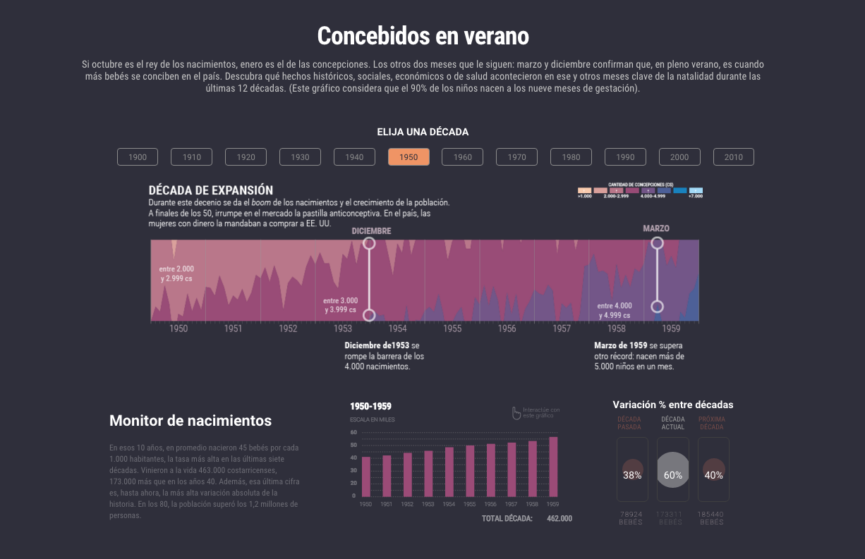
In June 2022, with a very basic understanding of the SAR technology, I started to use Sentinel-1 data to report on the progression of damage in Ukraine. Shortly after, Tim Wallace, our Editor for Geography connected me with Oregon State University, Jamon Van Den Hoek and City University of New York, Corey Scher, two leading researchers in the field of InSar sensing. They have been using this technology for a long time and were also exploring its use in Ukraine shortly after the beginning of the war. They have also help us to analyze the development of destruction in Gaza more recently.

Corey and Jamon help us to process terabytes of data to flag areas where structural changes happened. The first rounds were a challenge, the data is so sensitive that it was influenced by things like vegetation, soil conditions and snow. Things like mining activity, construction areas and train stations represented a challenge too.

A mine in Poltava. Red marks flag changes happening in the surface. BASE IMG BY PLANET LABS.
A port area in Odesa, red flags showed up probably due to vegetation and the moving shipping containers. IMG BY PLANET LABS.

Somehow we needed to filter out all of those things. I was doing a roll of analyst testing the data the researchers provide with HD satellite images. I spent weeks looking at the areas flagged to find things that maybe interesting to highlight later, but I also encountered weird stuff, which is normal in early stages of data analysis.

The image below is an screenshot of one of the many QGIS files I created to explore things in different ways, the rectangles there are areas I flagged for myself to follow closer.

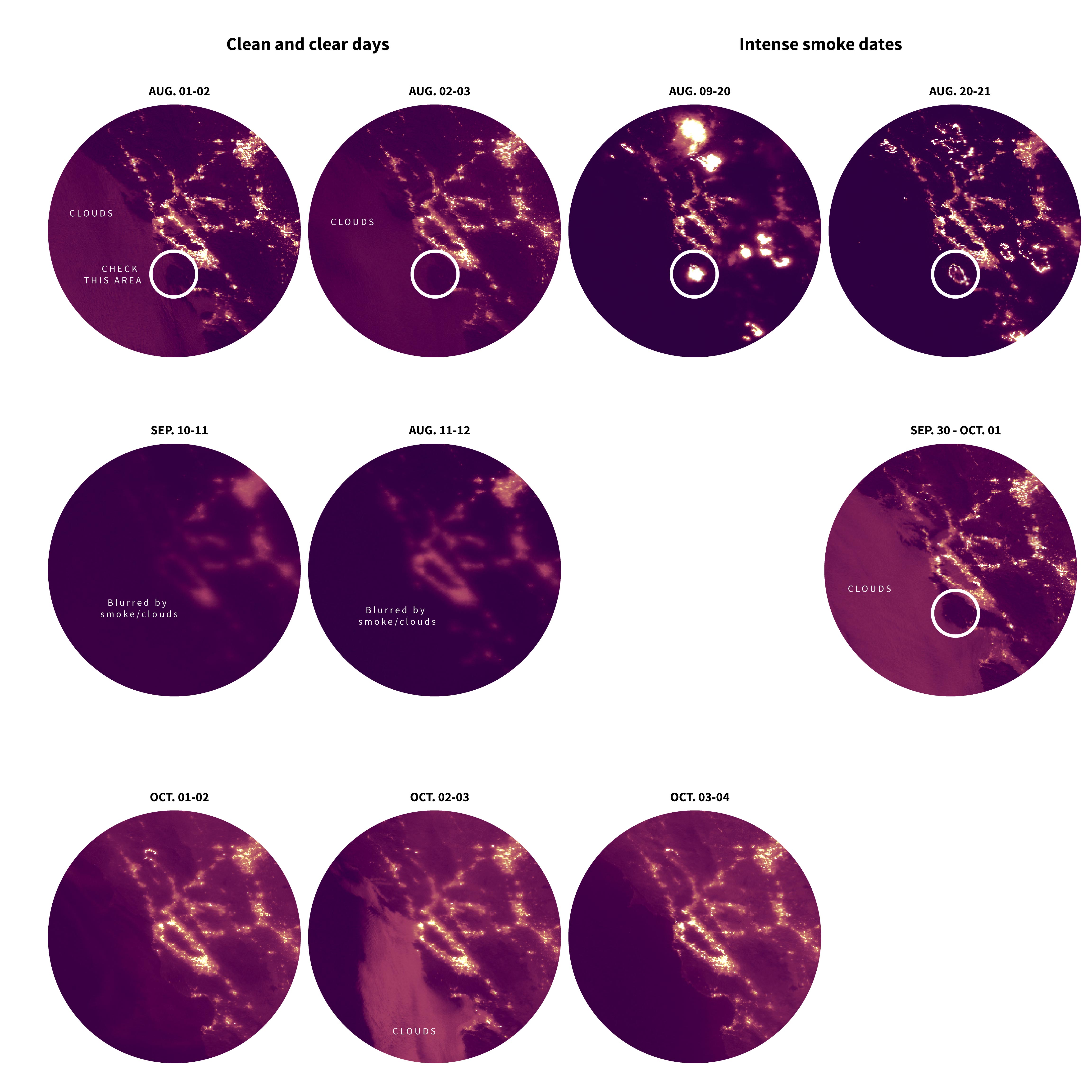
While exploring the data, I also noticed these long straight lines, which seemed to be the data tiles overlapping or something.

Looking down from space

I used QGIS, the Planet explorer, Maxar imagery and Google earth to crosscheck the data and be sure we were pointing at real damage related to the war and not something else.

Hundreds of buildings destroyed block after block after the battle for Mariupol, this is a detail of one of those blocks. IMG BY MAXAR, May 2022.

Every corner of the country had its own story to tell, some bettern known like the case of Mariupol, but during my exploration I learned about many places I had never heard of before, many villages that were destroyed far from the media spotlight.

A destroyed school in Izium. IMG BY PLANET LABS, March 2022.

In the satellite image below, the town of Kamyanka, in Kharkiv, shows the remains of what were once homes. When you look closely, you can notice the multiple craters, presumably caused by explosions.

IMG BY MAXAR VIA GOOGLE EARTH. March 2022.

Google has being updating imagery in Ukraine, this is one of those places you can easily see with Google Earth. As I’m writing this post the buildings are still in ruins accordingly to the image from August 29, 2022.

Damaged buildings… but what type: houses? stores? military?

I used OpenStreetMap to identify some of the damaged buildings, however, even tho OSM has a lot of good data, I needed more to fill the gaps.

Around June 2023, Microsoft Bing released a great data set of millions of structures in Ukraine, so I merged it with my existing OSM records, and ended up processing +17 million of building footprints. But it was also a nightmare, I tried to use Google Cloud and a few more things to get overlapping records with the damage flags, short story… all collapsed. –I probably set it up all wrong.

Finally I found a quicker way using a script python, reducing the time of cross check from weeks to a few hours running the code in my laptop overnight.

After overcoming that hurdle, I began collecting evidence of sensitive damaged locations.

I first identified schools, but I accumulated hundreds of these images for hospitals and churches too.

New data sets were back and forth, from that first version to a better, more precise and clearer one including additional months of data. Meanwhile I was going through hundreds of photos, fighting and shelling reports and other damaged related information. We accumulated so much data since the war started that it took me weeks to classify all of it and get a better sense of the mayor events happening in different cities.

Photos from our correspondents in the ground and wire providers also provided dates and places to confirm damaged records in certain locations.
I also explored social media for evidence of damage, like this footage of a warehouse in Partyzanske in Mykolaiv Oblast, media by Мужской Клуб Донбасса via Telegram here: https://t.me/donbass_mens_club/3691

A dosage of ‘infofails’

If you have read my blog before, you know what an infofail is. But just in case, I tend to save pretty much all the stuff I do, even if it’s just for my own understanding of the information. Here’s a little of a wonderful date set I spent a lot of time in, but we left out of the project.

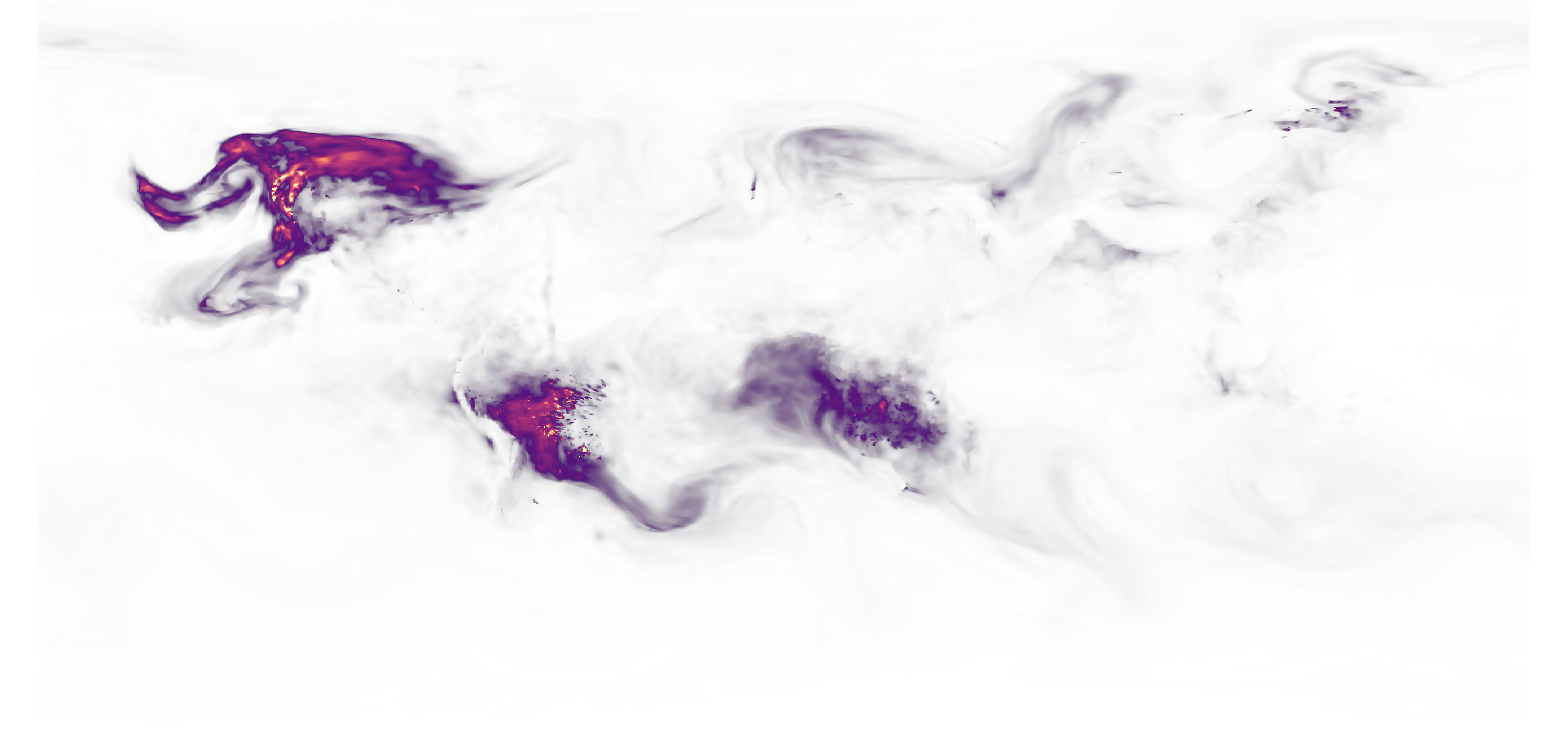
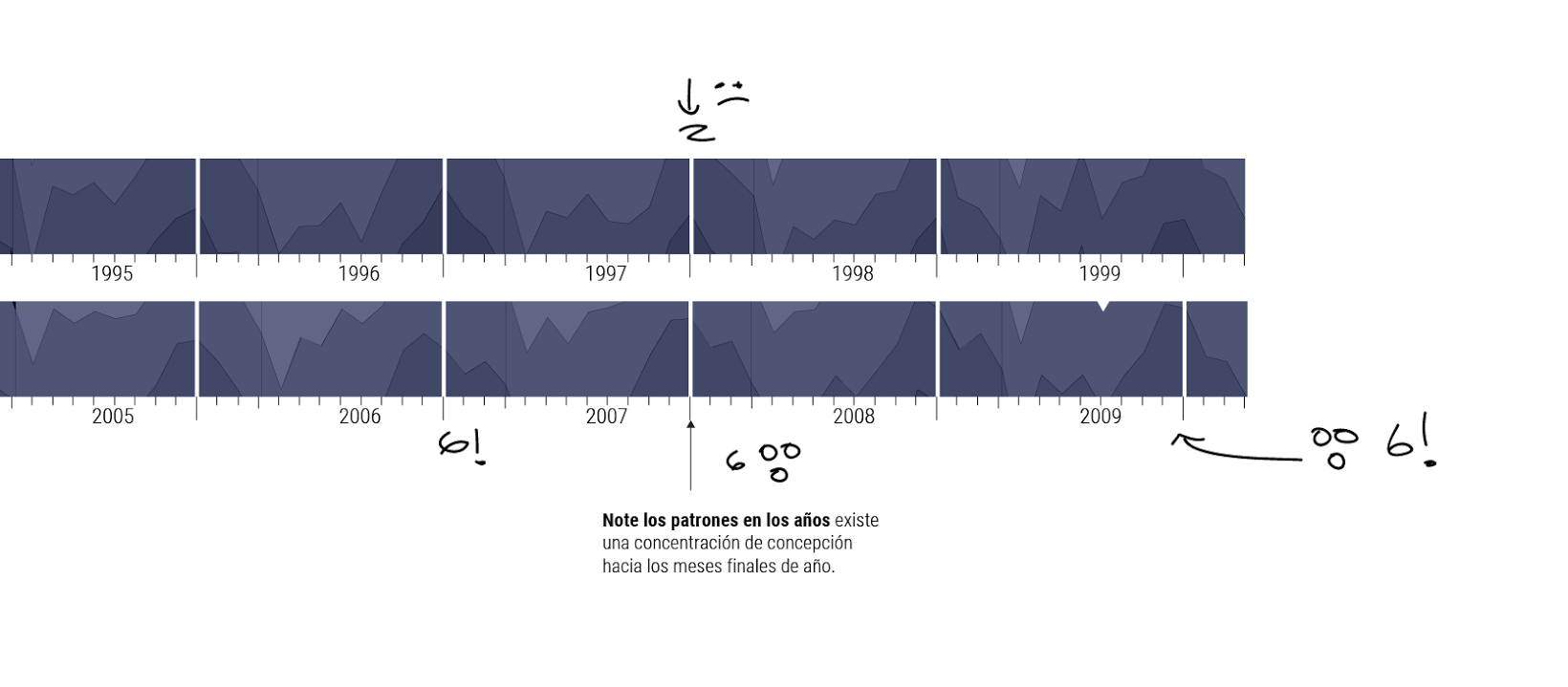
I did a lot of sketches to understand the data we have from fires, some seemed to align to the front lines after plotting the data like in the image below showing clusters of fire detections in a year.

Fire detections from various satellites clustered in grid cells, the darker the cell the more fires registered. Front lines data via ISW.

As I mentioned, we abandoned this data for editing reasons, but also because some months showed some sort of alignment with war events, and others just weren’t very clear. One idea I have was to use the large amount of photos we have showing explosions/fire in certain locations where the satellite also picked up a thermal signature.

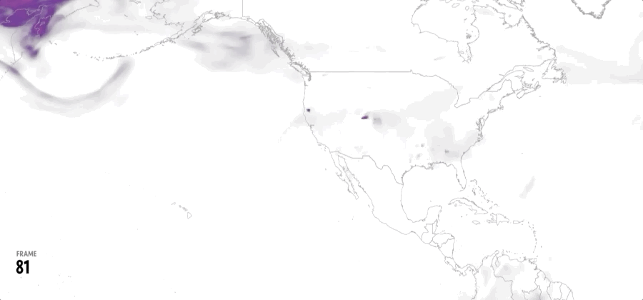
I also rendered a 2022 country wide “calendar of fires” (see below), there’s one row per month, taller and warmer colors represent more fire activity, some months match intense battles around the country, unfortunately other seasonal fires were also blended in the data.

From a csv file with values of thermal detections, rendered in Blender.

In the image above, January is at top, note the 3rd line were the columns are taller and warmer. That matches when Russia launched its full scale offensive over Ukraine.

But the data also slightly varies by region, so I also did 2d graphics looking a different locations, including a few more data and in different sorting of time.

Sketching data

As time went on, I continued sketching maps and other visualizations for this project. This was not full-time dedication, while working on this project, I published 17 other projects and explored about 15 more that led to nothing or are still in progress. So I had to do quick and easy things to distribute my efforts. But let’s take a look to those quick sketches.

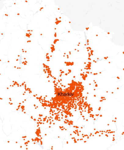
Part of my process is to annotate screenshots, just to remember things later. Below is an area of ​​Kharkiv, highlights in red are buildings damaged during the first months of the war in 2022.

This probably turns out to be obvious, but I found it quite interesting to see how in the first versions of the damage data some patterns emerged, the damage followed the roads leading to the cities. Can you see the lines too?

I spent long hours just exploring the map, turning layers on and off, adding before and after HD images, making things jump off my screen. Most of the exploring was made using Felt, Google Earth, Google spreadsheets and QGIS, screenshots and annotations on photoshop by copy+paste portions of my screen.

I did a lot of maps reporting on different of battles in other stories, so, some places seemed more familiar to me. Somehow the shape of the damage logs matched what I saw before, and that was a relief.

But also, other things, where it seems like the data tells a story that I can’t confirm. In the timelapse below, using the ISW control areas, you can see how perhaps Ukrainian troops tried to take this city, as the front lines move away, the records also cease.

Areas of control by ISW.

Ukraine has a huge territory, so I identified regions to look closer, sometimes because the change over time was interesting, or because the amount of damage registered. I guess my interest was too wide, I selected almost half of Ukraine, these are some quadrants I was interested in explore deeper:

Just to be clear, explore deeper mean I went on looking for more images, reading reports and blogs about what happened there… It took me months, but I did explore all of them.

I also did some sketches using 2d geometries based in the totals of area damaged per settlement.

I also sketched some of cities data through time using photoshop:

Then modeled in blender using an early version of the data, just to get a sense of a few cities and how they compare to each other. Note the colors are key in time, older records are cold (blues) while more recent are warmer.

Modeling data

We also tested some building height data, following the idea of ​​full 3D transitions from the photos we had of the Marinka town where we focused our story.

Transitioning concept from drone footage, to the city 3D model, to a satellite image.

We changed the top sequence a few times, but it was always focused over Marinka. The concept was to look close to a building with meaning to the residents, then scale to a street, to the town, to the region, to the country. That setting up to the reader the scale of data we analyzed.

Early concept to show damage recorded in Marinka

Here you have some of the first demos I did using the data on a larger area to eventually move the camera far enough to see the whole country.

Workflow

To get you an idea of my workflow, I started with a set of geotiffs, shapefiles and geojsons. We applied some python to filer the data and focus on the things we wanted, clustering data in different resolutions, then added all into QGIS to export tiff layers out. I used one black and white file for each feature, one for water, one for land, one for how high each polygon should be, one for color highlights and so on.

I like to use QGIS to wrap-up everything, but I feel better styling the data in photoshop, so some of the work in styles was done there, mostly color using the black/white tiffs as a mask over solid layers.

Then I exported a layer out of photoshop with colors and overall styles, plus one more with the elevation data matching the same crop from the original QGIS outputs.

Those tiffs went to blender to be rendered as 3d objects.

From blender, I moved all to After Effects. There is handled the timing, labels and transitions, a custom built script takes each layer and exports a single json file for the web component. The file includes the basic properties as position, styles and timing. The svelte component takes that and arranges the assets depending on what device you are watching on.

I tested a few different set ups changing styles and clustering, here’s one of those versions with a flight-over camera.

I did a few versions more just to find the one that feels right. Sometimes happy accidents happened like this inverted render, which is nice but not the thing I was looking for:

some more versions…

and versions…

Binary maps and storage

Many more versions later, I did a series of custom cities showing only buildings colored by damage as true/false. Red is damaged, by this point we were in the version 40 of the data, 1 terabyte of maps, photos, videos, scripts and many other assets. I bought an external drive for this project, every time I was going to move files I left my laptop running for a day or two to make sure I didn’t lose anything.

But that was just a little portion of the data we used. Corey and Jamon, the researchers you meet at the top of the long page, accumulated more than 50 times more data than me to get the right data set for this article.

Around +40 versions later, we landed in the definitive data set.

Introducing the story for readers

The story was almost there, but some small tweaks here and there, mostly in the copy side and technical descriptions, but there was yet one more thing to take care about, and that was explaining and introducing this to our readers in the home page.

I prepared still images and animations for this purpose, the video colleagues also help me prepare a reel that would be shown on the main page and on social networks. Basically me talking about the project, you can see the final version of it at The New York Times instagram account here.

Preparing the print

We usually go first on the web, then on print. So that means after we hit the publish button, I started to plan the pages for the print edition with a different team. Even tho we are using the same story as base line, the way of presenting things is different, new pieces should be produced taking into consideration the requirements of paper.

The process was sort of similar, first preparing assets in QGIS, render out black and white .tifs to be later used as color mask in photoshop, then merged in a color layer plus a black and white layer with the heights data baked in. Then those 2 layers went to blender to get the final base map. Annotations and other small details were done in Adobe Illustrator.

Blender setup for print.

A few different versions went around, because we move it to the front page, some small charts of context were dropped off. Here some of those early testing versions, some even with a few errors:

The print edition was published today (June 22, 2024) on a special format displaying the large map and a few more pages inside wrapping up the whole story with adaptations of the original content. The print team did an exceptional work, they have a lot of experience in getting the best version for the readers out there.

I started exploring this project in June 2022, and today, two years later, I find myself reading the last piece of the project finally published, there’s a sense of relief to know that I fulfilled the mission of reporting on this very relevant topic with such a display for the New York Times.

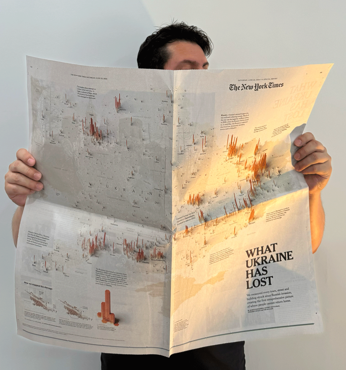
Thanks for reading, and don’t forget to buy this special edition of the paper.

Standard
blogging, infofails

The mismatch

Earlier this year I spent some time learning about the world of phenology. After reading some scientific papers and doing some interviews with researchers, I just found myself getting more and more curious about it.

If you google Phenology it will return something like “Phenology is the study of periodic events in biological life cycles and how these are influenced by seasonal and inter-annual variations in climate, as well as habitat factors.”

Since we live in a single network, studying the effects of climate on species brings us closer to what will inevitably also affect us, but it’s also a way to connects us a little more with all those other living beings with whom we share this space.

“The love for all living creatures is the most noble attribute of man.”

Charles Darwin

Darwin was right, after talking to a lot of people and understanding their passion for plants and animals, it is easy to understand the concern about the changes that some species are facing.

But moving on, if you have visited this blog before you may know where this is heading to… yup, this is another #infofails story. Here’s how all went wrong:

An unfinished illo for a blooming/ecological mismatch project I tried to run.

The embarrassment

The most embarrassing part of my failures is not facing your editor with a dumb idea, the hard part is getting excited about the information from sources and interviews and then watching time go by without you being able to develop the story you had in mind, especially if the people who spoke to you were super collaborative.

My first source in this endeavor (with whom I’m still embarrassed) was an Ecologist with the USGS. She shared with me some info from studies in the Gulf of Maine where she studies seasonal disturbances in marine life. In fact, it was she who explained to me what Phenology is. –Explained by a scientist who works on it.

My embarrassment also is with Richard B. Primack. He’s a Biology Professor at Boston University, I had a great conversation with him, he shared tons of great data.

You see, Prof. Primack has been studying and documenting the ecological mismatch for years, in 2016 he published a study where he explained how some birds arrived late to forage because spring is starting earlier. He show this example comparing the spring in 1850 describing the natural flow: first birds arrive, then leafs come, then insects appear, and finally flowers pop. Here’s a quick draft I did based on his publication:

Illustration of the Spring flow in 1850.
Sketches of the spring flow in 1850. Based on Prof. Primack’s paper published in American Scientist Magazine, 2016.

Makes sense doesn’t it? the observations show that these birds have continued to arrive on similar dates, but now spring is coming earlier. In 2010, for example, the leaves arrived earlier, so the insects also appeared earlier and spoiled the entire cycle for other species.

Spring 1850 vs 2010. Based on Prof. Primack’s paper published in American Scientist Magazine, 2016.

Staying with that same example from 2010, birds were observed arriving around the same date to find flowers when the insects should be just showing up. In other words, these days, for some species the natural flow looks something like this:

Sketches of the spring flow in 2010. Based on Prof. Primack’s paper published in American Scientist Magazine, 2016.

Prof. Primack along with many others researchers used Henry Thoreau’s observations to reconstruct the past of seasonal changes, that alone was a big story for me. So I went on and on, making more questions and asking for more data. And kindly they send me over tons of papers and tabular data.

Some of that data Prof. Primack shared with me included detailed records of plants and animals where he spotted those changes in spring and the struggling birds.

A data sketch I did with part of the data collected by Prof. Primack and a team of researchers merged with Thoreau’s records.

When I have a dataset that looks this interesting, I’m inevitably driven by ideas of how to show this in a story, it’s like a need of sketching data. At that point I need to somehow present this to my editors to push it forward and turn it into a story. Sometimes I spend time developing my ideas into sketches just to explain to editors what I’ve found interesting, but it’s not always as obvious to them as it is to me, so it’s necessary to write some paragraphs and accompany them with those images.

Some of the tree species that sprout leaves earlier. The steeper the slope of the red line, the earlier the leaves sprouted on average.

Just the right timing

That same process that I follow sometimes takes too long to put together a draft for my editors. When I came up with the proposal for this story, it was almost spring and it was hard to move a story past that window. That was just one of the things that spoiled the initiative I think.

It’s important to note that for those types of stories, I’m not developing the drafts over my daily work, but rather in free moments, which lengthens the process even more. But anyway, the lesson of this part was to keep an eye on your post window and not let your inner child distract you with what you find and diverge, maybe you’ll get the idea to the editors in time, it would be more easy for this to happen, who knows…

Adding more, more, more…

Certainly I was fascinated with the data and all the potential for a story, I was finding more and more data related to the same issue of animals struggling with the climate changes, the only problem was the this data was a little old already. Like this fascinating 2018 paper by Prof. Marketa Zimova + describing molting conditions in furry animals and how they struggle to survive when there is little snow and you are still covered in white fur. You may noticed the illustration at the top with a white hare on brown background which is kind of what they look to predators when there’s no snow around. Really sad the reality that these animals are going through, you know how it ends if you’re a white prey animal on a brown background.

A diagram based on the research data by Prof. Marketa from the University of Montana.

My second problem turned out to be that I was following the white rabbit into the world of tangencies. There is so much information on this that I started to integrate other studies and data, maps and things that led me to create a monster draft. A lot to digest from a news perspective maybe.

Earth temperature anomaly in April 2007. Based on NASA NEO. This event caused heavy damage to fruit tree crops during the spring of 2007.

A lesson from this would be to narrow the focus, crunching the idea down to its essentials can help early in the process. My mistake here was probably in choosing and editing the story I intended to show my editors. I added a thousand things on it, including interesting but a bit old data, maybe not the best selection for a news story.

While not everything should be breaking news, at least the focus of the story should be less scattered and consequently better defined.

Don’t follow the white rabbit. They tend to show you things that lead to a spiral of tangencies.
–A silly and perhaps inappropriate joke, sorry.
I hope you get the idea anyway.

We are experiencing climate change in many ways. In fact it’s easy to find news and research papers on early blooming and animal habitats threatened by seasons arriving earlier or later than they used to be and so many other changes that every species on this planet (including us) must endure.

If you’re in to news, I encourage you to talk more about this topic, worst case scenario don’t publish your story, but at least you’ll meet amazing people along the way and learn a little more about the fascinating world between us.


About #infofails post series:
I truly believe that failure is more important than success. One doesn’t try to fail as a goal, but by embracing failure I have learned a lot in my quest to do something different, or maybe it is because I have had few successes… it depends on how you look at it. Anyway, these posts are a compendium of graphics that are never formally published by any media. Those are maybe tons of versions of a single graphic or some floating concepts and ideas, all part of my creative process.

In short, #infofails are a summary of my creative process and extensive failures at work.

Are you liking #infofails?, have a look to previous ones:

01: Wildfires
02: Plastic bottles
03: Hong Kong protest
04: The Everest
05: Amazon gold
06: The world on fire
07: A busy 2021 kick off
08: Olympics
09: Floods
10: Doodles for news
11: Random Failed Maps

Standard
infofails

Doodles for news

August 2021 saw a tsunami of stories from Afghanistan in the news. Apart from a bunch of small graphics, I participated with Chaos in Kabul and Flights over Kabul both stories related to the Afghan skies and the complex situation lived there after the US troops withdraw. At Reuters, we did a good long list of potential stories, even I did a few kickoffs of some, but a packed agenda of long term projects for this year left most of them out.

Boeing Chinook CH-47, Mi171E, Sikorsky UH-60, Black Hawk, Boeing AH-64 Apache
illos published at the story “flights over Kabul” Aug. 2021 | Reuters graphics.
Globemaster III

Have you ever felt that you need a few copies of your self to materialise all the stuff in your mind? no? well maybe just me weirdo but I do. I would have loved to have some copies of me working on a few more stories from Afghanistan to get them in time to publish back then.

Those aircraft illos above are from stories that do made it, but you know I love to share pieces from under the rug, so… here you go:

US Humvee vehicle
D30 Howitzer illustration

For a day or two my desktop was full of guns blueprints, aircraft dossiers, technical documents of military equipment, tons of field photographs from our news feed, news articles… The home screen of photoshop and illustrator slowly turned red.

I usually start these things in photoshop, drawing outlines, then a base colour layer, a layer shadows and one more of lights on top. All always to scale and 2.5x the size I’ll need in the final version.

MD530
M16 illustration

The cool stuff related to my job. ❤

The night vision googles were my favourites, weird device actually. I learn some of them are like a video game with this cool display of augmented reality. The visuals looks really nice, check this story from The Washington Post [ here ] or just google “US army augmented reality night vision goggles” you will see.

BNVD googles

I love to learn new things, that’s one of the best things of my job actually. You never know what’s waiting for you tomorrow, what new curiosities are waiting there for you. And even if they don’t get published for sure you will learn something new.

Guns illustration. M9, G19 pistols. M4, M16, Dragunov rifles. RPK7, M249, M240, NSV12 machine guns. Mortar

The grey area of working in news

Beyond the research for the illustrations and the drawing itself, I made some maps and videos on a demo page with the proposal. Maybe all of this was pointing too high in the little time we had at the time since all the rest of the work has to be considered to complete the story.

Sometimes news are a bit cruel, you must do everything quickly before it’s no longer news. The tricky part of it is that most of us in this industry think quickly of the same things. It’s like a race against the clock, so, unless you can distinguish your story from others that have been already published, things are doomed, and may end here on my blog… which is fine, but of course it’s a sad thing to bring potential stories to the graveyard.

Humvee, Ford ranger, M113A2, MRAP vehicles.
Hercules C130, Mi17 Helicopter, MD530 Helicopter, A29 Tucano, C208

The summary of this failed idea contains a fair amount of learning, a lot of cool nerd stuff is on my head now. Although unfortunately none of this was published, it was not a complete waste of time either as I did not work on this exclusively. There are many other interesting things in the pipeline, some almost done, so enthusiasm always remains high.

About #infofails post series:
Graphics that are never formally published. Those are maybe tons of versions of a single graphic or some floating concepts and ideas, all part of my creative process. All wrapped up in #infofails, a compilation of my creative process and failures at work.

Did you like #infofails?
Have a look to other #infofails 👇

1: Wildfires
2: Plastic bottles
3: Hong Kong protest
4: The Everest
5: Amazon gold
6: The world on fire
7: A busy 2021 kick off
8: Olympics
9: Floods

Standard
Digital pieces, infofails

#Infofails: the world on fire

2020 kicked off with record-breaking wildfires in Australia, the hatching a global pandemic, and later the a new wildfires season turning into ashes thousands of sqkm of the U.S. West Coast, then Trump again… you know all that right?

In the middle of all that craziness, we were juggling to cover the events with visual stories. As usual, I did a little more than necessary in order to explore and get details relevant to our stories… and well, not all of them worked out…

Where there is fire, there is smoke

Some events on our planet reach sufficient dimensions to be easily seen from space, wildfires are one of them.

Mercator projected snapshot of organic carbon data on September 16th, 2020. Data from NASA-GMAO

I had work with GMAO data many times before, it’s a good source to see a model of aerosols and other specific data on a large scale, works very well for continental areas, not too much for a closer zoom like country level.

Anyway, the idea of this. visualisation was very clear, it was about to show the large dimension of the smoke caused by the wildfires in the US. West Coast.

One by one in QGIS, I did a series of renderings like the one shown above with data between June and mid-September (around 100 days), which is probably not too much, but the data is collected every 3 hours so I manually processed about 400 files to get a smooth animation.

Animation test v1.

To get control of the style without coming again to QGIS, I did the series of data only, a layer with the country borders, a layer with labels and so on… I also did one version with the same idea but in a globe.

Style test. v4.

I often try different versions of my graphics, On my team here at Reuters, we often joke that until we get to the twentieth version we won’t be close to finishing … Although in some cases that joke does come true.

The final version ended up looking a bit different. I controlled the final style in Illustrator, Photoshop and After Effects.

Final version. ( v.11 )

There are many more pieces in that story, including a really cool cutaway of the smoke made by my teammate Manas Sharma with data from NASA’s Calipso mission. You can have a look to the full story here: https://tmsnrt.rs/3nkkOkX.

But the wildfires continued to break historical records and turning the city’s skies orange-red. There were many other stories on that tragedy waiting to be told, even though the stories of the covid-19 did not stop harassing us either.

An aircraft swarm

OV-10 “Bronco” sketch test for the Cal Fire aircraft story.

Air attack was one of those stories we worked on in the middle of this year, the main idea was to show the impressive deployment and coordination of planes to deal with the fires in California. Just doing the planes was very enthusiastic, the main issue was how to pick the right ones.

Cal-Fire has on hand an extensive fleet of planes, tankers and helicopters, some in heavy operation, others less so. However, the flight and route logs from FlightRadar24 gave us an outlet to filter the aircraft.

Cal Fire aircraft sketches for the story.

You may have noticed some airplanes in the image above that aren’t in the final story. The AT-802A were used to guide tankers in the old days, they are probably still in use elsewhere, I think you can see them in the Pixar movie “Planes”.

That was one of the “unnecessary resources” that I created, thinking that it might have been nice to show how things have evolved over the years, but it was not the case. You can read the story through the following link: https://tmsnrt.rs/2Iy2K7W

Wine and ashes

There’s one thing you should know about me: I love wine.

I usually work colour at the end. More versions to test and try keeping outlines or light-shadows intact.

Most of the stories I’ve made in the last year or two are sad, some about environmental disasters, people in danger, dying, or losing everything.

Like many, this story came with some mixed feelings. I think it was the first time that I had the opportunity to do something about wine, and it involved the destruction of hundreds of vineyards.

Although I really enjoy to do reporting, create a map, draw a diagram, or write a story draft, those same stories always bring me a strange mix of joy in doing my job and the sadness of understanding the dimensions of a problem or event. I’m not complaining, I keep my job at the office, but it’s curious I guess.

You can have a look to the wine story here: https://tmsnrt.rs/3eZnWQ9

There’s no time enough in the world

Not matter how much time I can have, there’s always one more thing I’ll like to explore. Nice thing is you can save the idea in the bucket for next time. And the fires coverage wasn’t an exception.

Screenshot of the VIRS brightness data over California. Night time Aug. 03, 2020.

Around mid year, I was exploring at VIIRS/NPP data, this data contains 26 data sets including radiance sensors, shortwave IR radiance, earth’s brightness and temperatures etc.

That data can give you a daily quick look of lights and temperatures of the planet’s surface, of course if clouds play nice and go away from your interest area.

After downloading the data for a few days in the area, I noticed some bright areas that turned on and off depending on the day, probably fires that were seen burning from space at night.

The lights were so intense that you can easily mistake them for city lights. Check the white circles bellow:


About #infofails post series:
I keep my beta graphics, those that never go public… Maybe they are tons of versions of a graphic or just a few concepts, part of my creative process. So, where all those things go? well, ends-up in #infofails –a collection of my fails at work.

Did you like #infofails?
Have a look to other #infofails Chapters here:

1: Wildfires
2: Plastic bottles
3: Hong Kong protest
4: The Everest
5: Amazon gold

Standard
Awards, Digital pieces

SND Digital Awards

SND

Two of our digital works published at nacion.com wins an Award Of Excellence in the 2015 edition of the contest. The first one is the project in celebration of the “75th anniversary of the National Symphonic Orchestra” the design and development of this projects set a starting point to the trends of our unit.

The second project awarded this February in Washington D.C. was the “Birth of a Century“, I was invited to work in this project for the unit of Data from La Nación, and I have the fortune of the collaboration of the development unit as the artist Augusto Ramírez.

I have to say that I’m very very happy to get this awards of the Society for News Design in his digital contest, but this is a team work, and I must say thanks to my partners in the infographics unit, the Data Team of LN, the Development area, my Editors, and many many people who supports me last year.

This slideshow requires JavaScript.


Standard
Digital pieces

The birth of a century visualized: Backstage

Illustrations by Augusto Ramírez

Illustrations by Augusto Ramírez

A few days ago We published at nacion.com this special feature analyzing the data of 115 years of births in Costa Rica. We decide to take this special as an opportunity to explore the deep exploration of data visualizations with the efficiency and impact of illustrations. But besides the style and interface, the production process its the most interesting story.

One of the most complicated pieces of the special its the section of conceptions, we have all this data about the births, and the necessary references to relate it with the conception, so, We wanted to create a customized visualization to navigate through a 115 years of the country history and relating how the people gets pregnant.

We begin with a model of variation per decade, where we can see the balance in favor or against each decade in births. We use this chart as a navigator to show in the bottom detail of those ten years. By this time we have the idea of linking these points with major events taking place in the country and the region to relate the behavior of people with some important facts in time.

first version of the visualization of conceptions

First version of the visualization of conceptions. Note the dummy text 🙂

This special was an conjunction exercise with the Data Team of La Nación, I made my part in visualization and other support, but it because the skillfully profesional of they, it’s that the final product becomes properly. In spite of I have a small part of the special, the versions of the charts, the motion graphics and some other assets take about 1.1 GB of space. This is it because I made so many versions and testing design to find the better way to present the findings in the data.

I start with this horizon chart to visualize the concentration of conceptions, it was fun because i start thinking that i’m seeing in the moment in which the persons did their things in their beds conceiving new compatriots. So I could be seeing as in some parts of the graphics I surprised myself with what they meant those lines.

Full visualization by decade of conceptions in Costa Rica

Full visualization by decade of conceptions in Costa Rica

Obviously we not publish comments like the next ones that I’ll score when analyzing the chart in search of curiosities, but between the equipment if the process is to make more fun, I must say that is a personal process and does not refer to style publication of our environment here at La Nación.

in the top graphic I wrote "The begin of the Century, our grandparents also was having fun" the data reflects that they in the early century don't discriminate the time to get pregned

in the top graphic I wrote “The begin of the Century, our grandparents also was having fun” the data reflects that they in the early century don’t have prefers or discrimination of the time to get pregnant

Findings

in the top graphic I wrote “five months giving it!!!” the data show periods or season of conceptions, the behaviour changes through the time, the late conceptions prefers the 3 or 4 last months of the year to get pregnant. At the bottom I wrote “the early ones” for 2011

Also i add some drafted emoticons, at the top a sad face because the high season is only of 2 months, but for 2006-2007 the high season extended for 6 months OMG a lot of time enjoying the bed time!

Also i add some emotions, at the top a sad face because the high season is only of 2 months, but for 2006-2007 the high season has a prolongation of 6 months OMG a lot of time enjoying the bed time!

This if the full visualization if the 115 years of data of baby conceptions in Costa Rica, then i split it by decade.

This if the full visualization if the 115 years of data of baby conceptions in Costa Rica, then i split it by decade.


The final version have the instructions to read the horizon graphic and the indications of each space that will change when the reader click the upper menu by decade, then, the dashboard change the data according the user interest.

The main graphic is the conception concentration, at the bottom the decade resume, and the percent variation between decades

The main graphic is the conception concentration, at the bottom the decade resume, and the percent variation between decades

How to read the graphic, the title show a legend "before you start, you must know"

How to read the graphic, the title show a legend “before you start, you must know”

PLUS EXPERIENCE

We add some hide effects to give different experiences of navigation to the readers, if you use the side menu to navigate each section is preceded by an animation like the next one, if you want a see more of this project please visit it here http://bit.ly/1kpN45p  hope you enjoy the data experience.


Illustration by Augusto Ramírez.

Illustration by Augusto Ramírez, Motion by Marco Hernández.

Standard
Digital pieces

WebGL power for infographics

In the last weeks I’ been integrating the WebGL Technology to take advantage of the great skills of my partners of the infographics department here at nacion.com Daniel Solano and Edgar Jiménez both of them great artist´s, they works on Cinema 4D to produce print graphics for the regular editions of the news corporation, that kind of work it’s simply awesome and it’s a shame don’t use all his digital potential.

So, here’s a pair of work that we worked on together to improve the experiences for the readers.

Lost in space for ever and ever

with Daniel Solano

This slideshow requires JavaScript.

On september 15th of 1965 Fox and CBS launch in USA the TV Show “Lost in space”, 50 years after, we wants to remember the serie, the main characters and vehicles that captivated audiences for decades beyond its premiere. Here’s an exclusive access to the 3D models, The Chariot, and The Jupiter 2.

Original feature

Original feature

It’s really nice have the chance to work in this kind of topics, science and space are one of my all time favorites. if you want to know more about the graphic the original feature at nacion.com here.

Technology the leading actor

with Edgar Jiménez

NASA´s SEV Vehicle

NASA´s SEV Vehicle

At least nine of the technologies developed by NASA towards Mars space exploration are mentioned in the book and movie The Martian, this 3D infographic collects those coincidences.

Martian tech

Martian tech

I also want to add some short animations as gif files in the graphic to give support to the information and the whole infographic, Edgar and me develop this sort animations in After Effects.

This slideshow requires JavaScript.

if you want to know more about the graphic the original feature at nacion.com here.

The original feature publication at nacion.com

The original feature publication at nacion.com

I very lucky to have co-workers with this kind of skills, and the space to make this kind of publications, I love infographics, and space…   🙂

Standard
Digital pieces

CTCC Parque Viva

nocturno_00

A few hours more than a full day of work takes to two co-workers and me, to release today this special feature about the V8 cars competition in the “Parque Viva” racetrack.
Animated graphics, details about the cars and restrictions and a complementary key note of Jose Luis Rodríguez fusioned together to create this digital experience.
I hope you will enjoy it!

Graphics inside the special

Graphics inside the special

Graphics inside the special

Graphics inside the special

Graphics inside the special

Graphics inside the special

Graphics inside the special

Graphics inside the special

Visite the special site of nacion.com here: http://goo.gl/gzjLYy

Standard
Digital pieces

The National Symphonic Orchestra

Happy to finally conclude a couple of months of research, visualise and design this special feature in celebration of the 75th anniversary of the National Symphonic Orchestra of Costa Rica. For this project, I’m try to develop an experience immersed into dataviz fusioned with clear spaces, photography, video and even white space.

The 75th anniversary of the National Symphonic Orchestra.

The 75th anniversary of the National Symphonic Orchestra.

This special contains sections as the video documentary with the 75 years of history, small graphics of the instruments families, the musicians chronology, playlist and more.

This slideshow requires JavaScript.

Please, enjoy the experience at nacion.com

http://www.nacion.com/LNCSPC20150622_0001/index.html?desktop=true

Use Google Chrome for translation from spanish.

Standard
Awards

News Data App of the Year

The web app lets citizens find out the average monthly salary someone with their profile can receive in Costa Rica’s job market.

The web app lets citizens find out the average monthly salary someone with their profile can receive in Costa Rica’s job market.

We were awarded last June 17, the recognition of the best news application data through the work of “Does school pay off? How much?” http://bit.ly/1FTtpjH recognition was given in the category of News Data App of the year for small newsroom here is the details.

Alejandro Fernandez from El Financiero was the project manager. In the area of specialized design of GN we welcomed the project in the design phase, and the development department GN concrete it. Today with them, we celebrated the triumph of this web app in the summit of GEN2015. Here the details published regarding: http://bit.ly/1L2U69p

Standard