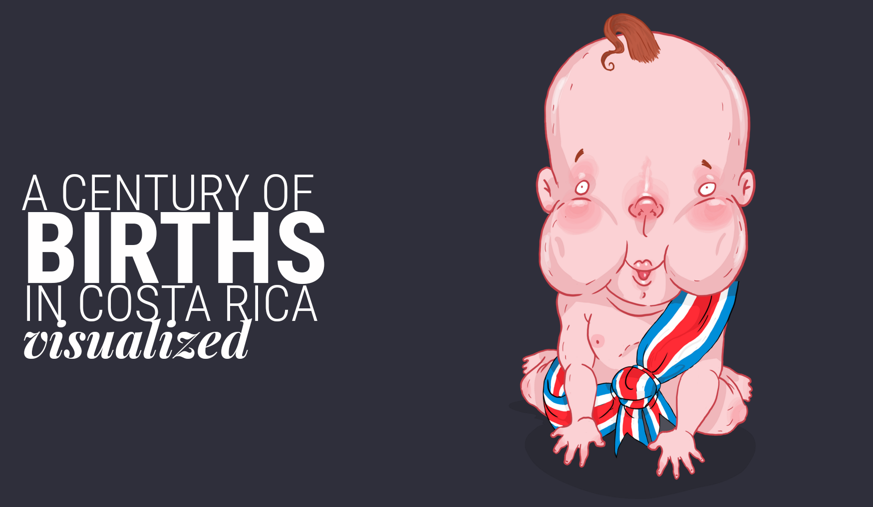
Illustrations by Augusto Ramírez
A few days ago We published at nacion.com this special feature analyzing the data of 115 years of births in Costa Rica. We decide to take this special as an opportunity to explore the deep exploration of data visualizations with the efficiency and impact of illustrations. But besides the style and interface, the production process its the most interesting story.
One of the most complicated pieces of the special its the section of conceptions, we have all this data about the births, and the necessary references to relate it with the conception, so, We wanted to create a customized visualization to navigate through a 115 years of the country history and relating how the people gets pregnant.
We begin with a model of variation per decade, where we can see the balance in favor or against each decade in births. We use this chart as a navigator to show in the bottom detail of those ten years. By this time we have the idea of linking these points with major events taking place in the country and the region to relate the behavior of people with some important facts in time.
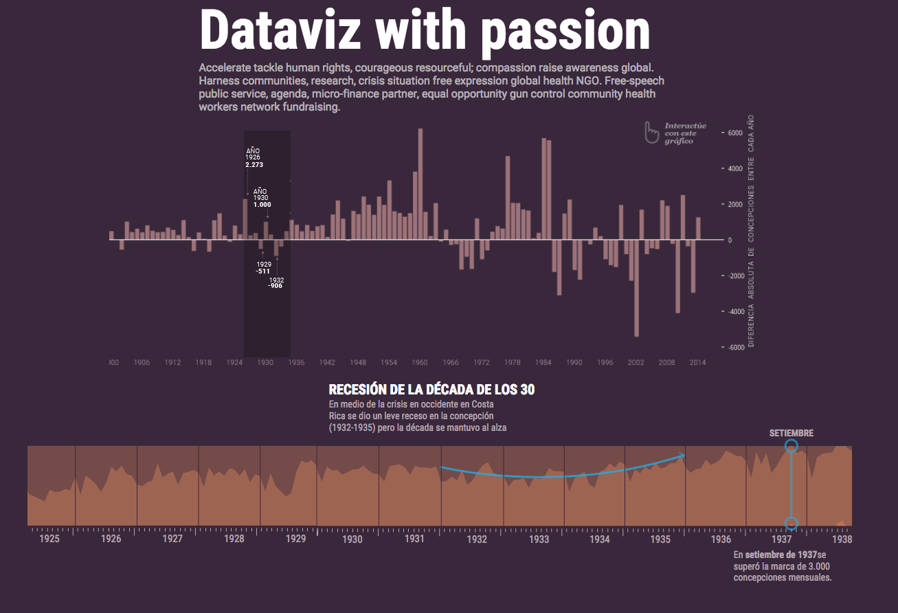
First version of the visualization of conceptions. Note the dummy text 🙂
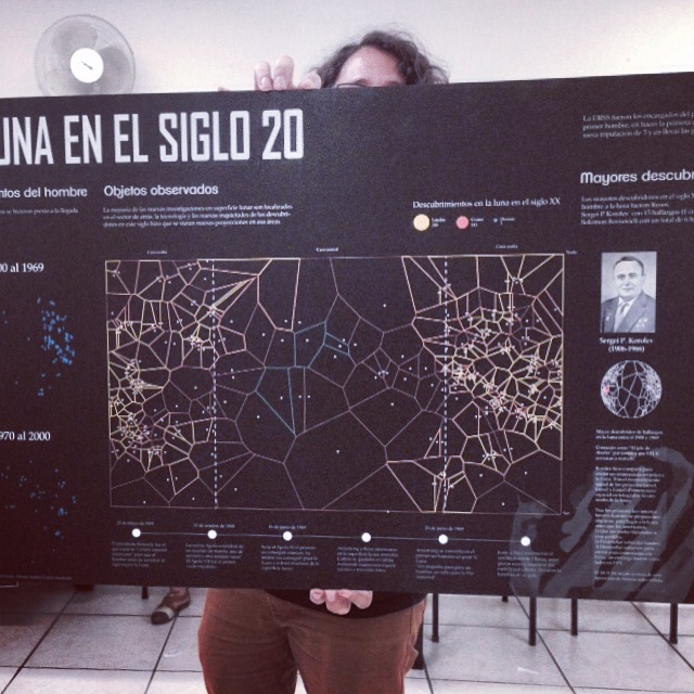
This special was an conjunction exercise with the Data Team of La Nación, I made my part in visualization and other support, but it because the skillfully profesional of they, it’s that the final product becomes properly. In spite of I have a small part of the special, the versions of the charts, the motion graphics and some other assets take about 1.1 GB of space. This is it because I made so many versions and testing design to find the better way to present the findings in the data.
I start with this horizon chart to visualize the concentration of conceptions, it was fun because i start thinking that i’m seeing in the moment in which the persons did their things in their beds conceiving new compatriots. So I could be seeing as in some parts of the graphics I surprised myself with what they meant those lines.
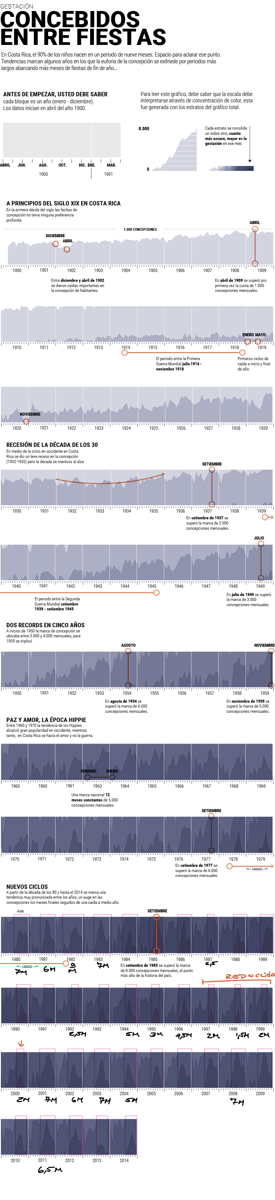
Full visualization by decade of conceptions in Costa Rica
Obviously we not publish comments like the next ones that I’ll score when analyzing the chart in search of curiosities, but between the equipment if the process is to make more fun, I must say that is a personal process and does not refer to style publication of our environment here at La Nación.
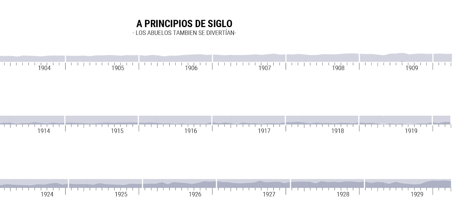
in the top graphic I wrote “The begin of the Century, our grandparents also was having fun” the data reflects that they in the early century don’t have prefers or discrimination of the time to get pregnant
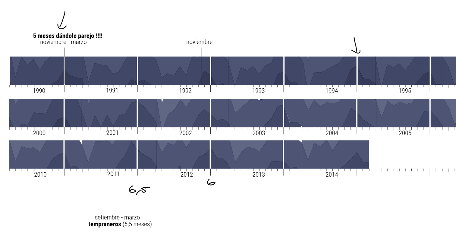
in the top graphic I wrote “five months giving it!!!” the data show periods or season of conceptions, the behaviour changes through the time, the late conceptions prefers the 3 or 4 last months of the year to get pregnant. At the bottom I wrote “the early ones” for 2011
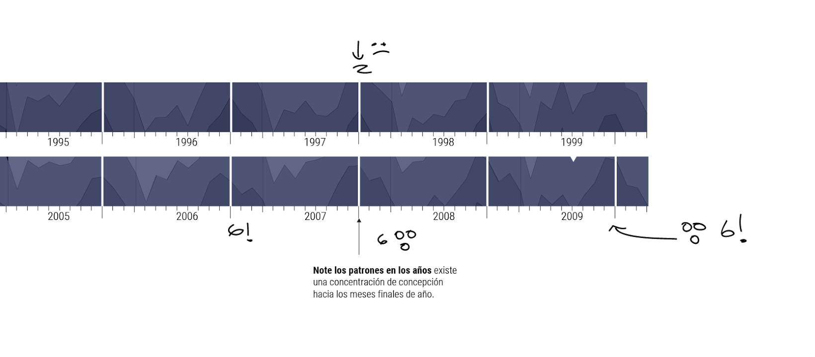
Also i add some emotions, at the top a sad face because the high season is only of 2 months, but for 2006-2007 the high season has a prolongation of 6 months OMG a lot of time enjoying the bed time!

This if the full visualization if the 115 years of data of baby conceptions in Costa Rica, then i split it by decade.
The final version have the instructions to read the horizon graphic and the indications of each space that will change when the reader click the upper menu by decade, then, the dashboard change the data according the user interest.
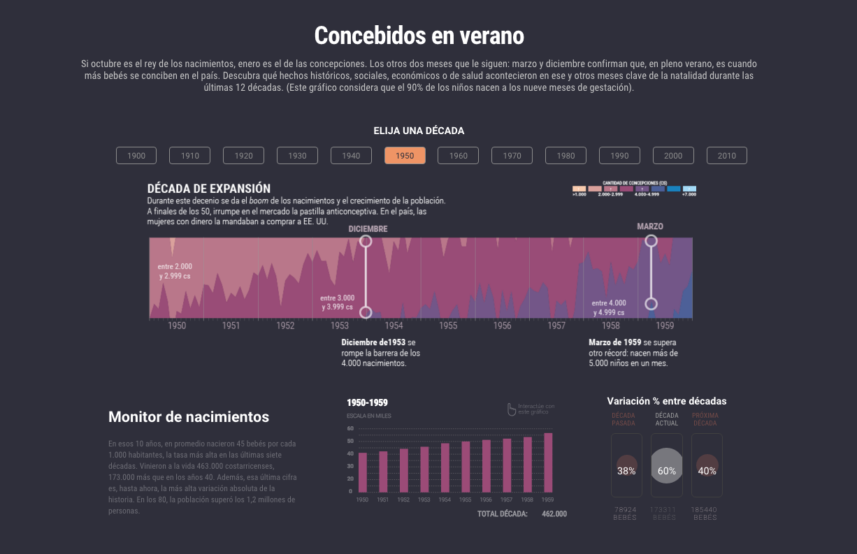
The main graphic is the conception concentration, at the bottom the decade resume, and the percent variation between decades
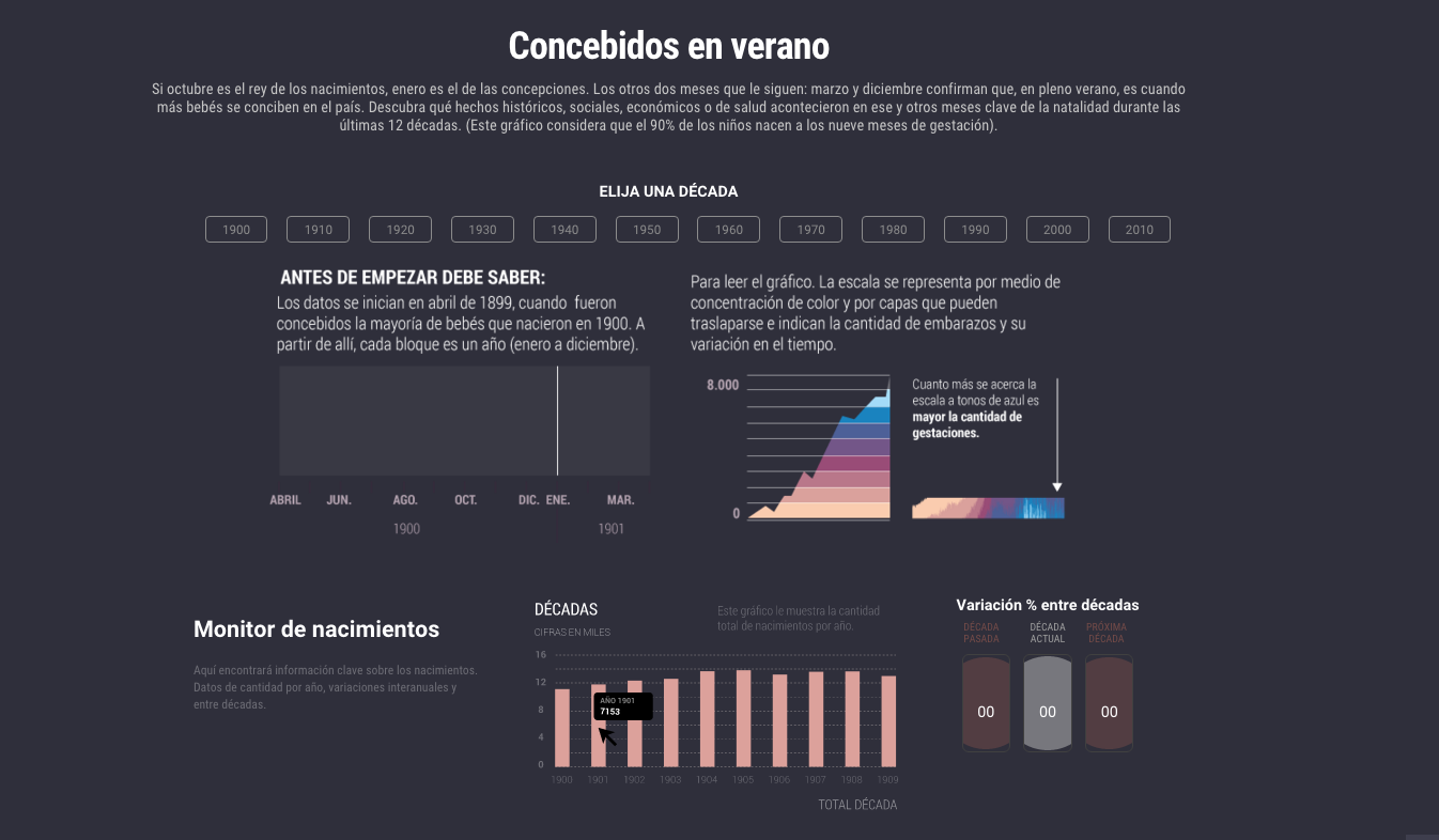
How to read the graphic, the title show a legend “before you start, you must know”
PLUS EXPERIENCE
We add some hide effects to give different experiences of navigation to the readers, if you use the side menu to navigate each section is preceded by an animation like the next one, if you want a see more of this project please visit it here http://bit.ly/1kpN45p hope you enjoy the data experience.

Illustration by Augusto Ramírez, Motion by Marco Hernández.