
A few days ago we released an special about the births of a century in Costa Rica, I had the chance to produce this motion for. It’s nice to get raw data and transform it in to visuals, alternative ways to see the past or future of a population, if you like to take a look in to the full site here http://bit.ly/1kpN45p you may use google chrome for translation from spanish 🙂
Author Archives: Marco
WebGL power for infographics
In the last weeks I’ been integrating the WebGL Technology to take advantage of the great skills of my partners of the infographics department here at nacion.com Daniel Solano and Edgar Jiménez both of them great artist´s, they works on Cinema 4D to produce print graphics for the regular editions of the news corporation, that kind of work it’s simply awesome and it’s a shame don’t use all his digital potential.
So, here’s a pair of work that we worked on together to improve the experiences for the readers.
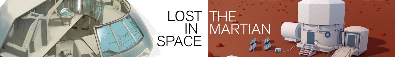
Lost in space for ever and ever
with Daniel Solano
On september 15th of 1965 Fox and CBS launch in USA the TV Show “Lost in space”, 50 years after, we wants to remember the serie, the main characters and vehicles that captivated audiences for decades beyond its premiere. Here’s an exclusive access to the 3D models, The Chariot, and The Jupiter 2.

Original feature
It’s really nice have the chance to work in this kind of topics, science and space are one of my all time favorites. if you want to know more about the graphic the original feature at nacion.com here.
Technology the leading actor
with Edgar Jiménez
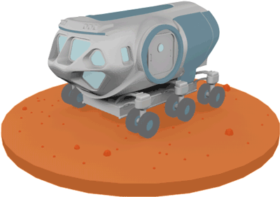
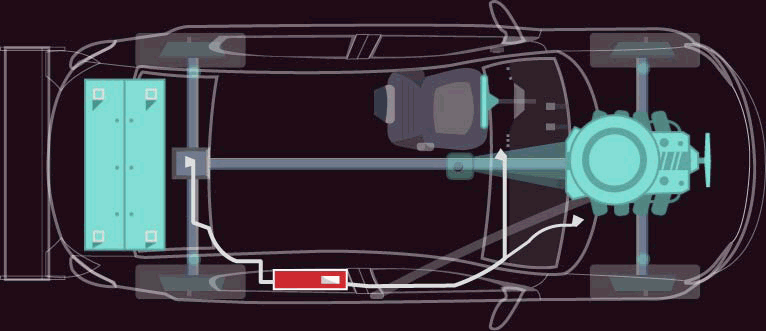
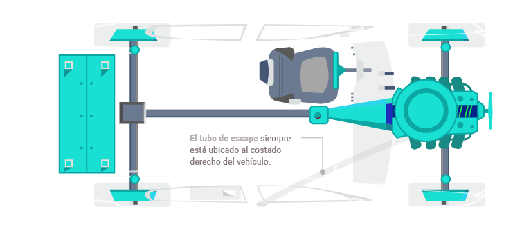
NASA´s SEV Vehicle
At least nine of the technologies developed by NASA towards Mars space exploration are mentioned in the book and movie The Martian, this 3D infographic collects those coincidences.
Martian tech
I also want to add some short animations as gif files in the graphic to give support to the information and the whole infographic, Edgar and me develop this sort animations in After Effects.
if you want to know more about the graphic the original feature at nacion.com here.

The original feature publication at nacion.com
I very lucky to have co-workers with this kind of skills, and the space to make this kind of publications, I love infographics, and space… 🙂
August of Dataviz

I have been teaching the course of information design for over two years now, and as I always say, my greatest satisfaction is to take a tour of the good things that these boys and girls have achieved with their projects change each cycle.
For this opportunity, my students worked on three projects, the first was the creation of pieces focusing on processes, for this I left them some issues to assist in the process and make more effective taking a decision, the second project was the creation of an analysis of literary works, in this case the intention was that from some books that previously chose to give them a pdf of these works, the students seek ways to visualize related to such works topics, the latest project was a a little free theme, with this the idea was to make a graphic interpretation of a classic tale, fairy tales that end up being interpreted with certain rules of any visual form.
interesting ways of looking at information through the eyes of my students, I invite you to see the whole pot with the description of the work and others at visual744 here: http://bit.ly/1hf7UlF use google chrome for translation from Spanish.

CTCC Parque Viva
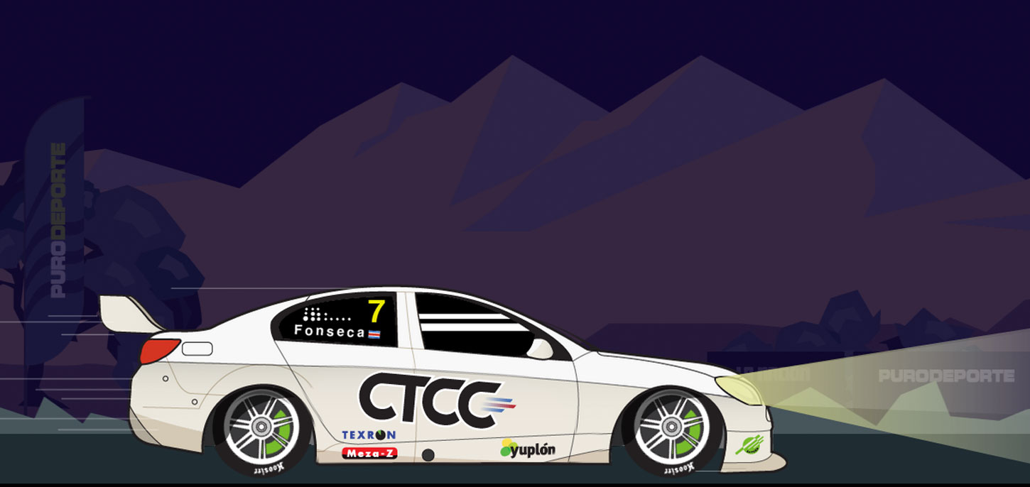
A few hours more than a full day of work takes to two co-workers and me, to release today this special feature about the V8 cars competition in the “Parque Viva” racetrack.
Animated graphics, details about the cars and restrictions and a complementary key note of Jose Luis Rodríguez fusioned together to create this digital experience.
I hope you will enjoy it!
Graphics inside the special
Graphics inside the special
Graphics inside the special
Graphics inside the special
Visite the special site of nacion.com here: http://goo.gl/gzjLYy

The National Symphonic Orchestra
Happy to finally conclude a couple of months of research, visualise and design this special feature in celebration of the 75th anniversary of the National Symphonic Orchestra of Costa Rica. For this project, I’m try to develop an experience immersed into dataviz fusioned with clear spaces, photography, video and even white space.
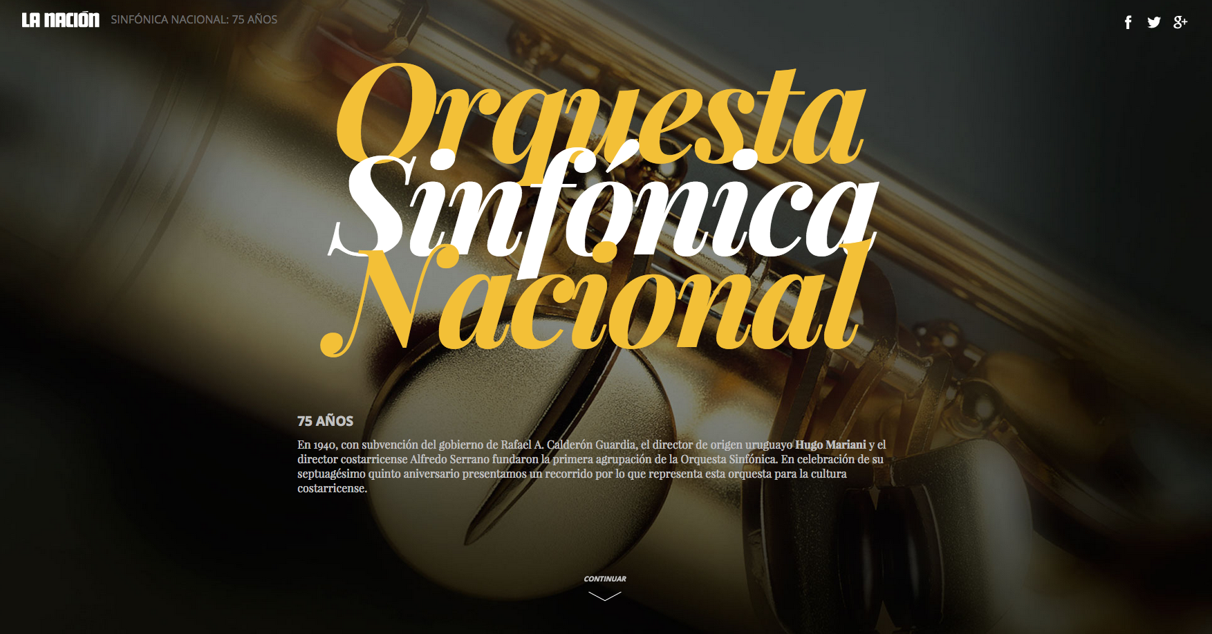
The 75th anniversary of the National Symphonic Orchestra.
Please, enjoy the experience at nacion.com
http://www.nacion.com/LNCSPC20150622_0001/index.html?desktop=true
Use Google Chrome for translation from spanish.

Al baúl de los recuerdos
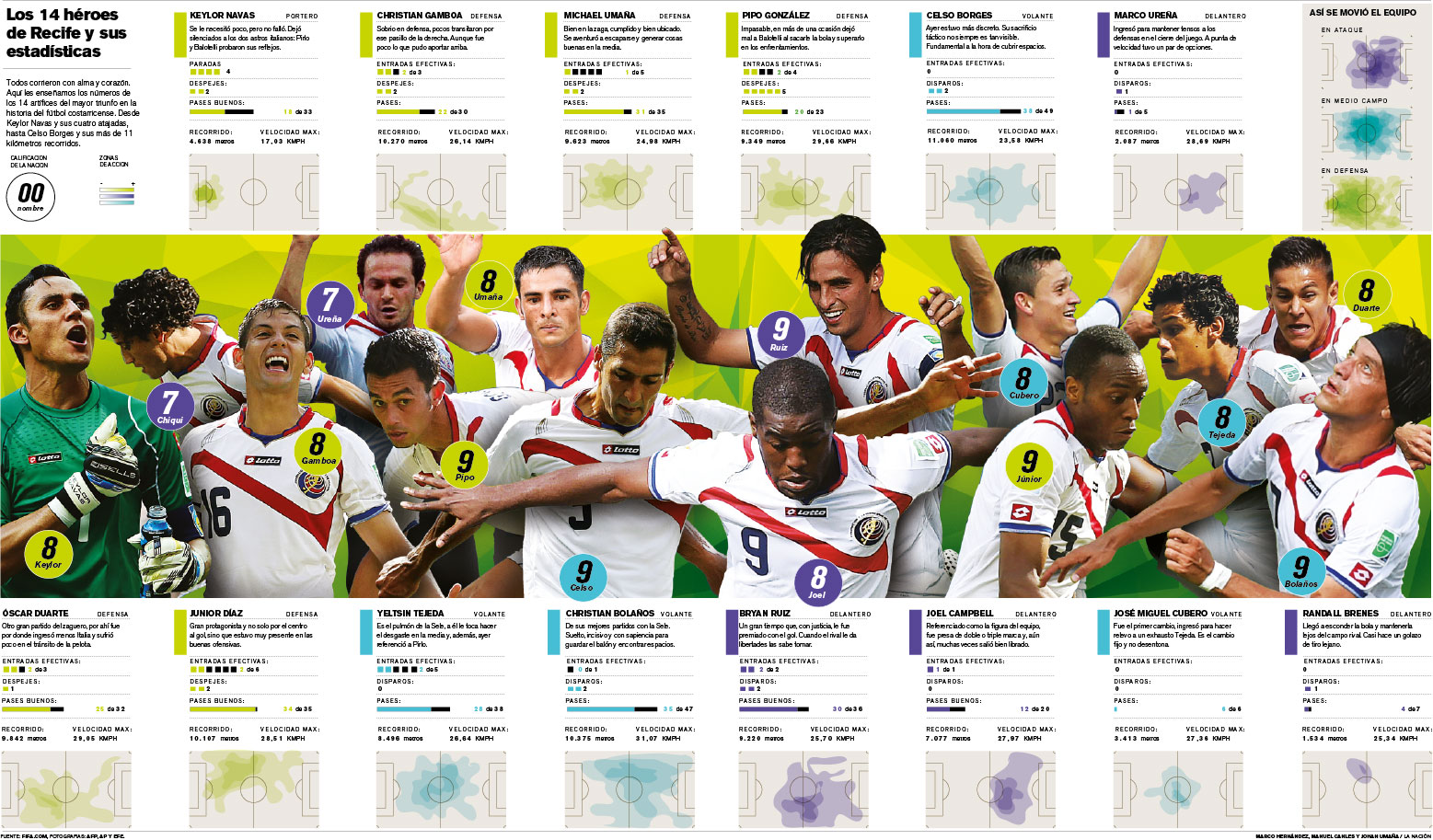
No siempre la visualización de la información es abstracta, una tabla de información que recibí hace unas semanas estaba casi destinada a ser una caja de nombres y puntos. No tengo nada en contra de una matriz, por el contrario, a veces me parecen la solución optima para presentar datos, pero no siempre son la vía más efectiva si se considera el medio de la publicación y el público a quien se dirige.
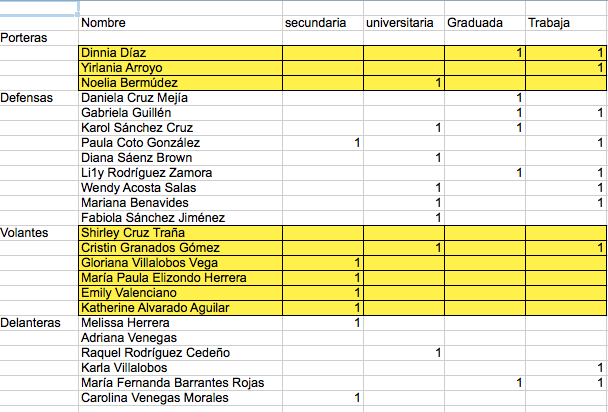
Características de las jugadoras de la selección nacional de fútbol de Costa Rica
En este caso en particular, se trataba de una revista, el proyecto se me planteó con un tiempo límite de un par de días y aunque la información no era gigantesca tenía algún potencial para presentar una página interesante, este fue el concepto que se planteó:
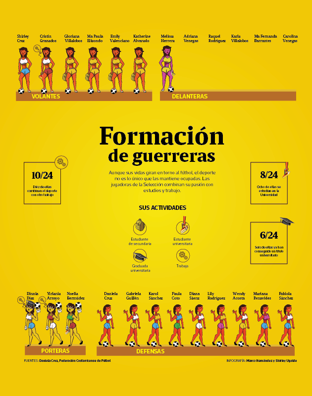
Concepto de la visualización de la información de las integrantes de la selección nacional
Finalmente algunos malentendidos de coordinación entre las secciones de los medios no permitieron la publicación y el trabajo se archivo, pero afortunadamente siempre hay otros medios para traer a la vista esos trabajos que de otra forma se van directo al baúl de los recuerdos (en el mejor de los casos).
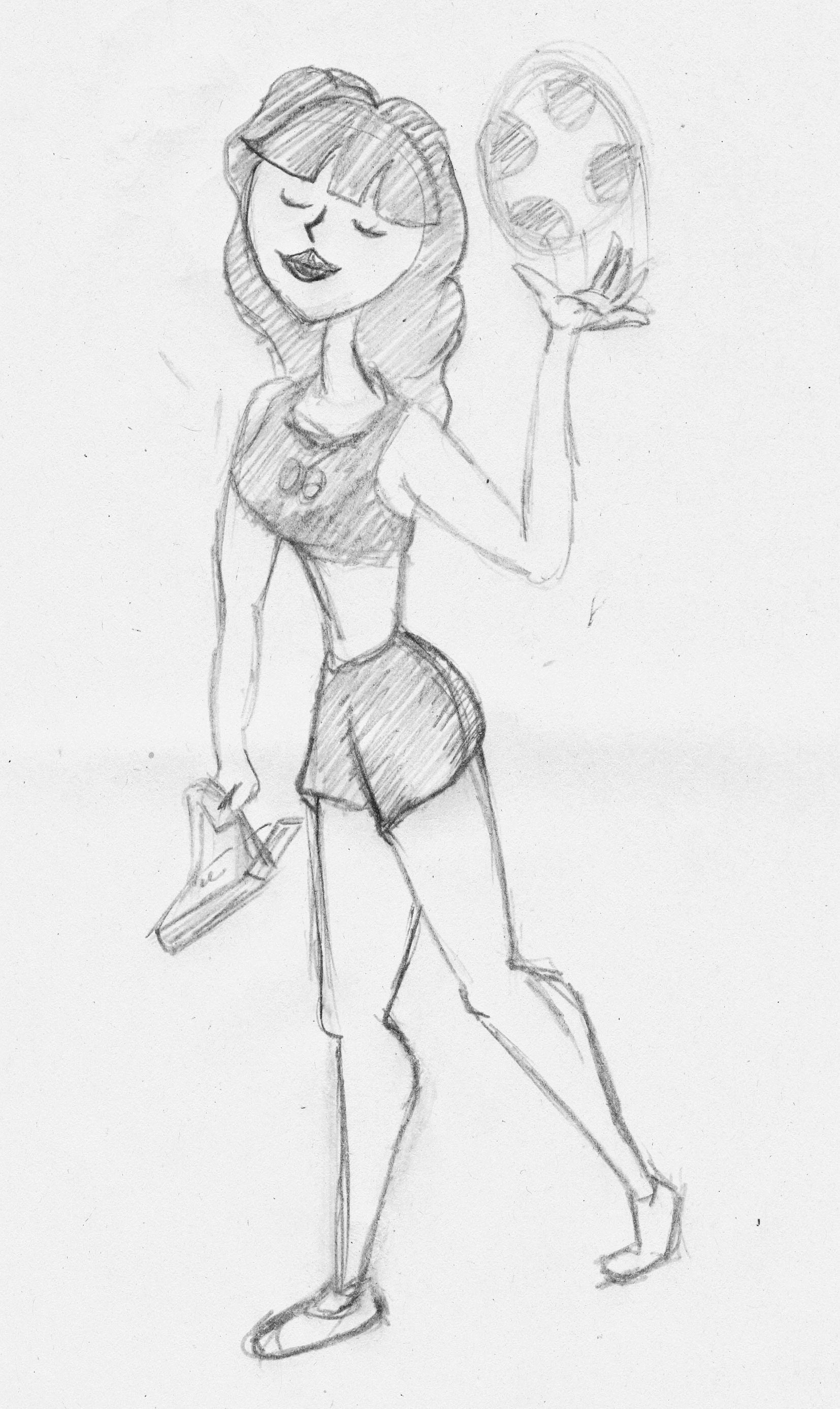
Boceto de uno de los personajes. Selección femenina de Costa Rica. FIFA Canadá 2015.
Es un ejercicio interesante, aunque no se publicara, da un espacio para intentar nuevas alternativas a la hora de visualizar datos, los visualizadores no deberíamos perder de vista nuestro lado en contacto con las artes. Tomar recursos de ese mundo visual puede refrescarnos las perspectivas un poco aunque no podemos dejarnos seducir por la estética como finalidad exclusiva… todo con moderación 🙂
Les dejo algunas otras capturas del proyecto:
Equipo de porteras de la sección nacional.

Concepto de las selección femenina de fútbol de Costa Rica.
Detalles adicionales de las ilustraciones y el proyecto en sí en Behance en este link: https://www.behance.net/gallery/27362599/Guerreras-en-la-cancha

News Data App of the Year

The web app lets citizens find out the average monthly salary someone with their profile can receive in Costa Rica’s job market.
We were awarded last June 17, the recognition of the best news application data through the work of “Does school pay off? How much?” http://bit.ly/1FTtpjH recognition was given in the category of News Data App of the year for small newsroom here is the details.
Alejandro Fernandez from El Financiero was the project manager. In the area of specialized design of GN we welcomed the project in the design phase, and the development department GN concrete it. Today with them, we celebrated the triumph of this web app in the summit of GEN2015. Here the details published regarding: http://bit.ly/1L2U69p
The quick report, my students work first cycle of 2015
A new cycle of students has be done at the Science and Arts University of Costa Rica, some interesting projects and concepts appears, the complete report is at visual744 but it is in Spanish, use Google Chrome for translation.
Here is the link to: http://visual744.blogspot.com/2015/04/un-ciclo-mas-de-dataviz.html
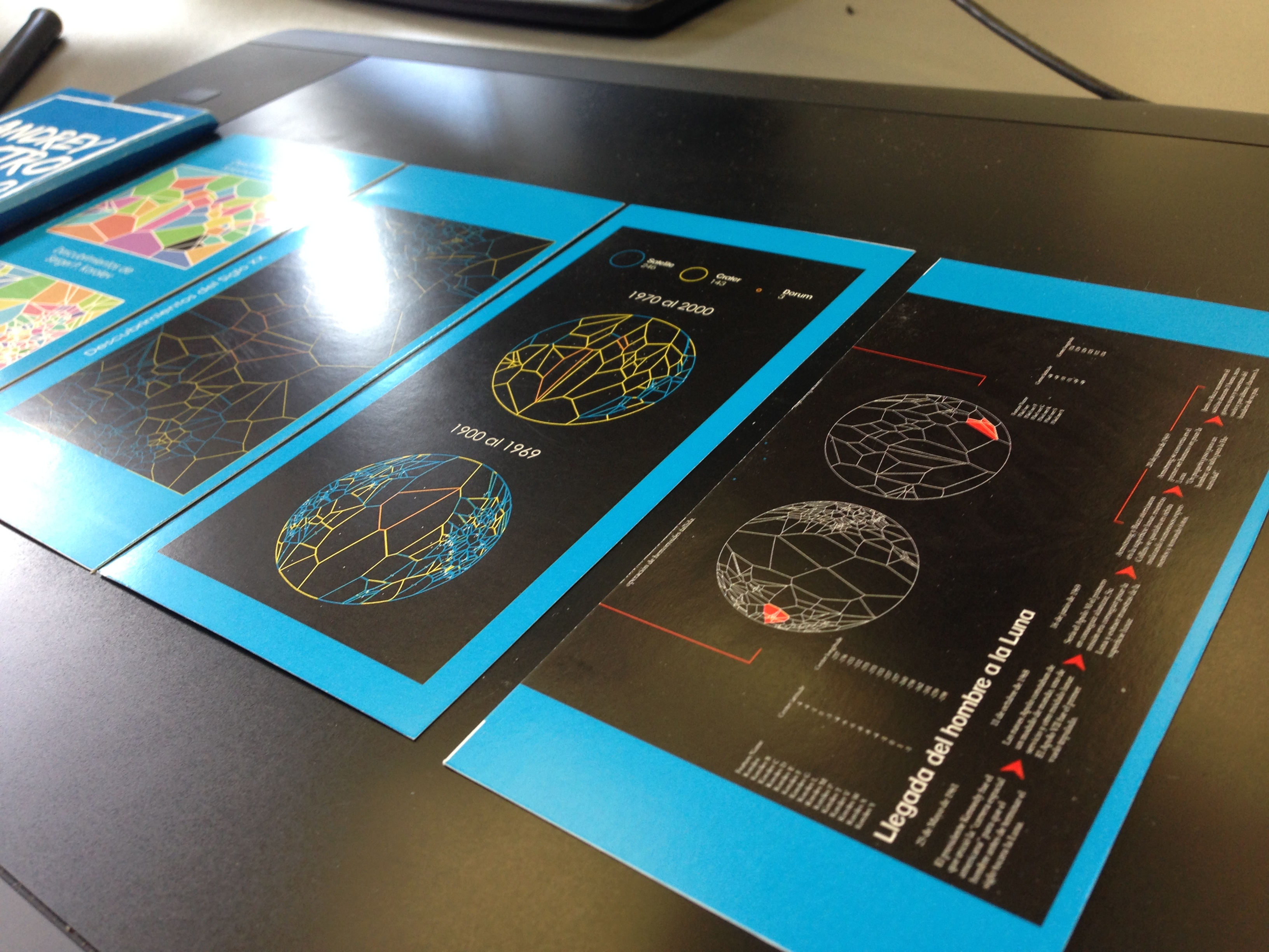
Details of the job log Andrey Castro, project “The Moon in the 20th century,” design student information. University of the Sciences and the Arts, April 2015.
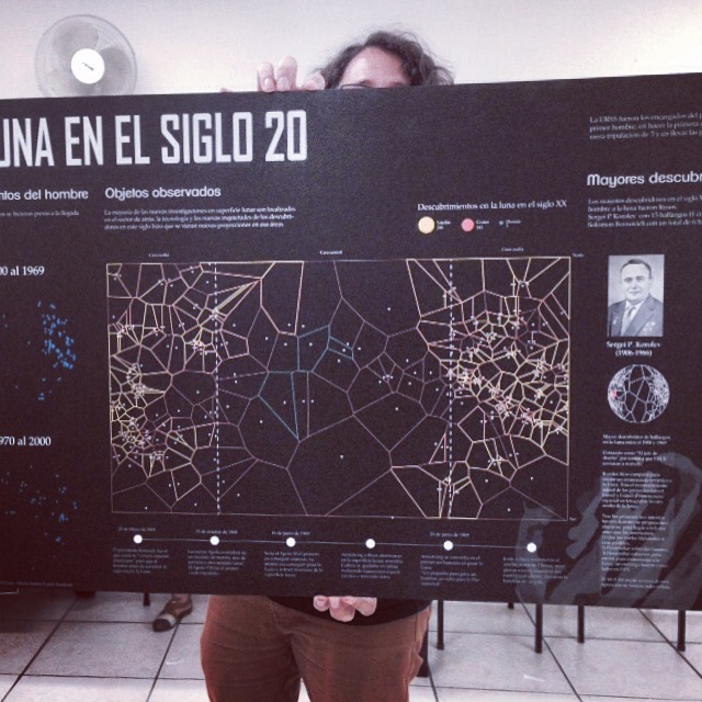
Infographic by Andrey Castro, project II “The Moon in the 20th century,” design of information student. University of the Sciences and the Arts, April 2015.
Malofiej 23, The Pulitzer awards of information graphics
Today the 23rd edition of Malofiej ended, the jury of the International Infographics Awards, organized by SND-E, gave medals for the best in graphics of the 2014. A great honor for us in GN Medios has been awarded with two silver medals, one for the special of the 75th Batman anniversary in print categories, and an other for the Market of Soccer players data visualisation of online graphics category. Congrats for all my visual team at GN Medios.

The Bat cave, Special information graphics in poster format.

Special mini-site: Soccer players transfers in Costa Rica / La Nación.
Visit the special awarded site here: http://bit.ly/1xGyZAp
SND 36th print awards
Yesterday the Society for News Design (SND) announces on his site the full list of winners of the 36th edition in print categories. The visual team of GN Medios gets 10 awards of excellence, 5 of these for the department of information graphics. Some of these works includes: the World Cup Brazil 2014 coverage, Special posters as the collection of the Human Body and the Batman 75th anniversary.
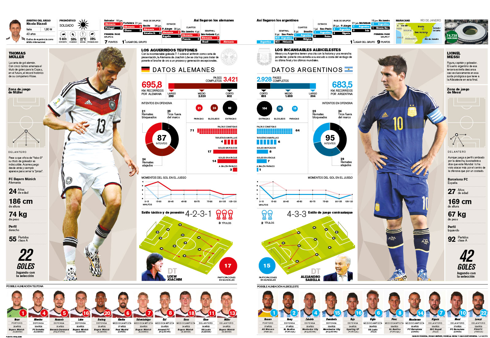
Graphic coverage of FIFA World Cup Brazil 2014. La Nación 2014. Marco Hernández and Manuel Canales.
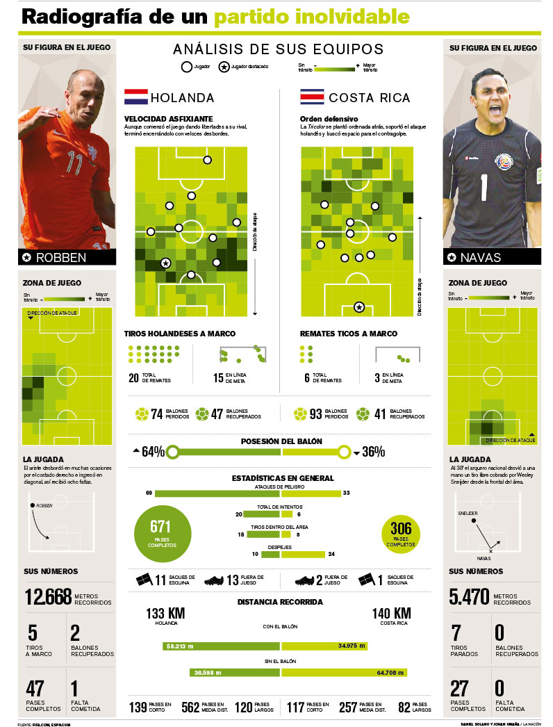
Graphic coverage of FIFA World Cup Brazil 2014. La Nación 2014. Daniel Solano and Johan Umaña.
Graphic coverage of FIFA World Cup Brazil 2014. La Nación 2014. Staff / Infographics Dept.
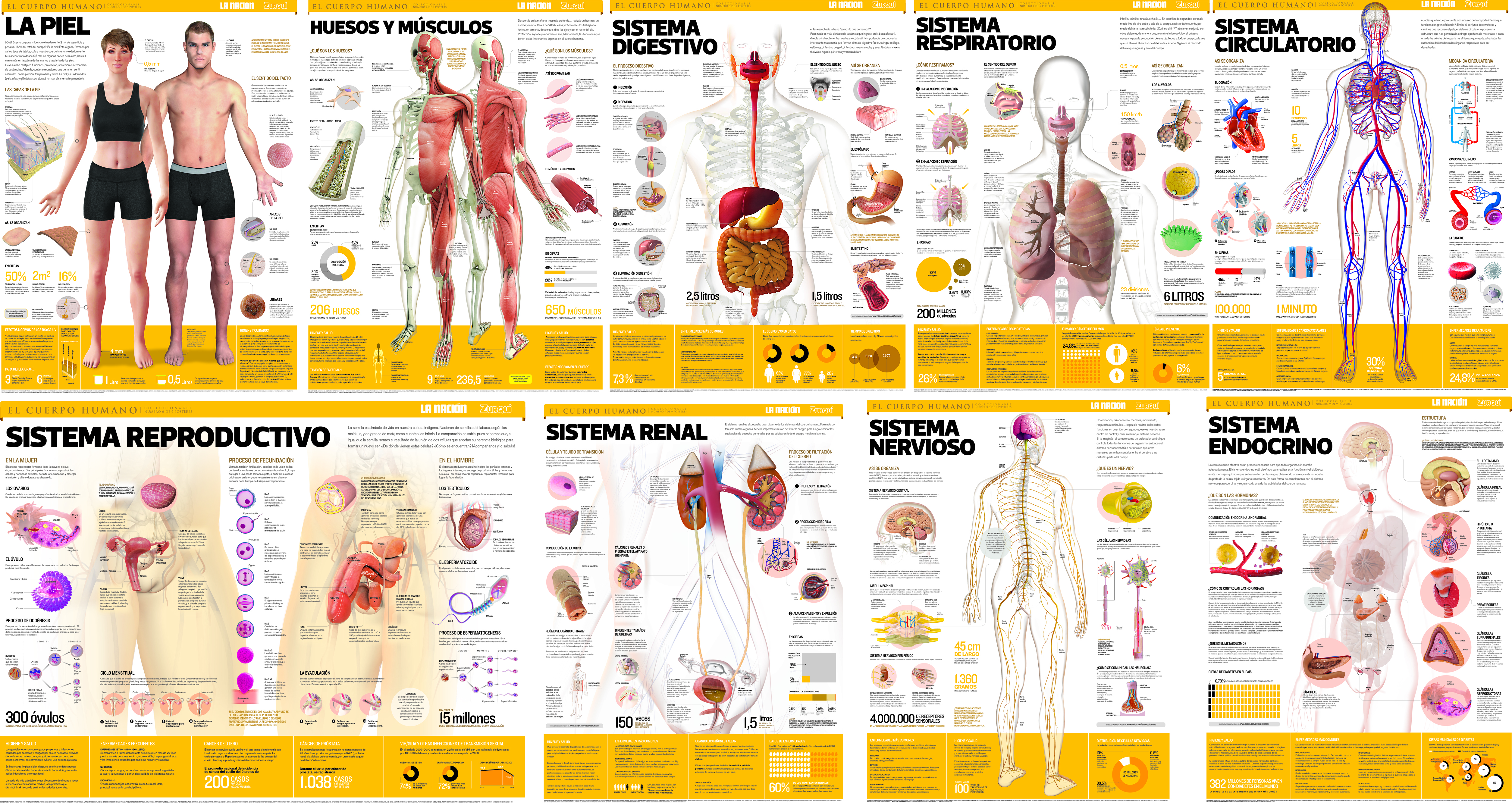
The collection of posters of the Human Body. Staff / infographics Dept.
The Bat cave, Special information graphics in poster format. Carlos Fonseca, Manuel Canales and Dan Mora.
