A few days ago this project about the ageing population goes live at scmp.com
This slideshow requires JavaScript.
Here is a lot of information to explore, the interactive special feature have plus 40 years of population forecast for Hong Kong, there, you can explore how the population will be conformed for the next years a how will be getting older and older.
Usually I don’t use or make much illustration by my self, but I been losing fear about, I have the intention to use illustration to make a balance of the serious and hard data-viz.
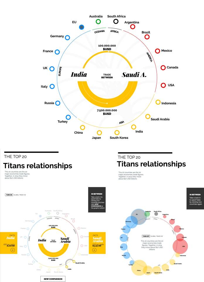
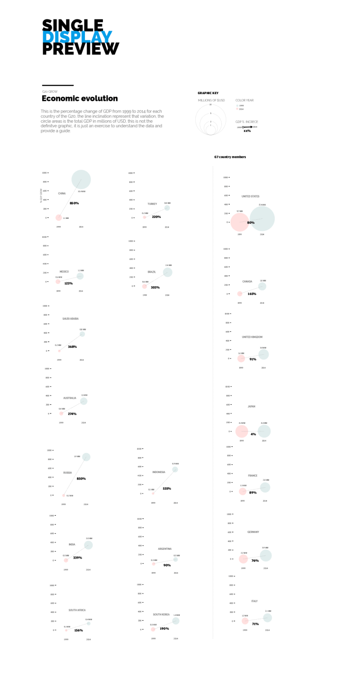
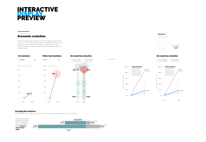
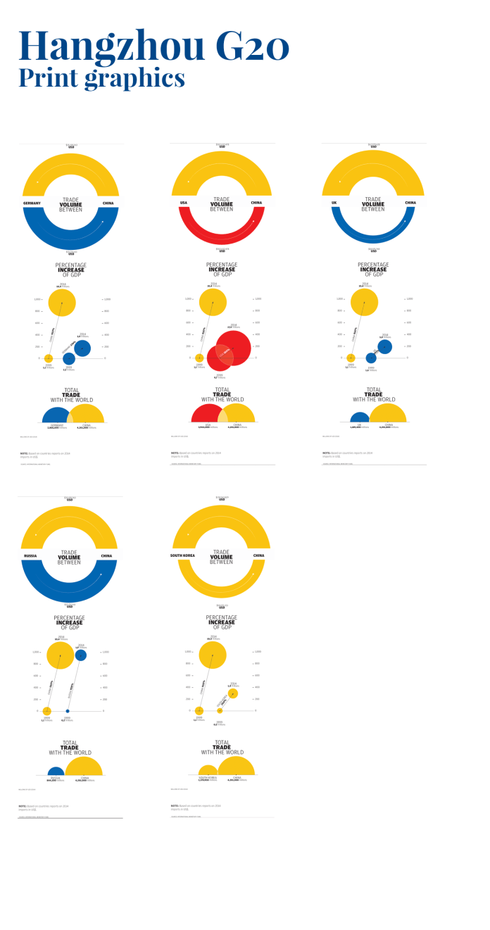
Some days ago, the SCMP special package about the G20 meeting in Hangzhou, China was released. I must admit, I would have liked to have more time to intervene in the design, but I have a graphics queue waiting in other projects, so, I focused particularly on the graphics for this time.
Illustrator layout for the first graphic.
There are 3 graphics, all them with small simply animations. Usually, I start analyzing the data on excel, or numbers in Mackintosh. Then I go to the paper, the scheme, aspect, interaction, variables and even animation is defined in the phase, thats the reason why this is the crucial part, and the harder one.
Next, is the vector time. I start the translation from paper to Illustrator, in this case, take the paper ideas to illustrator is just one day of work, but all the assets will be ready to the develop phase, is just a thing of order in the groups, layers and documents. That, because I take the illustrator files to generate the svg base for coding through javascript.
Initial scheme for the second graphic. This is a guide to take the idea. Some point forward the graphic change to an partial version with more interactive options by editors observations.
Here is the second proposal of the graphic 2, including the editors request.
The next step was the development phase.
I work with Brackets, an open source software to edit text code, it have a nice extensions to make the life simpler 🙂
If the asset don’t need to interact with js, I just call it as images, but if this asset needs to be transformed on color, position, size, opacity, content, shape… then a take the code from the svg file, which is very similar to an xml file. In this way I will be allowed to select parts of the svg and change it by coding instructions for the user interaction.
The first graphic has 191 posible configurations. At the bottom of this image, also is all the population density por all the G20 country members.
The process includes files such as .css .html .js .svg and some times depending on the functions or effects images, audio or video. Both versions (desktop and mobile) are working simultaneously, but some times different browser testing (cross browsing) and some queries remains to the end o the digital process.
Finally, when the digital product is ready, I have to make some smaller versions for the print, in this time, I take the graphics #1 and #3 to integrate in a very compact version, in total five graphics for different days of publications.
3 col graphics for 5 days of different publications
If you want to see the final product, you may find the interactive graphics here
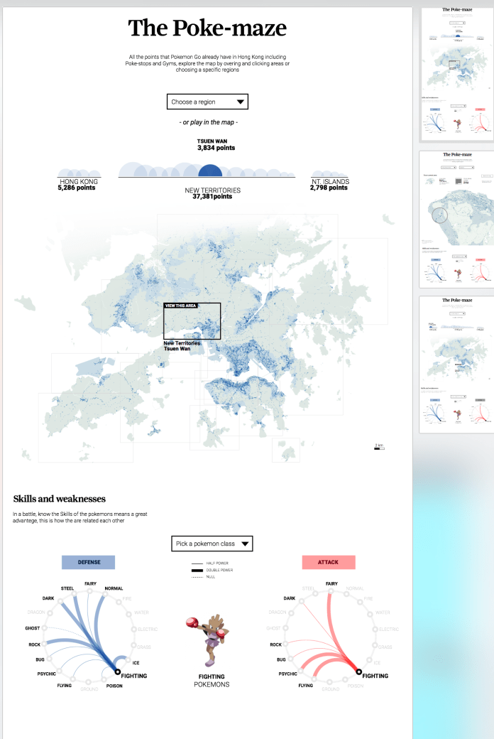
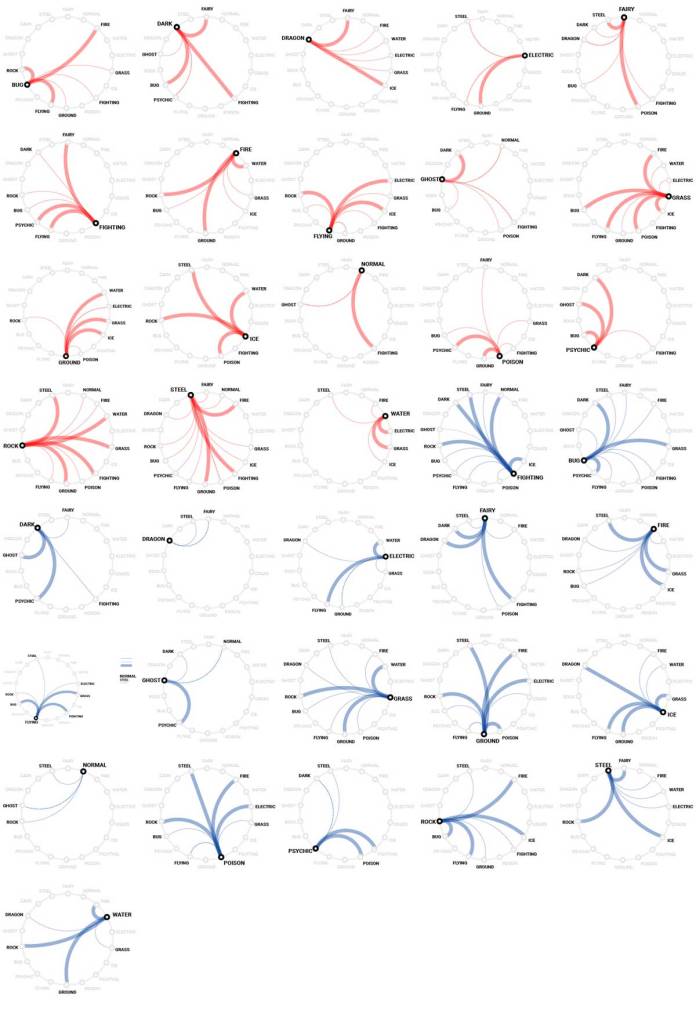
The Pokemon fever runs out the whole world, here in Hong Kong the people also was infected with the Pokemon global madness, so we in the SCMP graphics want’s to offer something different to our readers, and that was a detailed map of the Hong Kong Pokemon spots and a plus graphic about the Skills and weaknesses of each class of Pokemon.
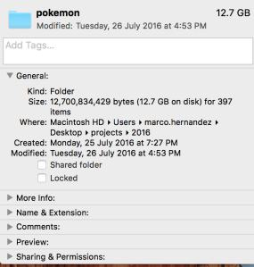
The map was a hard work, to get all this data the folder of Pokemon project reach about 12 Gigabytes of my computer, but off course the final application on line is just about 500KB, I catch this information from an other game in which the creators was based to create the Pokemon virtual world, the whole process takes me 5 days including the new design and the development phase.
When I finish the data catch phase and clean it, the points shows a really nice pattern, following the urban areas but also reveals by him self the Islands shapes.
10% map sized of the original data. In the bottom right corner the most concentrated area of Pokemon spots, corresponds with the Hong Kong Island districts and the Kowloon territory crossing the bay area.
My first design was a purple points for the spots over a grey map, to give it a high contrast, but, then turns green and blue to keep it closer to the actual game interface. Usually I wrote my own text, but as you may know my english is not the best so, the layouts and the final product changes a bit on that also.
Illustrator layouts for Pokemon project. Version 2.2
The bottom section has a graphic about some characteristics of each class of Pokemon, the dropdown menu allows readers to switch the class and display different graphics, I have to say that I don’t like the Pokemon at all, even when I was younger, but I love to create data visualizations and offer to the people an other way of stories… visual stories; so Yes, I enjoy this project much as the Pokemon lovers has enjoy it also.
All the small graphics for Pokemon skills. Red for attack, blue for defence.
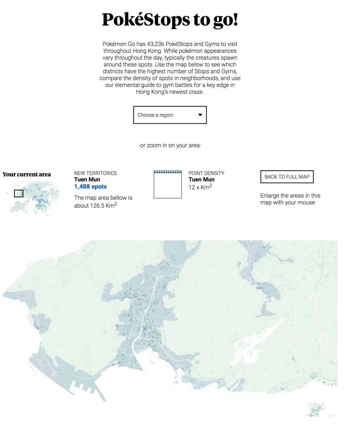
If you go inside a region of the map, the graphics will show you how dense are the spots in that area, how many spots are there and how big is in square km, ho! and also will allow you to zoom in just hovering the mouse in the map.
Area in detail, you can access by clicking areas in the main map, clicking the half circles of the top graphic, or choosing an specific region in the drop down menu.
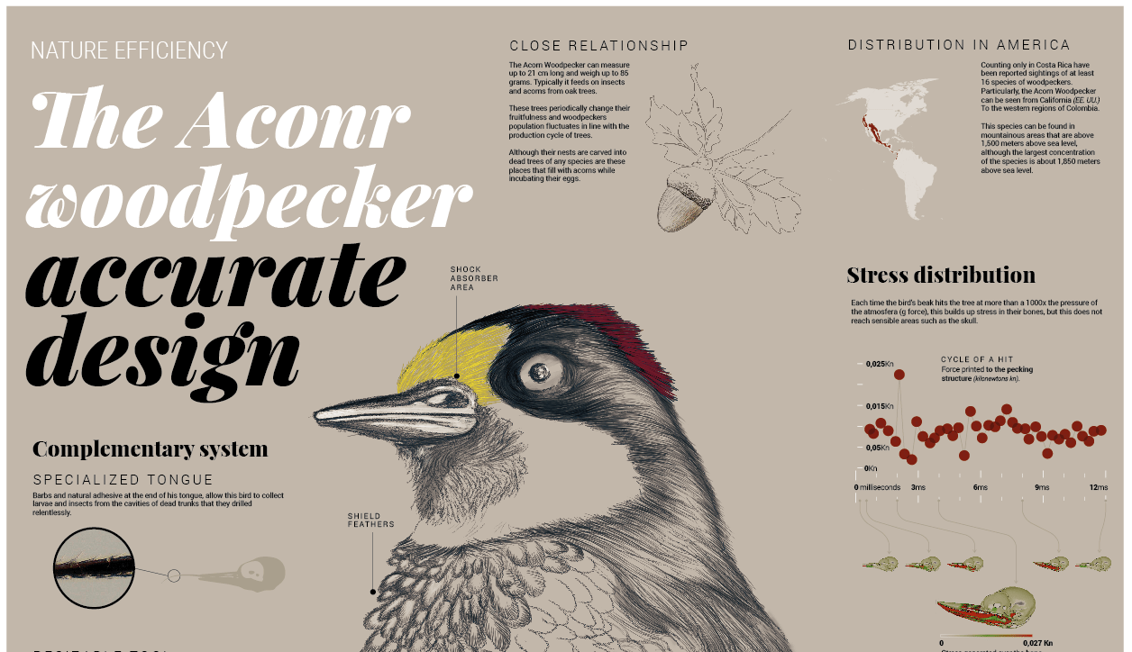
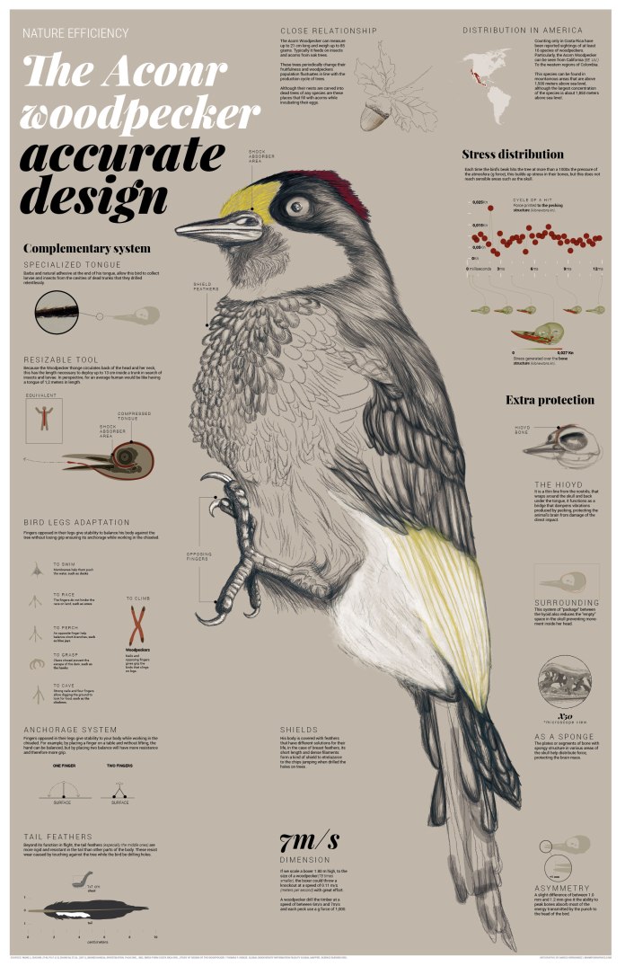
Some time ago while living there in Costa Rica, near my house were these tireless birds pecking lampposts, I always asked myself how could be that these birds will support all that stress on their heads without any problems.
Drill on wood with the peak would be like ourselves we were to take a door and hitting her with the nose to open a hole in it, not to mention the pain it can cause, the head injury is a real factor, but for some reason these bird is not. So I put myself behind the track that make me understand that about the woodpeckers and the reason of because they can do that, and actually there are several studies explained it, there is even information from other peculiarities of this bird that I found wonderful, so, I decided start this infographic with this information.
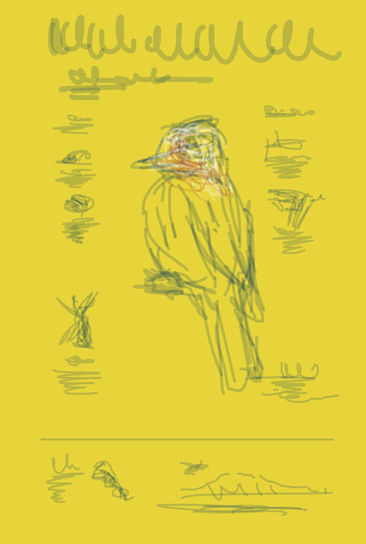
First draft of the woodpecker infographic
My initial idea was to talk about those particular things in the bird head, starting with the hyoid bone which happens to be one of those secrets of the Woodpeckers, and provide information of the population and its evolution time, but as sought was more particular details that could become new parts.
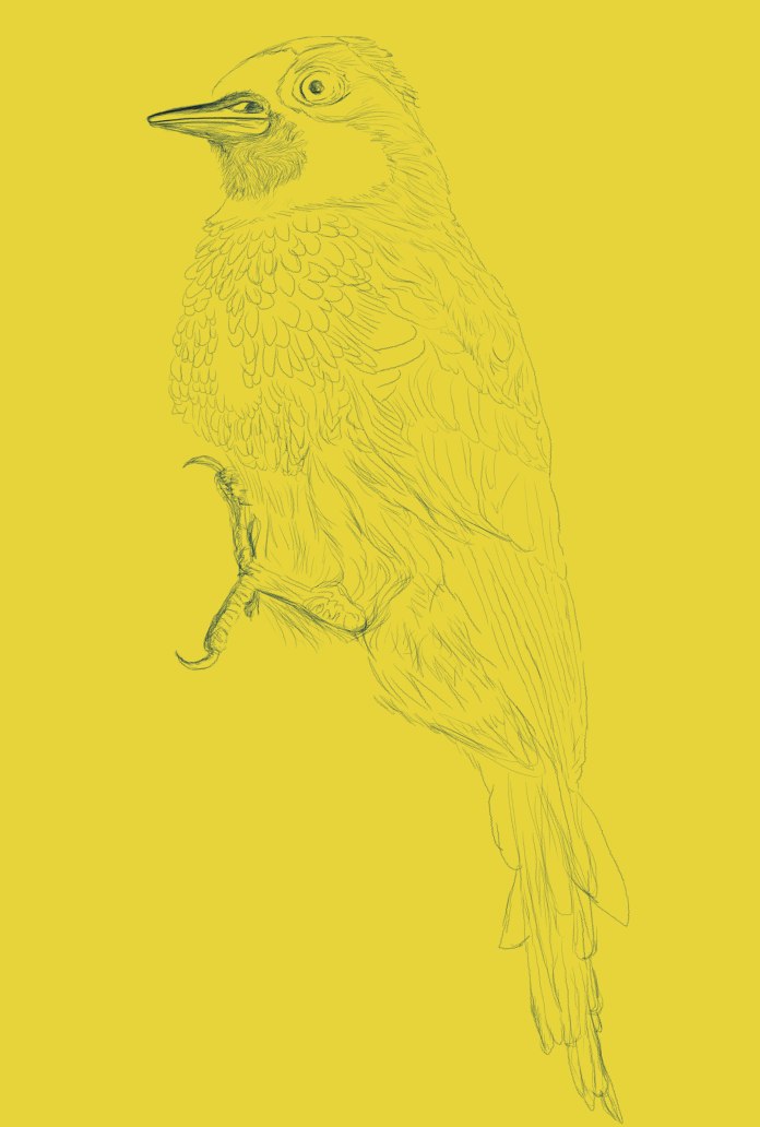
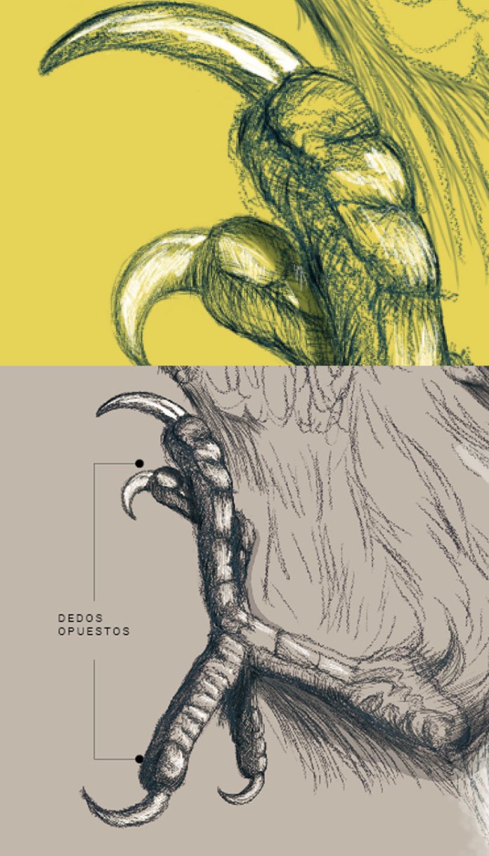
Process of the main illustration.
I usually work with data and abstractions, but in this case the information is also deserved a more visual and descriptive than quantitative contribution. I start the main illustration at 400% of the size that eventually would use to gain a little more detail in the finish, it was a good idea I thought the beginning… but ended up making the process very slow production, added to this, while in Costa Rica worked full time for La Nación news, also had my students and projects with the university there, and some other professional responsibilities drowned me the time to complete this work.
Up in the picture the original assets from photoshop, down in the picture the final presentation in illustrator.
All that changed suddenly when I left three days journey to a new life in Hong Kong, as it would have very long flights to get here, I found a space to work on this and to conclude what had begun months ago.
I love to do this kind of stuff because there are not tied to the daily work, I do it for the passion about infographics, because data and visual stories fascinate me and because I like to share that wonder that I feel to find complex information and hidden and to bring it to others in a effective visual way of consumption, and also feel that awe for the information that was there before.
Final infographic about the Acorn Woodpecker.
This probably is not the best way to deploy this chart because the difficult to read it, but if you want to see in detail, maybe just click this link to my drive and read it in detail.
I hope the information here is as interesting to you as it was for me, and enjoy the piece as I enjoyed building it for you.
Back in 2013, I start as a lecturer of information design at the Science and Arts University from Costa Rica. Many students come to my class, more than a hundred of them went their way after receiving an initiation into the world of infographics and data visualization.
I enjoyed a lot the experience to share knowledge, but the time to move on has come. I will be focus in the finish of other personal projects as a collection of infographics from places and native things in my town, and also the finishing and publishing of my book about infographics.
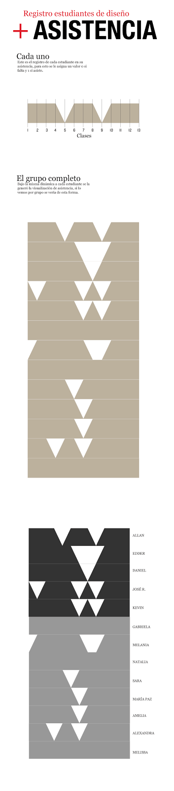
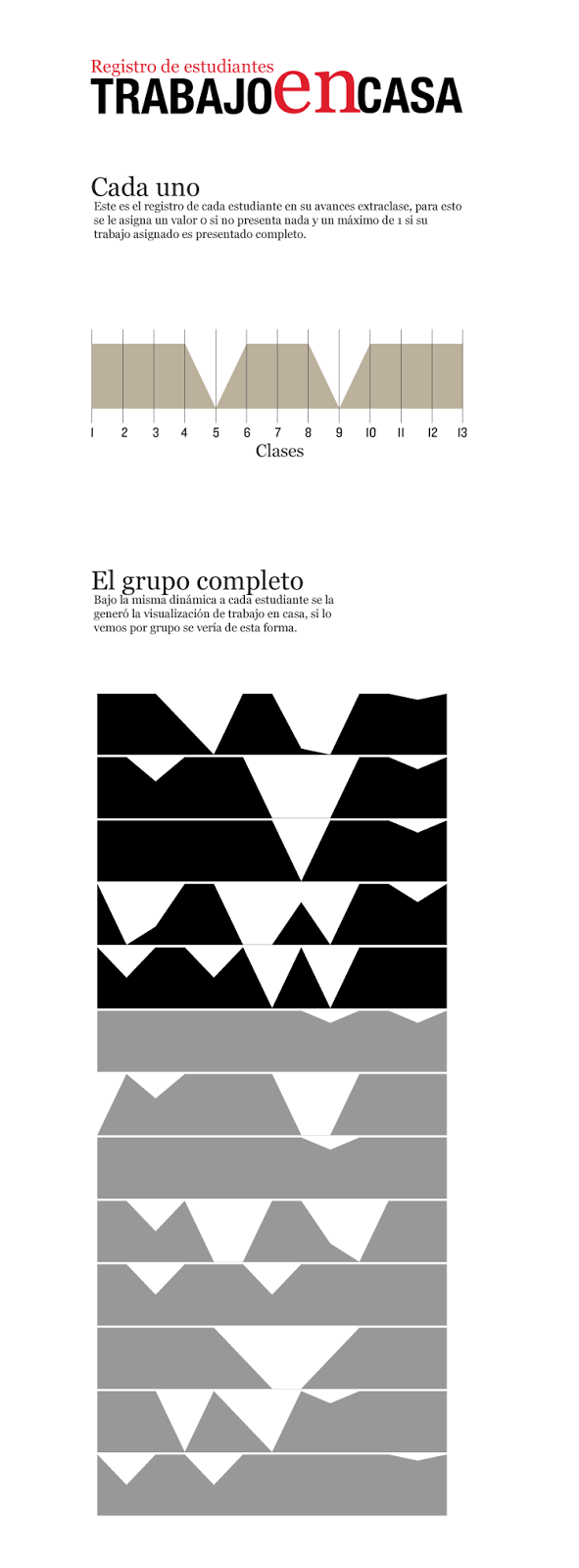
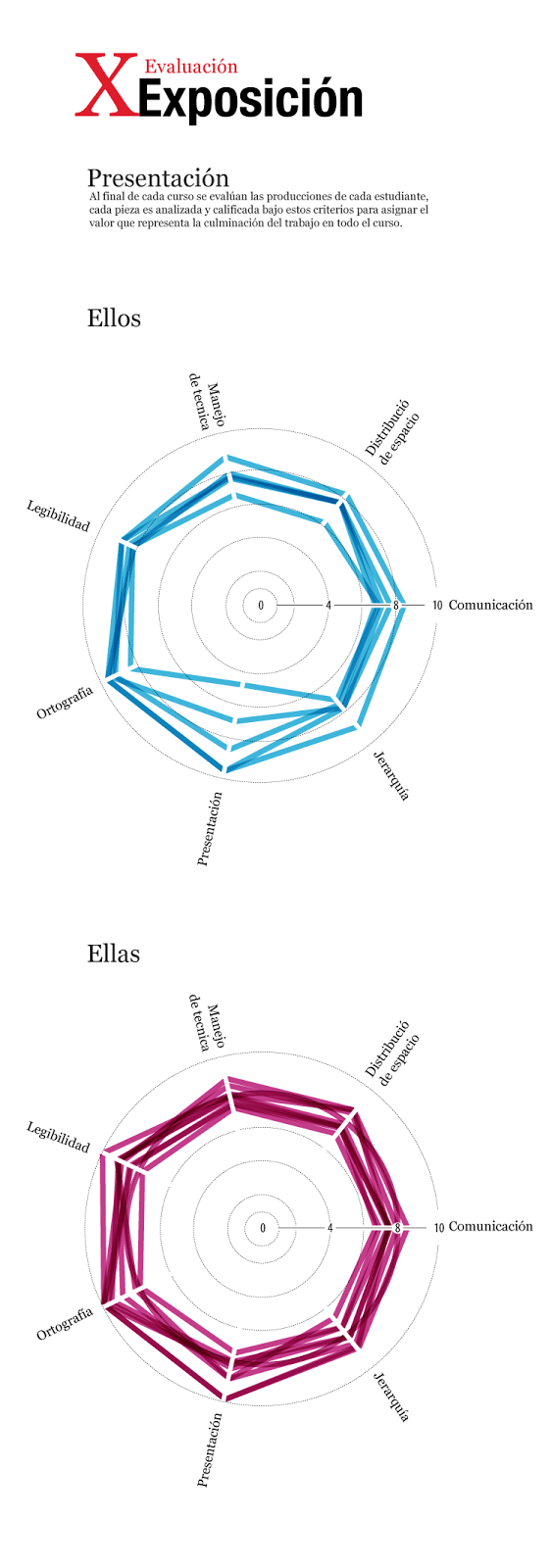
As a closure of this period, I want to make a tour for the results of work of my students, starting in 2013, the results of the fist class:
In 2013, I try to make some conclusions about my class to improve it, with all the data collected I made this pieces:
Students attendance individually records
Homework records
This was the final report about their performance in my class
Late in 2013, I published some highlighted works of students, many of them find a new passion in infographics design, they enjoy all the process from the research, write, sketch, design, and publish. Here is some works, and also the full story of the projects (also in spanish) http://visual744.blogspot.com/2013/12/una-nueva-camada-de-visualizadores.html
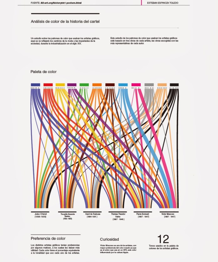
The color palette poster artist, infographic by Esteban Espinoza.
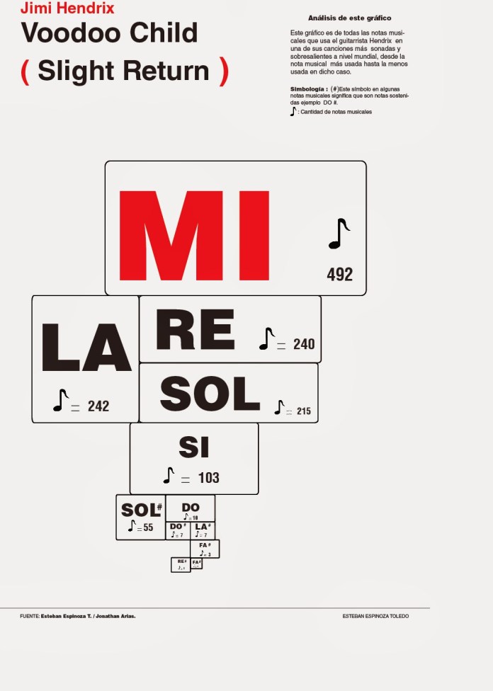
Voodoo Child, infographic by Esteban Espinoza.
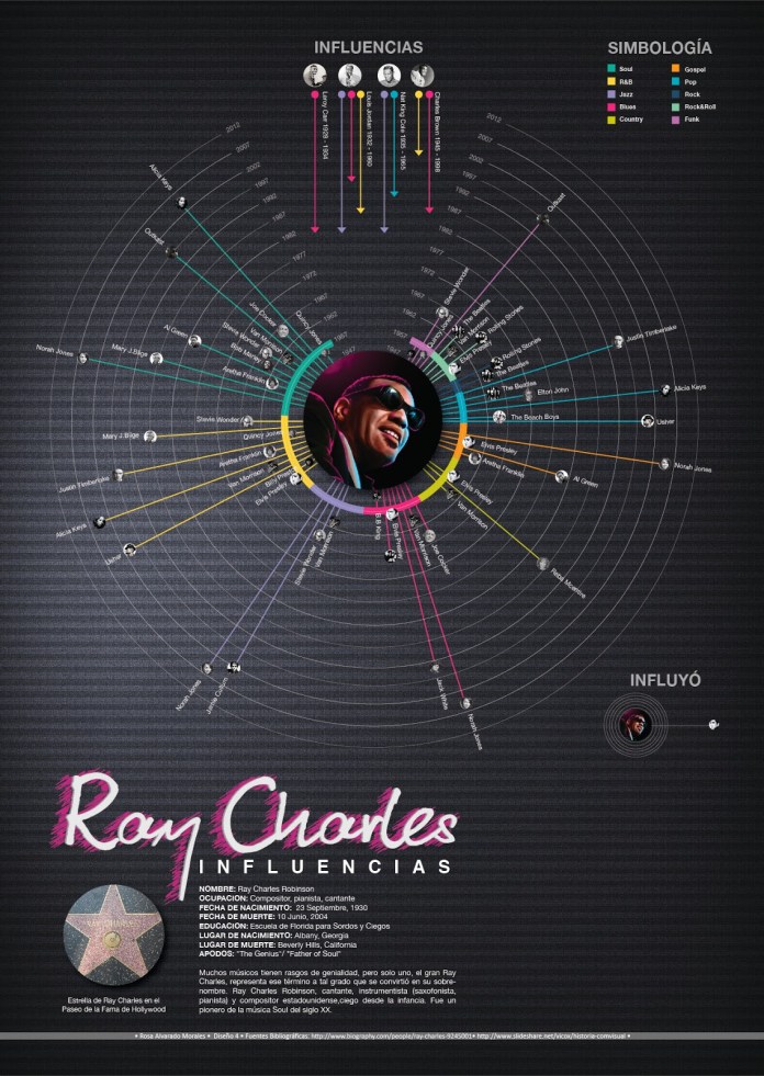
Ray Charles influences, infographic by Rosa Alvarado.
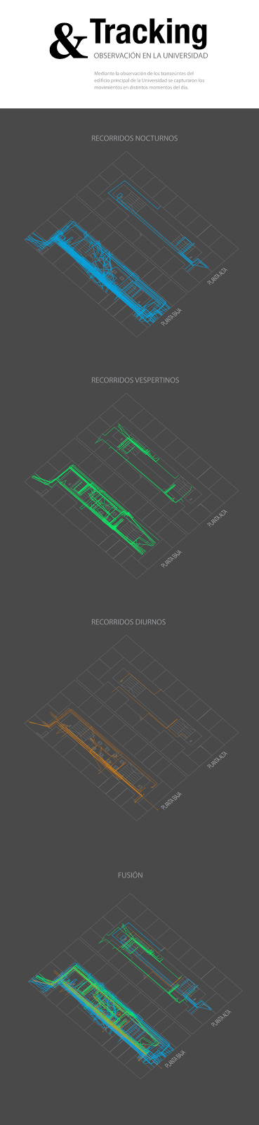
The 2013 was ended, and the new year comes with new ideas, I made always different topics to investigate and develop projects at the University, and thats why in the early 2014 my students was started to collect data on field, to visualice it, beyond just make a research. The first class of 2014 worked with data tracking and field research.
This is the full story abuot: http://visual744.blogspot.com/2014/04/visualizacion-indoor.html
Also in 2014, but in the next cycle of my class, the topics change again, this time the main focus was isometric structures of historic buildings from Costa Rica, and a little complement in data-viz about the posters artist.
The full story about this period: http://visual744.blogspot.com/2014/08/ciclo-ii-2014-en-la-universidad-de-las.html
And some works also:
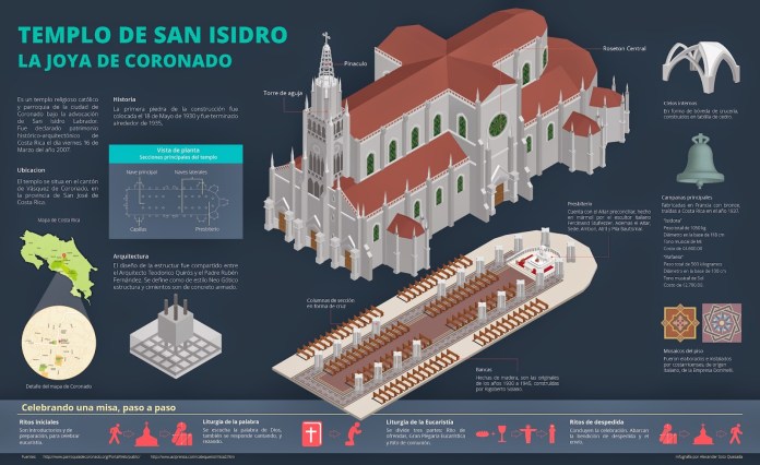
The church of Coronado, infographic Alexander Soto.
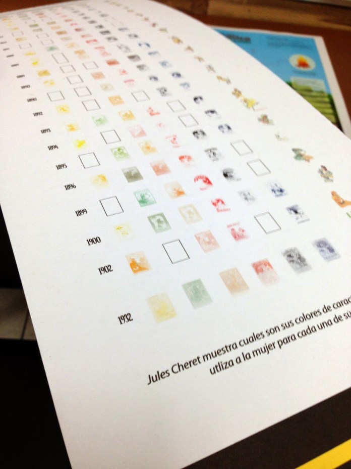
Detail: Analysis of the work of Cheret. Infographic: Daniela Rojas.
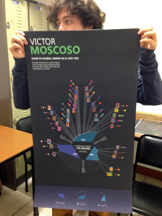
Displaying the work of Victor Moscoso. Nohelia Mora infographic.
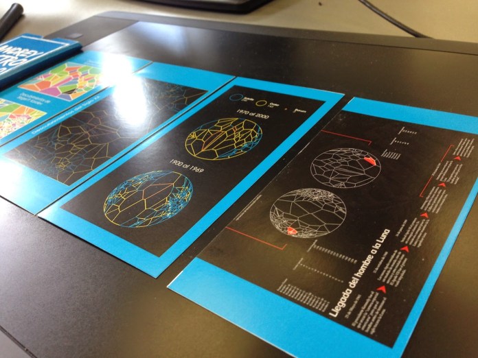
For the 2015, the first class start with a dataviz project about the things in the moon, tons of data about spacecrafts, natural features and some other stuff related.
Every cycle of my class contains at less 3 projects, but many time the students have nice results on one o two of these, not because a skill thing I suppose, it is more a issue related in time to dedicate between my class and the other things that they are doing.
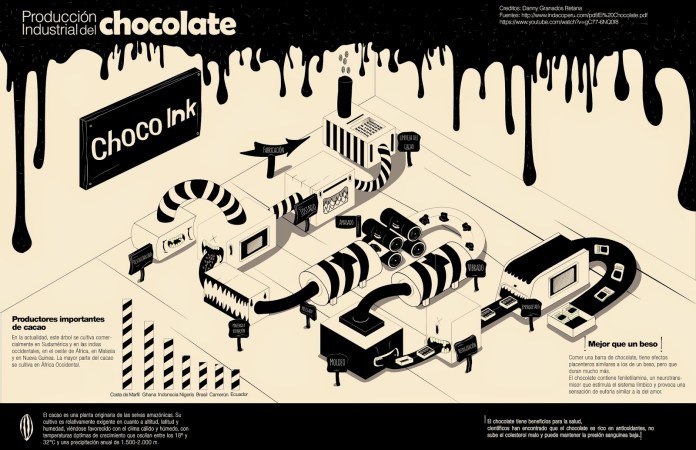
The chocolate factory. Infographic by Danny Granados. Universidad de las Ciencias y el Arte, Abril 2015.
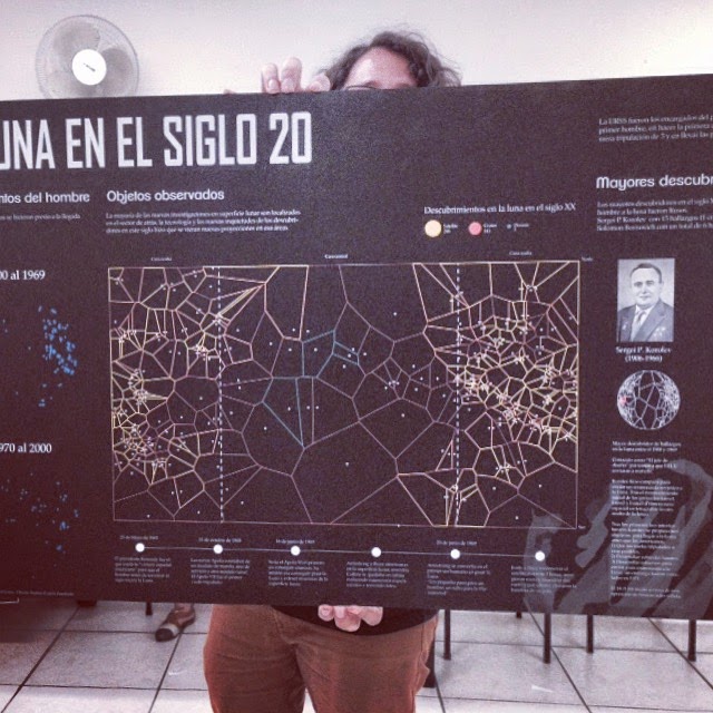
The moon in the 20th century, infographic by Andrey Castro, information design student. University of Science and Arts, in April 2015.
Detail of the Andrey Castro daily work, for his project “The Moon in the 20th century” University of Science and Arts, in April 2015.
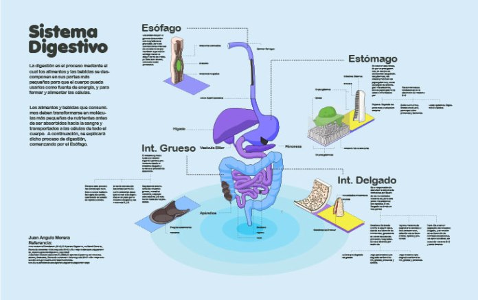
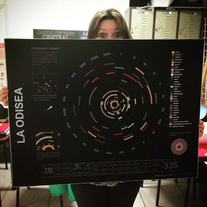
The next cycle of my class was dedicated to visualice classic books and the process of some systems inside the human body, in 2015 the students show some nice graphics also, take a look in to the full story here: http://visual744.blogspot.com/2015/08/ds4-agosto.html
And off course, here is some of they spotted works:
The digestive system. Project 1. infographic by Juan Angulo.
Homer’s Odyssey, Project 2. infographic by Inger Araya
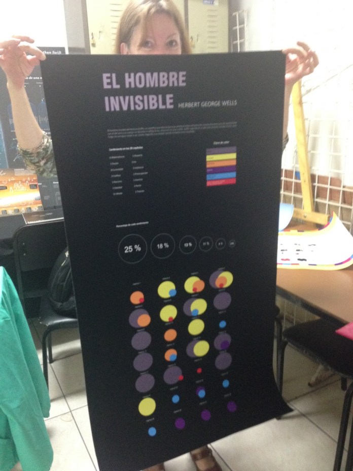
The Invisible Man, Project 2. Infographic by Indira Cascante
The 2015 was concluded with an new project of extra points, the last class of the year have the chance to make analogous weekly vizualizations in a half letter cardboard, they also made the classic 3 projects, and also gives nice results, here is the story http://visual744.blogspot.com/2015/12/introduccion-al-diseno-de-informacion.html and some projects:
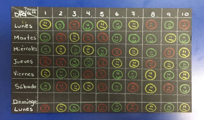
The response of an strange to a smile of me on a week. Social project for extra points by Kristel Mora.
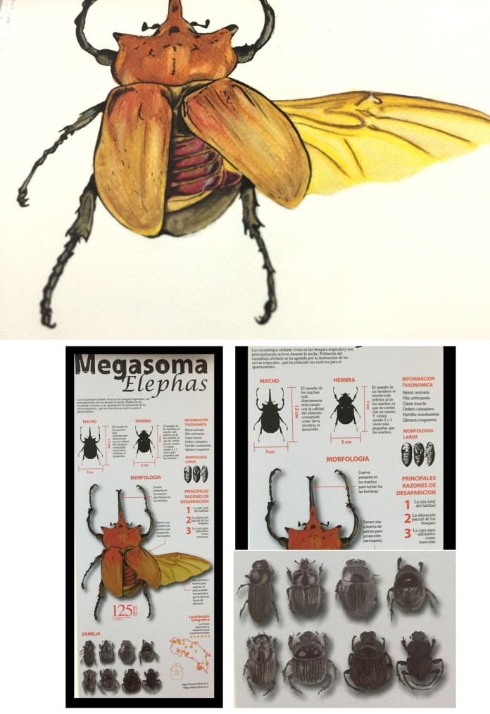
The Megasoma Elephas. infographic by Pablo Soto.
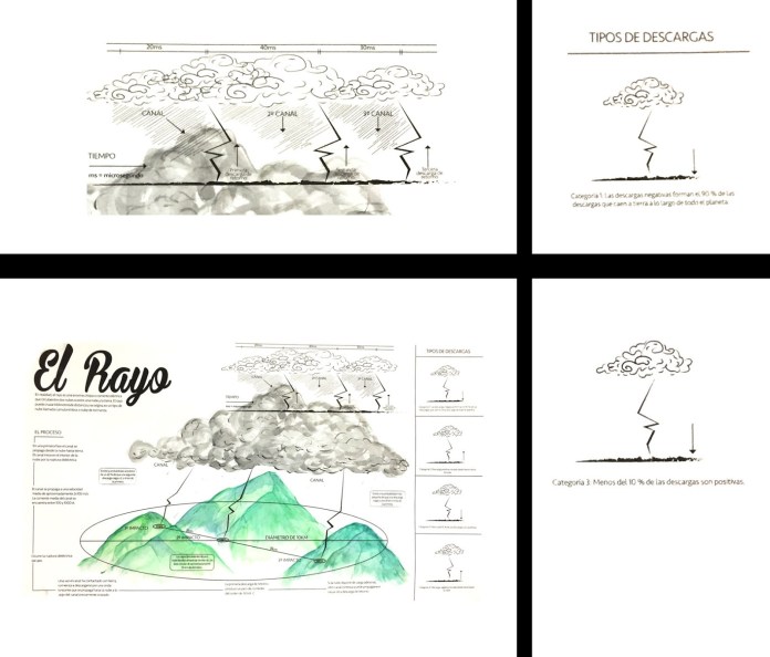
where the lightning comes from? infographic by Kevin Salazar
Finally, the last week my students present the results of the first cycle of the 2016, the first for the year and last for me. I hope these years in the classrooms of the University have been of benefit to all who crossed their training with my participation period of this wonderful experience of my life. I hope that at some point after finishing my projects I can share again with future professionals in this or another university and follow them sharing the passion for infographics.
Two of our digital works published at nacion.com wins an Award Of Excellence in the 2015 edition of the contest. The first one is the project in celebration of the “75th anniversary of the National Symphonic Orchestra” the design and development of this projects set a starting point to the trends of our unit.
The second project awarded this February in Washington D.C. was the “Birth of a Century“, I was invited to work in this project for the unit of Data from La Nación, and I have the fortune of the collaboration of the development unit as the artist Augusto Ramírez.
I have to say that I’m very very happy to get this awards of the Society for News Design in his digital contest, but this is a team work, and I must say thanks to my partners in the infographics unit, the Data Team of LN, the Development area, my Editors, and many many people who supports me last year.
The end of the 2015, and the beginning of 2016 becomes a hard work time here at La Nación, for this special event was required a full time dedication for about 3 months, but I enjoyed a lot.
With the Data Team, we create a tool for citizens that will gives them a chance to know more about the 605 candidates for mayors in all the Costa Rican territory. Segmented by province, the citizens can easily find their candidates, which in many cases , are completely unknown by his own voters, also this tool has the candidates complaints, money penalties or debts to social security, if there is some. http://goo.gl/6ZNVdp
But, there it was just a part of the planed work, all this data has tons of interesting points, ways to be visualized, and those were the deliveries of parallel information, every day… Here some of these pieces:
This slideshow requires JavaScript.
All the pieces goes to different publications, embedded in the reportage of the day, a few days after the elections day we released this special site [ http://bit.ly/1PMvuGG ] to join all this small pieces of the elections data.
When the elections day finally arrives, we change the attention to this other special production of live data visualization [ http://bit.ly/1Xg6A1A ] all the regional divisions was have the results just an hour after the voting centers closed his doors, updated in realtime.
Last year (2015) I start many new projects, some of them are still progress, but one of these are the quick graphics for social media.
At the unit of infographics and datavisualization, we spend many time in daily production and in special huge projects, I believe that we have enough time and muscle to produce frequently these small graphics, every single infographic must have a print version, desktop digital versión, mobile version but also, i like to choose some of these to develop a social media version, sometimes a gif, or an image or even a short video with a compact version of the main graphic.
So, here is some of my favorites picks:
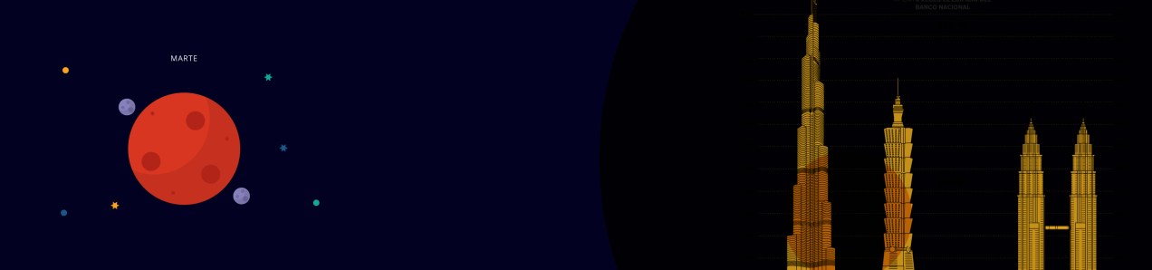
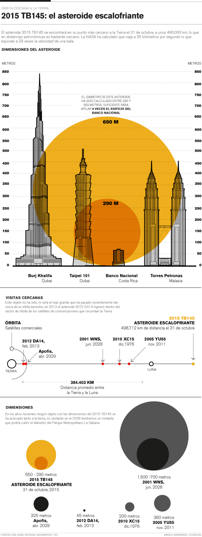
The spooky asteroid:
In october 31, an asteroid pass near the earth (near in space terms), this asteroid was renamed “the spooky asteroid” and take the attention of the world by the time of his visit, so it was a nice opportunity for a quick graphic for social media:
Compact version for social media. Motion-Infographic by Marco Hernández.
Gif version for social media. Infographic by Marco Hernández.
Desktop digital version for article. Infographic by Marco Hernández.
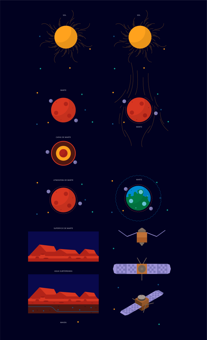
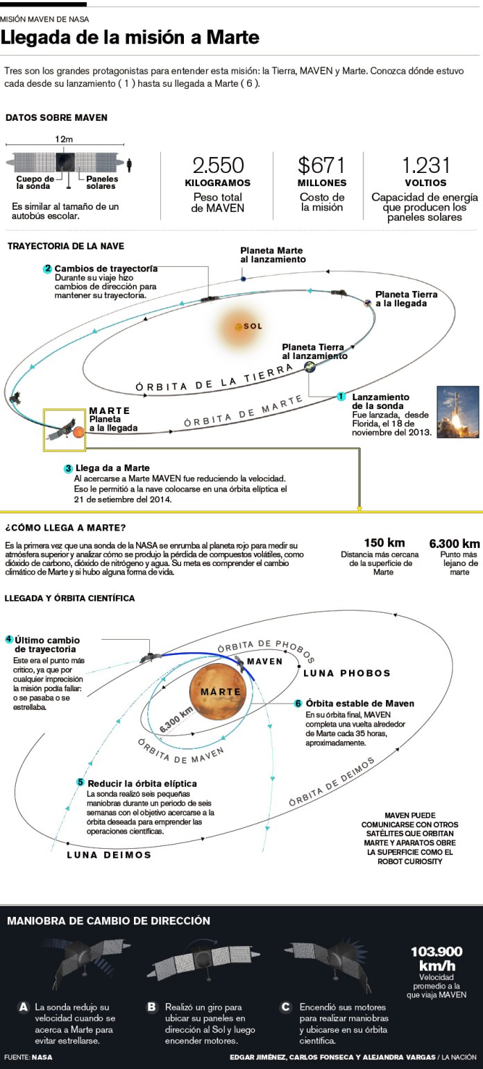
The MAVEN findings:
The NASA made the announcement of the Maven mission findings about what happened with the atmosphere and magnetic fields of the red planet. We are awaiting the press release with a stock of pieces to develop soon as we can a simply animation for social media:
Illustrations by Dominick Baltodano and Marco Hernández.
Compact version for social media. Motion-infographic by Marco Hernández.
Desktop version, infographic by Edgar Jiménez, Carlos Fonseca and Marco Hernández.
Hope in this 2016 have many more of these chances to create more quick graphics for social media, these are a great way to engage readers with content made exclusively for consumption on social networks.
The WordPress.com stats helper monkeys prepared a 2015 annual report for this blog.
Here’s an excerpt:
A San Francisco cable car holds 60 people. This blog was viewed about 2,400 times in 2015. If it were a cable car, it would take about 40 trips to carry that many people.
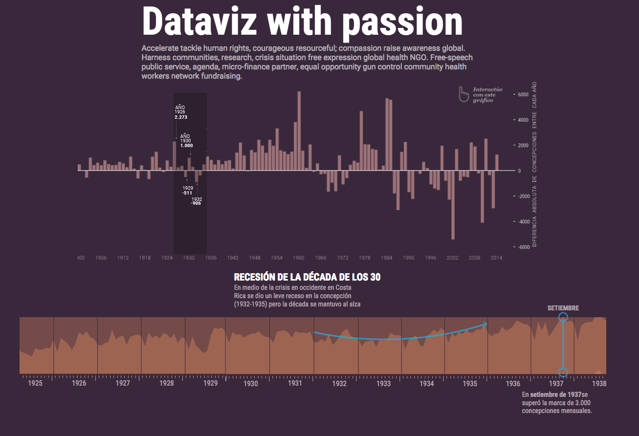
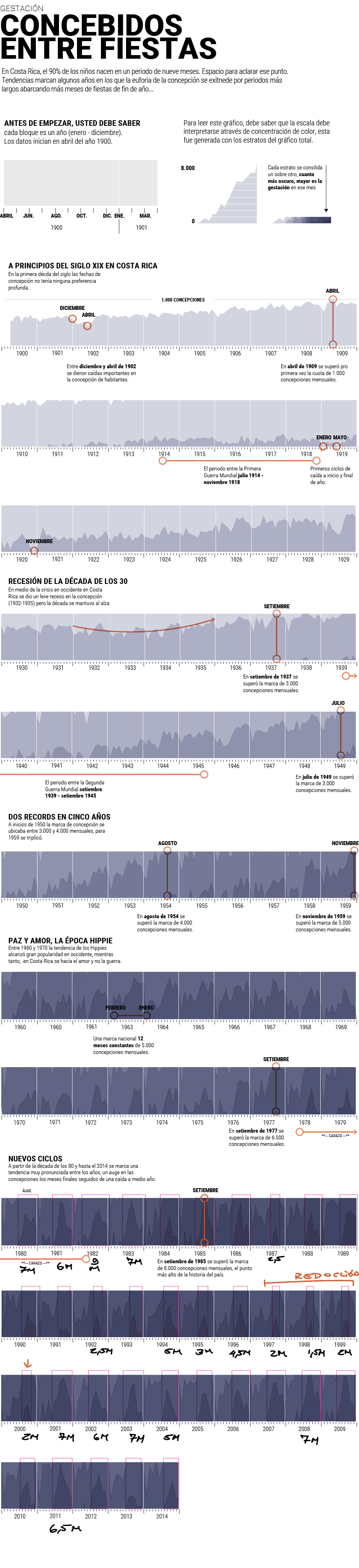
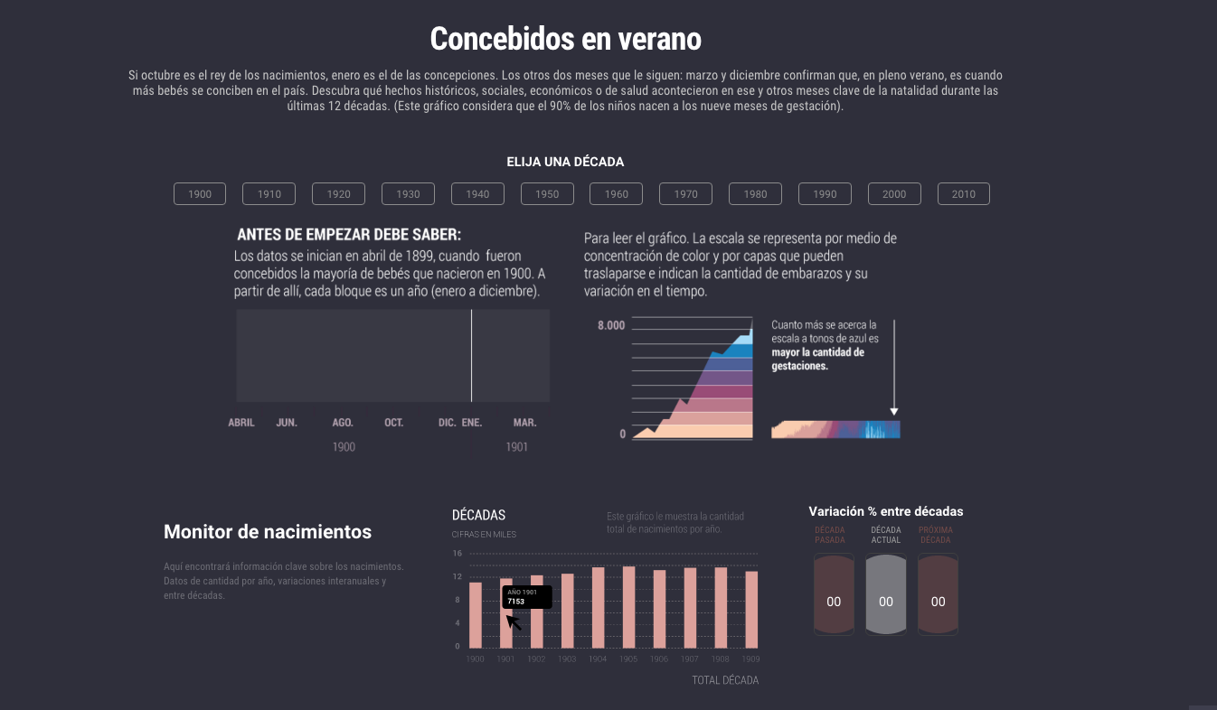
A few days ago We published at nacion.com this special feature analyzing the data of 115 years of births in Costa Rica. We decide to take this special as an opportunity to explore the deep exploration of data visualizations with the efficiency and impact of illustrations. But besides the style and interface, the production process its the most interesting story.
One of the most complicated pieces of the special its the section of conceptions, we have all this data about the births, and the necessary references to relate it with the conception, so, We wanted to create a customized visualization to navigate through a 115 years of the country history and relating how the people gets pregnant.
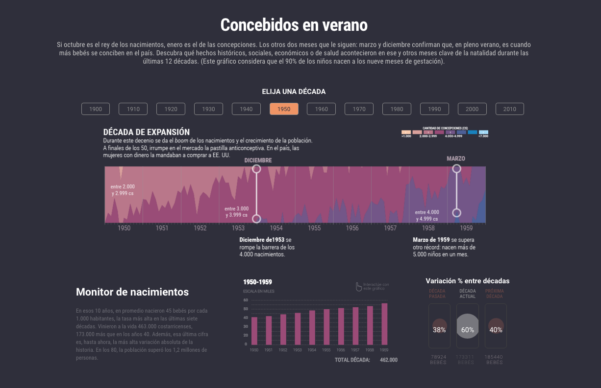
We begin with a model of variation per decade, where we can see the balance in favor or against each decade in births. We use this chart as a navigator to show in the bottom detail of those ten years. By this time we have the idea of linking these points with major events taking place in the country and the region to relate the behavior of people with some important facts in time.
First version of the visualization of conceptions. Note the dummy text 🙂
This special was an conjunction exercise with the Data Team of La Nación, I made my part in visualization and other support, but it because the skillfully profesional of they, it’s that the final product becomes properly. In spite of I have a small part of the special, the versions of the charts, the motion graphics and some other assets take about 1.1 GB of space. This is it because I made so many versions and testing design to find the better way to present the findings in the data.
I start with this horizon chart to visualize the concentration of conceptions, it was fun because i start thinking that i’m seeing in the moment in which the persons did their things in their beds conceiving new compatriots. So I could be seeing as in some parts of the graphics I surprised myself with what they meant those lines.
Full visualization by decade of conceptions in Costa Rica
Obviously we not publish comments like the next ones that I’ll score when analyzing the chart in search of curiosities, but between the equipment if the process is to make more fun, I must say that is a personal process and does not refer to style publication of our environment here at La Nación.
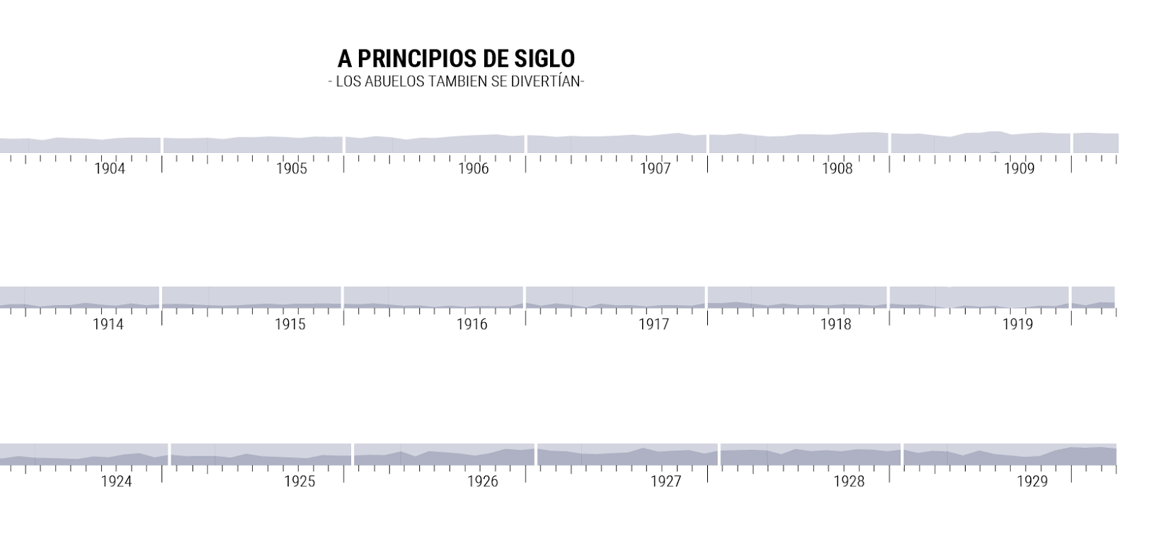
in the top graphic I wrote “The begin of the Century, our grandparents also was having fun” the data reflects that they in the early century don’t have prefers or discrimination of the time to get pregnant
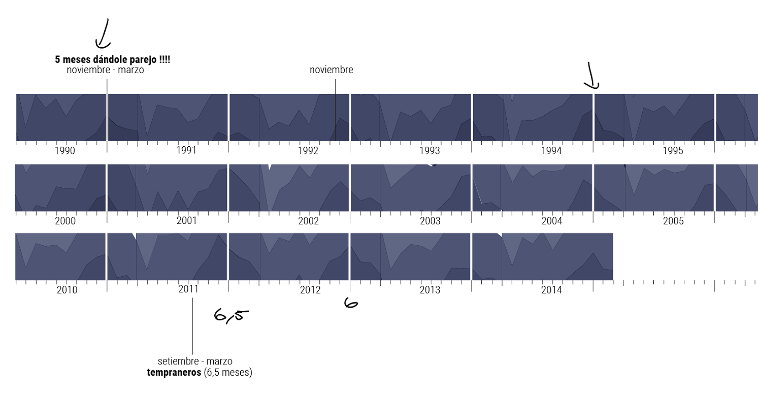
in the top graphic I wrote “five months giving it!!!” the data show periods or season of conceptions, the behaviour changes through the time, the late conceptions prefers the 3 or 4 last months of the year to get pregnant. At the bottom I wrote “the early ones” for 2011
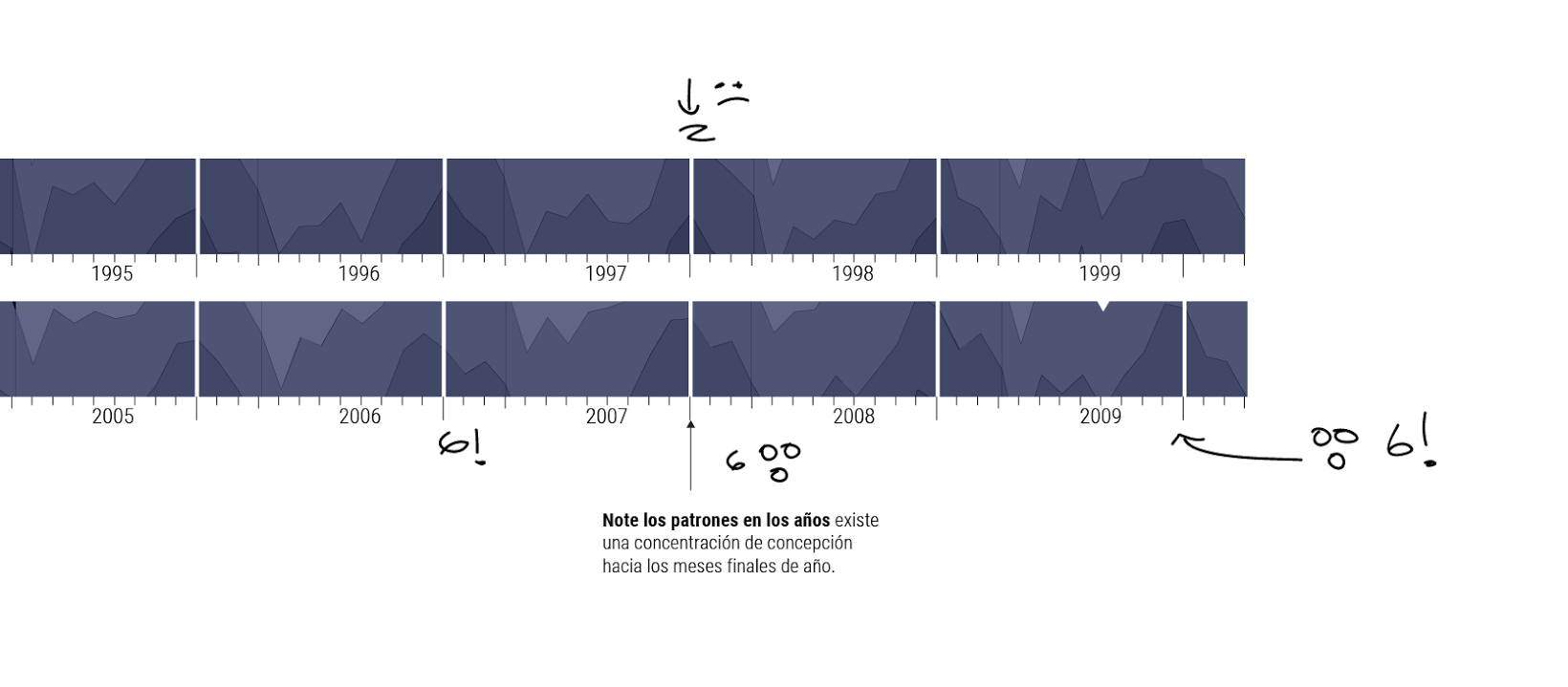
Also i add some emotions, at the top a sad face because the high season is only of 2 months, but for 2006-2007 the high season has a prolongation of 6 months OMG a lot of time enjoying the bed time!
This if the full visualization if the 115 years of data of baby conceptions in Costa Rica, then i split it by decade.
The final version have the instructions to read the horizon graphic and the indications of each space that will change when the reader click the upper menu by decade, then, the dashboard change the data according the user interest.
The main graphic is the conception concentration, at the bottom the decade resume, and the percent variation between decades
How to read the graphic, the title show a legend “before you start, you must know”
PLUS EXPERIENCE
We add some hide effects to give different experiences of navigation to the readers, if you use the side menu to navigate each section is preceded by an animation like the next one, if you want a see more of this project please visit it here http://bit.ly/1kpN45p hope you enjoy the data experience.
Illustration by Augusto Ramírez, Motion by Marco Hernández.