
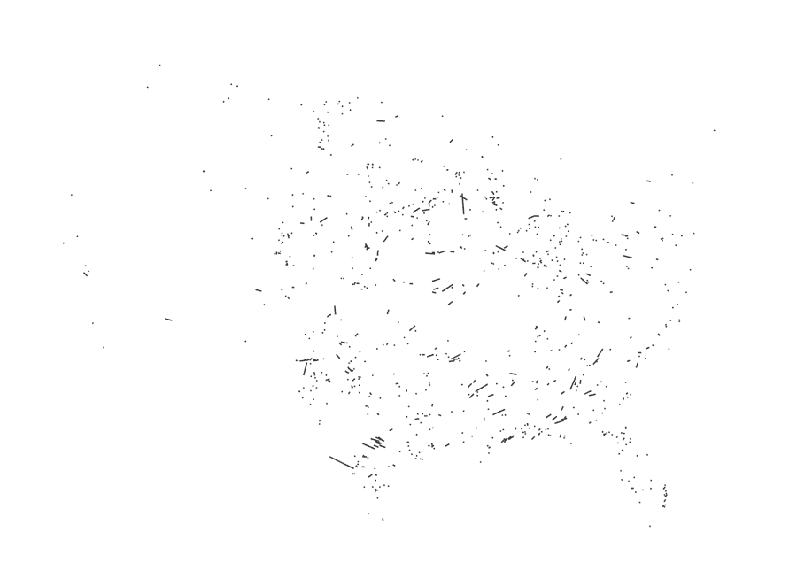
A while ago I started to look at the API of a company that does high res aerial imagery overlapped with FEMA’s damage reports. Truly it’s a great and detailed resource, here’s an example of the data, each dot here is a building classified by FEMA after a weather disaster, in this case a 2023 tornado in Little Rock, AR:
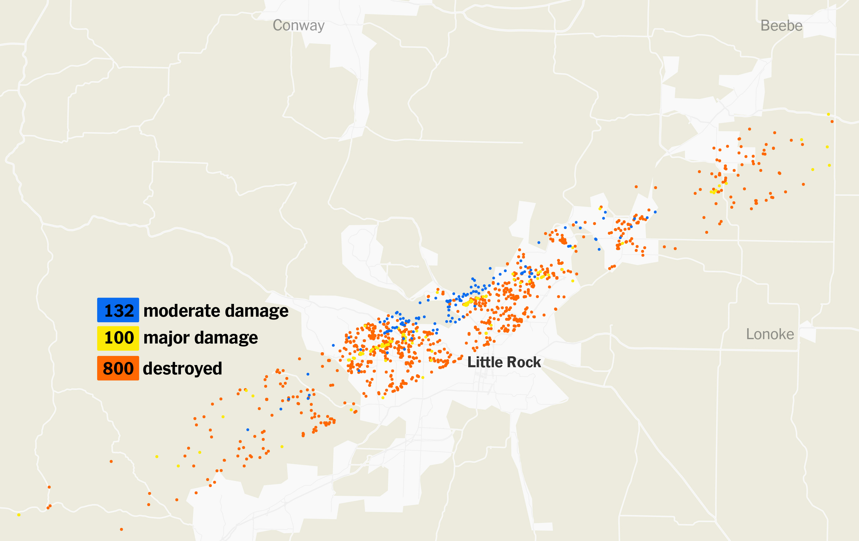
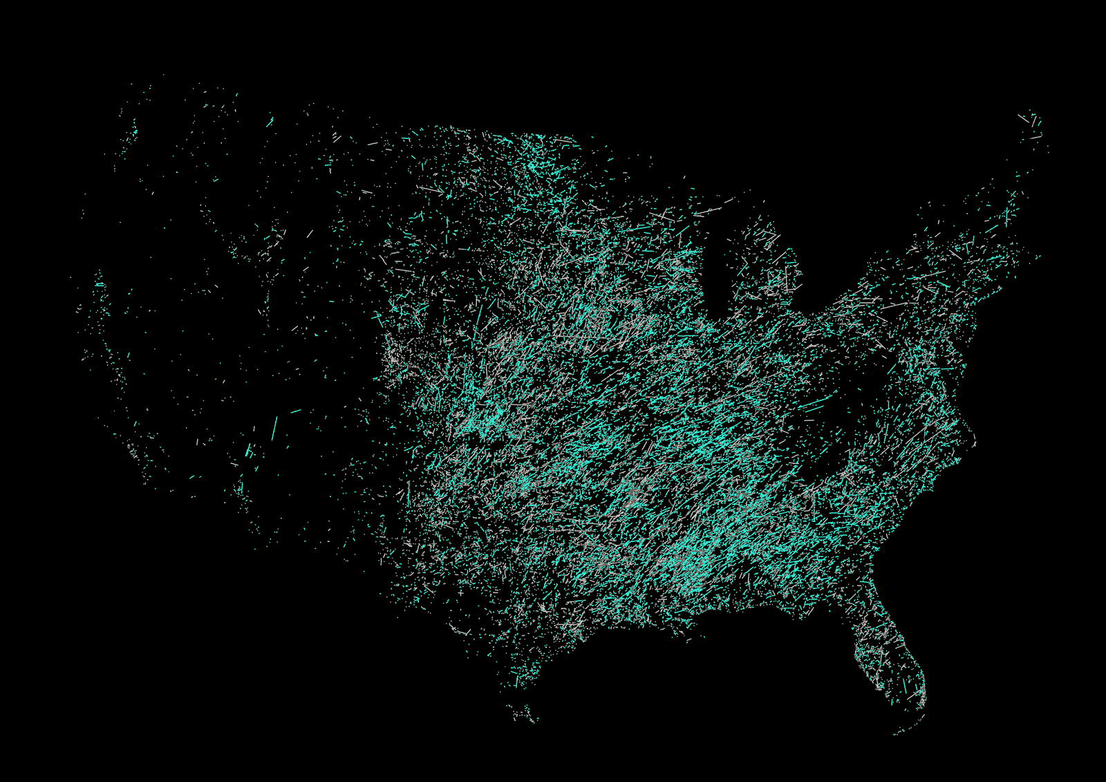
My original idea was to putt together all the destruction in 2024 across the US. And to some extent, I managed to extract all the information and create some visualizations that look like pages from a book written in an ancient language. Below is an unpublished piece with buildings damaged throughout 2024 by natural disasters such as hurricanes, fires and tornadoes, the area in detail is the just the ones affected by 2024’s hurricane Helene:
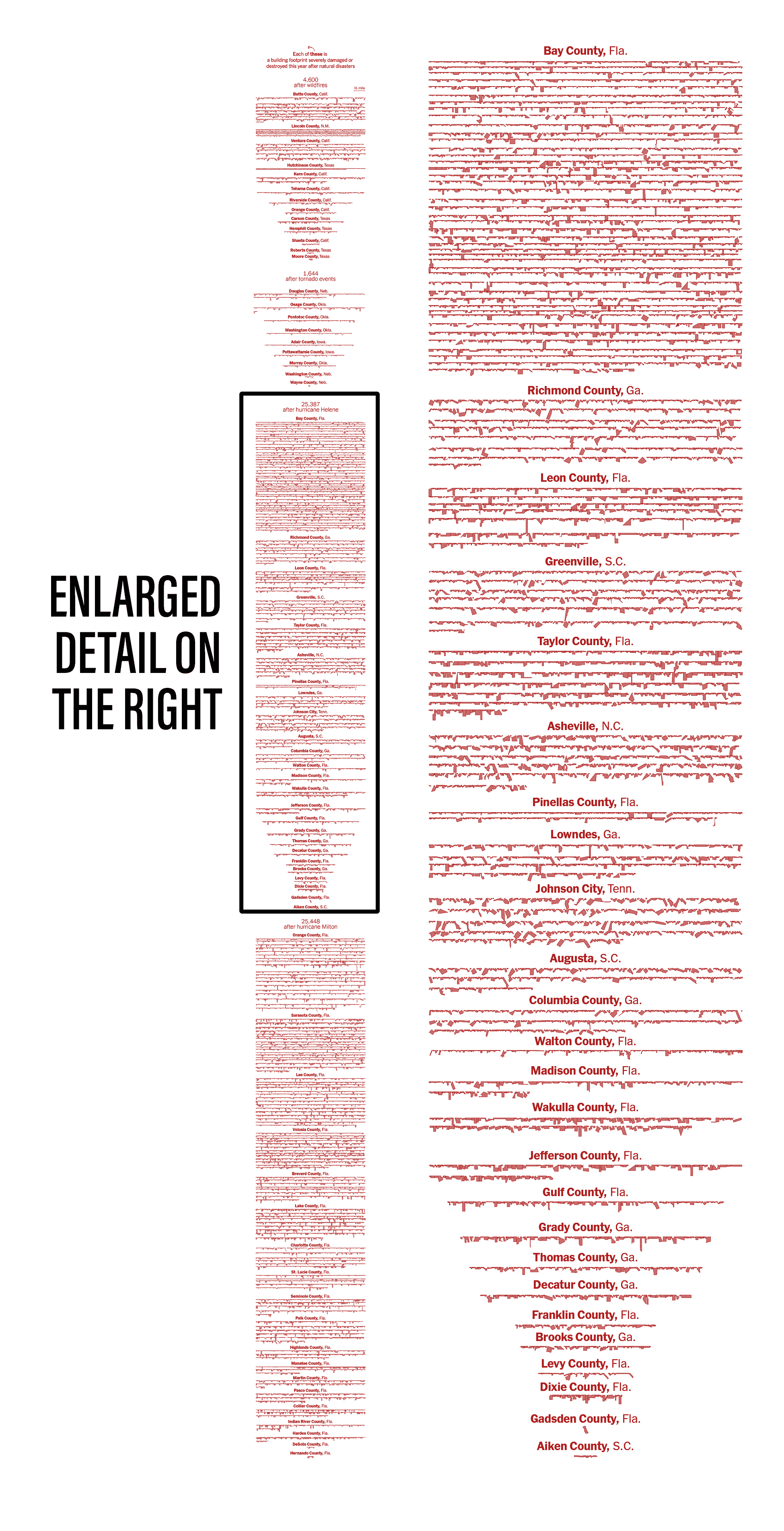
The abstraction of taking footprints out of the map was a fun idea, I think that shape allows you to see beyond the location, you can compare buildings, some states show larger damaged buildings, others are super tiny, also you can notice that there are places with larger clusters of damage due to certain events, works well to show scale of damage, but it’s a quite deep graphic with many layers of information.
I learned a lot from this project, for example I printed out SVG maps with the building footprint by county. But the dilemma was how to take each polygon and reposition it into line-blocks without changing the scale… That to thousands of polygons in different files. Python and js helped me out to read each of the 73 maps I got and align groups of buildings into these blocks.
I wrote my own script using svg.js, then a colleague sent me over this other nice way to re-arrange svg shapes using SVGnest, so fun! maybe this can help you if you are trying to achieve something similar.
However, looking at where all that happened is interesting, so I did a series of state maps to visualize clusters of damage. I created grids of 5km and counted how many buildings fall into each quadrant using one of the point analysis tools in QGIS. Then I took the result to blender to create one map per state like the one of Florida below.
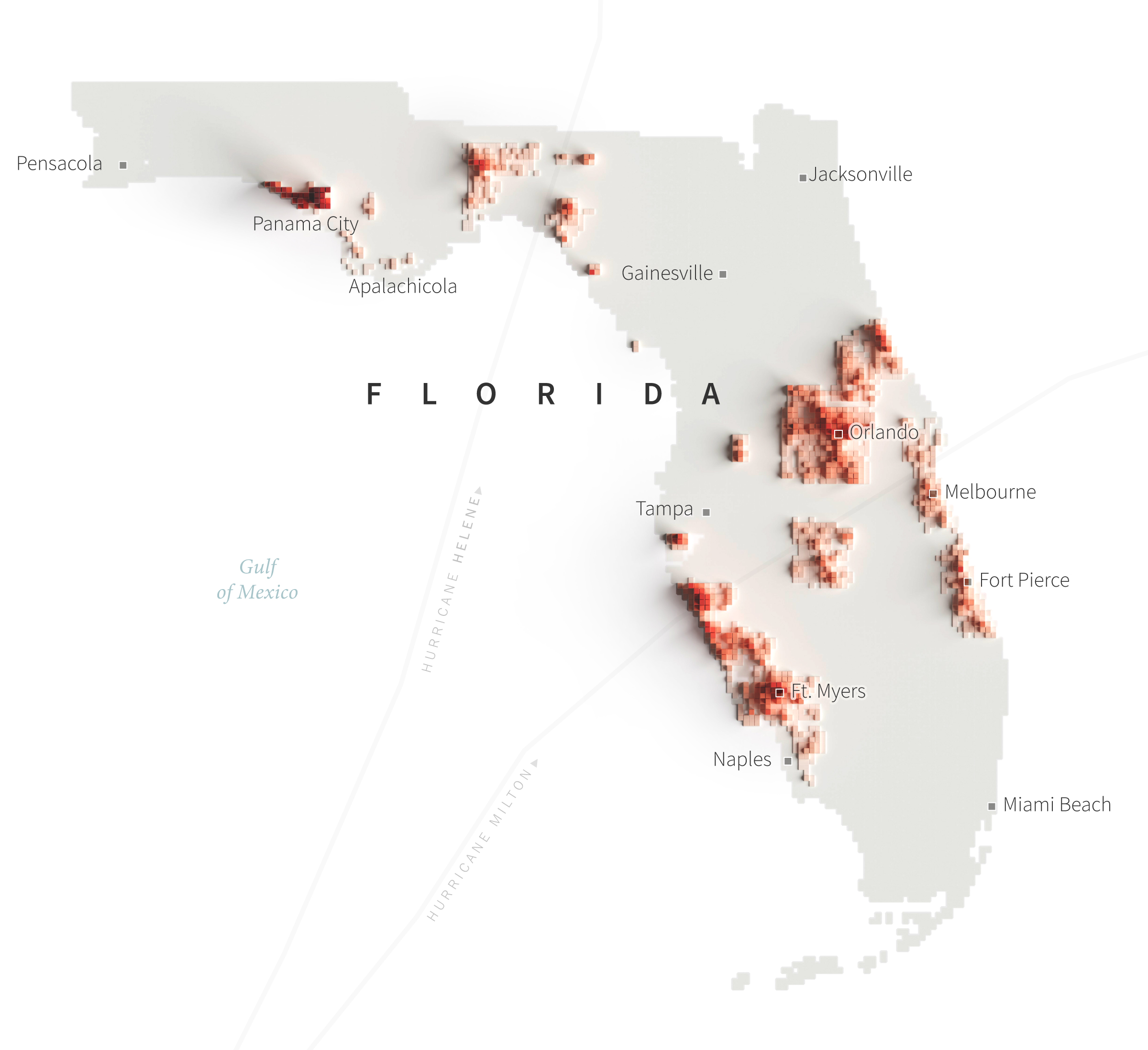
The animation showed one of these maps per state while counting the cumulative number of damaged buildings each time a new state was added until each record for 2024 was complete. That for +57,000 footprints.
Focus shift
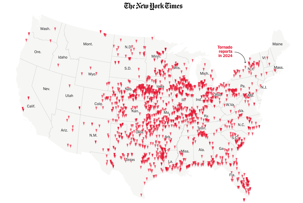
In a turn, I found that 2024 was a very active year for tornadoes, I did some interviews to researchers in different universities and found out more and more interesting data on these events, so the story went from mapping damage across the US to report on how intense the tornado season was in 2024.
I did used a little fraction of the footprints I prepared for the original story, but I guess this reflects how sometimes the stories can evolve into something else, talking to people might make you realize that there’s another interesting angle of things.
You can read more about the company providing the data for footprints and HD imagery on the tornado story I published at the Times here: [ UNLOCKED STORY LINK ]
Tornadoes turned out to be super interesting, there a lot of caveats on this data from NOAA, the CDC, FEMA and the private company doing the imagery. I guess my infofail here was spending too much time trying to map every damaged building in the U.S.
Digging into the data a little more and talking to experts can save you time and maybe, as it did for me, even give you a new perspective on a story you want to tell.
About infofails post series:
I believe that failure is more important than success. One doesn’t try to fail as a goal, but by embracing failure I have learned a lot in my quest to do something different. My infofails are a compendium of graphics that are never formally published by any media. These are perhaps many versions of a single graphic or some floating ideas that never landed.
In short, infofails are the result of my creative process and extensive failures at work.
Are you liking infofails?, have a look to previous ones:
01: Wildfires
02: Plastic bottles
03: Hong Kong protest
04: The Everest
05: Amazon gold
06: The world on fire
07: A busy 2021 kick off
08: Olympics
09: Floods
10: Doodles for news
11: Random Failed Maps
12: The Mismatch
13: Mapping Taiwanese Food
14: Mapping Damage in Ukraine

Pingback: 2024: The year in graphics | Marco Hernandez
Pingback: infofails: 30 days map challenge | Marco Hernandez