
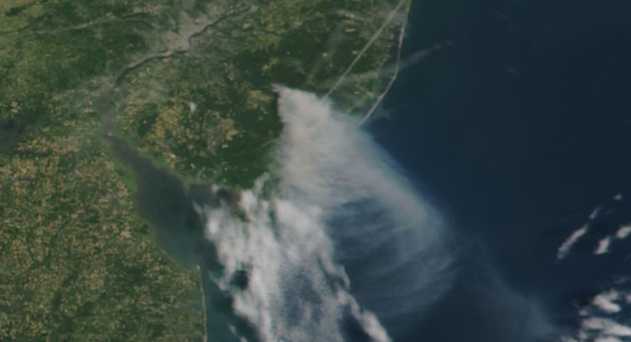
Long time ago someone on twitter ask me to do an explainer on how I did the “smoke” animations for this Reuters piece. It has been a while since then, but maybe it would be useful for someone out there, even if that mean learning how NOT to do things.
Before continuing, to follow my guide and visualize organic carbon, you should be able to use your terminal window, QGIS and optional Adobe After Effects.

Let’s talk about this wonderful data first
NASA’s Global Modeling and Assimilation Office Research Site (GMAO) provides a number of models from different data sets, this is basically a collection of data from many different services processed for historical records or forecast models. This data works well for a global picture or continent level even, but maybe isn’t a good idea to use this data for a country level analysis, for those uses you may want to check other sources of the data instead of GMAO models, like MODIS for instance if you you are looking for similar data.
ORGANIC CARBON
There are a lot of different sets of products available at the GMAO servers, you can check details here, here and here. However for purposes of this practical guide, I’ll be focusing in the emissions of Organic Carbon which is stored into the tavg3_2d_aer_Nx set. That’s a GEOS5 FP 2d time-averaged primary aerosol diagnostics, which includes Organic Carbon Column mass density in the 38th band, there is some documentation available in this pdf. ( No worries if is this sounds too technical stay with me and keep going. )
A day of observations accounts for 8 files since this data is processed every 3 hours. This is great for animation because it would look smooth. Knowing that, let’s move to our guide.
Step 1. Get the data
The data is stored into this url. You can go into the folders and get all 8 files for each day manually if you like or get them with a command line using wget or curl into the terminal. You just need to know a little of the url structure:

- Create a folder to store your files with some name like data
- Open your terminal window
- Type cd in the terminal window
- Drag the folder you created inside the window

Then run a short command like the following, you would get a file named 20220619_0130.nc4 in you data folder:
curl https://portal.nccs.nasa.gov/datashare/gmao/geos-fp/das/Y2022/M06/D19/GEOS.fp.asm.tavg3_2d_aer_Nx.20220619_0130.V01.nc4 -o 20220619_0130.nc4Note that I have renamed the output ( -o ) with a shorter name. The file will go to your folder ready to use into GQIS. Of course you will need a few more files to run an animation. Remember that this data is available for every 3 hours daily, so you need to set the url and name for something like this:
01:30 AM >> 20220619_0130.V01.nc4
04:30 AM >> 20220619_0430.V01.nc4
07:30 AM >> 20220619_0730.V01.nc4
10:30 AM >> 20220619_1030.V01.nc4
01:30 PM >> 20220619_1330.V01.nc4
04:30 PM >> 20220619_1630.V01.nc4
07:30 PM >> 20220619_1930.V01.nc4
10:30 PM >> 20220619_2230.V01.nc4
Just create a text list with all the urls you need and run the script into the terminal window with the same process:
curl -O [URL1] -O [URL2]Each file is usually about 120MB, if there’s something wrong with the data the file will be created anyway but would be an empty file of just a few KB. Do a day or two first and check, that’s 8-16 files, check them, if all looks good load a few more if you like.
Step 2. Loading the data
Once you have a nice folder with all the files you want, you can just drag and drop the .nc4 files into QGIS. We are looking for the 38th Band, OCCMASS which is our Organic Carbon Column mass:

Once you have the data loaded, you want to set the data projection to WGS 84, this will enable the data layers to be re-projected later on. To do that, select all you data layers, right click on them, and select Layer CRS > Set Layer CRS > 4326. Be sure of selecting all the layers at once so you do this only one time. Otherwise you will need to doing over and over.

Since this is a good global data set, you may want to load a globe for reference, you can use your own custom projection, or use a plugin like globe builder:

Once installed, just run it from the little globe icon, or in the menu plugins > Globe builder > Build globe view. You have a few options there, play around with the center point lat/long. You will see that this data sets always have large concentrations of emissions in Africa, maybe that’s a great place to start. I’ll do a similar view to the California story for now.

Step 3. Styling your map
The color ramp is important, you want to have a data layer that can be overlayed in the base map, so you want to have white/black for the lower values and high contrast in the other end of the data, since we are working on white background I’m using white to black with yellow and brown stops. Check what are the highest values in your data set the style for on layer to something like this:

Once you have the ideal color ramp for one layer, right click on that layer, go to Styles > Copy style. Then select all you carbon data layers, right click on them and select Styles > Paste Style.
Step 4. Preparing to export your map
You are almost done, by this point you can see how each data layer creates swirls in the atmosphere, maybe some evolution of it too just by toggling the layers visibility. I like to have all the layers well organized so you can quick check the data. I’m maybe a little too obsessive but I usually rename all layers and groups to something like this:

The name change works if you are using an automatic export of all layers, the script takes the name of the layer to save each file. But there are alternative ways to do this if you’re not as crazy as I am and don’t want to spend time manually renaming.
Step 5. Export your map
There are many ways of doing this, you can set up the time for each layer by using the temporal controller, there’s a good guide here. That way you can get a mp4 video right away from QGIS, but you need to set up each data layer time manually.
You can also use a little code to export each layer into an image, which you can then import into After Effects. To do that, the first step of course, is to get the script. Download the files HERE.
Now, go to the plugins menu at the top, there, you will see the Python console, go and click that, you will see this window popping-up:

Click the paper icon, then click the folder icon and select the python script you dowloaded above. Just be careful with the filePath option.
If you are on a mac, right click your output folder and hold the option key, that will allow you to copy the absolute path of you folder, paste that to replace the filePath field value (the green text in the image below). If you are on Windows, just make sure to get the absolute path and not a relative one.

I left some annotations on the script to better understand what each part is, it’s based on a script someone did with Vietnamese annotations, source and credit are in the drive link too.
Now just click the play button in the python console, seat back and look all the frames of your animation loading in the output folder you selected. You should see a file for each of your layers when the script finishes.
Step 6. Export your animation
Take all the files this into After Effects. First, add your carbon data as sequence (0001.png, 0002.png, 0003.png…), keep that in a sub-composition and use a multiply blend mode to overlay the layers, then add the countries/land and the optional halo.
Finally, in the drive folder you will see a .aep file, that’s a simple number animation to control dates, copy the text layer into your composition. You know when the data starts and when it ends, in the example is just 3 days 19-21, “June” is a different text layer, so add those numeric values to the keyframes into the text layer you have copied, and leave it at the very top:

Once you are all set, just export to media encoder to get you mp4 animation.
If any of this doesn’t make sense to you, or if you’re having trouble with a step, feel free to reach out to me on Twitter. I will be happy to hear from you.
Happy mapping!

Pingback: Tutorial: Visualizing global temperature step-by-step | Marco Hernandez
Hi Marco – How can I animate this in qgis using temporal controller panel? thanks
LikeLike
Hey Daniel, thanks for reading.
You need to enable the “Dynamic Temporal Control” option on each layer an entering the date/time one by one. Then you can control/export the animation in the main control panel (the clock icon). A good step by step guide can be found here: https://www.qgistutorials.com/en/docs/3/animating_time_series.html
LikeLike
That was quick!! 🙂 I’ll have to try that. btw – Here’s some python code to download all the files. I spend all day yesterday after reading your post putting this together. I’m a super geek about maps (I was an imagery analyst in the US Army in 1986-1993) and still love UTM’s.
# property of daniel bogesdorfer
# free use – just please ack developer
import requests
from bs4 import BeautifulSoup
import os
def search_directory(url):
# Make a GET request to the URL
response = requests.get(url)
# Parse the HTML content using BeautifulSoup
soup = BeautifulSoup(response.content, ‘html.parser’)
# Find all the tags with an href attribute
links = soup.find_all(‘a’, href=True)
# Loop through all the links and download the files containing the specified string
for link in links:
if “GEOS.fp.asm.inst1_2d_lfo_Nx.2023” in link[‘href’]:
file_url = url + link[‘href’]
file_name = link[‘href’]
#save all files to my local hard drive
file_path = os.path.join(“e:\\weather”, file_name)
# Download the file using requests
with open(file_path, ‘wb’) as f:
response = requests.get(file_url)
f.write(response.content)
print(f”Downloaded {file_name}”)
# Check if the link is a subdirectory
if link[‘href’].endswith(‘/’):
subdirectory_url = url + link[‘href’]
# Recursively search the subdirectory
search_directory(subdirectory_url)
# Start searching at the specified URL
url = “https://portal.nccs.nasa.gov/datashare/gmao/geos-fp/das/Y2023/M02/”
search_directory(url)
LikeLiked by 1 person
Pingback: A step-by-step guide: visualizing organic carbon in near real time - Storybench