
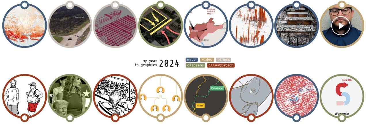
We’re leaving another year behind, and as usual, I like to close it with a summary of what I’ve seen, shared and created during the last year, so here we go:
––––––– :::: 🗓️ ::::: –––––––
January: Santa’s surprise visit
2024 started slowly for me. In the middle of the snowy days, I did a quick trip to DC to boost my inspiration with the museums of the city and of course meet some good friends who live there. But one of the most delightful moments of last January was when I returned to the office on the first day after vacation. That day there was a mysterious package on my desk, it felt like a late visit from Santa, a wonderful book compiling cartographic works of Xemartin Laborde. I enjoyed a lot looking at the maps that Xemartin kindly shared with me.
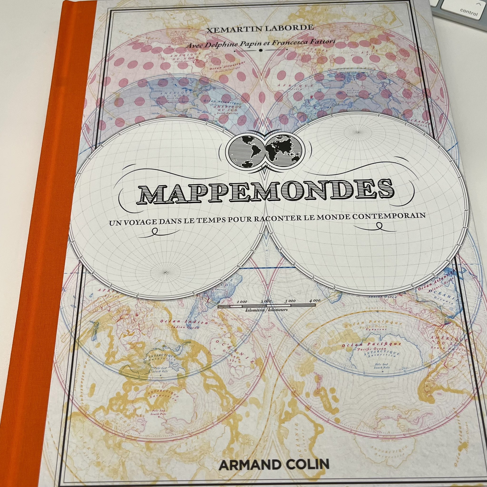
The rest of January I spent it doing research on extreme weather events. And of course, looking a few times more Mappemondes and talking about geography with my son. Once more thanks Xemartin!
––––––– :::: 🗓️ ::::: –––––––
February: Satellites
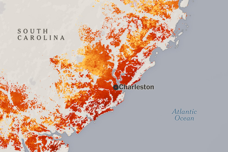
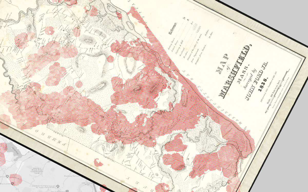
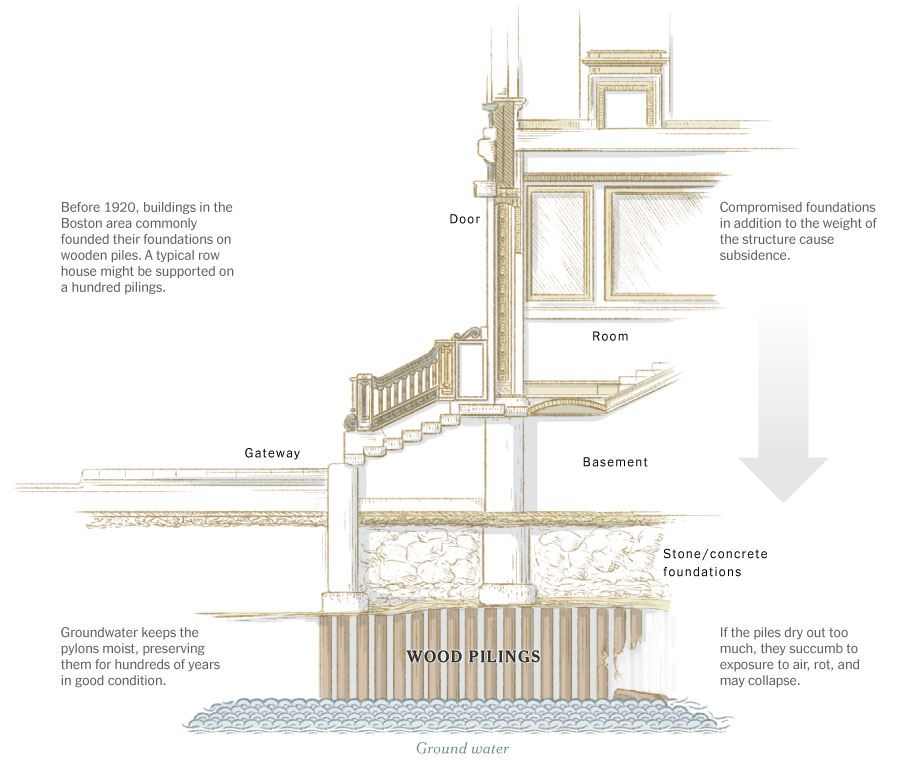
Back in February I was collaborating with the Climate team, Mira Rojanasakul and I did this piece explaining how the US East Coast is sinking, based on a recent study using radar technology onboard of the Sentinel constellation. I did a lot of iterations for this project, from maps styles to charts, illustrations and following up interviews with the scientist too. I spent some time looking closely at this data, looking for AOIs in various forms including levees, roads, bridges… I even looked at old records like this area of Massachusetts mapped in 1838 to which I overlaid SAR detections (in red) to see where the land is sinking:
I had a lot of nerdy fun with this project, here’s a piece we did not used explaining one of the many issues this phenomena causes, copy was not proofread as you might note:
––––––– :::: 🗓️ ::::: –––––––
March: A trip to Texas
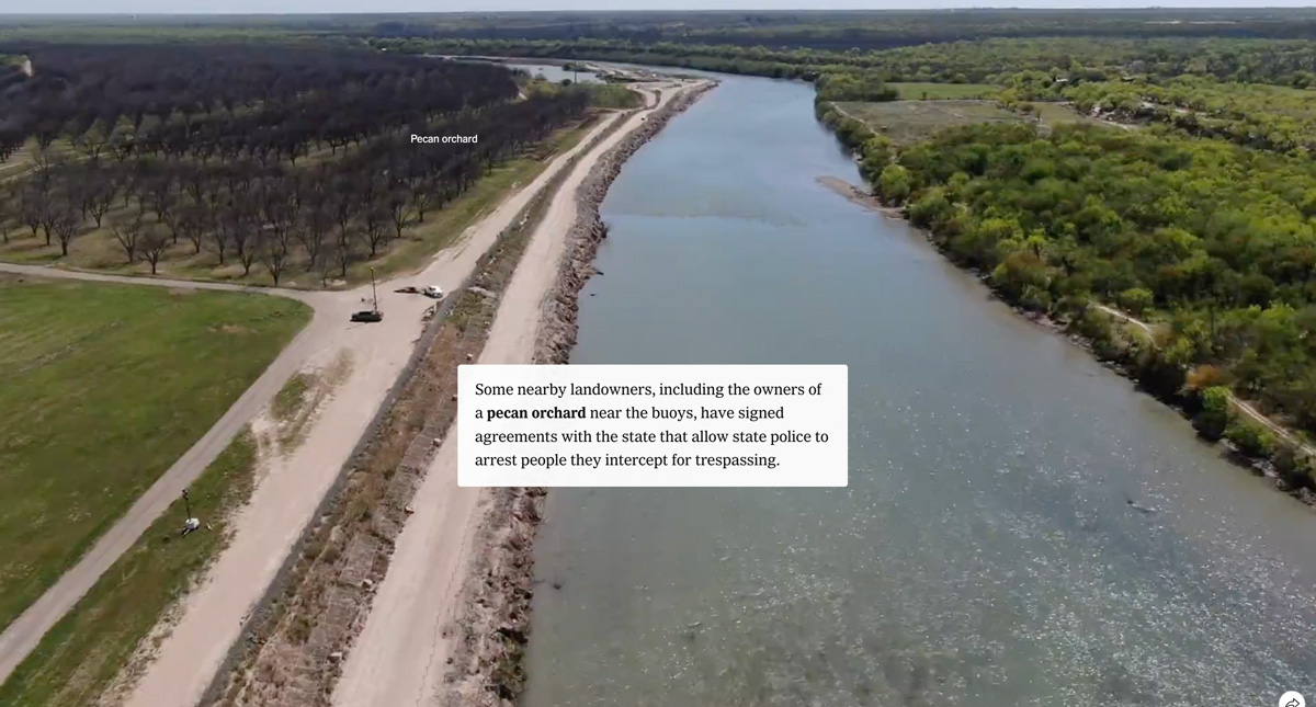
In March, I made a trip to the border with Mexico with a couple of colleagues to report on the takeover of a section of the border by the National Guard. The story was titled “See How Texas is Testing the Limits of State-Run Border Control“.
We used a drone to fly over the Rio Grande in the area controlled by the military, we also spoke to locals to see how their routines had changed after the waves of immigrants and the military presence. 2024 was an intense year for immigration issues and it is likely that this coming year I will do some more reports on the subject.
––––––– :::: 🗓️ ::::: –––––––
April: Gaza & Georgia
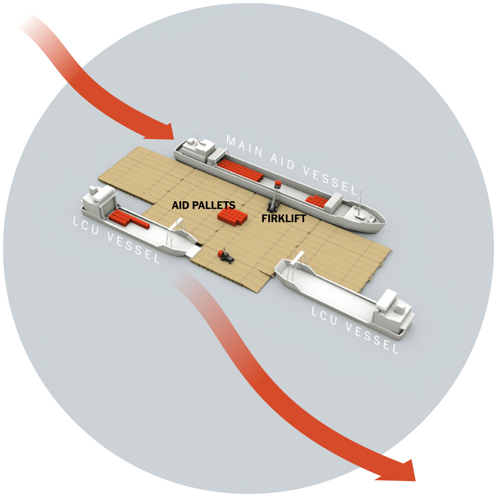
In April we kept an eye on the situation in Gaza, and I was part of a team tasked with investigating the deployment of the floating dock that the US intended to put at the disposal of Gaza to facilitate the entry of humanitarian aid. The project failed and ended up being dismantled. You can read more about that story here.
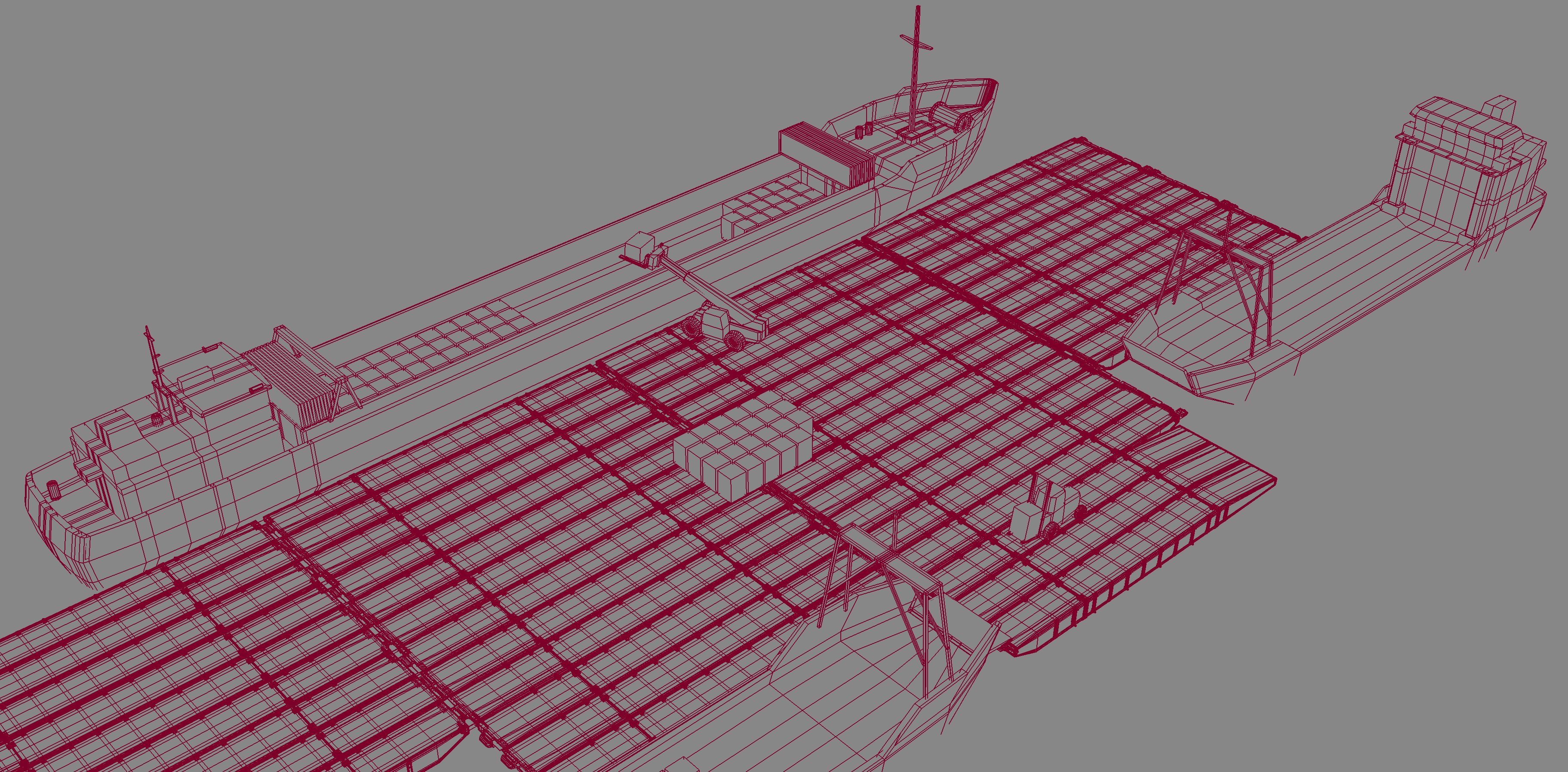
For that project I was working with Cinema 4D, but I’m using Blender more and more. That was the last thing I did in C4D in 2024, not sure if I would need it again in 2025. Should we all move to Blender anyways?
At the end of April I took a few days off and went with my family to northern Georgia and North Carolina, we spent some great days near Chatuge Lake and in the town of Helen GA, a super nice short vacation in the mountains.
––––––– :::: 🗓️ ::::: –––––––
May: UCLA & Minneapolis
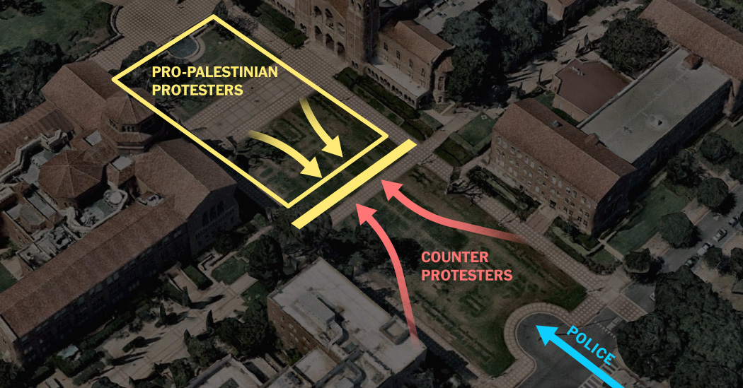
In May I collaborated with the Times Visual Investigations team to produce this breaking news piece showing How Counterprotesters at U.C.L.A. Provoked Violence, Unchecked for Hours.
That month I also took the initiative to travel on my own to Minneapolis to be inspired by the best of the Design Society that held its annual competition there, but also to see so many friends and colleagues who came together for a few days in this city from different continents.
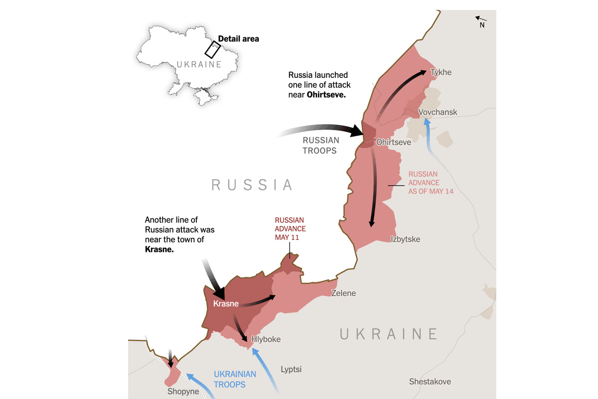
May was also a month to monitor the development of the war in Ukraine, in the middle of the month Russian troops made an incursion near Kharkiv, I reported it with a map of the area showing Russia’s sudden push across Ukrainian lines.
––––––– :::: 🗓️ ::::: –––––––
June: Ukraine

If you know me, you know that since I joined the Times I’ve spent a lot of time reporting on the war in Ukraine, I’ve made hundreds of maps, charts, diagrams and so many other things, but finally publishing this project that we had in our hands for about two years was felt really good.

In addition to the main story, we published a few other pieces like this video where I give a little more context to what we did, and if you follow this blog, of course you’ll remember the backstage story I posted here.
Hello Chicago!
In June I also traveled to Chicago to attend for the first time The Outlier, a conference organized by the Dataviz Society. I really liked it because of its diversity. You can find people from very diverse sectors with great energy it’s a great community. Of course, what we all there had in common there was that we all work with data to tell stories. If you also work with data and want to see for yourself, in 2025 it will be in Miami, I’m sure it will be great again.
––––––– :::: 🗓️ ::::: –––––––
July: Los Angeles & Milwaukee
This year I have traveled a lot within the US. At the beginning of July I was in Hollywood giving a workshop at the annual conference of the Association of Hispanic Journalists (NAHJ). I’m very pleased to know that many attendees started to use the tools and sources that we shared. Helping others who are at the beginning their careers is very gratifying for me.
Run Marco, run!
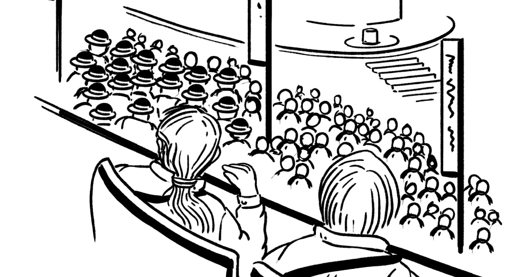
Upon my rushed return to New York over a weekend, the very next day I grabbed my Secret Service credentials and prepared to travel to the Republican National Convention in Wisconsin. The Times sends several reporters and photographers to these events, so it doesn’t make much sense for us to do exactly the same stories, so we focus on doing pieces with a twist.
My colleague Ashley Wu and I went there to listen, interview, and sketch scenes we encountered at the convention to capture the atmosphere of the convention un-staged, you can see all 20 scenes here.
––––––– :::: 🗓️ ::::: –––––––
August: Back to Chicago
In August I was back in Chicago, and my colleague Ashley and I traveled to the DNC to replicate the same format we published with the RNC. The experience was a bit different as expected, but it was an interesting exercise. You can see all the 20 scenes we captured from the Democratic National Convention here.
––––––– :::: 🗓️ ::::: –––––––
September: Scrolling & a train to Boston
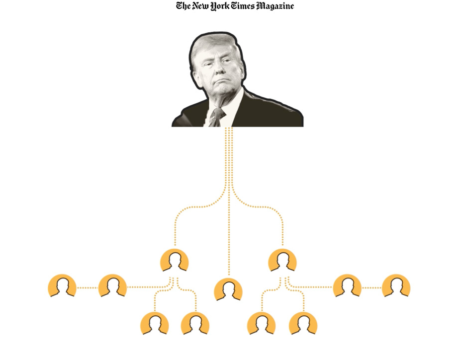
During September I collaborated with colleagues from Times Magazine, basically we were investigating the actions that Trump had described up to that point to use the judicial system and other methods against his political adversaries. Here’s a nerdy fact: This scroll-driven piece was built with After Effects and an internal tool that spits out json files, those files are then interpreted by Svelte components to generate the story you can see. If you want to read more about that story here: “Trump Wants to Jail His Political Adversaries. Here’s How He Could Do It“.
Hello Boston!
I spent the last days of September in Boston with my family. We walked a lot to enjoy the magnificent architecture of the city and its museums. I already have plans to go back there to share some slides and stories from my work with the students at Northeastern University.
––––––– :::: 🗓️ ::::: –––––––
October: Roads & Whales
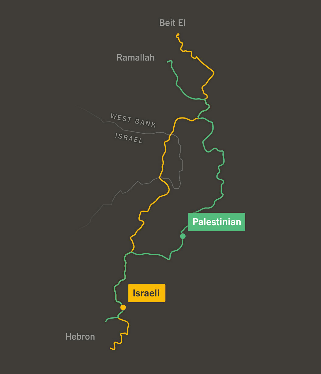
In October I collaborated with the talented Leanne Abraham and a few other colleagues on this story about how things are much more difficult if you are a Palestinian driving on the streets of the West Bank than if you are an Israeli. You can read more about this story here. My role this time was very much tied to narrative analysis and video editing, but I loved seeing Leanne’s process, I have a lot to learn from her to make better maps.
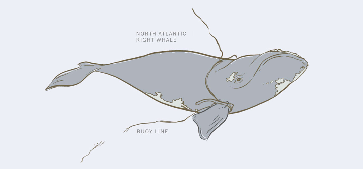
In October I did a quick collaboration with the Climate Desk to tell the story of Squilla, one of the last remaining right whales, and the challenges her species faces. Learn more about Squilla here.
––––––– :::: 🗓️ ::::: –––––––
November: Polls time
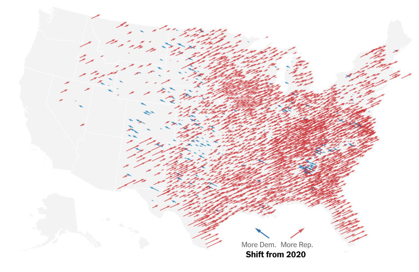
In my case, it was weeks of preparation, hundreds of graphics, concepts and templates that I created in anticipation of the first US results coming in. Personally, I was astonished at how quickly things moved, as all the maps quickly turned red… and you know the rest of the story. The first thing my team published was this piece showing the trend of shifting to the right, that’s the screenshot above.
Then the following day we published a second piece looking closer to the decisions made by different groups in swing states. We introduced these “snake” graphics in the piece titled “See the Voting Groups That Swung to the Right in The 2024 Vote”
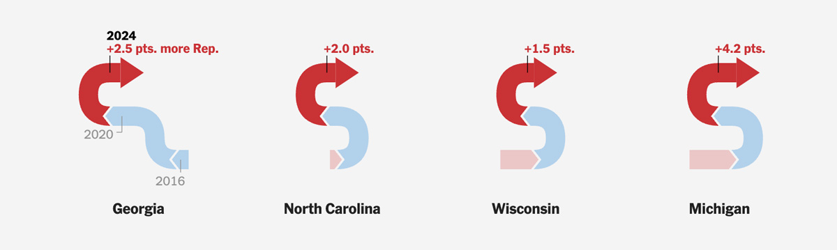
I did a lot of pre-sketching to conceptualize those graphics using test data, but it’s hard to predict what the final result would be, a lot of the pieces we designed and programmed weren’t used, but it was necessary “just in case”.
A new website
Shortly after the elections, I launched a new website too.
I’ve been working on this for a while because I felt like everything was so scattered here and there. I’m still making improvements and I hope to eventually consolidate everything into one place so I don’t have so many separate domains, but I think it will take me more time.
––––––– :::: 🗓️ ::::: –––––––
December: tornadoes
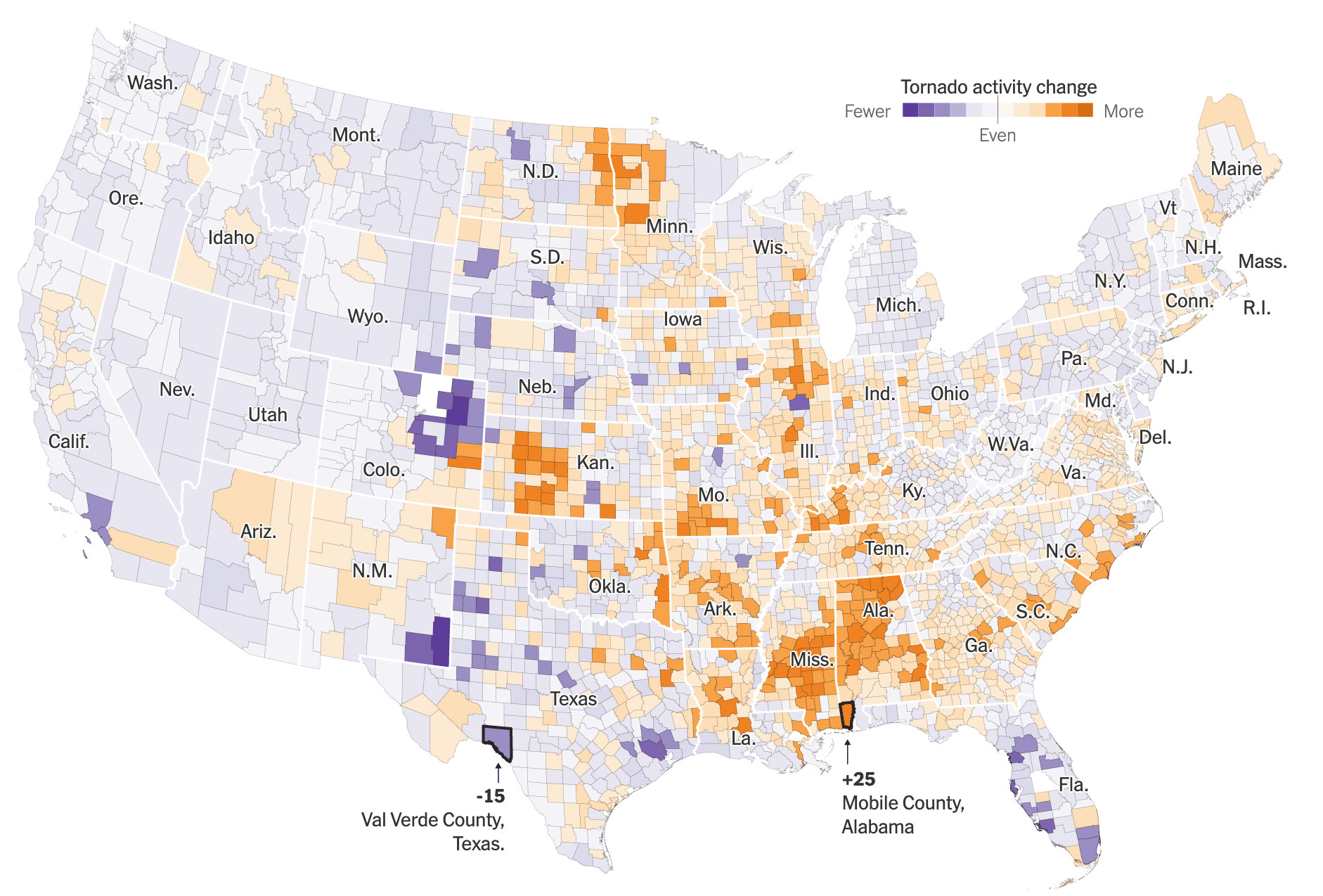
Earlier this year I went down a rabbit hole to understand the data behind tornadoes a little better. Shortly after, by coincidence, I also stumbled upon a company that does damage analysis after natural disasters; the data was just astounding, so I held onto it for a while before pitching the idea with the goal of coming up with a slightly more solid draft with some real data, aerial imagery, and maybe even a super detailed graphic of all the destruction from the year across the U.S., or that was my idea in my head, you might saw the story of how that went few days ago.
But anyway, the story turned a little bit into a more specific and narrower angle, I had the opportunity to learn a lot from many researchers I spoke with, it was a nice way to close the year doing maps and charts. You can read the piece here if you want to learn more about it, its an unlocked link for you. I still have a few more things in the works, but since vacation mode is coming, these projects probably would be in my 2025 year in graphics, leading January as the new beginning.
2024 was a wild year at work, I wish you the best in this new beginning.

See you all in 2025, Merry Christmas!
Some collections from previous years
- mhinfographics: 2023: The Year in Graphics
- mhinfographics: 2022: My Year in Graphics.
- mhinfographics: My fav little details of 2021 on Reuters.
- mhinfographics: 2020 in graphics: My favourite little details.
- mhinfographics: 2019: My sincere gratitude to the South China Morning Post.
— - The New York Times: 2024: The Year in Visual Stories and Graphics.
- The New York Times: 2023: The Year in Visual Stories and Graphics.
- The New York Times: 2022: The Year in Visual Stories and Graphics.
- Reuters: 2020 – The year in graphics.
- South China Morning Post: 2018 in visuals.
