
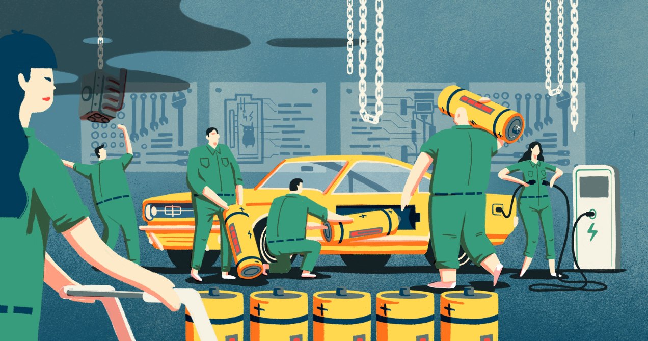
Illustration on top by Perry Tse
It has been a long time since my last post here, we got a lot of projects this year and there are few more to finish before the end of the year but I’m back anyway.
This time I’ll like to share a little about this project I made about electric cars, actually I made this “backstage” because some guys in Germany ask me to, I’m looking forward to see it in their website too. Anyway, here it is:
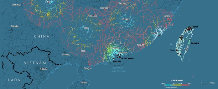
China’s electric cars map range
THE BACKSTAGE
The stones in the road for China’s 2025 plan on electric vehicles
This article is part of a series of visual stories we decide to cover about the Chinese Government plan to develop the country in the following years and set China as the top country in key areas. I assigned the topics to four of our colleagues and at the same time two topics to myself
Most of the data about electric cars was about sales, markets and boring stuff. It is important to explain why is important but not to create a visual story of it. That was a problem because the initial the idea came through that in particular
My solution was to complement that part with something else. Usually I make a document with everything I can find, any single topic, reference or interview then I pick the good ones to develop the analysis on it
After that, I split-up the topic in to mini-sections:
- Why is important (the boring part mostly done in small charts)
- Why is a problem (raw material providers)
- Why is difficult to achieve (findings watching a map)
- How it works (again small charts and diagrams)
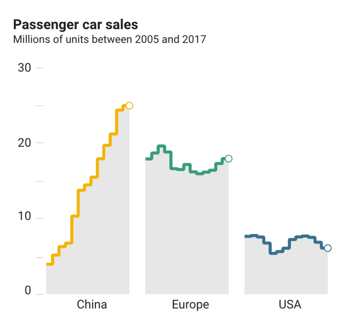
ICOA car sales report. One of the needed boring charts to complement the story
So, first section was done with the boring data. But when I was making more research I found this story about the Cobalt precedence, many data of production, the mix of minerals needed to the industry and how the minerals extracted manually in Africa will end-up in Europe or USA

Sketches of the cobalt extraction and trade flow.
Trying to understand this, I create a few sketches to myself, there I realised that was a nice idea to explain that part quick and ease and focus my effort into the maps section

Open Street Maps Tag info preview
My curiosity lead me to check if China had a public network of stations to recharge the cars. I now that USA have a lot of stations, but I never expected to find that few stations across the country, so I realise I have something nice to show
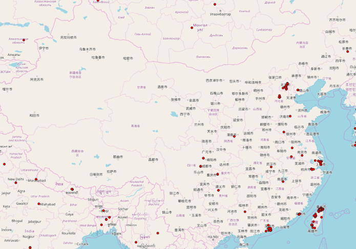
OSM stations imported into QGIS as vectors
I get there using the info tag website of Open Street Maps, funny I began with a huge area extension, but there was nothing around so, I just one more thing to get a nice story, the context in the visual
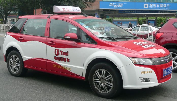
BYD E6 model. A taxi in Shenzhen, China. Image https://www.wikiwand.com/en/BYD_e6
By the data sales (the boring data at the beginning) I confirmed that the BYD electric car, particularly the E6 was the most popular car in China, according to the company, BYD’s E6 car model have a 300km battery range, so all I need to do was to trace 150km and 300 ranges from the stations over the roads of China to get a nice graphic
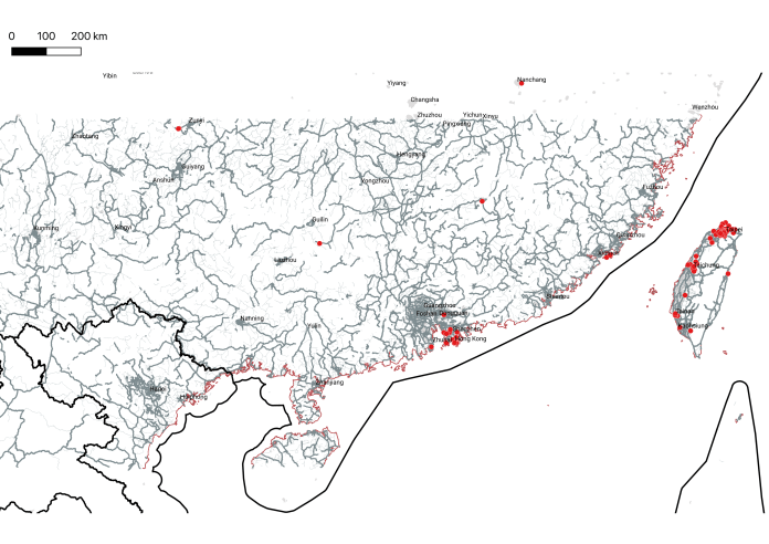
QGIS preliminary preview
I did this in QGIS, then I recoloured the map sections in photoshop to give it the desired aspect. For the print version I decided to leave only the range maps, but in paper the style doesn’t work so I create new versions of each of the maps. At the end I create four maps for desktop views, four to the mobile devices and five to the print version. Maybe is nice to mention I had a tight deadline, a week to do research, write the article, make the graphics, do the coding and make a print version of it.
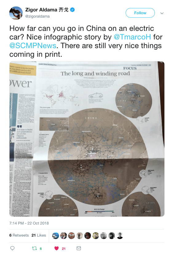
Readers reaction was really good, the graphic reached the average views for our stories very fast, even becoming in one of the most read of this series. The print also was good, people in China got a copy and enjoyed, but I’m not sure how because the SCMP is banned in Mainland China
Check the full visual story here
